
Statistics
We looked inside some of the posts by whatsimonmade and here's what we found interesting.
Average Info
Notes Per Post
52
Likes Per Post
43
Reblog Per Post
9
Reply Per Post
0
Time Between Posts
4 days
Number of Posts By Type
Text
12
Photo
1
Video
4
Last Seen Tumblr Blogs


Fun Fact
In Q3 of 2020, 31% of US users access the Tumblr app daily.
Text
Final Project with Aschehoug 2/2
Project together with: @mirakrogh and @trineerga
Components
We made multiple components, here are some of them explained.

The digital surface is shaped like this. One map, one timeline(both general and specific) and a mapping tool.

Map: where and when
Timeline: Who and what
Mindmap: Why

We also decided to make categories to easier dispaly the content. This was usertested and the users were able to explain the symbols before reading what they were about, and only using the symbols.

All the content is built up by metadata, which makes it easy for Aschehoug to implement the content they already have in their archives.

When you enter the timeline, you might think that the amounts of items might be overwhelming. That’s why we turned this into a good thing by locking some of the objects and making the user explore the available items to unlock new ones.
EXPLORE THE PROTOTYPE HERE!

The motivation: Unlocking new items on the timeline
Overview: Both on the timeline and the map
Connections: mindmapping
Time Travel: able to switch between different time periods.
Bundles
we also explored the possibility for Aschehoug to sell bundles to make the timeline and map contain more content.

Collaboration
We also think that it would be a great way to talk about maps made by students in class, and have an open discussion. Also, collaborating with other students to make a bigger mindmap would also be interesting to explore a bit more.

It feels like the project just started, and I personally would love to continue developing it, and exploring the working mechanisms even more.
3 notes
·
View notes
Text
Final Project with Aschehoug 1/2
Project together with: @trineerga and @mirakrogh

Samflink - the name itself is a play on the word «Samfunnsfag» and «Link» and also the combination of being «flink» together. The symbols represents two hands interlocking as well as a physical link that forms a chain.

This was our scope. Supplement the classical learning at school to get a better understanding of what the students actually learn at school and how it all ties together.

This was our competence goal from the revised learning plan for 2020. We also focused on one of the main goals for «samfunnsfag» which was «wonder and explore».

We made this project statement and started developing multiple concepts.

We started out with quite a lot of different concepts. This is how our concepts developed over the different phases.

We thought: if the students know; who, what, where and when, they could understand why.
3 notes
·
View notes
Text
Gjennomgående tilbakemeldinger fra hovedprosjektet som gjelder alle
Takk for en flotte gjennomganger i dag. Her er generelle tilbakemeldinger jeg håper flere kan dra nytte av:)
- Flott m. Visuell presentasjon. Viktig at de som lytter klarer å følge med på hvordan dere tenker
- Fint m. Overordnet flyt diagram for å forstå, men husk at man ofte omtaler elementer tilhørerne ikke kjenner til.
- I en dyp navigasjon kan det hende at grensesnittets tilbakeknapp ikke gir helt mening..
- Fint å tenke mye på hva som skjer i forkant og etterkant av bruken av et produkt
- Ikke dumt å benytte seg av video for å formidle en prototype «helt etter planen»
- Fint å sette i gang med en stemningsvideo for å komme inn i det man skal se
- Om man viser et produkt, gjerne vis overgangen fra spill/skjerm til virkeligheten. Funker det? Hva er overførbarheten?
- Utrolig fint å starte presentasjonen med å putte ting i setting
- Ikke bruk for lang tid på å komme til «the flesh of the project»
- Husk på å vise hva som er klikkbart og hva som ikke er det.
- TA TING / DESIGN / APPLIKASJONEN UT I KONTEKST
- Flott med presentasjoner som passer den visuelle profilen til designet
- Jobb, jobb, jobb med klikkbarhet, og ellers design som gir brukeren lyst til å gjøre det du vil at hen skal gjøre.
- I testing må man ofte gi testsubjektene en spesifikk oppgave de må løse.
- Nyttig å definere hva man mener med forskjellige begreper
- Om man skal løse et problem, gjerne vis problemet. Eks: designer man en enklere måte å formidle et budskap på, vis hvordan budskapet blir formidlet per dags dato.
- Legge inn forsinkelser, sperrer etc. For å få brukeren til å gjøre det du vil, selv om de kanskje heller vil gjøre noe annet. Eks. vil man få noen til å lese en tekst: få de til å scrolle til bunden eller del opp teksten i to og to setninger som kommer frem.
- Fint å kontekstualisere et prosjekt
- Gjerne forklar hvorfor man velger noe fremfor noe annet
- Flott å også avslutte med en test + planer om videre iterasjoner
- Tenk: hva skal designes i prosjektet? Diskusjonen? Overblikket? Samarbeidet? Tenk på dette hele veien og test, test, test.
- Skal man designe for en situasjon man ikke kan kontrollere må man designe for noe mer ukontrollert, om ting ikke helt går som det skal
- Se på konvensjonene rundt det som allerede eksisterer
- Vær noe objektiv til det man selv designer. Ikke basser for mye på deg selv. Farlig å basere en løsning på en person
- Har man et prosjekt man ikke kommer i mål med er det viktig å fokusere på refleksjon og lærdom
- Vit konkret hva designet ditt skal brukes til
- Smart å vise komponentene til grensesnittet på presentasjonen så det ikke er helt ukjent når man navigerer det

Spessiell takk til @trineerga og @whatsimonmade for et godt og lærerikt sammarbeid
11 notes
·
View notes
Text
Sneak Peek 🤫
Here are some of the components in the prototype explained.

This is a «map» to better understand how the digital surface is laid out. The timeline has two sections. The front is a more complex and overlooking section. While the one behind is a more general overview of the important factors at the time, but not time specific events.

The content bubbles themselves have different types of metadata as explained above. Most subjects also have location data, which makes them available on the world map.

As some events happen over a longer period. We have solved this by displaying the bubbles as longer bubbles, indicating the duration of the subject.
3 notes
·
View notes
Text
We’ve now ended on using three main sections for our app
Timeline
Used to find events in a chronological order. Aswell as unlocking new content by exploring the timeline. You can also drag «bubbles» from here into your maps and save them for sorting later.

Map
Used to find events across multiple continents to get a better understanding of what happened around the world at the same time

Connections
Is the section where all you saved subjects will appear. This section is for mapping out a complex network of connections to understand how everything is connectd somehow.

2 notes
·
View notes
Photo


Defining the categories for the content. And deciding the different formats and functions of the subject bubbles on the timeline. Everything is sort of coming together now.
2 notes
·
View notes
Video
tumblr
Trying to figure out the best way to display more information with expandable information “bubbles” on the timeline. Currently just starting with wireframe sketches.
Benefits with expanding the text bubbles is that when you zoom out you still get a view of the “bubbles” you have higlighted. Sketching in figma is probably the most fun thing I’ve done at AHO so far. Documentation is not.
Version 1 is to linear and visually not interesting enough.
Version 2 is better but i decided to add a version 3 with a little bigger sizes when expanding the boxes. Version 3 is just a further development of version 2. Also with the ability to zoom far out to get a better view of the total timeline.
0 notes
Text

Mapping out different components
Prioritisations is as follows
1. Overview
2. Context
3. Archive/Save
After mapping this out we went into figma to develop different elements before evaluatung which ones worked best. And then we combined to a mking prototype.
Overview
-timeline
-text
- subject view
Context
-stats overlay
-networks of events
-place and time
Thinking a bit forward i would assume we would have a map view aswell - this leads to an increase in information for each point in the timeline.
Data neede for each subject, include, but not limited to
1. Event/Person/Thing
2. Time
3. Location
4. Text information
5. Network information
2 notes
·
View notes
Text
Heack yeah! Maybe i should make my own post about the group project aswell? Or is reposting maybe enough :))


We have finished our first week in this semesters main porject with @whatsimonmade and @trineerga. This weeks main focus has been researching as well as narrowing down our focus area.
3 notes
·
View notes
Video
tumblr
Another little test of one of the other concepts. Originally planned as a interactive world map. Just testing out a few blobs on a timeline in Norway. Would be interesting to see more points and also be able to visit different places in the world at the same time.
1 note
·
View note
Text
Sweet stuff!!! Looking forward to a huuuuge project. Lesgoo :D:D
Research & konseptutvikling
@mirakrogh @whatsimonmade
5-7 trinn. Samfunnsfag - undring og utforsking
Et utsnitt av den første runden med research:


Vi valgte å addressere våre egne ønsker for å scope lettere og begynte med idémyldring, og kom frem til en rekke ulike konsepter, som du kan se listet under :


Vårt overordnende kompetansemål og 3 konsepter vi valgte å gå litt dypere inn i:


3 notes
·
View notes
Video
tumblr
The next project is fun, but I just wanted to post this here before getting into the serious stuff about the Aschehoug project. Just a quick figma sketch for sorting out relevant information in “Samfunnsfag”. Trying to develop a bit more on the different concepts to see which ones have potential. #killyourdarlings
1 note
·
View note
Text
Make it glow!
Using Neopixel presets from the MakeCode library to experiment. I made a «metal» detector using the light sensor on the board and an external lightsources used as the detector.


When the external lightsources is placed above the light sensor, it tells the lightsources to turn off and make a sound. When it turns of the light-level gets low enough and the lightsource is turned on again. This creates a feedback-loop when the lightsources is placed above the sensor on the board.
0 notes
Text


Its Alive! Make something that moves with servo!
I made a walking giraffe/dinosaur/dog. When I say walking I might exaggerate a bit. More like jiggling around.
When you want it to lay down and stop moving, you can either scream at it, clap og snap with your fingers. Just make a loud sound.
I also wanted the breadboard to be apart of the project(serving as the body with the components visible), and make static «boring» wires and servos alive!
The code made in MakeCode was as shown below:

5 notes
·
View notes
Text
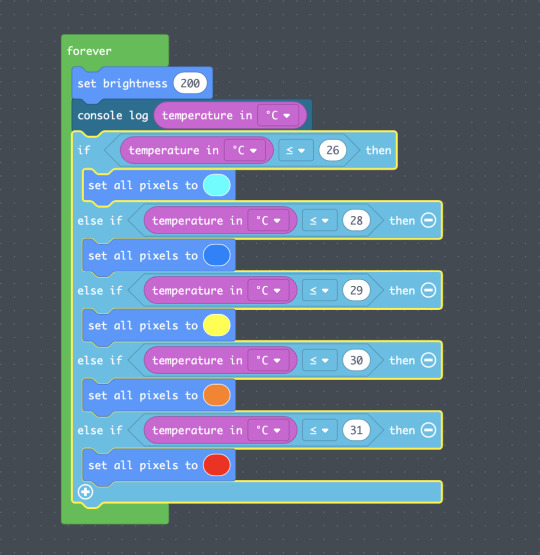


Prototype using Adafruits Circuit Playground Express.
Ever wondered when your tea is just the right temperature?
Maybe you always burn toungue, or remember to take a sip just as it's too cold.
This is the cup for you! Indicating temperature with light. Works for hot and cold drinks.
3 notes
·
View notes
Text
CityPulse
Using API from Oslo Bysykkel to visualize the flow of bikes around the city.
Project partner @hannelock! Today Oslo Bysykkel displays the live movement data statically through a map and some data points. ⬇️

We wanted to make something that behaves like a swarm, more dynamic and vibrant.
Meaningful > Usefulness
The dataset we chose as a base for our project tells us how many bikes and docks that are available for each station, and also how often (and how many) bikes are either in motion or locked. ⬇️

The result being a pulsating blob representing all the bikes that are out and about being in motion, with a ring around to represent all the bike connected stations all over Oslo. Smaller blobs (representing bikes) will travel between the .blob_center and the outer ring representing single bikes. As time passes by, the pulse is also added to a timeline with timestamps below to give a clearer picture of the activity throughout the whole day.

CLICK HERE WORKING PROTOTYPE!
The idea is that people who see this will be reminded about the constant collective movement representing the pulse of Oslo Bysykkel. Video ⬇️
https://va.media.tumblr.com/tumblr_qhl15aGx9z1ym2c50_720.mp4
«Pseudo-javascript» explaining the logic behind the visualization.


⚡️ Further improvements to be made:
Show visualizations from different events in time (rush hour vs calm hour)
Be more specific about the context; where, when and whom we design for
Use more specific data (numbers) from API if/when relevant
3 notes
·
View notes