
Statistics
We looked inside some of the posts by whodoesworkxd-blog and here's what we found interesting.
Average Info
Notes Per Post
7
Likes Per Post
7
Reblog Per Post
0
Reply Per Post
0
Time Between Posts
23 days
Number of Posts By Type
Text
7
Photo
1
Last Seen Tumblr Blogs


Fun Fact
In 2020, Tumblr had 29.4 million users in the US.
Text
Interface Design Development Brief

Before I started the project, I created a sitemap to guide me on what pages I would be needing to create so that I didn’t waste any time trying to figure out what pages I did and didn’t need when designing in photoshop.

When it came down to creating the app, I wanted an app which was easily usable for the user, something which could allow users to quickly download the app from the play store or app store and be able to straight use the app without any problems. The first technique I learned was just down to using other apps to help my needs, usually, when it comes down to creating apps I will use photoshop to draft what I want my app to look like but in this scenario, I used illustrator to design my icons. When creating the app's icon in illustrator, I used the artboard tool to find my centre, this way I could create the perfect circle, sphere Ellipse tool, holding down Shift-alt and dragging out a circle was made. Using the S command, I was able to open the scale, this allows me to control the size of the inner circle, using the uniform scale, I set it to 90%, then I copied it to create a second inner circle, giving a different colour it then gave the appeal of a highlighted circle. Finally, I used the L text icon, increasing it to a size which fitted my icon and the icon was completed. I then learned that you could export images from illustrator to photoshop, so I designed my settings icon (using the same circle technique alongside a rectangle to give off a settings Icon effect) and arrow icon in illustrator. When it came to designing the app, I used an 800x480px template which is the size of an android phone, from my own experience I feel that more PC related people and gamers tend to use androids as there a lot more capabilities of using an android and League Of Legends has an app already which works with the play store so my target audience was android.
When it came to the final result I was relatively pleased, the Icon was fine, nothing amazing so I would like to come back to it in future and spend more time on it. This way users are more attracted to the app as I feel the icon may prevent users from using the app as it isn’t attractive for a complete user audience. Only for those who play League Of Legends. I was satisfied with how the app looked and functioned though. I generally feel that it is a very easy app for users to use as I was designing it for all ages. I was especially happy about the audio-reader function as this can allow vision-impaired users to use the app. I also liked how I implemented other apps into my app, users who have a google+ account or facebook account can log into the app. This way friends of the user can see if other users have visited the museum and be able to provide feedback. Also, this provides me or other admins of the app to pinpoint user feedback. What I mean by this is that I am able to see the type of person using the app as I can locate them on Facebook. I can then see a trend of users allowing me or other admins to design the app for a more focus audience for better use.
Taking the concept forward, I have many ideas which I would like to implement, first I would like to add a QR code function, each section of the museum would have a QR code which would be scannable. The app would then show the user the current artwork, champion, season in detail on the app allowing the user a much easier experience as they would just have to scan the QR code instead of having to locate the artwork on the app. I would also like to add a section where the app can be connected to the main league of legends website, this way the app can allow the users to fully immerse themselves with the content of the museum and then be able to bring the information they learned back home. Overall I think the app is designed well but has its flaws, It has the potential to become a very easy user experience when the user is at the museum but for some, they may find it hard to use the app. In the future, though I would like to go into how to make the museum and the app work together so it can provide someone who has 0 knowledge of league of legends enough knowledge to understand the museum so then they can go home to try the game.
0 notes
Text
Ideation and Creative Problem Solving Blog
Week 2: Building on the work of Others
In this session, we looked into what is creativity and how you can use other people’s creativity to add to your own work.
We first looked into what creativity is and came up with an answer such as “The imaging of ideas to create new ones” and “The art of developing or illustrating something that has stemmed from your imagination or the work of others.” When looking into building on the work of others we were given quotes from inspiration people such as Picasso,”Good artists, borrow, great artists steal” and sent off to think of examples of innovations built on other work. We then set off to find examples of innovation built on the work of others. The rest of the lesson we looked into buildings and people who had used the method of building on the work of others. Finally. we used the method of reverse brainstorming to identify problems or challenges and find a solution to it.
Using my word doc on my laptop, I wrote down my examples of innovation built on other work and the reverse brainstorm challenge.
My Innovation build on other work example has to be Beyblades, an iconic children toy which is a perfect example of building on the work of others. The Spinning top a child's toy transformed into a toy which has vibrant colors and TV show to help the business grow shows that the designer had a key idea of turning a spinning top into a business.

Reverse brainstorming challenge.
1. Becoming an England Hockey keeper.
2. Not becoming the England hockey keeper by not training hard enough.
3. Set up a training regime, wake up earlier, study keepers, watch back on videos of myself to spot flaws.
4. Training Regime specifically designed on my flaws as a keeper.
5. The solution is solved by perfecting my keeping skills.
Overall, the creative approach was designed for us to understand that using other people’s work as inspiration for our own is okay. As long we bring unique ideas to the idea we can use other people’s work to make your own better. I feel that this approach is very effective for me as it gave me an understanding that by breaking down the problem, reversing the situation allows myself to have an understanding of a different part to the reverse solution allowing me to implement this into the actual problem at hand. This class helped me a lot as a person as I have had difficulty reaching my goal as the England Hockey Goalkeeper for a while and gave me understand that to figure out the situation is not to work on the steps towards the goal but to look at how I would fail to prevent me from making the mistakes that would prevent this goal instead of only looking at the steps to make it there giving me a broader look at the situation.
Week 4: Lateral Thinking

The first part of the lesson we were given a situation where we were given 3 different people” 1. An old lady who looks as if she is about to die. 2. An old friend who once saved your life. 3. The perfect partner you have been dreaming about.” and had to choose who would we pick up in the car. Then we were given a different question, “A man built a rectangular house, each side having a southern view. He spotted a bear. What colour was the bear?”. Both questions to simply understand our lateral thinking compared to our classmates. Once finished a video was played by John Cleese on creativity, very humorous but a very unique talk on creativity, for example, he would say, “Creativity is not an ability that you either have or do not have it is for example and this may surprise you absolutely unrelated to IQ provided your intelligence is above a certain minimal level” he talked about the closed mode vs the open mode and the tips to foster creativity. Finally, we were told more examples of lateral thinking followed by a final question “You have to choose between three rooms. You have to choose between three rooms.
The first is full of raging fires
The second is full of tigers that haven’t eaten in 3 years.
The third is full of assassins with loaded machine guns”.
Using my word doc on my laptop, I wrote down the answers to each question.
Question 1.
The optimal answer for this question is to save the old lady, she looks like she is about to die, you can have a chat to both people asking them why you can’t take them or return for them later to pick them up.
For a different person, they may say they want to pick up their friend and this could be down so social anxiety, talking to an old woman you never met and the perfect partner your dreaming about can seem daunting to the person so picking up their friend seemed like the best way to skip talking to those people.
Finally, it’s the “Gentleman answer” or the “Selfish answer” as picking up the woman can be seen as you being her knight in shining armor but in result hurting your friendship with your friend and accidentally killing an old lady but leaving her out in the cold.
Question 2.
Mine would be red for two reasons, one because red is my favorite colour and second is down to seeing the bear I can only feel scared so by seeing something which represents the colour of blood meanwhile being a large animal which could kill me terrifies me.
Question 3.
My answer would 3 as answer 1 and 2 would result in my death meanwhile answer 3 could have a slight possibility of me surviving my talking or bribing my way out of being assassinated.
In conclusion, lateral thinking is about being able to look at every angle on the thought and bring the most out of it. By using techniques such as open and closed thinking you can find different approaches and new answers to the problem. Lateral thinking is down to the person looking at two sides of a story, the rational or intuitive, the head-on or oblique. Whenever the situation there are 2 sides to think about it. These methods learned in class are very effective as they can be used in day to day life for example if your car were to break down, the closed thought would be contacting your A&E and worrying about the cost. Meanwhile the open is looking for ideas around the problem, can you fix the car with the tools at hand or maybe you can get some help from someone on the road.
Week 5: Creativity and the unconscious

At the start of the lesson we learnt the different parts of creativity. Unconscious, subconscious and intuition. Unconscious mind is when the process of the mind occur automatically but doesn’t involve introspection, thought processes, memory, affect and motivation. The subconscious is the part which is consciousness and focal aware. The intuition is the ability to gain information without reason or fact. We then performed an exercise which required us to choose a letter, then write down a word with that letter and then create a list of words that associated with that word. Then choose two from the list and write a one-paragraph connecting them to a life event. Then write another paragraph but include elements of things learned about life from any field of knowledge. Then write a paragraph about the wisdom and thought with adding a non-sequitur. Finally we were to make a poem out of it. After we completed this exercise we then were told to design a game, though we had to listen to a dream from our partner and incorporate 2 of 3 features from that dream.
Using my word doc on my laptop, I wrote down the letters/poem but forgot to take pictures about the game but I remember vividly what the game was about.
- J
- Jaguar
- E-type, crash, car, dad, old, grampa’s car,
When I was young me and my dad embarked to France in his E-type though when we were 10 miles out from Le Mans we crashed. I was 13 at the time so I didn’t know much but I did know to put my head down and cover my neck in case we were to crash. In hine-sight I wished my dad had check the wheel bearings before hand as this was the main reason we nearly crashed the car. Very funny.
13 was the age I embarked to France,
My father and his E-type ready to go Fast,
Twas 13 miles out that the wheel barring went fray.
And in result the wheel fell out of the archway,
Stranded on the side of the road,
It felt like there was no hope to go,
but with luck on our side,
Passerby's stopped and helped our poor car,
Make it’s way to our final destination,
Which wasn’t far.
For the game I designed, my partner had describe to in her dream that she was stuck inside a hamster ball being chased by dolls. In result I had designed a game which resembled most common mobile games, a catch’em game like temple run but instead the person was a hamster and the people chasing was dolls.
From what I can take from this exercise is that when it comes down to thinking about work, I need to approach it differently, I need to stop and think outside the box using conscious and unconscious thoughts as well as allowing myself to think for more often to allow my mind to take control of what I’m trying to make. So my ideas are more creative and bring something new to a situation.
Improv for Spontaneity

At the beginning of the lesson we told what improv was and how it deals with creating characters on scenarios on the spot. Then were told what spontaneity is which is justifying a situation and acting immediately to allow the performance to carry on. The first game we played was bunny bunny, where someone would say bunny bunny to someone in the circle and they would have to say it back to someone else, meanwhile the two people on the side had to waggle there feat and say tiki tiki. This was a way to get people aware and instantly ready so they are prepared in improv. We then formed a circle, in this circle three people would come forward, the first person would bring a problem, the second person would bring an object and the third person would justify how to fix the person. After this we then formed 2 lines, with these lines one person would come forward with a problem and the second person would come up with an answer. Finally we then created a story.
The story started off with 2 pirates on a ship, I myself was a Russian pirate and in a Russian voice me and my co-star talked about an island in the distance meanwhile another person voiced the parrot on my shoulder. 3 more people were introduced and were the 2 evil pirates on an island and one was an evil squid. Finally another 4 people were added and they were the men under the ship and sadly only had once scene where they talked about how annoying my parrot was. Then the evil pirates/squid boarded the ship and we battled, killing me but my co-star was victorious.
From what I learnt from this activity, is that by adding certain scenarios to a situation you can create something which isn’t that great at first into something spectacular by adding different situations. I feel the approach to the lesson was great but I generally didn’t feel like I learnt a lot about later thinking or spontaneity. It wasn’t until I was home that I read the brief of the lesson that I learnt the true reasons behind the activities as I generally found them more fun than learn. This lesson also taught me some key life skills, with conversation you can sometimes feel awkward when you can’t think about something but with improv it evolves the idea’s of a conversation as well as the class allowing me to knowing my class mates better.
Ideation and Creative Problem-solving


The point of this class, was to see us to be able use the lego in a serious manner to design structures which represent something but with our own touch. Using lego is a great way to allow our minds to explore and build endless structures while in a playfull environment. Our minds tend to not work at 100% when they are not enjoying the thing they are doing so by using lego our minds are able to “play” and “create” without limitations. Our first piece to make was a duck. We then were told to take way 3 pieces which still represented the duck. In image 3 you can see I had taken 2 of the legs away and the tail on the back. After this we were given 15 minutes to make what we want then after making it the model we were told to change it to a metaphor for how you feel on a Monday Morning. Picture 4 is the result of this, a very boring but creative piece as i haven’t added a colour scheme to it to represent that Monday, if your going to work it’s going to be all over the place, the structure is a machine with 2 guns on the top of it which represent how I feel on Monday, I want to get everything done with and if you get in my way I will remove you with my guns(metaphorically). After that we were told to create another piece, then add genetic engineering to it as well as marriage. This resulted in me creating a yellow ship, picture 2, where the genetic engineering is the ship having 2 design schemes added to it, its a normal ship at heart but if you add the black pieces it looks like a racing ship.
Overall what I learnt from this lesson is that when it comes to designing you can add different things to a piece and not all the times it does work but when It does work it looks amazing. As a life lesson, it does show that maybe I need to play with Lego more, as the pieces I made compared to my class mates were not as creative and so maybe playing with them more can result in me becoming a more creative person,.
0 notes
Text
Design Basics Portfolio
Design Fundamentals
Image Formats

When a photo, drawing or photo is saved on a computer it’s saved as an image format so that the computer can read the image to be able to open it in an application. There are many types of bitmaps but these are the most common:
PNG: A PNG format is known as a portable network graphic. Its the previous version was the GIF which could only contain 256 colours in an image, while the PNG is able to support over 16.7 million colours which provide a better quality of the image.
TIFF: A TIFF format is known as a Tagged Image File Format, the Digital camera’s sometimes used this format to provide high-quality pictures due to the file size being considerably bigger than a usual picture file size.
GIF: A GIF Format is known as a Graphics File Interchange, the format is commonly used on a web page due to the GIF format not being able to take more than 256 colours but being able to scroll through images similarly like a video.
JPEG: A JPEG Format is known as a Joint Photographic Expert Group, is one of the smaller file sizes due to its image quality being worse than a PNG. Like a GIF it’s commonly used on web pages due to its small file size and the image quality not being to bad for users not to be able to make out the image.
Line

The line, the first step to designing a picture, unlike the usual pen or pencil to paper where you start at one point and stop when you like. The line is completely different in graphic design as the points connect from point to point. The point of a line is like a draft of product, you make out the outline of what you want to make and work around the lines to make the image come to life. There are many different varieties of a line, it can be
Horizontal: Perpendicular to the Vertical line, goes straight up and down
Vertical: Perpendicular to the Horizontal line, goes straight up and down
Diagonal: Just a straight line
ZigZag: A bunch of diagonal lines which connect from at each end of a point.
Curved lines: A line which is bent at a certain angle or degree.
These lines can be altered in different ways, this can be either long, short, thick, thin. Smooth, rough, dotted, dashed, directionally changed and be paired together in different ways
Shape

Shapes can bring life to a page, they provide interest for the reader in a way they can relate as they know the shape already. The right shape can bring out a certain word or meaning to life so making sure the right shape is used is crucial. Here’s a list of different types of shapes:
Circle: A line which is sticks to a certain point in a curved motion.
Oval: A circle but at a much steeper angle
Triangle: 3 line points at a 60-degree angle.
Square: 4 lines connected to create a box.
Pentagon: 5 Angles connected on a 72 degree on the inside and 108 on the outside.
There are many types of shapes which can bring out a graphics design it’s how you use the image which can make the difference between bringing out an image or ruining it.
Colour Theory

Colour could be considered the most important part of a design as it’s what makes a user attract to a web page or not. Having multiple different colours can faze the user into not using the site as it’s unbearable for them to use it. So making sure that you find your image’s colour is the key to a good graphic design. Colour can is used in every part of a graphical design, the background, shape, texture, line, and typography. So finding the right colour for your image is the difference between someone being impressed or not impressed by your graphical design. The colour wheel is what an image should be based off to be able to provide a variety of different colours which allows a colour harmony (An experience for the user where their eyes are pleased by the colours used). The colour wheel has different versions but it can be broken down into three sections to allow all colours to be involved.
Primary: Red, Yellow and Blue. Three colours which cannot make different colours.
Secondary: Green, Orange, and Purple. Three colours which are required to be mixed with the primary colours.
Tertiary: Colours which are mixed with the primary and secondary. There are multiple types of colours for this wheel.
Typography

Typography is how you would arrange the type of words. The way you arrange type is how you express the overall theme, tone, and message. The type should be presented in a fashion, where it blends in with the shapes, background and overall format of the graphic design. When it comes down to the type, it's generally a formation of lines designed to look like words. These types of line align to present the letter:
Baseline: The bottom line which the text sits on.
Cap Height: The top line which the capital letter reaches to.
Ascender Height: A line which is slightly higher than the capital line to allow slanted letters such as k and h will reach to.
X-Height: The lowercase height.
Descender Height: Characters which go below the baseline such as commas.
Leading is also a crucial part of typography as it determines how many characters can be put on a line. This can be crucial for the reader as to much text on one line can seem daunting to the reader as it may be too much for there eyes or just outright don’t want to get engage cause the lines are too long to read.
Grid Systems

The grid system is a guideline for the person designing anything with graphics. Its purpose is to make sure the designer does not go outside the boundaries with the layers. The grid system is also to enable to user to easily look or use the design. Having no grid layout can allow the layers to go into different sections of the image which can frustrate and not please the user's eye. The grid is also to enable the designer to have a proportion so they can fit there image and text to the size of the design. This then enables the user to feel comfortable when using or seeing the image.
When a designer is using the grid layout they want to hit that golden ratio. The golden ratio is how pleasing the proportions of the image is to the human eye. The rules to the golden ratio include the size, position, proportion and aesthetically appealing the image is. Sometimes you can break the grid through to allow yourself to reach the golden ratio as there are scenarios which put the designer in a position to do this.
Visual Hierarchy

The visual hierarchy is about using the design tools you are given to prioritise and organise the design you are making. When using the visual hierarchy it is important to use this method to navigate the user otherwise using visual hierarchy to highlight random types or shapes can result in the user being confused. By choosing the right shape and making sure it’s size is right can bring a page to life and grasp the user. This then means that shapes which aren’t a big factor to the page will be considerably smaller. These methods are used to direct the user in the right direction when using the design. When it comes down to colours, using bright colours can attract a user to a screen. Though by using multiple bright colours it drenches the image and the user will find it hard to be attracted to design. So finding one bright colour and multiple dull colours can bring a page to life. Finally when it comes down to using Font, having professional font such as “Times new-roman” can allow the user to have a sense of professionalism to the design compared to a funky font such as “Comic sans mf”.
Museum Research
V&A


Inside the Museum (Pictures from the Web)


Research into collections
At the V&A their current collection includes one particular collection which is the fashioned from nature. It's the first UK exhibition to explore the fashion and nature from 1600 to the present day. Like my League of Legends Museum, it’s a one of a kind and a fantastic example and inspiration when it came to creating my museum. The type of clothing they have in the collection included, “Hat of suede and Himalayan monal pheasant. 1946. France” and “Waistcoat, 1780-1789 France”.


Historical and contextual context
Two completely different pieces from the same country but in 2 different times. This shows the growth in France’s fashion industry. Very old but lovely patterned waistcoat that wouldn’t really be seen worn in a time of 1946 as the colour difference is significant. The 1700’s used dull white and pale colours to maybe match there skin and clothing compared to the hat which is vibrant in colour and quite different to the usual hat which would of seemed weird in 1700’s. Also, the materials and manufacturing of the clothing would have been completely different so it shows how the industry has grown.
Research into interface/app design
Good and bad interface designs

The first picture is a perfect design of what somebody wants with a statistical interface. The designer has used every technique flawlessly and the outcome shows a vibrant looking interface design. First, he has used rectangle shapes to highlight different sections of the product to allow the user to identify different graphs, he has then used 3 territory colours in each rectangle to grasp the user's interest to the graphs. He has used territory colours to blend in the background colour of black-blue, this way it fits in with the theme and keeps the product professional as vibrant colours would seem childish for an app which is going to be used by adults in a professional environment. For the typography, he has made sure that all words are inline with each other using the methods to make the writing blend in with the background. This is the same with analytic numbers used on the second screen. For Visual hierarchy, to identify the headings for each page he has played the title at the top of the screen with a white colour to identify the text. This is to appeal to the user and instantly understand what page they on so they can navigate faster. Finally, the grid layout allows the screen to have multiple sections of data, each rectangle has a 2 line differential which shows that both graphs are not together. He has also gone out of the grid layout with the 3 line bar at the top left. This way the user can navigate to a menu page at ease as it’s easier to identify with it being misplaced outside the grid layout.

Unlike the interface design we saw before, this one is clearly missing the mark, there is barely any effort put into the design of the product as it’s clearly used for most people. The colours are completely out of place as well as the background colour not pleasing the eye. There is a grid layout but I feel that the placement of the shapes is wrong, there are types in weird places and sometimes you can’t even make out what function they are going to do.
Users Experiences and Responsive Design

For user experience, the current best design I feel is with snapchat, as a user myself the app is very easy to use, clearly outlining what features can be used and when. Each circle lights up when a story is updated which a unique way of using shapes and colour to outline a certain event, as well as an arrow, lights up when a message is sent. The grid layout for the app shows each person has their own section to touch and chat with friends. The colours are vibrant to be an app for all audiences young and old. Though they only use blue-yellow and yellow as there colours which helps with identifying the app.
Research into Museum Apps


The Natural history museum app is a fantastic example of an interactive graphic design user interface. A very simple app designed for all ages, the app’s attracts the user using their unique colour of rose-red, using visual hierarchy you can determine what you're looking at straight away with the enlarged text. Navigating your way throughout the app easily using the search function at the top right corner and the menu bar on the left of the main screen. Overall the app is very easy to use for someone who wants to go the museum.
Current Development of Fantasy Museum
Range of Different Design outcomes


Research into Fantasy Museums
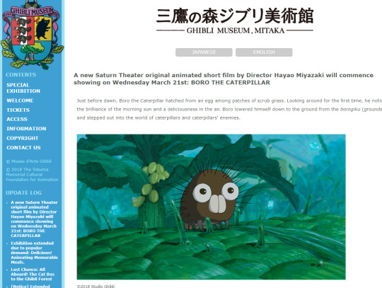
Here we have the GHIBLI Museum in Mitaka, an anime museum based in Japan which most of the world cannot have access to so they publish their art online. A very simple format they have the picture or anime, describe what the picture or anime is and then allow the user to move on. I will implement this into my app as I want the museum to be able to easily get around the map at a fast pace so they constantly interested in what’s coming next.
Classroom Tasks
Interface Design

Logo Design

Icon Design

Creating a map
0 notes
Text
Adobe After Effects
https://youtu.be/ibnQemQdGd4
When it came to design phase I wanted to try and really get to grips with the song. Try and show some of the essence of how the song act’s for example the song is called ignite so I wanted to implement a lot fire aspects to the design stage. Adobe after effects has been around for years and my main techniques were coming from the youtube community. One of the key features I wanted to implement was to use the background of the orginal song and be able to have the words slide up the screen as in it was apart of the tornado.
My main idea was to have the lyrics to reiterate the fire aspects of the song. With having this key image in mind I used the background of the original song as it seemed to me like a gold mine when it came to styling the lyrics. So when it come to production stage I wanted originally have the lyrics to spark and then go up the tornado giving off the effect that the lyrics were apart of it. Though due to my computer performance It couldn’t handle the saber animation and just caused the song to run slowly and just generally unable to work on the lyrics. This then moved me to using the tornado as a way of the lyric just moving up to give of that aspect that the tornado is apart of the song. I did this by using the rotation tool in adobe after effects which then I styled alongside the tornado so the lyrics would go up.
I felt the lyrics going up the tornado were a real key aspect to watching the video and gave off this element that the background was alive. If I were able to undertake the task again I would first use an actual computer which could run adobe after effects to it’s full capacity so that I could use features like saber which can provide a spark effect to my lyrics. When people saw the video they weren’t overly amused as it looked to them like it doesn’t take much effort to produce words going off a screen. This criticism definitely motivates me to providing more key features to future projects.
1 note
·
View note
Text
Bitsy Game Design
https://maxko2.itch.io/knuckles-rescues-the-queen
When it came to the techniques of how to use bitsy it was down to the imagination of how you develop a game around the 2 scene system. The software is relatively new so there isn’t much history when it comes to developing the game with bitsy. When it came to production I made a plan about the game and what I wanted to do with it. https://gyazo.com/502512c12d43195aa4e84f862891eb6e The screen shot is my planning process. Regarding techniques the only help I could have was seeing other peoples game and playing it. Then I would implement the same mechanics into my game which i felt were interesting.
The main idea of my game was for knuckles to save the queen but having to go through trials to get there. The problem with this was that the game design bitsy isn’t really designed yet for this type of game and it caused a lot of problems during my implementation stage. One of my major creative decisions was for knuckles to get the key which would then unlock the room to save the queen. Though the game design system doesn’t actually have this mechanic implemented yet so I felt that the game really took a massive hit into it’s production because of this. A lot of more pre planned designs did not come into action because of the bitsy game deisgn system such as a timer and key.
The best bit’s about my game is generally the story as it’s relatively funny and can compel to a funny audience but it won’t be great to those hardcore gamers. The game itself isn’t at a finish staged and this is due to the bitsy game design system. I will 100% in the future come back to this project to implement the key features I wanted so that the game can truly be played for what it was designed for. A lot of people said the game was funny but not really creative as quoted many times this is down to my limited options and not expecting these issues to occur in the planing phase. I had a lot of criticism because of it and the game itself wasn’t much of a success to the audiences I was showing.
1 note
·
View note
Text
Stop Motion
https://www.youtube.com/watch?v=n9I4kTTmP9Q
For my stop motion piece, I used inspiration from youtube as my template to what I wanted my stop motion to be. By seeing the videos, I was able to understand that a lot of the stop motion work required a lot of frames for such small movement. This would then allow the stop motion pictures to seem more life like when put into action. If you type in stop motion into youtube you are bombarded by an immense amounts of video’s which show you how fluid stop motion can be and how to make it. One of the most compelling features about the stop motion youtube videos was how slight the movements was when it came to taking the pictures.
When it came to the production phase I wanted to do something which allowed the human to seem super human and go through a journey of what they do with there new super power. The power was that once the person clicked there fingers, whatever was in front of them instantly disappears which then led me down the route of how the person used the power for good or evil. The key skills I used to make sure that the video seemed realistic was to make sure to keep my hand in place when taking specific takes such as the bed scene where I had to remove my bedding to make the viewer believe that by clicking my finger, the mattress would disappear and so I had to make sure that my hand stayed in place to give that effect.
When it came to the finish product I feel that It exceeded expectations because i expected the clips to be a little less fluid when in actual fact they seemed pretty crisp. If I were to go back on the project I definitely would redo the first section of the video as I feel a lot of the motion isn’t as fluid as I wanted it to be. When I showed people my work they instantly fell in love with it, they loved how by clicking my fingers stuff would disappear including the scene where I make my housemate disappear. When I asked if I could make any improvement they agreed that I should of made more fluid motions at the start.
1 note
·
View note


Text
First Assesment


When colorizing black and white images, the first thought which comes to mind is old fashioned, so I knew before starting my project that the image I was going to be using an old fashioned piece which required certain colourising techniques. I had seen colourised black and white images on certain new sites which have been colourised which gave me my inspiration and my design direction of what I wanted my piece to be. When looking at an old fashioned image the colourised pieces would use dull colours which would grasp the concept of the image being old fashioned.
When looking for my image, I wanted to find something which required different parts of the image to stand out which would bring the spotlight away from the main image. This allowed me to bring my own creativity to the piece rather than just colourising a black and white image to a normal standard. When it game to colourising the picture, I would go online to search up the different type of coins and what their colour scheme was. The hard part was the identifying the coin so I would end up searching certain coin shapes online in hope of identifying what they are. I would then copy/paste the image into photoshop, by using the eyedrop tool I would be able to get the colour of the coin and colour over the coin I have researched with the correct colour.
Looking at the picture, I am more than satisfied of how the handwatch has turned out. I looked at a lot of pictures to understand the different colour schemes of the hand watch and what different parts of the watch needed to be coloured. If I were to come back to project, I would like to spend a lot more time on the individual coins. Some of the coins are not colourised properly and some tend to stand out more than others. When showing other people my piece a lot of them tend to compliment how real the hand watch looks. They did criticized how the quality of the piece wasn’t great and the certain sections of the picture seemed to be blurred which was done on the original piece.
3 notes
·
View notes