
✨Development Blog for my witch worldbuilding project ✨
Last active 4 hours ago
Don't wanna be here? Send us removal request.
Statistics
We looked inside some of the posts by witchycornerr and here's what we found interesting.
Average Info
Notes Per Post
33
Likes Per Post
27
Reblog Per Post
4
Reply Per Post
2
Time Between Posts
13 hours
Number of Posts By Type
Text
12
Last Seen Tumblr Blogs


Fun Fact
Kazakhstan’s Minister of Communications and Informatics has blocked the Tumblr site because it contained 60 sites of terrorism, extremism, and pornography in 2015.
Text
Early School Explorations
Below are some early ideas for the school interiors. They helped in exploring the mood I wanted to go for. I have a stronger grasp of the architectural design language I want to go for now, though, so a lot will be changing. Nonetheless, thought these early ideas were still worth sharing.


These two were ideas for the gym and classroom respectively. The gym here (and as you'll see below in some of the subsequent ones) feels a little too barren for the general school styling. I have since also made the window stylings have circular patterns embedded in them, like in the classroom image, as opposed to the more traditional grid. The classroom actually still has a lot of elements I like. I plan to build off of it when tackling the classroom designs.

I was also playing around with some dorm ideas. Like the gym, these also felt a little too barren for the school styling. They are meant to be more subdued comparatively, but this just leaned too far into it.


I also did some mood sketches for the yellow and red gyms. Like the blue one, I think these lack some more ornate styling and will be changed significantly. Something I was playing around with, though, was exploring ways to contrast the schools and show off their education styles. The yellow school is meant to be the most lax and exploratory option of the 3. The red school on the other hand has the most rigid and strict curriculum and a small student body. They're also the most prestigious and hardest to get into. The blue school is an in-between of the two and has the largest student body size.
#artists on tumblr#concept art#my art#digital art#environment design#environment art#architecture#witch art#witch school
1 note
·
View note
Text
The Engineering Wing
Following up from the choreography wing, the 3rd wing is engineering. Most of my design thoughts are pretty similar to approaching designing these uniforms. I wanted to include subtle cues from mechanic uniforms if possible too.

These were my 1st passes on the blue school's engineering uniforms. Like with the choreography, these were done early in the process when I was still figuring out my constraints, so I explored a wide variety of options.

I picked a few I thought were promising, focusing in on ones that were mostly blue with minimal white to contrast better with the other branches. I made some small variants of the one with a blazer for the last 2, and picked the last one as my final as I liked that it brought in some subtle mechanic design ideas in the blazer.


I followed up the blue school with the engineering uniforms for the yellow one. I picked the ones I thought were working best to test in 3/4 view. In a vacuum I liked the 4th one best, but 2 just had a uniquely readable shape the vest formed, and a better ratio of lights to darks compared to the other branch uniforms, so it was my final choice.


The final school to tackle was the red one. I picked a couple I thought worked well to test in 3/4 and ended up feeling the 5th one worked best for my needs.

This was my final reference sheet of all the branch uniforms together!
3 notes
·
View notes
Text
The Choreography Wing
At some point I wanted to explore more options for variety in the school uniforms in hopes of having more avenues to differentiate characters. This line of thinking led me to creating 3 branches to the school, the performance wing - they carry out the dance performances, the engineering wing - they design performer's staffs and their light effects, and the choreography wing - they put together the performance routines. This post will just focus on the choreography wing.

There were a couple things that were important to me when tackling the branch uniform designs. 1st off, they had to clearly look like they were from the same school, 2nd they needed to easily be differentiated from the other branches on a 1st read, and 3rd they needed to look good together as a set and present enough variety both within the school and within the branch ie. all choreography uniforms for all 3 colored schools. If possible I also wanted this branch to feel the most elegant out of the 3.
I had a couple theories I was testing out with this quick 1st pass. Because these uniforms were basically made up of a dark and light value, I thought the best way to differentiate them was to have different ratios of the two, ie. if the performance wing outfit had 15% light to 85% dark in the uniform, the choreography wing one could have 40% light to 60% dark. I was planning to use different hat shapes to differentiate the branches as well (performance - triangle, choreography - circle, engineering - square). I also thought color wasn't going to be enough to make them look like they came from the same school, and thought they all needed a common design anchor, like having the same skirt or same shoulder pads.

After my 1st pass, I did an exploration tackling a wide range of ideas. This pass cemented a lot of my initial theories that differentiating the value percentage of light to dark was a strong way to distinguish character branches on a 1st read, and that color wasn't enough and a common design anchor was necessary. I also learned that characters needed to have the same dominant value in their uniforms within one school to feel cohesive. For example in the blue uniforms, the blue is the most dominant color, but for the designs where I tried making white the dominant color, it didn't feel cohesive (although it's something that could be good for the eventual teacher uniforms!)

I picked some of the ideas I thought had the most promise. The 1st one worked the best in my opinion. I thought the same skirt design served as a good visual anchor, the large amount of white in the vest felt good value wise to differentiate it from the other branches, and the vest mixed with the puffy sleeves made it feel the most elegant of the branches, something I thought was fitting for this category.


Because I had a clearer understanding of what I needed to explore in the uniforms from the 1st pass, these next ones came together pretty easily. I ended up with 2 designs I thought could work for the final pass of the yellow school. In a vacuum, I liked the 2nd one more, but the 1st had a better value ratio to differentiate itself from the yellow performance branch uniforms, so I went with that one.

I made the red design iterations in my sketchbook one evening. I was really happy with the 2nd design. It felt elegant and had a good value ratio so I went forward with it. It's nice every once in a while to have a design fall into place so quickly ✨✨✨

These were my finalized designs I put together so I could have a good reference of all them.

And I also put together a sketch of all 3 choreography uniforms with some placeholder characters.
3 notes
·
View notes
Text
Performance Outfits
These were a few ideations for performance outfits of different characters.

The above are performance outfit ideas for Calico. I like the 1st one, I think its fitting for her personality and plan to use it more later on. I also somewhat like the 3rd one, but don't feel it matches her personality well so will probably scrap it.

These were ideas for a performance outfit for Haze. I'm planning to go with some iteration of the 8th design, in large part because I decided this was going to be for a ball apparatus routine and the skirts would work poorly with that.
1 note
·
View note
Text
Creatures of the Ruins
I wanted as part of the ruins, to have these defunct creature/robot designs integrated. My goal was for most of them to have a hybrid of animal and robot like qualities. They are also meant to evoke a feeling of mystery, especially because in this world people don't fully understand their origins or how they worked, so it felt fitting to emphasize that visually. Although the vast majority of them have been long defunct, very rarely some have been spotted to still be active.

These were some of my 1st explorations for the creature/robot designs. One of the tricky things was to make sure they towed the line of not clearly looking dangerous or friendly, but being more ambiguous for that quality. For that reason designs like the 3rd one didn't work, in this case because it felt too friendly and cute. The 2nd one was also cut because it didn't have enough animal qualities to it.


This was a design for a scarab like robo-critter. The idea was when they were functional, they would pinpoint trees that had sap inside.
8 notes
·
View notes
Text
Magic Performances
The main "gimmick", for lack of a better word, of this project is that magic isn't used to fight monsters or anything like that, but rather commonly for dance performances. The best way I can describe it is like watching a ballet with magical light effects. The majority of performances focus heavily on dance and beautiful movements, but some have more story and theatrical elements embedded too. The main characters in this story attend school to learn this profession.

I tried out some ideas for visualizing these performances. I liked the idea of creating shapes with magic staffs that can look like a flower blooming, which is what the performance above is centered around. Overall this really helped visualize and solidify the performance concept for me and was a good 1st step.


I also wanted to play around with types of light effects that can come from the staffs. These were just a couple of ideas from light bursts to light streams.


After my 1st exploration with the flower like patterns, I wanted to explore more patterns that could be inspired by the natural world. The above are my take on what an aquatic inspired performance could look like. I also wanted to see how magic effects could be grouped together to create these more complex ones. For example, if you look closely at the wave one, there are characters following the leader that form the swishes underneath. In the 2nd example there are several characters forming fish and bubble patterns together. This was also helpful for me in recognizing that for some characters, it's better for them to wear outfits that fade into the background if they're supporting a light pattern.


Just a couple fun facts about the performances too! The movements are heavily based on rhythmic gymnastics, my FAVORITE sport to watch. It's so mesmerizing and magical, I highly recommend checking it out if you've never heard of it. Rhythmic gymnastics focuses on performances using 4 different apparatuses: ribbon, hoop, ball, and clubs. What's so cool about it each apparatus emphasizes different movement types, like with hoop going through it and throwing, and for ribbon emphasizing movements that have it flow beautifully. Each feels unique and the movements with the apparatuses are beautiful extensions of the body.


Set and outfit wise though, I took a lot more inspiration from ballet and theatre. I love how atmospheric the above are, and having control over the mood was important to me for these performances. This is one aspect of the project I'm really excited to explore more of soon :>
0 notes
Text
Casual Outfits
The general setting of this world is fantastical, but visually very inspired by the early-mid 1900s. I wanted the casual outfits of my characters to feel like they fit into that time period.


I started out with a few designs for Vix and Mulberry. Flared pants and floral patterns were things I often used that fit the time period well.

I did a pass on casual outfits for Haze too. Most likely I'm scrapping a lot of these, they just don't quite fit her style, but I really liked the 4th and 12th ones, and might keep/rework the 3rd, 5th, 9th and 11th ones. She lives in a colder region so a lot of these outfits are designed considering that.
2 notes
·
View notes
Text
Early Ruin Explorations
One thing I wanted for the setting was to have hub cities that are main population centers surrounded by swaths of forests and ruins.


I played a lot of Atelier Rorona when I was younger, and an aspect that always stuck out was how it integrated its ruins and ancient technology. The gist of the game is you're an alchemist in training trying to keep your shop afloat over the period of 3 years. You have to manage where you spend your time, whether it be adventuring, crafting, etc. over the course of the time limit, and where you spend that time can lead to a variety of endings. Unless you specifically spec into combat, you're unable to visit a towering ancient dungeon called the Orthogalaxen, shown in the images above. It is ever present in the marketing material, and towers over everything in the city. Maybe it was just me being bad at the combat system, but in my several playthroughs I never got the ending with that dungeon, and somehow that stuck with me for all these years. I actually really liked the idea that my character lived a life where this ruin was more a part of the setting than the plot. It felt enriching to the worldbuilding.
In my project's case the, logic of "this ruin is unexplored because there's too many strong monsters" didn't really work. Instead of that, there's a lot of ruins present because the population size of this world is much smaller and the ruins are so numerous that there's not enough time or resources to explore and document all of them outside of the larger and more prominent sites. There's a bit more to it, but that will have to wait for another post in the future!


These were my 1st explorations on the design language of the ruins. Starting with a prop for a power source was really helpful to hone in on shape and design ideas I wanted throughout the ruins. I also did a pass on what the modern city power source would like, but decided to scrap it as it's not varied enough from the ancient one.


I did a couple explorations for a ruin environment and how the design language would integrate into it. It was a good 1st step, but later iterations have the ruins being a little less built into natural forms, and instead focusing on nature taking over and growing around the ruins.
#artists on tumblr#digital artist#digital art#environment art#witch#witches#environment design#concept art
1 note
·
View note
Text
Early Setting Explorations
These were some of my 1st ideas for the setting of this world.

My 1st exploration pass was experimenting with a more modern day setting, but it didn't quite click for me, so it was quickly scrapped.


The next idea I tried was more Italy inspired, and that's still an aspect that has managed to stick. The general light blue color palette is also something I intend to keep. The tree parts have mostly been scrapped though. Very nature heavy ruins on the city outskirts are an important part of the setting, and I wanted to maintain a greater contrast between that and the inner cities. I've also decided to have a fantasy language with unique characters, so all the English signage will be replaced.
5 notes
·
View notes
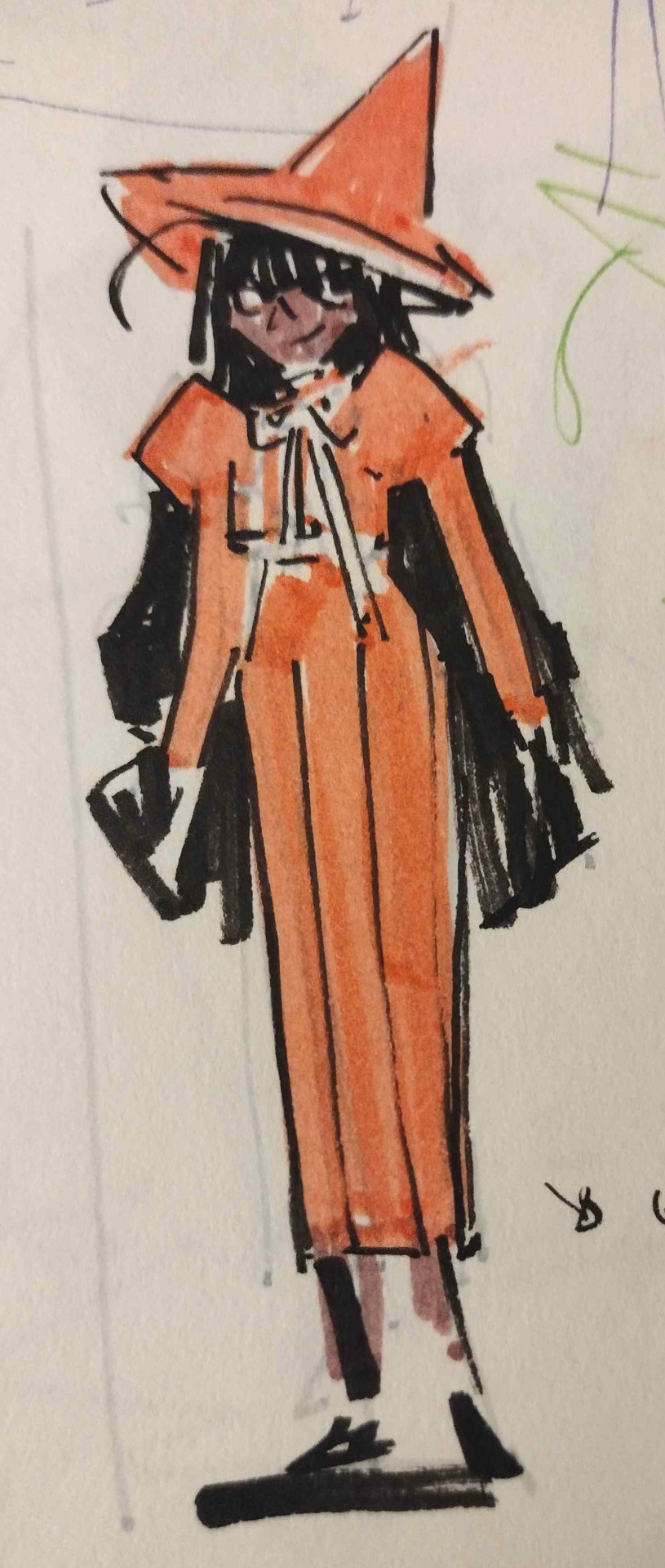
Text
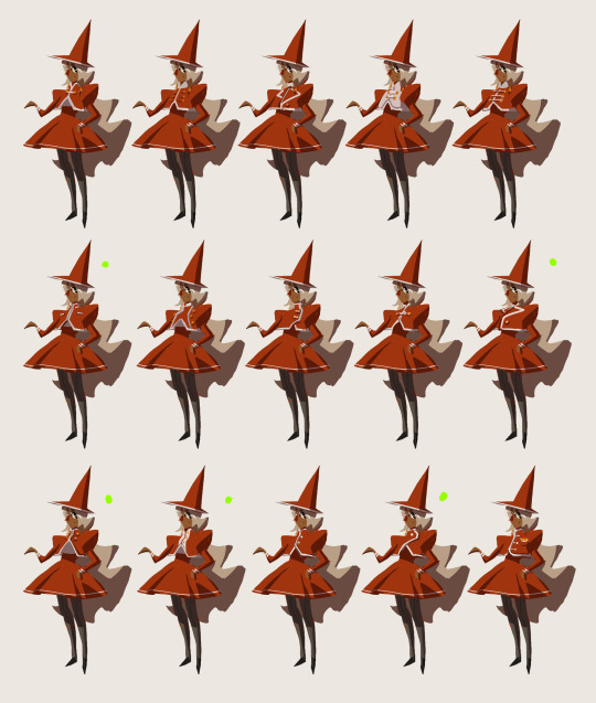
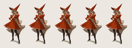
Haze Design Process
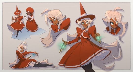
The 4th of 5 main characters, Haze. She is part of the red school. My goal with her was to read as an "approachable prodigy".
My 1st sketch ideation on what the red school's uniform would look like ended up being pretty far from what the final would turn out to be. Pretty much none of this initial idea survived, especially once I figured out what character personality I wanted. This uniform was just too uptight, and the browns in it made it too dull for what I was going for.
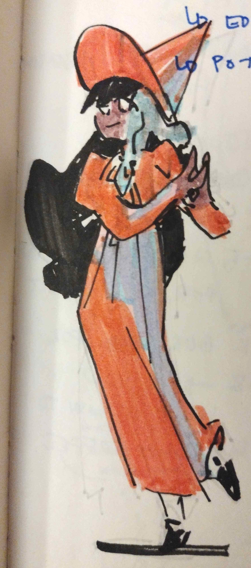
My next ideation round focused more on the uniform design than the character. It was important to me that the 3 school uniforms of blue, yellow, and red, all looked good in a set and had distinct silhouettes. I really liked the idea of broader shoulders in this one since it contrasted well with the other uniforms.
I played around with several different hairstyles and colors in this next phase. I did end up picking one I liked, but the more I sat on it, the more I had to come to terms with the fact it didn't meet my design goals of "approachable prodigy", she just felt a little too subdued for that intent.
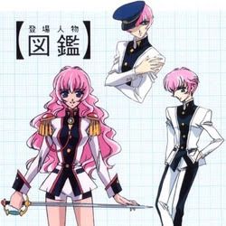
I had a real breakthrough when I took in Utena from the Revolutionary Girl Utena Movie as a big design inspiration. This character had a similar energy to what I wanted to convey with my own, and how she stands out among the other students. The contrast between sharp and round shapes in her hair down outfit on the left was also something that in my opinion helped convey her personality visually and helped me figure out where I needed to make changes in my own design.
For one, it made me realize that the uniform I designed had to be changed. I really did like its silhouette, but the more formal looking long skirt was fighting against the character I wanted and it was lacking in sharper shapes.
I tried my hand at a 1st pass on redesigning her face. This felt like I was getting closer compared to my previous designs, but she now felt a little too sharp and not welcoming enough.
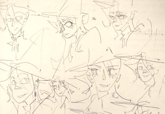
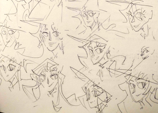
After this I continued exploring face designs. I took inspiration from Utena and other 90's shojo anime faces. The gentle curvy shapes added an element of elegance that I thought fit the character well.
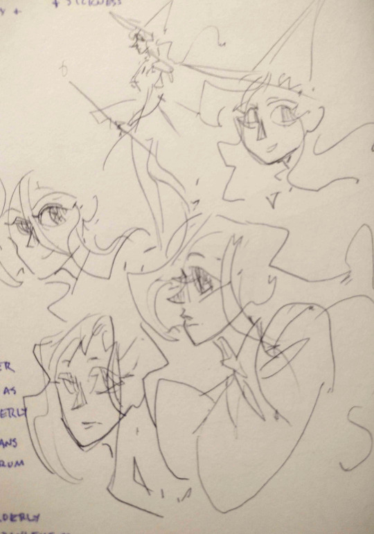
After the faces I made a quick full body sketch that I felt was pushing in the right direction. I was very happy with the skirt, both in the inviting round shape and how prominent and bold it looked in the silhouette. I also was quite happy with her hair and the sharper edges of her blazer, but felt I needed to do more iteration on the blazer's buttons.
I picked the blazers I liked from the last round and polished them a bit more. Honestly, I could have gone for a few of these as the final, but decided on the 5th one for its balance of simplicity with detailing in the pockets and neck. It felt like the right level of for that.
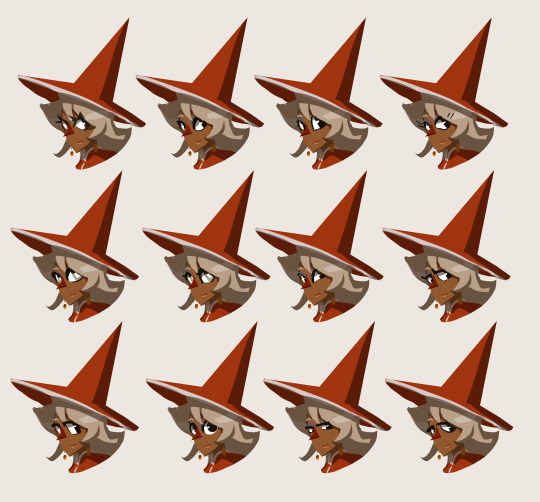
The final aspect I did iterations on was her eyes. Initially, I wanted to try out prominent triangular eyelashes like in the 1st set of eyes. The idea of having her eyes take on the shape of a star felt very fitting for the idea of prodigy, but because her hair was already pretty complex compared to everyone else, the eye silhouette just felt too noisy and overwhelming. I actually ended up really liking the simple circular shapes for her eyes. They balanced well with the more complex hair, and made her feel approachable and friendly. The final version I ended up going with was the green interior with a white rectangle inside. It added just the right level of interior complexity to make her stand out from the rest of the cast.
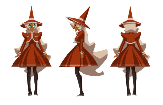
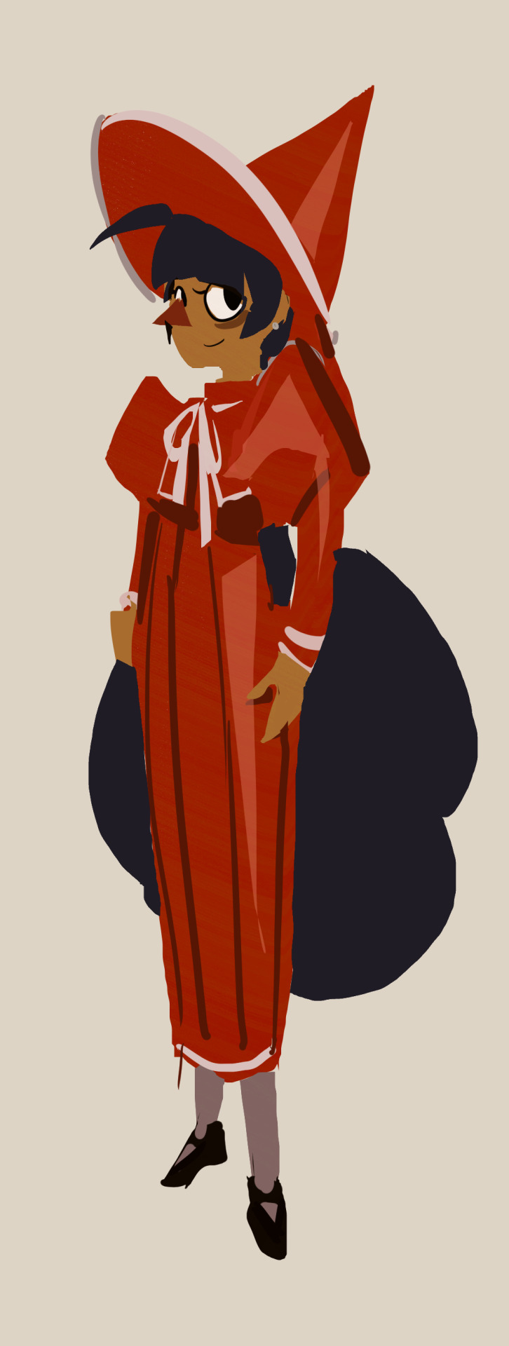
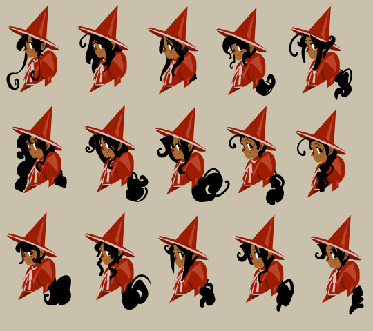
After a fair amount of changes, here's where I ended up with her final design. I'm pretty happy with this iteration of her, she fits well visually with the character I had in mind!
4 notes
·
View notes
Text
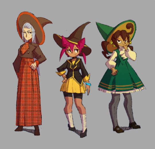
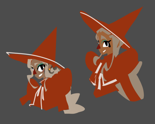
Calico Design Process
The 3rd of 5 main witch characters for this project, Calico. I wanted to have 3 main schools in this world, each correlating to a different primary color, and she's the main relevant character that attends the yellow school. She's meant to be serious and a little prickly on 1st impression. These were some of my 1st sketches for her design.


I was happy with the colors and how her design matched the sharper personality I wanted, but there were a couple things that needed changing. For one, her hair buns worked poorly with the witch hat, they didn't make much logical sense for how they fit. Her uniform also felt too modern, I wanted the setting to be closer to the early-mid 1900s so the styling of that needed changes as well. As such, most of my exploration was focused on the hairstyle and uniform.


I really liked the 3rd and 5th uniform designs I came up with, the others felt a little too cutesy for this character's personality. I decided to go with the 5th design and have an optional blazer like in the 3rd. For hairstyles, the 3rd one matched what I wanted the most with the triangular and thin hair shapes while fitting well into the hat.

This was my finalized design sheet for her!
3 notes
·
View notes
Text
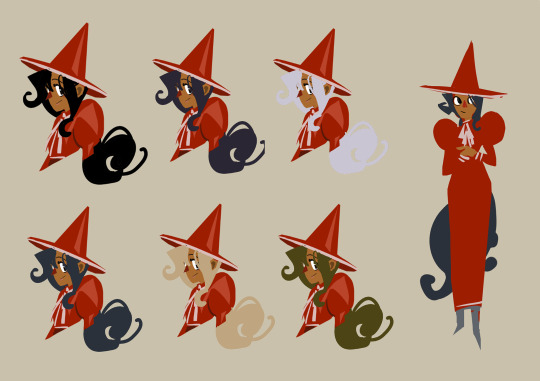
Vix and Mulberry Design Process
I wanted a space to share a worldbuilding project I've been working on for a while now, focusing on witches in the performing arts. I hope to share my thought process and log this project as it grows and evolves!


These were some of the initial sketches I did of the main characters, Vix and Mulberry.


These were more solidified ideas for the 1st pass character sheets

My most recent design sheet for these 2. Things mostly remained the same, but Vix's headband changed into a more prominent hair band, and Mulberry's face was made to be a little more oval shaped to look a little older and fit her personality better. Her hair ties also changed to be oriented higher on the head.
2 notes
·
View notes