Don't wanna be here? Send us removal request.
Text
forefront posts 8-12 Joker: Folie à Deux

Exploring the Forefront of Set Design: Insights from "Joker" (2019) One of my favorite movies of 2019 was Joker, with its stunning set design by Mark Friedberg, which brilliantly transformed New York into a 1980s Gotham City. Friedberg’s work exemplifies cutting-edge set design, blending nihilistic themes with humanity. He creates a world of extremes—comedy and tragedy, decay and bloom—reflecting the duality of the film’s central character, Arthur Fleck.
Cutting-Edge Techniques in Set Design Friedberg’s approach to Joker is rooted in extensive research, roaming New York’s streets to capture authentic, storied locations. This meticulous attention to detail is a hallmark of forefront set design, where realism and symbolism intertwine.

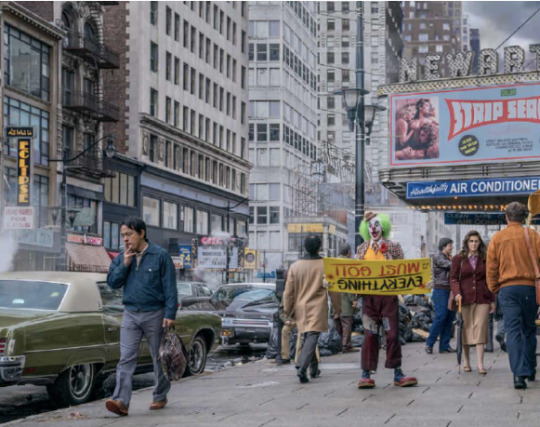


Comparing Concept Art and Final Set Design The film’s concept art and final set design share a focus on symmetry and lighting. The use of fluorescent lighting to create contrasting atmospheres—sterile in one scene, chaotic in another—demonstrates how color and light can evoke emotions, a crucial skill in modern set design.
Inspiration for Designers Designers can learn from Joker by experimenting with lighting to alter mood, using color to evoke specific emotions, and positioning characters to convey narrative dynamics. These techniques are essential in creating immersive, emotionally resonant environments, placing designers at the cutting edge of their field.
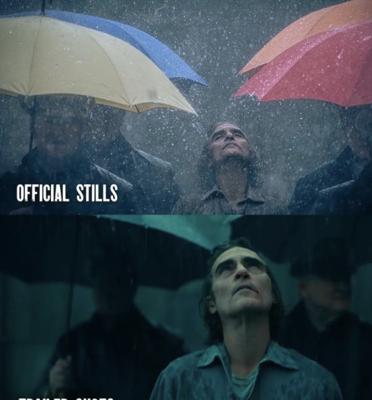
Looking Forward: Joker 2 The upcoming Joker: Folie à Deux promises to push these boundaries further, with the addition of Lady Gaga, known for her avant-garde style. This sequel is likely to inspire new trends in set design, combining theatricality with cinematic realism.
0 notes
Text
reflective posts 8\7
Finished all my final term assignments today and ready to start submitting them at the end of the week!
Looking back on these past three months of study, I realize how much I’ve grown in my ability to organize ideas and effectively demonstrate design thinking. Creating assignments allowed me to break down complex concepts into clearer, more structured presentations. I’ve also come to recognize the importance of professional quality—ensuring that visuals are clear, layouts consistent, and information presented in a way that truly resonates.
One of the most valuable lessons has been learning to adapt my work to the specific needs of my target audience. Understanding how to engage different audiences, whether through design or communication, has provided me with a new perspective on how to create impactful work.
Overall, this program has strengthened my skills in structured communication, critical evaluation, audience engagement, and professional presentation. These are not just academic achievements but essential tools I’ll carry forward into future creative and professional endeavors. The journey has been challenging, but the growth has been worth it, and I’m excited to apply these skills moving forward.
0 notes
Text
reflective posts 8\6
I'm more or less done with the video presentation of the entire assignment, so I wanted to review what there was in the creation of this video that I could do better in the next one.
Better use should be made of colour grading, adjusting the color scheme to enhance the atmosphere of the video. For example, using warm colors for a nostalgic feel and cool colors for a somber or futuristic atmosphere. I think I did okay in this video, enhancing the saturation of the colors to give the environment a bit more of a fantasy look.
Lighting Effects: Try to use lighting to create depth and draw attention to the focal point. I'm a combination of cyberpunk and wasteland style should use contrasting lighting, mixing dim, dirty skies with neon lights and flashing screens to emphasize the cyberpunk atmosphere. It's not done well here, the atmosphere is not something I can control in 3D software yet.
Visual Composition: Ensure that the composition of each shot is visually balanced, directing lines and focal points to guide the viewer's eye. Increase visual effects by adding mutation effects, digital noise and atmospheric elements.
Textures and Details: This assignment did a poor job of modelling this part of the mountain, I subtracted a lot of facets, so you can see some unevenness. The mountains also don't blend in naturally with the atmosphere.
Motion and Animation: Improve the fluidity of the animation and make sure the movements are natural, it's still a bit of a shame to draw your characters and not be able to put them into the scene.
Narrative Elements: It should be ensured that the visual cues and symbols effectively convey the storyline without overwhelming the viewer. The first time I tried to do a 1-minute animation, I also found that I got a little overwhelmed when I was cutting and combining videos. The airship is getting ready to pass through a valley, and at this point someone spots it and starts tracking it through another shot, thus showing my little bazaar. But the scene through the valley was repeated with the bazaar. I realized this later.
Atmospheric Effects: Incorporate environmental effects such as fog, rain or dust to add layers and atmosphere to the scene.Still not quite familiar with how to add these things in 3D that already come with motion.
These are the things that I think need to be improved from this assignment.
0 notes
Text
forefront posts 8-11 Robert Wilson
Exploring the Use of Light and Shadow
Atmospheric Depth: Robert Wilson’s innovative use of light and shadow is pivotal in creating atmospheric depth within his work. By utilizing a gradation of light, Wilson intensifies the focus on key elements, guiding the viewer’s attention and controlling their emotional response. In contemporary design, this technique can be employed to enhance visual storytelling and engagement. Designers can use light and shadow not only to illuminate but to direct the viewer’s gaze and evoke specific emotions, adding a profound layer of depth to their compositions.
Symbolic Lighting: Wilson’s approach to lighting transcends mere visibility; he employs it as a symbolic tool to convey abstract concepts and emotions. By manipulating the intensity, direction, and color of light, designers can imbue their work with additional layers of meaning. This method allows for a minimalist approach that still communicates complex ideas and feelings, proving that simplicity can be deeply expressive. The strategic use of symbolic lighting can transform a design from a simple visual into a rich narrative experience.


Minimalism and Visual Impact:
Minimalism is a hallmark of Wilson’s design philosophy, emphasizing essential elements while stripping away the superfluous. This approach ensures that core messages or actions are highlighted, creating powerful visuals that communicate effectively. In modern design, strategic simplicity is essential for creating impactful visuals that avoid overwhelming the audience. By focusing on core elements and eliminating distractions, designers can achieve clarity and directness in their work.
Wilson’s stage designs often feature a dynamic arrangement of elements that suggest movement and narrative progression. This approach is not limited to theatrical settings but can be applied to various design contexts. Designers should consider how the placement and interaction of objects within a space can tell a story or evoke motion, even in static images. This technique helps in creating engaging and compelling visuals that capture the viewer’s imagination.
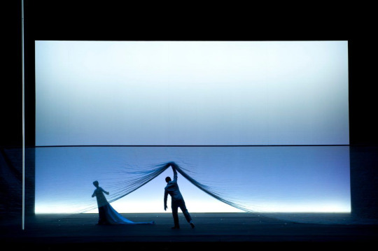
In the analyzed image, Wilson’s use of fabric to divide the stage horizontally introduces visual interest and depth. The lower section’s deepened color, combined with gradient lighting, creates a surreal and ethereal environment. The figures and fabrics are arranged in a way that suggests movement, infusing the scene with dynamic energy. The minimalistic set focuses attention on character interaction and the fluidity of the fabric, showcasing Wilson’s unique theatrical style that blends visual simplicity with abstract narrative.
Narrative Through Visual Design:
Wilson’s work exemplifies how visual elements can narrate a story. For designers, this means considering how space, light, and form can convey a narrative. Each element should contribute to the overall story, ensuring that the design not only looks aesthetically pleasing but also communicates a coherent message.
The interplay of minimalism and dramatic lighting in Wilson’s work creates a strong emotional resonance that lingers with the audience. Designers can achieve similar effects by carefully selecting and arranging design elements to evoke a powerful emotional response. This approach ensures that the work communicates not just a message but also an emotional experience, enhancing its impact on viewers.
Robert Wilson’s use of light, shadow, and minimalism offers valuable lessons for contemporary design. By integrating atmospheric depth, symbolic lighting, strategic simplicity, and dynamic composition, designers can create work that is both visually compelling and emotionally resonant. Embracing these techniques can elevate modern design practices, pushing the boundaries of how we use visual elements to tell stories and engage audiences.
Reference
Robert Wilson, 2024. Robert Wilson - The Official Website. [online] Available at: https://robertwilson.com/
0 notes
Text
weekly progress posts 8\21
It took three days to make the PowerPoint, and because it's quite long, I'm going to go over three main aspects of the PowerPoint.
Creating this PowerPoint helped me learn how to organize my structure and ideas effectively.This process honed my ability to prioritize information, focus on key points, and present them in a clear and concise manner.
I gained experience in articulating my design thinking and creative process from initial inspiration to final product.Learned to explain the steps I took, including sketching, conceptualization and development, and learned to critically evaluate my own work.Strengthened the ability to communicate your design journey and problem-solving skills, which are essential for demonstrating your expertise to potential clients or employers.
Creating this PowerPoint has provided valuable insight into the importance of critical self-assessment, audience-centered design, and professional quality. These lessons will enhance my ability to effectively present creative work in future projects and professional settings.

0 notes
Text
management posts 8\6
Finished laying out the entire pdf today, next to plan how to do the PowerPoint for Presentation.
In addition to presenting a 2-minute video, you should begin by clearly defining what my work is about.Explain the inspiration or motivation behind the project and outline what you hope to achieve with this project.
Next discuss the research, design thinking and problem solving methods I use.Evaluate my work, address the standards related to my field and how I overcame these challenges.
Conclude with a clear explanation of how my project meets the needs and expectations of my target audience.Explain how the project meets industry standards.
These are the only aspects that come to mind at the moment, will add to it tomorrow when I do the PowerPoint.
0 notes
Text
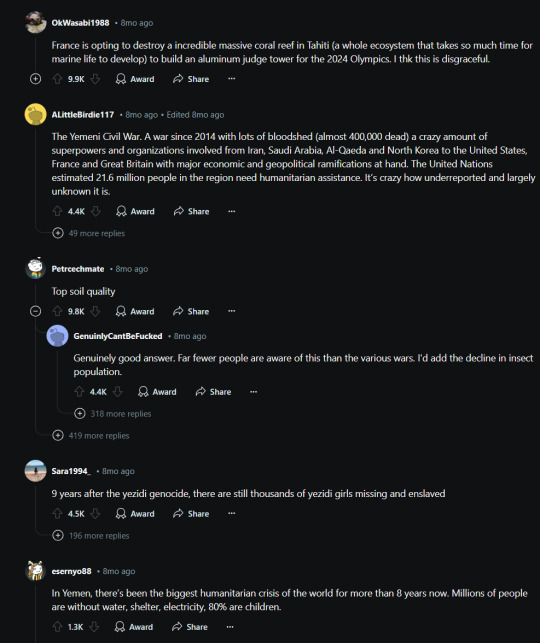
forefront posts 8-10 What is something serious going on in the world that a lot of people aren'taware of?

Recently, I engaged with a discussion about a significant global issue that remains underrecognized. This experience led me to reflect on how my role as a designer can address such real-world challenges. Understanding how our field is evolving and integrating these insights into our work is crucial for staying at the cutting edge of design.
Questioning Our Role in the Forefront of Design: In an era where design intersects with technology and social issues, it is imperative to consider: How can my design skills contribute to solving pressing global problems? This question underscores the difference between traditional aesthetics-focused roles and the evolving responsibilities of modern designers. Reflective practice is essential here; it encourages us to think beyond visual appeal and engage critically with the impact and relevance of our work.
Integrating Real-World Issues into Cutting-Edge Design:
1.Realism and Relevance in Design: At the forefront of design, integrating real-world issues can significantly enhance the depth and authenticity of our work. By grounding our projects in contemporary problems, we create designs that resonate more profoundly with audiences. For example, recent advancements in immersive technologies and interactive storytelling enable designers to craft narratives that reflect complex real-world issues, providing both engaging and educational experiences. This approach not only makes our designs more relevant but also aligns with the latest trends in experiential and narrative design.
2.Social Impact and Innovative Platforms: The integration of global issues into design represents a significant shift towards using creative platforms for social impact. Innovations such as virtual reality (VR), augmented reality (AR), and advanced AI are transforming how we engage with these issues. Games and interactive media are becoming powerful tools for social commentary, allowing designers to raise awareness and drive action. The cutting-edge use of these technologies demonstrates how modern design can influence public perception and behavior, highlighting the importance of interdisciplinary collaboration in creating impactful solutions.
Reflecting on Our Cutting-Edge Abilities: Reflective essays in design are vital for understanding how our skills align with the forefront of the field. This reflective practice helps us navigate the evolving landscape of design, which increasingly incorporates technological advancements and social relevance. By examining how our work intersects with real-world issues, we can better position ourselves within the cutting edge of the industry, leveraging emerging tools and methodologies to enhance our designs.
Reference
Reddit, 2013. What is something serious going on in the world right now that the public isn't aware of? [online] Available at: https://www.reddit.com/r/AskReddit/comments/18ewzhl/what_is_something_serious_going_on_in_the_world/
0 notes
Text
weekly progress posts 8\20
The back of the video was shaking a little fast, but I didn't want to have to go back in and reset the camera time. Tried freeze frame and it worked horribly. So I decided to add a story that someone kicked the camera and that's why it got so shaky.
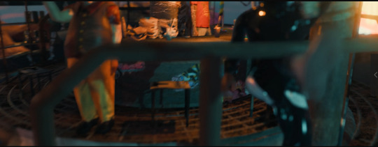

The characters are from the Mixamo website and the moves are auto-bound.
Mixamo. 'Mixamo'. Available at: https://www.mixamo.com/#/
0 notes
Text
weekly progress posts 8\19
Working on the editing of the video this week, I am focused on incorporating relevant images to enhance every frame. Ensuring the video is coherent and visually engaging is my top priority. The most complicated process of organizing the information and aligning it with the visuals has been completed. With these major hurdles behind us, I’m confident that the final touches will come together smoothly and the project will be ready soon.
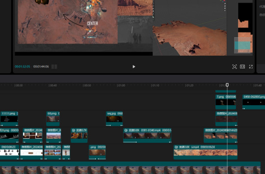
0 notes
Text
weekly progress posts 8\18


Neal gave me valuable feedback on my revised video and presented me with two options.
The first was to adjust the camera position from the original, and the top of the lens began to slowly move through the clouds to see my first shot.
The second is to add the modifications to the upper flyer and do a camera push of the flyer's movement to reach my first shot.
I ended up just deleting this part of the revision because it was simpler ….It seems I lack the character to do my best.
0 notes
Text
forefront posts 8-9 House of the Dragon: DracARys
HBO's Dragon App: A Case Study in AR Innovation Recently, HBO launched a mobile app that allows users to raise their own dragons using augmented reality (AR). As a fan of "Game of Thrones," I found this to be a fascinating blend of pop culture and cutting-edge technology.

The app immerses users in Westeros, where they can hatch and nurture dragons. This AR experience is not just a game; it creates a lifelike bond between users and their virtual dragons. The integration of voice commands and real-world environments deepens this connection, making the experience surprisingly emotional.
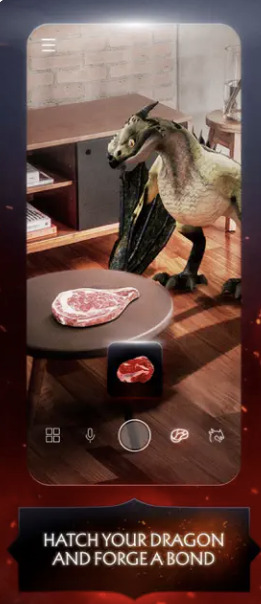

The Impact of AR on Social Interaction and Community Building AR games like this one encourage social interaction, connecting players globally and fostering communities around shared experiences. The ability to see other users' dragons in your sky, for example, breaks geographic barriers and enhances the sense of a global community. This emphasizes the role of AR in creating shared spaces that transcend physical boundaries.
Lessons for Concept Designers Innovation in Interactivity: AR games require designers to innovate in creating seamless, immersive experiences that blend the digital and physical worlds. This encourages the exploration of new forms of interaction that engage users in dynamic ways.
Pop Culture Integration: Using popular TV shows as the foundation for AR experiences demonstrates the power of cultural relevance in design. This can inspire designers to tap into existing cultural phenomena to enhance user engagement and create more compelling experiences.
Brand Extension and Gamification: The app's success highlights the importance of brand extension through gamification. Designers should consider how to extend existing brands into interactive experiences that resonate with users.
Community and Social Sharing: AR's ability to foster communities emphasizes the need for designs that encourage social interaction and sharing. This can create a stronger sense of belonging among users and enhance the overall impact of the experience.
Lastly showing off my little dragon haha, is the one on the ground.Yes, he can't fly yet …

Reference
HBO, 2024. House of the Dragon: DracARys App FAQ. [online] Available at: https://www.hbo.com/house-of-the-dragon/dracarys-app-faq [Accessed 26 July 2024].
Apple, 2024. House of the Dragon: DracARys. [online] Available at: https://apps.apple.com/us/app/house-of-the-dragon-dracarys/id1623419149 [Accessed 26 July 2024].
0 notes
Text
weekly progress posts 8\17

Neal provided me with some insightful feedback on the beginning and end of the clip. I’ll be revising these sections over the next few days to incorporate his suggestions.
I plan to add an effect where the craft appears to travel in front of the camera, with a subtle shake to simulate a weak signal. To emphasize that something might have gone wrong with the flying machine, I’ll include some sparks. After this sequence, I’ll transition to my first shot to complete the scene.


0 notes
Text
management posts 8\5
I'm going to start working on a 2-minute video clip to introduce my project.
So I need to plan what I'm going to need in 2 minutes.
1- Introduce what my project is, what I did to prepare for it, and what my strengths are. In add a recording. Clarify the purpose of the project and the key messages you want to convey.
2 - Write a concise script outlining the goals, benefits, and impacts of the project.
3- Organize ideas for my creative process, drafts and process of drawing. Plan visual elements including scenes, transitions and graphics.
4- Place the pictures and videos in order of thought.
5 - Edit and merge footage, add music, voiceovers and graphics to ensure a smooth and coherent flow.
6 - Review and revise to make sure the video is clear and free of errors.
7- Finalize and export, export the video in the proper format and post it to youtube.
0 notes
Text
reflective posts 8\5
I was watching the video I made over and over again and I felt like there was a bit of storytelling missing here, so I was thinking about how I wanted the viewer to feel while watching the video. How about personifying the concept and making it relatable.
So I reinforced the storyline with audio, with the noise of the bar increasing as the camera progressed. And to add some visual elements, I drew a couple of simple bounty posters to convey that this is not only a restaurant but also an illegal trading place. There was a pistol and a lot of money on the table, but the hirer said NO. Neal gave me the suggestion to make the money and the document in the form of an AR penetration.


I suddenly remembered the change in the design of my flying machine, at first I wanted to design it a bit nomadic, where a person could sit on the deck and fly it. But then when I was coloring it I realized that the bottom was a bit fragmented. Depending on how it's closed up it looks a little more techy. And I used red for the bottom and blue for the casing so that the colours can be a bit more varied as well.


0 notes
Text
forefront posts 7-8 Carolee Schneemann
More Wrong Things
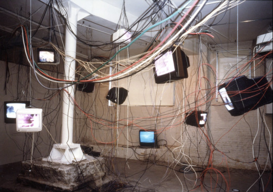

In the realm of Cyber aesthetics, certain visual motifs such as chaotic arrays of monitors, tangled cables, and malfunctioning displays have become prevalent. These elements often convey a sense of technological disarray and dystopian fragmentation. Recently, Carolee Schneemann’s exhibition "More Wrong" has provided a fresh perspective on these themes, offering valuable insights into how such aesthetics can be utilized to comment on contemporary societal issues.
1.Carolee Schneemann’s "More Wrong": A Cutting-Edge Approach Schneemann’s "More Wrong" stands at the cutting edge of Cyber art by integrating traditional artistic inspiration with modern technological commentary. The installation features a sprawling web of 500 feet of wires and 17 monitors, showcasing a loop of disaster footage from various global crises. Schneemann’s innovative use of space—drawing inspiration from fossilized dinosaur bones—transforms the exhibition into a powerful commentary on technological and societal collapse.
Understanding Schneemann’s approach to integrating physical space with thematic content is crucial for my own concept design work. Her method of employing tangled cables and multiple screens to create an overwhelming sensory experience can inform my design process, especially in developing virtual environments and multimedia installations. By analyzing how she combines traditional artistic elements with modern technology, I can explore new ways to convey complex narratives through immersive and interactive designs.
2.The Power of Historical and Cultural References Schneemann’s use of disaster footage from diverse cultural contexts demonstrates the significance of embedding historical and cultural references into art. This technique not only adds authenticity but also fosters a deeper emotional engagement with the audience. The installation’s blend of real-world crises and technological imagery underscores the importance of historical context in creating impactful art.
Incorporating historical and cultural references into my concept designs can enrich the narrative depth and resonance of my projects. By integrating meaningful elements that reflect real-world contexts, I can enhance the emotional and intellectual impact of my designs. This approach is especially relevant in areas such as multimedia installations, graphic design, and video game environments, where cultural and historical depth can create more engaging and thought-provoking experiences.
3.Innovative Uses of Space and Structure The physical arrangement in "More Wrong"—with its chaotic displays and extensive wiring—illustrates an avant-garde use of space and structure. This approach challenges conventional spatial design by creating a dynamic and interactive environment that reflects the installation’s thematic concerns about technological overload and societal fragmentation.
Exploring unconventional uses of space and structure in my designs can lead to more innovative and engaging outcomes. By experimenting with dynamic and interactive spatial arrangements, I can enhance the immersion and impact of my projects. This is particularly relevant in designing virtual environments.
4.Layering Elements and Narratives Schneemann’s ability to layer multiple elements and narratives within "More Wrong" exemplifies a sophisticated approach to storytelling. The installation’s integration of diverse video content and physical structures creates a multi-dimensional experience that prompts viewers to reflect on the intersections of technology, history, and human experience.
By blending visual, auditory, and interactive components, resonate with audiences on multiple levels. This technique is valuable in fields such as multimedia art, game design, and interactive installations.
Carolee Schneemann’s "More Wrong" represents a significant advancement in Cyber aesthetics, merging traditional artistic methods with contemporary technological commentary. Her innovative use of space, historical references, and layered narratives provides valuable insights for concept designers. By understanding and applying these cutting-edge approaches, I can enhance the depth, engagement, and impact of my own designs, contributing to the evolving field of concept art and design.
Reference:
Museum of Non-Visible Art. (n.d.) 'Carolee Schneemann'. Available at: https://museumofnonvisibleart.com/interviews/carolee-schneemann/ (Accessed: 23 July 2024).
Hales Gallery. (n.d.) 'Carolee Schneemann: More Wrong Things'. Available at: https://halesgallery.com/exhibitions/101-carolee-schneemann-more-wrong-things/ (Accessed: 23 July 2024).
Hales Gallery. (n.d.) 'Exhibition 101, Image 1234'. Available at: https://halesgallery.com/exhibitions/101/works/image1234/ (Accessed: 23 July 2024).
0 notes
Text
weekly progress posts 7\16
I wanted to finalize the image for the last post. You can see the centre building in full view.
Then looked for examples of short animated opening and closing displays.



0 notes
Text
weekly progress posts 7\15
I've organized the layout in a specific order: Characters, Aviators, Tools, Architecture, Scene Distribution, and Keyframes, respectively. For the Characters, I designed those representing the locals. I had initially sketched three outsider characters but decided to cancel them halfway through because I realized I might be adding too much content. I'll be sharing a couple of scene drawings later. Additionally, I’ve also designed a small logo to complement the project.

0 notes