
Statistics
We looked inside some of the posts by xin-aet and here's what we found interesting.
Average Info
Notes Per Post
2
Likes Per Post
2
Reblog Per Post
0
Reply Per Post
0
Time Between Posts
4 days
Number of Posts By Type
Text
15
Last Seen Tumblr Blogs


Fun Fact
When “GIF” was named word of the year in 2012, Oxford Dictionaries U.S.A. credited Tumblr for pushing the word.
Text

In-Class Exercise
A drawing done during class where I visualized certain design elements like space (foreground, middle ground, background), scale, and texture, etc. (as labeled on the image).
0 notes
Text
Scale and Proportion

In this movie poster for “The Legend of Hei”, an animated film, scale and proportion are used to create focus of importance. Based on size along, there is a hierarchy in which the black cat in the front (largest in size) is the most important and is a main character. The two people in the background shows human scale, as it depicts them as small since they are standing so far away. Relative to the cat in the foreground, the people and buildings in the background seem much smaller, emphasizing the scale of the cat through both scale & proportion, as well as space, since the sizing creates distance.
Scale and Proportion Glossary
Scale - the size of one object in relation to other objects in a design; a certain relative or proportionate size or extent (A human is 7.5 heads tall.); a standard of measurement or estimation (The UFO was as big as a football field.); point of reference by which to gauge or rate (My puppy is twice as big as your chihuahua.)
Aspect Ratio - refers to the proportions of the height and width of an image. It defines its overall shape, and it is usually shown as W:H (W is the width and H is the height).
Geometry - spheres, cubes, cylinders can be used to build more complex objects
Hierarchy - Arranged according to importance or power. What’s bigger or taller is often more important or harder to kill.
Human scale - sets the stage for the story happening to human-sized characters
Proportions - The size of the parts compared to the whole. Relativity.
Ratio - a ratio tells us what proportions mean to each other. Measuring one thing in terms of another. That monster is twice the size of the human. Their ratio is 2 to 1.
Relative - how objects appear in context with each other
0 notes
Text
Emphasis

This image of a mola, layered fabrics design created mainly by Gunadule women that document their cultural history, depicts a manta ray with other fish surrounding it. The Gunadule community originates from Columbia, South America, but now mostly reside in Panama. This piece here uses placement, where the ray is centered as the one element, capturing the viewer’s attention. The fish surround the ray are its subordinates, while the lines making up the ray leads the viewer’s eyes to the head of the ray, making it the focal point of the piece.
Emphasis Glossary
Emphasis - Pow! Something in a scene dominates. In other words, the designer gives visual priority to part of a scene in order to draw the eye there first.
Contrast in size, color, texture can make one thing stand out from the many things around it.
Focal Point - The focal point demands attention, it is accentuated, contrasted – the star or the most prominent component of a scene.
Isolation - Feature a single element alone, away from other elements to create emphasis.
One Element - Eliminate everything else in the composition and the thing that’s left will grab the attention such as a bold title or symbol.
Placement - Position your most important design component in a place to grab attention, such as the center of a poster.
Subordination -The focal point has the visual power while other elements of the scene are subordinate.
Whole over Parts - Sometimes we don’t want the eye to go somewhere specifically such as in an establishing shot at the beginning of a story. We want to show an overview of the environment before we jump into the story. We might look at a map with lots of details. The whole map is the important thing. When we select a place on the map to visit, then that spot becomes the focal point and the Emphasis shifts from the whole to the specific. Another example is that the whole game is more important than its levels.
0 notes
Text
Contrast

This painting, by Roque Zelaya Acosta, a Honduran artist, utilizes contrast to create a colorful and full scene of people with nature. The painting has value contrast between the complementary colors of the red-tinted ground and roofs of houses with the green grasses and trees. There is also a size contrast that clearly shows the difference between the sizes of the small humans versus the larger, geometric shapes that make up the houses. Additionally, the piece’s composition gives it movement, where the asymmetrical balance allows for the piece to seem dynamic. This asymmetry creates a lively flow, where the viewer’s eyes moves from left to right, following the curves of the road and the people on it.
Contrast Glossary
Contrast refers to the arrangement of opposite elements (light vs. dark colors, rough vs. smooth textures, large vs. small shapes, etc.) in a composition so as to create visual interest, excitement and drama.
Contrast creates variety within a unit, draws the eye to a focal point, creates a sense of adventure or mystery. Contrast is a unifier.
Value contrast is when a character or object has a strong darks and lights compared to the scene around it.
Size contrast is a gigantic space cruiser compared to much smaller fighters.
Asymmetrical balance is a dynamic compositional strategy in which each side of the axis are distinctly different yet belong to the same story.
High Contrast is strong dissimilarity such as black letters on a white background. The high contrast setting is an accessibility feature built into interfaces to assist people with vision impairment. In visual perception of the real world, contrast is determined by the difference in the color and brightness of the object and other objects within the same field of view. Because the human visual system is more sensitive to contrast than absolute luminance, we can perceive the world similarly regardless of the huge changes in illumination over the day or from place to place.
Low Contrast means a minimum of contrast between light and dark, so that the image is either predominantly dark or predominantly light. The sun sets, dusk sets in and in the gloom there is low contrast in the landscape.
Symmetrical is a form of balance in which both sides of the axis are the same, a mirror image of each other, creating stability and formality. In visual storytelling the symmetrical formal balance is often contrasted with the dynamic action of asymmetrical configurations. For example, the formal balance and discipline on the Death Star in Star Wars is contrasted with the diversity of the different rebel cells and militias from across the galaxy. The dynamic contrasting rhythms and visuals of the dark side contrasted with the Jedi and rebel alliance has kept the franchise going for decades.
Contrasting camera angles- Part of your story is how you show as well as how you tell. The camera is your audience’s view of your story and should be well planned to reveal the story in the most effective way possible.
0 notes
Text
Rhythm

In this Ancient Egyptian Hieroglyphic art, a portrayal of Anubis judging a soul is taking place. Switching between the writing and the drawing, there is an alternating rhythm that creates contrasting rhythms, since the two different styles are perceived at different paces. The writing would take time to thoroughly read, while the images can be generally understood from a glance (there are multiple figures, both gods and humans, as well as a scale, usually used to measure something). Additionally, the symbols of animals both in writing and drawing, and the patterns of feet on the top edge create visual rhythm because of their repeating nature.
Rhythm Glossary
Rhythm is caused by patterns in movement. What are those footsteps in the dark room? Are they slow or fast? Running or sneaking up on you? Rhythm controls the pace of action in your story. Rhythm can be repeated character types, weapons, or color strategies. We see and hear rhythm throughout nature as well as in our digital environment. Rhythm organizes units into patterns. Rhythm is created through repetition, alternation, and progression.
Alternating rhythm is a form of repetition and is predictable. We switch back and forth from one thing to another like a tennis match. Alternating rhythm can create tension, such as switching close up head shots of one character arguing with another.
Audio Rhythm are sounds that create patterns such breathing or shooting rounds of ammo.
Conceptual Rhythm Intensifies, moves along, or calms the story. Conceptual rhythm coordinates visual and audio rhythm with the pace of your story.
Contrasting Rhythms are two or more sounds or motions at obviously different tempos.
Legato means music in a smooth flowing manner, without breaks between notes or a smooth flowing motion.
Polyrhythmic pattern is the use of simultaneous contrasting rhythms. A battle scene has many(poly) rhythms such as big guns, small guns, shouts, rumbles, footsteps, and explosions.
Progressive rhythm is a pattern that changes over time to more or less intensity. Progressive rhythm makes us feel that. something is in an evolving state of change. We can tell when the battle is heating up by the rhythm of the sounds and the actions of the characters running toward or away from the fighting.
Repeating- the same thing again and again gives us a feeling of predictability
Rhythm and motion - When a motion repeats, speeds up, slows down it creates a rhythm. The rhythm of tai chi is slow. The rhythm of Kung Fu is fast.
Staccato derives from the Italian verb staccare, meaning “to detach,” and can now describe anything - not just sounds - made, done, or happening in an abrupt or disjointed way.
Visual Rhythm is when motifs such as lines or shapes repeat visual rhythm forms.
0 notes
Text
Unity

The Waharoa at Aotea Square in Auckland, New Zealand, is an art piece that has both Māori and Pākehā elements. The alignment of the large wooden pieces shape it into an entryway, giving it a welcoming atmosphere. The repetition of smaller decorations of instruments and animals that are special to New Zealand also gives the piece visual unity, because it brings together the otherwise empty space on the structure.
Unity Glossary
Unity - is an entity that is a systematic whole. A fusion or union of parts in harmony to create a oneness. A game is a unity based on a fusion of levels.
Alignment – a common axis creates relationship, the line up creates meaning. Alignment in games can help you find your way on the map or aim true with your weapon. Alignment of troops or vessels indicates organizational strength. Maps are visually aligned with the edge of the frame. Your stats are aligned in a table.
Beat Boards are used to illustrate major story points before the rest of the storyboard is completed. Beat boards are a series of single drawings that depict key focal points in a scene. Beat Boards can be compared to a children’s book illustration because an individual picture shows a complex story. Beat boards can serve in art direction to indicate how the shot is staged and show color strategies, using shapes and colors, but are not detailed sketches. (paraphrasedfromhttps://roshnikakad.blogspot.com/2012/02/ss2-discovering-beat-boards.html) Making sure the beat boards relate to each other creates unity.
Composition - is the arrangement of visual elements within a shot. The three basic shot compositions in filmmaking are long-shot, medium-shot, and close-up.
Conceptual unity – a palm tree, an ocean beach, and a beer unify around the concept of ‘vacation’.
Contrast – creates variety within a unit, draws the eye to a focal point, creates drama. Contrast is a unifier. Contrast is when a character or object has a strong darks and lights compared to the scene around it. Size contrast is a gigantic space cruiser compared to much smaller fighters.
Proximity– closer distances connect elements and far apart elements create separation and sometimes magnetism.
Repetition – things that look alike relate to each other. Shapes or colors that recur in the image create rhythm and recognizable situations.
Unifying Strategies – Designers manipulate contrast, repetition, alignment and proximity to create visual unity and to pull a story along.
Visual unity – is a group of repeating or similar elements that create balance or form a structure.
1 note
·
View note
Text
Point

Persona 5 is a game that utilizes point in order to create emphasis on important aspects of the game, both story and game-play-wise. The pixels that surround the user interface are highly saturated black and red colors. The same is done for the enemies, creating easily distinguishable color combinations between red, black, and green for their health. This contrast draws the viewers eyes, making them the focal points of the battle. The game also has dialogue options and boss fight time limits that affect the outcome of the game. If the player is not able to defeat a boss in time or betrays their friends, and chooses to continue the story, there will be a point of no return, where they will only be able to get a bad ending. These points within the game visually guide the player to important scenes, but also involves the player’s own choices with understanding the point of selecting certain dialogue options that will determine the ending of the game.
Point Glossary
Point is the smallest visual component.
Pixel: A pixel is the basic unit of programmable color on a computer display. Each visual composition on your screen is made of thousands of illuminated points of hue and value.
Focal point is the feature of adesign or work of art that is the most interesting or important or the most strongly emphasized.
The Point is what a player will tell a friend about the game if they like it.
The point is the mission or a moving target.
The point of no return (PNR or PONR) is the point beyond which one must continue on one’s current course of action because turning back is dangerous, physically impossible or difficult, or prohibitively expensive. The point of no return can be a calculated point during a continuous action (such as in aviation). A particular irreversible action (such as setting off an explosion or signing a contract) can be a point of no return.
0 notes
Text
Texture

In Stardew Valley, texture plays a big role in defining an object and the game’s environment. By using texture to make the trees, grass, water, houses, and other important objects distinct, it lets the player recognize which items they can interact with. Despite being fully pixel art, the game has visual textures, making the pine tree leaves look pointy and the water look reflective, even though it is all two dimensional. Because of the pixel-art style of Stardew, the textures are representative of real, physical textures, thus having less verisimilitude, since it is obvious that the objects and environment do not look realistic, or from their real-world counterpart.
Texture Glossary
Texture of something is the way that it feels when you touch it, how smooth or rough it is. The texture of an object depends on the unique structure of its molecules. Fur may feel soft or coarse, metal may be oiled and shiny or rusted and rough.
Tactile textures are physical, touchable textures that you can actually feel on your skin in the real world, like when you pet a cat or dog.
Texture mapping is a process in which a two-dimensional surface, a texture map, is wrapped around a three-dimensional object. When wrapped, the 3-D object acquires a visual surface texture. Texture maps create high frequency detail, surface texture, or color information on a computer-generated graphic or 3D model.
Visual texture is an illusion of texture. Pixels or traditional drawing and painting media can be manipulated to give the impression of texture, while the surface actually remains smooth and flat. The texture on an ancient wall, a vehicle, or a creature’s scaly or slimy skin increases the immersiveness of a game. Texture artist is a career path.
Texture artists are close observers as they collect, organize, and use textures to create believable surfaces.
Verisimilitude is the appearance of being real.
Trompe l’oeil, or “deceive the eye” (French), is the representation of an object with such verisimilitude that it deceives the viewer concerning the material reality of it
0 notes
Text
Motion

In this scene of Howl’s Moving Castle, the use of motion highlights the dynamic movement of characters as well as create a portrayal of their personalities. Here, as Howl jumps off a building, the short pause right before he does is an anticipated actions, as it cues the viewer that Howl will be falling backwards. The short pause, as well as the slowness of his fall at the beginning portrays him as almost carefree with the way he is not afraid at all when jumping off. As he accelerates downwards, the background is subject to motion blur, which accentuates his descent. As he jumps up and back, floats slowly, then gains speed in his fall, there is a clear line of action, which exaggerates his falling motion and posture.
Motion Glossary
180-Degree Rule: In filmmaking, the 180-degree rule is a basic guideline regarding the on-screen spatial relationship between a character and another character or object within a scene. By keeping the camera on one side of an imaginary axis between two characters, the first character is always framed right of the second character. Moving the camera over the axis is called jumping the line or crossing the line; breaking the 180-degree rule by shooting on all sides is known as shooting in the round.
Anticipated Action: A dramatic action frozen in time, the tension mounts, we feel anticipation. We expect the sword to swing or the finger to pull the trigger or the couple to kiss.
Camera Motion: Arrows are standard cues, a simple and recognizable way to show motion or progression in a storyboard.
Kinesthetic Empathy: A player’s actual movement when responding to action in a game. Leaning into a curve in a driving game is kinesthetic empathy.
Line of Action: Line of action is an artistic concept, an invisible line that captures the thrust and vitality of the movement. The line of action can be drawn by artists as the first element to capture or exaggerate the pose. Tip: Create the line of action as layer 1 so that you don’t downplay the pose. When you have the full energy of the drawing delete the action line layer.
Motion Blur: When your eyes or objects are in motion, the image will suffer from motion blur, resulting in an inability to resolve details. To cope with this, humans generally alternate between saccades (quick eye movements) and fixation (focusing on a single point).How is this biological situation useful in storyboard drawing? How do storyboard artists use motion blur? How does a smear function in animated motion?
Optical Movement: Optical movement is an optical illusion. Although the image is not moving, it appears to move. To see examples search “Op Art”.
Stillness: Stillness is calm, quiet, inaction, and peace. Stillness is the opposite of motion. It can be used to contrast with motion.
0 notes
Text
Space

In the game Nier: Automata, the usage of space gives the player a feeling of immersion into the world. As seen, there is atmospheric perspective, where the player-controlled character, 2B, has the most contrast and saturation of dark blues and white/silvers. The background on the other hand, is brighter from being illuminated by light, but the colors have less contrast, appearing farther away. Because the colors in the background have less contrast, they have a slight transparent quality, which makes it seem that there is almost a layer of mist or dust surrounding the buildings, marking them as farther away. This is also indicated through the distinctions between foreground, middle-ground, and background, as it clearly shows the distance between the main character (foreground), the enemy (middle-ground), and the buildings/scenery (background).
Space Glossary
Space: an area, expanse, territory, distance or range. Variable spaces expand or contract as our stories unfold. A closeup has a short range. A wide shot covers a lot of territory.
Atmospheric Perspective: Value contrast and color saturation decrease with distance. Brightness increases as objects fade further into the background. In addition, objects such as mountains may appear more blue.
Diagonal Shapes: pull the eye in a direction to create the illusion of depth. If the diagonal is going back like a railroad track or fence-line the eye will follow it into the perceived distance.
Elliptical Perspective: An ellipse is an oval shape. Elliptical perspective provides visual clues to the location of curved surfaces in space. Look straight down on a glass of water. The rim of the glass is a circle. Move the glass to the side, the rim now appears as an ellipse. Line up the rim at your exact eye level, the ellipse now appears as a straight line.
Foreground, Middle-ground, & Background: The 3 treatments of objects in space support design to achieve depth. This template for placing and sizing objects in the picture plane shows variations on the foreground, middle-ground, background configurations.
Foreshortening: when an object’s dimensions appear shorter when angled toward the viewer. At the same time the part coming toward the viewer is enlarged.
Linear Perspective: a system used by artists in which the relative size, shape, and position of objects are determined by drawn or imagined lines converging at a point on the horizon.
Overlapping: when part of one object is obscured by another object. The obscuring object appears to be in front.
S-Curve or Winding Path: In an image of a landscape, S-curve or winding path will draw the eye of the viewer into a perceived distance.
Size relationships: Objects appear smaller as their distance from the observer increases.
Transparency or Opacity: when we feel like we can see objects through a glassy, gauzy, smoky, or dusty layer. The transparent/opacity adjustment affects the saturation and color of objects to give a feel of depth.
Vertical Position: places objects higher up in the composition to appear further away.
Volume: is the amount, expanse, extent, magnitude, size, aggregate, bulk, dimensions, or mass of an object. The volume variable indicates the amount of territory needed for each object in a scene.
0 notes
Text
Shape

In this screenshot of the game Celeste, shapes are very distinct in defining platforms and other objects. The blocks are rectilinear, adding to the pixel art aesthetic and creating patterns that represent rocks, snow, fire, and dirt, etc. The background, dark, with dimmer colored shapes (such as the rock walls and bushes) is the negative space, which emphasizes the positive space that has more saturated colors. The positive space is also more defined because of the contrast of colors and distinction of shapes, making them feel closer and real (indicating that the player can stand on or interact with these objects and platforms).
Shape Glossary
Shape is the external form or appearance characteristic of someone or something; the outline of an area or figure. As a verb, to shape is to give a particular form. As artists, we shape our characters outward appearance by using shapes.
Abstract means no recognizable objects. Abstraction is a sliding scale from realism to completely non representational. Abstract shapes can be used in backgrounds and textures. The background pattern in this Minecraft image is abstract. The character is still recognizable as a human, but the doctor’s human form is abstracted in the game of Minecraft to conform to the blocks of the game world.
Biomorphic is a free-form pattern or design with a shape suggestive of a living organism, especially an amoeba or protozoan.
Curvilinear shapes are s-curves. Curvilinear shapes inform Jessica Rabbit’s character design and can represent a winding river vanishing into the distance.
Distortion is exaggeration, contortion, reform, slant, twist, or warp in ways that depart from reality. Look at the Minecraft Human body example. The figure of the Minecraft doctor is distorted by the shape of the blocks.
Idealism asserts that the physical world is less important than the mind or the spirit which shapes and animates it. Idealists choose the soul, the mind, or the psyche over the body, the material, and the historical. When ideals (of appearance, or proportion for example) regulate the way an artist represents the world, her work can be described as Idealistic. The leading artists of the High Renaissance - Leonardo, Raphael and Michelangelo - are all associated with varying forms of Idealism, as were ancient Greek sculptors. How do you think idealism affects avatar customization?
Non-objective shapes have no object as a reference and no recognizable subject matter. Non-objective shapes are often used to simplify design shapes. Geometric shapes such as a triangle, square, and circle are abstract until you put them together to represent a house or a smiley face. One Minecraft block, away from the game, is a non-objective shape. Inside the game that same block, depending on it’s color and texture could represent a part of a landscape, sheep, or sword. The block as part of a character or environment inside the game would no longer be abstract.
Positive space is the subject, focal point, or areas of high interest in any composition. Negative space is the area around the areas of interest. All compositions balance positive and negative space. Yes, stuff in the negative space can point to the focal point to make it most obvious. Positive and negative create a whole. Every composition is a combination of positive and negative space. Wield the positive and negative spaces with control and story-telling magic to become a design master.
Realism, or naturalism, attempts to represent subject matter truthfully, without artificiality or exotic or supernatural elements. In the visual arts, illusionistic realism strives for the accurate depiction of lifeforms, perspective, and the details of light and color.
Rectilinear is a boxy shape made with straight lines. For example, the screen you are looking at is a rectilinear shape filled with little square pixels, and pixels are also rectilinear. A storyboard is a series of drawings in a linear set of rectilinear frames.
Representational means objects that players can name. The object represents something from the real world, or something that has the verisimilitude of realism. A cartoon bunny can represent a rabbit without being realistic. Representational is a sliding scale from realism to almost abstract. 2 dots and a curve can be arranged into an abstract pattern or they can be arranged into an emoji that represents a smiley face.
Silhouette is a profile or shape that is easy to identify.
Squash and stretch are shapes profiles that emphasize motion. The stretched position shows the form in an extended condition. When you do a sit up your belly squashes and your back stretches.
0 notes
Text
Value

In this screencap of Studio Ghibli’s Spirited Away, Chihiro and No-Face sit in a train. The image uses value to emphasize the contrast between the warmer tones of the seat cushions and browns of the train interior with the darkness and shadows of No-Face. The different values also creates space because it shows the light source being above, with its reflections on the wooden train floor. Additionally, the values that are closer to the viewer are brighter, whereas farther back in the train, the values become dimmer and lighter (in the sense that it seems more washed out by the light rather than the more vibrant colors in the front that reflect light), giving a depth of field to the train.
Value Glossary
Value in design is lightness or darkness on a scale of white to black (with white being the highest value and black being the lowest value). Value is widely considered to be one of the most important variables to the success of a design.
Chiaroscuro (English: kee-AR-ə-SKOOR-oh, -SKEWR-, Italian:; Italian for “light-dark”), is the use of strong contrasts between light and dark with bold contrasts affecting a whole composition. Chiaroscuro is a technical term for the use of contrasts of light to achieve a sense of volume in modelling three-dimensional objects and figures.
Light and dark: Every element in your design has a value from 1% black (almost white) to 100% black. Value is relative to everything in the composition. Every color has an underlying value somewhere between white and black.
Value as emphasis: happens when a strong contrast in value draws attention to itself such as on this ancient Greek vase illustrating value contrast in the service of visual storytelling. Kylo Ren’s red light sable shows value contrast against the dark background.
Value and space: Designers use dark and light values to create the illusion of light as it falls on objects. Value is used to create the illusion of highlights and shadows. Highlights and shadows combine to create the illusion of a light source. The pattern of light and dark can create dimension, volume, and mass.
Value patterns appear regularly in the world, in human-made design, and even in abstract ideas such as stories. The elements of a pattern repeat in a predictable manner. Night and day is a value pattern common in stories.
0 notes
Text
Line

In this drawing, I used various line techniques to draw a tree with ornaments hanging off its branch. The lines are explicit, in which the outline of both the branch and the ornaments are distinct. The contour lines around the outline of the branch and the ornaments also have a thicker line weight than the thinner lines within. The thinner lines have a different line quality, where they seem more sketch-like, to give texture and imply shadows. This gives the piece a sense of depth, since the hatch-lines create a difference between light (the lighter, base red) and dark (the darker red that seems darker because of the lines).
Line Glossary
Lines have both a direction and a length. Line means a mark, streak, stroke, slash, path, stripe, border, contour, striation, course, route, and track. Curved, bent, thick, wide, broken, vertical, horizontal, burred, or freehand, lines delineate shapes, forms, and spaces, volumes, edges, movement and patterns. Not only that – lines create both 2D and 3D objects and figures. Lines are awesome and powerful.
Contour lines indicate the edge around an object or the changes in volume within an object. Contour lines dramatize changes of plane within the form. The curve of a belt around the waist is a contour line.
Diagonal Lines are useful to draw the eye into a composition such as toward the vanishing points. Three common types of diagonals are 1) actual diagonal lines 2) objects placed diagonally in a scene 3) a diagonal line created by the viewpoint such as the Dutch tilt.
Dutch Tilt (known as a Dutch angle, canted angle, or oblique angle) is a type of camera shot that has a noticeable tilt on the camera’s “x-axis.” The Dutch tilt camera technique was introduced by German Expressionists in the 1920s — so it’s not actually Dutch. Directors often use a Dutch angle to signal to the viewer that something is wrong, disorienting, or unsettling.
Explicit means clear, direct, and obvious. If a drawing is easy to read it may be that the lines are explicit, clean, with efficient use of variety. There are explicit lines around the frame of the Dutch Tilt illustration.
Gesture Lines capture motion, such as in an action pose when gesture drawings are used in storyboards. The figures at the head of the Rembrandt Elephant drawing show the quickly sketched human gestures responding to the elephant.
Implied lines in 3-D scenes a line in a scene that is not physically there but is suggested by points in the art. Implied lines suggest the edges of an object or planes within an object. The line may be broken such as a dotted line, it may be defined by value, color, or texture, or it may not be visible at all. With implied lines, our brain interprets that a line exists.
Line As Value has a long history. Artists have used line drawings to create value, or shading, and to achieve the impression of volume. In this quick sketch of a live elephant Rembrandt used outline contour lines around the edges of the elephant and curved contour lines around the big legs and belly. Most of the lines are at the lower part of the elephant to show that the light source was from above.
Line of action is an imaginary line that extends through the main action of the figure. When you draw an action figure you can capture the line of action on one layer then draw the figure drawing on another layer.
Line quality is the expressive essence of lines. Varying the line quality makes objects appear more 3-dimensional and exciting. Range in line quality heightens descriptive and 3 suggestive potential. A single line can change in darkness and width, can vanish all together to mentally reconnect later on an edge.
Line weight refers to the thickness or thinness of a line.
We don’t really need a strong contour line around every part of an object because our brain will fill in the blank where the edge disappears. When a line fades out and then restarts further along the edge it is called a lost and found line. There is a lost and found line at the top of Rembrandt’s elephant behind the head. There is a strong contour line of the skull of the elephant and a strong bulge of the back, but between the 2 curved shapes the line fades out, yet we still know that the elephant shape continues.
Psychic lines are invisible. Psychic lines form between characters or between a gun and a target, or a hand pointing in a direction. There is no real line yet we feel a line. Eyes looking in a direction, especially characters looking at each other create a psychic line.
0 notes
Text
Color
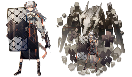

In these pictures of the character Saria from the game Arknights, color contributes greatly to the design of this character. The saturation contrast between the highly saturated oranges and the duller, warmer grey tones of her clothing and the background creates emphasis, which gives Saria an almost imposing presence. Given that she is a defender, it further highlights that strength. Additionally, there is a “temperature” difference in the colors in her art, where the warm greys (almost golden-brown) contrasts with the cool silver color of her hair and parts of her shield. Overall, the palette also seems to use an achromatic/chromatic mix strategy, where the achromatic part is from the varying shades of grey, and the chromatic aspect are the brighter orange hues that accent the white, grey, and black values.
Color Glossary
Visible light spectrum is the segment of the electromagnetic spectrum that the human eye can view. This range of wavelengths is called visible light. Typically, the human eye can detect wavelengths from 380 to 700 nanometers.
Color psychology is the study of the effect that colors have on emotions, behavior and feelings of people.
Color systems classify color and analyze their effects.
The additive color system is used for colors of light such as light emitted from computers, phone screens, and projectors. Red, green, and blue are the primary colors
The subtractive color system is used for pigments such as ink, dye, and paint. Cyan, magenta, and yellow are the primary colors.
Change in Color is to use color to separate the foreground, midground, and background planes to create the illusion of depth and is commonly used in animation.
The color wheel, or color circle, arranges a pattern of hues around a circle. There are several versions of the color wheel or color circle. The circle connects relationships between hues to illustrate color strategies. (see 12 Chromatic Strategies) Color wheel history goes way back.
Local color is the natural color of an object unmodified by adding unrealistic light and shadow or any other distortion. The color that the eye observes is altered by lighting conditions such as time of day or the surrounding environment. The local color of a lemon is yellow.
A palette is the range of colors used in a particular composition or by any person who uses color such as an artist, house painter or interior decorator. An example of a palette is Vincent Van Gogh’s limited palette of hues in his Starry Night painting. Starry Night’s palette is a variety of blues, greens and yellows.
Properties of color are hue, saturation, and brightness.
Hue is the named color around the color circle such as red, orange, green, yellow, violet, and blue.
Saturation is the intensity or purity of a hue. Fire engine red is more highly saturated than brick red or the color of red wine.
Brightness is the perceived intensity of light coming from a source such as a screen. On a color screen, brightness is the average of the red, green and blue pixels on the screen. Brightness is important to both color perception and battery life on mobile devices. Brightness of a screen can be adjusted.
Symbolism of color in art and anthropology refers to the use of color as a symbol in various cultures. There is great diversity in the use of colors and their associations. Diversity in color symbolism occurs because color meanings and symbolism occur on an individual, cultural and universal basis. Color symbolism is also context-dependent and changes over time.
12 Color Strategies:
Monochromatic means variations of a single hue such as a light blue and a dark blue or a greenish aqua blue and a lavender blue.
Achromatic color strategy integrates variations of black, white, gray, and a full range of neutrals.
Full Spectrum Strategy represents the full circle of spectral colors by incorporating at least five of the base hues.
In the Achromatic/Chromatic Mix strategy, Achromatic colors dominate the composition with a chromatic hue accent.
Warm/Cool: Contrasting ‘temperatures’ of warm & cool. Cool colors appear on the green/blue/violet side of the color wheel. The colors on the red/orange/yellow side of the color wheel are called warm. Emphasis is on the contrast between warm and cool achromatics: brown - gold (warm), grays - silver (cool)
Saturation Similarities: Hues may vary in this strategy, but all colors must have the same or very similar saturations. Saturation Contrast: Hues may vary but all colors must have significant contrast of saturation.
Value Similarities: Hues may vary in this strategy, but all colors have the same or very close values. Value Contrast: Black (or dark desaturated hues) contrast with white (or very desaturated tints of hues). The Value Contrast strategy demonstrates strong distinction of value with the strongest example being between black and white.
Complementary Dyad creates a strong hue contrast. Complementary hues are located directly opposite each other on the color circle
Split Complementary strategies are based on two complements. To create a split complementary color strategy select one hue and contrast it with the hues on either side of its complement, such as Red & Yellow-Green/Blue-Green.
A Tetrad strategy uses four equilateral hues from the color circle, such as Red, Orange, Green, Blue.
A Triad strategy uses three equilaterally balanced hues from the color circle, such as primary, secondary, or tertiary.
Analogous strategies collect 2 or 3 neighboring hues on the color circle.
0 notes
Text

Hi! This blog will be covering topics regarding design, aesthetics, and its elements/principles through the usage of examples from media ^ ^ .
1 note
·
View note