
Don't wanna be here? Send us removal request.
Statistics
We looked inside some of the posts by yashanisblog and here's what we found interesting.
Average Info
Notes Per Post
1
Likes Per Post
0
Reblog Per Post
0
Reply Per Post
1
Time Between Posts
4 days
Number of Posts By Type
Text
17
Last Seen Tumblr Blogs


Fun Fact
25% of US internet users with an annual income of $80-100K use Tumblr.


Text
Poster before final feedback

Too cramped and squashed
Bin having waves going into is not clear
Will work better with two posters tied together if stretched across two pages.
0 notes

Text
Poster Research

Typography into picture
Oscar graduated from the graphics (printmaking) course at Leeds in 1994, and established his studio in 1996 Follo...: Typographic art, typography, typographic design. Pinterest. (2022a, June 7). https://nz.pinterest.com/pin/338544097001051245/

Animation of the words melted into water/ washed up
Indieground’s weekly inspiration dose #107: Typography artwork, graphic design posters, cover art design. Pinterest. (2023, February 8). https://nz.pinterest.com/pin/852165560760457789/

Second poster about not littering in oceans to tie together with the first poster
Tag der Erde poster: Earth Day posters, environmental posters, environmental art. Pinterest. (2022, June 13). https://nz.pinterest.com/pin/597923288044128061/

Wharf created out of words/typogrpahy
Дизайн плаката: Poster design: Типографский постер, Современный плакат, Дизайн плаката. Pinterest. (2023b, May 2). https://nz.pinterest.com/pin/875739090021988667/
0 notes
Text
Reflective Statement
Research Skills:
My research skills are primarily utilized through Pinterest and Google. These platforms serve as my primary sources of inspiration for my designs. By exploring various design trends, color palettes, and typographic styles, I have been able to refine my concepts and create more effective designs. To further improve my research, I intend to explore other platforms to gain additional inspiration.
Creative Process:
Throughout my creative process, I have employed a variety of design techniques, with experimentation in InDesign being the most prominent. Engaging in trial and error within InDesign allows me to explore and refine my ideas, ultimately enhancing my design concepts. One weakness in my design process may stem from the limited extent of print testing, potentially resulting in unforeseen issues in the final output.
Decision Making:
When faced with challenging decisions, I often refer back to the brief for guidance and conduct research to find inspiration to inform my designs. Some decisions align closely with the brief and are straightforward, while others require more extensive research to ensure alignment. Moving forward, I aim to enhance my decision-making process by seeking feedback from peers and instructors to generate more ideas and improve my designs.
Overall Progress and Learning:
Reflecting on the overall progression of my work, I have learned that typography plays a crucial role in the effectiveness of poster design, rather than merely serving as filler. I have encountered challenges in balancing aesthetic appeal with readability and ensuring that my designs align with the project's brief. Looking ahead, I plan to further refine my typographic skills and concentrate on enhancing the overall visual storytelling in my designs.
1 note
·
View note
Text
Motion Posters Review

This poster is using mechanical animation on the typography.
I think this animation is affective because it emphasises the actual meaning of the word "unravel" by showing the letters "unraveling.

This poster is using animation out on the typography.
I think this animation is affective as it is quite literally expressing the meaning of the word by having the typography melt away like liquid.

This has a paths animation for the typography.
This animation does work as it matches the saying and has a great effect to catch viewers eyes, the only thing that might not work well is the motion is quite fast that it might be hard to read as well as it creates a little blur which can cause struggle for the viewers to read.

This poster uses organic motion for the typography.
This animation works as it relates to the word ping pong by doing that exact action from the activity "ping pong". Its simple and effective and easy to read.
0 notes

Text
Reflective Writing
Research skills
I used mostly Pinterest and Google to get my main inspiration.
Creative process
I did a lot of experimentation in InDesign. It worked the most for me because I can try new things and easily change it if I didn’t like it.
Decision making
I kept referring to the brief a lot to look for key things I need to do to reach the brief. I got stuck I would research on Google/Pinterest. I found it the hardest to not spend too cut time and making the focus the imagery but more focusing on the typography.
Overall progress of my work and learning
I learnt more how typography aren’t some just boring words and can never be the focus of a poster. I learnt that I could use typography to create an image.
0 notes
Text
Formative Posters + Rationale


Rationale
My first poster is called the “Melting Pot” poster. It represents how I see New Zealand as a “melting pot” with its rich cultural diversity. The choices of blue, black and red ties in with the colors from the national flag. The words are different nationalities which I then altered and morphed to look like they are melting and being poured into one pot being the country “New Zealand.” The second poster is representing a special place to me in New Zealand called Murrays Bay Wharf. By morphing the words being the name of the place into a wave shape, I tried to reflect the fluidity and rhythm of the ocean adding movement to the design. The color pallet of blue, black and light brown expresses the costal tones, allowing viewers to submerge themselves in the natural beauty of this place.
0 notes
Text
Poster Exploration


First:
Font = Kiwi School Handwriting
The color scheme is working with the green and white on top of the black.
As even though the "fern design" is to tie in New Zealand it might be too busy for the background (try solid background).
Second:
Font = Welcome Spring
The "wavy" effect on the word I think works well of the concept of it creating a reflective sunset on the beach.
I think the top might be a bit empty and unbalanced (can try adding the "spikes" at the top).
Third:
Font = Apple Garmond
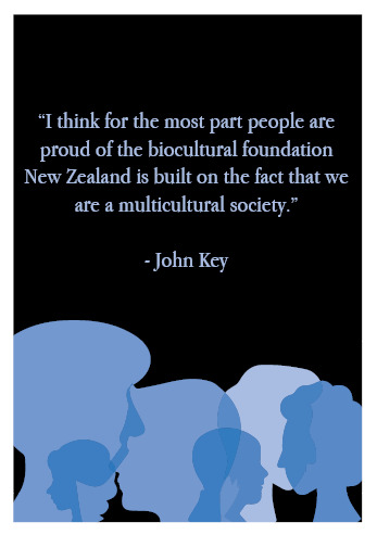
The "silhouettes" worked well with tying in/relating to the quote
I think the text needs to be narrower (make the word smaller and have more space around it).
0 notes
Text
Research

I liked the idea of writing making up the picture.
New Zealand map posters for sale | redbubble. (n.d.). https://www.redbubble.com/shop/new+zealand+map+posters
0 notes