ykmv
Your Kilometrage May Vary
a Philippine blawg about ink and fountain pens
21 posts
Don't wanna be here? Send us removal request.
Last Seen Blogs

jordanbryden
Jordan Bryden
loona
loona

relaxing-sleep-music
Relaxing Music

beauanyetixs
𝐂𝐚𝐥𝐥 𝐦𝐞 𝐆𝐚𝐛𝐲

liquidchiqen-blog
Lissticism
Photo

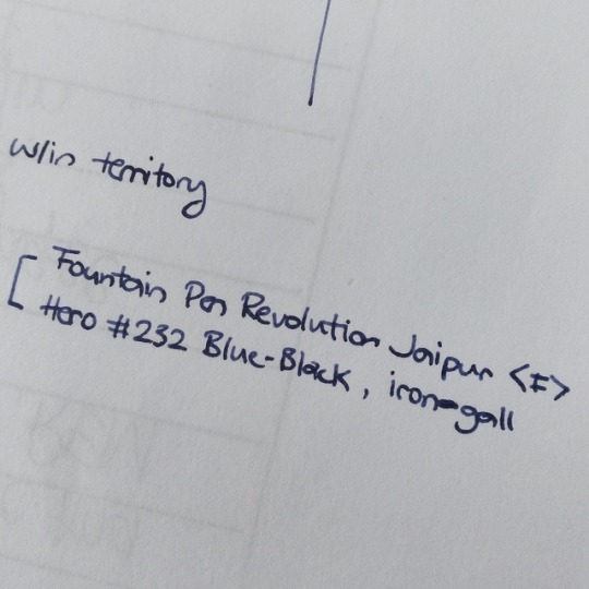
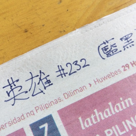
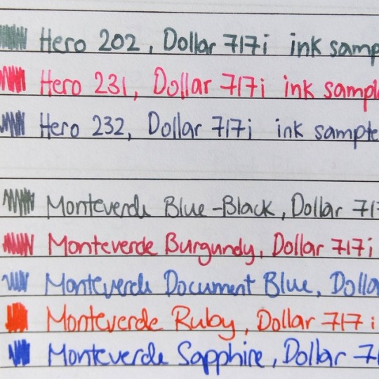
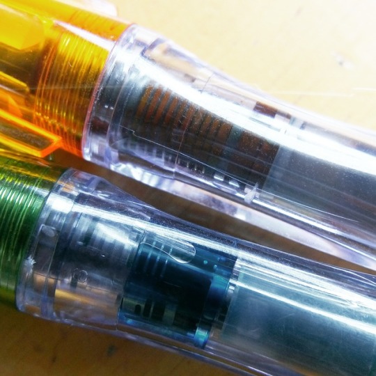
Fountain Pen Revolution Jaipur (clear, fine nib) inked with Hero #232 Blue-Black. Looking for what people call a "bar pen" and I'm trying out different pen-ink combinations to see what would work best under the circumstances. Any suggestions?
#Ykmv#Fountain pens#Fountain pen revolution#Fpr#Jaipur#Fpr jaipur#Fpn#Fountain pen network#Hero#Iron gall#Ig ink#Piston filler#Bar pen
6 notes
·
View notes
Photo
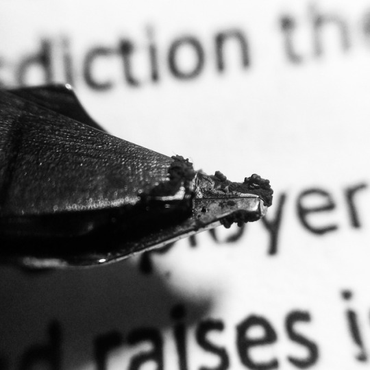
Nib crud. Icky but harmless.
5 notes
·
View notes
Photo
This is a story about a girl named Lucky.
3 notes
·
View notes
Photo
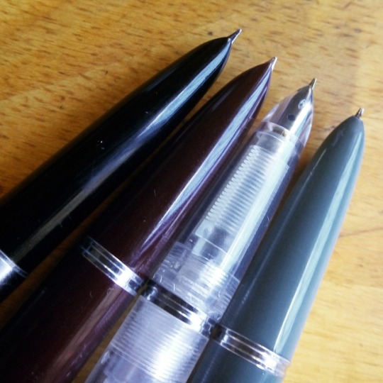
Some photos of the Dollar 717q and PenBBS No. 184 (diluted) at work!
2 notes
·
View notes
Photo
Is this what Lamy Petrol looks like?
Edit: Nope, Petrol is much greener where this is more of a teal black.
0 notes
Photo
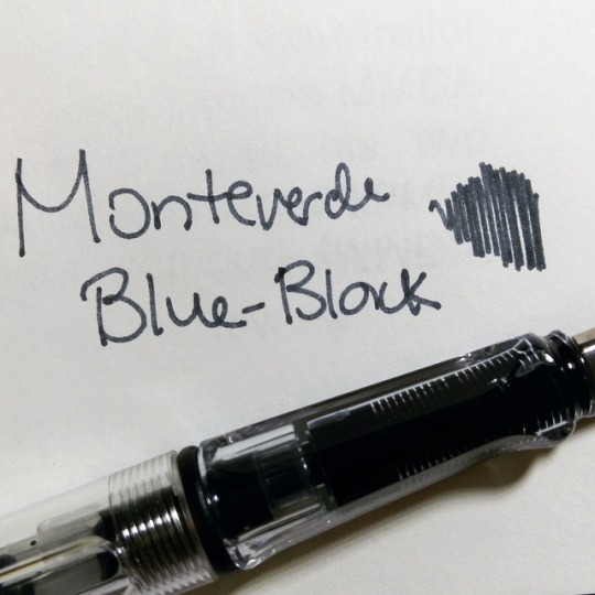
Some Monteverde inks. The Blue-Black is very different from all the swabs I looked at before buying and is a good example of the worst problem facing fountain pens: colour accuracy.
1 note
·
View note
Photo
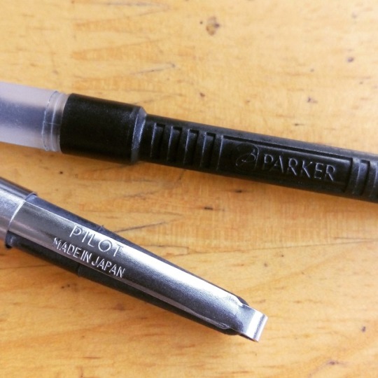
The Parker slide converter and the Pilot "cleaning" converter are the worst converters I have ever tried! Parker's will dry up on you after one fill and will be so snaggy it will convert itself to a cartridge. When it becomes snaggy, filling a pen is almost impossible to do without causing a minor spill with your herky-jerky movements. If you are filling from a near empty bottle or a bottle that needs to be held in place.. good luck! I broke one before just trying to fix it. The solution? When it dries up, dab the insides with some silicon oil or gel (although both are hard to find locally) and the problem is solved! The Pilot has quite some history with me because Pilot 78Gs were some of my first pens. Until last year, you couldn't get a Con-50 locally and that meant if this died you had to buy a new pen and I wasn't buying a new pen. And oh how consistently they died. Not long after the sac would deform and you could not screw the pen close without ink being shot out of the pen because the barrel was naturally squeezing against the sac which was now extending past its intended shape. Crazy! And you can't see how much ink you have left! I bought a dozen spare Pilot converters once they were available out of fear and distrust and fear.
0 notes
Photo
Got a pen secondhand for its 1975 introductory price of $10! This “25” is a 1990 production though–date code is IQ or the third quarter of 1990–so I’m not sure if that means I got an even better deal since the it was already $15 by 1980 according to ParkerPens.net. In any case, no regrets since I was looking to buy the same model for twice as much just last week.
The pen was sold as a medium but the feed/nib unit says it’s a B. By the difficulty I had in disassembly I don’t think it was removed before.
Quite a smooth writer with its big ball of iridium and the large feed means the pen stays wet uncapped for a long time. I uncapped it, had dinner, came back and it put down ink right off. Wow.
1 note
·
View note
Photo
The problem with the Pilot Plumix or Pluminix (we can also probably include the Penmanship) is that their sections are poorly constructed. It seems to be made-up of two parts: the one you hold and the inner sleeve/part where the feed fits by friction and your cartridge can be pushed on. Somewhere between the two is a problem that allows ink to seep through between them and since there's no way to disassemble the two without destroying the pen, you're stuck with this unsightly thing. Flushing and soaking does not work.
1 note
·
View note
Photo
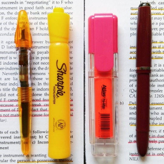
Have to make use of my italic nibs! The Dollar 717q is inked with Monteverde Burgundy (old formulation), diluted to improve transparency while the Pilot Pluminix is inked with PenBBS No. 184 "Gamboge". Still looking for the right green for my green Pluminix. PS Diamine Yellow is the best match to Sharpie Mango/Banana yellow and Stabilo Pastel Yellow that I kmow of. No. 184 is closer to an about-to-run-dry Sharpie.
#ykmv#Fountain pens#Pilot#Pluminix#Dollar fountain pens#Monteverde#Sharpie#Stabilo#Highlighters#Dollar 717
2 notes
·
View notes
Text
Your First Fountain Pen
For a beginner, and a student beginner especially, the largest consideration is price. I have had all the pens mentioned as good starter pens (except the Al-Star and the Loom, but have borrowed both multiple times from friends) and they are all good pens. Even the Petit1 is a good pen!
For "credentials", I have convinced more than two dozen people the past year to buy their first fountain pen. As far as I know they all still use the pens. Hashtag penvangelism.
My default answer to people who want to buy their first pen is the Pilot Metropolitan. Why? A lot of people (especially at my age; '90s kid) are used to ballpoints and gel pens. I know exactly one person in my life who uses a rollerball pen. This means most people are used to thin line widths which, in my experience, only the Pilot Metropolitan <F> can offer. I've used the EF nib of Lamy and TWSBI and both are demonstrably thicker than a Pilot Fine.
The logic behind suggesting a pen within the prospective convert's comfort zone is that you don't just want to suggest a good pen to someone, you want the person to keep using that pen and abandoning the use of non-fountain pens. Easing them into it helps.
Back to price. In my country, a Safari is three times more expensive than a Metro. The Safari does not come with a converter. Even if you want to switch to a Con-50 or Con-40, the Safari is still more than twice as expensive—I hate it). In my country as well, the Eco (about $40.00 here) is two dollars away from being four times as expensive as a Metro. This is a huge difference because even if we "sell" fountain pens as being built to last, most first-time buyers are perfectly fine using a $1 Pilot G-tec. They absolutely love the G-tec. A Metropolitan is fifteen G-tecs. To stretch the comparison a bit, a Porsche 911 Carrera S is just five Toyota Corollas.
A super budget pen would be a Preppy, a Petit1, or a V-Pen. The cap of the Preppy breaks with regular cautious use and a Petit1's clip will break-off. A V-Pen is too cumbersome to refill unless you have one where the feed can be pulled-off (mine can't, even with pliers). A Plaisir might be nice but that terrible looking nib and the local price have stopped me from trying. It is pretty cheap in China though (about $12) so..
I do like Chinese pens because they're so cheap. Definitely good writers when you find them (I have bought probably 30+ already this year, some for myself, most to be PIF-ed or sold and get people into Chinese pens). There are a few concerns for me if it's someone getting their first few pens. First, there will be lemons even if you buy from the "reputable sellers" we often hear. Even if they all write and are in good condition, some write better than others. I once bought a lot of 10 pens. 7 wrote well but 3 wrote incredibly incredibly well. Returning them or contacting the vendor will be a pain. The wait is also excruciatingly long and the pen might not arrive at all.
Another thing is consistency. eBay sellers would actually indicate if a Chinese pen was "M" and in some cases even put nib width "0.5" which is what I think a lot of pen users here (me included) wished pen manufacturers would do to standardize how thick pens are. But these listings aren't always true. A "0.5" actually doesn't mean "0.5". In fact I found a listing last night in Taobao where the seller had a table that "0.38" is actually 0.38 to 0.6 and "0.5" is actually 0.4-0.8 or something like that.
Now, why would you not buy a Pilot Metropolitan? Besides an uncommon problem of some people reporting that it ejects ink into the cap for no reason, the most obvious are the large step and the design. For quite some time, I didn't get a Metropolitan because the design didn't speak to me. They wrote well enough but not well enough for me to get over the weird middle band. I just couldn't understand why the background of the middle band was different in shade to the the rest of the pen (in MR1), and later on the animal bands just horrified me (in MR2). Eventually I got used to the design and I have three of them right now (I've owned five in total). Then there's the step. From all the pens mentioned this has the largest step. I understand why the step is there but I still prefer a pen that is streamline uncapped versus a pen that is streamline while capped. I look at pens when they are ready to use, not when they are to be kept in storage. I have since been able to modify my grip when using this and similar pens such that they are no more uncomfortable than other pens (my fingers sort of cling to the ledge of the step). You could also get a Kakuno instead! It is being introduced to more markets and it’s a good writer in fun colours. Somehow, my Kakuno felt sharper than my equivalent Metropolitan though.
That said, Pilot Metropolitan <M> sometimes have a tendency to skip when you first write with them. The problem miraculously goes away after a short while. I don't know if it is baby's bottom because I haven't gotten around to getting a loupe. I have bought and handled a few used Metropolitans and none have skipped.
Now, why would you get a Safari instead? While the nib width and quality control is a bit of a lottery and the inner cap does tend to break down, both problems are easily dealt with. The biggest draws for me is the easy exchange-ability of nibs matched only by Kaweco among current pens. Of course, depending on the market a Lamy nib costs more than a Metro... The section/grip of the Safari is also talked about a lot. It really depends on your grip and it's important that you be able to borrow a pen first before you buy it. There are also people who buy the pen after trying it in the store and then sell it a week later because it's too big or too heavy but these are unusual people. For me, the Safari is easier to hold than a Metro even if I don't hold pens the way Lamy wants me too (only one of my fingers is "where it's supposed to be").
Why don't you get an Eco? The grip is the easiest to use and the capacity will not leave you wanting. To me, the largest barrier is again the price. You must be a great fan of the demonstrator look and the piston capacity if you want this pen where I live. In the US it is the same price as a Safari so that might not be a consideration for others, of course. I do like the screw cap (I wish all pens were screw caps) but if you post your pens this has the worst posting experience among all of the pens mentioned. I'm sure it's secure but it doesn't inspire you about its security. I also think it looks the worse among all the pens. I actually like how the Preppy looks more than an Eco. The all clear version looks really great though, up until you fill it and ink inevitable gets on and behind the inner cap...
The Eco performs at a comparable rate to the Safari (again, I think they all write well albeit slightly differently) and it may come down to personal preferences. Do you value nib-swapping more than a piston's capacity? Do you prefer a screw cap to a snap cap? If you want to experiment with unusual inks you may be better off staying away from the Eco. There's too much worrying involved in keeping the barrel pristine.
Is anyone still reading?
Alright, a Kaweco Sport is alright and I really like the look. Besides the possibility of a poor nib (happens to all manufacturers anyway), you have to be open to dealing with unavoidable barrel wear. Unavoidable! You also need to post the pen to write with it. Another thing is that if you want to use cartridges on a transparent Kaweco you should know beforehand that it looks pretty lame. A lot of people complain about proprietary cartridges and there was a recent post here about someone making a permanent international cartridge; Kaweco needs to make a proprietary cartridge that fills the length of the Kaweco barrel. Short international cartridges look terrible!
A Loom is great and I really want to buy one save for two worries. First, the cap looks really bad and there is something off in the way it clicks shut. It also has a terrible looking clip. It is the pit of cap-shutting feel, at the opposite end of the Prera. Another is that it there is a risk of parts incompatibility. It's standard international but not all cartridges and converters work on it. A friend bought a Faber-Castell converter from the same store and it didn't fit..
The Prera is great (I really want a slate grey one) but do you want to pay that much more for the same writing end as a Metropolitan? Locally, it is about thrice as expensive as a Metropolitan. I’m not going to buy one brand new. On the secondhand market? The going rate is about five times. Again, a Porsche 911 Carrera S is just five Toyota Corollas. It face the same problem of Lamy system pens. You really need to want the different, more expensive body because it’s the only thing you’re paying a premium for. You also need to post the Prera to be able to write with it. If you're Kawhi Leonard don't even consider it.
For the less mentioned pens a Parker IM I think is the most expensive mentioned here. I have one. The clear coat has come off in spots and it's very ugly because of it. I think it's a good review pen because it's so easy to clean even if you can't remove the nib or the section. I would not recommend it. It's a $10 value to me. I also have a Parker 45 and it's good, smooth, and easy to disassemble. I think it's also the one with the most "character" among all the pens. I would caution everyone as to nib width though. I bought an NOS "45" that had a “fine nib” and wrote as thick as my Medium Safari. Very smooth writer, sure, but it needs an IG ink to be at a width I can work with. Otherwise I can only use it to underline my readings and that would be pretty sad for your first and only (so far) pen.
#starter pen#fountain pen#pilot#pilot metropolitan#metropolitan#beginner pen#kakuno#loom#kaweco#lamy#lamy safari#twsbi#eco#twsbi eco#prera#platinum preppy#platinum#plaisir
99 notes
·
View notes
Photo
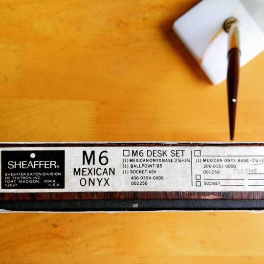
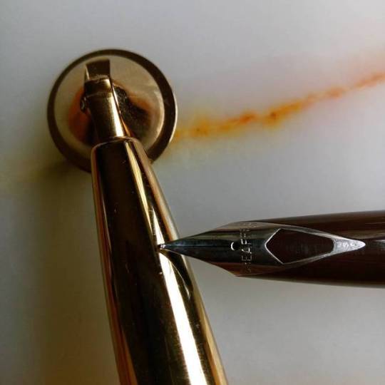
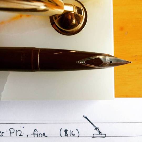
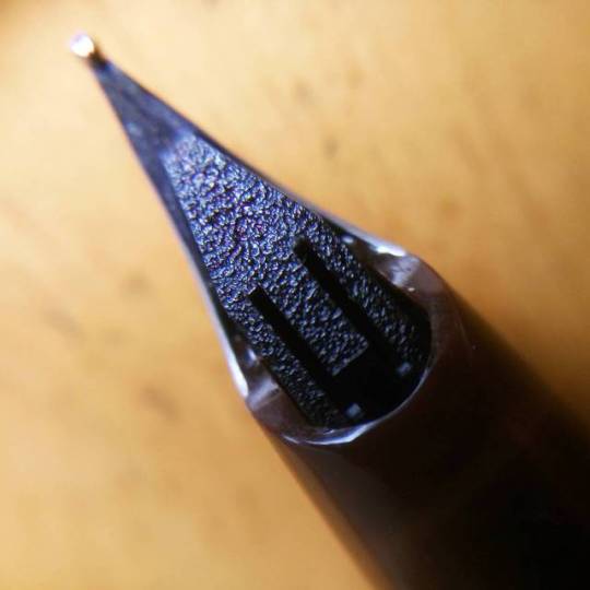
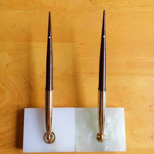
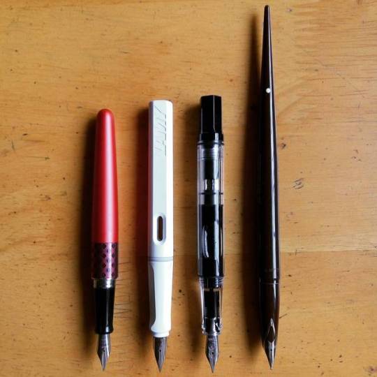
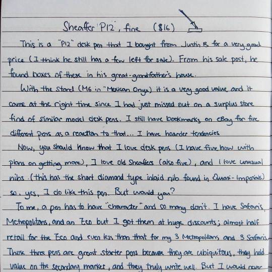
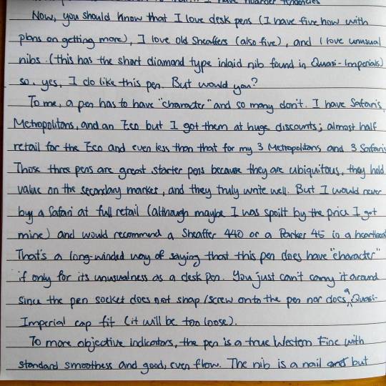
Sheaffer P12 (fine) desk fountain pen review
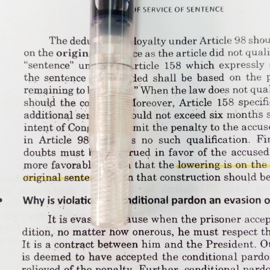
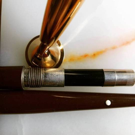
I believe the pen is of early 70′s vintage. It comes with a steel Imperial nib and can be filled with a cartridge or a converter. The old-style sac converter that came with the pen has “ossified”—you can no longer squeeze the sac. The current Sheaffer piston converter works perfectly.
The pen is incredibly good value for what I paid for it, though you will have to consider the cost of a converter (which, in the Philippines, is about the cost of a brand new Pilot Metropolitan or a bottle of good ink. Another thing you should consider is that these pen are anti-assembly. You can disassemble them but not with your bare hands and with great fuss. Definitely do not use these pens with problematic inks if you don’t write a lot or if you don’t enjoy cleaning your pens.
Lastly, this is not an expensive pen. This was $12.50 in a 1973 Sheaffer’s catalog which translates to around $60+ today. With the converter and filled with ink the pen is a good weight but it’s still light—about the same as an Eco—and if lining-up the white dot and the nib is important to you, it will take you a few tries to get it right.
The set comes with a stand which is made-up of the socket and the base. The socket is spring-loaded and pivots 180 degrees but at five settings (0, 45, 90, etc.). It feels well-made and sturdy. It also has a white inner cap which should fight ink evaporation (I’ll post an update on this once I empty the pen). The base is “mexican onyx”. It has a good weight and is very nice.
You should know that I got two sets and they’re not identical if you look closely. Both pens are brown but one has a medium nib and the other has a fine nib. The medium point is noticeably larger and it does write smoother. The width on paper I have yet to check with the same ink. Each base is unique.
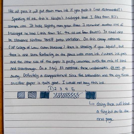
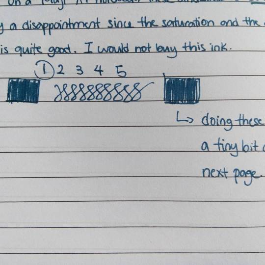
A short note about Noodler’s Midnight
Okay, so it doesn’t look “midnight” to me. This is Nathan Tardiff’s infamous batch variability at play since the ink looks much greener than I remember with a different vial from Goulet. I would not be surprised if this was a mislabeled Noodler’s Navy.
Dry time is good but at the cost of minor feathering and bleed-through. Most people won’t notice it but if you’re writing an ink review or really just examining an, ink the lines you make are not as clean or sharp as you’d want them to be. Water resistance is worse than Slovenian Skrip Blue-Black but it will survive a spill quite easily. I won’t buy this ink (because I don’t like the colour) but it’s far from a disaster.
0 notes
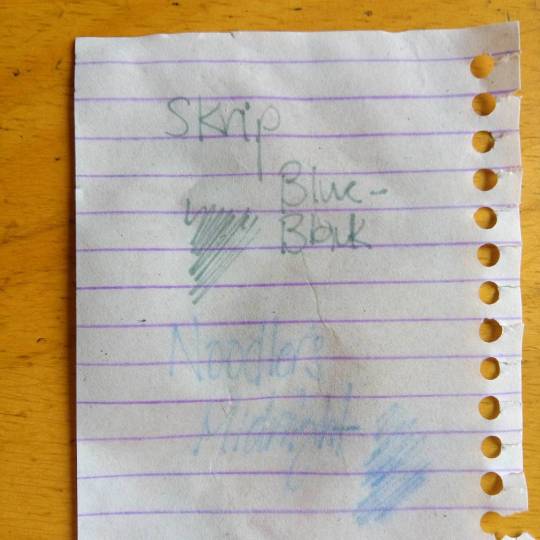
Photo
I bought a bottle of Slovenian Skrip Blue-Black and was quite unhappy with how much green I could see on the dried ink. It’s similar to what happens with the new Quink Blue-Black and Waterman Mysterious Blue but to a less obvious degree—it goes down blue-black but dries with a cast of green. The photo above is quite close although the shading is much more obvious in the real thing.
There was only one thing left to do: I added a couple of inks to a test vial of Skrip to stomp out the unwanted shade. I would say the result is at least 90% Skrip Blue-Black. A better name would be “Noir Bleu”, probably when I’ve finalized the ratio back to wet Skrip.
The resulting colour is much darker (I didn’t really watch my measurements this time) but the shading is still apparent and the excellent performance in even the cheapest of papers hasn’t gone away. Since all the component inks of the blend are “safe” inks I don’t forsee any safety problems either like staining, crud, etcetera. I think it’s a simpler, less water-resistant version of my “Orion” blend.
0 notes