
Statistics
We looked inside some of the posts by ylmckdesign and here's what we found interesting.
Average Info
Notes Per Post
0
Likes Per Post
0
Reblog Per Post
0
Reply Per Post
0
Time Between Posts
2 minutes
Number of Posts By Type
Text
17
Last Seen Tumblr Blogs


Fun Fact
In Q3 of 2020, 31% of US users access the Tumblr app daily.
Text
Bibliography:
- Behance (2023). fragmentos de distancia [fanzine]. [online] Behance. Available at: https://www.behance.net/gallery/187526649/fragmentos-de-distancia-fanzine?tracking_source=search_projects&l=3 [Accessed 3 Jun. 2024].
- Behance (2023). zine - conversations with my inner child. [online] Behance. Available at: https://www.behance.net/gallery/184523387/zine-conversations-with-my-inner-child?tracking_source=search_projects&l=2 [Accessed 3 Jun. 2024].
- Behance (2024). образы ветра. зин / wind shapes. zine. [online] Behance. Available at: https://www.behance.net/gallery/189455237/obrazy-vetra-zin-wind-shapes-zine?tracking_source=search_projects&l=14 [Accessed 3 Jun. 2024].
- Behance (2024). ZINEZŐ 2023. [online] Behance. Available at: https://www.behance.net/gallery/189775765/ZINEZO-2023?tracking_source=search_projects&l=15 [Accessed 3 Jun. 2024].
- Behance (2024). The bad day story. [online] Behance. Available at: https://www.behance.net/gallery/192865347/The-bad-day-story?tracking_source=search_projects [Accessed 3 Jun. 2024].
- Behance (2019). Moosh Graphic Novel. [online] Behance. Available at: https://www.behance.net/gallery/83862275/Moosh-Graphic-Novel?tracking_source=search_projects [Accessed 3 Jun. 2024].
- Keller, J. (2021). Little Books, Big Issues: 20 Books To Help Children Process Tough Topics. [online] Amex Essentials. Available at: https://www.amexessentials.com/books-for-children-about-tough-topics-difficult-issues/ [Accessed 3 Jun. 2024].
- Behance (2018). Graphic Novel - The Balloon - Personal Project. [online] Behance. Available at: https://www.behance.net/gallery/71062909/Graphic-Novel-The-Balloon-Personal-Project?tracking_source=search_projects [Accessed 3 Jun. 2024].
- Popova, M. (2016). Duck, Death and the Tulip: An Uncommonly Tender Illustrated Meditation on the Cycle of Life. [online] The Marginalian. Available at: https://www.themarginalian.org/2016/05/04/duck-death-and-the-tulip-wolf-erlbruch/.
- Blurb (2019). How to Start a Comic Book in 9 Steps. [online] Blurb Blog. Available at: https://www.blurb.com/blog/start-a-comic-book/.
- www.itsnicethat.com. (n.d.). Celebrating 200 issues of the It’s Nice That Weekly Comic. [online] Available at: https://www.itsnicethat.com/features/weekly-comic-200-issue-celebration-illustration-310322.
- www.itsnicethat.com. (n.d.). Conscious Comics: How four creatives celebrate unique species from around the world. [online] Available at: https://www.itsnicethat.com/features/conscious-comics-on-the-edge-illustration-partnership-231123.
- Popova, M. (2015). The Heart and the Bottle: A Tender Illustrated Fable of What Happens When We Deny Our Difficult Emotions. [online] The Marginalian. Available at: https://www.themarginalian.org/2015/05/14/oliver-jeffers-the-heart-and-the-bottle/.
- McCloud, S. (1993). Understanding Comics: The Invisible Art. New York: HarperCollins Publishers.
- Danziger-Russell, J. (2013). Girls and their comics : finding a female voice in comic book narrative. Lanham, Md.: Scarecrow Press, , Cop.
- Hayes, L. (2015). Not funny ha-ha : a handbook for something hard. Seattle, Washington: Fantagraphics Books.
- Madden, M. (2007). 99 Ways To Tell A Story : Exercises In Style. London: Jonathan Cape.
- FUNDAMENTALS OF CHARACTER DESIGN : how to create engaging characters for. (2020).
0 notes


Text


Self promotion/ portfolio
To create my portfolio, I chose some of the work I was most proud of producing over the last three years. I tried my best to demonstrate a clear level of my illustrative skill but also my understanding for editorial layout and compostition.
I feel as though these three projects are a good and clear indication of my skill set because the show a diverse range such as illustartion, type based editorial and even some collaborative work. Overall I feel as though this is a good starting point to build upon in the future.
0 notes


Text


Layout of text to be printed separately
0 notes
Text


Cover design for comic
I knew I wanted to keep the cover relatievly simple due the inside being so full and colourful. As to not give too much of the story away, I decided to create a quick collage of the best components throughout the book. I feel as thoug this style reminds me of an older style of illustration or book cover which leans in perfectly to the idea of further blending the old fable with the newer generation.
0 notes
Text


Choice of paper
To lean into the sketchy unfinished aesthetic of this project, I decided that a textured matte paper would be the most appropriate. Once I had test printed this idea was confirmed, the heavier weight also held the colour really nicely and the images did not lose any of their vibrancy which I am very happy with.
0 notes
Text


Initial struggles with colour
Initially when adding colour, I struggled to feel connected to iy because it all felt rather disjointed. I attempted a very minimalistic approach, however that type of stylistaion was not appropriate for the complexity of the eimagery I had created. The story at hand also needed a sense of life and using just a level of crosshatch shading was not going to convey the sense of life and joy I needed the story to.
I initially tried to incorporate the water colour effect from the characters onto the background however, I feel as though it looks unfinished and almost portrays the colours as challenging one and other.
0 notes
Text
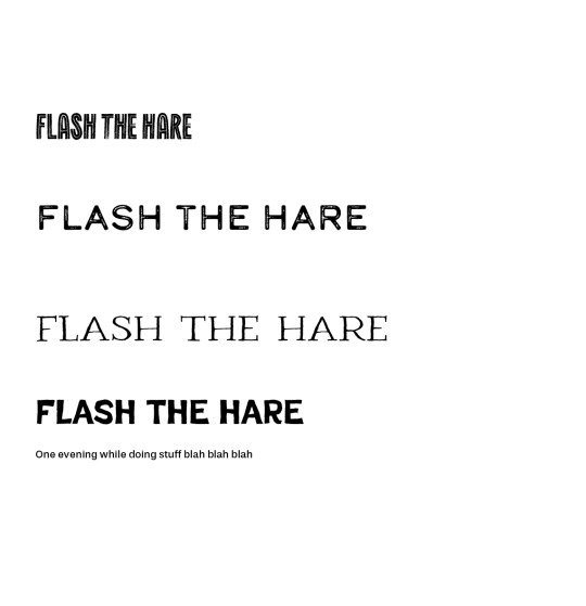
Initial text experimentation
When deciding on a typeface I knew that I wanted to use something a bit more rustic and worn to lean into the sketchy style of illustartion that I had chosen. However, I had Marks voice in the back of my mind telling me how much he hated pre distressed type. So to try and please all sides of the spectrum I decided to go with the most 'whimsical' title font which happened to remind me of the kind of style an old fable story would come in.
0 notes
Text


Initial sizing and layering of text
To overcome the issue regarding text, I decided to take inspiration from one of my previous projects and use tracing paper to create an extra layer within the layout of the pages.
I found that this allowed to the text tp sit freely but also created a nice seperation between the use of words and the power of then imagery. Because I had spent so long on the imagery, I did not want the appreciation to be lost and i feel as though this use of layering creates a perfect divide.
0 notes
Text


Initial layout of text
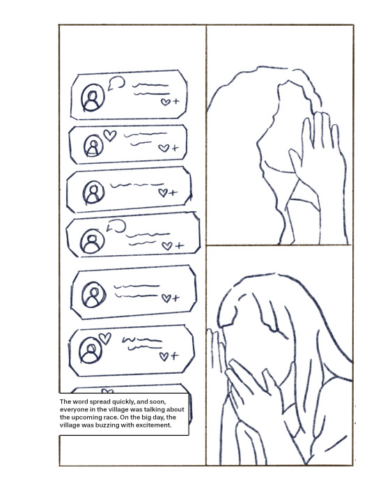
Once I had produced all of my story boards, I needed to consider how I was to add text. I knew that I wanted to include the text due to it being such a lengthy story. However, due to the way I divided upp the space on the page I initially found it quite difficult to incorporate the text. When I tried to create space for the text i felt as though it looked tacky and made it look overall unprofessional. Due to the layout of thr boxes it was also hard to place the cut out for the text in a way that would mean the text would be produced to a professional standard.
0 notes
Text

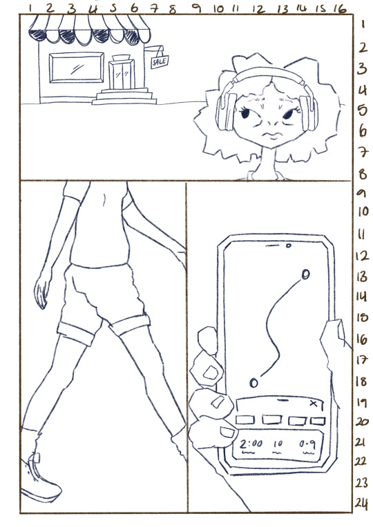
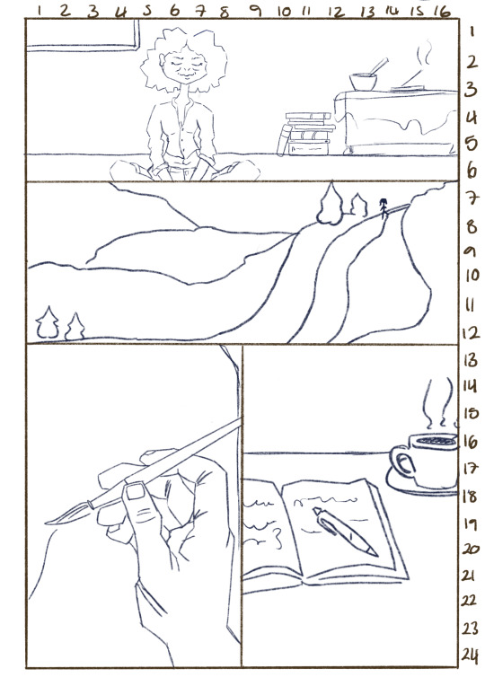
Devising a structure for layout
When producing the structure of each page, I decided to utilise the drawing guides on the software procreate. Utilising these grids allowed me to create a set fromat that I could divide the page into. Ulitlising the numbers down the side to keep a clean ratio and allow for an equal divide of proportion to each scene within the page.
0 notes
Text


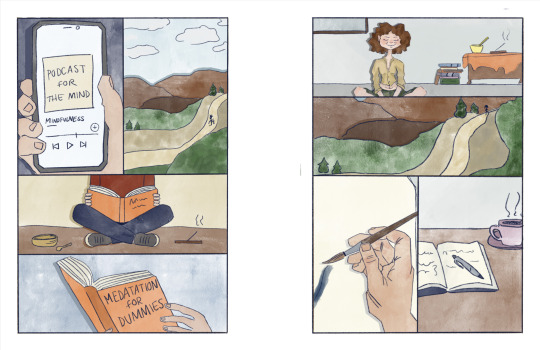
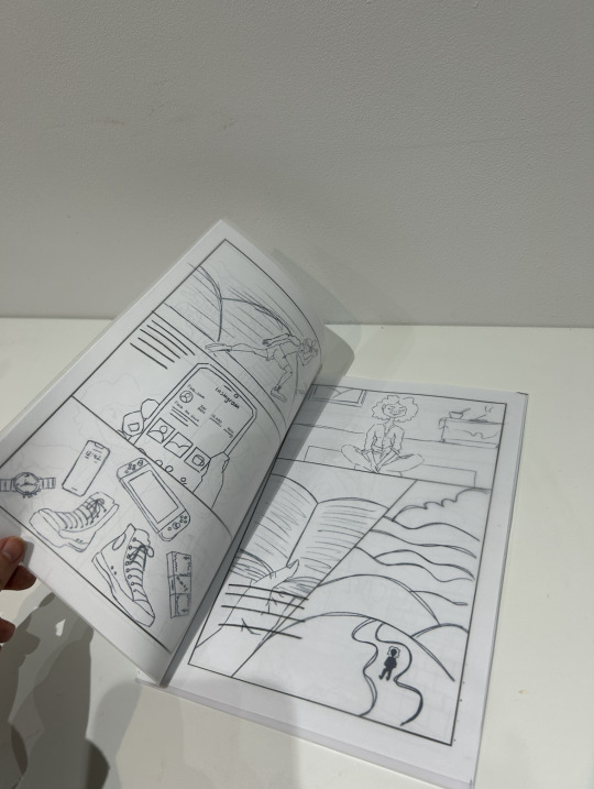
Developed storyboard
I decided to strip the storyboards back to the plain linework and I found this process a lot easier to produce the layouts.
Although it was easier to develop the ideas from the initial sketches, I did underestimate how long it would take to produce the amount of pages needed to tell the story. Due to the sketchy style I had chosen, i assumed that I would be able to produce them rather quickly. however, this was not the case. Builiding a composition within a smaller sized frame proved itself to be much more challenging.
Overall I am pleased with the outcome of the layouts and feel as though I was able to divide the amount of information on each page quite well.
0 notes
Text


Initial attempt at digital layout
Developing foward from the initial storyboards, I decided to attempt to digitise them. However I had not created a solid enough structure to begin adding colour or stylisation to the panels. At this stage i was feeling rather down trodden because i was not feeling inspired or enjoying the way that it was turning out. I decided to take a few steps back and reimagine the story boards, I decided that they needed to be stripped back and then digitised in order to create the structure I was looking for.
0 notes
Text

Quick simplification of characters
As I began developing the storyboards further, I was struggling to lay out the imagery as quickly as I needed to. To try and work around this, I attempted to simplify the characters to see if I would be able to produce more imagery at a quicker rate.
However, due to the simplification the majority of their stylisation and personality was lost. At this point I was struggling with motivation within the project and decided that I just needed to suck it up and produce the imagery in the style I initially intended at whatever pace it was produced.
0 notes
Text


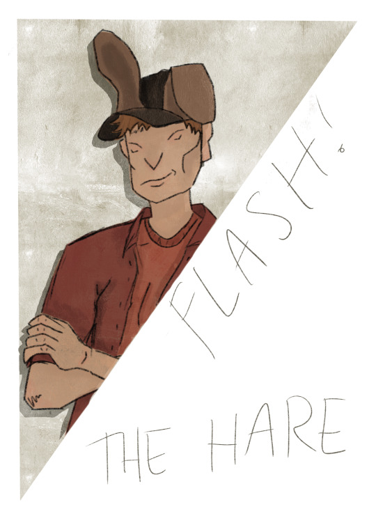
Adding colour and finalisation
When finishing off the character design, I knew that the use of colour would be one of the most important components.
Shelly The Tortoise: I aimed to use natural earthy tones to pay homage to the creature that inspired her but also because earthy, tan and beige colours are used to represent a sense of wisdom. When creating her hair, I tried to subtly replicate the tortoise shell print. Utilising the fact that she has curly hair and doubling up the use of texture.
Flash The Hare: The most typical colour associated with arrogance is red, i decided to use this as a nod to hi spersonality wihtout needing a full explanation. However, I did still want to incorporate some of the colours of an actual hare. Because the hat was the most obvious indicator, I decided to use the colours within the hat to tie the homage in together.
0 notes