My journey as a Graphic Arts student, looking at my weekly progress, inspiration and critical understanding.
Don't wanna be here? Send us removal request.
Statistics
We looked inside some of the posts by zak-graphicarts and here's what we found interesting.
Average Info
Notes Per Post
1
Likes Per Post
1
Reblog Per Post
0
Reply Per Post
0
Time Between Posts
1 hour
Number of Posts By Type
Text
16
Video
1
Last Seen Tumblr Blogs


Fun Fact
Tumblr has a 66 index score for customer satisfaction in the US.
Text
FMP: Evaluation
“A walk is the first thing to do. Learn all kinds, cause walks are about the toughest thing to do right. ”- Ken Harris, legendary animator

The brief, Under the Influence, asks us to discuss what we find interesting and inspiring as artists, and craft an independent project based off these lines of inquiry. Throughout these last two years, I’ve found my interest in Graphic Arts to be animation - a medium that allows us tell stories through whatever lens we want, rendering impossible worlds and breathing life into larger than life characters.
My project, Exquisite Walks, explores the potential of a walk cycle in animation - challenging myself to develop as an artist, and grow as an animator through exploring a range of animation techniques and processes. In animation, a walk helps define a character’s personality - but it’s also one of the first exercises in animation training, as outlined by legendary craftsmen like Richard Williams and Ken Harris, because it requires an understanding of physics, organic movement and acting.
With the FMP, we were to develop our own project that allows us to not only showcase our skills but challenge them. The main problems posed by this would be planning our time properly, and keeping the motivation and drive throughout the project. Finding and sustaining research was an initial challenge, but I made an effort to use primary sources as a way of sustaining ideas and inspiration throughout.
I wanted to tackle more introspective, meaningful questions to evidence a critical thinking on a higher level, and I’ve been able to discuss some of these more heavier topics on my blog. I’ve asked why I want to be a graphic artist, identifying my interests and how surrounding myself with these artistic influences drives me to create something of a high standard, and why I’m always working to develop on my work. I’ve been able to discuss animation as a context, and explore my own personal reasons for choosing the medium, and why it’s so unique, comparing it to other visual art forms. With a project that’s influenced by classic animators such as mine, I felt I needed to discuss the social and political implications of classic animation, addressing the very politically incorrect past of the medium, but more importantly, how the future is looking much brighter in this regard. This was to evidence a critical understanding of the medium at large, to step away from my work and consider those not in the same position as my peers and I; it’s given me a much more educated and critical view on the medium, considering perspectives and ideas other than my own.
Research has played an important role in the development of my ideas and practical experiments throughout my FMP, having had the opportunity to explore a range of sources. This began by visiting the Isle of Dogs exhibition as a way to look at stop motion animation, at an industry standard. It was here that I established my interest in the medium, and this sparked off a line of enquiry into my later stop motion developments and exploration into the claymation works of Aardman Studios.
My FMP is about exploring the potential of a walk cycle, but within that premise I’ve been able to explore a range of concepts and theories from exquisite corpse to the history of stop motion, the importance of drawing from life and discussed the wider context of animation. I feel that my research pool has been suitably diverse, with me picking from a range of books, websites, films and attending various exhibitions to explore a range of ideas, concepts and perspectives throughout. Most importantly, this project marks the first time I’ve conducted my own artist research, chatting with artists over email about their process, thoughts and getting feedback on my own work too.
Richard Williams has been the most influential to my project as a whole, I think - it’s his teachings in The Animator’s Survival Kit that fuelled my project concept. I’ve explored a range of styles and aesthetics over this FMP, from the loose, expressive and confident observational comics of Sam Elston to the iconic, cut out visual language of Saul Bass, but it’s these quotes that have underpinned my entire creative direction throughout the twelve weeks.
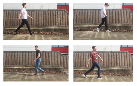
Finally, I think one of the most important research sources was my own short reel of walks. In the early stages of my project, I asked several of my peers to walk in-front of a camera in various ways, and from this reference I was able to draw from observation, sketching not only characters but identifying the actual mechanics of a walk cycle. Instead of copying from William’s reference, I was able to create my own key poses, through a digital rotoscoping process of drawing over each frame of film footage.
Through detailed blog posts, I have been able to present my research and analysis well. I’ve found that a blog is a brilliant way of presenting research, allowing for an in-depth discussion and reflection on concepts, theories and art that is able to evidence more of a critical perspective on the work I’m looking at in a visually pleasing manner.
My research interests and conceptual discussions have evolved and developed over the FMP - I think this is natural and almost necessary for a successful graphic arts project. It shouldn’t be a linear path - we should experiment, develop and grow as artists over the time frame and thus our project should do the same. I feel like I have worked efficiently through each week of the project, experimenting and refining practical outcomes from every session and pulling ideas from these responses and research to inspire new ones.
The diversity of my practical experimentation has been something I’ve put a focus on, exploring a variety of animation techniques and drawing mediums. The project began through stop motion cut out sequences, but since then I’ve explored traditional approaches to the medium, historical techniques such as the zoetrope and my practical experiments into stop motion, producing a puppet and several animations. Additionally to this, I’ve challenged myself to learn new digital processes, specifically Adobe Illustrator, Character Animator and After Effects. From this, I’ve gained and refined skills across a plethora of platforms and processes that will be extremely helpful as I develop as an animator in preparation for higher education.
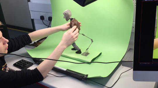
As a process, building a stop motion puppet was a real challenge, sculpting the head and refining the piece took time and effort but it resulted in a successful outcome. In the learning stages, After Effects was very difficult to grasp, due to the technical concepts and basic mechanics of the software being completely different from everything I’ve used before, but arguably resulted in the most exciting pieces.
I feel like I’ve used my time well to develop a body of work, keeping to a pre-written time plan for the most part and staying on track throughout the entire twelve weeks. I’ve put a focus on organisation throughout this FMP, writing lists and daily plans via digital checklists and following on from the actions described in each blog post.
The strength of my creative decisions lies in the processes I was able to explore, challenging myself to work in 3D producing a stop motion puppet and learning new digital processes. The strength of my creative decisions lies in my understanding of what I’m good at, and what I’m passionate about. I think this plays a large role in the strengths of my FMP- the brief is designed around letting us take the wheel in terms of concept, research and practical work which allowed me to craft a graphic arts project that not only showcases my skills, but challenges myself to grow as an artist using processes and mediums I haven’t explored before.
I feel that my final sequence is a successful and exciting response to the ideas outlined in my project concept. My intention was to explore the potential of the traditional walk cycle in animation, and what this can communicate to the audience, creating my own exquisite corpse - a singular animated outcome with contrasting visual styles and characters. The reel is exactly that: a creative cocktail of animation techniques and styles, with a colourful cast of characters stepping into the next with smooth transitions.
I was able to establish a context successfully with my reel, through a combination of film and audio, producing a sequence that opens the piece showing animator Richard Williams at his desk, discussing the importance of a walk cycle in animation training. With this quick sequence, I’ve established the core concept of my project, and given the audience a clear reason as to why this project exists.

The choices I made when creating the final piece were effective, with the pieces I selected being a handful of my most successful outcomes, with an interesting performance, smooth animation and exciting character design. Whilst my experiments into stop motion were interesting, they didn’t fit within the reel I was assembling. My intention was to have it be purely a showcase of my greatest hits, and removing this sequence evidences my ability to consistently reconsider whilst I’m working: not being afraid of cutting work, in order to produce a final piece that’s up to a higher standard. In terms of presentation, I produced a final edit that successfully establishes a context for my project, and assembled a sequence that features exciting animation, distorted and dream-like audio and an imperfect, retro-inspired soundtrack resulting in an entertaining exquisite corpse.
To get an objective view on the success of my work, I asked a few of my peers for their opinions on my final reel, who mentioned how it’s an exciting demonstration of skill and a celebration of animation, learning the basics of the medium as described by industry professionals. They were able to get a context from my work, which was an important factor in the overall success of my project, to me. Tutor and peer discussion and comparison has been extremely influential to a critical understanding towards my final piece, and my project as a whole. I’ve been able to discuss with my tutor the successes of my project, and most importantly, how to improve and progress. Having a tutor with a history in the animation industry has allowed my work to have a more refined, polished finish thanks to an experience and knowledge that I wouldn’t have otherwise. Speaking with peers about my final piece allowed me to realise the appeal of my work, and fortunately, I’m in a class of students passionate in a range of graphic art specialisms, from graphic design, fashion, architecture and illustration meaning the feedback I’ve received is from a range of creative ideas and perspectives, allowing for more objective comments and criticism.
Whilst the work I’ve managed to produce in my final project is exciting and artistically challenging, there’s a few things that I would change had I more time. I’ve discussed how my project is based around a fundamental exercise in animation training, but I would have liked to use this premise to explore a wider theme and message. This is something that I mentioned on my blog, exploring how I could add a commercial application to my project through encouraging walking in young people. If I did have more time, I would have liked to explore this avenue in more depth, producing an advertisement using the same exquisite corpse technique, but possessing more of a linear narrative working on my ‘Get Walking” storyboard. Producing a promotional piece for a charity, or walking event would have allowed my work to have a greater value - possessing an actual real-world application and thus a place outside of this brief. Not only this, but challenging myself to explore a more diverse breadth of research interests would have given my project more of a critical perspective on graphic arts as a whole, rather than just focusing on animation.
Over my FMP, I’ve been able to explore the potential of a walk cycle in animation, using this premise as an opportunity to develop my skills across a plethora of animation techniques and drawing throughout. Most importantly, I’ve been able to challenge myself to learn and grow as an artist, building a stop motion puppet and learning new intensive digital processes that result in a refined, polished final piece. With all the ideas and concepts I’ve explored over this FMP, it was a challenge to juggle them all, but I feel like I’ve produced a final sequence which is not only a successful response to my initial project concept, but also an exciting body of work showcasing my skills in animation, reflecting the progress I’ve made during these brilliant last two years on the course.

Ext. Graphic Arts Class of 2016-18!
1 note
·
View note
Video
vimeo
A creative cocktail of animation techniques and styles, with a colourful cast of characters stepping into the next with smooth transitions - exploring the potential of a walk cycle through an experimental exquisite corpse technique.
0 notes
Text
Unfinished Business: Exhibition Review
In this post, I want to briefly discuss our exhibition, Unfinished Business and our final showreel.


The pieces on show were all exciting and demonstrated a great deal of passion and love for their craft, some even being interactive pieces for the audience to animate themselves using an augmented reality app. I’ve only shown a few here, but from painted jackets, industry-quality comics, books and collage posters, the pieces on show were all exciting and demonstrated a great deal of passion and love for their respective craft.
As a way to cap off the project and our two years on the course, I feel like we managed to produce an exciting final show with an array of successful pieces. I was able to produce and edit the exhibition reel, compiling each sequence into a linear timeline and adding title credits, spacing and making sure the entire reel had a refined polish. It was important that Jack’s animated pieces Chit Chat shorts broke away from the other animations, and I feel like he was able to successfully challenge the audience’s expectations with the reel - I witnessed many viewers look puzzled after the glitches that open his sequences.

Chit Chat. (2018). Jack Titmas.
They’re extremely successful and refined final shorts, once again evidencing a passion for the craft and specialist skills within the medium of animation, through a digital lip-synching process.
All of the animated sequences were brilliant, with Kate’s sinister and ominous stop motion work “Hylophobia’ starting the show with a foreboding bang - an atmospheric animated piece showcasing her model and tense, cinematic direction.

‘Hylophobia’. (2018). Kate Webb.
This is followed up by Sam’s pixel magnum opus ‘To Exist or Not To Exist’, an equally atmospheric and unsettling piece of animation exploring a retro 8-bit aesthetic, looking like it was pulled straight out of a game boy screen. The subtle game control animations and text add a professional edge to the piece, resulting in a piece of refined, industry-standard animation that could very well be a cut scene from an actual retro video game.

‘To Exist or Not To Exist’. (2018). Sam Smith.
I was able to gauge a reaction from my audience during the exhibition, and noticed how excited everyone was at my After Effects pieces! Whilst the audio sample was somewhat on the quite side, I was relieved to see people taking photos of my work and discussing it with enthusiasm, actually acting out some of my character’s movements. There’s something exciting about the smooth digital animations I was able to produce, and the response I received proves this! The hand-drawn ‘mugen’ animation raised a few eyebrows, and the ‘rewind’ exquisite corpse final sequence turned a few heads too. I wanted my final piece to speak for itself, grab the audiences attention entertain them through an exquisite corpse of exciting walking animations and I’ve been able to do just that here. It certainly resulted in a warm response from a universal audience, engaging all ages through smooth animations and a relaxing atmosphere through sonic nostalgia.
Retrospectively, I think it’s a good thing I didn’t show my stop motion character as the audience would have expected a full sequence in the reel - and the last thing I want to do is leave viewers feeling disappointed.
The animated ident I was able to produce worked very nicely on the large screen, with a noticable VHS retro influence that engaged and impressed numerous viewers.I initially experimented with a muted red scheme, but decided to embrace that retro aesthetic with a monochrome, fuzzy final piece.


The design of the ident is simple, minimalist and the actual animation is smooth - created with After Effects, and having the limbs fade away as the character morphs into the Colchester Institute logo. I was fortunate enough to be able to contribute a commercial purpose to the reel, opening the piece and setting the stage for the brilliant pieces to come.

The exhibition was an exciting showcase of the class’ talent across a variety of graphic art disciplines, ranging from illustration, animation to architecture. My FMP is slowly coming to a close now, and with my final evaluation written, my next task is to ready my work for hand in.
What’s next? A Look Forward
I discussed with a few of my peers how ‘it’s never enough’, and I do share their sentiment. Whilst the piece I’ve created here is successful, I’m itching to make more using the same techniques, developing on from my After Effects pieces and pushing my understanding of the software further, producing animations of a more polished and professional quality.
I’ve been able to learn a great deal about animation through my two years on the course, exploring the basic principles, experimental approaches and an understanding of the medium that surprisingly not many students going into higher education for animation have. It’s not a subject that’s widely taught at a college level, and it was only due to my tutor having a passion and experience in the medium that I’ve been able to explore and develop my skills in the craft. It’s been a blast, I’ve grown considerably over these two years both as an artist and as an individual, and it’s largely a result of my studies here.

As to what’s next, I’ve been looking into a few animation competitions, and over the summer I’ll be contributing to a global animation experiment to promote the FIFA World Cup - interestingly, an exquisite corpse-type project celebrating the sport from animators all over the world. Although I’ll be taking a break over the summer, I plan to continue to hone my practical skills in animation and character design over this time and produce exciting sequences as I continue to explore the medium. I hope to go onto higher education further exploring animation as a subject - taking what I’ve been able to learn through this FMP and using it as a foundation for my further studies into university.
0 notes
Text
'Exquisite Walks’ Final Piece Review
In this post, I’m discussing my final reel in response to my FMP ‘Exquisite Walks’, and reflecting on my editing process.

My plan for the reel was an entertaining exquisite corpse of animated characters walking. Originally, the sequences would have had animated transitions, like the examples I’ve looked at already on this blog. However, as I was developing practical outcomes, I decided to keep working on producing more exciting animations in a range of techniques than work on transitions. For the final exquisite corpse, I had decided to simply transition the sequences based on the walk. All my characters are bi-pedal, and so walk in similar ways. Using this idea, I could then cut from one sequence to another, relatively seamlessly, following the movements of a walk cycle.

I purposely chose colours backdrops that compliment each other, working with a flat, muted palette drawing attention to the animation itself, whilst also being visually pleasing and exploring contemporary trends in graphic art - the flat design and muted colours that’s making waves in the industry at the moment - the retro aesthetic allows me to look back at the past, but also explore the present with animations possessing a clean, vector-graphic visual style.
Whilst I was curating all the clips that I wanted to use, I was asked to produce the final reel from the class. I agreed, of course, and I discussed with my tutor what the format the reel should follow. In previous assignments, the exhibition reel was more of a series of individual shorts than a single sequence.
This year’s final reel, however, was to have a theme and continuous style. Fellow student Jack is creating animated shorts featuring a cut out style of lip sync animation, with VHS static breaks which are intended to serve as an entertaining pause from the other animations. My tutor suggested I could have the entire reel follow this retro aesthetic, having sequences followed by one of Jack’s ‘chit chat’ shorts. Not only is this a great way to break from the serious tones of Kate, Sam and Cal’s animations - but it’s an effective way to give a continuity and theme to the reel.
A successful final piece should effectively be the conclusion of everything I’ve look at until now, and excite a specific audience. My target audience is really a universal one - the exhibition will be a public show, however the demographic will largely be students and their families. I wanted to create a visually entertaining reel for an all-ages audience, but also one that successfully explores the themes and ideas I have looked at over this project.

Aside from the animation, I wanted to include an actual quote from an animator I’ve looked at over this FMP. Initially, I looked for Ken Harris’ brilliant quote that I’ve discussed already. The purpose of this is ultimately my final piece’s message - this FMP was about me exploring the potential of a walk cycle, and developing as an animator. I wanted to explore walks as a subject because legendary animators like Harris, Richard Williams and even a university tutor I spoke to all said ‘start with a walk’.
A walk helps define a character’s personality, but it’s one of the first exercises in animation training because it requires an understanding of physics, organic movement and acting. Over this project, I hope that I’ve evidenced an understanding of all these things, and it’s this idea of a context behind my work is what I want to communicate in my reel.
After scouring the internet for sound bites, I was able to find a classic tv spot featuring legendary animator Richard Williams, titled ‘On Animated Walks’. In this short video I was able to grab a quote that was perfect for my reel:
‘The interesting thing is, to be able to animate crazy things, you first need to understand... a walk.”
The quote perfectly sums up why I’m exploring a walk cycle in animation, and I’ve added his title underneath the video to show who’s talking. I wanted to have a visual for William’s quote, but the video itself was just him talking to the interviewer. I wanted to show the animator at his craft, and eventually found a video of him working, traditionally, ripped from a vhs recording - with dust and scratches on the original video file itself. It was a combination of these things, and the audio quality itself that made me include a sound bite of someone putting a video into a VHS player to begin the reel. It’s a nice touch that adds to the retro video theme of the piece, and the old recording of Williams working. It just felt right to add it in, and I think that sound is so recognisable it takes a lot of people back to their youth. I was able to grow up with videos and video players, so it certainly has a nostalgic effect listening to it now.

Following this retro aesthetic, I wanted a soundtrack with a similar beat, but also quite a relaxing atmosphere. Considering my sampling of the VHS interview of Richard Williams, having a dubstep techno beat would come across a little incongruent. My search for music led me to exploring lo-fi hip hop, a genre of music that’s known for it’s nostalgic sound and sweet but melancholic atmosphere. The beats often sound undermixed, containing intended imperfections with an analogue distortion that produces music with purposely poor audio quality, record static and jazz samples. It’s quite popular on streaming services like Youtube, Spotify and the like due to it’s sense of nostalgia and relaxing atmosphere. These tracks often sample jazz, acoustic and sound bites from 80s anime and cartoons, and are incredibly easy to listen to due to their light, easy and laid-back sound.
Unlike Kate or Cal’s example, my animation’s purpose isn’t to scare the audience - it’s to entertain them. Jack spoke about how his chit chat shorts will break away from the foreboding feeling of these animations - something that will lighten the mood, so to speak. My sequence is designed to put viewers in a relaxed and calm mindset - the characters are just walking, not running - and so I decided to use one of these lo-fi tracks as a score for my piece, and along with the imperfect, VCR distorted sample and tracking marks, works to give the entire reel a subtle sense of nostalgia with a contemporary visual twist.
Using Premiere Pro, I was able to add subtle effects that further create a retro look and feel, with tracking bars, noise and warps. As I’m putting the final reel together, I edited my animation to finish with a retro glitch, which will segue into one of Jack’s chit chat shorts nicely.
The sample and footage of legendary animator Richard Williams quickly establish the context and purpose of my project, telling the audience exactly why I’ve created these animations. The low quality and imperfect audio and visuals work to harken back to the past, setting the stage for the sequences.

This aesthetic choice was largely a result of the sample, but also embracing the class’ retro feel of the entire reel. Having the animation follow this style simply allows the sequence to flow nicely, and have a visual theme beyond just a walk. It adds a visually pleasing texture, and along with the imperfect soundtrack, creates a relaxing and almost nostalgic atmosphere for the audience, changing the mood after a creepy animation by Kate.
The animations that follow are a collection of my most exciting animated sequences that I’ve been able to produce over this FMP, evidencing a handful of exciting techniques, styles and mediums that I’ve been able to explore through my project - from my ‘mugen’ style walks, oil pastel walk cycles and of course, my digital walks. I’ve found that these are the most successful and visually engaging, so the reel puts a focus on these sequences.

I’ve selected pieces that I feel are the most successful, and what I’ve had the best audience responses to considering the class’ reactions and my Instagram audience throughout the FMP. The most recent After Effects animations have been a hit, along with my stop motion works. The purpose of this final reel is to produce a sequence that showcases my specialist skills in animation, whilst being entertaining and effectively creating a relaxed atmosphere after the more creepy examples in the final reel. Jack and I are effectively working to lighten the mood with our examples.
In the editing process, I identified how the stop motion piece looked out of place - and broke the flow of the reel. It was here when I dropped the piece from the reel, which allowed all the animations to transition smoothly into another. Also, I mentioned how the stop motion sequence had a stilted movement, and the ‘real world’ backdrop proved too much of a contrast.

Over this FMP, I’ve been able to explore a range of animation processes and drawing techniques, and most importantly, develop my skills and understanding of my chosen specialist area in graphic arts, animation. My whole project is based on quotes from legendary animators discussing the potential of a walk in animation, and I wanted to show the audience why I’m doing what I’m doing.
It might be simple, but there is a purpose and concept behind my reel, and with the sample of Richard Williams, I’m able to tell my audience the context of my entire project. It’s about the basics of animation - a walk - and presenting these in a fun, collective way, inspired by the ideas of an exquisite corpse. Whilst this reel isn’t an exquisite corpse in the character design sense, it is a creatively assembled collection of works around a specific idea or theme - so it fits my description, atleast.
I wanted the sequence to have a sonic edge, acting as an audio experience just as much as a visual one. Sound is so integral to creating any real feeling in the audience, it’s the easiest way to create an atmosphere and so I wanted to produce my reel with this in mind. The sample I used had a pleasing faded low quality to the audio, matching the scratchy VHS video, but I wanted to mix the sample with the soundtrack. This was my first attempt in audio mixing, but I feel that the finished piece works nicely in creating that relaxed atmosphere. In Garageband, I distorted the sample of “a walk’’ and added a subtle echo, mixing the vocal with a static hum of a video player to blend the tracks with the imperfect beats of the soundtrack. After playing around with this, I added subtle echoes of Williams’ ‘walk’ sample throughout the animations, adding to the sonic nostalgia of the reel.

The piece is designed to set an atmosphere, whilst remaining up-beat and relaxing. In the process of producing the sequence, I was able to learn new techniques in editing package Premiere Pro, exploring different distortion effects. The main difficulty that arised when making the final reel was mixing the audio bites and adding the distrorting effects to the start and end of the sequence. After playing around in the software, I followed a few video tutorials, which taught me how to add more complex and interesting effects to my reel, embracing the retro aesthetic of the class’ reel as a whole, and my imperfect, aged samples.
An engaging blend of animation, film and music, the charm of the piece arises from the original character designs, variety of animation techniques and retro aesthetic, looking as if it’s just been ejected out of a VHS player. The transitions from each animation is almost seamless, following the movements of a walk cycle as a simple way to create a visually interesting animated exquisite corpse.
Whilst my initial idea for a final piece was a more traditional approach to an animated exquisite corpse, like the Rick and Morty example, my ideas have grown and developed up to the point where I’m no longer focusing on stop motion. Originally, I had planned for the sequence to be heavily animated using my stop motion character, but after exploring new Digital animation software these ideas changed into embracing a frankensteins-monster of different animation styles. Looking back at the start of my FMP, I consider this sequence to be an exiting conclusion to my studies and practical experiments - and a successful final piece to show at exhibition.
Towards the end, I was able to create an actual animated exquisite corpse - flicking through the various designs in one walk cycle, through a retro ‘rewind’ digital edit in Premiere Pro. In this, I was able to successfully meet my original project intentions, and show the progress and development I’ve made during the FMP.

I feel that this final sequence effectively concludes my project, exploring the potential of a walk cycle in animation in an attempt to develop my skills and understanding of the craft. It’s an entertaining and engaging sequence thanks to the exciting walks; blend of film, audio and animation and the relaxing, up-beat soundtrack that underpins the entire sequence. Having completed my final piece and place in the reel, my next move will be to produce the exhibition reel and start work on an animated ident for the reel, opening the sequences.
Music Credits
Kudasai. (2017). Ginseng and Honey.
Actions
Produce and edit the exhibition reel
Produce animated ident for the reel
0 notes
Text
Exhibition Notes
The main aim of any exhibition is to capture audiences attention, and engage them in some way, shape or form. I explored the posilibility of showcasing my stop motion puppet and rig, and it’s an approach that I like - showing the model in a glass case, with the metal rig and green screen base.
However, with the time and space remaining, this isn’t exactly realistic and if I presented the figure without the case I unfortunately run the risk of theft. A passer-by wouldn’t realise that underneath the model is a rather expensive metal armature, and just take it as a prank. The armature was almost an investment, considering I’ll be able to re-use it in with different puppets - running the possibility of losing such a thing simply isn’t worth it.
Also, I want my animations to speak for themselves. Having a puppet may cause audiences to expect a full stop motion sequence, like fellow student Kate’s, and be disappointed when it’s just a shot of the stop motion character walking for a few seconds. My final piece isn’t about stop motion, like it’s not about digital animation - it’s a celebration of the medium, exploring the basics of the craft through a walk cycle. Simply having my animation be on the TV allows the reel to speak for itself - to capture viewers attention through an engaging production of animation, film and music.

Having completed my final sequence, and helped paint and ready the studio for exhibition, my next action is to begin work on the animated indent for the reel, incorptatng the college’s logo into a digital walk animation.
0 notes
Text
The Social and Political Implications of Classic Animation
In this post, I’m continuing my discussion of animation as a medium, looking at perspectives and views towards the craft other than my own - and the problematic history of the medium, to say the least.

The purpose of this post is to explore a variety of approaches to animation besides my own, and to look at examples of the craft in cultures and locations other than my own. In my mid-project review, I discussed how I should be evidencing a variety of perspectives on my project - to step away from my work and consider those not in the same position as my peers and I.
When I’ve discussed animation so far on this blog, I’ve really only discussed the craft through rosey glasses - regretting to mention the sexist and racist starting of the medium. This is a result of me not really knowing the facts, as it’s a subject I haven’t really tackled yet.
I mentioned in my ‘why animation’ post that animation is a magical medium able to speak to everyone, a naive art form that captures the hearts and minds of many. Whilst this may be true today, this wasn’t always the case. I’ve been discussing the state of animation today, which is fairly diverse in content and creators, producing animations that excite audiences of all backgrounds and ages. I haven’t, however, spoken about the history of the medium, one that’s rooted in discrimination against other races and cultures. It’s not a nice topic, but it’s something I feel like I should acknowledge if I want to evidence a range of historical perspectives on my project and my analysis of animation as a whole.
Up until writing this post, my knowledge of animation’s history was a sum of the writings from The Animators Survival Kit and that’s pretty much it. t’s only when I began researching animation for this blog post that I realised the sexist and racist views of early examples of the medium.
For the most part, animation has always been considered a ‘boys club’. Likewise with comics, countless women in the industry describe the medium to be extremely male-centric.
In the 1920s and fifties, Disney and Warner Brothers animation studios all presented black characters more like animals than humans, drawing upon minstrel shows for reference. These involved white performers in black face, conforming to negative stereotypes associated with black Americans at the time. At this time, animators used these performers as a basis for any black character designs, which continued the racial stereotype in America for decades. Not to mention Mickey wearing blackface in more than one cartoon.

Cannibal Capers. (1930). Disney. African natives are depicted as cannibalistic savages.
Warner Brothers certainly weren’t free from this type of racist behaviour either, with Looney Tunes being very much product of it’s time through it’s portrayal of ethnic minorities. This can be shown through the Mexican steroptupe in the character of Speedy Gonzales, or the time where animators actually depicted Uncle Tom - the famous tale of a slave that’s since become an allegory for misplaced racially-motivated obedience, in 1937.
I don’t think I’ve ever really considered this, but animation has historically been a “boys club”. This isn’t something that I personally have ever felt, as my class is a combination of graphic designers, illustrators and animators from students of both sexes. On a personal level, it’s not something that I’ve really considered or felt - but it’s an important issue to note.
Some religions and cultures even despise animations and image-making in general, such as Islam which sees the act of creating something as wrong, and working against a higher power. As someone who doesn’t really follow a specific religion, I wouldn’t have considered animation to be wrong in any way, shape or form - to me, it’s just a way of telling stories.
As a medium and technique, it’s incredible, exciting and inspiring yet the history of the art form itself is mired in views and ideas that are simply wrong by today’s standards. I still have a love for classic Disney animation, but it’s certainly a product of it’s time, much like Warner Brothers and most animation at the time.
Animation is a great tool to send a message, but it also has the ability to transcend barriers and tell brilliant stories of the human experience that appeals to everyone.

Coco. (2017). Pixar Studios.
The recent Coco, however, has been earning praise from Mexian American audiences for it’s portrayal of Mexican culture and the holiday Day of the Dead. It’s a culturally sensitive film, portraying ethnic minorities in a way that garnered a positive reaction from Mexican audiences. It’s a step forward, but doesn’t erase Disney’s rather racist and sexist past.
important to consider these perspectives and negative views towards animation in order for me to understand the history of the medium I’m choosing to follow in more depth. Some people don’t have that much of a love for the medium, and I completely understand why.
Here, I’ve just begun to scratch the surface of why that is. I wanted to have that discussion, look at other perspectives on the medium other than my own, but found that the craft isn’t as universal and naive as I once thought. As I move onto some stop motion tests and eventually producing a reel of some kind, I’ll consider these perspectives moving forward. Ultimately, I just want to make animations that enthral and entertain not only myself, but audiences of all backgrounds and ages - encouraging acceptance and tolerance of everyone. My character designs aren’t based on any stereotype, because most of them are drawn from life as reference. I’m sketching real people, and creating characters from these - so I’m in no fear of stereotyping any minority or culture. I want everyone to enjoy the reel that I’m making, and celebrate the magical quality of animation itself, not the gross history of the medium.
It’s important to consider perspectives other than our own as artists. As my tutor discussed, that’s something that we easily forget when making things in the studio. We’re not fine artists - we’re graphic artists and designers. The work we’re making has a purpose and audience - and thus it’s important to consider the perspectives and needs of that audience when making that art work. It’s expression, perhaps, but it’s also the relationship between artist and audience that we have to consider.
As I’ve mentioned already, my project Exquisite Walks is about exploring the potential of a walk cycle in animation, looking at creating characters from observational drawing and exploring the collective assemblage ideas of an exquisite corpse as a way to present this. It’s allowing me to grow as an animator, to learn the basics of the craft but also engage a universal audience through imaginative character designs and a whole host of different techniques and styles.
The purpose of this post was to discuss representation in animation and to evidence an understanding of animation other than my own personal bubble. It’s easy to forget the wider cultural perspectives and opinions when I’m just in a small class of art students, and it’s important to have these discussions if anything is going to change. With works like Moana, Coco and The Bread Winner, though, atleast the future is looking more hopeful than the past. This allows me to have a better critical understanding of animation as a medium, the knowledge that animation isn’t this naive and universal subject that I thought it was. This also inspires me on my journey to become an animator, to break these stereotypes and prejudices if I do go onto work in the industry.
Moving forward, I’m going to be working on completing a final piece for my project, creating a collective of my walk cycle animations in the form of a singular sequence or reel.
Actions
Complete final sequence for Exquisite Walks
0 notes
Text
Uses of Animation in Society
In this post, I’m going to be looking at the different ways animation is used in society - as a way to explore a potential real-world application for my final pieces.

As a way to continue the contextual discussion of animation, I wanted to discuss the various uses of the craft in society. I always mention visual storytelling and narrative - but there’s other uses to the medium besides a purely entertainment value.
Despite this, the main use of animation would have to be entertainment. When I ask a member of the public what they think animation is, they’ll usually respond with an answer similar to Toy Story or Shrek. To the public, this is the sole purpose of the medium - entertainment.
As a medium, animation has always been a staple in consumerist and entertainment culture. It’s always had a special place int he hearts and minds of those who consumed animation, by realising the impossible before their eyes. Since it’s inception, animation has always been regarded with a sense of awe and spectacle. There’s something inherently magical about a medium that can bring life to anything we can imagine - taking on a range of formats and styles from traditional hand-drawn animation, to computer generated techniques.
The medium has found use for promoting propaganda, advertising and educating people. These are the main uses I’m going o be discussing here, and looking at some examples of each for reference.
Animation as Propaganda
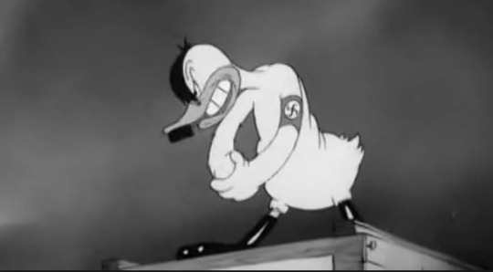
The Ducktators. (1942). Warner Brothers.
Animation has been used to promote policatcal ideas and propaganda since the second world war, after the attack on pearl Harbour which threw America into World War Two. Animation was seen as a fresh, exciting medium to educate troops and boost morale to the US. Some of the biggest examples of these animations were from the top studios Walt Disney Animation studio and, above, Warner Brothers - who, along with Laika Studios, are still the top players in the game to this day.
The animation industry grew during this time, as studios realised the power the medium possesses. Cartoons went from entertaining the young ones to educating adults and troops on repairs, equipment and other basic training in a more appealing way than a manual, or a long speech.
In an attempt to boost morale, Warner Brothers produced a host of cartoons featuring the Looney Tunes characters ridiculing the enemy, with racial stereotypes playing a common element in this war-time entertainment. These were much more racist than other cartoons at the time, particularly towards the Germans and the Japanese. Warner Brothers was able to get these racial charicatures and adult themes past the board as they didn’t need to be submitted to any production code - a set of rules ensuring cartoons are family friendly and appealing to all ages, with no risqué humour or real violence. These stereotypes depicted in these films were later deemed too offensive and pulled from further screenings in later years.
Aside from these cartoons, Disney studios produced a series of animations that attempted to boost morale in the average everyday citizen, whilst also encourage patriotism and to support the war time efforts - encouraging men to join the war, and civilians to donate scrap metal.
Animation has had an interesting history in terms of propaganda use. Whilst it also highlighted the racial stereotypes of the time, it allowed the industry to grow and not just be seen as something to entertain the kids: studios began to realise the impact animation could have as an education tool.
Animation as Education

Civil Engineering. (2018). Crash Course. - An example of animation that teaches viewers the basics of civil engineering through simple motion graphics. The channel also have videos on a plethora of different subjects.
Animation has long since been recognised as an extremely powerful education tool, since the second World War - but it’s since the advent of powerful computer systems that’s resulted in the recent popularity of the genre.
Studios and companies are now able to produce animation much more easily and cheaply thanks to ever-changing and developing technology and software. Animation can be used to help learners understand and remember information, through exciting visuals and the ability to visualise non-representational concepts in an easy, appealing way.
Previously, this was only achieved through traditional animation - a craft which demanded specialist experience and techniques that most teachers and systems didn’t really have the time or budget for. Today, however, software is now available like Flash, Character Animator or even something as simple as PowerPoint allowing teachers to create their own moving graphics in a quick, easy and relatively inexpensive way.
Because of the inherent nature of animation, we can show change over time in a way that’s much more clear and effective than diagrams can. Instead of using arrows or motion lines, animations can simply show movement - allowing learners to quickly and easily grasp the concept at hand.
There’s been countless studies into the effects of animation, and it’s generally agreed upon that animation does allow students to learn faster and easier - if they can understand what’s being shown on screen. Animations can show the growth of population in an easy to understand manner, and show invisible and impossible concepts like an electric current, or magnetic forces. As a learning technique, animation can appeal to a range of different learning styles, increases engagement with the subject matter through visual stimulus and excitement within students.
Perhaps one of the most well-known examples of educational animation would be the Change4Life campaign, a public health programme in England, run by the Department of Heath.
The campaign aims to help people make small and sustainable improvements to their diet, activity levels and alcohol consumption in a way that makes a significant impact on their life. Although the campaign makes use of a range of marketing techniques and formats, Change4Life primarily use claymation indents by British animation studio Aardman Animations.
Animation as Advertisement

American Express: Realise the Potential. (2010). Oglivy.
It’s also in this example that I’m discussing the use of animation as an advertising tool. Because of the same reasons animation is good for teaching, it’s also a great tool for advertising - from cartoon characters advertising kids cereal to smooth motion graphics discussing credit cards. Kids respond well to cartoon characters, so what’s the best way to sell a product to children? Have Frosty the Tiger advertise it.
Change 4 Life, however, doesn’t want to sell you anything. It’s a campaign which has produced numerous animated indents, but it’s their Be Food Smart ad from 2013 that I’ll be mainly discussing here.

Change4Life:Be Food Smart. (2013). Aardman Studios.
A bright and child-friendly blend of 2D and stop motion animation, the advertisement makes audiences aware of what’s really in the food and drink we’re lazily consuming on our couches. The integration between the 2D drawn elements, claymation figures and a pixelation hand nudges audiences towards healthy eating with a charming aesthetic, as the medium allows studios to physically show what’s in the food through actual models. Aardman Studios allows the animation to stand apart from any other health campaign or animated advertisement on the market, with their smooth movement, character acting and subtle motions.
As a way to teach families how to eat healthy, and promote healthy living, it’s a very successful piece which has found a warm reception from families and people all over the country. Sun and Moon Studios give the indents a hand-drawn, appealing aesthetic that allows the advertisements to be a seamless hybrid of handrawn animation and stop motion.
Blending stop motion and 2D drawn animation isn’t something I’ve ever really considered - I’d always unknowingly saw them as separate mediums. But as evidenced here, it’s an extremely effective technique when used right. For my stop motion pieces I’ve used motion tracking and green screening, but I’d like to explore a hand-drawn touch to the animations too.
In this post, I’ve briefly discussed a few uses of animation in society. It’s a medium mostly viewed as entertainment to a general audience, but also has its morale boosting use in propaganda, education and of course, advertising. Animation is an integral part of society, and it’s seemingly magical hold on the human mind will never cease to captivate and inspire the imagination with endless creative and commercial potential.
My plan for Exquisite Walks is to create a single sequence compiling the various walk cycle animations I’ve been able to complete and refine over this project - a reel exploring a range of techniques and processes, and a core concept in animation. Initially, I had intended to follow a narrative similar to the Change 4 Life indents, encouraging exercise and specifically walking.

I’ve produced a storyboard of how this could potentially go, but realistically I won’t have the time to create something as intensive as the story outlined in those sketches. My project is winding down now, and having explored stop motion, traditional animation and digital character rigging, my focus will have to be on compiling these refined sequences into a final reel, ready for exhibition. Had I more time, I would want to explore this commercial application to my work, but realistically I need to be working on presenting my outcomes in a professional and considered manner.
I want to produce a reel for this project, but still following the basic ideas of an exquisite corpse. I’ve produced a series of walk cycles across a range of mediums - and I will now be compiling and editing these into one sequence. This will be my main practical focus going forward.
Beyond this, I want to continue to discuss the context of animation on this blog. In my ‘why animation’ post, I said how I needed to discuss the social and political implications of animation as a medium, addressing the politically incorrect nature of classic animations as a whole. If I’m discussing the context of animation, I need to address other perspectives on the craft and a critical awareness of the medium - not just throughout rose-coloured glasses.
Actions
Continue the discussion of animation as a medium, looking at perspectives and cultural views towards the medium other than my own
Begin creating a final reel for show
0 notes
Text
Final Developments in After Effects
In this post, I’m discussing my final developments in Adobe After Effects and Rubber Hose, producing two more digital walk cycles in response to my initial audience reaction.

Previously, I was able to gauge an initial reaction from the class on my test reel - a quickly compiled collection of my digital and analogue walk cycles I’ve been able to produce so far in this project. The purpose of this was to test out the TV screen for exhibit, but it also gave me a chance to see what was the most exciting and enaging, to the class as an audience. It was a great reaction, but the most effective sequence was identified as my latest, the ‘happy stroll’ I created in After Effects.
With this in mind, this session was about me developing from this sequence - producing two more digital animations using the same software and flat design aesthetic. One criticism of the happy stroll walk cycle was the non-existent character design - something I heavily agreed with. With these final experiments, however, I wanted to work on some actual character designs. Instead of creating a new one, my first sequence was based on a character I’d sketched pretty early on in the project, exploring the potential project idea of I See Faces, where I’d characterise everyday objects inspired by Jon Burgerman and similar artists. Aside from the traditional animation test I created, this is a character that’s gone relatively unused. For this walk cycle, I went back to my Larry the Light-switch sketches, and began creating a simplified, flat version of the character in After Effects, piece by piece. With the shape and pen tool, I was able to create quite a fun design based on the character, embracing simplicity but also adding some subtle white highlights to the character to add a bit of visual flair.

It’s a simple design, but one that benefits from the minimalist approach, I think. I decided not to have the character squash and stretch with the walk, as a way to keep his rectangular light-switch nature intact. He just bops up and down, looking very happy and relaxed. I based the foot movements off my happy stroll, spending a little less time in the air than my initial animation, and decided to have his arms swing from side to side more - almost as if he’s walking to a jingle, or beat. This was largely inspired by my traditional test, which followed the same exaggerated arm swing inspired by classic 30s ‘rubberhose’ style of traditional animation.

The muted dark red contrasts the pale blue and white character nicely, whilst the space directs your attention to the character at hand, instead of distracting from the animation with a loud vibrancy. I’m making sure to choose colours that not only compliment each other but stand apart from the other sequences, working both as independent pieces and as a collective with a similarly flat, muted colour scheme.
As a final development for the sequence, I wanted to add some gloves to the character, which was a rather simple process but gave the animation even more character and personality. Until this point, it felt like somewhat of a copy of happy stroll, but this little character detail added a much-needed visual flair and point of interest to the animation.

Here, I wanted to create a character design with a universal appeal, giving an everyday object a personality and appeal. In a pleasing way, this sequence also acts as a conclusion to my initial experiments into my alternate project idea I See Faces too, meaning they weren’t just potential sketches and photographs - they actually have a purpose in my FMP.
As a final After Effects walk cycle, I wanted to embrace my initial rounded fat bounce animation, which I swapped for more of a cartoon-like muscular build in my happy stroll piece. Over this FMP, I’ve been repeatedly drawing people down by the beach for reference, and I wanted to nod towards that with this design. Based on a bouncier version of my ‘happy stroll’, I created most of the character in illustrator, using rubber hose just for the legs in this example.
The design is based off some initial drawings in my sketchbook, as I was exploring a more rounded, heavy character than my previous pieces. Once in After Effects, I got to work animating the legs using the same process as before, isolating the feet and then adding a rubber hose to each foot. It was here when I wanted to challenge the minimalist approach I’d taken towards leg design at the time, and instead of just spaghetti legs, gave the character some blue shorts, with rolled up cuffs to add extra personality.

The main challenge of this cycle was getting the body to squash and stretch. It’s something I began to look at with happy stroll, but here I could properly make the character’s body squash and stretch with an appealing fluidity. I achieved this jiggling weight through changing the body’s scale using keyframes, switching from a tall and thin oval to a squashed one in a matter of seconds. After Effects does the rest, resulting in a fluid bounce and jiggle that really adds a sense of personality and character to the walk. For the head, I duplicated this layer and shrunk it down to size, parenting the head to the body. This allows the head to follow the movements of the body, and after squashing the head in unison using the same process, added sun glasses, ears and a nose. As I parented these features to the head, they all stretch with the face, and move in sync with the bouncing motions of the body.
Like my light-switch example before it, it’s an entertaining animation with an added humerous edge - the jiggling body is rather fun to look at, thanks to the fluid motion created via keyframes. In these examples, I’ve attempted to add a bit of character to the designs and I think I’ve achieved this here. They’re still simple designs, responding to the minimalist, flat design aesthetic I’ve discusssed already, but there’s individual personality to each one. This is something I wanted to achieve here, and I think I’ve been able to do that with relative success.

Publishing these on social media sites has resulted in a very warm response, with motion graphic studios and brands asking if I’d like to be promoted on their page, and receving dozens of viewers responding to the animations in a positive way. It’s easy to overestimate the value of likes and comments on social media sites, but it is a way to gauge a reaction on our work other than our friends and family, to gain a more objective response to our art - something very valuable and important, if we are to grow and develop as graphic artists.
These final After Effects sequences represent what I’ve been able to learn in these last few weeks, and my new direction into flat design and motion graphics. It’s in this session that I’ve really gotten to grips with After Effects and key framing, something that I’ve found challenging but also very rewarding. It’s a steep learning curve, but I’ve kept at it and produced some exciting animations as a result of that persistence. I’ve produced animations with appealing character designs - something suggested from a positive reaction and comments - and most importantly, an effective walk animation.
Over this FMP, I’ve been able to explore a range of animation techniques, styles and approaches to drawing which have allowed me to grow as both an animator and graphic artist. I’ve contacted artists to conduct my own artist research, constantly drawn from life for inspiration and challenged myself to learn new processes along the way. I’ve experimented with traditional animation techniques like the classic zoetrope, built a stop motion puppet and produced numerous digital walk cycles, learning both Character Animator and most recently After Effects in the process. I’ve gained a deeper understanding of animation as a process and as a craft, through experiments and practical developments. Not only this, but I’ve put a focus onto drawing and making things this project - something that in previous ones I’ve replaced with extensive reflections. Having completed the experimentation and development stage of my FMP, my focus now will shift into producing a final outcome to show at exhibition, curating selected animated sequences into my very own exquisite corpse.
Additionally, I want to continue the context discussion of animation as a medium on this blog. I’ve dived into what makes the craft unique, but I want to explore the various uses of animation as a way to consider a real-world application for my final piece, and acknowledge the exclusivity of animation’s history. It’s a heavy subject, but I feel like I have to mention it if we are to progress as a medium, and also as a discussion of animation as a whole. At a time like this in my FMP, it’s important to remember the context of my project, and other perspectives on the work I produce.
Actions
Produce a final reel
Explore the uses of animation in society, and discuss the social and political implications of animation as a medium
0 notes
Text
After Effects Developments: The Magic of Rubber Hose
In this post, I’m discussing my further developments into After Effects, creating a walk cycle with a fun optimism using the brilliant plug in Rubber Hose.

In my previous post, I gained an introduction to the software After Effects through a helpful video by animation studio Gigantic. I was able to produce a few animations in the process, and learnt how to properly rig a character. The geometric walk cycle that I was able to create however, left a lot to be desired. The jolting movements and sliding feet resulted in an animation that felt much more mechanical and robotic than a natural walk.
This was mainly due to the feet not changing shape at all, and a fast pace. The plug in that I was using, DUIK, allowed me to rig characters, but in a way that didn’t really help for something like a walk cycle. The individual controller nature of the plug in resulted in a somewhat jolting motion, as seen in my Locksmith example.
Inspired by what animator Oscar Barany had said about a plug-in called Rubber Hose, I began looking into the program. It’s a plug-in that allows me to remove a lot of technical process from animation. I still need to animate the body, head, and other features, but Rubber Hose allows me to create a ‘hose’ or rig that works like an arm or leg. With a simple slider system, I’m able to control the hose length, radius and direction whilst also customising the very appearance of the hose. It’s what allows my animations to look more like actual legs than the parented shapes I used in my geometric example.

The above demo shows the concept behind Rubber Hose, which can be found at http://www.battleaxe.co/rh2-v1#demo
By itself, the plug-in is relatively useless in terms of animation. But if I use it alongside animation, it makes the whole process easier and most importantly, allows me to create a successful walk cycle with relative ease.
In this session, I’m playing around with the plug-in, and creating a visually dynamic walk cycle with an optimistic, happy personality. As always, I started in my sketchbook drawing a series of different designs, ranging from simple and geometric characters to a design that’s more reminiscent of early 30s ‘rubber hose’ style animation. As I’ll be building the character in After Effects, I wanted to keep the design simple and geometric. With a basic idea established, I moved into After Effects.

The process was a long one, starting with creating a body shape and then making this bounce up and down, using key frames. In this session, I was following a video tutorial from animator and motion designer Sam Pillar, who works in Nottingham, UK.
To make the head, I duplicated the body and scaled it down, placed atop the body and parented it to body layer. This resulted in a simple up and down body animation, as if the character is walking. From here, my next move was to create and animate the feet. Using the pen tool, I created a rounded foot, moved the anchor point to the ankle position and began animating. It was the same process of positioning and rotating the foot, and making a key frame after each big movement, but this time I found out how to change the shape of the foot every frame. Separating the position into separate dimensions allowed me to edit the x and y position of the foot, going up and down, and right to left.

I learnt how to edit the shape’s path, using the same keyframe technique, and dragging points of the line up and down to achieve the desired shape. This would change every frame, as the heel lifts up and the toes follow in this cyclic motion. The heel is the controller here, which dictates how our toes move. The motion is a smooth arc, with the toes moving up just before they’re about to hit the ground. I exaggerated this in my animation, to emphasise the cartoon, happy motions of the character.
With one foot complete, I could then add in an expression to allow the animation to loop in a cycle, and then duplicated the layer for the second foot. After selecting the frames of the second foot, I could then offset the foot to the start, allowing both feet to take a step. At this point, my walk already looks so much more effective and exciting than my previous After Effects experiments. The ability to raise the heel of a foot is so important to creating an authentic walk cycle!
With the feet successfully animated, I could then begin experimenting with the new plug in Rubber Hose. Having created the animation for the legs and body already, adding a leg was rather simple. The user interface on the rubber hose panel is very simple and easy to use, just click on the ‘create a new rubber hose’ icon and it does just that. In order to connect it to the body, I dragged the hip controller to where a leg would be on the body, and the ankle controller of the hose to the correct foot’s ankle. Rather straight-froward, and after parenting the leg to the body and ankle to foot, the rubber hose worked as a functioning leg, bending at the right place.

Creating the second hose was the same process, shortening the hose’s length but also adjusting radius and direction. Unlike DUIK, there’s no draggable controllers so the motion is very smooth and successful here.
With the legs complete, I then worked on adding the squash and stretch principle to the animation, adding key frames to the scale of the body through the walk - making him squash and stretch after each step. This little touch gave the animation a life and personality that cannot be overstated. This bounce gives the animation a character, as the wobbly weight is rather appealing to viewers. It gives the illusion of weight, form and most importantly - life.
The final aspect of the animation was to create an arm, using the pen tool again and rotating it from one side to the other. In order for it to loop, I pasted the first key frame at the end, and used the pen tool to alter the path on each frame, allowing the arm to swing back and forth and change shape on each swing.
At this point, the character’s design was limited to a circle with legs. The ‘gym’ design of the character was a result of large arms, and looking back to a few thumbnail sketches from my sketchbook. I abandoned the fat, circular body shape and added a rectangular torso, giving the character a muscular build.
Adding a shadow was comparatively rather easy, just creating a oval that shrinks and grows in sync with the character’s steps. It’s final touches like these that gives the sequence an overall polish, and adds to the exciting effect of the animation.
To complete the piece, I gave the character a nose, a closed eye to convey a sense of happiness and a one-piece red gym leotard, embracing the muscular build of the character and in an effort to add a further narrative. In the same vein as my other digital animations, I chose a flat muted colour backdrop, a pleasing baby blue in this example, and the process was complete.

In comparison to my initial experiments into After Effects walk cycles, I can say without a doubt that this is the most successful and exciting piece of the bunch. Gone is the mechanical foot placements and fast pace of my geometric example, and sinking character from Locksmith and in it’s place is an entertaining animated sequence with a fluidity and flow unrivalled by any of my other sequences.
It’s the only walk cycle in which I think I’ve produced an accurate walking motion, with no real improvements to be made in this example. For what it is, it’s an accurate walk. The character is clearly happy, optimistic and full of joy - something communicated through the bouncing and jiggling body movements, the slowly swinging arms and the closed eye.
The animation of the feet is the most successful digital walk I’ve produced so far, peeling off with the heel before slapping back down on the ground. I’m responding to the minimalist flat design style of contemporary graphic arts and motion graphics, but also my own practical developments up until this point. Having shown the sequence to my class and tutor, I was met with an incredibly welcome response. The simple character design, inherent optimism and smooth motion of the animation appealed to everyone, with the only suggestion I received being ‘make more’. Although I’ve managed to produce a very exciting animation here, this was a rather time consuming process. It’s only due to the fact that I was following Sam Pillar’s tuition and using the brilliant plug in Rubber Hose that I was able to create the sequence. I plan on developing this further, of course, but I’ll be working on my own devices if I want to take this animation further.
It’s a much more complex and investing software and process than almost any other animation technique I’ve explored in this FMP. There is a huge learning curve, and it’s one that I’ve begun to appreciate in this session.
Something that I do want to mention is the minimalist approach I took in designing the character. He has a bit of personality, but my tutor suggested I work on some more interesting character designs in my next developments, and I have to agree. It’s a fun animation, but the actual character design is pretty much non-existent here. As a way to rectify this, someone suggested I give him a pair of headphones so he’s almost dancing to music whilst walking. I really liked this idea, and did just that. This is the final sequence I’ll be using in the reel.

The purpose of this development session was to produce a more exiting walk cycle using After Effects and Rubber Hose, creating an animation up to an Industry standard compared my initial experiment with the software. In my project, I’m exploring the potential of a walk cycle in animation, looking at the curation ideas of an exquisite corpse and leanrng new techniques and approaches to the medium of animation in the process. Here, I’m doing exactly that.
An Initial Reaction
In the process of writing this post, I was able to curate my animations in to a short reel, as a way to test out the TV we’d be using in exhibition. However, this also allowed me to gain an initial reaction from the class. The reel was a short compilation of both my analogue and digital walk cycles, including the ‘happy stroll’ I’m talking about in this post. With this test reel, I was able to gauge an initial reaction as to what technique and style of animation was the most engaging and exciting, from my peers perspective.
The clear winner was this stroll walk cycle - the smooth motion, graphic style and movements appealed to almost everyone. Some liked the zombie walk cycle, and the stretching brain whilst others thought the gentle giant Locksmith was the most appealing. As a whole, the reel seemed exciting and entertaining - and that’s exactly what I want to do with my final piece. I purposely included a range of animation styles and techniques in this little test reel, as a way to gauge a reaction in which direction I should develop in.
I’ve mentioned this before, but I don’t want my project to be just for the purposes of my own self-indulgence as an artist. Not only is this quite selfish, but also it doesn’t result in a well-rounded, considered project. Up until now, I’ve had the opportunity to explore a range of animation techniques, styes and approaches, from traditional zoetropes to character rigging now in After Effects. It hasn’t been a straight-forward direction, I’ve explored a few tangents and alternate ideas along the way and it’s only due to my primary research into animator Oscar Barany that I’ve explored After Effects at all. I’ve been able to develop not only as an artist, but as an animator too, and as the project reaches a natural conclusion, I’ve been able to gauge a reaction on all my tests and experiments that will influence my final practical developments.
Having identified this reaction, I will begin work on more animations using the same flat design style and software. With these, however, I want to be creating animations with actual character designs. I like the idea of looking back at previous drawings in my sketchbook for reference, bringing to life an unused design rather than making new ones.
I want my final piece to be entertain and exciting for all, to produce a reel or sequence that not only shows a range of tecnhwiens and processes in animation but also engages my audience. The happy stroll has been a massive hit - that’s the head-turner, so to speak - so I’ll be working on producing some more of these style animations before I begin work on a final sequence.
Actions
Produce another animation using the After Effects program and same flat design aesthetic, this time with a more considered character design
0 notes
Text
Introduction to Adobe After Effects & Character Rigging
In this post, I’m reflecting on my initial experiments and practical developments with the animation software Adobe After Effects, exploring how to rig a character and the potential of the process.
In my last post, I discussed with animator Oscar Barany about his ‘mugen’ walk cycle, and asked how he created the piece. He created a walk cycle animation in After Effects, using a character rigging tool called DUIK. Initially, I didn’t want to explore the software due to the intimidating user interface and alternative approach to animation in comparison to Photoshop or Character Animator. However, I wanted to challenge myself to play around with the program and learn how to use the software.
After Effects is quickly becoming the industry standard in commercial animation and motion graphics, with the ability to quickly rig a character with Illustrator or Photoshop files. The software also lends itself to the flat, vector-graphic style of animation that’s making waves in contemporary graphic art, as we’re able to create characters in the program using simple shape tools. After Effects, however, isn’t just used for advertising animations - it’s widely used in narrative-based pieces too, so it’s quite important I have a basic understanding of the software.
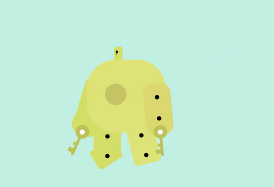
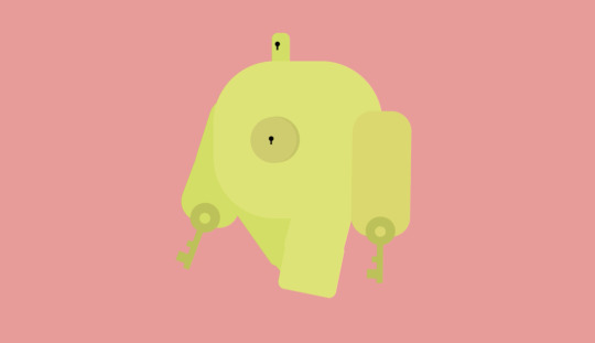
The session began by creating a few character designs in my sketchbook, just loose drawings which I could then digitise. At this early stage, I knew I wanted to explore a heavy character, which would allow me to try a different walk than I have produced already. That meant creating a small, bulky character with heavy arms, small legs and a big body. When I was sketching, I glanced down at my keys and was inspired to design a character based on this. The result was Locksmith, a gentle giant with huge keys for arms. He can unlock anything, and walks with a real weight. He has the ability to fly, too.
This wasn’t the only sketch I produced, I experimented with a Martian on holiday but ultimately thought the design was a bit too cliche. The idea of an alien walk was interesting, however.
Having settled on my Locksmith character, I jumped into Illustrator and built the gentle giant using simple shapes and that appealing vector-graphic, clean aesthetic with no defining key line. It’s a visual style that I’ve looked at already, and it results in a smooth, professional looking graphic so I wanted to continue it here.

As a design, I think it’s visually very appealing due to that soft, clean graphic aesthetic. The muted colours and flat style of the design is both inspired by my own developments and current graphic trends in contemporary motion graphics , and an under spoken colour palette gives the design a soft appeal, in comparison to a striking combination of bright, primary colours. The rounded edges give the design an overall warmth, and playful charm. It’s a successful digital translation from my sketches to Illustrator.
Following a video tutorial by animator Gigantic, I built the character in individual layers, making sure each one is in the correct position and title. Like Character Animator, it was important to build my character in separate parts. In order to rig my design, I downloaded free After Effects plug-in DUIK - as recommended by Barany - and following Gigantic’s tutorial, proceeded to properly rig my character.
At this point, I opened After Effects and simly followed the video’s instructions. The first step was to parent the body parts to the body, using a ‘pick whip’ tool. This allowed the character to be treated as one piece, with my cursour I could drag Locksmith around.

Using the DUIK panel, I was able to create ‘controllers’ on the limbs of the character. When I dragged these, the corresponding limb would move in the direction I’m moving it in - and thus the character was successfully rigged. Its a simple rig, but one that allows me to animate my character.
This process of rigging the character, however, was not easy. I faced a numerous amount of technical difficulties and seriously struggled with the software to begin with. Creating a two point rig for the legs and arms proved difficult, and actually creating the animation was a challenge.
Instead of working frame by frame, or using behaviours like Character Animator, After Effects uses ‘key frames’ and animates in-between those key frames for you. Whilst this seems easy, it was a difficult concept for me to properly understand and just a walk cycle proved to be quite the challenge.
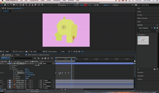
I was able to create a walk, however, where Locksmith stomps down on each step and swings his arms in the process. This was a result of me changing the body positon in different places on the timeline, creating the illusion of a walk. It was from my own practical experiments with the software that I developed an understanding of the basic mechanics, like key frames, parenting and the idea of a rig.
After producing a walk cycle, I experimented with a quick flying motion and noticed how, now the body parts are rigged, they move naturally. With the fly, I only added key frames to the body. As they are parented, the limbs move with the body.

Just in this quick animation, I was able to convey a good amount of personality, with the flight path being a visually pleasing curve, and the legs swinging in sync with the body’s motion. It’s visually pleasing, but ultimately was just a test. My actual walk cycle, however, proved to be most exciting in terms of potential.
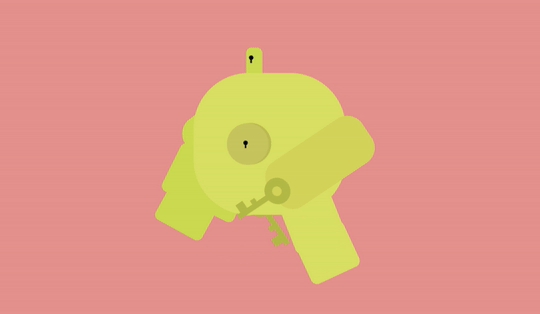
Not only is the sequence visually engaging due to a soft, muted colour palette and clean, vector-graphic aesthetic, but the walk itself works to convey ideas of a heavy weight to the character. The motion is pretty smooth, and the jolting stomp of each leg propels Locksmith’s body up as it would in reality. The sequence represents a different approach to a walk cycle than my previous tests, with a heavier personality and weight. The block fill background allows it to work nicely when composed with my other digital animations, and I’ll likely be using this sequence when I begin work on a final reel.
The sequence isn’t without it’s problems, though, as Locksmith does subtly sink down into the floor with his steps. It’s not too noticeable, especially with the stomping motion , but it’s something I wanted to mention. This was a result of me using the controllers to move the legs, but most animators actually animate feet separately, and then use DUIK or a similar plug in to rig the body to the feet, in a walk cycle.
My next move was to do just that, creating a simple geometric character design in After Effects itself, and using the position keyframes for feet, created a basic walk cycle. With this, I parented the legs to the body and was able to produce a regular walk cycle. In the process, I was able to play around with the shape and pen tools in After Effects to create my own geometric character, and used the rotation setting to have my character swing their arms. The design was inspired by my oil pastel works, featuring the same colour scheme and basic proportions, just digitised into a clean, minimal shape style.
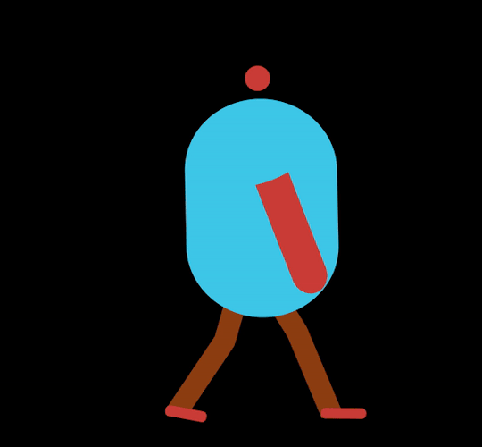
Whilst the animation is interesting, it’s what this test represents that is the most valuable. In the process of creating these sequences, I was able to gain an introduction to After Effects and the basic mechanics of the software, in both character rigging and animating from scratch, using just keyframes.
The actual walk in this test is lackluster, I feel - too fast and jolting to be a natural walk and instead looks as if the character is on a running machine. This is mostly due to the fast movements of the character, but also the flat placements of the foot. I want to explore how to alter the foot’s leg shape, as this is one of the main factors in an authentic walk cycle.
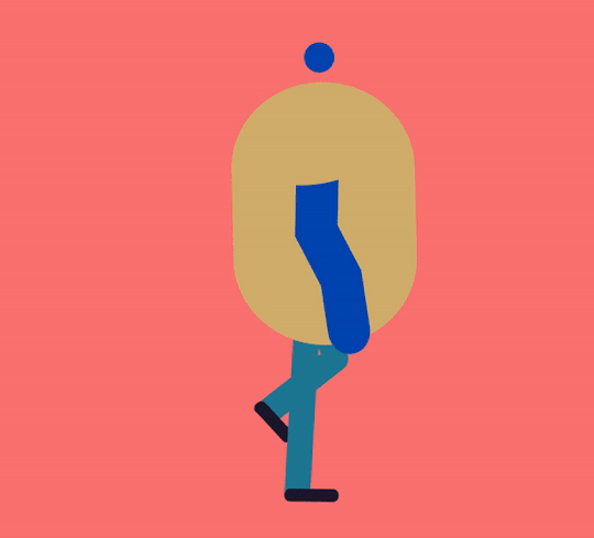
In the above example, I added the animation principle ‘squash and stretch’. Whilst this results in a more ‘fun’ animation, the walk is still too fast.
It’s a different workflow to Character Animator, but I can see the potential here. The ability to rig a character design and use keyframes instead of working on each one is a complete game changer compared to working on a frame by frame basis. It allows the animations to have a smooth polish, as the character designs won’t change in the process. Having played around with both Character Animator and now After Effects, I can compare the two for producing digital 2D animations.
Character Animator, to me, seems like a stripped down and simplistic version of After Effects. As far as I can tell, we can do everything that we can in CA (and more) in After Effects. The user interface isn’t as friendly, but After Effects represents more control and choice in animation when compared to the behavioural concepts of Character Animator. After Effects doesn’t have precoded motions for your character to follow, but it does allow you to do so much more with characters than CA does. Character Animator is much easier, and able to produce animations quicker than AE, but there’s a loss of personality and art when we’re just clicking ‘walk’ and our character begins to walk. Animation is a demanding medium, and in comparison to frame by frame or even After Effects, Character Animator can come across as a little lazy in it’s approach to animation. It still produces some great results, but conceptually it does feel like cheating the craft.
In this session, I gained an introduction to After Effects and produced some practical tests in response, further exploring the potential of a walk cycle in different techniques and styles of animation. As a rigging tool, DUIK seems to be very interesting and allows us to animate characters in a way that’s more akin to stop motion than traditional 2D animation. It’s an entirely different approach to animation than anything I’ve explored so far, and possesses some real potential for walk cycles.
These experiments are interesting, but apart from the Locksmith sequence, lack a personality and character. I want to develop upon this process, and look at how to produce a walk cycle with a personality. In my traditional tests I explored the idea of an optimistic double bounce, inspired by early 30s animation, and I think looking at this movement in After Effects would be a good development from these initial practical responses.
Actions
Develop on this process, create a more refined and polished walk cycle with a happy, optimistic personality.
0 notes
Text
Traditional Animation Review
As another way to explore traditional animation techniques, I wanted to create a test sequence using the traditional method of punched paper and a Lightbox. I’d produced a few loose drawings in my sketchbook of a character design, developing on from the light switch sketches I’d produced early on in this FMP.

For this test, I wanted to look at early 30s animation - which used a ‘rubberhose’ style of animation. What this means is the characters didn’t have any bones, the limbs could move around freely like rubber. This was one of the first animation styles that became standardised in the American animation industry, with the defining feature of the style being ‘rubber hose limbs’ - arms and legs that are simple, flowing curves without any bones. Rubber hose animation describes the bouncy, rubbery way in which characters were animated during the 1920s to the mid 1930s, primarily in American cartoons.

Animation from a Betty Boop animation, 1933.
Working in this simple style, I created a few more sketches before jumping into animation. For this test, I animated the legs and feet separately, and then added the torso and head after. I was working from Preston’s example here, adding large rounded shoes for feet inspired by the character design trends of the time, which featured a lot of curves, simple features, gloves and shoes. This was both to save time and money, animators didn’t have to worry about realistic movements and also it resulted in very smooth and visually pleasing movement, usually in sync with music.


The animation that I was able to create represents a look back at the traditional methods of the craft. So far I’ve been focusing on digital and stop motion animation, and I’ve somewhat neglected to go ‘old school’, so to speak. Whilst the animation is interesting, ultimately it was just an experiment. The zoetrope animations I’ve been able to produce are very exciting, and working on these inspired me to produce a walk cycle using my own character - and looking at a fun and creative style of American animation. In this test, I’m animating using the straight ahead technique, meaning I’m drawing each frame as I go along. Animator Richard Williams says how this can be good and bad, it results in fluid movement and a lively action, but the character can change size or shape in the process.

With this test, that’s exactly what’s happened. The character’s body shrinks, but how I’ve animated the swinging arms makes it look like he’s pushing inwards with every step. This wasn’t my intention, but this way the character appears to be contracting naturally, instead of just shrinking. It’s a result of a subtlely changing perspective, but it stops the animation from looking like a failed test. The way the arms and legs move are inspired by the rubbery, bouncy style of 30s animation, and I think the way these move is quite successful. I feel like adding some vintage filters, in Premiere Pro, to make this animation look like a classic piece would be a fun development from this test.
There is value here, it’s a style of animation that I’ve yet to explore properly and something that I hope to look at more. Digital character rigging is fun, but there is something magical about traditional animation. It’s a technique that I’ll be exploring further in higher education, and whilst it’s interesting - I can produce work up to a higher standard by developing my digital and stop motion experiments.
The purpose of this session was to animate an unused character design in the traditional animation technique of punched paper and a Lightbox, using the ‘rubberhose’ stye of classic animation as inspiration. For the final show, however, I need to present animations that are both visually exciting and up to a high standard - this traditional test isn’t up to that industry standard, I don’t think.
In this post, I was able to break away from the screen and produce a traditional animation test, using paper and a Lightbox. The sequence is interesting, but ultimately, lackluster. I’ll be continuing on with my digital animation developments, producing animations up to an industry standard. The character design of the light switch, however, is quite engaging so I’ll be adapting the design into After Effects in the next post.
Having explored traditional animation through this example and my zoetrope developments, I’ll be exploring Adobe After Effects. After speaking with animator Oscar Barany about using the software for a walk cycle, and discussing with my tutor about rigging characters using After Effects, I want to challenge myself to learn the program and produce clean, polished digital animations.
Actions
Explore Adobe After Effects, get an introduction to the software and produce some animations in response
0 notes
Text
Vintage Animation: Exploring the Zoetrope
In this post, I’m exploring traditional animation techniques - through the zoetrope.

So far in this FMP, I haven’t really explored traditional animation as a technique. My project is about learning new processes, walk cycles in animation and challenging myself to grow as an artist - but I’ve yet to create a traditional animation, using punched paper and a lightbox. This is a result of me focusing on digital animation up until now, but also the fact that I’ve experimented with traditional animation before - and wanted to challenge myself to explore new mediums and processes. My tutor, however, suggested I look at vintage approaches to animation - examples such as the classic zoetrope and the like.
I set out to explore a walk cycle in analogue animation, using a classic hand drawn technique on a strip of paper to create a zoetrope animation. In contrast to the digital polish of my Character Animator animations, I wanted to experiment with a distinctly hand-drawn and classic approach to the medium.
Not only this, but explore another legendary animator’s approach to a walk cycle: Preston Blair. Having looked at Richard Williams’ reference, I wanted to compare the two and comment on the different approaches each animator takes. To start off the review, I think it’s important to establish a brief history of the zoetrope, and animation in general.
Animation has it’s roots in the numerous parlour game toys from the early 1800s. These toys experimented with a persistence of vision effect known as the PHI phenomenon. This describes the optical illusion of perceiving a series of still images, when played back at a speed, as a continuous motion. One of the founders of Gestalt Theory, Max Wertheimer defined this phenomenon in 1912.
The zoetrope was invented by William George Horner, in 1934, which he named Daedalum or ‘wheel of the devil’. It was mostly forgotten about for around 30 years, however, until William F Lincoln, USA and Milton Bradley discovered and patented the toy almost simultaneously. Lincoln gave the device it’s new name zoetrope, meaning ‘wheel of life’.

An antique zoetrope.
The basic ideas of the zoetrope was an adaptation of the principles of the Phenakistoscope, a similar toy which allowed viewers to watch the animation through a mirror. The zoetrope, however, didn’t need a mirror, and viewers could watch the motion through slits. The original zoetrope was constructed of an open-top drum, a hand-drawn sequence of pictures on a strip of paper facing inwards. The outside of the drum has slits cut into the cylindrical surface, and when the drum is spun, the images could be viewed through the slits creating the illusion of movement.

A modern example of the technique, from animation studio Cartoon Network.
The Zoetrope gave rise to the illusion of movement through the presentation of sequential static images. It’s also important to note that history tends to be Western centric, and it’s also reported that an unknown Chinese inventor created a similar device to the Zoetrope back around 180.
The zoetrope uses the persistence of vision principle. This means that the retina holds an image that was caputured for one tenth of a second before seeing the next image. When it’s spun, we then see the image as a continuous motion. These examples often featured animals, objects or performers all moving in a cyclic motion. They’re examples of hand-drawn animation that have an incredible fluidity and life to the movements in a way that some contemporary animations don’t.
There’s something magical about the device, and it’s Victorian heritage allows the animations to feel distinctly vintage and classic. Perhaps one of the best ways to explore actual classic and traditional animation, I wanted to create a few examples of my own. The content of these animations would be inspired by legendary animator Preston Blair’s work, and his book Cartoon Animation which demonstrates how he would approach cycles of all kinds. These pages, Movements of the Two Legged Figure, will act as a reference for my own animations. I’m exploring the potential of a walk cycle in animation, so I’ll be animating some exaggerated walks in this session.

The actual process was quite simple. As I’m exploring how Blair approaches a walk cycle - the actual poses have already been drawn for me. I created a series of template strips, marked where each frame would be and began drawing the frames - using a lightbox and brush pen.
Blair’s characters are much more dough-like than Williams’, meaning it’s easier to convey a change in weight with these examples. With Williams’ guide, the characters are just cylinders, but Preston’s designs have a flour-sack-like quality that allows the motions to be smooth and most importantly, fluid.
The purpose of the walks I chose was to explore exaggerations in a walk - I’ve looked at how to convey emotion and character through a walk cycle, but it’s in these examples that the idea is most clear to the audience, I think. The drooped head and hands in pockets posing of Shuffler allows the animation to have a melancholy and depressed tone. This character is clearly having a bad day.

I’m not only creating a traditional animated walk, but I’m subsequently learning the poses and movements of a sad shuffle which I can then apply to any animation medium. I’m not only comparing the two, but I’m gaining an understanding of emotion through walk through these animation exercises.

The movement here is successful, I think. It’s smooth, and as I’d expected, full of life due to the fluidity of the steps. There’s no jolting movements, or repeated drawings - it’s frame by frame, hand-drawn animation that results in an inherently exciting piece. The character’s drooping head and arched back gives the feeling of sadness, and his feet stay low to the ground with no real energy.
However, it’s by no means perfect. The linework varies from successful to messy, and although the character is walking, it looks as if he’s stepping to the camera and then away again. This wasn’t my intention, and does detract from the overall effectivity of the piece.
If we compare this to my digital attempt at a sad walk, we can see one is clearly more mechanical than the other. My digital walk still communicates the same emotion in a clear way, but the actual animation is more lazy and amateur than my traditional example. There’s a fluidity in my zoetrope example that harkens back to the hand-drawn era of Disney animation, whereas my digital example looks a little flat and lifeless in comparison.

They’re both successful in communicating an emotion, but my hand-drawn example is the better example of smooth motion. Looking at my digital examples, this is a common theme. The walk cycle roughs I’ve created digitally lack any visual flair or interest - in comparison to my zoetrope and even Character Animator examples, they’re just boring and pretty dull to look at. I think the appeal and success in the other examples arises from one of two things - an engaging and interesting character design, or fluid and smooth movement. These are really the only two criteria of a successful animation - everything else is of little importance. I mentioned in my ‘why animation’ post that the straightforward, goof and bad element of animation is something that appealed to me. Whilst my digital experiments are interesting just in terms of emotion, those tests were simply exploring how to evoke emotion in a walk cycle. Almost like a blueprint for these animation. When collating pieces for a final sequence, I won’t be choosing these digital tests because they aren’t engaging or visually interesting.
I was able to show a few of my friends in the class these zoetrope examples, and I was met with an rather impressed response. Most of them knew what a zoetrope was, and I think the vintage element to the animation really did add to the ‘fun factor’ of the piece. They spun the drum themselves, and I think that interactive element added to the animation. There’s a child-like creativity and awe that’s at the heart of animation as a medium, and that idea of spectacle and amazement will never cease to captivate audiences. The animations are smooth, fluid and simple to understand thanks to the exaggerated movements. Exaggeration is a key principle in the craft, which allows animators to communicate an idea in a clearer way through exaggerating and emphasising that idea past the laws of reality.
As always, I posted the work online to my Instagram page where it was also met with a warm welcome. The video was played more than 40 times and received more positive responses than most of my posts to date. It’s a departure from the contemporary and digital approaches to animation I’ve been following up until now, and I think the break from the screen and jump to pencil and paper is refreshing to my audience - as it was to me. Zoetrope as a technique isn’t all that common in popular culture today, but it is seeing somewhat of a rise in popularity in the animation community through 3D sculpture, with talented creators producing zoetropes with actual figures and models, or in one case, stop motion armatures.
As a way to contrast this melancholic animation, my next action was a happy walk - a double bounce that shows an energetic optimism. Richard Williams’ describes this as the ‘North American can do’ attitude, which animators used extensively in the 1930s. This was a time of economic depression, and a terrible drought in the US - and so animators used this cartoon walk as a way to help boost morale to the public.

The main challenge at this point was purely a technical one: using the brush pen. I’ve used the tool before, but I’m not yet comfortable with the uneven line and heavy weihghted strokes - resulting in a few mistake marks on the animation. It’s not too noticeable, but trying to get a consistent and confident line whilst also not creating a heavy brush stroke was difficult. This especially was a challenge given the rather extremely small scale I was working on, calling for some line control that, at the start, I clearly didn’t possess.

Through a couple test pieces, though, my lines did become more confident and successful, able to not distract from the movement. As a final zoetrope test, I wanted to depart from the walks and explore a more exciting and dynamic motion: a jump.
To create this, I followed the same process of lightboxing Preson’s reference, but wanted to achieve a more confident quality of line through a fineliner in place of the brush pen. This is a tool that I’m much more confident with, and as a result, produced the most exciting animation out of all three tests. It’s important to look at my work objectively, and after asking which was the most successful in terms of animation - this jump cycle took the cake.

It’s important to note that Preston provides the basic poses of a walk cycle, but like Williams’ example, only are half-cycles. To adapt the reference to my zoetrope strip of paper, I reversed the leg and arm movements and added an in-between pose between two extreme frames in order to create a smooth cyclic motion. In a project from last year, I experimented with a walk cycle similar to this but didn’t understand the ‘half cycle’ concept and so the character switched legs at the start of each cycle. Through actual research and exploration, I’ve been able to create full walk cycles that effectively loop.
The jump cycle is an example of successful, dynamic and exciting movement with a life and energy that’s impossible to deny. The linework is much more consistent and confident, with no large strokes of ink overtaking body parts, allowing the movement to hold the audience’s full attention.
The hand-drawn element of these zoetrope animations give a life and charm that my digital experiments lack. Preston’s dough like characters are able to convey change in weight in such a way that’s unrivalled by my Character Animator and photoshop developments. With something like my Michael walk cycle, it’s almost as if he’s walking on a bouncy castle - the foot placements aren’t quite where they should be - a result of the automatic ‘behaviour’ concept of the software. There’s a classic, traditional charm that these zoetropes possess that results in audience engagement across the board. There’s a magical quality to the device, and it’s still able to capture our imagination.

Despite this, these animations aren’t all my own. I’ve certainly created these, but the character designs are non-existent. A good way to develop from this would be to give the figures an actual character design, or scan the drawings in and work into them digitally - evidencing a blend of both analogue and digital processes.
I find the hand-drawn element of these tests to be the most exciting, the idea that I’m drawing each one frame by frame harkens back to the traditional and classic era of 2D animation. In my opinion, Blair’s walk cycle results in a more exaggerated and ’animated’ walk in comparison to Williams - but both are extremely successful examples to use as reference.
The purpose of this session was to explore an alternative approach to animation - the traditional, hand-drawn technique of the zoetrope. In this post, I was able to look at another reference to walk cycles from legendary animator Preston Blair, and the history of the device which effectively gave way to animation as we know it today. Through Blair’s examples, I was able to continue to explore emotion in a walk and a further understanding of the core principles of animation. In a previous post, I mentioned how I wanted to create a ‘bounce’ animation reminiscent of early Disney animation and here, I was able to do just that.
As a technique, I think the zoetrope remains just as effective and engaging to a audiences as it was when it was first invented, in 1834. The interactivty of spinning the wheel ourselves only adds to the magical quality of animation, and will likely entertain audiences for years to come. The animations I’ve been able to produce are effortless engaging and exciting to audiences of all ages, in a way that focuses on the fluidity of motion rather than interesting character designs like my CA pieces. It possesses great potential, and I would like to create another walk cycle using the same device with my own character designs.
I wanted to explore a traditional approach to animation, as a way to breakaway from my mostly digital animations so far, using programs like Character Animator and Photoshop. These are exciting programs, but the rigging aspect can sometimes loose the vitality and inherent life of these traditional animations.
Having looked at one of the earliest forms of animation, I want to continue this line of enquiry into the history of the craft. My next move will be to create a traditional animation using punched paper and a Lightbox, inspired by the classic ‘rubberhose’ style animations from the early 30s.
Actions
Further look at traditional animation, create a ‘happy bounce’ walk using the classic method of punched paper and Lightbox
0 notes
Text
‘Bin Man’: Animation Test Review
In this post, I just wanted to briefly discuss my animation test Bin Man.

Inspired by several sketches and observational comics I’d created whilst observing numerous recycle men around my local area, I wanted to produce a test for an animated short.
Whilst I had been going around sketching characters in my sketchbook, I had been subsequently following several recycling men driving around the village, picking up trash from various bins. Inspired by local artist Sam Elston and his various influences including Jon Stokhoost, I wanted to create sketches of the people I saw on my various walks.

After producing some simple character designs and a quick storyboard, I set out to create a rough animation in Photoshop. The purpose of this was to explore my own abilities in visual storytelling, and problem solving without any animation reference. The sequence is comprised of one shot, centrally focusing on a bin the entire time. I was inspired by the central compositions of director Wes Anderson for this element, as we follow the quiet and lonely life of a bin man carrying out his daily duties.

It was an exercise in visual storytelling, creative limitations and most importantly - problem solving. I wanted to challenge myself to not use any other animation references, rotoscoping techniques or other processes other than hand-drawn animation. I wanted to include a walk too, as a way to relate to the themes of my project - but the main focus here was an experiment in simple storytelling and animation.
It’s meant to show how much these recycle men do care about the job, taking the time to upright the bin after it’s fallen over. It’s a little action, but is the main idea of the sequence.
It was a challenge not to draw from any real artistic influences beside the framing centrality of Wes Anderson - and even then, it’s a loose inspiration. The main idea of this independent session was to draw from life as my only reference, creating a rough animation of a sequence that I actually experienced.
The main challenge of the session was to strictly draw from primary observation for the animation, and how the bin instantly falls over as the bag is lifted out. Aside from this, creating the illusion of weight as the character walks away with the bin bag was a challenge, something I tried to solve with the character’s shoulders drooping and bag dragging against the floor.

The actual animation is purposely rough - there’s no real smooth movement to the piece, and the walk itself is a little jolting. It tells the story well, though, and evidences a breakaway and pause from the walk-centric focus of my project to exercise my ability to tell a story, and draw from observation. It’s a little test that I thought was worth mentioning on this blog, due to the experimental nature of the session and focus on observational sketches.

Whilst this piece doesn’t strictly show a walk cycle, it is focused on me challenging myself as an animator and drawing from life - ideas centric to my project. As a bit of a break from the character rigging of Character Animator and stop motion tests, it’s an interesting experiment in visual storytelling and quick character design based on primary reference.
Through this session, I’ve learnt to drop my perfectionist mentality in favour of a playful approach to animation. The movement isn’t smooth or polished, I’m effectively taking JG Quintel’s naive, hand-drawn and rough approach to animation in this test - choosing storytelling over animation in a way that I found quite refreshing. Rigging a character using digital software is exciting, but I do find something comforting and engaging as an artist, in hand-drawn animation. I think there’s a charm in the rough aesthetic - that idea of raw creativity that is communicated to the audience through an abandon of tradition animation practices in favour of telling a story.

2 IN THE AM PM. (2011). JG Quintel.
Inspired by this piece, I want to be exploring a traditional approach to animation as my next move. So far, I’ve looked at a few digital processes but have neglected to explore more classical approaches to the medium. I’ve responded to the ideas of a walk by animator Richard Williams, but I want to look at legendary animator Preston Blair’s approach and compare the two.
Action
Explore a traditional approach to animation
0 notes
Text
‘Mugen’ Analogue Experiment
In this session, I’m creating a flashing character design walk cycle, inspired by the works of animator Oscar Barany.

In response to my research into freelance animator Oscar Barany, I wanted to create a flashing character walk cycle, inspired by his ‘Mugen’ example.
The sequence is essentially a one-man exquisite corpse of exciting and rich character designs, drawn digitally in photoshop. Oringially, I had assumed the artist used the program to create the actual animation, but after chatting online, I found out that this wasn’t the case. Barany created a normal walk cycle in After Effects, using a character rigging tool named DUIK. ‘Once I'd got a nice looping walk cycle I rendered it out and I put that into photoshop and redrew each frame using the walk cycle as a guide.’

It Never Ends. (2017). Oscar Barany. Mugen.
I asked why he chose to create a walk cycle of this experimental nature for the project, if it was a stylistic choice or out of budgetary reasons. The artist chose a walk cycle due to limited time he had in which he could create a visual that would have ‘a lot of impact’. The project had no budget, Mugen was a music experiment from the start and so Barany was working on the sequence alongside other work. He used different styles for each frames because he wanted to ‘use it as a quick illustration challenge, and as an excuse to test out a load of different drawing styles’.

Oscar Barany. (2018).
Looking at the animation, I can see this. There’s a range of experimental character designs but they alll evidence new approaches and drawing styles. They’re all digital illustrations, of course, but the approach to character is different every frame. The collective used the different frames for different single covers out of economy - ‘the creative director realised we could use the different frames separately, so they were used in various campaigns for the project’.
Finally, I mentioned how I’m asking animators in the industry for an opinion of my work. ‘Looks like you’re on the right track practising walks, deffo read through the animator’s survival kit there’s a wealth of knowledge in there. A lot of people start with the feet and legs, and then do the rest after’. Here, Barany suggests that a walk cycle is a great challenge to start with, and the work I’m creating is interesting, atleast. His last comment, though, is something that I’ve never considered before: animate the legs first, and then add the torso, arms and head. This allows us as animators to focus on the leg and foot placement first, and then isolate the other parts.
What I find the most exciting part of Barany’s walk cycle is the very concept of it. Having the animation feature variations of a character design isn’t something I’ve seen before, and it’s very visually stimulating and engaging to us an audience. The flashing character designs asks us to pause the video, and appreciate each one. It’s almost like a challenge for the viewer, and that’s inherently engaging and fun. The flash of colours and styles give the animation a lucid feeling, matching the overall tone of the track It Never Ends very nicely.
I’ve already explored this digital, clean approach to character designs in my FMP, looking at my experiments in Character Animator for example. In response to this research and analysis, I wanted to create a flashing ‘mugen’ style walk animation, but challenge myself to use a range of traditional, analogue mediums and materials.
The process began, however, by creating a simple walk cycle using Photoshop. Like Barany, I wanted to create a looping walk animation that I’m happy with and then use these as a guide for the final frames. It was important that this walk possessed a different character from my other experiments, however, so sketched a few designs in my sketchbook. These were simple thumbnail sketches just exploring potential shapes and proportions, settling on a large, circular body, small head and long legs.
I wanted a design that contrasted my Michael walk animation in shape and proportions, and this did just that. Happy with this basic design, I moved into Photoshop and created a quick walk cycle, using my understanding of the movements that I’ve been able to grasp through my FMP. For the walk, I’m using a traditional frame by frame animation technique, just on a digital workspace rather than punched paper and a Lightbox. I’m not worried about any character design or perfect line quality here, just about getting a smooth walking motion that I can then use as reference.

Oscar created the template walk in After Effects with a rigging tool, but here I wanted to develop on from my photoshop animations and continue with the hand-drawn, traditional technique.

Whereas my Character Animator pieces were reserved in movements, with Michael having his hands in his pockets, and my stop motion tests showing a rather slow and tired character - I wanted this walk to have an excitement to it, almost like a leap from each step. It’s quite a smooth motion, but I was able to create this dramatic effect through empathising the extreme poses so my character raises his foot very high off the ground.
With this completed, I exported the animation frame by frame and printed these off, to use as a guide. Before jumping to the animation stage, I wanted to explore some potential ideas, materials and styles for the frames. In my sketchbook, I created some quick sketches of my character in different drawing styles and materials, sticking to a primarily analogue approach.

I found the crayon and charcoal sketches to be the most interesting here, due to the textural quality of the medium. In this animation, I wanted to create a clearly hand-drawn aesthetic, and I think embracing the obvious mark making style of these naive materials will help me to achieve this.
After setting a Lightbox up and some paper, I began re-drawing each frame, in a variety of styles, mediums and drawing approaches from biro to oil pastel.
In this process, I was able to create frames using traditional drawing styles using pencil, biro and finaliser, but also more experimental technwieus such as continuous line and charcoal markings. The point of this was to work fast, treating it as an excuse to play around with drawing tehcniwus and mediums that I’ve neglected to explore so far in this project. The purpose was to explore a range of drawing processes and mediums, and embrace the textural quality in comparison to the flat, minimal character designs I’ve already created.


I was able to record myself creating these frames, as a way to visually document the process instead of discussing each one at length. Personally, though, I feel like the oil pastel and charcoal frames were the most visually exciting and interesting, due to the inherently textural quality of the material. There’s a physicality to the medium that I’m really engaged by, and it’s this grainy, visually rough aesthetic that communicates hand-drawn and ‘analogue’ the best, I think.
Having produced these, I then scanned each of these into Photoshop, cleaned them up using a simple Levels edit and compiled them into a frame by frame sequence. This was the result, a collective walk cycle exploring a range of analogue mediums and materials.

The textural quality of the animation is what stands out to me as the most important element of the sequence. If we compare this to my digital animations, or my zoetrope experiments, there’s a rich physicality to the marks I’m making here. It’s what has the most potential, I think, in terms of development.
The flashing character designs work well, with the audience still being able to understand the character’s walk cycle. It’s an exquisite corpse of character designs, analogue materials and styles ranging from a crayon-coloured superhero to a loose charcoal sketch. The flashing character designs work to make the animation visually engaging to the audience - it hooks your attention straight away, and asks you to take a closer look at each one. I’ve been able to successfully convey the ‘leap’ walk from my digital reference, and the animation loops smoothly.
Fellow student Jack mentioned the effective quality of the animation, and how it successfully represents my project as a whole. The experimentation of analogue drawing materials is something I’d neglected to do until now, and the use of oil pastel and charcoal is something he identified as exciting and visually quite engaging. This is something I wanted to explore - up until now my animations themselves have been singular pieces, which I want to curate into an exquisite corpse. Here, however, I wanted to take a more simplistic approach to the idea, putting a focus on the walk whilst also being a frankensteins-monster of character designs.

The sequence, though, isn’t without it’s problems. The most glaring issue for me was the brush frame, which juts out from the others due to the bold and large brush strokes. It’s a little jarring, I think, and the blend of a digital Illustrator-based frame doesn’t really fit with the sequence. On the whole, though, its quite entertaining and the walk animation itself is successful. I’ll be using this in the final animation, and the textural quality of the oil pastel frames inspired me to explore the medium further.
As a development of this animation, I sat by the beach and produced a series of quick observational sketches using the material. I’ve been told to draw people at cafes, but I’m not quite that confident yet, and drawing people down by the beach has brought me success already in my FMP, so I thought I’d continue.

The sketches aren’t realistic - there were no green or red people walking down the beach - I was focusing on their body shape, proportions and poses mid-walking. It was a way to continue to explore a walk, but also get inspiration for more character designs - drawing from life in the process. The sketches I created aren’t accurate to life, but they serve as an interesting document of the people I’ve seen, to refer to for character designs. From this, I was able to capture a range of shapes, sizes and proportions and was developing on the rich textural quality and bright, colourful nature of oil pastels as a medium.
Having created those, I then produced a walk cycle using just oil pastels, using the same walk cycle as reference. It was a quick process, but I feel that transitioning from this sequence to the flashing design animation would work well when compiling a final reel. The bright colours evoke a childlike sense of creative, fun and life with clear mark making and rough, granular texture that we as an audience can almost feel.

The combination of these two sequences creates a singular exquisite corpse in itself, flashing between varying character designs and drawing styles whilst also bringing focus to the walk itself. It’s an entertaining piece of animation, challenging my digital predisposition in place for a textural, experimental and naive appeal.

The purpose of this session was to explore experimental materials and drawing mediums, and create a more exaggerated walk cycle animation in the process - responding to Oscar Barany’s ‘mugen’ example. In the process, was able to talk with the artist about his approach and the Mugen Project, explore oil pastels as a drawing medium for quick observational sketches and produce a sequence that effectively represents my project as a whole.
This session was about me putting a heavy focus on analogue materials, and experimenting with different drawing processes whilst also producing an animation. It’s something that I’ve somewhat neglected to do so far in this FMP, sticking to pencil and pen for the most part. Having looked at oil pastel amongst other mediums, and created an animation with a rich textural quality I’ve been able to do just that.
After speaking to Barany about his process, I want to explore Adobe After Effects and character rigging within the software. It’s a digital animation program with a completely different approach and mechanics to Photoshop or Character Animator - and it’s a program that I’ve always felt a little intimated by, due to the extensive controls and user interface. After speaking with Oscar about using the software for a walk cycle, however, and discussing with my tutor about rigging characters using After Effects, I want to challenge myself to learn the program, in an attempt to ready myself for the industry.
After Effects and motion graphics are quickly becoming the standard in commercial animation, and even narrative-based animations from studio Animade. My next move is to play around with the software, and attempt to create a walk cycle exploring a new approach to animation.
Producing these analogue animations has resulted in some exciting pieces here, however, and I want to look further at traditional animation as a process before I continue with my digital exploration into new software Adobe After Effects.
Actions
Explore traditional animation further, create a sequence using punched paper and a Lightbox
0 notes
Text
Stop Motion in Real Life
In this post, I’m discussing my experiments into greenscreening my stop motion animations, looking at incorporating a simple approach to motion tracking to allow my character to walk in our world.

In a recent blog post exploring examples of an exquisite corpse in animation, I briefly the idea of animated characters interacting with real world actors. This is a concept called The Roger Rabbit Effect, named after the 1988 animated classic Who Framed Roger Rabbit, who perfected the idea. The idea of animated characters interacting with real people is one of the oldest special effects in Hollywood, with a great example being Gertie The Dinosaur - an animated film from 1914 which saw animator Winsor McCay interacting with the animated character in real time.
The main example that inspired me the most, however, was a quick sequence from Rick and Morty Exquisite Corpse, where a digitally drawn Rick and Morty are thrown into our world. I mentioned that I wanted to explore this idea using my stop motion developments, having my character walk through areas of my local area. This is something that I discussed in my early ideas for an FMP, I wanted to explore a new way of working and develop my digital skills further.

Rick and Morty Exquisite Corpse. (2017).
The actual green screen process was relatively simple, dragging an ‘ultra key’ effect onto the video and colour picking a green from my frame. Initially, this resulted in a scratchy figure but playing around with the choke and colour effects allowed me to have a successful green screen effect. The main problem to solve here was removing the rig from the sequence. Initially I tried dragging another block colour image over the rig, but this resulted in a clunky effect.

After doing a bit of research, I found that I could add a ‘mask’ to the video file. Premiere Pro allows you to draw your own shaped mask, and when you shift the mask to any direction - what’s in the mask is gone from the video. This wasn’t a smooth process by any means, though, with the software automatically trying to track the mask through the video resulting in my character losing an arm for a few frames. My solution to this was a rather long one, resulting in me moving the mask frame by frame to avoid any loss of limbs.

To begin with, I experimented with a plain background - like my digital Character Animator pieces. Whilst it would fit the theme I’ve somewhat already established, I feel like this doesn’t have the same effect. As it’s a stop motion sequence, having a singular colour background takes away from the physicality of the medium, I think. It’s quite pleasing in it’s minimal approach, but I want to throw my character into our world, in response to the Rick and Morty sequence.

I’m not ruling out this one colour approach, however, as it is quite visually pleasing, and may work better in my final exquisite corpse sequence.
From here, I went out and shot a few videos for motion tracking, filming paths and streets as I was walking in a slow, stilted movement in order to capture my character Mick’s motions.
My initial tests using these filmed sequences weren’t too successful, with my character seemingly running across the screen or walking into a tree repeatedly, like a failed video game character.

This ultimately stemmed from a lack of understanding of my animations themselves, and after watching and timing the movements, I produced another test which was more effective than my previous attempts - whilst still not a smooth blend of stop motion and reality. This sequence was just my character walking - a continuous motion that was almost too fast for the animation.
After understanding this, I wanted to use my final stop motion sequence, where he walks, stops, and continues walking again. This stop and start motion lends itself to The Roger Rabbit Effect, I think, as the audience can see that the camera is moving in tandem with the stop motion character - creating a more authentic illusion of life.

With this in mind, I shot a slower video, with myself walking, stopping, and then continuing to walk again. This allowed the video a realistic pace, and when green screened with my animation, resulted in an interesting piece.

Whilst it’s not perfect by any means, this is definitely my most successful piece out of these motion tracking tests. The green screened blend of my stop motion character with the film is actually quite effective, with the rig being erased from the film with relative success. The walking motion is quite realistic, taking large, slow strides in an effort to show Mick’s tired personality. It looks like the character is using a lot of effort to walk here, and that was just my intention.

My initial idea for the character was to have him be a stop motion version of Michael - my CA character. In the building process, however, he evolved into his own character, more older, melancholic and heavy. Gone was the initial tall, lanky youthful character and instead was an older Mick, with a sharp jacket and shiny black shoes.
The walk and camera movements are somewhat synced, with Mme speeding up as Mick steps into the last few frames and slowing down at the beginning, easing in and out of the motion.
Despite this, as Mick slows down to a halt, the camera keeps moving for a few frames. This results in the floor sliding, something which instantly shatters the illusion I want to create with the animation. It’s not as important as to detract from the entire piece, but I would want to edit it further if I were to add this sequence to a reel.
In terms of the idea, however, I really find it interesting and effective. The Roger Rabbit Effect isn’t something I’ve played around with before, but there’s something very charming and fun about animated characters interacting with the real world. It’s an idea I’ve spoken about before on this blog, inspired by the works of Jon Burgerman but also most recently the #secretsidekick challenge by art festival and publisher PictoPlasma that encourages artists to create characters interacting with the everyday. With these examples and the recent Rick and Morty Exquisite Corpse, it seems like the idea of characters interacting with the real world seems to be gaining popularity in contemporary graphic art scenes.

If we compare this motion tracked sequence to the plain colour, there’s an instant lack of world building and sense that our character is anywhere. I think the block colour background works for the digital animations because of the clean, minimalist and flat design aesthetic of the characters themselves. Having a stop motion character do the same seems a little incongruent, not really fitting the pop scheme. With a little bit of quick editing, I was able to minimise the floor sliding of the sequence, and I think it’s quite an interesting experiment and animation - one that will contrast nicely to the digital minimalism of my Character Animator pieces.
The purpose of this session was to explore an alternative approach to walk cycles and the block colour aesthetic I’ve looked at in my previous digital developments. I wanted to look at how I could make my stop motion character interact with the everyday, in response to my analysis into the Rick and Morty Exquisite Corpse. I’ve been able to discuss those experiments here, and produced a successful piece that I could include in a final exquisite corpse animation. In the process, I’ve learnt some new skills in editing and post production, allowing me to remove parts of a video or image that I don’t want, using the masking feature. When I do begin creating the final sequence, it’s important that my animations aren’t too similar, that they evidence a few different styles and mediums in order to keep the audience’s attention - so breaking away from the block colour background, and into the real world is one way in which I could do this.
The motion tracking here proved to be successful, though a potential development would be to take this a step further and film more footage in more exciting locations and produce a more smooth camera movement, avoiding any sliding floors. I filmed a quiet area to show a calm, collected and uninteresting everyday life, but I could experiment with more visually interesting areas and locations, interacting with the public, perhaps?
Having moved away from the digital animations, I want to continue to explore alternative approaches to animating a walk cycle - experimenting with different analogue drawing techniques and mediums. Inspired by Oscar Barany’s flashing ‘Mugen’ walk cycle, I want to create a walk animation that is an exquisite corpse on its own - using these analogue techniques and mediums.
Actions
Create a flashing walk cycle using analogue materials, inspired by Oscar Barany’s ‘Mugen’ example
0 notes
Text
Stop Motion Animation: Movie Magic
In this post, I’m looking at stop motion animation in a bit more depth.

Fantastic Mr Fox. (2009).
I’ve discussed the appeal of Wes Anderson’s stop motion features Fantastic Mr Fox and the recent magnum opus Isle of Dogs, but I’ve failed to discuss the contextual history of the medium.
Stop-Motion is an animation technique to make an object appear to move on its own. This is done by moving an object, usually a character puppet in incremental motions. After each movement is made, a photograph is taken. When played back as a sequence, the object appears to move, creating the illusion of life.
The technique dates back to the 1890s, where director Albert E Smith and J Stuart Blackton created the first stop motion short The Humpty Dumpty Circus in 1897. Only a few stills of the film are all that remain, but it supposedly followed a toy circus coming to life, by magic. The same idea, of bringing inanimate objects to life by magic can be seen in Jason and the Argonauts where our hero fights a series of stop motion skeletons, and Bedknocks and Broomsticks.

Jason and the Argonauts. (1963).
The first recorded film to use actual stop motion puppets was a Russian stop motion feature by director Ladisalas Starevich, using real beetles with wire legs as puppets. The film explores a fight between two beetles, using the stop motion technique. The Polish-Russian animator has made several stop motion works, but it’s The Beautiful Lukanida that he’s best known for.

The Beautiful Lukanida.(1912).
Perhaps one of the most well-known classic stop motion examples of the form would be King Kong, praised for it’s complex blend of stop ton animation and live acton film. It’s a technique often incorporated with lvl acton film, with Aside from this, stop motion was used extensively in special effects, with notable big budget examples like The Terminator, Jurrasic Park, and the space chess scene from George Lucas’ Star Wars in 1977.

King Kong. (1933).
Stop motion is able to create such a range of emotions and feelings, from excitement and fun in Wallace and Gromit, to the deeply unsettling work of the Key Brothers work in Street of Crocodiles -a creepy, foreboding piece of animation that makes your skin crawl due to the clockwork motion of the sap motion puppets and the shining-esque shrieking score. It’s an incredibly atmospheric and successful animation, one which successfully gets under the audiences’ skin.

Street of Crocodiles. (1986).
Most recently, Laika Studios and Aardman have been the front runners for stop motion animation, with examples like Coraline and of course, Chicken Run. Along with eccentric filmmaker Wes Anderson, stop motion is still alive and kicking today. With films like Isle of Dogs, Kubo and the Two Strings and the upcoming Chicken Run 2, some audiences might even say we’re entering another golden age of stop motion animation. It’s still a relatively young art form, still evolving and growing to this day (for example the giant stop motion puppet made for Kubo). Out of all the animation techniques, stop motion, I think, is the most timeless. The craft has the ability to enthral audiences of all ages, and I want to explore why that is here.
The appeal of stop motion comes from an appreciation of the medium, I think. Animator Nick Park of Aardman fame explained it best, in a recent interview.
“Audiences can see the material - there’s a tangibility to stop motion. We know what clay is, and to see it taking life on screen is truly impressive. It’s created by hand, and that real aspect is what captivates audiences, I think.” - Nick Park
It’s a process that’s surrounded by this sense of magic, whimsy and wonder that’s unrivalled by any other animation technique. It demands patentee and discipline, but most importantly - passion. This is why stop motion animation is so exciting to audiences - we can feel that passion when watching the film. It’s a labour of love, and as an audience, we can tell that. It’s this dedication to the medium, the craftsmanship and talent that can sometimes be forgotten with computer generated imagery. In this regard, the market has been saturated with computer animated features up tot he point where nothing is all that suporisng or impressive anymore. It still demands a great deal of handwork, artists and talent, but I think the public is beginning to realise that anything is possible with computer animation - and we see it so much that we’re not really impressed at this point.
Stop motion, however, is not the same. There’s only been a handful of stop motion films released, and generally, audiences eat them up straight away. Moreso than ever, I feel, there’s a demand for stop motion films. Digital animation can produce more realistic results with motion capture technology and 3D modelling, but there’s no form of animation more real than stop motion. The appeal comes from it’s timeless nature, and the passion animators put into every single frame. There’s no lazy stop motion films because in order to choose that way of working - you have to be dedicated. It’s an idea that I really identify with, and share myself. With the few developments into stop motion I’ve done in this FMP, I’ve seen a massive appreciation from anyone who’s seen my work - both in real life, and online. There’s no other animation technique that is more real than stop motion, and audience know this.
The purpose of this blog post was to discuss a brief history of stop motion as a medium, but also to discuss why stop motion is so appealing to the general public, and a universal audience. This allows me to understand the medium I’m working in, and most importantly, my audience. It’s important to consider the needs andideats of our adueicne as we are ultimately making work for that demographic. Having a critical understanding and awareness only puts me in a better place to create animations that speak to the audience, and engage them in an exciting way.
Having produced a stop motion puppet and animations myself, I wanted to explore exactly why audiences are engaged by my work, and I’ve been able to do just that in this blog post.
My next move is to attempt to chroma-key my animations in Premiere Pro, exploring different backgrounds and motion tracking in the process.
Actions
Green-screen my stop motion animations, look at motion tracking
0 notes
Text
Stop Motion Animation Review
In this post, I’m discussing my developments into stop motion using my puppet to create some walk cycle animations.

Stop motion animaton is a process that I’ve wanted to explore for a while now - I got an introduction to the medium in a previous project Scrappers, which cemented my interest in the process. Having built an articulated stop motion puppet, I wanted to explore the potential of a walk cycle using a physical process in comparison to my digital developments so far.
With these developments, I’m working in response to not only Wes Anderson’s use of the technique, but the stop motion works of legendary British animation studio Aardman, including Wallace and Gromit and Animated Conversations. Whilst I’m not having my character talk, or follow a claymation technique, it’s the subtly stilted movements and overall aesthetic that I’m taking from these examples.
The animation is successful, but it’s not exactly smooth or fluid - like the puppets themselves, there’s an imperfect, hand-crafted charm that carries the films. It’s all mostly shot on twos, meaning two frames are shot after every movement. It allows the motion to feel more stilted, but still full of life. It’s an understated feeling of movement, but one that’s just as successful as the fluid movement of something like rotoscope, in a different way.

What I did notice, however, was the unnatural movement Wallace takes when walking up to the camera. It works, but I think there’s a reason why we abruptly cut to another angle - the animators knew what they were capable of, and didn’t push it past that. We see the two characters walking, but it’s always form afar. Park also uses props and smart cuts to avoid showing characters waking where he can - it’s obviously a challenge here.

I wanted to take another look at Aardman’s classic approach to walks, so explored Sales Pitch from heir conversation piece series. The character acting is on top form, as I expected, but interestingly enough when a character walks there’s a weird unnatural movement. It’s very stilted, jittery and jarring. Although it doesn’t detract from the overall success of these examples, it is a clear restriction that the animators faced. This means, to me, that a successful walk cycle in stop motion animation is a challenge, to say the least. I kept this in mind whilst approaching the animation, which actually went rather well.

Making sure to tape everything down allowed the animation to avoid any background chattering, and attaching the rig at the character’s torso meant the walk could be much more natural than my armature experiments.
The process was largely the same as before, setting up the camera and tripod, attaching the dragon frame controller and switching on the lights I could begin animating. Something I didn’t really discuss in my armature post was a review of the stop motion process.

It’s a rather intuitive process, Dragon Frame software allows me to see the previous frame, and I move my puppet in small incremental motions. After each movement, I take two photographs using the remote controller and repeat the cycle. Having the remote controller (and the onion skin ability) was a godsend as an animator, up until now we were having to produce stop motion works without these features, sometimes resulting in a bit of chattering between frames. With these features, I could create a smooth walk animation following on from each previous pose, and the remote control meant I didn’t need to keep moving between poses - preventing any jolts or knocks to the set.
Something that a few of my friends said was ‘that must take a lot of patience”. My answer was yes, but that’s not necessarily a bad thing. Stop motion is an inherently laborious process, but only as much as any form of animation is. It’s not a process I find tiring or boring - rather, I can get lost in the work.
For the actual walk, I was experimenting with a few different approaches. I started off with the standard, with no real emotion, but began experimenting with a more down-wards heavy walk towards the end of the session. With the dragon frame software,I could constantly flick through and see my progress. There were a few times where the motion was too jolty, so I would delete the frame and start again.

Moving the figure was probably the most difficult part of the process, animating the model in a way that resulted in an accurate walk. At this point, I’ve memorised the basic mechanics of a walk cycle - contact, passing, up, contact, passing - so I didn’t have to keep looking at reference sheets. For the walks, I was working on a Preston Blair style shuffle and some sketches. Balancing was an issue with some frames, but the rig allowed the puppet to stay balanced for most of the time. There was a few times where Michale leaned to one directoon, and I solved this problem by looking at it from the front.
The biggest problem in my armature tests was the arched back of the character, something that resulted from placing the rig in the armature’s back. In these examples, however, I connected it to the armature’s torso. This instantly made a huge difference in the movements I was able to create, and allowed my character to walk upright.
As a way to add a bit of character to the walk, I decided to have the character stop walking and look around, and then continue on his way. This was more of a challenge than the other sequences, as I had to consider how to slowly come to a stop. In a normal walk, we don’t just stop walking - we slow our movements down up to the point where we come to a natural stop. If not, the animation would look very jolted and mechanical.
The final animations that I was able to create are a mixture of successful and jarring. My first tests suffered from large movements in between frames meaning the animation was quite stilted, and it was in my first animation that the feet are too slippery, sliding underneath the character. This was due to my idea to have a subtle, more realistic walk - but animation needs some exaggeration in order to work. As a test, it proves this theory and shows the errors of creating a walk cycle instead of a walk animation. Animator Richard Williams was famous in his dislike towards cyclic animations, and this was exactly the type of slippery movement he advised against.

My next test represented me going in complete contrast against this, creating a walk cycle with exaggerated movements with swinging arms and extreme contact poses. The movement is a happy one, but something I found out during this process is my character’s inherent sad emotions. This wasn’t something I had intended going into the sculpting process, but means that it comes across a bit weird when I try to animate a happy walk.

Knowing this, my next attempts were more heavy footed and melancholic in tone. I pushed this as far as I could with my shuffle walk test, having my puppet’s body droop down with every movement. If the puppet didn’t move upwards to the extreme he does, it would be quite a successful walk cycle. The up and down body movement on this walk cycle results I quite jarring animation.
The next couple developments were more successful, but still didn’t really possess any smooth animation that could loop into an effective walk cycle. In these, I’m learning the walk movements in more depth and applying the ideas I’ve explored in other mediums.

My final piece, having Michael walk, stop and then continue walk is the most successful, I feel. The walking motion is smooth, realistic and is able to loop nicely. The way the puppet stops is convincing, and the added movement of the head gives the puppet a bit more personality and character. It’s this sort of added motion that elevates the animation from just being a walk cycle to an actual character. There’s a difference that I think I’ve been regretting to discuss.
The arm movements work well with the rest of the body, which avoid feeling unbalanced or unnatural throughout. Shot on twos, the walk is surprisingly smooth and overall is an engaging piece of animation. Despite this, it’s not without it’s problems. The character leans forward up to the point of exaggeration, and the ‘stop and start’ movements are somewhat jolting. If we compare this to the walks shown in Aardman’s early examples, however, I would say it’s a successful stop motion walk. There’s no awkward posing for the most part, whereas the appeal in Wallace and Gromit comes from the character acting, I was able to create a stop motion walk that looks interesting, if a little stilted.

I’ve created a few exciting animations here, developing my knowledge and practice of the process into something more industry standard, due to an actual rig and articualted puppet, and professional software. I’ve learnt what it would be like to work in the industry, and I really enjoyed the process. I’ve been able to push my skills in further than ever before here, and I think the results have been relatively successful.
Something that I began to discuss in the previous post was the audience appeal of stop motion. Just in my class, it’s something I found to be true. Almost everyone in the class, and people just walking past the corridor stopped and asked me about it. There’s an obvious understanding of the medium that most people have from beloved works like the afore-mentioned Wallace and Gromit and Morph, and the physicality of the model also plays a role in this appeal, I think.
This was something that I touched upon in a previous project, explaining how physical models and puppets can engage audiences in a way that flat film and drawings just cannot. There’s a hand-crafted, low-tech aesthetic to stop motion that’s inherently magical and exciting to a universal audience. Quite a few people watched the process, and commented on the success of my final animations. For me, this is why I want to do this. Although small, animation has the power to entertain people and engage them in a way that’s specific to the medium.
Having produced these animations, I’ll be taking the most successful examples into post production and playing around with green screening the sequence. It’s important the animation works, but also that I can replace the background with my own. As a way to blend processes and mediums, I want to have my stop motion character walk in the real world. In response to the use of motion tracking in the Rick and Morty example, I’m going to shoot some footage of a plain street, and imagine where my character would be. The idea is to have this be my own local area, and then green screen this in Premiere Pro, an editing software.
Actions
Experiment with green screening the story motion animation
Shoot a motion-tracked video of a street to use as a background
0 notes