
Don't wanna be here? Send us removal request.
Statistics
We looked inside some of the posts by zecrosis and here's what we found interesting.
Average Info
Notes Per Post
0
Likes Per Post
0
Reblog Per Post
0
Reply Per Post
0
Time Between Posts
9 days
Number of Posts By Type
Text
9
Photo
7
Video
1
Last Seen Tumblr Blogs


Fun Fact
When “GIF” was named word of the year in 2012, Oxford Dictionaries U.S.A. credited Tumblr for pushing the word.
Text
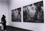
Reflection
The lectures in the second week were very informative for me as it was explaining in great detail all the information about x-height and the correct was that typefaces should be used in what contexts. from then,I have come to notice so many more typefaces around being able to identify some and the meaning behind them.
After learning this, I noticed in a clip that I saw in another class that particular typefaces were used to convey very important meaning and how much impact that they can have themselves. the first activity was very exciting being able to physically work on a project and create something that we would then use later on.
The type choice was largely at random for this piece as I was yet unsure of what was to be intended or any of the rules of type that I am now aware of.
We also learnt about various techniques regarding HUE manipulation to be able to make a unique piece that we would also use later on in the project
However, the most interesting and informative information we learnt during this time was the design of our monogram and how these particular typefaces can be used in any ways to express how we view ourselves and how we want to be viewed by other people
0 notes
Text
Typeface Research
Gills sans:
The font Gill Sans is a sans-serif font typeface that was created in 1926 by designer Eric Gills and was later released by the British branch of Monotype form 1928 onward. Eric Gill’s abstracted the idea of his teachers, Edward Johnston’s, typeface which was used as the designed for the London Underground Railway in 1918. The letterform was originally only created as in an uppercase form where the lowercase form of the type was later added into the set onto the typeface in 1929, and the 1930’s developing more of the varying weights and variations, being now one of the most widely used typefaces
Monotype marketed the design as ‘classic simplicity and real beauty’, and was intended to be used as a display typeface that was going to be used for poster and advertisements, or clearly legible sizes such as book blurbs, timetables or price lists. This was before the idea that documents would be entirely set in sans-serif script type
Soon after the creation of the typeface, it became the main type for the company LNER which is a railway system which is the London and North-Eastern Railway, which soon was seen on every facet of the company’s identity. Most recently known is the development of the Gill Sans font in the digital era, to be used as the main system font on all Mac computers and Microsoft Office. In 1997, the BBC office changed the typeface of their brand mark to Gills Sans. The change in the design was commented by the designer of the BC brand mark, Martin Lambie-Nairn explained that, ‘by choosing a typeface that stood the test of time, we avoid the trap of going down a route that might look outdated in several years’ time’
2 variations of the font were developed in 1997 and 2015. In 997, Gill Sans Hellenic was designed to incorporate Greek characters which includes 23 fonts in 4 weights. In 2015, Gill Sans Nova was changed one again to incorporate such things as a new Ultra-light weight. In which the family of Gill Sans now included 43 fonts.
Lucida:
Lucida is the extended family of typefaces developed by Charles Bigelow and Kris Holmes in 1985. The design behind the type face is that it is intended to be used when there is a small typeface or it is to be presented on a low-resolution display. There are many variants of Lucida, including serif, sans-serif and scripts, most of which are released with Microsoft office. The original designers, together with TeX vendor Y&Y, extended the Lucida family to include the full set of mathematical symbols, making it one of the only few typefaces to include all of the TeX certified mathematical symbols
There are a few key features that are consistent over all iterations of the Lucida family type. The most prominent ones being that they have a very being x-height such that it is approximately 53% of the body size and widely spaced letters designed for legibility in large bodies of text. This x-height assists in perceptually increasing the size of the typeface, aiding legibility. Capital letters are here designed to be shorter and narrower to assist in al Caps acronyms blending in.
Being 16 different types of type, there are very minor changes between all of them. Just to explain Lucida console, Console has smaller line spacing. In 2014, bold and italics in normal and narrow widths were released. It has also been used as the primary default font for Notepad from Windows until Windows 8.
https://en.wikipedia.org/wiki/Gill_Sans
http://typedia.com/explore/typeface/gill-sans/
https://en.wikipedia.org/wiki/Lucida
https://www.prepressure.com/fonts/interesting/lucida
http://bigelowandholmes.typepad.com/bigelow-holmes/2014/10/how-and-why-we-designed-lucida.html
0 notes
Text
Reflection
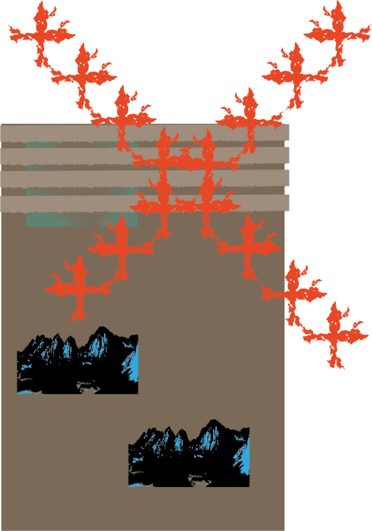

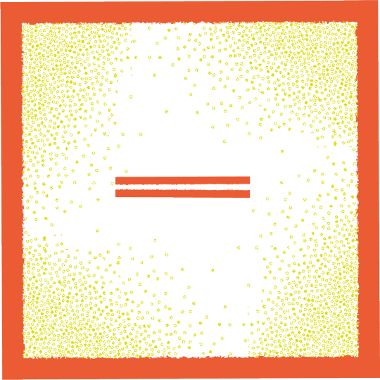


This is the final product of the artwork, the main idea being the ability or inability to travel to the horizon, into the distance but there to always be another horizon, something else there always waiting for you at the end
0 notes


Photo
MEDA102 Assignment 2
//size of the window size (1000, 1000); //background color background(200); //noFill(); //noLoop();
//stroke color stroke(0); //side specifications for the outer square //rect attempted on outside circle, was occuring errors with size even with width and height parameters line (0 + 200, 0 + 200, width - 200, 0 + 200); line (0 + 200, 0 + 200, 0 + 200, height - 200); line (width - 200, 0 + 200, width - 200, height - 200); line (width - 200, height - 200, 0 + 200, height - 200);
//cross section lines
line (0 + 350, 0 + 350, width - 350, height - 350); line (width - 350, 0 + 350, 0 + 350, height - 350);
//
line (width/2, 0 + 200, width/2, height - 200); line (0 + 200, height/2, width - 200, height/2);
// Vertical divisoin lines line (0 + 350, 0 + 200, 0 + 350, height - 200); line (width - 350, 0 + 200, width - 350, height - 200);
//Horizontal division lines line (0 + 200, 0 + 350, width - 200, 0 + 350); line (0 + 200, height - 350, width - 200, height - 350);
//outer angled lines line (0 + 200, 0 + 350, 0 + 350, 0 + 200); line (width - 350, 0 + 200, width - 200, 0 + 350); line (0 + 200, height - 350, 0 + 350, height - 200); line (width - 350, height - 200, width - 200, height - 350);
// 1st rotaional square
line (0 + 350, 0 + 200, width - 200, 0 + 350); line (width - 200, 0 + 350, width - 350, height - 200); line (width - 350, height - 200, 0 + 200, height - 350); line (0 + 200, height - 350, 0 + 350, 0 + 200);
//2nd rotational square using PushMatrix
pushMatrix(); translate(600, -200); rotate(radians(53)); fill(0); line (0 + 350, 0 + 200, width - 200, 0 + 350); line (width - 200, 0 + 350, width - 350, height - 200); line (width - 350, height - 200, 0 + 200, height - 350); line (0 + 200, height - 350, 0 + 350, 0 + 200); popMatrix();
//location of finalised angle lines line (0 + 200, 0 + 350, width - 350, height - 200); line (0 + 350, 0 + 200, width - 200, height - 350); line (width - 350, 0 + 200, 0 + 200, height - 350); line (width - 200, 0 + 350, 0 + 350, height - 200);
// there were many issues with the creation of the artwork that I had to adjust it to use just basic line descritors
Description: I used a part of the artwork based on what i had created on in the first Assignment. i had so many problem with being able to recreate it as i have many attempts of trying to create arrays and function that i was unable to create a working piece of code.
i originally wanted to create something that looked simple at first but was more in depth when you looked into it. due to the problems i faced along the way of making this therefore unable to make it as complicated underneath as i would have liked. i have a second piece of art that i’d like to use as a substitute, from a working piece of code i have. i shall upload that as see how this artistic representation of being able to use 2 dimensional arrays and function to create a randomized artwork
// Declare and Create array int[] bunchANumbers ; // declaration
void setup () { // Size of window size (2000, 2000); //noFill(); noLoop();
bunchANumbers = new int[width]; // initialisation // Populating Array for (int p = 0; p < width; p = p + 1) { bunchANumbers[p] = (int)random(width); // population } }
void draw() { for (int x = 0 ; x < width ; x = x + 20) { //specfying y as height and deincrementing 20 for (int y = height ; y > 0 ; y = y - 20) { if ( bunchANumbers[x] < width/2) { //creating rotation for rect pushMatrix(); translate(x, y); rotate(radians(random(360))); //random stroke fill fill(random(255), random(255), random(255)); rect(0, 0, 0 + random(0, width/10), 0 + random(0, height/10)); popMatrix(); } else { if ((x > random(width)) && (x < random(width)) ) { //creating line if unable to create rectangle line(random(width), random(height), random(width), random(height)); stroke(random(255)); } } } } }
this is the code line for the second artwork
0 notes
Text
Analysis
The form of the shape changed drastically over the course over several people drawing it, I saw many changes and differences between them and i could determine what each person had messed up in each drawing. what i also found out by talking to the drawer after each one was that they had each determined various steps in the instruction process differently. this instruction set was rather detailed so if they had changed a small detail earlier on, it changed the entire outcome for the final drawing.
The end design would of changed drastically had here been any alteration in what instrument and materials had been used to execute the instructions. For example, it did not specify until the end that the pencil needed to be erased and if the executor had used anything that could not be erased, that would have ruined he entire execution of he jnstruction process.
The instruction could have been changed drastically which would have resulted in an entirely different drawing. However, this was most likely, because of how detailed the instruction were and this didn't alow the executor to determine the instruction for themselves
2 of the deign seemed to get the general idea behind what I was trying to interpret but none of them was 100% correct to what I was doing
0 notes
Text
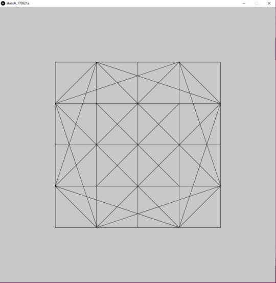
Instructions
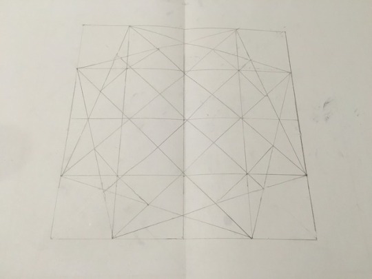
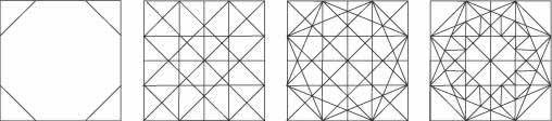
With Pencil Create a large even square in the center of the page (and use a ruler for all lines)
Separate the square into a 4x4 grid with the inside area being half the size of the other areas
Draw a straight line from each corner of the original square & diagonal lines across each of the corner areas
From the bottom left & top right of the top leftmost small square, draw diagonal lines to the respective corners in the bottom right small square
Repeat previous step from the top right square to the bottom right
Create an angled square from the top right of the top left square to the bottom right of the top right square. Follow the lines slightly angled down to the top left of the bottom left square and the bottom left of the bottom right square respectively
Connect the points to finish the square
Repeat previous 2 steps to create another angled square without touching the inner most or outer most points of the original square
Mark each point in which the large middle square touches other lines (Leave the corners absent)
From each mark, create a straight line and a angled line to the 2 closest intersections
Erase the 3 corner lines from the corner squares tot he inside square
0 notes
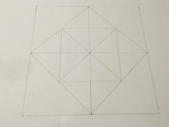
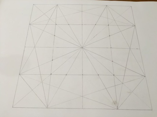
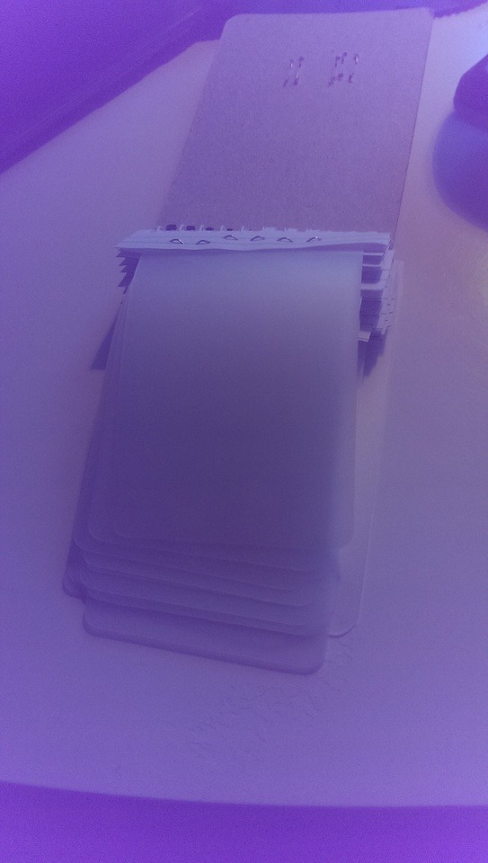
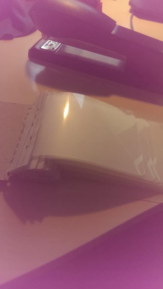
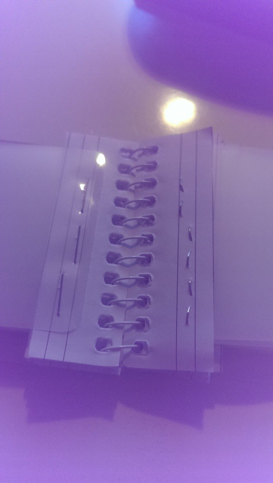
Photo
the right most design is the one that I ended up going with. the previous Photos helped me choose determine my instructions
0 notes
Text
Reflection
There are a few things that I learnt during this workshop, the most important I think to me was the lesson we had on the many different types of process we learnt about for the different types of materials in our second lesson. This opened my mind massively as it allowed me to see all the possibilities for each material and how they can be processed to create great objects or pieces of art based of these techniques. The most intriguing one was the water jet being able to cut straight through stone to be able to cut into raw stone. I am always most interested in the experimentation aspect of art and the way that the imagination is capable of making up elaborate devices that some people may not even be able to realize unless they had not come to understand how many different types of material processing techniques there are.
One techniques that I have briefly explain in an earlier segment had me very interested, and that was the way the Hercleum light was made without wires. The technique of dipping all the fiber material in conductive metal so that electricity was able to travel through it, was ingenious, in inexpensive but also in some form dangerous unless executed right
An important lesson that I have learnt which directly involves my art discipline is the origins and history of film, all the way from when paper film was first made, to the cultural relevance the use of film in our everyday world. I shall be able to adapt this to my art practices in my Digital Media degree as I should be able to use this information to be able to recount useful information which I can use for the rest of my degree and most likely when I have finished.
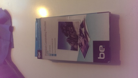
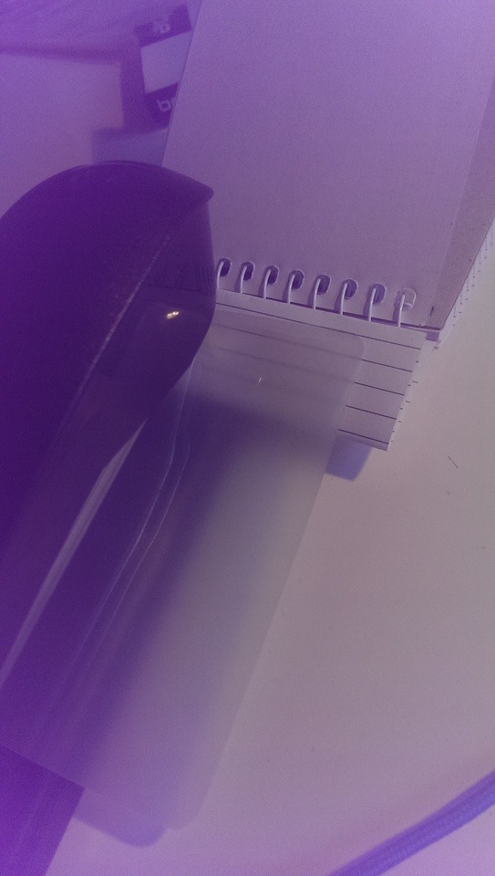
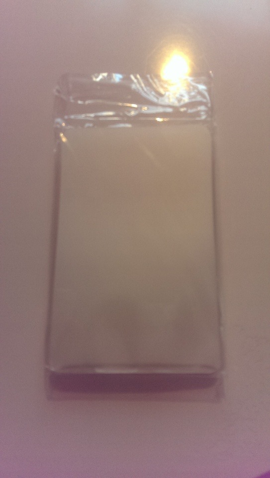
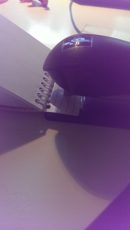
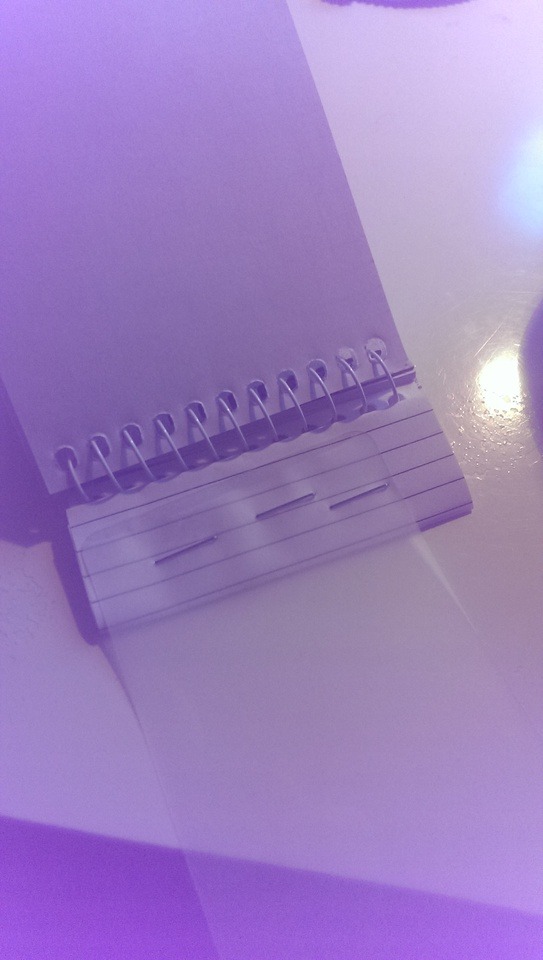
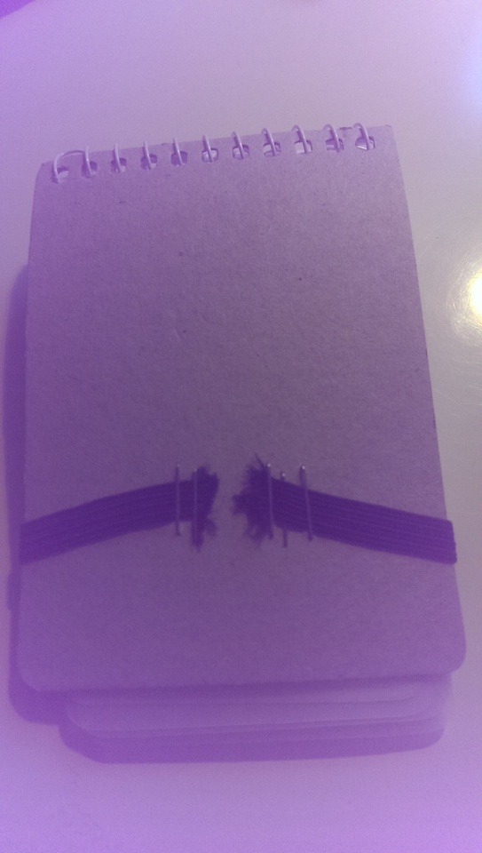
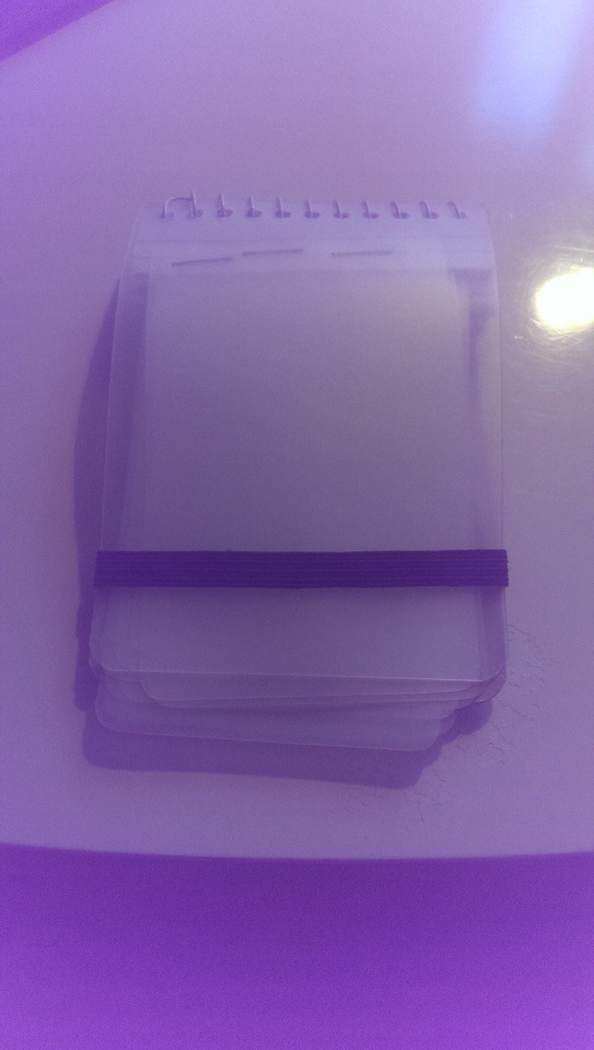
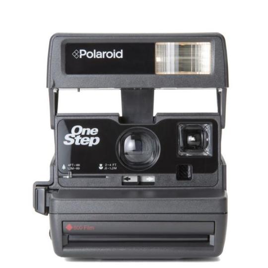
Another important lesson is that I found out that there are many makeshift objects you can create at home with just the materials you have around and how you can repurpose them to create practical objects. This is exactly the method that I have used in the creation of my work as I have mostly used what most people would have around their house already to create a rather simple but practical object. In case the pictures do not tell enough, my goal was to create an object that was practical to one of my friends. I wanted to create an object that they could use and what that is, is that I have created a 20-page pocket sized photo album for polaroid photos.
0 notes


Text
Photographic Film
The object that I chose to pick characteristics from and the recreate via that characteristic was photographic film.
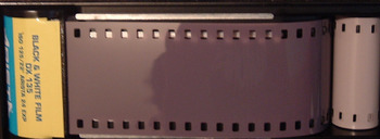
Origins:
Photographic film was first sold and originated in 1885, from George Eastman who is the co-founder of Kodak which was founded in September 8, 1888. However, unlike current film, the first form of film was made as a coating on a paper base which then the image bearing layer was stripped from the paper and attached to a sheet of hardened gelatin. The first transparent film, most commonly used was originally made in 1889.
Early Photographic plates and films were only sensitive to blue, violet and ultraviolet light. As a result, the view of the film would appear as if it was viewed through a piece of deep blue glass. In 1894, it was discovered that the spectral sensitivity could be extended to green and yellow colors by adding certain types of dyes. Although it was used for various film and movies, color film was first commercially and practically used in 1907, however it was still not sensitive enough or inexpensive enough to be used for hand held devices.
Cultural Relevance
The cultural relevance of film had changed over the years in which, of course in which also the important role of leisure on the everyday lives of ordinary people, because not only does film provide evidence, records and entertainment for people, it is also as key role in the modern world. Film is one of the big forms of media in the current world as the film industry is very large and contributes a large amount of entertainment to all people whether it be online videos, feature films, home videos, all types of cameras and film recorders which originated from basic paper and plastic film.
Current use:
Currently, basic plastic film is rarely used in everyday life as there are far more advanced forms of photo and video capture. However, that is not to say that it is no longer used. There are rare occasions in which a more advanced form, but still film, is used in disposable photo cameras. Even photo devices such as Polaroid cameras, which were popular in the when they were first invented around 1924 and the years to come, are still in use to this day.
Film as social and cultural history, History Matters, Viewed 7 August 2017, <http://historymatters.gmu.edu/mse/film/socialhist.html>
History of film, Wikipedia, viewed 8 August 2017, <https://en.wikipedia.org/wiki/Photographic_film#History_of_film>
0 notes
Text
Bertjan Pot
Bertjan Pot is a Dutch designer which primarily works within the boundaries of other Dutch companies so that he can collaborate with and go to the production factory to design his art pieces. Each of his artworks initially starts with extensive research on a material which he then uses as a starting point for each of his products. The outcome for most of his products is usually an interesting product which uses unique techniques, structures, patterns and colors to create interesting pieces of art. These artworks, which usually start out as experiments, are made by a certain curiosity for how things would function of how things would work and from each of these experiments he tries to explore all the possibilities and push the boundaries of each of the materials. (Studio Bertjan Pot). Therefore, instead of using mundane objects, Bertjan Pot uses mundane materials and repurposes them to create interesting pieces of art.
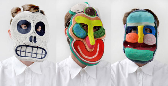
Bertjan Pots approach to design in odd as he is not one to sketch up designs for each of his artworks individually, but rather prefers to create 1:10 scale models to show he the project will come to be. Some of his most well-known pieces of art are the many various masks that he creates. Some of these he creates on a daily basis, even stating that “Sometimes I start the day with making a mask”. These masks are made from sewing together different types and different colors of yarn and rope to create wonderful and inspiring designs. He also creates the masks this way as a way to use more primitive means also being able to stay more closely aligned to how they are originally made in various tribes throughout the world.
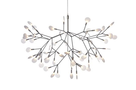
Even with the primitive ways of creating these masks, he is also able to create quite high-tech designs such as the ‘Hercleum’ light which he designed for Moooi, which is a Dutch furniture, Lighting and interior design studio. The Hercleum light is quite a fascinating piece as it is a wireless chandelier. The way that it is created is that, the branch like material was dipped in metal that would conduct electricity twice. Not only did it look better but is was also to be able to be produced for a reasonable price. The problem was originally was that the price of soldering each individual ‘leaf’ was going to be way too expensive
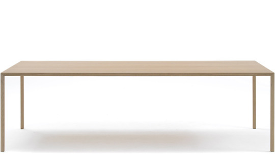
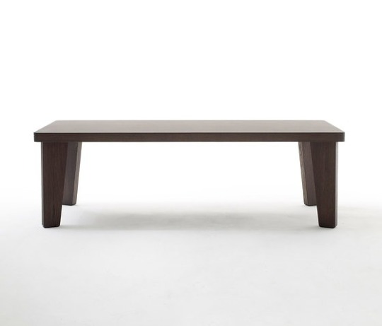
In an Interview, Bertjan Pot says that “Every material has its own ‘right’ appearance” (2014). In saying that, he means that the technique that he uses to create each of his pieces often comes before the appearance. This meaning that depending on the technique uses, that object could come pout as fat and blobby or thin and fragile. With this he created both the ‘Slim’ table and the ‘Fat’ table which was an experimentation to create the opposite effects where one was able to be several meters long and still only have thin fragile legs, whereas the fat and a small table was only small and had to have large legs to be able to cope with the table weight
The main thing I like about how Bertjan Pot approaches his art style is the way that he prefers the experiment with different materials and the techniques that can be used to make use of each material. I appreciate how he prefers to research each individual aspect of his materials and analyses how they may be beneficial to his design work
About, Studio Bertjan Pot, viewed 6 August 2017, <http://www.bertjanpot.nl/about/>
Don’t Believe the hype 2017, Moooi, viewed 5 August 2017, <https://www.moooi.com/designers/bertjan-pot>
Bertjan Pot interview – Dutch design can be fun 2014, Design.daily, viewed 6 August 2017 <https://www.designdaily.com.au/blog/2014/5/bertjan-pot-interview-dutch-design-can-be-fun>
0 notes
Video
tumblr
I spent most of the time is was editing experimenting with different effects to find how I could alter various nature clips. I decided on using opacity effects and black and white (greyscale) video effects. i took a lot of shots in the one place that i could alter to best suit a particular mood that i was attempting to create. The music I have received from royalty free music sites, which is referenced below. I altered between the two different types of black/white and colour to create a difference between a dissociation between different moods
Music: www.bensound.com
0 notes
Photo
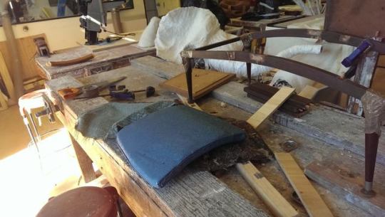
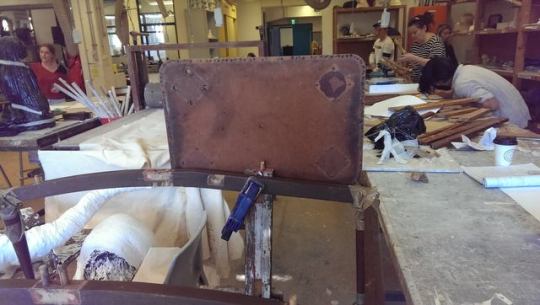
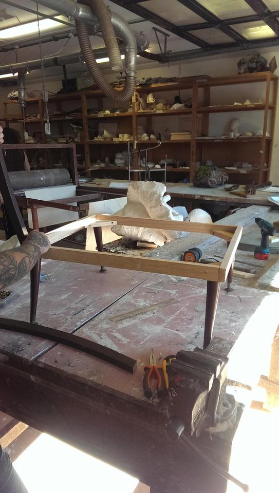
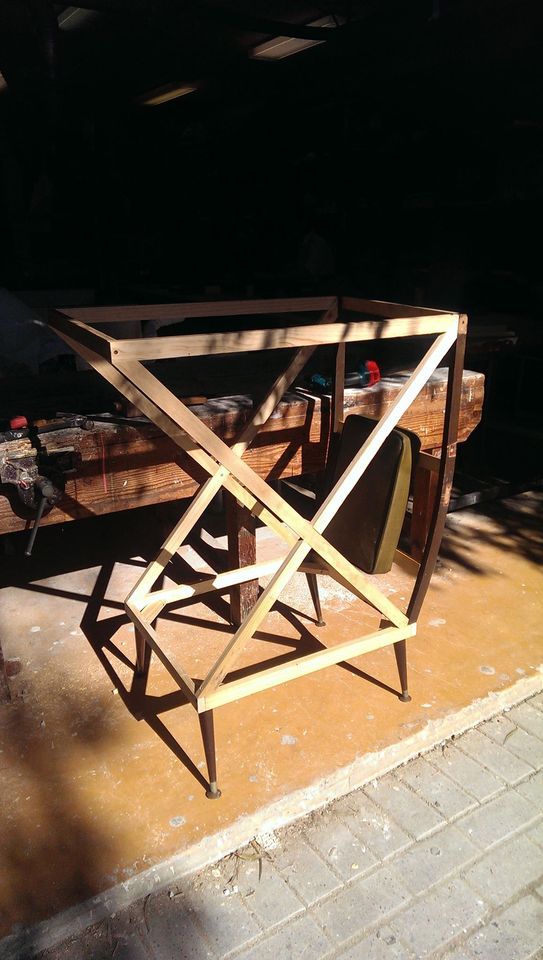
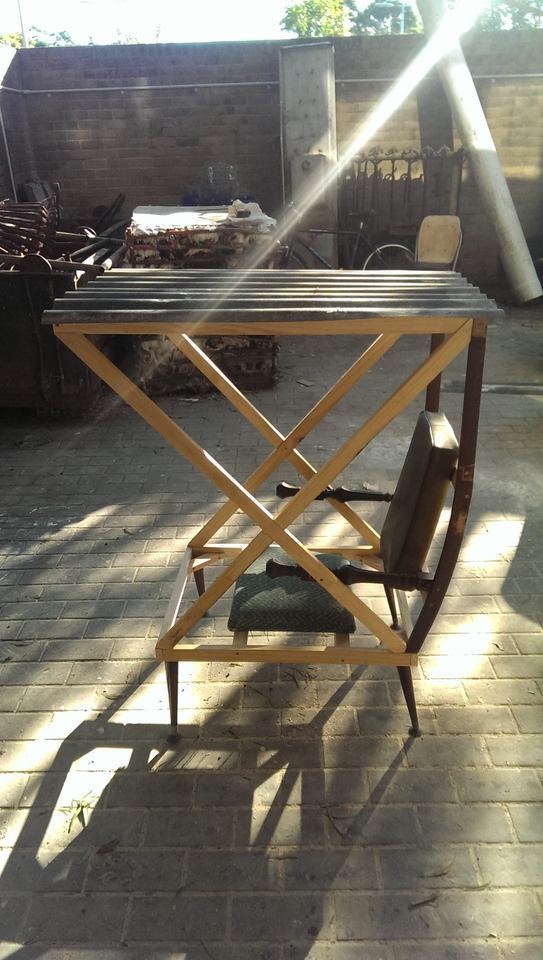

Chair Progress Pictures
1. Original Design With Materials
2. Original Design with Backrest
3. First Day Work, Base of Final Chair
4. Second Day Work, Chair Structure
5. Finished Chair Side
6. Finished Chair Front
0 notes