
Я иногда рисую, отвечаю на ваши письма...но это не точно!
Don't wanna be here? Send us removal request.
Statistics
We looked inside some of the posts by zero-sonic-exe-blog and here's what we found interesting.
Average Info
Notes Per Post
491K
Likes Per Post
269K
Reblog Per Post
221K
Reply Per Post
566
Time Between Posts
8 days
Number of Posts By Type
Photo
13
Video
3
Text
1
Last Seen Tumblr Blogs


Fun Fact
The Tumblr app for Google Glass was released on May 16, 2013.


Video
tumblr
Protect what you love
Hugely inspired by Rhythm Tengoku, I love this game a lot!
18K notes
·
View notes


Photo

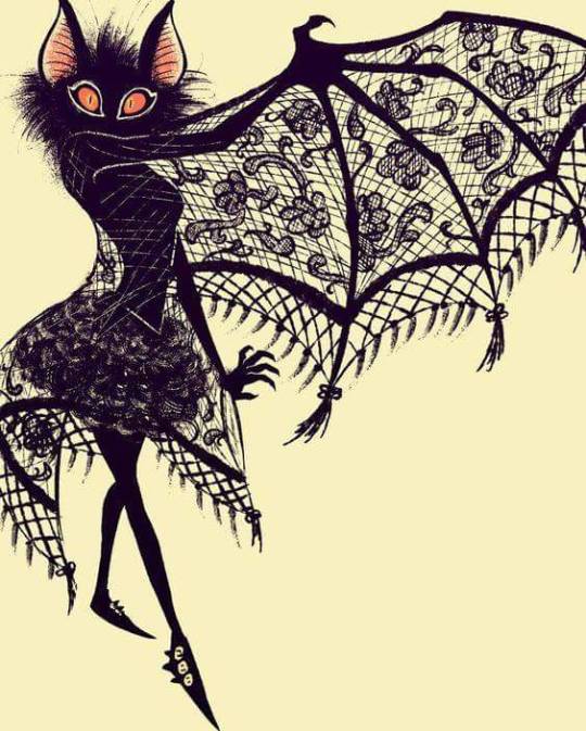
я не старался, я просто херней страдаю
0 notes
Photo


My edits
Here’s some generations icons, they are probably a bit low quality but enjoy these anyway :)
176 notes
·
View notes
Photo


so my roommate & I have been playing through every crappy sonic game for gamecube and recently we decided to challenge ourselves to draw gijinkas of the main sonic adventure 2 battle cast… shadow looks like ryuko matoi oops lol
(as someone who is eh at people this is the only circumstance in which I would human-ify perfectly good furries)
2K notes
·
View notes
Photo

I created a color palette challenge. Feel free to use it!
Have fun drawing :)
19K notes
·
View notes
Text
HIIRAREFS: Basic and Intermidiate guide to colouring in
What better day to end the year then with a basic guide to colouring- This is for beginners or intermediate artists. Colouring is a big part to an art piece, whether you decide to use colours or not, that’s up to you, but for the most part, having some knowledge on appliance of colour will really help you out!
____________________________________________
ARTISTS WITH AN INSPIRING KNOWLEDGE OF COLOUR APPLICATION! Please take the time to have a look at other artists work so that you ca research and get inspired!
Gullacass: Uses brights, dulls and pastels to create brilliant guro, pop and macabre pieces| DA + TUMBLR
TinyCalcium: Old friend of mine who explores brights and mustard colours and places them as a foundation for their work | TUMBLR
BeastPop: Talented with opposing and Triwheel colours. Outstanding cell-shading, and knows how to flexibly bend colour form to their will in popart. | DA
H0stel: Fantastic composition of light direction and applies colour to bodies based on ambient occlusion. | TUMBLR
_____________________________________________
COLOUR SLANG: I use some strange slang to express colour types and shades as well as groups. Although they may not be canonically correct, I will use these terms to describe colour palates to the best of my ability! Analogous: Colours that are near or adjacent to each other on the colour wheel, EG: Red and Orange

Oppositional/complimentary: Colours that are opposed or opposite from each other on the colour wheel, EG: Cherry and Green

Triadic: Colours that form a triangle on the Colour wheel, EG: Cyan, Magenta and Yellow. These three colours when mixed together will make black.

Arrowtype/Quadcolour: Four colours, that generally form an arrow shape on the colour wheel.

Tetradic: Colours that form a rectangle or square in the colour wheel

Neons: The very brightest you can get a colour, be careful where you use them as they can look ugly together at the most. Try to use neons when you are adding bright glowing objects to your piece. Neons are great for highlights.

Brights: Slightly washed Neons. Appropriate if you have characters that are colourful.

Washed: Very washed brights with a hint of grey. These are also useful for colourful characters.

Pastels: Colour with white in them to make them seem light.

Baby Pastel: Pastel with even more white in them, good for subtle highlights.

Darks: Colour with black added to them. Used mostly for lineart.

Mustards: Colours with dark grey added to them

Earthen: Colours with brown added to them

Warm and Cool colours: Warm colours are colours that range fromMagenta to Yellow. Cool ones range from Lime to Fuchsia.

Straight tones: A greyscale palate. or a straight scale of one colour from black to it’s neon form.

Warm and cool tones: Warm tones are a greyscale mixed with warm colours and cool tones are greyscale mixed with cool colours.

Skintones: Warm washed or pastel colours generally used to colour in skin, but they don’t have to be warm at all! ( I will not show you a palate for this however)
______________________________________________
WHAT TO AVOID WHEN COLOURING: beginner artists, tend to go ahead and start by colouring their line art with neon and mustard colours. Neons are not necessarily good for base colours unless the character has a glow.

I often see lazy attempts to shade, often a beginner artist with use an airbrush and use black and white to shade and highlight their piece. This is not very effective, and I’m sorry to say… It’s kind of gross as well. Try to avoid being lazy. If you have a piece that has bold black lines, avoid using soft shading and airbrushing at this point of time.

Black and white isn’t always the best option when colouring in your piece, but it also depends on the style you are trying to convey. If you plan on only using straight tones to colour in a piece, black and white is good.

A GOOD BASIC WAY TO COLOUR For this basic tutorial I will show you a nice way to colour in a piece with bold lines. I will be using Minty’s Classic character as an example.

Begin with using brights that have been washed down a little and washed skin tones if your character is human based. Avoid using neons or mustards if you are able. If there is white on the character, such as the white on an eyeball or the teeth, consider using baby pastels. For Minty’s eyeballs I have used a baby pastel blue. I have chosen to use a darker and more washed version for her Irises.

With you foundation colours placed down, use a washed warm colour for the skin tone, such as a salmon. If the character’s hair or fur is warm coloured, use a pink or red orange to shade that as well. Use the cell shading technique. This may mean you will have to erase some of your shading so be sure to do this on another layer. For your baby pastels, you can use a regular pastel to shade it. For Minty’s eyes I have used pastel blue and lowered the opacity by a little.

For Highlights, I have chosen to use baby pastel yellow. I wanted the piece to be warm.

Applying a light airbrush over the top of the piece makes it feel a little softer. I have also applied the airbrush over the initial borders to create colour bleed, giving a very subtle reflective approach.

Colouring your line art layer, particularly if you have bold lines, can really make a piece look more interesting! I like to leave the overall outline black. You can gradient and bleed colour in your line art as well

Light tracing is a technique lots of artist’s use, where they run a sharp line of highlight next to line art to divide borders.

This looks a lot nicer than the black and white shading, doesn’t it!? __________________________________________
This is a very very simple guide to applying colour to your piece! If This helped, please reblog and share this guide around!
If you have any questions or feedback, don’t be afraid to send me a message!
135K notes
·
View notes


Video
tumblr
i’m putting this old thing here because YT muted the audio QmQ
Scourge Eternal Blackout “trailer”
i remember having fun when i made this flipnote story, so now it will be continued through comic format instead of animation.
957 notes
·
View notes
Video
tumblr
colin and i found this sonic underground scene over a year ago and ive thought about the noise sonic makes every single day since
224K notes
·
View notes
Photo

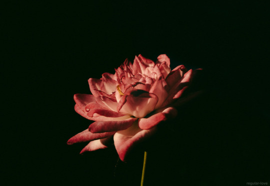
Пытаюсь,..все же я рисую не очень
1 note
·
View note
Photo

@emerlean i made a process gif for you!
233 notes
·
View notes
