
Life Hacker💻/ Helping Entrepreneurs Systematically Grow and Making A Difference 🚀
Don't wanna be here? Send us removal request.
Statistics
We looked inside some of the posts by zoliang and here's what we found interesting.
Average Info
Notes Per Post
3
Likes Per Post
3
Reblog Per Post
0
Reply Per Post
0
Time Between Posts
22 days
Number of Posts By Type
Text
17
Last Seen Tumblr Blogs


Fun Fact
China blocked Tumblr because of pornography and censorship problems in 2013.
Text
Pros and Cons of Flat Design
There’s not denying that flat design is the big thing in design these days.
It’s everywhere. And not just flat design, but now with almost flat design as well.
The arguments about the validity and application of the style are raging. The super-trendy design style elicits an opinion from almost everyone. So let’s take a step back and look at both sides of the issue and some pros and cons of flat design.
Pro: Flat Design is Trendy
Flat design is very trendy , but how long will it last?
If you are an on-trend designer this is the time to jump on the flat design ship if you have not already. Projects using the style – and using it well – are getting a ton of recognition from blogs, including this one, that can help you promote your design.
And it’s a lot of fun to design with the times.
Con: It’s Trendy
On the flip side of the trend equation is that you never know how long a trend will last.
Already we are beginning to see more of a move from purely flat design to almost flat design or flat design using long shadows .
If you reinvent your website or app frequently, trendy design may be for you. If you want a website that has a long shelf life, consider something a little less “in the moment.”
Pro: Simple Mobile Interface
One of the best applications for flat design really is in simple mobile design.
Some of the most impressive flat interfaces and designs are for mobile apps that function simply. Big bold buttons are east to tap on mobile devices, eliminating the need for zooming to find links.
Con: Usability Concerns
When it comes to more complex user experiences, flat design can sometimes, well, fall flat.
Not all users are comfortable with the style of interface and don’t always know what and were to click or tap.
An analysis by the Norman Nielsen Group found that flat design styles can hinder usability because users don’t always know what is clickable. Further, flat design projects tend to include less “information density” in an effort to keep it simple.
Pro: Bright Color Sets a Mood
Maybe it’s just me but flat design just seems happy. All the bright, bold color is engaging and sets a tone of engagement and positivity.
Flat UI Colors, a website designed to showcase and help designers create and use flat colors, is a great mood-booster.
Take a look at the hues, they are all warm and inviting. Even the darker colors are based in warmer tones.
Because flat design often includes a lot of color, that increases the positive associations. Who ever looked at a rainbow and called it sad?
Con: Color Palettes Can be Tough to Match
The more colors you use in a project, the tougher it can be to match them properly.
Creating a harmonious color palette is a challenge on its own, and can be even more challenging when you add four, five or more colors. Designers who create the most successful flat color palettes tend to stick to a uniform look in terms of saturation and brightness so color choices look intentional.
Pro: Focus on Great Typography
One of the great things about flat design is the true focus on beautiful type .
With no decoration, typography really has blossomed in flat design projects.From beautiful decorative lettering to simple sans serifs, great type is one of the key components to a great flat design outline.
And personally, drop shadows on type kind of ruin great lettering. The sharp contrast between interesting typefaces and bold color is impressive and refreshing.
Con: Weak Typography Becomes More Obvious
Just as flat design helps create a focus on good typography, it can really make bad typography stand out as well. (Just look at all the flack Apple received after previewing iOS 7 with an ultra-thin primary typeface, a design decision that has since been revised.)
Flat design is very unforgiving when it comes to boldness. Every choice has some degree of drama, making it hard to hide less-than-ideal typography.
If you are not comfortable pairing or selecting fonts, flat design may not be the best option for you.
Pro: Visuals are Sharp and Clean
The nature of flat design is sharp and clean. That’s one of the features that makes it beautiful.
The style uses a lot of high-contrast features including color, type and an overall boldness that make lines clean and easy to follow. Buttons and other user interface elements are often design using basic geometric shapes with shapes, although basic rounding may also be used for some corners or edges.
Con: It Can Look Too Simple
Depending on the use, flat design has been called “too simple” by some.
It can be difficult to convey a complicated visual message in flat design.
The other argument against flat design is the simplicity of user-interface tools.Proponents of skeuomorphic design say embellishments that add a sense of realism make tools easy to use. Frankly, it depends on the context.
Visual hierarchy can also be a concern with super-simple interface designs. What is most important? How do you emphasis it visually?
Pro: Flat Design Discourages Boredom Decoration
There’s nothing worse than looking at a design and knowing the designer was bored with the project.
The tell-tale signs include too many shadows, odd animations or just a smattering of random effects that don’t seem to have a place.
Because of the simple nature of flat design, constraints help keep designers “honest” if they want to complete a project in the true nature of the style.
Con: Some Decoration Can be Good
Not all decoration is bad.
Flat design truly limits the number of tricks you can use if you want the project to be truly flat.
Conclusion
No design outlines is perfect. Tailor your design for each project so that the look matches the feel and tone of the message.
Design is about more than how something looks. It is also about usability and function. Good design is easy to use.
0 notes
Text
Using Transparency In Web Design: Dos and Don'ts
Experimenting with transparencies is a great way to expand your design repertoire. Like many other effects, use this technique sparingly and test the design in multiple environments to ensure that it works and looks as you intended.
Creating a web design using transparency can be both beautiful and tricky.Transparency is the effect created when a color block, text or image is “made thinner” or desaturated so that the color is diluted and what is behind it shows through.
The effect can be quite stunning when executed properly – creating a great place for text or as a way to bring focus to a certain part of an image.
Designers must be careful though when using transparency. The effect can be tricky to do well, as readability is often a concern. Transparent boxes and text at the wrong levels can also be distracting and take away from the overall design.
Following is a set of dos and don’ts – with examples of sites executing transparency beautifully.
Do Use Transparency to Create Contrast
The No. 1 benefit to using transparency as a design technique is to create contrast. The effect allows designers to establish a focal point with a clock of color, big text over an image or as a varying color screen with dimension.
Transparency can also be used to help text pop off a background that may not showcase it as well.
It is especially important to consider contrast when working with transparencies. A transparency will only work with both the image (or background) and text are readable. When considering a transparency effect, ask yourself: Will this make the text/image easier for users to understand?
Don’t Cover Essential Parts of an Image
Transparencies should not cover parts of the background or image beneath it that is important to the message. Be aware of what is “lost” when determining placement of transparent frames.
Do Use Transparency in Varying Levels
There is no perfect level of transparency. For some projects an 80 percent transparency is ideal; for others 15 percent may be best. Play with varying levels of transparencies for each project.
Don’t Think Transparency Will Make Text Readable
Just because you are using a transparent box for text does not mean the text is automatically readable. Think about contrast – both in terms of the transparent box to the text and from the background image to the transparent frame.
When using a transparency for images, colored boxes or text, it is vitally important to consider the readability of the words. Remember, your message will not be communicated if design effects render text illegible.
Do Use Transparency in Small Spaces
Transparencies are not just for the main part of your site. This effect can work great in small spaces as well.
Think about using a transparency to show off navigational tools or as a hover effect for buttons and clickable elements. Just try to not go too crazy with multiple transparencies. Pick an element and transparency style and stick to it throughout the site design.
Don’t Place Transparency Over Images with Sharp Contrast
Because of readability concerns, it is best to avoid using transparencies over items that already contain elements containing sharply contrasting elements – think pockets of black and white or colors that are opposites on the color wheel.
Using a transparency over these types of elements, unless really saturated can have a negative impact on your design because it can be difficult to create the correct effect across all parts of the background. Consider a tint box instead.
Do Use Transparency as Art
Transparencies are not just secondary effects. Consider creating a dominant image for your site using this effect.
A large transparency can be a striking way to create contrast, emphasis and visual intrigue.
Don’t Use Transparency as a Decoration
Transparency is not an effect to add as an afterthought because you are bored with the design. Using this effect as a decoration is a surefire way to get into a design pickle.
The use of transparencies should be planned and thought out in advance.Transparency is not a simple effect such as bolding and can look sloppy and unprofessional if not done well.
Do Use Transparency in the Background
Transparent effects are not just for elements at the forefront of your design, this effect can be used on background images as well. Some of the best transparent elements are subtle.
Other transparencies may fall in between image layers. Tony Chester’s site for example uses a brilliant set of layering techniques with transparency to create a multi-dimensional design.
Don’t Use Too Many Transparent Effects Simultaneously
Limit use of different type of transparent effects to one per project.Transparencies should create distinction, contrast and visual interest. Using too much of a distinctive effect such as this one can be distracting for users.
Do Use Transparency with Still and/or Rotating Images
The use of transparencies is not limited to a single-page or still design. They can also work with varying images and backgrounds. Use transparencies in both ways.
Creating a transparency for rotating images can be one of the most tricky executions of the effect, but also one of the most impressive. Think about multiple background images careful. Choose images that have similar color and contrast schemes so that a single transparency will work while image backgrounds move behind it.
Pay careful attention to how the transparency fits over each image so that you maintain the integrity of each image, create a readable photo or other background and text and maintain visual consistency.
Conclusion
Experimenting with transparencies is a great way to expand your design repertoire. Like many other effects, use this technique sparingly and test the design in multiple environments to ensure that it works and looks as you intended.
The biggest challenges with transparency are creating it so that text is readable when interchanging images are used and ensuring that the transparent item does not cover the wrong parts of what is beneath it.
Experiment with different levels and uses of transparency – with images, with backgrounds, as a hover effect – to determine what works best for each project.
0 notes
Text
Flat Design and Color Trends
Flat Design Refresher
Flat design is a technique that uses simple effects – or lack thereof – to create a design scheme that does not include three-dimensional attributes. Effects such as drop shadows, bevels, embossing and gradients are not used in flat design projects.
Some call the look of flat design simple, although it can be quite complex. The look itself is simple, direct and user-friendly, making it an increasingly popular option for mobile user interfaces as well as trendy web design.
Defining a Color Palette
When it comes to color, flat design works with a variety of colors, but most commonly designers are choosing to go bold and bright.
The other thing that makes flat design different in terms of color? Designers are expanding palettes from just a shade or two to three, four or more colors. Most of these choices are bright, fully saturated hues that are sometimes countered with grays or blacks.
When it comes to color and flat design, many of the traditional rules about color pairing and matching are thrown out of the window in favor of palettes that span the rainbow with lots of pop.
What we are seeing more of with flat design and color though is the matching of tone and saturation. While designers may choose to use quite a few shades, they will often mirror each other in how deep the color is, whether it is a more primary or secondary color combination or from another part of the color wheel and whether colors contain more black or white mixes.
When it comes to color, flat design schemes often trend as super-saturated and bright, more retro or monotone. That’s not to say these are the only options, but as the trend has evolved they are the most popular.
Bright Colors
Bright color is often a characteristic associated with flat design because it creates a distinct feel. Bright colors typically work well against both light and dark backgrounds, creating contrast and engaging users. It is the most popular color trend out there in relation to flat design.
So where do you start?
FlatUIColors.com has a great starter list of some of the most popular hues in flat design. From bright blues and greens to yellows and oranges, these colors epitomize what we are seeing in terms of color and trend. The site is a great starting point because you can choose a color and download the color values at no charge. (Personally, I am a fan of the gray tones for something a little different.)
Designmodo has taken this bright design outline a step further in the recently released Flat UI Free kit, with these same bright hues as the outlines for a great and easy-to-use interface kit. The flat-designed, stylish icons work in a variety of projects and come with the color swatches included (a great option if you are new to mixing color).
One thing you don’t see often with bright flat design color palettes is the use of strictly primary colors – pure red, blue and yellow are often overlooked in favor of richer, mixed colors.
If you want to pair your own bright colors in a flat design scheme, opt for simplicity. Choose colors that have similar color tones and saturation. Plus we’ve given you a few color swatches with values to get started.
Bright swatches: Try these color combinations together or mixed in groups to create a great flat color palette. Each of these colors will pop against a white or black background for maximum impact.
Popular colors: Blues, greens and purples
Retro Colors
Retro color schemes are also a popular choice when working with flat design projects.
These less saturated, but hues build on the idea of bright colors but with the addition of white to make them more muted. The look is not that of a pastel but distinctly old-school. Retro color schemes often contain a lot of orange and yellow and sometimes red or blue.
It is more common to see primary and secondary colors used in retro color schemes when working with flat design, because of the toning down of the color.
Retro swatches: Retro colors work best when they stand along as a dominant color element. Pair them with images or muted colors for the best results.
Popular colors: Oranges, peach or plum tones and dark blues
Monotone Colors
Monotone color schemes paired with flat design techniques are gaining popularity at a rapid pace. These color palettes rely on a single color with black and white to create a bright, but distinct palette.
Most monotone color schemes use a base color and two or three tints for effect.The most popular color choice seems to be blue, but many designers are opting for a monotone color scheme based on black (grays as well) with a pop of color such as red for buttons or calls to action.
Another option is to create a monotone effect using slight variances in color. If you start with blue, for example, add tints of green to create a scheme of blue-green color.
Monotone color techniques are especially popular for mobile and app design.
Monotone swatches: Just like with other color palettes, monotone schemes also need to include contrast. Mix tints to that each different “color” is distinct from the parent color. Start with a full color (100 percent) and tints of 50 percent, 20 percent and 8 percent.
Popular colors: Blues, grays and greens
Conclusion
One thing that really makes the flat design trend work is that it is new and fun.Your projects should reflect that.
Create a color palette that matches the tone of your project, instructs users how to use your site and is visually interesting and fun. Think beyond some traditional color matching rules and step outside of your comfort level when creating a flat color scheme.
0 notes
Text
Six Tips from Apple on How to Create Better App Icons
This is a guest post by Martin LeBlanc, the founder of IconFinder , a search engine for icons. You can follow him on twitter here
Shortly after the WWDC event in San Francisco in June, a plethora of iOS7 resources became available on the web. Throughout the hundreds of sessions, speakers and keynotes, Apple unveiled its new iOS 7 to thousands of delegates lucky enough to be there.
We found a great presentation called “Best Practice Guide for Great iOS Design” by Apple UX Evangelist, Mike Stern.
The first part of his presentation is about app icons and what Apple believes makes a good icon. He goes through a list of six important things to consider when you are designing your app icon. We will do our best to summarise the presentation in this post.
Mike Stern begins by explaining why it’s important to pay attention to the UI and app icon: Your users aren’t going to judge your app based on how many technologies you are using, or how many APIs you integrated or how elegant your code. The way they are going to judge your app is what it enables them to do and how it makes them feel. Users expect intuitive, beautiful and sometimes even magical experiences when using apps.
Six tips on how to create better apps icons
There are a few common pitfalls and mistakes made over and over by developers and a lot of apps get rejected from the app store during the review process. Bad app icons are among the top 3 reasons why apps get rejected.
The app icon is usually the first place most people will encounter your app. You have to stand out from the crowd. We’re shown a screen shot of a search in the app store on ‘Camera’ apps where apps like Path stand out from the crowd of camera apps using the camera lens metaphor. Being beautiful and instantly recognizable are the two main qualities you want to keep in mind.
When users see your app icon in the App store they start to build assumptions about the user experience, how enjoyable i’s going to be to use, how intuitive it will be and how well will it serve your needs. If an icon looks great and is carefully crafted, it is reasonable to assume that the rest of the app is equally well crafted. But it goes beyond that – users start to build other kinds of assumptions about your app – how good your technology is, how secure you app is, is it stable, is it better than the competition? So, with that in mind, it’s really important to invest time and focus into your app icon.
Now, what makes an app icon great? Two things: beauty and, more importantly, instantly recognizability. So how do you accomplish that? There are six things that distinguish every great app icon from the rest:
Tip 1: Focus on a unique shape
These four icons are very different – some have many colors or feature gradients, but they all start with a simple shape. That allows them to be recognisable at a distance and at a glance.
Icons are seen at all different sizes. They are large in the App store, get small on the home screen and even smaller in the notification center and in groups. Make sure that the image that you choose for your icons can reduce really well and is clear at any size.
Tip 2: Carefully select colors
Choose a limited palette. One or maybe two colors are enough. There are many great icons with many colors, but it’s hard to pull off.
Tip 3: Avoid using a photo
Try to avoid photos in app icons. Sipp app is a great example of how an app icon can have the same elements as a photo, but it was illustrated with the shape of the letter ‘S’.
Tip 4: Avoid a lot of text
If you can get away with using no text then it’s probably the best thing to do.Try using just a symbol or your logo for the app icon. Great examples of this include Ness , Pocket , Vine , Snapguide and Pinterest .
Tip 5: Accurately portray materials
This is perhaps a little surprising given the changes in iOS7. Paper is one example (previous ADA winner in 2012). Square wallet also ‘just pops really well’ with it’s hologram and distinct shape. The icon for 1password brilliantly reflects the security of the data and gives you ease of mind through an emotional response. LifeKraze has an app icon that nails the skeuomorphic approach so well, that Mike even admits to ‘not knowing how they made it – it’s the highest level of artistry.’ A genuinely big compliment to SoftFacade coming from an Apple designer of 7 years.
Tip 6: Be creative
You’re trying to stand out from the crowd. Routesy , Hipstamatic , Evernote Food and Brewski Me all feature as darlings of this discipline. Often, the trick is to developed simple concepts – sometimes the most complicated of renderings are based on simple shape compositions.
Bonus tip: Test your app icon on different wallpapers
While your new icon might look great against the old raindrops, there’s no guarantee it looks great on all wallpapers. Make sure you test your app icon against all different kinds of wallpapers and try grouping your designs into folders to evaluate how it looks.
Cool case study: Turnplay
Famous icon design firm, Ramotion did a remendous work on an app calledTurnplay . It’s a cool little app that lets you play your music files as though they were on a vinyl record.
When it was time for Ramotion to design the app icon for Turnplay, they started the way they always do – with old school paper sketches. It’s awesome to see pencil designs in so much detail at the early stage and how they play with different ideas. You can see from the composition, that the team never lost sight of the design even as the renderings and detail became more and more complex.
Among the many attempts, they tried to use the T from the name in the icon, fingerprints on the vinyl and so forth. Eventually they got to this: a turntable with a play symbol in the middle – a simple icon based on basic shapes:
If you get the opportunity to watch the session in full it’s definitely worth an hour of your time. You can view the full length version – it requires and Apple Developer account though.
0 notes
Text
75 Essential Tools for iOS Developers

If you were to go to a master woodworker’s shop, you’d invariably find a plethora of tools that he or she uses to accomplish various tasks.
In software it is the same. You can measure a software developer by how they use their tools. Experienced software developers master their tools. It is important to learn your current tools deeply, and be aware of alternatives to fill in gaps where your current ones fall short.
With that in mind, I present to you a gigantic list of tools. Some of these I use daily, others I see potential in. If you have more tools you’d like to see here, just make sure to add a comment.
I tried to categorize these the best I can. Some of the entries are websites, some are back-end services, but most are apps that you install. Not all of the apps are free, so I’ll make a note with a $ to denote that an app costs money.
And without further ado, we’ll start from the beginning of any project, and that
Inspiration
pttrns - A great library of iOS screen designs categories by task. If you want to see how other apps handle activity feeds, for instance, this is a great place to go see a bunch of examples.
TappGala - Another great collection of nice app designs. It’s not categorized by task, but is just a list of great apps to get inspiration from.
Cocoa Controls - A great list of components (code) that you can use in your iOS apps. Sometimes you’ll find great pieces of code that can save you time, other times you can just learn how other developers accomplish certain features. Subscribe to their weekly newsletter; all signal, little noise.
IICNS - A collection of really great icons. Get inspired, but don’t copy.
Dribbble - Some of the best digital designers post up their work for all to see.A treasure-trove of designs to look at.
Capptivate - a gallery of inspirational designs. Some contain animations.
Design
Mocks ($) - An easy to use tool to create a quick mockup of an iOS app.Comes with a bunch of the default controls you can use to assemble something quickly.
Briefs ($) - A really useful app that allows you to create a mockup of an app and stitch them together so you can see the interaction. Deploy to a device so you can see what it feels like in your hand.
Acorn ($) - A strong competitor to Photoshop, only way cheaper. I find myself reaching for Photoshop less & less these days. Under active development.
Sketch ($) - A vector-based drawing tool that is increasingly useful these days, as screen sizes and pixel densities change. It is often helpful to design once and have the freedom to scale up & down as needed. Also sports a really powerful export system. For some example Sketch projects, check out Sketchmine . See my screencast on Sketch for a live demo.
iOS 7 PSD by Teehan+Lax - A super handy resource if you (or your designer) uses Photoshop. An iOS 6 version is also available.
Bjango’s Photoshop Actions - A definite time-saver if you use Photoshop to design iOS apps. One click access to resize canvases, scale by 200% (or 50%), set global lighting to 90º, and more. Their blog also has a bunch of useful Photoshop workflow tips.
xScope ($) - An indespensible swiss-army knife of tools such as guides, pixel loupes, screen rulers, and more. Want to know what color value that pixel is? Want to see how many pixels between a button and the window for a random Mac app? xScope has you covered. Also check out their companion iPhone app for mirroring designs you’re working on and seeing them in pixel-perfect glory on your iDevice.
Glyphish ($) - A fantastic collection of high quality icons for your iOS apps.Apple doesn’t provide a lot of built-in icons, so it’s handy to have a collection of icons covering all kinds of various concepts. I’m still looking for a use for that baby icon though. Glyphish comes in packs, and the latest pack has iOS 7 “thin line” icons which will be very handy when designing an iOS 7 app.
Fontastic Icons for iOS - An open source set of classes for utilizing icon fonts, such as Font Awesome in your iOS app. Quickly and easily have an icon in whatever pixel dimensions you require. Since fonts by nature can be scaled up and down with ease, this makes a really nice way to ship & use your icons without having to export multiple versions for the sizes you require.
PaintCode ($) - A vector-based drawing tool that exports your artwork as the equivalent Core Graphics source code. Awesome for learning how Core Graphics drawing works, but also incredibly handy if you want your drawing to be dynamic. See my screencast on PaintCode for a live demo.
Edge Insets ($) - A simple tool that helps you define your edge insets for repeatable images. Available on the Mac App Store.
LiveView - A remote screen viewer for iOS, making it easy to immediately see your designs on a device.
Skala Preview ($) - Another excellent tool for quickly showing your designs off on a real device. The guys at Bjango are awesome and this app is deserving of the price. Thanks, jn40!
Source Control
Git - If you’re not using source control stop what you’re doing and rectify that. I use git for everything I do and love it.
Kaleidoscope ($) - The best diff/merge tool around. Does 3-way merges and is beautiful to look at. I use it every day.
p4merge - A free, ugly alternative to Kaleidoscope. Powerful 3-way merge, but good luck finding the download link. It’s hidden deeper in their site every time I look for it.
Git X - A simple, powerful GUI tool for visualizing git timelines and quickly & easily staging commits. I usually live in the Terminal for git usage, but fall back to this app when I need to stage hunks of changes into logical commits.This is a fork of the original (abandoned) GitX, which I found on this list of forks .
Source Tree - A free, full-featured Git application. I don’t use this because I favor the command line, but if a GUI tool is your cup-o-tea, check this app out.
Dissecting Apps
pngcrush - This little utility can crush & uncrush PNG files, which is handy when you want to view images contained in app bundled distributed in the App Store. Just open iTunes, view the local Apps list, and right click on any icon to Show in Finder. Once there, open up the app and you’ll see a bunch of PNG files, but you can’t view them. Using pngcrush you can extract the full version so it can be opened with Preview.
appcrush.rb - This handy little ruby script will automate the above process for all images. Just point it to a .app file on your disk and it will extract all the images to a folder on your desktop. Handy for seeing how apps on your phone accomplish certain designs. Check out my screencast on dissecting apps for a live demo.
Charles ($, free limited demo) - I don’t know what’s going on with the ugly UI or icon, but Charles is an essential tool for any developer. Charles acts as a proxy to allow you to inspect your network traffic to & from the iPhone Simulator. You can also inspect traffic from your device by setting your phone’s proxy to your Mac running Charles. With self-signed SSL certificates, request & response breakpoints, and request/response viewers, Charles is really amazingly powerful. A must-have tool. Again, my screencast on dissecting apps covers this well.
Editors
I know what you’re thinking, don’t all iOS developers use Xcode? Well mostly, yes. But with my love/hate relationship with Xcode, I believe there is tremendous value in considering alternatives.
AppCode - A full-fledged IDE from Jetbrains (makers of the excellent ReSharper for .NET). Immensely powerful refactorings & features that help you write code faster. Quickly identify dead code, automatically insert #importstatements when you use related code, easily extract variables, methods, and classes. My only wish for this app is that it would instead be a plugin to Xcode.
Vim - Wait, vim? Really? Yes, there are folks who do all their Objective-C development in vim. I’m not one of these, but I am a fan of vim for Ruby development. As such, I’m a huge fan of…
Xvim - An Xcode plug-in that gives you vim keybindings. Works well, ‘nuff said.
OMColorSense - Another plugin for Xcode, this one gives you a small display of color when your cursor is on a line looking like: [UIColor redColor].Clicking on this little color tab opens a color picker that you can change, and any change in color you make is reflected in the code by changing the line to[UIColor colorWithRed:… green:… blue:… alpha:… ]. When someone is watching me write code with this enabled, they invariably ask me, “Whoa!What was that?!”
KSImageNamed - Another Xcode plug-in, this one allows you to autocompleted image filenames from your bundle when typing [UIImage imageNamed:…]. Great way to avoid the inevitable typo that causes this method to return nil and you to subsequently waste 10 minutes trying to figure out why your images aren’t displaying.
CocoaPods Xcode Plugin - This plug-in adds a menu item for interacting with CocoaPods. Useful if you don’t like dropping to the command line.
Alcatraz Package Manager - An awesome meta plug-in that allows you to easily install other Xcode color schemes and plug-ins with a single click.
Code Runner ($) - a light-weight code-aware text editor that knows how to compile & run code in most languages. Want to test out a quick snippet of Objective-C code and don’t want to create an entire Xcode project to do it?Code Runner to the rescue.
Documentation
Ahhh, documentation, everyone’s favorite topic. Even still, documentation is really important to have, so pay attention so we can make your life easier.
appledoc - Want to automatically generate documentation that look’s like Apple’s? Look no further. Automatically inter-links symbols defined in your project as well as extracting discussion to output using specially formatted code-comments. Generates official docsets and HTML web sites.
Dash ($) - A must-have API documentation viewer and code snippet manager. This tool is really handy as it allows you to download & search API docs for all kinds of languages & frameworks with lightning speed. The fastest way to get access to the docs. I integrate Dash with Alfred to make searches even faster.
Dependency Management
Yes, there’s only one tool listed here. I didn’t want to include actual 3rd party libraries, as that would be a different list entirely. When it comes to dependency management, there’s only one game in town:
CocoaPods - The essential tool for Objective-C projects. Allows you to quickly & easily integrate 3rd party libraries into your application. It does so by creating a second static library project and automatically links this with your projects. There are thousands of pods available, and it’s easy to add support for libraries that you don’t own (or perhaps are private). I use CocoaPods in every single project I work on.
Diagnostics & Debugging
At some point our app is in the field and we need to understand better what’s going on, maybe to fix bugs or to improve performance.
Cocoa Lumberjack - a much more powerful NSLog, Cocoa Lumberjack offers advanced logging behaviors such as logging to rotated files, logging to the network, and filtering based on log level (info, debug, warn, error). Covered by NSScreencast Episode 61
DCIntrospect - crazy powerful tool that you’d link inside your app when running in debug and on the simulator. Once you do, you can press the spacebar to get some really helpful view debugging support. See exact dimensions of elements on the screen, print out view hierarchies, even nudge views horizontally or vertically.
Pony Debugger - another tool you’d use by embedding a library in your debug builds, Pony Debugger actually utilizes Chrome’s dev tools for seeing network requests coming out of the device, as well as a rudimentary Core Data browser. It’s hard to describe, but check out my screencast on Pony Debugger for more info.
Runscope ($) - Runscope is a service running online that can capture requests, log details, and give you valuable data about your API. Simple to set up, as it’s an HTTP pass-through API, all you need to change is your host name.
SimPholders - Quick, easy access to your simulator folders. Browse by iOS version, then app name and jump right to the folder in Finder.
Spark Inspector - Debug your view hierarchy running on your app in debug mode, in 3D. This app really has to be seen to fully understand the value, but it can really help to understand what views are used to compose your app.Also contains a notification center inspector, so you can easily see whatNSNotifications are firing and who is observing them. Another app to look at that is similar is Reveal .
Images
ImageAlpha - A Mac app that allows you to convert a 24-bit PNG with transparency to an 8-bit PNG with an alpha channel. Typically 8-bit PNGs don’t have an alpha channel, so if your image can be represented in 8-bits (say, a solid color button) you can save a lot on storage by converting the 24-bit PNG to 8-bit using ImageAlpha.
ImageOptim - Another Mac app that compresses PNGs in order to save space.Most PNG files can shave off a few % of the size, and sometimes you’ll shrink the files by 30% or more. Smaller images mean smaller app sizes and less memory used to load them at runtime.
Prepo - A little Mac app that can quickly resize artwork in all the various sizes you might need. Just drag a large icon file (say, 1024x1024) onto Prepo and watch it spit out 512x512 iTunesArtwork, 114x114 [email protected], and all the other sizes & filenames you’d expect.
Slender ($) - an awesome app that analyzes your app and finds all sorts of problems, such as missing retina artwork, unused images, image that could benefit from compression and more. Shave kilobytes off of your iPhone app by shedding unused images with Slender.
Core Data
Mogenerator - still a super useful tool for generating smart subclasses of yourNSManagedObjects in your Core Data model. Some use Xcode for this, and resort to manually subclassing or creating categories in order to add logic to the models. Mogenerator runs as a quick pre-compile script to generate subclasses for you to use. It does this by creating an underscored version (_User) and a regular one for you to modify (User).
Base ($) - there will come a time when you need to inspect your actual Core Data sqlite database to see what’s going on. You can use the sqlite3command line tool, but Base offers a nice looking GUI browser. Just don’t vomit when you see the database schema that Core Data created for you.
Core Data Editor ($) - for more advanced data anlysis, exploration, and modification you can use Core Data Editor. This app understands Core Data, so you’re working directly with the entities instead of database rows.
Back-end Services
Ultimately your iOS app will likely want to talk to a server to share data, fetch new content, send push notifications or whatever. While this can be accomplished manually, you might want a more drop-in solution.
Helios - Helios is an open-source framework that provides essential backend services for iOS apps, from data synchronization and push notifications to in-app purchases and passbook integration. Built on top of many open source ruby gems, so you can pick & choose and build your own stack if you so desire. Take a look at the Nomad CLI set of handy related tools as well.
Windows Azure Mobile Services - you can think of this sort of like a programmable database in the cloud. Create tables, run JavaScript on read, insert, delete to add additional functionality. Really easy support for push notifications as well.
Urban Airship - I’ve been using Urban Airship to deliver push notifications for a while now. Really easy to integrate with, and small usage is free.
Parse - This is another data-in-the-cloud service, but offers an impressive API and online data browser. We use Parse for a really small app and works well for that.
Analytics
There are other players here, but none that I’ve seen have been compelling enough to switch from flurry. I’m open to hearing suggestions, so let’s hear about ‘em in the comments.
Flurry - I’ve used flurry for a long time to provide useful analytics on the usage of my apps. Need to know when to stop supporting iOS 5? Flurry gives you the numbers to have a realistic conversation.
Deployment
Deploymate ($) - Need to support iOS 4 still, but you’re compiling with the iOS 6 SDK? Deploymate will warn you when you’re using symbols that don’t exist in your deployment target.
Cupertino - Part of the Nomad CLI tools, Cupertino gives you command line access to managing devices & profiles in the Apple Provisioning Portal. For example, just type ios devices:list to see the current list of devices in your account. Useful for automating lots of processes.
Hockey App ($) - A great service for managing the distribution of your ad-hoc builds. Testers can get a link to install new betas over the air. Also provides robust crash reporting so you can easily respond to crashes in your apps.
TestFlight - A free service, similar to Hockey App. We’ve used TestFlight with great success for easily distributing apps and collecting feedback from our users. My only wish is that they’d start charging for the service. Also includes analytics and crash reporting, but we don’t use those features.
iOS Simulator Cropper - A really easy way to snap images of the simulator, with or without status bar, with or without device chrome, etc. Great for taking App Store or just general marketing screenshots.
Status Magic ($) - Take better app store screenshots. Nothing makes your app look less crappy than an App Store screenshot that includes a low battery, or low signal. Status Magic gives you complete customization over what’s present in your status bar, including removing elements, changing the time to “9:41 AM” like Apple tends to do, and more.
Crashlytics - Excellent crash reporting for your apps in the field.Automatically uploads dSYMs on release builds so your crashes are automatically symbolicated and organized for you to focus on the most critical ones.
Testing
I don’t think we as a community focus enough on testing. There are great tools available to us, and most are so easy to use we have no real excuse not to write at least some tests for our apps.
Kiwi - A great Rspec-style testing framework for iOS. Built on top of SenTestingKit, so you just type ⌘U to run your specs. Also includes a completely robust mocking & stubbing library as well as assertions.
Specta - A light-weight BDD framework very similar to Kiwi, but the expectation syntax has one major benefit over Kiwi: everything is implicitly boxed like this: expect(items.count).to.equal(5). There’s no need to wrap 5 in an NSNumber like Kiwi does. Use in conjunction with Expecta for a bunch of useful matchers.
The following are all various ways of performing end-to-end acceptance tests.These tests will actually interact with your interface, touching buttons, scrolling, etc. By nature these will be slower and more brittle, but testing in broad strokes is certainly helpful to see if all of the pieces fit together properly.
Demos / Marketing
Reflector ($) - Wirelessly mirror your iOS device on your Mac using Air Play.Great for doing demos of applications on your computer.
Placeit - A great collection of high res photos of people using devices, but the screens are templates that you can insert your own screenshots into. Very cool, and great for displaying your app in a nice way on your website.
App Sales Reporting
Of course you want to be able to see how much money you’re making on your app, right? There are a few solutions for this, but here are a couple that work well:
App Viz 2 ($) - a really useful Mac app for tracking sales of your apps. You run it locally and it logs in and downloads your sales reports.
App Annie - an online sales reporting tool. I’m less comfortable giving my credentials to iTunes to a 3rd party, but it does keep the reports up to date for you so you don’t have to run an app locally. In the comments, Josh Brown suggests creating a different user for analytics in iTunes Connect, which is a really good idea.
Grab Bag
These tools don’t have a defined category above, but deserve a mention nonetheless.
Quick Radar - Submitting bug reports to Apple is our only way of making their tools better. If you’re frustrated by the lack of a feature, you should be submitting a bug report. If you come across a bug, you should be submitting a bug report. One has no right to complain if they have not yet filed a radar :).With that in mind, submitting bug reports via bugreporter feels like a trip back to 1995. Quick Radar is an awesome little app that makes submitting bug reports super easy. Sports automatic posting to open radar so others can see it, in addition to tweeting, and posting to App.net. I use this app several times per week.
And there you have it. A gigantic wall of tools. Hopefully you learned about a few new ones you can add to your arsenal. If you enjoyed this post, please check out my iOS screencasts over at NSScreencast .
0 notes
Text
Creating an Effective Coming Soon Page

Coming soon pages are a rather young concept on the internet. Back in the day, when a new business was planning to launch a website, one day there was no website, and the next day the thing was live … just like that with no warning.
Nowadays, marketing works a little differently… Everything needs to build up a sufficient amount of buzz, virality, and other new-English words before it can see the daylight. And this is where coming soon pages come into play, if you will.
Now, there are a lot of great examples online, massive lists that showcase tens of beautiful coming soon pages, like these:
Due to all this abundance I’ve decided to take a closer look at the construction of a coming soon page and list some of its most important elements. Both from the designer’s and marketer’s point of view.
“The intangible element ”
Sorry for starting this list a little vague, but I consider this the most important element of them all. And what I mean by the intangible element is simply:
The Wow! Effect
In my opinion, a coming soon page has no business cluttering the web if it doesn’t have any wow! effect working for it.
If you can’t give your coming soon page design any wow! then you shouldn’t publish it at all. The whole point of a coming soon page is to get people interested in what’s coming, not to bore them to death.
Of course, the most difficult part here is that this wow! effect is very difficult to define. I have absolutely no idea how to write a tutorial on finding it. I guess that it all comes down to the overall feel of the design. It’s simply something that is or isn’t visible at the end of the day once the work has been done…
Say what’s coming

Image from Vic Bell
Since it is a coming soon page then there has to be something coming, right?And I’m not trying to be Captain Obvious here. I just want to point out that there are way too many sites on the internet that try to convince me to subscribe to a notification newsletter without even telling me what’s coming.
Rule #1: If you want people to anticipate what’s coming, you have to tell them what it is. Focus on creating curiosity. Share the interesting stuff, not the boring features.
Don’t give away too much information though. If you do, people will get the impression that they know everything, so they no longer have to anticipate anything. You must find the right balance between curiosity and information … something you have to figure out on your own.
This should also be reflected in the design. Boring designs have no place among coming soon pages (going back to the wow! effect).
The easiest way to make your design interesting-description-friendly as opposed to boring-description-friendly is to use rather big-sized fonts. If there’s only place for a limited lines of text then it forces the website owner to provide only the essential information.
Countdown timers

Image from Jarno Fabritius
Personally, I like the idea of a countdown timer. It’s simple, easy-to-grasp, there are tens of plugins and scripts available providing such functionality, and it’s perfectly understandable for the visitor.
However, it makes launching the final site a bit more difficult. If you have a timer then you absolutely have to launch the site when the timer displays zero.There can be no delay, or the whole point of a timer loses its meaning.
Email lists / newsletters

Image from Tom Brennessl
Newsletters and email lists are one of the best performing marketing methods online. It’s almost strange that email marketing works that well in every market imaginable.
The simple fact is that people still use email as their main mean of communication online. Even despite the amount of spam that’s circulating around.
In my opinion, placing an email newsletter signup form on a coming soon page is one of the best things you can do. Period.
If you’ve managed to arouse enough interest in the product/site then at least some percentage of your visitors should be interested in getting timely updates about it.
Also, you can then use the list to announce the launch the minute it happens.This will bring you an additional stream of visitors right from the get-go.
And finally, email newsletters are a lot easier to promote than blank coming soon pages.
Pre-launch bonuses and discounts

Image from Mike | Creative Mints
Depending on the thing that’s coming, offering some pre-launch bonuses or discounts can make sense. Especially if it’s a new tool, service, or traditional product.
You can offer a discount to everyone who subscribes to your newsletter. You’re killing two birds with one stone here. Apart from the fact that you get people to sign up to your newsletter, you’re also giving them a great reason to visit the site once it’s live.
Of course, you have to make sure that the site can still remain profitable in spite of the discounts. This is something you have to discuss with your client, and make sure that there’s place for discounts in their marketing strategy.
Use the main branding elements
This is basic, and I’m only mentioning it to make the message complete.
I know that no one will probably forget about using the site’s logo if it’s available. But you also have to remember about the color scheme and other small branding elements that will keep the coming soon page and the final website in congruence.
Keep SEO in mind
I know that a coming soon page is bound to have a short lifespan, but you should still have SEO in mind during the creation process.
Remember to use proper <h> tags, page titles, and descriptions. If there’s a promotional campaign prepared for the site (e.g. guest posting, or some link building campaigns) then making the coming soon page SEO-friendly will surely help the marketing efforts.
Besides, this isn’t even about going to the top of search engines with a coming soon page. This is more about not getting the domain itself flagged/banned before the final site even sees the daylight (something many people forget about).
How about a blog?
The main coming soon page is one thing. But a blog that goes along with it can make the whole site a lot more attractive.
Let’s face it, there are very few reasons why a visitor would want to come back to a coming soon page. There are, however, many reasons why they would want to come back to a blog.
Of course, this is a lot more work, but if you’re working on a coming soon page for a medium- or big company then you can point out such a possibility.
Have it easy, use a special theme
Nowadays, WordPress is among the most popular website management platforms available. What this results in is a big number of themes (free and paid ones) meant to achieve tens of different things. Not surprisingly, there’s also a fair share of coming soon themes.
Even if you don’t want to use any part of the design offered by a given theme, you can probably still use the framework. Such themes often provide quite a nice set of features that will make your work way easier.
Just give it a shot, there’s not much you can lose by testing such a theme quickly.
That’s it for my list of elements of a proper coming soon page. Feel free to comment, tell me what you think, and point out some other elements you find suitable for such a page.
2 notes
·
View notes
Text
Guidelines and Best Practices - The Elements Of The Mobile User Experience
Mobile users and mobile usage are growing. With more users doing more on mobile , the spotlight is on how to improve the individual elements that together create the mobile user experience.
The mobile user experience encompasses the user’s perceptions and feelings before, during and after their interaction with your mobile presence — be it through a browser or an app — using a mobile device that could lie anywhere on the continuum from low-end feature phone to high-definition tablet.
Creating mobile user experiences that delight users forces us to rethink a lot of what we have taken for granted so far with desktop design. It is complicated in part by mobile-specific considerations that go hand in hand with small screens, wide variations in device features, constraints in usage and connectivity, and the hard-to-identify-but-ever-changing mobile context.
Dissecting the mobile user experience into its key components gives us a conceptual framework for building and evaluating good mobile experiences, within the context of a user-centered approach to designing for mobile 1. These components shape the mobile user experience — including functionality, context, user input, content and marketing, among others.
The relevance of these elements will change depending on the type of device (feature phone versus smartphone versus tablet) and the presentation interface (app versus Web). This article briefly describes each of these elements and elaborates on each with selected guidelines.
Functionality
This has to do with tools and features that enable users to complete tasks and achieve their goals.
Guidelines
Prioritize and present core features from other channels that have especial relevance in a mobile environment. For an airline, this includes flight statuses and flight check-ins. For cosmetic chain Sephora, it includes supporting in-store shopping via easy access to product reviews on mobile devices.
Offer relevant mobile-only functionality (like barcode scanning and image recognition), and enhance functionality using the capabilities of mobile devices where possible to engage and delight users. Old Navy’s app serves up surprise games or savings when users snap the logo in a store.
Ensure that fundamental features and content are optimized for mobile. For example, make sure the store locator shows the nearest stores based on the device’s location, and make the phone numbers click-to-call.
Include features that are relevant to the business category. For retail websites and apps, this would include product search, order status and shopping cart.
Offer key capabilities across all channels. Users who sign in should see their personalized settings, irrespective of the device or channel being used. If certain functionality is not offered on mobile, then direct users to the appropriate channel, as TripIt does to set up a personal network.
Additional Reading
“Sharing App Bump 3.0 Slashes Most Features, Proves Less Really Can Be More 2,” Fast Company
Information Architecture
This has to do with arranging the functionality and content into a logical structure to help users find information and complete tasks. This includes navigation, search and labeling.
Guidelines
Present links to the main features and content on the landing page, prioritized according to the user’s needs. Mobile Design Pattern Gallery 3 has examples of primary and secondary navigation patterns for mobile, many of which are vertical instead of horizontal as on desktop websites.
Enable mobile users to navigate to the most important content and functionality in as few taps or key presses as possible. Navigation optimized for small screens is usually broad and shallow instead of deep. While three clicks (or taps) is not the magic number 4, users need to be able to recognize that each tap is helping them complete their task. Every additional level also means more taps, more waiting for a page to load and more bandwidth consumed.
Address the navigation needs of both touchscreen and non-touchscreen users. When designing for touch, make sure the tap size of the navigation item is at least 30 pixels wide or tall. Provide keypad shortcuts for feature phones, so that users can enter, say, a number (0 to 9) to quickly access a link:
Cater to feature phone users, as CNN does with access keys (left), not as Delta does by making the first action to be nine key presses downs (middle and right).
Provide navigational cues to let users know where they are, how to get back and how to jump back to the start. Mobile breadcrumbs are often implemented by replacing the “Back” button with a label showing users the section or category that they came from. For mobile websites, use standard conventions, such as a home icon that links back to the start screen, especially when navigation is not repeated on every screen.
Use concise, clear, consistent and descriptive labels for navigation items and links. While always a good practice, it becomes even more important on tiny mobile devices.
Additional Reading
“Chapter 1: Navigation ,” Mobile Design Pattern Gallery, Theresa Neil
Content
Otherwise known as “the stuff on your website” (as Lou Rosenfeld and Peter Morville refer to it in Information Architecture for the World Wide Web), content is the various types of material in different formats, such as text, images and video, that provide information to the user.
Guidelines
Present an appropriate and balanced mix of content to users (product information, social content, instructional and support content, marketing content).
Use multimedia when it supports the user’s tasks in a mobile context, adds value to the content or supports the goals of the website. Most of the time, multimedia content is best provided when the user is looking for distraction or entertainment (such as news or funny clips) or when it has instructional value (for example, how to use an app or new feature).
Always give the user control over multimedia content by not auto-starting video or sound, by allowing the user to skip or stop multimedia content and by being mindful of the bandwidth it takes up.
Ensure that content is mobile appropriate. Just as we had chunking guidelines when going from print to Web, copy should be written for shorter attention spans on mobile devices. Optimize images and media for the device; this means scaling down for smaller devices and making sure images are sharp enough for the new iPad 5.
Ensure that primary content is presented in a format supported on the target device. Even now, websites such as Volkswagen’s ask iOS users to download Flash.
Additional Reading
Design
This has to do with the visual presentation and interactive experience of mobile, including graphic design, branding and layout.
Guidelines
Remember the sayings “Mobilize, don’t miniaturize” (popularized by Barbara Ballard) and “Don’t shrink, rethink” (of Nokia). Both make the point that mobile design should not just rehash the desktop design.
Design for glanceability and quick scanning. Glanceability refers to how quickly and easily the visual design conveys information.
Maintain visual consistency with other touchpoints and experiences (mobile, app, Web, print and real world) through the use of color, typography and personality. Identifying Amazon in the stack below is easy even though the brand name is not visible.
Guide users from the initial and most prominent element of the design to other elements to help them complete their tasks. This is known as visual flow. A good design brings together visual elements as well as information architecture, content and functionality to convey the brand’s identity and guide the user.
Consider both portrait and landscape orientations in the design process.Devices increasingly support multiple orientations and automatically adjust to match their physical orientation. Maintain the user’s location on the page when they change orientation. Indicate additional or different functionality in the new orientation if applicable, as shown by ING:
Additional Reading
“Designing Glanceable Peripheral Displays ” (6 MB, PDF), Matthews, Forlizzi and Rohrbach, UC Berkeley
Universal Principles of Design, Revised and Updated 6: 125 Ways to Enhance Usability, Influence Perception, Increase Appeal, Make Better Design Decisions, and Teach through Design, William Lidwell, Kritina Holden, Jill Butler
User Input
This has to do with the effort required to enter data, which should be minimized on mobile devices and not require the use of both hands.
Guidelines
Limit input to essential fields. Or, as Luke Wroblewski says in his bookMobile First, “When it comes to mobile forms, be brutally efficient and trim, trim, trim.” Limit registration forms to the minimum fields required, and use shorter alternatives where possible, such as a ZIP code instead of city and state. My favorite offender of this guideline is Volkswagen’s form to schedule a test drive; the mobile form has more required fields than the desktop version (the extra fields are highlighted below):
Display default values wherever possible. This could be the last item selected by the user (such as an airport or train station) or the most frequently selected item (such as today’s date when checking a flight’s status):
Offer alternate input mechanisms based on the device’s capabilities where possible. Apps take advantage of quite a few input mechanisms built into devices, including motion, camera, gyroscope and voice, but mobile websites are just starting to use some of these features, particularly geolocation.
Use the appropriate input mechanism and display the appropriate touch keyboard to save users from having to navigate their keyboard screens to enter data. Keep in mind that inputting data is more tedious on feature phones that have only a numeric keypad. For non-sensitive applications, allow users to stay signed in on their mobile device; and save information such as email address and user name because mobile phones tend to be personal devices, unlike tablets, which tend to be shared between multiple people.
Consider offering auto-completion, spellcheck suggestions and prediction technology to reduce the effort required to input data and to reduce errors — with the ability to revert as needed. Disable features such as CAPTCHA where not appropriate.
Additional Reading
“Forms on Mobile Devices: Modern Solutions ,” Luke Wroblewski
Mobile Context
A mobile device can be used at anytime, anywhere. The mobile context is about the environment and circumstances of usage — anything that affects the interaction between the user and the interface, which is especially important for mobile because the context can change constantly and rapidly. While we often focus on distractions, multitasking, motion, low lighting conditions and poor connectivity, it also includes the other extreme — think using a tablet in a relaxed setting over a fast Wi-Fi connection.
“The Context of Mobile Interaction ,” Nadav Savio
Guidelines
Use device features and capabilities to anticipate and support the user’s context of use. The iCookbook app allows users to walk through a recipe using voice commands — a nice feature when your hands are covered in batter!
Accommodate for changes in context based on the time of day and when the user is using the app. The Navfree GPS app automatically switches from day to night mode, showing low-glare maps for safer nighttime driving.
Use location to identify where the user is and to display relevant nearby content and offers. A Google search for “movies” on a mobile device brings up movies playing nearby and that day’s showtimes, with links to buy tickets online if available.
Leverage information that the user has provided, and respect their preferences and settings. After the first leg of a multi-leg flight, TripIt showed me the flight and gate information for my next flight, as well as how much time I had to kill. United’s app did no such thing, even though it knew much more about me. It could have shown me how to get from my current plane to the connecting flight and highlighted the location of the United Club along the way, where I could comfortably spend my two-hour wait, since it knew I was a member.
Default to the user experience most appropriate for the device (i.e. a mobile experience for small screens, and perhaps a desktop-like experience for tablets), but give users the option to have enhanced features. A big discussion on how to present this to the user recently took place, with Jakob Nielsen recommending a separate mobile website 7 and Josh Clark arguing instead for a responsive design ; yet others believe that Nielsen and Clark are both wrong .
Additional Reading
“The Context of Mobile Interaction ” (0.2 MB, PDF), Nadav Savio and Jared Braiterman
“On Mobile Context ,” Jason Grigsby Don’t miss the links to resources on the mobile context near the end.
“When and Where Are People Using Mobile Devices? 8,” Luke Wroblewski
Usability
This is the overall measure of how well the information architecture, design, content and other elements work together to enable users to accomplish their goals.
Guidelines
Make it clear to the user what can be selected, tapped or swiped (this is known as affordance), especially on touchscreen devices. One of the big findings of Nielsen Norman Group’s usability studies of the iPad 9 was that users didn’t know what was touchable or tappable. Another issue was swipe ambiguity: when the same swipe gesture means different things in different areas of a screen. Ensure that touchability is clear and that items such as links, icons and buttons are visibly tappable.
For touchscreen devices, ensure that touch targets are appropriately sized and well spaced to avoid selection errors. Also, place touch targets in the appropriate screen zones; for example, put destructive actions such as those for deletion in the “Reach” zone, as shown by Luke Wroblewski in his bookMobile First:
Follow conventions and patterns to reduce the learning curve for users and to make the mobile experience more intuitive.Dedicated apps should follow platform-specific standards and guidelines. A comprehensive collection of links to official UI and UX guidelines is available in the article “UI Guidelines for Mobile and Tablet Web App Design 10” on Breaking the Mobile Web.
Ensure usability in variable conditions, including for daylight glare and changed angle of viewing and orientation, by paying attention to design elements like contrast, color, typography and font size.
Do not rely on technology that is not universally supported by your audience’s devices, including Java, JavaScript, cookies, Flash, frames, pop-ups and auto-refreshing. When opening new windows or transitioning from an app to the browser, warn users to avoid overwriting already open tabs.
Additional Reading
Trustworthiness
This relates to the level of confidence, trust and comfort that users feel when using a mobile website or app. According to a 2011 study by Truste and Harris Interactive 14, privacy and security are the top two concerns among smartphone users:
Guidelines
Do not collect or use personal information (such as location and contact list) from mobile devices without the explicit permission of the user. The first few months of this year have seen numerous reports of apps secretly copying smartphone address books, with watchdogs up in arms 15 and users retaliating 16.
Make it easy for users to control how their personal information is shared in a mobile app by asking before collecting their location data and by allowing them to opt out of targeted advertising.
Clearly state your business practices (including for privacy, security and returns), and present them contextually (such as by displaying links to your privacy and security policies on the registration screen). The policies themselves should be accessible in a secondary section of the mobile user experience (such as the footer or a “More” tab). Reinforce credibility by displaying trusted badges, especially when users need to trust you with their personal or financial information.
Present policies appropriately on mobile devices by offering a concise summary and an option to email the entire policy. Privacy and security policies tend to be notoriously long and full of boring legalese that users often blindly click through to continue what they really want to do, so make it easy for users who are interested in the fine print.
Don’t break the user’s workflow when displaying legalese. Take them back to where they were 17 before being interrupted, instead of making them start all over.
Additional Reading
“Layered Policy Design 18“, TRUSTe Blog
Feedback
This has to do with the methods for attracting the user’s attention and displaying important information.
Guidelines
Minimize the number of alerts the app displays, and ensure that each alert offers critical information and useful choices. For a smile, look at Chris Crutchfield’s video on notification and alert overload .
Keep alerts brief and clear, explaining what caused the alert and what the user can do, along with clearly labeled buttons.
Notifications should be brief and informative, not interfere with anything the user is doing, and be easy to act on or dismiss.
Provide feedback and confirmation on screen without disrupting the user’s workflow.
If your app displays badges and status bar notifications, keep the badges updated and clear them only when the user has attended to the new information. Chase clears the notifications badge for its mobile app the moment the user visits the notification section, even before the user has seen which of their multiple accounts triggered the badge, forcing them to hunt through each account to see what triggered it.
Additional Reading
This relates to the options, products and services that are available to assist the user in using the website or app.
Guidelines
Make it easy for users to access help and support options. Users commonly look for help in the footer of a mobile website and in the toolbar or tab bar of an app.
Offer multiple ways to get support, including options relevant in a mobile context, such as self-serve FAQs, live support via click-to-call, and near-real-time Direct Message tweets. Two financial service companies that actively offer support via Twitter are American Express and Citibank.
Present a quick introduction and short tutorial on using the app when it first launches, with options for the user to skip and view later.
When introducing new or unique functionality (such as when check depositing via mobile apps was first introduced), offer contextual help and tips to guide users the first time, and as a refresher for infrequently used functionality.
Offer help videos when appropriate, but allow the user to start, pause, stop and control the volume as they wish, and keep in mind the multimedia guidelines mentioned in the “Content” section above.
Additional Reading
“Chapter 7: Invitations ” and “Chapter 9: Help,” Mobile Design Pattern Gallery: UI Patters for Mobile Applications, Theresa Neil Chapter 7 is available online at UX Booth.
“Top 6 Help Design Patterns for iPhone Apps ,” Catriona Cornett, inspireUX
Social
This relates to content and features that create a sense of social participation, that enable user interaction and that facilitate sharing on established social networks.
Guidelines
Create and maintain a presence on social networks (for example, a Facebook page) and local services (for example, a profile page on services such as Google Places, Bing Business Portal and Yahoo Local). These will be highlighted in search results and on location-based social networking services. In addition to your business’ name, include your physical address, phone number, URL and hours of operation.
Incorporate your social presence and activity into your website’s mobile experience by showing your recent activity and offering an easy way to follow or like you on these networks.
Integrate social networking features into your website’s mobile experience to make it easy for users to connect with their own social networks. This could be as simple as using APIs 20 to enable social sharing, bookmarking, tagging, liking and commenting.
Invite users to generate content featuring your brand, product or service from their mobile device, offering some incentive in return. For example, the burger chain Red Robin could invite the user to share a picture of their child reading a school book at one of its locations to get a free milkshake.
Provide mobile offers that can be shared and go viral. American Express currently offers savings and discounts to users who sync their profiles 21 on networks such as Facebook, Twitter and Foursquare to their credit card.
Apps that rely on social contributions from users should look at ways to seed content in a way that is useful and, eventually, self-sustaining. For example, the My TSA app has a user-contributed feature that shows the wait times at security checkpoints, but it often shows outdated information, even though airport staff post physical signs of wait times at some airports.
Additional Reading
“The Definitive Guide to Adding Social Features to Your Mobile Apps 22“, Verious
Marketing
This has to do with the methods by which a user finds a website or app and the factors that encourage repeated usage.
Guidelines
Ensure findability by optimizing for mobile search and discovery, such as by keeping URLs short. If you have a separate mobile website, follow URL naming conventions (m.site.com or mobile.site.com). In mobile search results, provide quick access to location-based content (e.g. directions from one’s current location) and device-formatted options (e.g. click to call).
Mobile-formatted information is optimized for UPS (left), but partially missing for FedEx (right).
“Quick response” (QR) codes should lead to a mobile-optimized landing page, instead of a traditional page that requires zooming or, worse still, to the website’s home page, from where the user has to hunt for information. As a side note, QR codes painted on buildings should be big and clear enough to be recognized and deciphered by mobile devices.
Email campaigns should include a link to view the message in a mobile-friendly format, which itself links to the relevant offer page formatted for mobile — unlike CVS/pharmacy, which takes users to its mobile home page.
Promote your app in other channels where possible (TV, print and in-store advertising), and offer incentives to download and use the app, usually in the form of discounts and savings. If your app has a price tag, attract users to buy it in an overcrowded market by offering a limited-time promotional price.Another option is to promote the app through the Free App A Day marketplace.
Prompt users to rate and review your app or to share it on social networks after they have used it, but give them the option to postpone or stop these prompts. This will not only generate word of mouth, but give you insight into what users like and don’t like about the app. “Taking Control of Your Reviews ” by smalltech discusses the strategy of encouraging happy customers to post reviews and unhappy customers to email you feedback.
Additional Reading
Conclusion
Mobile user experience is still a developing field, and opportunities for improvement continue to emerge. We’ve presented an overview of the key elements of the mobile user experience, along with some guidelines to get started in each. Focusing on these individual elements will help us create great overall mobile user experiences for our users.
0 notes
Text
Why 2013 Is the Year of Responsive Web Design
You may have noticed that Mashable got a new look recently . The design seems wider than usual, and when you shrink your browser, the content resizes to fit.
The aim here isn't merely prettiness or technical trickery, however: Media companies like ours are seeing a major shift in the consumption habits of their audiences. Those organizations that don't act may find themselves behind the curve. Here's why.
The Post-PC Era
2012 has been a very unusual year in the PC market. For the first time since 2001, PC sales are projected to be lower than they were in the previous year .
So which devices are consumers buying? Tablets, for one thing.
Tablet sales are expected to exceed 100 million this year.
Tablet sales are expected to exceed 100 million this year. Their sales numbersmay top notebooks next year . Smartphones, of course, are also a hot commodity — according to Nielsen , the majority of U.S. mobile subscribers now own smartphones, not feature phones.
Meanwhile, the shift to mobile is happening at an extraordinary speed. Today, 30% of Mashable's traffic is mobile. By the end of next year, this may exceed 50%.
Web or Apps? How About Both.
For those of us who create websites and services, all this leads to a singular conclusion: A million screens have bloomed, and we need to build for all of them.
Building apps may seem like the obvious solution. There's no doubt that having mobile apps for the major platforms is better than having no apps at all, and yet how do you build for every app store? Last month, for instance, Mashable was accessed on more than 2,500 different devices. We could certainly build apps to reach a good number of those platforms, but probably not all of them.
When it comes to news sites like ours, there's even more data suggesting that the mobile web is key. According to the Pew Research Center , 60% of tablet users prefer reading news on the mobile web than via an app. While I think media companies should certainly offer apps, it's clear that having a great mobile website should be the priority.
Responsive Web Design
The solution, of course, is to make a website that works equally well on every device. Enter responsive web design.
In simple terms, a responsive web design uses "media queries" to figure out what resolution of device it's being served on.
In simple terms, a responsive web design uses "media queries" to figure out what resolution of device it's being served on. Flexible images and fluid grids then size correctly to fit the screen. If you're viewing this article on a desktop browser, for example, try making your browser window smaller. The images and content column will shrink, then the sidebar will disappear altogether. On our homepage, you'll see the layout shrink from three columns, to two columns, to a singular column of content.
In the case of Mashable, we also detect the type of device and change the site's behavior accordingly. On touch devices, for instance, we enable swiping between columns. (Technically, detecting device functionalities may be referred to as "adaptive design," rather than "responsive," but increasingly both approaches are used in tandem.)
The benefits are obvious: You build a website once, and it works seamlessly across thousands of different screens.
2013: A Responsive Year
Given the rapid adoption of tablets and smartphones — and the fact that users currently seem to prefer reading their news on the mobile web rather than in apps — I think it's inevitable that 2013 will be the year that responsive design takes off.
For publishers, it offers the simplest way to reach readers across multiple devices. For users, it ensures a great experience on every screen.
As Ethan Marcotte, the author of Responsive Web Design, explains , "Now more than ever, we’re designing work meant to be viewed along a gradient of different experiences. Responsive web design offers us a way forward, finally allowing us to 'design for the ebb and flow of things.'"
0 notes
Text
Should Your Startup Go Freemium?
Over the last several months, there has been an intense debate about the viability of freemium business models. For some, freemium is a costly trap, a business model that sacrifices revenues and forces a startup to support freeloaders who will never become paying customers. For others, freemium is the future of business, the logical conclusion of a world in which the cost of bandwidth, storage, and information processing approaches zero. Both sides agree that the model is extremely powerful. As Rob Walling of HitTail notes in a recent Wall Street Journal article, freemium is like a Samurai sword: “unless you’re a master at using it, you can cut your arm off.”
While we’re not Samurai sword fighters at IVP, we believe that freemium is massively disruptive and needs to be understood. We’ve spent the last several months interviewing freemium software leaders, including 37signals, Dropbox (an IVP portfolio company), Evernote, GitHub, HootSuite, New Relic, SurveyMonkey, Weebly, and Zendesk (For the sake of simplicity, we’ve focused on software companies that seek to convert free users to paying customers, rather than those subsidized by ad-supported models.) With the help of these companies, we’ve put together the following six lessons for freemium software businesses. Use them wisely!
1) START WITH THE PRODUCT
Over the course of our interviews, one point came up again and again: make sure your No. 1 priority is your product. While designing a quality product is important for every startup, it is crucial and particularly challenging when building a freemium company. The perfect freemium product will market itself, acquire new users (both free and paid), onboard users, and automate customer service, all with little or no human intervention and minimal expense. This is only possible with a well-designed product that users truly love.
Typical freemium companies convert between 1 percent and 10 percent of users into eventual paying customers. As a result, it’s important that a freemium product has both (a) low marginal costs and (b) minimal sales and marketing expenses. Because the vast majority of users don’t pay, a freemium company will struggle if its product is expensive to market, deliver or support. Your product needs to sell itself and attract loyal users based purely on its own merits and without a large marketing budget. For a user, the product has to be simple and “just work.” This doesn’t mean it shouldn’t be technically complex or challenging behind the scenes – it just can’t feel that way to the user.
Furthermore, the simplicity and quality of your product must be consistent across both free and paid offerings. Many freemium companies fail because they provide a free “gimmicky” product that provides little value with the hope that users will convert to the paid version. In reality, offering users a sub-par product makes them less (not more) likely to become paying customers, defeating the purpose of having a freemium model in the first place. The best freemium companies provide real value to both free users and paid customers and spend the majority of their time making their free product even better.
You can’t attract free users or paid customers unless you build a great product. Once you’ve designed and built a world-class product, it’s time to get to know your customer and understand whether freemium is right for them.
2) KNOW YOUR CUSTOMER: IS FREEMIUM RIGHT FOR THEM?
Freemium, like subscription, perpetual license, or service-based pricing models, is just a tool among many that helps your customers buy your product. Your first job is to understand your customers’ pain and build a product to solve it. Once you’ve done that, you can start asking questions about how they want to buy your product and figure out if freemium is the right way to go.
Here are a couple of questions to answer when deciding if freemium will be attractive to your customers:
How complex is your product? If you’re in a market where your customers are asking for pilots, RFPs, RFIs, or other strange acronyms, there’s a good chance that your product is too complex for freemium. For freemium models to work, your customers need to be able to understand and use your product quickly without long integration periods. If your customers expect hands-on training or support from the start, freemium probably isn’t the right model.
Are your customers attracted by free? What would you say if a stranger offered you free babysitting? How about if you saw a dirty sofa on the street corner for free? Chances are you say no to lots of free things every day because you’ve learned that free is never really free. Sometimes things are so mission critical (e.g. babysitting, Lasik surgery, etc.) that you actually prefer to pay for them. Other times, the cost in time and/or effort of using a free product is too high to outweigh the benefits.
Once you’re convinced that freemium makes sense for your customers, it’s time to understand the value of free users and decide if freemium makes sense for your business.
3) UNDERSTAND THE VALUE OF FREE USERS: IS FREEMIUM RIGHT FOR YOU?
Free users are only worthwhile if they provide value to your business. Often the most alluring (but dangerous) aspect of freemium is the relative ease of acquiring free users. What entrepreneur doesn’t want to see 100K, 1 million, or 100 million people around the world using her product? But if these users don’t ever lead to paid customers (directly or indirectly), they can become an expensive burden that slowly bankrupts a company. For your freemium model to work, free users must fit into one of the two categories below:
1. Free users who convert into paid customers These users don’t pay you anything today, but based on a good understanding of your cohort data (see Lesson No. 5), you can predict that a good portion of them will convert to paying customers.
Key Product Attribute: Users derive increasing value from your product over time.
Example Company: Evernote. On Day 1, a new Evernote user has no stored content. The only thing she can do when using the product is create new content. But as this user slowly builds up a library of notes, web clippings, etc., she has more reasons to return to the product and interact in different ways with this historical data. Three years in, the average Evernote user is receiving significantly more value from the product than on Day 1, and it’s more likely that she will return. While most businesses show declining usage over time, Evernote actually has negative churn, with usage increasing after the first year (see their “Smile Graph” chart below). As users derive increasing value from the free product, some eventually convert to paid customers and deliver meaningful revenue to Evernote.
2. Free users who attract paying customers These users don’t pay you anything today and may never pay you. However, through their loyal and active use of your product, they attract other paid customers. In many ways, this type of user can be viewed as another marketing channel with an associated expense and a measureable ROI.
Key Product Attribute: Virality
Example Company: SurveyMonkey. Online surveys are a great example of a viral product. A free user who sends out dozens of surveys is marketing SurveyMonkey to hundreds of potential customers. With the right conversion rate, this marketing program can be a very efficient paid customer acquisition channel (even if the original user never becomes a paying customer).
To succeed as a freemium company, your product needs to either deliver increased value over time (resulting in direct conversion) or virality (to attract new customers). A few companies are lucky to have both. In the case of Dropbox and GitHub, a free user both recruits new users through file sharing (or public repository sharing) and also may convert to a customer as their storage (or private sharing) needs grow. These dynamics make for ideal freemium products.
Once you are sure your free users are adding value to your business, it’s time to make sure the math works.
4) MAKE SURE THE MATH WORKS
Freemium fundamentally disrupts the economics of your business, which can be both good and bad. Even if you’re confident that you are adding free users for the right reasons, understanding the economics and ensuring they work in your favor are fundamental to making sure the model will help your business thrive. The two most important analyses you need to review are as follows:
Market Size: Freemium only works when you’re going after a huge market, which is why the most successful freemium companies like Dropbox and Evernote offer solutions targeted at large, horizontal markets. By pricing something of value at zero, you’ve anchored your paid product price to a low number, making it hard to charge a significant amount. You’ve also cannibalized potential customers by offering them a free alternative. Because a large percentage of users are free, it often takes millions of users to build a sizeable number of paying customers. Most freemium companies have customer conversion rates of between 1 percent and 10 percent (with the average around 2 percent to 4 percent). A typical customer also rarely pays more than a few hundred dollars per year. So if you want to build a $100 million annual revenue company, this implies that you likely need to reach many millions of users (see example below). If your market isn’t that big, you shouldn’t be building a freemium company.
This model assumes no customer churn. Churn increases the free users needed or requires a higher lifetime conversion percentage.
2. Freemium ROI: In addition to going after a large market, it’s also important that the return you get from converting users to paying customers exceeds the costs of servicing all users. As mentioned above, freemium only works when you have a product with low marginal costs, meaning that it’s relatively cheap to service the next incremental user (which is why software businesses are ideal for freemium). Products with high marginal costs, such as hardware devices or where significant customer service or customer acquisition costs are involved, typically don’t work as freemium businesses. By comparing the cost of servicing free users to the revenue you receive from customer conversion, you can calculate your freemium ROI (see the hypothetical example below).
As discussed in Lesson No. 3, you can expect to generate revenue from free customers if they either (a) convert to paying customers (Conversion %) or (b) attract other users (Viral Coefficient). If freemium is right for you, your resulting 1-year ROI should be meaningfully positive – ideally over 50% for most startups. (In some cases you can have a negative 1-year ROI to increase market share, assuming the multi-year ROI is still substantially positive. However, this can be an expensive strategy that is best employed by more mature businesses with stable and predictable metrics.)
Optimizing these key economic drivers is one of the most difficult aspects of building a successful freemium business. Determining product pricing and where to set the cutoff between free and paid products are the decisions that will have the highest impact on conversion, virality, revenue and, ultimately, ROI. Initially, these decisions must be based on guesswork and extensive trial and error. However, with a solid understanding of freemium math and exhaustive measurement of your cohorts (covered in Lesson No. 5), it’s possible to arrive at the price point and feature or usage limit that maximizes ROI and total profitability.
5) MEASURE: LOVE YOUR COHORTS
As investors, we love businesses that can provide us with loads of user cohort data. Why? Because cohort data reveals both the current health and the future potential of a company. By grouping users into cohorts (based on a standard sign-up period such as a month or a week), a freemium business can measure trends in user acquisition, engagement, conversion, and retention.
Cohort analyses are particularly important for freemium businesses because the time between signup and ultimate conversion can be long. In traditional software license models, a customer pays money to receive software immediately – and the transaction is (mostly) over. But in freemium businesses, a free user may join several years before paying a cent. The only way a freemium company can evaluate whether conversion is on schedule is by tracking cohort events along the way. Just as a winemaker tastes wine from the barrel to make sure each vintage is progressing appropriately, a freemium executive should track her cohorts carefully to make sure her business is ripening.
A company that closely monitors and understands its cohorts gains two important benefits:
1. Insight into Conversion and Retention: Cohort metrics provide business insights that can be invaluable when making product and pricing decisions. One of the most common freemium cohort analyses is tracking cumulative conversion rates over time (see sample chart below). Ideally, a freemium business should see rising cumulative conversion (less churn) over time, as well as improvements in the conversion metrics for each successive cohort.
Time-based cohort data can also be helpful in tracking other key metrics including:
What typical behaviors do users exhibit three months after signup? One year? Three years?
What is a free/paid user’s lifetime value?
Are users acquired via different channels converting at different rates?
How do product revisions change cohort behavior?
How do pricing changes affect usage or conversion?
2. Visibility: With robust cohort data, a freemium business becomes extremely predictable as it matures. (And there’s nothing CEOs, venture capitalists, and, eventually, public market investors like better than predictability). In a given period, a freemium business generates revenue from three sources:
Premium customers who converted in prior periods and continue to pay
Free users acquired in previous periods who convert for the first time
New users acquired in the current period who instantly convert
Armed with historical cohort data, a freemium business will go into a quarter with a good sense of both how many premium customers will continue to pay and how many free users will convert to customers, leaving new customers as the only uncertain source of revenue. This makes freemium even more predictable than SaaS businesses. For more details on the predictability of freemium, see Jules’ blog post on the topic: “If you like SaaS, try Freemium!”
6) BEYOND FREEMIUM
Although freemium can be extremely scalable and profitable, it shouldn’t be a model set in stone. Many of the most successful software companies have moved beyond freemium and adjusted their businesses to meet customer demand, often leveraging multiple strategies at once. They’ve embraced one or both of the following principles:
1. Sales is not the Enemy: While many freemium companies succeed in building easy-to-use products that automatically convert users to customers, they often struggle with the role of sales in their organizations. As companies such as Dropbox, New Relic, and HootSuite achieve significant enterprise penetration, they discover that customers want to sign enterprise-wide deals and speak with someone in sales. Don’t worry, this is a good thing.
While many freemium companies have relatively small sales organizations, the smart ones remember Lesson #2: Know Your Customer. If customers want to buy your product in a different way, it’s okay to adjust your sales model. Freemium companies can build strong sales organizations within a product-focused culture. They also have a huge advantage on their non-freemium counterparts since they have thousands, or even millions, of high-quality leads (users) who already love the product. For example, Dropbox’s freemium user base serves as a great set of potential customers for its Teams (enterprise) product, which is not in itself a freemium service.
2. Free Trials are Free Too: Additionally, there are a set of companies, including 37signals and Zendesk, that take advantage of the benefits of freemium without offering a perpetually free product. These companies believe that all users who are getting value from their products ought to eventually pay. However, by offering a free trial, an intuitive product, and simple pricing, they get the benefits of a product that sells itself. Like freemium companies, these businesses employ a high-velocity salesmodel that requires a product-focused culture. They may sacrifice market share (because they reach fewer users than freemium competitors), but they still build profitable, fast-growing companies.
CONCLUSION
While freemium is certainly not the right model for every company, when used wisely, it can be an extremely powerful tool. We’ve already seen numerous companies, including the nine startups that we interviewed, generate significant revenue and profit from freemium or high-velocity selling. We believe that just as Salesforce grew to a multi-billion-dollar revenue company by pioneering a SaaS model, we’ll see a generation of successful freemium companies build lasting, substantial businesses.
But before you start the next great freemium company, remember that all startups should begin by creating a world-class product that solves an important pain point for users. If you should decide that the freemium model is the right fit for your business, the team here at IVP hopes the preceding lessons will help along the way. Good luck!
Thank you to the executives at 37signals, Dropbox, Evernote, GitHub, HootSuite, New Relic, SurveyMonkey, Weebly, and Zendesk for generously spending their time educating us about freemium. If you have any thoughts/advice/comments/input don’t hesitate to drop us a line. A PDF version of this paper can be found here.
0 notes
Text
Design Mistakes We Made in Our iPhone App
This year at FreshBooks, we released our first iPhone app. Our company’s been around for almost 10 years, and this is truly our first new product since the launch of our cloud accounting web application.
We treated the development of our iPhone app like a blank canvas where we could apply some of our team’s most recent design principles. We also wanted to reinforce the lessons we’ve learned during the development our product. But ultimately, the creation of our official iPhone app was an opportunity for us to learn and grow.
Making Mistakes is OK
Getting things wrong is inevitable when designing a complex user experience like a mobile app. That’s especially true when you’ve never done it before.
As logical as your wireframes may seem, or as beautiful as your mock-ups may look, some of your designs are going to fail when you put them in front of customers.
And, believe it or not, that’s a really, really great thing.
When we designed the FreshBooks iPhone app, we embraced failure as part of our design process.
Embracing failure means these three things:
Recognizing that no design is sacred, no matter how great it seems on paper.
Acknowledging that our customers ultimately define the success or failure of a design.
Reacting quickly when something doesn’t work, and iterating until our customers tell us we have it right.
The net result is a far superior final product and less uncertainty about how it will be received by our customers.
So, without further ado, here are three things that we got wrong in our iPhone app and what we did to fix them.
iPhone Home Screen
At the outset of this project, we interviewed a number of existing FreshBooks customers to find out how they already use mobile in their daily lives, the problems they face, and what they’d like to see in a FreshBooks mobile experience.
The trends and insights we observed during these interviews ultimately informed a set of design principles.
Here’s one design principle we developed from our interviews:
Task-Centric User Experience
The mobile user experience will be optimized around the discrete set of billing tasks (tracking time, snapping a receipt photo, creating an invoice, etc.) that will be most common in mobile contexts.
Deferring more complicated scenarios (e.g., bulk editing, managing permissions, customization and configuration, etc.) to the FreshBooks web application is acceptable in order to maintain focus and simplicity in the mobile app.
Following this principle, our first iPhone Home screen design for the app comprised of a set of tiles describing important tasks on mobile, such as creating an invoice, logging an expense, tracking time, and so forth. Tapping one of these tiles initiated the corresponding task.
This approach was born out of the idea that optimizing around quick creation was essential to a person in a mobile context (e.g., they’ve only got 30 seconds in the back seat of a cab to file their expense).
Here’s our original Home screen design:
Optimized for quick creation: Tapping "New invoice" on the Home screen navigates the user to the list of invoices and creates a new blank invoice.
This navigation scheme deviates from typical iOS design patterns, as well as from our own web application.
Often, the information architecture (IA) is based on collections (e.g., invoices, estimates, expenses, etc.) rather than their associated tasks/verbs (create invoice, create estimate, log expense, etc.). Below are typical examples of organizing content based on collections.
Traditional navigation schemes based on collections.
Our thought was that by orienting the app’s Home screen around tasks instead of collections, it would mean that it’s only a single tap to creating an invoice, logging time, logging an expense, etc., making our app a fundamentally task-centric experience.
How We Got It Wrong
Our beta testers universally found our task-based Home screen orientation confusing. It deviated too far from their existing mental models established by our web application and many other iPhone apps.
Here’s a usability-testing video we captured from a person having trouble navigating around our original task-based-oriented Home screen design:
Broken mental models: Beta testers struggled with the task-based orientation.
Watching the testers interact with the app additionally exposed a flaw in our task-centric design principle. The discrete billing tasks that we identified as important for mobile — creating an invoice, tracking time, logging an expense, etc. — were all fundamentally about creation.
We neglected to consider the importance of other categories of tasks, such as:
viewing: Checking the status of invoice or estimate, viewing the history of a project, etc.
updating: Rebilling an expense, sending a draft invoice, etc.
These kinds of tasks were actually more common than creation — especially on mobile, where users were more interested in reviewing and editing rather than creating — yet our design de-emphasized their importance.
The Solution
The solution, in this case, was fairly simple. Adopt the same IA as our core web application.
In other words, stick with what works.
Here’s the updated Home screen design and what you see when you click on theInvoices icon:
Stick with what works. A traditional information architecture is easier to grok.
The First Run Experience
We created two design principles to guide our approach to our app’s first run experience (what you see and experience when you launch our app for the first time). These design principles are: Mobile First and Frictionless Getting Started.
Below are the two design principles in greater detail:
Mobile First
We can no longer assume people will primarily find us through a web browser. When they’re just getting started on mobile, new users should not be burdened with the complexity of our web application — let alone the knowledge of its existence. For example, account subdomains (e.g.,http://youraccountsubomain.freshbooks.com), a core concept in the web application, should be invisible for "mobile first" users since they have little relevance on mobile.
The web application will be gradually introduced to mobile users when the value of a service complement is strongest (e.g., when saving an invoice, to enable automatic backup to the cloud).
Frictionless Getting Started
New users will see value as soon as they launch the mobile application — no configuration or setup required. This follows directly from the "Mobile First" principle.
At first, we adopted a very literal application of the Frictionless Getting Startedprinciple in our designs of the app’s first run experience. Before even creating an account or logging in, users were immediately taken to the Home screen where they could start creating invoices, tracking time, logging expenses, and so forth — all within seconds of launching the app. No login or account creation required.
This design deferred account creation and login until it presented a relevant benefit to the user. For example, when saving an invoice/estimate/expense, the user was prompted to create an account or log in so that they can back up this data to the cloud — a clear benefit.
Benefit-driven setup: On save, prompt the user to create an account or log in to back up information to the cloud.
Another example: sending an invoice via snail mail.
Benefit driven setup: Prompt the user to create an account or log in to send an invoice via snail mail.
How We Got It Wrong
The first run experience suffered from a similar usability issue to the Home screen. Beta testers expected to create an account or login immediately after the launching the app given the ubiquity of this paradigm.
Presented with just the Home screen, testers approached the app with hesitation and lots of unanswered questions. Where would their data be saved? To a new account? What if they already have an account?
The following video shows the confusion caused by our original first-run experience design:
Unanswered questions: A radical departure from a ubiquitous paradigm led to hesitation and confusion.
Deferring account creation or login to an opportune time when its benefit is most relevant was novel, but ultimately just too radical.
The Solution
After further exploration, we determined that the best approach was to immediately present the user with three conspicuous options on first run:
Create an Account
Login to an Existing Account
Just Try the App
Users who are ready to create an account or log in can do so right away. Those who aren’t ready to commit can tour the app first, with full confidence that they’ll be able to create or connect an account when they’re ready.
Best of both worlds: Users can create an account, log in immediately, or tour the app first.
Feature Gaps Between Mobile and the Web Application
Before delving into the design, we structured our approach by defining the functional scope for mobile: our minimum viable product.
This is important for a few reasons:
There’s significant risk of feature creep if scope is loosely defined, especially in a "version 1" product. Ultimately, it’s important to know when a product will be functionally complete to avoid chasing a moving target.
A clear scope provides confidence that the top functional requirements derived from research will be satisfied by the end product.
The scope of a web application already in the market might seem to imply the scope of its corresponding mobile app. This is a bad assumption. A mobile app is optimized for a different set of scenarios and generally does not warrant feature parity (read: complexity parity) with a web application.
Finally, establishing mobile scope upfront unblocks related development of any dependent features in a web application. (For example, we identified photographing receipts as a key scenario for mobile, which required upfront work in the web application to support receipt images.)
As mentioned earlier, we originally assumed that what people really wanted was quick creation of common entities (invoices, expenses, time-entries). As such, when defining the scope of the project, we limited what we were developing to these core tasks.
Here are two examples of web application features that were de-scoped for mobile.
Settings
As our co-founder and UX maestro Mike says, long, complicated settings pages are generally a sign of bad design. The web application has been steadily simplifying and removing settings but we’ve still got a long way to go.
Since mobile represented an opportunity to start fresh, we decided to adopt a very minimalist settings experience, even at the cost of removing some of the customization available in the web application.
Reports
Accounting Reports (e.g. Profit and Loss, Accounts Aging, etc.) are an essential part of FreshBooks’ core value proposition of Cloud Accounting.
However, accounting reports have a well-defined format that isn’t easily adapted to the mobile form factor. Ultimately, we decided that reports were best left to the web application where viewing reports will be much more common and can be better supported.
How We Got It Wrong
Deferring accounting reports to the FreshBooks web application was problematic for beta testers who had no prior experience or knowledge of said application (i.e., the "mobile first" users).
The absence of Reports on mobile meant that we didn’t meet their expectations of a full-featured accounting app.
In a real-world scenario, this apparent feature gap could easily dissuade users from engaging long enough to realize Reports were, in fact, a free feature available in the web application.
The Solution
Still, the problem of presenting readable financial reports on a mobile device was not easily solved. But this was not the problem that needed solving. It turns out beta testers didn’t want to actually view Reports on their phones, they merely wanted assurances of their existence before proceeding with the trial.
Reports, then, became just another opportunity to convey the benefit of creating an account and connecting to the FreshBooks service.
Build-in conspicuous assurances of key features like Reports, even if they’re not a key mobile scenario.
Bottom Line
FreshBooks literally exists because its first user and co-founder, Mike McDerment, was frustrated one busy afternoon in 2003 when he accidentally saved over an invoice and lost his work.
Recognizing that potential failure and frustration is a part of every user’s experience is the first step toward creating better products.
Every design project at FreshBooks starts with empathy for our customers; it is the fundamental principle that drives everything we do.
0 notes
Text
A Field Guide To Mobile App Testing

Testers are often thought of as people who find bugs, but have you ever considered how testers actually approach testing? Do you ever wonder what testers actually do, and how they can add value to a typical technology project?
I’d like to take you through the thought process of testers and discuss the types of things they consider when testing a mobile app. The intention here is to highlight their thought processes and to show the coverage and depth that testers often go to.
Testers Ask Questions
At the heart of testing is the capability to ask challenging and relevant questions. You are on your way to becoming a good tester if you combine investigative and questioning skills with knowledge of technology and products.
For example, testers might ask:
What platforms should this product work on?
What is the app supposed to do?
What happens if I do this?
And so forth.
Testers find questions in all sorts of places. It could be from conversations, designs, documentation, user feedback or the product itself. The options are huge… So, let’s dive in!
Where To Start Testing
In an ideal world, testers would all have up-to-date details on what is being built. In the real world, this is rare. So, like everyone else, testers make do with what they have. Don’t let this be an excuse not to test! Information used for testing can be gathered from many different sources, internally and externally.
At this stage questions, testers might ask these questions:
What information exists? Specifications? Project conversations? User documentation? Knowledgeable team members? Could the support forum or an online company forum be of help? Is there a log of existing bugs?
What OS, platform and device should this app work on and be tested on?
What kind of data is processed by the application (i.e. personal, credit cards, etc.)?
Does the application integrate with external applications (APIs, data sources)?
Does the app work with certain mobile browsers?
What do existing customers say about the product?
How much time is available for testing?
What priorities and risks are there?
Who is experiencing pain, and why?
How are releases or updates made?
Based on the information gathered, testers can put together a plan on how to approach the testing. Budgets often determine how testing is approached. You would certainly approach testing differently if you had one day instead of a week or a month. Predicting outcomes gets much easier as you come to understand the team, its processes and the answers to many of these types of questions.
Example: Social Commentary on the Facebook App
I love using the Facebook app as an example when I’m gathering information as a tester. Complaints of it are everywhere. Just check out the comments in the iTunes App Store for some of the frustrations users are facing. Plenty more are dotted across the Web.
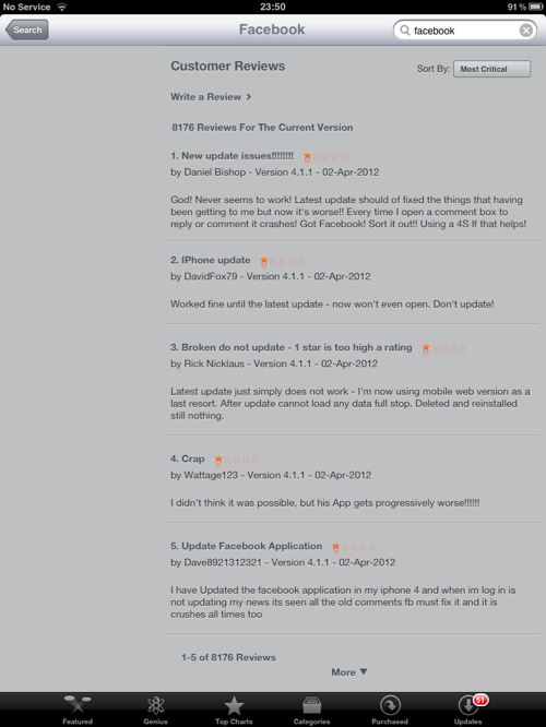
Facebook’s iPhone App has a lot of negative reviews.
If I were challenged to test the Facebook app, I would definitely take this feedback into consideration. I would be daft not to!
The Creativity Of Testers
You probably know what the app is meant to do, but what can it do? And how will people actually use it? Testers are great at thinking outside of the box, trying out different things, asking “What if” and “Why” constantly.
For example, mobile testers will often adopt the mindset of different types of people — not literally, of course, but the ability to think, analyze and visualize themselves as different users can be quite enlightening.
Testers might put themselves in these shoes:
Novice user,
Experienced user,
Hacker,
Competitor.
Many more personalities could be adopted; much of this really depends on what you are building. But it’s not just about personalities, but about behavior and workflows, too. People use products in strange ways. For example, they:
Go back when they are not supposed to,
Are impatient and hit keys multiple times,
Enter incorrect data,
Can’t figure out how to do something,
Might not have the required setup,
Might assume they know what they are doing (neglecting to read instructions, for example).
Testers look for these situations, often discovering unexpected results along the way. Sometimes the bugs initially found can appear small and insignificant, whereupon deeper investigation uncovers bigger problems.
Many of these issues can be identified up front with testing. When it comes to testing mobile apps, these might not all be relevant, but perhaps try asking questions such as these:
Does it do what it says on the tin?
Does the app perform the tasks it was designed to do?
Does the app perform tasks that it wasn’t designed to do?
How does the app perform when being used consistently or under a load? Is it sluggish? Does it crash? Does it update? Does it give feedback?
Do crash reports give clues about the app?
How can one navigate creatively, logically or negatively around the app?
Does the user trust your brand?
How secure is the user’s data?
Is it possible to break or hack the app?
What happens when you push the app to its limits?
Does the app ask to turn on related services? (e.g. GPS, Wifi)? What if the user does? Or doesn’t?
Where does the app redirect me? To the website? From website to app? Does it cause problems?
Is communication and marketing consistent with the app’s function, design and content?
What is the sign-up process like? Can it be done on the app? On a website?
Does sign-up integrate with other services such as Facebook and Twitter?
Example: RunKeeper’s Buggy Update
RunKeeper, an app to track your fitness activities, recently released an update with new “Goal Setting” features. I was interested in giving it a try, a bit from a testing perspective, but also as a genuinely interested user. I discovered a few problems.
It defaulted to pounds. I wanted weights in kilograms.
Switching between pounds and kilograms just didn’t work properly.
This ended up causing confusion and causing incorrect data and graphs to be shown when setting my goals.
Because of that, I wanted to delete the goals, but found there was no way to do it in the mobile app.
To work around this, I had to change my weight so that the app would register the goal as being completed.
I could then try adding the goal again.
Because of all of this confusion, I played around with it a bit more to see what other issues I could find.
Below are some screenshots of some of the issues found.
A recent update of RunKeeper included a new “Goals” section. Playing around with its dates, I discovered start and end dates could be set from the year 1 A.D. Also, why two years with “1”?
Another RunKeeper bug.This one is a typo in the “Current Weight” section. This happened when removing the data from the field. Typos are simple bugs to fix but look very unprofessional if ignored.
Here is the confusion that happened as a result of trying to switch between pounds and kilograms. If I want to lose 46 pounds, the bar actually shows 21 pounds.
There is no quick way to identify issues like these. Every app and team faces different challenges. However, one defining characteristic of testers is that they want to go beyond the limits, do the unusual, change things around, test over a long period of time — days, weeks or months instead of minutes — do what they have been told is not possible. These are the types of scenarios that often bring up bugs.
Where’s All The Data?
Testers like to have fun with data, sometimes to the frustration of developers. The reality is that confusing either the user or the software can be easy in the flow of information. This is ever more important with data- and cloud-based services; there is so much room for errors to occur.
Perhaps you could try checking out what happens in the following scenarios:
The mobile device is full of data.
The tester removes all of the data.
The tester deletes the app. What happens to the data?
The tester deletes then reinstalls the app.
Too much or too little content causes the design or layout to change.
Working with different times and time zones.
Data does not sync.
Syncing is interrupted.
Data updates affect other services (such as websites and cloud services).
Data is processed rapidly or in large amounts.
Invalid data is used.
Example: Soup.me Is Wrong
I was trying out Soup.me, a Web service that sorts your Instagram photos by map and color, but I didn’t get very far. When I tried to sign up, it said that I didn’t have enough Instagram photos. This is a lie not true because I have published over 500 photos on my Instagram account. It’s not clear what the problem was here. It could have been a data issue. It could have been a performance issue. Or perhaps it was a mistake in the app’s error messages.
Another Example: Quicklytics
Quickytics is a Web analytics iPad app. In my scenario, a website profile of mine still exists despite my having deleted it from my Google Analytics account. My questions here are:
I have deleted this Web profile, so why is this still being displayed?
The left panel doesn’t appear to have been designed to account for no data.Could this be improved to avoid confusing the user?
Testers like to test the limits of data, too. They will often get to know the app as a typical user would, but pushing the limits doesn’t take them long. Data is messy, and testers try to consider the types of users of the software and how to test in many different scenarios.
For example, they might try to do the following:
Test the limits of user input,
Play around with duplicate data,
Test on brand new clean phone,
Test on an old phone,
Pre-populate the app with different types of data,
Consider crowd-sourcing the testing,
Automate some tests,
Stress the app with some unexpected data to see how it copes,
Analyze how information and data affects the user experience,
Always question whether what they see is correct,
Creating Errors And Messages
I’m not here to talk about (good) error message design. Rather, I’m approaching this from a user and tester’s point of view. Errors and messages are such common places for testers to find problems.
Questions to Ask About Error Messages
Consider the following questions:
Is the UI for errors acceptable?
Are error messages accessible?
Are error messages consistent?
Are they helpful?
Is the content appropriate?
Do errors adhere to good practices and standards?
Are the error messages security-conscious?
Are logs and crashes accessible to user and developer?
Have all errors been produced in testing?
What state is the user left in after an error message?
Have no errors appeared when they should have?
Error messages quite often creep into the user experience. Bad and unhelpful errors are everywhere. Trying to stop users from encountering error messages would be ideal, but this is probably impossible. Errors can be designed for and implemented and verified against expectations, but testers are great at finding unexpected bugs and at carefully considering whether what they see could be improved.
Some Examples of Error Messages
I like the example below of an error message in the Facebook app on the iPhone.Not only is the text somewhat longwinded and sheepishly trying to cover many different scenarios, but there is also the possibility that the message gets lost into the ether.
Perhaps the messages below are candidates for the Hall of Fame of how not to write messages?
What about this one from The Guardian’s app for the iPad? What if I don’t want to “Retry”?
Platform-Specific Considerations
Becoming knowledgeable about the business, technology and design constraints of relevant platforms is crucial for any project team member.
So, what types of bugs do testers look for in mobile apps?
Does it follow the design guidelines for that particular platform?
How does the design compare with designs by competitors and in the industry?
Does the product work with peripherals?
Does the touchscreen support gestures (tap, double-tap, touch and hold, drag, shake, pinch, flick, swipe)?
Is the app accessible?
What happens when you change the orientation of the device?
Does it make use of mapping and GPS?
Is there a user guide?
Is the email workflow user-friendly?
Does the app work smoothly when sharing through social networks? Does it integrate with other social apps or websites?
Does the app behave properly when the user is multitasking and switching between apps?
Does the app update with a time stamp when the user pulls to refresh?
What are the app’s default settings? Have they been adjusted?
Does audio make a difference?
Example: ChimpStats
ChimpStats is an iPad app for viewing details of email campaigns. I first started using the app in horizontal mode. I got a bit stuck as soon as I wanted to enter the API key. I couldn’t actually enter any content into the API field unless I rotated it vertically.
Connectivity Issues And Interruption
Funny things can happen when connections go up and down or you get interrupted unexpectedly.
Have you tried using the app in the following situations:
Moving about?
With Wi-Fi connectivity?
Without Wi-Fi?
On 3G?
With intermittent connectivity?
Set to airplane mode?
When a phone call comes in?
While receiving a text message?
When receiving an app notification?
With low or no battery life?
When the app forces an update?
When receiving a voicemail?
These types of tests are a breeding ground for errors and bugs. I highly recommend testing your app in these conditions — not just starting it up and checking to see that it works, but going through some user workflows and forcing connectivity and interruptions at particular intervals.
Does the app provide adequate feedback?
Does data get transmitted knowingly?
Does it grind to a halt and then crash?
What happens when the app is open?
What happens midway through a task?
Is it possible to lose your work?
Can you ignore a notification? What happens?
Can you respond to a notification? What happens?
Is any (error) messaging appropriate when something goes wrong?
What happens if your log-in expires or times out?
Maintaining The App
Speeding up the process of testing an app is so easy. Test it once and it will be OK forever, right?
Think again.
One problem I’m facing at the moment with some apps on my iPad is that they won’t download after being updated. As a user, this is very frustrating.
Perhaps this is out of the control of the app’s developer. Who knows? All I know is that it doesn’t work for me as a user. I’ve tried removing the app and then reinstalling, but the problem still occurs. I’ve done a bit of searching; no luck with any of my questions, aside from suggestions to update my OS. Perhaps I’ll try that next… when I have time.
The point is, if the app was tested once and only once (or over a short period of time), many problems could have gone undetected. Your app might not have changed, but things all around it could make it break.
When things are changing constantly and quickly, how does it affect your app?Ask yourself:
Can I download the app?
Can I download and install an update?
Does the app still work after updating?
Can I update the app when multiple updates are waiting?
What happens if the OS is updated?
What happens if the OS is not updated?
Does the app automatically sync downloading to other devices via iTunes?
Is it worth automating some tasks or tests?
Does the app communicate with Web services? How would this make a difference?
Testing your mobile app after each release would be wise. Define a set of priority tests to cover at each new release, and make sure the tests are performed in a variety of conditions — perhaps on the most popular platforms. Over time, it might be worth automating some tests — but remember that automated tests are not a magic bullet; some problems are spotted only by a human eye.
Example: Analytics App on the iPhone
I’ve had this app for two years now. It’s worked absolutely fine until recently; now, it has been showing no data for some of my websites (yes, more than one person has visited my website over the course of a month!). A quick look at the comments in the app store showed that I wasn’t the only one with this problem.
Here is another example from the Twitter app for the iPhone. After updating and starting up the app, I saw this message momentarily (Note: I have been an active tweeter for five years). I got a bit worried for a second! Thankfully, the message about having an empty timeline disappeared quickly and of its own accord.
Testing Is Not Clear-Cut
We’ve covered some ground of what mobile testing can cover, the basis of it being: with questions, we can find problems.
All too often, testing is thought of as being entirely logical, planned and predictable, full of processes, test scripts and test plans, passes and fails, green and red lights. This couldn’t be further from the truth.
Sure, we can have these processes if and when necessary, but this shouldn’t be the result of what we do. We’re not here just to create test cases and find bugs. We’re here to find the problems that matter, to provide information of value that enables other project members to confidently decide when to release. And the best way we get there is by asking questions!
0 notes
Text
How To Hire Hackers: A Realistic Guide For Startups
The following is a guest post by Iris Shoor . She's a co-founder atTakipi , a new startup looking to change the way developers work in the cloud. Previously, she was co-founder at VisualTao, a B2B startup acquired by Autodesk.
Call them hackers, ‘ninjas’, or ‘rock stars’ if you’d like. Other than being very talented developers, they all share one thing in common -- it’s unbelievably hard to bring them on-board your company. And as if competing with other companies for the same talent was not enough, being a startup just adds more challenges to the equation. Your startup may be the next Google/Facebook/Instagram, but until then - how can you convince the best developers out there to join a company where the CEO’s office is an IKEA desk?
Here’s one answer -- recruit like a startup, in a creative and agile way, doing things the way big companies can’t. During the last 5 years I’ve interviewed over 250 candidates and recruited dozens of great engineers. The first interviews took place in our tiny office’s kitchen, and we still managed to convince some of the best candidates to join. There aren’t any magic tricks involved, but here are some tips and methods which helped us get ninjas, rock stars and other highly talented people on-board.
You’re a startup -- have the founders make the first contact.
We lose many potential candidates even before the starting line - we fail to bring them over for a first interview. Some are already talking with too many companies, or decide after a brief visit to your web-site that your startup just isn’t their thing. That’s the point where you can make a difference. Our co-founders (including myself) are in charge of sending the first e-mail to potential candidates. We’ve kept this habit even as we’ve grown. At first, I was worried some candidates may think we have too much free time on our hands (sadly, we don’t). I soon found out that when candidates receive a personal and flattering e-mail (important when it comes to star developers) from a co-founder, it sends a message that this startup is all about its employees. Here are some helpful points for writing the first email:
Link to your online profile (personal blog, an interview with you, a YouTube video) when introducing yourself. Once there’s a face behind the email you’re more likely to get a positive response.
Add a personal touch. Have other employees who went to the same college? Mention it. Grew up in the same town? Write it down. It might sound irrelevant, but it creates the first hook, enough to have them come over for a meeting.
Interviewing: It’s not just about the role, it’s also about who they will have lunch with.
While we tend to tell candidates everything about the role, the managers and the company, there’s one part that’s usually missing - who will they work with?One of the most common answers I get when asking people why they've chosen one job over the other is knowing other employees there. Let candidates know who'll be sitting next to their (IKEA) desk and sharing their 9GAG jokes.
When candidates come for an interview we try to have them meet at least one future co-worker. A candidate asks a good tech question during the interview? Refer him to the engineer working on it instead of answering yourself. Found out the candidate has something in common with one of the employees (skydiving, growing up in Ohio, have a thing for ASCII art)?Introduce them. It’s not something we plan ahead, but given the opportunity, having the candidate stay at the office after the interview chatting with other employees, is considered a success.
Don’t interview too early or too late during the day, when the office is empty. If the only time your future star can come in for an interview is 8:00am, make sure some people come early. You want to paint a full picture of what it will be like working at your startup.
[You don’t need a fancy office to make good impression - the small details do the job. Our entrance door has code on it and these are our meeting room custom coasters ]
Interviewing: Choose carefully which opportunity to pitch.
There truly are great things about joining a startup - new technological challenges, opportunities for moving up the ladder more quickly, learning about the business side of things, stock options and more. Don’t sell them all at once. Pitching becoming a manager to an engineer who just wants to experiment with new technologies? Bzzzz -- wrong move -- which might send her elsewhere.
Look back - When we first started interviewing we used to ask candidates what they’re looking for. Instead of sharing their true motivations, they answered with what they thought was the ‘right’ answer -- “I just want to work on interesting stuff”. After a while we discovered the magic trick; instead of asking what they’re looking for now, we began asking how they've made previous job decisions. When asked about past decisions, people tend to share what really matters to them.
Don’t pitch, give examples - You can’t really promise someone that he or she will become a manager in the future, or only work on interesting stuff.Instead, I tell candidates what talented people who've joined the company a year ago are doing now. This could be how an engineer with no previous management experience is already heading a small team, or how a developer straight out of college is doing such a great job we’ve put her in charge of some very key algorithms.
Signing: How to make candidates sign an employment agreement more quickly.
You've reached the homestretch. The candidate you really liked said yes, and now all is left is to sign the employment agreement. This can turn into a very risky period. The current employer is likely to come with a counter offer and so can other companies.
Important: Avoid having your future star waste time on legal issues. To help with this we've decided to have the exact same employment agreement for everyone in the company. Other than the terms themselves, everything is the same - from the number of vacation days down to the small letters. It’s a super friendly agreement and we never change it. Once I tell candidates that everyone -- the CEO, the engineers and myself have all signed the exact same contract, and therefore we can’t change it, it usually takes them only a day or two to sign it. There’s much less need to re-read every part.
Scott Weiss from A16Z shares a great tip about the pre-signing period with the ‘Welcome basket ’.
How to hear ‘No” and how to say ‘No ’
Hearing No - Stay in touch with good candidates who chose a different company over yours. When a candidate I really like accepts a different offer over ours I always get the feeling I was dumped. True, I can’t honestly say I don’t understand how can someone pick a great job at Google over a small and unknown startup, but it still hurts. While the easiest thing to do after hearing a ‘No’ is, well, nothing, I try to make one last effort to stay in the picture. There are two main reasons for it : 1). Startups grow quickly. You might have a good candidate who decided a 10 employee company is not for him/her but a year or two later as your company grows it will become much more attractive. 2). Receiving a negative answer usually means you've reached second place. Sometimes, the first choice doesn't turn out to be the dream job they were hoping for. Some candidates don’t feel comfortable getting back in touch after they gave you a negative answer. By making the first move you’re saying that everything is fine and we’re still interested in you. Yes, it’s very much like dating. How to keep yourself in the picture? I like to send FB friend requests to candidates, and that’s something that you can do only as a startup (it can get pretty awkward when done by someone from a large company). Facebook is a great platform to share how well your startup is doing over the years. I also like sending an email once every 4-6 months, sharing how we’re doing and asking how’s everything going. I found out that most people find it friendly (and somehow flattering) rather than annoying.
Saying No - giving a smart negative answer will help you reach other great engineers in the future. I often ask myself how I would have liked to receive a “No”. My answer is that I would like to hear the truth. Instead of using the default answer of “we've decided to continue the process with someone else”, I write the (sometime hard) truth- “You didn't pass the technical test’, ‘you don’t seem like a startup kind of guy’, ‘it seems like you’re more interested in managing and that’s something we can’t offer right now’. I also make sure to write some of the things I liked about the candidate. True, there are some cases you can’t write the real reason, but in most cases you can. I was terrified when I sent the first 100% sincere email, but I soon found out that candidates embrace this, and usually agree with the reason. Now comes the interesting part - instead of feeling rejected, most people rightly feel they interviewed for the wrong role. Once you don’t ‘break-up’ with them, you can ask them to recommend friends or co-workers they think could fit the position. Yep, it sounds crazy, but it’s true. Even if you don’t get a new lead, rest assured you’ll have a past candidate saying good things about your company, and that’s something great in itself.
0 notes
Text
Making Beautiful Forms - Square and Recurly
Square (and their card case app) are impressed with their UX as it is simple (much use of white space a la Google), but in a way that is quite beautiful and not bland as Google can be. One area that jumped out to me was on a very simple flow. Adding your credit card info.
Most sites make you select a bunch of unnecessarily information and the forms are overly verbose. Contrast them to the the Square flow (you should try it on the app as the transitions are part of the beauty).
Initial Ask
You are simply asked for your credit card number:
There is a mini picture of a credit card to the left of the number text field
As soon as you type a number the credit card “face” changes to become a VISA or MASTERCARD (or whatever) showing you instantly that they are grokking what you are typing in. There is no need to ask the user for the type of card. We know based on the first digits.
Now you are asked for the secondary info
As soon as the full credit card is in place, the text field zooms to a small size, showing just the last 4 digit (nice privacy and use of space). In place of the large text field they place others for the date, CVV/CIN/whatever you care to call it, and zip. As you fill in the info, you are moved on to the next field. For the date a nice “/” is placed in there for you.
When you get to the CCV/CIN number, see how the card flips and you get a mini version pointing to where the 3 digits will be. The feedback throughout the experience is fantastic. Errors are handled nicely, and it is just a pleasure to use something so simple.
Nice job Square! If you are looking at checkout flows in a web app, Recurly have published examples of their CSS based “secure, PCI compliant transaction forms.”
As you can see in the sample above of Square, a single input field is used to capture credit card number first. If the credit card number is invalid an error is displayed that prevents the user from moving forward. If the credit card number is valid, the generic credit card icon changes to reflect the type of card entered. This removes the need for a separate credit card “type” drop down or selector and reassures someone that their entry has been understood.
Once the credit card number is validated, it slides over to the left leaving only the last four trailing digits for reference and the next set of inputs appear in the mask: expiration date, CVV (security) code, and ZIP code. Since these are all numeric inputs, a 0-9 set of soft keys is all that is needed to keep people moving along on the keyboard.
Since the expiration date on a credit card can’t be in the past or far future, the input mask one again helps keep people away from errors. Invalid months or years simply won’t be accepted. After a valid expiration date has been added, Square’s design features another excellent enhancement. The credit card icon changes to reveal where the CVV code is located on the specific card being used to pay. This small detail helps clue people in to what information is required next.
Because CVV and ZIP are also numeric entries, there’s no reason to ever leave the dial-pad throughout the payment input process: no jumping between multiple form fields required. Zachary’s also made sure that people can use their keyboard (tab and shift-tab) and mouse to move between the various parts of this payment input mask.
Kudos to the Square team for rethinking how payment information can be collected in forms and to Zachary for coding this up for the Web. It’s a great example of how input masks can make text input faster and more accurate (especially on mobile devices).
1 note
·
View note
Text
Font Smoothing, Anti-Aliasing, and Sub-Pixel Rendering
Apple and Microsoft have always disagreed in how to display fonts on computer displays. Today, both companies are using sub-pixel rendering to coax sharper-looking fonts out of typical low resolution screens. Where they differ is in philosophy.
Apple generally believes that the goal of the algorithm should be to preserve the design of the typeface as much as possible, even at the cost of a little bit of blurriness.
Microsoft generally believes that the shape of each letter should be hammered into pixel boundaries to prevent blur and improve readability, even at the cost of not being true to the typeface.
Now that Safari for Windows is available, which goes to great trouble to use Apple's rendering algorithms, you can actually compare the philosophies side-by-side on the very same monitor and see what I mean. I think you'll notice the difference. Apple's fonts are indeed fuzzy, with blurry edges, but at small font sizes, there seems to be much more variation between different font families, because their rendering is truer to what the font would look like if it were printed at high resolution.
(Note: To see the following illustration correctly, you need to have an LCD monitor with pixels arranged in R,G,B order, like mine. Otherwise it's going to look different and wrong.)
The difference originates from Apple's legacy in desktop publishing and graphic design. The nice thing about the Apple algorithm is that you can lay out a page of text for print, and on screen, you get a nice approximation of the finished product. This is especially significant when you consider how dark a block of text looks. Microsoft's mechanism of hammering fonts into pixels means that they don't really mind using thinner lines to eliminate blurry edges, even though this makes the entire paragraph lighter than it would be in print.
The advantage of Microsoft's method is that it works better for on-screen reading. Microsoft pragmatically decided that the design of the typeface is not so holy, and that sharp on-screen text that's comfortable to read is more important than the typeface designer's idea of how light or dark an entire block of text should feel. Indeed Microsoft actually designed font faces for on-screen reading, like Georgia and Verdana, around the pixel boundaries; these are beautiful on screen but don't have much character in print.
Typically, Apple chose the stylish route, putting art above practicality, because Steve Jobs has taste, while Microsoft chose the comfortable route, the measurably pragmatic way of doing things that completely lacks in panache. To put it another way, if Apple was Target, Microsoft would be Wal-Mart.
Now, on to the question of what people prefer. Jeff Atwood's post from yesterday comparing the two font technologies side-by-side generated rather predictable heat: Apple users liked Apple's system, while Windows users liked Microsoft's system. This is not just standard fanboyism; it reflects the fact that when you ask people to choose a style or design that they prefer, unless they are trained, they will generally choose the one that looks most familiar. In most matters of taste, when you do preference surveys, you'll find that most people don't really know what to choose, and will opt for the one that seems most familiar. This goes for anything from silverware (people pick out the patterns that match the silverware they had growing up) to typefaces to graphic design: unless people are trained to know what to look for, they're going to pick the one that is most familiar.
Which is why Apple engineers probably feel like they're doing a huge service to the Windows community, bringing their "superior" font rendering technology to the heathens, and it explains why Windows users are generally going to think that Safari's font rendering is blurry and strange and they don't know why, they just don't like it. Actually they're thinking... "Whoa! That's different. I don't like different. Why don't I like these fonts? Oh, when I look closer, they look blurry. That must be why."
0 notes
Text
WhatsApp is Using IMEI Numbers as Passwords
As you probably already heard in recent news, 1,000,001 Apple UDID’s were leaked. It’s unfortunate that so many apps use UDID’s to identify users since it’s extremely insecure.
This brings me to WhatsApp, a free messaging service, used by millions of people. Their system runs on a modified version of XMPP (Extensible Messaging and Presence Protocol). There is nothing wrong with using XMPP, but there is a problem in how WhatsApp handle authentication.
If you installed WhatsApp on an Android device for example, your password is likely to be an inverse of your phones IMEI number with an MD5 cryptographic hash thrown on top of it (without salt).
md5(strrev(‘your-imei-goes-here’))
When I say Android, I don’t exclusively mean Android. It just happens to be a different case when it comes to iOS. Windows Mobile, Blackberry etc… might very well have the same password method. It actually wouldn’t surprise me. WhatsApp on the iPhone might be using your IMEI too, or maybe UDID’s to generate passwords, but not the exact same method. If I do find out, I will update this post.
Then comes the username. It’s your phone number (doh).
To obtain both these values is rather simple.
Examples:
You have direct access to your victims phone, in which case you dial & call *#06# (in most cases) and you’ve got their IMEI number.
You develop an app that silently sends the victims IMEI number to your server in the background (many applications do this already) & phone number, either by letting them fill it in themselves in a registration part of your app, or also silently (this method however isn’t always airtight but works in a lot of cases).
A hacker leaks a database/file with IMEI numbers with associated phone numbers, ding ding ding!
A spammer buys this information from an app developer.
Time for some Android code examples..
Android code example to retrieve IMEI number: TelephonyManager tm = (TelephonyManager) getSystemService(Context.TELEPHONY_SERVICE);
String device_id = tm.getDeviceId();
To retrieve the victims phone number: TelephonyManager tMgr =(TelephonyManager)mAppContext.getSystemService(Context.TELEPHONY_SERVICE); mPhoneNumber = tMgr.getLine1Number();
You can also retrieve the users voicemail number too just in case: TelephonyManager.getCompleteVoiceMailNumber()
Using this information allows you to intercept and send messages using your victims account details.
This could mess up peoples lives if you use their account to send a message to someone they know, with any kind of f’ed up message. This could cause huge problems for your victim, especially if the receiver of the message is mentally unstable. It might sound dramatic, but it’s feasible.
You could intercept naked photos & other sensitive personal messages.
Alternatively, you could just spam the hell out of WhatsApp, especially if you have a nice big database.
Is this already happening? It wouldn’t surprise me if it is. I’ve succeeded in sending/receiving messages (from friends accounts who gave me permission to take their accounts over) and I’m not even a “hardcore hacker”.
Do you use WhatsApp? Think twice before you send a private WhatsApp message. Think twice when you receive a messed up WhatsApp message. You don’t know what’s going on in the background.
And WhatsApp, if you are reading this, get your act together. People expect a secure system when it comes to personal messaging. And with the amount of customers you have, you should be taking better security measures. I sincerely hope you fix this issue soon.
The intent of this blog post is not give “hackers” or “scriptkiddies” any funny ideas, but merely for awareness.
0 notes
Text
WebRTC: A New Game-Changer, Disrupting Telcos and OTTs
It’s been a tough couple of years for carriers (a.k.a. network operators) who have been fighting off competition from over-the-top (OTT) players such as Skype and WhatsApp, offering services such as voice and SMS over the carriers’ own networks. The impact of these OTT players has been astonishing – whether they’re nimble startups like Viber (with more than 90 million users , making over 1.5 billion calls a month and sending over 2 billion text messages), or large corporations such as Apple, whose iMessage reaches 140 million users, sending 1 billion iMessages every day.
But now an even bigger challenge has appeared on the scene: WebRTC .
WebRTC is a technology that allows developers to build real-time communication into web pages. And it’s not just going to affect the carriers – it’s the OTT vendors who now face a real danger because WebRTC brings down the subscription walls of different OTT players.
Right now, when it comes to OTT services, if I want to communicate with someone in real time, there’s no way to do so without installing a piece of software – plus, you can’t connect across services, e.g. call a Skype user from Viber.
[Championed by Google, WebRTC allows browsers to make calls from your PC or phone - and it's disupting both telcos and incumbent VoIP players, from Skype to Viber. Guest author Tsahi Levent-Levi discusses Google's intentions and the trouble ahead for both telcos and OTT players.]
WebRTC is going to change everything
How? It places the ability to use VoIP applications within any browser as it’s going to be part of the HTML5 standard. You won’t need a Skype ID, phone number, email address etc. – it will all take place through the browser, you won’t need to subscribe to any service, and you’ll have Google to thank for it.
Google bought Global IP Solutions (GIPS), which provided and licensed voice and video media engines to anyone who wanted to develop a VoIP application (including Yahoo and Skype), reducing the effort considerably by offering the real-time multimedia parts of the application “out of the box”. Google didn’t stop at acquiring the technology – it is now using it to commoditize its competition in the communication space and drive browser sophistication even further.
Here’s what Google did
- Google created WebRTC by wrapping GIPS up with a set of Java Script APIs targeted at web browser developers, which means opening up VoIP technology to millions of developers. - Google open-sourced WebRTC, under a permissive BSD license – this made the technology available to reuse, modify and create derivatives; taking it out of the control of real-time media engineers and marginalized competitors like Spirit-DSP - It took the technology to W3C and IETF standards bodies for standardization to make sure it gets adopted and become an ubiquitous and common component in the browser, and in the process, removing any Google-centric connotations from the technology - It ignored the signalling layer, allowing vendors to use WebRTC in any real time communication settings, regardless of the protocol used for signalling call setup
The strategy behind Google’s decision
This is a classic “economics of complements” strategy that is commonly used by Google and it’s about to change the entire landscape of communication services for both carriers and OTT players.
WebRTC is all about real-time communication from within the web browser, and it’s a crucial part of Google’s strategy because it reduces the barriers of developing rich communication applications by having legions of web developers exposed to WebRTC as a free technology. These web developers will take voice and video services into new domains with new use cases, expanding the richness of communication and making it easier than ever before to start your own VoIP service using WebRTC.
For Google, this decision is simply about strengthening the Web and the web browser to reduce the gap between native application capabilities, whether they’re on the desktop or in the mobile realm. The real value for Google lies in allowing them to serve more ads and mine more insights out of people’s browser behavior – these are things that Google treasures. Such a move can weaken Microsoft along with its Skype acquisition and hurt Apple’s FaceTime service.
The usual OTT business model
OTT vendors base their strategy around reaching as many users as possible, offering them a compelling free service, locking them into it and then trying to monetize it via four main approaches:
Advertising, done by ooVoo, Skype and others
Connectivity to PSTN (Skype make most of their money out of connectivity to PSTN and the carrier’s phone numbering scheme)
Value-added services, such as multipoint video calling; (done by ooVoo)
Cashing out upon acquisition (which is what Viber is hoping to do)
OTT vendors make their money out of mass usage of their system, and for that, they prefer having users work within the boundaries of their service, and not letting them interact with competing OTT offerings: (Just try calling from Viber to Skype. You can’t.)
Goodbye, walls – hello to a new way of communicating
WebRTC literally tears down the silo’ed walls of OTT vendors by removing the need for a physical client for each OTT vendor and for an OTT user ID (such as your skype ID or email address). Since there is no specific signaling, each vendor can decide whether (and how) to use user IDs.
It will change the way we communicate , for example:
- Think of a local insurance agent in Paris looking to lure new customers: he sets up a website, invests in AdWords to bring leads into his sales funnel, and then routes these leads to a contact page – or a phone number. With WebRTC, he can close the loop and have the person at home access his website and contact him directly from the web browser – to wherever the insurance agent is. No OTT vendor required. - Or a niche social network website for backpackers, trying to connect people planning a trip with one another. They won’t need to exchange user IDs or phone numbers, or install anything – with a click of a button they get connected through the social network website itself.
There are already startup companies offering services using WebRTC. These include Bistri , Cloudeo , FrisB , TenHands and TokBox .
As with the current web paradigm of signing in for new services using existing social media accounts, many of the new vendors who will adopt WebRTC technology will also opt for that model, removing the need for a unique service ID.
And what about the carriers?
Is WebRTC a threat or an opportunity? Well, it’s both – it just depends what the carriers do with it.
It does mean that carriers face further disruption to their communication services but in parallel, there are also sizeable WebRTC opportunities. However, in order to seize them, carriers will need to embrace the web developer community and deliver value to WebRTC-based applications and services, curving itself a place in this vibrant ecosystem. Web developers are already looking for WebRTC solutions they can stitch and mesh into their applications. Carriers can actually become a vehicle for innovation vehicle by offering:
- Session-based charging for WebRTC. As with any carrier service, they can charge customers for the WebRTC sessions they make: WebRTC communication passing through the carrier’s network can be tracked (through DPI and other means) and then charged for, probably against a bucket of minutes/sessions in the customer’s plan. - Merging RCS with WebRTC. RCS (also known as Joyn), is the carriers’ instant messaging solution. By adding WebRTC to RCS, it can offer out-of-the-box programmable multimedia capabilities with no need to look into additional protocols such as VoLTE. - Quality of service assurance. Need the police? Other emergency services? A business-related call? A carrier can assure the quality of service for that call and make sure it gets the proper priority over its network (at a cost, of course…). - Infrastructure. WebRTC is just a protocol – making a solution out of it requires a lot of additional components, most of which are server-side. A carrier can offer the server-side infrastructure as a service to customers. - PSTN connectivity. Carriers have their own existing voice communication network, along with connectivity to PSTN landline services. They can offer WebRTC termination to PSTN and GSM, bridging the gap between these voice services. - WebRTC signalling. WebRTC offers only the media component with no signaling and you still have to reach a person via WebRTC (which is where the carrier comes in – it provides the connectivity for the users).
As much as they might want to, carriers are never going to be able to return to the golden revenue days before OTT players arrived on the scene, but WebRTC will allow them to stop the trend, (and maybe even reverse it a little bit), depending on how fast and how far they’re going to act. AT&T, T-Mobile, Deutsche Telekom and Orange are all examples of major carriers who have been quick to recognize and start to investigate the opportunities that WebRTC presents. The question is… how long will it take for others to follow?
0 notes
Text
How Online Reviews Are Crucial to A Restaurant's Takings
US economists find that when a restaurant rating improved by just half a star it was very much more likely to be full at peak dining times
It is something every restaurateur and hotel owner knows: good reviews boost takings while terrible ones can close you down. And, in an age when everyone can be an online critic, ratings have never been more important. But until now no one could be sure just how important the online star ratings system employed by sites such as Toptable and Tripadvisor could be for a business's fortunes.
Work by two economists at the University of California, Berkeley, Professors Michael Anderson and Jeremy Magruder, published in this month's edition of the Economic Journal, represents the first attempt to gauge the relationship between online star ratings and customers' purchasing decisions. The pair focused on the effects of positive online ratings on 300 San Francisco restaurants that were then collated to form a star system on Yelp.com, a popular US ratings site.
They found that a restaurant with a rating improved by just half a star – on a scale of 1 to 5 – was much more likely to be full at peak dining times.
Indeed, an extra half-star rating caused a restaurant's 7pm bookings to sell out on from 30% to 49% of the evenings it was open for business.
Significantly, the two economists found that the increase in trade happened without any change in prices or the quality of food and service, confirming that it was the reviews that brought in the new customers.
The economists write: "The findings of this study demonstrate that – although social media sites and forums may not generate the financial returns for which investors yearn – they play an increasingly important role in how consumers judge the quality of goods and services."
Petrus in south London. Photograph: Katherine Rose/guardian.co.uk
The economists conceded that, while restaurants with strong reviews on the site did better business than poorly reviewed restaurants, establishing cause and effect was difficult.
"After all, restaurants that get good reviews are those that appeal to consumers and they would probably do well even in the absence of any reviews," the pair write. However, they are confident the research is robust. They note that, when Yelp.com computes a business's average rating (which ranges from 1 to 5 stars), it rounds off to the nearest half-star.
So, two restaurants that have similar average ratings can actually appear to be of very different quality to online viewers. For example, a restaurant with an average rating of 3.74 displays a 3.5-star average rating, while a restaurant with an average rating of 3.76 displays a 4-star average rating.
This, the economists claim, allows them to make important comparisons between restaurants that have different ratings – for example, 4 stars versus 3.5 stars – but are of nearly identical quality (for example, a 3.76 average versus a 3.74 average). Their conclusion? That half a star makes all the difference.
The economists write: "Differences in customer flows between such restaurants can therefore be attributed to the ratings themselves rather than differences in the quality of food or service."
The study collected reviews and daily reservation availability for 328 restaurants in San Francisco. It found that moving from 3 stars to 3.5 stars increased a restaurant's chance of selling out during prime dining times from 13% to 34%. Moving from 3.5 stars to 4 stars increased the chance of selling out during prime dining times by 19 percentage points.
The pair conclude that changes in consumer preferences "occur even though restaurant quality is held constant. This study demonstrates that these reviews have become a salient factor in consumer decisions."
Significantly, they found that the effect was even more profound when alternative information was hard to come by, opening up the possibility that invented reviews could boost fortunes.
The pair write: "These returns suggest that restaurateurs face incentives to leave fake reviews, but a rich set of robustness checks confirm that restaurants do not manipulate ratings in a confounding, discontinuous manner."
Concerns that retailers and restaurant owners are seeking to manipulate the online ratings system are becoming a key issue for the internet.
"Everyone's trying to do something to make themselves look better," Linchi Kwok, an assistant professor at Syracuse University in New York who is researching social media and the hospitality industry, told the New York Timeslast month. "Some of them, if they cannot generate authentic reviews, may hire somebody to do it."
Tripadvisor places a "red flag" against the names of hotels that it suspects have planted enthusiastic reviews on its website.
0 notes