Archie McKenzie (they/them) || Shri Gunasekara (she/her)Welcome to our little blog where we document our art processes! Please enjoy your stay :0
Don't wanna be here? Send us removal request.
Statistics
We looked inside some of the posts by archandshri and here's what we found interesting.
Average Info
Notes Per Post
4K
Likes Per Post
3K
Reblog Per Post
1K
Reply Per Post
20
Time Between Posts
17 days
Number of Posts By Type
Text
17
Last Seen Tumblr Blogs


Fun Fact
Tumblr has been providing a Korean-language service since 2013.
Text

Kichijoji Winter II, Kichijoji 吉祥寺
4K notes
·
View notes
Text
Alice in Wonderland Cover Redesign (P4) Shri - 03/08/2024
Hi Archie and everone!
Hope you all have been having a lovey week!
(and it seams saterday are the only dates i actually get enough time to wright these bad bois up ;( but I guess we'll live so ¯\_(ツ)_/¯ )
So getting straight into it, this is where we left off.

To start getting back into it I got Alice nailed down, along with her pose.

Grayscale.
This is actually a slightly different element I am introducing into my prosess. My comic When I Say 'love you', was done in mono colour (pink) and I'd say the values/colours in this comic are really solid - and this is to do with the fact I had to focus on value because I was only working with one hue. pushing me to create contrust in value instead of in colour. This was discovered form a conversation with Arche talking about this comic. So Archie suggested using/looking at values more during my normal process. This is me attempting to do so in the AIW bookcover, hence why im showing a lot of gray scales in its prosses.
I quite like just playing with colours and just eye-balling them so I'm keeping the values more like a reference point then anything.
(Don't worry I will do a small blog on the When I Say 'love you' Comic soon)


Blocking in the colours was quite rewarding, it's ushely in this stage I'm like 'its coming together!'


But then I paniced and hated the colour and forgot how to colour. So I left it here and come back to it (because timestimes that all you need to get through a creative issue)
(images belowe is me paniking and fogettting who to colour)


And it worked, I just get a new colour later and started doing colours that felt right and here we are.


Notes on what I've done:
Moves the wave so it allowed the title a bit more room
Added a few motifes of the bottom and cake
Added drip marked to the roses to show their painted
To Do:
Make rose look more painted red
Sort out what your going to do with the blurb (as right now itsits lost in the wallpaper background)
Adding my ushaly colour jitter
Adding texture
Thats all from me today!
Hope you all have lovey dinners
Shri
#art blog#artist blog#artists on tumblr#illustration blog#art#art process#illustration#comic artist#smileyshri#alice and wonderland book cover#alice in wonderland book coverr#book cover redesign#picture book#Alice in wonderland book cover
0 notes
Text
Alice in Wonderland Cover Redesign (P3) Shri - 20/07/2024
Hi Archie and Peeps,

Been a solid minute, this is mostly because I was going through my unsociable faze where I just need a few weeks of Shri time. But I'm getting back into the groove of things so let's get into it!
Thanks again for the suggestion Archie, I'll defo check out The Bean Baguette when I get around to fleshing out my mouse!
Also so nice to hear you break down that comic - it really does feel like a leap in your creative practice! And you HAD FUN WITH IT! which is amazing!
The Alice in wonderland Project, I've probably worked on it for about 20 hours in the last few weeks.
Last time I wanted to Iron out the following
Patton in keyhole
how to draw a mouse
blurb and other design stuff
spine design
small element in water
Things I'm thinking about.
Alice in Wonderland title can blend in with lines of water (thinking about placement of essential elements like title and blurb)
The tone of the piece needs to stay playful and fun while being weird

This is where we left off.
So the first thing I wanted to sort out was the keyhole, as that is the main focus of the image - it's quite critical in getting right.
here I am trying to figure out what exactly is happening in the keyhole


Note: I also moved some important elements in more visual areas I was aware the water would cove the bottom of the keyhole. This is why I love the rabbit motif to the top instead.


Once I had the keyhole nailed down (which took a lot of work) I could love on to fleshing out the rest of the image.

These are a few notes here
I fleshed out the flowers to show more of a garden (refracting the garden Alice sees through the keyhole.
I also added some petals to hopefully fill that wired space
I also added the key above the blurb because I thought it would be nice there!

Then the flowers looked stiff and not very much in my style (this is probably just from the lack of mileage in drawing flowers)

More flower sketches that look stiff

more fluid flowers but still feel wired

This is more the vibe I'm going for...

It's giving more English guardian vibes with the bluebells - so it's getting there still a lot of work to do (I like to think of it like bread, I've got the dough right, it just needs needing now!)
So just a quick recap:
Patton in keyhole ✓
how to draw a mouse
blurb and other design stuff ✓
spine design (In progress)
small element in water (in process)
Alice in Wonderland title can blend in with lines of water (thinking about placement of essential elements like title and blurb) ✓
The tone of the piece needs to stay playful and fun while being weird
So that's where I am now
Let me know if you lot have any questions :)
Sending good vibes and hope you all have a lovely dinner
Shri
#art blog#artist blog#artists on tumblr#illustration blog#art#art process#comic artist#illustration#smileyshri#archillustrates#alice and wonderland book cover#alice in wonderland#book cover redesign#book cover
5 notes
·
View notes
Text
28th June ‘24 - [arch] One Page Limitation??? - My process for Traffic Zine #5

Hello All!
A couple months ago, I got accepted to @trafficzine, a digital anthology of pieces by a large group of artists and writers based on the most recent season of the Life Series. I made this piece back in April, but thankfully I kept some notes of my process.
Heads up - this contains spoilers for Secret Life :D
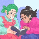
We were able to choose our own prompt from a list! For this project, I wanted to push my comic making - especially how to communicate a lot of information in a small space. I went through and watched a few clips from the series to see which prompt would fit a comic and settled on Scott’s death.
As usual, I began by getting some reference images and going ham on some big paper. This gets me excited about the project and helps generate ideas. I go for whatever interests me in terms of medium and subject matter, but I try to use a process that doesn’t let me control too much (in this case brush and ink)
initial sketches for fun and vibes :D
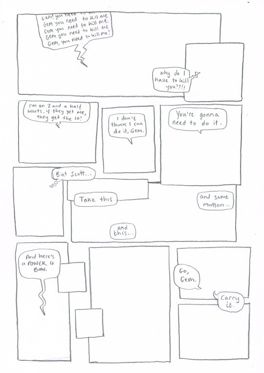
During this, I also took the time to transcribe the scene - I wanted to use the dialogue directly, and see how much I could fit into the single page that I was allowed for the zine.
In these early planning stages I make sure to do warm-up sketches to remind myself of the energy I want to communicate. This also keeps things fun and fresh so I'm not ONLY thinking about page composition and making things 'good'. (the expectation for it to be 'good' kills a project prove me wrong)
Dialogue from the clip + warm up sketches
Next up, I started to plan what panels I have on the page. At this stage, some panels might just be a box with some words, and some may have a sketch if I have a clear composition in mind. This stage is mostly for pacing and plot, so instead of focusing on what the panel and page will look like, I will think about:
what will happen in the panel
it's purpose and
what it will communicate
Sometimes I'll illustrate a string of panels that tell the story and fit them on a page after - but this depends on the project and my confidence with the size of it.
After messing around with these and coming up with a pretty clear direction, I draw a bunch of boxes to see how the panels could sit nicely together. At this stage I might realise I have too many panels, and need to cut a few or come up with a creative solution. Nothing is set in stone at this point.
sketching panel layouts
Now begins the fun! I decide on the layout I prefer and I can start putting planned compositions into the boxes. I often do this digitally, or a digital editing process will be involved.

Once planned, I print these out to do a more refined sketch over. I find that my traditional drawings have a lot more life and character to them than digital ones, so I try to keep the majority of the process traditional, with passes of scanning and digital editing.


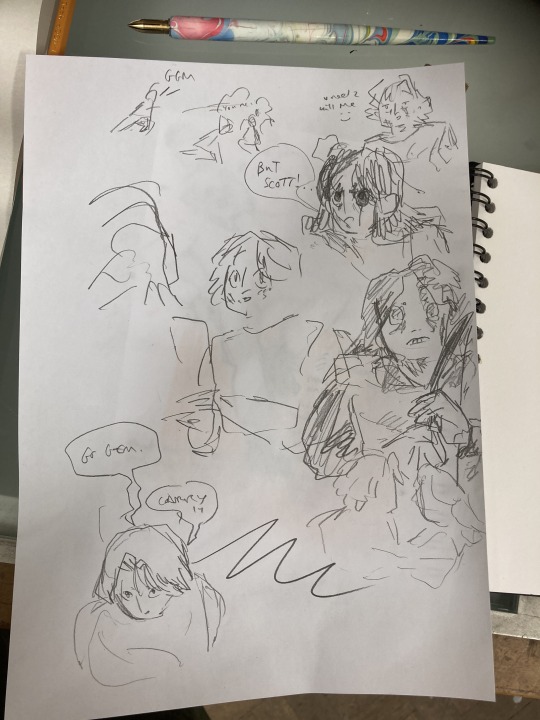
I tried a version with her looking out at the distance - ready to face the oncoming battle. But it still felt off. So I turned to my slides to ask myself some questions!!

I tried to think of more things that were working - but I really felt like it was lacking a lot. I was going for this slower emotional feeling because that came more naturally to me, but it just wasn't working for this image. The original clip is quite rushed and chaotic - which would be harder to communicate in a comic format but the challenge interested me. Either way, I knew I wasn't happy with this direction so... i decided to start from scratch! Back to the drawing board!!!
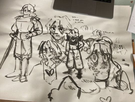
In the previous version, I had cut out a lot of the dialogue, but I decided to go back to the original clip and use AS MUCH as possible. Since passing the bow was my favourite part of that first composition, I really wanted to lean into it as the emotional height and final goodbye before Scott's death. It's a moment to slow down and absorb the vibes :D

I made a list of panels along with their descriptions to refer to when trying to figure out the order of panels. there were SO MANY and it was VERY CONFUSING when they were too small to read.
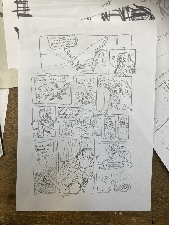
These thumbnails were super small and would not have made sense without my list, I swear.
I printed this tiny thumbnail out at A4, so I could sketch over it and get a clearer sense of flow. Then began a loooong process of printing out tiny photocopies and rearranging the panels to be legible. It was a difficult balance of communicating busyness while making sure the hierarchy/reading order made sense.


After some tweaking, i printed out an A3 copy to draw my panel borders and text.
Doing this on a separate piece of paper means I don't have to worry so much about messing up the text or borders when drawing the characters. This allows me to be more free and expressive with my illustration.
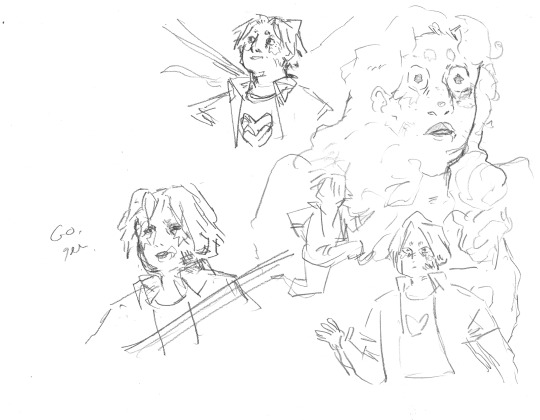
Woah! Quick trip back in time!! During the thumbnailing process I drew these warm up sketches! I looooved the way the linework came out. I drew this on an A3 piece of paper - and the shocked Gem would, in theory, be one of the smallest panels. So I decided to do a crazy thing.
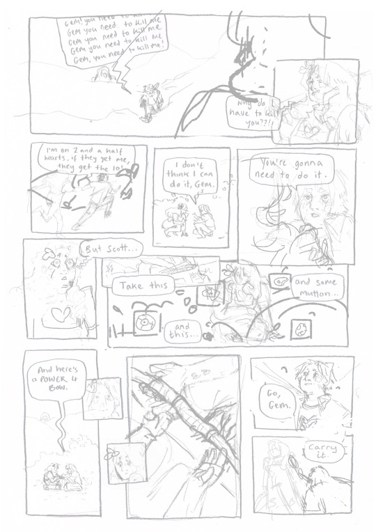
I touched up the sketch digitally, compiling some of my favourite warm up sketches, some traditional sketches made for the panels, and filling the rest in digitally. Then I printed this image out in QUATERS at A3!! This meant the final sketch layer, printed out was A1!! (aka very large, considering the final file would be at A4, about 8x smaller)
I did this so I could get fairly small detailed lines with my pencil while being quite expressive and firm with my mark-making. Slowly, I dlined all of the panels traditionally and scanned them in. Then I assembled the finished linework on Photoshop, along with the text and panel borders and got to colouring :D

final linework :D
For colouring, I played a little bit with halftone but I found the texture made it feel a bit too busy - the panels are already doing enough. Because of this, I also decided to use a limited colour palette. Here are some images of the colouring process, which I won't go into today.


I'm really happy with how this came out - I think it captures the chaos of the moment, while taking time to linger on the emotion of it. Keeping that bow moment really made it, I think.
I think the last panel is still quite weak. Earlier in the process there was a low-angle shot of Gem about to kill Scott which may have been more powerful, but I think I was struggling with my actual drawing skill when it comes to perspective. A lot of learning how to draw, and in particular with comics, is about knowing where your skills are at, how to utilise them best and how to test and push them.
I'm glad that I started again, instead of finishing that composition I wasn't happy with. It was a tough project but I learnt sooooo much from it, and it's been essential skill-building for.... the current comic I'm working on (stay tuned!!! :0) Thanks for reading this incredibly long post! Go check out @trafficzine and look at all the other cool art Cool vibes and silly men,
Archie :D
#archillustrates#arch is learning#project development#art#art process#art resource#process#artists on tumblr#illustration#comic#picture book#art blog#illustration blog#queer artists on tumblr#illustrator#female illustrator#queer illustrator#comic artist#comic art#female artists on instagram#artists on instagram#procreate#digital artwork#artist blog#artist on tumblr#web comics#tumblr art#tumblr art blog#art on tumblr#life series
144 notes
·
View notes
Text
Omg love the progress!!! For mice - There’s an artist that draws mice (and mostly rats really expressively, and their influence would look awesome in your style! They are called The Bean Baguette and worth having a look at!!


Their work helped me understand how to break down rodent anatomy - the key is to pretend they’re wearing harem pants :0
Lots of love <3
Archie
Alice in Wonderland Cover Redesign (P2) Shri - 21/06/2024
Hi Archie! So glad to see you prioritising your rest and health! Well done! Glad to have you back! Hopefully, it will feel a little less like I'm monologuing to myself now...
Anyway, it would be so interesting to hear your perspective on the mind’s eye and picturing artwork. I feel you'll have some really good thoughts on it.
Also so glad you are obsessed with WHA, I'm almost up-to-date now, just need to read Vol 10 - 12. It is such a beautiful Manga, especially its panelling work. I have this amazing video I watched about it.
I think it does minimal spoilers? Anyways, it's a great video go check it out!
youtube
So getting into the last two weeks on my AIW project (Alice in Wonderland).
In the last two weeks I’ve done about 6-10 hours of development and I’ve selected final sketches
I also set some soft deadlines for this project to make sure it's chugging along
Sketch 17/06/23
Cleaned up sketch 08/07/24
Linework 29/07/24
Colour 19/08/24
Final 09/09/24
So let's hope I keep to these deadlines...
Anyway with this in mind I hit my forts deadline this week which was to choose a sketch with the one below.

I picked this one over the others because it effectively conveyed the themes I wanted to express and highlight in this book.
I picked this one over the other because they didn't serve the story. Even if I personally love the perspective and vibe of the one on the left, it gives it too much of a horror physiological vibe. Which Alice in Wonderland is not.


So here are my further refined sketches below.


I thought it would be really good to have some of the motifs from AIW embedded into the keyhole design - however, because the style of illustration is not my usual approach, it's been pretty hard to get my head around it.

Here are the final sketches of the book cover - there are still a few details to iron out.
To Iron out:
Patton in keyhole
how to draw a mouse
blurb and other design stuff
spine design
small element in water
Things I'm thinking about.
Alice in Wonderland title can blend in with lines of water (thinking about placement of essential elements like title and blurb)
The tone of the piece needs to stay playful and fun while being weird
So that's all from me this week peeps
Hope you all have a lovely dinner and send good vibes
Shri
5 notes
·
View notes
Text
Alice in Wonderland Cover Redesign (P2) Shri - 21/06/2024
Hi Archie! So glad to see you prioritising your rest and health! Well done! Glad to have you back! Hopefully, it will feel a little less like I'm monologuing to myself now...
Anyway, it would be so interesting to hear your perspective on the mind’s eye and picturing artwork. I feel you'll have some really good thoughts on it.
Also so glad you are obsessed with WHA, I'm almost up-to-date now, just need to read Vol 10 - 12. It is such a beautiful Manga, especially its panelling work. I have this amazing video I watched about it.
I think it does minimal spoilers? Anyways, it's a great video go check it out!
youtube
So getting into the last two weeks on my AIW project (Alice in Wonderland).
In the last two weeks I’ve done about 6-10 hours of development and I’ve selected final sketches
I also set some soft deadlines for this project to make sure it's chugging along
Sketch 17/06/23
Cleaned up sketch 08/07/24
Linework 29/07/24
Colour 19/08/24
Final 09/09/24
So let's hope I keep to these deadlines...
Anyway with this in mind I hit my forts deadline this week which was to choose a sketch with the one below.
I picked this one over the others because it effectively conveyed the themes I wanted to express and highlight in this book.
I picked this one over the other because they didn't serve the story. Even if I personally love the perspective and vibe of the one on the left, it gives it too much of a horror physiological vibe. Which Alice in Wonderland is not.
So here are my further refined sketches below.
I thought it would be really good to have some of the motifs from AIW embedded into the keyhole design - however, because the style of illustration is not my usual approach, it's been pretty hard to get my head around it.
Here are the final sketches of the book cover - there are still a few details to iron out.
To Iron out:
Patton in keyhole
how to draw a mouse
blurb and other design stuff
spine design
small element in water
Things I'm thinking about.
Alice in Wonderland title can blend in with lines of water (thinking about placement of essential elements like title and blurb)
The tone of the piece needs to stay playful and fun while being weird
So that's all from me this week peeps
Hope you all have a lovely dinner and send good vibes
Shri
#art blog#artist blog#artists on tumblr#illustration blog#art#art process#illustration#comic artist#smileyshri#Alice in wonderland#book cover redesign#book cover design#Alice in wonderland book coverr#Youtube
5 notes
·
View notes
Text
23rd May ‘24 - [arch] Witch Hat Atelier Takeover Episode
Greetings! I am back from the dead! I have had a fair few weeks of rest and admin and now I have lots of art thoughts! (lets see if I can get some down)
OMG Shri I am in LOVE with your last few posts!!! Have you considered not hitting it out of the park every time?? I have thoughts about the mind’s eye thing and picturing your work… maybe at some point I’ll write a blog about it :0
I’m working on a super cool comic for some people I can’t yet talk about but I’m going through a HUGE research process for it. It’s awesome, it feels like I’m back at uni. Learning so many skills and documenting my research properly in my slides again 💪💪
Though I can’t talk about the project itself, I would love to share a bit of analysis I’ve been doing on Witch Hat Atelier!! (Heads up - the following post contains spoilers for the first half of the first volume)
Expressions!!!

Though not unique to Witch Hat Atelier (WHA from now on), the manga uses a combination of subtler, realistic illustrations combined with goofy exaggerated ones - in particular using styles found commonly in manga.

The first few pages have quite minimal facial expressions - they’re still obvious (and to a degree, exaggerated in Coco's case) but not goofy. Shirahama uses additional techniques like text and sparkles on the right hand page to communicate Coco's excitement.

Traditional manga expressions, with more exaggerated and goofy features, are saved for comedic moments - in this instance from Coco’s childlike excitement.

Here we have quite realistic expressions, exaggerated by a combination of shadow (right-hand page) and tight close-ups. This. brings us into Coco's wonder, and communicates her high level of engagement.


In fact, the goofy expressions are almost exclusively saved for smaller panels, whilst more high drama or wonder moments take up larger panels and whole pages, so there's space for that high level of detail.

In this spread, expressions are playing a more minor role until the last two panels. In the panel circled in red, Coco’s expression is distressed. Because it’s a smaller panel, mid shot panel, her expression is emphasized by more cartoonish techniques (eg. The lines down her face.)
The last two panels return to slightly more realistic expressions, without the more cartoonish aids. This makes the moment feel more dire. Shirahama emphasises this once again by using close-ups and darkness surrounding them for the appropriate ambience.


Shirahama uses a high level of detail to capture moments of high wonder. They force the reader to take in the extent of the image. These are usually paired with minimal text which also requests that the reader takes time to absorb the image, rather than skimming over text.
Panel Pacing and Flow :0
For the ‘day to day’ ordinary scenes, pretty straightforward paneling is used. On a grid, straight lines, very little overlapping.
This is broken in moments, like introducing Qifrey. A three-quarter image of him breaks the panel structure to say ‘hey, this guy is important’.

Overlapping panels are first introduced in this moment - which is huge for Coco, as she realises how magic is used. The change in format once again tells the reader that this is important by adding more visual interest. The images sit like a bunch of disjointed puzzle pieces, like she’s about to put something together.
On the second page of the spread, the format returns to (mostly) normal as everything slots into place.

What can I say... line of action!!! Look at those gorgeous textures that lead the composition into that curve. That's all from me today folks, hope you enjoyed reading through! I've got a bit more stability in my life now, so hopefully I'll be more consistent with my uploads. (no promises I'm taking it easy) lots of love! :D Archie
#archillustrates#arch is learning#project development#art#art process#art resource#process#artists on tumblr#illustration#comic#small art blog#art blog#illustration blog#illustrator#book illustrator#queer illustrator#comic artist#comic art#artists on instagram#digital artwork#digital artist#risograph#artist blog#tumblr art blog#witch hat atelier#manga#analysis#media analysis#discussion
7 notes
·
View notes
Text
Alice in Wonderland Cover Redesign (P1) Shri - 07/06/2024
Hey Everone!
This will be a little different, this time I'll be blogging about the project I'm doing right now, sort of like a real-time blog post?
So I’ve just started a self-directed project of redesigning the book cover for Alice and Wonderland to add to my portfolio.
So this will probably last a few months - not sure if all my posts will be related to this project? (or maybe it will, I'm not sure yet)
Anyways hopefully this can be more insightful as sometime when looking back and a project you forget all the small revelation/decision you made along the way - so hopefully this will capture the process better. :)
Anyways getting into it
First here are some super initial ideas and sketches


At the moment I am in full play/research mode. What this means I’m trying everything and playing with all ideas
Looking at Existing Alice in wonderland Covers
Looking at my Favourite book covers
Finding one or two of the best book cover and seeing what i like about them and what i don’t like about them
Screenshots of my slides


The main point of this research is to pick apart and understand what makes the story Alice in Wonderland function, especially with its themes. Finding out what elements I think should be featured and highlighted on the cover.
I want to show:
Normalised Wirdness/madness
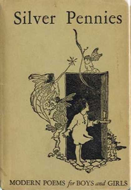
Old-time vibes (like in The Brothers Lionheart)
Alice Changes


Here are my further thumbnails - again just really going ham. I only have my creative cap on right now, not worrying about logistics or deconstruction yet.


Here are some more cleaned-up sketches
Also note: Rereading the book really helps get the tone right.
Anyway That's all I got today
Hope you have some lovely dinners!
Shri
#art blog#artist blog#artists on tumblr#illustration blog#art#art process#illustration#comic artist#smileyshri#art thoughts#artist problems#alice in wonderland#alice and wonderland book cover#book illustrator#book cover design#book cover redesign
3 notes
·
View notes
Text
Update from Shri - 23/05/2024
Hey Archie and everyone!
Had a bit of a busy week finishing off work and going to fairs, so I thought I'd just share a speed paint of my print I did to go along with the kickstarted Boxes Vol 2 with Third Bear press
Any questions just let me know
Thanks and hope you all have some lovely dinners!
Shri
#art blog#artist blog#artists on tumblr#illustration blog#art#art process#illustration#comic artist#smileyshri#speedpaint#speed paint#love#wholesome
1 note
·
View note
Text
The value in comfort characters from Shri - 11/05/2024
Hi Archie and everyone!
(ignore the late blog post *sweats profusely*)
Today I just wanted to talk about comfort characters and the values in them! (and subsequently convincing you to get one if you don't already have one!)
I also want to rant about mine briefly so... sue me!
If you have a comfortable character hopefully this should reassure you of the value in them and if you don't have one - this should convince you to get one!
First I'll explain what a comfort charater is!
Comfort characters (in drawing context):
A character (person or creature or environment o guess???) that provides comfort when drawing them. This can be your own character or another creator's character.
Personal note: I find that a lot of my comfort characters are a mix of traits I either wish I had and/or existing trains from me or other people I know.
The Value in Comfort characters:
Something to always draw:
When you don't know what to draw - you just draw your comfort character!
I also love to think about them/their world/story lines before going to sleep most nights - which is super fun!
Something to practice with:
When doing studies why don't you make it more fun by adding your comfort characters to it? Figure drawing - make the figures your comfort characters! Environment studies? Put your comfort character in there somewhere! I've done that sort of stuff for years!
Value in self-indulgent drawing :
This is something I'm very passionate about and it's the value in self-indulgent drawing. What I mean by this is drawing/sketching just for your own enjoyment!
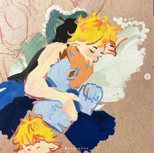
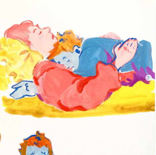
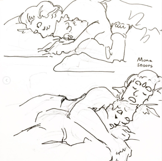
For example, I went through a massive faze of just drawing my comfort characters having really snuggly hugs or sleepy snuggles
This was completely self-indulgent and it made me so happy to draw this - I just kept drawing cuddles for months and months! It was just so nice and comforting!
Anyway's, finally time to introduce you to my Comfort characters!
Here are their character sheets which I'm still adding to
(and ignoring the spelling issues)
And yes they are all adopted siblings - and I love them dearly
The last note is because they’re comfort characters they don't necessarily have to be the pinnacle of good character design, a lot of choices I make with my comfort characters or for self-indulgent choices. I probably wouldn't make the same choices if I were designing for client work or professional projects.
So keep that in mind! It's okay to make bad character design choices if it means you get more enjoyment from them!
That's all today peeps! I hope I have convinced those without comfort characters to get some!
Hope everyone has some lovely dinners
Shri
#art blog#artist blog#artists on tumblr#illustration blog#art#art process#illustration#comic artist#smileyshri#own character#my ocs#get some comfort characters!#comfort character
2 notes
·
View notes
Text
The vision for an illustration breakdown from Shri - 27/04/2024
Hey Archie and everyone!
It's lovely to hear you taking control over your health and not letting anyone/society's expectations of a working/hustle culture control your life - leading to burnout. It really does feel like directly fighting against the capitalistic view when we value fun and rest above work and their view of 'success'
I also couldn't agree more with you - fairs are such a magical place, I've definitely got the best compliments and feedback from them, it always reminded me of the importance art has on people sometimes; always leaving me a bit dazed.
As promised my slightly late blog post is here. (It didn't allow me to edit my original post so)
I mentioned I just did a really big hand-in yesterday with Third Bear Press, so I don't want to go to ham on this post.
I did think about talking about my recent hand in but it's still too soon (I've been staring at those pages for two weeks straight and many weeks before that)
But if you want to have a cheeky look at it go check out the Kickstarter with Third Bear Press!
link: https://www.kickstarter.com/projects/thirdbearpress/boxes-2
Anyway actually getting into the blog, I wanted to talk about something I've been pondering recently.
Archie and I were talking a while ago about how they're a bit frustrated with the difference between their vision for an illustration and their skill set - when your skill set doesn't match your creative vision.
And I indeed, I had some thoughts about it.
(also this is not supposed to be an @ at you Archie, I just went on a really long thought tangent).

My first thought was "I used to feel that all the time" Then I was like "Wow I haven't felt that for a long time" Then I thought "Wow that kinda sounds a bit fullhead?!"
But then I was like "Hold up, back up. I don't think it has to do completely with the skillset, it also has to do with the visions/expectations itself?" because I can't remember the last time I had that experience of having that illustration idea the same way I did a few years ago.
They're different, so it got me thinking why?
Breaking down my thoughts
Also, slight disclaimer: I did no research whatsoever for this so it's literally just my thoughts. Anyways, enjoy!
The vision/idea of an illustration
I don't have the same vision for an illustration anymore as I used to. Before I used to start illustrations/projects with a distinct image in mind, and then draw from there.
Nowadays I think of the idea/image and then clarify it with the message/thing I'm trying to convey through the image. Having this clarification on what you are trying to say is so helpful when hitting issues because you can always refuse back to that as a touchstone.
Without it shit hits the fan then it's harder to take that step back and reevaluate the image.
The minds-eye and the vision/idea
So this section of pondering reminded me a lot of the book I read What We See When We Read by Peter Mendelsund (very good book with a lot of nice pictures). This book discusses what we see when we read (hence the title), one of the main points of the book is what our brain actually images/pictures when reading text.
Here is an extract because it explains it better:
These readers contend that the success of a work of fiction hinges on the putative authenticity of the characters. Some readers go further and suggest that the only way they can enjoy a novel is if the main characters are easily visible: "Can you picture, in your mind, what Anna Karenina looks like?" I ask. "Yes," they say, "as if she were standing here in front of me." "What does her nose look like?" "I hadn't thought it out; but now that I think of it, she would be the kind of person who would have a nose like .. "But wait-how did you picture her before I asked? Noseless?" "Well..." "Does she have a heavy brow? Bangs? Where does she hold her weight? Does she slouch? Does she have laugh lines?" (Only a very tedious writer would tell you this much About a character)
pg 24 of What We See When We Read by Peter Mendelsund
This strangeness of the brain of feeling/believing we can see a character in your mind's eye in full clarity - but at the same time, not actually seeing any details?
This is what I think also happens when we have an illustration vision/idea for a piece of artwork, being able to 'see it' but at the same time not.
This then can cause a lot of issues in the fulfilment of this vision for an illustration, because how can you ever go to the standard of your idea if you don't even know what it is exactly your idea is?
The skillset
This I wanted to touch on because although there is more to it then a skillset, skillset does have a play in this - but maybe not in the way you expect it. Although yes if your skillset is better it's easier to meet these expectations for an illustration, I also believe it has a lot do to with processes and how to handle issues in illustration pieces.
So before university, my process for illustration was very simple.
idea for illustration
Sketch out illustration
Line the sketch
Colour the illustration
Finished
And if at any point in this process, the illustration won't working or I run into an issue - I kinda just gave up on it?
My process now:
Idea on illustration (along with what I'm trying to convey through it)
Research (sometimes, depending on the project)
Thumbnails
Initial sketch
Fleshed out sketch
Line
Colour
Texture
Finished
And at any point I run into an issue I solve it, for example, if the hand passion is wrong and just resketch it until I find one that's good.
Obviously, these a big elements of being skilled enough to be able to identify how something is wrong and how to fix it - so there is a sense of drawing mileage by being able to identify those things.
Anyways those our my thought on it - let me know if you guys have any thoughts/ideas on it too!
Thanks for reading my rambling thoughts
Hope everyone has a lovely dinner (I had a really nice roasted cauliflower with other picky bits)
All the good vibes
Shri
#art blog#artist blog#artists on tumblr#illustration blog#art#art process#illustration#comic artist#smileyshri#illustrator#artwork#drawing#art thoughts
7 notes
·
View notes
Text
Coming soon 👀 from Shri - 27/04/2024
Hey everyone,
Just letting you know I’ll be posting tomorrow, as I’ve just had a big hand in today!
(I’ll probably just re-edit this post?)
Anyways hope you’re gunna have some yummy dinner’s tonight
Shri
2 notes
·
View notes
Text
19th April ‘24 - [arch] Community and Rest :D

Hey Shri! Short one today. It’s been a nice week, I’ve spent several days resting this week and making up for all the energy spent last week.
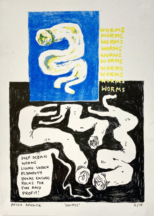
I went to Something’s Fishy Art Market on Saturday - it was lovely!! Got to catch up with a few Plymouth friends and chat to people about Shipworms. I think events like that are really important in our industry. Sure, we make money at those things, but they’re so important for community. As illustrators, unless we work in a shared studio or other social environment, we spend so much time on our own. Sometimes our only contact with others in an arty setting is getting feedback on your work. When I was selling lots through Etsy, I’d get super burnt out with all the labour of posting, never seeing the people’s reactions - it was all just numbers.
Fairs are magical, through. You get to see people engage with your work, be moved by it, and see them fall in love with the other creator’s work around you. You get to be inspired and by all the incredible artists selling their wares, have discussions about technique, compare experiences, or just chat. During uni, we had a module where we had to come up with 5 rules for self-promotion for ourselves. I still think about it sometimes. It was after I’d began to struggle with my upload schedule on Twitter, and the idea of ‘self-promotion’ made me feel sick. Once I spoke to my tutor, we concluded I should focus on how to do self-promotion healthily. I don’t remember the other 4 rules I came up with - but one was try to attend fairs. I knew that seeing real people and the tangible impact of my work made me burn out less. I’m really grateful for that lesson!!
This week I’ve been resting. I did a day of work hanging around the studio (had some meetings about a cool thing that’s happening soon 👀)
It’s the Printhaus Open Day tomorrow and I will be hanging around! - feel free to pop by if you’re in Cardiff :D
Things I’ve learnt this week:
Make sure I have downtime days (for me this means a four day work week (max!) - then one or two days for managing my space, disability, and a day or two for fun)
Your job means there’s lots to do on weekends, so make sure you do an artificial weekend during the week if needed.
Make art fun - if it’s boring maybe you need to change it and/or your perspective
Or maybe you need to sleep for a hot min.
Nice to catch up with you!! Catch you next week :D
Archie 🕺🕺🕺
1 note
·
View note
Text
12 April ‘24 - [arch] Making a Comic in a Week, Disability and Burnout (all unrelated, of course!)
Hey Shri and folks!! LOVED seeing part three of the Lionheart Brothers cover. Stunning!! And awesome to see your process. Also cool to see what you’ve been looking at lately - I’ve just finished a rewatch of Firefly and the characters are still living in my brain a bit.
Life is a bit relentless, huh. I’ve spent a lot of time and energy working on disability stuff - meal prepping, sorting silly government forms, all that sort of thing. Exhausting and super easy to burn out on - but also sets me up for the future in my personal life and for illustration! I want to discuss the balance of pushing and burnout this week with an excellent example - I tried foreshadowing to make a comic in a week.
When I was in uni, it was easy to create cool stuff regularly - you’re constantly receiving prompts, doing activities, getting feedback etc. I still have access to these things, especially through my shared studio community, but it’s not as easy as it used to be. I miss creating finished books, in particular, so frequently. So! I challenged myself to make a comic in time for Something’s Fishy Zine Fair in Plymouth tomorrow, which was just over a week from when I started.
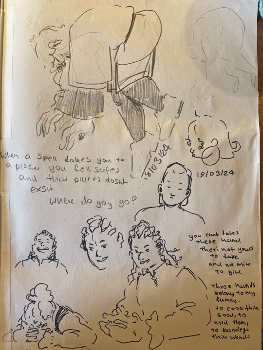
I had come up with the concept for the comic while travelling, written the script and done a couple of sketches. I often come up with concepts while travelling - I just don’t often follow through :P Here’s a couple of sketches I did on the journey.

I’ve been chatting to lots of people about what they enjoy about art - I’ve noticed that I tend to crave the end of the project and having the physical thing with high expectations of myself, which doesn’t lead to a very enjoyable process. Many people I’ve spoken to enjoy the ‘zone’, the focus of the project where you’re just figuring stuff out and not thinking about anything else. Bearing this in mind, I wanted to make the process as fun as possible - this comic is for fun and not for the purpose of having the thing at the end.


I started with a few development sketches of the characters and the vibe. I used ink and my funky kakimori dip pen, plus some brushes. These mediums are hard to control, which makes them good for development for me - they don’t have to be good, this time is for gestural drawings and ideas generation. Some continued doodles in my sketchbook from some downtime :) Fish wouldn't leave my brain.

After a bit of character development, I began by adapting my script into pages - I read the script and try to feel the vibes on how I want to pace the comic, considering:
How much dialogue and plot do I want to put on one page?
Do I want it to be more text or image-heavy?
Do I want it to feel fast and snappy, or slow and dreamy?
Which parts of dialogue feel like a page-turner?
Are there any twists that should be separated from the rest of the scene by a page-turn?
Are there any moments that should sit next to each other on spreads?

You can see me changing some dialogue around, writing as I draw a bit. Also playing around with some weird looking fish?? With noses???
I got a bit stuck at this stage. I was scared my script wasn’t good enough. And worried about if I could even draw fish. After a couple of chats with art friends, and some rambling in my slides, I reminded myself that the lesson this time is fun!! Have fun goddamn it!! No point doing it if you’re not having fun. (it’s not like we make any money from riso printed zines anyway)
Screenshots from my slides - these things are wonderful for gathering inspiration and venting when you run into a problem with the project.
So I decided to just go for it. Not even thumbnail, but just take a scene and draw it. I asked a studio friend to choose a number, and I drew that scene.
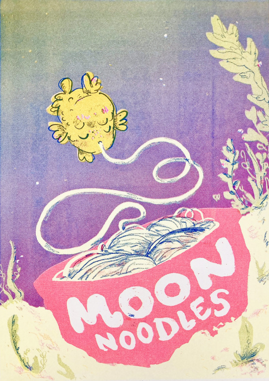
Because of the chatty style of the comic, and how much dialogue there was gonna be, I knew there would have to be a LOT of panels. I decided to make it A4, and use a 8x6 grid. I’ll draw the images at A3, and than scale them down to A4 when it comes to printing.
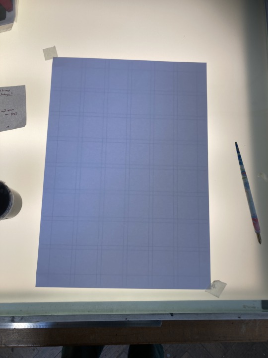

left: A3 grid on the lightbox, for tracing over || Right: A4 grid with boxes of different sizes for me to reference while choosing the layout - this way I can see the final print size
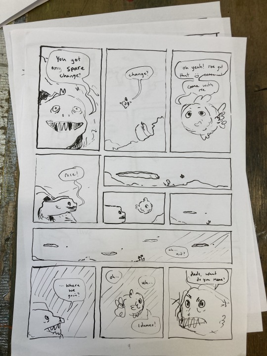
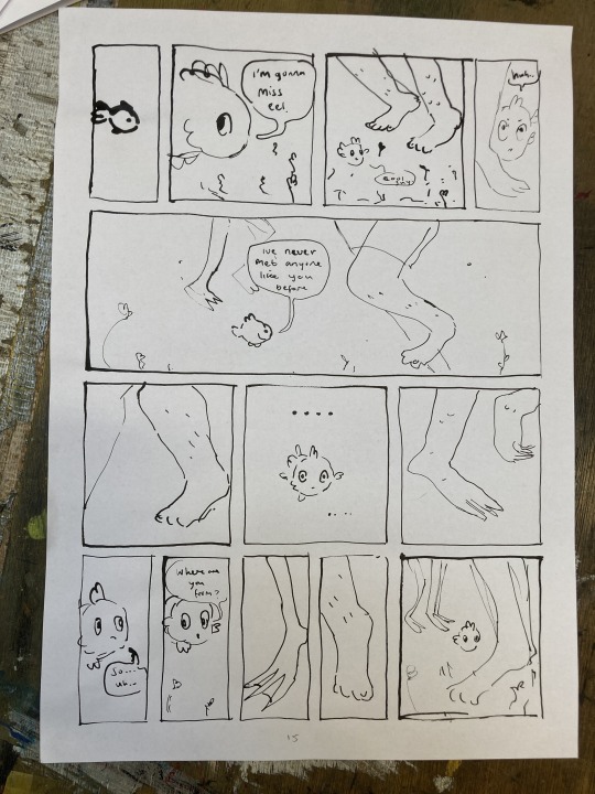
First drafts of a couple of random pages from Moon Noodles.
The first day I drew several pages that I was really happy with! It gave me a lot more confidence in my script - seeing it come to life with the characters on the page - some pages even got some laughs which was nice. I would look at the page plan, script, and spend a few minutes thinking about the pacing and how I wanted the dialogue on the page, and the go straight in with the dip pen - with the awareness that it might be wrong. This process taught me an important lesson - you have to just do it. The thing is, if you do it and it’s bad, you just do it again but different. Repeat. Staring at that script thinking it wasn’t good enough wasn’t actually going to get anything done, be fun OR make nice stuff. You have to do the thing. Then you make it better.
The other thing I learnt from this process was to give it space. There was a day where I did one page, hated it and thought the pacing was off, and spent the next day trying to translate it into two pages. It didn’t work. I came back the next day and realised the first page I’d done was fine and just needed a couple of tweaks. Do the thing. Let it be.
Here’s a little picture of my setup.

(Sorry all of Printhaus for hoarding the light box and getting ink all over it :( love u)
Useful stuff!!!!
Finished pages to refer to, plus more A3 paper underneath for future pages
Laptop with script
Dip pen, ink and water for keeping that little guy clean!
development sketches for relevant scenes
Page plan (you can see I have shortened it considerably since last time - now it's 20-24 pages and noted on scraps of paper so I can move them around if there's any changes of plan)
A4 sheet with boxes to show the sizes of the final print
also scissors??? i don't remember why they're here
But then monday morning came. I realised that if I wanted to get it all printed by friday, I needed to:
Plan and 12 pages on Monday, and 12 on tuesday
Get the final files for every one of the 24 pages by Thursday
Print friday morning
Travel down to devon Friday afternoon
Fair Saturday
Not only is that basically impossible, but it would be very bad for my health, make for a rushed comic, and most importantly, not be fun. The thing is, I’ve made whole comics in a couple days before. I figured I could still do it. But that’s not actually a good thing - my skills and taste have increased, I'm aiming for bigger, more ambitious projects and yet I expect the timelines to stay the same? It doesn’t exactly work like that now, does it?
But I kept going anyway.
Tuesday morning, I decide to get the cover put together so I can get the preorder post-out. I get pulled into an unexpected meeting, and then spend the rest of the day inking this thing and getting the files sorted. At this point, I know for sure It’s not possible to get this done. Thankfully my two Printhaus besties were in. They helped me drop it. I love this comic, it feels fun and joyous and I’ve enjoyed working on it - lets not rush it and end up with a bad product that will bother me. Let’s take time, explore it and really enjoy the process!!!
All is not lost for Something’s Fishy Zine Fair, though! Originally, I had planned to do a print of the Moon Noodles Cover for preorders only, but why not print that for Something’s Fishy?? Anyone who buys the print will also get a discount code for the pre-order :D (also here’s the pre-order link)
So here’s a few images of the Moon Noodles cover print and the process!! I hope to see some of you at Something’s Fishy. It’s a joy to visit Plym again :D
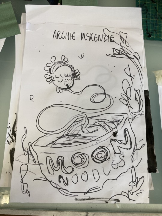

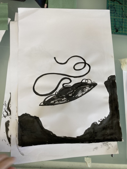
Sketch printed out at A3, and 2 of the layers. I scanned these in and edited them on photoshop to get the files ready to print.

Coming to terms with the fact that 1) I don’t have illustration superpowers even if my expectations are that high and 2) I’m disabled (yes it’s been years and it’s still hard to face) is really hard!! I need to spend most of my time when I’m well preparing for when I’m not AND fight the urge to work until I burn out, which I always lean towards because it’s nice escapism.
The thing is that living, and not being too exhausted to move is much more important than a comic. And if I am gonna spend my functioning time making comics, they’re gonna have to be enjoyable to make. Otherwise your life slips away from you and you haven’t been really living it.
Hope that hasn’t got too deep for you. I think that stuff is important to face, especially since the creative life is so incredibly busy.
Thank you for reading this goddamn essay, I hope that it helped in some way! As usual, feel free to drop an ask if you have any questions.
Chat soon :D Archie <3
#archillustrates#arch is learning#project development#art#art process#art resource#process#artists on tumblr#illustration#comic#picture book#small art blog#art blog#illustration blog#queer artists on tumblr#illustrator#book illustrator#queer illustrator#comic artist#comic art#artists on instagram#procreate#digital artwork#digital artist#riso#risograph#artist blog#artist on tumblr#web comics#tumblr art
4 notes
·
View notes
Text
General update/Consumption from Shri - 12/04/24
Hi Archie and Peeps!
Hope the move went well with you Archie! Moving is so much energy in all forms from the brain to the physical - so hopefully it when as smoothly as a house move can go!
I'll be doing a general update today; mostly looking at what I've been consuming at the moment. This is because I am in the middle of finishing stuff for the deadline (I've got one at the end of this month for one of them ˙◠˙ ) and feeling like my brain is slowly melting somewhat.
So Just a chill update today!
What I've consumed and would recommend:
Link Click - great Chinese animation, waiting for season three ˙◠˙
P.S. Absolutely obsessed with session one opening Back in time, like they really didn't need to make it such a bop!

Witch Hat altervia - on the Forth Volume now!
Absolutely love the found family vibes! Also, look how pretty it is!!!

Sherlock and Co - This is a great modern podcast of Sherlock, what more is there to say.

Half-life by Livingston and Beautiful Things by Benson Boone - I've been listening to these songs on repeat! They very much remind me of one of my comfort characters Tossgo

Keeping Finance Personal by Ellyce Fulmore - Slowly making my way through this one because it's got a lot of homework I gotta make sure I do!

Oh, I also read this amazing picture book called Big by Vashti Harrison.

Some of the spread in this book *Chefs Kiss*
Anyways that's all from me folks! I'll see you soon
Hope you all have some lovely dinners!
Shri
#art#art blog#artist blog#artists on tumblr#illustration#illustration blog#art process#comic artist#smileyshri#Vashti Harrison#Big#witch hat atelier#Keeping finance personal#Ellyce Fulmore#Link click#sherlock & co
1 note
·
View note
Text
Hey folks!!
Been moving this week so the blog will have to wait. Hopefully I'll have something for you before next Friday.
- arch <3
1 note
·
View note
Text
The Lionheart Brothers Bookcover (part - 3) from Shri - 29/03/24
Hi Archie!
I'm glad that my bullying (affectionately) worked!
Seeing you getting so stuck in your character's stories makes me want to get back to my comfort characters and their stories - I'm actually trying to make some official character sheets for them, so maybe one day I'll be able to officially show them to people.
Until then here are some of my warm-ups and cool-downs of them instead.
Anyways getting into Part 3!!!
Recap on what I was talking about
The last blog was about how I was completely lost in what to do next as I just couldn't come up with anything with the right vibe.
So I went back to the basics by analysing first what the existing covers were doing and what I liked and disliked about them.
Notes at the time
What I’m struggling with is both depicting their relationship (their adorsion for each other) while also showing the more intense scene later in the book
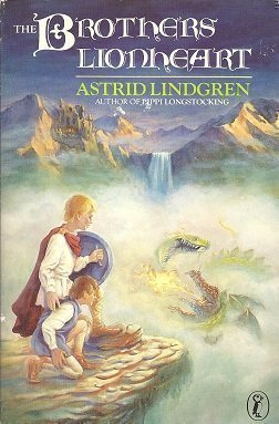
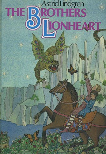
Both the covers on the left [above] have the brothers physically larger than the dragon, showing how although the dragon is massive, the story is about them and overcoming the dragon.
These are good examples, showing more of the adventurous side.
Though I don’t like how it shows the dragon which is a mystery of the whole book, so kinda a spoiler.
I also had a look at other book covers to find what kind of vibe I wanted the cover to look like


I absolutely loved the composition of this one, with the ice queen overshading the character, again showing the control over the progestins story.
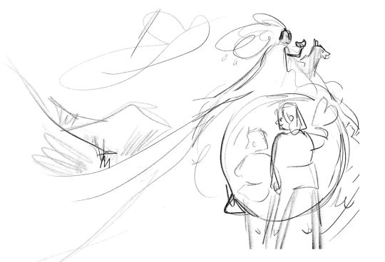

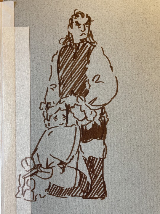
I then came up with these two sketches.
This was the breaking point for me although it's very similar in composition to the first draft I did, its tone is completely different.

Differences
Brothers Poses:
The pose on the first draft was showing fear, running and determination. while the new pose of the brother shows the absolute adoration they have for each other and how the book is driven by their love for each other.
Notice how the older brother is not even looking at the perales ahead he's just looking at his younger brother with so much love, while his younger brother returns the gaze.
(btw I am obviously talking about familial love)
This gives the cover a hint of a vintage look, implying the tone of the story - capturing the innocence of vintage stories I was struggling to capture.
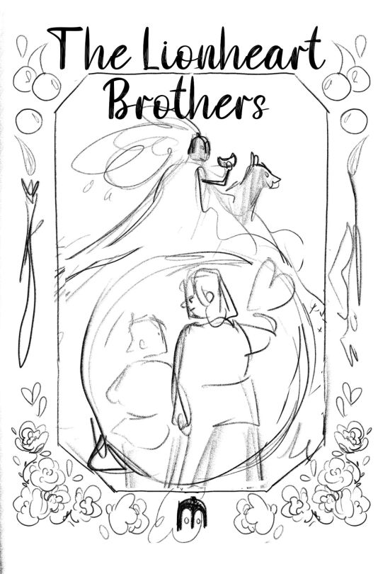

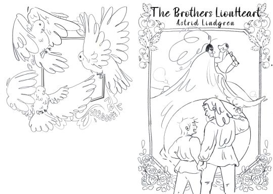
Notes at the time
Positive
Love the position on the ruler
Improvements/edits
The cherries at the top look better in the sketches
Bird feels a bit strange in that space
Rusty legs need tweaking
The space on the ruler's right is strange
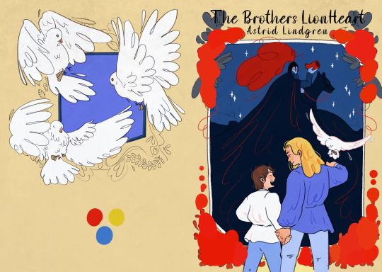
Note how during the colour phase I took out the eye complete getting rid of the dragon. this was because I felt visually that the area was getting too busy, distracting from the brothers. so I took it out.
And other notes
The Cherries and the roses are a narrative node towards the village's feathers in the book. Cerry village and wild Rose village.
Look how the brothers are in front of the border/frame, this was to visually show how they go from one world to another in the story. going into another world with the vibe of a painting or a storybook.
The dove flying onto his arm shows how he's an advocate for peace and will fight for it (pose - he's visually standing against the bad guy in the image) and his natural acceptance of the dove shows it's his nature to fight for peace.
The bag guy seamlessly blends into the landscape filled with shadows - again showing his control over the lands. Notice how the two elements in red (and at the highest pion of the page) are the shell/horn and his helmet feathers - these are his symbols of power
His cold colour pellet contracting with the warmth of the brothers

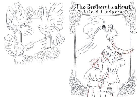
Screenshot from my slides
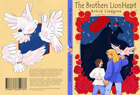
and here's the final! (finally) (Q_Q)
Anyway there is my process from start to finish on doing my book covers (with a lot of issues along the way)
Let me know if anyone has any questions!
I'll see you all soon and have a lovely day!
#art#art blog#artist blog#artists on tumblr#illustration#illustration blog#art process#comic artist#smileyshri#the lionheart brothers#book illustrator#book covers#book cover#digital artwork#digital illustration#digital drawing
11 notes
·
View notes