Hello and welcome to Complete Resources, a blog dedicated to bringing you all the photoshop and tumblr resources you could ever need. Here you'll find everything from tutorials and PSDs to fonts, themes and more. We track the tag #completeresources.
Don't wanna be here? Send us removal request.
Statistics
We looked inside some of the posts by completeresources and here's what we found interesting.
Average Info
Notes Per Post
3K
Likes Per Post
2K
Reblog Per Post
1K
Reply Per Post
0
Time Between Posts
19 days
Number of Posts By Type
Text
11
Note
6
Last Seen Tumblr Blogs


Fun Fact
The Tumblr app for Google Glass was released on May 16, 2013.
Text

PSCENTRAL — EVENT 41: HEROES
this month's prompt is HEROES! they can be super and aspirational, real and relatable, and everything in between! this event runs from august 3rd ~ 29th 2025. the deadline of this event is 11:59pm pacific time of august 29th 2025.
to participate: ✦ join the network ✦ reblog this post ✦ make a gifset that fits this month’s prompt ✦ caption your post with: @pscentral event 41: heroes
feel free to message us if you have any questions about the event. we’re excited to see what you create!
[template credit]
49 notes
·
View notes
Text

Welcome to laufeysource! Your one stop shop for all things related to Grammy Award Winning singer-songwriter, Laufey (pronounced Lay-vay)!
Here we'll share updates, photos, gifs, edits, fanart, and other things about Laufey and her work!
Make sure to tag us in your posts using #laufeysource and #laufeyedit
We're currently taking gif requests to help us grow. Feel free to send some suggestions!
13 notes
·
View notes
Text

PSCENTRAL — EVENT 39: PRIDE
happy pride month! this june we'll celebrate pride - anything pride-themed from your favourite pieces of media, characters, celebrities, to colours! this event runs from june 1st ~ 28th 2025. the deadline of this event is 11:59pm pacific time of june 28th 2025.
to participate: ✦ join the network ✦ reblog this post ✦ make a gifset that fits this month’s prompt ✦ caption your post with: @pscentral event 39: pride
feel free to message us if you have any questions about the event. we’re excited to see what you create!
71 notes
·
View notes
Text


MUSIC LYRICS TEMPLATES PACK by @loviestudio
The templates were made in Photoshop CC; it will work on Photopea!
TERMS
Like and/or reblog to help a creator.
Don’t repost, re-upload or put it on packs and/or google drive. Don’t claim my resources as your own, and don‘t share them without my consent! Don’t use my resources as a base or copy them.
Credits are not mandatory, although I’d love to see your edits!
My resources are free for personal or non-commercial use only. For commercial use, you must pay for the download. If you paid for the download, you are authorized to use it commercially. Reach out to me for more information or if you have questions about my resources licenses.
Follow me for more resources! ♡
This is a free resource, you can download it on Ko-Fi. Thank you!
DISCLAIMER: I have no affiliation, endorsement, or sponsorship by Apple Inc., Spotify AB, or their affiliates. Logos are registered trademarks of their respective owners and are used under fair use principles for non-commercial, creative projects. This is a free template intended for personal or educational use. Do not redistribute or sell this design.
415 notes
·
View notes
Note
Hi, I love your gifs for Himiko!!!
https://www.tumblr.com/biblical-love/781849514019536896/lgbtqcreators-event-27-doomed-by-the?source=share
Please tell me how you made the shape and its color in the third gif

thank you for your kind words anon, and of course, i'd be happy to show you how i did this effect!
(note: i did my best to make this tutorial as beginner friendly as possible, but absolutely do let me know if there's anything i need to elaborate on!)
STEP ONE: TYPE OUT YOUR TEXT
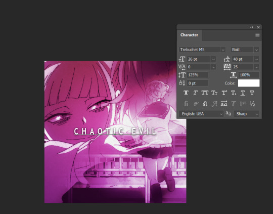
These are the text settings I used (in case you were curious).
STEP TWO: ADD A ROUNDED RECTANGLE

it doesn't actually matter if your rectangle is in front of or behind your text. the hex code for the shade of gray i used i #a9a2a7, but you can also go lighter or darker if you want to, so long as it's a shade of white / black / gray.
STEP THREE: SELECT YOUR TEXT
To do this, hold down your "ctrl" key, and click on the icon for the text layer under your "layers window". it's somewhat difficult to see in this screenshot, but you should see a dashed line outlining your text after you've done this
STEP FOUR: INVERT THE SELECTION

Use your Marquee tool (which you can access by clicking the "m" key), and right click on the selected typography
STEP FIVE: ADD A LAYER MASK TO THE RECTANGLE
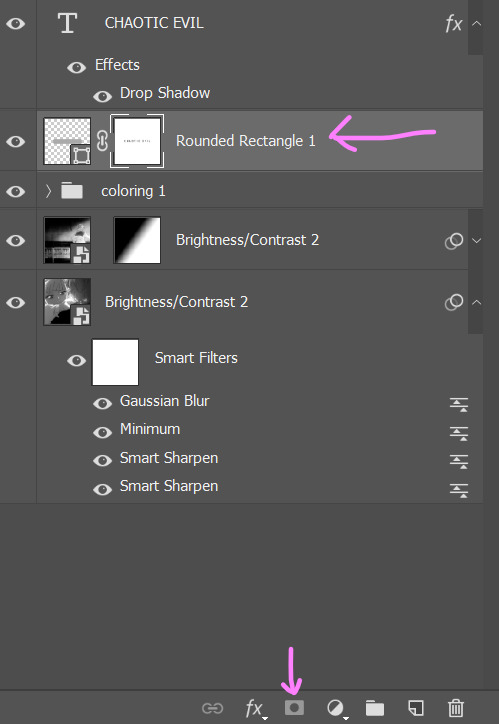
MAKE SURE YOUR INVERTED SELECTION IS STILL OUTLINED. click on the layer for your rounded rectangle in the layers window. then, find the icon at the bottom of the window that looks like a rectangle with a circle missing from the middle.
STEP SIX: DELETE YOUR TEXT

this will leave you with just the rectangle, which has had the text cut out by the layer mask.
STEP SEVEN: CHANGE THE RECTANGLE'S BLEND MODE TO "DIFFERENCE" OR EXCLUSION

honestly, there isn't really much of a difference between the settings and what they do, so just pick whichever one you like more. if you don't like the colors, don't sweat it. we're going to be changing them in the next step.
STEP EIGHT: ADD A GRADIENT OR COLOR OVERLAY

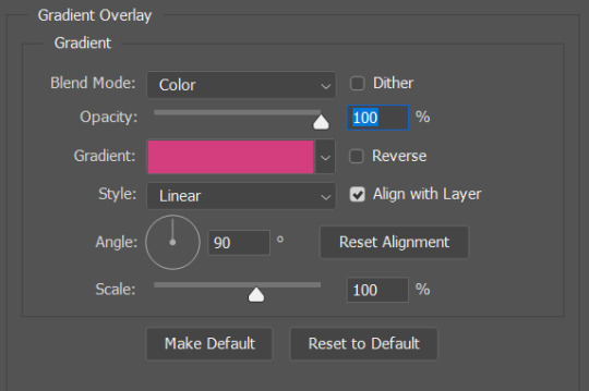
to add the overlay, click on your rounded rectangle layer, and then find the button that looks like the letters "fx" (it should be right next to the layer mask button from earlier).
and that's it! you now have a custom block font!

if you use this tutorial to create any gifs, make sure to tag me (by using the #tuserecho tag) - i'd love to see them!
56 notes
·
View notes
Note
Hi, could you please tell me how to do this slanted layout? the-borgias*tumblr*com/post/695485491217334272/one-chicago-appreciation-week-day-one-favorite
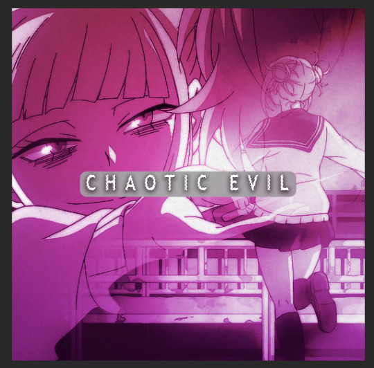
Hi, Anon! I'm sorry this took me a few days to answer but I struggled making this tutorial (not because the process itself is difficult but it is difficult to explain it properly.) Anyway, here's the gifset Anon is asking about. I hope this is easy to understand and I also included a .psd file of the layout :)

PSD FILE OF THE GIF ABOVE & TEMPLATE
What you'll need:
Basic Photoshop knowledge (I use Photoshop 2023)
Basic knowledge on how to make layouts (here are a couple of tutorials: x x)
Basic knowledge about layer masks (tutorial)
STEP 1: Make a basic layout
You can do pretty much any layout you want but for the sake of the tutorial I tried to recreate the same template I used in that gifset. I'm assuming you already know how layouts/templates work so I created a 540x540px canvas and went to View > Guides > New guide layout. I used these settings:

And this is how my canvas looked like:

Now I pressed (M) to use the Rectangular Marquee tool and create the rectangles I wanted. This is my end result:

STEP 2: Tilt the layout
This is actually pretty easy. First we're going to select all our layers. I paired mine in groups so they looked like this:

Once we've selected all of them (groups, layers, whatever you're working with) press Ctrl + T. Your canvas should look like this:

And we're going to tilt it by changing the angle to -2.00 in here:

Now our layout is slanted! But as you can see we have transparent spaces we need to fill. I don't know if this is the easier method to do it but I use the Polygonal Lasso tool (L). I'll use the first orange box as an example:

As you can see I use a ridiculously big zoom so I can be as accurate as possible but it's basically impossible to create a perfect box, so this will work. Once we have selected our desired shape we'll use the Brush tool (B) to paint in the layer of our original orange box:

You have to do this with every box so it's a bit tedious but that's the way I did it 🤷♀️ This is the end result:

STEP 3: Place the gifs (using Layer Masks)
But now, how do I know which size my gif should be? Our initial measures won't work because our final boxes are bigger so here's what I do. I'll select the Polygonal lasso tool again and make sure I select a little bit more of the box I'm measuring, like this:

It's a little hard to see it but the dots are just a little bit bigger than the orange shape. To be more accurate, my original box was 178x87px and the shape I selected is 174x100px. So I'm going to make a 174x100px gif and place it right above the background, like this:

Now we're going to select the layers of our gif (I'm assuming you're working with a Group because it's easier) and click Ctrl + the orange box. You should see this in your canvas:

And now create a layer mask in your gif group (if you don't know how to do it check out the tutorials I liked at the start of the post.)

Now you can delete the orange box. And, once again, you have to do this with every box and write down the measures (and remember that all your gifs must to have the same number of screencaps!)
I hope y'all don't mind that I didn't create 8 different gifs lmao I was too lazy so I just used a big gif as a background and made 4 small gifs. This my end result:

For the background I merged the remaining boxes and used that to create the layer mask. I'm not going to explain it since I believe it's much easier if you check out the psd file.
And that's pretty much it! It's the same as making a standard layout you just have to be careful with your gif measures. Oh and also see how my gifset shows those white marks between the gifs under a dark background?

Well, that can't be avoided since we aren't working with straight lines (you can see the same effect in the 2nd gif of this set, different layout but also not straight lines) so we'll just ignore them.
I hope this was helpful (I lowkey feel like this tutorial is a mess) and if you have any questions feel free to ask :)
272 notes
·
View notes
Note
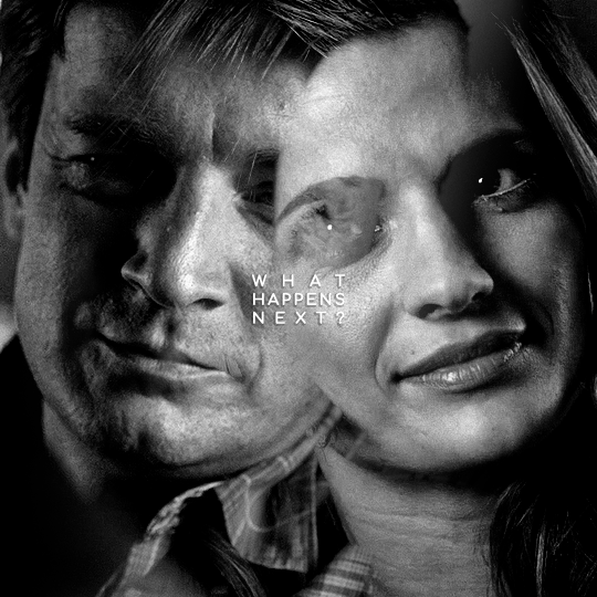
Hello! I just saw your last Caskett gifset for usergif and i loved it, can i aks how did you make the old film look/filter?
Hi, Anon! I used an overlay which I got from here :) I don't know if you're familiar with overlays but here's what I do:
SMALL OVERLAY TUTORIAL
First I make my gif as I usually do and in that gifset this was the base I was working with (a gif with 37 frames):
So, next I take screencaps of the overlay I'm using and I make sure it's got the same number of frames, in this case 37. Now I put my overlay screencaps above my gif and this is what my photoshop looks like:
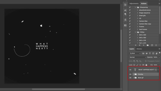
Notice how I placed my overlay between the text and the base gif. The text thing is optional but I liked the text to stand out.
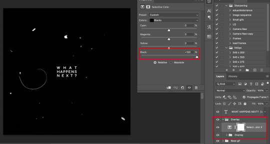
Now, as you can see this overlay's background isn't completely black but gray, and I didn't want that. I added a Selective Color layer and increased the "Black" in the "Black" tab to +100. This is how it looks now:
The difference is noticeable right? Well now onto the last step. I went to my overlay group layer and set the Blending mode to Lighter Color and the Opacity to 50%.
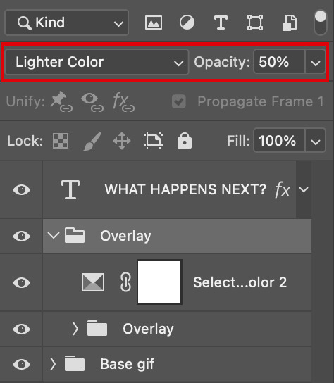
This step depends on your personal preference so feel free to play around with the Blending Modes and the Opacity and see which ones suit your gif best. With those settings I got my final gif:
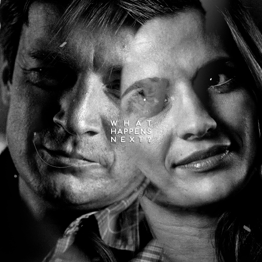
And that's how I work with overlays! There are so many nice overlays in youtube you just have to use keywords like camera, vhs, old video, lightleaks, etc. Overlays can completely change your gifs and turn a simple gif into a beautiful and complex one!
151 notes
·
View notes
Note
if you ever have time/feel so inclined, i would love to see a tutorial or some tips from you about how to do color isolation sets!! they are absolutely incredible and I love them so much! <3
absolutely! thank you so much 💙
here are a few examples of my color isolation sets:
the substance (yellow) || beetlejuice (red) || us (red) || conclave (blue) || sleeping beauty (cyan/blue) || crimson peak (yellow) || smosh (purple) || conclave (red)
beneath the cut, i'll walk you through my coloring process!
notes: tutorial assumes basic gifmaking knowledge & i'm using adobe photoshop 2023 (though afaik, your version shouldn't matter much)
i don't color my gifs until they're sharpened and i'll give you a quick overview of my process: file -> import -> video frames to layers -> trim any extra frames -> crop to desired dimensions -> run sharpening action (i used this tutorial and just made it into an action) which also converts to timeline
once i'm in timeline, i go through my normal coloring process. unless i'm giffing similarly colored scenes that i've already colored and saved a psd for, i usually color from scratch every time. obviously, some adjustment layers vary depending on the source material, but these are almost always my main adjustments, just with differing values
a brightness/contrast layer set to screen - this is a gamechanger for especially dark scenes. note: i do not adjust the values, i leave them both at 0 and just change the blending mode
a curves layer utilizing the black & white eyedropper tools. first, i select the black eyedropper and then click on the blackest area of the gif. i do the same with the white one, using it to select the brightest/whitest spot. this can help a lot if you're dealing with heavily tinted scenes!
a selective color layer (set to absolute, not relative) where i adjust the blacks usually anywhere from 1-5 notches higher and the neutrals either up or down the same amount depending on the scene. be careful with the neutrals when giffing poc as lightening them can result in whitewashing. if need be, i will also adjust the whites, making them slightly whiter with the black slider. selective color is by far my fave adjustment layer and i use it in every single coloring.
after this, i sometimes add a black & white gradient map adjustment layer set to soft light. i'll play around with the opacity, leaving it anywhere between 5-100% depending on the scene. i think this adds depth to your colors and adds some contrast, but i don't use it in every psd.
occasionally, i'll mess around with vibrance/saturation, and that'll be my final layer, but oftentimes i won't actually add this layer until i've finished the rest of the coloring. this is just where the layer will go.
these are the main 5 layers i almost always start every single coloring with and they act mostly as a base and to color-correct any weirdly tinted or exceptionally dark scenes.
now, let's talk about scene selection. i try to set myself up for success by choosing scenes that either already have a very noticeable pop of color or have a color i know can easily be manipulated. you'll want to pick scenes that aren't drenched with the color you want to isolate though, or you won't have the contrast of the black & white.
here are a few examples of good scenes:

the only red here is the covered bridge and it will be easy to adjust only that and not the blue, green, or yellow.

same as above, apart from ralph fiennes's face, which obviously contains red undertones. i'll go more in-depth on this in a bit, but because this scene doesn't have a lot of movement, this will be able to be fixed with layer masks.

again, here we have one bright occurrence of yellow surrounded by blue that we'll easily be able to neutralize.
and a few of bad/less than ideal scenes:

while this scene is an absolute dream for making super vibrant sets or color palettes, it's no good for color isolation. this yellow covers basically everything, leaving no other colors to cancel out.

while i definitely did try this one out, the scene is ultimately too dark and too cyan-tinted to properly isolate the red of the blood or the cyan in her eyes and on the walls.

just like the first one, this scene is fully just. color drenched. would make a great base for a vibrant or color palette set but not useful for color isolation.

bad and wrong!! coloring this movie, however beloved, was a test of my sanity. you have this yellow/green filter over everything and so much of it that isolating or changing one or the other is pretty much impossible.
with all that being said, play around! the best way to learn what does what is to try it out yourself. selective color, though there are other ways of getting the same or similar effects, will be your best friend. it's how i'm able to make sets like this & this!
let's look at this adjustment layer using a scene from conclave:

truthfully, you could either isolate the orange of the wall or the blue of her outfit. i'm going for the latter at the moment.
add a selective color layer by clicking this button:

i like to really emphasize the color i'm going to isolate, make sure it's as consistent with the other scenes i'm using and that it pops. from the dropdown in the layer properties, i select blue.

each color from the dropdown will look like this. you have adjustable sliders for cyan, magenta, yellow, and black. the more to the right, the more you're emphasizing that color in any blues in your image. the further to the left, the more of that color's opposite you'll adjust. each opposite pairing is as follows:
cyan + red magenta + green yellow + blue black + white
if you're struggling with this (i did at first), visualize it. pull up one of those "bad" examples. say we take the yellow scene from the gorge. add a selective color layer to it and select yellow from the dropdown. play with the sliders to see how AND how much each adjustment changes the coloring. decreasing the yellow slider all the way to -100% is adding blue to anything ps identifies as yellow. because yellow and blue are opposites, it pretty much neutralizes the scene. instead, if you use the magenta slider and push it all the way to the left, you make any yellows become green. if you move the magenta slider all the way to the right, you'll add magenta to any yellows, making the scene orange. it's all about knowing the color wheel and experimenting!
back to the conclave gif! i want to bring out the blue as much as possible, under the blue dropdown, i crank the cyan slider all the way up and bring the yellow all the way down.

is it a massive difference? no, but you can definitely see the difference between the left (with the adjustment) and the right (without).
depending on the scene and color i'm working with, i'll play around with other layers from the dropdown. but i prefer to do each color in a different layer and i right-click on the box with the eye in the layers panel and change it to the applicable color. that way, it's easier to adjust something later on. you can also rename your layers, but this is quicker and easier imo.

with this particular scene, this is the only adjustment i want to make to the blue for the time being. now, it's all about getting rid of any other colors. to do this, add a hue/saturation layer and select every color, one at a time, EXCEPT the color(s) you're isolating and bring the saturation all the way down to -100. in this case, it's everything but the cyans & blues.

and this is what i'm left with:

from here, you can leave it, but a lot of the time, i'll add a vibrance layer or even another blue/cyan selective color layer and crank that shit up.

this is after adding a vibrance layer (increasing both vibrance & saturation to 100) AND a selective color layer (decreasing the yellows to -100 in the blues).
i would consider this finished, but this can also be super fun to mess around with, again, using selective color:


and if the way her hair changed colors is bugging you, toggle your layers on and off until you find which one(s) changed it and add a layer mask, coloring over her hair with a soft black brush:

once you're happy with everything, save your gif in your preferred way. these are my save settings just for shiggles:


et voilà!
overall, the best advice i can give is to try. experiment! if you're not sure a scene will work, give it a shot. even if it doesn't, you've still learned something. i know it can seem confusing at first, especially if you're not super familiar with these layers or the color wheel, but please feel free to ask any questions. also, let me know if anyone wants another tutorial(s) where i go more in-depth on other colors. i'm happy to do it!
118 notes
·
View notes
Note
Coloring anon here, yes, I would definitely like to know more about how you color frame by frame and the other techniques you mentioned! It would be much appreciated, thank you!
Hi anon! I'd be happy to go over my preferred methods for colouring!

First resort (ideal):
Painting over shots with little movement (the first method in this tutorial)
Colour manipulation using selective colours (the second method in this tutorial; alternate tutorial -> i also sometimes add a hue/saturation layer on top to manipulate the cyans/blues as well)
Second resort:
Keyframes for shots with consistent movement where it's easy to hide "imperfections" (tutorial 1, tutorial 2)
Last resort:
Frame by frame colouring -> DISCLAIMER: the way I do this method is the easiest way I've gotten it to work for me but that also means that it's very inflexible when it comes to editing any of the colouring afterwards. Once you start colouring in frame animation mode you're basically locked in so you need your gifs to be exactly the way you want them prior to adding your colour
So in this tutorial I'll go over how I do my frame by frame colouring as well as how I create actions to automate the repetitive parts of this process! (Some resources that explain how to create actions are here: 1 2)
To use the select subject feature you will need Photoshop CC 2018 or later
Step 1: Preparing your gif with base colouring
So first you want to do your base colouring for your gif in timeline mode, which I've explained here. I keep my gifs short (ideally 40 frames or less) since this colouring process is tedious!
I make sure that in my hue/saturation layer, I turn the saturation in the yellow, green, cyan, and blue tabs all down to -100 (and for the yellows I usually add around +20 to +60 in lightness)
Here's my gif with the base colouring that I'll be starting with:

Note: turning down the saturation in almost all the colours gives you that nice silver/grey neutral background to paint on top of. It's a lot less noticeable when your painted layers aren't perfect
Step 2: Converting to Frame Animation Mode
I use the save action from this action pack to convert my gif from timeline mode to frame animation mode.
You cannot edit your base colouring from this point onwards!
Step 3: Using Select Subject
If you're recording an action this is the step you would *start recording*
This is what your window should look like:

Making sure your first frame and first layer are selected, go to Select at the top of your window and click Subject

You should then see the marching ants outline around the person in your gif

You then want to create a new solid colour fill layer (which can be found when you click that little circle icon at the bottom of your layers panel), and set the layer blending mode to colour.
The layer mask will automatically be created since you had the marching ants outline.

Since my person is in colour and not the background, I want to invert the layer mask by clicking on it and using command + i (or ctrl + i), and now this is what it looks like:

Note: Select subject isn't always perfect!!!, depending on how cluttered the scene is and how much contrast there is between your person and the background, select subject could either do a really good job like it did here, or screw up a little like it did here:

That's okay though because it still gives us a good base to start from! We can fix any issues by painting with black and white brushes on the layer mask.
Step 3.5: Create clipping mask
Thanks to @wolfchans for telling me about this because it gives us back a little bit of flexibility when colouring frame by frame! Instead of merging down, we can make a clipping mask instead. Right click the solid colour fill layer and select create clipping mask.


If you're recording an action, it's at this point where I would *stop recording*
Step 4: Fixing the layer mask if needed
So now I want his jacket and t-shirt to also be purple, and to show his fingers behind the glass. I make sure the layer mask is selected, and paint with a brush at 60-70% hardness (painting with black erases the colour, painting with white shows the colour). User smaller brush sizes to paint smaller details!
This is what my canvas and layer mask look like now.

Step 5: Repeat
Now I click on my second frame and second layer, and repeat steps 3-4. As you can see, using the clipping mask allows you to still see and edit the colouring of the previous frame, just make sure you click on the right frame and it's corresponding layer when you're doing further editing.

This is where an action is super helpful in cutting down all the repetitive steps and clicks you need to do. So at this point I'd just play the action I created and paint on the layer mask as needed.
Repeat for all your frames and then you're done! After this I convert it back to timeline mode again so that I can add my text and do any other effects such as blending or transitions. Hope this helped!!
256 notes
·
View notes
Text
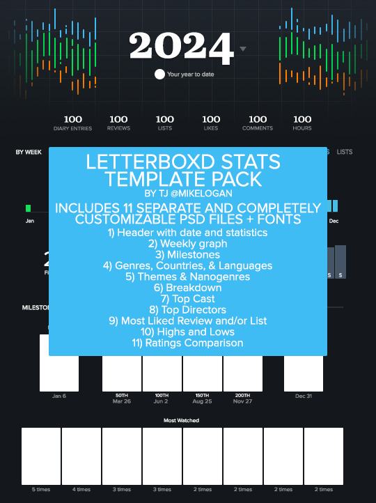
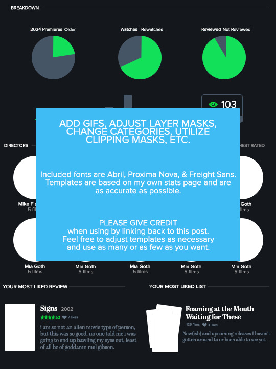
LETTERBOXD STATS TEMPLATE PACK by tj @mikelogan Includes 11 separate and completely customizable .psd files + 3 font families
Header with date and statistics Weekly graph Milestones Genres, Countries, & Languages Themes & Nanogenres Breakdown Top Cast Top Directors Most Liked Review and/or List Highs and Lows Ratings Comparison
WHAT YOU NEED*:
Basic gifmaking knowledge Including: layer masks and clipping masks
TO USE:
PLEASE GIVE CREDIT BY LINKING BACK TO THIS POST PLEASE DO NOT REPOST/CLAIM AS YOUR OWN REBLOGS ARE APPRECIATED FEEL FREE TO TAG ME IN ANY SETS YOU MAKE WITH #USERTJ
MEDIAFIRE DL | MEGA DL MY LETTERBOXD
*A FEW NOTES:
All graphs are completely customizable using layer masks. For all the bar graphs, I find them easiest to edit using the rectangular marquee tool to select the proper area and then using your brush tool. For the pie charts, I had the best luck using the polygonal lasso tool to select the slice I wanted to mask. All the information used was taken directly from my Letterboxd stats page. I believe there are a few sections only available to patrons of the site, such as the Ratings Comparison. The only parts I left out were the lists integrated into the stats page and the Crew & Studios section. The fonts included in the folder are the exact ones used by Letterboxd, so you could always use them to create your own templates for those if you want to. I have no issue with anyone using these templates to help create their own, but please give proper credit. Making these took literal hours.
IF YOU HAVE ANY QUESTIONS OR PROBLEMS WITH THE TEMPLATES, PLEASE SEND ME AN ASK OR A MESSAGE AND I'LL HELP HOWEVER I CAN!
203 notes
·
View notes
Text

PSCENTRAL — EVENT 34: FANTASY & SCI-FI
this december we’re going to explore all things fantasy & sci-fi! whatever your interpretation is of the theme, feel free to get as creative as you want! this event will run from december 1st through to the 29th.
to participate: ✦ join the network ✦ reblog this post ✦ make a gifset that fits this month’s prompt ✦ caption your post with: @pscentral event 34: fantasy & sci-fi
feel free to message us if you have any questions about the event. we’re excited to see what you create!
60 notes
·
View notes
Text

WELCOME TO PLATONICSOURCE!
this is a new source blog for non-romantic dynamics across pop culture, be that friendships, families or even enemies.
this blog is in need of both members and affiliates! you can apply here. to become a member, this is what we need to know.
what’s your url? — how often do you think you can post original content to the blog? — please provide a link to your edits — if accepted, you’ll be contacted via ask or dm!
also feel free to tag us under #platonicsource, which is our tracked tag.
137 notes
·
View notes
Note
anon here! i would CERTAINLY love a tutorial on your colouring!!
hi anon!! i'm honoured that you like my colouring 🥺🥹 i'll walk through colouring one of the tommy scenes you mentioned (3rd gif from this post), but i use the same steps for all my gifs, just with slight variations on the settings! i've also been enjoying cool backgrounds and warm skin tones lately, so that's the effect i aim to achieve!
this is the base gif that i'll be using, and this is after i apply my sharpening. tutorial under the cut:

Section 1: Brightening and Contrast
these are the layers i use for this section and the order i apply them in:
Exposure
Curves: white eyedropper
Curves: black eyedropper
Exposure
Levels
Brightness/contrast
Exposure - so first i'll use an exposure layer and drag the top slider to the right. my settings are usually between 0 and 1 (i avoid going over 1!), and i try to get as much brightness as i can using this setting, without making the bright spots of the gif too white and glowy.
if there's bright patches in the gif (like the sunlight on tommy's face) i might use a slightly lower setting than the max brightness i can get (because we're going to add more brightness later).

Curves: white eyedropper - next i use the white and black eye eyedropper tools, and this helps with minor colour correction as well as minor brightness/contrast (but does a lot of heavy lifting!). this tutorial explains how it works best.
the first curves layer is using the white eyedropper tool. you want to click on the white eyedropper (red square) and click on the brightest parts of your gif (red circles).
sometimes this isn't too easy to identify, so you can drag the little black toggle (cyan square) to the right, and this emphasizes the bright parts of the gif (make sure to undo this step!! it's just to help us with identifying the brightest areas!!)

i then zoom into the bright part of gif (around his chin) so that i can see the individual pixels, and i try to select the brightest pixel. i usually select a pixel that has a yellow or pink tint, that way once the curves layer is applied, it counterbalances the tint.
tip: if you have any areas in your gif that are supposed to be white (e.g. a wall, a t-shirt, shoes, sometimes even eyes/teeth) it's a good idea to select a pixel from these areas.


here's what we have so far

as you can see, the curves layer got rid of the reddish tint on the gif and made the colours cooler.
Curves: black eyedropper - next we add a second curves layer, and this time we're doing the same thing but with the black eyedropper. we use the black eyedropper (red square) to select the darkest parts of the gif (red circles).
if you slide the white toggle (cyan square) to the left, this will help us identify the darkest part and especially helps us pick out the tints in the pixels (don't forget to undo this step after!!)

so now i'm going to zoom in to the dark part of the gif where his hair is, with the white toggle dragged to the left so that i can see the tints. i think i made the gif slightly too cool in the previous step, so i'm going to choose a dark green/blue pixel to add back a little warmth.
tip: if you think the gif is still too reddish/yellow, then click on a dark red/brown pixel to remove more warmth.

these are what the settings look like after i select that pixel. as you can see in the gif below, we added some of the warmth back as well as added some contrast.


Alternate: auto curves layer - sometimes scenes just have ugly colours to start, and your white/black eyedropper tools won't make much of a difference. in these cases, i just skip using the eyedroppers, and just use the 'auto' button and then sometimes decrease the layer's opacity as needed.
Exposure - next i add a second exposure layer. my offset settings are always the same. i then drag the gamma correction toggle to the left. my settings are usually between 1.00 and 1.10, and never beyond 1.20. i don't touch the exposure toggle in this step!

Levels - i first drag the white toggle to the left, adding as much brightness as the gif can take without making the white spots too glowy (sometimes as little as 250, usually never below 200). then i drag the middle toggle to the left to ease up on the contrast a bit (usually never more than 1.05, and definitely never more than 1.10). finally, i drag the black toggle to the right (sometimes as little as 4, usually never more than 10).

Brightness/Contrast - i add these exact settings to almost every gif, unless it looks like the gif can't handle it.


Section 2: Colour Correction
now we get to manipulate our colours! i keep my colour balance tabs and selective colour tabs on separate layers. you can do all the colour balance steps in one layer and all the selective colour steps in one layer, but i find it easier to modify when they're on separate layers. also if you use separate layers, the colours build on each other and you can get richer/brighter colours sometimes.
Colour balance: highlights
Colour balance: shadows
Colour balance: midtones
Hue/saturation
Selective colour layers (separate layers in this order): reds, yellows, magentas, cyans, blues, greens, whites, neutrals/blacks
Colour balance: highlights (cool) - so i start with the highlights, and drag the cyans slider to the left (usually not beyond -25), and yellows slider to the right (usually not beyond +25)
Colour balance: shadows (cool) - next i do the shadows on a new layer, and i usually end up doing -4, +2, +4 for the settings (cyans to the left, magentas to the right, and yellows to the right).
Colour balance: midtones (warm) - now this is where i add the warmth back in. i usually slide the cyans to the right, and yellows to the left, and i usually keep the values the same or very close together (so +6 cyans, -6 yellows, or +6 cyans, -5 yellows). i never go beyond a value of 10 for each slider.

Hue/saturation (optional) - so in this gif i didn't touch this layer because we have the green leaves behind tommy. however, in other scenes where there's not supposed to be any green, i'll decrease the saturation on the green tab all the way, to get rid of any stray green pixels (personal preference!) with these settings:

tip: if you go to the yellow tab and decrease the saturation, you can get a cool silvery effect, just be mindful of skin tones (you can usually correct for this later with selective colour)
Section 2.5: Selective colours
with selective colours i find it so subjective that idk if sharing the settings will even be helpful. instead i'll mainly go over my thought process when editing these. you'll need to understand what the sliders do to make good use of this step.

Cyan slider: dragging to the left makes the colour more warm/red, dragging to the right makes it more cool/cyan.
Magenta slider: dragging to the left removes warmth and makes the colour more yellow/green, dragging to the right makes it more warm/magenta.
Yellow slider: dragging to the left decreases yellow, dragging to the right increases yellow.
Black slider: dragging to the left decreases contrast in that colour, dragging to the right increases contrast.
most of my selective colour adjustments are very minor!! my settings are usually in the +/- 5 to +/- 30 range, unless it's for select bright colours (magentas, blues, greens).
Editing skin tones
so i start with fixing the skin tones first before editing any of the other colours. i start with the reds tab and drag the cyan slider to the left to add warmth (if it's too red to start, i'll cool down the skin tone by dragging the cyan slider to the right).
i then drag the magenta slider slightly to the left (especially if their cheeks are really magenta). i drag the yellow slider slightly to the left as well if the person starts looking too yellow. for the black slider, if there's a lot of shadow/contrast in the skin, i'll drag it slightly to the left, otherwise i'll increase contrast by dragging it slightly to the right.
next in the yellows tab, i first go to the yellow slider and drag it slightly to the left, and stop before the person starts looking too pink. i then add more yellow back by dragging the black slider to the right. if i want more warmth, i drag the cyan slider to the left. if i want it cooler, i drag the cyan slider to the right.
2. Editing lips/cheeks/other features
in the magentas tab, i start with the magenta and yellow sliders at +100. i then drag the cyan slider to the left as needed. this step really makes lips pop if the person has some colour on their lips (it didn't do much for this gif of tommy).
3. Editing clothes/background
i then go to the cyans tab and set the cyan slider to +100. i drag the yellow slider to the left to make the cyans more blue (sometimes all the way to -100). if i want a darker colour, i drag the black slider to the right.
next i go to the blues tab and set the cyan slider to +100, and drag the yellow slider to the left as preferred. i sometimes drag the black slider to the right to make the colour darker.
i use the greens tab only if there's leaves/trees/grass in the background or if the characters are wearing green clothes (basically if green is a large part of the gif). i make the greens pop by setting the cyan and yellow sliders to +100. i drag the magenta slider slightly to the left, and the black slider slightly to the right.
4. More brightness and contrast
in the whites tab, i drag the black slider to the left (usually about -10 to -30), and sometimes i drag the yellow slider to the left (usually about -10 to -20). this is to make the white parts super white and not have a yellow tint.
however, some scenes have really bright white glowy spots (like the sunlight on tommy's face). in this case i'll drag the black slider to the right. i might also drag the cyan and yellow sliders to the left to get some of the skin colour back.
next in the neutrals tab, i only adjust the black slider. i use anywhere from -2 to -4 to make the gif brighter, or i use up to +3 to add contrast.
same thing for the blacks tab, i only adjust the black slider set from +2 to +4 to add contrast.

Section 3: Final Touches
these settings usually never change:
Gradient map: gray to white (layer opacity: 20%)
Gradient map: black to white (layer opacity: 10%)
Vibrance (+25 vibrance, 0 saturation)
the opacity of the black to white gradient map layer can be decreased down to 5% if it makes the gif too dark.
Section 3.5: Optional Final Steps
Auto curves layer - i use the auto button on a new curves layer on top of all my other layers. i then change the layer opacity, usually around 20-30%, sometimes around 50-80%, and very rarely at 100%. this adds brightness/evens out the contrast.
Levels - sometimes i want to add back some more brightness and contrast, so i'll add a levels layer on top of all my other layers, dragging the white toggle slightly to the left, and black toggle slightly to the right (usually not more than +/- 10).
Selective colour - sometimes i'll add a final selective colour layer on top of everything else, to fix skin tones (so i edit the reds/yellows/magentas)

there you have it! i know i use a lot of layers but i find that it gives me the most control over brightness, contrast, and colours. i hope this was helpful!!
137 notes
·
View notes
Text

We're excited to announce our first open event: FILM AND TV OF YESTERDAY, TODAY, AND TOMORROW!
This is an event focusing on all types of films and television shows, whether they're new, old, cancelled, ongoing, or something else! This event is open to gifmakers from all fandoms and will run from November 17 to November 23. Here's how to participate:
reblog this post and follow @filmtvtoday
create a gifset within the interpretative boundaries of each day's prompt
caption your creations with the following: FILM & TV YESTERDAY, TODAY, TOMORROW: Day # – prompt name
tag your creations with #filmtvweek24 so we can reblog them!
The prompts:
Day 1 (Nov 17): Favorite Day 2 (Nov 18): Genre Day 3 (Nov 19): Characters Day 4 (Nov 20): URL/Icon Day 5 (Nov 21): Nostalgia Day 6 (Nov 22): Ratings and reviews Day 7 (Nov 23): Iconic OR Best of 2024 [choose 1 prompt!]
290 notes
·
View notes
Text


Dear gifmakers, you're all oficially welcome to this Giftober 4th edition!! 👋🪄
The wait is over! Well, at least for me haha idk about you guys, but I was really looking forward to meet you all again!
As always the goal of these October 31 prompts is specially inspire, encourage and support the work of gifmakers 💗. (Work that deserves an appreciation that so often lacks these days.)
HOW TO PARTICIPATE:
Reblog this post. (Optional but encouraged.) Create a gifset inspired by the daily prompts. Tag your posts with #giftober2024. Caption your gifsets with: @giftober 2024 | Day #: "prompt description". (Recommended.)
IMPORTANT:
Make your own gifs. (I won´t reblog reposted gifs or gifs taken from the Tumblr search.) No explicit content. All fandoms are welcome! As long as you all respect each other! ☝
NEW: I created a FAQ page (and this post to acces from the app), to help you with your doubts. I also updated the blog desktop view, hoping it will be easier for you to navigate. 😊
OUR DATE IS ON OCTOBER 1ST! Hope to see you all then and your creations! 💗
Ele :))
(The prompt written list and tagged blogs under the cut.)
REMEMBER: These prompts are to inspire your creativeness, they are completely up to your own interpretation.
PROMPT LIST:
Broken
In Bed
Gold
Slow motion
Angelic
Brands
Helping
Home
Numbers
Cheering/Clapping
Orange
Hidden
Olympics/Sports
Stairs
References
Lights
Phone call/Text
Gift
Purple
Crowded
Minimalistic
Reactions
Fourth Wall
Summer Time
Devilish
One Gif
Blue
Mess
Doors
Relaxing
Free Choice
(Thanks @4marvels-universe for you invaluable help and patience! 💗)
Now, everyone in the following mentions and tags below are cordially invited to participate and/or to share this post so this can reach more fandoms. Every reblog will be greatly appreciated, thank you! 💗)
@sersi @madeline-kahn @djarin @anthonybrxdgerton @avasillva
@simonghostrileys @linusbenjamin @tomshiddles @cal-kestis @cressida-cowper
@ewans-mitchell @nikossasaki @userpeggycarter @cobiesmlders @enidsinclair
@crowley-anthony @shawnee-smith @magnusedom @anastasia-my-darlings @troublefindsme
@arabellas @hakurasakura @elena-gilbert @rhaenyratargaryns @bigfrozensix
@daisyssousa @bcth-uk @safedistancefrombeingsmart @cutterpillow92 @a-victorian-girl
@scottxlogan @everythingsouthasian @mel-loves-all @seth-lael @ijustthinkevilunoisneat
@thelostsmiles @eddiediaaz @antoniosvivaldi @walnutmistjamie @t-u-i-t-c
@crystal-bytes @lucy-sky @queen-daya @bo-katan @heatherfield
@walterkov @pensbridgerton @uyallstars @hidengifs @manny-jacinto
377 notes
·
View notes
Text


theme_04: energetic by wonhoutboy
[temporary] live preview / static preview (light) / get the code
a single column theme with a passion for gradients. • gradient background and accent gradient; • (optional) fixed navbar; • 4 navbar links, 5 dropdown links and 6 #tag spaces; • follow button; • credit page + credits in the code.
!! if you find any bugs/if anything doesn’t go well or if you just struggle with customizing it, please reach out to me via private message or ask and i’ll gladly help!
146 notes
·
View notes
Text

PSCENTRAL — EVENT 31: FACELESS
it's september - the transitory month between summer and fall. we're celebrating it with our prompt: faceless. feel free to get creative with it or make it as straight-forward as this announcement gif!
this event will run from september 1st through the 28th. the event submission deadline is at 11:59 pm (pacific standard time) on september 28th.
to participate: ✦ join the network ✦ reblog this post ✦ make a gifset that fits this month’s prompt ✦ caption your post with: @pscentral event 31: faceless
feel free to message us if you have any questions about the event. we're excited to see what you create!
83 notes
·
View notes