
Statistics
We looked inside some of the posts by inkseydesign and here's what we found interesting.
Average Info
Notes Per Post
44
Likes Per Post
41
Reblog Per Post
3
Reply Per Post
0
Time Between Posts
21 days
Number of Posts By Type
Photo
14
Text
2
Video
1
Last Seen Tumblr Blogs


Fun Fact
When “GIF” was named word of the year in 2012, Oxford Dictionaries U.S.A. credited Tumblr for pushing the word.
Photo


Game Assets
some gravestone assets I made for my game Ghostdoku. These are the abandoned and decaying gravestones that have been forgotten about over the years.
#gravestone#sudoku#game#assets#game assets#art#digital art#photoshop#forgotten#decaying#broken#ruined#ghost#grave#graveyard#painting
7 notes
·
View notes
Text
Doodles

1 note
·
View note
Photo

Concept Art - Ghostdoku
This is some title screen concept art for a game I am working on (at polytech).
#ghosts#ghost#game#game dev#game development#school#learning#project#home screen#title screen#sudoku#games#start screen#mobile game#graveyard#grave#art#photoshop#digital art#digital#buttons
1 note
·
View note
Photo


Commissioned Custom Label for Home Brews
Daddy Conrad’s Burning Liquor
Under the “Pick Your Poison” you are able to write what alcohol it is. Originally I was going to make it with pre-written drink types such as “Vodka” “Tequila” “Rum” etc but then thought that they might run out of the ‘Vodka Stickers’ and need to reprint a whole sticker sheet again. I simplified it as much as possible so that the user could write anything they wanted, so I have left the space blank for this reason (they could even name the brew of alcohol a custom name like “Daddy’s Vodka” or “Mummy’s Rum”)
#sticker#alcohol#label#brand#custom#commission#vodka#rum#liquor#poison#sticker sheet#daddy conrad#burning liquor#customisable
2 notes
·
View notes
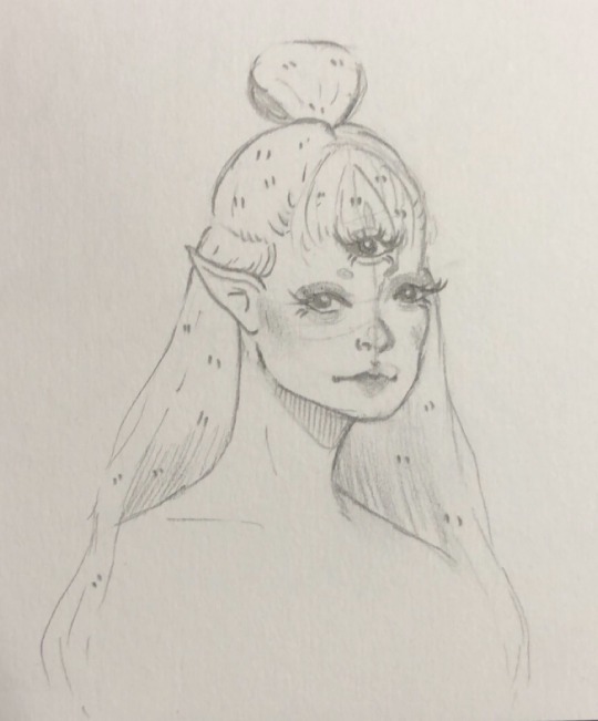
Photo


Face Study and Practice
I went onto pinterest and found some images that I wanted to try to recreate, so that I could try to enhance my sketching skills
#pinterest#practice#sketch#draw#study#portraits#faces#face#drawing#sketching#practicing#skills#drawing skills#drawing practice
2 notes
·
View notes
Photo


Stefan Sagmeister Hates Gotham
A book I made during my design course. (The reference page is missing as I couldn’t fit it all on one post, and some of the formatting is a little bit messed up too.) I had to make a book about the designer; Sagmeister and the font; Gotham and make them relate in some way. Sagmeister is a designer that typically goes with his own handwriting instead of using a pre-made font; hence the name of the book as he would hate using the Gotham font.
I tried to incorporate his style within my book by handwriting annotations beside the imagery (all painted imagery was digitally painted by me).
#Stefan Sagmeister#Sagmeister#book#design#paint#digital paint#digital#wacom#inDesgin#photoshop#create#creative#gotham#gotham font#font#Stefan Sagmeister Hates Gotham
1 note
·
View note
Photo


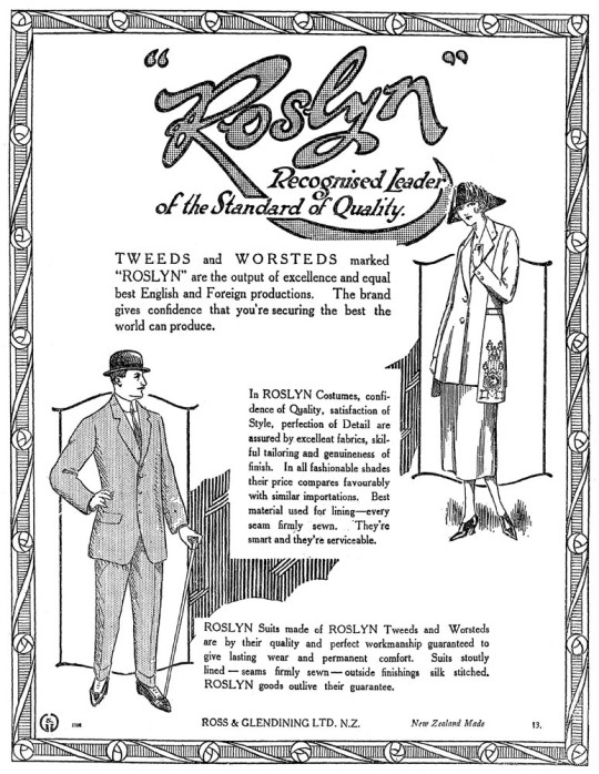

Font
Based off of the historical building 8 Stafford Street in Dunedin.
My type narrative is gothic style. This is a classic Dunedin style typeface. The Dunedin signs were designed to reflect the city’s architectural heritage, mining history and physical landscape. Michael Harrison said the gothic font had become “very much part of the branding for businesses and the city”.
The gothic style is what I want to pursue because it feels homely. 8 Stafford Street has ‘No. 8 Stafford’ written in gothic font along the front of the building, as stated above, the gothic font shows the architectural heritage and history. 8 Stafford Street has developed greatly over the years, being remodelled/rebuilt/repurposed over 3 times and is now known to be a shared office space called Petridish.
The building was previously Ross and Glendining, and to this day their names are still carved into the front of the building in large, serif font. It was first built in 1866 and was remodelled in 1874 and 1919.
They originally didn’t have the gothic typeface along the front of the building (this wouldn’t have been painted onto the building until at least March 1919, when the building was redesigned). The only font on the face of the building was a serif font that wrote ‘Ross and Glendining’s”. This font suited the building at the time as 8 Stafford Street was a textiles and clothing industry, and later a hat factory; serif font made sense as it showed sophistication. The gothic font now on the building represents the architectural development and history, which is what the city of Dunedin is all about.
8 Stafford Street is now owned by Kate and Jason Lindsey, who have turned the space into shared offices, in order to connect the people of Dunedin. Previously there were two floors of shared offices and a penthouse on the top floor. Now there are three floors, a cafe, and event rooms to allow the community to connect to the building in multiple ways, whether you work there, go there for a meal or have a private function.
I want to create a font for building owners to use that have repurposed old historical buildings and brought them back to life. The name of my font is going to be called ‘Lindsey’, Lindsey is the last name of the current owners of the building. These people have turned the previous building (a manufacturing building that produced hats and fabrics) into a shared office space. They transformed it into a building where people from the Dunedin community get to interact with each other every day.
0 notes
Photo


Quarantine Illustration
This is an illustration based off of the experience of quarantine. The message is trying to tell a serious message in a fun, playful and calming way. This illustration was for my zine about quarantine that I made in 2020 and I also applied for a quarantine art competition and was one of the finalists.
#quarantine#covid#bubble#t-shirt#competition#2020#design#finalist#zine#illustration#fun message#bubbles#serious#dont burst your bubble#stay safe#stay alive#stay inside#new zealand
0 notes


Video
tumblr
Animation - Ugly
Created by Samantha Lindsey
This is my first attempt at making an animation (made during my first year of my design course). It’s about a blob fish (something society considers ugly) and how the fact that they’re ugly gets them out of a horrible situation and they are able to live a better life compared to other fish. In the blob fish’s case, being ugly is the best thing that could have ever happened to it. Sometimes being ugly has its advantages, so embrace UGLY.
1 note
·
View note
Photo

Orange Juice
This is my interpretation of the song ‘Orange Juice’ from Melanie Martinez’s album ‘K-12′.
This is how I would imagine the album cover to look like if the album was called ‘Orange Juice’ or if the song was released as a single.
I have chosen to use a font similar to the font she uses on her official album cover for ‘K-12′ so that it felt familiar to viewers and they would easily be able to associate this concept piece to her most recent album.
I wanted to make this piece look surreal as the song itself is quite surreal and not obvious as to what the song is about. Melanie herself is quite a quirky and doesn’t conform to ‘normal society expectations’ so I thought a piece like this would be fitting to her personality and what she stands for.
#Melanie#melanie martinez#album#orange#orange juice#juice#cover#album cover#art#design#photoshop#create#creative#artwork#K-12#non conformist#single#orange juice k-12#melanie martinez k-12
12 notes
·
View notes
Photo
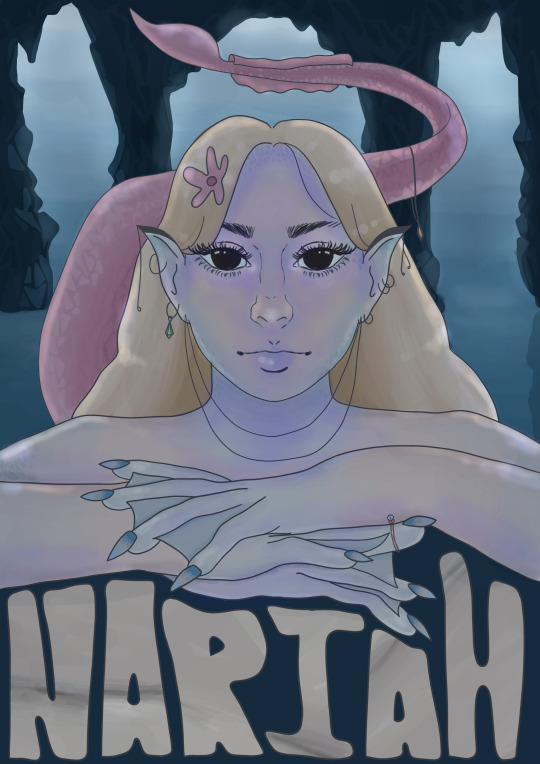
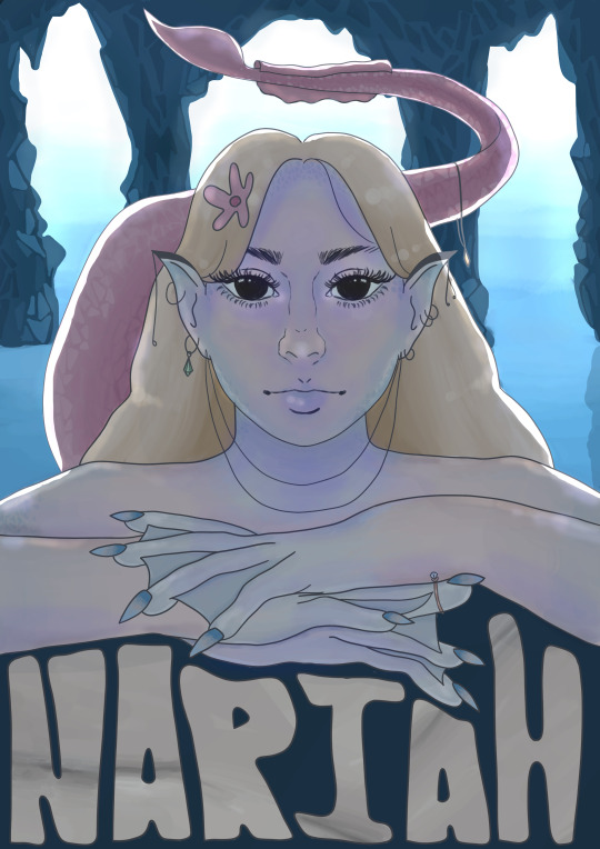
The Final Push 04/06/2021
The first image was what my original final looked like but I thought it looked too flat and I remembered some advice that was given to me which was that the background should be lighter to create a sense of depth and distance. So I lightened the background and added highlights to where the light would hit her and then realised that the highlights weren’t accurate in the second poster final as it makes it seem like the tail is close and directly behind her, meaning her hair on the left wouldn’t have any light hit it. So I re-highlighted her in the third and final version of the poster.
#siren#finals#process#final stretch#illustration#poster#design#photoshop#chou kuse ni narisou#final#paint#digital paint
3 notes
·
View notes
Text
Final Poster 04/06/2021

Nariah is a loner siren in search of love, though she is greedy when it comes to finding it. She will lure sailors into her rocky home with her songs and hold them captive while they gush over her. Eventually the sailors starve as she doesn’t know how to keep them alive. She believes that the other sirens are cruel as they kill sailors just for fun and that they don’t believe in the same things as her. She soon realises that she is just as bad as the other sirens and wants to make a difference.
This poster is for an animated movie. I brightened up the background a bit to show that this is the only light source and to give the illusion that it’s in the background. I gave her a slight glow on other parts of her body as the light from outside will be reflected from the water and from the cave walls.
I really enjoyed this project as I was able to develop my skills and learn how to make a fleshed out character + character backstory. I also enjoyed the fact that we had to make multiple character backstory mockups as this allowed the creativity to flow and I was able to branch out with my ideas. When I first entered this course, my heart was set on creating an elven character but it didn’t end up that way. I created an elven, a wendigo and a siren character and each characters background got more interesting and well thought out as I went. I ended up doing a siren character based off of the greek mythology. I found that my time management was really good for this course and felt as though I spent a decent amount of my own time working on this project since I enjoyed it quite a lot.
Before this course, I had some experience with drawing on a drawing tablet. I still enjoy sketching on paper first but have grown to like sketching straight onto the computer too. I would say that I am good at physically painting, but I wasn’t as good at painting digitally, so this course was a really helpful push towards getting better at digital painting. I especially think that the eye value studies were very helpful in the way where it forced me to really look at the values of the photo and also study the proportions using guide lines. Because of these value studies I was able to paint a cat skull purely free hand just by studying the photography beside the digital canvas (I am quite proud of myself). It was pretty interesting to see how I improved between the first and second value study and how this helped me with other value studies. I also learnt about the importance of a silhouette and before this course I had never even thought about how important it is and I will definitely be using this in the future when created more of my own original characters.
Learning how to get proportions right was a pretty interesting process for me. There are so many ways to learn how to get proportions right such as using yourself as reference, looking at an actor/model creating poses, using 3d character pose makers. I feel like I understand the workings of a hand now and feel like I can still improve but I definitely feel more confident with hands now (not every hand has to be realistic, some can have 2 fingers, some could have incredibly long fingers, some could have webbed hands).
I chose to do this course because I believed it would be beneficial to me to learn how to create a character and their backstory for when I apply to get into the gaming industry. I want to become a character designer or a creative director in this field and I believe this is a helpful step towards this goal. I now know how to do character research, how to make a character interesting to an audience, how shapes can change the narrative of a characters personality (my character poster features triangles in the poster to show that she is a smart, villainous character) etc. When I do my 2d gaming elective next week, I will integrate these new skills into my new project and come up with an interesting story narrative for my character.
#siren#retrospective#100 words#story#reflection#design#photoshop#jpeg#final#poster#poster final#character#greek#greek mythology#finished#happy#game#gaming industry#game design#character design#research#study#6 weeks#narrative
5 notes
·
View notes
Photo


Experimenting 03/06/2021
I tried multiple different overlay settings such as: darken, multiply, colour burn, overlay, soft light, hard mix, difference, exclusion, subtract, colour. I was trying to see what it would look like with all of these different settings and see how it changes the narrative of the poster. The first 5 are just subtle changes of colour. I put the colours of green, white, red and navy blue over top of the poster and added the affects to them (plus played around with the opacity of the colour on top of the poster). The fifth image looks like there is some sort of pollution in the environment and looks a bit poisonous. The sixth image gives the same effect except it is a little bit more dramatic. The seventh one looks like a cotton candy friendly siren which is definitely not the right mood but still cool to look at. The eighth one looks murderous and the ninth one looks like a more extreme murderous image. The tenth one looks really cold and spooky. Most of these posters lose a lot of the detail in the art but I think the third and fifth posters look really cool :)
#siren#experiment#testing#filter#photoshop#workbook#design#study#nariah#darken#multiply#colour burn#difference#subtract#poison#toxic#deadly#scary
2 notes
·
View notes
Photo


Title Design 03/06/2021
The top is what I was working towards, trying to make the text look like it had skulls within it but I came to the conclusion that it would look too busy and distracts the eye away from the viewer.
I ended up going for a bone texture/ colour instead of going into too much detail. I used a sample of a portion of my skull painting I did previously so that I would have the right colours and blending in order to save time and get the colour right the first time.
#siren#character#shading#font#text#title#design#photoshop#update#close to being finished#nariah#progress#WIP
1 note
·
View note
Photo


Shading 03/06/2021
The way my character looked before was super flat looking and I tried to add some highlights and shading on the body (as seen on the second image (looks absolutely horrific)). I then thought that the lighting in the first image was too bright for the mood I was trying to portray. On another layer I went over it with a dark navy blue and lowered the opacity so that It would create a dark, gloomy and slightly hostile look rather than bright and friendly. I then used a colouring mode and used purple to add shadows on her and I feel like the purple works really well with the colours and vibe on the poster. It makes her look mystical and non-human which is exactly the look I’m going for. I wanted to make sure that it looked like the light was coming from behind her and for her eyes to almost look like they’re glowing.
I also originally planned to have her name be in gold to represent pirate treasure, but then decided against it as it tells a false narrative and would probably just make her look like a thief or a collector. So I want to make her name out of bones so that it tells the narrative that is true. There’s a lot of death in her story, lots of drowned sailors and there’s nothing about stealing treasure in her story so it wouldn’t make sense to have treasure.
I wanted to test what she would look like without the line art and I think the hands look pretty cool when they were finally shaded, though I think I will keep the line art on her as this is what I originally intended to do.
#siren#shading#bones#mermaid#design#photoshop#narrative#decisions#colour#highlight#highlights#character#poster#layers#opacity
5 notes
·
View notes
Photo


I tried out the character modelling website that was sent to us, I just wanted to try it out.
1 note
·
View note