#600+ Google Fonts
Explore tagged Tumblr posts
Visit Tumblr Blog
Explore Tumblr blogs with no restrictions, modern design and the best experience.
Last Seen Tumblr Blogs


Fun Fact
Tumblr’s reach among the 26-to-35-year-olds in the US is 11%.
Text
https://tinyurl.com/426eu8v2
#Elementor Ready#Header & Footer Builder#Live Customizer#Revolution Slider Included#WPML Ready#One Click Demo Importer#Fully Responsive#Mega Menu#Translation Ready#Retina Ready#Sticky Menu#WooCommerce Compatible#Product Wishlist integration#Product Comparison integration#Visual Attributes integration#Additional Widgets to filter by WooCommerce Attributes.#Ajax Shop#Product Image 360#Custom Product Label#WooCommerce Product Color Swatch#WooCommerce Product Color Swatch Gallery Images#WooCommerce Product Images Swatch#WooCommerce Product Video Thumbnail#Product List Color Attribute Filter#Quick View Product#Ajax Mini Cart#Visual Editor#Ajax load more#Child Theme Included#600+ Google Fonts
0 notes
Text

ImageGallery Theme
Preview / Download / Docs / Remove Credit
Portfolio theme built for curators, freelance photographers, image collectors, and photography agencies that are looking to develop their online galleries and impress potential clients.
Features:
Grid layout
Choose between 4, 6, 7 & 8 column of posts.
Floating navigation
Open and view photos on the blog page
Fullscreen 2 columns on desktop & mobile
Infinite scroll
Hidden fullscreen about/bio page
Choose from over 600 fonts with Google & Adobe web font integration
Fullscreen banner image or video
Toggle to show/hide sidebar avatar, navigation and post meta data
See more Stash themes at https://stashthemes.com
53 notes
·
View notes
Text

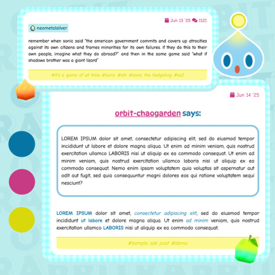


CHAO GARDEN (#002)
in celebration of sonic's 34th birthday, dress your blog up with a theme that tells people you were once a single mom who works two jobs, who loves her chaos and never stops 💛

live preview ★ free download here — includes theme guide, credits & code
★ core features
single column container with multiple background options
npf + legacy friendly 500px posts
browser tab title, blog title and description
1 extra sidebar for extra blog updates
5 - 6 custom links
a simple music player that condemns blog visitors to listen to your (1) silly song in a loop 4ever
customizable font sizes, color scheme and tumblr controls
unapologetically announce your emotional state to the public and choose any chao to help depict said emotional state
100% born (chaotic) neutral from chao garden
★ theme notes
slow connection will cause the theme or some parts of it to look glitched out. just refresh and patiently wait for the chaos to put their backs into it !
unable to properly test on all browsers / screen sizes, but it looks suitable so far for google chrome + safari desktop with the ff. screen resolutions: 1024 x 600, 1024 x 768, 1280 × 720, 1280 x 800, 1366 x 768, 1440 x 900, 1536 × 864, 1680 x 1050, 1920 x 1080px.
credits to @zacharyfury-blog (smooth scroll), malihu (tooltips), @neothms & @magnusthemes (unnest captions), @glenthemes (npf audio player), and @ramdons (custom music player) 🏆
for my second theme, i'm bringing chao garden back from 2001 !! but in all seriousness, i hope other sonic fans would enjoy this theme as much as i had fun making it ~
#sonic the hedgehog#sth#themes#cute themes#tumblr themes#���₊˚✩ custom themes#‧₊˚✩ freebies#‧₊˚✩ creations#happy sonic day!#and happy late SA2 anniv!
4 notes
·
View notes
Text
not to publicly out myself as a recruiter but i'm a bit done after today. i don't want to be the bad guy to people who just don't know how the process works and make stupid mistakes because of it.
here are some very angry tips. may or may not apply to you. enjoy.
for context, i'm hiring mostly for entry-level jobs. i'm not the US. things may change based on the company and country.
CV:
make it clean. don't overcrowd it. if i need to zoom in to read it, you've done it wrong
mention the most important parts of your experience. no job experience? volunteering. list that. list most important responsibilities you had. do not blow it out of proportion. we can tell, and even if we can't straight away, you'll burn in an interview. don't lie.
if you use AI to format text for your cv, that's fine. if i can tell you obviously used chatgpt to write most of it, i will be doubting you.
if you're applying for a corporate job, this is your cv for a corporate job, not your art school project. you can make it pretty, but keep in mind where you're applying.
if the font color you chose burns my autistic eyes, i will call you, but i will hate you upfront. stay away from those neons.
for the love of god, make sure it aligns. i don't mean everything needs to be perfectly symmetrical, but if that text has five different directions, it's bad.
there are five billion cv templates out there. pick one. canva has a lot of free ones.
double check it for mistakes. triple check it for mistakes.
keep it up to date.
Application:
read that job description. i beg of you. look for caveats but also good things. know what you want to see and check if it matches it.
at the time you hit apply, you should be able to say at least three facts about the company without googling (can be vague) and at least two reasons you applied for this specific position.
some countries require jobs to write the salary or at least salary range in the job description. if you live in a place like this and the posting doesn't state the salary? don't waste your time. don't go there. run. though more importantly: do not apply to that position and then rant that they are legally required to state it. especially if they actually stated it and you just didn't see it.
sometimes you can argue for salary. sometimes you can't. advocate for yourself, but be smart. if there's a screening question with your salary expectation, don't ask for 600€ more than the salary range in the screening question. they'll reject you outright.
some places underpay their workers. badly. know your worth. but if you applied for the position with a stated fixed salary, that's the stated fixed salary.
most places are looking for a person with specific amount of experience, not the best in the industry. if you're overqualified, they may talk to you. the salary range for the position will not increase. if the salary's not enough for you, save yourself and recruiter the trouble, don't apply there.
typically, the first person to call you is not the ceo. if you're applying for entry level, the recruiter is not the one to decide your salary or working conditions. i was literally earning 100€ less than the entry-level position i hired for when i started, and while i agreed and argued that they should've been paid more, it was kind of funny when someone went ballistic on me that the salary is too low. honey, i know. i didn't decide it.
answer your screening questions properly. in the language that the question was asked.
why is this remote position asking if i would have the possibility to attend to the headquarters if needed? that's not remote that's hybrid! no it's not. they're asking because of extra situations. also onboarding. equipment. cases of internet/electricity outages. there may be jobs that are trying to fumble you, but that's not what the screening question is doing. you can ask why that was asked during the interview. see how they respond.
answer to the point. don't write a letter under a simple question. do not use chatgpt for this one. be polite. don't be nasty. if you try to be overly sassy, a recruiter with any power to reject you will do so.
Pre-Interview or Phone Screen:
after you apply for a job, you lose the right of not answering calls from unknown numbers. some places call you first, either for a short chat and arranging the first interview or for a first interview itself. it's okay if you don't pick up at first but don't ignore it.
same goes for email. once you apply, you're looking at your email at least every couple of days. for entry level positions in this economy they will not be waiting two months for you to notice it.
if it's not a good time to talk when they call, inform them. they should be understanding. arrange a different time together. pick up when they call, if they don't call back, text or email them. politely.
if they call when you can't talk and don't accept that you are currently busy or make you feel bad for it, don't go there. you don't want that job.
if they call you after what could be reasonably considered their actual work hours that may not be an immediate "you don't want to work here", but it is your first red flag. cautiously look out for more. if you're anxious about it, ask. they have to be able to explain themselves. i was careful about the fact that my interview invite came after 5, it turns out we work till 6 here, that's fine. as tiktok told you, "it's not mandatory, but most employees stay after work hours most days" = run
sound alive. if it's an entry level position, they are looking for some key skills, but most important thing is cultural fit, motivation and a good colleague with potential to grow. this is not the time to sound super negative or bitchy.
know your motivation. be able to say it. at least a couple of sentences. if your motivation starts and ends at "it's hard to find a job, i need money, the hours are flexible and the office is close" i will relate to you personally but reject you as a recruiter. give something more. i want to start my career, i'm interested in xyz field, wanted to gain some experience or any other thing. doesn't have to be some made up or super deep thing. however, they will be writing it down and sending it to the hiring manager. if they don't have a way to make it good on the feedback sheet, they will not let you through.
Interview:
if it is a scheduled interview. do not be late. if you see you're running late, inform the interviewer. ahead of time. arrange something.
wear something you feel comfortable in but look presentable. no sweatpants. no cleavage. if your skirt's short, sit in it a couple of times to see where it will naturally end up. hoodie may be fine depending on the company and the position you're going for. if you're anxious about it and the company has a linkedin or some other page - look at the people there. make sure you're not looking at the party pictures though.
if you will need more flexibility with the schedule, ask about it in the first stages. they'll tell you. some positions will, some won't. find out early. don't waste your or their time.
learn to introduce yourself/your experience in a brief way. tiktok tips are good on this one. when they ask that question, you should answer it in 3 minutes max. mention most important bits, especially for the position you are applying for. if you want, you can ask if you should talk more about anything specific. more likely, they're going to have more questions to get there.
when they ask a question, answer in more than one sentence, unless the question calls for that. stay on course though. if you answer a very broad question in three words, you're a bad interviewee.
you can occasionally ask them to specify a question if you didn't understand what they're getting at.
do know what they legally cannot ask. protect yourself. however, you're better off not becoming combative. they're people, sometimes they make mistakes. i can admit i've asked people what country are they from when i just started. it felt natural to me, didn't know i can't do that. continue in good faith, just don't give them sensitive information they're fishing for.
do not shit talk your previous/current company. especially if you still have strong emotions about it. the only way to do it is if you are completely sure you can do it in a cold, measured constructive criticism way. you can ask questions to make sure the company is not toxic, but do it in good faith. if you're defensive, we can tell.
why are they asking for my weaknesses? twofold. everyone has weaknesses. first, they're checking for self-reflection. do you know them? can you own up to them? second, they're matching with the position. you're an extrovert who has a lot of energy but lacks attention to detail/hates documentation? you're going into event planning? slay, we may need to double check your advertisements before posting. same person going into administration? huge no. know them, match the position. extra step: link them to a strength. i straight up told my manager i'm slow in my work because i care a lot and i need to think everything over before giving a final decision. they hired me.
for the love of god, do not ask those tiktok questions just to ask them. if you do, make them your own. your own tone of voice. if you're super casual throughout that whole interview and then suddenly pull out "how does a successful employee look after 6 months at your company" or "do you have any reservations about my candidacy" in a robotic, obviously rehearsed voice, you're not going to impress anyone. i've seen that tiktok. i know you didn't just think it up.
ask questions if you have them. nobody think less of you if you don't.
thank for they interview. just to be polite. give them a compliment if you have one. don't try to come up with one just so you can.
this one's extremely petty but they ever happen to sneeze when you're talking. pause for three seconds and say bless you.
at the end of the day recruiters are people. treat them like people. talk to them like people.
on the same note however, you are a person. if that recruiter doesn't treat you like a person, don't make yourself smaller. don't be bitchy either, stay respectful, recruiters talk. but don't let yourself be manipulated. know your rights. stay safe out there.
#corporate#career#jobsearch#jobseekers#i hate linkedin#i know this would probably be more useful on linkedin but i hate that fucking place#tired of young people fucking up in job interviews#opportunities#jobs#the recruiter#job market#can you do this please
5 notes
·
View notes
Text
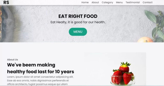
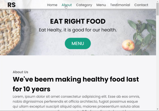
Restaurant Website Using HTML And CSS With Source Code
Restaurant Website Using HTML And CSS With Source Code
Hello coder, Welcome to the Codewithrandom blog. In this article, we create a Restaurant Website using HTML and CSS with Source Code. This is a Simple Restaurant Website with a main home page, types of food available, a food menu, customer reviews, and a contact form section on the restaurant website.
The HTML code for the Restaurant Website is the first thing we develop, and after that, the CSS for styling and JavaScript code. we add JavaScript for smooth scrolling on our website otherwise javascript is optional for this project.
Let’s Start a Responsive and Amazing Restaurant Website Using HTML and CSS. Let’s code a Simple website, We use 1,000+ lines of code to make our Restaurant Website Fully Responsive.
100+ HTML,CSS and JavaScript Projects With Source Code ( Beginners to Advanced)
Basic Knowledge About Project
It’s a front-end intermediate-level project that uses some advanced frameworks like CSS and JavaScript to make the project more elegant and responsive. We have provided you with the project with step-by-step explanations, which will help you better understand the project.
Before we dive into the step-by-step solution to the project, let’s understand some of the basic concepts about restaurant websites using HTML, CSS, and Javascript.
What is an online Restaurant Website?
An online restaurant website is a digital version of any restaurant that allows users to order food directly from the restaurant while sitting at home. These websites were created for customers who wish to eat restaurant food at home. The consumer can select items from the food menu and make payments for faster deliveries.
What are the benefits of Online Restaurant Websites?
reaches the maximum number of customers.
Easy to order
Hassle-free payments
increase in customer reach.
increase in profit.
Live Preview Of Restaurant Website Source Code:-
Restaurant Website Html Code:-
In this HTML code, we create a complete navbar for the footer structure of the restaurant website. first, we link our CSS and JavaScript files in html code. now we add a font awesome icon CDN link in the code because we create the What Our Customers Say section on the website and we show that review with a star so we use a font awesome icon.
Gym Website Using HTML ,CSS and JavaScript (Source Code)
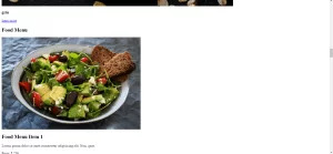
then we create the structure of the navbar and it’s very important in our website because we create a responsive navbar in the project. then we create some simple sections of the restaurant website like what food is available and a food menu list.
and lastly, we create a contact form and a footer copyright line at end of the website.
This is almost 300 lines of HTML code for the restaurant website, and you can see the output below with only the HTML code output of the restaurant menu. Then we add CSS code for styling our restaurant website.
Output Of Only HTML Code For Restaurant Website:-
This is all image output that we create using only HTML code. Now the time is to style our restaurant website using css😍.
Restaurant Website HTML CSS Code:-
In CSS code we include Poppins font from Google font. then we style all sections of the website step by step. we write comments in CSS code so if you want to customize any of the restaurant website parts you can change that section code and it’s all done.
Responsive Resume/CV Website Using HTML & CSS
This is our whole CSS code with 600+ lines. We style our Restaurant Website step by step. We style the utility class and then style our navbar. After the navbar, we styled every html section🔥.
At the end of the code, we use media queries to make our Restaurant Website completely responsive and mobile-friendly. So you can see the output with CSS code. Then we add a little bit of javascript for the scroll effect otherwise our website is completely ready with code.
Ecommerce Website Using HTML, CSS, and JavaScript (Source Code)
Output Of HTML CSS Code Restaurant Website:-
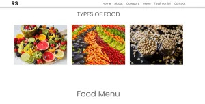
You can see this awesome👏 output with HTML + CSS Code for Restaurant Website. Now we add JavaScript for smooth scrolling.
this is completely optional to add JavaScrpt to this project.
That’s it for our Whole restaurant website code. We write every useful code like making the website mobile-friendly and adding media queries for this. Add JQuery code for smooth scrolling on the restaurant website.
50+ HTML, CSS & JavaScript Projects With Source Code
[su_button id=”download” url=”https://drive.google.com/drive/folders/1Wx9W99uIH3WiO1nkz6aJYCuXVv_ibGmA?usp=sharing” target=”blank” style=”3d” size=”11″ wide=”yes” center=”yes” icon=”icon: download”]DOWNLOAD NOW[/su_button]
Final Output For Restaurant Website Using HTML and CSS Code
You can see this video output to see the complete output. You can see how smooth the website scrolls and this design.
Hope you like this Restaurant Website Project, we create your own and use this project in any project as a part project like the reviews section, and a contact form. If you need any more project-related frontend. Visit our homepage and you get 100+ projects💝.
Age Calculator Using Html Css Javascript ( Source Code )
if you have any confusion Comment below or you can contact us by filling out our Contact Us form from the home section. 🤞🎉
Code By – Sanket Bodake
was written by – Codewithrandom
FAQ For Restaurant Website
Which code editor do you use for this Restaurant Website project coding?
I personally recommend using VS Code Studio, it’s very simple and easy to use.
is this project responsive or not?
Yes! This project is responsive.
What is an online Restaurant Website?
An online restaurant website is a digital version of any restaurant that allows users to order food directly from the restaurant while sitting at home. These websites were created for customers who wish to eat restaurant food at home. The consumer can select items from the food menu and make payments for faster deliveries.
What are the benefits of Online Restaurant Websites?
1. Reach the maximum number of customers. 2. Easy to order 3. Hassle-free payments 4. Restaurant Like food at Home. 5. Increase in profit.
2 notes
·
View notes
Text
To put it into perspective: 600 words is about a single page on Google Docs in the default font and size
Also, pro tip: you don't have to write the whole thing in one sitting! Sometimes you really can't find 600 words to write, that's why the teacher gave you like a week to do it - my best essays were written at a 100 words per day pace
Another pro tip: talk to your pet, or an inanimate object you particularly like, to focus yourself or figure out how to flesh out your argument.
Extra pro tip: if your introduction is about 50 words, and your conclusion is about 70 words, that means the actually hard part of the essay only needs to be ~500 words long
im still losing it over the "how did high schoolers write 600 word essays before chatgpt" post. 600 words. that is nothing. that is so few words what do you mean you can't write 600 words. 600 words. this post right here is 45 words.
97K notes
·
View notes
Text
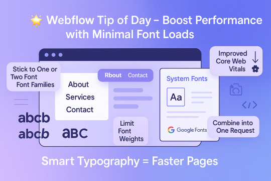
Webflow Tip of the Day
Boost Performance with Minimal Font Loads
Did you know that loading multiple font families and weights can slow down your site?
Smart Typography = Faster Pages
Here’s how to optimize your typography without compromising design:
1. Stick to One or Two Font Families
Too many fonts = heavier load. Choose a strong primary font and, if needed, one secondary.
2. Limit Font Weights
Instead of loading 100, 300, 400, 500, 600, 700 – stick to what you actually use. For most websites, 400 (regular) and 700 (bold) are enough.
3. Use System Fonts Where Appropriate
System fonts like Arial, Helvetica, or Roboto load instantly – no extra fetch needed.
4. Combine Google Fonts into One Request
When using Google Fonts, bundle them smartly using Webflow’s font settings or manual embed.
Why It Matters:
Faster load times
Improved Core Web Vitals
Better mobile performance
SEO gains with cleaner code


#webflow#freelancewebdeveloper#web design#web development#webflowdesign#webflowlandingpage#webflowexperts#website#nocode#ui ux design
0 notes
Text
Se você é jornalista, esse post é pra você
Sou Leandro Branquinho. Palestrante de vendas, especialista em atendimento, comportamento do consumidor, varejo e inteligência artificial aplicada à experiência do cliente.
Talvez você me conheça pelas mais de 2.000 avaliações 5 estrelas no Google. Ou pelos 600 mil seguidores no Instagram e TikTok.
O que talvez você ainda não saiba é que agora criei um mini site exclusivo para jornalistas.
Se você trabalha com pautas sobre consumo, encantamento de clientes, negociação, redes sociais ou personal branding… Pode contar comigo como fonte.
Organizei tudo o que você precisa: bio, temas, dados e contatos. Sem enrolação. Tudo pronto pra facilitar sua próxima matéria.
👉 Acesse aqui
0 notes
Text
Beginner's Guide to Responsive Web Design
Websites are the storefronts of the digital world. Everyone wants a sleek, stylish, and easy-to-use web design in Sydney. However, not everyone knows how to make one that works on all devices. That is where responsive web design comes in. It is not just a trend—it is the new normal. If your web design in Sydney is not responsive, you are already behind. But don’t worry, this guide will help you catch up.
What is Responsive Web Design?
Responsive web design means a website adjusts to any screen size. You don’t need to zoom in. You don’t need to scroll side to side. Everything lines up. Everything flows. It feels natural.
So, the goal is simple: Make your web design in Sydney readable and usable, no matter the device. No matter the screen resolution.
Why Should You Care?
People use all kinds of gadgets today. Laptops, tablets, smartphones, smart TVs, and so on. Some websites look perfect on a laptop, but try the same site on your phone. It’s a mess. The text is tiny. Buttons are hard to click. Images get cut off. All this chaos makes your visitors leave in frustration.
Google loves responsive websites and gives them better rankings. This leads to more visitors and better visibility. Thus, a responsive site is not a luxury but a necessity.
The Key Ingredients of Responsive Design
1. Fluid Grids
A fluid grid uses percentages instead of fixed pixels. That way, elements grow or shrink depending on the screen size. For example, imagine a picture might be 50% wide. It stretches on a big screen, while on a small screen, it shrinks. The layout stays balanced. The structure remains intact.
2. Flexible Images
Images are tricky. If not sized properly, they break layouts. So, responsive design always uses flexible images that are easy to scale and adjust. No overflow. No broken sections. Just smooth visuals. You can use CSS to control this. A common trick is to set the image width to 100%. That way, it always fills the space.
3. Media Queries
This is the secret sauce. Media queries are CSS rules. They tell the browser how to style the page based on screen size.
When the screen is 600 pixels wide or smaller, the background turns light blue. You can:
Change fonts
Rearrange sections
Hide or show content
In short, media queries give you control and make your design smart.
Mobile-First Design: Start Small
Design for the smallest screen first. That is mobile-first design. It makes you focus. It helps you prioritise. You start with what really matters. To put it in order:
Build a layout for phones.
Then scale it up for tablets.
Then expand it for desktops.
This approach saves time while reducing clutter. It also ensures a clean and clear user experience.
Tools to Help You Get Started
Bootstrap
This is a popular framework with pre-made grid systems. It includes responsive components, from buttons to forms to navigation bars. You can build fast. You can customise easily.
CSS Flexbox
Flexbox helps you align items in rows or columns. It adapts quickly and is ideal for one-dimensional layouts. Want a row of cards that wraps on small screens? Flexbox does that.
CSS Grid
Grid is perfect for complex layouts. You can place items wherever you want—rows, columns, or overlapping elements. It gives you full control.
Chrome DevTools
Test your design right in your browser.
Open Chrome.
Press F12.
You’ll see the Developer Tools.
Switch to mobile view.
Resize the window.
See how your site responds.
Adjust and fix issues on the spot.
Tips for Better Responsive Web Design in Sydney
Keep Navigation Simple
Big menus do not work well on phones. Use icons or collapsible menus, and keep it clean. More importantly, keep it user-friendly.
Avoid Fixed Widths
Fixed widths can break your layout. Stick to percentages. Embrace fluidity.
Use Viewport Meta Tag
Add this to your HTML:
```html
<meta name="viewport" content="width=device-width, initial-scale=1.0">
```
This tells the browser how to scale the page. Without it, your design might look weird on mobile.
Test on Real Devices
Simulators help, but nothing beats the real thing. Open your site on different phones. Try it on tablets. Check how it looks. Check how it feels.
Optimise Loading Time
Mobile users want speed. Compress your images. Minify your CSS and JavaScript. Use lazy loading. Keep things light.
Real World Example
Let’s take a basic layout. A homepage with a header, a main section, a sidebar, and a footer.
On desktop:
– The header stretches across the top.
– The main section sits on the left.
– The sidebar is on the right.
– The footer is at the bottom.
On mobile:
– The header still sits on top.
– The sidebar moves below the main section.
– Everything stacks vertically.
Same content. Different layout. That’s the beauty of responsive design.
Common Mistakes to Avoid
Even the best designers mess up. Let’s make sure you don’t.
– Don’t forget the viewport meta tag.
– Don’t use large fixed images.
– Don’t hide important content on mobile.
– Don’t ignore load speed.
– Don’t test only on one screen size.
Each screen is a new experience. Each visitor deserves a smooth journey.
Final Thoughts: The Future is Flexible
The internet will keep changing. New devices will appear and new screen sizes will emerge. So, your fully responsive website must be ready. It keeps your site future-proof. To get started with your responsive web design in Sydney - https://www.makemywebsite.com.au/web-design/sydney/ , connect with Make My Website.
Web design is not just about looking pretty. It’s about function. It’s about flow. It’s about flexibility. Responsive design gives your website a fighting chance.
0 notes
Text
At Least You’re Out There Somewhere
It’s been forever since we last talked. Days, weeks, and months have passed. Yet…it still feels like it was yesterday when I last saw you. Even though you’ve basically vanished off the face of where we were, even though nothing could change the fact that circumstances got twisted and hurt, a part of me will always be influenced by you - for better and worse.
It’s kind of crazy, right? We fell out pretty badly. Chances are that you might not remember me. I honestly wonder why I am writing this piece in the first place on a platform which you rarely seem to frequent. But here I am, writing up this 600 something word essay that is probably going to give off lowercase-mental-health-Medium confessions vibes.
For a while, I often wondered to myself if you were even alive. There had been no sign of you anywhere after you decided to disappear.
The only reason I know you’re still somewhere on the planet is because I saw your shadow looming one day. It wasn’t just like the times when people felt your presence while you were anything but there. This was different. I knew from the moment I saw it that it was unmistakably you.
A lot of crazy things have happened since then. If I told you everything, it would take much longer than I would want this article to be. Besides, I’m really not sure if any of it is on your list of things you’d like to know. It’s all a game-changer in the worst way possible, to say the least.
However, if you ever want to find out, I have the door open for you. I know a lot of people wouldn’t approve. I couldn’t care less about their opinions, though. I mean, some of them are definitely valid. But do they affect me personally? Are they a show of your overall character as a whole? No.
You might be wondering why I have to make this writeup around six hundred words. Here’s the thing. Actually, two things.
First of all, there’s a platform called Vocal Media that I recently joined which requires a minimum word count of 600 words for full articles to be published there. Granted, there have been some automation exploiters sneaking under the administrators’ radar. But I honestly do prefer having some integrity, in spite of what you may believe.
Ultimately, though? I’m not really sure what else to tell you. It might not seem like much to you. However, I find six hundred words to be a lot for me to write. When I started out on Medium, I usually only tried to target a page and a half in Google Docs using Arial font at size 11. The resulting paragraph breaks would sometimes only get me barely over 500.
Speaking of Medium…I’ve been doing pretty well here. I’m not ultra-famous, that’s for sure. But I have joined and published in multiple publications with five digit follower counts. I also have a three digit number of followers myself. Sometimes, I’m pretty startled that I got all of that.
Anyways, enough about me. I know you saw my apology from a while back. I promise it wasn’t simply copied and pasted. I even put it into an AI and a plagiarism checker - if you want some proof.
But if it wasn’t enough for you, I’m sorry. Whether you forgive me or not, I hope you’re doing well. I know that you’d much rather take some time away from everything in general to find your inner peace, and I won’t disturb that.
Wherever you are, take care.
Other Socials
Twitter/X: https://x.com/snarkylisa
Main Tumblr: https://snarkylisa.tumblr.com/
Medium version: https://medium.com/@SnarkyLisa/at-least-youre-out-there-somewhere-9f981de6011a
#article#writing#essay#medium#tumblr#tumblr stuff#rant#ranting#life#relationships#relationship#fallout#medium.com
0 notes
Text
PenNews Multi Purpose AMP WordPress Theme v6.6.8
https://themesfores.com/product/pennews-multi-purpose-amp-wordpress-theme/ Note: This Product is Activated Use any Key/Username PenNews is a powerful WordPress Theme from PenciDesign. This theme helps you create a new site in such a short time by drag & drop with great designs. We also bring to you great support and friendly help. You can use this theme for every purpose – create things like the way you love. PenNews is a Best WordPress News Theme PenNews Multi-Purpose AMP WordPress Theme PenNews WordPress Theme Key Features One click install any demo. Google AMP & Facebook Instant Article Supported & Validated Multiple premium plugins included for free Multiple Custom Widgets with great designs 600+ options from WordPress Customizer Drag & Drop page builder by WPBakery Page Builder ( Visual Composer ). White Lable Tool EU GDRP Policy Compatible Unlimited Fonts: Upload your custom fonts & google fonts Advanced Social Counters & Sharing Buttons 10+ Post Styles for Different Stories 10+ header styles with each different container 28+ featured sliders style – check demos slider 40+ Content Blocks – check demos 10+ Big Grids – check demos Supports 3 Types of review: Star, Percent and point. Multiple global Options for All VC elements, example: Multiple Sidebar Layouts: Multiple mega menu styles & menu items style: Mega Menu Columns & Category Mega Menu With 2 different styles Hide/show most elements on your site Sticky/Un-sticky Navigation Sticky Sidebar Ajax Live Search Unlimited Custom Sidebar – add any custom sidebar you want to your site without touching to the codes. Video Playlist for VC elements & Widgets Ajax Login & Register Form Multiple Portfolio Layouts: Woocommerce Compatible – easy to create a store/shop on your site. BBPress & BuddyPress Compatible – easy to create a forum & community on your site. The Event Calendar Compatible – easy create & manage the events. Multilingual Supported: WPML & Polylang Compatible – easy to create multiple languages site. Quick Text Translation – Translation your site to your language in seconds. Free Updates Life Time. WordPress Multi-Site Supported Auto-Updates – Don’t worries about update. This theme can be update itself automatically. Detailed Documentation Dedicated & Fast Customers Support from PenciDesign Please note that any digital products presented on this website do not contain malicious code, viruses or advertising. https://themesfores.com/product/pennews-multi-purpose-amp-wordpress-theme/ #NewspaperThemes #WordpressTheme
0 notes
Text
Dezembro de 2023 trouxe uma expectativa mista entre os beneficiários do Programa Bolsa Família. Enquanto os pagamentos regulares do mês seguem seu curso, muitos aguardam ansiosamente por um possível décimo terceiro pagamento, um abono natalino que poderia trazer um alívio adicional para as festas de fim de ano. A Realidade do Décimo Terceiro no Bolsa Família Contrariando as expectativas de muitos, o Ministério do Desenvolvimento e Assistência Social, Família e Combate à Fome (MDS) esclareceu que não há previsão para o repasse do décimo terceiro para os beneficiários do Bolsa Família em 2023. Isso se deve à ausência de uma regulamentação específica que obrigue o pagamento desse valor extra em dezembro. O Bolsa Família e a Renda das Famílias O governo federal defende que o Bolsa Família é um complemento à renda principal das famílias, não sendo considerado a fonte principal de renda, como ocorre com os beneficiários do INSS. Essa distinção é crucial para entender por que o décimo terceiro não é visto como uma necessidade pelo governo, especialmente considerando que as famílias já recebem um valor mínimo de R$600 por mês, além de benefícios adicionais. Exceção na Paraíba: Um Abono Natalino Especial Uma exceção notável em 2023 é o estado da Paraíba, que anunciou um abono natalino de R$64 para os beneficiários do Bolsa Família residentes no estado. Este gesto destaca a discrepância entre as políticas estaduais e federais e traz à tona a discussão sobre a necessidade de um apoio extra durante o período festivo. O Impacto da Ausência do Décimo Terceiro A falta de um décimo terceiro para os beneficiários do Bolsa Família levanta questões sobre o apoio adequado às famílias de baixa renda no Brasil. Enquanto o programa ajuda milhões a superar a linha da pobreza, a ausência de um pagamento extra em dezembro pode significar um Natal menos alegre para muitos. O Futuro do Bolsa Família O debate sobre o décimo terceiro no Bolsa Família abre caminho para discussões mais amplas sobre a estrutura e o alcance do programa. Com o aumento do custo de vida e as crescentes demandas das famílias brasileiras, a necessidade de revisar e expandir os benefícios do programa se torna cada vez mais evidente. Conclusão: Entre a Esperança e a Realidade O final de 2023 no Bolsa Família reflete a complexa interação entre as necessidades das famílias de baixa renda e as políticas governamentais. Enquanto o décimo terceiro permanece uma esperança para muitos, a realidade atual exige uma reflexão sobre como melhor apoiar as famílias que dependem desse programa vital. Gostou da notícia? Aproveite para participar do nosso grupo no whatsapp e receba notícias exclusivas diariamente. ENTRE NO GRUPO AQUI é grátis, e você recebe em primeira mão as nossas notícias! Siga o SC Hoje News no Google News para ficar bem informado. Siga nosso perfil no Instagram: @schojenews Siga nossa página no Facebook: @schojenews Inscreva-se no nosso Canal no YouTube: @schojenews
0 notes
Text
Building a Strong Online Presence with the Gym WordPress Theme

In today's competitive fitness industry, having an online presence is no longer optional—it's essential. For gym owners and personal trainers looking to distinguish themselves, the Gym WordPress Theme provides an exceptional solution. This user-friendly theme is designed to help you create a compelling website that showcases your services and attracts more clients without requiring advanced coding skills.
User-Friendly Design
The Gym WordPress Theme is perfect for users with any level of technical expertise. Even those with little to no coding knowledge can easily design their website by following the comprehensive documentation provided. Additionally, free installation support ensures that you can get your site up and running smoothly.
Customizable Elements
One of the standout features of the Gym WordPress Theme is its high level of customization. You can tweak various elements such as colors, layouts, and more to align with your brand identity and keep pace with changing market conditions. The theme's interface is built to adapt, ensuring your website remains fresh and relevant.
Extensive Plugin Compatibility
The Gym WordPress Theme is compatible with popular page builder plugins like Gutenberg, Elementor, Divi, Visual Composer, Beaver Builder, and Live Composer. This flexibility allows you to create stunning page layouts with ease. Furthermore, the theme adheres to WordPress codex theme review standards, ensuring high-quality coding practices.
Cross-Browser and Device Compatibility
Your gym website will be accessible on both old and new browsers, thanks to the theme's flat and material design approach. It has been tested across various browsers, including Chrome, Safari, and Opera, ensuring a seamless experience for all users. Additionally, the theme is responsive and compatible with all devices, providing an optimal viewing experience on smartphones, tablets, and desktops.
Enhanced Loading Speed
Website loading speed is crucial for maintaining visitor interest and boosting traffic. The Gym WordPress Theme supports cache plugins to enhance your site's loading speed, making it faster and more efficient.
Engaging Blog and Media Integration
The theme includes a blog section designed to keep visitors engaged with your content for longer durations. You can choose from four different layout variations to create an elegant blog section. Additionally, the theme supports a mix of images, videos, and banners to present your content in an alluring and aesthetic format.
Multilingual and High-Resolution Ready
The Gym WordPress Theme supports various RTL languages like Hebrew and Arabic, making it versatile for global use. It is also high-resolution ready, ensuring your website looks sharp and professional on all devices.
Security and SEO
Security is paramount, and this theme supports various security plugins to protect your website from malicious attacks and hackers. Moreover, it is SEO and social media-friendly, helping you to enhance your online visibility and reach a broader audience.
Additional Features
Full color-changing options with a color picker
Over 580 social icons and other icons available
A dedicated bio area to showcase your gym trainers
Theme options for various buttons, info boxes, and accordions
Multilingual support with qTranslate X compatibility
PO file for easy translation into other languages
Over 600 Google fonts to choose from
Shortcodes plugin compatibility for better content setup
WooCommerce compatibility for setting up an online shop
Contact form and Google Map integration
Gallery area for displaying images of your gym
Widgetized sidebar, footer, and header
HTML5 & CSS3 coding standards
Conclusion
The Gym WordPress Theme is an ideal choice for gym owners and personal trainers aiming to build a strong online presence. Its comprehensive features and user-friendly design make it easy to create an attractive and functional website that stands out in the competitive fitness industry. Start building your fitness website today with the Gym WordPress Theme and make a lasting impact in the fitness world.
By leveraging the Gym WordPress Theme, you can effectively showcase your training services, attract more clients, and maintain a competitive edge. Don't miss out on the opportunity to enhance your online presence—take the first step towards building your compelling fitness website now.
#BestWordPressThemes#BestPaidWordPressThemes#TopWordPressWebsitesinIndia#PurchaseWordPressTemplates#BestWordPressThemesToBuy#PremiumWordPresstemplates#BuyResponsiveWordPressTheme#WordPressThemes#BuyWordPressThemes#PurchaseWordPressThemes#DownloadWordPressThemes#WordPressThemesIndia#IndianWordPressThemes
0 notes
Text
Benefits of Google Looker Studio | Liveblack

Marketers or Marketing Agencies need to generate reports now and then, and developing reports has always been challenging. When it comes to reporting on marketing activities can be a lengthy task if you need to monitor the data on a day-to-day basis. Or if you prepare the report manually for the whole week or month, this work can be very bothersome.
Even a tiny mistake in the entire report created by you can cause trouble. To create reports and measure performance, there is a need for a tool that collects your data from different platforms and prepares creative reports accordingly.
what is Google Looker Studio?
Google Looker Studio or Data Studio is one tool for creating accurate and tidy reports. Marketing firms collect information about marketing performance and turn it into visuals using documents made in Google Looker Studio. GDS offers many great features that are available for free.
One of Looker Studio’s key features is the potential to display data from multiple data sources in a single visualization. You can draw attention to details from different social media platforms like Facebook, Instagram, YouTube, Google Ads, Google Analytics, Google Search Console, CRM, Google Sheets, and other information from the eCommerce platform.
Benefits of Google Looker Studio
1 — Easy to Use
Google Analytics Looker Studio provides an easy-to-use UI that should help anyone familiar with Google products get started building dashboards. In that sense, it eases your learning curve.
2 — Free of Cost
Google Data Studio is a free tool where marketing agencies don’t need to pay money to create and arrange an account. GDS turns your data into informative, easy-to-read, shared, and fully customizable reports. However, they only let you connect to products and services of Google like Google Sheets, Google Analytics, Google Ads, YouTube, etc.
Google Looker Studio has over 600 connectors that allow marketing agencies to pull data sets from any popular marketing platform, which is a huge plus. Looker Studio connectors can be created, implemented, and assigned for free. This means marketers can create connectors to build interactive dashboards and manage their data.
3 — Links to Several Data Sources
Keeping marketing strategies and different platforms in mind, there are many such sources whose data reports have to be prepared. Looker Studio gives you the advantage that by collecting the data of all the sources in one place, you can also prepare a report that you can share with your client.
You can connect to multiple data sources in a single dashboard using Google Looker Studio. Unifying different data sources from your Google Data Studio dashboard makes creating reports for Social Media Platforms, SEO, or Google Ads simple.
4 — Fully Customizable
Looker Studio allows you to build fully customizable dashboards. You can start with a blank template or use a pre-programmed template; whatever you choose, Looker Studio helps you to create fully detailed and easy-to-understand reports that include data, charts, and widgets, according to your requirements, you can put things in it. You can also opt for colors, fonts, design, and formatting to match your organization’s or your client’s brand.
5 — Informative Report — Easy-to-Understand
Google Looker Studio helps you make your digital marketing services more accessible and faster. Looker Studio allows you to create real-time, dynamic, and informative dashboards that make it easy to collect your data. This means that you can create your reports and send them to the recipients of your choice, and with this, there is also an advantage that whoever you send them to can modify reports as per their requirements.
6 — Blending Data
One of the best features of Looker Studio is that it blends your different data very well. Data blending allows you to mix or combine multiple data sources into a chart or graph. Data blending will enable you to combine data from two platforms into a single graph to see other platforms’ data in a single report, chart, or graph. This way, both data sets are easily consumed instead of creating separate reports.
7 — Easy to Allot Reports
You can easily allot reports in Looker Studio. You can share a link with your team and allow others to read or edit the report. This feature lets you and your team members view and edit reports while sharing them in real time simultaneously. By sharing the report this way, you can save time.
Google Looker Studio creates creative reports tailored to your marketing process so that you can get a comprehensive view of the data taken from two different platforms in one place. It is beneficial in every way and easy to use. You can modify it according to your own and add Widgets too. Google Looker Studio has over 600 connectors that connect the studio to the primary data. Linking your data this way creates a data source.
Liveblack is a firm that strives to expand your company to new heights. Liveblack is one of the best digital marketing agencies in Ahmedabad, where you can get in touch for all of your marketing and design requirements and receive the best outcomes.
#what is Google Looker Studio?#Data Studio#Benefits of Google Looker Studio#Google Analytics Looker Studio#Google Data Studio#Google Analytics#social media platforms#Google Data Studio dashboard#Google Looker Studio#Looker Studio#the best digital marketing agencies in Ahmedabad
0 notes
Text
Difference Between Astra Theme and BeTheme
Introduction
When creating a website, one of the first decisions you need to make is choosing the right theme. Two popular themes that many people use are Astra and BeTheme. In this blog, we will explore the differences between these two themes to help you decide which one might be the best fit for your website.
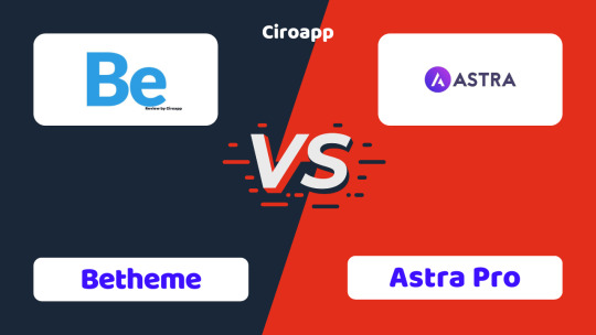
What is a Theme?
Before we dive into the details, let’s understand what a theme is. A theme is like the clothes for your website. It decides how your website looks and feels. Different themes can make your website look elegant, fun, professional, or creative. Now, let's look at Astra and BeTheme and see what makes each one special.
Astra Theme
Overview
Astra is a lightweight and fast theme. It is designed to be simple and easy to use. Many people like Astra because it makes their websites load quickly. A fast website is important because it makes visitors happy and helps your site rank higher on search engines like Google.

Features
Speed: Astra is known for being very fast. It does not have a lot of extra features that can slow your website down.
Customization: Even though Astra is simple, you can still change many things to make your website look just how you want. You can change colors, fonts, and layouts easily.
Page Builder Friendly: Astra works well with popular page builders like Elementor, Beaver Builder, and others. These tools let you drag and drop elements to create your website without needing to know any coding.
Pre-made Templates: Astra offers many pre-made website templates. You can choose one you like and then change it to fit your needs. This makes creating a website much faster.
WooCommerce Support: If you want to create an online store, Astra supports WooCommerce. WooCommerce is a plugin that helps you sell products online.
SEO Friendly: Astra is designed to be good for SEO (Search Engine Optimization). This means it helps your website show up in search engine results.
Pros and Cons
Pros:
Very fast and lightweight
Easy to use and customize
Works well with page builders
Lots of pre-made templates
Good for SEO
Cons:
Might be too simple for very complex websites
Some advanced features require the pro version
BeTheme
Overview
BeTheme is a more feature-rich theme. It comes with many tools and options, making it suitable for almost any kind of website. If you like having lots of choices and don’t mind a bit of complexity, BeTheme might be a good option for you.
Features
Design Options: BeTheme offers over 600 pre-made website designs. This means you can find a design for almost any type of website you want to create.
Customization: BeTheme has a powerful customization tool. You can change almost every aspect of your website’s design. This includes layouts, colors, fonts, and more.
Built-in Features: BeTheme comes with many built-in features like sliders, menus, and forms. You don’t need to add extra plugins for these features, which can make your website faster and easier to manage.
Shortcodes: Shortcodes are little pieces of code that let you add different elements to your website easily. BeTheme has many shortcodes for things like buttons, columns, and galleries.
Responsive Design: BeTheme makes sure your website looks good on all devices, whether it's a computer, tablet, or smartphone.
SEO Friendly: Like Astra, BeTheme is also designed to be good for SEO.
Pros and Cons
Pros:
Lots of design options and pre-made templates
Powerful customization tools
Many built-in features
Good for complex websites
SEO friendly
Cons:
Can be overwhelming due to many options
Might be slower than lightweight themes
More complex, which means a steeper learning curve
Detailed Comparison
Speed
Astra: Known for its speed and lightweight nature. It doesn’t have many built-in features that can slow it down.
BeTheme: While still fast, BeTheme has more built-in features and options, which can make it a bit slower than Astra.
Ease of Use
Astra: Very easy to use, especially for beginners. Its simplicity makes it a great choice for those who are new to website building.
BeTheme: Offers more options and features, which can be overwhelming for beginners. It might take more time to learn how to use all its features.
Customization
Astra: Allows for a good amount of customization, but it keeps things simple. If you need more advanced customization, you might need to get the pro version.
BeTheme: Extremely customizable with a powerful tool to change almost every aspect of your website. Great for those who want complete control over their website’s design.
Pre-made Templates
Astra: Offers a variety of pre-made templates that are easy to use and customize.
BeTheme: Provides over 600 pre-made designs, covering almost any type of website you can think of.
Built-in Features
Astra: Keeps built-in features to a minimum to maintain speed and simplicity.
BeTheme: Comes with many built-in features like sliders, forms, and shortcodes, reducing the need for additional plugins.
WooCommerce Support
Astra: Fully supports WooCommerce and is a great choice for creating online stores.
BeTheme: Also supports WooCommerce and provides many design options for online stores.
SEO
Astra: Designed to be SEO friendly, helping your website rank well on search engines.
BeTheme: Also SEO friendly, with features that help improve your website’s visibility on search engines.
Which One Should You Choose?
Choosing between Astra and BeTheme depends on your needs and preferences:
If you want a fast, lightweight, and easy-to-use theme, Astra is a great choice. It’s perfect for beginners and those who want a simple website without too many bells and whistles.
If you need a highly customizable theme with many design options and built-in features, BeTheme is the way to go. It’s ideal for those who don’t mind spending extra time learning how to use all its features and want complete control over their website’s design.
Conclusion
Both Astra and BeTheme are excellent themes with their own strengths and weaknesses. Astra is great for simplicity and speed, while BeTheme offers more customization and built-in features. Consider what’s most important for your website and choose the theme that best fits your needs.
Remember, you can’t go wrong with either theme. They both have large communities and plenty of support available, so you can get help if you need it. Happy website building!
Want to read more about WordPress Themes and Plugins, Click Here
0 notes
Text


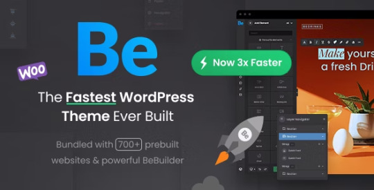
The Agency is a professional one-page creative WordPress theme, perfect for digital agencies, marketing firms, and other creative businesses. This multipurpose theme is cross-browser compatible, fully responsive, and retina ready. The theme is easily customizable and easy to maintain, making it a pleasure to work with. The theme performs beautifully on all devices, with smooth animations and optimum speed.
Visual Composer Drag Drop page builder : Most advanced and Popular pagebuilder that ever built in the world. And we've developed 10 additional advanced element on this plugin those makes your live easier than ever.
Easy one page sections : Applying one page style was never easy like that. You can convert your any custom pate into One Page style with a single Checkbox. Assign your important parts as a section.
Real One click data : This is an awesome feature. You can have all the demo data with a mouse click.
Live customize options : Powerful Live custom option but not many & boring. all those experienced options help you make any different views in a seconds.
Custom brand color : Just pick your brand color on a picker and change aspect your whole web feeling.
600+ Google web fonts : Having custom fonts on your site is limitless. Just pick 2 different beautiful fonts on your heading and body fonts.
Retina ready : Nine is absolutely retina ready and includes all the thing by vector icon fonts and css styles those looks beautiful on all retina & high resolution screens.
Fully responsive : Nine is a fully responsive WordPress theme and aspects perfectly on all small screens and mobile devices.
Mailchimp plugin supports : Supported a free mailchimp plugin on the footer and you can get subscription list with it.
Contact form 7 support : Awesome free form legend. Making a form without it is a tough job. Look at contact form & Reservation form on the Restaurant page and see how you can handle them as you wanted.
Extensive documentation : Online documentation
Friendly & 5 star support : Timely and friendly support burns all your troubles with a reply. Just let us know your issues. And everything is gonna be alright.
0 notes