#BCU Viscom
Explore tagged Tumblr posts
Visit Tumblr Blog
Explore Tumblr blogs with no restrictions, modern design and the best experience.
Last Seen Tumblr Blogs


Fun Fact
Tumblr has 411 employees.
Text
Animaster Design College
Established in 2003, Animaster Design College is a very reputed Design Institute in India.Animaster is the best animation college in Bangalore. Our Design school offers campus, online & diploma courses in Graphic Design, 2D 3D Animation, Maya, Vfx, Interior Design, Multimedia, Motion Graphics, Visual communication, Game design & UI/Ux. Affiliated to BCU University, we're a top bachelor degree College offering BVA, Bdes, BA & BSc in Animation & VFX degree, Multimedia, Gaming, Interiors, Viscom & Graphic Design degree courses after 10th & 12th. Our School of Visual Arts teaches Fine Art, 2D sketching, Illustration & Drawing classes for Kids & Corporate training.Our motto is to provide affordable, qualitative design courses & top industry jobs."
Business Keywords : Design College in Bangalore,Top Design School in Bangalore
social profile links: https://www.facebook.com/animastercollege/
https://www.linkedin.com/school/animaster-academy---college-for-excellence-in-animation/
Business Email : [email protected]
Business hours: Friday 8:30 am–7:30 pm Saturday 8:30 am–7:30 pm Sunday Closed Monday 8:30 am–7:30 pm Tuesday 8:30 am–7:30 pm Wednesday 8:30 am–7:30 pm Thursday 8:30 am–7:30 pm
Phone number: 9901975609
Website: https://www.animaster.com/
Address : 52, RamaTowers, Bellary Rd, next to Baptist Hospital, Vinayakanagar, Hebbal, Bengaluru, Karnataka 560024
1 note
·
View note
Text
01/ Exciting Times!
ADM5000 22/12/21
Hey :)
I’m currently taking part in my first work placement at University, all of which I will be documenting here on Tumblr for the purpose of reflecting on my personal development, experiences within the creative industry, and the challenges I undergo along the way.
This is also an insightful opportunity for anyone reading to learn from the handful of new experiences I plan on sharing my advice on.
More coming soon, stay tuned.
Berenice
#GraphicDesign#workplacement#student#creative#design#newrole#graphicdesigner#graphiccommunication#bcu#viscom
3 notes
·
View notes
Link
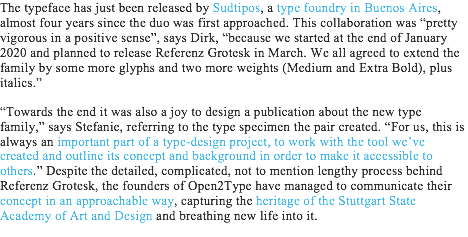
From my last post, I have continued researching the process behind making designing typefaces and typography in general. I found another article by It’s Nice That that explores the recent release of Referenz Grotesk, a typeface designed to pay homage to the heritage of the ‘Stuttgart School’. I have documented the crucial points from the article while noting down my thoughts from the extracts I have collected.
The phrase ‘medium’ suggests that the Open2Type collective uses typefaces as a method to amply stories to everyday people that would be oblivious to. They provide a platform to the unknown or untold tale, helping to communicate different voices to a broad audience, educating more on wider issues. By using typefaces as the medium, it ensures more people will become aware of the story told, as we continuously see and use them within our daily tasks that it would be normal to come across a font detailing a deeper meaning.
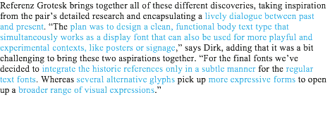
The use of the word ‘dialogue’ highlights that both the past and present work hand in hand in the design Refernz Grotesk. By incorporating old specimens from leading figures into a functional digital typeface, it allows the type designers of today to bring new life into the past through experimental visuals, helping to ensure the influential heritage of the Stuttgart School remains with the new generation.
Final Evaluation:
The concept behind Referenz Grotesk is interesting because it captures the legacy and heritage of the ‘Stuttgart School’ in the medium it heavily influenced, typography, which adds to the impact they had in modern design within and outside Germany. The typeface itself is a testament of the influence, as it directly references crucial figures work, showcasing the talents found and produced in the academy. By using these, references it helps to provide them with a new life for new generations to learn from and experiment with to continue showcasing the heritage of the Stuttgart School. It implies that typography can have an immense impact that moves away from being an outlet for the spoken and written language.
The fact that the typeface is fully functional as well as playful, suggests the level of thought that went into the design process. By creating to this style, it ensures the longevity of the typeface, as it's flexible enough to work in corporate settings as well as experimental expressions, ensuring that new generations will be able to use it regardless of the demand of the industry.
I think the typeface works because it sums up the rich typographic history of the school in three designs. They have successfully combined shapes and styles into a functional form that works to current technology that enables experimentation while showcasing Stuttgart School finest designers.
1 note
·
View note
Photo

Brief 7: Personal Branding (Business Cards)
In preparation for Gradshow, I have been throughly working hard to make sure that the branding of myself as a professional practitioner is to a high standard and best reflects me.
From redesigning my brand logo, to updating my portfolio website, I wanted to think about Gradshow and how my brand can be positioned physically.
Above / I have created a series of business cards, complete with my revised logo and relevant contact details (Instagram, LinkedIn, Email Address, Phone Number and Online Portfolio web link).
These have currently been sent to print and should arrive in time to be placed by my exhibition boards for the Gradshow. I also intend on having postcards made, which highlight snaps of my best work, as well as a physical portfolio that the public can flick through.
#VIS6036#L6#major study#bcu#viscom#graphic communication#creative thinking & communication#ideas & development#personal branding#brief#brand#business cards
3 notes
·
View notes
Text
Poetry Poster Essay
School of Visual Communication | BA (Hons) Visual Communication
Personal Module Evaluation (approx. 1000 words)
In your own words, how did you understand the problem you were asked to solve? Firstly I started off by printing out the brief and going through it top to bottom several times to make sure I understood every specific thing of what was getting asked of me. To further this I then looked at the module guide which went into more detail of what I had to solve and produce. I was given 5 weeks to research and develop our work across various media such as Sketchbooks, online blog etc. I was to show an understanding of the relationship between theory and practice. Secondly to produce excellent visual solutions and showcase that I was informed by key subject ideas.
Furthermore, the aim of the module was to explore persuasive communication as ‘Visual Poetry’ maximising on experimentation and interdisciplinary approaches in line with the course philosophy. As my first solo module, this project was in a way to test my skills. The first time having to properly follow a brief. Meaning; in the first brief we had total freedom of what item to choose and what to create from that items inspiration. However, with this, it’s a little more specific. Which I prefer as in a sense it’s more controlled, I know what the ‘client’ is asking for, what specs, what style etc. To create a poetry poster is interesting to me, I like the ideology of it especially as I’ve made several digital posters before on my BTEC graphic course. The specs are as followed: Size being A2 (portrait), can be printed, digital or interactive and I may consider 3D applications.
Who were you designing or producing work for? On the Main Brief it was made clear that March 21st, 2018 is International poetry day and we were to create a poster to promote our chosen poet.
From the brief: Using a poem of my choice, create a publicising and meaningful poster to showcase the poet and poem. The use of persuasive language will help engage an audience. Consider using the lectures and workshops available to give myself a head start. Also look into the documents and guides put on to Moodle to help, they may give me important information on the principles and elements of design and typefaces and anatomy. Secondly, I have to make this for a certain target audience; that could be likers of the poet or poem, people interested in to poetry overall or just have a keen interest for typographical posters. In a way as well we are designing this for our tutors to review and receive feedback from, not just to receive a mark and be done with it but to help us better ourselves and tell us what an “audience” would get from it by first impressions etc.
What relevant theory, reading or research underpinned your approach to solving the problem? I started of by using my sketchbook as a kind of journey logbook, which it’s supposed to be anyway. I attended lectures and participated and became more aware of various methods and options which were available to me. Various tasks on the course have helped me in certain ways to come up with my ideas. One of the first tasks was to simply find one principle of design and one element and we were to print out an A6 postcard showcasing our findings. I chose to line and pattern. Pattern being a massive inspiration as for a poster it’d be appealing, and it’d draw the viewer in. More about this is in my previous blog post about Design Principles.
The next task after this was called Micro & Macro, this was again not a hard task and quite fun. We were given wooden letterforms to basically scale and draw out; this doesn’t sound like it would help but the ‘0’ I was given was a very strong and bold character and from doing research into it, turns out to be the typeface ‘Impact’. Which I then went on to use in my designs for my magazine spreads.
What were the best ideas you came up with and how do you know that? & How did you develop your ideas before choosing a particular one to produce? In terms of ideas I was mainly swaying towards creating something digital as I went to a demonstration of Jonathan Jones’ work and he showed us various pieces of digital styles and ideas using Adobe After Effects. Straight away I wanted to do create something digital. I believe one of my ideas was to use After Effects and have a slowed down clip of me walking the canal, with a voice over by me reading the poem and to have the words come up on screen as I say them. My other good ideas were to make the video fast and also have the words come up fast; inspired by the Nike advert which was showed to the group during a presentation. Sadly even after getting a hold of After Effects, it was just too much for my laptop to run. It kept on crashing and I had to try my hand in creating the film again twice. This started to frustrate me, so I thought I’d keep a formal and digital approach, so this is where one of my best ideas stemmed from. The City River Blues GIF. This in a sense was very similar to the idea of the sped-up canal video. But, looking at the video I recorded there was a certain part where I recorded the light reflection bouncing off the water; it was appealing to the eye. I thought this would be a great GIF/Animated poster and with experience in the bag on how to create GIFS, I just thought it was one of the best ideas but not THE best. After designing it I thought it just wasn’t enough; I didn’t feel like it met the criteria like my final design did. My final and best idea was to create an A2 poster and for it to be interactive and 3D. I wanted this to have life to it. Taking the poem into mind and my own experience walking the canal system, it gave me one main idea and that was to create a collage-like painting/sculpture of the river bed.
Which relevant practitioners did you study in order to validate your personal reasoning? I chose to look into Ivan Cherymayeff as I’ve considered his work before and he came to mind when I was walking down the canal and I saw these brown paper bags floating in the water and it looked messy but coordinated and somehow it just reminded of his work, thus getting the inspiration to make a collage type poster. My second inspiration was from Tracey Emin ‘My bed’. I have a separate post about this for more information overall but basically my idea at this point was a collage to do with the canal; linking to the words from Benjamin Zephaniah’s poem. There were certain words in that poem (s***-coloured river, condoms galore) which made me think of ‘My bed’ by Emin and instantaneously I had the idea to make my poster very visual and even have a certain smell to it. I wanted to put the audience there, like there were with Benjamin as he was writing or even living the experience/poem.
What editing process did you use to choose the preferred solution? For the actual A2 poster, nothing. It was all handmade But for the GIF, it was simply photoshop
How did you go about producing your solution/s and why? & Why did you choose your particular production methods? Give reasons I started off by buying an A2 foam board from the university shop to follow the brief as that is the desired size. Following day, I laid out a bigger piece of card (which I had left over from the previous module), so I wouldn’t get paint on my carpet; want to make sure I get my deposit back! I chose to use paint as I’m not that strong with painting yet and feel like it needs improving so it was a risk but at the same time I had the paint and the utensils already, so it was more handy/practical. So I started off by painting the board using brown paint which visually is the colour of the canal but it’s also to link to the line ‘our s***-coloured river’. I then painted the board with a wave/swirl effect to have the pattern and feel like it was water. Once that was done I then went over it with ash water to give it the smell and to add a gloss to the paint. But this is also to link the line ‘Got damned lungs’ from the poem. Next was the adding of 3D items; I began stapling the cigarette butts to the board as I didn’t have strong enough glue for them to hold. I decided to add these as again to link with the previously quoted line from the poem and from my experience down the canal…it’s all you see, in and out of the water.
Furthermore, I then dirtied up a receipt and burned up train tickets to look like they’ve been well-used and in the water for a while. I applied these with PVA glue as this was just strong enough to hold these. Putting a train ticket in the top right and bottom left corner; the receipt in the top left. I done this to show pattern and symmetry. This left the bottom right empty and I already knew what was going there. I got a condom wrapper and burned it at the sides and applied this with staples in each corner so it’s stable but also coming out of you in the 3D sense. Lastly this is the last linked item to the poem, the line being ‘And condoms galore’. Now for the centre/main piece. Going back to the whole brown bag/Ivan Cherymayeff inspiration, I decided to dirty up a brown bag and then paint (white) in sans-serif typeface the title of the poem ‘City River Blues’. I then glued this to the board but making sure you can still have access to the bag. This is where my interactive idea comes to play. I then cut a piece of paper out from my old sketchbook and then again began the dirtying process, once dry I drew out in blue crayon a phrase from the poem. Once done I placed it in the bag and that was my final piece done.
In the whole process…
What was successful and why? I believe my final designs overall, magazine, GIF and my A2 Poster were all majority meeting the learning outcomes and brief.
My poster being the right/required size, being interactive which I think is a whole new term when it comes to my poster and overall, I add another sense into the mix - smell. As I said before I wanted to immerse the audience into my poster, so it genuinely feels like they’re in that environment. My GIF was more appealing and for more of a side piece, I still feel like this was a strong and very appealing visual.
What was unsuccessful and why? I feel like my overall planning and timekeeping was a downfall as I ran into problems near the end, if I started sooner then I wouldn’t of had those problems or at least had more time to deal with them and then giving me reassurance when it came to my final designs. Even though I’m happy with my final poster design, I still wanted to go the whole film route and I just don’t think the poster is visually appealing as I first wanted from the get go.
How will you modify or change your approach in future? From now I will plan and start a lot sooner, straight away work on my blog and sketchbook but keeping it organised and coordinated to help me in the future if I want to look back. I would also like to do more mock-up designs in the future to show my progress and ideas.
#bcu#l42017#graphic design#graphic communication#viscom#visual communication#second module#city river blues#benjamin zephaniah#typography#photoshop#photography#collage#painting#inspiration#research#poetry#poetry poster#essay#poetry poster essay
11 notes
·
View notes
Photo

Probably going to be the last time I see this place in a while. What a wonderful few years it's been. . . . . . . #bcu #bcuparkside #bcuviscom #visualcommunication #viscom https://www.instagram.com/p/B21D_54Blw7/?igshid=3arcn9ajt1u8
0 notes
Text


Teamed up with Afsa in a two part activity to scamp ideas for short briefs & we won the votes from the class in both rounds!! Winning ideas marked with green stars
0 notes
Photo

At New Designers #nd17 if you happen to be in London, come visit us at Business Design Center. Our exhibition stall for BCU viscom illustration VC 20. See ya there. #newdesigners2017 #london #exhibition #artwork #illustrations #viscom #bcu
2 notes
·
View notes
Photo

Love graphic design? Love free booze? Come down to the BCU Graphic Design showcase: Catalyst. Private viewing on Weds 14th June from 6pm @ Birmingham City University - Parkside building. The show will be open until 23rd June. Hope to see your lovely faces there! 🤗 . . . . . #catalyst #bcu #viscom #visualcommunication #graphicdesign #booze #design #art #digital #uni #designspiration #inspiration #inspiredfestival #event #june #mylittleeye (at Birmingham City University Parkside Building)
#digital#design#visualcommunication#viscom#uni#inspiredfestival#event#bcu#june#inspiration#art#catalyst#designspiration#booze#mylittleeye#graphicdesign
1 note
·
View note
Photo

Treasure Island Poster Covers: Since Treasure Island has had a lot of reboots, I started to look at some of the posters that have been made from the 1900 - 2012. May create a poster as well for the book. Looking at the colours, composition, typography which some have the some kind of style and images they use.
#treasure island#posters#exploring narrative#new project#workinprogress#hardwork#bcu#bcu student#graphic student#viscom
4 notes
·
View notes
Photo


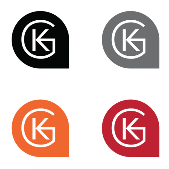

Kode Gaming
I was approached over social media to create a new logo and branding design for an up and coming gamer. They were only starting but they wanted a logo which would be over their twitch and other media accounts. We sent each other a few sketches of what he wanted, he was really clear on creating a KG icon mixing the two together. Also since he was a kind off commentator/lets play gamer he talks alot so I started to experiment with shapes to do with speech marks and bubbles. This is where the shape comes from.
He loved this after an initial sketch and then after I vectorised it he loved it and instantly wanted the image and files, which is great! He also has asked for a possible banner designs, again for social media presence stuff and also a small intro to be created for him. I will get round to doing these asap as he needs them doing and then we will discuss the payment but loved doing this!
5 notes
·
View notes
Link
For my first project, into my last year at university, I have decided to approach the field of type design to try to expand my knowledge on the process and the ways typography is changing. When researching into this topic, I came across this article by It’s Nice That where they explore the recent project from Typelab to sent typefaces into space as a way of communicating human culture and history. I have documented by notes and analysis by highlighting key points from the extracts I have collected below.

The extract suggests that the Typelab is pioneering space for newcomers in the industry to help provide them with a platform to expand their work, encouraging more to support the designers. However, it highlights that the digital platform is developing further by becoming a type foundry that built for budding creators across the globe. The company is growing with the times and filling a gap in the market, as the same fonts, created hundreds of years ago, are still consumed today, creating the same visuals over and over again. We, as designers, want new and fresh fonts that are unique to clients or brands.
The concept is all about capturing the essence of human culture through a capsule of typefaces that express the variety of groups within the umbrella term, typeface. By resembling the Nasa launch, it adds greater emphasis on our culture, as the company is one of the key figures in our understanding of outer space. The history and legacy of the company would be linked, to the Space Collection, due to the vast similarities. This would help to add to the heritage stored in the capsule.
The phrase ‘cultural references’ suggests a typeface is heavily influenced, by the culture at the time. They can detail the desirable style of lettering and how the designer created them if only we looked closer at them. A typeface in itself is a time capsule that can be reflected and learnt from if only we looked past its usage.

The statement suggests the collection takes on a wider perspective into our culture by showcasing the work of international designers, as a way of creating an accurate glance at our society.
The futuristic theme was a great way at capturing the idea of the project, as it treats each typeface like its own planet or universe, helping to capture the emotion tied behind the design. By personifying each typeface, the viewer can delve into their imagination and mould the meaning or story to their heart's content. The visuals are easy to understand and take away, regardless of their technical knowledge of design.
The statement highlights that the needs of brands and consumers are altering to become more digital and experimental with motion as well as typography. It implies that the way we use and create typography is changing, rather than producing typefaces for printer presses, we desire flexible fonts for all uses. The development of technology has increased the need for digital outlets, as it ensures every part of a brand's audience will be targeted effectively. By combining an experimental style with motion and typography, it breaks the visual chaos from competing brands to ensure that more consumers are aware of the other options on the market.
Final Evaluation:
The concept behind the Space Collection is exciting as it opens up new ways that we could use and create typography. It highlights that the industry is no longer satisfied with typefaces working to only print mediums. With the technological advances, it makes sense to push type design into motion to fit with the changing requirements from consumers and brands. By following this direction, it ensures that the industry stays relevant and in touch with the current development of technology, helping to keep the demand for new typefaces.
In my opinion, I believe the addition of motion helps to add to the hidden stories and heritage behind a typeface, as it’s challenging to decode a typeface without the knowledge of type design’s extensive history. Consumers would not be aware of the difference between a serif or sans serif typeface. By adding movement, it creates visuals that aid the understanding of the hidden meaning, as it produces a visual language that any viewer can breakdown easily.
1 note
·
View note
Photo


Brief 6: Starbucks Past/Existing Campaigns (Poster Advertisements)
Written within the creative brief for this project, my final outcomes will consist of several static print advertisements including an outdoor billboard ad. The print ads will work to be placed within the Starbucks stores across the country, including outside where the general public can see them in passing (such as on bus shelters and pop-up digital screens).
As this is going to be the format of my main deliverables I have been looking at the types of printed campaigns Starbucks has produced before. Above are a selection of print ads i’ve found while researching, some of which grabbed my eye and looked visually appealing.
The first one for example promoting the new Frappuccino line of beverages utilises an illustrative approach to highlight the imagery of their products. With quirky illustrations and some hand lettering the advertisements are given an almost playful and excitable feel/dynamic.
Following on from this are a series of advertisements designed for the launch of their festive red cups campaign. The first one cleverly depicts several coffee cups aligned centrally. With the cream of each coffee cup they are made to appear staggered, forming the imagery of a Christmas tree.
The final campaign is constructed to appear like a paper cut out. The coffee cups look like they are placed between several snowy hills. In terms of the lettering it looks as though it has been hand written using ribbon, providing an overall crafted feel to the poster campaign.
Characteristics:
Analysing each of the individual campaigns it could be said that they all follow similar traits and conventions in how they appear. One of the most obvious characteristics is how the writing appears over the top of all imagery. In each of the posters, the Starbucks cup takes centre stage as the main important image.
#VIS6036#L6#major study#bcu#viscom#graphic communication#research & audience#creative thinking & communication#starbucks#starbucks coffee#cupforchange#past campaigns#print#print advertising#advertisements
2 notes
·
View notes
Photo
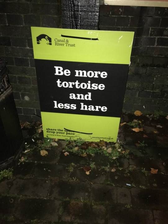

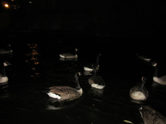
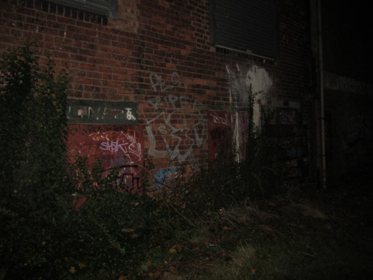
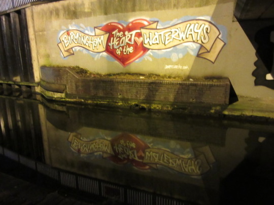
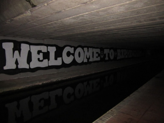

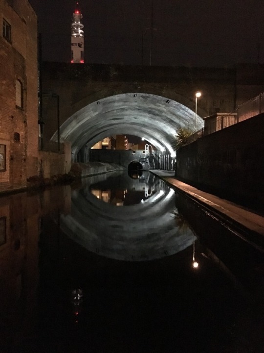
My photography from my trip to canal for inspiration and ideas for my poetry poster project.
#bcu#l42017#graphic design#graphic communication#viscom#visual communication#second module#poetry#poetry poster#birmingham#birmingham canal#photography
7 notes
·
View notes
Photo


Commissioned canvas art piece for a client of Dublin's Ha'penny bridge in an abstract, expressionistic style. Expanding my work by doing art commissions along side my graphic's based work
1 note
·
View note
Photo


Rob Draper Lecture
A designer named Rob Draper gave a talk at BCU on Thursday 22nd, which I decided to go to last minute and it was a really good decision to go and be witness to someone so intensely into his craft. His work ethic always stays very strong and consistent even through difficult turns in his life and the work he produces is always stunning, proving you don’t need expensive materials or a big budget to create something visually satisfying.
0 notes