#Border in CSS3
Explore tagged Tumblr posts
Visit Tumblr Blog
Explore Tumblr blogs with no restrictions, modern design and the best experience.
Last Seen Tumblr Blogs


Fun Fact
In 2020, 27% of US Tumblr users had an annual household income of over $100,000.
Text

CSS Button Animation
#css button border animation#css buttons#codenewbies#html css#html5 css3#frontenddevelopment#css#css animation examples#pure css animation#css animation tutorial#code#css tricks#css snippets#html5#frontend
3 notes
·
View notes
Text
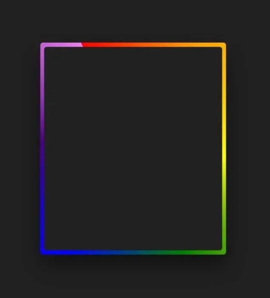
Gradient Border Animation
#css border animation#css gradient background animation#codingflicks#html css#frontend#html#css#frontenddevelopment#css3#webdesign#html css animation#css animation examples#border animation css#neduzone
5 notes
·
View notes
Text
CSS Box Model and Layouts by Abdelfattah Ragab
CSS Box Model and Layouts by Abdelfattah Ragab
Welcome to the book "CSS Box Model and Layouts". In this book, I explain the properties of CSS box model such as width, height, margin, padding and so on. By the end of this book, you will be able to position your box correctly on the page, control its size and spacing, and handle all kinds of scenarios. Let us go!
Available on https://shop.tredition.com and https://www.amazon.com

0 notes
Text
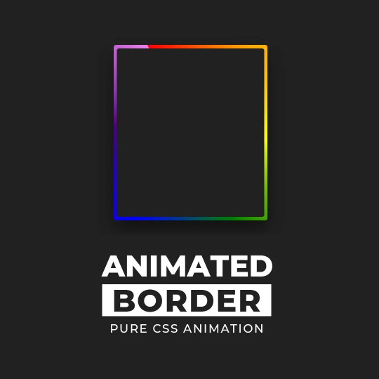
CSS Border Animation
#css border animation#html css#frontenddevelopment#css#html#css3#pure css animation#css animation examples#css animation tutorial#divinector#html5#html5 css3#css3 animation
0 notes
Text
Menu Sleep
Oooooooi :3
Hooje to com pressa porque vou cortar meu cabelo enfim, vou ensinar a voces um menu super fofo que achei!
VEJA O MENU AQUI
Vamos aos códigos? Vamos!
Como sempre vamos começar pelos scripts cole esse código abaixo logo depois de <head>:
<script type="text/javascript" src="http://ajax.googleapis.com/ajax/libs/jquery/1.4.0/jquery.min.js"></script>
Depois de colar o script acima vamos para o css do theme, cole esse código abaixo agora entre as tags <style> e </style>:
@font-face {font-family: "Pf Arma Five";src: url('http://static.tumblr.com/bigjj8s/1Tmm7vjp6/pf_arma_five.ttf');}#content {margin: 5px auto;background:;padding:10px 0;}#content .menu {text-align:center;padding-top:30px;}#content .menu .primary-menu {list-style-type:none;position:relative;}#content .menu .primary-menu li {display:inline;text-align:center;margin:0 10px;position:relative;}#content .menu .primary-menu li a {position:relative;text-decoration:none;background:#d9d9d9;display:inline-block;width:50px;height:35px;padding-top:15px;color:#fff;border:3px solid #eee;-webkit-border-radius:100px;-moz-border-radius:100px;-o-border-radius:100px;-ms-border-radius:100px;-khtml-border-radius:100px;border-radius:100px;-webkit-box-shadow:0 0 1px 1px #afafaf;-moz-box-shadow:0 0 1px 1px #afafaf;-o-box-shadow: 0 0 1px 1px #afafaf;-ms-box-shadow: 0 0 1px 1px #afafaf;-khtml-box-shadow:0 0 1px 1px #afafaf;box-shadow:0 0 1px 1px #afafaf;-webkit-transition:all 1s;-moz-transition:all 1s;-o-transition:all 1s;-ms-transition:all 1s;-khtml-transition:all 1s;transition:all 1s;behavior: url(http://static.tumblr.com/de00tfu/eyOmby4jh/pie.htc); /* CSS3 Fix for Internet Explorer */}#content .menu .primary-menu li.m1 a{ background-color:#00438f; background: url('http://static.tumblr.com/de00tfu/b8vmby5n9/m.png');}#content .menu .primary-menu li.m2 a{ background-color:#00b8df; background: url('http://static.tumblr.com/de00tfu/tMmmby5w9/e.png');}#content .menu .primary-menu li.m3 a{ background-color:#df00bd; background: url('http://static.tumblr.com/de00tfu/ukhmby61o/n.png');}#content .menu .primary-menu li.m4 a{ background-color:#ff7800; background: url('http://static.tumblr.com/de00tfu/x5Jmby62q/u.png');}#content .menu .primary-menu li a:hover {-webkit-transform: rotate(360deg);-moz-transform: rotate(360deg);-o-transform: rotate(360deg);-ms-transform: rotate(360deg);-khtml-transform: rotate(360deg);transform: rotate(360deg);behavior: url(http://static.tumblr.com/de00tfu/eyOmby4jh/pie.htc);}#content .menu .primary-menu li span.social-span {font-family: Pf Arma Five;font-size:8px;color: #fff;position:absolute;width:100px;top:45px;left:-45%;background:#eb925d;padding:5px;opacity:0;-webkit-border-radius:10px;-moz-border-radius:10px;-o-border-radius:10px;-ms-border-radius:10px;-khtml-border-radius:10px;border-radius:10px;-webkit-transition:opacity 1s ease-in-out;-moz-transition:opacity 1s ease-in-out;-o-transition:opacity 1s ease-in-out;-ms-transition:opacity 1s ease-in-out;-khtml-transition:opacity: 1s ease-in-out;transition:opacity 1s ease-in-out;behavior: url(http://static.tumblr.com/de00tfu/eyOmby4jh/pie.htc);}#content .menu .primary-menu li a:hover ~ span.social-span {opacity:1;}#content .menu .primary-menu li span.social-span:after {content:"";position:absolute;border-color:#eb925d transparent;display:block;top:-7px;left:40%;width:0;border-width:0 7px 7px;border-style:solid;}
Vamos entender os principais códigos acima:
width:50px;height:35px; - É o tamanho do circulo.
color:#fff; e border:3px solid #eee;- Cor da fonte e cor da borda do ciirculo.
-webkit-border-radius:100px;-moz-border-radius:100px;-o-border-radius:100px;-ms-border-radius:100px;-khtml-border-radius:100px;border-radius:100px;- Então gente esse código é o que define o circulo portanto se voce quiser um quadrado retire esse código.
width:100px;left:-45%;background:#eb925d; - Define o tamanho e a posição do tooltip do menu e a cor do fundo.
border-color:#eb925d- Coloque a mesma cor que voce colocou o fundo acima porque é a setinha :)
Apoos entender esse código e fazer as modificações necessarias voce vai mudar as imagens e adicionar mais se quiser, lembrando que se for adicionar mais tem que mudar o nome da class “.m1” para a class a mais, feito isso vamos para o html ou seja o que vai fazer o efeito funcionar, então cole esse código aonde quiser que o efeito apareça:
<div id="content"> <div class="menu"> <ul class="primary-menu"> <li class="m1"><a class="social-item" href="url"></a><span class="social-span">Menu Leep</span></li> <li class="m2"><a class="social-item" href="url"></a><span class="social-span">Por: João Netto</span></li> <li class="m3"><a class="social-item" href="url"></a><span class="social-span">Se usar</span></li> <li class="m4"><a class="social-item" href="url"></a><span class="social-span">dê like e credite ♥</span></li> </ul> </div> </div>
Pronto!
0 notes
Text
Libre "NeueGeosyndicate", our custom theme pack
(HTML5+CSS3, Markdown+Liquid...)
AFTER
[ WIP commission project with @userbru ... ]
BEFORE (?-2024)

So, before I migrate away my mainline content away from Tumblr, let me revamp my whole CSS blog theme in a way to make the transition towards Jekyll and then Hexo really vibrant yet humble. (Neocities-like perhaps would describe it better?)
Checklist of what to include
Symbolically generated Common LISP tables... (I guess that would be user profile cards for now)
Argdown philosophy argument treescapes... (useful for familial relationships, cladograms & computer filesystem-based hierarchies... )
Custom responsive flexbox layout with floating footer, sidebar user profile cards, articles feed(s?) and navigation left sidebar;
Custom icons, banners & buttons with their hyperlinks...
ActivityPub / copyleft Fediverse integration (Odysee, Mastodon, PeerTube, Lemmy, BookWyrm, Matrix, SourceHut, Funkwhale, NextCloud, Bonfire...)
100Rabbits + Landchad.net components
Neocities indieweb-like wiki
Explorable interactivity components (NickyCase's Joy.JS -like framework with SVGs)
Custom animated page dolls ()
Custom scrolling border marquees (some animated but content-static GIFs & some more dynamic as RSS ticker news headlines updates)
Custom animated tiling scrolling background wallpaper (probably too much to ask thus far)
Custom music with some embedded media player widget (playing on request, so not by default / on initial page load)
Custom animated cursor pack (Gruvbox Light Medium colored)
Custom soundscape & sfx scheme (not doing it here, some custom sound board will suffice once I get there)
Custom nesting threads guestbook & instant messaging shoutbox modules (the two as distinct widgets)
Custom RSS feeds / data logs for distinct virtual agents & factions; (Will come handy to make live updating agents to simulate lives through my in-progress file archive-based worldscape simulation system)
Yeah, sounds like I am and will expand much forth for my constructed world 16^12 Angora "game" setting, almost like a virtual pet site or some social simulacrum; 😉 Mostly through the WikiHow.Life silly computer town page but with my growing technical skills and much inspirations...
1 note
·
View note
Text
Attractive Web Button With Animated Glowing Borders (CSS Only)
This is an attractive animated web button you’ve seen on modern SaaS and AI tool websites. Built with only HTML and CSS/CSS3. It features a glowing light strip that moves smoothly along the button’s border, illuminating the section the light touches. This makes it perfect for prominent buttons like “Download,” “Try It Now,” or “Sign Up.” How to use it: 1. Create a container div with two child…
0 notes
Text
Web Development Course in rajkot
1. What is the importance of responsive design in web development?
Answer: Responsive design is crucial because it ensures that websites are usable and visually appealing on a variety of devices, including desktops, tablets, and smartphones. By using flexible grids, layouts, images, and CSS media queries, responsive design enhances the user experience and improves SEO rankings since search engines prefer mobile-friendly websites. This is a fundamental topic in any Web Design Course in ahmedabad.
2. Can you explain the concept of a CSS preprocessor and name a few?
Answer: A CSS preprocessor extends the default capabilities of CSS by adding features such as variables, nested rules, and mixins, which help to write reusable and maintainable CSS code. Popular CSS preprocessors include Sass (Syntactically Awesome Stylesheets), Less, and Stylus. These preprocessors compile the extended syntax into standard CSS that browsers can understand. Learning about CSS preprocessors is a key part of any website development course
3. What is the difference between a fixed layout and a fluid layout in web design?
Answer: A fixed layout has a set width in pixels and does not change regardless of the screen size. This can cause issues on smaller screens, as content may be cut off. A fluid layout, on the other hand, uses percentage-based widths, making it more flexible and able to adapt to different screen sizes. Fluid layouts are more user-friendly on various devices.
4. Describe the box model in CSS
Answer: The CSS box model describes the rectangular boxes that are generated for elements in the document tree and consists of four parts: content, padding, border, and margin. The content is the innermost part where text and images appear. Padding is the space between the content and the border. The border encloses the padding and content. Margin is the outermost part, providing space between the element and other elements. Understanding the box model is essential in Web Designing in ahmedabad.
5. What are media queries, and how do they work?
Answer: Media queries are a feature of CSS3 that allow the application of different styles based on the characteristics of the user's device, such as screen width, height, orientation, and resolution. By using media queries, developers can create responsive designs that adjust the layout and styling of a website to provide an optimal viewing experience on various devices.
6. How do you ensure that your web design is accessible to users with disabilities?
Answer: Ensuring web accessibility involves several practices, including using semantic HTML tags, providing alternative text for images, ensuring sufficient color contrast, making content navigable via keyboard, and using ARIA (Accessible Rich Internet Applications) roles and properties to enhance the information provided to assistive technologies. It's also important to test the website with screen readers and other assistive tools. Accessibility is a key topic in any Website Development Course.
7. What is the purpose of a wireframe in web design?
Answer: A wireframe is a visual guide that represents the skeletal framework of a website. It outlines the structure, layout, and key elements of a web page without including detailed design or content. Wireframes are used to plan the layout, ensure a logical flow of information, and serve as a blueprint for the design and development process. They help stakeholders and developers understand the basic structure before adding visual design elements. Wireframing is an essential skill in Website Design Training.
8. Can explain the difference between UX (User Experience) and UI (User Interface) design?
Answer: UX design focuses on the overall experience a user has when interacting with a product or website, including usability, functionality, and satisfaction. It involves research, prototyping, and testing to create a user-centered design. UI design, on the other hand, is concerned with the visual and interactive elements of a product, such as buttons, icons, typography, and color schemes. UI design aims to create an aesthetically pleasing and intuitive interface that enhances the user experience. Both UX and UI design are covered in-depth.
9. What are some common web design trends you follow?
Answer: Some common web design trends include:-
Minimalism and simplicity
Responsive and mobile-first design
Use of bold typography
Micro-interactions and animations
Dark mode design
Asymmetrical layouts
Use of gradients and vibrant colors
Incorporating illustrations and custom graphics
Accessibility and inclusive design
Voice user interface (VUI) integration
Keeping up with these trends is important for anyone involved in web designing.
10. How do you approach a web design project from start to finish?
Answer: Approaching a web design project involves several key steps:-
Discovery and Research: Understand the client's goals, target audience, and competitors. Gather requirements and define the project scope.
Planning: Create a project plan, including timelines and milestones. Develop a site map and user flow diagrams.
Wireframing and Prototyping: Design wireframes to outline the structure and layout. Create interactive prototypes to visualize the user experience.
Visual Design: Develop the visual style, including color schemes, typography, and graphics. Design high-fidelity mockups.
Development: Convert the design into a functional website using HTML, CSS, JavaScript, and other technologies. Ensure the site is responsive and accessible.
Testing: Conduct thorough testing, including usability, compatibility, performance, and accessibility testing. Fix any issues that arise.
Launch: Deploy the website to a live server. Monitor for any post-launch issues and make necessary adjustments.
Maintenance: Provide ongoing support, updates, and improvements based on user feedback and analytics.
0 notes
Text
CSS
Cascading Style Sheets, or CSS, is a cornerstone technology in web development, wielding immense power and versatility in shaping the visual presentation of web pages. From defining layout structures to fine-tuning the minutest details of typography and color schemes, CSS empowers developers to create stunning and immersive digital experiences. Let's delve into the depths of CSS and explore its key features, functionalities, and the role it plays in modern web design.
Understanding CSS:
At its core, CSS is a style sheet language used to describe the presentation of a document written in a markup language like HTML. It works by selecting HTML elements and applying styles to them, defining how they should appear on the screen or other media. CSS allows developers to separate content from presentation, enabling greater flexibility and maintainability in web development projects.
Key Features and Functionality:
Selectors and Declarations: CSS employs selectors to target specific HTML elements and declarations to define the styles applied to those elements. Selectors can be based on element types, classes, IDs, attributes, or even hierarchical relationships within the HTML document.
Box Model: The CSS box model conceptualizes every HTML element as a rectangular box with content, padding, border, and margin areas. Developers can manipulate these properties to control the size, spacing, and positioning of elements on the page.
Layout and Flexibility: CSS offers various layout techniques, including floats, positioning, and the more modern Flexbox and Grid layouts. These tools empower developers to create responsive and adaptive designs that adapt to different screen sizes and devices seamlessly.
Typography and Fonts: With CSS, developers can customize typography by specifying font families, sizes, weights, styles, and spacing. CSS3 introduces advanced features like web fonts, text shadows, and text effects, further enhancing typographic creativity.
Colors and Gradients: CSS provides extensive capabilities for color manipulation, including specifying colors using hexadecimal, RGB, HSL, or named values. Additionally, CSS3 introduces gradient properties, allowing for the creation of smooth color transitions and dynamic backgrounds.
Transitions and Animations: CSS transitions and animations enable the creation of fluid and interactive user experiences. Developers can define animations for properties like opacity, position, and size, adding visual interest and engagement to web interfaces.
Media Queries: Media queries enable developers to apply different styles based on the characteristics of the device or viewport, such as screen size, resolution, or orientation. This facilitates the creation of responsive designs that adapt to various browsing contexts.
The Role of CSS in Modern Web Design:
In the ever-evolving landscape of web design, CSS plays a pivotal role in shaping the visual identity and user experience of websites and applications. Its versatility and expressive power empower designers and developers to bring their creative visions to life, while its modular and scalable nature promotes code maintainability and efficiency.
From simple layouts to complex animations, CSS offers a rich toolkit for crafting immersive digital experiences that captivate and engage audiences. By mastering the intricacies of CSS and staying abreast of emerging trends and best practices, web professionals can unlock the full potential of this indispensable technology and push the boundaries of what's possible in web design.
In conclusion, CSS stands as a cornerstone of modern web development, offering unparalleled control and flexibility in styling web content. Its robust features, combined with its ability to adapt to diverse design requirements, make it an indispensable tool for creating visually stunning and user-friendly websites and applications. As the web continues to evolve, CSS will undoubtedly remain at the forefront of innovation, driving the next generation of digital experiences forward.
Web Development Company in Dehradun
0 notes
Text

CSS Button Border Animation
#css button hover effects#html css#codenewbies#frontenddevelopment#html5 css3#css animation examples#pure css animation#css animation tutorial#webdesign#css#css button border animation#animation
6 notes
·
View notes
Text
CSS Gradient Border Animation
#gradient border animation#css border animation#css animation examples#css animation tutorial#css animation#cool css animation#css gradient animation#css gradient#learn to code#code#html css#css#html#css3#frontenddevelopment#webdesign#frontend#gradient
7 notes
·
View notes
Text
0 notes
Text
CSS Button Border animation
#css button border animation#css animation#css animation examples#css buttons#html css buttons#learn to code#html css#divinectorweb#frontenddevelopment#css3#css#code#html
1 note
·
View note
Text
Table Talk: Creating Beautiful Tables with CSS
Introduction
Welcome to the fascinating world of table design in web development! Tables play a crucial role in organizing and presenting data on websites, and with the power of CSS, we can transform them into visually stunning elements that enhance the overall user experience. In this blog post, we will embark on a journey to explore the art of creating beautiful tables with CSS. Whether you're a beginner seeking to understand the basics or an experienced developer looking to refine your skills, this guide will cover everything from the fundamentals to advanced styling techniques, responsive design considerations, accessibility best practices, and tips for optimizing performance. Join us as we delve into the realm of table talk, where we unravel the secrets of crafting tables that not only convey information effectively but also captivate and engage your website visitors. Let's bring life to your tables and make them an integral part of your website's visual appeal!
Understanding Table Structure
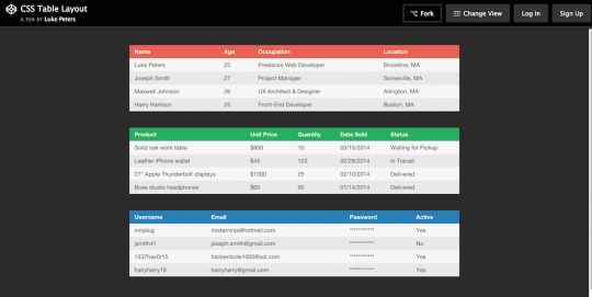
Before we embark on the exciting journey of styling tables with CSS, it's essential to have a solid understanding of the underlying structure of HTML tables. Tables are constructed using a combination of various HTML elements, each serving a specific purpose in organizing and presenting data. The primary elements involved in table structure include: - : The fundamental container for the entire table. - : Stands for "table row" and is used to define a row within the table. - : Represents a table header cell, typically used to label columns or rows. - : Signifies a standard table cell containing data. Let's break down the structure further: ElementDescriptionThe outermost element, encapsulating the entire table.Contained within the element, representing a row in the table.Used for header cells, providing labels for columns or rows. It is placed within the element.Represents a standard data cell within the table, residing within the element. Understanding this basic structure lays the foundation for effective table styling. As we proceed, we'll explore how CSS can be applied to these elements to create visually appealing and well-organized tables on your website.
Basic CSS Styling for Tables
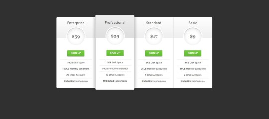
See the Pen CSS3 pricing table by Arkev (@arkev) on CodePen. Now that we have a grasp of the fundamental structure of HTML tables, let's dive into the exciting realm of CSS styling to enhance their visual appeal. Basic CSS properties can be employed to customize the appearance of tables, making them more aesthetically pleasing and aligned with your website's design. Here are some key CSS properties you can use for basic table styling: - border: Defines the border of table cells, allowing you to control the thickness, style, and color. - padding: Adds space within table cells, enhancing the overall spacing and readability of your table. - margin: Sets the margin outside the table, influencing its positioning within the surrounding elements. Let's explore a simple example of applying these properties: PropertyDescriptionborderDefine the border of table cells using properties like border-width, border-style, and border-color.paddingEnhance cell spacing by applying padding using the padding property.marginControl the table's positioning with the margin property, setting the space outside the table. For instance, to add a solid border to all table cells, you can use: CSStable { border-collapse: collapse; } td, th { border: 1px solid #dddddd; padding: 8px; text-align: left; }
Advanced Styling Techniques
As we continue our exploration of CSS table styling, it's time to elevate our design game with advanced techniques that go beyond the basics. These techniques allow you to unleash your creativity and transform your tables into visually stunning elements that capture the attention of your website visitors. Here are some advanced CSS styling techniques for tables: - Customization of Table Headers: Tailor the appearance of table headers by using CSS properties like background-color, color, and font-weight. This helps in creating a distinct visual hierarchy within the table. - Row and Cell Customization: Apply different styles to specific rows or cells using pseudo-classes such as :nth-child. This is particularly useful for highlighting important data or creating alternating row colors. - Background Colors, Gradients, and Shadows: Infuse life into your tables by incorporating background colors, gradients, and box shadows. These elements add depth and dimension to the table, enhancing its overall aesthetic appeal. Let's delve into an example to illustrate these concepts: TechniqueDescriptionCustomization of Table HeadersStyle headers with properties like background-color, color, and font-weight to make them visually distinct.Row and Cell CustomizationUse pseudo-classes like :nth-child to apply different styles to specific rows or cells, enhancing readability and organization.Background Colors, Gradients, and ShadowsIntegrate background colors, gradients, and shadows to add a touch of sophistication and depth to your table design. For example, to create alternating row colors, you can use the following CSS: CSStr:nth-child(even) { background-color: #f2f2f2; }
Responsive Tables
In the ever-evolving landscape of web design, responsiveness is key to ensuring a seamless user experience across various devices and screen sizes. Responsive tables adapt to different viewport dimensions, allowing your tables to remain functional and visually appealing on both desktops and mobile devices. Here are some essential considerations and techniques for creating responsive tables: - Importance of Responsive Design: Understand why responsive design is crucial for tables and how it enhances accessibility and usability on smaller screens. - Media Queries: Implement media queries in your CSS to apply different styles based on the device's screen size. This allows you to tailor the table's appearance for specific breakpoints. - Stacking and Hiding: Explore techniques like stacking and hiding table elements to optimize the layout for smaller screens. This involves rearranging and prioritizing content to maintain clarity. Let's delve into an example of using media queries to create a responsive table: TechniqueDescriptionImportance of Responsive DesignExplain why responsive design is essential for tables, emphasizing the diverse range of devices and screen sizes used by website visitors.Media QueriesIntroduce media queries in CSS to conditionally apply styles based on the device's screen size. This allows for a tailored and optimized table layout for each breakpoint.Stacking and HidingDiscuss techniques like stacking and hiding elements to rearrange and prioritize content, ensuring a user-friendly experience on smaller screens without sacrificing information. For instance, the following media query adjusts the font size for better readability on smaller screens: CSS@media only screen and (max-width: 600px) { td { font-size: 14px; } }
Accessibility Considerations
Ensuring that your tables are accessible is not just a best practice but a fundamental aspect of web development. Accessibility ensures that all users, including those with disabilities, can perceive, navigate, and interact with your tables. Let's delve into key considerations and best practices for creating accessible tables with CSS: - Importance of Accessibility: Understand the significance of accessibility and its impact on providing an inclusive user experience. Emphasize the diversity of users, including those with visual or cognitive impairments. - Semantic HTML: Utilize semantic HTML elements to enhance the structure and meaning of your tables. Use for headers, for table captions, and ensure proper attributes. - Contrast and Color: Pay attention to contrast ratios and avoid relying solely on color to convey information. Ensure that text and background colors provide sufficient contrast for users with visual impairments. - Keyboard Navigation: Test and optimize your table for keyboard navigation. Users who rely on keyboard input should be able to navigate and interact with the table efficiently. - Use of ARIA Attributes: Leverage Accessible Rich Internet Applications (ARIA) attributes to enhance the accessibility of dynamic content and interactions within your tables. Include attributes like aria-describedby and aria-labelledby. Let's illustrate the importance of semantic HTML and ARIA attributes with an example: ConsiderationDescriptionImportance of AccessibilityHighlight the significance of creating tables that are accessible to users with diverse abilities, fostering inclusivity and a positive user experience.Semantic HTMLEmphasize the use of semantic HTML elements, such as and , to provide meaningful structure and context to assistive technologies.Use of ARIA AttributesIntroduce ARIA attributes like aria-describedby and aria-labelledby to enhance the accessibility of dynamic content within tables, ensuring proper information relay for screen readers. By prioritizing accessibility considerations, you contribute to a web environment that is welcoming and usable for everyone, regardless of their abilities or disabilities.
Optimizing Performance
Efficient table styling not only contributes to a visually appealing website but also plays a crucial role in optimizing performance. Ensuring that your tables load quickly and smoothly is essential for providing a seamless user experience. Let's explore key tips and techniques for optimizing the performance of your CSS-styled tables: - Minimization of Styles: Strive for minimalism in your CSS styles. Avoid overloading your tables with unnecessary styles and prioritize only the essential design elements. This reduces the overall file size and improves loading times. - Consolidation of Stylesheets: If your website uses multiple stylesheets, consider consolidating them. Combining stylesheets into a single file reduces the number of HTTP requests, resulting in faster loading times. - Utilization of Browser Cache: Leverage browser caching to store frequently used styles and assets locally on the user's device. This reduces the need for repeated downloads, enhancing the overall performance of your tables. - Optimized Image Usage: If your tables include images, ensure they are optimized for the web. Compress images without sacrificing quality to reduce file sizes and accelerate loading times. - Browser Compatibility: Test your table styles across different browsers to ensure compatibility. Address any issues that may arise, preventing performance bottlenecks on specific browsers. Let's delve into an example that emphasizes the importance of minimizing styles for optimal performance: Optimization TechniqueDescriptionMinimization of StylesHighlight the significance of streamlining CSS styles to include only essential design elements. Avoid unnecessary styles to reduce file size and enhance loading speed.Consolidation of StylesheetsEncourage the consolidation of multiple stylesheets into a single file. This reduces HTTP requests and contributes to a more efficient loading process.Utilization of Browser CacheExplain the benefits of browser caching in storing frequently used styles and assets locally, reducing the need for repeated downloads and improving overall performance. By implementing these optimization techniques, you not only enhance the performance of your CSS-styled tables but also contribute to a faster and more enjoyable user experience on your website.
FAQ
Explore common questions and solutions related to CSS table styling in this Frequently Asked Questions section. Whether you're a beginner or an experienced developer, find answers to queries that may arise during your journey of creating beautiful tables with CSS. Q: How can I center-align text within table cells? A: To center-align text in table cells, you can use the CSS property text-align: center;. Apply this property to the or elements within your table. Q: What is the significance of the border-collapse property? A: The border-collapse property is crucial for controlling the spacing and appearance of borders between table cells. Setting it to collapse ensures a single border is shared between adjacent cells, creating a cleaner and more cohesive table layout. Q: How can I create alternating row colors for better readability? A: You can use the :nth-child(even) and :nth-child(odd) pseudo-classes in CSS to apply different background colors to alternating rows. This enhances readability and adds a visually appealing touch to your tables. Q: What role do media queries play in creating responsive tables? A: Media queries are instrumental in responsive design. They allow you to apply different styles based on the device's screen size. By using media queries, you can optimize your tables for various breakpoints, ensuring they remain user-friendly on both desktop and mobile devices. Q: How can I ensure my tables are accessible to all users? A: Prioritize semantic HTML, use ARIA attributes, and pay attention to contrast and color choices. Implementing these practices ensures that your tables are accessible to users with disabilities, providing an inclusive experience for all. Feel free to explore these FAQs to troubleshoot common issues and enhance your understanding of CSS table styling. If you have additional questions, don't hesitate to reach out for further assistance.
Conclusion
Congratulations on completing your journey into the world of creating beautiful tables with CSS! Throughout this comprehensive guide, we've covered essential concepts, techniques, and best practices to empower you in enhancing the visual appeal and functionality of your tables. As a quick recap, we started by understanding the basic structure of HTML tables, delving into the roles of elements such as , , , and . From there, we explored basic CSS styling to customize the appearance of tables, incorporating properties like border, padding, and margin. We then ventured into advanced styling techniques, learning how to customize headers, rows, and cells, as well as integrating background colors, gradients, and shadows to create visually captivating tables. The importance of responsive design was highlighted, with insights into media queries and techniques for optimizing tables on various devices. Accessibility considerations played a crucial role, emphasizing semantic HTML, contrast and color choices, keyboard navigation, and the use of ARIA attributes to ensure an inclusive experience for all users. We also explored performance optimization tips, focusing on minimizing styles, consolidating stylesheets, and leveraging browser cache. In the FAQ section, common queries were addressed, providing solutions to challenges you may encounter in your table styling endeavors. Whether you're a novice or an experienced developer, these FAQs serve as a valuable resource for troubleshooting and expanding your knowledge. As you continue refining your skills in CSS table styling, remember that practice and experimentation are key. Feel free to explore, test, and implement these techniques to create tables that not only convey information effectively but also contribute to the overall aesthetics and usability of your website. Thank you for joining us on this journey. May your tables be both functional and visually stunning, enhancing the user experience on your website! Read the full article
0 notes
Text
I Went Above And Beyond To Get The Frontend Job I Wanted But It Didn't Work.
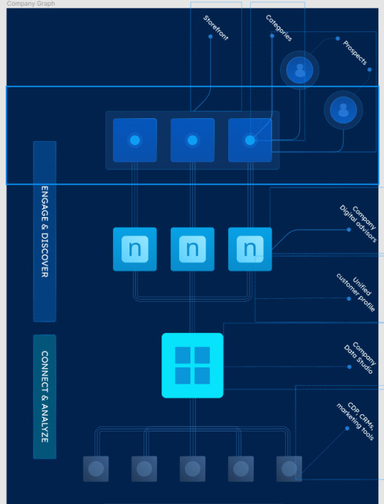
I was very interested in a job position in Europe that came with visa sponsorship. While browsing the company's website, I noticed their sleek CSS animations. However, one diagram stood out because it was static:

Seeing this, an idea struck me. They were on the hunt for a Frontend developer. Why not showcase my skills by transforming this static image into HTML elements with polished CSS3 animations? I saw it as a great opportunity to experiment with Figma, which I believed could assist in generating some of the required HTML and CSS. My strategy was to initially craft it in a 2D format (from top to bottom). After exporting, I planned to manually infuse a 3D touch, incorporating aspects like rotation and bevels. Creating the three lines that interconnected each square was undoubtedly the most challenging. Positioning becomes a tad complex with intricate designs in Figma, especially when layering one element over another. Yet, I must admit, Figma proved to be quite a robust tool. Here’s what it looked like at that stage:
I then attempted to export the CSS/HTML using a Figma plugin named "Anima". Unfortunately, it didn't quite hit the mark. Rather than creating individual HTML components for each square and connecting line, it compacted everything into a singular static image. This was a far cry from what I was aiming for. To provide a clearer picture: in Figma, I had primarily used two layers, one for elements with absolute positioning and another for those with relative positioning. The plugin merged the latter into one bitmap image. My persistence paid off when I realized that exporting the relative layer by itself worked perfectly. My subsequent task was to individually export the components and manually integrate them using my local code editor.
However, there was a minor hiccup with the borders. Since CSS doesn't natively support gradient colors for borders and the plugin didn't offer a workaround, the borders ended up looking quite blocky. This was especially evident with the circular elements at the bottom, as can be observed here:

After exporting the HTML I started by rotating the full container, but the big beveled cyan square needed to look 3D and not like a flat surface so I had to add create some additional HTML elements:

Then I animated it (on mouse hover) using it "scaleX" on the ::before and ::after selectors (the "bevels") and then "translate" on the big square itself (otherwise it wouldn't look like going down but stuck mid-air):

While I might have glossed over a few steps, if you're curious about the technicalities or you want to see it live here it is: https://replit.com/@IvanCastellanos/demo-css-animation?v=1
I even went the extra mile by creating a video on YouTube to showcase my entire process. However, despite my efforts, I didn't secure the position. The feedback I received was rather generic, stating, "[...]we don’t think there’s a good fit for the position you applied for". It makes me wonder: perhaps going the extra mile isn't always appreciated, or maybe it boils down to the individual reviewing the application. Nevertheless, it was a good learning experience.
If, by chance, you or your organization are scouting for talent, feel free to drop me a message at ivanca at gmail. My expertise spans JavaScript, TypeScript, CSS, PHP, and Python. And at the moment I'm open to opportunities for remote work or one that offers visa sponsorship.
0 notes