#I also started using larger paper formats
Explore tagged Tumblr posts
Visit Tumblr Blog
Explore Tumblr blogs with no restrictions, modern design and the best experience.
Last Seen Tumblr Blogs


Fun Fact
US Tumblr user growth rate is estimated to slow down to 4.1%.
Text
Random midnight thoughts 🌙
My art speed has significantly decreased
But also I like how I can take my time to make my art better
I look at stuff I drew recently and I’m more proud of it??? HM impösible
#guys is it bad/silly#somehow taking more time feels so unatural 💥#I got so used to speedrunning that it’s just part of my psyche#I also started using larger paper formats#usually I used A5 for my comics#but now I’m drawing a page on A4 😈#this way I can fit more details and just like *actually draw*#my resource saving maniac is goin crazy up there 💥#I hope you guys don’t mind me taking it slow nowadays#I forgot how it feels to enjoy stuff 💥 I wanna remember ‼️#anyway it’s late#me need eep but no eep#*bear creature hugs a pillow with no result*#art stuff#art thoughts#midnight thoughts
33 notes
·
View notes
Text
Weird Magic: the Gathering effects: Fourth edition
Starting last year, and on three separate occasions, I've ran polling games listing weird magic the gathering card effects among which hid one fake one, to see how easy it was to figure out. It's time for another!
Like previous instances, this is intended for people who aren't experts at magic and would recognize all the cards instantly, more as entertainment for people outside the game, but I've been told it also works for plenty of actual magic players. There are certainly effects there I didn't know existed in specific before pulling this poll together.
As last time, only the current text of effects is used, not necessarily the one printed on the card. Limited to cards that exist in paper, and are legal to play in at least some tournament formats. Though I did expand in previous polls to text that's part of keyword rules or that's part of the current reminder text on at least one card, and that might apply here as well.
This time some of the cards are less obscure, but I wanted to include them because they're flavorful bits of text. Without further ado...
I will give one bit of context for people who don't play the game at all: your library is what your deck of cards is called while a game is going.
EDIT: the poll is over, time to add the solution under the cut on this message! It is also available in a reblog here, if you prefer that.
First, the Correct answer, and then the rest by order of voting percentage.
Whenever this creature becomes goaded, it fights up to one target creature (35.4%)


This first answer was the correct one, as was recognized by the majority (most of which, I assume, are Magic players who recognized the rest.) It was written as something that makes flavorful sense, and inspired by both Goad and the old mechanic of Provoke using similar meanings. Provoke later evolved into Fighting.
As mentioned, I like this effect, I ended up making a custom card with that mechanic while waiting for the poll to be over, though the wording is slightly different and that won't be in this post.
--
This creature isn't a creature (17.5%)
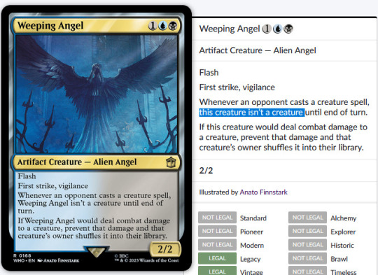
This text doesn't appear printed on any card, but it is the current text of Weeping Angel from the Doctor Who set following a templating update of cards to avoid using their own name to refer to themselves, except for legends. Of course, within larger context. I've seen some people guess Gods from Theros as the source of this text, but since they're all legendary, they use their own names still, or a shortened version rather.
This is such a nonsensical line to be on a card that I knew it needed an inclusion here.
--
Put a +1/+2 counter on target creature. (10.7%)

In the early days of magic, stats-buffing (or stats-reducing) counters weren't relegated to mere +1/+1 and -1/-1 counters. There were some +2/+2, -0/-1, +0/+1 counters and more, and when they mixed it made tracking the size of a creature with them a nightmare, so they stopped doing that. During that time, exactly ONE card, Armor Thrull, was created that put a +1/+2 counters on a creature. Neat and also weird!
--
Redistribute any number of players’ life totals. (9.1%)

A very unique effect, Reverse the Sands is rarely worth the inclusion in any deck, but it is quite impactful. Printed in a game before commander hit big, expecting two players most of the time, it wasn't that different from other life swapping effects, but with Multiplayer becoming such a big part of the game nowadays, it's fun to have around.
--
Your devotion to each color and each combination of colors is increased by one. (7.5%)

Devotion is a mechanic found in the ancient greek mythology setting of Theros within magic, caring how deeply you commit yourself to any given colors by encouraging you to play harder-to-cast permanents of that color. In the latest return to Theros, there is one card, Altar of the Pantheon, that has a weird effect of artificially altering your devotion without any cost shenanigans.
--
If this creature would be destroyed, regenerate it. (5.8%)


Mossbridge Troll has a unique effect of just ALWAYS regenerating for free whenever it would be destroyed, be it by damage or destroy effects. In practice, it's mostly a fancy version of indestructible.
It also allows me to mention Mossbridge Troll from Shadowmoor is the creature associated with Mosswort Bridge from Lorwyn. Each of the five original Hideaway lands in Lorwyn had an associated "awakened" creature in Shadowmoor! Not the most obscure fact, but neat to know about.
--
Other creatures are Food (3.9%)

A delightfully flavorful (well, except for all the salt) piece of rules text from Ygra here. Everything is Food for the Eater of All.
--
1/1 named Legitimate Businessperson. (2.9%)

Witness Protection is a pretty normal design, but changing the name of the creature is a really neat touch that just adds a bit of flavor and makes it a card dear to many. It's funny how a small change like that can make a boring common into a card many remember for years to come. It even made its way into the "core" experience of the game through the Foundations expansion later on!
--
You draw cards from the bottom of your library rather than the top. (2.6%)

Another appearance from Doctor Who, this time with River Song, who has an ability that is pretty flavorful, but in practice doesn't do much, since the cards at the bottom of your library are just as random as the ones on the top. Or are they? It's marginally easier to set up the bottom of your deck than the top of it, and to create loops with that and cards that put stuff back onto the bottom of your deck from your graveyard.
Unfortunately, that easily devolves back into infinite extra turns, which is very flavorful for a time traveler, but generally frowned upon in more social environments.
--
Whenever another creature you control dies, investigate. (1.9%)

This one isn't that weird, but I wanted to include it for just how flavorful it is to investigate the murder of your creatures. Except of course you're likely the one to be doing the murdering for all those sweet clues. Oops?
This effect does not specify nontoken creatures, which means it's actually quite easy to make bucketloads of clues with it. Or an infinity, if you turn your clues into creatures themselves, so be wary of that because it's easy to end up in an infinite loop you can't stop, which causes the game to end in a draw, drowned in clues.
Protection from everything (1.6%)

Protection from everything has appeared on a few cards, but the most iconic (though not the most played, that'd be Teferi's Protection), is Progenitus, the first to feature it. A giant creature that's almost impossible to cast and can't be cheated into play from the graveyard, Progenitus has impressed many a player!
Unfortunately, it's both clunky to actually use and not immune to everything. While EVERYTHING does mean everything, Protection has a relatively narrow definition in the game rules, and Magic is a game where very specific rules matter. Getting rid of a Progenitus is difficult, but far from impossible. Any effect that blankets destroys or exiles all creatures will remove it just as easily as everything else.
Venture into the dungeon. (1%)

Venture into the Dungeon was one of the main mechanics for the first D&D set Magic has done, Adventures in the Forgotten Realms. They revisited it later on in the second with a slight variation. While flavorful, the mechanic involved a lot of extra baggage involving having three extra Dungeon cards to pick from each with several abilities and to plan a trip through them and... It ended up seeing just a little bit of play, and not being the designers' best work, even if it had a LOT of flavor.


Thank you for participating and reading through all this! See you in the fifth edition if I ever put it together!
#mtg#magic#the gathering#polls#tcg#game design#not really#a few iconic cards in there#but it's also for non-magic players to see some of the weird stuff#Honestly I kinda want to make a custom card out of the fake one#Maybe once the poll is over#someone remind me
111 notes
·
View notes
Text
as per a request in my local renegade server: here is my process (such as it is) for the stenciled covers i've done for my binds. obviously, huge thanks to everyone in the renegade discord for teaching me most of what i know about bookbinding. this tutorial only exists thanks to the resources they've made available and the conversations i've had there.
material list
vinyl cutter (i have a silhouette portrait 3) + mat + blade
stencil vinyl (i have this one, but have had some adherence troubles with it. unclear whether this is just The Nature Of Stencil Vinyl or whether there's a better brand out there. adhesive vinyl can also be a viable option, although i haven't personally experimented with it yet.)
transfer tape (i have this stuff. it's fine.)
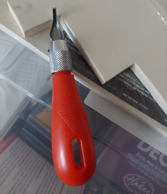
weeding tools (i have this hook and a very fine tip pair of tweezers. i highly recommend getting a hook, especially if you—like me—are haunted by the specter of carpal tunnel. get an off-brand one or get one on sale, though. i only have the silhouette brand one because it was on clearance.)
acrylic medium (i have this one because it was on sale at the time i was buying acrylic medium. when i replace it, i will be replacing it with a matte one. the gloss definitely has a noticeable sheen that i don't love.)
acrylic paint (literally any paint will do. i've been mostly using the decoart extreme sheen because it's $4 at michaels. you may be noticing a theme here.)
stiff stenciling brushes (the ones i have are similar to these but cost even less. again, there's a theme here.)
an iron and some parchment paper (jury is still out on whether using heat to "set" the pattern is necessary, but i do feel like it melts the paint a bit into the bookcloth and lessens the extent to which the pattern sits above the bookcloth.)
your trusty bone folder
instructions and a truly hideous number of words under the cut.
step 0.5: discern what will make a good stencil and what will make you hate yourself, your life, and the art of bookbinding
there are a LOT of different ways to put titling on a book. you could do a paper cover with a printed design or paste paper labels onto bookcloth or foil your title onto your cover with heat activated foil. the best method depends on what kind of design you have in mind, what tools you have available to you, and what materials you're working with (for example, i've had very bad luck getting acrylic paint to adhere to Allure bookcloth, but Allure does foil like a dream).
as far as stencils are concerned, you can kind of sort cover designs into three categories:
BEST for stencils: big, bold shapes on larger format books (think letter folio or letter/legal quarto)
OKAY for stencils, but you might hate yourself: intricate detail at a large enough form factor for it to be cut well by your vinyl cutter
BAD for stencils, you will die and it will hurt the entire time you are dying: lots of intricate detail and lots of fine lines
below are examples of category 1, 2, and 3 (all designed for letter folio). to be clear, category 3 can technically be possible, depending on the design. but only undertake it with the awareness that you will die, and it will hurt the entire time you are dying.
step 1: design a thing to put on your cover
i'm not going to go too in depth on this because cover design is a HUGE can of worms. a few pointers, though:
i never start designing my cover until my text block is done. this allows me to design my cover at "full size" based on the measured size of my text block and cover boards.
i fully lay out my cover in a separate program before exporting a transparent PNG to silhouette studio (or whichever proprietary software you have to use to communicate with your particular vinyl cutter). i use affinity designer. some free options would be inkscape (if you want to work with vectors) or gimp.
i design my cover on a document with dimensions of (HEIGHT of boards + 20 mm) x (WIDTH of boards or spine + 20 mm) and 10 mm margins. the area within the margins represents the actual dimensions of the thing i'm designing, while the area outside of the margins creates a mask that prevents me from getting paint on things i don't want paint on (like the covers, if i'm creating a spine stencil).
i always outline my document with a 3 or 4pt black line. this creates the outer edge of my stencil and provides my vinyl cutter with a cut line. if you're working with a smaller vinyl cutter (like the cricut joy) there are ways to jigsaw designs together from smaller pieces of vinyl, but i'm not the person to ask about that. i specifically bought a portrait so that i didn't have to worry about that.
here's an example of one of my affinity files from a recent cover. i've exaggerated my outline to make it clearer. you can also see that i use affinity to experiment with color combinations. before i export, i turn all my elements black and make any backgrounds transparent, meaning that the PNG i import into silhouette studio looks like the one on the right.

step 2: cut and weed your stencil
again, not going to go terribly in depth here. there is a veritable army of youtubers out there with tutorials about how to use [insert propriety vinyl cutter software here]. but, again, a few pointers:
with my particular vinyl cutter and stencil vinyl, i usually cut my stencils with the material set to "washi," depth at 1, force at 13, and speed at 4. google, experiment, see what works. also, you want to put your stencil vinyl on the mat with the blue vinyl facing UP, and you don't want to mirror your design. with stencils, what you see is what you get.
i cut my vinyl a bit bigger than necessary because i'd rather waste a bit of vinyl than have to worry about a stencil falling off the edge of my vinyl because i misaligned it on the mat.
unlike HTV, you will be weeding out all the black parts of your original image. be prepared to hate the letters "e" and "a" forever, because you will have to somehow keep the little eye of them in place while you pry out the rest of it.
step 3: apply your stencil to your case
alright, now let's get into the meat of it. i always stencil after my case is finished but before i case in my book. this means that if i totally fuck it up, i can trash the case instead of the entire book.
additionally, i completely stencil my spine first (as in lay down stencil, paint, remove stencil) and then stencil my covers. i've found that it's easier when you don't have stencils overlapping and sticking to each other.
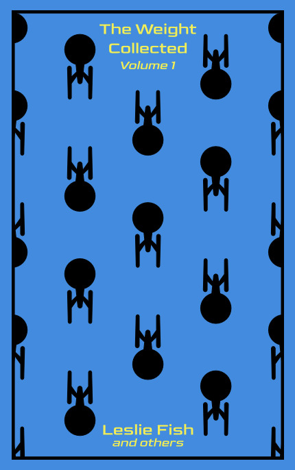
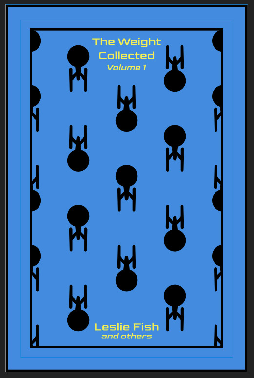
OPTIONAL STEP: mark guides onto your cover to help you position your stencil. whether or not i do this step depends on the design. a lot of the time, i just eyeball it. but for some designs, precision is key. for those projects, i use my ruler to mark out guides in white chalk for where i need certain elements of the stencil to fall. (i used guide marks for the "penguin clothbound" copies of the The Weight Collected that i've been using as an example in this post—the black rectangular boarder would've made uneven placement REALLY obvious.)
use transfer tape to remove your vinyl from its slick backing. what i've found is that you really, really don't want your transfer tape to be too sticky. you want it just barely sticky enough to pick up the stencil if you rub it down with a bone folder or your fingernail. i have a piece of transfer tape that i stuck to my jeans a bunch of times and then proceeded to use for 8 books in a row. it is, frankly, still a little bit too sticky. i have rolled it up so that i can use it for the next 8 books, at which point it will presumably be the right level of stickiness.
position your stencil. when you're happy with it, rub it firmly down with your bone folder. then do it again. then use your fingernail to score down over the titling text. then pray. in my experience, stencils prefer to stick to transfer tape rather than bookcloth. ymmv.
start at one corner of your stencil. carefully begin peeling back the transfer tape. i've found that essentially folding back the transfer tape (like, the corner that's been freed from the stencil being folded back away from the stencil) helps the tape to release. go slowly, rubbing down with the bone fold as necessary.
after you've finally manage to pry the tape off, go back and smooth down the stencil and firmly rub it down to get it to adhere to the bookcloth as thoroughly as possible with as few ripples or air bubbles as possible.
step 4: paint time!
here is a secret that the renegade discord taught me that i am now passing on to all of you: before you put any paint on your stencil, put down a layer of clear acrylic medium. the medium will finish the job of pasting down the stencil to your cover, and any leaks that happen in the process will be clear medium instead of colored paint (and will therefore be basically unnoticeable). ergo:
stipple a thin coat of acrylic medium over your stencil. you want to use an up-and-down daubing motion, not a brushing motion. brushing will get paint under your stencil. let dry.
after your medium is dry, stipple a few thin coats of your colored acrylic paint onto your stencil. let dry between coats. (i usually find that two coats is enough.) again, try to keep your coats thin. you don't want a thick layer of paint because that will create a raised surface above your bookcloth.
let your paint fully dry. i usually leave it overnight, but if i'm feeling especially impatient, i still make sure to at least give it a good three or four hours.
peel up your stencil. your weeding tools will once again come into play here to pry up little bits and pieces of stencil (like the stupid eyes of the "a"s and "e"s that were so annoying during the initial weeding stage).
step 5: optional setting stage
again, jury is still out on whether or not this is necessary, and the effects are pretty subtle. but i do it every time anyway. some tips:
use an iron on very low heat (i keep mine at the low end of the synthetic setting) and with steam turned OFF
keep a piece of parchment paper (NOT waxed paper. you want the slick paper that you put under cookies to keep them from sticking to the pan.) between the iron and your cover.
press the iron down, don't rub it like you're ironing a shirt. it's possible to smear your paint doing that (ask me how i know).
i usually lay the iron down on a section for 10-15 seconds at a time, then lift it and move it to another section.
start with less of everything (less heat, less time) and build up. always better to be conservative with this.
i usually continue until the paint is warm to the touch, then move onto another section. after it's cooled, i evaluate if i feel like it's melted into the cloth enough. if not, i repeat the process.
step 6: BOOK
congrats, you have put a design on a book cover. the world is your oyster. go forth and make books. become ungovernable.


114 notes
·
View notes
Text
Tewkensuchus: King of Punta Peligro
Last month we got our fourth croc of the year and our second notosuchian: Tewkensuchus salamanquensis (Forehead crocodile from the Salamanca Formation), a large-bodied sebecoid from the earliest Paleocene of Argentina. And GODDAMN is it a cool one.
Below some of the fossil material of Tewkensuchus, it doesn't look like much but stay with me for this post.

Starting with the fossil material, Tewkensuchus is admittedly not the most complete sebecid, hell Dentaneosuchus from two years ago is significantly better preserved. Essentially, Tewkensuchus preserves a bit of the skull and a few vertebrae. But the material we do have is exceptional in other ways. Like some European sebecoids, it had a high and broad sagittal crest that extends over its forehead flanked by two broad depressions. Remember the similarity to European sebecoids, thats gonna come back later. Theres also some interesting stuff in how the bony eyebrows, the palpebrals, articulate with the rest of the skull.
What is REALLY weird however is the shape of the postorbitals. Quick anatomy lesson, in crocs the postorbitals form the front corners of the skull table thats located just behind the eyes. They tend to be flat, but in the case of Tewkensuchus they are inclined so that they rise upwards behind the eyes. Now we have plenty of examples of crocodylomorphs with raised squamosals, giving them a somewhat ear-like appearance, but raised postorbitals are a new one.
Below: An artistic interpretation of Tewkensuchus featuring its unique cranial morphology by Manusuchus (give them a follow) from different angles.


One last thing on its anatomy, it was BIG. And I mean big. The team that described Tewkensuchus estimate that its complete skull might have been just over half a meter long, so some 20 inches. This might correspond to a weight of perhaps 300 kg (660 lb), larger than even the largest Cretaceous Baurusuchids.
Now, I hope you remember the part where I said that theres similarities to European sebecoids. Well that sentence has two key points the paper deals with. First of all, the connection to European forms itself. Phylogenetic analysis seems to indicate that despite being found in Patagonia, all its closest relatives are from the Eocene of Europe. These are the recently named giant Dentaneosuchus from France, Bergisuchus from Germany and Iberosuchus (I'll let you figure that one out for yourselves). So after Tewkensuchus disappears South America is inhabited by only distant cousins while its closest relatives show up some 20 million years later on the other side of the Atlantic.
The other noteworthy part of the statement is the use of "Sebecoid" rather than sebecid. That's because of taxonomic back and forth. Essentially, a few previous studies have not included European sebecoids (Bergisuchus and Iberosuchus) within the family Sebecidae, instead featuring them as a separate branch that split off beforehand. In some studies that branch is known as Bergisuchidae, in others they are two branches, you get the idea. Now the description of Dentaneosuchus for instance did away with Bergisuchidae and simply include these European forms within Sebecidae itself. Still as the basalmost members, but given the honor of being at least included. Same goes for Ogresuchus. Well, in the description of Tewkensuchus, we go back to the separate model. So Bergisuchus, Iberosuchus, Dentaneosuchus and Tewkensuchus all form a single not officially named group simply referred to as the "Eurogondwanan clade". This group was placed as the sister family to Sebecidae and together with Ogresuchus the two form the newly named Sebecoidea.
Europe's sebecoids, Dentaneosuchus (art by Joschua Knüppe), Bergisuchus (by Scott Reid) and Iberosuchus (once again Manusuchus)


And this is where we need to address the fact that Tewkensuchus creates a bunch of new problems and makes old ones worse. For starters, it's size. By all accounts its way too big. Keep in mind, this animal appeared some 2 to 3 million years after the extinction of the dinosaurs, an extinction event that is generally thought to have killed everything on land heavier than 10 kilos. And then you get Tewkensuchus with an estimated weight of 300. Well, there's two possible explanations for that. Explanation 1 hinges on the known fact that these rules don't quite apply to semi-aquatic animals. Sure, anything large on land got whiped out, but eusuchian crocodiles managed to survive quite well despite their large size in part because they were partially aquatic. So perhaps Tewkensuchus and sebecoids as a whole underwent an aquatic phase? Well, this would work quite well with what is known as the Sebecia-hypothesis. Essentially, there is some debate on the relationship between sebecids and other notosuchians. Some studies draw a link between them and the similarily terrestrial baurusuchids, placing them in the group Sebecosuchia. Other studies meanwhile believe that sebecids are most closely related to peirosaurids, which in turn are close kin to itasuchids and mahajangasuchids, with both of the latter being more semi-aquatic than other notosuchians. The problem with this is twofold. On the one hand, to my knowledge there has never been any indication that sebecids underwent an aquatic phase and even Cretaceous sebecoids like Ogresuchus from before the impact were clearly terrestrial. The other issue, as nice as this would fit with the Sebecia-hypothesis, this particular study actually recovers the Sebecosuchia model. So there's that.
Personally I don't really buy into this explanation, which takes us to the second possibility. Sebecoids got really jacked really fast. I mean, that's it really. If sebecoids didn't undergo some weird little phase that somehow excempts them from the 10 kilo rule then the only logical answer is that they must have grown to a ridiculous degree the second the dust settled. Do we have evidence for that? Well....kinda but not really no. The closest we have is the fact that Dentaneosuchus from the Eocene clearly reached an enormous size on its own, but that was over 20 million years after the impact. We do at least know that sebecoids were small prior to the KPG thanks to Ogresuchus from Spain, which grew to only a meter in length. But a sample size of one isn't exactly exact proof that all sebecoids were small prior to the impact, especially with shifting phylogenies. The paper itself argues that its most parsimonious that whatever sebecoid crossed the boundry was already fairly large, but time will tell if this holds up. Whatever the case, with a skull half a meter in length it was certainly a formidable predator and a terrifying sight to any unfortunate mammal to cross its path.
Tewkensuchus attacking a startled Monotrematum, a South American monotreme, art by Joschua Knüppe

Finally the last thing to address, paleogeography. It sucks. Moving on. Jokes aside, sebecoid geography was already a pain in the ass. Assuming the sebecosuchian model, sebecoids likely split off from baurusuchids during the Santonian. Mind you this is purely based in the first appearance of baurusuchids, since sebecoids didn't appear for quite a while. Ignoring the problematic Doratodon, the first sebecoid to appear in the fossil record is Ogresuchus in the Maastrichtian of Spain. In the Paleocene we then obviously get Tewkensuchus representing the Eurogondwana clade in Argentina as well as sebecids proper, which seem to be constrained to South America. But then in the Eocene we suddenly have sebecoids in Europe and Africa (for simplicity I'm assuming that Eremosuchus was a sebecoid rather than a sebecid as is traditional). So, how does any of this work? We don't know. I've been breaking my head over how to best explain this without just repeating the paper itself, so let me just say this. Maybe sebecoids originated in South America with baurusuchids, they managed to enter Europe at the very least once giving rise to Ogresuchus, probably via Africa given that its very much undersampled. From there who fucking knows. Maybe Ogresuchus was just one random branch and the two main groups both actually originate in South America. Maybe the Eurogondwana group emmigrating to Europe as well while sebecids proper remained. Maybe the Eurogondwana group originated in Europe and Tewkensuchus simply returned to South America, or maybe they originated in Africa and had members travel west to South America and north to Europe. Or maybe....you get the idea, we don't know. We don't know if they rafted or took land bridges (tho the latter seems more likely), we don't know where certain groups first originated in actuality, we do not know a lot and Tewkensuchus being such a blatant link between Paleocene South America and Europe, which were well separated by that point, raises so many questions.
I imagine this is what this entire last section reads like....

I wish that last segment wasn't as chaotic as it is, but like I said, its a big old confusing mess and it gives me a headachse just thinking about it. So for the time being, its simplest to assume that they split from baurusuchids in South America and then some stuff happened we don't understand. Personally, I'm very much putting my trust in Africa here, I am 100% convinced that some very important stuff went down that we just haven't found yet. But thats just me.
#tewkensuchus#sebecidae#sebecoidea#bergisuchidae#sebecosuchia#evolution#palaeoblr#paleontology#prehistory#pseudosuchia#notosuchia#ziphosuchia#crocodile#croc#paleocene#cenozoic#kpg extinction#long post
130 notes
·
View notes
Note
your work is so beautiful!! can you share a little bit about your process when working with gouache and india ink?
thank you so much! and of course I can!!!
it’s a long one…details below!
I use gouache just because it’s what I have to hand, but watercolour would work well, if not better.
I start with a sketch, then a wash of the blue, covering the whole page - it can be messy because most of it will be covered with the black ink. at this point I like to go over the shapes with the blue just to vaguely define the forms.
I like to start with the darkest areas! usually this is around the studs, or the ‘seams’ (if there are technical names pls let me know 🙏). I try not to focus on one area too much at once just to keep everything proportional and remind myself of the overall form! India ink is fab because it dries so quickly, and as far as I’m aware it doesn’t lift once dried, so I can go over the fine details to add reflections and shading! when I do the shading, I treat the ink like watercolour - I dilute it heavily, going from light to dark. you can always add more pigment later!
I always forget to take photos as I go along, but hopefully this kind of illustrates what I’m yapping about
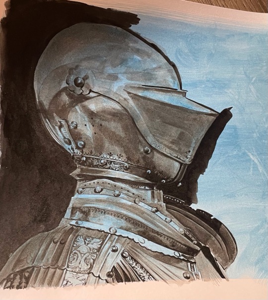
I was very silly and forgot to take my brushes with me to uni… buuuut from memory, I think it’s a ‘round’ brush? it can carry a lot of ink but tapers to a very fine point at the end, allowing for the teeny tiny details on the armour, as well as the larger washes of pigment. this is a4 paper for scale (I think that’s around 8.5 x 11 inches!) I use a bigger round brush for bigger areas! I also loosely sketch out the details in pencil before painting but the drawing is usually more ambitious than what I can realistically achieve at this scale - the squiggly lines were the hardest! I tended to depart from the reference at this point and make up some organic shapes. basically the smaller scale means it’s no biggie if you do make a mistake!
I use bristol paper - super smooth surface that holds the ink really well!
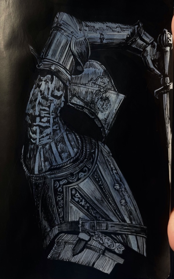
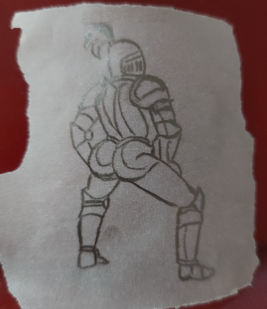
it’s a little different for my first knight though (below)! still started with the blue gouache wash, but I used fine liner pen. I think it’s either 0.5 or 0.3 - leaning towards the latter just because of the smaller details! this is a less forgiving medium imo, but super satisfying. I used black gouache to fill in the background for this one - I didn’t have any inks at this point. I’m working on a5 paper here in a moleskine notebook, so it wasn’t really meant to be damp.
also I am still bad at taking photos of my art - but I am getting better! I scanned the painting, then adjusted the shadows (just using the photos app). literally the only edit is turning ‘shadows’ down to -100, but you can see how much of a difference this makes! I’m including this because it’s always so disheartening when the camera doesn’t pick up the artwork properly. something I struggle with when using ink is getting an even surface with large areas of undiluted black, which is why I tend to adjust the contrast. if anyone has any tips on this I would appreciate it!

apologies for the very long post - if there’s anything else I can clarify please let me know!! I’m quite new to tumblr so sorry if the formatting of this post is a little off.
unfortunately I have just gone back to university, so it will probably be a while before I have some art to post - I also left all my art supplies at home… whoops! maybe this is a chance to improve my digital art!!
and thank you so so much for all the notes on my previous post! I read every tag on reblogs and they always make my day <3
82 notes
·
View notes
Note
Hey! Just found that physical fanfic, and got super excited. Planning on printing one of my fav klance fics as well, but I have a question - What did you use to format it?? When I download it straight from ao3 and upload the file, it makes the book extremely large. I’m talkin 8.5 x 11”, and I really don’t want a book that large. I’m trying to figure it out, as my fic is also from ao3. Any tips would be very much appreciated!!
Hello! It’s cool that you’re looking into giving this a shot!! I’m big on collecting physical media, so I’m always overjoyed when an author gives me the green light to do this with a story <3 I've had a few asks like this so I'll just kinda answer the formatting specific questions here.
Before I get started, this is just a reminder that anyone attempting this should always ask permission before printing any fics/art that isn’t yours! A lack of response is not permission - only a “yes” is permission. Someone else having permission is not you having permission. Always respect your creators by letting them keep control over their work - it’s the least you can do for the people who have freely given you something you love so much!
This is just a bit long and is largely technical, so I’ll leave the answer below the Read More.
Okay. The way I format a fic is through Google Docs, so you'll need to have a basic understanding of how to navigate that application (ex. insert page breaks, alignment, indenting, etc). To keep this from becoming a How to GoogleDocs thing, just know that in my copy all titles and headers are Georgia size 15.5 font and all notes and body text are Veranda size 9.5 font (though I should have probably made it size 9 font as it turned out just a tad larger than I anticipated (**edit: I have since printed another fic at size 9 font and it was perfect size!)). This is not what typical printed books do, but I wanted to keep things as close to reading on AO3 as possible to preserve my experience, therefore indentations and paragraph spacing reflects the website rather than that of a standard book edit. Below shows how that translates into the physical copy. For the sake of consistency with previous asks, I will continue to use The Raven Boys by Maggie Steifvater as the standard book format and there, nestled against his pulse by hiuythn as the printed fanfic so you can compare the two.
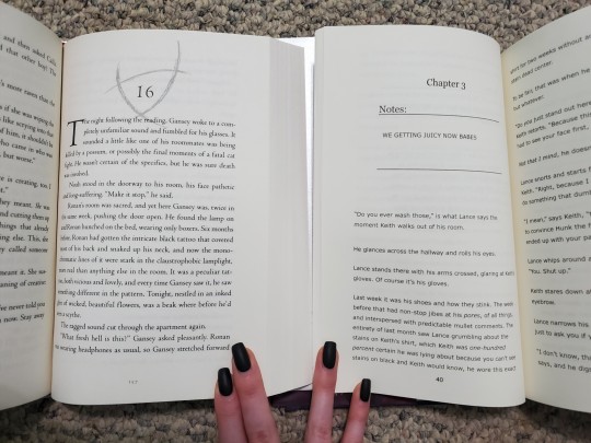
And since you asked a specific formatting question, I’ll show a quick step-by-step of how to change page settings to match that of a book below. *Keep in mind, books come in different dimensions, so you can easily change this to other sizes if you want a smaller/larger print.
I don’t have a computer, so the following is all done from my iPad. The placement of settings may be a bit different, but all of the settings will still be available on a computer. First, find this menu.

Navigate to “Page setup.”

Choose your “Paper size.” I set mine to “5.5 x 8.5.”

From that same “Page set up” menu, customize your margins. I set mine to 0.5 on top and bottom and 0.75 on the sides so that the text doesn’t get too close to the inner part of the page when printed.

And now you’re ready to roll! Hope this helps!
20 notes
·
View notes
Text
How To Start Reading Marvel Comics
Okay, so let's say you're a fan of the Marvel movies or games or you just saw Spider-Verse and you want to know how to start reading comics. Hi, welcome! This is one method of getting into comics; it is not the only one. We're going to be heavily relying on digital comics for this one, so if you prefer reading on paper, this might not be for you.
Step One: Pick a Character
This should be easy! Pick a character whose comics you want to read. It doesn't have to be your favorite character of all time; it just needs to be a character you're interested in getting to know a little better. A character is going to work better for this particular method than a team will, although there are plenty of team reading guides if you really want them.
Let's say, for the sake of example, that you just watched the Moon Knight Disney+ series and you want to read some stuff about Moon Knight.
Step Two: Find a Reading List
The very technically advanced way to do this is to Google "[Character] Reading List" or "[Character] Recommended Reading." For Moon Knight, Marvel has an official one that pops up right away.
The official ones are good places to start, but IMO, the best ones are usually from tumblr or Reddit. Comic fans can be very intense, but we also know more about the material than anyone, including Marvel. :) Here's one for Moon Knight.)
Step Three: Understanding the Reading List
Comic names are formatted one of two ways. You might see someone say Moon Knight (vol 7) or Moon Knight (2014). These refer to the same series of comics. They mean that the title of the series is Moon Knight, that it is the 7th series published under that title, and that it started publication in 2014. Moon Knight (vol 1) is Moon Knight (1980), because it's the first run of comics called Moon Knight and it started publication in 1980.
So, how do you know? That's where the wiki comes in. marvel.fandom.com is my best friend. So, when you type "Moon Knight vol 7" into the search bar, it brings up this page. See how it says (2014-2015) at the top? That's how you know that Moon Knight (vol 7) is Moon Knight (2014).
Step Four: Accessing Comics
Now we have to get the comics. We have a number of options:
For digital comics:
Buying digital comics. You can do this on Amazon or Marvel.com. However, this gets expensive real fast - for example, Moon Knight (1980) has 38 issues, and each of those costs $1.99. That's almost $80, just for volume 1.
Marvel Unlimited subscription. This is not a bad deal TBH. It's $10 a month, and they have quite an extensive catalogue. The only problem is that the site takes forever to load and is not easily searchable. Usually, I'll type into Google the name of the exact comic I want to access (e.g. "Moon Knight (1980) #1") and then click on the marvel.com link that comes up.
Piracy. This is the easiest and cheapest option, and thus the most popular. I'm not going to link any sites, but ask a friend or Google and you'll find one easily enough.
Physical comics are also an option, but they are more complicated. Groups of issues are collected in trade paperback collections, but finding which collections contain which issues can be a bit more of a hassle. And then buying those collections can get pricey very quickly.
If you like physical comics and have a public library card, I'd recommend checking out what they have on their shelves. On a Marvel comic, you want to look at the back cover, usually in the lower right-hand corner, and it will tell you which issues are in the comic (e.g. "Collects Moon Knight (2014) #1-6"). You might find some things that were on your reading list, or you might find some comics you'd never have read otherwise. A lot of public libraries (at least in the US) have a larger comic book collection than you'd expect.
Step Five: Have Fun and Be Yourself!
The most important thing to remember is that you are supposed to be having fun. There might be some frustration if you're not used to reading visual media (I know I wasn't), but it should overall be fun. If a comic feels like a slog, you don't have to read it! Maybe you and the person who made the reading list just have different taste. Try a different comic. Try a different character.
Also, remember that it's okay to be confused. You might be jumping around a little bit and so you might not know everything that's going on. This is kind of the perpetual state of reading comics. If you want to double-check the wiki or ask your friendly neighborhood comics blogger, that's totally fine.
#me making this guide after not reading comics for a month#like look i DO know how to read comics. i just don't do it!#also i feel like this is a deeply condescending and narcissistic guide but like. what/ever.
329 notes
·
View notes
Note
Ok! So I mostly want to make sure I have my general timeline and magic system in place before sending this au off into the tumblr verse
We can start with magic systems first, mainly the name situation seeing as it’s kinda a big deal
Big smoking gun of this aus magic is that you can either use innate magic, the power you’re born with and cultivate as you live, or magic of the surrounding area
Take the shamadi fire for instance, that’s innate magic that Red Son was born with and could guide/use without much conscious thought(even if it was wild)
But what the monks and many humans used was contracted magic used through seals or spell circles(note that they don’t necessarily have to be shaped like a circle, they’re just called that because the first few were)
Contracted magic has a few stipulations that innate magic doesn’t, like the spell absolutely needing to have an end requirement and material component like a paper and ink or blood in order to persuade the powers that be into agreeing to abide by your spell circle contract
Innate magic has a few stipulations as well, most have it tied to their stamina and need to train for ages to have a large reserve of power to draw from or at least have to eat and sleep a lot, making it hard to keep up with others at times and possibly ending their lives if they use magic too much
Thoughts on the distinction?
Thats a really cool magic system!
The cultivated sounds a lot like the Dao-based method Subodhi taught his students. Cultivating magic like a learned skill rather than an inherent talent. Wukong was born with a lot of inherent magic, but had poor control over it - causing him to only really have control after Subodhi helped him "shape" it.
And ofc theres areas in the Jttw book that are Super Magical like the Ginseng Fruit Tree; by virtue of something greater happening there or from its natural formation. Mountains in chinese mythos have their own mini gods by virtue of the amount of energy they represent.
The "contract" magic you describe also reminds me of how magic is often represented in Japanese works; with clear instruction/end goals. Most often this is represented through paper talismans; Ofuda for Shinto, Sutras for Buddhism. This is also why in anime, the paper usually burns up when used - metaphorically signalling that the magic has been completed and cannot be repeated with the same material/action.
I like the "Innate Magic is tied to Stamina" idea too!
I hc that a lot of the Big Powerful entities have a HUGE cooldown period for their power, one that gets bigger with the more innate power they hold. The deities that control and/or represent larger aspects like Islands, Stars, Planets, Seas etc; are brimming with magic, but take longer to react and recover from using it. A comparison I guess would be a matchstick compared to a volcanic eruption.
This do be sounding super cool! I hope to hear more about your Au in the future! ^-^
11 notes
·
View notes
Text
here’s my guide to making typesets! I use Word to make my typesets, Canva for designs, and Adobe to insert the majority of my designs.
this is a ton of info and I tried to make it as readable as possible, but plz let me know if u need any clarification!
Word: always use the app, the online program doesn't have all of the options needed
paper size: US Letter Borderless
then i flip it landscape, do custom borders, and select book fold. I do 1 inch on top and bottom, .75 in inside, and .5 in outside. i leave the gutter option alone and leave it set to 0. You can choose how large you want your signatures to be (sheets in booklet option on the margins page): I normally do 40 page signatures, but if it's a smaller text you'll want to go smaller for stability. after that, you should have a half page to start your typeset!
Inserting your fic:
the next thing you’ll do is insert your fic; on ao3 click entire story, CTRL A to select all, CTRL C to copy it all. Paste it into your document. word automatically detects the headings, and you should be able to see all your chapters on the left side bar (if you can’t see it, click the page numbers on the bottom left to open the tab).
Formatting:
you can do the next few steps in any order, but we’re going to fix the formatting now. you’ll want to CTRL A everything, pick a font and a font size. I normally use georgia and size 10, going smaller or larger depending on the file size.
To have an indent on every line: CTRL A your work to select all, right click the “normal” style, on the home tab. go to the bottom left, open the drop-down menu, and select “paragraph”. next to special, hit first line. i like to do .3, you can do whatever you want. i then like to make sure the space after is set to 0, the line spacing to single, and then hit save. it should automatically adjust your lines to start at whatever indent you picked.
To fix the spacing: go into the layout tab, and go to spacing. There'll be a before and after option: write in 0, then click enter for both of them. Word is a little bit bitchy so you have to force it do things sometimes. after this you can choose if you want single spacing, or 1.5, or whatever you want.
*sometimes, the way the fic was formatted when posted to ao3 means that even after setting the line spacing to zero, there will still be a space in between each line. this is where you have to troubleshoot. you can either go line by line to delete the excess space (yes, for real. and yes, it's just as awful as it sounds) or, sometimes, not every-time but sometimes, you can highlight the chapter text, go into the home tab on top, click the A with the purple eraser to erase all formatting, and then do all the beginning steps again, and it will get rid of the extra space.*
Now that your format is mostly fixed, delete the archive of our own beta, and anything else you don't want. I normally delete everything up to the title of the work, and leave that for creating my copyright page. Remember to do the same for the end of the work!
Page Breaks and Section Breaks:
the next part is the most crucial. it's how we format both the chapters, but also how we format the headings and footer. this was the part that took me the longest to figure out: it's the page breaks and section breaks. page breaks mark the place where one page ends, and another begins. section breaks will create a new section in your document, so you can break the beginning few pages from the rest of your textblock. This will allow you to insert page numbers that start on page one, instead of at the first page of the document.
I like to go the end of the description, and then click on the first chapter. then I'll add a section break. you can find this in the layout tab, click breaks, and then click section break. so now our section 2 starts with chapter one. After this, add a blank page after the description and before your new section, and then click on the first chapter. (adding a blank page allows for smoother formatting later with headers and footers)
I then go to each chapter, delete the authors notes at the start and end of each chapter, and add a page break at the start of each chapter. i like to use the heading tab on the left to click each chapter, so I know I'm actually starting the new page right where I need to, and other formatting won't delete the page break.
when I create a compilation fic, where I have muitlple fics in one typeset, I use section breaks at the starts of each new fic. this will allow the page numbers to continue, but I can then edit each sectio to change the fic title and the authors name. if you're really fancy, you can do this for each chapter title as well, you would just hve to use a section break for each chapter instead of page break. *Remember to click link to previous to turn it off, so you are only editing that section, and not all the other sections. this can be found in the heading and footer tab on the top, which will automatically open when you click on the heading or footer.*
Adding page numbers, authors name, text name:
To add a page number, I click the footer, which automatically opens the header/footer tab on top. Then, I click page numbers, add page numbers. I turn on different odd and even pages, which is also found in the header/footer tab. you'll have to insert page numbers on both an even and odd age to get them to show up once you click that option. Page one should be an odd page, page two should be an even page. I like to put the page numbers on the outside of the page. Then you'll click format page numbers, click "start at" instead of "continue from previous section", and write in 1. now your typeset starts at 1 on chapter one instead of the start of your document! you'll need to go back and delete the numbers that showed up on the first section, but remember to deselect link to previous before you do that! or you'll end up deleting your page numbers again.
to add text on page numbers:
click into the header/footer again. double click directly on the page number, then start typing. You ca highlight the whole thing to change the font, font seize, etc. I normally do the same size as my text, and I'll either do georgia font or garamond font. I google "copy paste line for text" to get that line dividing the page number from whatever text I have next to it.
to add graphics on an entire work:
you can go into the header or footer, go to the insert tab, and insert a picture. Doing it in the header or footer will ensure it's on every single page that shares that header or footer. I have done this in the past, and find it's cute, but it's also tricky because it needs to be small enough to fit inside the header or footer, and won't really be able to interact with the text because it's different on each page, while the graphic will stay in the same position regardless.
Blank Pages:
you want blank pages at the start and end of your textblock: this is what you'll be glueing your end papers to. even more, you'll want to ensure your total page number is both divisible by 4 (each page of paper will have four pages of your text on it, two to each side) and fits into your signature count. If you're working with a 40 page signature, and you have 420 pages, that's fine. You'll end up having the last signature only be 5 regular pages instead of 10, which is plenty enough to sew. you really just want to try and avoid only having one of two pages in that last signature, as that won't be very strong in holding up your end page, or be very stable in sewing on to your book block.
to make sure they're blank, with no page numbers, you'll want to insert a section break on the last page of text. Deselect link to previous, delete the page numbers and you should be all good!
Printing/Saving:
I'm on a mac. I don't know how you would do this on anything but a mac. let that be a warning lmao. but I will CTRL A everything, ensure it's US Letter Borderless, and then hit print. if you don't tell the document it's the right size, it'll be funky when you go to print because of the margins. to insert images, i click save as pdf. it'll save it in the correct order to print for your signatures, and then I upload it into adobe to edit further. that'll have to be a different post bc this is entirely too long already.
If you want to print directly from here, ensure it's printing the right size, flip on short edge, double sided. and you're all done!
#tips and tricks#typesetting guide#i woke up at 630 am with a purpose and shat this out#it might not even be legible#apologies in advance#how to typeset#bookbinding#fanfiction#ao3 fanfic#typesetting#microsoft word#adobe#canva#signature#resource
124 notes
·
View notes
Text
What I've been getting up to without my computer
Since I don't have any game updates at the moment I thought I'd give you a look at my very analogue Sherlock Holmes related project!
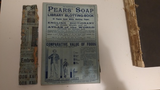
As you probably know, the Sherlock Holmes stories were mostly originally published in the Strand Magazine which came out as floppy monthly magazines with hardback collections every six months.
A while ago I spotted a really beaten up copy of the July to December 1893 book on eBay for £8. This book can sometimes go for £200 in good condition because it's the one with...
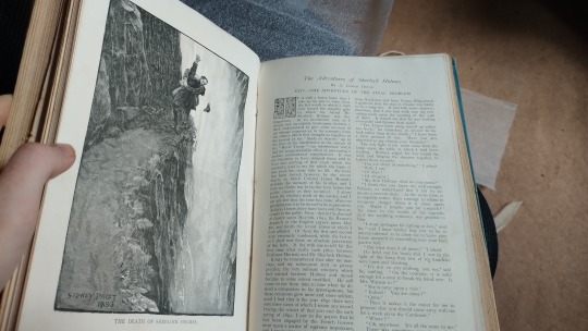
I immediately decided to make repairing it a Project!

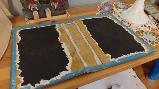
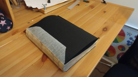
You can see here that the text block has totally come away from the boards.
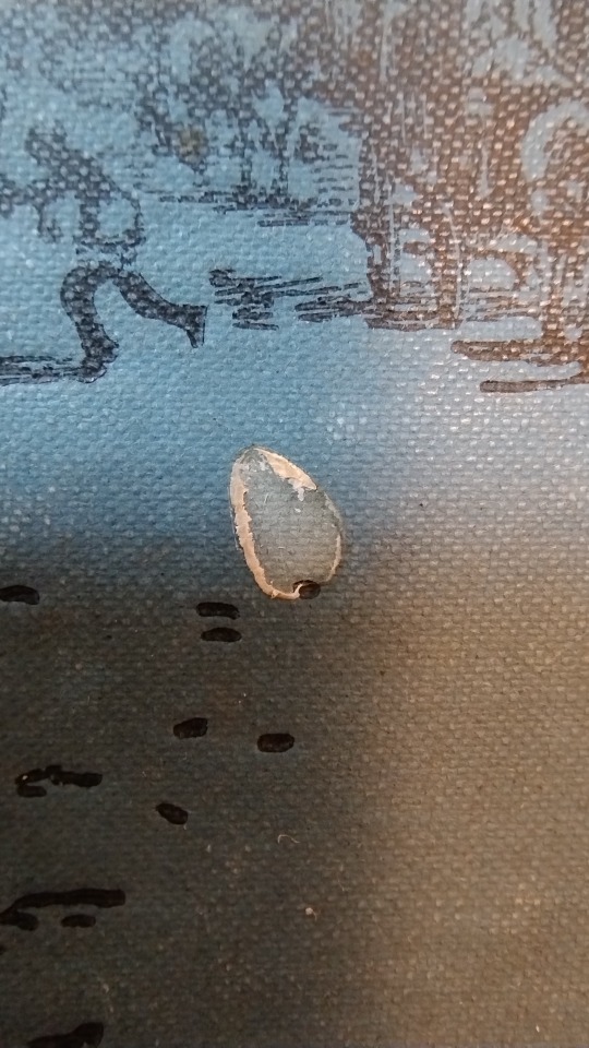
Along the spine I was really excited to see something a little familiar being used to give some structural support! My initial thought was that this had to be a slice of a cover of one of the floppy Strand magazines.
But when I got it loose and studied it, although the paper and ink colour is the same, it doesn't actually follow the layout format of the Strand covers. It's lots of little ads, and they run off the bottom like this is part of a larger document.
Scrap of paper on left, a Strand Magazine on the right:
So yeah, that's still a bit of a mystery, but it's cool to see this scrap of paper the printers had lying around. I had to remove it, but I'm going to keep it safe.
I did some gentle cleaning of the cover using a putty eraser, just gently pressing and rolling, never rubbing. It picked up a little of the grime.

The cover had got some paint splotches on at some point in the past, and I tried to gently remove these. Part of me wishes I'd left them as I think I was starting to effect the blue colour in the area.
(Original on the right, my attempt at cleaning on the left!)

I also reinforced some of the parts of the bookcloth around the spine that were very worn with Japanese tissue, which is very thin but very, very difficult to tear.
Now here's a fun part, with some help from my cat Miss Malkin!

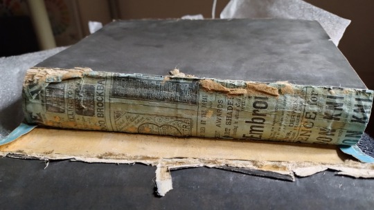
The spine of the book had a few problems.
The fabric which wraps around it and helps attach it to the cover/boards which is called scrim (or mull, I've seen it called both!) had totally decayed and turned into gross dust, I knew I'd need to replace it.
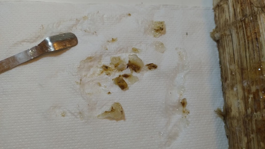
Although the sewn binding was sound, I could tell that the glue wasn't doing its job anymore. It was old 'animal glue' that had turned hard and brittle. I knew I'd need to replace it with something else, like PVA.
I needed to get that glue off, so I tried out a trick I saw online. I made a paste/gel out of methycellulose, which is a substance that gets used as a thickener in lots of food products. Of course I keep mine in a fancy little jar:

The gel softens the old glue without getting it dangerously damp, allowing you to gently scrape it away. I have a really satisfying video of me doing it, but Tumblr only lets you upload one video per post, boo.
Look at all this gnarly gunk!
But look at how good the text block looks with its new scrim and glue!
I got the black paper from Shepherd's in London which is a specialist Art & Conservation Paper shop (they have a book bindery too but it's closed at the weekends.) Buying it was so fun, I got to look through lots of samples and pick something which matched the original paper.
I then had to get it home half way across the country on public transport. Yaaaaay.
I was trying to think what I was going to use to replace the Strand Magazine page on the spine. In the end I decided to leave a little note, for some future person who might take the binding apart someday!

So, here it is!
I have to admit that this whole project has been a real challenge, emotionally more than anything! It's required me to be brave about messing with an old book, and to acknowledge that even where I've made mistakes, at least it's better off then it was when It arrived at my house.
194 notes
·
View notes
Text
I have so much to say about the Mario & Luigi Brothership trailer so buckle in!

At the start of the trailer, they show their hands glowing and it made me think about the hand abilities from Superstar Saga. They might make a comeback but I doubt it because they probably would've shown it off in the trailer. There's probably some good lore about why they have glowing hands.

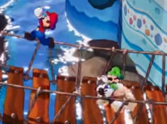
In gameplay, the brothers seem to be more distant to each other than in previous games. This is probably because of the larger locations, distant camera and the sections where they split up.

Luigi got SHAPE on him!

These seem like minor villains like Popple. Their eyes give Dream Team vibes but that's probably not relevant. I hope they're quirky. Also, I'm loving how the character designs in this game are as unique as the older games in the series.


These enemies look like alternate versions of established enemies from the previous games. The one on the right looks like a metal treevil.
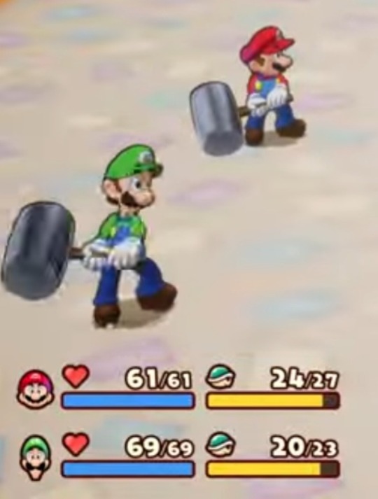
The health display now shows health as a bar and in the 00/00 format which I'm thankful for because only being able to see a number means I have to manually check if health is full. Looks good!

Emergency guard has been moved from X to R. It was X in Paper Jam because Paper Mario used Y and it would've been weird to not use the last face button. I wonder if X and Y have different uses in battle now.

I call this the UFBro. I think it's going to replace the spin jump since it's pretty much better in most aspects.
More in my next post!
23 notes
·
View notes
Note
I remember when Jonathan first talked about his nocturnal existence causing him to have fragile nerves -or something of the sort- and being startled at his own shadow, he stopped reporting how bad his nerves are from it. Despite having to spend hours with Dracula every night unless told otherwise. Mina after the first few times she woke up for Lucy, she reported the same toll on her health from being awakened and then unable to go back to sleep, but she's not talking about how tired she is anymore. Despite having to be up for Lucy's sleepwalking every night unless told otherwise. She keeps track of Lucy's health, not her own.
Yeah! They both leave out these kinds of ongoing stressors for themselves. We have to look for clues and read between the lines to realize that, hey, Dracula is still keeping Jonathan up for long chats throughout basically the entire stay, or wow Mina must be beat.
And it makes sense in a way. They both have higher priorities. Jonathan has limited freedom to write and paper to write on, and is focused on talking about Dracula's inhumanity and his own efforts to escape. Mina uses her diary to talk a lot about her worries and fears but she is mainly focused on Lucy. Her journal reflects her desire to meet the responsibility for Lucy's care that she's been given, and her own state isn't as important compared to that.
At least to her. I care a lot about it, and the way both of them just don't talk about how badly they're doing - or try to downplay it when they do - hurts to think about. At least we know they love one another so much that they will absolutely look after each other's health and wellbeing assiduously. But they've got a tendency to push themselves really hard and just act like it's nothing. A part of me wonders if it stems (partially, I think it's definitely personality too) from their orphan backgrounds - they're used to having to work hard and to perhaps not being given the space or importance to linger on their own upsets or ailments. They are practiced at focusing on what needs to get done instead.
...anyways, you know what I love to imagine? How their respective journals look over time. They both start out written neatly, with precise lines and perhaps a fair bit of effort put in to getting the shorthand right. Jonathan's gets messy first: writing entries on a bumpy carriage ride will do that to you. Mina has to practice writing really quickly when interviewing Mr. Swales, and her handwriting takes on more of a slant... Jonathan's gets smaller over time, both to reflect his more secretive mindset and also how he's trying to preserve all the space he can. Sometimes his hand shakes so much that the shorthand is hard to read, maybe a page is even torn a little. Mina's writing gets larger when she's exhausted, sometimes her pen lingers long enough to almost blot or trails off. Some of her entries might be pen, some pencil. Jonathan's all pencil, and you can see when he needed to resharpen it. I doubt either are probably writing on any kind of lined paper and their ability to write in a straight line suffers over time. Both of them have pages that are stained by tears...
I can't read shorthand so obviously I'd need the proper English version to be able to read it, but I would love a version of Dracula that incorporates all those elements into "photograph of diary pages" type formatting. It would have typewriting for those portions, maybe different fonts depending on the typewriter. Unique handwriting for everyone. Maybe even a sketch in the corner where appropriate. Basically, what re: Dracula has done with the audio, but in visual format.
37 notes
·
View notes
Text
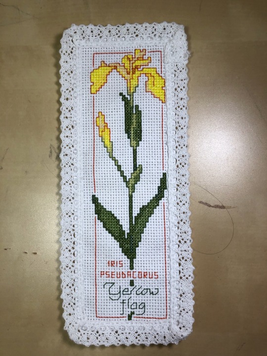
Also completed 2023. This one is from a different kit from the same brand.
Definitely didn’t centre this one great, though it doesn’t help that the lace is slightly crooked on each blank. My major complaint about this kit is that the patterns are typically larger than the Aida blank provided.
So basically, I went in and scanned all 8 patterns and put them into GIMP, then carefully edited out a few carefully chosen rows on each pattern to make it a 30 x 100 grid. Then I uploaded the edited file to Markup R-XP and manually selected the symbols to match each colour because my scan quality is terrible.
I love how it turned out but there’s a lot of setup involved for turning paper patterns into a format Markup R-XP likes. BUT I really like the program itself for stitching. I wish it was a one time purchase instead of a subscription, but I do find it useful enough to pay for it. At $25 per year I think it’s worth it.
My one complaint is that you can’t easily sync between devices (you have to export/import each time instead of syncing automatically) so if I start a project on my phone I have to finish it on my phone, etc. For small projects like this I typically use my iPad to edit the grid lines and match the symbols, then export it to my phone so I can stitch anywhere.
11 notes
·
View notes
Note
Heyy there,just wanna say that I absolutely love your linocuts, specially how funny and colored they are! Can't wait to SEE more of your creative/printing process :))
Thanks for the love !
I'm kinda dying to discuss this so I'll take the opportunity, if only for myself, to express my thoughts and structure them. Hope you don't mind me using your ask to do this.
Recently, the process has mostly involved tracing base images and modifying them before transferring onto a sheet of "engraving eraser" (idk what the english term for it is but someone likened it to what they call "keshigomu" in Japan, where it seems pretty well spread) which I think is just softer lino.
Sir Clappemcheek the 1st, on carbon paper; and my trusty blade
I used to draw on regular erasers with a pencil but it's much messier, less precise and runs the risk of damaging the surface. There's also another kind I use that's a bit softer that you can press a pencil drawing on paper onto and it will transfer, skipping the carbon paper step. It's thicker, a little less precise and a little bit crumbly, but I like it a lot


type of sheets I've been on
I try to do a healthy mix of drawing my own stuff and tracing. Because I haven't had any formal training, I figure the more I trace and tweak said traced designs, the better I'll get at standing on my own two feet and coming up with entirely original designs, while also not feeling too frustrated at myself and having fun carving cool designs.
Full disclosure: I have been using some AI generated pictures as a base for a number of those, because they provide a very convenient starting point, help me get poses right, or at least help me understand how a pose might be wrong and how to fix it. I'm not a fan (understatement) of generative AI's recent developments and the way some people revere it as some kind of higher power, but I still find it helpful as a learning tool, and I feel like my printmaking is transformative enough to be in a different category from the usual output of "prompters".

the AI pic I traced the original sir Clappemcheek from
I would actually love to know people's thoughts on my use of it, good or bad or if they even care at all, as I've been feeling a little self-conscious/doubtful about it, in the face of the positive reaction some of my prints have been getting. This is also partly why I hesitate on the ethics of selling prints (at least those made using AI pics as a base).
Still, I do my best to not get complacent and keep drawing, or at least use other sources (the big tittied landsknecht was traced from an Albrecht Durer engraving and then bimbofied by hand)
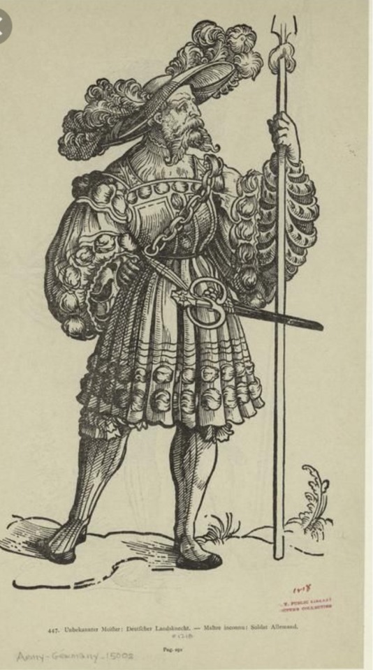
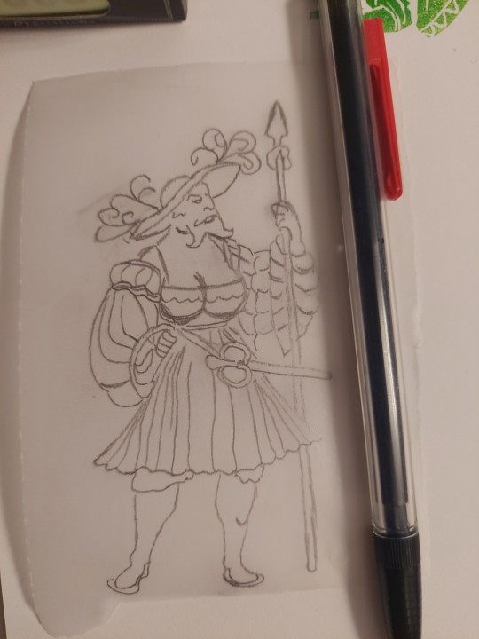
what Albrecht Durer always envisioned
As for ink, I use just good old ink pads that I press the stamps into until I get decent coverage. Still have to look into the little roller setup I usually see in linoprinting, but I also feel like that might work better for larger pieces than what I do, and for a "standard" format. With the way I tend to cut out the stamp from the sheet, pressing the paper on top of the stamp is more awkward than pressing the stamp on the paper.
These are some of my thoughts, however jumbled, and I'm very grateful for the interest my silly little crafts have generated.
12 notes
·
View notes
Text
I have zero contractual obligation to do this, but I’m doing this anyways because I think it’s genuinely a really cool app, especially for note-takers (both for professional, school, and personal usage).
EVERNOTE BABY (it also has a desktop version!!!)
I was watching TikTok before it gets banned, as one does, and I came across a video of someone talking about the whole issue with Google Docs issuing the stuff you write in a doc to train AI.
I don’t know what compelled me, but I went into the comment section to see what others had to say, and saw someone recommend Evernote for- not only keeping track of notes for stories, but also being able to add media and other stuff pretty easily (I’ve only used the note-writing bit since I’ve got it [2 days ago], so idk how that part works just yet).

The home page of Evernote is really nicely structured imo. You have notes at the top, and everything else at the bottom. There’s other options to add as well in settings, it’s not limited to just those three, but that’s all I personally see a use for with what I’m using the app for.
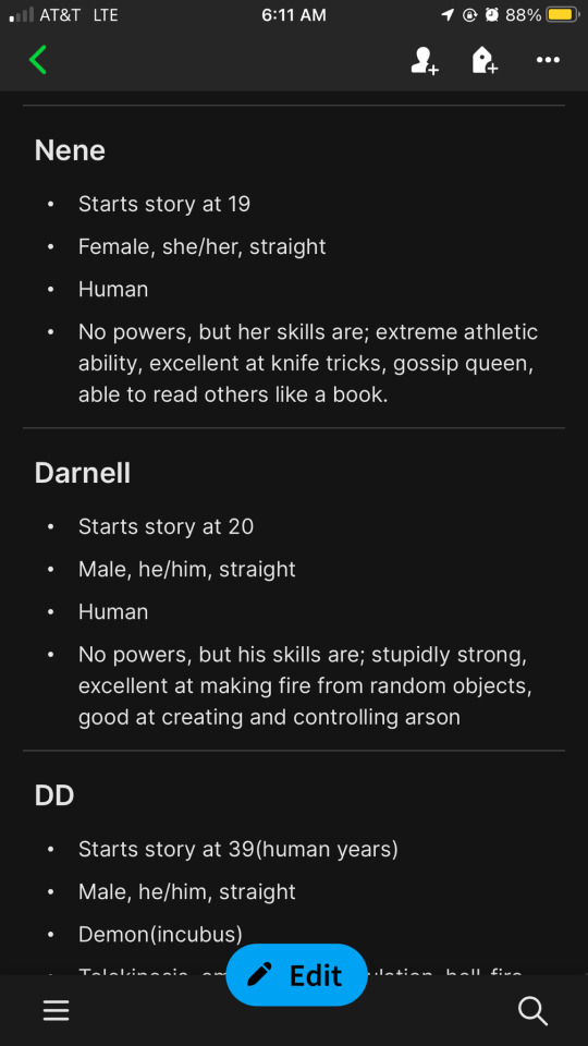
Now time to show off the cool shit this app can do in the notes section because that’s what I mainly use this app for, using an example from the character notes for the FNF au!
The larger and bolder text is done similarly to Microsoft Word and Google Docs, where there’s a bar above the keyboard that has all the text options.
You can bold, italics, underline, strike through, change text size, create a bulleted list(or a numbered/lettered one if you prefer that), you can indent your shit so that you can now format text to school standards (how every English paper demands an indent with a new paragraph 😒), and more.
That little grey bar separating Nene from Darnell, and Darnell for DD, is done by putting three asterisks (***) OR three equals (===) on a line and then starting a new line. The app will automatically turn it into that kickass grey bar!
There is (sadly, imo) an option to use AI to “clean up” your notes/text. If you don’t want it, don’t use it. I’d prefer if they didn’t have AI in the app all together, but, to me, it’s really the only downside to this app. And- in their defense- as far as I know, they aren’t using it to steal your data or train AI like Google is.
So, once again, not a contractual obligation, but I do genuinely like this app literally in just the two-ish days I’ve used it so much that I’m literally actually planning on moving all my notes regarding my stories to it.
I think I’ll still keep actually writing my stories on the built-in notes app, but that’s mainly because the format I write in is so I can easily keep track of what I need to italicize or not, and using the built-in functions of Evernote for that will make transferring it to ao3 so much more difficult imo.
So, I’ll personally keep the stories to the notes app, but transfer the actual notes to Evernote because it’s formatted better :>
#evernote#fanfic writers#writerblr#writing resources#female writers#ao3 writer#fnf au#fnf corruption au#putting those there to summon my people#sponsorship; but I’m not being paid to do this#i genuinely like this app enough to do this
3 notes
·
View notes
Text
Animation
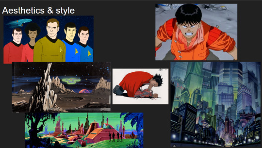
Reinvention in story telling
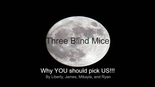
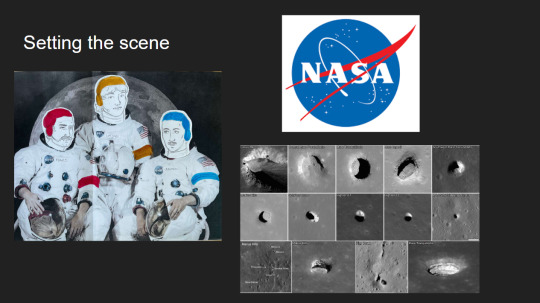
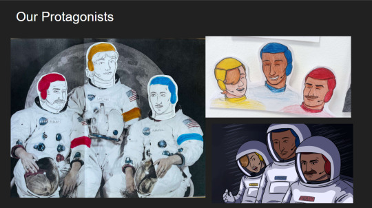
Three Blind Mice, Epic/Historical, Space Age (1957-present)
Week 3, 22-28/04/24
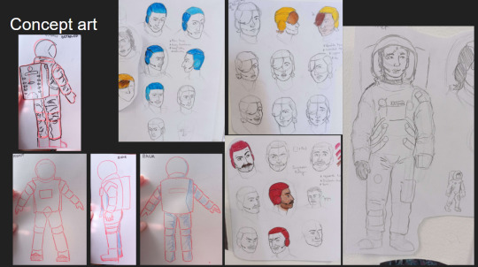
Monday
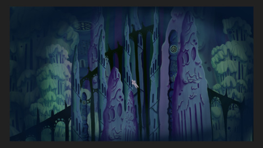
Did a zine workshop during the morning, I made a sad little zine with some bits of rough potential visuals for the project.
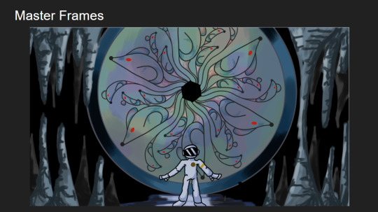
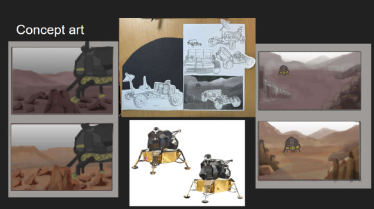
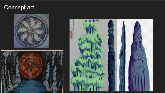
I then jumped straight into creating concept art and trying to figure out how to combine natural cave formations with architectural features. What I ended up doing that day was creating this rough pencil of some stalagmites and drawing arches and doorways on top of it.
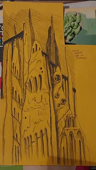
Using this as a starting point I went off and photocopied it a few times, which I then cut up and collaged together on a page to gain a rough idea of what this metropolis could look like.
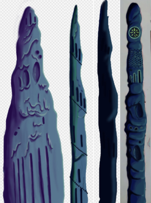
This is what I ended up with. I love how the buttresses came out but the perspective of the piece looks completely wrong, making it look cluttered without purpose. I tried colouring parts blue and pink to separate it a small bit, but I think the main issue is that all of the structures are the same size even at a distance, in future I'll have to make the ones in the back larger and more hazy looking whereas the ones in front smaller and more detailed. This was just an experiment so its not too important.
Later that evening I did a colour study of scenes from Akira to develop my understanding of cel shading, I also watched a few videos on the production of Akira. It ended up being very useful and I found myself very surprised with Akira's colour palette. I quite literally colour dropped the colours from the scenes and and did rough drawings of the scenes using them, I was really surprised to see that the colour I dropped was the same as the one in the scene. It was absolutely fascinating.
Tuesday
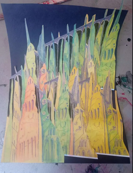
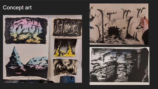
I further looked into combining architecture with cave structures by doing a quick study on Antoni Gaudi's building designs and did a study on different stalagmites.
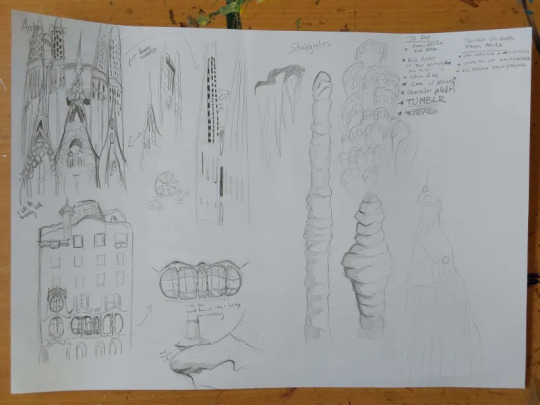
Looking at Gaudi's designs was interesting as he uses lots of organic shapes that almost look like they're melting in a way, and in other works like the Sagrada Familia he has lots of towers with unique features.
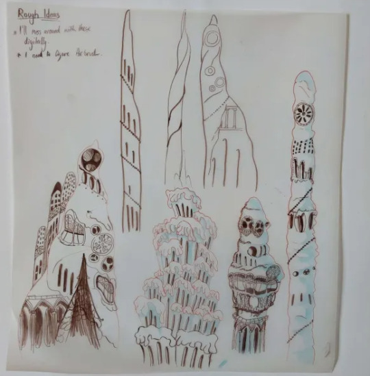
I tried combining these features to the stalagmites I studied to gain unique structures that would be believed to have belonged to an underground metropolis. I ended up with some nice designs, I worry a small bit that they might be too detailed but overall I'm happy with them, I still think these designs would have to be further developed but I don't have the time to do so.
At the moment my plan is to individually recreate these digitally and then photoshop them together in different ways to gain the illusion of having more designs than I do.
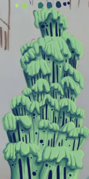
The photo is a small bit fuzzy but this was the first structure I recreated digitally. This took me around 6 hours to do, which was mainly because I've never done a proper digital piece before, so it took me a bit of time figure out what worked best and what short cuts I could take. I actually drew on top of a picture of my original paper sketch instead of redrawing it.
I created this solely using the air brush tool, and I love how it turned out, it looks so drippy. The only thing I can say really is that I wish I got it done a bit quicker, and that the values were much darker on my personal monitor.
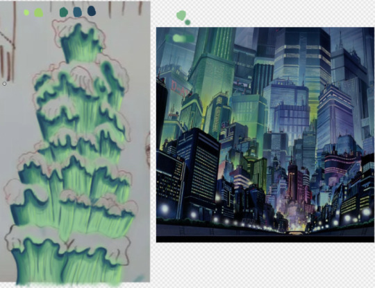
I used the background from Akira as a reference for the colours.
Thursday
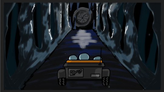
I made 4 more structures, significantly much more quicker too. While I spent too much time on the first one it gave me the experience needed to bang these ones out quickly and more efficiently. These were also done using the airbrush tool. For the backgrounds we actually made it a point to solely use airbrush as a way to commemorate the animations from the 70's/80's.
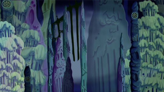
Since most of my pieces were done I got started on piecing them together. I tried making the buildings further back bigger and transparent and the ones closer to the viewer bigger. This was as far as I got on Thursday. If I'm being honest I'm not happy with the layout. I was using the Akira background as a reference but then realised it wouldn't work as the light source in the background is from behind, in my background the light source is from the front. I knew I definitely had to redo the layout.
Friday
We did a pitch workshop with Paul and Yvonne and then as a team discussed how we would go about our pitch . We discussed who would say what, what we thought a funder would want to know before investing in a project, we worked out costs, how many episodes, how many animators it would take to animate it in a year and ect...
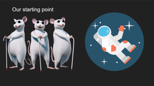
We also did a few rehearsals in the studio improvising our lines and timing ourselves to get a feel for it. We decided that I would open and close our pitch, introducing our Nursery rhyme, genre, & time period while also setting the scene for our animatic.

Before work I managed to redo my background, I thought this one turned out way better. The perspective looked way better than last time too. I feel like with more time I could develop this further but I don't have that time so this is what I have and I'm happy with it.
Sunday
youtube
I made the presentation for our project, and the team went on call to rehearse our pitch. We did this twice.
2 notes
·
View notes