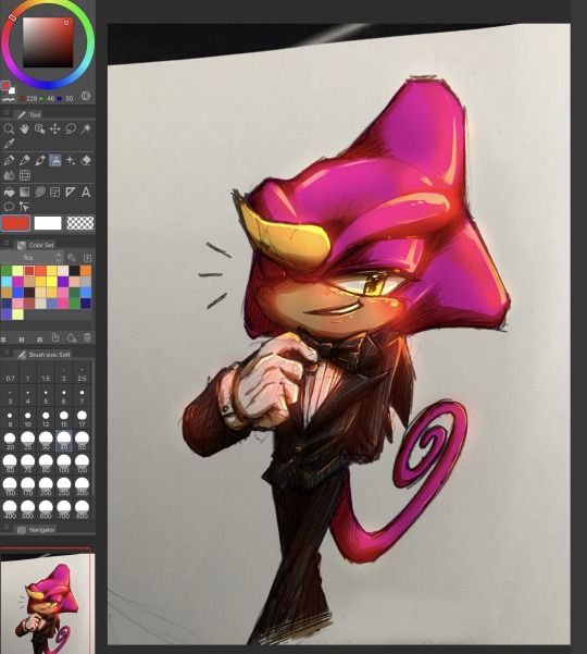
#I like the lineart and crosshatching :)
Explore tagged Tumblr posts
Visit Tumblr Blog
Explore Tumblr blogs with no restrictions, modern design and the best experience.
Last Seen Tumblr Blogs


Fun Fact
In February 2021, Tumblr had 518.6 million blog accounts.
Text

Yeah this is exactly what happened
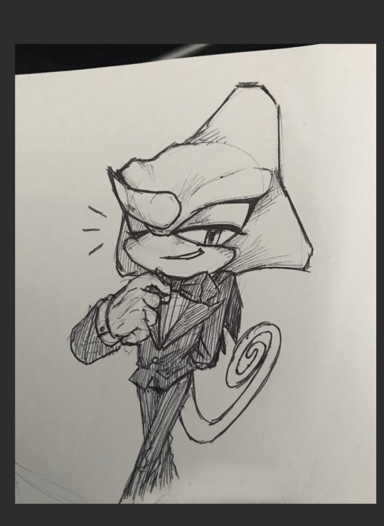
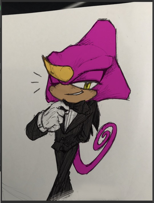
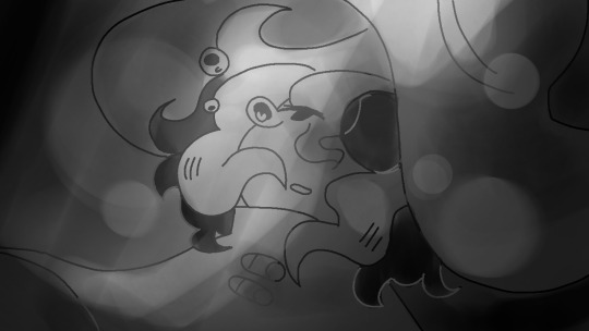
hello isat fandom I have arrived!
please accept this humble offering
#ouughhh I don’t like this#at all#but I’ve done it so here you go#I imagine this happening in the tree somehow don’t think too hard about this#I rlly like the first Siffrin#Don’t like the second panel as much but it wouldn’t be the meme without it#Ok I’m gonna stop yapping about it#I like the lineart and crosshatching :)#rip quality#in stars and time#isat#isat fanart#Isat Siffrin#isat loop#meme#my art#I’ll probably edit the speech bubble to read better#the text is kinda ugly but my handwriting is messy
490 notes
·
View notes
Text
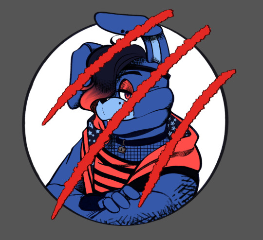
and another one! Thank you to @pixlokita for letting me use this wonderful lineart to color! Hot Topic Glamrock Bonnie made me laugh harder than it should have. I couldn’t pick one version, so here’s my favorites!

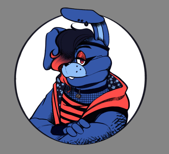


I know glamrock bonnie is a much lighter/greener blue, i just darkened it to make him ✨more emo✨but I didn’t like the weird dark cyan that made so I moved it over into the pure blue a bit more.
#I just thought the claw marks were neat#also fun fact: the dark blue of the hoodie and hair was color picked from the original lineart#and the red of everything but the claw marks was color picked from the eyes#I also noticed that a lot of the fnaf coloring books I’ve seen have a bunch of crosshatching shading#So I wanted to try something with that#and yes the stars in the hoodie are a reference to glamrock freddie#because I like to think that he calls bonnie superstar sometimes when he’s being sappy.#Thanks Pix!#This was a delight to color!
84 notes
·
View notes
Text


2014 Ren vs a quick 2025 one. I decided to not go further with it because the composition itself was starting to bug me. The pose was fun to improve on though.
#my art#my ocs#making background compositions that highlight a central figure is harder than just drawing backgrounds#certain lineart densities can’t overpower the central figure’s lines#tho I might try out colored or tinted lineart for background sometime soon#something that can be expressive but not louder than the figure maybe?#like how golden age Disney did it with their painted backgrounds. (‘I do like crosshatching too tho.. colored hatching hmm
9 notes
·
View notes
Text

“Kai”
I had sketched this picture a couple months ago. At the time, I was planning on doing my usual soft inking and painting style if I had gone on to continue the picture. I suddenly felt inspired to continue this picture today, and to my surprise, I felt inclined to do dark, solid lineart. As it progressed, I went as far as filling in his shirt with black and shading it with crosshatching! I felt brave enough to do my usual watercoloring on top of this "harsh" lineart, and I think it turned out surprisingly well! The contrast between the harsh lines and soft painting suits Kai, doesn't it? I'm glad I decided not to add shines to his eyes. The soulless look suits him.
I recorded both the inking process and painting process of this picture and uploaded them to my YouTube channel!
You can buy a print of this on my inprnt shop!
If you like my art, please consider supporting me through my Patreon! Thank you!
86 notes
·
View notes
Note
Hi xuune, I have a question.
I want to study specific elements of many different artists, but their art styles are so different that I’m not sure how to combine them to make it my own. Any advice?
tbh it takes a lot of experimentation and study to find an art style that you can call your own. my response is kinda long since i'll be showing you a process with how i think about this.
i like to ask myself these questions when looking at different artists' art styles:
1. what makes their art style appealing? figure out 1-2 specific element of each artist that's the most appealing to you (linework, color, stylization of anatomy, etc). depending on how many artists you're looking at, i would try grouping them based on those categories.
2. what do i observe with each artists' style? typically a lot of artists have their own "rule" of how they use a specific element in their artwork. if you want to study how someone else makes an appealing piece of artwork, make some observational notes of what they're doing to break it down. 3. start two at a time when combining styles. say you like artist A's use of linework but also artist B's use of color. try combining those first and mixing and matching anything else slowly.
it might be helpful if i got to see which artists you're looking at as well just so i understand what might be troubling you in trying to combine their styles? but either way, for example purposes, i'm going to reference napp (lineart) and ggdg (colors). here's what i notice about their artworks that i hyperlinked: napp's linework:
use of solid blacks/crosshatching on shadows
form/textures defined by line weight
uses a textured brush

i more or less attempted to be similar to napp's linework style with how they choose to define forms and shadow.
moving onto colors, here's what i noticed for ggdg's:
primarily flat colors/rendering style
hair is shaded stylistically in black texturing
has a preference for lineless
uses a textured brush

i decided to follow along with most things i observed except for having the colors done in lineless. i did make some creative liberties to add terminator lines to shadows since that's my personal preferences with rendering.
but i also decided to combine one more style and it's the graphic elements from urana's artworks:

that's typically how i would think if i want to try combining styles to find something i like! after doing this exercise i was pretty satisfied with how my art came out.
don't feel discouraged if it takes some time for you to figure out what you want your artwork to look like! tbh even now i still don't feel like my pieces have a distinguished art style since i like studying off of other artists a lot. my pieces tend to vary time to time so ¯\_ (ツ)_/¯
at the end of the day, i think it's most important to observe closely and break down why an artist's elements are appealing to you and is working for you, and see if it's something that you actually like seeing in your own artwork. there's a clear difference between appreciating someone's style because it speaks out to your aesthetics vs actually incorporating it into your own art. there's plenty of artists whose styles i like, but some of them aren't ones i want to combine into my own style.
either way, i hoped my advice and seeing my process helped in some way! maybe you might've been already thinking in this way but i hope my explanations were still worth reading :)
22 notes
·
View notes
Text

Out on the open seas~
Here's a Chip drawing I made almost exclusively using the lasso tool! The JRWI brainworms are back (they never left) and I'm so happy with how this turned out.
Under the cut is the full version (plus commentary). I really liked the balance of the cropped version for the main image, but wanted to include both as the wave and shirt details stand out more in the original. Also because it got compressed.. curse you compression..

I started this piece because I really wanted to draw, but couldn't use my usual methods due to recovering from wrist injuries. This was a lot more low impact and let me focus a lot more on shapes and motion instead of my usual weighted, crosshatched lineart and layers of shading. And I loved it! I really liked drawing in this style. It was loose and freeing and lended itself a lot more to experimentation because I wasn't bogged down in the tiny details.
As for this piece specifically, I wanted to incorporate references to the sea, Chip's original tattoos, and his often melancholy self reflection. To add more visual interest and convey some of this, I overlayed some of the low-opacity blues and made his shirt flow into the waves themselves.
#I just finished episode 115 a couple days ago and have been losing my mind#head in my freaking hands#(in the best way)#they make me ill#anyway! this was a ton of fun! it felt great to make art again after a month or two break#chip jrwi#chip jrwi fanart#jrwi fanart#quags.art
17 notes
·
View notes
Note
sorry if youve talked about this before, but do you have any tips relating to your coloring process? i ADOREE the way you render things and it looks soso cool and once i saw a post where you said your art typically only took a couple hours and i was in SHOCK. cuz ive been working on a yuji piece that has a similarish (not really but idk how to describe it…) coloring style and ive been working at it for. about a month now…sorry this is rambly i hope u have a good day!!!
hi!!! first of all thank you so much I'm happy you like the way I render! honestly it Is still the aspect of drawing that takes the longest for me, I've only recently started to come up with ways to streamline my process (mainly through keeping my layers/brushes limited and overall being less anal about details) . these days my average drawing does take about 2.5-4 hours I'd say, with Big Illustrations obviously being the exception
i wouldn't beat yourself up too much about taking longer to finish a drawing tho ! it took me. a While to learn how to speed up and honestly my biggest piece of advice is loosen up and let certain things look imperfect or unfinished ! and if you're like i was and want to work at getting faster then i would recommend practicing churning out sketchy/rough pieces and see what tricks and habits you can implement or adjust to save time
all that being said I realize haven't done an updated overview of my colouring/rendering process so I guess this can be that ! I'll put it under the cut because i too like to ramble and this Will get long
lineart and base colour/underpainting


my lineart is nearly Always on multiply. it helps the lines stand out less starkly against the colours and makes it so that I don't have to change the colour of as many sections of lines later on
the base colour layer is honestly completely optional, tbh i sometimes skip it so you don't Have to have one but i like it for a few reasons: - I like to keep all my colours on the same layer so if i'm going for a painterly style this serves as an underpaint layer of sorts . having this means that when i paint, whatever colour i have here will blend with all the other colours i use and help them look cohesive - even if I'm not painting, i still like to work with all my colours on the same layer and it helps me make sure I'm not missing any spots, which helps when it comes time to section individual areas off in the next steps
2. flats

lock transparency button my beloved . this makes it so that you're only able to paint on areas where there is Already colour (which is where having an underpaint layer comes in handy)
not much else to say about this step, just choosing colours rly !
3. shading
here's where the fun starts ! since i'm working all on one layer, i use the wand or lasso tool to section off whatever area I want to work on, then go in with (usually) one of the three brushes below: from left to right 1. my favourite dry brush that i use to cover large areas, it has an amazing dry paint stroke-y texture and i use it in everything. great for skin/clothes/hair/fur/organic material...she does it all 2. smaller, blendier/smoother brush that I use to soften out the rougher edges left by the first brush. I find it's really good for hair and small clothing creases 3. rough pen brush that I use to add little bits of flavour in the form of crosshatches or stray lines, usually to hint at individual hair strands! I also use it to line sometimes but I'm using it less for that recently
also, since the lineart layer is set to multiply, it's super easy to colour directly under the lines on my colour layer and use that as a way to make certain lines Darker . it's most obvious at the eyelashes and under the jaw but I do it everywhere

4. finishing touches and texture overlay
here I add another layer above the multiply/lineart layer and use it to add highlights and other details! this is also the layer i use to paint directly on top of any areas that got messy or need extra definition
my texture overlay of choice is just a rough monochrome static file that I got on the csp assets page but use whatever you'd like tbh ! set the layer mode to overlay and adjust the opacity to your liking (I also like to rasterize the layer to make it easier to work with but it's not too consequential if you skip that step since you're basically done by this point anyway)
And done ! slap a signature on that bad boy and send it <3

#answered#flowingredscale#art advice#my art#i rly hope this was helpful!!!#best of luck with your yuuji piece <3
35 notes
·
View notes
Note
your art is so cool i must know how you color your traditional sketches digitally O_O (/nf)
lessfuckingo friends!
this is my very quick and very easy process for colouring traditional sketches!
Step uno! Pick a sketch! Or make a sketch! I like to sketch in pen cos I like the look of all the under structures in a drawing and I use a lot of crosshatching for texture but you can use a pencil sketch and clean it up if you want a cleaner pic!
Next step! Clean and crop the sketch to your liking! I like to remove surrounding drawings but I still like it to look like it’s on a page so I keep any visible edges, and adjust contrast so the lines are darker, since they will be the lineart
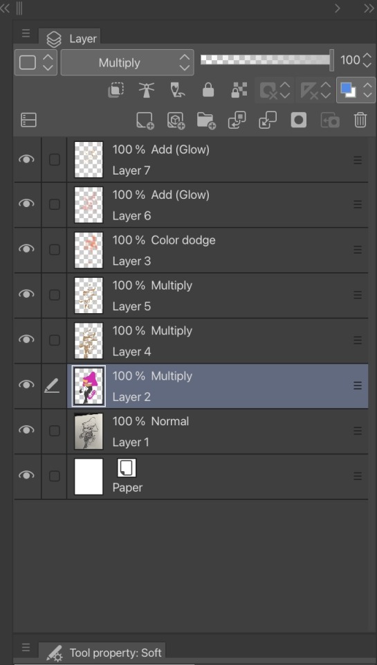
Step 3! Make a new layer above the current layer and set it to multiply! I use clip studio paint but I believe most programs have the same or similar layer styles. This layer is where I put my flat colour, I leave the white of the page for white for now. I use the pen tool to colour cos it’s the easiest for me
Step 4! I add the base “glow” using a colour dodge layer and adding red with airbrush to any part I like to feel warmer, such as cheeks ears elbows etc. this is more of a warmth thing than shading thing tho it does lighten…
Step 5! Put a multiply over your flat colours, this will be your shadows. I use a beige brownish colour cos it mimics the warmth of the paper a little.
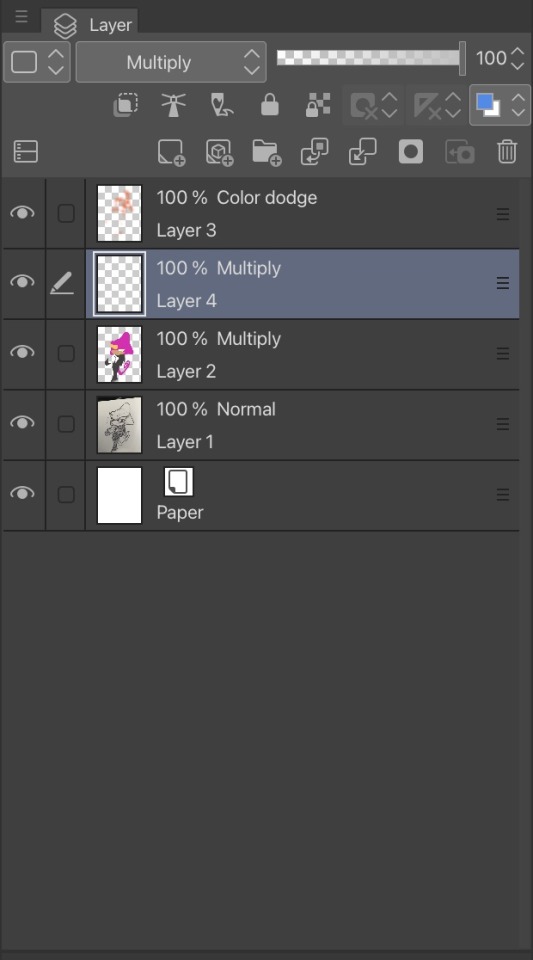
Step 5! Again! I do 2 layers of shading cos it’s added depth, I do some crosshatching in the shading too like to original sketch. A soft eraser can be used if some of the shadows feel too harsh or sharp
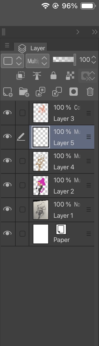

Step 6! Make a new layer on top of all your layers in a lighting style. I like add glow. Airbrush the general areas I want to highlight ! I use red and a large brush
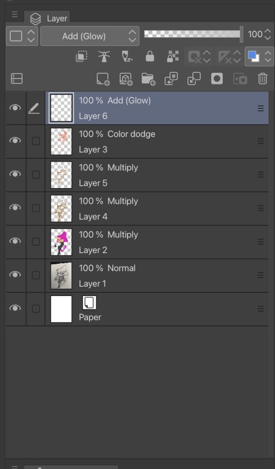
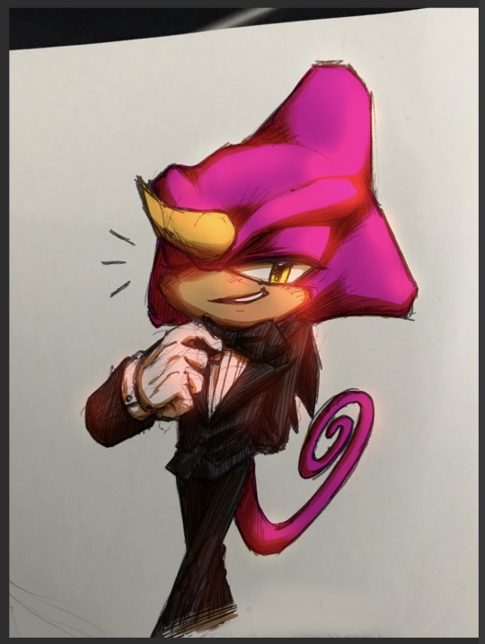
Step 7! Make a new lighting layer and use a smaller pen tool to add the solid highlights! This adds the gloss and shine on the lightest points. I use orange here cos again, warmth. Use a soft eraser to soften anywhere you feel looks to harsh or sharp

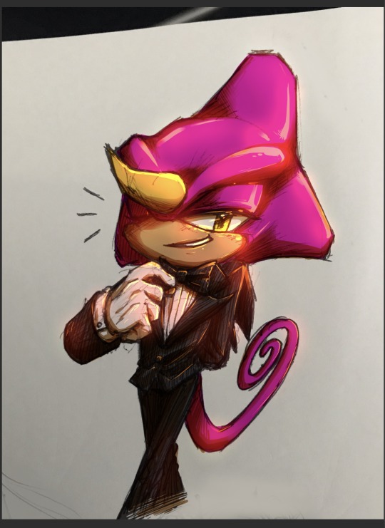
Last step! I go into my flat colour layer again and use a large airbrush in red to hammer home the vibes of this boy is so gd warm. You can use whatever colours you want to radiate but I like red hehe
And we are done!

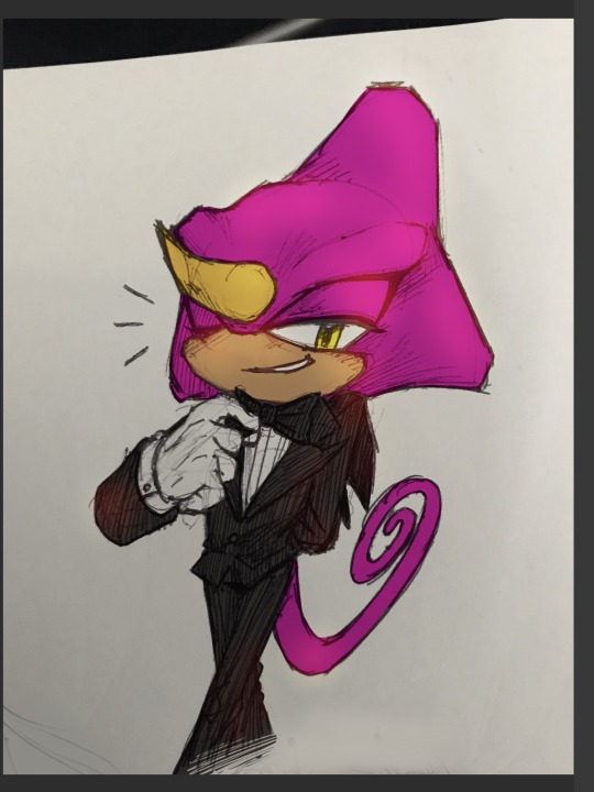
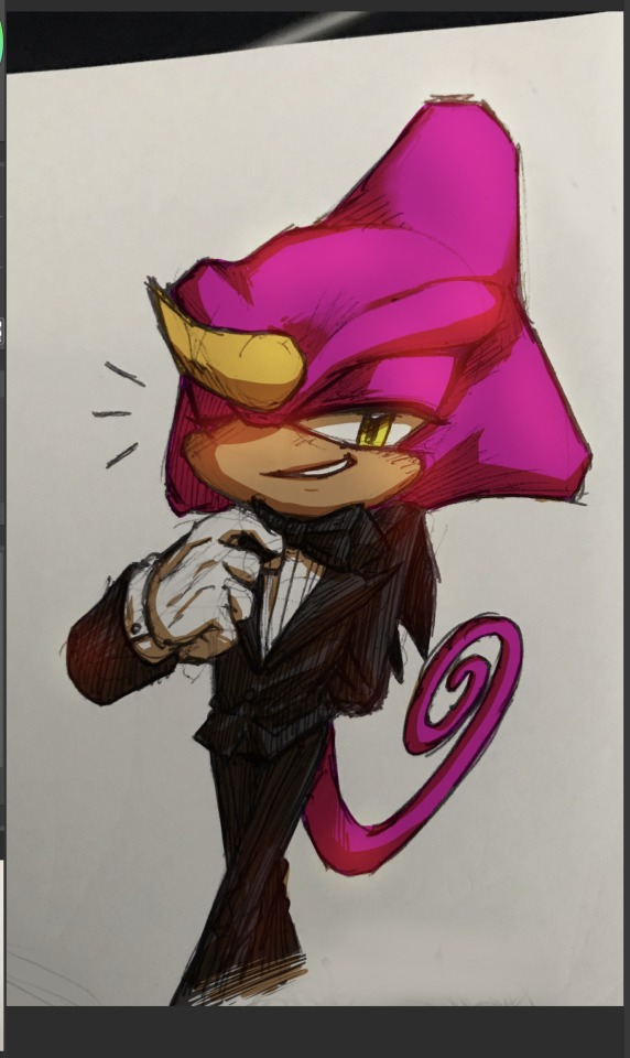
All my traditional sketches with colour are coloured this same way! Hope this was clear and understandable hehe
#sonic#espio the chameleon#sonic the hedgehog#my art#art tips#this isn’t by any means a definitive way to do this but it feels like the easiest to me#Gg multiply layers we love you
25 notes
·
View notes
Note
Did you make the hatching texture you use to fill your drawings yourself? I really like how it looks!
I have! Here's the base.

As you can see I made a line or so by hand and then copy-pasted it to make a full 5347x4343px (don't ask why this number, I messed up creating the canvas but it worked well so far).
I copy the layer with the hatching texture and apply it on a layer above my lineart, increase the size on top and bottom to have thinner hatching, and then I remove the excess. On full illustrations, the lighter hatching is set at 30% opacity and the darker is set at 70% ON TOP of the already existing 30% layer. For quick comics I only use one layer of hatching set at 60% opacity.
(I'm basically using my premade crosshatching like traditional manga screentones, except I made it hatching instead of dots because dots can have weird effects depending on the size of your screen (and also it hurts my eyes haha))


(That's how traditional screentones work, for the ones who have never seen them (pic source : canson.com))
#I can do a full step by step someday if y'all want#from sketch to finish#ask me anything#art#art tips
26 notes
·
View notes
Note
Hi! Your art is stunning and I love how you shade! Would you mind sharing your brush settings?
Thank you!! :'D And sure! I use Paint Tool SAI 2

Now I use this one for.. honestly almost everything. I use it to sketch, to lineart, to render (in both lined and lineless styles), I've been using the same brush for the past 5 years or so with some minimal adjustments to minimum size and density. It's an airbrush tool set to these settings (as you can see from the icon).

This one is also an "airbrush" tool, I use this one with flat face and flat bristle to add painterly strokes while rendering in lineless styles (but I prefer flat face most of the time).
The rest of my tools are on defaults honestly, sometimes I blend with the brush and water tool (but not too much bc I don't like things getting muddy) my main technique involves diffusing colours with non blending brushes as much as possible (using a lot of crosshatching in lineless styles) then blending in areas that really require softening (I've been really enjoying using "flat bristle" with the brush tool recently too!). If you watch my speedpaints (link in my carrd in my bio) you'll get what I mean. I also upload in high qualiity and my full screen so you could see any settings you'd like.Hope this helps!
18 notes
·
View notes
Text
fun little art tip with llilyrose
there's lot of niche terms used to define different aspects of art; e.g. "rendering" is different from "shading" where shading provides depths and rendering includes shading but also includes parts of the process like hue-shifting and gradient charts, or half-tones vs. crosshatching (which is a different thing entirely).
The example I wanted to talk about here is cel shading vs. soft shading!! it's become more relevant in my art as i start pumping out fully rendered pieces and I thought it was notable enough to post.
"`What's the difference?"
here's a chart so you can get at what I'm saying:
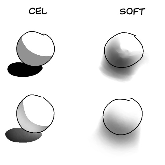
Cel shading is the type of shading you'll see in animation! That's because it's easier to redraw every frame, of course. It's also just a lot more common. While soft shading leans towards a more abstract form of shadows and form, cel is very direct and easier to understand unless the person using soft shading knows what they're doing. it can use fades within its blocky parameters (usually to indicate light bouncing back onto the shadow), but its edges are tend to be pretty crisp.
Soft shading, as the name suggests, focuses on impressionistic shading. this means it will imply something is there instead of making it 100% clear, like you can see in the shadows cast by the sphered shaded in soft. in ibis paint this is seen in the airbrush pen or the pen brush (fade), which i personally rely on while shading.
"which ones better?"
it depends on the situation, of course!
"in which situations should i use each shading?"
I'm glad you asked!
obviously, if your artstyle leans more towards one type of shading than the other, this advice won't mean a whole lot to you, but if your artstyle blends the two it's very important to remember:
cel shading should be used when a light source is close to its object, and can change depending on the brightness of the light. rim lights (the thin lighting you see close to/within lineart) usually come from lights behind the object. think about how bright your light is and what exactly it touches in the art piece.
take this for example:
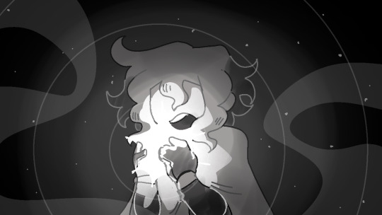
this piece uses a mix of soft and cel shading, but i want you to focus on the cel shading for me here. the lighting is harsh and only touches everything that the star's light would! since it's the only light source, everything else should be practically pitch black, but sometimes you have to sacrifice realistic aspects of your artwork in for it to be intelligible.
this post is MOSTLY about soft shading, though, because I'm most familiar with it and people need help with that the most, evidently.
soft shading should be used to highlight the brightness of an object (think of the "halos of light" that surround real world light sources). in the above piece, everything gets darker the further away it is from the star, and i utilize circles of soft shading for this effect. i also soft shade into a darker color the parts of siffrin that aren't reached by the star to give him some depth. there's some soft shading for clothing wrinkles too but that's just my own style.
soft shading can also be used for distant light sources!
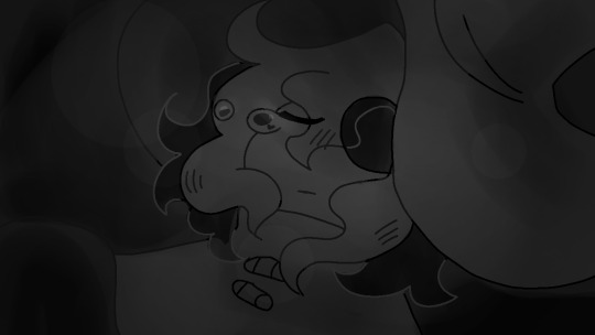
the first image is a subtler example of this effect and the second image is a lot more direct.
you can tell that the light source isn't In His Face because the lines between values aren't super clear. even though the second image's light is bright, you know it's not as harsh as the last example was because the shading isn't as clear cut.
usually when bright light hits an object I'll set a layer to the "add" blending mode and gently airbrush it before setting it to a lower opacity. it's meant to mimic the light that bounces off an object when lightwaves hit it, but this only works in SOME pieces.
(addendum: using soft shading ONLY for your pieces can be difficult if you don't understand how light would normaly hit your object. soft shading works best on rounded surfaces and cel shading works best on sharper ones, like pyramids and cubes and whatnot)
overall both styles of shading are perfect for some things and not so perfect for others. they work the best when you use them together, but they look similarly stunning when used in their own as well!! this post is just meant to give a few tips on a piece of my art process and maybe give you a look into the core of my art style,,,, if anyone has any questions about the things I make my askbox is always open!
#art tips#shading#as im writing this there are dogs BARKING AND HOWLING OUTSIDE. HELP. THEY'VE LITERALLY NEVER DONE THIS BEFORE#WGAT DO I DO???? do we have wolves?? I didn't think there were any whereg i lived. what.
9 notes
·
View notes
Text


it's been a rough art year for me but behind the curtain it's been productive as far as figuring out how i LIKE to draw as opposed to how i think i SHOULD be drawing. ie using my sketches as lineart and using crosshatch shading more. so.
get noi'd idiot
#digital art#procreate#dorohedoro#noi dorohedoro#noi drhdr#love my big cute wife and her big tsundere husband#cw blood
22 notes
·
View notes
Note
We love your art style!! What's your process like?
thank you!!! thats so nice of you :3
so my process differs from piece to piece, but i usually start with a sketch done in thin lines with no pen pressure (like so:)

depending on how the first sketch goes, i sometimes take time to refine it, either by working directly on the sketch or using a new layer and doing something similar to lineart. i havent done lineart with the intent to, well, line for a couple years, though.
next, i throw down some base colors. depending on the complexity of the piece, i do very haphazard unblended shading on this layer just to get the vibe down, which looks sorta like this:

(hello, secret WIP)
from there, i use a chalk pastelly brush to layer on colors and shade how id like. everythings at 100% opacity, i blend by crosshatching or transition colors instead of mixing them together - it turns out something like this:

then, once I've finished the first render, i zoom out and take in the piece as a whole, then add lighting details in the same chalk pastelly way. my process is a LOT of layering :3

here's a recent finished piece!! thx for asking 🫶
3 notes
·
View notes
Note
hi!! I love your art and have been wondering what brushes you use since they always look very smooth
omg thank you so much!!! 😭 that means a lot to me cuz im actually a rly messy artist so ive been trying hard to make my art neater and the lineart cleaner,, i actually use random brushes interchangeably so since theres quite a bit ill just expound below the read more cut :>

so for the entire year or so the main brushes ive used are wendy xu's esterbrook double elastic #135 vintage dip pen mimic and fine point sharpie mimic ! its pay what you like (min $1) and theyre only available on procreate. i highly recc them, they feel SO nice to use! ive been using them a lot esp in the recent (ivantill) comics ive been drawing but also for rendered pieces to clean them up a bit
also rly fun to use for sketching / crosshatching! personally i love to use the mimic gel pen for sketching while the elastic is for clean ups
sometimes i also just use the default ink procreate brushes like "syrup" or "gesinski ink"


for more rendered pieces like the ones above ive been using rinreeper's procreate brush pack (pay what you like, min $0) and marmastry's brush pack (pay what you like, min $0). both of these packs have really lovely brushes that make blending a lot easier, and coloring becomes a lot more fun :> they've been a huge help for me for a long time now (i also used the aforementioned wendy xu brushes for inking and lineart)
these brush packs also come with their own lineart brushes and i sometimes use them too


for pieces that are blockier / not quite as blended i love to use twulf's procreate brush packs, specifically the draw and paint packs. its free and only on procreate! for the draw pack i use "filly 1", while for paint i use "002" and "basic rounded cube". this is perfect if youre not rly looking to blend your colors and rather lay it out as is
OK thats pretty much it, sorry if its incoherent in any way i wasnt sure how to like. format this;; but these are the brushes ive been using d entire year 🫡
6 notes
·
View notes
Text
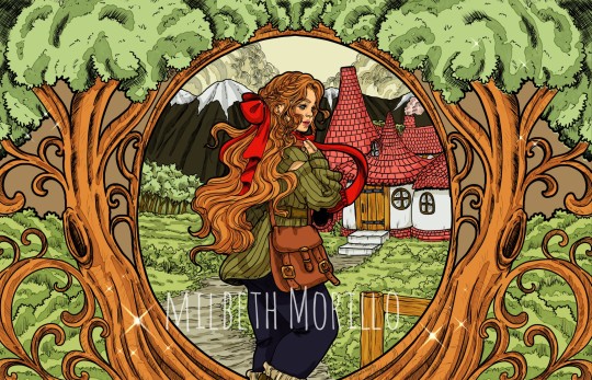
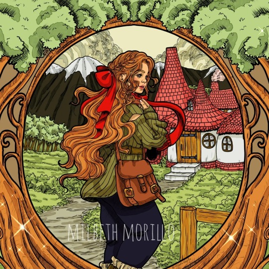
Saw this Manga cover called "A Witch hat Atelier" and I got a hit of inspiration, also made me remember old RPG games like Rhapsody a musical adventure, legend of mana and many others, so I drew something without references and I think I ended up drawing my dream house 😂 I really just wanna be the forest witch, Baba yaga is my rol model lol. I also wanted to keep it simple with the coloring and shading and just let the old style Lineart with crosshatch be the star.
#illustration#fantasy art#fairy#fairy tales#storybook#picture books#crosshatching#ink illustration#fantasy illustration#fantasy#cottagecore#cottage aesthetic#cottage witch
9 notes
·
View notes
Text
So, my best friend (hi) and I have been talking a lot about Jax/Holt over the past few days ever since I got them also obsessed with Monster High. And we (by that I mean I) decided on who our "main cast" would be for our version of Monster High. And that cast is:
Jackson/Holt, Deuce Gorgon, Clawd Wolf, Clawdeen Wolf, and Draculaura!
So, I've decided to redesign all of them! Save Jax/Holt, because I redesign them too often anyways. So I'm going to start out with Clawdeen, since I had the most inspiration for her! And I've decided to share a bit of my creative process here as well, so if you're interested, continue reading!
Starting out with the first step I take in a redesign: the concept sketch.
This is usually a tiny, tiny sketch somewhere in my sketchbook mapping out the basic design. I took heavy inspiration from Moonlight Jewel's OOAK Clawdeen doll, Haunt Couture Clawdeen, and Wave 1 Clawdeen. I don't usually map in colours here, I keep those bouncing around in my brain.
The next step I take is: the headshot.
Pretty simple. I get a feel for how I want the character's face to look. Most of the time I use what I've coined the "Pinterest girl stare"; ie, no readable expression. I changed Clawdeen up a little bit in the final, but I still like this bust!
Next, I finally start on the full body ref!
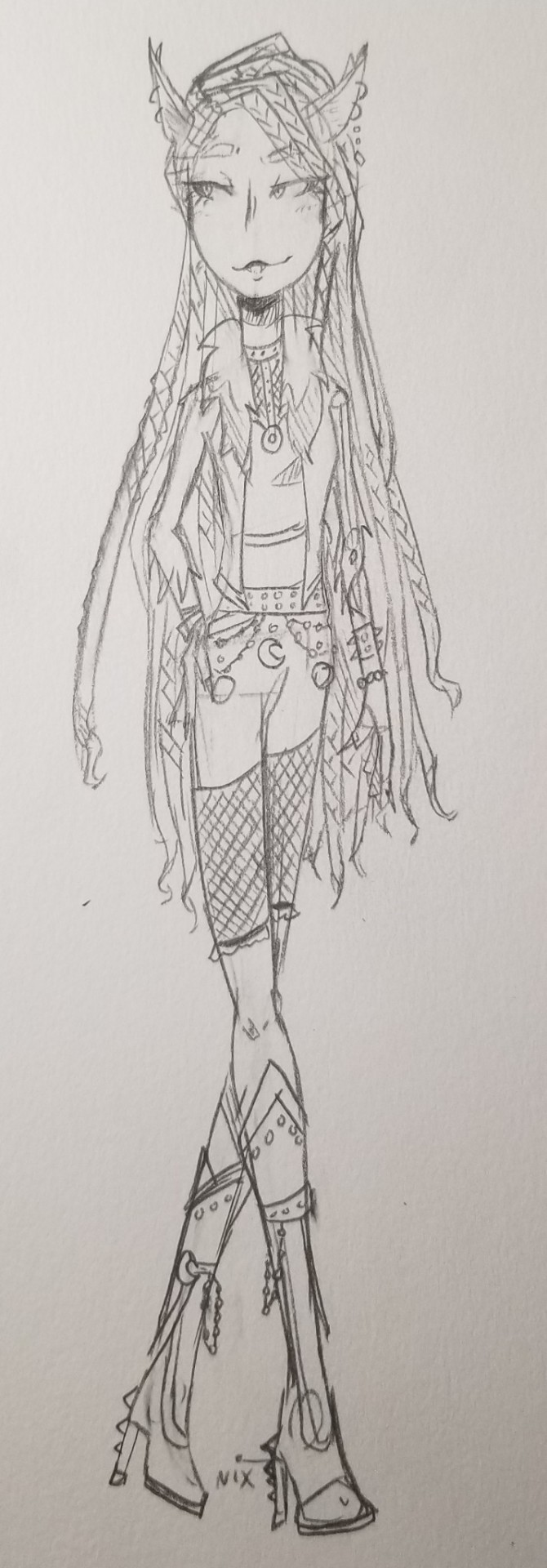
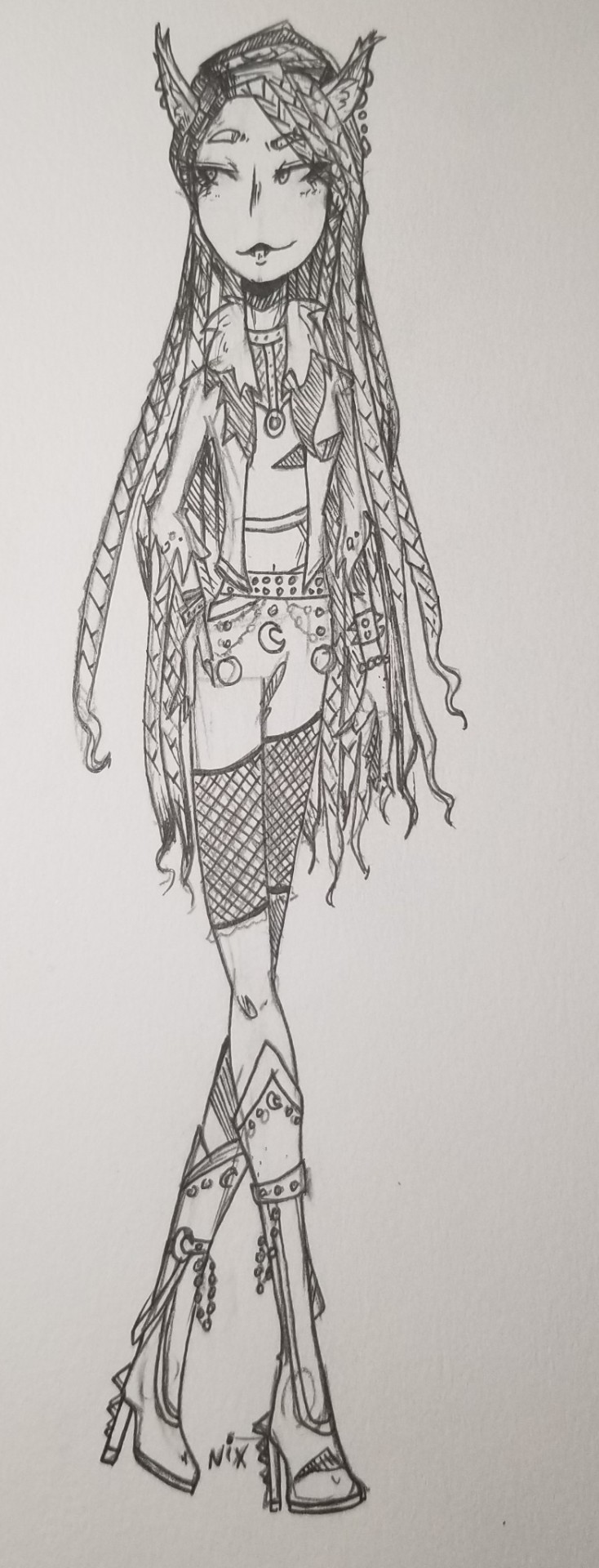
I lumped the sketch and lineart together for simplicity's sake. The lineart is where I add most of the finer details, crosshatching, and decide what I do or don't want. Ex: I ended up cutting the ruffles off the end of her fishnets. You might also notice I didn't ink the chains on her belt- that's because I knew at this point that her pants would be black, so I wanted to ink the chains in white later. (Her hair was super fun to do here btw!! I love drawing undercuts and I love drawing braids, so it's a fun culmination of both!)
And once it's coloured, we have the final design!
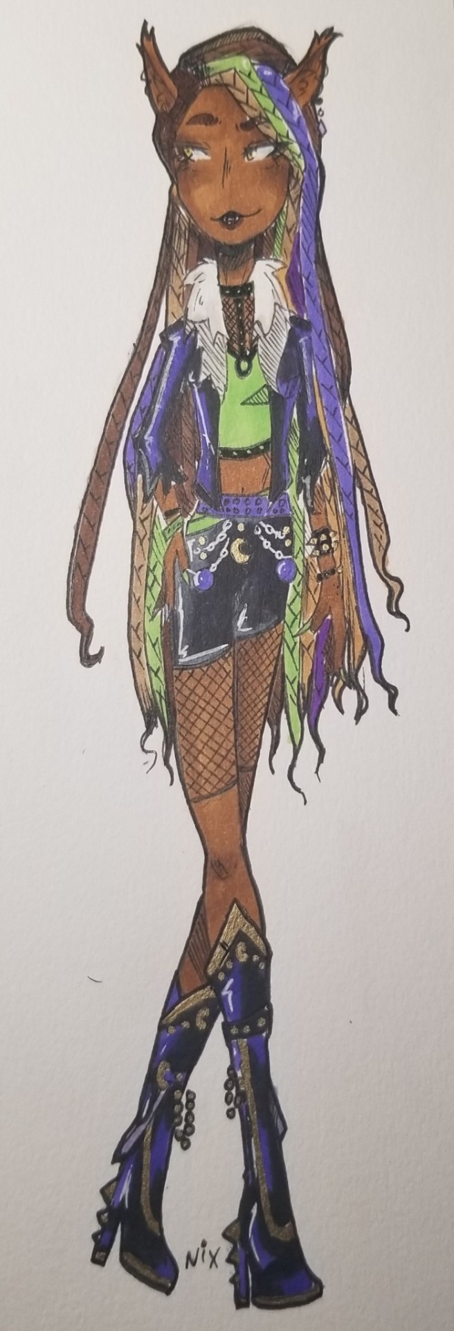
Overall, I think she turned out great! I've always loved how freaky fab Clawdeen looks in green, and ofc neon green is my fave colour. I'd sell multiple of my organs to have this as a doll.
Hope you love this redesign, and stick around for the next part!! 🦇💕
#monster high#hee ho ha ho im a funny lil art man#monster high fanart#monster high redesign#clawdeen wolf#monster high clawdeen wolf#clawdeen#ghoulboss!!#love how she came out...#she was literally so fun#I'll probably design casual fits for the main 5#but thatll be later LMAO#her shoes are basically just boot-versions of her haunt couture shoes#because id kill for those shoes actually#gasfright gatecreep ghoulboss#anyways enjoy ur food clawdeen lovers <33
7 notes
·
View notes