#Mobile-First vs Responsive Design
Explore tagged Tumblr posts
Visit Tumblr Blog
Explore Tumblr blogs with no restrictions, modern design and the best experience.
Last Seen Tumblr Blogs


Fun Fact
130K people were victims of a chain letter scam that affected Tumblr in May 2011.
Text
Explore the world of mobile-first UX design! Learn its importance, principles, and best practices to create exceptional user experiences for mobile users. Unlock business growth with a mobile-first approach.
#Mobile-First UX Design#User Experience Design#Mobile-First Design Principles#Responsive Web Design#Mobile UI/UX Best Practices#Importance of Mobile-First Design#Mobile SEO Optimization#Touch-Friendly Design#UX Design Case Studies#Mobile-First vs Responsive Design#Mobile-Friendly Websites#Simplified Layouts for Mobile#Accessibility in UX Design#Mobile User Engagement#UX Tools for Mobile Design#Instinct Design Studio
0 notes
Text
Humans Are Extinct TWST Yandere AU Masterlist pt 2
Links to my various HAE stuff, some mobile devices do not show the links properly.
Warnings: Yandere Twisted Wonderland AU, Minors Do Not Interact, Monster Twisted Wonderland AU, Fics and Head Canons, Links,
Link to pt 1:
Link to pt 3:
Group Headcanons: - Hoof Care (Riddle, Trey, Silver) - Rile the Dogs (Jack, Ruggie, Sebek) - Can Ace and Deuce Share? - Plucking (Vil, Neige, Crowley, Ambrose) - Waterproof? (Sebek, Vil, Crowley, Jack, Ruggie) - Dry Heaving (Ruggie, Sebek, Jack) - Divus is Parental Over Human (The Hoard, Malleus, Divus) - Vil vs Lilia - Introducing The Human to Trottr (Idia, Azul, Erikir, Lilia)
NSFW Group Head Canons: - General Anatomy? NSFW - Accidental 'Excitement' Centaurs NSFW - Human-Fuckers pt 1 NSFW - Human-Fuckers pt 2 NSFW - Centaur Logistics NSFW - More Logistics NSFW - First Horizontal Tango w/ Human NSFW - Walk in on The Human NSFW Pt 1 (Riddle, Leona, Jamil, Rook, Idia, Malleus) - Walk in on The Human NSFW Pt 2 (Vil, Lilia, Sebek, Jade) - Human Wants to Lose their Virginity - Monster Response to Tail Being Grabbed (Mix of SFW/NSFW) - Intimacy and the -taur (Cervitaur, Centaur, ect) - Monsters and Hookup Culture - Oral - Feeding Kink
General Head Canons (Including how the character looks in the AU) - Part 1 (Riddle, Silver, Grim) - Part 2 (Rook, Vil, Leona) - Part 3 (Ortho (Platonic), Ruggie, Lilia) - Part 4 (Riddle, Leona, Ruggie, Vil, Rook, Grim (Platonic), Ortho (Platonic), Idia, Silver, Lilia) - Part 5* (Malleus, Papa Hades, Riddle*, Azul, Jamil, Epel, Trey)
Individual Head Cannons Ace Trappola: #Hae Ace -
Deuce Spade: #Hae Deuce -
Cater Diamond: #Hae Cater - Cater Headcanons - Cater and Poachers - Cater Using Split Card (NSFW) - Will Cater Forgive Himself?
Trey Clover: #Hae Trey - Kelpies and Humans?
Riddle Rosehearts: #Hae Riddle - Riddle's Star HCs - Does he regret telling others MCs status as a virgin? - How do Unicorns Sense Virginity? - Riddle's Weapon* - Flowers - Riddle's Mane - Riddle and Swimming
Che'nya Pinker: #Hae Che'nya - General Heacanons - Bathing - Toe Beans - Territorial Grim - Kitsune vs Bakeneko Roots
Jack Howl: #Hae Jack - General Head Canons - Floofy Jack
Ruggie Bucchi: #Hae Ruggie - What is a Gnoll? - Ruggie and Human Food - Feed the Gnoll - Ruggie is a Gnoll - Grammy? - Cackle Ranking - Kiss on the Nose
Leona Kingscholar: #Hae Leona - Biting Him (NSFW)
Floyd and Jade Leech: #Hae Jade #Hae Floyd - General Head Canon (Jade) - General Head Canon (Floyd and Jade) - Hearts? (Jade and Floyd) - Cuddle Autistic Human (Floyd) - Mushrooms and Jade - Would they Gather Scales for The Human? - Floyd Finds The Human Hiding in Rook's Shed
Azul Ashengrotto: #Hae Azul - Is Azul Venomous? - Insecure - The Human Bites Azul (NSFW) - How Does Azul's Poison Work? - Azul Feeding His Tentacles to The Human pt 1 - Azul Feeding His Tentacles to The Human pt 2
Jamil Viper: #Hae Jamil - Coil Jail - Freeing Jamil - Human Proposes
Kalim Al-Asim: #Hae Kalim - General Headcanons - Wish on Kalim? (+ 2 other Questions) - Kalim's Wishes - Kalim's Lamp - Kill Count - Genie Reproduction - Destroy Lamp - To Kill A Genie - Kalim's Designs - Kalim and NRC - Genies and Food - Genies and Lamps - Time Inside The Lamp - Calm Kalim
Epel Felmier: #Hae Epel - Tree Nymph? - Epel Loses a Limb
Rook Hunt: #Hae Rook - Rook and Small Spaces (Partly NSFW) - Rook's Pupils (NSFW) - Rook Makes Clothes (NSFW) - The Most Dangerous Game HCs - Rook and Human Mimic - Rook and Napping Human - How Does Intimacy w/Rook Work? (NSFW) - Rook Shedding His Exoskeleton - Hiding In Rook's Shed pt 1 - Hiding In Rook's Shed pt 2
105 notes
·
View notes
Note
hi! so I had a question, how long did it take you to build a following on tumblr? how long have you been writing for spn as a whole (I assume you started with it but I’m not sure I meant when did you start writing on the app mostly) and do you think it usually takes as long as it did for you for other people? (I hope the wuestion made sense)
Hi there, lovely anon!
Oh, these are great questions, and I'm happy to answer. I'm going to be referencing this post, as someone asked me a similar question.
I also talk a lot about my beginning fanfic/coming to Tumblr experience and building a following in this interview I did with the @idlingintheimpalapodcast.
That being said, here's how I got started in SPN fandom and on Tumblr, and 6 Tumblr Tips related to how I've tried to grow my blog:
Learn How Tumblr Functions
Create a Tag List
Posting Schedules, Announcements, and Sneak Previews
People are Visual (Use Images & Design Elements) + shoutouts to blogs I looked to for inspo
Support Your Fellow Writers! Reblog/Comment on What You Read & Enjoy
When I Do Get Engagement, I Reply to Comments and Reblogs
Deeper dive below the cut:
Writing for SPN & Starting on Tumblr
To be honest, I'm a bit late to the party when it comes to Tumblr. I've written for many different fandoms over the 15 years or so I've been writing fanfic, but I've been writing for Supernatural in particular since around 2015. I wrote on platforms like Fanfiction.net, and later I moved over to Ao3.
I dabbled with Tumblr starting in 2021 while I was working on a Billy Butcher x OC story for the Boys (And So It Goes). But after watching the last season of SPN, I got the SPN bug again, so I started dipping back into the fandom.
But I wasn't really that active on Tumblr until January 2023, when I wrote my first soulmate AU series for Dean Winchester, called Never Say Goodbye (Dean x soulmate!Reader).
That started a very fun journey for me in the Tumblr world, engaging with people and making friends here with awesome people! 💕
Now, here are a few tips on what I've learned in building my following. You don't have to do exactly what I did. This is just my advice based on my personal experience here:
Tip #1: Learn How Tumblr Functions
Everything has been a process of trial and error. I have a professional background in content and social media marketing, so that knowledge has helped me a lot with some elements I'll get into later.
But it took me time to learn the Tumblr landscape. I had to figure out:
Why it's important to reblog -- not just your own work in replying to people's comments, but what you read and enjoy. It's what makes Tumblr go 'round.
The different mobile vs. desktop views and functions.
How to format my posts and use hashtags that would best optimize my fics and posts, based on the most followed tags in the fandom I was writing for.
How to create design elements, like banners, dividers, and headers that matched my aesthetic and the fandom.
Make sure my blog is easy to read, visually, and easy to navigate, technically (links to my masterlists, series masterlists, tag list, my fic library side blog, Patreon, etc.).
I'm still adjusting all these things now and then as I figure out new ways to keep readers engaged, and make my blog as easy to navigate as possible.
Tip #2: Create a Tag List
A tag list is a list of blog users that request to be tagged in your upcoming fics. (See this post on tips for formatting tag lists and optimizing hashtags on posts.)
Some authors don't do tag lists anymore because they find it a hassle (and it can be), but even if you're just starting out, advertise your tag list -- I suggest at the end of a fic and in your bio, your masterlist, and/or navigation page. It will get more eyes on your posts, and hopefully more engagement.
I used Google Forms to build up my tag lists because it's easy to use and it creates a Google spreadsheet for you based on the responses you get (an idea I got from another writer who was doing the same thing). You can also create more sheets within the file to organize the responses by character, for example.
On my tag list, I gave readers options to choose which character they wanted to be tagged on based on the fandoms I write for. I also created tag lists for new series to go with the series masterlist. Like I said above, I created spreadsheets for each of these lists within my tag list form master sheet.
Now, you don't have to do it exactly this way. There are many ways to keep track of a tag list.
Some people may think my approach is too much work, but this was very successful for me in building up my tag lists and increasing my following. Staying organized is key! 🤓✌🏽
I have since created a side blog @zepskieswrites for people to follow with notifications on.
Tip #3: Posting Schedules, Announcements & Sneak Previews
When my blog started to gain traction from my first SPN series, I knew I wanted to post consistently to keep people's interests. For me, this meant once a week (sometimes more if the mood strikes me), to keep that momentum going. YouTube vloggers do the same thing for this reason. They have a set posting schedule and give announcements.
You don't have to post once a week. You don't even have to have a set schedule. That's just what I did last year to increase engagement, but also because I love to write, I was getting inspired, and I made the time for it!
Remember that writing and sharing your work and being a part of the fandom on Tumblr is supposed to be fun! At the same time, what you get out of something depends on how much time you have to put into it.
Basically what I’m saying is, I’ve put a lot of time and energy into my writing and my blog, but only because it’s been very fun to do it! 😉
Now, going back to being consistent. It can help you! When people know they have content waiting for them by a certain timeframe, and they see that you stick to that deadline, they're more likely to tune in and engage with your work.
Of course, real life comes first, always, and things can derail you, but on the whole I make sure that I keep my word when I say I'm going to post something. Tumblr has a scheduling feature that allows you to schedule posts ahead of time, which I use on a daily basis. That can help you as well.
To try and generate buzz around new stories, I give writing updates or announcements, often with sneak previews, and the dates when I plan to drop the upcoming story. When I'm writing a series, on each chapter I give a preview of the next one, so I can try to keep people invested and waiting for the next chapter.
Tip #4: People are Visual (Use Images & Design Elements)
A huge element of successful content and social media is visuals. The first thing people are often drawn to when they look at a web page, an ad, or any kind of digital content is the picture -- and any other visual elements. Then they look at the title/headline, followed by the rest of the story.
This is why I always lead with the title of the story/headline and a GIF or image at the top of the post for a story. Draw readers in with their eyes to the visual, and then the content. I now create my own design elements, including story headers.
When I got started here on Tumblr, I also took a closer look at how other popular blogs I admired were organizing their masterlists, formatting their stories with banners, dividers, tags/warnings, word count, creating tag lists, and more -- both to create their blog aesthetic and to make it easier for readers to enjoy their work on different levels -- the content itself, and the visual elements.
Shoutouts to some of those writers I looked to, who have a lovely blog aesthetic and organization: @luci-in-trenchcoats @deanwinchesterswitch @deanbrainrotwritings @dean-winchester-is-a-warrior
Form and function is a balance, and they should work together. For example, there are some design/post formatting elements that are getting popular now on Tumblr that I personally don't vibe with, because I think it takes away from the reader's experience.
Like making the entire post or story in small case. Readers that have trouble seeing small fonts won't want to read this.
or making everything in the story lower case. this just bothers me for grammatical reasons. guarantee i will be turned off from reading. 😂
Also, most people browse Tumblr on their phone rather than on desktop. (About 62% according to current Semrush statistics.) So certain things that are small in your desktop version will be even smaller on mobile.
If you have a custom blog design, some design elements may not transfer well visually on mobile vs. desktop, and vice versa. So you'll want to check both versions to see how it looks, and possibly make adjustments.
Now, this isn't to say you have to become a graphic designer if that's not your thing. There are plenty of people who share their lovely designs for free, as long as you make sure to credit them if you use one of their banners, dividers, etc. Check out @cafekitsune and @firefly-graphics, for example.
Some of them even take requests. Just make sure to check their bio to see if they state whether they're currently taking requests or not. (This also goes for writers on fic requests.)
Tip #5: Support Your Fellow Writers! Reblog/Comment on What You Read & Enjoy
This is part of the fun when you start truly engaging with the fandoms you love.
Likes are cool. Comments are wonderful. Reblogs with comments are awesome, because not only do they get that engagement/feedback that they can reply to, but the reblog helps your fellow writers get seen. And while they aren't obligated to, they might be more inclined to do the same for you.
You'll also start to develop relationships within your fandom community. This is how I've made many friends and gained new readers on Tumblr -- by reblogging, sharing, commenting on what I liked about the fics I read. 💜
I try my best to support my fellow writers, no matter how new or how popular they are. Just because a writer has a bigger following, doesn't mean they appreciate feedback any less.
Feedback gives us writers energy and fuels us to write more. It can lead to more inspiration, and to continue the series you might be so invested in.
So if I took the time to read something, if I enjoyed it, I'm usually reblogging it and sharing my thoughts, even if it's just a gif or a couple of lines, or a long raving review. 💖
Tip #6: When I Do Get Engagement, I Reply to Comments and Reblogs
Along with supporting my fellow writers, engaging with the lovely people who read my work is just good fun! It's the best part of sharing my work on here and on Ao3. And it lets them know that you value and appreciate them for taking the time to comment and/or comment in a reblog. 💓💓💓
I hope these tips are helpful! Now, to answer your last question...
Do you think it usually takes as long as it did for you
[to build a following] for other people?
Interesting, but the truth is, I'm not sure. My knowledge of content and social media marketing has probably given me a leg up, I think, even though it took me a while to learn the Tumblrscape. I've also been writing fanfic for a long time. Long before I ever heard about Tumblr.
I've spent years studying literature, creative writing, and screenwriting, and putting it into practice. I've spent years writing for other voices besides my own, outside of the fanfic world. Like anyone else, I can only go by what I've learned, my own instincts, my frame of reference, and what I want to write about next.
Like anyone else, I can only hope that what I put out there vibes with people and touches them in some way, enough that they feel comfortable letting me know what they thought about it. 💜
In the meantime, I'll just keep getting inspiration from this guy (and other characters):

#zepskies answers#how to build a tumblr following (in my experience)#dean winchester#dean winchester x reader#soldier boy#spn#the boys#dean winchester x you#jensen ackles#supernatural#dean winchester imagine#spn fanfic#dean winchester fanfiction#jackles#sam winchester#sam winchester x reader#supernatural x reader#soldier boy x reader#soldier boy fanfiction#russell shaw x reader#russell shaw#tracker#beau arlen#beau arlen x reader#dean winchester x oc#priestly x reader#alec mcdowell x reader#jason teague x reader#billy butcher#cj braxton x reader
67 notes
·
View notes
Note
New to Egg lore so this may have been answered before, but why does Egg occasionally have a bandage around her leg? I understand she uses mobility aides and you can totally ignore if you don't want to answer.
I'm so sorry, as I typed this out it became an info dump about my fursona I'm so sorry
She did!! When I first got her as an adoptable, she had a bandage and little horns! As she's changed and as I healed from what I was going through at the time, the bandages slowly made their way out of her design! Sometimes I post older art of her that I've forgotten about, so if she's wearing a bandage it's smth from last year or older :3 Heres her original design vs her current! :3


And she still has her horns in a sense! She has a Deviled Egg form where she gets horns and a third eye! :3 she transforms into Deviled Egg when she experiences intense emotions of any kind

She also has a celestial form! Has similar elements to the Devilled form, except pink and leaves a trail of rainbow light behind her while a golden ribbon twirls around her :3

Sorry for the long response, I love Egg sn and I especially love talking abt their lore! :"3
113 notes
·
View notes
Text
The Ultimate Guide to SEO: Boost Your Website’s Rankings in 2024
Search Engine Optimization (SEO) is a crucial digital marketing strategy that helps websites rank higher on search engines like Google, Bing, and Yahoo. With ever-evolving algorithms, staying updated with the latest SEO trends is essential for success.
In this comprehensive guide, we’ll cover: ✔ What is SEO? ✔ Why SEO Matters ✔ Key SEO Ranking Factors ✔ On-Page vs. Off-Page SEO ✔ Technical SEO Best Practices ✔ SEO Trends in 2024 ✔ Free SEO Tools to Improve Rankings
Let’s dive in!
What is SEO? SEO stands for Search Engine Optimization, the process of optimizing a website to improve its visibility in organic (non-paid) search results. The goal is to attract high-quality traffic by ranking for relevant keywords.
Types of SEO: On-Page SEO – Optimizing content, meta tags, and internal links.
Off-Page SEO – Building backlinks and brand authority.
Technical SEO – Improving site speed, mobile-friendliness, and indexing.
Why SEO Matters ✅ Increases Organic Traffic – Higher rankings = more clicks. ✅ Builds Credibility & Trust – Top-ranked sites are seen as authoritative. ✅ Cost-Effective Marketing – Outperforms paid ads in the long run. ✅ Better User Experience – SEO improves site structure and speed.
Without SEO, your website may remain invisible to potential customers.
Key SEO Ranking Factors (2024) Google’s algorithm considers 200+ ranking factors, but the most critical ones include:
A. On-Page SEO Factors ✔ Keyword Optimization (Title, Headers, Content) ✔ High-Quality Content (Comprehensive, Engaging) ✔ Meta Descriptions & Title Tags (Click-Worthy Snippets) ✔ Internal Linking (Helps Google Crawl Your Site) ✔ Image Optimization (Alt Text + Compression)
B. Off-Page SEO Factors ✔ Backlinks (Quality Over Quantity) ✔ Social Signals (Shares, Engagement) ✔ Brand Mentions (Unlinked Citations Still Help)
C. Technical SEO Factors ✔ Page Speed (Google’s Core Web Vitals) ✔ Mobile-Friendliness (Responsive Design) ✔ Secure Website (HTTPS Over HTTP) ✔ Structured Data Markup (Rich Snippets)
On-Page vs. Off-Page SEO On-Page SEO Off-Page SEO Optimizing content & HTML Building backlinks & authority Includes meta tags, headers Includes guest posts, PR Controlled by you Requires outreach Both are essential for a strong SEO strategy.
Technical SEO Best Practices 🔹 Fix Broken Links (Use Screaming Frog) 🔹 Optimize URL Structure (Short, Keyword-Rich) 🔹 Improve Site Speed (Compress Images, Use CDN) 🔹 Use Schema Markup (Enhances SERP Appearance) 🔹 Ensure Mobile Responsiveness (Google’s Mobile-First Indexing)
SEO Trends in 2024 🚀 AI & Machine Learning (Google’s RankBrain, BERT) 🚀 Voice Search Optimization (Long-Tail Keywords) 🚀 Video SEO (YouTube & Short-Form Videos) 🚀 E-A-T (Expertise, Authoritativeness, Trustworthiness) 🚀 Zero-Click Searches (Optimize for Featured Snippets)
Free SEO Tools to Improve Rankings 🔎 Google Search Console – Track performance. 🔎 Ahrefs Webmaster Tools – Analyze backlinks. 🔎 Ubersuggest – Keyword research. 🔎 PageSpeed Insights – Check site speed. 🔎 AnswerThePublic – Find user queries.
2 notes
·
View notes
Text
Why Noida is Becoming the Hub for Innovative Website Design Services
Introduction
Noida, a bustling city near India’s capital, has rapidly evolved into a major IT hub. With an increasing number of startups and tech companies, the demand for website design services has surged. Businesses now understand that a well-designed website is crucial for success in the digital era. But why has Noida emerged as a leader in innovative website design? Let’s explore.
Why Noida is the Preferred Destination for Web Design
Strategic Location and Connectivity
Noida enjoys excellent connectivity to Delhi and other major cities, making it a prime location for IT companies. The presence of high-end infrastructure, affordable office spaces, and a well-developed tech ecosystem further strengthens its position.
Thriving IT and Startup Ecosystem
With the rise of digital transformation, Noida has become a hotspot for IT startups. Several businesses look to Noida-based web designers to craft high-performance, visually appealing websites.
ArtAttackk: Leading the Way in Noida
Introduction to ArtAttackk
Among the top web design agencies in Noida, ArtAttackk stands out with its innovative approach. Specializing in creating user-centric websites, the company has gained recognition for its creativity and expertise.
Unique Services and Expertise
ArtAttackk offers a wide range of services, including UI/UX design, branding, and e-commerce solutions. Their ability to blend aesthetics with functionality makes them a preferred choice for businesses.
Success Stories and Client Testimonials
Many well-established brands and startups have benefited from ArtAttackk’s services, with clients praising their strategic approach and modern design aesthetics.
Affordable and High-Quality Services
One of the reasons Noida is booming in website design is the affordability factor. Compared to cities like Mumbai and Bangalore, Noida offers high-quality services at a fraction of the cost, making it a go-to destination for businesses worldwide.
The Role of Skilled Talent Pool
Presence of Top-Tier Professionals
Noida is home to some of the best IT professionals and designers. The city’s booming job market attracts skilled individuals who push the boundaries of web design.
Contributions from IT Institutes and Universities
Reputed institutions like Amity University and NIIT supply a steady stream of talented web designers and developers, ensuring continuous innovation in the industry.
Advanced Technologies in Website Design
AI and Machine Learning in Website Development
Modern web design agencies in Noida leverage AI to enhance user experience. Features like chatbots, automated customer support, and AI-driven personalization are becoming the norm.
User Experience (UX) and UI Innovations
Companies like ArtAttackk focus on UX/UI to ensure seamless navigation and engaging interfaces that keep visitors hooked.
Custom Web Design vs. Templates: What Works Best?
While pre-made templates are budget-friendly, custom-built websites offer greater flexibility and uniqueness. Noida-based firms provide tailored solutions that align perfectly with business goals.
Mobile-First Approach in Web Development
With mobile users surpassing desktop users, responsive web design is a priority. Noida’s web designers ensure seamless experiences across all devices, boosting customer engagement.
E-Commerce Boom and Noida’s Role
Noida’s web design industry has significantly contributed to the growth of e-commerce businesses, providing tailored solutions for online stores, payment integration, and customer-friendly layouts.
SEO and Digital Marketing Integration
Noida’s web design agencies don’t just build websites—they optimize them for search engines. This ensures businesses rank higher on Google, driving more traffic and conversions.
The Rise of Freelancers and Agencies
Apart from established agencies like ArtAttackk, Noida also has a growing community of skilled freelancers who provide quality web design services at competitive prices.
Government Initiatives Supporting IT Growth
The Indian government’s Startup India initiative and other policies have played a key role in promoting Noida as an IT hub, further fueling the web design industry.
Challenges and Future Trends
Despite its success, Noida’s web design industry faces challenges like increased competition and evolving technologies. However, with AI, AR/VR, and voice search optimization on the rise, the future looks promising.
Conclusion
Noida has firmly positioned itself as a leader in website design services. With a mix of affordability, skilled talent, innovative agencies like ArtAttackk, and cutting-edge technology, the city continues to attract businesses looking for high-quality web solutions.
FAQs
Why is Noida emerging as a web design hub? Noida offers a combination of skilled professionals, affordable services, and a strong IT ecosystem, making it a top choice for web design.
What makes ArtAttackk stand out? ArtAttackk excels in creative and user-centric designs, offering customized web solutions for businesses of all sizes.
Are web design services in Noida affordable? Yes, Noida offers high-quality web design at competitive prices compared to metro cities like Mumbai or Bangalore.
How important is UX/UI in web design? A well-designed UX/UI enhances user engagement, leading to better conversions and business growth.
What future trends will shape Noida’s web design industry? AI-driven design, AR/VR experiences, and voice search optimization are expected to play a significant role in the coming years.
2 notes
·
View notes
Text
Choosing the Right Shopify Theme for Your Online Store: A Complete Guide

Selecting the right theme is crucial to the success of your Shopify store. It sets the tone for your brand, influences user experience, and plays a vital role in converting visitors into customers.
Why Shopify Themes Matter
Shopify offers an extensive marketplace of themes, both free and paid. Each theme comes with its unique layout, customization options, and features. The theme you select dictates the overall look and feel of your store. A well-designed theme can:
Boost Engagement: Visual appeal is one of the first things customers notice. A clean, intuitive design keeps visitors on your site longer, reducing bounce rates.
Enhance User Experience: A theme that’s easy to navigate makes the shopping process smoother for customers, improving overall satisfaction.
Increase Conversions: With optimized layouts and responsive designs, the right theme can lead to higher sales.
Improve SEO Performance: A theme optimized for mobile devices, fast loading times, and clear navigation structures will positively impact your store’s search engine rankings.
Features to Look for in a Shopify Theme

When choosing a theme, it’s essential to look beyond the aesthetic. Here are some key features to consider:
1. Responsive Design
Your customers may be shopping from a variety of devices, from desktop computers to smartphones. A responsive design ensures that your store looks great and functions seamlessly across all devices. This is also a crucial factor for SEO, as Google prioritizes mobile-friendly websites in its search results.
2. Customizability
No two stores are the same, and neither should their themes be. Look for themes that offer extensive customization options. This allows you to tailor the design, colors, fonts, and layout to align with your brand.
3. Fast Loading Time
Site speed is critical for user experience and SEO. A slow-loading site frustrates visitors and drives them away. Make sure the theme you choose is optimized for performance to keep users engaged and improve conversion rates.
4. Integration with Apps
Your Shopify store likely uses various apps to enhance functionality. From marketing automation to customer support tools, a good theme should integrate smoothly with Shopify’s vast ecosystem of apps, providing a cohesive experience.
5. Support and Updates
Themes should be regularly updated to keep up with platform changes and security improvements. Ensure that your theme developer provides ongoing support and updates, so your store remains functional and secure.
6. SEO Optimization
Many Shopify themes come with built-in SEO features, including clean HTML coding, fast page load times, and mobile-friendliness. These features are vital for improving your store’s visibility on search engines.
Free vs. Paid Shopify Themes
One major decision when choosing a theme is whether to go for a free or paid option. Here’s a quick comparison:
Free Themes: Shopify’s free themes are simple, clean, and functional. They’re great for beginners or those on a budget. However, they usually offer limited customization and features.
Paid Themes: Premium themes come with more advanced features, extensive customization options, and higher-quality design. They are typically more optimized for performance and SEO. The investment in a paid theme can significantly impact your store's success by providing a polished, professional appearance and better user experience.
How to Choose the Right Shopify Theme for Your Business
Choosing a theme can be overwhelming with so many options available. Here’s a step-by-step guide to help you narrow down the right one for your business:
Understand Your Niche: Your store's theme should reflect your niche. For example, a minimalist theme works well for a luxury fashion store, while a vibrant and playful theme might suit a kids' toy store.
Consider Your Branding: Make sure the theme aligns with your brand colors, fonts, and messaging.
Check Reviews: Always read reviews before purchasing a theme. Look for feedback on the theme’s performance, ease of customization, and support.
Preview the Theme: Most Shopify themes allow you to preview your store’s design before committing. This helps you get a real-time feel of how the theme would look with your products.
Test Responsiveness: Check how the theme appears across different devices to ensure a seamless shopping experience for your customers.
Introducing Impression - Premium Shopify Theme by Arham Web Works
If you’re looking for the perfect Shopify theme, look no further than Impression - Premium Shopify Theme by Arham Web Works. This theme is designed to help your e-commerce store stand out and provide a top-tier shopping experience for your customers.
Key Features of Impression:
Fully Responsive Design: No matter where your customers are shopping from—whether it’s a desktop, tablet, or smartphone—the "Impression" theme ensures a flawless experience across all devices. This leads to better user engagement and satisfaction.
Customizable Layouts: With a range of layout options, you can tailor the look and feel of your store to match your brand. Choose from various pre-designed templates or create your own to match your unique vision.
Performance-Optimized: "Impression" is designed to be fast and lightweight, ensuring that your store loads quickly. This enhances customer experience and helps with search engine rankings.
Boost Conversions: With "Impression," you can expect up to a 20% increase in conversions, thanks to its intuitive design and customer-focused features.
Easy Integration: The theme works seamlessly with Shopify’s app ecosystem, so you can enhance your store’s functionality without any technical headaches.
Choosing the right Shopify theme is essential for the success of your online store. With the Impression - Premium Shopify Theme by Arham Web Works, you get a beautiful, functional, and conversion-optimized design that will take your e-commerce business to the next level.
2 notes
·
View notes
Text
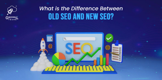
What is the Difference Between Old SEO and New SEO?
Introduction
Search engine optimization (SEO) has a rich history, spanning several decades, and has adapted to the ever-changing digital landscape. The days of keyword stuffing to boost a website's search ranking are long gone.
In today's digital environment, search engines have evolved, becoming more sophisticated with ever-changing algorithms.
In this blog, we will delve into the pivotal distinctions between traditional SEO practices and modern SEO, shedding light on their implications for your online business.
So, what sets the two apart?
Let's begin with old SEO. It heavily relied on practices like keyword stuffing and link spamming, employing tricks to deceive search engines into granting higher rankings. It prioritized quantity over quality, resulting in many websites featuring spammy, low-quality content.
However, the landscape has shifted with the advent of new SEO. Instead of attempting to outsmart the system, modern SEO centers on generating top-notch, valuable content that resonates with both search engines and real human readers.
This entails crafting engaging blog posts, crafting visually appealing content, and establishing natural, authoritative backlinks. In essence, the focus is on delivering genuine value to your audience.
Why the shift?
For starters, search engines have significantly upgraded their capabilities. They can now readily identify and penalize websites employing spammy SEO strategies. Furthermore, with the internet becoming increasingly saturated with content, users have grown more discerning about their online choices.
By delivering genuinely valuable content, you can distinguish yourself in a crowded digital landscape and cultivate a dedicated and loyal audience.
The Key Difference Between Old SEO and New SEO
The primary contrast between classical SEO and modern SEO is rooted in the progression of search engine algorithms, shifts in user behavior, and technological advancements. Below are some of the key distinctions:
Keyword Stuffing vs. Content Quality
Old SEO: In the past, SEO relied on keyword stuffing, cramming content with keywords regardless of readability.
New SEO: Modern SEO prioritizes user-centric, high-quality content. It focuses on offering valuable information, addressing user queries, and genuinely meeting audience needs.
Backlinks Quantity vs. Quality
Old SEO: Quantity of backlinks took precedence, often resulting in link farms and spammy practices.
New SEO: Emphasis shifted to the quality of backlinks, with a focus on earning links from reputable, authoritative sources and building natural, relevant connections.
Algorithm Updates
Old SEO: Less advanced algorithms made it easier to manipulate rankings with black-hat techniques.
New SEO: Frequent and sophisticated algorithm updates (e.g., Google's Panda, Penguin, BERT) prioritize user experience, penalize low-quality content, and reward genuine, valuable websites.
Mobile Optimization
Old SEO: Mobile optimization was an afterthought, with websites primarily designed for desktop users.
New SEO: Mobile-first indexing is the norm. Responsive, mobile-friendly websites are essential due to the increasing mobile user base.
Voice Search and AI
Old SEO: Voice search and AI-powered assistants were less prevalent.
New SEO: SEO strategies now consider voice search and conversational queries, optimizing content to provide concise answers.
Local SEO
Old SEO: Local businesses had limited online visibility.
New SEO: Local SEO has gained significance, with businesses optimizing for local searches and using tools like Google My Business.
User Experience (UX):
Old SEO: User experience was not a primary consideration.
New SEO: UX is crucial. Fast loading times, intuitive navigation, and mobile responsiveness contribute to higher rankings.
Content Formats:
Old SEO: Text-based content dominated.
New SEO: Multimedia content (videos, infographics, podcasts) is increasingly important to engage modern audiences.
Personalization:
Old SEO: Search Results were Less Personalized.
New SEO: Search engines use user data and behavior to deliver personalized search results, making it essential for SEOs to understand user intent.
Old SEO: Aimed at manipulating search engine algorithms through keyword stuffing and low-quality tactics. New SEO is user-centric, emphasizing content quality, relevance, and a comprehensive online presence. It adapts to evolving technology and user expectations to provide a superior online experience.
Final Thoughts
The dawn of new SEO signifies a transition towards delivering genuine value to the audience, ensuring that content is both engaging and informative.
While old SEO practices still hold their ground, it's imperative to acknowledge that search engines remain in a state of constant evolution. Adapting to these shifts and keeping pace with the latest SEO trends is vital to remaining pertinent and attracting increased website traffic.
If your goal is to boost your website's search engine rankings by approaching leading SEO agency, it's essential to shift away from outdated SEO techniques and embrace the modern SEO approach.
Consider enlisting the expertise of our team of seasoned SEO specialists to attain higher search result rankings and nurture a loyal fan base that continually returns for more.
3 notes
·
View notes
Text
Responsive vs. Adaptive vs. Neither of those things
Aight so. Big topic. We hear the word 'responsive' a lot when talking about web design but it's kind of a wishy washy topic for lots of people outside tech, especially if you've mostly coded while interacting with jcink. John did it really weird, with two skins- one for mobile, and one for desktop. This is actually pretty convenient because it helps distinguish two ideas. If you go to a website like youtube or even tumblr and resize your window as large as you can and as small as you can. These sites are properly responsive- the layout changes and adapts to the size of the screen. Youtube is (unsurprisingly) better at this than tumblr. It changes to use all of the available screen width at every size, pretty much no matter what. Tumblr (the dash anyway) only expands to a certain size- but it also doesn't break when you make it really small. Now go look at the base jcink skin- jcink support forums for instance. If you look at it on a phone, it'll mostly look okay, and after a certain size, will mostly look okay on desktop too. But there's this whole area between the two where things start to get janky. The fixed sizes of everything start to spill over the window size. That's an adaptive skin. Everything is a fixed size, and which layout you see depends on the type of device you're using. Adaptive sites are generally seen as outdated at this point. Almost no one is coding this way anymore. Now go to a jcink skin. Do the same thing with making your window bigger and smaller. In every skin I've ever seen, *something* will break. Text will overflow, you'll have to scroll from side to side to read a post, images will start to overlap other content. That kind of thing. Some sites will resize to a certain point, but almost none of them will do so all the way down to a mobile size, or even half of a laptop screen. This is neither adaptive nor responsive. THIS IS OKAY. I mean it's not ideal, but almost no one coding for jcink is a professional, and these are legitimately difficult things to get right. You have to be thinking about it from the start of the design process. What's going to happen to that icon when the screen gets small? What about the topic information? How are you going to keep information which looks beautiful at a desktop size looking good at tablet and phone sizes? It's legitimately difficult, and if you're not building with that in mind from the start it's a non-trivial task to make an unresponsive skin responsive. If you want to start thinking about these things, I'd recommend reading about media query breakpoints. For jcink, I think it's fair to code for desktop first (usually it's mobile first today) because people using a jcink site will usually want to be typing in it somewhere. Anecdotally, I think even people who post on mobile usually are writing in a notes app first. My skin worked really well at a 600px breakpoint, but other skins might need different figures. That's okay! As long as you can identify (maybe two) places where your views start to breakdown and have consistent behavior in your css for those breakpoints, you should be fine. I think it's good practice to know what you want your mobile version to look like, and code at least the skeleton of both views as you go, so you don't back yourself into corners. That's already a lot of text, so I'll stop there. I'll follow this up with a few different ways you can approach responsive design beyond breakpoints- grid, flexbox, and percentage based css. I can't really effectively teach these things on tumblr, but I can talk about the pros and cons of each approach so you can start looking into the things that seem like they might fit your use case.
2 notes
·
View notes
Text
How to design Interactive Web Design in best price?
Designing an interactive web design on a budget requires careful planning, creativity, and efficient use of resources. In this guide, I'll provide you with a step-by-step approach to creating an engaging and interactive web design within the best price constraints.
Interactive web design is a powerful tool for creating memorable and effective online experiences that benefit both users and businesses alike. As technology continues to evolve, web designers must keep innovating and adapting interactive elements to cater to the ever-changing expectations of users.
Set Clear Goals and Scope
Before starting any project, define your goals and project scope. Understand the purpose of the Interactive Websites, its target audience, and the specific Interactive Websites elements you want to include. Having a clear vision will help you stay focused and avoid unnecessary expenses.
Choose the Right Platform and Tools
Select a web development platform that aligns with your budget and requirements. Popular cost-effective options include WordPress, Joomla, or using a website builder like Wix or Squarespace. These platforms often come with built-in interactive features and templates that can save you time and money. Utilize free or affordable design tools like Canva or GIMP for graphics and image editing.
Responsive Design
Ensure your web design is responsive, meaning it adapts to different screen sizes and devices. Responsive Interactive Websites design eliminates the need for separate mobile versions, reducing development costs.
Minimalistic Design Approach
Embrace a minimalistic design approach that focuses on simplicity and clean aesthetics. Fewer design elements mean less time spent on development and lower costs. Use negative space effectively and choose a cohesive color palette to create an elegant yet cost-efficient design.
Open-Source Templates and Themes
Explore free and open-source website templates and themes available online. Platforms like WordPress offer a wide range of themes with Interactive Websites elements that can be customized to suit your needs, saving you both time and money.
DIY vs. Hiring Professionals
Assess your skills and expertise in Interactive Websites and development. If you have the required knowledge, consider doing some parts of the design yourself. For complex interactive features, like animations or custom coding, it may be worth hiring freelancers or a web development agency. Compare prices and portfolios to find the best fit for your budget.
Optimize for Performance
Performance optimization is crucial for user experience and search engine rankings. Compress images, minify CSS and JavaScript, and enable caching to reduce loading times. Faster-loading pages often lead to higher engagement and conversion rates with your Interactive Websites.
User-First Approach
Place user experience at the forefront of your design. Ensure that Interactive Websites elements enhance usability and engagement, rather than complicating the navigation. Conduct user testing and gather feedback to refine your design iteratively.
Integrate Social Media
Use social media integrations to increase user engagement and expand your online presence. Social media plugins and sharing buttons can be easily added to your Interactive Websites for little to no cost.
Educational Content and Tutorials
Create educational content and Interactive Websites tutorials that provide value to your audience. Informative videos, infographics, and interactive guides can be cost-effective ways to engage users and establish your expertise.
Continuous Maintenance and Updates
Regularly update and maintain your website to ensure it stays relevant and functional. Promptly fix any bugs or issues that arise to avoid costly repairs in the future.
Therefore creating an interactive web design on a budget requires smart decision-making and resourceful use of available tools and platforms. By following these guidelines and maintaining a user-centric approach, you can design an engaging website without breaking the bank. Remember to regularly evaluate the performance and user feedback to make improvements over time.
Interactive Web Design
Interactive web design refers to the process of creating web pages or applications that engage users and allow them to interact with the content and functionality. The primary goal of interactive web design is to enhance user experience, encourage user participation, and make the website or web application more enjoyable and effective.
Key Elements of Interactive Web Design:
User Interface (UI): The UI is the visual and Interactive Websites elements of the website that users interact with, such as buttons, menus, forms, and navigation. A well-designed UI makes it easy for users to understand and use the website's features.
User Experience (UX): UX focuses on creating a positive and seamless experience for users while they interact with the website. This involves considering user needs, preferences, and behaviors to design intuitive and efficient interactions.
Animation and Transitions: Adding subtle animations and transitions to elements can make the website feel more dynamic and responsive. However, it's essential not to overdo it, as excessive animation can lead to a cluttered and distracting experience.
Responsiveness: Interactive web design should adapt to different devices and screen sizes. This means the website should be mobile-friendly and work well on various devices, including smartphones, tablets, and desktop computers.
Feedback and Validation: Providing real-time feedback to users when they interact with elements like forms or buttons helps them understand their actions and prevents errors. Validation messages for form inputs are crucial to guide users and reduce frustration.
Microinteractions: These are small, subtle interactions that serve a specific purpose, such as liking a post, clicking a button, or expanding a menu. Microinteractions add a sense of delight and engagement to the user experience.
Scroll and Parallax Effects: Scrolling can be used creatively to enhance storytelling or to trigger animations and effects as users move down the page. Parallax effects, where background elements move at a different speed than foreground elements, can create a sense of depth and immersion.
Gamification: Incorporating game-like elements, such as points, badges, or progress bars, can make the website more fun and encourage users to explore and engage with the content.
Multimedia Elements: Using images, videos, audio, and interactive elements like sliders and carousels can make the website more engaging and visually appealing.
Personalization: Tailoring the user experience based on individual preferences and behavior can make the website feel more relevant and user-centric.
Remember that interactive web design should not sacrifice usability and accessibility for the sake of novelty. The goal is to strike a balance between creativity and user-friendliness, ensuring that all visitors can easily interact with and enjoy the website.
Interactive web design is a powerful and essential approach to creating engaging and user-friendly websites. By incorporating interactive elements, such as animations, hover effects, interactive forms, and dynamic content, web designers can enhance the user experience and encourage visitors to stay longer on the site.
One of the key benefits of interactive web design is its ability to create a more memorable and enjoyable browsing experience. Users are more likely to connect with a website that responds to their actions and provides instant feedback. This increased engagement can lead to higher user retention, increased conversions, and improved brand perception.
Furthermore, interactive web design plays a crucial role in keeping up with the ever-evolving digital landscape. As technology advances and user expectations grow, static and traditional web designs may fall short in delivering the desired user experience. By embracing interactive design principles, websites can adapt to various devices and cater to different user preferences, ensuring they remain relevant and competitive in the online space.
Additionally, interactive web design fosters better communication and interaction between businesses and their customers. Through interactive elements like chatbots, feedback forms, and interactive product showcases, companies can gather valuable insights, understand their audience better, and provide personalized solutions to their users' needs.
However, while interactive web design can be highly beneficial, it should be approached with care. Overloading a website with unnecessary animations or complex interactions can lead to slow loading times and a cluttered user interface, which can be counterproductive and frustrating for users. Thus, striking the right balance between functionality, aesthetics, and user-friendliness is crucial.
Interactive web design is a vital component of modern web development that can significantly impact user engagement, brand perception, and business success. By creating dynamic, user-centric, and visually appealing experiences, web designers can elevate their websites and ensure they stay ahead in an increasingly competitive digital world.
2 notes
·
View notes
Text
Mobile-First vs. Responsive Design: What’s the Difference?
While they may sound similar, mobile-first design and responsive design serve different strategies in web development.
Mobile-first design begins with the smallest screen in mind, crafting an experience tailored for smartphones first, then scaling up for tablets and desktops. This ensures faster loading, clean navigation, and better SEO performance.
Responsive design, on the other hand, starts with a desktop layout and adjusts content to fit smaller screens. Though flexible, it may not prioritize the mobile user experience as effectively as mobile-first design.
As Google prioritizes mobile-first indexing, businesses can’t afford to ignore this shift. A mobile-first strategy ensures your site ranks higher, loads faster, and converts better.
Ready to redesign your site the right way? Visit Clay Web Design — where performance meets innovation.
0 notes
Text
Web Development: Building the Future of Your Business
In today’s digital-first world, your website is the face of your brand. A well-designed and professionally developed website is no longer optional — it is essential for attracting, engaging, and converting customers. Modern web development goes far beyond simple design; it combines technology, strategy, and creativity to deliver an exceptional online experience.
If you are looking for expert web development solutions in Kerala, Ishas Creative Media provides end-to-end services that help you build a website tailored to your business goals.
Why Professional Web Development Matters
✅ First Impressions Count Your website is often the first point of contact for your customers. A fast, visually appealing, and user-friendly website builds trust and credibility from the very first click.
✅ Mobile-Optimized Experience With over 60% of global traffic coming from mobile devices, responsive design is critical. A professional web development team ensures that your website looks and performs flawlessly on all screen sizes.
✅ Better SEO Performance Clean code, optimized structure, and fast loading times are key to ranking higher on Google. Web development done right will improve your organic search visibility and drive targeted traffic to your business.
✅ Enhanced User Experience Smooth navigation, intuitive layouts, and interactive elements keep your visitors engaged and encourage them to take action.
✅ Scalability and Security As your business grows, your website should scale with you. Secure, future-proof architecture built by professional developers will protect your data and support your expansion.
Features of a High-Performing Website
To stay competitive in 2025 and beyond, a business website should include:
Responsive and adaptive design
Fast page load times
Secure HTTPS protocols
SEO-friendly architecture
Accessible, user-centered layouts
Intuitive content management (CMS)
Integrated analytics tools
Consistent branding elements
Partnering with Ishas Creative Media guarantees these essential features are implemented with precision and care.
Professional Developers vs. DIY Website Builders
While DIY website platforms may seem cost-effective, they often fail to deliver on performance, flexibility, and SEO. Some limitations of DIY solutions include:
🚫 Limited customization 🚫 Weak security 🚫 Subpar SEO capabilities 🚫 Minimal scalability
On the other hand, hiring professional web developers ensures:
✅ A custom, unique design ✅ Fast, optimized performance ✅ Reliable security measures ✅ Ongoing technical support ✅ Freedom to scale and integrate new features
Emerging Web Development Trends in 2025
🚀 Progressive Web Apps (PWAs) 🚀 Voice search optimization 🚀 AI-driven chatbots 🚀 Headless CMS frameworks 🚀 Enhanced cybersecurity protocols
By working with experienced agencies like Ishas Creative Media, you can stay ahead of these trends and future-proof your website.
Final Thoughts
Your website is the most powerful marketing and sales asset your business has. Investing in professional web development will help you build trust, attract more customers, and create a platform that grows with your business.
👉 Ready to take your online presence to the next level? Contact Ishas Creative Media to build a website that delivers results today — and scales for tomorrow
0 notes
Text
Step-by-Step Guide: How to Create Male-Escort Job ID in Gurugram for First-Time Applicants

Are you interested in a job that gives you freedom, flexibility, and high earning potential? Creating a Male-Escort Job ID in Gurugram through yoooo.app is a simple and secure way to begin your journey — especially if you’re a first-time applicant.
Let’s walk through the full process and explore the benefits you’ll enjoy, including a powerful comparison of earnings vs. office jobs 📊.
🔹 Why Choose yoooo.app?
Here’s what makes yoooo.app the top choice for joining a male escort job in Gurugram:
Feature
yoooo.app Offers
Website
User-friendly, fast, mobile-responsive
Joining Process
Simple & paperless
Eligibility
Just 18+, fit, and open-minded
Support
24/7 guidance via chat or call
Privacy
100% secure profile & personal info
Payment
Daily payouts through UPI/Bank
Earning Potential
₹3,000 to ₹15,000 per day
✅ Step-by-Step to Create Your Job ID on yoooo.app
Step 1: Visit the Official Website
Go to 👉 www.yoooo.app. The site is smooth and designed for mobile and desktop. No popups, no confusion.
Step 2: Click on “Join as Escort” or “Create Job ID”
This will take you to the registration form. It’s short and takes less than 2 minutes! Our male escort job is available all over Gurugram cities, so you can start earning quickly no matter where you live.
Step 3: Fill in Your Details
Name
Age (must be 18+)
City: Gurugram
Phone Number (for verification)
Services you're comfortable offering (companionship, parties, events, etc.)
Step 4: Upload a Profile Photo
A decent, clear selfie will do. You don’t need to look like a celebrity. Just be real and confident.
Step 5: Submit and Wait for Approval
Your ID will be verified and approved usually within 24–48 hours.
📈 Feature Spotlight: High Earning Potential Compared to Office Jobs
Let’s break it down. A typical office job in Gurugram pays ₹20,000–₹30,000/month.
But with yoooo.app, you can earn much more!
🔸 Earnings Comparison Table:
Type of Work
Avg. Monthly Hours
Avg. Daily Income
Monthly Income
Office Job
200 hrs
₹1,000
₹25,000
yoooo.app Escort Job
60–80 hrs
₹4,000
₹1,00,000+
🔸 Bar Graph: Monthly Income Comparison
markdown
CopyEdit
Monthly Income (₹)
|
| █
| █ yoooo.app Escort (₹1,00,000+)
| █
| █
| █ █
| █ █
| █ █
| █ █
|____█____█____________________
Office Job yoooo.app
💡 Conclusion: More income, fewer working hours, and complete control of your time — welcome to the freedom of yoooo.app.
✨ Extra Benefits of Using yoooo.app
💬 Instant Alerts: Get booking messages via WhatsApp
🧾 No Documents Needed: No Aadhaar, PAN, or resumes required
💼 Flexible Work: Choose when to work — weekends only, or full-time
🚀 Boost Your Lifestyle: Freedom, travel, connections, confidence
🛑 Important Guidelines
Always communicate clearly and professionally
Follow safety practices (use location sharing, let a friend know)
Respect your own boundaries — accept only what you’re comfortable with
🚀 Ready to Get Started?
In just a few clicks, you can unlock a whole new career. 👉 Go to www.yoooo.app now and create your Male-Escort Job ID in Gurugram.
Your journey to success, independence, and confidence starts today! 🌟
0 notes
Text
Digital Marketing vs Traditional Marketing: What Works Better for Kerala Businesses?
Introduction
Marketing has always been the backbone of business growth. Over the years, marketing strategies have evolved dramatically, moving from traditional methods like print ads and TV commercials to digital platforms like social media and search engines. For businesses in Kerala, choosing the right marketing approach is critical to reaching their target audience effectively and maximizing returns.
This blog explores the key differences between digital marketing and traditional marketing, analyzing which works better for Kerala businesses in today’s fast-changing market environment.
Understanding Traditional Marketing
Traditional marketing includes offline methods like print, TV, and billboards-widely used across Kerala to promote products and services.
Print Advertising : Newspapers, magazines, and brochures are still popular in Kerala, especially among older audiences who prefer physical reading formats.
Television and Radio Commercials : Local TV and FM channels have wide reach in Kerala households, offering mass visibility despite limited targeting control.
Billboards and Banners : Banners and hoardings in busy areas like bus stands or town centers increase local brand awareness through repeated visibility.
Direct Mail and Telemarketing : Some Kerala businesses still use brochures or phone calls for direct outreach, though response rates are usually lower than digital methods.
Event Sponsorships and Trade Shows : Sponsoring temple festivals, local events, or expos builds community trust and positions your brand as locally active and credible.
Pros of Traditional Marketing for Kerala Businesses
Local Reach : Traditional media like Malayala Manorama or Asianet reaches deep into rural Kerala, where digital access is still limited.
Tangible Presence : Physical marketing materials are harder to ignore, and locals may remember a well-designed banner or flyer for longer.
Trust Factor : Kerala audiences often view newspapers and mainstream media as more trustworthy than unfamiliar digital sources or ads.
Cons of Traditional Marketing
High Costs : TV spots or newspaper ads in Kerala can be expensive, especially for small businesses with limited advertising budgets.
Difficult to Measure : It’s hard to know how many people responded to a newspaper ad or billboard without digital tracking tools.
Less Flexibility : Once printed or aired, traditional ads can’t be easily changed — making it tough to correct errors or update offers.
Understanding Digital Marketing
Digital marketing uses online platforms like websites, social media, search engines, and emails to reach and engage specific customer groups.
Key Digital Marketing Channels
Search Engine Optimization (SEO) : Improves your website’s visibility on Google so local customers in Kerala can easily discover your business or services.
Pay-Per-Click Advertising (PPC) : Run targeted ads on Google or social media, paying only when someone clicks — ideal for quick Kerala-based promotions.
Social Media Marketing (SMM) : Engage audiences on platforms like Instagram and Facebook. Perfect for Kerala’s young, mobile-first audience who scroll daily.
Content Marketing : Publish useful blogs, videos, and posts that educate or entertain — building trust and loyalty among your Kerala customers.
Email Marketing : Send personalized updates, offers, and newsletters directly to interested leads. Effective for nurturing local relationships at low cost.
Influencer Marketing : Collaborate with local Kerala influencers to promote your brand authentically and reach niche audiences that trust their recommendations.
Pros of Digital Marketing for Kerala Businesses
Precise Targeting : You can target users by location (e.g., Kozhikode), age, interests, or behavior — maximizing ad effectiveness and ROI.
Cost-Effective : Even with small budgets, digital platforms allow you to reach thousands — making it ideal for small Kerala businesses.
Measurable Results : Track clicks, sales, and engagement in real-time using tools like Google Analytics and adjust campaigns based on insights.
Flexibility : Make instant updates to ads, budgets, or creatives. Quickly adapt your strategy to seasonal trends or real-time performance.
Wider Reach : Digital marketing connects you to both urban and global customers — especially Kerala’s younger, tech-savvy, mobile-first generation.
Cons of Digital Marketing
Learning Curve : Understanding tools like Google Ads or SEO can be challenging without proper training or expert guidance.
High Competition : With more Kerala businesses going online, standing out requires better strategy, content, and consistent optimization.
Dependence on Internet : Rural areas with low internet penetration may not be reached, making digital alone insufficient for complete coverage.
What Works Better for Kerala Businesses in 2025?
Discover what works better for Kerala businesses in 2025. This blog explores effective digital marketing strategies tailored to local audiences, helping brands grow through SEO, social media, and location-based targeting.
The Kerala Market Context
Digital Adoption Rising : Kerala shows high digital adoption with rising smartphone use, fast internet, and strong growth in digital literacy across urban areas.
Young & Urban Are Online : Younger audiences actively use Instagram, YouTube, and Google for discovering new products, services, and local business options daily.
Traditional Still Has Impact : Print ads, banners, and local TV still influence older and rural groups — traditional media remains trusted by many.
A Balanced Approach
Combine Digital and Traditional : The smartest Kerala businesses blend both strategies — targeting online users while maintaining a strong offline local presence.
Use Digital for Targeting : Digital marketing offers precision — reach the right audience based on location, behavior, and interests at lower cost.
Use Traditional for Trust : Offline ads like newspaper spots or local sponsorships build familiarity and credibility, especially in smaller towns and villages.
Real-Life Kerala Examples
Urban Restaurant Example : A Kochi restaurant runs Google Ads, optimizes for Maps SEO, and uses newspaper ads for community trust and reach.
Textile Shop in Small Town : A local textile store combines banner ads and Malayalam newspaper inserts with WhatsApp updates and a basic website.
Conclusion
While traditional marketing still holds value in Kerala, digital marketing offers unparalleled opportunities for precise targeting, cost efficiency, and measurable growth. As Kerala’s market evolves, businesses must adapt by integrating digital strategies to stay competitive and relevant.
As a freelance digital marketer in Kerala, I help businesses navigate this dynamic landscape by crafting customized marketing plans that leverage both traditional and digital tools, ensuring maximum impact and ROI.
https://amaldevdigital.in/digital-marketing-vs-traditional-marketing-what-works-better-for-kerala-businesses/
0 notes
Text
Top 10 Best Websites for Accountants in the UK
1. Crunch.co.uk
Overview
Crunch is a pioneer in online accounting for freelancers and small businesses.
Key Features
Real-time accounting dashboard
Clean, modern interface
Resources like tax calculators and guides
2. TaxAssist.co.uk
Overview
One of the most recognised brands in the UK for small business accounting.
Key Features
Strong local SEO
Franchise locator
Easy navigation and FAQ-rich content
3. Theaccountancy.co.uk (The Accountancy Partnership)
Overview
Affordable, online accounting service that caters to startups and freelancers.
Key Features
Transparent pricing
Great user interface
Client login portal
4. Mazuma.co.uk
Overview
Known for simplicity and purple branding, Mazuma offers subscription-based accounting.
Key Features
Clear service tiers
Free accounting app
Excellent support
5. DNSassociates.co.uk
Overview
Ideal for SMEs and contractors, DNS provides a personalised approach.
Key Features
Industry-specific services
Informative blog
Responsive customer support
6. BrooksonOne.co.uk
Overview
Catering to self-employed professionals and contractors.
Key Features
IR35 expertise
Accountancy + legal services
Dedicated client dashboard
7. GorillaAccounting.com
Overview
Modern and minimalistic, Gorilla is perfect for contractors and freelancers.
Key Features
One price, all-inclusive plans
Dedicated accountant
Fast onboarding
8. 1tap.io
Overview
A mobile-first tool for self-employed professionals.
Key Features
Snap and store receipts
HMRC integration
Perfect for Making Tax Digital
9. IntouchAccounting.com
Overview
Tailored for personal service companies and contractors.
Key Features
Real-time dashboards
Emphasis on compliance
Friendly UX
10. ClearSkyAccounting.co.uk
Overview
A full-service provider for contractors and limited companies.
Key Features
IR35 compliant
Transparent pricing
Client case studies and testimonials
What to Look for in an Accounting Website Builder
Custom Templates for Finance Professionals
Generic websites won’t cut it. Look for templates made for accounting, with financial jargon and service pages built-in.
Integrations with Accounting Tools
Tools like Xero, QuickBooks, or FreeAgent should connect easily to make your workflow smoother.
GDPR Compliance
Ensure your site protects user data and complies with UK GDPR standards.
DIY vs Hiring a Website Designer
Pros and Cons of DIY Platforms
Pros:
Affordable
Quick to launch
Great for small budgets
Cons:
Limited design freedom
SEO and technical knowledge required
Time-consuming
Benefits of Hiring a Professional
Customised branding
Optimised for SEO
Scalable for growth
SEO Tips for Accountant Websites
Keywords That Convert
Think beyond “accountant near me.” Use phrases like “tax advisor for small business UK” or “freelancer accountant London.”
Blogging for Authority
Write about common tax issues, HMRC updates, or business budgeting tips to drive organic traffic.
Local SEO Importance
Use Google My Business, local schema markup, and include your location in metadata to dominate your region.
Conclusion
Your website is the heart of your digital identity. Whether you're a solo accountant or a growing firm, investing in a well-designed, user-friendly, SEO-optimized website is one of the smartest business decisions you'll make. Check out what the top 10 websites are doing right – and let your site do the talking while you crunch the numbers.
0 notes
Text
Best AngularJS Web Development India | Top AngularJS Developers Delhi | Oprezo India

AngularJS Development Company in India Power Your Business with Oprezo India
In today's fast-paced digital world, your web applications must be: ✅ Dynamic ✅ Mobile-Responsive ✅ Real-Time Ready ✅ User-Centric
At Oprezo India, we are known as the most stylish and high-performing AngularJS Development Company in India delivering scalable, interactive, and SEO-friendly web apps.
We combine innovation with functionality to provide: ✨ Custom Web Application Development ✨ AngularJS E-commerce Solutions ✨ Real-Time Web App Development ✨ UI/UX-Focused AngularJS Applications
Hire AngularJS Developers in Delhi with Oprezo India
Looking to Hire AngularJS Developers in Delhi? Look no further than Oprezo India, where expertise meets creativity.
We provide: ✔️ Experienced AngularJS Developers ✔️ Rapid Application Development ✔️ Seamless Integration with APIs & Backends ✔️ Support Across Devices (Mobile, Tablet, Desktop)
We serve businesses across Delhi, Noida, Gurugram, Faridabad, Meerut, Sonipat — ensuring fast, modern, and secure web solutions.
Best AngularJS Web Development Services India
Your project deserves the Best AngularJS Web Development Services in India. With Oprezo India, you get: ✅ Custom, SEO-Optimized AngularJS Web Applications ✅ Real-Time Data Handling ✅ Dynamic User Experiences ✅ Lightning-Fast Load Times
From startups to large enterprises, our AngularJS apps are designed to impress, engage, and convert.
Top AngularJS Development Agency Delhi NCR Oprezo India
Why Oprezo India?
We are the Top AngularJS Development Agency in Delhi NCR, building cutting-edge applications with AngularJS, tailored for: ✔️ High Traffic Portals ✔️ Scalable Business Applications ✔️ Mobile-Responsive Interfaces ✔️ Secure, Real-Time Systems
Our team serves: Delhi, Noida, Gurugram, Faridabad, Meerut, Sonipat, and pan-India clients looking for excellence in AngularJS.
AngularJS vs ReactJS Development India Oprezo India’s Expert Comparison
Choosing between AngularJS vs ReactJS for your project? Here's what you need to know:FeatureAngularJSReactJSTypeComplete Frontend FrameworkUI-Focused JavaScript LibraryData BindingTwo-Way Data BindingOne-Way Data FlowBest ForComplex, Enterprise-Grade AppsFast, High-Performance UIsScalabilityExtremely ScalableHighly ScalableReal-Time SupportExcellent with Live Data HandlingDepends on Additional Libraries
Need help choosing? Oprezo India provides expert consulting to ensure your technology stack aligns with your vision.
Custom AngularJS Web Applications India
We believe every business is unique. That’s why we specialize in Custom AngularJS Web Applications in India, offering: ✔️ Tailored Business Portals ✔️ Interactive, Real-Time Applications ✔️ Cross-Platform Compatibility ✔️ SEO-Driven Web Architecture
Partner with Oprezo India for web solutions that truly reflect your brand.
AngularJS E-commerce Development India Oprezo India
Boost your online sales with AngularJS E-commerce Development India from Oprezo India.
We create high-performing online stores with: ✅ Fast Loading Times ✅ Mobile-First Designs ✅ Secure Payment Gateways ✅ Dynamic Product Displays ✅ Real-Time Updates
Your eCommerce store deserves speed, style, and scalability — that's exactly what we deliver.
Real-Time AngularJS Web App Development India (Delhi/Noida/Faridabad/Meerut/Gurugram/Sonipat
Stay ahead of the competition with Real-Time AngularJS Web App Development by Oprezo India.
We design apps with: ✔️ Instant Data Synchronization ✔️ Real-Time Dashboards ✔️ Live Notification Systems ✔️ Interactive User Interfaces
Available for businesses across: Delhi Noida Faridabad Meerut Gurugram Sonipat
Frequently Asked Questions Oprezo India, AngularJS Experts
Q1: Why choose Oprezo India for AngularJS development? We blend stylish design with powerful, scalable AngularJS solutions. Our apps are mobile-responsive, SEO-optimized, and real-time ready.
Q2: How do I hire AngularJS developers from Oprezo India? It’s simple! Contact us, share your project details, and our expert AngularJS developers in Delhi NCR will bring your vision to life.
Q3: Do you develop AngularJS e-commerce applications? Yes! We build fast, secure, and responsive eCommerce platforms using AngularJS tailored for mobile and desktop.
Q4: What cities do you serve for AngularJS development? We provide services across Delhi, Noida, Gurugram, Faridabad, Meerut, Sonipat, and all over India.
Q5: Can you build real-time AngularJS apps? Absolutely! From live dashboards to real-time chat systems, we build real-time AngularJS applications designed for performance. Visit to Website links :www.oprezoindia.com Contract Us :+91-7015612699 Mail Id :[email protected]
#angular web development#web development#web desgin company#website development node js#react js web development#note js#ecom website development#wordpress
1 note
·
View note