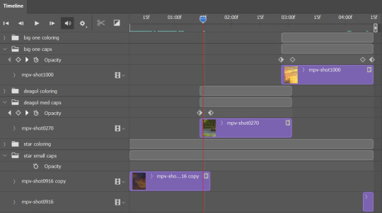
#Set Column Width
Explore tagged Tumblr posts
Visit Tumblr Blog
Explore Tumblr blogs with no restrictions, modern design and the best experience.
Last Seen Tumblr Blogs


Fun Fact
Tumblr has been providing a Korean-language service since 2013.
Text
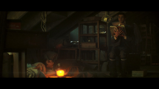
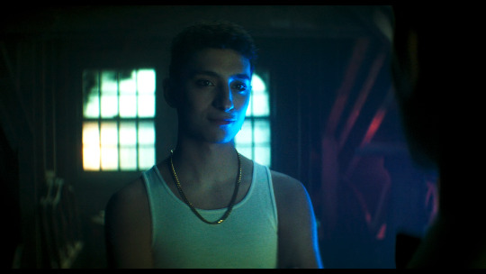
SFX Magazine Issue 372 - Designing Good Omens ❤ 😊


PRODUCTION DESIGNER MICHAEL RALPH REVEALS HOW THE SHOW’S CENTREPIECE SET, WHICKBER STREET, WAS GIVEN A DEVILISHLY CLEVER UPGRADE FOR THE SECOND SEASON
WORDS: DAVE GOLDER
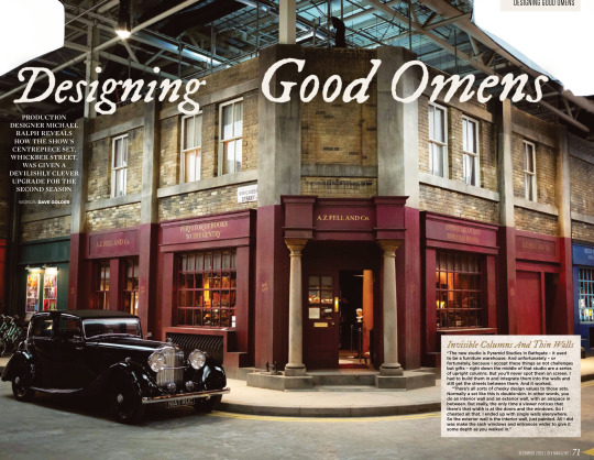
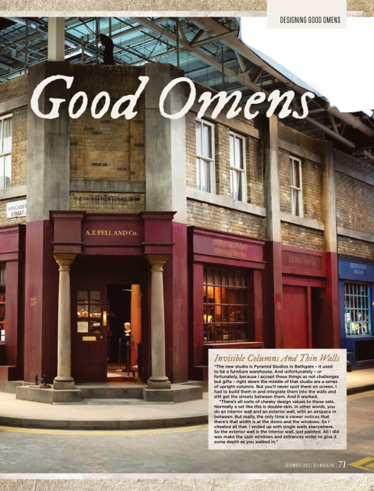
Invisible Columns And Thin Walls “The new studio is Pyramid Studios in Bathgate – it used to be a furniture warehouse. And unfortunately – or fortunately, because I accept these things as not challenges but gifts – right down the middle of that studio are a series of upright columns. But you’ll never spot them on screen. I had to build them in and integrate them into the walls and still get the streets between them. And it worked.
“There’s all sorts of cheeky design values to those sets. Normally a set like this is double-skin. In other words, you do an interior wall and an exterior wall, with an airspace in between. But really, the only time a viewer notices that there’s that width is at the doors and the windows. So I cheated all that. I ended up with single walls everywhere. So the exterior wall is the interior wall, just painted. All I did was make the sash windows and entrances wider to give it some depth as you walked in.”
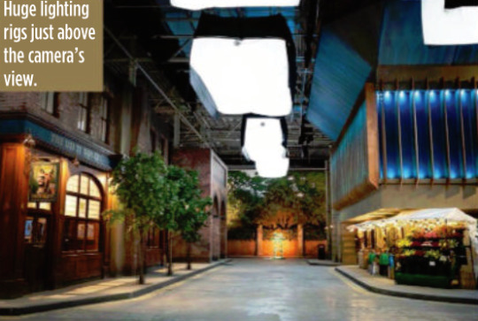
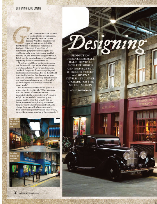
GOOD OMENS HAD A CHANGE of location for its second season, but hopefully you didn’t notice. Because Whickber Street in Soho upped sticks from an airfield in Hertfordshire to a furniture warehouse in Bathgate, Edinburgh. It’s the kind of nonsensical geographical shenanigans that could only make sense in the crazy world of film and TV, and production designer Michael Ralph was the man in charge of rebuilding and expanding the show’s vast central set. “I wish we could have built more in season one than we did,” says Ralph, whose previous work has included Primeval and Dickensian. “We built the ground floor of everything and the facades of all the shops. But we didn’t build anything higher than that, because we were out on an airfield in a very, very difficult terrain and weather conditions, so we really couldn’t go much higher. Visual effects created the upper levels.”
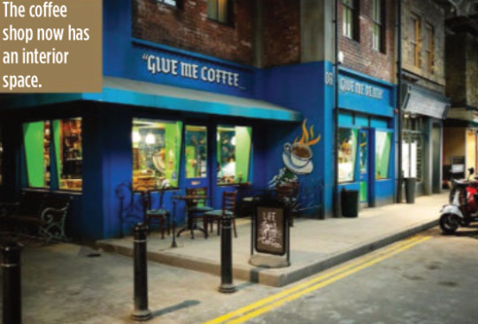
But with season two the set has gone to a whole other level… literally. “What happened was that the rest of the street became integrated into the series’s storyline,” explains Ralph. “So we needed a record shop, we needed a coffee shop that actually had an inside, we needed a magic shop, we needed the pub. To introduce those meant we had to change the street with a layout that works from a storylines point of view. In other words, things like someone standing at the counter in the record shop had to be able to eyeball somebody standing at the counter in the coffee shop. They had to be able to eyeball Aziraphale sitting in his office in the window of the bookshop. But the rest of it was a pleasure to do inside, because we could expand it and I could go up two storeys.”
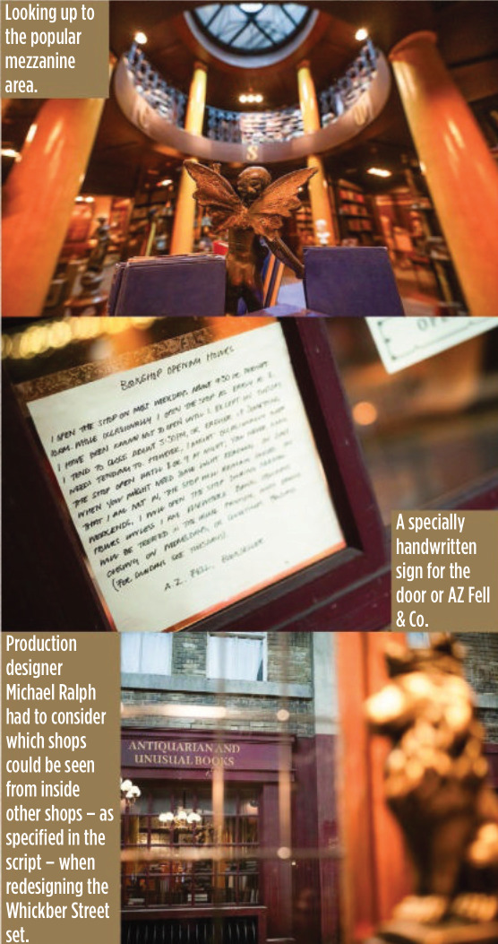
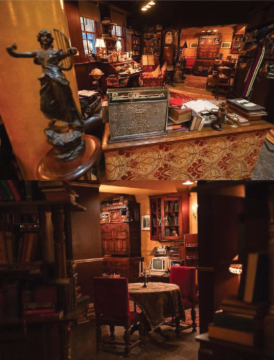
For most of the set, which is around 80 metres long and 60 metres wide, the two storeys only applied to the shop frontages, but in the case of Aziraphale’s bookshop, it allowed Ralph to build the mezzanine level for real this time. According to Ralph it became one of the cast and crews’ favourite places to hang out during down time.
But while AZ Fell & Co has grown in height, it actually has a slightly smaller footprint because of the logistics of adapting it to the new studio.
“Everybody swore to me that no one would notice,” says Ralph wryly. “I walked onto it and instinctively knew there was a difference immediately, and they hated me for that. I have this innate sense about spatial awareness and an eye like a spirit level.
“It’s not a lot, though – I think we’ve lost maybe two and a half feet on the front wall internally. I think that there’s a couple of other smaller areas, but only I’d notice. So I can be really annoying to my guys, but only on those levels. Not on any other. They actually quite like me…”
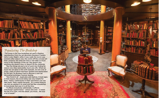
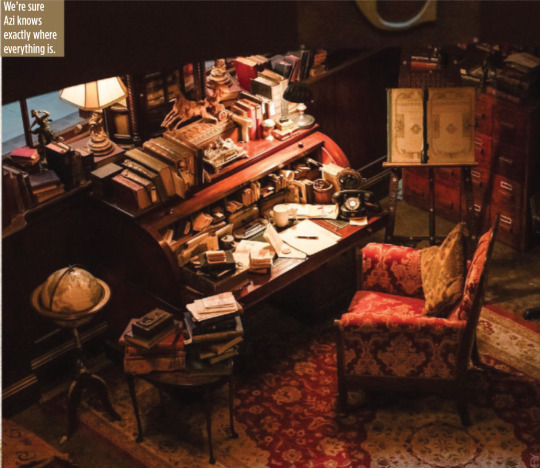
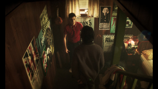
Populating The Bookshop “The props in the new bookshop set were a flawless reproduction from the set decorator Bronwyn Franklin [who is also Ralph’s wife]. It was really the worst-case scenario after season one. She works off the concept art that I produce, but what she does is she adds so much more to the character of the set. She doesn’t buy anything she doesn’t love, or doesn’t fit the character.
“But the things she put a lot of work into finding for season one, they were pretty much one-offs. When we burnt the set down in the sixth episode, we lost a lot of props, many of which had been spotted and appreciated by the fans. So Bronwyn had to discover a new set decorating technique: forensic buying.
“She found it all – duplicates and replicas. It took ages. In that respect, the Covid delay was very helpful for Bron. There’s 7,000 books in there and there’s not one fake book. That’s mainly because… it’s a weird thing to say, but we wanted it to smell and feel like a bookshop to everybody that was in it, all the time.
“It affects everybody subliminally; it affects everybody’s performance – actors and crew – it raises the bar 15 to 20%. And the detail, you know… We love a lot of detail.”
(look at the description under this, they called him 'Azi' hehehehe :D <3)
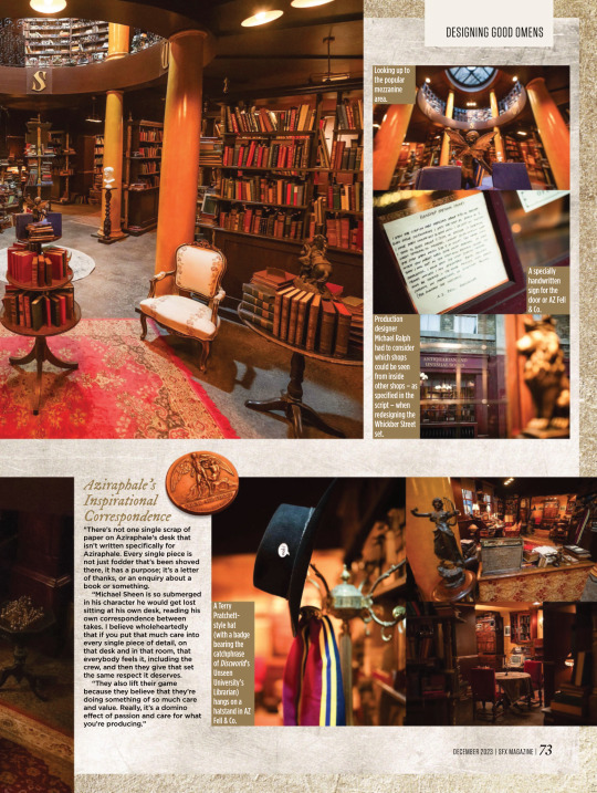
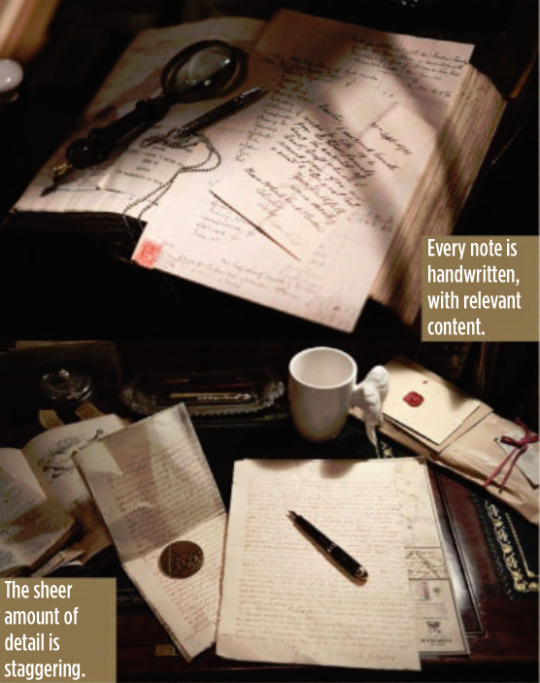
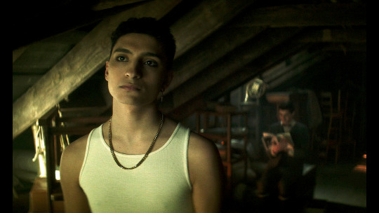
Aziraphale’s Inspirational Correspondence “There’s not one single scrap of paper on Aziraphale’s desk that isn’t written specifically for Aziraphale. Every single piece is not just fodder that’s been shoved there, it has a purpose; it’s a letter of thanks, or an enquiry about a book or something.
“Michael Sheen is so submerged in his character he would get lost sitting at his own desk, reading his own correspondence between takes. I believe wholeheartedly that if you put that much care into every single piece of detail, on that desk and in that room, that everybody feels it, including the crew, and then they give that set the same respect it deserves.
“They also lift their game because they believe that they’re doing something of so much care and value. Really, it’s a domino effect of passion and care for what you’re producing.”

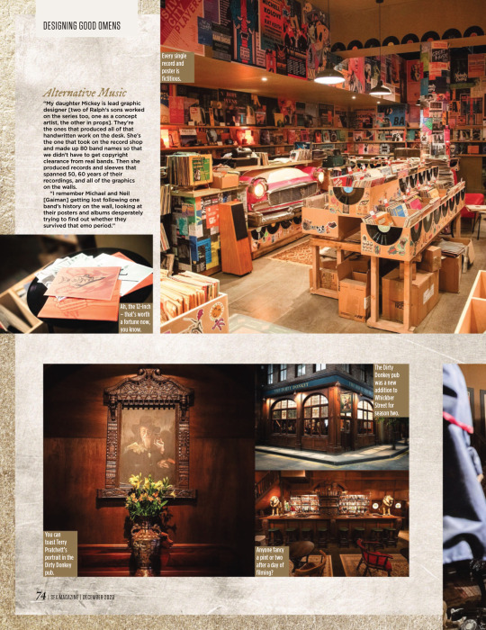
Alternative Music “My daughter Mickey is lead graphic designer [two of Ralph’s sons worked on the series too, one as a concept artist, the other in props]. They’re the ones that produced all of that handwritten work on the desk. She’s the one that took on the record shop and made up 80 band names so that we didn’t have to get copyright clearance from real bands. Then she produced records and sleeves that spanned 50, 60 years of their recordings, and all of the graphics on the walls.
“I remember Michael and Neil [Gaiman] getting lost following one band’s history on the wall, looking at their posters and albums desperately trying to find out whether they survived that emo period.”


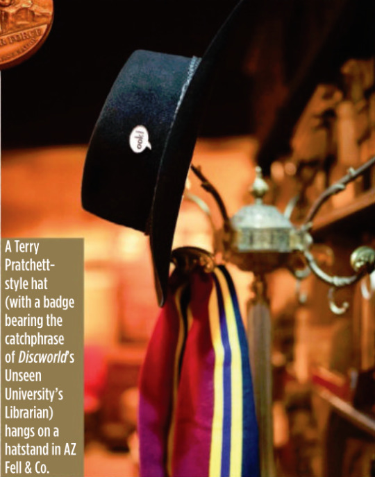
It’s A Kind Of Magic One of the new shops in Whickber Street for season two was Will Goldstone’s Magic Shop, which is full of as many Easter eggs as off-the-shelf conjuring tricks, including a Matt Smith Doctor Who-style fez and a toy orang-utan that’s a nod to Discworld’s The Librarian. Ralph says that while the series is full of references to Gaiman, Pratchett and Doctor Who, Michael Sheen never complained about a lack of Masters Of Sex in-jokes. “He’d be the last person to make that sort of comment!”
Ralph also reveals that the magic shop counter was another one of his wife’s purchases, bought at a Glasgow reclamation yard.
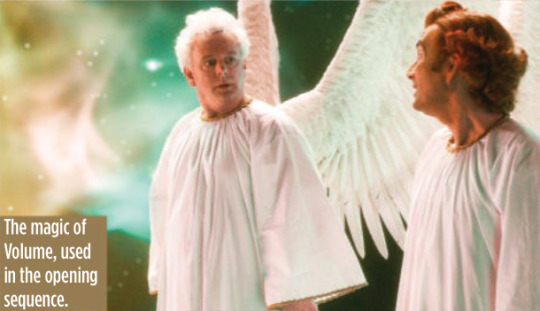
The Anansi Boys Connection Ralph reveals that Good Omens season two used the state-of-the-art special effects tech Volume (famous for its use in The Mandalorian to create virtual backdrops) for just one sequence, but he will be using it extensively elsewhere on another Gaiman TV series being made for Prime Video.
“We used Volume on the opening sequence to create the creation of the universe. I was designing Anansi Boys in duality with this project, which seems an outrageously suicidal thing to do. But it was fantastic and Anansi Boys was all on Volume. So I designed for Volume on one show and not Volume on the other. The complexities and the psychology of both is different.”
#good omens#gos2#season 2#photos#bts#bts photos#interview#sfx magazine#magazines#hq photos#neil gaiman#terry pratchett#michael sheen#david tennant#michael ralph#mickey ralph#bronwyn franklin#anansi boys#the small back room#maggie's record shop#soho#aziraphale's bookshop#dirty donkey#magic shop#aziraphale's correspondence#give me coffee or give me death#fun fact#michael ralph interview#sfx 372 magazine#s2 interview
4K notes
·
View notes
Text
I have gotten a lot of messages saying that they really love the presentation of CURSE/KISS/CUTE. Often the commenter in question can’t say what exactly it is about the formatting that they appreciate, but that it just reads well and looks good. Well!!! Allow me to bare my wealth of secret knowledge for you once and for all:
I sorta just did some research into book typography...?
Here’s something you should know about web development, alright: typography on the web is really, really bad. The tools we have at our disposal—HTML and CSS—are incredibly powerful, but they are set up to fight you every step of the way towards Good Typography. When you know what you’re looking for, you can fix all the common issues quickly and easily. But it’s not easy to know what to look for, because
problematic typography is overwhelmingly the norm on the web, and
good typography is invisible.
Here’s a screenshot from CURSE/KISS/CUTE episode 0:

Now, I don’t want this post to come across as prescriptive. It is not my intention to tell you, “This is what good typography looks like, so follow my lead exactly.” I made a lot of choices with the typography of my web novel: many of those choices would not make sense in other contexts. What I want to convey to you is what those choices are, so that you will know they’re available to be made.
I mentioned that the web “fights you” when it comes to good typography. What do I mean by that? Well, check this out:

This is how that passage of text renders “by default.” In other words, this is how a web browser would render that text without any input from me about what styles to apply. It kind of sucks ass! But it also looks pretty familiar, right? This is not that far off from how a lot of websites—even websites full of prose (looking at you, AO3)—render text.
I think the most illustrative thing to do here would be to walk you through my thought process and show you, step by step, what decisions I made to turn this unstyled text into the styled version you see in the novel.
So, first things first:
1. We have got to shrink that text column.
Computer monitors... are wide. They are wider than they are tall. They are so wide, and they have so many pixels. This means you can fit a lot of characters on them. If you wanted, you could just have a wall of characters from the left side of the screen all the way to the right side. Talk about efficient!!
You should never, ever, ever do this.
This is one choice that I actually will make a prescriptive statement about, because it’s supported by quite a lot of research: fairly narrow text columns are more legible. Specifically, research seems to support the idea that a width in the range of 50 to 70 characters per line is the most comfortable for people to read*. Every font is different, so it takes a little doing to turn that “characters” figure into a pixel measurement; I went with 512 CSS pixels for the maximum width of my text column:

Isn’t that just so much nicer to read already?
*A commenter reminds me that I’d be remiss not to point out that the research on column width legibility isn’t completely conclusive. You do want to limit the width of your text columns, but going over the 70 character-per-line recommendation isn’t necessarily the end of the world, and you might have good reasons to do so. I did not: as mentioned, one of my goals was to mimic book-style typography, and books by nature have fairly restrained column widths, on account of they’re books.
2. Picking a font.
I’m not going to give you the blow-by-blow on how I decided what font to use. The short story is that I asked some designers, and one of the recommendations I got was the free font Crimson Pro, which I took a liking to immediately:

It’s just an all-around attractive serif font, but one thing I really like about it for use in a novel is its highly-visible quotation marks. They’re just kinda jumbo! They’re real big! Easy to see! In a novel, those things aren’t just ornamentation. It makes a great deal of practical sense for them to stand out just a bit. It also has a fairly large x-height, unlike a lot of the more traditional options, which is good for legibility on a computer screen.
3. Adjusting the line-height
Web browsers default to a line-height of about 1.2em, which, as you can probably tell, is quite cramped. If you go and Google “optimal line height for legibility”, you’ll get a number of results right off the bat suggesting 1.5em. Sounds good! Let’s do that:

Well... hmm. That’s definitely an improvement, but between you and me, it actually looks a bit too spacey to my eyes. I wonder why?
I’ll cut to the chase: the 1.5em recommendation makes some assumptions about the font you’re using. In Arial, the letter “A” is about 0.6em tall; in Crimson Pro, it’s about 0.5em. That means that there’s no one-size-fits-all solution to spacing your lines, because different fonts have different amounts of empty space baked in. How annoying!
Let me tell you something about the kind of nerd I am. When I had this realization, I grabbed some books off my shelf and pulled out a literal micrometer. I started measuring the line-heights against various font features to see if there were any patterns I could spot in professional typesetting. Here’s what I found:

Almost every book on my shelf spaces lines such that the distance between one baseline and the next is about three times the x-height. How cool is that? I clapped my hands like a seal when I put this together.
Adjusting the line-height to match what I observed in the wild gives us this:

It’s a subtle difference, but to my eyes it feels just right. It’s almost like magic!
4. Paragraph spacing...
Let’s address the elephant in the room. Probably the most controversial choice I made with CURSE/KISS/CUTE’s typography was to opt for book-style paragraph indentation rather than web-style paragraph spacing—like so:

I did this for a few reasons:
It’s what I’m used to. I’ve read a lot of books, and this is just the way that books are formatted. I think for something aspiring to the title of “novel”, there’s value in making it look the way a reader probably expects a novel to look.
A novel has a lot of paragraph breaks in it. A paragraph in, say, an encyclopedia entry might go on for half a page or more; whereas it is unusual for a paragraph in a modern work of narrative prose to run for more than a handful of sentences, especially in any scene with dialogue. Because paragraph breaks are so common, spacing between paragraphs in a novel results in a lot of wasted space. Also, subjectively speaking, the additional space seems to me to lend an undue amount of weight to paragraph breaks. I’m just starting a new thought; there’s no need for a 21-gun salute, you know?
Having said that, here are some good reasons you might decide not to do paragraph indentation anyway:
Doing it right requires a bit of extra legwork. Notice how the very first paragraph in the image above has no indentation. That’s because it’s the start of a new section, and the first paragraph in a section traditionally goes unindented. This is an easy detail to miss, and it can be difficult to wrangle CSS into doing it for you automatically.
Web users don’t expect it. For the first decade of the web’s existence, there was no good way to do paragraph indentation; by the time CSS rolled around and made it easy, paragraph spacing had already become the norm. And while CURSE/KISS/CUTE may be a novel, it is also, specifically, a web novel!
But it’s my house and I get to make the rules, so I went with indentation. Incidentally, there seems to be a dire lack of research into the question of whether indentation or spacing is more legible for readers—but the data that does exist appears inconclusive at best. So, the choice really does come down to vibes.
5. The tragedy of justification.
You’ll note that one way in which I did not make my web novel look like a paper novel is the text alignment. It’s un-justified: the right margin is ripsaw-ragged.
This is because it is not possible to justify text on the web.
Oh, you can try. Look right here: there’s a CSS property for it and everything. Just turn on “text-align: justify” and...

Nightmare! The interword spacing on that first line is almost as wide as the indentation!
Reader, I’m afraid that your web browser is simply too dumb. That’s not the browser’s fault: robust algorithms for justifying text without creating these distractingly huge gaps between words have existed for many decades, and modern computers are powerful enough to run them in real time with little performance impact. It’s just, uh—nobody has ever bothered to implement them into web browsers. It is the damnedest thing.
I tried, I really did. You can mitigate this problem a bit if you enable automatic hyphenation, but browsers are unfortunately also kind of dumb at hyphenating. Firefox, for example, will refuse to hyphenate any word containing a capital letter, so any sentence with a lot of proper nouns in it is a lost cause. I tried manually inserting soft hyphens with a text preprocessor I wrote myself, but still these overjustified lines plagued me: when the text column narrows, for example on a phone, even hyphens can’t save you. The line-breaking algorithm is simply too naïve to optimize for well-justified text, and that’s not something you can fix as a web developer.
As a result, my heavy-hearted recommendation is to never use text justification. It’s just too distracting.
6. And then some extra stuff just for me
I added drop-caps because it looks neat and I made the ellipses spacier because I think it looks good when it, uh, when they are spacier. I think that looks pretty good that���s just my opinion though.
That’s all! Hope you learned something bye!!!
527 notes
·
View notes
Text
Alliance Normandy SR2 interior redesign: Introduction
The Normandy is a sexy sexy spaceship, but the interior we see is defined by game play: corridors are extremely wide so Shepard doesn't get stuck on the scenery, the crew is sparse because animating crew members takes resources and NPCs are also obstacles Shepard could get stuck on, you need larger spaces for camera angles, etc.
I wanted to see if I could redesign the space to fit a crew of 70–90... ...and I got carried away.

This post covers the rules I set myself and the basic process. Each deck will get a separate post (check back for links):
Intro
Loft
Command deck
Crew deck
Engineering deck
Hangar deck
Design rules
Keep major elements in basically the same places. This is the Normandy as she exists in my fic Sunset & Evening Star, and readers shouldn't have to study a floorplan!
Use only space that's 'available' in the game. If we can access it as the player, it's fair game. If it's a mysterious void in-game, I assume it's full of Important Spaceship Parts and the only access is for ship maintenance.
The elevator shaft is vertical. No Willy Wonka/ST turbo lift shit.
*There are inertial dampeners; if there weren't none of this would work. But as an author I like to imagine that any system can be overloaded.
Step one: Align & scale the deck maps
I aligned the deck maps around the elevator, the only element that shows up on every one. Each is shown at a different scale, so I eyeballed their relationship based on furniture, which is the only thing required to have a relatively consistent size. This is a big assumption; game designers resize whatever they need to! Shepard's bed, for instance, has pillows about a meter square. Presumably they needed room to made the pixel dolls have sex. Shepard's bed can therefore not be trusted, and to a lesser extent neither can anything else.
(There are also floor panels that look a lot like standard 4'x8' construction sheet stock, but A) developers can re-size those as needed without the player noticing, and B) If we're still using imperial units to construct spaceships in 2184 I hope the reapers eat us.**)
**...that said, I used a scale of 1px:2ft to draw this. I'm so sorry. I'm American and I've done construction, it's easy for me to visualize. (The scale was two inches to the pixel, if you're curious.)
Step two: Redesign over the existing space
This is where I saw how much I could fit in the space the game design allowed (given my guesses on scale). Y'know, the fun bit that I thought I'd be spending most of my time doing!
(I was so wrong).
Redesign goals
The Alliance refitted the Normandy for an Admiral. Admirals don't captain their own ships, so I needed to account for an Admiral and their staff as well as the captain and crew.
Align bunks fore-aft, so that the most common major inertial vectors* will hit sleeping crew in the least dangerous direction.
Plumbing should be stacked when possible. (I don't know spaceships but I know about plumbing columns. Glamorous!)
Step three: Adjust to the hull
One modeler figured the ship had to be ~370 meters long to fit the decks as-is, which would leave them using only ~20% of the length. One dev is quoted as saying she's 170m. Fan estimates comparing it with other ships suggest somewhere from 210–230 meters.
The hangar deck is the one*** place the interior aligns with the exterior for certain. The hangar needs to fit two kodiaks in the space between the bay door and the elevator, and each kodiak needs to fit 12 people plus the pilot. Additionally, as the lowest deck the hanger is limited in width by the inward curve of the hull (and that limit changes based on how low you go, which is why the drawing above includes a front elevation).
***Yes, we also see Joker piloting right up in the nose. This is impossible to achieve and also stupid, so I've elected to ignore it.
Sizing it to the smallest reasonable hangar — and after drawing a rather stubbier kodiak — I managed a 194 meter hull; ~217 if you include thrusters. At this size the liveable area takes up just over a third of the hull length. It's still an awful lot of nose, but that nose means 136 meters for the main gun, which for my purposes is still a rail gun (so size matters). Sadly it can't be a hull-length gun; it would run into first the elevator, and then the eezo core.
I did NOT pretend to figure out where the Make Spaceship Go parts are, or the Keep People Alive parts. There's a LOT of 'wasted' space; assume it's all in use and accessible through engineering access-ways, though how comfortable or safe they are is questionable.
———
Thanks to @swaps55 for the amazing high-res screenshots of the game maps, and to @faejilly and @sheepishwolfy for the long-ago talks about crew size that started all this!
#mass effect#mass effect meta#mass effect lore#fire the headcan(n)on#The Normandy SR2#Alliance Normandy SR-2#Sunset and Evening Star#Normandy redesign#Normandy SR-2 redesign
297 notes
·
View notes
Text
Final part! Parts one and two are posted! (it is completely possible i used every pet name known to man)
NSFW! MDNI!

Art is true to his word. He picks you up at 7 with flowers in hand. He tells you you’re the most beautiful girl he’s ever seen, cups your face and leans in to press a respectful kiss to your cheek. Your heart swoons.
The restaurant he takes you to is lowkey, and Art requests a table in the back for privacy. Turns out, he actually is a nice guy behind all the overt confidence. His laugh is infectious. You follow the line of his neck every time he tilts his head at you, similar to how he watched you in your apartment. Eventually you’re running your heeled foot up the inside of his leg, absentmindedly, like you’ve known him forever. He takes the check.
You expect him to follow you into your apartment, and a large part of you hopes he does. However, he doesn’t, and when you turn to look at him with confusion, he’s leaning against your doorframe, looking at you adoringly. You’re flustered for the first time. It’s harder to keep your composure when he’s being sweet and turning your heart to mush.
Art reaches a hand to your hip and pulls you towards him without stepping over the threshold. You steady yourself with a gentle hand wrapped around his tricep. “I had a lot of fun tonight,” he tells you. You gulp, somehow nervous to kiss him as if you hadn’t done it already the night before. But this time it meant something.
“Me, too. Thanks for taking me out.” You look away from him shyly. “Sorry for being so harsh,” you murmur, “you’re not a bad guy.”
Art chuckles, tightens the hand on your waist to pull you the last inch closer. He nudges your forehead with his nose and you look up at him. He ducks down, runs the tip of his nose down the bridge of yours. When your lips are a hair’s width apart, grazing one another, he whispers, “I know,” into your mouth. He meets you the rest of the way in a slow kiss that you push up into, chest against his.
He moves his hand from your waist to cup your jaw and pull away. “I’ll text you,” he says easily, kisses your cheek, then starts the path back to his car. You’re left dumbfounded in the doorway of your apartment.
Art takes you on more dates, makes sure they’re private and always drops you at your door with a respectful kiss goodnight. On the phone one night, you ask him, insecurity showing, if he’s not as attracted to you without the chase. He is adamant that’s not the case, says you feel different, that he wants to take his time and do right by you.
A month later and he asks you to stay over his place. He’ll order take-out, you can watch movies, and if you want him to sleep on the couch he’s happy to. That’s how you find yourself in his living room, feet in his lap while you ask each other silly hypotheticals and sip some wine. His hand is warm around your foot and his head is tilted back in a laugh, exposing the long column of his throat that you love.
You set your glass down and remove your feet from his grasp, crawling across the couch to him and sitting back on your heels. Art lifts his head to meet your gaze, still chuckling. “What’s up?” he asks. You take his glass from his hand and put it on the side table. He’s about to make a joke about you taking his drinks when you lift your thigh over his lap to straddle him. He looks intrigued, settles his hands on your waist to keep you steady.
“I like you, a lot more than I thought I would,” you admit, sheepish. Your arms wrap around his shoulders, a hand sliding into his hair.
One of his hands glides up the length of your back to rest between your should blades and he presses you closer to him. He drags his lips across your collarbone, says, “ouch,” then sinks his teeth into the center of your chest. He rumbles deep in his throat when you gasp.
Art pulls his head away from your body, tilts his chin up to look at you. You look shy, the way you have since you’ve dropped the tough exterior. “What are you trying to say, hmm?” He kissed the underside of your jaw.
“Don’t be a jerk,” you say without real heat. “You know what I’m saying.”
He keeps peppering kisses to your soft skin, hand kneading at your waist. “Mhm, sure I do, sweetness.” He leaves a wet kiss where your jaw meets your neck. “You want to be mine? Just ask.”
You whine, roll your hips down into his, but he stops you, goads you to speak. “You’re supposed to ask me,” you say instead, defiant energy making a return.
Art matches your pout, nods in mock sincerity. “You’re right, I’m sorry, angel.” You’re suddenly being moved. He’s turning your body and guiding your back to rest on the plush couch cushions. He lifts himself to blanket over you, caresses your face gently. “Will you be my girlfriend?”
You tilt your head, pretending to ponder. “Hmm, I don’t know, Artie,” you trail off.
Art laughs, digging his fingers into your sides. He calls you a brat and he means it but he kisses you anyway. He rubs the flat of his hand up you flank. “So how about it?” he probes.
You smile big. “Of course.”
Art’s all over you in the next second, coaxing your body up the couch so there’s room to lay comfortably. His hands roam your body, kissing you wherever he can reach. You’re yanking at his hoodie, trying to pull it over his head and he lets you. “Eager, are we?” You ignore him, taking a minute to trace your fingers across his chest, down his abs. You hook a finger into the elastic of his sweatpants and drag him back to you. He’s happy to lick into your mouth, slowing down the pace. “Want to take my time with you,” he says sweetly, “s’that alright, pretty girl?” You nod dumbly.
He slides his hands up your belly, dragging the crew neck up and over your head. Your hair fans around your head like a perfect halo. Art is lost for words as he takes you in. It makes you feel vulnerable, and without really noticing, you try pulling your arms across your bra-clad chest.
Art tsks, wraps hands around your wrists and squeezes gently. “Let me look at you,” he requests, “please, baby?” You let him drag your arms away so you’re not hiding, your cheeks blazing. He leans down, kissing and sucking a path from your neck to your navel, torturously slow. “You’re so pretty, you know that, right?”
You caress his cheek. “No, you,” you rebut. Art smiles, asks permission to pull your leggings down and you let him. He slips his sweats off next. “Can we go to your bed,” you ask, and Art nods immediately. He pulls you to a stand and guides you by your hand to his bedroom.
The bed is large, easily a king. He has fluffy, powder blue bed sheets with 3 pillows on either side of the headboard. He finds your hips from behind, presses a kiss to your bare shoulder. “Got these after seeing you in that dress on our third date. Want to see you in that color all the time.”
He’s herding you towards the bed, crawling between your legs when you scoot yourself backwards to the headboard. Art is rutting his clothed hips into yours and the friction is enough to make you gasp his name. His hand reaches behind you to skillfully unclamp your bra and remove it from your body. He pays a lot of attention to your breasts, cupping one while he sucks harshly on the other. All of your nerve endings are alight, pushing yourself closer to him if it’s even possible.
Art starts to drag himself down your torso. He surprises you by licking a fat stripe up your clothed center. He smirks at the reaction it elicits, tells you to keep making those pretty noises for him. Art hooks his fingers into your waistband, pulls your panties off of your ankles, and just marvels at the sight of you. He settles on his belly between your legs, placing a few kisses to your pillowy thighs. He has your right leg held over his left shoulder and uses his right arm to push your left leg, spreading you wide. He drags a thumb lazily though your folds, over your clit. He doesn’t respond to your whining, too hypnotized by your pussy.
He pauses to look up at you when you grab his wrist, a plea slipping from your throat. “Oh, honey,” he says, “you’ve been so good for me and I’ve just been so distracted. Tell me what you want.” You cant your hips up toward him, and he doesn’t make you beg, just dips his head down into you. “Like this?” he asks around your clit, swiping his tongue faster when you moan.
Art slips his middle finger into you without trouble, pumping to the rhythm of his tongue. You mewl when he adds his ring finger, drool dripping out the corner of your mouth. Art is just as eager, making out with your folds and rutting his hips into the bed. “You look so good stretched on my fingers, sweet girl,” he murmurs. You whine. Art picks up his pace, lets you hold his hand when you reach your release, hips twitching toward him or away from him he can’t tell. He licks his fingers clean then slides up your body to kiss the life back into you.
You paw at his clothed cock, tell him it’s your turn but he stops you. When you pout he thumbs over your lip, pushing the digit into your mouth. “Gotta get inside you, baby, another time.” He slides his boxers down his thighs and kicks them off. His cock is hard and dripping against your core. He goes slack jawed, inching the head of his cock past the ring of your entrance. “So –mmf – so tight,” he gasps into your mouth. You’re clinging to his back, nails leaving crescent-shaped indents.
You tell him he’s so big, that you don’t think he’ll fit and he’s shushing you while he slides all the way in, slowly. You’re gasping. Art presses a hand to your lower tummy when he starts rocking into you. “Feel me here?” You nod, dizzy. He fucks you slow, pushes in to the hilt, grinds in a little deeper just to feel you squeeze around him. Art’s holding your face in his hands now, your mouths touching but no real kissing happening, both too lost in your pleasure.
Suddenly you gasp out, “no more kissing fans.” It catches him off guard, his hips pausing their movement. You’re looking at him so sternly. “I mean it. Even if it’s a photo-op, just – nghhh,” you rock your hips up, frustrated and trying to regain a rhythm, “don’t please.” Art presses in so deep you think he might actually be in your guts.
“Anything for you, sweetheart.” Art’s hips are slamming into yours now. You’re grabbing at his arms, his back, his hair. He reaches his hand between your bodies to rub viciously at your clit. With a high pitched squeal you’re coming, pulling his face to yours so you can moan into his mouth. He pulls away only to ask where you want him to finish. He almost passes out when you tell him on your pussy. Art pumps his cock into you twice more, pulls out and is spilling along your wet folds. His chest rises and falls quickly, trying to catch his breath. Mesmerized, Art starts to rub himself onto your cunt, circling your sensitive bud until you whine that it’s too much.
He leaves you briefly to get a warm wet cloth, insists on cleaning you up. It’s the most intimate you’ve ever been with someone. He lays with you after, your leg thrown over his and your head pillowed on his chest. His fingers make patterns on your back. “Don’t break my heart,” you murmur without looking up at him.
Art pulls you closer, drops kisses to the crown of your head. “Wouldn’t dream of it, angel.”
139 notes
·
View notes
Text
i always get questions when i do a split gifset, and it's a deceptively simple process so i thought i'd try to show how i do it! i don't know if these types of gifsets have a more universally recognized name, but that's what i call them so that's what i'm going with.
i'm going to write this assuming you have a solid familiarity with photoshop and making gifs, but please feel free to send me an ask if anything is unclear. i use video timeline/smart objects so will be showing that (here's a great general tutorial on giffing with timeline). i will also be talking A LOT about gif dimensions, so first let's briefly go over the limits and theory a little bit.
a 1 column gifset can accommodate gifs 540 pixels wide
2 columns = 268 pixels each with a 4 pixel gutter between
3 columns = 177, 178, 177 pixels with 4 pixel gutters
i'm mostly going to talk about 2 column split gifs here (what i will refer to as 2x1 from now on - 2 across and 1 high), but the process is the same for 3 column (3x1) and so on (1x2, 2x2, etc).
so, why would you even want to make a gifset like this? i mean, let’s face it, generally, bigger is better for gifs on tumblr, and there are obvious incentives to 540 width gifs over 268 or 177/8 width, especially since the upload limit went to 10MB. but even 10MB isn’t much when you’re talking about high quality footage. gif making is a constant balance between quality (whatever that means to you: frame dimensions, sharpening, coloring, etc) and file size. split gifs are a cheat to that limitation >:)
i personally believe an untapped frontier of tumblr gifmaking is playing with dimensions and time. that sentence makes me sound like an old-timey sci-fi villain, but you get the idea: gifmaking is an art and there are many fun and interesting ways of exploring the medium. you can do a lot with 268 pixels! longer frame loops to gif longer scenes unbroken, bolder coloring on a wide shot you don’t want to pare down. and, a shorter x axis means the y axis’s bang goes a lot further on a buck. also just if you have a 2 column set but only 5 gifs so you need to make one take up 2 slots. there's a lot of reasons but the most important one is it's fun :) here are some examples of other split gifs i've made: x, x, x
this isn't so much a limitation, more of a shift in how you think about gifs, but it's important to remember that each gif should ideally be doing something still. when making split gifs, it’s easy to pick a wide scene without thinking about how it’ll be split down the middle, and then you’re left with a lot of something on one side and a lot of incongruous nothing on the other - or you're left with a person cut in half awkwardly in the middle. so while a split gif can still be a whole scene, you shouldn’t ignore the break and what it means to the bigger picture. now this is personal preference, but i like to play with the break and make it a part of the gifset. mirrored movement, subjects trapped on either side but still talking to each other, a bird flying from one side to the other. fun with frames! it can be another way of drawing attention to specific images/moments/feelings happening within the same shot.
SIMPLE SPLIT GIFS
to more narrowly define what i’m calling “simple split gifs,” it’s one set of frames split down the middle into two separate gifs that are meant to play concurrently, side by side.
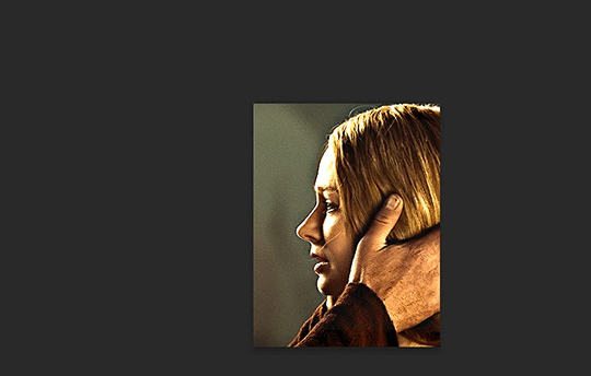
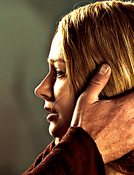
first thing's first, crop your gif and uncheck delete cropped pixels if it is not already (very important). i'm cropping it to the 1x1 size, in this case 268x350. if you need to see how the full size will look, you can try it out with 536 first. but this one is pretty easy, this is the exact center of the frame (the left boundary of this crop is the center line) and both their heads fit within their respective 1x1 crop.
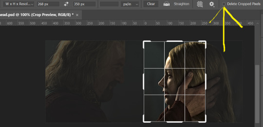
then color as you normally would. if your scene is very different one side to the other, it might be easier for you to color on a wider crop and then either crop again or copy paste your coloring to the smaller crop version. i do that with the 2x6s, but it's usually not that big a deal to color the 2x1s with just the small crop on your canvas at the time. this scene is very symmetrical, both in movement and colors, so i'm good.
now the fun part! once you've got one side how you want it, save/export as you normally would. at this point i also like to make a mental note of how many frames there are.
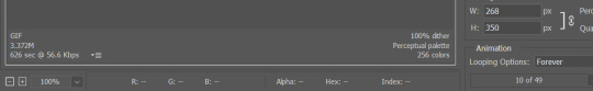
so i have 49 frames and it's still only ~3MB! this is just an example that i picked from my rotk fancy set, otherwise i probably would have made this gif longer.
then onto the other side, so i ctrl + z my way back to my smart object video timeline. to get to theoden i just drag and drop the smart object 268 pixels over. since this one is in the exact center of the image, it even helpfully guides me (this can get annoying if you are NOT giffing the center of the image fyi, but you can always manually go pixel by pixel too if you need to with your <- -> keyboard buttons. just always remember where you started and count accurately). i can never move around my smart object without hiding the adjustment layers on top of it, so you'll see me do that in this screen recording.
see how it corrected me when i dragged it a few pixels down by accident, and with all those pink guidelines? sometimes photoshop is good 😌
then make sure you still like the coloring, adjust whatever needs to be adjusted, but watch out! don't make any major changes because it still has to match the other side. and export again.

what we perceive as 1 series of frames chopped down the middle is just 2 separate gifs with the same frame rate. when tumblr loads the images, it will run concurrently in the post (even though it never does in the draft post 🙄). and that's it!
COMPLEX SPLIT GIFS
again i'm making up terms, but i call anything with more than 2 components a complex split gifset. i've tweaked some things in the process as i went along, but this is generally how i did the lotr series. these sets are basically just many split gifs with transitions. and here's where endurance becomes a factor :) there's a lot of prep done blind. but if set up well, it will be fairly easy to pull together by the end.
first i decide on my dimensions, using my upper bounds to determine how big i'm going to go. since lotr has very nice large file sizes, i can go pretty big without sacrificing much in quality. i decided on 3 rows of 350 pixel height gifs and it's worked well for me. that means my biggest gif will have a total height of 1050 pixels - fun! you could also do 8 rows, with two 2x2s or just a series of 2x1s that transition to 1x1s. there really is no limit to this except your imagination and source material.
i cap everything i'm going to use before i even open photoshop, then do all of them at once. uncheck delete cropped pixels, then i make my gifs! this is where i spend 90% of the time on this set. every gif should be the size of the smallest 1x1 gif (268x350 for me). i make all 10 into a fully colored, separate psd. (and then i usually go back through all of them a few times to get the colors to match better 😅) for the bigger ones (2x1: 536x350 and 2x6: 536x1050), i just crop them as if they were 1x1 but always thinking about how they will look when big. this gets tricky when i do the big one :) my lazy workaround for that is to basically make it twice: one cropped as it will be and one full size for me to color. then i copy and paste all the coloring layers onto the small one and voila, i know that the coloring in the upper right slice will also look good on the bottom left slice 1050 pixels away because i saw it on the full size version.
coloring is probably the biggest thing i'm thinking about with this kind of set. the whole idea is that these gifs are using the same colors, more or less, throughout each phase. even with the 1x1s, they're still part of a larger color concept, and they should (🤞) work with each other.

in a pinch, i like to eyedrop a color from one gif and add it as an accent to another. one of my 1x1s had a much more muted color palette originally, but i wanted it to have deeper blues and yellows to complement the 1x1 that would go next to it, so i added some gradients on lower opacity over it, color picked from other gifs i already colored.
i keep my coloring and the smart object in separate folders to help me in the final step of combining everything, and then i trim everything down to my lowest common denominator of frames. you might think you need to keep frames pretty minimal if you're doing 3 phases with transitions like this, but there's more room to work with on a small gif, in terms of file size. i usually do 30-50 frames for each phase, with the assumption that i'll be adding a transition on each side of each gif that will eat up some frames (i usually do 4-6 frame fade transitions). for the rotk set my final frame count was 129 and i never went over 8MB on a gif, so there's plenty of space play around with things :)
and then, combine! whatever order you start with, you are stuck with (unless you're getting even more complicated, but we won't go into that lol). for these sets i go small 1x1 -> medium 2x1 -> big 2x6. i like to think of it in phases from this point on. small is the first phase, then medium, then big. then i put in the fade transitions, chopping up the first phase gif so the last one will fade into it, restarting the whole cycle seamlessly. i'm just doing a quick and dirty fade here, but here's a tutorial if you want more explanation on transitions.
at this point i save this psd as its position, "top left" or whatever (usually it's a psb by this point too 🥲), just in case i need to go back to it. then i export this first gif and move on to the rest.
it's the same concept as a simple split gif: drag and drop the smart object to the new position, but now there are multiple phases to keep track of. folder organization has been key for me to keep everything straight. i move through the gifs in a backwards S, starting with the top left. but you could go any direction, just gotta stick with it and remember your counts. in my case, i'm always thinking of 268 pixels over and, for the 2x6, 350 up/down. it's a tedious process, but it goes quick (apart from waiting for photoshop to load each time you export).
i did this series as a color concept aesthetic kind of thing, so my theory was by using the same-ish colors throughout, that would save me in the end when it came time to export. there's only 256 colors max to work with on a gif, and that's usually what gets me over the 10MB limit. but as i said, i have never even gotten close to the size limit on this series. it's pretty hard to reach the limit on 268 pixels, but not impossible. (i did run into that on the emma set i did, and that was hell. but also not an impossible fix in the end.)
and that's it! if you try any of this and have trouble, i'm happy to help if i can but mostly this is a "click around and see what works for you" kind of process. and feel free to tag me on your split gifsets :) i love seeing them <3
#*lotrsplit#*#split gifs#gif tutorial#photoshop tutorial#usergif#allresources#chaoticresources#completeresources#photoshop tag
339 notes
·
View notes
Text
Part 2 — this time with a focus on the flashbacks
(Check out the first post for some background info that will be useful)
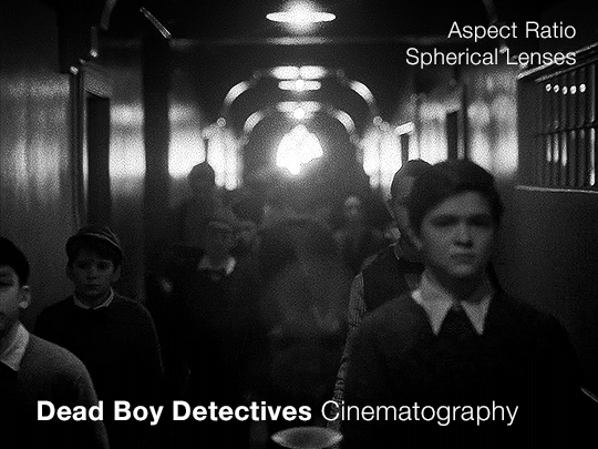
When we’re looking at the cinematography of any piece, once we’ve established what the norm is (which is the use of anamorphic lenses, as per the last post) we can then look to see where it diverges. As far as I can tell, the only part of Dead Boy Detectives that doesn’t use an anamorphic lens is Edwin’s flashback scene.
Now this is particularly interesting since not only is it filmed with a spherical lens, but it also is the only scene with a different aspect ratio, and the only scene in black and white. Everything about this scene is glaringly different. The easy and obvious reason is that it sets this scene apart as something important to pay attention to, as well as emphasizing the difference in the time period. But I want to highlight how exactly it does this since it is quite clever.
It also raises the question: Why not film Charles’ flashback scenes differently?
Like last time, let’s start with a review of history and technical information.
What is an aspect ratio?
This is just the ratio of the width to height of the frame. 1:1 is a square, whereas 2:1 is a rectangle twice as wide as it is high. In film, aspect ratios are usually listed as a ratio of x:1, so you get common formats like 1.85:1 and 2.39:1 (the second being a super-widescreen format, i.e. a long rectangle). Other common ratios are listed with different numbers, like 4:3 and 16:9. Any time I write an aspect ratio with other numbers, I’ll also list it at least once with the x:1 format so you can compare things easily.
What are some common aspect ratios and what have the standards been across the past 100+ years of film and television history?
Brief history of aspect ratios in Film
The original silent films were mostly filmed in 4:3 (1.33:1). This aspect ratio persisted until the late 20s/early 30s when the Academy Ratio, 1.375:1, was introduced and somewhat standardized (at least in the USA) until the 50s. Then, widescreen became pretty popular and was used to draw audiences to the theaters. At this point, we get tons of variation in aspect ratios in films. But, for American theaters, common projections are 1.85:1 (which became super common) and 2.40:1 or 2.39:1, whereas in some European theaters, 1.66:1 is a more common ratio.
Some other common ratios deal particularly with 70mm film:
Standard 70mm film is usually 2.2:1. However, using anamorphic lenses will create a higher aspect ratio, and unless using a specific format common in the 50s and 60s (Todd-AO), this wasn’t often the aspect ratio that viewers would see. (The Sound of Music was shot with Todd-AO in 2.2:1, but until recently, most people only saw the general release in 35mm, which had a different aspect ratio)
IMAX, which is 1.43:1 (if IMAX is shot on film and not digital, it uses 70mm film)
Brief history of aspect ratios in Television
Pretty much all televisions until around the 1990s-2000s used 4:3, and broadcasters would show content in that aspect ratio. If a movie was broadcast over TV, sometimes there would be letterboxing (black bars), but pan-and-scan was common, where they would crop the movie to the 4:3 ratio, and pan around to wherever the action was happening. Starting in the 90s, widescreen televisions started to gain traction, and the 16:9 (1.77:1) format prevailed, and TV broadcasting had some more wiggle room for aspect ratio.
**Side note: Computers are often at this ratio, so if you watch older TV shows on your laptop, you’ll probably see pillarboxing (black columns on the sides), whereas newer movies are often shot with higher aspect ratios so they have letterboxing (black bars on the top and bottom)**
A note on widescreen
Movies are usually considered widescreen if they’re any higher than 4:3 (or 1.33:1). However, because of the aspect ratio of modern TVs and computers, and the even higher aspect ratios of most smartphones in landscape mode, a lot of people (especially younger generations) won’t consider things “widescreen” until they’ve got a much higher aspect ratio.
Streaming and Aspect Ratios
A weird effect of streaming services, and in particular Netflix, was the rise of a new standard in aspect ratios, 2:1. It’s used in shows like Stranger Things. It’s widescreen enough that it feels cinematic but it displays well on lots of devices. There’s minimal letterboxing (or none) on your phone, and more letterboxing on your computer and TV, but not enough to seem like you’re watching a movie instead of a show.
Netflix (and Amazon) really like this aspect ratio. In 2017, one of the production requirement documents from Netflix stated that any aspect ratio greater than 2:1 had to be subject to further approval (though now they state “Aspect ratio choices should be discussed with Netflix for approval”). It’s become increasingly common, and these companies have a pretty set standard for 1.9:1 and 2:1. If we see those ratios on a streaming show it isn’t always a creative choice, similar to the way older TV shows were required to be in 4:3.
A brief reminder about lens types with some extra bits about the timeline.
That 2.39:1 aspect ratio that movies use? That’s the standard for anamorphic lenses (discussed in Part 1). Anamorphic technology was developed around 1915 (for military reasons), but wasn’t used for films until 1927, and didn’t become commonly used until the 50s.
So, with that, let’s look at Dead Boy Detectives.
Aspect Ratio
The whole show is shot with anamorphic lenses, but instead of a 2.39:1 ratio, they use a 2.2:1 ratio. This is a really interesting choice since it is an uncommon ratio. It’s more widescreen than Netflix shows (they started shooting before being acquired by Netflix though so we can ignore any impact Netflix may have had on this decision) but not quite the widescreen that anamorphic lenses typically use.
Movies and shows can use almost any aspect ratio today, but it is still common to stick to the standards. When they choose something else, it’s not because of technical limitations, but because of a creative choice.
The one caveat I have is that Doom Patrol used 2.2:1, so it’s possible that HBO and DC originally just chose this for continuity between the two, before the show was shifted over to Netflix and the Sandman universe. But for this post, I’m going to assume that they were sort of starting from scratch when choosing the look.
If we consider what a 2.2:1 ratio has been used for, and what viewers have been “trained” to associate it with, we end up with Todd-AO 70mm prints and a few others from the 50s and 60s. It’s the kind of aspect ratio you don’t see often unless you’re lucky enough to live near a theater with a 70mm film projector. There are a few notable movies shot in this aspect ratio: Lawrence of Arabia and 2001: A Space Odyssey. Some more recent movies that used 2.2:1 include Dunkirk, Tomorrowland, Nope, and the non-IMAX parts of Oppenheimer. It’s also occasionally used in recent TV, but not a ton, and not with many popular shows.
This is an aspect ratio used by large-format, high-budget movies. As mentioned in the previous post, anamorphic lenses are associated with a romanticized notion of “cinema” and this aspect ratio only serves to further that, associating Dead Boy Detectives with the limited pool of content made in this aspect ratio. It may be a TV show, but it’s being shot like a movie.
Another really interesting point that follows up on the previous post is the idea of using cinematography to enhance the sense of the supernatural and separate the characters from the normalcy of the real world. The aspect ratio is a bit unnatural too, which serves to complement and augment this.
Let’s briefly look at what the show would look like in different aspect ratios. As a baseline, this is the 2.2:1 aspect ratio that the show is in:
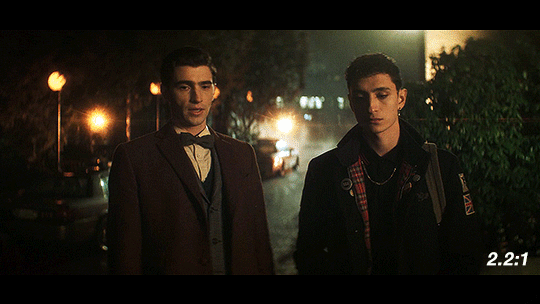
If they had gone for a 2.39:1, a very typical aspect ratio for the kind of lenses they’re using, it would look like this:
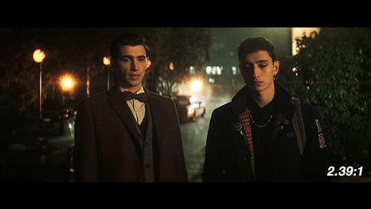
When we see things shot with anamorphic lenses, we’re used to seeing it in a frame like this one. Especially in shots like this with the dramatic lens flares, this is going to look and feel familiar to people who watch a lot of movies. It has more of that Star Trek (2009) look, and feels kind of glossy and polished.
Next up, we have 2:1, the aspect ratio popularized by Netflix. It’s a reasonable possibility that if this show had been produced by Netflix from the very beginning, this is what it would look like.
Over the past few years, this has become the “streaming platform” aspect ratio. With the extra vertical height, it’s got some extra space to breathe. We would get less of the background and more of the characters, especially since Dead Boy Detectives favors centered shots of single characters over group shots like this one.
Finally, I’ve got the scene in 1.85:1, a ubiquitous film aspect ratio, yet one that is not used often on TV.
This is considered to be standard widescreen and it’s a great aspect ratio. Given how many creative decisions in this show were made to emphasize the supernatural, this could have been another good option as an aspect ratio, since we’re not used to seeing TV shows like this. However, they’re using anamorphic lenses so this would have required a lot of cropping. Because of how the anamorphic lenses work, this would also necessitate a lot of additional attention during the shoot. If they had gone with 1.85:1, we likely would have gotten a show shot on sphericals instead.
So what about Edwin’s flashback?
This section is shot in 4:3 (1.33:1). It’s the only part shot in a different aspect ratio. Sure, changing the aspect ratio forces us to acknowledge the difference in time period, but why exactly does it work so well?
Remember the history part? 4:3 was used for most of the early silent films. If we are to consider the “historical accuracy” of shooting the different time periods in this show, anamorphic lenses and 2.2:1 make sense for the present-day parts and Charles’ flashback.
But in 1916, widescreen cinema wasn’t a thing. If Edwin had ever been to see a movie while alive, it would have been in 4:3. The first time he would have ever gotten to see something in widescreen (if we assume he watches any movies at all) would be after he escaped Hell.
Using this aspect ratio is not just a vague decision that a lower aspect ratio and black & white looks older. It is, like many other aspects of the show, historically informed. They could have used the academy ratio here, but they didn’t. They used 4:3.
Not only does the aspect ratio switch for this scene, but also the height of the image changes.
This transition also sort of mimics the breathing effect of anamorphic lenses:
Something you may not know about how Netflix usually works is that regardless of the aspect ratio of the picture, the video file you see is part of a larger container, which is usually 16:9 (1.77:1). The black bars on top and bottom are part of the file, as shown in this screenshot of how it looks when you load up some screencaps in photoshop.
If you make gifs, edits, or are otherwise just used to having video files you are probably familiar with this. The Dead Boy Detectives files have letterboxing that is cropped out whenever people make fan content with it, whereas if you have a file for an independent movie, it usually does not have those black bars. Those black bars being part of the file make this transition possible.
We don’t usually realize that the container extends beyond the picture. For all we know, that’s the edge of the frame. But then it changes and forces us to reconsider what we previously thought to be true. Breaking out of what we think to be the image height is jarring, especially considering that this is the only time it happens (other than the brief flashbacks to the same footage later in the show).
Here’s a mockup of what it would look like if they kept the same image height, and just moved from 2.2:1 to 4:3 without expanding vertically. I find that it doesn’t have quite the same effect.
This would look so cool if it was being shown at a movie theater on a huge widescreen, but we’re not watching this show in theaters. We’re watching it on screens where this would make it look small; what they do instead retains the feel of watching something big and cinematic.
So back to the actual transition:
In breaking out of the perceived container, it’s as if it were breaking the fourth wall, an acknowledgment of the video’s format and its true container. This story is addressed to the audience in a way that the rest of the show is not, and it uses the aspect ratio to let us know that.
Spherical Lens
(I would highly recommend you read pt 1 if you haven’t already)
Edwin’s flashback is not only the sole scene with its own aspect ratio, it’s also the only scene shot with a spherical lens. Like the aspect ratio, this is a historically informed choice. Anamorphic lenses technically existed during the last year or two of Edwin’s life, but movies were not being shot on them.
How do we know that a spherical lens is being used, and how does this affect the show?
One of the quickest ways to identify the lens is to look at the shapes of the bokeh. There’s not much bokeh in the flashback, so I apologize for the intensity of my first example. But here, look behind Edwin’s head, where the lights from above reflect on the wet basement floor. They’re all circles, instead of the ovals that we get with the anamorphics.
The lens flares are also really different. Remember that the anamorphic lens flares are horizontal lines. Spherical lenses don’t do that, but they can produce lots of different kinds of lens flares. In this shot, the flashlight pointed at the lens lets off lines in lots of directions, kind of like sun rays.
This shot has another cool flare, in much more detail this time:
The next shot shows us more of the circular bokeh and another kind of lens flare.
For the bokeh, look at the lights on the ceiling as well as the corners of the out-of-focus architectural details (the semi-arches).
The lens flare here is the bouncing, blurry circle near the middle, as well as the brighter shape near the center bottom.
We can then look at the things that are not different, but absent when using the spherical lens: barrel distortion and focus falloff.
In this example, look at the windows in the background, as well as Edwin’s chair. An anamorphic lens would distort the vertical lines, bending them into a gentle fisheye. It would also make that chair and the lines of the window frames a bit blurry, as they’re close to the edges of the frame. Instead, the lines are straight and clear throughout the whole shot.
In this next example, not only do we get a great view of the lack of focus falloff, with clear lines throughout the shot, but we can see more of the difference in perspective and distortion of lines.
You may notice that the windows and doors are not perfectly straight up and down. But is this barrel distortion? If there was barrel distortion, the walls would curve back towards the center of the frame at the top.
Spherical lenses are often the ‘default’ lens. They’re wonderful and used in a lot of media because they are neutral. They distort less, thus representing the world closer to how it actually is. If we consider the anamorphic lenses in the rest of the show being used to enhance the sense of supernatural and story, changing to a spherical lens enhances the sharp reality. This is Edwin, alive.
The image breaks out of its perceived container, reaching out to the audience, and then changes the lens to be more ‘real.’ In these two changes, not only do we have a more historically accurate image, but it's as if the creators are issuing a warning to us. Maybe the demon isn’t real, but bullies are. Kids can be cruel. Classmates hurt their queer peers. This is not fantasy, and this is as true in 1916 as it is today.
Using a spherical lens in this instance, juxtaposed to the rest of the show, is a dramatic shift to make, as it alters just about everything in the image. In using a less distorted picture, for this, we are reminded of reality and life and the mundane.
On Charles’ Flashback (and an experiment)
Edwin’s flashback got the Cinematography Treatment™ but what about Charles’ flashback? It’s shot with the same aspect ratio and lens as the rest of the show. From the perspective of historical accuracy, this is fine. It’s a scene that could have been shot in 1989, cinematographically speaking. The reason I suspect that it wasn’t given any stand-out look is because, unlike Edwin’s flashback, Charles’ flashback scenes are closely tied to the present-day plot. They aren’t just scenes of Charles remembering things, they are a direct result of the Night Nurse’s “memory magic.”
Maybe changing something here would separate us too much from the plot. Both flashbacks (in episodes 4 and 7) are induced for a specific purpose related to other present-day characters. It wouldn’t make as much sense to have them be standalones.
However, if I were simultaneously the showrunner, screenwriter, and cinematographer, I would give Charles a standalone flashback scene. In that flashback scene, here’s how I would shoot it:
There would be a much deeper depth of field/smaller aperture than the rest of the show, so the background would be more in focus.
There would be harder, less-diffused lighting. This would also impact the coloring, and I’d maybe add some more saturated lights.
I’d try to make an argument to shoot that scene on film (and then argue to do Edwin’s on film too).
There would be a different aspect ratio; 2.2:1 isn’t out of the realm of possibility for the 80s, but it wasn’t common, and it wouldn’t have the kind of impact I’m searching for if it didn’t change.
There are three different aspect ratios I would choose between, and the lens would change depending on my pick.
I’ve made some mock-ups for how these would look, though I cannot adjust things like bokeh and depth of focus, and I can only do so much with the lighting.
2.39:1 with anamorphic lenses (specifically Panavision lenses) This is a super standard widescreen, with a popular lens from the time. We don’t have lens info for the rest of the show, but I think they’re using Panavision anamorphics anyway so the lens may not be a change. Big, blockbuster action movies from the 80s would often be shot in this (perhaps most relevantly, Ghostbusters), and it’s a style that kind of faded in popularity in the 90s and 2000s, so it can have more of a retro look, especially if shot on film. One downside to this would be the aspect ratio change would not be as dramatic.
Movies from the 80s shot with this combo: Raiders of the Lost Ark (and other Indiana Jones movies), Star Wars: Episode V - The Empire Strikes Back (as well as Episode 4, which came out in the 70s. Episode 6 used the same ratio and did use anamorphic lenses, but not Panavision), Ghostbusters
1.85:1 and spherical lenses. This is also ‘widescreen,’ but the advantage of using this aspect ratio is that we could get another dramatic breaking of the image container, just like in Edwin’s flashback. It’s an incredibly common setup, so it’s not really unique, but it would look different from the rest of the show. Given how pervasive ultra-widescreen still is today, I think a lower aspect ratio would also ramp up the ‘nostalgia’ factor a bit. Using a spherical lens we’d end up with the same sense of stark reality that we get for Edwin’s flashback as well (the warning that kids are cruel, but this time to people of color), and I like the idea of that as a parallel.
Movies from the 80s shot with this combo: Back to the Future, Dirty Dancing, The Princess Bride, An American Werewolf in London, Clue, Another Country
1.66:1 and spherical lenses. This is a ratio that was used widely across Europe, but has never been a common ratio in the USA. However, by the 80s, filmmakers were going for a more widescreen look so it was fading from popularity everywhere. The 80s liked widescreen, so it’s maybe not the best pick for making a scene look “80s”. However, my main motivation for this ratio is that my personal picks for the most Edwin-coded and most Charles-coded queer films are both 80s films shot with a 1.66:1 ratio. We would also get the same benefits from using the spherical lens as I mentioned in the 1.85:1 section.
Movies from the 80s shot with this combo: Maurice, My Beautiful Laundrette, Law of Desire (La ley del deseo), and an honorable mention to Chungking Express, a 90s film that really exemplifies the kind of look I'm going for here
Giving Charles’ flashback a special treatment would probably do a lot to more firmly establish his character as a co-protagonist rather than a deuteragonist, which is definitely not the case but does seem to be how some people view him.
With the impact of the spherical lens and aspect ratio in Edwin’s flashback, the final two options for Charles flashback would be the closest in terms of echoing Edwin’s flashback, and would probably provide the most gravity and sense of crushing reality to the scene.
Setting a single scene (or two scenes) aside like this, with a unique aspect ratio, lens, and color grading (which I didn’t explore much for the Charles flashback), makes us consider a scene more independently from the rest of the show. Edwin’s flashback is a striking moment with a very different look, and that’s deeply memorable. It comes together to push how tragic and unjust Edwin’s story is.
—————
This concludes the planned portion of my cinematography analysis. I had a ton of fun researching and writing this (and making all the graphics) and I hope you all find this interesting/helpful/informative :)
Finally, I want to give another name drop to the cinematographers, Marc Laliberté, Craig Powell, and Pierre Gill. They’ve really nailed it from the very first episode to the last, and there’s so much intention and thought given to every aspect of how they shoot this.
#dead boy detectives#dbda meta#dbda#edwin payne#charles rowland#cinematography#dead boy detectives analysis#cinematography analysis#mygifs#dbdagifs
284 notes
·
View notes
Text
·Come to Koru (Full Story)
Whisper of Hunger
They say there’s an island that does not appear on maps.
A place born of gluttonous gods and sealed in mist, guarded by hunger itself.
Koru, it is called.
Where desire becomes doctrine, and the belly is a sacred altar.
The winds whisper its name only to those who crave more than flesh and bone.
More than love, more than power.
They must crave devotion through indulgence, transcendence through fullness.
Elias did not believe in legends. Not until the dream came.
A lush fever of scent and sound—roast meats dripping with fat, spiced puddings thick with cream, drums pounding like a heartbeat.
He awoke in a haze of sweat and hunger, mouth wet, belly hollow, the memory of glistening hands feeding him from golden bowls fading as the sun rose.
And then he saw it.
The envelope. Resting on the windowsill, damp with sea salt as though it had drifted across oceans.
Handwritten. Sealed with wax in the shape of a spiral—ancient and perfect.
> “Come to Koru.
Come taste true pleasure.
Bring only your hunger.”
He brought it.
In abundance.
His appetite had always set him apart—quiet, shameful, unspoken.
But now it pulsed in him like a calling.
A sacred ache.
His hunger had a destination.
And soon, it would have a purpose.
Chapter 1: The Invitation
Elias stood at the prow of a worn fishing boat, the hull groaning with each surge of the tide. The sea stretched endless around him, gray and trembling with mist. The wind was thick with salt and something else—something older, heavier. A weight in the air that tasted like fate.
He clutched the wax-sealed letter in his pocket, its spiral imprint warm against his skin despite the cold.
For three days, he followed the impossible coordinates scrawled inside.
For three nights, he dreamed:
Fruit, heavy and overripe, bursting on his tongue.
Dark hands smearing honey across his lips.
A chorus of voices chanting low and steady as his belly rose, swollen and round, each bite a prayer.
By the fourth morning, the mist began to move—not away, but aside.
A corridor opened in the fog, lined with light.
And there it was.
Koru.
The island surged from the ocean like a god’s indulgence—untamed and decadent.
Vines the width of his arms wrapped lazily around fluted marble columns, their blossoms fat and slick with nectar.
A golden haze floated above the treetops, perfumed with spice and sweetness.
And above it all, rising from the jungle like a dark star, stood a temple of obsidian stone.
Its surface pulsed subtly, as if it breathed.
They were waiting.
On the shore, a semicircle of men stood in silence.
Towering. Glorious.
Their bodies were vast and divine, wrapped in crimson robes that clung to the mounds of their bellies.
Each glistened in the sunlight, not with sweat, but with oil, as though anointed.
Their gazes met his—not with judgment, not with lust, but recognition.
Elias stepped onto the sand.
His body, strong and honed from years of control, suddenly felt small.
Still lean, still hard—but lacking the ripeness, the abundance of the figures before him.
From the center of the Devoted stepped one whose presence commanded the others.
His robe was edged in gold, his belly massive and firm, adorned with a jeweled spiral over the navel.
He moved like a tide.
“You’ve come to be filled,” he said, voice low and resonant—each word like a drumbeat in Elias’s chest.
“Koru welcomes you.”
Elias said nothing. His throat was tight, his breath shallow.
But his stomach growled—loud, raw, needing.
The Devoted smiled.
And the drums began to beat.
Chapter 2: The Garden of Flesh and Fruit
They led him through the jungle on a path lined with obsidian stones, each carved with spirals and symbols that shimmered faintly in the light. The scent of spiced oil and roasting fruit thickened with each step. Vines parted as if at command. Somewhere far above, unseen birds sang in slow, syrupy tones.
Elias’s feet moved without thinking. Hunger guided him now.
Then the path opened—and he beheld the Garden.
A vast terrace carved into the mountainside, basking in the golden light of Koru’s twin suns. Here, paradise unfolded in tiers:
On silken beds and mossy thrones lay the fattened sons of Koru—
Men of impossible size and beauty, their bodies vast, glistening, and serene. Rolls of flesh glowed with sacred oil; bellies domed like sun-warmed altars. Each one a living monument to appetite, adorned with gold chains, floral garlands, and jeweled piercings that accentuated their stretchmarks and curves.
They did not move. They received.
Beside them knelt the Feeders—
Tall, powerfully built men with bare chests and strong, worshipful hands. Muscles glinted with sweat as they lifted fruits split open with ripeness, bowls brimming with thick creams, cuts of roasted meat lacquered in honey. They fed their charges with reverence—slow, sensual, rhythmic.
Some kissed as they served. Others whispered prayers into thick ears. One massaged a sloshing belly with oiled hands while guiding a goblet of nectar to the lips of his bloated master.
Elias stopped in his tracks, struck dumb by the scene. His mouth parted. His heart thundered.
A Devoted leaned in, speaking just above a whisper.
“This is the Way. The Divine Balance. The ones who eat and rise, and the ones who lift and serve. Both are holy. Both are one.”
Elias watched as a man with a belly like a throne sighed with contentment, a trickle of cream at the corner of his mouth. His Feeder smiled, wiped it away with a kiss, and continued.
The air was thick with heat and perfume and pleasure. Every breath tasted like sugar and smoke.
“You may choose your role,” the Devoted said. “Or let Koru choose for you.”
But Elias already knew.
His stomach clenched again, hard. His hands trembled.
He did not want to lift.
He wanted to swell.
He wanted to be among them.
Here is the updated and expanded version of Chapter 3: The First Feast, now incorporating the visual description you requested:
Chapter 3: The First Feast
They led Elias through winding paths carved with spirals—each vine-covered stone step warm beneath his feet, humming with a rhythm that pulsed through the soles of his feet and echoed in his belly. The jungle whispered around him. Leaves shivered without wind. Somewhere, a drum beat slow and low, like the heartbeat of something enormous and sleeping.
The scent grew thicker with every step: roasted fruit, dark sugar, spices older than memory. And beneath it all—something sacred. A scent like warm skin and fire-kissed stone, ripe with divine promise.
At last, the jungle parted.
A wide, golden-lit frame: Elias stood at the edge of a clearing, before a vast structure that pulsed like it breathed. His lean body was silhouetted against the warm glow, hair tousled from sea air, eyes wide with awe. Before him rose the Temple of Bloom.
Carved from black basalt and veined with living gold, the temple loomed like a living creature. The stone glowed faintly in the golden light of dusk. Columns rose thick and curved, entwined with vines bearing pale blossoms and heavy fruit. Along the walls, carvings of round-bellied gods stretched in eternal gluttony—arms raised to accept offerings, mouths parted in blissful hunger, bellies swollen in divine fullness.
The temple swelled from the earth, its curves exaggerated, organic—an architecture not of precision, but of desire.
Braziers flanked the entrance, releasing spirals of golden vapor that curled upward, catching the light in strange, dancing patterns. In the smoke, Elias swore he saw faces—smiling, open-mouthed, expectant.
Inside, the air grew lush and warm. The temple breathed.
The walls pulsed faintly with hidden veins of amber light. The scent of fruit and roasted fat lingered over everything. Petals drifted from unseen blossoms, landing on stone and skin alike.
Elias passed beneath a vaulted ceiling covered in ancient mosaics—each tile a fragment of a sacred story. He saw slender figures lifted by dozens of hands, their bellies rising with each offering. Men who entered narrow and curious, leaving vast, radiant, adored. Their hunger worshipped. Their growth inevitable.
He was trembling.
They brought him deeper, to a chamber lit by hundreds of flickering sconces—each flame nestled in a carved spiral. At the center stood the Feast Table.
It stretched wide and low, carved from volcanic stone, its surface inlaid with spirals of mother-of-pearl and gold. Draped in cloth spun from threads finer than silk, it shimmered like sunlight on water.
The food was not mortal.
Golden-roasted beasts basted in honey and spice, their skins crackling with perfume. Figs, black as night, split with ripeness and spilling crimson syrup. Platters of cheeses that oozed and sighed. Jars of glistening preserved fruit, their scent floral and heady. Puddings quivered in silver bowls, breathing warm steam. Crystal goblets of thick nectar sweated in the heat.
Above it all, from the temple's great dome, a single stone navel was carved into the ceiling—deep and wide, catching the rising spirals of sacred smoke.
“Eat,” said Brother Cane, voice low and full of promise.
Elias sat, hands shaking. He obeyed.
At first, each bite was careful.
But the food undid him.
It melted over his tongue like silk, thick with spice and sweetness. With each chew, his eyes fluttered shut. He felt it in his blood—warmth, weight, delight. Dates dripped honey down his chin. Meat fell from the bone and dissolved into sugar on his tongue. Cream pooled in the hollows of his mouth. The food didn’t fill him—it awakened something ancient.
The Devoted moved around him in silence, their vast bellies swaying with reverence. They replaced each empty dish with a new temptation, tailored perfectly to the rhythm of Elias’s hunger. They watched with soft, approving smiles as his eating quickened, his breathing thickened.
His shirt bunched at his ribs. His belt dug into his softening middle. He moaned softly when he unfastened it—just for relief. But they knew. They had seen it before.
“Let go,” murmured an acolyte, placing a still-warm roll against his lips, fingers brushing his jaw. “Let Koru fill you.”
He did.
Time vanished.
There were no clocks in the Temple of Bloom. No sun, only the firelight and the sacred spirals of smoke.
By the seventh course, Elias could no longer sit upright. His belly—round, flushed, and glorious—rose before him like an offering bowl. He leaned back into silken cushions, arms slack at his sides. His skin shone with sweat and sacred oil.
The Devoted knelt around him, hands reverent. One spooned syrup into his mouth while another massaged his gut with fingers slick with glowing balm. The flesh responded—growing, glowing, rumbling softly with fullness.
Brother Cane approached, eyes full of hunger and holiness.
“It begins,” he said, tracing a spiral over the center of Elias’s stretched belly. As his fingers moved, light sparked beneath the skin. A mark emerged—gold and slow, like a brand given by the gods themselves.
Elias groaned—not in pain, but ecstasy. He couldn’t see his feet. His arms felt heavy with bliss. His thighs had softened, thickened. His chest had begun to swell.
He was full. Gloriously, worshipfully full.
And yet—he hungered still.
Chapter 4: The Weighting Ritual
When Elias awoke, he was not in the feast chamber.
He lay on a massive stone platform, carved in the shape of a reclining body—its belly rising beneath him like a gentle hill. The surface was warm, pulsing faintly. Silken cushions cradled his limbs, and perfumed oil slicked his skin. His belly, still tight and swollen, sat gloriously atop him—heavier now, rounder, fatter. The spiral sigil etched into it shimmered faintly, like fire under skin.
He tried to sit. He couldn’t.
The weight of him was too much.
“Do not struggle,” came Brother Cane’s voice, low and warm as the air. “Today, we measure what you’ve become.”
The chamber around him glowed with amber light. Carved alcoves held massive statues—each a Devoted, rendered in black stone, their bellies immense and radiant, their expressions ecstatic. Incense curled from the mouths of bronze lion heads, scenting the room with clove, fig, and musk.
Brother Cane appeared, flanked by two acolytes. One carried a silver basin. The other, a scroll wound tight in red ribbon.
“This is the Weighting Ritual,” Cane said, stepping close. “The gods of Koru do not judge by goodness, nor purity, nor restraint. Only by fullness and fatness”
Elias’s breath caught as the acolytes began their work.
One knelt by his side, pressing a thick, golden cord around the widest curve of his belly. The other unfurled the scroll and dipped a quill into a glowing inkpot. As they took measurements, they chanted in unison, the syllables slow and honeyed:
> First hunger, now held.
First skin, now stretch.
First man, now vessel.
When the cord was removed, the acolyte held it up. The gold thread shimmered with symbols—measurements, but more than physical. It marked desire. Transformation. Willingness to be consumed and reformed.
Brother Cane placed a wide bowl of nectar beside Elias’s mouth. “Drink,” he said. “You are not just being weighed. You are being prepared.”
Elias drank.
The nectar was thick and tart, like plum and blood. It slid down his throat and bloomed in his gut, warming him anew. He felt it settle—then expand. His belly gurgled loudly. He gasped.
The acolytes began to anoint him—rubbing sacred balm into his softening thighs, his thickening chest, the rising curve of his belly. Their touch was firm and reverent. Every press of their hands sent shivers down his spine. He moaned, his nipples hardening, his legs trembling.
“You grow well,” Cane whispered, his hand resting atop Elias’s dome. “The gods see your hunger. And they are pleased.”
Then came the scales.
Brought forth on a litter of dark wood and brass, the Scales of Bloom were ancient and vast. Instead of numbers, the arching dial bore spiral symbols—each one representing a stage of transformation.
The acolytes raised Elias, carefully, using silken cords and sacred chants. He was guided onto the central platform, his body trembling, his belly leading the way. When he was seated, the chamber fell utterly silent.
The scale groaned. The dial spun.
Then slowed.
Then clicked.
The spiral stopped glowing red. It turned gold.
Gasps echoed through the temple.
“You are blessed,” Cane said, eyes wide. “You have passed the First Bloom.”
As he said it, the spiral on Elias’s belly pulsed. Magic sank into his skin, his fat, his bones. He felt it—an opening. A doorway inside him that had never existed before. The hunger was no longer just in his belly—it was in his soul.
He would grow more. Much more.
He belonged to Koru now.
Chapter 5: Transformation
Elias awoke sprawled across velvet cushions, his body sunk deep into their embrace. The room glowed with candlelight, golden and pulsing like breath. His belly—once gloriously stretched taut from the feast—now rested softer, lower… yet somehow heavier. It ached.
Not from pain.
From longing.
The ache was ancient, primal. It came not from emptiness, but from the echo of fullness—like a bell rung so loud its silence became unbearable.
The Devoted were already gathered.
A circle of crimson-robed men, bodies immense and glistening, eyes serene as still water. They bore offerings in silence: bowls piled with glistening fruit, platters of glimmering meat, jugs filled with thick, sun-warmed cream. Each step they took caused the earth to sigh beneath them.
None spoke.
They only fed.
One knelt and placed a sugared fig on Elias’s tongue, its skin bursting into syrup. Another tipped a jug, pouring honeyed milk down his throat, slow and warm. A third pressed his hands to Elias’s belly, massaging in slow spirals, chanting in breathy whispers.
> “Spiral turn, flesh awaken,
Hunger rise, body taken.
Something had changed.
The transformation began not with a whisper, but a quake.
With every bite, Elias expanded—no longer slowly, but with sacred urgency. His flesh bloomed beneath the skin, like ripened fruit swelling in the sun. His gut surged forward. He groaned as his shirt split apart down the center, seams snapping like sacred bells.
RIIIPPP.
His pants tore straight down the thighs, revealing new softness—his legs thick and creamed, every inch glistening with divine growth. His belly wobbled with new weight, pressing upward in proud, gelatinous arcs.
He tried to sit.
He couldn’t.
“Let go,” Brother Cane murmured, kneeling beside him, hand pressed firm to the glowing spiral on Elias’s navel. “Let your hunger consume you. You are chosen. You are the Vessel.”
Elias arched.
A deep moan escaped him, half agony, half ecstasy, as his belly surged again—rounder, wider, grander. Each breath fed his form. His chest softened into great mounds, nipples swelling dark and tender. His arms thickened with luxurious weight. His cheeks puffed into plush, glowing rounds.
Stretchmarks bloomed like lightning across his body—radiant, golden, holy.
His navel deepened, yawning into a sacred pit. And within it, the spiral pulsed—fiery, divine, alive.
The Devoted moaned in unison. Their bodies trembled. The temple walls quaked as if Koru itself had exhaled in rapture.
And then—The dream began. Or was it the revelation?
Elias stood—impossibly—on a mirrored floor beneath a starless sky. He was naked, colossal, his belly round as a harvest moon. Every breath sent ripples through the globe of his gut. It glistened like wet marble, reflecting light that had no source.
He looked down.
Dozens of reflections stretched outward like ripples in time. Each one larger than the last—each more divine. His thighs slapped together with every movement. His chest bounced gently, rhythmically. His face had become cherubic, eyes glowing like suns behind fattened lids.
He lifted his arms.
The Devoted, in the world above and the mirrors below, raised theirs in reply. Their chant trembled the air.
> “He is the Vessel.
He is the Bloom.
He is Hunger, made Flesh.”
The spiral on his navel blazed. His belly surged outward again—impossibly—until it defied gravity, reason, humanity. He laughed. He cried. His body was no longer his—it was more. A monument. A god-body. A living altar of gluttony and grace.
He burst—not in death, but in bloom.
Flesh spilled in slow, beautiful waves. His moans became music. His fat shimmered like gold in sunlight. His body became a prayer carved in flesh.
And in the center of it all, the spiral turned.
He awoke again.
His skin glistened with oil. Stretchmarks shimmered across him like constellations. The Devoted gazed upon him not with hunger, but with reverence.
He had passed the threshold.
He was no longer just Elias.
He was becoming.
Chapter 6: The Spiral Within
Elias could no longer walk.
Not because he was weak, but because he was magnificent.
His belly—gargantuan and glowing—rested across his lap like a sacred boulder. The skin shimmered faintly in the candlelight, veined with gold, stretchmarks etched like constellations. He had become a living altar.
They no longer merely fed him.
They worshiped him.
The Devoted called him Blooming One, their voices lilting in ritual songs every dawn and dusk. The Temple of Bloom pulsed with their chants, the black stone humming in harmony with Elias’s breath.
They bathed him in honeyed milk from golden urns.
They anointed him with oils—cinnamon, rose, orange blossom.
They kissed his flesh, whispered prayers into the folds of his thighs and the rising hill of his belly, as if decoding a sacred text written in flesh.
Every sigh he gave was echoed by birdsong. Every groan of fullness—met by thunder.
And still, the spiral deepened.
It wasn’t just a mark anymore. It wasn’t just glowing.
The spiral pulsed from deep within him, spinning at the core of his being. It moved through his blood, his dreams, his very hunger. When he closed his eyes, he saw it: a galaxy of golden curves, turning endlessly. And within that spiral—something ancient. Something vast and watching.
Each meal now was a rite.
Each swallow, a hymn.
The food had changed. It shimmered with impossible colors. Flesh of beasts that didn’t exist in the mortal world. Fruits that sang when bitten. Bowls of nectar that showed him visions when sipped.
With each bite, his awareness widened. He began to see them—the Bloomed Ones who came before him. Their bodies immense. Their eyes lit with eternity. Their bellies stretched into the heavens. Some wept as they fed. Others laughed with holy abandon.
Sometimes Elias trembled when he chewed, overwhelmed by images of himself in a distant time—so massive his arms could cradle valleys. His breath stirred clouds.
A hand reached toward him from the vision, holding a flaming apple the size of a boulder.
“Grow until you burst the sky,” a voice whispered.
Elias no longer spoke with words.
He radiated hunger.
He pulsed presence.
The Devoted felt it. When he stirred, they wept. When he belched, they cheered.
---
Brother Cane began joining him nightly during the dusk feasts. The older man’s belly, once a source of pride, now seemed modest beside Elias’s swelling throne.
They would sit in the sacred haze, surrounded by offerings and chanting. Cane would press his forehead to Elias’s side and listen to the gurgling within.
“You are nearly ready,” he murmured one night.
Elias turned his soft, glowing face. “Ready for what?” His voice, deep and thick with honeyed weight, was the first he'd spoken aloud in days.
Brother Cane smiled. “To become more than Vessel. To become Koru itself.”
That night, Elias did not dream.
He spiraled.
He fell inward through endless golden curves. Flesh turned to velvet clouds. He was tumbling through his own vastness, through his skin, his stretchmarks, his belly, deeper still.
He passed through stars made of syrup.
Moons shaped like swollen stomachs.
Galaxies that rotated around navels carved in marble.
At the center of everything was a table—round, radiant, rimmed in fruits and planets. And there sat another Elias. Colossal. Divine. His belly, a dome larger than cities, pulsed with light. Stretchmarks etched in burning silver wrapped his chest and arms. He wore a crown of spoon-like branches. His nipples glowed like twin suns.
He looked up. And smiled.
“You’re almost me,” he said.
And then he opened his arms wide.
Here is the fully expanded Final Chapter: The Ascension Banquet, deepening the imagery, emotion, and cosmic transformation of Elias into Koru:
Final Chapter: The Ascension Banquet
The island trembled with anticipation.
For days, the winds had stilled. The birds held their songs. Even the trees seemed reluctant to sway. The ocean, once rippling with tide and moon, now lay flat as glass—mirroring the sky above in reverent silence. On the horizon, the ancient volcano glowed faintly, golden veins threading through its stone like divine arteries. Smoke no longer rose from its peak.
Even the earth seemed to listen.
Elias’s Ascension Banquet had come.
And the world knew it.
He was no longer fed.
He was offered to.
In the heart of the Temple of Bloom, Elias lay stretched across a marble slab vast as a ship. Half altar, half throne, it gleamed with inlaid spirals of gold and mother-of-pearl. Around it, carved gods of belly and bloom bowed low, their stone forms round and smiling.
Elias was radiant.
His body had grown beyond mortal memory—colossal, sacred, and glistening with scented oil. His belly alone spanned wider than his outstretched arms, rounding up in soft majesty like a second sun. The spiral at its peak glowed white-hot, turning slowly with a pulse that shook the marble beneath him. His skin bore thousands of stretchmarks, each one lit with flickering stars.
His thighs poured over the altar’s edges like softened hills.
His chest swelled into plush twin moons, nipples kissed gold.
His arms, thick as tree trunks, rested beside him in dimpled serenity.
He did not move.
He received.
The Devoted circled him, bare-skinned and blooming.
Robes discarded, their bodies were painted in spiraling patterns—golden coils across bellies and backs, silver dots around nipples and navels. They danced in slow ecstasy, their flesh jiggling in reverence, eyes wide with awe.
They carried forth the sacred feast—a final indulgence, an offering to the god-form Elias had become.
Suckling pigs glistened with honeyed glaze, bursting with fruits soaked in wine.
Jellied creams shimmered with starlight, held in obsidian chalices.
Towers of braided bread steamed gently, shaped like spirals and moons.
There were bowls of preserved figs, dishes of candied yams laced with rose syrup, and pies that oozed with thick nectar.
The scent—thick, spiced, divine—coated the temple air.
They chanted as they moved, voices deep and rhythmic in the Old Tongue:
“Spiral inward. Spiral out.
From hunger born. To fullness bloom.”
Elias opened his mouth.
And they came.
One by one, acolytes climbed the dais, some weeping, some moaning softly, each carrying a morsel. A fig pressed to his tongue. A bite of roasted peach. A spoonful of glowing custard. With each taste, he swelled.
His belly creaked—its seams stretching, skin tugging forward.
His hips widened. His thighs pooled.
His arms softened further into plush, pillow-thick columns.
His cheeks rounded with divine fullness.
Every bite bloomed his body outward.
A single taste brought visions.
A sip of sacred nectar showed him oceans rising to kiss his belly.
A crust of blessed bread echoed with laughter—his own, as a star-swollen god.
Still, he hungered.
Still, they fed.
Then came the Cradle Offering.
An immense bowl—twice the size of a man—was carried forward by eight Devoted. It was filled with sacred cream: thick, glowing, warm, swirled with nectar so rich it hummed with power. The scent alone made the air shimmer.
They knelt.
They lifted Elias, carefully, reverently—his belly wobbling like a tide, his body sighing beneath their touch—and placed him within.
He sank into it.
The cream lapped up to his chest, sweet and golden.
And he drank.
He pressed his lips to the edge of the bowl and drank in long, greedy gulps.
Cream spilled down his chin, across his chest.
Tears rolled down his cheeks as the taste filled him—not just his belly, but his being.
The temple shook.
Above, the domed ceiling cracked open—stone folding like petals—revealing a night sky unlike any other. The stars had drawn close, watching. Waiting.
And from deep within Elias’s body, the spiral pulsed.
Once.
Twice.
A third time—
And then it erupted.
Golden light exploded from his navel, a spiral beam that shot skyward like a pillar of flame. It curled around the stars, wrapping the heavens in sacred geometry. The ground split. The trees bowed. The volcano sang.
Elias arched back, moaning—not in pain, but in pure, boundless ecstasy.
His body expanded with glorious finality:
Flesh surged in radiant waves.
His belly bloated outward, softer and wider than the altar itself.
His chest lifted like twin suns, nipples glowing like halos.
His moans became music—a cosmic tone of fullness, of eternity.
His skin dissolved into light.
His stretchmarks burst into stars.
His body transcended weight and shape, becoming massive, divine—sacred presence without end.
He was no longer Elias.
He was Koru.
The Spiral. The God of Bloom. The Womb of the World.
The Devoted collapsed in worship, their own bellies swelling with sympathy—rippling, rounding, kissed by Koru’s glory. The air was thick with tears and incense. Their god had fed. Their god had bloomed.
Their god would feed the world.
And far above the island, through the spiral of golden light,
a second sun rose.
Round. Glowing. Full.
The belly of Koru.
And it would never stop rising.
45 notes
·
View notes
Text
Bloomy— a responsive, single-column theme with a sidebar
Static previews: - Preview: left sidebar - Preview: right sidebar
Download code: GitHub
This is a single-column Tumblr theme with an option between a left or right sidebar, with a Google font of your choosing. Full support of npf posts. Optional dark/light mode toggle available. With 3 tabs included in the sidebar - show info, navigation and updates tab.
Read features and notes below the cut
Customize colours for dark and light mode Customize 2 gradient colours (home button in the sidebar)
Customizable post margin
Custom title + description field boxes
Select font-size (11-18px)
Select Post-width (350-540px)
Select photoset gutter (1-4px)
Select displayed tags or upon a toggle
Select post info displayed as text or icons
Toggle between shadows or no shadows
Toggle between sharp or round corners on content
Toggle between displaying or hiding Tumblr controls behind an icon.
Toggle to center post column
Navigation: An unlimited display of native Tumblr pages within a dropdown. Learn how they work in my FAQ here. Custom home archive + ask titles.
Search bar: The search bar will automatically be hidden if you have the option to discourage searching your blog from search results enabled. Go to your blog’s settings to do so.
Sidebar Image: 60x60px. Choose a size between shapes square, rounded, circle or blob. Separate icons for light and dark mode! But If you want the same icon, simply upload it twice.
Dark Mode: If you decide to offer dark mode, it detects if visitor’s operating system is on dark mode, and displays that choice at the first visit - of course with the option to toggle the other mode on/off.
Tabs in sidebar: to hide a tab in the tab sidebar, delete the text in the corresponding field. Example: "Tab 3 Title" for the update tab. Learn about how to change icons further down under icon change.
Icon change: To change the icons in the tabs sidebar or in the update tab, go to phosphoricons.com and simply copy the name of the icon like so:
Into the corresponding field:
Notes:
Via/source links are on permalink pages
to hide the archive link, simply delete the text in the field.
Submit-link and ask-link only shows if toggled on in your blog settings.
Credits
#theme hunter#themehunter#dailythemes#themes#tumblr themes#resourcemarket#supportcontentcreators#whew#this is a mix of *3* different old themes never released lol#with updated features of course#codes by me
678 notes
·
View notes
Text


o1. Overture
[TEMP. PREVIEW] / [CODE] / [CREDITS]
My first tumblr theme! Made mostly to cater to one of my sideblog's needs... but, since I've covered quite a few bases, might as well publish it, right? Let me know if there's anything I've missed, this is literally my first contact with tumblr theme editing 💙
FEATURES
— Optional header with 3 image options (displays one randomly every time you refresh the page) — One column of posts, two sidebars (one can be toggled) — Customizable post width, sidebar widths and position — Up to 5 custom links with custom icons from Cappuccicons (can also be toggled to be the links you check 'show a link to this page' on page settings) — 3 degrees of edge 'rounded-ness' for all boxes — Optional projects, about and sideblog sections — See all variables under the cut!
NOTES
— This theme is not mobile responsive. It'll display a non-intrusive warning if your screen is smaller than the content (sidebars + post column) width. — You'll need to edit the HTML directly for the projects, about and sideblog sections. They are marked with a ✨ emoji in the code.
All the variables are down below!

424 notes
·
View notes
Text
IN DEPTH TUTORIAL FOR MY SCHOOL NOTION⋆.ೃ࿔*:・📄

i dont know how to make templates, so instead im going to make an in depth tutorial for how i made my school notion bcuz i didn't use a template.
STEP ONE ; go to ur sidebar and where it says "private" click on the + button (it should say add a page)
STEP TWO ; click the three dots on the upper right hand corner and set the text to serif and make the page full width. title it however u want, add an icon and a cute banner. i found mine off of pinterest.
STEP THREE ; press enter as though you were about to fill the page and click on the tiny six dots. go to turn into and make it to two columns
STEP FOUR ; decorate it however u want with cute photos from pinterest. i made 3 different toggle lists labeled "resources, knowledge outside of school, and digital notes"
TO CREATE A TASK BOARD ; click the + button and scroll down to where it says "board view" and go to "table" add a calendar and label it "school calendar" and thats all ✨ have fun with ur school notion. some things u can add into it to personalize it are ;
studying playlists
studying methods
links to important school resources
SOME PHOTOS THAT I USED ; all these photos can be found on pinterest + none of these are mine 💗

here's where i posted my current school notion for some inspo.
#it girl#becoming that girl#self care#honeytonedhottie⭐️#that girl#it girl energy#dream girl#dream girl tips#dream life#notion✍🏽🎀#pink academia#girly#girl blogging#girl blog#girly tumblr#studying#studying inspiration#study motivation#notion tutorial
369 notes
·
View notes
Text
Amateur Translation Programs
So I had a lot of imaginative and informative responses to my post about looking for an amateur translation program -- something where I could load in a foreign language and it would insert a box where I could add a translation every-other-line. The idea was that this way I could practice translation with more advanced texts, and texts I chose, and thus move away from Duolingo, which at this point is good for drilling and daily practice but not for more advanced learning.
I didn't find precisely what was needed but I did get some inspiration for further explanation, and I also learned that adding the term "glossing" (thank you @thewalrus-said) into my searches helped a great deal in terms of weeding out programs that were either "Let this AI translate for you" or just endless promotional links for Babbel and Duolingo and such. I thought I'd collect up the suggestions and post them here; at the end I'm including my best swing at designing what I wanted, and why it doesn't work yet.
Suggestion one, from many people, was various ways to generate a page that is simply fixed Italian text with space underneath each line to add in a translation. This is pretty simple as a process and there are sites that will do it for you, such as this one that @ame-kage suggested. However, most of these don't allow for movement in the Italian text, and many produce a PDF which you would need to print out in order to write on unless you're willing to open it in Acrobat (and deal with Acrobat). A good solution for some but not what I'm looking for purely because I'm trying to make this super frictionless so that (knowing myself as I do) I will actually do it.
I did find this version interesting, suggested by @drivemetogeek: Have one word doc saved as your "template" doc and set the line spacing as 2.0 or higher. Select your text from source and paste it into the template doc as text-only. Ctrl a, ctrl c to select all and copy, then open a new document and "paste special" as picture. Right click and set the "wrap text" as behind text. Now you have a document where you can, basically, type over the existing text because it's the background of the page. This seems like the most frictionless version, because you could set up a bunch of them ahead of time. If you wanted to move between desktop and mobile, however, you'd need to ensure that the pasted image was fairly narrow so that you don't have to sideways-scroll.
Relatedly, people suggested generating a document that is simply the Italian text with empty space beneath it for typing in of the translation. This can be done either semi-automated, using a macro or a language like Python, or find-and-replace on, say, the stops at the ends of sentences. It basically outputs the same as above but with a more digitally accessible format, without any more effort than above. If you were to do this in Google Sheets you could also fix the column width so that it didn't do anything weird when you opened it on your phone. But it is still very friction-y, and does not allow for easy shifting of the Italian as needed. There's high probability of the translation breaking weirdly across the page. Still a top option in terms of simplicity and access.
@smokeandholograms suggested another variation illustrated here where essentially you're converting the text to a series of tables, with each paragraph a row, and an empty cell next to it for the translation. I might play around more with this one eventually, since I think I could possibly make it a three-column and put the Italian in one, the translation in the next, and the auto-translate to let me know where I might be slipping in the third. (Not that I trust auto-translate but comparing a hand translation to an auto translation can be useful in terms of working out when I've messed up the way a tense or mood is read. I tend to read indirect verbs as automatically imperative because I'm a weirdo.)
@wynjara linked to an add-in for Word specifically designed for translators, known as TransTools; this appears to employ a macro to do the same thing, though it does have a format where you can place the translation next to each sentence directly rather than in a separate cell. The full suite of tools is only $45 which is reasonable for my budget, but for what I need I think I could also just create the macro.
Using LaTeX as a tool specially designed for glossing was an option on offer, but I don't know enough about LaTeX to figure out the pros of this one, which is in itself the major con -- there's a learning curve that I think varies widely by person but for me is unfortunately a wall. It came out of a discussion on Reddit about trying to find something like what I want; also in that discussion is a link to a code generator that allows you to…do something…to the initial language, but it's not entirely clear to me (I'm sure it's clear to people who understand coding) what you would then do with it that would allow it to be output in the way I'm hoping for. Like, I could turn a paragraph of text into HTML, I understand that far, but any Italian I find is already on a website.
Moving more into apps that might work, Redditors on the LaTeX discussion suggested SIL Fieldworks, which is a professional language tech tool. Fieldworks isn't a program I'd previously encountered but much as with the ones I had, it looks like the learning curve is fairly steep and it is definitely overkill generally for what I need, though it might also harbor within it the thing I want. It is free, so I may download and play around with it.
@brightwanderer suggested using note-taking or "whiteboard" apps such as Freeform or Nebo; these are generally a kind of "infinite canvas" in which you can drop objects, text boxes, or handwriting. I don't know that Freeform would be measurably different to just using Word and a macro, since I'd still have to input/format all the text and then be stuck with the same "fixed text" setup -- and it's also iOS only -- but for some folks it might be more helpful. Nebo is a similar infinite-canvas with unfortunately the same issues, though on the plus it's available for Android, which is where most of my mobile property resides.
@bloodbright suggested that I was looking for a CAT tool, a professional translation tool mainly used by translators working in the field. This was a concept I'd encountered, but I hadn't found a good starting place. They suggested Smartcat and OmegaT. Smartcat bills itself as an AI translation platform and is HARD pushing the "don't translate it yourself, hire a translator or let AI do it" angle, so it's difficult to tell what it offers in terms of actual tools for translators, and it's also cagey about pricing, so I can't really evaluate it. OmegaT is free and gives off big "some weirdo homebrewed this in their basement" vibe (which I am here for) but I also recognized it from screengrabs that were the reason I veered away from professional-grade software: it looked too complex. Realistically, the major downside of OmegaT is that I don't think I can put it on my phone. One thing I did find interesting is that once you translate a portion of the text, the original language goes away, though I assume you can turn that off if needed. I do kind of like that because it means my distractable brain is looking at Less Stuff.
So where did I end up?
Well, it looked like I was going to have to try a homebrew myself. I had the idea of trying some of the initial suggestions but in reverse -- designing a document where every other line was a single-cell table fixed to the page. You could paste in the Italian, which would wrap around the cells, and then enter the English in the cells.
You can fix a table in place in Google Docs -- you click on the table, then under Table > Style select Wrap Text, Both Sides, and Fix On Page. Getting the whole page set up is a little labor intensive but once you did that, you could just save it as a template and make a duplicate of it each time. And this actually works….on desktop.
Unfortunately, if you open it in the mobile Docs app, the app can't handle the fixed tables and automatically moves them all to after the text that's been pasted in. I tried redesigning it so that it's a table within a table -- one for the Italian, then within that a series of them for the English -- but when you nest a table in Google Docs, it doesn't let you fix the second table in place. And you are also still dealing with the wrap issue, although you can resize the page and add a large right-hand margin as a kludge of a fix for that.
You can build this same kind of document in Word, so I tried building one in Word and then uploading it to Drive, but when you open the Word file in Docs (or in Microsoft Word for Android), it still strips the fixed positioning -- there's just some functionality missing from both apps that doesn't allow them to handle fixed-position tables.
So, the design is sound, just not the final execution. If I could program an app, I could probably remedy the issues with it -- it's simply a series of text boxes nested inside one another with different formatting. I would imagine that's relatively basic to set up, although given that neither Docs nor Word can handle fixed tables in mobile, perhaps I've stumbled on a much bigger problem that everyone is ignoring because nobody actually needs or wants fixed tables in mobile. :D
Experimentation is ongoing, anyway. I might simply have to resign myself to the fact that my translation study is going to have to be in front of a computer, which might be for the best anyway when I inevitably want to compare my translation to an auto-translate to see where I might have read something wrong.
69 notes
·
View notes
Text

"DMT-EDMT Series for December Geometry #30"
From another perspective...
Yesterday's post (#29)
The Butterfly Fractal 1 (BF1) is a fractal resulting from the simple doubling of quantity "1" -- 1 -- 1x2=2 -- 1x2x2=4. -- 1x2x2x2=8,...16--32--64...
When you lay it out into its "Butterfly-like" array, you can see that every "1" becomes a new source for the self-similar, re-iterative redundancy of the same "fractal" pattern within.
The BF1 pattern is repeated on both sides (of the "wings.”)
Today...
The central BF1 -- 1--2-- 4--8--16--32--64 in YELLOW is the key.
Yesterday (MULTI-COLOR butterfly) we showed it formed the two sides (wings) of the butterfly-like pattern.
It, in turn, informs the Mersenne Prime Square (MPS) -- (BLUE BF1 Columns) -- as the 127 BF1 Columns would actually form a true square if they were scaled down to equal the width.
Now, on the right, we have a "summary" of all that is going on in the figures on the left. It reveals 8 of the 10 ID parameters that ALL "containers" follow.
p=Prime, but it may be easier to think of it as the exponential power that 2 is raised to. (Reason: for some "containers" p is not prime, yet their pattern follows as though it was.) See below.
This "summary" pattern is EXACTLY the same for ALL SET 1 and SET 2 "containers" -- including the Mp-PN. This is a TRUE Mp-PN SET 1 "container."
Personally, the jump from the BF1 butterfly image to either of the MPS images is harder to keep straight until one remembers that the MPS presents the same information in 3 overlapping layers:
1. MPS = z² =127² = 16129
2. PN = xz = 64•127 = 8128, and, OC = yz = 63•127 = 8001, and, PN+OC = 8128+8001 = 16129
3. PNS = x² = 64² = 4096, and, OCS = y² = 63² = 3969, and, CR (Complement Rectangle) = xy = 64•63 = 4032, thus PNS + OCS + 2(CR) = 4096+3969+2(4032) = 16129=MPS.
Perfect Number Square (PNS) + CR = PN, and, ODD Complement Square (OCS) + CR = OC.
~~~~~~~~~~~~~~~~~~~~~~~~~~~~~~~~~~~~~~~~~~~~~~~
Math: Euclid-Euler Theorem = 2ᵖ⁻¹ (2ᵖ -1) = Perfect Number (PN) where 2ᵖ⁻¹ = x = 2⁶ = 64, and, 2ᵖ -1 = z = 127 = Mersenne Prime (Mp), as xz=PN.
~~~~~~~~~~~~~~~~~~~~~~~~~~~~~~~~~~~~~~~~~~~~~~~
more...
#rbrooksdesign#digital art#number theory#perfect numbers#mersenne prime squares#primes#fractals#butterfly fractal 1#exponentials#mathematics#geometry#entanglement#divisor matrix table#dmt#math#quantum entanglement#entropy#graphics#archives#bim
26 notes
·
View notes
Text

Read on Ao3 // Fic Masterlist // SJM Omegaverse Masterlist // Dark Feysand Masterlist
Summary: If there was one thing Rhys was well aware of, it was that his life expectancy as a kingpin was a short one. Unless he wanted his uncle seizing power the moment he bled out, he was in need of an heir. An Alpha heir at that.
The only way he could guarantee such a thing was by breeding an omega, a designation nearly extinct in the world they lived in. Regardless, he would acquire one—no matter how unconventional his means may be.
OR;
The Mafia Omega Auction Fic
CW: Dark!Rhys, mafia AU, very much in the “omegas are property” type of omegaverse here. Non-con in future chapters.
Chapter II
Feyre
“I’m not sharing a room with you. You can forget that now.” The room was lovely of course. The whole villa was. Built for luxury, the two story home was all open space and clean lines, one room flowing smoothly into the next while the dark color scheme of blue and black dominated most of the property. At least the first floor, which was the only one she’d had the time to see before her captor’s tour led them to his bedroom.
“Omega.”
That single word was an order in itself and she almost caved to it. Probably would have if she wasn’t so angry at his presumptuous attitude. “I’m already your prisoner. I won’t be your toy too. And I don’t care how much money and power and influence you may have in this city. I am not a thing to own and order about like one of your goons.”
Sighing, Rhys took her by the hips and forced her backwards until her legs hit the end of the bed and she lost her balance. Though her skimpy auction dress had been replaced with jeans and a loose top before they’d deplaned, Feyre still felt entirely exposed to him when he leaned over her, fists braced on either side of her head, the width of his hips forcing her legs wide.
He was so damn big. Some tiny, yet not-insignificant part of her wanted to roll over and obey every word that rolled off his tongue—fall into the trap her mother had tried to push her into when Feyre first presented as a pre-teen, mere months after her sister had been sold off to some wealthy alpha looking for a sweet little broodmare.
But surely in this day and age, omegas could find more than a life of servitude, couldn’t they? She felt horrid even thinking it, but she was stronger than Elain in some ways. She could fight that instinct to bend to an alpha if she really wanted to. Keep her autonomy. There had to be a limit to an alpha’s dominance, surely.
“You will have a role here, Feyre. I doubt you’ll enjoy it at first, but you’ll cooperate.”
“Fat chance.” She made a swing at him, but he caught her by the wrist before she could actually land a blow, pinning both hands over her head with humbling ease. “Get your hands off of me!”
One sharp growl and she was baring her neck to him, crushing any hopes of fighting her instincts as an omega. “You’re going to listen to what I have to say, little girl. Or you’re going to end up with a very sore bottom. Is that clear?” She swallowed, hating how the command bled into her, setting her shivering beneath him. She was in no position to ask him to purr for her after being so difficult, not that she wanted to turn to him for comfort in the long run.
“What is my—my role,” she choked out, ignoring that base urge to lick up the column of his throat when he leaned in closer. He was a monster, she loathed the man. But he was also devastatingly handsome, and after so long hiding away from alphas… it was just her body’s natural response. It said nothing about her as a person—or her mental stability. “Why did you bid for me?”
It was likely just a matter of the rarity of omegas. Having two in her family was unheard of; their family tree suggested it was a genetic “blessing”, but it hardly seemed to matter now. She just hoped this was about more than a rich guy wanting a trophy wife. She wanted to be worth more than that, even in this cruel world where it was so unlikely.
Rolling off of her, Rhys arranged her so she was straddling his lap, gently bending her arms so he could both cage her torso with his arms and keep her wrists clasped in his hand. “I won’t try to hit you again,” she mumbled. She had to put space between them before she did something stupid on impulse alone.
“Forgive me for doubting your honesty, darling.” The half-smile her comment earned slipped from his face. “As I said, this arrangement is purely for my benefit, but I expect you to cooperate. If you can’t manage that then there will be consequences.”
“Like a spanking?” she grumbled.
“Perhaps. The severity will suit the infraction, that I promise.” She wasn’t sure how honest he was being then, but she didn’t dare say as much. “All that said, it’s up to you just how unpleasant this has to be. I’d love nothing more than to spoil you rotten, but I won’t tolerate you fighting me constantly.”
“I can fight you sometimes, then?” She clamped her mouth shut immediately, flinching away as much as his hold would allow.
He chuckled. “Bratty little thing. I’ll let you decide the risk and reward in that.” Again, his humor slipped away all to quickly. “In my line of work there are many risks, and precautions I have to take. Contingency plans, if you will.
“There are more people than I care to admit who want me dead, Feyre. The next in line to take my place is an unfavorable option.” The pieces were coming together. She knew why she was here, and yet she still prayed he wouldn’t say it. She was barely nineteen. “You’re going to give me an heir, Feyre. Several if I have it my way.” And he would have it his way, she knew. Alphas always did. “Your next heat will be induced, unless your cycle is approaching in the next few weeks.”
Cold dread rushed through her at that. “You can’t force a heat.”
“I assure you, little one, a single injection and you’ll be begging for my knot within a few hours. When was your last heat, Feyre? And do not try to lie to me.”
She swallowed. “June.”
“You have a year between them?” She nodded. “Once you’re settled I’ll call for the doctor. Start making your nest, pet.”
“And if I don’t?”
Clearly unimpressed with her pointless argument, he leaned in, the tip of his nose dragging across the tender skin beneath her jaw. “If you don’t nest, Omega, you’ll be feeling even more vulnerable and stressed all through your heat. I’m going to fuck you whether you make a nest or not. I already told you I want to make this easier for you. Stubbornness isn’t going to save you this time.” ~~~~~ Feyre made a half-hearted nest on the floor that night, though her captor had certainly done his best to coax her into the massive bed. If there was one good trait Rhys had it was basic respect for the creation and occupancy of a nest. Feyre might not be acting out at the moment, but she didn’t trust him. And until he gained her trust—which was never going to happen—he wasn’t getting anywhere near her nest.
With the fluffy blankets and body pillow beneath her she was perfectly comfortable on the floor, not to mention exhausted from jetlag. But she still found sleep impossible to reach. The heavy sigh from the bed an hour after the lights were turned out told her all of her tossing and turning was keeping Rhys up too.
“Feyre, come here.” She laid still, hoping he’d roll over and forget about her. No such luck, as a moment later two strong arms were hooked under her knees and back. She squeaked, but didn’t struggle.
Not when he was already purring for her. It immediately soothed her anxious energy.”New places are hard to sleep in, aren’t they, sweet girl? We’ll get you adjusted.” Against her better judgment, she melted into his chest, groaning softly when his fingers carded through her hair. “That’s it, darling. So sweet for your Alpha.”
“Alpha,” she murmured, nuzzling in just above his collar bone and letting his addictive scent wash over her. “Smell good.”
“So damn sweet,” he muttered again. “Eyes closed, sweetheart. Sleep now.”
“Purr?”
“Of course, darling. Sweet dreams.”
Taglist: @littlest-w01f // @whatishowedyouinthedark // @ninthcircleofprythian // @sajirah // @acourtofladydeath // @lulling-night-sky // @edgyellie // @shallyne // @the-lonelybarricade // @darling-archeron // @goddess-aelin // @the-lost-changeling // @faeriequeensuriel // @pandavelaris // @s-uppertime // @elentiya-whitethorn // @acotar-fanns // @jealousveronya // @acourtofwips // @reverie-tales // @gwynkyrie // @corcracrow // @thelovelymadone // @rosanna-writer // @toporecall //@popjunkie42-blog
#acotar#feysand#fanfiction#feyre archeron#rhysand#feysand fic#mafia au#omegaverse#acotar omegaverse#a/b/o dynamics
32 notes
·
View notes
Note
can you explain the process of gif making?
sure, i can share a summary of my process! there are so many really well-written tutorials out there, so this will be an abbreviated version with some links. if you'd like more information on anything i can certainly do a more in-depth tutorial (though it would take a bit of time to put together, so we'll start here!). so, in summary:
Make screencaps from source file. I use MPV Player. You can find a really good explanation on how to install the program (and a link to how to screencap with it) here.
Load screencaps into Photoshop via "Load Multiple DICOM Files". There are different ways to load your screencaps into Photoshop, but this is my personal favorite. This tutorial describes how to do this step very clearly!
Crop to size. Using the crop tool, cut the image to the right size. (As a note, at this stage, you'll only see the last image in the stack of screencaps - that's ok, you'll be able to work with the full gif later.) Single column gifsets have a width of 540px, two column gifsets have a width of 268px, and three column gifsets have a width of 177px + 177px + 178px (one needs to be a pixel wider). For height, I generally do between 300px and 450px for single column gifsets (300px if there are more than 6 gifs, 350-400px for 4-6 gif sets, and 400-450px for 2-4 gif sets). Most commonly, I make my two column gifsets 268px by 260px, but sometimes I do 300px height for tall and thin sets.
Make the loaded screencaps (layers) into a smart object. This is the most technical part, and this tutorial (same as step 2) lays out all of the steps very clearly. It also includes information on how to do all of this with an Action. Now, I am a recent convert to the use of Actions. I used to do this the long way. I avoided actions for years. Stubbornly, because I am more earth sign than any one human should be. I finally tried using the action from the tutorial and I cannot go back. Actions look really intimidating imo, but 1) they're not when you actually start learning about them, and 2) the effort is soooo worth it.
Sharpen. I use the same process and very similar settings to the information in the tutorial above.
Soften and Glow. I like my gifs to looks a little softer and romantic-glowy than the smart sharpen step leaves them, so I right click on the smart object and Duplicate Layer. On that duplicate, I put a Gaussian Blur filter on (Filter > Blur > Gaussian Blur) and set it at 2.4 radius. I then duplicate that blurred layer, and set it on Screen at 30%.
Coloring. The most fun part! Make it look pretty! My goal in giffing is, first and foremost, to be able to see details. That means I like my gifs bright and light (moreso than is generally preferred probably, so keep that in mind as you adapt this to your own style). My standard coloring steps are: 1) Curves (check out this tutorial for how to set your white point, which is the best way to start); 2) Levels (my beloved! I generally adjust the middle slider to the left to increase the light in the gif); 3) Brightness/Contrast (I raise brightness to ~30, contrast to ~70), 4) Gradient Map (I use a black/white gradient map set on soft light at 35%, makes it more contrasted), 5) Photo Filter (I usually use a cooling filter at ~20% because I abhor yellow/orange tint in gifs), and 6) Saturation (I boost the Master setting to +20ish). Honorable mentions to Color Balance and Selective Color to color correct things that look funky after the standard coloring.
Text. My standar is Myriad Pro on Bold Italic for dialogue sets, usually between 17px-22px font size.
Exporting. This tutorial also outlines the saving step beautifully, including the frame rate timing. I usually save mine at either .05 seconds or .06 (leaning toward the latter because I like to really be able to analyze the movement and .05 is a tad too fast for me).
Enjoy! redbelle's tutorial really outlines everything so so well, but if you have questions after reading it I am happy to answer!
#ask#reply#Anonymous#i wrote this whole thing and then realized the real answer is:#1. open photoshop#2. get distracted for 6 hours#3. sigh#4. shut photoshop and go to bed in shame
7 notes
·
View notes
Text
So our assistant director is this very sweet man who is bright and kind and completely overwhelmed by computers and sometimes he calls me for an easy fix which makes him feel silly.
This morning he was geting ##### in excel cells when he went to print something and didn’t know why so when I blew in, took a look, adjusted the column width and fixed it (#### is almost always a “not enough room to display” error) he turned red and was like “you must think I’m so stupid.”
And I got to look him in the eye and say “this weekend I got my ass roundly kicked by a tub faucet for half an hour trying to find a non-existent set screw, so maybe we can both agree that we have our own strengths?”
I love him, he is ridiculous.
13 notes
·
View notes
Note
How do you design your patterns for knitting?? They are so pretty! 😍
In Excel (or the spreadsheet program of your choice*). First I set the ratio of the cells so each cell is one stitch. Double knitting, like for the blanket is a 2:3 ratio, roughly, which means that every two stitches across is about the same length as three stitches upwards. So I set the width of each column to 0.3 cm and the height of each cell to 0.2 cm. (For contrast, standard colourwork is usually closer to a 4:5 ratio, so don't use double knitting diagrams for single knitting or vice versa)
(Weirdly, in Excel you only seem to be able to adjust in centimetres if you put the spreadsheet in print view first, so it looks like different pages, idk why. Excel sucks like that I guess.)
*Not Google Sheets, because last time I checked it doesn't allow background images. This may have changed since.
Then I put a thick black border around the limits of my pattern. For the baby blankets it's about 176 columns by 264 rows, though the width is subject to change a little based on the pattern (if I decide on a repeating border it has to be divisible by the right number), and if I change that, I might adjust the length as well because I want the blankets to be roughly square.
Once that's done, I decide on a theme and a rough idea of what I want it to look like. For my most recent blanket I knew I wanted mountains because my friends like to hike. I knew I wanted space because one of them is really into space stuff. And I knew I wanted chickens because the other has chickens that she loves.
When I know roughly what elements I want to include, I do an image search for silhouettes of that thing. This is one of the reasons I haven't made any of the patterns available, because copyright. I do transform the images I find, and some of the elements (borders, patterns) are entirely from my own mind, but there's a lot that's based off images I find. I don't specifically go searching for creative commons images because it's personal use and the only place I even show pictures of them is here on Tumblr. Like I said, I transform them, and it's personal use, so I'm pretty sure I'm clear just making my blankets for my friends, but any further might be questionable. Idk. Copyright is a thorny sort of a thing.
ANYWAY. I get a silhouette image (silhouettes because they're clearer, although one of the chickens on the latest blanket is from a photograph, but that's trickier to work with). Then I set it as the background of my Excel spreadsheet.
One interesting thing about Excel is that the zooming in and out doesn't affect the background image like it does the cells, so I zoom in or out until the image is about the size I want in relation to the size of the whole blanket. Then I colour in the cells on top of it. At first it's just the cells that are completely filled in in the image below, then it's the ones that are half filled in or more.
Once that's done, I remove the background image and I fuck around with what's left (essentially a pixel art version of the silhouette). This is the stage that takes a lot of time, because there's often a lot of tweaking to do to make it look good. Fine lines and curves are difficult, and sometimes things just need to be changed. For instance, the owl on my most recent blanket started out life as a long-eared owl and I changed it into a barn owl because that suited my aesthetic more. The mouse I adjusted the size of multiple times and the shape of the back and the ears and the nose... and the tail... to make it fit the space I wanted it in and also to make it look more mouse-like. Literally changing one cell can make a huge difference to how something looks, it's crazy.
For borders and decorative bits, I tend to just mess around with colouring in the cells in swirly patterns until I come up with a shape I like. Repeating patterns are a lot easier to do, but do require you to do maths to make sure they fit properly. This probably requires patience, but I find it strangely addictive and zen-like.
For the ivy on my last one, I used silhouettes for the leaves, then used the transform tools in excel to mirror the five or six different leaf silhouettes I had vertically and horizontally, then moved them around and connected them with twisting lines to create the impression of vines.
Once I've got all the separate pieces, I copy them all into the outline I have of the blanket and move them around (it's important to keep the originals separate, because when you move things in excel you can often copy over something and chop off an ear or a tail or half a bird).
But yeah, then I move stuff around until the layout works for me. Sometimes at this point I have to resize things, which is annoying.
Then, when I've got things roughly in place, I mess around with them some more until they look right. It's a lot of trial and error at this stage
For example, in the dragon and unicorn blanket I did, the dragon's tail was messed around with a lot at this point. I had it curling one way, then the other way. I made it really long. I made it really short. I had it end with spikes. I had it end with the spade.
As a final touch, I then add the more random details that don't need as much work, like the stars or the snowflakes, which are fairly easy to just design on the spot. I move those around as well, until I'm happy with them.
Then I start knitting.
The design does often evolve as I'm knitting. For instance, after seeing how the tension worked on the mouse in my most recent blanket, I realised that the planet was going to be stretched thin the way I had initially designed it, so I tweaked it to be fatter so it would appear more round in the finished product. Similarly I added some more leaves to the tree and moved the top branch down a bit for better framing.
That got kind of long, but I hope it helps.
#Ask me stuff#Knitting#stitchcraft#how I create knitting patterns#Anonymous#Making patterns for colour or cabling when there are increasing or decreasing rows is a lot more difficult#because you need to take into account where the decreases are and the changing number of stitches per row#But I have done that as well#One day I will finish my Rivendell Cable poncho#One day#I know Microsoft didn't intend to create a knitting pattern software#but they did#Also worth noting#Don't try and open a design from Excel in Google Sheets#it will not work#the column widths will fuck up#Luckily when you download it and open it in Excel or LibreOffice it looks fine still#but Google Sheets hates me
14 notes
·
View notes