#accessible app design
Explore tagged Tumblr posts
Visit Tumblr Blog
Explore Tumblr blogs with no restrictions, modern design and the best experience.
Last Seen Tumblr Blogs


Fun Fact
70% of Tumblr users say the Dashboard is their favorite place to spend time online.
Text
Accessibility in App Development: Design for All Users
Are you reaching out to all prospective consumers using your app? Have you thought about your audience's different needs? Accessibility in app development is more than simply a duty; it's an essential component that assures inclusivity and usefulness for all. But how can you make sure your app is accessible to everyone? Why should you entrust Hive's Web and App Development Service with this task?
Let's explore the realm of accessibility and see why Hive shines out! We'll assist you in developing apps that empower and delight people of all abilities by leveraging our experience, passion, and commitment to accessibility. Choose Hive, and let's make the digital world more inclusive for everyone.
#accessible app design#inclusive app development#universal design in mobile apps#designing for users with disabilities#app accessibility features
0 notes
Text
Edit: the app launched and Is down- I have the initial apology video in a post here and I’m working on getting a full archive of their TikTok up ASAP. I’m letting the rest of this post remain since I do still stand by most of it and also don’t like altering things already in circulation.
Warning for criticism and what I’d consider some harsh to outright mean words:
So I’ve just been made aware of the project known of as ‘lore.fm’ and I’m not a fan for multiple reasons. For one this ‘accessibility’ tool complicates the process of essentially just using a screen reader (something native to all I phones specifically because this is a proposed IOS app) in utterly needless and inaccessible ways. From what I have been seeing on Reddit they have been shielding themselves (or fans of the project have been defending them) with this claim of being an accessibility tool as well to which is infuriating for so many reasons.
I plan to make a longer post explaining why this is a terrible idea later but I’ll keep it short for tonight with my main three criticisms and a few extras:
1. Your service requires people to copy a url for a fic then open your app then paste it into your app and click a button then wait for your audio to be prepared to use. This is needlessly complicating a process that exists on IOS already and can be done IN BROWSER using an overlay that you can fully control the placement of.
2. This is potentially killing your own fandom if it catches on with the proposed target market of xreader smut enjoyers because of only needing the link as mentioned above. You don’t have to open a fic to get a link this the author may potentially not even get any hits much less any other feedback. At least when you download a pdf you leave a hit: the download button is on the page with the fic for a reason. Fandom is a self sustaining eco system and many authors get discouraged and post less/even stop writing all together if they get low interaction.
3. Maybe we shouldn’t put something marketed as turning smut fanfic into audio books on the IOS App Store right now. Maybe with KOSA that’s a bad idea? Just maybe? Sarcasm aside we could see fan fiction be under even more legal threat if minors use this to listen to the content we know they all consume via sites like ao3 (even if we ask them not to) and are caught with it. Auditory content has historically been considered much more obscene/inappropriate than written content: this is a recipe for a disaster and more internet regulations we are trying to avoid.
I also have many issues with the fact that this is obviously redistributing fanfiction (thus violating the copyright we hold over our words and our plots) and removing control the author should have over their content and digital footprint. Then there is the fact that even though the creator on TikTok SAYS you can email to have your fic ‘excluded’ based on the way the demo works (pasting a link) I’m gonna assume that’s just to cover her ass/is utter bullshit. I know that’s harsh but if it walks like a duck and quacks like a duck it’s probably a duck.
I am all for women in stem- I’ve BEEN a woman in Stem- but this is not a cool girl boss moment. This is someone naive enough to think this will go over well at best or many other things (security risks especially) at worst.
In conclusion for tonight: I hope this person is a troll but there is enough hype and enough paid for web domains that I don’t think that’s the case. There are a litany of reasons every fanfic reader and writer should be against something like this existing and I’ll outline them all in several other posts later.
Do not email their opt out email address there is no saying what is actually happening with that data and it is simply not worth the risks it could bring up. I hate treating seemingly well meaning people like potential cyber criminals but I’ve seen enough shit by now that it’s better to be safe than sorry. You’re much safer just locking all your fics to account only. I haven’t yet but I may in the future if that is the only option.
If anyone wants a screen reader tutorial and a walk through of my free favorites as well as the native IOS screen reader I can post that later as well. Sorry for the heavy content I know it’s not my normal fare.
#it’s especially insulting the way this is marketed as solving a problem when the solution already exists#ableism#lore.fm#terrible app ideas that shouldn’t happen#serious#accessibility#screen readers#lore.fm should not launch#accessibility tools that are inherently ableist in design#I wish I was making this up
598 notes
·
View notes
Text

Getting back to my roots with a Hayley edit. Went in with Fake Happy in mind, then Tell Me How and Misguided Ghosts came on as I was starting. I wanted to do a mask of sorts like the one she has in the Fake Happy MV but I decided to trust the process. Go in blind. I used half of PFA Hayley for a throwback to 2020, lowered the saturation on both pictures with a lyric I had in mind "I can feel my saturation leaving me slowly" from twenty one pilots' song Good Day. Found some cardboard boxes which then gave me the idea of using the shredded pieces of paper to help keep yourself together. Parts of yourself at odds with the other, all out of sorts. Paper ghosts represents some of what you've lost, the plastic skeletons were a silly addition with one wearing a straw hat ready for gardening. Another using glue to hold some of the petals in the armor in place. The Hayley posing at the side nonchalantly as if there's nothing out of the ordinary, faking happy? Maybe. This also comes from how I've felt these last few weeks. Whole but missing something crucial in a few places. Keeping from losing the parts of myself I want safe from the harsh reality of the world. Paramore will forever be my favorite therapist.
#paramore#hayley williams#this is why#hayley from paramore#paramore wallpapers#my edits#editors on tumblr#by lovefortayley#paramore edits#paramore graphics#graphic art#digital edits#digital collages#graphics#graphic design#I can't access my Instagram because the app keeps SIGNING ME OUT#I'll try to post this later in the week but I'm just tired of fighting with Instagram so I'm letting it cool off
40 notes
·
View notes
Text
First Steps:
So I want to learn how to get access to the spotify api and my data first in my terminal. So I want to:
Get my top albums in terminal
Get my top artists in terminal
Get my top songs in terminal
If I figure it out really quick:
Add that json data into an xbar project on my Macbook
If that is easy then I'll add more stuff for when you click on xbar
#programmer#software engineering#software#code#coding#codeblr#website development#web developers#web design#baby coder#I know how to do nothing I just learned how to access APIs and make crude Ruby on Rails apps#ruby on rails#ruby
8 notes
·
View notes
Text
Man, the android update is...ugly lmao
(Also keeps making my apps crash as soon as I open them lmao)
#text post#im sure theres a way to fix the accessibility stuff i had set up (like my font!!!!)#give me back my damn chosen font so i can read shit on my home screen!!!#but oof the actual design is...rough lmao#ultimately this is a stupid problem to have but deadass the app crashing and font thing is peeving me off lol
3 notes
·
View notes
Text
youtube
Is your website accessible? (Beginners Guide)
Making your website as accessible as possible is not just a legal or ethical requirement, it’s also a practical concern—allowing everyone to benefit from your content. Here are four areas to review.
#beginners guide#ui ux design#ui design#youtube#ux and ui design#web design#education#free education#How to Design Accessible UX#web accessibility#ui design inspiration#ux design process#ux research#ux designer#ux ui design#breaking barriers#accessibility#accessibleliving#accessible design#accessibility for all#website accessible#app developers#Youtube
4 notes
·
View notes
Text
Interactive mouthpiece opens new opportunities for health data, assistive technology, and hands-free interactions
New Post has been published on https://thedigitalinsider.com/interactive-mouthpiece-opens-new-opportunities-for-health-data-assistive-technology-and-hands-free-interactions/
Interactive mouthpiece opens new opportunities for health data, assistive technology, and hands-free interactions
When you think about hands-free devices, you might picture Alexa and other voice-activated in-home assistants, Bluetooth earpieces, or asking Siri to make a phone call in your car. You might not imagine using your mouth to communicate with other devices like a computer or a phone remotely.
Thinking outside the box, MIT Computer Science and Artificial Intelligence Laboratory (CSAIL) and Aarhus University researchers have now engineered “MouthIO,” a dental brace that can be fabricated with sensors and feedback components to capture in-mouth interactions and data. This interactive wearable could eventually assist dentists and other doctors with collecting health data and help motor-impaired individuals interact with a phone, computer, or fitness tracker using their mouths.
Resembling an electronic retainer, MouthIO is a see-through brace that fits the specifications of your upper or lower set of teeth from a scan. The researchers created a plugin for the modeling software Blender to help users tailor the device to fit a dental scan, where you can then 3D print your design in dental resin. This computer-aided design tool allows users to digitally customize a panel (called PCB housing) on the side to integrate electronic components like batteries, sensors (including detectors for temperature and acceleration, as well as tongue-touch sensors), and actuators (like vibration motors and LEDs for feedback). You can also place small electronics outside of the PCB housing on individual teeth.
Play video
MouthIO: Fabricating Customizable Oral User Interfaces with Integrated Sensing and Actuation Video: MIT CSAIL
The active mouth
“The mouth is a really interesting place for an interactive wearable and can open up many opportunities, but has remained largely unexplored due to its complexity,” says senior author Michael Wessely, a former CSAIL postdoc and senior author on a paper about MouthIO who is now an assistant professor at Aarhus University. “This compact, humid environment has elaborate geometries, making it hard to build a wearable interface to place inside. With MouthIO, though, we’ve developed a new kind of device that’s comfortable, safe, and almost invisible to others. Dentists and other doctors are eager about MouthIO for its potential to provide new health insights, tracking things like teeth grinding and potentially bacteria in your saliva.”
The excitement for MouthIO’s potential in health monitoring stems from initial experiments. The team found that their device could track bruxism (the habit of grinding teeth) by embedding an accelerometer within the brace to track jaw movements. When attached to the lower set of teeth, MouthIO detected when users grind and bite, with the data charted to show how often users did each.
Wessely and his colleagues’ customizable brace could one day help users with motor impairments, too. The team connected small touchpads to MouthIO, helping detect when a user’s tongue taps their teeth. These interactions could be sent via Bluetooth to scroll across a webpage, for example, allowing the tongue to act as a “third hand” to open up a new avenue for hands-free interaction.
“MouthIO is a great example how miniature electronics now allow us to integrate sensing into a broad range of everyday interactions,” says study co-author Stefanie Mueller, the TIBCO Career Development Associate Professor in the MIT departments of Electrical Engineering and Computer Science and Mechanical Engineering and leader of the HCI Engineering Group at CSAIL. “I’m especially excited about the potential to help improve accessibility and track potential health issues among users.”
Molding and making MouthIO
To get a 3D model of your teeth, you can first create a physical impression and fill it with plaster. You can then scan your mold with a mobile app like Polycam and upload that to Blender. Using the researchers’ plugin within this program, you can clean up your dental scan to outline a precise brace design. Finally, you 3D print your digital creation in clear dental resin, where the electronic components can then be soldered on. Users can create a standard brace that covers their teeth, or opt for an “open-bite” design within their Blender plugin. The latter fits more like open-finger gloves, exposing the tips of your teeth, which helps users avoid lisping and talk naturally.
This “do it yourself” method costs roughly $15 to produce and takes two hours to be 3D-printed. MouthIO can also be fabricated with a more expensive, professional-level teeth scanner similar to what dentists and orthodontists use, which is faster and less labor-intensive.
Compared to its closed counterpart, which fully covers your teeth, the researchers view the open-bite design as a more comfortable option. The team preferred to use it for beverage monitoring experiments, where they fabricated a brace capable of alerting users when a drink was too hot. This iteration of MouthIO had a temperature sensor and a monitor embedded within the PCB housing that vibrated when a drink exceeded 65 degrees Celsius (or 149 degrees Fahrenheit). This could help individuals with mouth numbness better understand what they’re consuming.
In a user study, participants also preferred the open-bite version of MouthIO. “We found that our device could be suitable for everyday use in the future,” says study lead author and Aarhus University PhD student Yijing Jiang. “Since the tongue can touch the front teeth in our open-bite design, users don’t have a lisp. This made users feel more comfortable wearing the device during extended periods with breaks, similar to how people use retainers.”
The team’s initial findings indicate that MouthIO is a cost-effective, accessible, and customizable interface, and the team is working on a more long-term study to evaluate its viability further. They’re looking to improve its design, including experimenting with more flexible materials, and placing it in other parts of the mouth, like the cheek and the palate. Among these ideas, the researchers have already prototyped two new designs for MouthIO: a single-sided brace for even higher comfort when wearing MouthIO while also being fully invisible to others, and another fully capable of wireless charging and communication.
Jiang, Mueller, and Wessely’s co-authors include PhD student Julia Kleinau, master’s student Till Max Eckroth, and associate professor Eve Hoggan, all of Aarhus University. Their work was supported by a Novo Nordisk Foundation grant and was presented at ACM’s Symposium on User Interface Software and Technology.
#3-D printing#3d#3D model#Accessibility#alexa#app#artificial#Artificial Intelligence#Assistive technology#author#Bacteria#batteries#bluetooth#box#Capture#career#career development#communication#complexity#computer#Computer Science#Computer Science and Artificial Intelligence Laboratory (CSAIL)#Computer science and technology#data#dental#Design#development#devices#do it yourself#Electrical engineering and computer science (EECS)
2 notes
·
View notes
Text
phone got bricked 😔 was on tumblr, as one does, and the phone decided to reboot itself which, usually, not a problem! you do you! but now it's stuck in the not-off-but-not-rebooted-yet logo screen phase and none of the various fixes worked so far hskjhkjhadk not even safe mode turn on, that one gets stuck too. the last fix is "drain the battery and hope for the best" so i guess imma try that??? and go to phone repair shop if that doesnt work
#emily's life#if i dont get it back up im fucked lol#i cant access my bank account without the mobile app code which. seems like a pretty shit design#and i have at least 3 confirmation apps on there too#oh the joy#why is goddamn everything reliant on my phone???
3 notes
·
View notes
Text
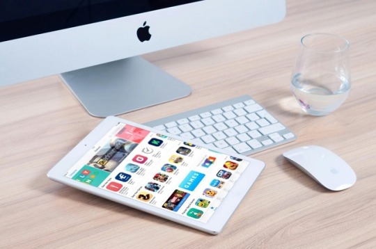
Mobile App Accessibility: Inclusive Design Approaches for 2025
#Mobile App Accessibility#Inclusive Design Approaches#mobile app development#mobile app development agency
0 notes
Text
💸 What Is a Cash Advance & How Can It Help?
A cash advance is essentially borrowing a small amount of money against your future income or credit line. It’s a short-term solution designed to help when you need funds fast — whether for an emergency bill, a repair, or an unexpected cost.
Apps like Gerald make cash advances easy and transparent. With fast cash advance and buy now, pay later options, you can handle urgent needs without hidden fees or confusing terms.
✅ Quick access to funds ✅ Flexible repayment options ✅ No hidden charges
👉 See how it works 👉 Explore tips on the Gerald blog
📲 Download Gerald Cash Advance App: Google Play | App Store
💡 For guidance on responsible borrowing, visit Consumer Financial Protection Bureau.
#A cash advance is essentially borrowing a small amount of money against your future income or credit line. It’s a short-term solution design#a repair#or an unexpected cost.#Apps like Gerald make cash advances easy and transparent. With fast cash advance and buy now#pay later options#you can handle urgent needs without hidden fees or confusing terms.#✅ Quick access to funds#✅ Flexible repayment options#✅ No hidden charges#👉 See how it works#👉 Explore tips on the Gerald blog#📲 Download Gerald Cash Advance App:#Google Play | App Store#💡 For guidance on responsible borrowing#visit Consumer Financial Protection Bureau.
1 note
·
View note
Text
Forex Trading App for Fast, Secure, and Smart Currency Trades
Trade global currencies with speed, safety, and insight using the Forex trading app from tradewill.com. Designed for smart traders seeking mobile, real-time market access and control.
#Trade global currencies with speed#safety#and insight using the Forex trading app from tradewill.com. Designed for smart traders seeking mobile#real-time market access and control.
0 notes
Text
The Future of Smart Living with SwitchBot
Embracing Smart Living!!! The rise of smart home technology has transformed how we interact with our living spaces, making them more convenient, secure, and efficient. One of the standout brands in this industry is SwitchBot, which has consistently delivered innovative solutions to enhance our daily lives.
A key product that has gained attention is the SwitchBot Smart Lock. This remarkable device allows homeowners to manage their door security effortlessly. With the ability to lock and unlock your door remotely via a smartphone, you can ensure your home is always secure, even when you're away. The Smart Lock integrates seamlessly with other SwitchBot devices, creating a cohesive smart home ecosystem.
Here are some fantastic features of the SwitchBot Smart Lock that I absolutely love:
Easy installation that fits most standard doors without the need for complex tools
Remote access control, allowing you to grant entry to guests from anywhere
A user-friendly app that provides real-time notifications and monitoring
Compatibility with voice assistants for hands-free operation
Enhanced security features, such as auto-locking and tamper alerts
A sleek and modern design that complements any home decor
As we look to the future, the possibilities for smart living are endless, and brands like SwitchBot are leading the way. I encourage everyone to share their thoughts and experiences with smart home technology and what features they would love to see in future innovations!
#SwitchBot#modern design#voice assistants#remote access#user-friendly app#smart living#innovation#smart home technology
0 notes
Text

https://ift.tt/Ia5J6KG Color & Contrast is an interactive guide to color for designers. ♥️ Source: https://ift.tt/RQfxIy0
0 notes
Text
The Psychology of Colors in UI/UX Design

When it comes to UI/UX design, color isn’t just a design choice; it’s a powerful tool that impacts how users feel and interact with a product. Understanding the psychology of colors can help you create a more effective, engaging, and user-friendly interface. Whether you’re designing a website, mobile app, or digital product, the colors you choose can influence the user experience (UX) in ways you might not even realize.
For more articles please visit: https://pixelizes.com
In this blog, we’ll explore how colors can affect user perception, behavior, and emotions in UI/UX design.
Why Colors Matter in UI/UX Design
Colors have a significant psychological impact. They can trigger emotions, influence behavior, and even drive decision-making. In the context of UI/UX design, your choice of colors can:
Enhance usability and navigation
Improve readability
Set the tone of the design
Influence conversions (clicks, sign-ups, purchases)
Red: Energy and Urgency
Red is a color associated with passion, action, and urgency. It’s bold and attention-grabbing, which is why it’s commonly used for calls-to-action (CTAs), like “Buy Now” buttons or error messages. It can stimulate the senses and increase heart rates, making it perfect for encouraging immediate action.
When to Use Red:
To create urgency or excitement (e.g., discounts, limited-time offers)
To highlight critical actions (e.g., delete buttons, error notifications)
Caution: Too much red can be overwhelming, so balance it with neutral tones for harmony.
Green: Calm and Trust
Green is the color of nature, growth, and balance. It’s often used to communicate trust, sustainability, and health. In UX design, green is commonly used to signify success or positive outcomes (e.g., “Success” messages or confirmation buttons). It is also associated with ease of use, so it’s a good choice for buttons or elements requiring user interaction.
When to Use Green:
For positive actions (e.g., “Submit,” “Confirm”)
To convey eco-friendliness or sustainability
For calming or soothing experiences (e.g., wellness or meditation apps)
Blue: Trust and Professionalism
Blue is known for its association with trust, calmness, and professionalism. It’s one of the most commonly used colors in UI/UX design for industries that require a high degree of trust, such as banking, healthcare, and technology. Blue evokes a sense of security, making users feel confident and safe while navigating your interface.
When to Use Blue:
In forms, navigation bars, or CTA buttons that require trust
For backgrounds or sections where you want users to feel calm and assured
In corporate websites or services where professionalism is key
Yellow: Optimism and Attention
Yellow is the color of optimism, creativity, and happiness. It grabs attention and stimulates mental clarity, but too much yellow can feel overpowering. Use yellow sparingly to draw attention to important elements or to add a pop of energy to your design.
When to Use Yellow:
To highlight important actions or notifications
In small doses to evoke positivity and enthusiasm
For calls-to-action that want to stand out (like “Subscribe” or “Learn More”)
Caution: Ensure it doesn’t dominate the design; too much yellow can cause eye strain.
Purple: Luxury and Creativity
Purple is associated with luxury, creativity, and innovation. It’s a great color for conveying sophistication, elegance, and originality. Purple is often used in industries like beauty, fashion, and high-end products. In UI/UX design, purple can be used to create a sense of exclusivity or to enhance the creativity of the interface.
When to Use Purple:
For premium products or services
In creative fields like design, fashion, or beauty
To add a touch of luxury or elegance
Black & White: Minimalism and Contrast
While not technically colors, black and white are incredibly important in UI/UX design. They represent simplicity, clarity, and contrast. A monochrome color scheme can help create a clean, minimalist look, and the stark contrast between black and white enhances readability and focus.
When to Use Black & White:
For minimalist designs that prioritize clarity
To create visual contrast and make other colors pop
In sophisticated and high-end brands looking for simplicity and elegance
Pink: Playfulness and Femininity
Pink is often associated with playfulness, warmth, and femininity. It’s commonly used in designs targeting young audiences or those in the fashion and beauty industries. Pink evokes positive emotions and can create a welcoming, friendly experience for users.
When to Use Pink:
For apps or websites targeting a younger, trendy audience
In creative or fun products
For enhancing the aesthetic of fashion, beauty, or lifestyle sites
Tips for Using Colors in UI/UX Design
Contrast is Key: Always ensure there’s enough contrast between text and background for readability.
Consistency: Stick to a cohesive color palette to keep the user interface consistent.
Accessibility: Use color contrast checkers to ensure that your design is accessible to those with color blindness.
Cultural Relevance: Different cultures may associate different meanings with colors, so always consider your target audience’s cultural background.
Final Thoughts
Understanding the psychology of colors can help you make more informed, strategic decisions in your UI/UX design. By carefully selecting colors that align with your brand’s values and the emotional experience you want to evoke, you can enhance usability, guide user actions, and create a more engaging and effective interface.
Remember: Colors are not just visual elements—they’re an integral part of the user experience!
#UI/UX design#Color psychology#UX design tips#Color in design#User interface design#Color theory#Emotional design#Web design#Mobile app design#Color contrast#User experience#Branding and color#Design for accessibility#Color palettes#Conversion optimization#Visual design#Design aesthetics#User behavior in design#UI design trends.
1 note
·
View note
Text
Why Inclusive Design is a Must for Healthcare Apps
Learn the importance of inclusive design in healthcare apps and how it matters more and more in 2025.
1 note
·
View note
Text
UX/UI Best Practices for E-Commerce Platforms in 2025
Table of Contents Introduction to UX/UI for E-Commerce in 2025 Why UX/UI Matters in E-Commerce Success Key UX/UI Trends for E-Commerce in 2025 AI and Automation in UX/UI Design Essential UX/UI Best Practices for E-Commerce a. Mobile-First Design b. Simplified Navigation & Search c. Personalization & AI Recommendations d. High-Speed Performance & Load Time Optimization e. Secure &…
#A/B testing#accessibility design#AI chatbots#AI personalization#bounce rate reduction#conversion rate#digital experience#E-commerce UX#fast-loading websites#future of UX/UI#intuitive navigation#lazy loading#mobile-first design#online shopping#personalized shopping#progressive web apps#seamless checkout#SEO for e-commerce#smart recommendations#trust signals#UI best practices#user-friendly interface#UX design trends#voice search#website optimization
0 notes