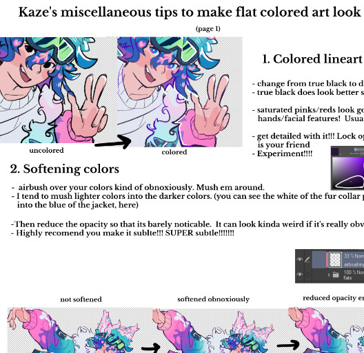
#airbrush + blur + shade effect
Explore tagged Tumblr posts
Visit Tumblr Blog
Explore Tumblr blogs with no restrictions, modern design and the best experience.
Last Seen Tumblr Blogs


Fun Fact
The Tumblr office adopted Tommy, an 11-year-old Pomeranian.
Text
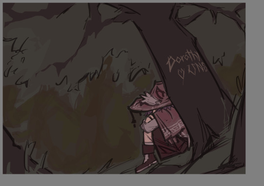
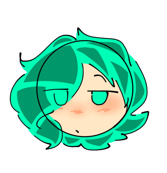
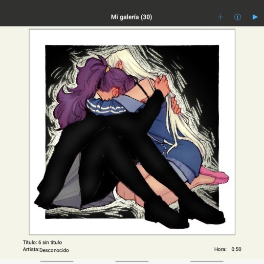
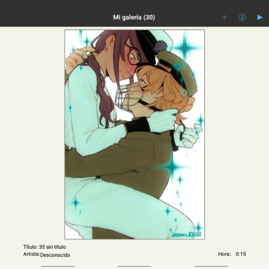
My favorite type of art that I need to draw more of is two characters just having beef with one another

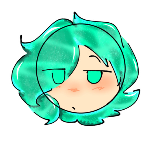
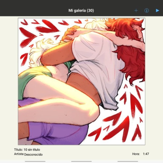
The newest Japanese pop up store gave me inspiration to draw Pomni and Jax fighting and I love it
LET THEM BEAT THE SHIT OUTTA EACH OTHER
The original screenshot:

She is beating his ass YEAH GET HIM
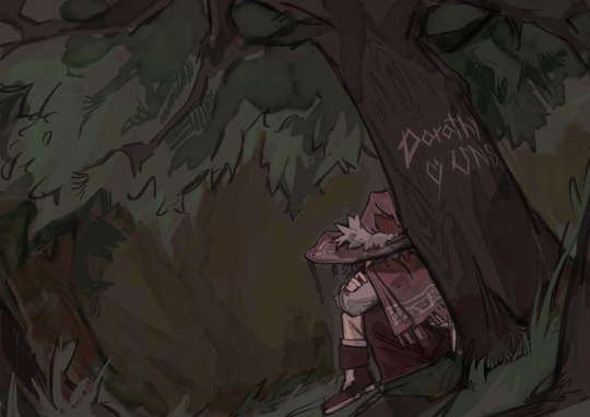
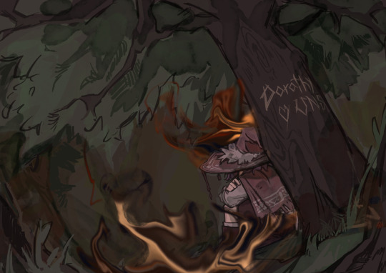
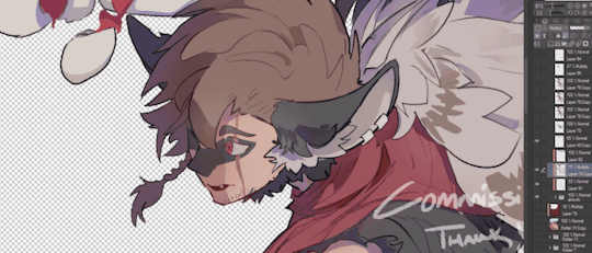
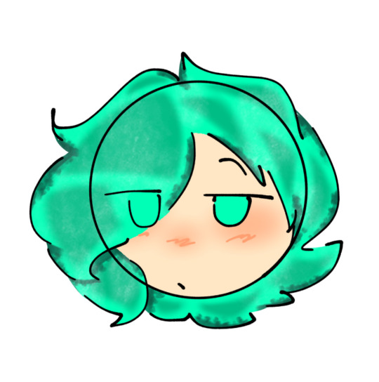
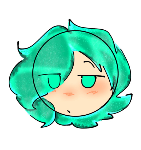
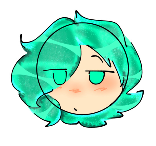
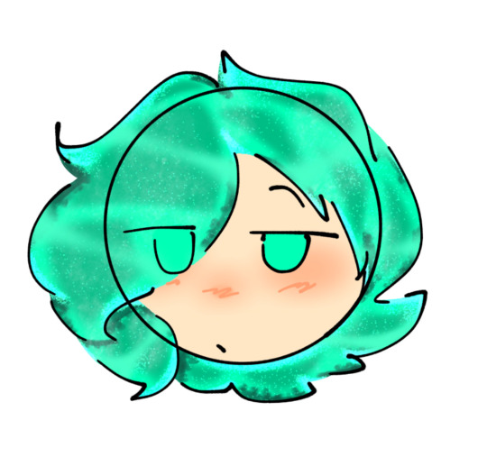
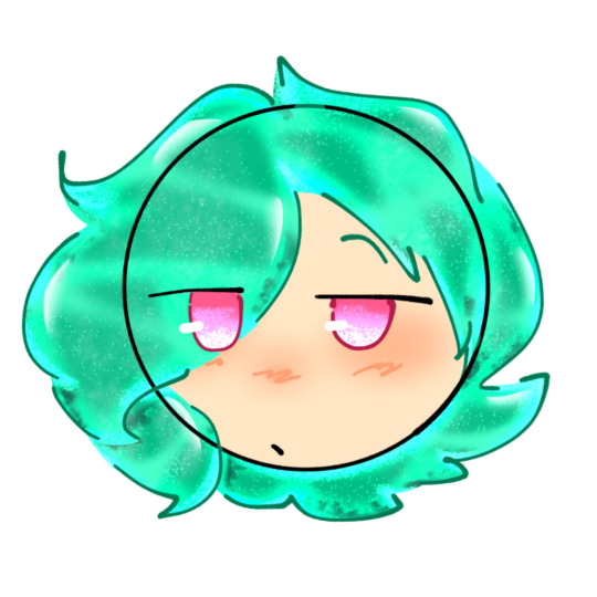
#the amazing digital circus#amazing digital circus#the digital circus#digital circus#tadc#pomni#tadc pomni#jax#tadc jax#DOES this count as funnybunny?#Maybe?#Considering how a lot of my friends draw em most likely#funnybunny?#tadc art#tadc fanart#digital circus art#THE GIRLIES ARE FIGHTING#BEEF BEEF BEEF#also did try a different shading style in this#airbrush + blur + shade effect#look at me experimenting :3c
177 notes
·
View notes
Text
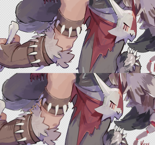
a lot of comic art would benefit from sticking to the flatcolors
#too often is the coloring for comics rubbery and airbrushed-looking#the way a lot of comic artists ink already gives it dimension/depth without having to render#gradients can have a powerful effect but sometimes when i see artists share wips for their pages i honestly prefer the flatcolors#simple. classic. clean. accentuates the inks instead of muddying/distracting from them#no doubt there ARE times when the rendering has saved bad inks#but i feel like it just comes down to restraint#my hyprocritical ass typing all this up rn bc i’m stalling on my coloring stage lol#genuinely i think my art looks better in flats but that might just be my lack of coloring competence. idk restraint 💔#ik i gotta commit to it for this piece but the dilemma always passes my mind when i get to this part of the process#danbles#(this was prompted by seeing the flats vs final for the GL/GA special)#(lucas meyer your lines are sexy as hell WHY are we using gaussian blur to shade)
69 notes
·
View notes
Text
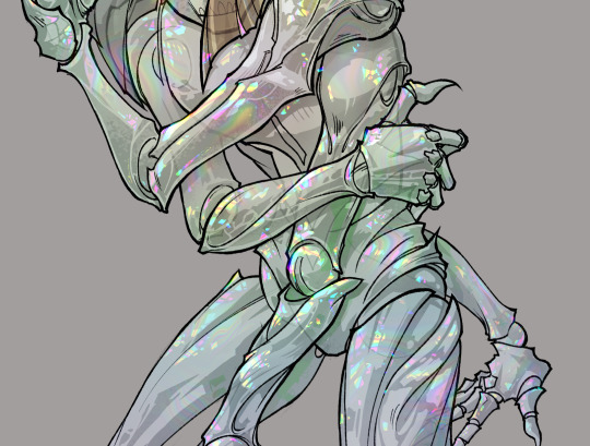
gonna show u guys a little opalescent highlight hack i threw together today
rainbow gradient above your main figure (i usually have all my main figure folders/layers in one big folder, so i can clip gradient maps + adjustments to it!). liquify tool to push the colors around a bit. STAY WITH ME I KNOW IT LOOKS STUPID RN I'M GOING SOMEWHERE WITH THIS
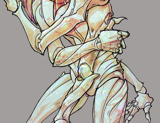
THEN: set it to add/glow (or the equivalent in ur drawing program), lower the opacity a bit, and apply a layer mask. then u can edit the mask with whatever tools you like to create rainbow highlights!!
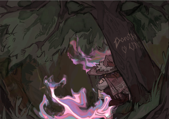
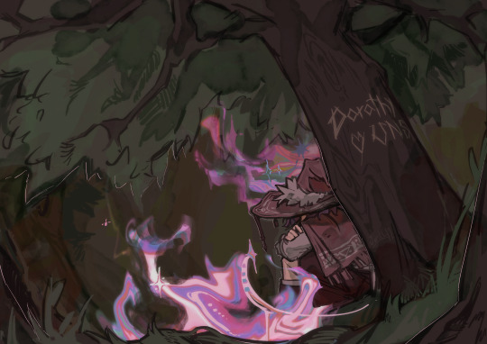
in this case i'm mostly using the lasso fill tool to chip out little facets, but i've also done some soft airbrushing to bring in larger rainbow swirls in some areas. it's pretty subtle here, but you can see it better when i remove the gradient map that's above everything, since below i'm working in greyscale:
more granular rambling beneath the cut!
u could also just do this with a brush that has color jitter, but what i like about using layer masks for highlight/shading layers is how simple and reversible it makes everything. i can use whatever brushes i want, and erasing/redoing things is super low stakes, which is great when i often approach this stuff with a super trial-and-error approach.
example: have u ever thrown a gradient w multiple colors over an entire piece, set it to multiply etc, and then tried to erase it away to carve out shadows/highlights? it's super frustrating, bc it looks really good, but if u erase something and then change ur mind later, u basically would have to like. recreate the gradient in the area u want to cover up again. that's how i used to do things before figuring out layer masks!! but masking basically creates a version of this with INFINITE undo bc u can erase/re-place the base layer whenever u want.
anyway, back to rambling about this specific method:
i actually have TWO of these layers on this piece (one with the liquified swirls shown above, and another that's just a normal concentric circle gradient with much broader stripes) so i can vary the highlights easily as needed.
since i've basically hidden the rainbow pattern from myself, the colors in each brushstroke i make will kind of be a surprise, which isn't always great -- but easily fixable! for example, if i carve out a highlight and it turns out the rainbow pattern in that area is way too stripey, i can just switch from editing the mask to editing the main layer and blur that spot a bit.
also, this isn't a full explanation of the overall transparency effect in these screencaps! there's other layer stuff happening below the rainbow highlights, but the short version is i have all this character's body parts in different folders, each with their own lineart and background fill, and then the fill opacity is lowered and there's multiply layers clipped to that -- blah blah it's a whole thing. maybe i'll have a whole rundown on this on patreon later. uhhh i think that's it tho! i hope u get something useful out of this extremely specific thing i did lmao
12K notes
·
View notes
Note
Art process and rendering tutorials pls 🙏🙏🙏🙏
okay please bear with me as I try explain the incomprehensible mess that is my art process (I tried to take screenshots thr the entire process). Im gonna use this post while explaining (btw i use krita). Most of my 'process' is me fucking around and finding out im sorry
First I start by filling in the background colour and basic elements with the lasso fill tool and the fill block brush (a square brush). I dont know how much of a tutorial you want but I tilted the whole thing to make the composition more interesting. Id say try to have some foreground and background elements to the drawing makes it more dynamic (even if its just a shadowy shape in the front it adds alot). Also i always start with the background colours first so i can set the mood for the rest of it yknow
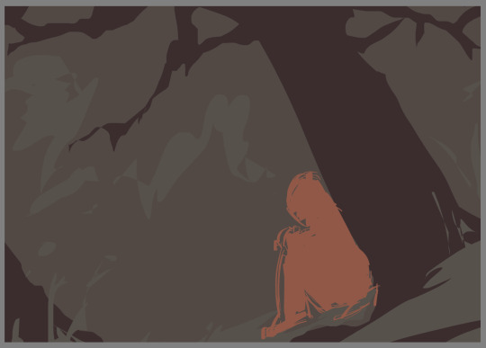
Then I add some line art on to it (on a diff layer) and actually draw the details of the character (which is the focus) using the fill block brush again (thats my main brush just assume i use it for almost everything) Oh and also i delete the orange shape of the character i used, and also messed with the brightness settings for the background to fit the vibe more

Then on a layer beneath the lines i do the base colouring (both background and character and try to seperate the figures a bit and figure out the colours.
Next is shading. I add a new later set it to multiply and choose a colour which fits (in this case green and orange i think) I use the waterpaint hard edges brush for this. This is normally where i wing the lighting situation but uh this piece didnt really have a complicated one? so its just in the obvious places (ie. underneath the tree, underneath the hat etc). make sure your shadows kinda dont remove the focus from the character by either making it too dark or too light around there? Idk if that makes sense im trying to give advice
Okay now rendering which i will try give a tutorial: I merge all my layers and make a new one on top and just go in with the fill block brush. I use the colour picker alot during this. This is where i smooth out the lines by colouring over them or thickening them depending on what looks nice (I think line variation is pretty important, id say thicker=darker and thiner=lighter) I also add hatching to my shadows and outline them with a darker colour (makes it look better ithink), just in general i fix up the shapes, add shadows for contrast/form/perspective and also a few textures (the treebark). Im sorry this isnt really helpful i just countinue to go over my lines and proportions using a basic brush and the colour picker till its nice
okay for this drawing i added effects (normally not there in my art) so ill explain what i normally do: I take one of my old art pieces (preferably with at least some interesting vibes) and liquify and warp it to resemble the effect i want
Then I mess with all the colour adjustment curves till it looks liek the colours i want
Then i blur it slightly to get a softer look and add some details (stars and all).
After that i use some multiply and add layers to make the colours more interesting (with an airbrush and using matching colours to the piece). Then is my favourite trick which is to merge ALL the layers and duplicate it and gaussian blur it (around like 20-50 percent idk) and set it to a lower opacity. Then i erase the parts in focus (the character) it just gives a softer look as well as bring more focus to the character. I just outline couple things with a light colour and im done :)
Hopefully there was SOMETHING in there but i dont thinkk any of that was useful
#ask#my art#im pretty sure you taught me that gaussian blur trick#this was so bad im so sorry i just mess around till something works😭
15 notes
·
View notes
Note
Hello!!! I love your art so much, especially the way you render!! Do you have any tips, tutorials, etc on rendering?? Be as detailed or curt as you like, I'm just hoping to improve my skills -- and I hope to see more art from you, in any form!!! You're a fantastic artist !!!! Have a good day :)
Sorry for the delay in answering this, I wanted to answer it well!!!
Here's my typical 5-step process:
flats
he has been flatted. You'll notice I also colored the lineart at this stage as well! Also, I do work with the background at the same time, but I have hidden it here for simplicity.
2. Cell shade shadows

I used to skip cell shading and just ball with my rendering, but I have found starting out like this is much faster!!
3. Airbrush shadows and colors
I did two things here, one is just a touch of airbrushing the colors into eachother, to help make everything more harmonious. The other is to airbrush colors onto my shadows! I set that layer to multiply, and mess around until something looks a little like I want.

4. Painting

This is the time sink - there's no getting around it, it just takes forever!! It's a lot about making the dark areas darker, and artifically injecting some color diversity - I like to diversify shades, and just slap on slight hue shifts as i go, and if it sucks I just paint over it some more. I draw different colors into eachother (look at the black shirt above, see how i bring in the tan and whites into the grey?) and add detail and texture. It's a little hard to explain beyond that, hmm... Do let me know if you have specific questions about it!
5. bedazzle and effects
I add extra highlights to the highlights, maybe a sparkle or two on a hard edge, hash lines for texture, and occasionally I also do screentones in shadows. Also, importantly, i blur things that shgould be out of focus! See on the arms and legs here - the bottom image has them blurred more intensely the further they are from the focal point. It's a small thing, but this effect goes a long way!
Annd done!

It's the little things that make a rendered piece sing! A balance between detailing and speed is a tricky one to figure out - I'm still working on that myself!
Also, there's two different ways I render at the moment, one is the quick-messy for sketches, which is what I've done for most of my fanart lately, but I assumed that you were asking about my full process so I went into detail on that. Tho if you're curious about my sketch rendering, anyone is welcome to ask me about that as well!
(there is little method to this madness though, haha)
Omg wait I had forgotten, a few months ago i was making a mini art guide about some tips and tricks
I lost motivation but if anyone is actually interested do let me know and maybe i'll finish it hjsdhjfghjs
Anyway, thank you so much anon!!!!! wah!!!!!!! Your kind words mean the world to me ;w; They fill me with strength and joy1!!!!!! thank you so much!!!!!!!!
54 notes
·
View notes
Text
Alrighty, here is a part two!
So you curious as to how I used shading and lighting? All secrets will be revealed…
So, the first step is clip a new layer above the prime. Color-drop any mid or dark color then set it to multiply. Adjust opacity to your liking:

Next, add another layer (this is a common theme), and use a soft airbrush using any mid color you want, then set it to multiply again. You can also adjust the opacity, too:

There. The shading section is done. Not so hard, right?
Now, add another clipped layer above the two multiply layers. Use the airbrush again, this time with a lighter color. Then set it to either add or screen:

This time, add another clipped layer, but place it under the add/screen layer.
Set it in overlay, and draw in areas of the character where the light touches, using a bright color and a technical pen brush:

Once you’re satisfied, blur the overlay layer with the Gaussian blur effect, about 4-6%. Adjust the opacity to your liking:

Then you merge all layers together, bottom to the top in that order.
And that’s the lighting section! But there’s still more.
So, this is where things get tricky. Duplicate your layer, and lower your top duplicate at least halfway. Then, use Gaussian blur on the bottom duplicate at about 5%:

Go back to the top layer, and adjust it with the gradient map. Choose one that works with you, play with the opacity:

Next, find a filter for the top layer. It could be whatever, as long as it’s not too bright or too dark. Then merge the layers again:

With the merged layer, use the sharpen tool and set it all the way to 100%. Finally, add in small details and any other filters:

Ta-Da!! Tutorial complete.
Hopefully this all makes sense in some way. Thanks for sticking around! 😁
19 notes
·
View notes
Note
What brushes do ya use??
Program: ibis paint
Lineart (and flat colors): dip pen
Shading + Lighting: fluffy watercolor mix 2 (make sure each shaded/lighted part is on diff layers + clipping)
I do this thing where I save the image so far as a png (no bg) add it to the artwork, (add effect stroke outline) add another layer, set to multiply + clipping mask, erase and smudge light parts with gauze, then do the same thing with another layer set to screen + clipping but instead erase light parts. Most of the time these layers are set to 10% opacity.
Save the image again and add it to the artwork, set to linear burn (clipping), erase light parts with flat brush point, do the same thing with an add layer but erase dark parts. Most of the time these layers are at 10-15% opacity.
Brushes I use for bg are edge dot, lasso tool, airbrush* and round dot.
I use five lines, net 1, and round dot for the contrasting details.
Effects I use: anime bg, chromatic aberration (zooming), perspective blur, lens blur, and frosted glass.
*airbrush is used on layers set to overlay and opacity lowered
9 notes
·
View notes
Text
✨ Gem Hair Tutorial ✨
Hello hello! I decided to make a tutorial on how i personally create Houseki No Kuni / Land of The Lustrous hair (and bonus eyes) for any sort of gemstone character.
Here I’ll provide step by step, screenshot with screenshot for the finished product.
I’d LOVE to see your attempts with my tutorial, so dont be shy to @ me or reply this post!!
— — —
This tutorial is done in my DOODLE STYLE, not REGULAR STYLE.
Characters featured in this tutorial ARE MY OWN CHARACTERS. YOU WILL NOT CREDIT OR CLAIM THEM AS YOUR OWN.
Program Used: IbisPaintX
— — —
1.
- Insert Base / Flat color of choice.
— — —
2.
- Select a darker color from the base color.
- Draw it in simple shapes in the hair. I suggest sharpening the edges via erasing.
— — —
3.
- Set the layer to a lower opacity. Recommended percents are 75, 65, and 55.
— — —
4.
- Blur out the shapes.
- DONT FULLY BLUR THE SHAPES!! Blur the edges / sides.
- Make sure to set your blur brush to a lower opacity. 60 percent range is recommended.
— — —
5.
- Create shadows with a 2nd darker color.
- I used a custom brush by someone (i forgot unfortunately who made this brush…), but for a similar look you could use an airbrush or watercolor brush.
- On this part, set the brush to a low opacity percent. I recommend between 80 & 60.
— — —
6.
- Set your color to WHITE.
- Using that same brush for Step 5, LIGHTLY and FAINTLY speckle the hair with the white all around.
— — —
7.
- Set layer to Add.
- Once again, i am using another custom brush by someone (i cant remember this person either so so sorry). For a similar look, use a Pointillism brush.
- Get a slightly lighter hue of the base color and shade around.
- Speckle the brush allll around the hair.
— — —
8.
- Create this shading detail across parts with your regular brush.
- TRY NOT TO HAVE THESE ALL OVER IN EVERY SECTION OR STRAND!! Make it big in select areas that connect from one side of the hair to the other.
- For the color of step, use the base color but SLIGHTLY lighten it.
— — —
9.
- Blur the shit out of Step 8 shading. Make sure you can still see it somewhat!
- Make sure to your blur brush back to 100 percent opacity for this step.
— — —
10.
- Set color to WHITE once more.
- Use regular brush of choice.
- Add little highlight marks like these across select parts the hair.
— — —
11.
- Blur the ends of the previous step. Dont fully blur it; the white highlights are meant to be seen.
- Change the opacity of the highlights. I recommend 80 or 75 percent.
— — —
12.
- Set this layer to Add again.
- Using your airbrush/watercolor brush again, shade in select areas.
- Change the layer opacity to a recommended range of 85 to 60.
- OPTIONAL: Color the hair line art. Use a darker color of your base color.
— — —
✨ BONUS: Eyes ✨
1.
- Set layer to add.
- Use regular brush of choice, and use base color.
— — —
2.
- Set new layer again to Add.
- Blur the middle between base color and add base color/previous step.
- Use Pointillism brush to create the speckle effect.
- Make the bottom sparkles white. In the middle of the base color and add base color from the previous step, sparkle by that area with the base color.
- OPTIONAL: Color the eye line art.
— — —
And there you are!!! You have completed the tutorial!!! ✨✨
I tried my best with this for each and every instruction. Hope i did good!!
Again, dont be shy to @ me or reply to this post if you have attempted my tutorial. Id love to see all attempts! :]]
#art#digital art#original character#oc#land of the lustrous#houseki no kuni#lotl#hnk#hnk oc#lotl oc#art tutorial#tutorial
22 notes
·
View notes
Note
Your lighting and rendering in all your drawings is top tier dawg how do you do the flash photography effect😭
thank u first of all !!!!!
second of all, honestly i think a lot of it just has to do with how exactly you color the skin and stuff. i always look at photos for coloring reference actually, because cameras and surroundings can make the skin look different if that makes sense. with digital cameras, it makes the skin look very bright and airbrushed, but the flash of the camera also focuses on certain areas. i find that since the face is usually the center of attention, the face and neck are sometimes lighter than the rest of the body (since that’s where the camera is probably pointed, thus lighting it up more). so i try and keep that in mind, and add more shading to the skin in parts where i know the flash wouldn’t be hitting as directly. skin is also very shiny, people are oily, so don’t be afraid to add some harsh highlights around oily areas (i find this is usually the face and chest). same with hair, eyes, and mouth, it helps to just know which areas of the body are glossier than others, and use harsher highlights on those.
with how i do things, sometimes i like to color pick from reference pictures while also using the aforementioned method to actually color. sometimes ill literally just type digital cam photo into pinterest, and then find someone with a similar skin tone to the character, in a similar environment as the drawing. then you just have to apply your knowledge and know which colors to take, and where to put them back down.
one more small coloring note, shadows with digital cameras are usually very small, but they can be harsh. don’t add too much shading to areas you know are getting a lot of light, because there’s a big flash that’s brightening everything up. instead i’d say to just add thin, dark shadows around those areas. also, keep in mind what angle the camera is shooting from, and that’s the angle the shadows should be going in. the drawing below is kind of what i mean, but the environment this photo is hypothetically being taken in is very dark, so the shadows are much harsher than they’d be in a lighter room.

another thing i do along with paying close attention to the coloring, is just making things kinda blurry. recently what ive been doing is duplicating the sketch layer (which i use as lineart), blurring it as much as i see fit, coloring it anywhere from purple to red (it depends), and just turning that into a multiply layer and adjusting the opacity as i see fit. sometimes what i also do is once the whole thing is done and the layers are all together, i duplicate the whole drawing, blur that, and then turn that into a soft light layer and lower the opacity. it depends on what your drawing looks like, so it looks better with some things than others. anything that works with your process that makes things look “dreamy,” probably does the same thing !
only the first one is meant to look like it’s off a digital camera lol, but if you look close at these drawings, you can sorta see what i mean.
30 notes
·
View notes
Text
My 3 Ways of Coloring Eyes
I got bored so here’s some quick tutorials on the three ways I color my eyes in IbisPaint.
Eye one is the method I use the most since it fits my art style. Eye three is a method I use when I’m working on more detailed art works. Eye two is a method I recently started using. It’s quick and simple and works pretty well when I’m feeling a little lazy to do completely detailed art works.
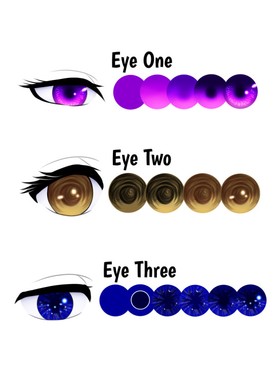
Eye One
Step One: Base Color - Color in the eye with the character's eye color.
Step Two: Screen Effect - Add a new layer and clip it to the base color layer. Set this layer to the Screen effect. The colors you’ll need is the base color, and one or two lighter tints from the base color. If you want to add a fourth color you can. Using the airbrush (trapezoid 60%), color the circle from the middle downwards starting with the base color. With each tint/light color, you’ll want to color closer to the bottom part of the circle to create a gradient.
Step Three: Hard-light Effect - Once step two is complete you can merge the layer with the base one. Create a new layer and clip it then set it to Hard light. Repeat the process of Step two but upwards. Using the base color first color the top half of the circle and the center to create the pupil. Then use one or two more colors darker than the base color and repeat the process.
Step Four: Multiply Effect - After merging the layer for step 3 create a new layer and set it to the multiply effect. Remember to clip it to the base layer. Use the darkest color from step three and/or it’s optional an even darker color. Color in the pupil and the very top part of the eye. You can slowly blend in the darker color by coloring along the edge of the circle or use the blur tool (not the blur effect). Make sure to avoid the pupil if you’re using the blur tool. As seen in Step 5, I also colored around the bottom half of the circle to make the lighter colors appear more on the inner part of the eye.
Step Five: Highlights - After merging the layer from step 4, you can create the final layer and set it to Add. Brushes I used was Dip Pen for the small highlights surrounding the iris and Neon 2 - Add for the bigger highlights. Use two or three colors lighter than the base. The highlights can be any length or size so feel free to experiment as much as you want with the highlights! I mostly drew small and short lines and dots for my highlights. Once you’re satisfied with the highlights you can merge the layer!

Eye Two
Step One: Sketch in the Pupil - Depending on how you draw your lineart, the sketch for the pupil and shadow will be on a separate layer underneath the lineart layer. Adjust your brush's opacity to 50-60 or however low or high you’d like. Start from the pupil on the center of the eye and create circular or curved sketched lines. Work your way outwards and to the top half of the eye, making wider curved lines. Try to leave some gaps between the lines and keep the bottom half untouched. And don’t focus too much on this half, just make quick sketches it doesn’t have to be perfect!
Step Two: Screen Effect - With a new layer UNDER the sketch layer for step one, set this layer to Screen. Use the airbrush to color the bottom half of the eye. I used the base color and a lighter shade for this step.
Step Three: Sketch Color - Going back to the pupil layer from step one, you’re going to change the color of the sketch to a dark color of the base color. Once you picked out the color set it to hard light. This is optional but you can also use the blur effect. Also optional, you can do mixed colors or another effect besides the hard light one as well for this method. Try experimenting with it!
Step Four: Highlights - After merging the previous layers together you can add a new layer and set it to Add. Use either the Neon 2 - Add or an outline brushes for this step. Use the light color from step 2 or other lighter colors to create the highlights. I just added a couple of dots and a small line for my highlights but the highlights can be any size you like. This is optional but you can also use the blur effect to soften the highlights.
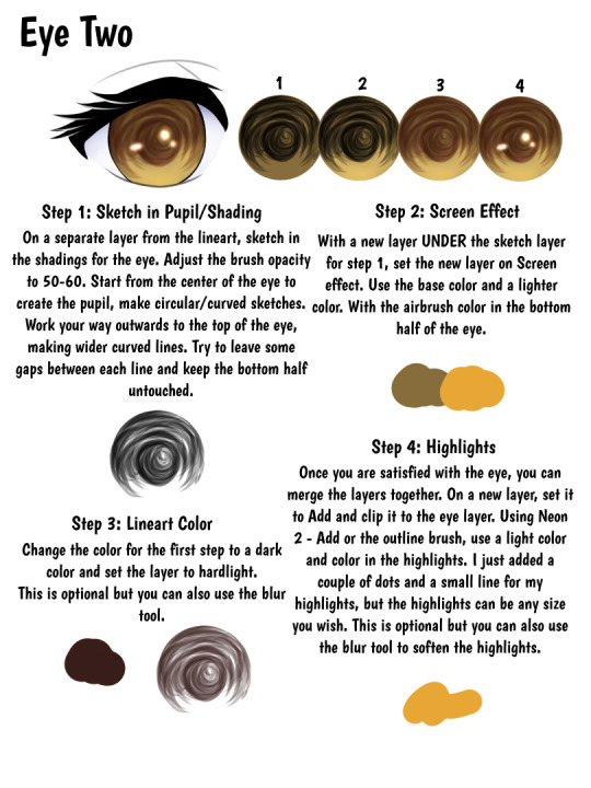
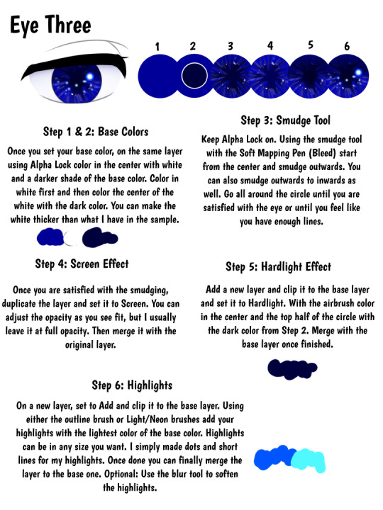
Eye Three
Step One & Two: Base Colors - After picking out your base color, turn on alpha lock and color in the center of the circle with white and a darker shade of the base color. You can do this two ways, color in white first and then the darker color. Or you can color in the darker shade first and then color in white alongside the dark color. You can make the white thicker than what I have shown in the sample. White should be one of the main colors used in this but if you wish to use the lightest tint of the base color in place of white you can do that too!
Step Three: Smudge Tool - Make sure alpha lock is still enabled and using the smudge tool with the Soft Mapping Pen (Bleed) start smudging lines from the center outwards. You can also smudge outwards to inwards as well. Go all around the circle until you are satisfied with the eye or until you feel like you have enough lines. Make sure to adjust the size of the brush to make the lines thin or thick.
Step Four: Screen Effect - Once you’re satisfied with the smudges, duplicate the layer and set it to screen. You can adjust the opacity as you see fit but I usually just leave it at full opacity. Then merge it with the base layer.
Step Five: Hard Light Effect - On a new layer, clipped to the base one set it to hard light effect. With the airbrush color I’m the center of the eye to create the pupil and the top half of the circle. Use the dark color from step 2. If you wish to make the pupil more visible you can color it in more or use a darker color. Once finished, merge the layer to the base.
Step Six: Highlights - On a new layer, set to Add and clipped to the base layer we can add the highlights! Use either the Neon/Light brushes and the Outline brushes to draw the highlights with the lightest tint of the base color. The highlights can be any shape or size you wish. I mostly made dots and short lines for my highlights. This is optional but you can also use the blur effect to soften the highlights.
#ariparri#art tutorial#coloring tutorial#eye tutorial#ibispaint#ibispaint tutorial#eye reference#art tip#art reference#ibispaint tips
19 notes
·
View notes
Note
What's your process for rendering? It always looks so pretty!
maybe i should do a speedpaint video some day!
not really sure how to explain this without showing but my basic steps are
>make sure the base colors are done
>do base shadows using a really blend-able paint brush like clothes' creases and etc. I also add extra strands of hair around in this step
>merge all the color layers together
>clip and apply a multiply layer with a color from the background for that realism i guess
>erase parts of the multiply layer where you want light to shine with a hard eraser and then again in some areas with a soft one
>apply and clip another layer but its add glow with the color you want the lighting to be (if sunset, like an orange color for example) I usually never lower the opacity, just color over the light places lightly and make sure im not overdoing it on the add (my eyes) oh and i use a soft airbrush most of the time
>insert trial and error of a ton of blur and effect filters until it seems good. I sometimes like to add a gradient correction layer so that everything blends nicely and matches. Think of it like I don't want my character to be neon when the background is a dull monochrome lol
noise layer!
yeah idk sometimes this varies from work to work depending on what type of feel i want or brushes i use. Especially in a big work, i try hard a little more on the base shading and hair but usually this is my process lol
#yumii yap#rendering is different for everyone!#my art style: trial and error#ur art is pretty too!#yumii ask#art process
6 notes
·
View notes
Note
Hello! I absolutely love the airbrush look on that g3 wysteria drawing. Would you be willing to share the brush/settings, or have any tips for achieving the look? I understand if not though, so no need to answer this if you don't want to!
HI THANK YOU!!! ill try my gbest to explain! i used this brush for everything on that piece:

i use it at around 25px on a 2000x2000px canvas if that means anything to anyone
i tried to recreate the process here, heres my little annotations: 1. kind of just make a rough outline of the shape u want 2. add shadows, with black closest to the face so the hair has like a gradient effect 3. add sqiggles!!! your worms!!! this will be cleaned up so go as messy as you want 4. colours, change the black to a purplish colour(or whatever shade you want im doing pink hair so purple goes well with that yknow) on a linear burn layer on like 80ish percent with your colours underneath, i just scribble these in and keep it lighter around the edges again, ill flatten everything and then draw lighter curls on top to make it look cool 5. clean up, this is the longest part uits essentially colour picking parts of the hair and making them more prominent, i kind of just mess around here and keep whatever i think looks good 6. its basically finished now but i like to go with an extra extra light pink underneath and do an airbrush effect around the hair and then add in more curls- and then flatten everything -> duplicate -> gaussian blur at like 15% maybe -> change layer opacity to around 30 or whatever looks good to get more of that airbrush 'ethereal' effect
really i tend to just 'fuck around and find out' when it comes to art, i had to redraw this piece like 3 times until it looked right to me so i think just scribble around and see what you like really. i hope this helped if u need anything else LMK ta
23 notes
·
View notes
Note
Hello again, I’ve “finished” that drawing I asked you about a while ago! I think I’ll add some lettering to the bottom and make the green-lighted lady’s arms larger, but aside from that, what do you think I should revise? I also wanted to add a glitch effect to the characters at the top (for lore reasons), but I can’t tell if it looks horrible or not. I also am a bit worried about compositional readability.


Please let me know what you think! If context helps, this is a project which will be included in my school portfolio. Thank you for answering my ask before also ☺️
the glitch effect is cool, but id stick to red, white, and blue for the colours of the glitch, as the green looks out of place and muddy. the characters at the top are also very dark and at first glance I didn't see them at all. if they are meant to be hidden that's fine, but I just want to let you know they aren't very visible, so if that's not your intention id make them brighter or the lighting on them stronger.
the shading looks great for most of the characters but I cant understand where the light source is coming from for the yellow character on the right (not the one in the middle). the shading is also very soft, which for some surfaces makes sense, but in this drawing, everything is shaded very softly with an airbrush. id include some more hard edges in shading since those are important, especially in the face. there should definitely be harder shadows/highlights on the noses too. the hair needs harder highlights especially, all of the hair here looks very soft like a pillow, and not shiny like hair actually is. darker skin is also more reflective and has more contrasted shading, but in this art piece the lighter skin and the darker skin are shaded the same.
the strong coloured highlights really swallow up the colours of the characters clothes and skin, which is why I prefer to use multiply and overlay blend modes, since it retains the colour underneath all the shading.
if I blur my eyes and look at the drawing as a whole, the lightest and most eye-catching part of the drawing is in the middle with the white character, but it seems the characters in the very front should be more emphasised. so i'd say to make the bottom of the image even brighter, simply an overlay layer with a white airbrush can brighten it up, also putting the overlay over the characters at the very top can make them brighter, its a very easy fix.
the pink and light blue character's skintones are looking rather grey, a little bit more orange/red can help with this. i would say the grey character's skin also looks grey, but that's their colour so I'm not sure if that's intentional.
also I'm not sure if the white text is important, but I do want to point out that I have no clue what it says, I can't read it. (I see starry mask on the left, but what does it say on the right? I'm seeing "cplouge") also this is optional but I really like to do it and it adds a lot of life to art, just adding a small white highlight in the eyes
hope i helped!
5 notes
·
View notes
Note
Just wanted to say that your art, in particular your colouring style, is gorgeous! I would love to know anything about how you go about colouring – it gives your characters this really deep, soft, plush look and the backgrounds almost remind me of stained glass or jewels.
aa thank you very much , this means plenty to me !!
for my colouring process i just use the basic in-app brushes in the program i use (Procreate). the main brush i for mostly everything is the Soft Airbrush, for both gradient markings and shading, for more solid markings and cell-shading i use either Studio Pen or Dry Ink brush.
i also do mix some cell-shading with the air brushing, depending on what the scene is or what i'm going for, the cell shading is typically on a low opacity — but it does makes a difference imo. (if im doing something that's completely cell-shading then i will use the airbrush with erase very lightly on some or most of the edges of the shading)
if i want the piece to look even softer, or more 'dream-like', then i will usually save the piece and open it on a different canvas — then duplicate the layer to blur it around 2% or 3% and then lower the opacity to either 40% or 50% of the blurred layer over the normal one.
adding grain effect at 2% also helps.
on the backgrounds note, for the behind the stained glass ones i use a realistic oil painting brush that i bought off Gumroad (i think).
i love making backgrounds look like stained glass so much, despite how tedious it is for me (i would absolutely make them more high in detail if i had the patience lol, trying to learn and build that into myself lately). i've always loved admiring big stained glass windows, they are always so pretty and i try to incorporate such.
5 notes
·
View notes
Text
a lot of recent anime especially bishoujo ones that focus on just showng off the pretty girls uses these blobby shadows style


and thats what i been trying to pin down. also trying to like limit the shading amount because this would be "animation" and not promotional art lol. sometimes i'll see this soft "glow" effect too around the shadows and usually I use airbrush to soften them but this time I went with duplicating the layer and then blurring it
#Are you telling me Char broiled this burger?#mwdh IS basically a harem so like the style of bishoujo harems works we have the same goals but im better
5 notes
·
View notes
Note
Hi hi, hope you're doing well!! Wanted to ask if you could explain how you pick colours! They're always so appealing to look at... (If you could also explain how you pick blush colours it'd be great! I never manage to pick good ones, no matter how hard I try :'))
hi anon, i'm doing fine!! it's summer right now where i live and that's healing all my problems (◡ ω ◡)
i have recorded the process of some of my drawings and everything is posted in my youtube channel (in twitter too), so i'll drop the link here and try my best to explain the coloring part to you. the short answer is that none of the colors you see in my drawings are similar to those i initially picked.
i try to keep my lineart loose but i pay attention to the outlines so i can quickly select the outer parts, invert the selection and fill it with the bucket tool. my base colors are all 100% opaque and i don't use any fancy brushes here.
as to how i pick colors, i never use the color picker tool, i eyeball everything. that's important for me because i tend to make all of them warmer: the greens are dark yellows, the pinks are light reds, and everything that's close to blue is very desaturated. i do this even for drawings that turn out much different later, unless i have a very specific vibe in mind from the beginning. i also never use pure whites for anything, and if something is black i make it part of the lineart.
then i always color my lineart!! there's no trick to that, the layer is in normal mode and i just paint it with a darker color than what's below it. i usually add the shadows and highlights at this stage of the drawing too. you're going to kill me for this but shade with gray set in color burn or linear burn (never multiply). i just don't want to think about color variety at this stage because it makes things more difficult for later. sometimes i add textures and some basic color correction here (curves, color balance, layers set in overlay, etc.) but i mostly leave that for the next part.
as to how i choose blush colors, i usually pick the base color and move it towards the saturated end of the color wheel, and a bit more pink. sometimes i add a multiply layer and airbrush hot red over the base colors at low opacity. coloring the lineart with hot colors surrounding the blush areas helps a lot too :)
i also almost always duplicate the lineart, blur it and set it in linear burn (i paint this layer in a light gray). this adds a lot of depth to the drawing, especially if later combined with the bloom effect.
the key to why the colors in my art pop so much is that i don't enjoy drawing as much as i enjoy postprocessing pictures 😂🤣😅👌✌️👍 once i'm satisfied with the "base" colors i merge everything except the background, open a new canvas and go crazy with filters and textures. that's why i use ibispaint X even if i do the lineart elsewhere (krita), and even if it works a bit wonky with big canvases.
i do something different for each drawing here, so first i'm going to explain my reasoning so that you understand my process: i used to have a problem of using very strong colors that overshadowed my beloved lineart into which i had put a lot of effort, so my goal nowadays is to make everything look less contrasted without losing the visual impact of saturated colors. that way the lineart remains a strong point and not just a way to separate one color from another.
what i usually do is duplicate the new merged layer, set it to exclusion mode, add a gradient map and play with the opacity. then i duplicate that and do the same thing with another gradient or another blending mode. i tend to add like 3-6 layers of bullshit over my drawings, including textures and other filters like "bloom" or "sharpen". i understand everything that's going on there but i don't think too deeply about it, i just pick whatever looks best.
for the final touches i always pull up the saturation and contrast (since a lot of it gets lost in the process), and i usually have to manually change some colors (ibispaint X has a filter to do that) or tweak the curves. then i add chromatic aberration, noise set to overlay and little polka dots set to linear dodge.
here are some comparisons of the before and after of recent drawings. the 1st one is very subtle, but you can clearly see how much warmth and depth it gains it gets after all the postprocessing. the 2nd one is so different that i understand why you're curious about how i pick colors. i don't think i can replicate that look just from picking nice colors, there's a lot more going on!! the 3rd one personally feels like it had potential lost (i liked the yellow highlights), but the colors were too strong and all over the place, so the finished result looks more intimate and calm and i like it a lot more.

thank you for the interest anon, i'm very happy that you like the way i color things and i hope i have explained myself. good luck with your own journey!!
24 notes
·
View notes