#alertdialog
Explore tagged Tumblr posts
Visit Tumblr Blog
Explore Tumblr blogs with no restrictions, modern design and the best experience.
Last Seen Tumblr Blogs


Fun Fact
The most popular pages on Tumblr are about Minecraft, GIFs, and David J. Peterson.
Video
youtube
🛑 How to Create an AlertDialog in Flutter | Flutter UI Tutorial 🚀
#youtube#📌 How to Create Custom Classes in Flutter? 🚀 In Flutter using custom classes helps organize your code making it more modular and readable#🚀 Perfect for beginners and developers looking to refine their Flutter UI skills! 📢 Join Our Community! 📌 Telegram Channel :-- https:
2 notes
·
View notes
Text
How to use HarmonyOS NEXT - AlertDialog?
Display warning pop-up component, which can set text content and response callback. [code] AlertDialog.show(value: AlertDialogParamWithConfirm | AlertDialogParamWithButtons | AlertDialogParamWithOptions) [/code]
AlertDialogParam object description ·Title: Pop up title. ·Subtitle: Pop up subtitle. ·Message: Pop up content. ·AutoCancel: Whether to close the pop-up window when clicking on the obstruction layer, true means to close the pop-up window. False means not closing the pop-up window. (Default value: true) ·Cancel: The callback when clicking on the blocking layer to close the dialog. ·Alignment: The vertical alignment of the pop-up window. (Default value: DialogAlignment.Default) ·Offset: The offset of the pop-up window relative to the position of the alignment. (Default value: { dx: 0 , dy: 0 }) ·GridCount: The number of grids occupied by the width of the pop-up container. (Default value: 4, value range: integers greater than or equal to 0.) ·MaskRect: In the pop-up masking layer area, events within the masking layer area are not transparent, while events outside the masking layer area are transparent. (Default value: { x: 0, y: 0, width: '100%', height: '100%' }) ·ShowInSubWindow: When a certain popup needs to be displayed outside the main window, should it be displayed in a sub window. (Default value: false, Pop ups are displayed within the application, rather than as separate child windows ·IsModal: Is the pop-up window a modal window? Modal windows have masks, while non modal windows have no masks. (Default value: true�� At this moment, there is a mask on the pop-up window ·Background Color: The color of the pop-up panel. (Default value: Color.Transparent) ·BackBlurStyle: Pop up window back panel blurred material. (Default value: BlurStyle.COMPONENT_ULTRA_THICK) ·OnWillDismiss: interactively closes the callback function. ·CornerRadius: Set the corner radius of the backplate. You can set the radii of four rounded corners separately. (Default value: { topLeft: '32vp', topRight: '32vp', bottomLeft: '32vp', bottomRight: '32vp' }) The size of the rounded corner is limited by the size of the component, with a maximum value of half the width or height of the component. If the value is negative, it will be processed according to the default value. Percentage parameter method: Set the rounded corner of the popup based on the percentage of the parent element's popup width and height. ·Transition: Set the transition effect for pop-up display and exit. ·Width: Set the width of the pop-up panel. ·Height: Set the height of the pop-up panel. ·BorderWidth: Four border widths can be set separately. (Default value: 0) Percentage parameter method: Set the border width of the pop-up window as a percentage of the parent element's pop-up width. When the left and right borders of a pop-up window are larger than the width of the pop-up window, and the upper and lower borders of the pop-up window are larger than the height of the pop-up window, the display may not meet expectations. ·BorderColor: Set the border color of the pop-up panel. (Default value: Color. Black) If using the borderColor attribute, it needs to be used together with the borderWidth attribute.
Example demonstration: AlertDialogPage [code] @Entry @Component struct AlertDialogPage { @State message: string = 'AlertDialog'; @State dialogMessage:string=''
build() { Column({space:10}) { Text(this.message) .fontSize(20) .fontWeight(FontWeight.Bold) Button('点击弹窗').onClick(()=>{ AlertDialog.show({ title:'删除联系人', message:'是否删除所选的联系人', primaryButton:{ value:'取消', action:()=>{ //点击“取消”按钮的业务逻辑 this.dialogMessage='点击了取消' } }, secondaryButton:{ value:'删除', fontColor:Color.Red, action:()=>{ //点击“删除”按钮的业务逻辑 this.dialogMessage='成功删除' } } }) }) Text('弹窗消息:'+this.dialogMessage) } .height('100%') .width('100%')
} } [/code]
1 note
·
View note
Text
0 notes
Text
Clarifying the Relationship Between Popovers and Dialogs
New Post has been published on https://thedigitalinsider.com/clarifying-the-relationship-between-popovers-and-dialogs/
Clarifying the Relationship Between Popovers and Dialogs
The difference between Popovers (i.e., the popover attribute) and Dialogs (i.e., both the <dialog> element and the dialog accessible role) is incredibly confusing — so much that many articles (like this, this, and this) have tried to shed some light on the issue.
If you’re still feeling confused, I hope this one clears up that confusion once and for all.
Distinguishing Popovers From Dialogs
Let’s pull back on the technical implementations and consider the greater picture that makes more sense and puts everything into perspective.
The reason for this categorization comes from a couple of noteworthy points.
First, we know that a popover is content that “pops” up when a user clicks a button (or hovers over it, or focuses on it). In the ARIA world, there is a useful attribute called aria-haspopup that categorizes such popups into five different roles:
menu
listbox
tree
grid
dialog
Strictly speaking, there’s a sixth value, true, that evaluates to menu. I didn’t include it above since it’s effectively just menu.
By virtue of dialog being on this list, we already know that dialog is a type of popover. But there’s more evidence behind this too.
The Three Types of Dialogues
Since we’re already talking about the dialog role, let’s further expand that into its subcategories:
Dialogs can be categorized into three main kinds:
Modal: A dialog with an overlay and focus trapping
Non-Modal: A dialog with neither an overlay nor focus trapping
Alert Dialog: A dialog that alerts screen readers when shown. It can be either modal or non-modal.
This brings us to another reason why a dialog is considered a popover.
Some people may say that popovers are strictly non-modal, but this seems to be a major misunderstanding — because popovers have a ::backdrop pseudo-element on the top layer. The presence of ::backdrop indicates that popovers are modal. Quoting the CSS-Tricks almanac:
The ::backdrop CSS pseudo-element creates a backdrop that covers the entire viewport and is rendered immediately below a <dialog>, an element with the popup attribute, or any element that enters fullscreen mode using the Fullscreen API.
That said, I don’t recommend using the Popover API for modality because it doesn’t have a showModal() method (that <dialog> has) that creates inertness, focus trapping, and other necessary features to make it a real modal. If you only use the Popover API, you’ll need to build those features from scratch.
So, the fact that popovers can be modal means that a dialog is simply one kind of popover.
A Popover Needs an Accessible Role
Popovers need a role to be accessible. Hidde has a great article on selecting the right role, but I’m going to provide some points in this article as well.
To start, you can use one of the aria-haspopup roles mentioned above:
menu
listbox
tree
grid
dialog
You could also use one of the more complex roles like:
treegrid
alertdialog
There are two additional roles that are slightly more contentious but may do just fine.
tooltip
status
To understand why tooltip and status could be valid popover roles, we need to take a detour into the world of tooltips.
A Note on Tooltips
From a visual perspective, a tooltip is a popover because it contains a tiny window that pops up when the tooltip is displayed.
I included tooltip in the mental model because it is reasonable to implement tooltip with the Popover API.
<div popver role="tooltip">...</div>
The tooltip role doesn’t do much in screen readers today so you need to use aria-describedby to create accessible tooltips. But it is still important because it may extend accessibility support for some software.
But, from an accessibility standpoint, tooltips are not popovers. In the accessibility world, tooltips must not contain interactive content. If they contain interactive content, you’re not looking at a tooltip, but a dialog.
You’re thinking of dialogs. Use a dialog.
Heydon Pickering, “Your Tooltips are Bogus”
This is also why aria-haspopup doesn’t include tooltip —aria-haspopup is supposed to signify interactive content but a tooltip must not contain interactive content.
With that, let’s move on to status which is an interesting role that requires some explanation.
Why status?
Tooltips have a pretty complex history in the world of accessible interfaces so there’s a lot of discussion and contention over it.
To keep things short (again), there’s an accessibility issue with tooltips since tooltips should only show on hover. This means screen readers and mobile phone users won’t be able to see those tooltips (since they can’t hover on the interface).
Steve Faulkner created an alternative — toggletips — to fill the gap. In doing so, he explained that toggletip content must be announced by screen readers through live regions.
When initially displayed content is announced by (most) screen readers that support aria-live
Heydon Pickering later added that status can be used in his article on toggletips.
We can supply an empty live region, and populate it with the toggletip “bubble” when it is invoked. This will both make the bubble appear visually and cause the live region to announce the tooltip’s information.
<!-- Code example by Heydon --> <span class="tooltip-container"> <button type="button" aria-label="more info" data-toggletip-content="This clarifies whatever needs clarifying">i</button> <span role="status"> <span class="toggletip-bubble">This clarifies whatever needs clarifying</span> </span> </span>
This is why status can be a potential role for a popover, but you must use discretion when creating it.
That said, I’ve chosen not to include the status role in the Popover mental model because status is a live region role and hence different from the rest.
In Summary
Here’s a quick summary of the mental model:
Popover is an umbrella term for any kind of on-demand popup.
Dialog is one type of popover — a kind that creates a new window (or card) to contain some content.
When you internalize this, it’s not hard to see why the Popover API can be used with the dialog element.
<!-- Uses the popover API. Role needs to be determined manually --> <div popover>...</div> <!-- Dialog with the popover API. Role is dialog --> <dialog popover>...</dialog> <!-- Dialog that doesn't use the popover API. Role is dialog --> <dialog>...</dialog>
When choosing a role for your popover, you can use one of these roles safely.
menu
listbox
tree
grid
treegrid
dialog
alertdialog
The added benefit is most of these roles work together with aria-haspopup which gained decent support in screen readers last year.
Of course, there are a couple more you can use like status and tooltip, but you won’t be able to use them together with aria-haspopup.
Further Reading
#Accessibility#alerts#API#aria#Article#Articles#code#container#content#course#CSS#css-tricks#data#dialog#Difference Between#Explained#explanation#Features#focus#gap#grid#History#hover#it#Light#list#menu#Method#Mobile#mobile phone
0 notes
Text
Flutter でポップアップで通知をする方法はいくつかありますが、一般的なものは以下の2つです。
- AlertDialog を使う方法
- 画面上からトーストを表示する方法
AlertDialog を使う方法は、ユーザーに何かしらの選択肢や確認を求めるときに便利です。AlertDialog ウィジェットはマテリアルデザインのアラートを表示できます。title, content, actions でそれぞれ表示したい内容を指定し、showDialog 関数でダイアログを表示します。ダイアログの戻り値は Navigator で画面を pop するときに引数で指定できます。詳しくは[こちら](^5^)を参照してください。
画面上からトーストを表示する方法は、ユーザーに簡単なメッセージや通知を伝えるときに便利です。fluttertoast パッケージを使うと、簡単にトーストを表示できます。Fluttertoast.showToast メソッドでトーストを表示させることができます。gravity に ToastGravity.TOP を渡すと、画面上からトーストを表示できます。詳しくは[こちら](^3^)を参照してください。
ソース: Bing との会話 2024/3/2
(1) [Flutter] ダイアログを表示する方法 - Web備忘録. https://webbibouroku.com/Blog/Article/flutter-dialog.
(2) 【Flutter】画面上から通知バナーをポップアップ表示 - Code .... https://bing.com/search?q=flutter+%e3%81%a7%e3%80%81%e3%83%9d%e3%83%83%e3%83%97%e3%82%a2%e3%83%83%e3%83%97%e3%81%a7%e9%80%9a%e7%9f%a5%e3%82%92%e3%81%99%e3%82%8b%e6%96%b9%e6%b3%95.
(3) 【Flutter】AlertDialogを使い、ポップアップウィンドウを表示する. https://www.azukipan.com/posts/flutter-alertDialog/.
(4) Flutter でプッシュ通知するときに知っておきたいこと .... https://future-architect.github.io/articles/20220323a/.
(5) Flutter × FCMでプッシュ通知を実装する - Zenn. https://zenn.dev/flutteruniv_dev/articles/flutter_push_notification.
0 notes
Link
#show progressbar#progressdialog#alertdialog#androiddevelopment#android development#mobile application design#mobile app development
1 note
·
View note
Text
Android Custom Dialog Example - Making Custom AlertDialog - Android Coding by DMTechnolab
Android Custom Dialog Example – Making Custom AlertDialog – Android Coding by DMTechnolab
<Vector Android:The height= =“24dp” Android:Viewportheight= =“512” Android:viewportWidth= =“512” Android:The width= =“24dp” xmlns:Android= =“http://schemas.android.com/apk/res/android”> <The path Android:Fill color= =“#FFFFFF” Android:pathData= =“M468.907,214.604c-11.423,0 -20.682,9.26 -20.682,20.682v20.831c-0.031,54.338 -21.221,105.412 -59.666,14.814.812c-38.417,38.372-89.467,59.5…

View On WordPress
0 notes
Link
CupertinoAlertDialog is An iOS-style alert dialog. In this tutorial we want to look at a popular style of dialog in flutter called CupertinoDialog. Generally we utilize an alert dialog to tell the user about situations that need user attention or acknowledgement. AlertDialogs can have the following: Title(Optional) – displayed above content Content(Optional) – displayed between content and list of actions. List of actions(Optional) – displayed below the content The title is displayed above the content and the actions are displayed below the content.
#cupertino dialog action ios style in flutter#flutter#flutterdev#flutterexperience#hire flutter app developers#flutter tutorial#android#androidstudio#androidapp#flutterapp#flutterui#fluttergoogle#google#cupertino#alertdialog#alertdialogaction#ios#style#flutteranimation#googledev#development#developer#appdevelopment
0 notes
Video
youtube
Cara Membuat Alert Dialog Sederhana di Eclipse ADT #12
1 note
·
View note
Link
original source : https://stackoverflow.com/questions/6276501/how-to-put-an-image-in-an-alertdialog-android
Create one sample.xml and add ImageView in that XML.
sample.xml
<?xml version="1.0" encoding="utf-8"?> <LinearLayout xmlns:android="http://schemas.android.com/apk/res/android" android:layout_width="match_parent" android:layout_height="match_parent"> <ImageView android:id="@+id/dialog_imageview" android:layout_width="wrap_content" android:layout_height="wrap_content" android:src="@drawable/ic_launcher" /> </LinearLayout>
Java Code :
AlertDialog.Builder alertadd = new AlertDialog.Builder(MessageDemo.this); LayoutInflater factory = LayoutInflater.from(MessageDemo.this); final View view = factory.inflate(R.layout.sample, null); alertadd.setView(view); alertadd.setNeutralButton("Here!", new DialogInterface.OnClickListener() { public void onClick(DialogInterface dlg, int sumthin) { } }); alertadd.show();
0 notes
Text
Crear un modal en Flutter con 2 botones
Crear un modal en Flutter con 2 botones aparece primero en nuestro https://jonathanmelgoza.com/blog/crear-un-modal-en-flutter/
Hoy hablamos sobre cómo crear un modal en Flutter con dos botones de opción, cancelar y confirmar, te dejo una función lista, para integrar en tus proyectos rápidamente y te explico lo que hacemos para que no te pierdas de nada.
Recientemente, he estado trabajando en un proyecto de aplicación móvil multiplataforma.
La elección tomada fue Flutter por su simplicidad y el gigante detrás de esta tecnología.
En este proyecto he tenido que experimentar mucho con esta tecnología, por lo que próximamente estaré subiendo más snippets de código.
Hoy les hablaré un poco sobre una funcionalidad que recientemente tuve que implementar y que creo es muy necesaria en cualquier proyecto.
Veremos como crear un modal en Flutter con dos botones de acción: cancelar y eliminar.
Por supuesto puedes cambiar estas opciones, pues la estructura es la misma, puedes hacer por ejemplo un cancelar y confirmar.
Como te he comentado antes he puesto el código en una función para que sea más fácil integrar en tus proyectos.
Solo debes de tomar en cuenta a partir del código del botón que abre el modal para llamar la función.
onPressed: () async showConfirmDelete(context); ,
Lo único que hacemos es llamar a una función y mandar como parámetro nuestro contexto.
Ahora vemos la función principal de este post.
showConfirmDelete(BuildContext context) Widget cancelButton = ElevatedButton( child: Text("Cancelar"), style: ButtonStyle( backgroundColor: MaterialStateProperty.all<Color>(primarycolor), shape: MaterialStateProperty.all( RoundedRectangleBorder( borderRadius: BorderRadius.circular(16), ), ), ), onPressed: () print("Cancelando.."); Navigator.of(context).pop(); , ); Widget continueButton = ElevatedButton( child: Text("Eliminar"), style: ButtonStyle( backgroundColor: MaterialStateProperty.all<Color>(redcolor), shape: MaterialStateProperty.all( RoundedRectangleBorder( borderRadius: BorderRadius.circular(16), ), ), ), onPressed: () print("Eliminando.."); // Otras acciones de eliminar , ); // set up the AlertDialog AlertDialog alert = AlertDialog( title: Text("Eliminar cuenta"), content: Text("¿Estás seguro de eliminar permanentemente tu cuenta?"), actions: [ cancelButton, continueButton, ], ); // show the dialog showDialog( context: context, builder: (BuildContext context) return alert; , );
Lo primero que hacemos es crear nuestros dos botones de acción: cancelar y eliminar.
Agregamos un pequeño estilo, en mi caso el botón de Eliminar lo he puesto en rojo.
Puedes notar que para simplemente salir del modal para por ejemplo el botón de cancelar usamos:
Navigator.of(context).pop();
Nuestro modal lo creamos con AlertDialog donde podemos personalizar el título y contenido, además de por supuesto agregar los botones que creamos antes.
Como puedes ver no es nada complicado, pero es muy útil en proyectos de apps móviles con Flutter.
Si este artículo sobre cómo crear un modal en Flutter te ha sido de utilidad, no olvides compartirlo en tus redes sociales y dejarnos un comentario en la sección de abajo si tienes cualquier duda respecto a este tema, será un placer ayudarte.
¡Hasta luego!
3 notes
·
View notes
Text
Complete Flutter and Dart Roadmap 2020
Mohammad Ali Shuvo
Oct 30, 2020·4 min read
DART ROADMAP
Basics
Arrays, Maps
Classes
Play On Dart Compiler
String Interpolation
VARIABLES
var
dynamic
int
String
double
bool
runes
symbols
FINAL AND CONST
differences
const value and const variable
NUMBERS
hex
exponent
parse methods
num methods
math library
STRINGS
methods
interpolation
multi-line string
raw string
LISTS
List (Fixed and Growable)
methods
MAPS
Map (Fixed and Growable)
methods
SETS
Set ((Fixed and Growable)
methods
FUNCTIONS
Function as a variabl
optional and required parameters
fat arrow
named parameters
@required keyword
positional parameters
default parameter values
Function as first-class objects
Anonymous functions
lexical scopes
Lexical closures
OPERATORS
unary postfix expr++ expr — () [] . ?.
unary prefix -expr !expr ~expr ++expr — expr await expr
multiplicative * / % ~/
additive + -
shift << >> >>>
bitwise AND &
bitwise XOR ^
bitwise OR |
relational and type test >= > <= < as is is!
equality == !=
logical AND &&
logical OR ||
if null ??
conditional expr1 ? expr2 : expr3
cascade ..
assignment = *= /= += -= &= ^= etc.
CONTROL FLOW STATEMENTS
if and else
for loops
while and do-while
break and continue
switch and case
assert
EXCEPTIONS (ALL ARE UNCHECKED)
Throw
Catch
on
rethrow
finally
CLASSES
Class members
Constructors
Getting object type
instance variables
getters and setters
Named constructors
Initializer lists
Constant constructors
Redirecting constructors
Factory constructors
instance methods
abstract methods
abstract classes
Inheritance
Overriding
Overriding operators
noSuchMethod()
Extension methods
Enums
Mixins (on keyword in mixins)
Static keyword, static variables and methods
GENERICS
Restricting the parameterized type
Using generic methods
LIBRARIES AND VISIBILITY
import
as
show
hide
deferred
ASYNCHRONY SUPPORT
Futures
await
async
Streams
Stream methods
OTHER TOPICS
Generators
Callable classes
Isolates
Typedefs
Metadata
Custom annotation
Comments, Single-line comments, Multi-line comments, Documentation comments
OTHER KEYWORDS FUNCTIONS
covariant
export
external
part
sync
yield
FLUTTER ROADMAP
Flutter Installation (First App)
Flutter Installation
Basic Structure
Android Directory Structure
iOS Directory Structure
BASICS
MaterialApp
Scaffold
AppBar
Container
Icon
Image
PlaceHolder
RaisedButton
Text
RichText
STATELESS AND STATEFULWIDGETS
Differences
When To Use?
How To Use?
Add Some Functionality
INPUT
Form
Form Field
Text Field
TextEditing Controller
Focus Node
LAYOUTS
Align
Aspect Ratio
Baseline
Center
Constrained Box
Container
Expanded
Fitted Box
FractionallySizedBox
Intrinsic Height
Intrinsic Width
Limited Box
Overflow Box
Padding
Sized Box
SizedOverflowBox
Transform
Column
Flow
Grid View
Indexed Stack
Layout Builder
List Body
List View
Row
Stack
Table
Wrap
Safe Area
MATERIAL COMPONENTS
App bar
Bottom Navigation Bar
Drawer
Material App
Scaffold
SliverAppBar
TabBar
TabBarView
WidgetsApp
NAVIGATOR
pop
Routes
Bottom Navigation
Drawer
Create Multipage App
popUntil
canPop
push
pushNamed
popAndPushNamed
replace
pushAndRemoveUntil
NavigatorObserver
MaterialRouteBuilder
BUTTONS
ButtonBar
DropdownButton
FlatButton
FloatingActionButton
IconButton
OutlineButton
PopupMenuButton
RaisedButton
INPUT AND SELECTIONS
Checkbox
Date & Time Pickers
Radio
Slider
Switch
DIALOGS, ALERTS, AND PANELS
AlertDialog
BottomSheet
ExpansionPanel
SimpleDialog
SnackBar
INFORMATION DISPLAYS
Card
Chip
CircularProgressIndicator
DataTable
LinearProgressIndicator
Tooltip
LAYOUT
Divider
ListTile
Stepper
SCROLLING
CustomScrollView
NestedScrollView
NotificationListener
PageView
RefreshIndicator
ScrollConfiguration
Scrollable
Scrollbar
SingleChildScrollView
Theory …
Flutter -Inside View
Dart
Skia Engine
Performance
Comparison
App Built In Flutter
OTHER USEFUL WIDGETS
MediaQuery
LayoutBuilder
OrientationBuilder
FutureBuilder
StreamBuilder
DraggableScrollableSheet
Learn How to Use Third Party Plugins
CUPERTINO (IOS-STYLE) WIDGETS
CupertinoActionSheet
CupertinoActivityIndicator
CupertinoAlertDialog
CupertinoButton
CupertinoContextMenu
CupertinoDatePicker
CupertinoDialog
CupertinoDialogAction
CupertinoNavigationBar
CupertinoPageScaffold
CupertinoPicker
CupertinoPageTransition
CupertinoScrollbar
CupertinoSegmentedControl
CupertinoSlider
CupertinoSlidingSegmentedControl
CupertinoSwitch
CupertinoTabBar
CupertinoTabScaffold
CupertinoTabView
CupertinoTextField
CupertinoTimerPicker
ANIMATIONS
Ticker
Animation
AnimationController
Tween animation
Physics-based animation
AnimatedWidget
AnimatedBuilder
AnimatedContainer
AnimatedOpacity
AnimatedSize
FadeTransition
Hero
RotationTransition
ScaleTransition
SizeTransition
SlideTransition
NETWORKING
http, dio libraries
json parsing
Local Persistent Storage
SQFLITE
Shared Preferences
Hive
JSON
JSON- PARSING
INTERNATIONALI ZING FLUTTER APPS
Locale
AppLocalization
json files
STATE MANAGEMENT
setState
InheritedWidget
ScopedModel
Provider
Redux
BLOC
OTHER IMPORTANT TOPICS
Widget Tree, Element Tree and Render Tree
App Lifecycle
Dynamic Theming
Flare
Overlay widget
Visibility Widget
Spacer Widget
Universal error
Search Layout
CustomPainter
WidgetsBindingObserver
RouteObserver
SystemChrome
Internet connectivity
Http Interceptor
Google Map
Firebase Auth
Cloud FireStore DB
Real time DB
File/Image Upload
Firebase database
Firestore
Semantic versioning
Finding size and position of widget using RenderObject
Building release APK
Publishing APK on Play Store
RxDart
USEFUL TOOLS
Dev Tools
Observatory
Git and GitHub
Basics
Add ,Commit
Push
Pull
Github,Gitlab And Bitbucket
Learn How to Become UI Pro
Recreate Apps
Animations
Dribble -App Ui
Make Custom Widgets
Native Components
Native Share
Permissions
Local Storage
Bluetooth
WIFI
IR Sensor
API -REST/GRAPH
Consume API
Basics of Web Dev
Server
TESTING AND DEBUGGING
Debugging
Unit Testing
UI (Widget) Testing
Integration Testing
WRITING CUSTOM PLATFORM-SPECIFIC CODE
Platform Channel
Conclusion: There are some courses out there but I believe self-learning is the best. However, you can take help whenever you feel like it. Continue Your Journey By making Apps and also You can clone the existing apps for learning the concept more clearly like Ecommerce , Instagram , Expense Manager , Messenger ,bla bla …….
Most important thing to remember that don’t depend on others too much , when you face any problem just google it and a large flutter community is always with you.
Best of luck for your Flutter journey
Get Ready and Go………..
1 note
·
View note
Text
1 note
·
View note
Text
PDF Downlod and Ofline view
dependencies {
implementation 'com.github.barteksc:android-pdf-viewer:3.2.0-beta.1' implementation 'com.airbnb.android:lottie:6.3.0' implementation 'com.mindorks.android:prdownloader:0.6.0' } //-------
MainActivity -----------------
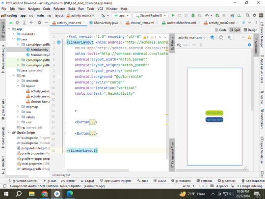
<?xml version="1.0" encoding="utf-8"?> <LinearLayout xmlns:android="http://schemas.android.com/apk/res/android" xmlns:app="http://schemas.android.com/apk/res-auto" xmlns:tools="http://schemas.android.com/tools" android:layout_width="match_parent" android:layout_height="match_parent" android:layout_gravity="center" android:background="@color/white" android:gravity="center" android:orientation="vertical" tools:context=".MainActivity" >
<Button android:id="@+id/button1" android:layout_width="wrap_content" android:layout_height="wrap_content" android:backgroundTint="#BCCC25" android:padding="10sp" android:text="PDF One View" android:textColor="#60BF46" android:textSize="30dp" />
<Button android:id="@+id/button2" android:layout_width="wrap_content" android:layout_height="wrap_content" android:layout_marginTop="10dp" android:backgroundTint="#395393" android:padding="10sp" android:text="PDF One View" android:textColor="#33BAB6" android:textSize="30dp" />
</LinearLayout>
Main Activity.java class
package com.shipon.pdflodanddownlod;
import androidx.appcompat.app.AlertDialog; import androidx.appcompat.app.AppCompatActivity;
import android.app.ProgressDialog; import android.content.DialogInterface; import android.content.Intent; import android.os.Bundle; import android.view.LayoutInflater; import android.view.View; import android.webkit.URLUtil; import android.widget.Button; import android.widget.LinearLayout; import android.widget.Toast;
import com.downloader.Error; import com.downloader.OnCancelListener; import com.downloader.OnDownloadListener; import com.downloader.OnPauseListener; import com.downloader.OnProgressListener; import com.downloader.OnStartOrResumeListener; import com.downloader.PRDownloader; import com.downloader.Progress;
import java.io.File;
public class MainActivity extends AppCompatActivity {
Button button1, button2; int downloadId;
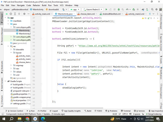
@Override protected void onCreate(Bundle savedInstanceState) { super.onCreate(savedInstanceState); setContentView(R.layout.activity_main); PRDownloader.initialize(getApplicationContext());
button1 = findViewById(R.id.button1); button2 = findViewById(R.id.button2);
button1.setOnClickListener(v -> {
String pdfurl = "https://www.w3.org/WAI/ER/tests/xhtml/testfiles/resources/pdf/dummy.pdf";
File fil = new File(getCacheDir(), URLUtil.guessFileName(pdfurl, null, null));
if (fil.exists()){
Intent intent = new Intent(MainActivity.this, MainActivity2.class); intent.putExtra("isOnline", false); intent.putExtra("pdfurl", pdfurl); startActivity(intent);
}else { showDialog(pdfurl); }
});
button2.setOnClickListener(v -> {
String pdfurl = "https://www.clickdimensions.com/links/TestPDFfile.pdf"; File fil = new File(getCacheDir(), URLUtil.guessFileName(pdfurl, null, null));
if (fil.exists()){
Intent intent = new Intent(MainActivity.this, MainActivity2.class); intent.putExtra("isOnline", false); intent.putExtra("pdfurl", pdfurl); startActivity(intent);
}else { showDialog(pdfurl); }
});
}//============== onCreate end method ================= public void showDialog(String pdfUrl) {
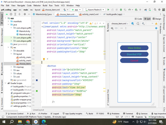
AlertDialog.Builder alert = new AlertDialog.Builder(MainActivity.this); LayoutInflater inflater = getLayoutInflater();
View myView = inflater.inflate(R.layout.choose_item, null); Button btOnline = myView.findViewById(R.id.btOnline); Button btDownlod = myView.findViewById(R.id.btDownlod); Button btCancel = myView.findViewById(R.id.btCancel); alert.setView(myView);
AlertDialog alertDialog = alert.create();
alertDialog.setCancelable(false);
btOnline.setOnClickListener(v -> {
Intent intent = new Intent(MainActivity.this, MainActivity2.class); intent.putExtra("isOnline", true); intent.putExtra("pdfurl", pdfUrl); startActivity(intent);
alertDialog.dismiss();
});
btDownlod.setOnClickListener(v -> {
downlodPDF(pdfUrl); alertDialog.dismiss(); });
btCancel.setOnClickListener(v -> {
alertDialog.dismiss();
});
alertDialog.show(); }// how Dialog end method -------- private void downlodPDF(String pdfurl) {
ProgressDialog progressDialog=new ProgressDialog(MainActivity.this); progressDialog.setIcon(R.drawable.down_24); progressDialog.setMessage("Downloading PDF File, Please Wait a moment..."); progressDialog.setCancelable(false); progressDialog.setButton(DialogInterface.BUTTON_NEGATIVE, "Cancel", new DialogInterface.OnClickListener() { @Override public void onClick(DialogInterface dialog, int which) { Toast.makeText(getApplicationContext(), "Downlod Start", Toast.LENGTH_SHORT).show(); PRDownloader.cancel(downloadId); progressDialog.dismiss(); } });
progressDialog.show(); downloadId = PRDownloader.download(pdfurl, String.valueOf(getCacheDir()), URLUtil.guessFileName(pdfurl, null, null)) .build() .setOnStartOrResumeListener(new OnStartOrResumeListener() { @Override public void onStartOrResume() {
} }) .setOnPauseListener(new OnPauseListener() { @Override public void onPause() {
} }) .setOnCancelListener(new OnCancelListener() { @Override public void onCancel() {
} }) .setOnProgressListener(new OnProgressListener() { @Override public void onProgress(Progress progress) { int progressPercentage = (int) (progress.currentBytes*100/progress.totalBytes); progressDialog.setMessage("Downlod : "+progressPercentage+" %");
} }) .start(new OnDownloadListener() { @Override public void onDownloadComplete() {
Toast.makeText(getApplicationContext(), "Downlod Completed", Toast.LENGTH_SHORT).show(); Intent intent = new Intent(MainActivity.this, MainActivity2.class); intent.putExtra("isOnline", false); intent.putExtra("pdfurl", pdfurl); startActivity(intent);
progressDialog.dismiss(); }
@Override public void onError(Error error) {
Toast.makeText(getApplicationContext(), "Downlod Failed", Toast.LENGTH_SHORT).show(); progressDialog.dismiss(); } });
}
}//============== public class ==========================
MainActivity 2 xmal class start
<?xml version="1.0" encoding="utf-8"?> <RelativeLayout xmlns:android="http://schemas.android.com/apk/res/android" xmlns:app="http://schemas.android.com/apk/res-auto" xmlns:tools="http://schemas.android.com/tools" android:layout_width="match_parent" android:layout_height="match_parent" android:background="@color/white" tools:context=".MainActivity2">
<com.airbnb.lottie.LottieAnimationView android:id="@+id/lotti" android:layout_width="match_parent" android:layout_height="wrap_content" android:visibility="invisible" app:lottie_autoPlay="true" app:lottie_loop="true" app:lottie_rawRes="@raw/pdf" />
<com.github.barteksc.pdfviewer.PDFView android:id="@+id/pdfView" android:layout_width="match_parent" android:layout_height="match_parent" android:visibility="invisible" />
</RelativeLayout>
MainActivity2.java class start
package com.shipon.pdflodanddownlod;
import androidx.appcompat.app.AppCompatActivity;
import android.os.AsyncTask; import android.os.Bundle; import android.view.View; import android.webkit.URLUtil; import android.widget.Toast;
import com.airbnb.lottie.LottieAnimationView; import com.github.barteksc.pdfviewer.PDFView; import com.github.barteksc.pdfviewer.util.FitPolicy;
import java.io.BufferedInputStream; import java.io.File; import java.io.IOException; import java.io.InputStream; import java.net.HttpURLConnection; import java.net.MalformedURLException; import java.net.URL;
public class MainActivity2 extends AppCompatActivity {
// public static String AssateName=""; LottieAnimationView lotti; PDFView pdfView;
@Override protected void onCreate(Bundle savedInstanceState) { super.onCreate(savedInstanceState); setContentView(R.layout.activity_main2);
pdfView = findViewById(R.id.pdfView); lotti = findViewById(R.id.lotti); lotti.setVisibility(View.VISIBLE);
boolean isOnline = getIntent().getBooleanExtra("isOnline", true); String pdfurl = getIntent().getStringExtra("pdfurl"); if (isOnline == true) { new RetrivePDFfromUrl().execute(pdfurl);
} else {
File fil = new File(getCacheDir(), URLUtil.guessFileName(pdfurl, null, null));
lodPDFOffline(fil);
}
}//============= onCreate ned method =================== private class RetrivePDFfromUrl extends AsyncTask<String, Void, InputStream> { @Override protected InputStream doInBackground(String... strings) {
try { URL url = new URL(strings[0]); HttpURLConnection httpURLConnection = (HttpURLConnection) url.openConnection();
if (httpURLConnection.getResponseCode() == HttpURLConnection.HTTP_OK) { return new BufferedInputStream(httpURLConnection.getInputStream()); }
} catch (MalformedURLException e) { throw new RuntimeException(e);
} catch (IOException e) { throw new RuntimeException(e); }
return null; }
@Override protected void onPostExecute(InputStream inputStream) { super.onPostExecute(inputStream);
if (inputStream != null) { lodPDFOnline(inputStream);
} else { Toast.makeText(MainActivity2.this, "PDF lod failed", Toast.LENGTH_SHORT).show(); }
} }
private void lodPDFOnline(InputStream inputStream) {
pdfView.fromStream(inputStream) .enableSwipe(true) .swipeHorizontal(true) .enableDoubletap(true) .defaultPage(0) .enableAnnotationRendering(false) .password(null) .scrollHandle(null) .enableAntialiasing(true) .spacing(0) .pageFitPolicy(FitPolicy.WIDTH) .pageSnap(true) // snap pages to screen boundaries .pageFling(true) // make a fling change only a single page like ViewPager .onLoad(nbPages -> { lotti.setVisibility(View.GONE); pdfView.setVisibility(View.VISIBLE);
}) .load();
}
private void lodPDFOffline(File file) {
pdfView.fromFile(file) .enableSwipe(true) .swipeHorizontal(true) .enableDoubletap(true) .defaultPage(0) .enableAnnotationRendering(false) .password(null) .scrollHandle(null) .enableAntialiasing(true) .spacing(0) .pageFitPolicy(FitPolicy.WIDTH) .pageSnap(true) // snap pages to screen boundaries .pageFling(true) // make a fling change only a single page like ViewPager .onLoad(nbPages -> { lotti.setVisibility(View.GONE); pdfView.setVisibility(View.VISIBLE);
}) .load();
}
}//= ==================== public calss end method =======================
#shipon sarker#shipon2004#across the spiderverse#android#hazbin hotel#joker out#pakistan#sagor#shipon#super mario#pdf download#pdfDownload
0 notes
Text
DroidDialog
DroidDialog Android Visual | Android Design Library | Android Template | Android Design | Android Library http://www.androidvisual.com/droiddialog/
0 notes
Text
How to create Progress Dialog in android ?
A dialog showing a progress indicator and an optional text message or view. Only a text message or a view can be used at the same time. Progress Dialog is an extends class of Alert Dialog or It is an extension of Alert Dialog . Progress Dialog is used to show the progress of a task that takes some time to complete .
0 notes