#also what design elements are consistent and what change
Explore tagged Tumblr posts
Visit Tumblr Blog
Explore Tumblr blogs with no restrictions, modern design and the best experience.
Last Seen Tumblr Blogs


Fun Fact
Tumblr was created by web developers David Karp and Marco Arment.
Text
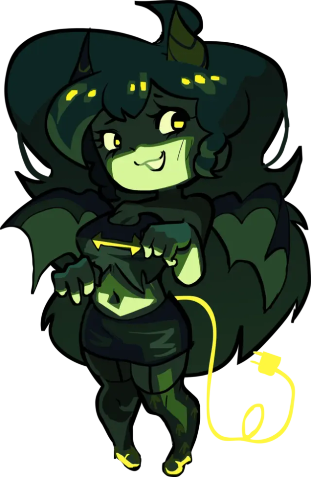
was asked to see a bit more of my process of making my bookmarks! I don't save much process but I have an ongoing concept document and I can ramble about things for Ages so here's some of that:

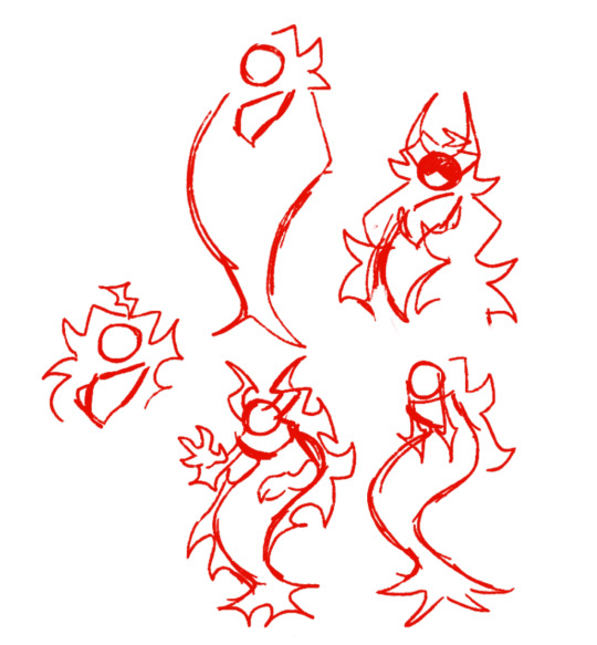
This was my very first group of sketches after the initial mushrooms I did (which were planned/lined traditionally). As you can see, some are almost identical to how they ended up, some changed a lot, some didn't go anywhere. the book spines I guess I just started like that and developed them further in the actual final file.

Below is kinda 1.5 I guess (crossed off after I completed them, I just hid that layer on the other images), there's the couple newest dagger ones, purple/yellow fungi (different species at this point, I just wanted those colours), very rough colour blocks for the book spines I already had + new ideas just to see all the colours together..


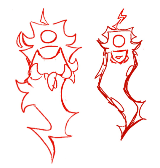
and then current page:

shifted those vague book shaped blobs here to work on them better. some, like the dragon, I just figured out in the proper file, the rest are clearly pretty worked out at this point already. I'm not sure if I'll do the lichen since I already have a bunch of green ones, and I really want to do a wizard spells kinda vibe I just can NOT figure out a colour palette or what objects to use for it.

I've been prioritising the book spines since they sell way better than the daggers/swords and I think are the most unique, but I do want to make more swords because ultimately i just do what i want........ have almost finished the jungle & dark water ones which is probably where I'll stop for now.
[I also haven't 100% decided on the dark or light version of the snowy book - I will print proofs of both. I like the contrast of the dark one but I think the light one might look better as a physical object]
As far as decision making, I start with ideas/colours I like obviously, but I also think about:
what colour palettes are common on book covers with similar themes (I often think of a few books I like to match them to specifically)
what colours/palettes have I not used yet? I like to have a rainbow of bookmark designs. (you can see in the concepts above I've got a little group of some colours I might use for new ones...)
what genre/niche of book have I not covered much of yet (how I came to do a couple more horror & sci-fi - ish ones)
what other slightly different imagery or design element can I add in to the main theme to make it a bit more interesting? (like: the celestial theme on the cards/coins one; the key on the fantasy map, there's some spiderwebs on the eldritch one #tma)
also all of them (except some of the fungi) are different on the back in some form! either subtly (slightly different flame overlap) or very obviously (different colour or details, broken sword, closed angel eye)
my only 'limits' really are keeping some level of consistency with the different types, ie: fungi designs all have a squared bottom shape; the swords all have a wider background element (often kinda elements or environments?), the daggers have more closeup specific objects as a background; the books are either fantasy or sciencey themed. if I ever choose to do non-book or non-sword/dagger bookmarks I would want to do a set, not just having a random bookmark that's a different kind of weapon or something
Oh, the other relevant thing to the book designs is that I briefly explored if I could get special versions made with gold/silver foil on the spine designs - only sparkly ink was an option, and that wasn't obvious enough to be worth it. But that is what made me end up doing these matching sticker designs - because metallic effects can be done on stickers! Some of these I did after the matching bookmark design, some before.
Also I have speedpaints of some of these on tiktok: bones, crystal dagger, potions, plants part 2, crystals, fire, water, honey, orange fungi, purple roses, a couple daggers, raven, murderbot, sabran, ead. mostly just parts of the process on the rare occasion I remembered to record some.
-----
Also since I'm here? I made graphs of all my bookmark sales at events since late 2023
This doesn't include the sets that I used to sell (5 swords, 6 daggers, 5 book spines), since I don't sell them as sets anymore in person. I keep making new designs and it's annoying to update sets constantly (also, table space)


I didn't include the fandom designs in the rest of this post since I did them kinda separately but here's the sales for those too. obviously I sell them mostly online!

and below is all of the total bookmarks I've ordered (as in the numbers I requested from my manu - not counting the extras they sometimes give me or bgrade/damaged ones, etc). I also of course have a thousand or so in stock that I haven't sold yet
(I've been counting the 3 priory designs in one total here, which is why it's far above the others)
organised by type, then in order from when I made them. obviously some have been around for 4 years so I've had more time to sell more of them, hence the general downward curves

we are approaching 10k. that's a lot of bookmarks. wow thanks!
34 notes
·
View notes
Text
I love seeing people's characterizations of Nerevar because the fella is so important, but he also functionally isn't a character. He has almost no characterization to speak of. You can pull some tidbits out about how he might of been, but he's basically a plot device--a backstory for all the important people. The only accounts we hear about him are from the most biased and untrustworthy sources in the whole game. So it's so fun to see what people do with those scraps. At this point he's Morrowind fans' collectively owned OC
#mine#morrowind#tes#indoril nerevar#nerevar#there's a lot of tes characters you could apply this to#nerevar just cracks me up because at least the others you can interact with at some point#its just fun seeing what the common points are and where the differences in interpretation happen#also what design elements are consistent and what change#like his hair#my nerevar characterization fun take is that how you characterize him should be based on how you characterize your nerevarine#like make them parallels or opposites of foils or something#he doesnt need a consistent characterization hes not supposed to have one#tes has some of the strongest fanon ive ever seen i love it
320 notes
·
View notes
Text
on the aesthetics of asian erasure in star wars: obi-wan kenobi and the planet of naboo

when we talk about representation in star wars, the conversation often stops at what’s visible or credited. star wars has a long-standing problem with the lack of asian leads or asian-coded worlds, but sometimes what’s more insidious is the erasure of asian influence where it once existed, or where it was clearly intended to be.
take obi-wan kenobi. before alec guinness was cast, george lucas had reportedly wanted a japanese actor to play the role, toshirō mifune, most famously known for his work with akira kurosawa. lucas has never strayed away from citing the hidden fortress as a direct inspiration for a new hope, and the jedi, in their original conception, from eastern philosophies, particularly bushido and zen buddhism. this was not accidental. it’s embedded into the language, “obi” (the sash of a kimono), “wan” (a name component common in chinese and southeast asian names), and “kenobi,” which emulates the structure of japanese surnames. it is an asian-inspired name, heavily so.
but when mifune declined, lucas pivoted. and instead of keeping that vision intact, the jedi master archetype, the wise elder, steeped in tradition, was lifted from its asian origins and handed to a white british actor. and then later, to ewan mcgregor, whose performance, while incredible, westernized the role further. we are told obi-wan is from “stewjon,” a planet born out of a joke, a merging of jon stewart’s name, after he asked lucas where obi-wan was from. then “space scotland” became the shorthand. that change from asian inspiration to european performance was never really questioned.
it’s not about demanding obi-wan look asian. it’s that the character was rooted in an asian framework, and that framework was abandoned the moment it became inconvenient to uphold. and that sets the tone for much of star wars, aesthetic borrowing without meaningful credit.
naboo is another case where this shows up. the common narrative is that naboo was inspired by renaissance europe, with its lush italian architecture, baroque dresses, and romanticized monarchy. those elements are there. but there’s a consistent thread of asian influence that is almost never acknowledged.
the names of the monarchs are a starting point. padmé, from the sanskrit “padma,” meaning lotus. sabé and saché, echoing asian and hindi name constructions. queen jamillia, whose name stems from arabic roots, suggests influence from islamic culture. even the name “naboo” itself sounds curiously close to nebo, a mesopotamian god, or nabu, the sumerian deity of wisdom. the planets closest to naboo in the galactic grid, like sereno and ord mantell, also carry vague echoes of eurasian tone.
but most significantly, look at the costume design in the phantom menace. trisha biggar drew from a range of global influences, but some of queen amidala’s most iconic gowns were directly modeled after traditional mongolian royal attire, specifically the headdress and layered robes worn by mongolian empresses. the high collars, rich brocades, and facial makeup are unmistakable. yet, in the lore, naboo is labeled as european. not central asian. not global. and certainly not asian.
this is not to say star wars owes its worldbuilding to any one culture. it doesn’t. part of its power comes from its ability to merge and reimagine cultures. but there is a problem when the contributions of asian cultures are stripped of credit, while european aesthetics are exalted as canonical. when a jedi’s name can be asian, his values drawn from eastern philosophies, his robes loosely modeled on samurai garb, and yet his face, voice, and homeworld are made definitively western.
#star wars#obi wan kenobi#george lucas#ewan mcgregor#naboo#padme amidala#padme naberrie#sabe#leia organa#breha organa#bail organa#luke skywalker#jedi#sith#darth vader#han solo#cassian andor#mon mothma#luthen rael#bix caleen#kleya marki#qui gon jinn#ki adi mundi#mace windu#yoda#shaak ti#ahsoka tano#plo koon#anakin skywalker#kit fisto
349 notes
·
View notes
Text
What manifestation technique is best designed for you? PAC
Left to Right
Pile one
This is my pile of witches and warlocks. The best way you manifest is through spells, and rituals. You have magic in your blooddddd hunnyy. You might be highly mythical, intuitive, and just divine. Use this divine nature in a creative way, and all you desire shall manifest… this could be through glamour magic, love spells, abundance spells..
Pile two
These are my divine feminines. This pile best manifests by setting intentions and going with the flow. Working with the feminine via moon rituals, water element or just that shakti power will draw all you desire to you… there is a huge theme of co-creation and just feminine energy. This pile might need to release what doesn’t work emotionally and truly tap into their feminine wisdom when it comes to manifesting… what works for you, might not work for everyone else and that is okay… you might be alone in this power…
Pile three
This pile best manifest by mastering the earth element. This pile might be able to use scripting to manifest or just using the natural element to manifest. Could use some earthy/elemental witchcraft….
But what i am hearing most is having self compassion and really devoting yourself to what you are trying to manifest = fruition of the desire. This might look like manifesting one thing at a time, and while you are manifesting it, you sleep, breath, and dream it. You continuously tap into the desire, and deeply ground yourself into the feeling consistently. Though remember balance, and leave a bit of space for life and your mental health. The whole saying, let it go and detachment for manifesting, DOES NOT apply to you. Your attachment to it really creates it…. This might be my obsessive manifestors… do you guys have any strong pluto in your charts btw???
Pile four
So there’s a lot of overdoing in this pile, and anxiety. There might be a lot of freezing and overthinking when it comes to choosing and sticking to what you are attempting to create. Rest assured it’s okay to feel how you feel at this moment. Rest assured that things will and can get better. Spirit is saying just remember to be ambitious, flexible but also grounded. Listen to where your intuition is guiding you. Manifesting isn’t supposed to add MORE problems to life. Like life can be difficult enough… stop taking it so seriously tbh. Like yes you can create change, but you create change in little and big practical ways everyday. From the moment you choose to brush your teeth, to the moment you decide on studying. Didn’t get much of a method for this pile! You might need to give manifesting a break and come back to it…
Pile five
This pile might manifest best through chaos, and destruction. You seem to create great things from dark places. Where people see destruction, you see a moment to create. You might be really good at seeing people’s potential, and helping them shift into that.. How you can effectively use this power for yourself to manifest, I think is by doing shadow work, emotionally releasing rituals, and working with darker goddesses/gods.
For example, let’s say you wanted to manifest a home, maybe journal about blockages you might have.. Do you feel undeserving? Do you feel its unattainable? Or maybe there is a childhood wound? Once you understand your depth, choose a ritual to release it, and then maybe channel those same feelings into getting what u want or set your desired intentions after you have released what doesn’t serve you?
Also, I don’t know how to properly describe but channeling anger, fear and etc might work really well for you… being put through trials and tribulations might also work well for you… hopefully y’all get what im trying to put down <3
This pile gives me the vibe of the type of people that go through the most horrible break up and 6 months later, they look good asf and they make 5x times what they used to make…
Pile six
this is a very Venusian pile. This pile manifests best through instruments, dance, and music. Also having a communion with god as well… speaking to god, letting god/goddess know what you want.. Keeping that relationship with spirit will really help you..
Also, gratitude practices might really help you manifest your desired things. and, general affirmations might really work for you. Everything is as it should be. Everything is working out. I feel great.. those type of affirmations!
220 notes
·
View notes
Note
Out of pure curiosity how did you design your persona? Was it difficult?
I've been trying to design my own for roughly 3 years but I'm so unsure with myself on what I want represented as myself.
gonna be so fr but I change my persona all the time. No rule to say you can only have one! But my process with my moth persona design changes a little bit each time I draw them, because I don't like some element or I want to convey them differently.

I start off with inspirations and combine things I like:


Sometimes ya gotta be okay if it doesn't come out how you envisioned it the first time, things don't need consistency from the start. I know some see it as a invisible rule but who's gonna stop me ᕕ( ͡° ͜ʖ ͡° )ᕗ Also your persona doesn't need to look like you either.
123 notes
·
View notes
Text
me: i guess it's just the more i think about it, the humor in/around bg3 starts to feel like larian cares more about pleasing people, even if it breaks immersion or flattens/flanderizes characters, than making a game that's fun and funny because of a consistent internal logic and sense of genre and setting.
the tulpa of tom wambsgans i keep in the attic: people do like funny games.
me: but what does it mean for a game as an interactive medium to be funny? like, people find it funny if a game is broken or janky, but a game can also be funny because the mechanics are working and they're designed in a funny way. like, the disco elysium skills are effectively their own cast of characters as a part of the mechanics, and intentionally made into a huge element of the game's humor. watching harry fumble is a lot funnier when the peanut gallery always has something to say about it. or even, i dunno, the very obsidian bit of dialogue choices going 'yes,' 'no,' '[lie] yes,' '[lie] no.' that's humor that relies on the nature of dialogue trees.
tulpa wambsgans, who i've forced to play disco elysium: right. there's plenty of times when you thought the mechanics of bg3 led to funny situations, though.
me: that's not exactly what i'm trying to get at. or it's not the biggest part of it. like, i feel like i've brought this up one too many times already, but the 'hot githyanki girlfriend' dialogue choice you get when romancing lae'zel - it's 'funny,' right? it's supposed to be funny.
tulpa wambsgans: i mean, it is, funny. isn't it?
me: i mean, not to me. i think it's fucking cringe. but it's like, why is that cringe to me, and not disco elysium's 'i want to have fuck with you?' on the surface, it seems like kind of similar humor, like it's your character saying stupid shit. but in disco elysium, the joke is on you-as-harry, because that became your dialogue option after you failed. and the... i'd argue central conceit of disco elysium, maybe, is that harry as an amnesiac wreck with a bunch of skills talking to him in his head is the only way to in-world make sense of a guy who acts like a video game character. and the joke is that you're a video game character selecting dialogue options, but if you were a real person, like harry's supposed to be, you'd seem like a fucking weirdo, and people in the game treat you like a fucking weirdo.
tulpa wambsgans: so what's the problem with baldur's gate 3?
me: i guess it feels like the joke is on the game for being a game that wants to be taken seriously? on the characters within it, for being characters that can only take the game seriously? i don't know if that makes sense. when you incorporate in memes like the god's favorite princess stuff or whatever it was, that's for the player, like almost as a reward for making that joke about the game outside of the game. but it's also, i mean, it's a huge... oversimplification of everything shadowheart's got going on, right? like, shar is or was explicitly abusing her.
tulpa wambsgans: it's a joke, though.
me: right, but what kind of relationship does that create, between the player and the studio, and the player and the game, if the player is rewarded for these kinds of jokes by having them funneled back into the game as part of its reality? the game of fandom telephone where canon events and characters get simplified and miscommunicated over and over, but this time the studio, the makers of canon, are in on it. i mean, it doesn't need to be about jokes, i think that just bothers me more because people tend to have such a positive reaction to jokes. like, lae'zel's dismiss to camp dialogue being changed as well as minthara's recruitment no longer conflicting with halsin's is i would argue part of the same problem.
tulpa wambsgans: ....does any of this really matter?
me: tulpa tom wambsgans you know i only come up into the attic to talk to you about shit that doesn't matter
922 notes
·
View notes
Text
So I've been kinda musing on the idea of a helmetless Gabriel design because. well. idk, I keep seeing them. And while some of them are really cool, I just don't personally vibe with the concept as a whole, I guess? Keep his hat on. That's his face. Either that or it's a featureless ball of light under there or something. you freaks can take off his underwear but do NOT take off the helmet
There's always something a little off about it to me. Like either he's Just A Guy which is technically more biblically accurate but also kinda boring, or he's some kind of cool """biblically accurate angel""" deal that isn't actually biblically accurate even though it looks cooler.
I ended up settling on a concept that's kind of the best of both worlds to me. It makes a sort of sense for Gabe to have a human face under there, since he's meant to be a messenger to humanity, but I'm thinking, rather than having A Face, he kind of just... appears to individuals as their stereotypical idea of an angel, with either a face that the individual would find trustworthy or stern or outright terrifying depending on what message he's trying to send; different for every observer but always beautiful, flawless.
So to humans, he'd generally appear as something resembling common artistic depictions of him. No set features, but with some consistent elements: young, conventionally attractive & 'perfect'; somewhat androgynous; and with glowing eyes.

On the other hand, V1 doesn't really have anything internal to draw on. It doesn't pay attention to faces. It has no beauty standards. It doesn't trust or hate. It has a completely different thought process, brain structure. So instead, it sees something it can't quite comprehend, because it wasn't meant to comprehend it. A shifting form of faces and wings and light superimposed on each other, closer to the truth than any human but unable to make sense of it.
You know how if AI tries to animate something (or really do anything), it can kind of trail off and lose track of what it's doing and get increasingly nonsensical? It's dumb, but the best example I can think of for how I'd imagine V1 would see Gabriel would be AI Minecraft. The way that a white pixel can become a sheep can become snow can become clouds, and looking up at the sky and then back down will completely change the entire landscape. All its processing power going to solidify some kind of humanoid face in what it's seeing, confirmation bias building up a stronger and stronger image, only for it to tilt its head slightly and the entire illusion shatters.
"ok but what would Gabriel see in the mirror?" do u think i know how angels see
...All that being said. The real answer is still "leave his hat on". freaks
#my art#ultrakill#gabriel ultrakill#have been pondering this for a while & if the question *must* be asked then its the only headcanon i personally find satisfactory#also to clarify!! absolutely no hate to the helmetless gabe designs out there. theyre cool and creative just not my personal cup of tea
143 notes
·
View notes
Text
whoops only just saw this now since i can only see submissions on desktop not on mobile but i'll try my best to summarize most of my thoughts
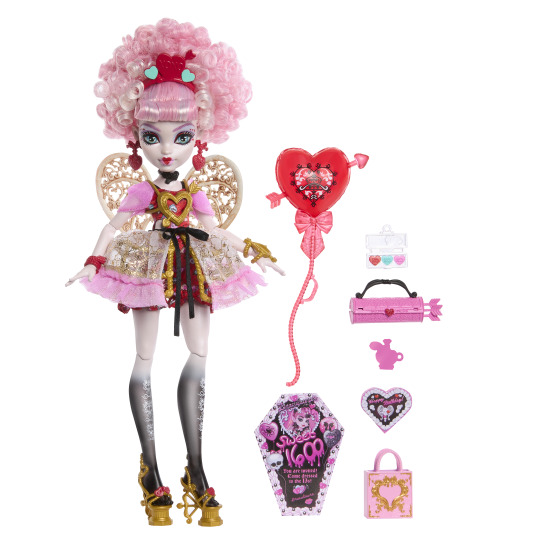
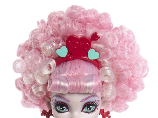
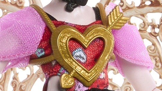
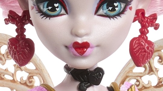
SHE'S SO GORGEOUS AND PINK I LOVE HER!!!
(images of the new doll from DollBoy29 on twitter)
first of all, i think it's a gorgeous doll. not a collector myself, but if i was, i would buy it in a heartbeat. anything was a step up from the budget doll lines from eah that cupid was last in so i'm thankful for that. (also, not an expert on fashion or dolls. so please take my review with a grain of salt)
i like the theming/style that they went with her doll. the style of french rococo is very much romantic and whimsical and i think it pairs well with cupid's character motifs and imagery. though the style isn't 1:1 to rococo fashion, the inspiration is still very much there. the hair and the dress pair very well and i think it's a great design.
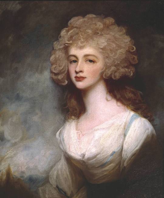
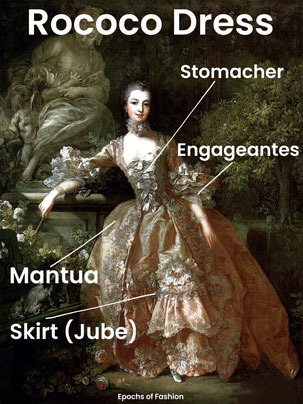
(Top right image is Lady Altamont by George Romney. Bottom left is Rococo Terminology from Epochs of Fashion)
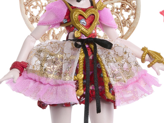
while i like it overall, i'm kind of iffy about some of the little details:

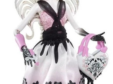
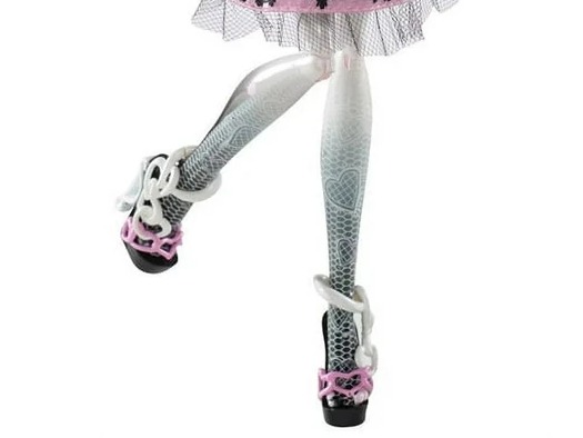
(1) in her previous mh dolls, her hands faded to black. a nod to her heritage as a bone elemental. in this new doll, only her legs fade to black while her arms don't. i don't understand keeping this feature for one set of limbs but not for the other. either keep it for both or remove it for both. or maybe find another way to showcase she's an elemental. but kind of a sloppy design choice imo.
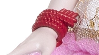
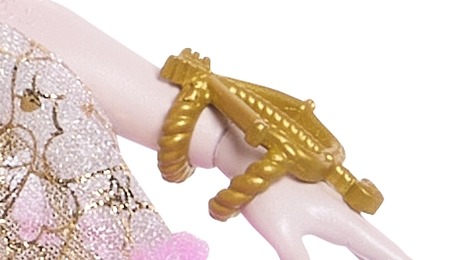
(2) another one i don't like is the hot pink accessories on her!!! not to be a nitpicker, but this shade of hot pink/fuschia is not cupid's palette. her previous dolls (not counting the budget ones) pretty much stuck to her shades of pink (bubblegum, coral, light pink) which i think better suit her. also her accessories have been consistently bronze (or black) which fits her ancient greek background. and she's pretty much the only mh girl in g1 to utilize bronze. she is not a hot pink girl!
(also having her headband be the same color range as her hair makes it blend into the background and doesn't help it pop. the hot pink makes it look a bit cheap and i'd rather the accessories be in the shade of bronze in the other pics.)

(3) i also don't like her new cupid's bow lips. i prefer the old one and the bright taffy pink doesn't suit the rest of the doll. i think a more rose pink would have been better to suit the red heart. or keep the background of the heart uncolored like the g1 doll.
and so as not to end on a sour note, i saved the new things i liked for the end!
(1) her new wings! oh my ghouls just absolutely beautiful! very much reminds me of rococo pattern. i could see this in the wallpaper or metalwork of the rococo period. the entire shape of the wing is a heart and the curls inside are in the shapes of heart too. the mantua of her dress is also in hearts which is just so pretty.
(2) her new shoes! so pretty. the platform of the heel is in the style of ancient greek columns which is an amazing detail. the straps of the shoes look to be made of braided rope which is what greeks used to tie their chitons/tunics with is also another great detail. the heel of her shoes is also a bow and arrow! while i do miss her winged shoes from previous dolls, she can still fly without them and i think this is an equally great shoe. (ashlynn would be proud.)
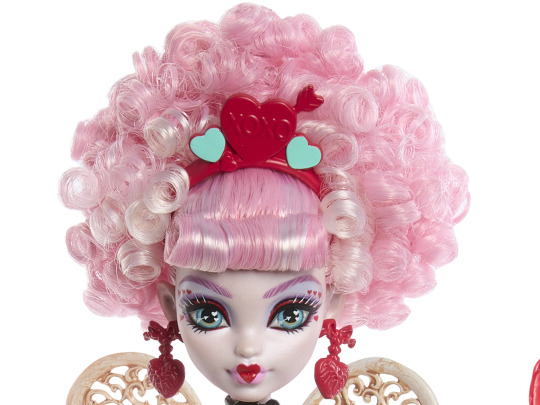
(3) her new hair and her eye makeup!!!! the new hair is gorgeous and beautiful and has so much volume. while best curls and volume of all time (for me), still goes to honey swamp, cupid is very much the runner up. i also adore the different shades of pink in her hair as opposed to her one shade of pink hair from last time. her eye makeup is also so pretty! the blue eyeshadow brings out her eyes and i love the hearts around her pupil and the hearts around the edges of her eyes! sooooo pretty.
tldr: a gorgeous doll, some details i don't like, but very much love the larger changes they made
#monster high#ever after high#cupid#cupid asteria#c.a. cupid#ca cupid#mh cupid#monster high scary sweet birthday#doll#dolls#fashion doll#dollblr#mh#eah#eah cupid
160 notes
·
View notes
Text
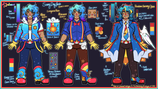
Sunny Day Jack ★ Stari’s Versions
—
★ DO NOT USE/REPOST WITHOUT MY PERMISSION. NO MINORS.
—
Apologies for the tumblr inactivity, space crew! I’m much more active over on Twitter!
Here’s a simple lineup of Jack designs that I’ll be personally using for myself! I love when artists take a character and add their own personal twists on them, so I’ve done the same to my favorite technicolor clown.
I’ve also seen a few people be interested in two other designs that I’ve done, so I’ve added them to the lineup as well for others to use or to see their full outfits!
—
Here’s a explanation of each design element if you all are interested in that:
Sunnyverse Jack(Left):
Sunnyverse!Jack is my personal interpretation, artistic recolor, and story with him. He is basically a spin-off of the Sunny Time Town AU by JambeeBot.
I wanted his jacket to reflect looking up at a vibrant summer sky, with clouds, rainbow pockets, swirls, and stickers to add to the childlike wonder. His different color suspenders replaces the stripes on his shirt, which is now a sun on the collar!
I’ve personally always liked the idea of Jack’s hair cascading into purple tips, it’s been referenced in many other drawings of mine. Considering Papa Rise also has purple-ish hair, I think it fits!
This design went through a couple sketch phases and some reworks with the most recent showcase being the birthday drawing of Artemis, where this design can be seen in now outdated-concept!
Alternate Outfit (Middle):
Over a year ago, I made a drawing about Jack and bowties, spreading my bowtie propaganda…. And I still am HAHA. Listen, Jack with a bowtie is so cute, So I’m bringing that design back as well as a full ref!
I’d like to say that this is his work or side outfit, but this is not the teacher AU. I did not create that AU, so don’t refer to this design as the teacher AU!
Even though I don’t consider Jack as a rodeo clown, I gave him clown cowboy boots to reference [Redacted] and his southern residence somewhere.
Rainbow Factory Jack(Right):
RainbowFactory!Jack or RF!Jack is an AU I made last year as well, and finally got around to giving you all a full standing ref for him!
He got more attention than I thought, I know a couple of you like delusional men. I get it.
For his hair, aside from the primary highlights, I also changed the coloring to be a bit more muddled and darker on the teal spectrum, as I like to do that when I draw Jack in a not so-friendly manner. His hair is also more spiked, compared to the others who have more of a fluffy round curl.
His coat is very simple, red and yellow stripes down to a cloud border, and the inside of the coat shows a giant sun on the underside. He also has different color rainbow splotches in different places on him!
His eyes can vary in size or be consistent, and the colors of them can change or spiral too! Usually though, the right eye is lighter than the other. His colors are more saturated and darker than the other designs.
Cotton Candy Cupid Jack:
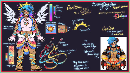
Finally, the last design I have in the lineup is Cupid!Jack!
This is the first custom design I’ve made of Jack. Shared in this post, this was meant to be the Valentine’s Day design I had for him! Though this drawings is extremely old and outdated now for both my MC and art, I decided to carry it on to a proper Cupid AU design for everyone!
He was originally labeled as Cotton Candy Jack in a wip post that keeps getting shared around from time to time, but I’m unsure if I should keep that name for this lover boy now! There was a community cotton candy Jack trend a month or two ago, so maybe I should change the name? What do you all think?
Design wise he parallels the classic Incubus Jack, which I believe was originally a Halloween costume. His design shares similarities on purpose, being the extended body paint gradient and the sheer fabric overlay on the pants.
Almost like an angel/devil duo, Cupid Jack is more pastel, softer/brighter primary hues, has fluffy wings! My goal was to have them be similar enough side by side, but also different enough to tell that they are different themes/holidays.
He has a motif of hearts, ribbons, and sun swirls. His hair gradient is also the most vibrant one, going from cyan to a vibrant pink at the tips.
He has sandals because I thought it fit the whole Cupid vibe, but drawing his dogs out every-time might actually be the end of me.
—
While I will use these personal redesigns, I want to make it clearly stated and obvious that Jack is not my original character, nor are these redesigns an attempt to change his character or completely detach him from his media. There are simply my fun artistic portrayals of him, as I admire his original design, media, and game as well.
The Rainbow Factory and Cupid AUs are technically my AUs. Ship art, written stories, headcanons, etc. of RF or Cupid Jack are completely okay to create! I just ask that you tag me so that I can see what you all do with him!
However, I ask that if Sunnyverse Jack is used, please ask for permission before using his custom design, as it is my own design of him that I use personally.
…and also, I wanna see more MV Jacks! Artists! Show me how you would draw him in your trademark! I love creative expression!
#sunny day jack#swwsdj#sunny day jack au#sdjsunnyverse#sunny time town#sdj#rainbowfactoryjack#cupidjack#cotton candy jack#Sunny Day Jack but in my eyes#colorful clown man gets more colorful
146 notes
·
View notes
Text
What is Douma's official hair color?
Learning about his character design was one of the first and oldest research I have done for my fanfic: cold affections. While there are many fanon elements, I took seriously with what is canon first and foremost. His hair took me a while because I was surprised the information shared along the majority had the misconception that Douma is blonde. The yellowish or golden-like form. I do not blame anyone for thinking this misconception except those who kept pushing the idea after only seeing either glimpse the colored manga (I also don’t rely on the visual coloring because after trying to find source of whoever colored it — it seems it’s fanon. i could be wrong.) or the anime without knowing his backstory.
It is common knowledge that light objects reflects light while black absorbs it. If the object has a similar hue to the light, it absorbs the others and only reflects what is similar to it. Douma's hair reflection to the setting's light varies accordingly.
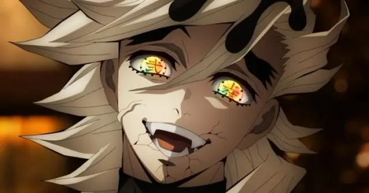
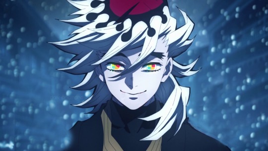
It may be his appearance in season three and the colored manga that people often call him blonde (yellow/gold). He looks blonde but he is not. That was the warm yellow lighting of the infinity castle.
I’m not knowledgeable about the means of blonde entirely so I have to search and understand the etymology. Blonde has a couple of different meanings. To hair it means fair or pale yellow. to racial characteristics it means someone of having fair hair and light complexion. to wood or other substance it means light in color.
Focusing on hair, blond or blonde, is also referred to as fair hair. A hair that has low eumelanin (the dark pigment). If you have high eumelanin in your body, it’d come out as either forms of black or brown. I used to hear this when I was in pharmacy moreover my anatomy and cosmetic subjects, however I don’t recall much anymore since it has been a while. But anyways, blonde still has a variation of shades like sandy, platinum, ash, strawberry, etc., and they all commonly consists of a hint of yellowish color.
Platinum blonde hair is second mostly shared among the fandom that douma has that type of color. I honestly don't reject the idea because it is similar to his official hair color. Platinum blonde has a cooler tone of ashy and pearly blonde with a hint of metallic shine. platinum is defined as a silver-white color.
The difference between silver and gray is silver having more metallic shine to it. With Douma's light hair having reflected light so vividly, to describe it having a shine, his appearance description being one of them as platinum blonde is close to accurate. In my fanfic, it is still being rewritten, but since the beginning I have described his hair to be silver or platinum due to lighting, and pale gray nonetheless.
So why gray? Pale gray specifically. Well it is said so in the English translation manga, according to his fuckass parents.

With m&m eyes and senior citizen hair color, he became a cult figure which makes sense… since Douma is written to how a unique looking person could affect his deluded peers, environment, and mostly himself.
Either way, there is also another official here to note, and that after reading this, with Douma's magical color changing hair, he might as well be a K-pop idol or DanTDM in the Minecraft story game.

I read an analysis from a person I personally trust because of their insightful analysis and studies on kny. They also made researched on Douma, even his hair. Here, is the link for more information about what they discuss:
I'll just briefly mention in here that they talked about Douma's official hair color description being as 白橡, "shirotsurubami," a white-ish shade of oak (very light brown or beige color.) Brown is desaturated colors of red, orange, and yellow. And I thought this circles back to him being close to blonde once again but I'm just overthinking. It is still a different description, yet one amongst official to Douma.
Personally, I think he was officially described this way because of how he appeared in the Infinity Castle and how the warm colored lighting affects his appearance, but that's just a humble opinion.
Either way, for me I am only following what Koyoharu Gotouge has intended to portray Douma after all this time. And these are the very evidence by the author themselves, as they personally colored these:
alright i sleep its 3:30 am here...
#douma#demon slayer#kimetsu no yaiba#kny#kimetsu no yaiba douma#demon slayer douma#kny douma#douma demon slayer#douma kny#discussion
47 notes
·
View notes
Note
re: neopets, Have you reviewed the royal styles? not the ones who had pre-conversion poses, but new ones like Bori and Ogrin
(Similar to the Darigan style review I did a while back, this review will only cover the "regal" styles and will only focus on the pets I think got the biggest glow-ups, rather than my favorite designs overall.)

Royal pets suffered pretty badly from customization—while being able to remove the clothes and do cross-paints is nice, a big draw of royal pets used to be that they were anthro and usually had very strong, fun personalities. Many designs just didn't translate to quadrupeds very well, and the resulting designs were very bland overall. Basically, what I'm saying is that this colour definitely needed these styles.
As for the styles themselves, they're pretty good! I like the poses and a lot of them are very expressive. The only real drawback is that the art quality on them isn't very consistent with the old pre-existing artwork, or sometimes old Neopets art in general—some have subtle gradients, some have way too much detail in their designs, and some have too many layers of finicky shading on them. However, most people probably won't notice this, and they still look good overall.
Favorite Style Glow-Ups:


Koi: I already liked the royal Koi's design, but their pet styles look particularly good. The art feels very on-point with the classic Neopets style, and the dynamic poses have a really nice sense of movement (and have the bonus of not having weird hand-fins). I particularly like how the royal girl and royal boy styles are swimming around each other, with the royal girl swimming down and the royal boy swimming up.


Xweetok: The original royal Xweetok designs are just okay at best, and frankly I don't think the style improved them much in that regard. However, they do give them an absolutely delightful personality, with the royal girl sporting a "oh-aren't-you-a-sweet-little-peasant" kind of look and the royal boy doing a pretentious bow. The outfits also look much better due to things like the royal boy's necklace actually being visible.
My only issue (outside of the tails being too long and thin) is that I wish they had adjusted the designs to feel more like old artwork, i.e., simplifying the overly-complex patterns and getting rid of the gradients. They've done those type of changes on other styles, so it's not like there wasn't pretense for it. Still, these look pretty good.


Gnorbu: The Gnorbu's are similar to the royal Xweetoks, in that the designs didn't change that much, but they read much, much better when on anthro pets (for example, being able to see the neck and chest areas that are normally hidden by their manes). They also fix some issues like the crown clipping into the royal boy's ear. Beyond that, however, I really like the haughty expressions and the anatomy, which is both appropriately stocky and works well with the designs (like the female's mane leading perfectly into her chest). Once again, the patterns and shading could've been simplified, but that's not a huge deal.


BONUS: The royal Ogrin styles are going here as a bonus because they blatantly copy/paste many elements from the converted versions, like the royal girl's tail or royal boy's necklace (and yes, they're VERY complex, but see the notes on just simplifying the designs above). However, the poses are very fun, and the trainwreck clothing at least reads a bit better when the pets are anthro. The artist also did a much better job of rendering clothing folds than whoever did the original designs did.
31 notes
·
View notes
Text
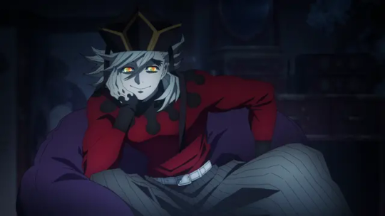
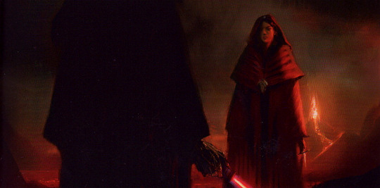
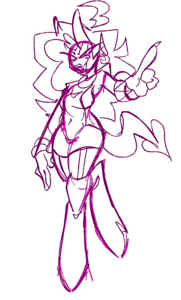
Baldur's Gate 3 (Part 2 - Minthara)
Okay, I covered the stuff in Baldur's Gate 3 is mixed and complicated. Let's talk about an objectively well executed character and visually designed - Minthara.

From a general writing perspective, she's exactly what I mean when I say it's not enough to support, women's rights - we need to support their wrongs. She is complicated, ruthless and villainous in a way we rarely get to see female characters - and every aspect of her design supports and conveys it.
Spoilers below the cut.
We are first introduced to her in here scheming:

And then when you get to meet her in game, the vibes are immaculate. No notes.

The armor design here is genuinely AAA grade. Multiple layers of protection, intimidation through jagged designs without endangering the wearer. Decorative pauldrons to convey power, materials indicating her fantastic background.
But she has camp gear and even underwear that expresses additional elements of her character and personality.
Check out her majesty... then compare it to her camp clothes, and her underwear.


What I really like about this is the general trend that is consistent upon key character traits of Minthara's: she is pragmatic in the field, a dreamer in private and determined to live, love or die on her own terms.
Her camp attire is sexy, but in a way that conveys her domineering and confident attitude. Her underwear is sex, but not uncomfortable or or any sort of indicator of that she feels her gender also demands submissiveness.
And, without going into the details - the writing makes her a unicorn evil woman character who is uninterested in changing her ways, but as complicated and feeling as her more moral peers.
Now, all we need is for society to evolve to where she can also be the kind of buff muscle mommy you expect to rush into combat dual wielding maces with perfect confidence.

-wincenworks
(This still from Heart of Flames by Miracle of Sound with Karliene, footage created by Mispap1)
#Mintha#Baldur's Gate 3#Positive Examples#Fantasy#Female Armor#Armor Design#Costume Design#Commentary#Long Post#Image#Bikini Armor Battle Damage#BikiniArmorBattleDamage#BABD#bg3
139 notes
·
View notes
Text
TW: Discussion of rape accusations.
[For the love of God read this all the way through.]
I'm going to speak to you guys from the perspective of someone who has been sexually assaulted. Who did not accept that's what happened to me until roughly a year after it happened. Who made excuses and downplayed what me abuser did to me. Who likely wouldn't have gone to the police about the incident even if I had the motivation to do so directly after it happened-- by just, not being able to handle the way I know they would have treated me. Someone who was a profoundly imperfect victim, who accidentally basically did EVERYTHING wrong to make myself look as untrustworthy as possible to anyone who didn't know me or visibly witness the full context of everything that happened, and thought for two seconds more about the series of events that took placd. An element of our relationship, my abuser actively weaponized against me among our peers. I am a person with first-hamd experience of the optics not being on my side. Of someone who DID have evidence of at least SOMETHING not okay doing down between us at least, though no definitive proof of the details-- that I was terrified to actually show anyone, because as guilty as it made my abuser look, it also made me look as pathetic and small and as easily manipulated as I felt.
Of being someone not actually entirely certain if I was full on raped or not until YEARS later-- only because my abuser kinda sorta half admitted to it? Not that they said, "oh I raped [Liquid] and it was high-key a bop." But that they admitted sex occurred between us, which they characterized as consensual-- while I know it wasn't. Because I was all the way black out drunk and woke up in media res.
That it MIGHT have even happened more than once-- but that they consistently only did so when I was too high or drunk to really know, and I have absolutely nothing for any other time something might have went down. So. I just have to eat that L. Booboo I'm the fool.
I know EXACTLY what that kind of soul obliterating experience that is. I even know what having this experience litigated in the court of public opinion is like-- though not online, which is probably ten times worse. Don't fucking come at me with any sort of, "oh police bad, justice system broken, victims should come out, scream out until they wake heaven itself with their plight, you're not being empathetic, you're not supporting the girlies."
Yes I am. What I am about to say is more empathetic and helpful to victims then you uncritically cropdusting the entire internet with allegations with your key citation being a fucking vibe check.
The reality is, any kind of recourse against a perpetrator is going to be profoundly taxing on the victim. All options kind of fucking suck. That is as horrible as it sounds, but that doesn't change that it's just fucking true.
Which means, what recourse is taken HAS TO BE a cost-benifit analysis.
What's the fucking goal? What is the best and worst outcome for any action taken to attempt to help the victim? What is the potential harm or benifit if information is withheld from the public if the alleged perpetrator is a public figure until things can be thoroughly teased out? What is absolutely nessesary to keep this victim safe, and stop any future harm for other potential victims?
All victims should be taken seriously. All victims should be heard out. All victims have the right to seek out support. That support could include but is not limited to: providing emotional support, getting them in contact for resources to get professional help, contacting the police, contacting an organization designed to help victims, and/or making the public aware of the allegations. In the order of escalation that makes the most sense.
I can tell you with absolute fucking certainty making a fucking tone deaf meme nightmare hell nuclear holocaust of a callout video that tosses in a "trust me bro" rape allegation an already mostly complete tea-sesh, and then telling the alleged victim to "go 2 da popo okie uwu? key bayyyyyyyyyy." Is the fucking opposite of supporting a victim. At BEST you are setting a victim up to get dicked over on two fronts, and at WORST, you're causing a witchhunt. You are adding to the fire of actual victims who aren't blessed with a sexual assault story that "plays well" to public perception. ESPECIALLY, if you have a very public petty vendetta against the accused. I am utterly gobsmacked, the degree of selfishness required to not realize how that fucking looks-- even if you believe the allegations are true.
I typically hold my tongue now in instances of of rape and sexual assault allegations until the dust has thoroughly settled. As a sexual assault survivor myself, I have a hard time uncoupling my own feelings and experiences from instances of this happening-- and it's just better for me to recuse myself from adding to the chorus until I have all possible available information-- and even then.
And if I'm being totally honest, I found out first about this video first as KP stealing an asset from me in the pettiest way she possibly could have, and it was something of a slow car-crash what the video was actually about.
Blessing in disguise she went out of her way not to credit me, it turns out. So no one could really realistically make the mistake I was involved or associated with this video. But, to be honest, it does sting a little. Even an inconsequential, stupid little asset being nabbed and used like that-- it doesn't feel good. I try to engage with this sort of thing on my own terms-- and that option was taken away from me because of KP's bullshit.
It's not really about me. But I would have probably waited to say something if I knew what the subject matter of the video was initially. Or maybe not, I'm not sure.
I'm not going to know now, the choice was taken from me. I wasn't expecting my stupid fucking Lily puppet LIKE THAT, you know?
I'm going to ask that this post not be taken as me making any sort of definitive judgement on the Saberspark allegations. I might say something when it seems all the information is out, I might not. If I feel like I have something of value to add I will, but I'm not Judge Liquid over here-- ultimate decider of guilt.
This post is directed at ILoveKimPossibleALot, Courtney Peet, Brony Fandont and anyone else I think deserved to take some of the blame for this clusterfuck.
I'll. . . Say this:
I have been for some amount of time been made privy of semi-private information that, though definitely proves nothing, implies some involved parties are, for SOME REASON, not willing to fully stand behind the legitimacy of the allegations when backed into a corner. I don't know if any of these parties have more information than has been made public, but it kind of seems like they MIGHT.
And that I have seen some red flags, that, in my VERY SUBJECTIVE interpretation of events, suggest that potentially KP in tentionally or otherwise, took advantage of a person very vulnerable to suggestion to massage a more substantial accusation out of a half-truth. That does happen. Especially with an alleged victim that is mentally ill, they can be pressured into exaggerating an event that emotionally affected them by creating a narrative that matches the intensity of their feelings.
That is ->NOT<- cause to doubt victims with mental illnesses. But that DOES mean victims need to be handled with care. That DOES mean it is natural human behavior to say what they have to socially protect ourselves. And if you, say, had an awkward personal interaction with an internet personality you developed a strong parasocial infatuation with as a child you never really properly processed. And, years later, when the memory was good and deep fried in your head, you were, say, directed to a youtuber who had all the ulterior motive in the world to press you into making it worth her while to give you the time of day. . .
Well.
#liquid orcard#ilovekimpossiblealot#saberspark#youtuber drama#youtube drama#youtuber#youtube#courtney peet#brony fandont#tw sa mention#eldrich lily
21 notes
·
View notes
Text
Padme, during RotS development
One thing to understand is that for the first several months of pre-production, George Lucas is still writing the script (pre-production started roughly around late April of 2002, with the first draft of the script finished in late January 2003. To quote Paul Duncan: 'before the script was written, the design team were given the freedom to imagine possible scenarios', and Rick McCallum: 'usually no one would go off and spend millions of dollars without understanding what the very foundation of the film they're making is, but we break that very rule of film production'.
Sources for this post are The Art of Revenge of the Sith by J. W. Rinzler (2005), The Making of Revenge of the Sith by J. W. Rinzler (2005) and The Star Wars Archives, 1999-2005 by Paul Duncan (2020).
It's also going to be a long ass post, so see under the cut.
June 7-21 2002(?): Ryan Church painted a battle scene: 'What if a bunch of bad guys were attacking Padme and the clones who were trying to get back to their ship?'

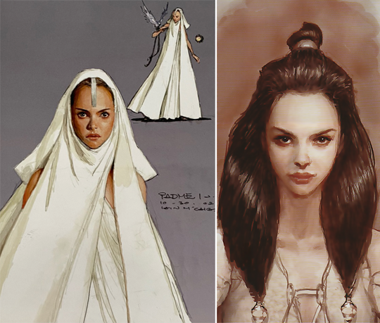
August 2002: While revieving costume designs, GLucas indicated that Padme will need senatorial, casual and action wear.
October 12th, 2002: 'For the first time, it is rumoured that Padmé might die in this film. She might be seen last on Alderaan.'
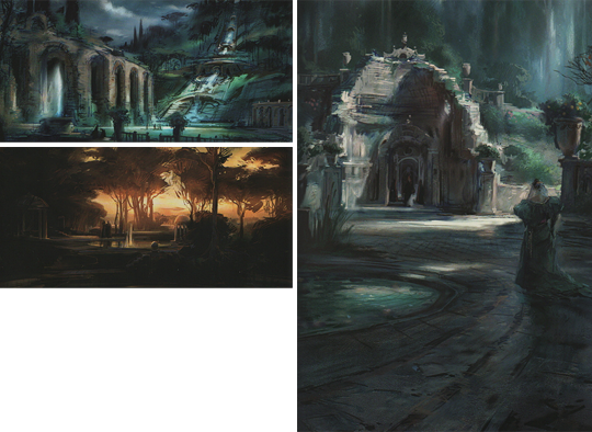
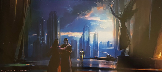
October 25th-31st, 2002: In response to GLucas requesting a new locale for a Padme and Anakin 'love scene', Erik Tiemens designed several Naboo sceneries. Upon viewing them, GLucas moved the scene to Coruscant; some design elements are used for Kashyyyk.
October, 2002: Iain McCaig designed costumes for Padme. Note the bird of prey.
October 2002: While designing the world of Kashyyyk, Erik Tiemens painted a scene of Padme walking with wookies. (Note: Image is a cropped version of the full art work)

November 1st-8th, 2002: Iain McCaig: 'George said there might be a scene where Padme's doubled over in agony and Yoda is there unable to help her'.

November 22nd, 2022: Erik Tiemens designed a set of new locations for Padme and Anakin 'love scene' on Coruscant.
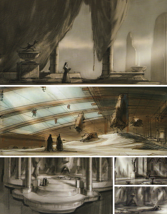

December 19th, 2002: Erik Tiemens: 'I was brainstorming with Iain [McCaig] and he thought that Padme might have a dagger in her hand'.
December 20th, 2002: Derek Thompson illustrated his idea of having Vader find Padme and the children, who are being protected by Jedi.
January 31st 2003: GLucas delivered the first rough draft to his producer Rick McCallum. The outline given in the book is brief, but Padme's basic storyline in the 55 page script appears no different. However, Anakin's nightmare about Padme features her consumed by flames, and Padme goes to Mustafar with her handmaidens and Captain Typho - who are gunned down by clones on arrival.
February 6th, 2003: Erik Tiemens designed a piece of concept art for Padme's funeral procession.
April 12th/13th 2003: GLucas presented the first official draft of the movie script. It's 111 pages long. Padmé and her entourage are still attacked on their arrival on Mustafar, but this time by droids whom Anakin defeats. In regards to Padme's death, Palpatine tells Vader that a Jedi murdered her.
May 5th, 2003: Iain McCaig's designed Padme's funeral outfit.

May 24th, 2003: Erik Tiemens illustrated Padme and Anakin's farewell before he leaves for Mustafar.
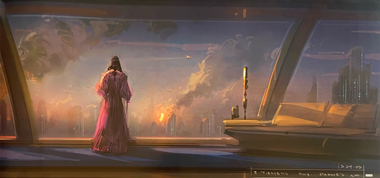
May 29th, 2003: Erik Tiemens illustrated Padme watching the Jedi temple burn.
June 13th 2003: GLucas presented the second official draft of the movie script. It's 135 pages long. Anakin's nightmare of Padmé is changed from her being consumed by flames, to her dying in childbirth. There is now a scene where Palpatine suggests to Anakin that Obi-Wan is meeting with Padmé secretly. In regards to Padme's actual death, Palpatine tells Vader that he [Vader] murdered her, just as in the movie. Just like the finished movie, it is noted that Padme dies of a broken heart. Padme's final smile at Leia is noted to be the smile that Leia remembers in RotJ.
June 26th, 2003: The fourth draft of the script is completed, consisting of 129 pages. Padme is no longer accompanied to Mustafar by Typho and her handmaidens.
June 30th, 2003: Principal photography begins.
July 2nd, 2003: First Padme scenes are shot, both located in her apartment (Her and Obi-Wan discussing Anakin, and Padme with the other senators).
July 3rd, 2003: Revised script for the scene in which Obi-Wan tells Padme he knows about her and Anakin.

August 12th, 2003: Last day of principal shooting for Natalie Portman.
September 17th, 2003: Principal shooting finishes.
December 21st, 2003: Iain McCaig designed a practical costume for Padme.

March 9th, 2004: All but the last ('thunderous applause') of Padme's political scenes have now been cut from the final film.
August 23rd - September 3rd 2004: Reshoots
August 23rd, 2004: Additional scene scripted for reshoot the following day.

January 31st, 2005: One last day of filming for Natalie Portman and Hayden Christensen.
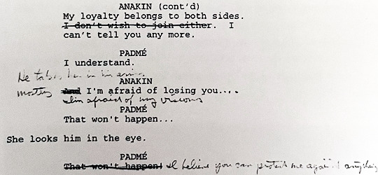
Script excerpt (unknown date)
Art (unsure dates)


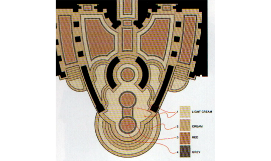
Padme's apartment layout and colours
98 notes
·
View notes
Note
Why does screenwriting have such a weird format? I know it's standard for scripts of all kinds, but it's also alien? It almost looks like it's designed for someone to write quickly??
Why are screenplays the way they are?
Screenplays are interesting pieces of writing because while they can read very beautifully, and quality is apparent in some scripts more than others, it is a medium that is extremely purposeful. The script is not the final destination of the idea, and that is what you have to remember. The script is, more than anything, a map. It gives the cast, crew, and producers the necessary information to get a sense of the story so that it can be adapted effectively. Therefore, the quality of a script is judged by a completely different rubrick:
Adaptability: Scripts are naturally going to go through many changes to serve the filmmaking process. Filmmaking is a fundamentally collaborative process so other members of the group must be able to effectively interpret the script well enough to make strategic improvements. Scripts are definitely works of art in their own right, but the design must account for adaptation into a completely different medium and you will not always be the person making executive decisions on how that is to be done.
Clarity: Creative liberty is acceptable in a lot of forms of writing, and style is definitely apparent in a screenwriter's work, but that is primarily to be found in how they practically form the elements of the story, rather than how it is delivered in words. The clearer your meaning and intent in a script, the easier it will be for the other people you're collaborating with to interpret and translate into the next medium. Even if your work is meant to be experimental, abstract, or avant garde, the script is the place where you make sure everyone that is inside of the production understands the point, so that they can help you make sure everyone outside of it is confused in the desired way. Your talent and style can be showcased in the way you demonstrate the particular brand of humor or suspense or drama in the descriptions, dialogue, and dialogue cues.
Efficiency: Format is extremely strict in the industry because it is a collaborative medium that often brings together hundreds of crew members who are all from different backgrounds/experience. The one thing that must remain consistent and reliable is the legibility of the script. The gaffer and the producer alike must be able to pick up the script and find what they need to learn in order to fulfill their role. The format of the script denotes specific crew member's cues in specific places so they know how to find what's expected of them quickly and efficiently. While on larger productions, there's often many directorial positions who are coordinating and communicating with the crew members who handle more detail oriented jobs, that isn't always the case.
My advice, if you're looking to gain experience in writing scripts that are actually meant to be adapted is to practice self-discipline, pragmatism, and distance. Your script won't always belong to you. There isn't the autonomy in screenwriting that you have in prose. Learn the rules of screenwriting, then learn how to enhance them in your own way.
Best of luck,
x Kate
–
Masterlist
If you enjoy my blog and wish for it to continue being updated frequently and for me to continue putting my energy toward answering your questions, please consider Buying Me A Coffee, or pledging your support on Patreon.
208 notes
·
View notes
Text
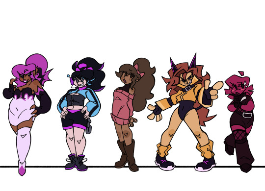
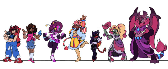
FNF CONNECTED UNIVERSE LINE UP Part 2: The Girlfriends
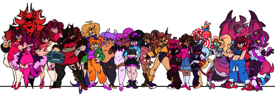
Yippee, new line up. Didn't have as much trouble on this one either.
Idk how much yapping I'll be doing, since I don't really know how much I have to talk about.
But still
Close ups and yapping under the cut
Alternate Universe Girlfriends
So just like with the Boyfriends, all these Girlfriends are technically all the same person, just from different universes. So I tried some elements of their designs consistent between them all, which stem from my base game Girlfriend design.
Unlike BF, there's a good bit more to talk about with GF since I draw her pretty different compared to her in-game design. The main thing is her more apparent demonic traits, like her horns, tail, and purple splotches. The explanation for this, in universe, is that she doesn't have the full power to cloak herself yet. See, her and her family are "music demons", which gain their power by leeching from music, usually a particular genre. GF hasn't really decided what genre to leech from yet, so she isn't as powerful as she could be. She also has a coat cuz uhhh. Silly. Things like her demonic traits and her coat (Or something of similar shape like a feather boa) would be the things to connect all the AU GFs.
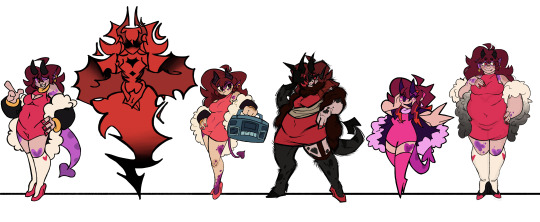
Moving on, we have Herself, who I was looking forward to drawing the moment I started this line up cuz I had just. Such a clear vision of her in my head. Although it was a struggle to put that vision on paper.
It's hard to put the exact vision into words, but it's like having her form become less defined as it goes downwards, until it's just the wispy silhouette of her hair. There's a certain balance you have to strike with the wispy nature of her form and the trademark Girlfriend hair shapes, and that's what ended up being the biggest struggle. Once I figured that out though, it was pretty simple. Shapes were the most important thing since her coloring is pretty monochromatic. Not counting the black, this design only utilizes two different colors, both being shades of red. Her design includes a feather boa instead of a jacket, mainly cuz I completely forgot about that rule when I got to her and the boa was a lot easier to add than a jacket. It also makes an interesting shape I think.
Next is Funkadelix, and she really wasn't too hard. The main thing was giving her traits from my main GF design, which wasn't hard at all. For her horns I referenced her Halloween attire. Her tail too, sorta, but I mainly just referenced the thinness of it.
There isn't all too much to say about MDM. There wasn't a lot to change or add. Main addition was the boa, which was admittedly kinda fun to draw in my style for that AU.
Now onto Mix. If you saw my post yesterday about the doodle/sketch pile for this line up, you might've seen a design concept I did for Mommy Mearest, and that was literally just for Mix's design. Except it was virtually pointless cuz I didn't really include any aspects of my MMM into my Mix design. It's fine though, I think she turned out fine. Might take another pass at her in the future when I ACTUALLY have my MMM design figured out.
Lastly for this section, HD. I actually had quite a bit of fun drawing her. Don't really got much to say about her though. I'm pretty sure she was the first AU GF I gave a boa, so she's the one that started that. It was originally going to be all white, but my good good friend @minxtheeenby suggested it fading into black, and I really like how it turned out.
"Side" GFs
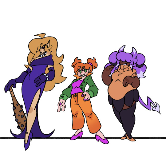
So first is Belladonn (B-Side). I know I wanted her to appear more sophisticated. That's just always how I imagined her, even back well the mod was still a simple recolor remix mod. There's also something so fun about classy characters that are also dangerous. We need more regal women that carry around bats full of nails. I had a lot of trouble nailing (pun not intended) her hair. The main thing that sets it apart from the traditional GF cut is her side bang (idk hair terms, I think that's what it is), but besides that, not much else. So I had to mess with it a bunch to get something I liked.
Amelia's (D-Side) design was pretty straight forward. The main thing was just adding a few more details to spice it up a bit. Which just happened to be buttons on her jacket and lil heart patterns on her knees. I also wanted her to be short. Cuz idk, she gives short vibes. A lil idea for her that isn't showcased here is that I imagine her pigtail buns actually turn into her horns when she is in her demon form. (Bad doodle, but just to show the concept:)

Lizzy (G-Side) was kinda fun to come up with ideas for. Most of her design is taken from the fake teasers for the mod, cuz silly. But because her mom is some sort of light spirit.. thing, I wanted to mix that in somehow too. So that's where the white highlights on her horns, hair, and tail come from, but that's not all it added.
She also has pretty funky eyes, that are somewhat inspired by Shara Ishvalda's eyes
Also, in that doodle, I imagine all of her hair is floating, I just. Didn't feel like drawing her pigtails cuz I mainly wanted to highlight the eye thing.
The New Yorkers
With Shaya, I mainly added a bit of stuff to her outfit, since the original is too simple with my design style. I basically just added a bat wing shape motif to her design. Cuz. Cuz vampire. This is also present in her ear shape cuz I didn't want them to JUST be pointed, cuz I wanted her to stand out a bit more from the demon girls. So different ear shape.
I don't really know how much Azalea (Neo) changed. I know I changed her hair a bit (to further differentiate her from GF) and I altered her top a bit but I THINK that's it. I did change her and her family's lore a bit though. Cuz I made them robots. THATS RIGHT, THIS IS WHO I WAS TALKING ABOUT WHEN I WAS TALKING ABOUT MAKING ONE OF THE GIRLFRIENDS A ROBOT. Azalea's pretty android-esc, but I imagine her parents are just full on robots. I can't wait to design them. But yeah, I imagine Azalea is much more human looking because she just wants to be part of human society and her parents love her so they got her the more human looking body so she could live out her dream. We love supportive parents *explosion emoji* *explosion emoji* *explosion emoji*
Not much to say about Grace. I just gave her a bit of melanin cuz apparently she's mixed. That's all I really changed tho.
I don't think I changed Judith MUCH. Her face is a bit more. Wolf-like? Idk. I also TOTALLY didn't reference Clawdeen Wolf's hair when designing her. Totally not.
Vikki (Minus) is grouped with the New Yorkers cuz. There's only one of her. Unlike the Minus BFs. I just made her a lil more goth, since people literally call her "Goth GF". Also made her hair a bit more blocky. cuz. cuz the minus symbol. Shape *sparkle emoji*
Who the Fuck Knows (Miscellaneous)
So starting with Cherry (Swappin'), in this AU she's actually GF's younger sister. She also already has a music genre to leech from (rap), so she's better at concealing herself. Not much else to say, I did not change her design much.
Nothing much to say about Barbara either, I barely changed her.
Now Astra (Starcatcher) was fun. While I was initially sketching her, I realized that both her alien species and the Alien Hominids have the same style of classic antennae. So I decided "Huh, what if their species are related." So I did that. Not much else to touch on besides that.
Tootsie belongs to @minxtheeenby and is part of their Sunday Night Snackin' AU. I drew her with her wings and tail out, which aren't usually out, but uh. Silly.
Belletrix didn't really change as much as I was expecting her too. The main thing was just. Making her an imp that could exist in the Hellaverse. Which was pretty easy. And then I just made shit up when it came to her outfit cuz it was kinda hard what was going on with that in the first place.
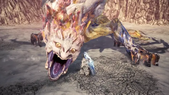
Next is Gabriella, YIPPEE. So she's the GF from Plants vs. Rappers. Vastly different appearance wise though, cuz, yknow. Can't have her look too similar to GF. And just like I did with Dennis, I decided to base her on another zombie from Neon Mixtape Tour: The Glitter Zombie
Idk, I thought it'd be cutie patootie. And it was. I really like how she turned out. I got lazy when it came to her flag, I did not feel like drawing that shit.
Last but not least is Ashley, the GF from my own AU. Which does not have a name. Idk, it's mainly just an excuse for me to draw anthro Monster Hunter monsters. But yeah, she's an intersex Leostra (Gender neutral term for the Teostra/Lunastra species that @sleepymushrxxm came up with) and I love her.
That's all I got. Gonna hopefully start working on the Pico's here soon.
#ashedwings post#ashedwings art#fnf#friday night funkin#friday night funkin’#wingz!ng au#fnf mod#ashedwings design#fnf mods#gf fnf#fnf gf#girlfriend friday night funkin#fnf girlfriend#fnf au#long post#ashedwings ramble
98 notes
·
View notes