#and also learning cel shading
Explore tagged Tumblr posts
Visit Tumblr Blog
Explore Tumblr blogs with no restrictions, modern design and the best experience.
Last Seen Tumblr Blogs


Fun Fact
In 2020, Tumblr had 29.4 million users in the US.
Text
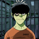
#zuko#avatar the last airbender#atla#prince zuko#zukka#avatar#trying to learn my style#and also learning cel shading#and zuko is my favorite practice because I never get tired of drawing him 😭#danie draws things
26 notes
·
View notes
Text
oh man i wannt to play the sims again i just have to move up fixing my wifi downloads' problem and get a better cpu ?? less errors please.
#maybe tonight i can queue effect tutorials for making them look so nice#I got hung up on cel shading with digital art but editing is so much fun too.#if i have to many tabs open my videos won't load XC#also i download a heck ton of CC packs .... add mods to that and i think i try to learn too much for my small brain
0 notes
Text

Hi uh new brainrot alert☝️🤓, Jack Jeanne is gonna consume my life till the sequel comes out so uh be prepared 🤑 My favorite character so far is Mitsuki but that’s probably cause I love Rama Havenna and his route was the first i played (been listening to Faded Color a lot on repeat and I’d love to make an animation with it or storyboard)
This was a BG test cause I never draw backgrounds other than in life study’s but I drew this shit in the car so that’s why I blurred it LOL, also trying to learn to take sketches and render them since I’m use to doing cel shading and lineart. I think I need to find a brush I fw, this one worked fine but mmmm not feeling it but it was too late to change brushes midway through 🤲
#jack jeanne#mitsuki shirota#Rama havenna#procreate#drawing#Otome#visual novel#dating sim#theater#clip studio paint#ジャックジャンヌ#白田美ツ騎
65 notes
·
View notes
Note
hi!! I was wondering if you could share tips (or at least a timelapse) on how you do your lineless art? It’s so simple, yet so pretty, and I’d really love to learn from you :0
Thank you so much! Lineless art IS simple (or rather...as simple as you make it haha)....lined stuff with cel shading is what I find really tough as it's SO tied down and concrete! You can definitely cheat a lot more with raw colour...
I put this tutorial together quickly to hopefully explain a little the basics of my process. I use A LOT of layers but it's mainly to keep all the 'bits' seperate (limbs from torso, head from torso etc) as I'm a fiddler when it comes to rotations but the actual process is very simple. Of course you can add further complexity with gradients, texture etc but I thought I'd use a really straight-forward example.
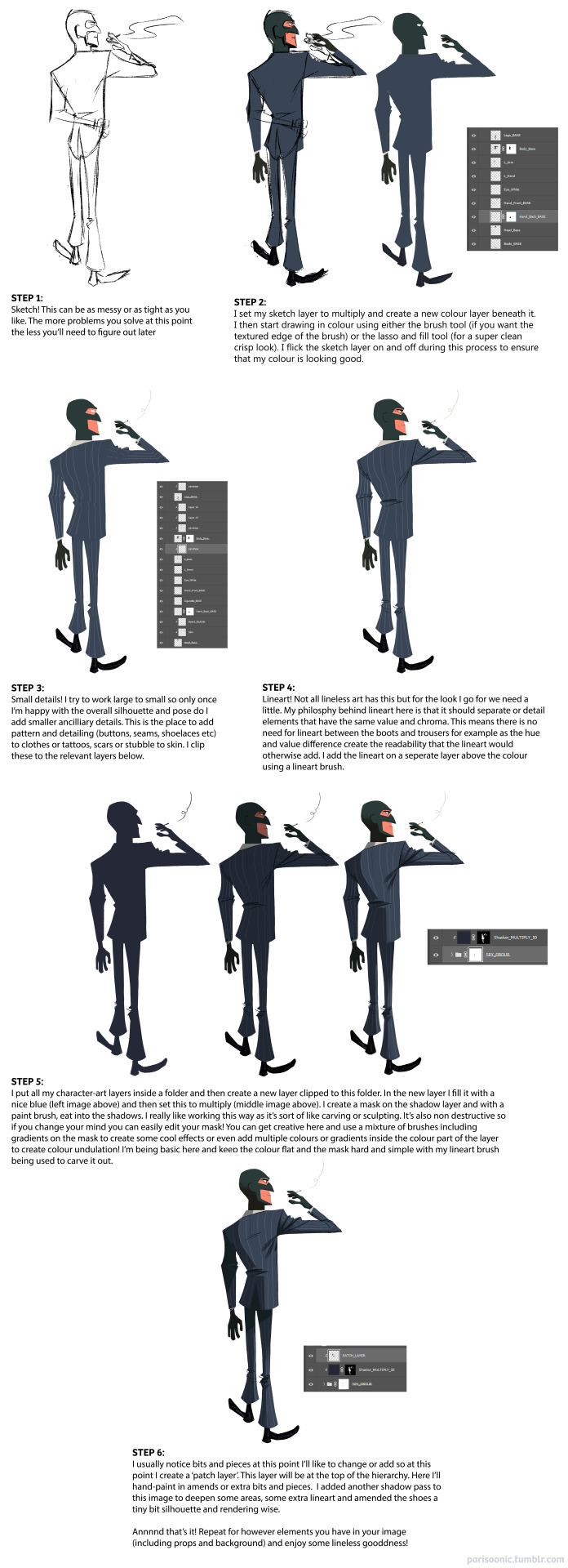
Unfortunately I don't have any timelapses to hand and I'd have to either bust out Procreate or figure out how to record my screen in PS to record one! Might be fun to do in the future :) Next best thing though - my pal works in exactly the same way I do and she's uploaded a bunch of speed paints here (albeit most are landscapes). I also touch on my lineless approach with the few progress pics I posted here and here. Hopefully this helps! Studying other lineless art is the way to go - lots of great vintage illustration to look at as well as shows like Tangled: The Series, Carmen San Diego and Samurai Jack.
360 notes
·
View notes
Text
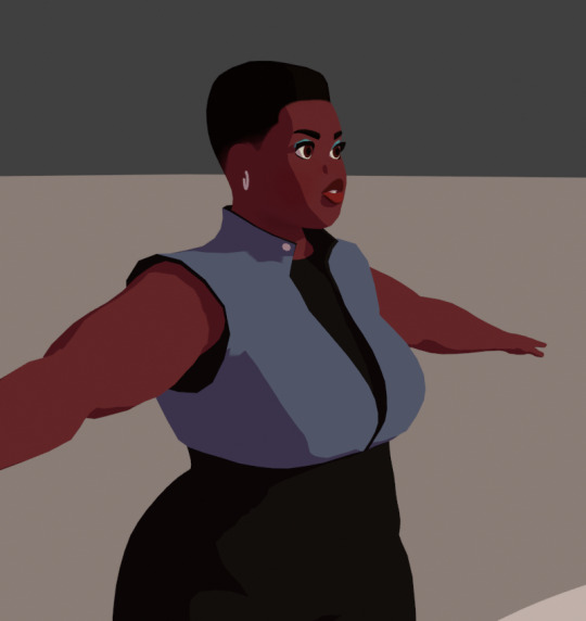
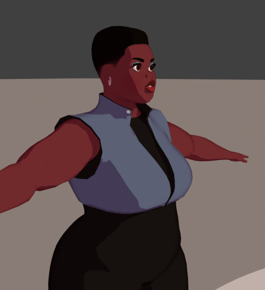
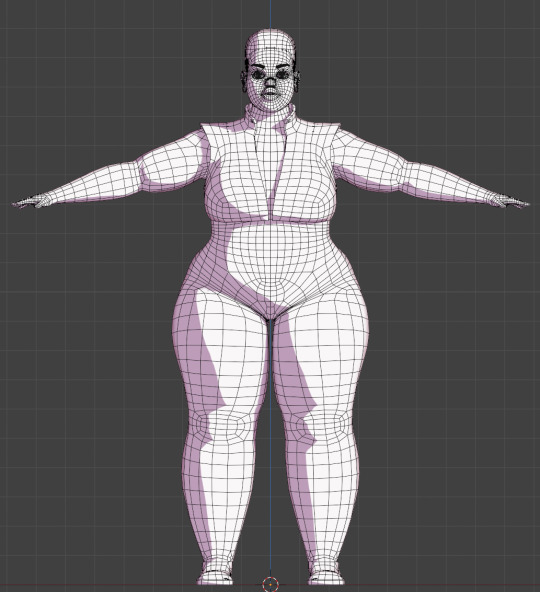
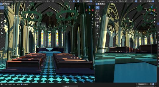
My model appeared on the Tumblr radar! I appreciate all the comments! It was interesting to hear that multiple people didn't realize it was a 3D model. I work a full-time job and modeling in Blender is one of my hobbies. Whenever I look back at my earliest models, I'm always shocked at my improvement. I look forward to seeing where I'll be at a year from now.
Multiple people asked how I was able to get my cel shader to look good. I've learned a lot from watching multiple videos and reading various blogs over the years. Here are a few things that I did for this model.
To start, here is how my shader graph looks like.
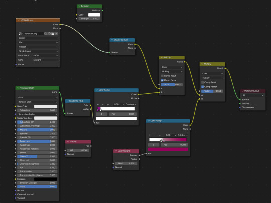
I have the Layer Weight plugged into the Color Ramp. This creates a soft outline around the model so that when objects of the same color overlap, it doesn't look flat. I've been experimenting with the options, but as of now, I like the way the B-Spline option looks.
Something else that I change is the shadow color on the color ramp. By default, it's set to black. This always felt dull to me, so I will usually change it to a magenta or purple. I also keep an Emission node ready so I can switch the model to all white. This mostly helps when modeling so I can see how the light will interact with the model in this style. Adjusting the settings of the light also improves the shadows.
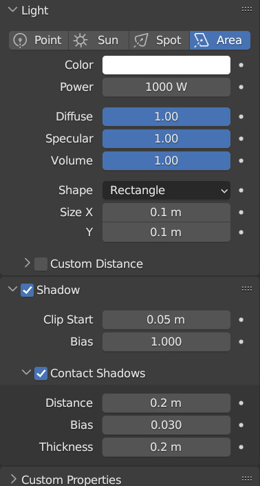
Also, change the Color Management from Filmic to Standard. This ensures that the colors you're using to paint your model will look the same in the viewport. This option can be found at the bottom of the Render Properties.
Check out these resources for more useful tips. Also, the props are from a Synty pack. I picked them up years ago when they were on sale.
Anime Shading In Blender (INTRODUCTION) Lightning Boy Shader - Beginner Guide - Shading & Modeling Tips
Synty™ Store - 3D Assets for Games (Unity + Unreal) – Synty Store
#3dmodeling#character modeling#cel shaded#blender3d#character design#character art#plus size art#tutorial#blender#original character
122 notes
·
View notes
Note
Hii first of all, I FUCKIN LOVE YOUR ART! ITS GORGEOUS AND IM SURE EVERYONE CAN UNDERSTAND YOU REALLY GIVE YOUR SOUL INTO THAT🤧 Your color palette looks so good, What do you pay attention to when painting? (Like when do you think its better to use multiply or something like that and etc.)
first off, I'M HAPPY YOU CAN TELL THAT I PUT MY SOUL INTO MY ART!!! im genuinely in love with drawing and am always finding ways to make creating art enjoyable and impress myself with what i can achieve and learn :D
second, thanks for asking your question!! i dont mind answering it, but my response is quite long. here's my thinking process:
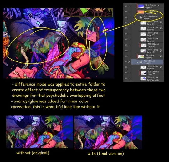
(you specified layer modes like multiply, so im gonna gear my answer towards that a bit) 1. REFERENCE SEARCHING IS KING. color is actually extremely hard for me, so i search around for artworks with palettes i'd like to use and study how an artist uses it. some situations i have a clear idea of what i want, but usually the images in my head are extremely vague, so i borrow palettes from various other artworks that fit the vibe of what i want. an example is this one. my main palette reference were from these artworks. im looking at this artist's use of high saturates and how drawings are overlayed on top of each other. while looking at references, im asking myself how is this artist using warm/cools, where are these warm/cools placed, if their illustration used any form of texturing (like halftones, hatching), how do they use their palette to render form/shape/gradient, when/where do they saturate/desaturate their colors. those questions inform my decisions when using colors too.
2. USING LAYER MODES WHEN NECESSARY. i used to be reliant on multiply for everything, which atp i dont do since i can definitely push colors more first before using layer modes. only when i feel like my current colors are lacking do i start tinkering with tone curves and/or brightness/contrast/hue/saturation/luminosity settings. and if that doesn't work, then i start using layer modes. using layer modes do help with achieving certain effects, color corrections, or when i want to fuck around and find out. i think having a better understanding of what these modes can do makes you more decisive on how you can properly utilize them and to achieve a particular look (like using multiply for a cel shaded style). here's an example:
this leads into my next point:
3. BALANCING OUT VALUES. big thing that makes an illustration hard to read is if values blend together which affects the hues and contrast. i check for what elements need to be distinguished from one another and if it can be read clearly. using layer modes can either help with this or not help at all. it's very dependent on the type of layer mode. here's this example where i applied pin light:

back to #2, there are various instances where i'm using layer modes for quick color corrections and/or to help with readability:


other times, i start off having my entire subject in gray and to figure out main shadow/lights (similar to the multiply cel shaded process i linked ealier). im thinking about what this should look like if i only used 2 value tones:


when in doubt though, i check my artwork in grayscale to ensure values aren't overly blended into each other, especially if i didnt start with grayscale like this one:

painting for me takes into consideration a lot of different aspects. im thinking about how colors should interact, where/when to give contrast, checking/balancing out values, etc, but im also making it a time to study off of how other artists use their colors through the references i collected.
hope this answered your question! lmk if there's more :]
#answered art process questions#answered asks#this one took me a couple of hours to form out my thoughts while editing in examples ngl
151 notes
·
View notes
Text

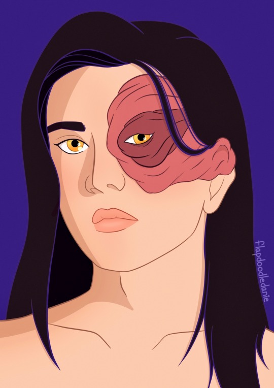
"Star ✦" — ISAT-ober 2024, Day 4
My fourth day of @darlnyan's ISAT-ober prompt!
Haha, "Star" prompt, for In Stars and Time...
This one took roughly two and a half hours, most of it being voice chatting with a friend of mine whose also working on the prompts. I am happy that I've made an original illustration out of the intro of the game than a simple redraw. And unlike yesterday's prompt, I didn't need to clutch draw this in a time limit! So working on it is a lot less stressful.
With details of the original artwork being implemented, I've created a background texture to make the drawing a little less linear than it being flat colored. I've also learned some coloring techniques while aiming to mimic insertdisc5's art style, that being cel shading (still in progress) and blending in black and white colors clashing together. (partially also while working on Day 3's artwork)
From working on all of the prompts so far, it really made me start to enjoy drawing more from the direction and skills it takes to make something beautiful. I had a lot of fun throughout ISAT-ober where I may consider drawing regularly often if I were to lower my worries in expression what I like to illustrate. It's something I wish I would be able to accomplish much earlier in life, but it's better than never I suppose.
Besides that, I hope you all enjoy this drawing. 💜
#art#digitalart#drawing#in stars and time#isat siffrin#hackgame#my artwork#eyepatch boi#isatober#isat fanart#star
83 notes
·
View notes
Note
ok im new here and just. HOLY CRAP THAT LOOKS SO GOOD IM SO EXCITED??? THE FINAL PIECES LOOK DELICIOUS AGH. also lil question cause im so curious-- i see you use blender for backgrounds-- do u draw on blender too or do you export the backgrounds to another program? just askin cause it looks too good to be grease pencil asjdj but maybe im wrong oagh
ooo welcome new fellow potato and thanks so much ^0^ should be out next month, i hope you like the final result💖
nope, dunno how to use Grease Pencil T_Tso everything is straight up:
modelization, lighting and shaders. I place my cameras, hit render, then once I got all my PNG sequence, I send them into After Effect at 24 fps
I use a Stroke and Scene Lineart modifier for my 3D assets and it usually loks like this:
Although, i quickly realized it looked too flat on environment. I couldn't have the dramatic light look I wanted with the same technique. With a cel-shade shader, you fake your own shadows with your color scale.

After adjsutments, revising and informing more about cathedral lighting and structure. I deleted all cel-shade shaders and went back with Blender procedural lights and materials

Before (cel-shade shader attempt)
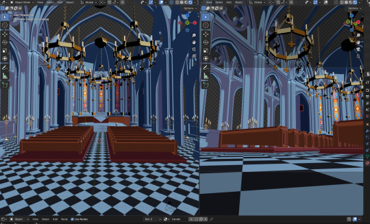
After (procedural lighting)
Although, i would looove to learn how to use Grease Pencil, it's insane what I saw other artists do with the tool! but oh shit-- hope that answers your question
THANK YOU
23 notes
·
View notes
Note
Hiii, I really love your art and I really wanna ask a question, but how do you your cel-shading stuff but yet still use some textured brushes while at it! And how to use these textured brushes without making it too muddy? I would really love to learn your process
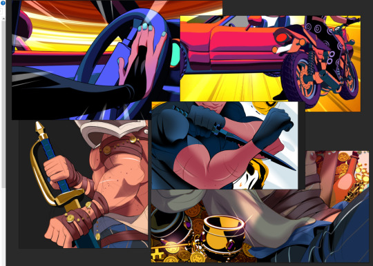
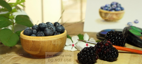
Well my technique varies a little bit from piece to piece but I have a few general rules of thumb developed usually to allow me to finish coloring pieces in a timely manner. I'll throw in an example piece here to reference while I talk about what I did in it below the break!

Ok so this is basically my go to coloring style for character art. I block out a base flat color (usually like the primary fur/feather color of a character), and then create a new layer (with the clip to layer below modifier) for each individual flat color on top of that for the various elements of the design. Then when coloring I tend to stick to the rule of one primary darker shade and one highlight shade, but since I'm using a rough brush it gives me a little wiggle room for opacity and texture (also use lock alpha to make shading way easier on the individual parts). These shadows and highlights are usually painted-on actual colors but sometimes I use multiply layers to push the contrast in areas a bit further. And for shiny metal bits, like Iris's claws here, I sometimes throw an airbrushed glow layer on top to make it really appear shiny and metallic!
Oh! also i create another clipping layer above the line art and color over it in parts to better match up with the colors below. Like over the brown clothing bits the lines become a dark reddish brown, they become shiny and light on the metal sword, etc etc.
Hopefully that helps and wasn't just random rambling.
124 notes
·
View notes
Note
how do you decide the colors of your art? color theory is so hard and your art is always so vibrant and cute! 🥲
Non are you on the right page? 😅 jkjk
uh I've put off answering this ask (this was from March 2nd aksjdhk) because Idk what I'm doing most of the time and go with the vibe BUT I tried my best with this, sorry if it's messy af akjshdkjasd
again like the previous tutorial-ish ask I answered, I am not a professional artist by any means so all of these are just stuff I learned on my own and heavily simplified for me to digest and implement it easily, you'll have to take these with a grain of salt. With that said-
Okay first off, yeah color theory is hard and I don't know everything about it xD I think the most I've used are these ones:

There's a lot of tutorial, advice and like, art out there that explains the entire color theory thing, some are complicated and some are easy. My advice is pick only 1 thing to focus on, try to understand it and then use that one advice, then only moving on to other concepts, because there's so much going on with color theory it's very easy to get overwhelmed and to give up on it!
here are some recommendations if you want to learn color theory:
bluebiscuits
nouconcept has a lot of post of all kind explaining her process and colors in a cutesy, bright and colorful manner, so feel free to scroll through her page! I recommend [basic knowledge with colors, color theory, color palettes (more on this later)]
Btw if you're on Procreate, I like to use the square more than the triangle. Also, if you click on "Harmony", there are modes of color theories (the complementary, tetradic color thingy) that you can pick to create colors easily.


Like when I set it to "Split Complementary" and when I pick this bright pink as my main colors, there are 2 more circle to indicate the complementary colors (green and blue)

Okay in terms of picking my colors like the how and why, the easiest way is to find color palettes to work with, you can find them in abundance in pinterest for starters, but if you want more specific or control you can try colorhunt, sometimes you'll see me reblogging palettes from @/color-palettes too (here's an example on the result of using a set of colors, pretty cool!)
If you're using Procreate, you can also convert images to palette easily. You know how sometimes when you see really aesthetically pleasing screenshots whether it's from games or anything and you go, "huh, I wanna color something like that but I don't know how and I don't feel like color picking every pixel"? yeah just plop it into procreate and you'll get an array of colors to work with. Here's how to do it.


Uhhh next is about shading I guess? xD here's my simplified way to do it. If you want me to go in depth or more about "Layers" you can send me another ask, but I'm not the greatest at it I just like to use a few of it.
On the alpha lock lineart thing, red is usually nice to work with on skins, orange is good for like a glowy/warm/AYO LIGHT IS RIGHT HERE ON HIS HAIR situation, blue is for reflective lights or like in the darker zone (don't take my words for it cuz I rarely use blue correctly)

I think when it comes with shading there's a lot that can go wrong, and very quickly too, so what I would suggest is try out the cel shading technique first, in my opinion it's cleaner and much easier to handle. Marc Brunet does an excellent tutorial on this. If you want to know the differences between cel shading and the usual soft shading you can watch this video by Winged Canvas.
Why I think cel shading is easier? because there's not a lot of blending that needs to be done. From my experience, I feel like blending can sometimes lead to badly smudged, blurry, undefined look on a painting, it comes with experience from understanding different aspects like lighting, face planes, color coherency etc. If you want to learn more about the details, I can suggest:
How to learn digital painting (beginners) by Sinix Design (highly recommend them for the basics and foundations)
Better Shadows by Sinix Design again, this is still something I'm learning and struggling with but this video talks in detail about hard lines and soft lines, planes and etc, essentially the things that make up a good color piece
While we're at it, actually I think before you even tackle color you probably wanna take a look at greyscale first xD but okay then that's a whole new thing to learn so, this post is more like a simplified way of how I color stuff. I will rec Ariabba and Lucas Peinador's videos if you're interested tho.
RIGHT okay so the next few are just more like things I do. When it comes to colored doodle, once I've picked a palette I want to work with, I stick to it. Idk what to call this except color group consistency. You can look at this example below.

You can see how all the colors are primarily from the ones on the side, the only difference I would make are saturation and hue but only very minimal for shadows. (This is also why I recommended finding a color palette in the beginning) I feel like whenever we do colors we're quick to jump into the big fiasco of "oh I want to make everything really bright and really colorful!" and there is nothing wrong with that thinking, it's good! But if you're new to coloring in general, that kind of approach can make a painting feel...uh...disconnected? I think? it's like the colors aren't matching well together if you don't know how to blend and make all the colors work xD If we stick to a set of colors, it's much easier to maintain the tone of the art.
Okay, another tip when it comes to shading is this.

Let me preface this by saying, there is nothing wrong with the "Dull" method, it all depends on the mood/setting of the piece you're working with. Say if you're drawing something that is moody, in the shadow, in the rain, just basically in a darker surrounding, then it works well. But in other cases, if you feel like your colors looked dull then maybe you can try the 2nd method. Basically you shift your hue (the outer circle, the ones with different colors like green blue purple and all) a tiny bit then increase the saturation to the level you want. This would make the shadows/shades much brighter and nicer to look at.
Another tip is understones! they help tremendously in terms of adding just that extra oomph to your art. Take a look at this example.

Adjust your brush opacity (make it lower) to color a base (in this case, orange), then only shade in the color you wanted (red), you can see how it's a little bit more interesting to look at. Again, this is just a preference thing, if you prefer to make it red then go red.
Here's another example, I think this is more so of combining undertones and color stacking. If I just color Laswell's shirt with pure dark purple, it wouldn't be as interesting and eye-catching, ya know? So I actually used a mix of blue and pink as undertone, then I shade dark purple over it, then adjust in some places with a lighter purple as accents.

This is another thing that I do sometimes, not often because idk what I'm doing with this LMFAO but I'm basically trying to add more variation and some pop to a painting by dotting in really bright, almost neon like colors to well, make it interesting looking. I think I always use the blue, purple, orange, yellow category.

Lastly (and I like to say this a lot), when all else fail, just use a gradient. It doesn't matter if you don't know how just know to use a (light color) (base color) (darker base color) combo and instantly your art already looks more interesting. Hell, why not take it a step further and add some texture to the piece? It doesn't have to be complicated, you could put random lines, dots, hearts, whichever works as long as it creates a subtle contrast to the whole piece. Very small detail but it can make a big change! Let's take Alexander the IV as example:

Once we added a green to it, it looks good on itself already, like hey now we know the lil buddy is green. But it's boring, okay then smack on some gradient, make the top lighter and the bottom darker. Hm but it's missing something, okay random bullshit go! Add lines, hearts or use a noise brush over the green and boom, now Alexander the IV looks cuter.
Hope these help!
#gomz scuff advice#man idk if i even make sense aksjhdkjghsk#like i do monochrome doodles like 80% of the time....so...idk shi about colors...DKSJZHLSKGJ#and most of my color doodles usually have shittier engagement/numbers/reach so that says a lot LMAO#i almost didnt want to answer this....but fuck it lmao i didnt feel like removing your ask either so here#maybe it can help a tiny bit#hopefully#waiting for another artist who knows what they're doing - sees this and go wtf is this panda on about kajhsfdkjh#sorry HASKD uhm anyways#ask response#idk how to tag this#color#art#i guess???? yeah sure why not
20 notes
·
View notes
Text
Art Advice: The Misconception Behind "Study Realism"
Most people who draw anime/cartoons have, while asking for ways to improve, at one point or another been told to "study realism." A common response to this is, "But I don't want to draw realism!"
But, did you know that the purpose behind this suggestion is NOT so that you draw realism? They're not suggesting you change to a more realistic style. What, then?
Let's look at this through an analogy:
Say you don't know music yet and decide you want to learn how to play the Happy Birthday song. You're not interested in playing anything else, just the HB song, and you haven't started learning anything related to music at this point. OK, that's fine, and now we have our situation set up. Once you've decided this, you set yourself to learning the sequence of notes to the HB song. You practice and practice, and, after a while, you can play it really well without a hitch. After a few years, it starts feeling bland to you, and you ask, "How can I make my HB song better?" And someone tells you, "Learn all the other music notes," and "Study classical and other genres of music." And you reply, "But I don't want to play that type of music; I want to play the HB song!" (And that's FINE! It's valid; it's what you want to do.[*Footnote 1]) But without having learned all the other notes and other types of music, you can't make a remix of the HB song, or an "epic version," or a hip-hop-fusion version; you've capped at the end of the first paragraph of this story.
So drawing anime or cartoons is like playing the HB song, or any one song in our example.
And here's where our misunderstanding comes in:
"Study Realism" DOES NOT MEAN "Draw Realism"
Yes, you'll have to draw it to study it (not only your brain, but also your hand needs to learn the skill), but it doesn't mean that's what all your artwork will look like. It is meant to give you more tools to make your anime and cartoon work stronger, more appealing, and more unique.
How will it do that? The more music notes you know, the more types of music you understand and can play, the more original a remix /version of the Happy Birthday song you'll be able to make - and it will be unique. Because you will be able to take all that diverse knowledge and apply it to your song, making it stand out, and the next time you play the HB song, people will go, "Wow! This is a really cool version!"
So now we can be clear: There is a difference between learning something and performing it. You can perform whatever you choose, but by learning all the things, your performance of your "Thing of Choice" will be stronger.
What, Exactly, Will Studying Realism Teach You, Then?
I. VALUES
If you learn how to paint/shade with a full range of values (by learning realistic shading) that properly depict both volume and lighting, you will have no trouble simplifying that to cel-shading or gradient-shading in your anime or cartoon drawings, because you will at once spot when something is undershaded or the shadows are in the wrong spot.
On the other hand, if you try to do cel- or gradient-shading first, you are way more likely to a) undershade, and b) have an inconsistent light source. And when these things happen, you won't be able to tell *why* your drawing looks "off" or bland.
II. COLOR
By studying realistic coloring, you'll be able to learn how color varies across an item (say, a shirt) that is a "solid color." Example: you're drawing a character with a pink t-shirt, standing in the sun, at the end of the school day. The t-shirt is solid pink, however, the colors on it will vary from orange-ish to purple-gray, with some areas almost a bright red (and that's not even considering items around the shirt that would bounce light back onto the shirt and change its color). But you'll only know this (and how to do it) if you study realistic coloring.
Then you can apply that knowledge to your stylized artwork and make it stand out more.
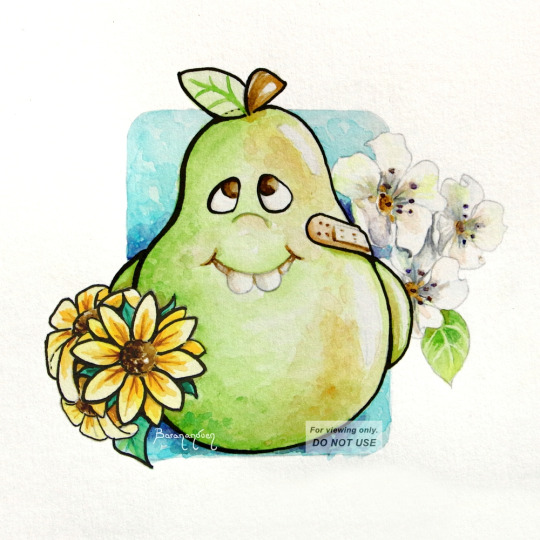
Painting of a stylized pear, where I studied real pears to understand their coloring and texture. See how studying realism can enhance your cartoon work.
III. MAKE BETTER STYLIZED ANATOMY
By studying and learning realistic anatomy, you will be able to make stylized art that, for example, doesn't have one arm longer than the other, because you will have learned how to measure proportions, even if you don't draw realistic proportions. So that if you decide you want to draw unrealistically long legs (eg: Sailor Moon), you'll be able to make them look good and keep them consistent.
You will also be able to draw figures in any position, because you will have learned how body parts are made up and how they move, as well as foreshortening/perspective. Then, when you go to draw a pose you haven't drawn before, it will be WAY easier.
IV. UNDERLYING SHAPES
Although this is one of the least-mentioned aspects of art-learning, it is, in my opinion, one of the most important, because when you learn to see underlying shapes (the quasi-geometrical shapes that build up a figure), coupled with learning how to measure a form using other parts of the same form as reference (measuring the length of one body part by the number of times another body part fits in it, as mentioned in Section III, above), you will be able to DRAW. (Period.) You won't be able to draw just people. Or just wolves. Or just cats. You will be able to break down a new subject into its building blocks and come up with a very reasonable likeness. And whatever's different, you'll easily be able to make relative measurements to spot why and fix it.
Once you learn to identify underlying shapes and how to measure proportions in anything, you will also be able to pick up and reproduce any existing style without much trouble.
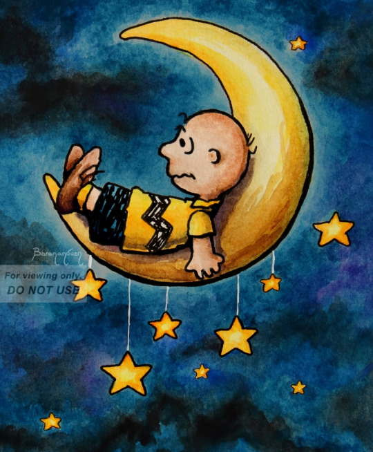
[link to Tumblr post with this artwork]
For example, this was my first time drawing anything Peanuts. I didn't have to do practice sketches for it (though there's nothing wrong with doing that). But I knew, from realism, that to achieve a good likeness, you need to measure body parts relative to other body parts, so I looked at Schulz's drawings and was able to determine: OK, Charlie Brown's head is roughly this shape, his body is so many heads tall, his eyes are this % of the head, the ears are this far in, the arms reach down to here, etc. I knew what to look for.
V. FOR THOSE WHO WANT SEMI-REALISM
If you want to do "semi-realism," you'll have a way easier time of it by learning realism and then stripping it down as much as you like, than by starting off with "100% anime" and trying to build it up without knowledge of realism. People think the latter is easier, because it *seems* less intimidating, but it's like trying to drive to a store you've never been to without knowing its address: you'll be driving around forever trying to find it, and it will be frustrating. What people call "semi-realism" is stylized realism, and you can't really hit it without knowing how realism works.
CLOSING NOTES
It also doesn't mean you should stop drawing anime/cartoons and focus solely on realism for X amount of time - you can do both concurrently. In fact, the most fun way to study realism is to do so on your favorite subjects; you can even turn your reference into your favorite character!
Studying realism is also one of the best ways to help develop your OWN, unique style; one which, when people look at it, say, "Oh, that's [your name]'s work!"
[*]Footnote 1: It is fine as long as you are drawing for yourself. As soon as art is a job and you're drawing for an employer, you have to draw in the style they tell you to. So, in this case, it's to your advantage to be flexible.
I hope this was helpful and helps clear up a common misunderstanding people go through when receiving feedback. 💞
MORE ART ADVICE ARTICLES
You can find the index to all Art Advice Articles [here] including:
How to Deal with Art Block
How to Have a Positive Outlook
How to Develop Your Own Style (coming soon!)
etc.
#art advice#art tips#art help#art resources#art learning#artists on tumblr#art#how to#art tutorial#anime art#cartoon#semi realism
91 notes
·
View notes
Note
I am so late to this but I had only just realised Neopets added new gray nostalgic styles with brand-new artwork for combos that don't exist pre-conversion! Do you have a favourite out of them?
(I already did the main grey review here before the new pet styles were released.)

Even as someone who enjoys customization, I think the execution of it was pretty poor. It definitely should've been that you could freely switch between the UC design and the converted design at any point, and the option would exist for pets that were painted after conversion instead of it being a thing you had to grandfather into. Likewise, I'd argue that TNT should've done new UC designs for colours that used to get special poses even after customization, so you wouldn't be losing the beautiful art.
It took the NC Mall and 17 years, but new TNT finally wised up and switched all UCs over to purchasable NC pet styles. Originally it seemed like they were only going to include pre-existing UCs; then, it seemed like they'd do pre-existing UCs plus some other pets with old art but no UCs; and then, finally, we learned that TNT would be giving pets that didn't even have old art styles. This is a great idea, as it gives the pets that didn't get a chance at unique art (Lutaris and Vandagyres being good examples) to have some. Plus the converted versions still exist, so it's just more designs for everyone.


(Pictured: Two UC/styled grey pets with pre-existing old art.)
The most interesting part about these new styles is watching new TNT trying to mimic the classic Neopets' art styles. There's no hard rule as to how old Neopet art worked (because different artists worked on different pets), but the following are what I'd consider the most consistent and important points:
Shading: Hard-lined cel-shading with only one or two layers. Generally high-contrast, especially for grey pets. Sometimes there'll be a small amount of highlights, but not always.
Lineart: Not too thick or too thin with natural weight variation.
Design: Not always present, but often times will include fun little plays on the original design like the Yurble's uncurled ears.
Pose: Easy to read with a good sense of motion. Matches the proportions of the original basic colour pet.


Of course, just because a new pet style isn't quite on point doesn't make it inherently bad (though I personally like the on point ones more, and have highlighted the best in that regard below). The new grey Xweetok style is pretty off compared to an actual UC; like, here's the old sad blue Xweetok pose, which is somewhat similar to it:

You can easily see that there's way too much detail in the shading and highlights (highlights too thin/plentiful, shading too hairline and layered too closely together), and the proportions and design details are also way off model (eyes missing the black "liner" at the back; head way too big; paws too big; ears slightly too big). But dang, it's absolutely adorable, and much much better than the converted version, which looks vaguely ill. It's a good example of how much personality a style can add.
Favorite (New) Species:


Blumaroo: BROKEN HEART FEET. BROKEN. HEART. FEET!! That's such a wonderful detail, and 100% feels like something a UC version would've had. The pose is also really good, and the shading and lineart are pretty accurate (the lines are just a smidge too thick, but obviously not actually a problem).


Bruce: Another pretty good pose with excellent lineart and shading (might be the same artist for this and the Blumaroo)? It's adorably mopey and little things like the extra chubby cheeks and bigger bow add a lot.


Hissi: The shading's not quite as accurate as the above two (one too many layers on the wings, which are also a little too fluffy relative to the non-converted Hissi's wings), but the pose on this one is perfect and really feels like something that existed back in the day. I really like the eye shape in particular and how it affects the entire upper brow, so to speak.
Least Favorite (New) Species:


Bori: Sorry, Bori, but you're not quite right. There's just a lot of things slightly off with this one, like the shading (WAY too much fur detailing that doesn't flow with the actual lineart fur; too low contrast; highlights too minimal in areas like the tail fur). Like I said above, accuracy doesn't matter if the design and pose are good, but that also feels off here. The pose is just kind of strange, like it's about to be smacked or something, and the head is like... off, like it's too far down and too far in in a way that makes it look like it has no neck. It's still got a lot more personality than the converted though, so that's good.
36 notes
·
View notes
Text
Angel & Snake

Digital drawing, May 2024
This time I focused on the snake scales, the face and the lights. Therefore the clothes and background aren't as much elaborated.

I had major struggles to get the face proportions right. Still have to practice and learn so much °~° But in the end I managed to do it.
Also, I decided to let the outlines stay with about 25% visibility. It looks even better, adding a certain touch of cel-shading - or smth like that.
#good omens#good omens art#good omens fanart#digital drawing#art#drawing#fanart#artist on tumblr#crowley & aziraphale#aziracrow#ineffable husbands#my art
62 notes
·
View notes
Text
Some Persona 3 Reload fanart wooo Learned some nice additions to cel-shading for future stuff on this one. Ive also been streaming! twitch.tv/doctorbro777 The timelapse is also here on youtube
#persona 3#persona 3 reload#makoto yuki#artwork#digital art#anime art#drawing#digital illustration#persona series#persona fanart
114 notes
·
View notes
Text
My Art Journey Officially Begins! *Failed*
I have wanted to learn to draw for my entire life. Whenever I have tried to learn though I very quickly get discouraged by my work and stop practicing for a while. I also never really seem to have structure in the things i want to do. Its also super discouraging that people can skip the learning process entirely and just prompt an AI to make stuff for them. I do still believe that it has its uses, and rather than taking the easy route of using AI to just make my art for me I will use it to make myself a better artist. I had it give me a 30 day plan of things I can do for 30 minutes each day with a focus on learning furry art and anime style illustrations. Also to keep me accountable no matter how bad my work for the day is I am committed to posting it on this blog daily.
I would gladly take suggestions on changes to the list but as it currently is the gameplan for my next month is:
Gesture Drawing Warmup – humanoid & animal poses ✅
Head Construction Basics – anime and anthro heads ✅
Facial Expressions – focused on anthro emotion range ✅
Muzzle Practice – profile and ¾ view ☑️
Anime Eyes – styles, shine, shape language✅
Anime Mouths & Expression Lines – stylized mouths✅
Anime Hair – shape, flow, bangs, volume (masc & femme)☑️
Furry Ears – placement, emotion, integration with anime faces❌️
Hands & Paws – anime hands, paw variants, stylization tips
Leg Types & Feet – plantigrade vs digitigrade, anime stylization
Tail Motion & Personality – simple to complex tails
Clothing Basics – stylized folds, skirts, jackets, loose fabric
Hybrid Character Design 1 – build 2–3 anime-furry heads
Dynamic Body Poses – jumping, stretching, fighting, floating
Cheek Fluff & Facial Silhouettes – visual identity through fluff
Stylized Body Proportions – anthro vs anime vs chibi hybrids
Feather Flow Practice – shape, layering, fluff
Tail Design Day – final pass on your fursona’s tail
Expression Masterclass – exaggeration, sparkles, tears
Interaction Studies – hugs, leaning, reacting
Hybrid Character Design 2 – full characters with outfit + pose
Stylized Lighting Practice – cel shading, anime glow, fluff shine
Lineweight & Inking Practice – clean lines, fuzzy edge tricks
Simple Backgrounds – minimal style environments
Prop Practice – phones, coffee cups, glasses, earrings
Outfit Day – cute, casual, fantasy, scene-fitting design
Scene Composition – 1–2 characters interacting in a space
Action Pose & Effects – magic blasts, motion lines, sparkles
Draw Your Fursona – final illustration, fully inked/sketched
Reflection Day – redraw a piece from Day 1–3 with your new skills
Day 30+ Hopefully I have got myself into enough of a habit and built up my skills enough to continue learning and improving.
For the record I will be using Infinite Painter on a Galaxy Tab S7 any tips and constructive criticism along the way will be greatly appreciated!
#artwork#art#artists on tumblr#digital art#art study#infinite painter#digital artist#small artist#new artist#drawing#trans artist#furry art#anthro art#anime art
11 notes
·
View notes
Text
question from my YT I wanted to give a more in depth answer to with visuals!
Why I like CSP animation better than photoshop: mostly just more organized/easier workflow! because:
Video groups can be clipping masks
Groups can be frames + CSP remembers previous frame's settings
also tl;dr go watch finchwing's photoshop and then clip studio paint animation tutorials if you want to compare the two programs for animation!!
youtube
Photoshop can have INDIVIDUAL layers or regular non-video groups clipped onto video groups. But CSP can have video groups clipped onto other video groups, so for me the workflow in CSP is much simpler/cleaner. (+The visual clutter of photoshop animation can kinda get overwhelming for me lol but that’s personal pref).
Finchwing has an Amazing video tutorial on photoshop animation including a video on colouring+shading animation in photoshop; it’s where I first learned how to animate on photoshop and I highly recommend taking a look. But even just to compare what their photoshop timeline has to look like for shading compared to CSP, CSP looks much more organized while photoshop is a “giant staircase of frames” (as Finch describes) just because photoshop has to use individual layers to maintain their clipping mask functionality (turning it into a video group makes it unable to be clipping masks, which Finchwing mentions at 10:50).
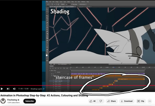
Actually speaking of Finchwing, they made another animation tutorial with CSP if you want a more in depth comparison I’d really recommend just watching both their photoshop + CSP tutorial to compare the two programs!!
2. Groups can be frames in CSP. Again this makes for easier cleaner organization, and CSP does this cool thing where if I insert a new frame, it will REMEMBER the settings of the previous frame. So my previous frame was 1 group, with two layers in it (one for line one for colour). When I insert a frame it automatically creates 1 group with two empty layers in it. Very convenient. Photoshop can’t have groups within Video Groups, If you try it just puts the layers you’re trying to group together side-by-side like two separate frames. (which tbh i was fine with having separate video groups for line and colour in photoshop lol i can see benefits to just keeping them separate even in CSP as well)
IN CONCLUSION:
It really is more of an organization/quality of life thing. photoshop served me well for many years! Animation is so totally doable in photoshop (just look at finchwings photoshop animation work as evidence that you can POP off in there), but now that I won’t have access to adobe as I’m graduating and preferred a 1-time purchase over a subscription, I went and got CSP.
I admit after photoshop the learning curve was a little tough (CSP's distinction between 'frames' vs 'cels' confused me for a bit + I really missed how visual the ‘cutting’ of frames looks in photoshop lol?), but it only took me about 3-4 small test/practice projects, some googling, and a few custom keyboard shortcuts to get me preferring CSP over photoshop animation now C:
(also bonus gripe with photoshop: idk if there is a way to do this and i just never figured it out, but. i couldn't find a way to use arrowkeys/other keyboard shortcuts to scrub to frame to frame?? I had to use my mouse to drag the header along lol. CSP i set a keyboard shortcut for going to previous/next frame and bam that was that)
#tutorial#clip studio paint#animation#photoshop#adobe photoshop#art programs#ppmpost#if you or anyone else has any qs about comparing csp n photoshop feel free to ask while i still have photoshop until end of May lol#that way i can show more direct visual comparisons while i still have both programs
15 notes
·
View notes