#animatedsketchbook
Explore tagged Tumblr posts
Visit Tumblr Blog
Explore Tumblr blogs with no restrictions, modern design and the best experience.
Last Seen Tumblr Blogs


Fun Fact
Tumblr has 411 employees.
Video
instagram
"El fuego es así, ama a quienes no le tienen miedo / Fire is like that, love those who are not afraid of it."⠀ ⠀ Jean-Marie Gustave Le Clézio⠀ & Drew Christie @drewmchristie (artist)⠀ ⠀ ⠀ #2danimation #animation #illust #illustration #illustrations #illustrationart #illustrationartits #illustrationartist #illustrator #illustagram #illustrated #illustrate #illustration_best #illustree #illustrarts #illustrationage #surrealillustration #ilustradora #illustrator #illustrators #animatedsketchbook #sketch #sketchart #popsurreal #surrealism #popsurrealism #jesuislesurrealisme #marcopolorules #vagabondwho #drewchristie https://www.instagram.com/p/B_GHmMXHJLO/?igshid=nnwlq9y0be6a
#2danimation#animation#illust#illustration#illustrations#illustrationart#illustrationartits#illustrationartist#illustrator#illustagram#illustrated#illustrate#illustration_best#illustree#illustrarts#illustrationage#surrealillustration#ilustradora#illustrators#animatedsketchbook#sketch#sketchart#popsurreal#surrealism#popsurrealism#jesuislesurrealisme#marcopolorules#vagabondwho#drewchristie
1 note
·
View note
Photo


Embedded image Más
Sonic The Hedgehog, Miles "Tails" Prower, Knuckles The Echidna & Professor Robotnik - Concept Art - Sonic Mania Adventure
Mighty, Ray, and Metal Sonic turnarounds from Sonic Mania Adventures.
youtube
Sonic Mania Adventures - Part 6 (Holiday Special) - YouTube
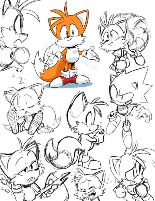
tails the fox drawings I went back to the basics for drawing tails and worked my way up.

sonic appreciation blog! — My edits Have some icons of the cutest hedgehog!

Shadow the Hedgehog
I used all these sketches to help with drawing the characters as I haven’t done it in a while. All of these characters belong to Saga. By drawing sonic the hedgehog I am learning how to make animals more human like by adding longer arms and legs and creating a personality for them. I have also learnt how to draw harsher lines and softer lines, while drawing this I have also learnt how to colour and shade using markers to create depth. At first it was hard to get in the swing of drawing the characters such as Silver and Shadow because of the shapes of their quills being more sharp and at an angle than Sonics but I soon got confident with drawing these characters. I will be drawing more of them but with only the basic shape design.
13 notes
·
View notes
Text
Sketchbook Habits.

One of the first lesson was looking at how we could improve our sketchbooks and imaginative drawings with a few different tasks. The one above was memory recall. Trying to remember what we had seen in the past and drawing it with less time to show distinctive features. We also did this with bears, trying to draw one from memory then pictures and finally from a video. It was challenging but very successful at informing my imagination of what a bear could/should look like. This one I will do in the future as it worked well for me.

The one above was a spider diagram exercise to help create possible imaginative links on a singular subject based on facts and things you already know. This one definitely works however I am not used to using it in relation to my own drawings.

This one was definitely a lot of fun to do with the class and could help spark ideas for sure...however I don’t know how I could use it. Maybe if I started with my theme and let other people continue the thought?

This is one of my favorite ways to link imagination with reality. For myself it tends to be little words or sentences I hear from people around me as I walk, but it’s good fun. I’d like to do this one more often.
1 note
·
View note
Photo

I started working on my animated sketchbook this week, I used a youtube video of a ballet dancer as a reference and also asked some of my flatmates to dance around for me while I did some sketches! This is only the rough version but I am really happy with it so far. I decided to go for a darker background and a white over the top as I have never done this before and I think it adds a lil something to the animation.. an almost surreal aspect which I like. The movement definitely needs improving as well as the timing but this is something I will improve during the tie down.
1 note
·
View note
Text
Week Four Summary
Animation principles - I am struggling to keep up with the animated tasks and still find a lot of the animation software quite difficult to pick up. I have chosen to focus on the flour sack animation for now and have found this a lot easier having learnt from the mistakes that slowed me down in other animations.
Introduction to stop motion - I enjoyed learning a little bit about the basics of stop motion and it as interesting to repeat some tasks we learnt in 2D with a new material. We found it was a little more difficult to get precise changes to the ball but the overall result was good.
Narrative research - From this weeks session it was interesting to see how Propp’s 7 key characters theory could be applied to so many different films and stories. I have continued researching films using the questions as a bit of a guide and a have settled on a few I would be interested in.
Animated sketchbook - Having missed quite a key bit introduction to the panoramic it was good to be able to talk to the tutor and begin coming up with ideas for mine. I have started a little research into panoramas as an illustration style but have yet to settle on a subject I would like to draw.
0 notes
Text

In these tests I was trying out a method of using colour for figures that I can utilise in my final panorama. It is largely in keeping with the abstract nature of the other work I’ve done but suits the more colourful setting of the final product.
0 notes
Photo


This is my panorama project. I decided to make a boxing match to display intense motion from both the boxers and the ones who view the match.
Firstly, i watched a boxing match and the i studied the boxers motions by observing them on the video and looking at some images.
This is not the final version but it doesn't differ much. The only different is that in the final, the drawings are connected in a better way.
0 notes
Text
Animated sketchbook - 8
I’ve finally drawn out the pencil outlines and it didn’t take me as long as I thought it would have, as I had a pretty good idea of what to draw in my head.


The pencil outlining is quite light, so you can’t see them very well in the images, but the first three and a half pages will be the war ships and the fishing boats and the docks, the next three and half are dedicated to the village and scenery, and the last page is a forest scene.
I was also able to start painting this week as well and got quite a lot finished. I started with the background first and made my way forward. I’m already really proud of how it’s all turning out, although I wasn’t quite able to get it done before reading week as planned, as I still have the boats and house to complete.


0 notes
Photo


Hermione Granger
Ginny Weasley and brothers
You are just as sane as I am by LauraBono.deviantart.com on @deviantart
The reason I did research on these characters is because of the different types of hairs and body langue, it helped me learn how hair is drawn and how different body langue can tell about the character personality. I drew a basic sketch then added detail soon after, I then added colour to the charters by looking at there colour design I learnt a bit more about colour theory and how and why things are coloured the way they are.
0 notes
Text
Animated Sketchbook
I’ve been working on this project for so long really hard now that I couldn’t decide exactly where to stop and update my blog. Though, I believe that I can now - having it almost finished - just start explaining it from the beginning to the very end altogether in the same post.
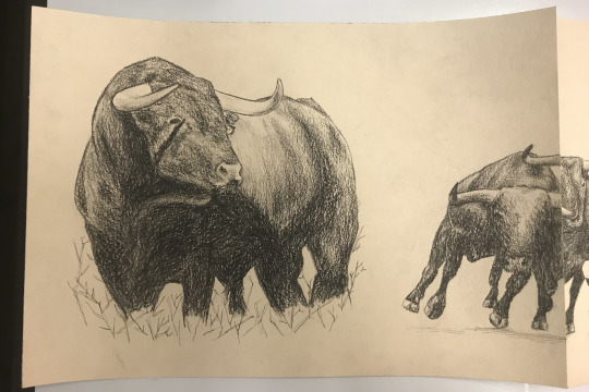
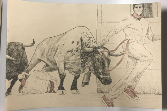
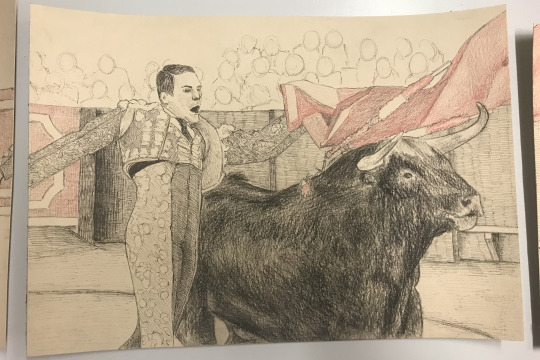
So, bulls. Bullfighting, in fact; not so fan of it though.
First of all, I don’t really know how to say this, but I am a big fan of muscular quadruped animals... yeah. I really enjoy drawing animals like horses or... bulls!
So: animals. ¿What to do with them in a panoramic? So many options but none of them really caught my attention. Then... ¿what can I offer? ¿What can I create that says something, contributes to something? The only thing that I could really think of was the fact that I’m Spanish and the people that these days are around me and are going to see this drawing... just aren’t. Spanish themed it is then. But it had to be something ‘iconic’, ‘recognisable’ + animals = bullfighting - to my great regret.
So, it was easy to decide that it was going to be somehow depicting a journey, the bull’s journey when bullfighting happens.
I believe that in the previous - and only - post that wrote a few weeks ago I talked a little about the actual final idea and some structures I was considering.
Basically, Bull's journey with a twist. Those days I was considering the Kishōtenketsu structure; though I did step back and went for the conventional Three Act Structure. It feels just natural to me that way:
Act 1. Set up → Before going into the arena/ring.
being in nature
running to the ring (already part of the journey)
entering through the door
Act 2. Confrontation → Inside the arena; the characteristical - and cruel - part of the fight.
two bull+fighter
bull looking up
bull looking down - getting more defeated
bull completely looking down + fighter stabbing ‘empowered’
bull going through the cape - like a release; looking up again
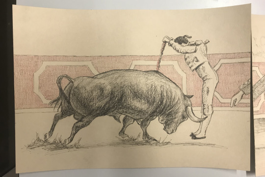
Act 3. Resolution → Change of positions.
bull empowered ‘stabes’ the defeated fighter - parallelism with the 5th one
focus on the audience, it being bulls
I’ve been changing idea so many times before reaching this conclusion that I feel like it may differs quite a lot from the first actual 'goal.'
In my sketchbook - the one dedicated to this in particular - is reflected some decision making, such the pain that the 7th panorama was:
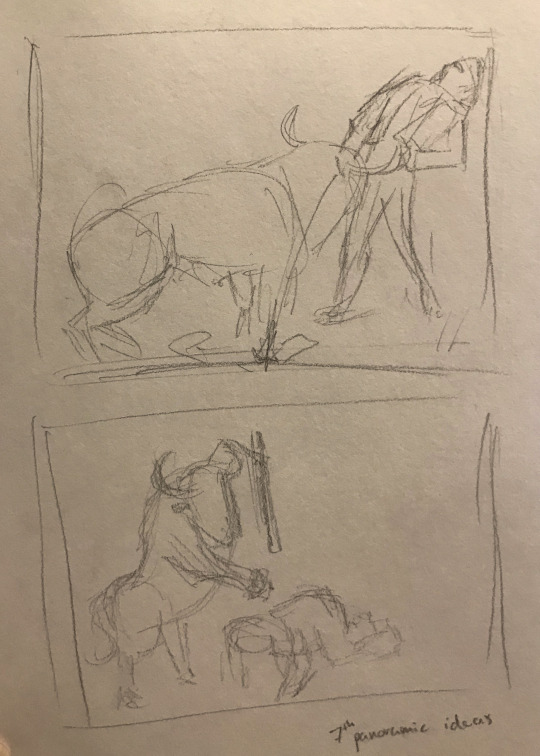
The initial idea was something closer to the bottom thumbnail. However, the upper one was the chosen one at the end. It is less shocking in the narrative, a less clear twist, ¿less effective? Maybe. Nonetheless, I couldn't think of fitting in such a 'realistically styled' series of drawing, such a 'funny' pose, as it is physically impossible for a bull to do anything even close to that pose. The idea of literary changing roles by keeping the sword was hard to let go, but it was just necessary.
I’ll talk about each ‘frame’ more in depth (excuse the bad quality pictures):
Page 1
I wanted to somehow represent the part of the bull being an ordinary God’s creature doing no harm or wanting to so that it’s more evident that they’re pushed by us when they have to attack - fight back.
It’s straightforward and simple as I wanted to have the bulky looking pages focused on the middle, the ones really dark or detailed. Besides that, I’ll add some more tiny details in the blanck spaces so that it doesn't look so empty or that the figure it’s just floating there.
Page 2
Here the ‘action’ begins, they’re running through streets and around humans, forced by them to be there, indeed.
I thought of adding some more people between the wall and the guy on the right, but, at the same time, didn’t want it to be ‘too much’, so these two guys are supposed to represent a whole group of them. Again, I’ll probably add some more texture on the floor.
Page 3
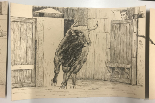
This page looks to me like the most complete one; it was also the first one that I inked and painted and I’m still happy with it. Only thing that I can say, I forgot that there was going to be a hand in front of the door on the leg (from the previous page) while doing the crosshatching, I might simply add it over it.
Page 4
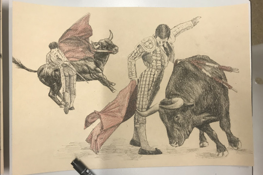
For this one, I had the idea of the progression from the bull looking up and ending looking down, as the fight goes one he gets unavoidably defeated. Also, I visualised the action in this frame going on diagonally. A diagonal line was traced corner to corner at the very first stage of sketching it.
I’m still thinking about how in the world can I blend/cohesion this one, especially with the next page. Right now they look only like two separated figures that just happened to be on the same page, not the goal.
Page 5
Fave page right there - :(. I really like the aesthetic and the framing going on here but hate the actual situation, so yeah. Not much to say about this one, it is clear and blends well with the next one - yay.
I’ll come back to this one when talking about the 7th, though.
Page 6
In this one, I wanted to subtly add the audience as well as having the bull��figuratively fleeing.
Page 7
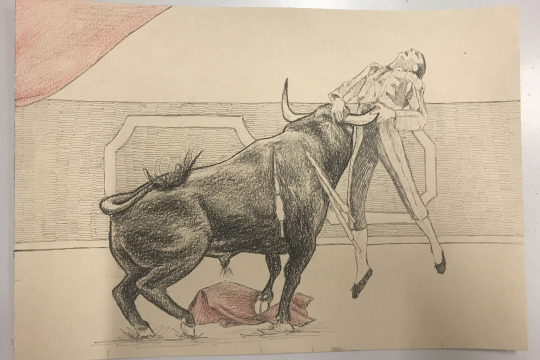
I did this one referencing the 5th one, showing a clear contrast between them.
Page 8
[undone yet] ...
I tried the red to be also a narrative feature that goes throughout the whole panorama and comes with the fighter and the cruelty around what he’s doing. That’s why the lack of it in the begging and the increasing presence. Also, when the bull is finally taking the control, he’s stepping up on it, the red cape.
Hoping to end this early, add the final touches everywhere, and see how it looks all together.
0 notes
Photo


I finished the sketches!! Finally!! Holy guacamole!!
Honestly I'm not a huge fan but I also don't hate it. I'm actually super proud of the continuity of it, because connecting each page was something I really wanted to do. I think it tells the story I want to a good standard, I mean, everyone should know what flat lining is on an ECG machine??
I can't wait to put it in pen, I just think it'll help a lot and let me put in some extra detail that I was too in pain to put into this sketch up. It's been a lot of drawing, and my poor muscles aren't used this kind of work, I like stop motion.
10/02/18
0 notes
Photo

The rough storyboard for the sack of flour animation. It shows the sack making its way, until it finds the ball, picks it up, and throws it across.
2 notes
·
View notes
Text
Animated sketchbook tutorial
I unfortunately missed the introduction to the panoramic project, but was able to find out in the tutorial. I did a little research to get some ideas for mine.

Image: artist, Lo Parkin with her panoramic illustration
http://loparkin.com/LFW-AN-ILLUSTRATED-PANORAMA


Images: Illustrations for The Illustrated London News, 22 November 1851. http://www.victorianweb.org/history/1851/31.html
0 notes
Text
Individual Tutorial
The individual tutorial assisted in solidifying my idea for the panorama project; I’ve decided to illustrate one of the stories within the Mabinogion (a group of interrelated medieval Welsh prose tales) - “Lludd and Llefelys” - as well as another old Celtic story that continues on from where “Lludd and Llefelys” ends. Stories as old as these two tend to have multiple different iterations, so I will be illustrating my interpretation of a specific telling of these two interconnected stories.
The stories revolve mainly around two dragons - one red, one white - who fight each other throughout the narrative. I find the mythological aspect of stories more interesting, so I will likely focus on the dragons and their conflict. ‘Lludd’ refers to the Welsh hero Lludd Llaw Eraint, Llefelys being his brother, and while my panorama will focus on the dragons, Lludd and Llefelys are still integral to the story.
As dragons are mythical beings, I can’t just simply imagine my own design/appearance for them. I’ve decided I will practise drawing different creatures and take features from them to create a dragon design reminiscent of real-life animals. Creatures such as lizards, bats, or other fitting animals would be interesting.
Going by my understanding/iteration of “Lludd and Llefelys”, it begins when an invading white dragon encroaches on the red dragon’s territory - Britain. The two fight, though the red dragon’s cries cause plants and animals to die, the land to become barren, and women to miscarry. (A bit dark!) King Lludd wants to protect his people from this apparent plague, so he goes to his brother Llefelys in France. Llefelys tells Lludd to dig a large pit in the centre of Britain, fill it with mead, and cover it with a cloth. Lludd does this, causing the dragons to drink the mead, become drowsy, and eventually fall asleep. This enables Lludd to capture them and keep them sealed in the pit underground at Dinas Emrys - a wooded hillock in Snowdonia. This is where “Lludd and Llefelys” ends, as far as my narrative goes. The second story is based many years later and is the legend of the Welsh Dragon, the Welsh national animal. It begins with King Vortigern (a potential 5th-century warlord and/or king of the Britons). Vortigern was searching for a place to build a castle, and decided on Dinas Emrys. Every night, however, the castle’s foundations kept being destroyed by unknown forces. Vortigern sought insight from his advisers, who told him to find a boy born with no natural father and to sacrifice him on Dinas Emrys. King Vortigern found such a boy (who, in some tellings, later ended up becoming Merlin, one of the most legendary wizards in history), though the boy found out he was to be sacrificed. He told King Vortigern about the two dragons imprisoned underground and that they were the reason his castle was being destroyed. Vortigern had Dinas Emrys excavated, freeing the dragons. They continued their battle, and the red dragon eventually won. Some said the red dragon represented the Britons, while the white dragon represented the Saxons.
0 notes
Text
Imagery Inspiration.
These are two more ideas I had.The water plants were what I originally wanted to put in the background of my illustration but I’ve changed that since to fit each quote better. The second is a few examples of suspension that I drew observation from. I chose these because the body looks heavy and uncomfortable and hangs in almost unnatural ways. There are also a lot more of these sort of pictures compared to say underwater pictures, which I also considered as reference but found people were in similar poses, trying to be overly elegant, which I didn’t want.


0 notes
Text
Animated sketchbook - 7
I didn’t do anything for animated sketchbook last week, so I didn’t write a blog, as I was under many piles of other work to do. However, I have finally started to draw out some reference drawings, and have practiced a bit with water colours to see which colours would work and to just get a feel for them again.


I like the effect that the water colours give this drawings, as it kind of makes them look old, which is a good thing, as it goes quite well with the viking idea of mine. I aim to start drawing it all out and finishing the panoramic by next week before the reading week starts.
0 notes