#artwithexplanation
Explore tagged Tumblr posts
Visit Tumblr Blog
Explore Tumblr blogs with no restrictions, modern design and the best experience.
Last Seen Tumblr Blogs


Fun Fact
Celebrities use Tumblr as well.
Photo


Please click the “Read More” for the full explanation! <3
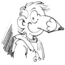
For months (or a year now), I've been having difficulties with the grayscale to color technique. I've only recently started to get the process after several tutorials and frustrations. I mainly watch youtube for the processes and watch speedpaints to soak in the process. I once gave up with this technique when after several tries the colors came out muddy. I've been used to the color first technique. I'll be listing the pro's and con's of starting out with a greyscale technique. Do keep in mind that these are all subject to my opinion/observations and I am in no way teaching this as the only way to deal with it. I am just merely sharing my own way of dealing with it xD The example above is made with a hooman head but this can be done with any subject as well as a subject with a background C: Pro's: - Your values are always in check. - You do not get stuck with what colors to use only to re-do them again. With greyscale, the values are set and separate from the color layers. You can redo the colors without re-doing everything. - You limit yourself to only using the grey palette providing you focus on the values first instead of details (e.g . Con's: - Depending on the way it is dealt, it adds another couple of hours to the process in finishing a piece. Sketch > Base > Greyscale > Color > Color corrections > Details > Refining - Colors can get muddy with the finished product so you have to to always keep your values in check. Below are the steps with the explanations of each steps. I did my very best to explain each and I have also included the palette I used. This can be applied in any art program (as long as they have layer adjustments like color/soft light and overlay to name a few). Steps: HOLD ON! First and foremost let's go ahead and check my brush setting. I use a slightly tweaked round hard brush with a 10% spacing and transfer turned on (both in pen pressure option). I have my brush in either 80% or 100% opacity. I rely mostly with how hard I press my pen than with the flow and opacity settings. However if you would rather do the opposite, you can tweak with the flow and opacity options to have the effect you want when painting. ��- Palette I used. I only used a grey as my neutral color and a slightly darker purple as my shade. I never use black or white when I shade. I always have the shadows, even when very very dark, to at least have a little bit of colorf in them. It prevents the muddy look. Same with the highlight. - Layers I have. I almost always only have less than 5 layers when I paint. This is different with larger and full illustrations with complex bgs. Sketch: This is where everything starts. Depending on how big the piece will be, it will be a plain sketch or a sketch from a thumbnail. Either way, this is where you will start. You don't have to make it very very clean. It's just the "skeleton" to your piece. You do not need to fuss on details in this stage, be free and do not be afraid of mistakes at this point. Just let your hand draw what your mind wants it to draw. I have my sketch as a normal layer. Tako, I have finished my sketch! Base + Shadow:Good job! The next path you will take is laying the base. Choose a very neutral gray for it. After that, it's time for you to take that dark color (not black) and lay it where light does not hit your subject. This will be your shadow. I have the layer locked so I won't be able to paint outside of the base color. Always remember to take not of how hard you press with your pen (pen pressure) when laying in the shadows and highlights and when blending the shadow to the base. In this stage it is best to paint like a sculptor like this. You will need knowledge with how 3d objects work. Color: You are done with the greyscale yay! Now time to lay in the colors. This is somewhat hard for those attempting this technique for the first time. I have experienced muddy colors afterwards but I will explain to you how to avoid that. First, set your brush at 80% opacity and create a new layer above the base layer and set it in Color mode. I found this mode to be the best as it does not affect your values too much. Lay in a base color (a reddish brown tone) to set in the final colors. Next carefully lay in the proper colors of your subject. At this stage, I took in mind the rule of Color zones of the face. He will look like an alien for a time but do not fret we are just beginning C: What about the highlights, where are they?? Highlights: It is now time for it, do not worry! You have to have confidence and merge the color layer with the base. Then create a new layer on top and set it to Soft light and choose a light shade of your light source. Then lightly brush it along the planes where light will touch your subject. I made sure to be careful in this stage to avoid a very overly exposed subject because this is not the final stage. Refining: Next step I do is I merge the highlights layer with my original layer. Once that is done, it is time for me to paint and refine the shadows and highlights as well as to fix the colors of the subject. This is the stage where you would also want to correct any mistakes you want to change such as anatomy or additional stuff you want to add in. Details: Once I am satisfied with the overall look of my subject: the colors, shadows and highlights. I start to lay in the details starting with the eyes. Viewers will most usually focus on faces first so this is the part where I lay in the details first. Any color that seems to be dominant which are not supposed to be, I paint it over lightly. I slowly build up the look and paint over everything to refine it. Finalizing: I am now overly satisfied with everything with my piece and if you are too it is time for us to finalize stuff. I put in more reflective lights and create a new layer and set it to overlay. I then choose a nice shade of any saturated warm color and lightly brush it wherever the light touches my subject. It is also the stage where I finally go and paint the freckles and his scars. I then create a new layer adjustment called Levels and Curves to adjust the final overall values and color of the subject. IT IS DONE! Yay! It is a very long process and you will need patience and of course the passion for it. Your art will look "shitty" at the start as all creations look in the beginning but once you push through and be patient with it will become what you want. Usually xD It is also helpful to study how the old masters paint! Anyways, thank you for reading and I hope that this is helpful in any way! Feel free to ask in the comments below and I will do my best to answer. Some helpful videos: - How to paint like the old masters - Grayscale to Color Tutorial - Sara Tepes - Grayscale to Color Tutorial - Artgerm - Grayscale to Color Tutorial search results youtube/a> and James Gurney xD gurneyjourney.blogspot.com/
#myart#tutorials#process#grayscaltocolor#howto#art#illustration#walkthrough#stepbystep#artwithexplanation#painting
1 note
·
View note