#beginner digital artist here... ;3;
Explore tagged Tumblr posts
Visit Tumblr Blog
Explore Tumblr blogs with no restrictions, modern design and the best experience.
Last Seen Tumblr Blogs


Fun Fact
69% of Tumblr users are millennials.
Text
FINISHED! (Semester's over!)
I can finally focus on playing FFXIV, read books, and draw with my new tablet I got for my birthday!
...
Oh yeah, I moved to FFXIV because I lost interest in Neverwinter. Weeeeeeee!
#the spring semester is over!#college#digital art time#ffxiv#I love FFXIV!!#digital vercci and voldo time?#beginner digital artist here... ;3;#I CAN RESTSTTST-
2 notes
·
View notes
Text


I’ve recently been obsessed with ‘Annie’s Song’ by John Denver and I think it’s so fitting for them 🩷
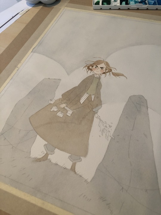
When I tell you I agonized over this until I couldn’t look at it anymore… I was learning as I went (I haven’t attempted digital art on my tablet in years- I mostly just drew original characters for fics and shared them with people on Discord bc I always felt my art was too amateur to post- but I’ve hit a stride of ‘let things be bad’ and ‘progress is progress’.)
I hit a stalling point with the layers and the methods I was coloring things and I definitely know some techniques now that would have made it better from the start, but to fix it would be to start over- and that seemed exhausting- so here it is! I feel like you can literally see where I found a weird brush and went ‘what does this do’? 😅
I did that thing with this where I had this extremely ambitious idea and no practical experience to execute it (I do this with sewing projects and home improvement stuff ALL THE TIME) and instead of simplifying it or being realistic I just forge stubbornly ahead 🫡
But the biggest thing I learned is that I actually do enjoy this- so I will continue to be bad at it for the sake of having a good time drawing silly characters to sappy song lyrics 🤩
#aruani#armin arlert#annie leonhart#aot fan art#my art <3#song lyrics#this is the beginning of my ‘every John Denver song is about my favorite characters’ agenda#digital art#beginner artist#i am OPEN to suggestions and feedback btw like so genuinely#i do not know what i am doing but i am having FUN dammit#connie springer#he’s technically here too#falbi#they’re here also#Spotify
36 notes
·
View notes
Text

Ngl I haven’t been super interested in deltarune recently but it was rly fun to draw fanart for it again :D
#deltarune#kris#kris deltarune#art#digital art#beginner artist#i think this is my first time posting a full body drawing on here#my posts :3
46 notes
·
View notes
Text
no goggles mark fanart i made after watching a 3h long video tutorial on how to draw a head (if you have any tips on how to improve semi-realism and coloring i'd appreciate that 🙏)
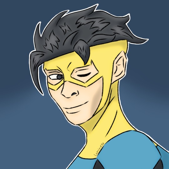
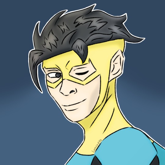
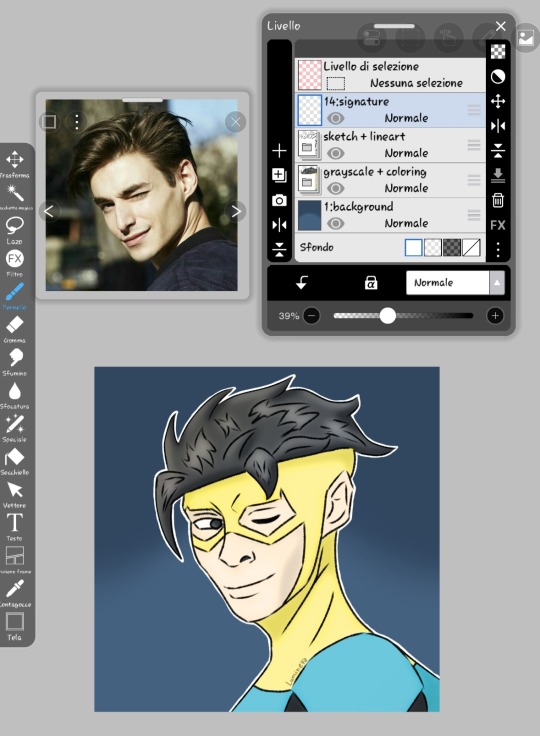
#invincible#invincible season 3#invincible fanart#no goggles invincible#no goggles mark#lensless invincible#lenseless mark#mark variants#fanart#digital art#beginner artist#my first post here on tumblr so uuh#idk how the tagging system works here#random tags ig
16 notes
·
View notes
Text


#couldn't decide which version i liked better#so here's both#my sweet demon boy <3#an old oc#also a part of the book im writing#art#drawing#oc#original character#digital art#character design#original art#clip studio paint#artist#small artist#beginner artist
19 notes
·
View notes
Text
...
#Posting art on tumblr these days is so damn disheartening#Especially for small fandoms#Like. Even when I tag ppl (which is an extremely uncomfortable thing for me to do bc I feel like I'm bothering ppl n begging for attention)#And I don't want my art to come across like that#But still.... People will drop 1 pity like and move on#Like okay here's something I devoted 3-4 hours of my time but thanks for letting me know it was worthless ig?#It didn't used to be like this. People used to actively engage and talk in the tags and at the very least REBLOG STUFF#I remember when I started out on digital art and was doing absolutely shit at it (like all beginners do)#But even then the amount of reblogs/ encouraging little tags on my shitty art was so much more than what I see now#It's esp noticeable in small fandoms. Like okay. We are barely a 30 ppl community in this whole app#and still somehow ppl will pick n choose which creative posts (gifs / arts / edits / xyz) to throw in a reblog for :))))#Anyway. Posting art is getting kinda useless here day by day.#Like yes I do draw mainly for myself but I post online with the intention of spreading the love/ excitement I experienced with others#It's supposed to be an *exchange*. That's what fan communities are supposed to do#But I guess ppls social media habits have change to mindless consumerism and doomscrolling with no energy given back to creators :))))#No wonder gif makers and artists and gfx makers are leaving by the dozens or stop posting altogether#Because ppl here are slowly killing the culture that made it possible for those ppl to share their arts w others#Anyway. Whatever. I'm just so tired tbh#Idk why I even make the effort anymore :')#Personal
4 notes
·
View notes
Text

its the venti!!!!
#beginner artist#fan art#genshin impact#genshin venti#my art <3#artists on tumblr#digital art#i lost my pen shortly after this drawing i hate it here
8 notes
·
View notes
Text
why Aurora's art is genius
It's break for me, and I've been meaning to sit down and read the Aurora webcomic (https://comicaurora.com/, @comicaurora on Tumblr) for quite a bit. So I did that over the last few days.
And… y'know. I can't actually say "I should've read this earlier," because otherwise I would've been up at 2:30-3am when I had responsibilities in the morning and I couldn't have properly enjoyed it, but. Holy shit guys THIS COMIC.
I intended to just do a generalized "hello this is all the things I love about this story," and I wrote a paragraph or two about art style. …and then another. And another. And I realized I needed to actually reference things so I would stop being too vague. I was reading the comic on my tablet or phone, because I wanted to stay curled up in my chair, but I type at a big monitor and so I saw more details… aaaaaand it turned into its own giant-ass post.
SO. Enjoy a few thousand words of me nerding out about this insanely cool art style and how fucking gorgeous this comic is? (There are screenshots, I promise it isn't just a wall of text.) In my defense, I just spent two semesters in graphic design classes focusing on the Adobe Suite, so… I get to be a nerd about pretty things…???
All positive feedback btw! No downers here. <3
---
I cannot emphasize enough how much I love the beautiful, simple stylistic method of drawing characters and figures. It is absolutely stunning and effortless and utterly graceful—it is so hard to capture the sheer beauty and fluidity of the human form in such a fashion. Even a simple outline of a character feels dynamic! It's gorgeous!
Though I do have a love-hate relationship with this, because my artistic side looks at that lovely simplicity, goes "I CAN DO THAT!" and then I sit down and go to the paper and realize that no, in fact, I cannot do that yet, because that simplicity is born of a hell of a lot of practice and understanding of bodies and actually is really hard to do. It's a very developed style that only looks simple because the artist knows what they're doing. The human body is hard to pull off, and this comic does so beautifully and makes it look effortless.
Also: line weight line weight line weight. It's especially important in simplified shapes and figures like this, and hoo boy is it used excellently. It's especially apparent the newer the pages get—I love watching that improvement over time—but with simpler figures and lines, you get nice light lines to emphasize both smaller details, like in the draping of clothing and the curls of hair—which, hello, yes—and thicker lines to emphasize bigger and more important details and silhouettes. It's the sort of thing that's essential to most illustrations, but I wanted to make a note of it because it's so vital to this art style.
THE USE OF LAYER BLENDING MODES OH MY GODS. (...uhhh, apologies to the people who don't know what that means, it's a digital art program thing? This article explains it for beginners.)
Bear with me, I just finished my second Photoshop course, I spent months and months working on projects with this shit so I see the genius use of Screen and/or its siblings (of which there are many—if I say "Screen" here, assume I mean the entire umbrella of Screen blending modes and possibly Overlay) and go nuts, but seriously it's so clever and also fucking gorgeous:
Firstly: the use of screened-on sound effect words over an action? A "CRACK" written over a branch and then put on Screen in glowy green so that it's subtle enough that it doesn't disrupt the visual flow, but still sticks out enough to make itself heard? Little "scritches" that are transparent where they're laid on without outlines to emphasize the sound without disrupting the underlying image? FUCK YES. I haven't seen this done literally anywhere else—granted, I haven't read a massive amount of comics, but I've read enough—and it is so clever and I adore it. Examples:


Secondly: The beautiful lighting effects. The curling leaves, all the magic, the various glowing eyes, the fog, the way it's all so vividly colored but doesn't burn your eyeballs out—a balance that's way harder to achieve than you'd think—and the soft glows around them, eeeee it's so pretty so pretty SO PRETTY. Not sure if some of these are Outer/Inner Glow/Shadow layer effects or if it's entirely hand-drawn, but major kudos either way; I can see the beautiful use of blending modes and I SALUTE YOUR GENIUS.
I keep looking at some of this stuff and go "is that a layer effect or is it done by hand?" Because you can make some similar things with the Satin layer effect in Photoshop (I don't know if other programs have this? I'm gonna have to find out since I won't have access to PS for much longer ;-;) that resembles some of the swirly inner bits on some of the lit effects, but I'm not sure if it is that or not. Or you could mask over textures? There's... many ways to do it.
If done by hand: oh my gods the patience, how. If done with layer effects: really clever work that knows how to stop said effects from looking wonky, because ugh those things get temperamental. If done with a layer of texture that's been masked over: very, very good masking work. No matter the method, pretty shimmers and swirly bits inside the bigger pretty swirls!
Next: The way color contrast is used! I will never be over the glowy green-on-black Primordial Life vibes when Alinua gets dropped into that… unconscious space?? with Life, for example, and the sharp contrast of vines and crack and branches and leaves against pitch black is just visually stunning. The way the roots sink into the ground and the three-dimensional sensation of it is particularly badass here:

Friggin. How does this imply depth like that. HOW. IT'S SO FREAKING COOL.
A huge point here is also color language and use! Everybody has their own particular shade, generally matching their eyes, magic, and personality, and I adore how this is used to make it clear who's talking or who's doing an action. That was especially apparent to me with Dainix and Falst in the caves—their colors are both fairly warm, but quite distinct, and I love how this clarifies who's doing what in panels with a lot of action from both of them. There is a particular bit that stuck out to me, so I dug up the panels (see this page and the following one https://comicaurora.com/aurora/1-20-30/):

(Gods it looks even prettier now that I put it against a plain background. Also, appreciation to Falst for managing a bridal-carry midair, damn.)
The way that their colors MERGE here! And the immense attention to detail in doing so—Dainix is higher up than Falst is in the first panel, so Dainix's orange fades into Falst's orange at the base. The next panel has gold up top and orange on bottom; we can't really tell in that panel where each of them are, but that's carried over to the next panel—

—where we now see that Falst's position is raised above Dainix's due to the way he's carrying him. (Points for continuity!) And, of course, we see the little "huffs" flowing from orange to yellow over their heads (where Dainix's head is higher than Falst's) to merge the sound of their breathing, which is absurdly clever because it emphasizes to the viewer how we hear two sets of huffing overlaying each other, not one. Absolutely brilliant.
(A few other notes of appreciation to that panel: beautiful glows around them, the sparks, the jagged silhouette of the spider legs, the lovely colors that have no right to make the area around a spider corpse that pretty, the excellent texturing on the cave walls plus perspective, the way Falst's movements imply Dainix's hefty weight, the natural posing of the characters, their on-point expressions that convey exactly how fuckin terrifying everything is right now, the slight glows to their eyes, and also they're just handsome boys <3)
Next up: Rain!!!! So well done! It's subtle enough that it never ever disrupts the impact of the focal point, but evident enough you can tell! And more importantly: THE MIST OFF THE CHARACTERS. Rain does this irl, it has that little vapor that comes off you and makes that little misty effect that plays with lighting, it's so cool-looking and here it's used to such pretty effect!
One of the panel captions says something about it blurring out all the injuries on the characters but like THAT AIN'T TOO BIG OF A PROBLEM when it gets across the environmental vibes, and also that'd be how it would look in real life too so like… outside viewer's angle is the same as the characters', mostly? my point is: that's the environment!!! that's the vibes, that's the feel! It gets it across and it does so in the most pretty way possible!
And another thing re: rain, the use of it to establish perspective, particularly in panels like this—

—where we can tell we're looking down at Tynan due to the perspective on the rain and where it's pointing. Excellent. (Also, kudos for looking down and emphasizing how Tynan's losing his advantage—lovely use of visual storytelling.)
Additionally, the misting here:

We see it most heavily in the leftmost panel, where it's quite foggy as you would expect in a rainstorm, especially in an environment with a lot of heat, but it's also lightly powdered on in the following two panels and tends to follow light sources, which makes complete sense given how light bounces off particles in the air.
A major point of strength in these too is a thorough understanding of lighting, like rim lighting, the various hues and shades, and an intricate understanding of how light bounces off surfaces even when they're in shadow (we'll see a faint glow in spots where characters are half in shadow, but that's how it would work in real life, because of how light bounces around).
Bringing some of these points together: the fluidity of the lines in magic, and the way simple glowing lines are used to emphasize motion and the magic itself, is deeply clever. I'm basically pulling at random from panels and there's definitely even better examples, but here's one (see this page https://comicaurora.com/aurora/1-16-33/):

First panel, listed in numbers because these build on each other:
The tension of the lines in Tess's magic here. This works on a couple levels: first, the way she's holding her fists, as if she's pulling a rope taut.
The way there's one primary line, emphasizing the rope feeling, accompanied by smaller ones.
The additional lines starbursting around her hands, to indicate the energy crackling in her hands and how she's doing a good bit more than just holding it. (That combined with the fists suggests some tension to the magic, too.) Also the variations in brightness, a feature you'll find in actual lightning. :D Additional kudos for how the lightning sparks and breaks off the metal of the sword.
A handful of miscellaneous notes on the second panel:
The reflection of the flames in Erin's typically dark blue eyes (which bears a remarkable resemblance to Dainix, incidentally—almost a thematic sort of parallel given Erin's using the same magic Dainix specializes in?)
The flowing of fabric in the wind and associated variation in the lineart
The way Erin's tattoos interact with the fire he's pulling to his hand
The way the rain overlays some of the fainter areas of fire (attention! to! detail! hell yeah!)
I could go on. I won't because this is a lot of writing already.
Third panel gets paragraphs, not bullets:
Erin's giant-ass "FWOOM" of fire there, and the way the outline of the word is puffy-edged and gradated to feel almost three-dimensional, plus once again using Screen or a variation on it so that the stars show up in the background. All this against that stunning plume of fire, which ripples and sparks so gorgeously, and the ending "om" of the onomatopoeia is emphasized incredibly brightly against that, adding to the punch of it and making the plume feel even brighter.
Also, once again, rain helping establish perspective, especially in how it's very angular in the left side of the panel and then slowly becomes more like a point to the right to indicate it's falling directly down on the viewer. Add in the bright, beautiful glow effects, fainter but no less important black lines beneath them to emphasize the sky and smoke and the like, and the stunningly beautiful lighting and gradated glows surrounding Erin plus the lightning jagging up at him from below, and you get one hell of an impactful panel right there. (And there is definitely more in there I could break down, this is just a lot already.)
And in general: The colors in this? Incredible. The blues and purples and oranges and golds compliment so well, and it's all so rich.
Like, seriously, just throughout the whole comic, the use of gradients, blending modes, color balance and hues, all the things, all the things, it makes for the most beautiful effects and glows and such a rich environment. There's a very distinct style to this comic in its simplified backgrounds (which I recognize are done partly because it's way easier and also backgrounds are so time-consuming dear gods but lemme say this) and vivid, smoothly drawn characters; the simplicity lets them come to the front and gives room for those beautiful, richly saturated focal points, letting the stylized designs of the magic and characters shine. The use of distinct silhouettes is insanely good. Honestly, complex backgrounds might run the risk of making everything too visually busy in this case. It's just, augh, so GORGEOUS.
Another bit, take a look at this page (https://comicaurora.com/aurora/1-15-28/):

It's not quite as evident here as it is in the next page, but this one does some other fun things so I'm grabbing it. Points:
Once again, using different colors to represent different character actions. The "WHAM" of Kendal hitting the ground is caused by Dainix's force, so it's orange (and kudos for doubling the word over to add a shake effect). But we see blue layered underneath, which could be an environmental choice, but might also be because it's Kendal, whose color is blue.
And speaking off, take a look at the right-most panel on top, where Kendal grabs the spear: his motion is, again, illustrated in bright blue, versus the atmospheric screened-on orange lines that point toward him around the whole panel (I'm sure these have a name, I think they might be more of a manga thing though and the only experience I have in manga is reading a bit of Fullmetal Alchemist). Those lines emphasize the weight of the spear being shoved at him, and their color tells us Dainix is responsible for it.
One of my all-time favorite effects in this comic is the way cracks manifest across Dainix's body to represent when he starts to lose control; it is utterly gorgeous and wonderfully thematic. These are more evident in the page before and after this one, but you get a decent idea here. I love the way they glow softly, the way the fire juuuust flickers through at the start and then becomes more evident over time, and the cracks feel so realistic, like his skin is made of pottery. Additional points for how fire begins to creep into his hair.
A small detail that's generally consistent across the comic, but which I want to make note of here because you can see it pretty well: Kendal's eyes glow about the same as the jewel in his sword, mirroring his connection to said sword and calling back to how the jewel became Vash's eye temporarily and thus was once Kendal's eye. You can always see this connection (though there might be some spots where this also changes in a symbolic manner; I went through it quickly on the first time around, so I'll pay more attention when I inevitably reread this), where Kendal's always got that little shine of blue in his eyes the same as the jewel. It's a beautiful visual parallel that encourages the reader to subconsciously link them together, especially since the lines used to illustrate character movements typically mirror their eye color. It's an extension of Kendal.
Did I mention how ABSOLUTELY BEAUTIFUL the colors in this are?
Also, the mythological/legend-type scenes are illustrated in familiar style often used for that type of story, a simple and heavily symbolic two-dimensional cave-painting-like look. They are absolutely beautiful on many levels, employing simple, lovely gradients, slightly rougher and thicker lineart that is nonetheless smoothly beautiful, and working with clear silhouettes (a major strength of this art style, but also a strength in the comic overall). But in particular, I wanted to call attention to a particular thing (see this page https://comicaurora.com/aurora/1-12-4/):

The flowing symbolic lineart surrounding each character. This is actually quite consistent across characters—see also Life's typical lines and how they curl:

What's particularly interesting here is how these symbols are often similar, but not the same. Vash's lines are always smooth, clean curls, often playing off each other and echoing one another like ripples in a pond. You'd think they'd look too similar to Life's—but they don't. Life's curl like vines, and they remain connected; where one curve might echo another but exist entirely detached from each other in Vash's, Life's lines still remain wound together, because vines are continuous and don't float around. :P
Tahraim's are less continuous, often breaking up with significantly smaller bits and pieces floating around like—of course—sparks, and come to sharper points. These are also constants: we see the vines repeated over and over in Alinua's dreams of Life, and the echoing ripples of Vash are consistent wherever we encounter him. Kendal's dream of the ghost citizens of the city of Vash in the last few chapters is filled with these rippling, echoing patterns, to beautiful effect (https://comicaurora.com/aurora/1-20-14/):

They ripple and spiral, often in long, sinuous curves, with smooth elegance. It reminds me a great deal of images of space and sine waves and the like. This establishes a definite feel to these different characters and their magic. And the thing is, that's not something that had to be done—the colors are good at emphasizing who's who. But it was done, and it adds a whole other dimension to the story. Whenever you're in a deity's domain, you know whose it is no matter the color.
Regarding that shape language, I wanted to make another note, too—Vash is sometimes described as chaotic and doing what he likes, which is interesting to me, because smooth, elegant curves and the color blue aren't generally associated with chaos. So while Vash might behave like that on the surface, I'm guessing he's got a lot more going on underneath; he's probably much more intentional in his actions than you'd think at a glance, and he is certainly quite caring with his city. The other thing is that this suits Kendal perfectly. He's a paragon character; he is kind, virtuous, and self-sacrificing, and often we see him aiming to calm others and keep them safe. Blue is such a good color for him. There is… probably more to this, but I'm not deep enough in yet to say.
And here's the thing: I'm only scratching the surface. There is so much more here I'm not covering (color palettes! outfits! character design! environment! the deities! so much more!) and a lot more I can't cover, because I don't have the experience; this is me as a hobbyist artist who happened to take a couple design classes because I wanted to. The art style to this comic is so clever and creative and beautiful, though, I just had to go off about it. <3
...brownie points for getting all the way down here? Have a cookie.
#aurora comic#aurora webcomic#comicaurora#art analysis#...I hope those are the right tags???#new fandom new tagging practices to learn ig#much thanks for something to read while I try to rest my wrists. carpal tunnel BAD. (ignore that I wrote this I've got braces ok it's fine)#anyway! I HAVE. MANY MORE THOUGHTS. ON THE STORY ITSELF. THIS LOVELY STORY#also a collection of reactions to a chunk of the comic before I hit the point where I was too busy reading to write anything down#idk how to format those tho#...yeet them into one post...???#eh I usually don't go off this much these days but this seems like a smaller tight-knit fandom so... might as well help build it?#and I have a little more time thanks to break so#oh yes also shoutout to my insanely awesome professor for teaching me all the technical stuff from this he is LOVELY#made an incredibly complex program into something comprehensible <3#synapse talks
809 notes
·
View notes
Note
Hello! I just got home from the new Superman movie and it made me want to read comics for the first time in several years. I am a long-time DC reader but have never ventured much into Superfamily-focused stuff and you seemed like a good person to ask this question: do you have recommendations for good arcs or runs for a Superman beginner? (Any era welcome.) Thank you so much!
Yay! Yes absolutely!
Here are a few basically standalone stories you can read without any prior context or jumping into any big runs:
Superman Smashes the Klan
Superman for All Seasons
Superman: Birthright (best origin)
Superman: Red and Blue and the digital-first 2013 series Adventures of Superman - these are anthology books with rotating creators so they're easy to read in a vacuum. There's one Superman: Red and Blue story that I literally cannot even think about, let alone describe, without crying. I have tears in my eyes just from finding the link. (Don't worry, it's a good cry!)
Superman/Shazam: First Thunder - obvs a crossover but very good
My favorite eras of Superman are:
Golden Age Superman, especially 1938 to about 1948: Literally just start from the beginning. Any collection of Golden Age stories or early Superman adventures will do. They are so good right from the get go!!! Joe Shuster's art is so beautiful (not something that can be said for every Golden Age artist), Clark is such a funny little troll and is just constantly tormenting rich people and corrupt politicians, and the chemistry between him and Lois is blazing hot right away. So so good.
Post-Crisis: Start with the Man of Steel (1986) miniseries by John Byrne and then pick up the regular books from that era (Action Comics #584 and on, Superman (1987), and Adventures of Superman (1987)). Anything that says "Superman by John Byrne" will get you started, but really all of the creators are great and this era is amazing for rich character development for the whole supporting cast and lots of soap opera plots. Honestly just keep going with these as long as you want - it's great at least through Death of Superman and then it kind of turns into a lot of stunt publishing with bonus mullets but by that point you're invested in the characters so you might as well keep reading.
Rebirth: If you want to read something more contemporary, Rebirth is a great place to start! Superman and Action Comics, both the 2016 volumes. Bonus: Jon is here, and he's perfect.
Current comics: Right now Superman is starring in Action Comics, Superman (2023 series), and Superman Unlimited. They're...fine? They're all fine, there's nothing wrong with them. Superman is probably the hardest to jump into since the plot is Legion of Super-Heroes related, the other two are more accessible.
And if you want recs for the rest of the Superfamily:
Supergirl: The best Supergirl series is the 1996 Peter David run, which is about Matrix/Linda Danvers and not Kara, but it's still great and I highly recommend it. The late 2000s Sterling Gates/Jamal Igle run is good but very embedded in ongoing Superman plotlines of the time. The current series is only 3 issues in and it's GREAT so an excellent jumping on point!
(And since someone will mention it in the notes: I hated Supergirl: Woman of Tomorrow but it's what the upcoming movie is based on so...idk. Read it if you want.)
Kon: Young Justice. His solo series from 1994 is also fun.
Jon: Super Sons obviously - the original run, then Adventures of the Super Sons, then Challenge of the Super Sons. I have not liked any of his comics since he got aged up until Secret Six which is delightfully messy.
Have fun!!!
43 notes
·
View notes
Note
Hi I just wanna say I LOVE your art so much!! The way you draw all of them is so fitting to their characters and their expressions make me go insane!!! /vpos so so glad I found your blog! :3 I hope life goes easier on you and remember to take care as well! <3
And, do you have any advice on how to improve one's art(style)? Are there any key points or practice ways you'd recommend to someone?
Hi! Just found your mesage in my mountain of inbox asks. Thank you for the compliments! And Support! I'm here to make others happy! So thank you very much! In terms of learning an artstyle. I would pick an artist, or a few, And try replicate their style. Obviously do not sell or use this artwork as promotions, just use it as study. My favorite artists are the online artist Phobs and Sam Yang. Look up youtube videos on how to draw things like: Tone, lighting, volume form. https://youtu.be/f0r5-f87YK8 https://youtu.be/U156SKXjdUA https://www.youtube.com/watch?v=wDfVyKy-tl0 This video as well I found so useful Also check out companies and their processes. If you want expressive characters I would recommend looking into animation companies, Disney, Warner brothers, look at their model sheets. These are concept artwork that break down their characters for animators to animate.

Like this Finally, one big thing is this: Make bad art. Don't erase doodles you have done, Even if it is bad. Because redoing something over and over won't help you learn. If you don't like something, stop the doodle and draw elsewhere. Use it as reference.
To give you an idea of how many doodles I have:

If you want to practice with digital media I use a completely free software called fire alpaca: https://firealpaca.com/
Download this and you can draw for free on your computer! You can also do animation in it. In terms of a tablet I recommend getting a basic tablet first something like this:

I have a Wacom intuos but for christmas i'm getting a big screen tablet (I'm excited) But the normal ones are best for beginners. It will take practice to draw while not looking at your hand but you will get the hang of it! I don't know much about traditional art sorry :p Always been digital.
Anyway I hope this helps! If you want more tips I'd be happy to break down how I draw
114 notes
·
View notes
Note
Do you have any tips for beginner artists dealing with art block?
ah, good old art blocks...
In general, you probably need to understand what it was that drove you into this state.
Lack of inspiration, dissatisfaction with the results, exhaustion, etc.
Inspiration is unlikely to come on its own, you have to look for it. Pinterest, movies, games (someone recommended dnd and I think it can really help), music.
Sometimes it's possible that you're just exhausted and only a break from drawing and a change of activity will help you, this also applies to finding inspiration. You don't know if playing a game will give you :D (doesn't always work with burnout) If you're comparing yourself to other artists, you need to take it a little easier on yourself. Don't say to yourself “he's so great, I'll never be able to do that”, you can just analyze how the person achieved such a result, what he did and what you did. Plus we often have a tendency to compare ourselves to artists whose skills are MULTIPLE times superior to us. I know its hard, i still doing such mistake when i look at my friend's artworks.
OKAY, SORRY, SO, TIME FOR SOME TIPS i will write in text, but also will attach videos with it ( some of them in russian, but auto generated subtitles are good enough)
1. Don't draw a picture, but put it into words.
There is a few different approaches to that. The first is when you create a blank canvas or taking blank sheet of paper and just cloud draw the location of different elements and label them. Smth like that.
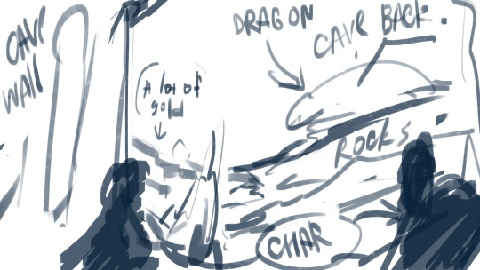
Another approach is my friend told me its when you collecting key words for artwork that you wanna draw. For this one like: dragon, two people hiding, caves, adventure, fantasy, gold, dim light. (at least this is how i understood that)
2. Try new things and practice in other directions
Sometimes you just getting tired from everything you drawing. So its good to try new things. For example im getting tired from my usual art, and its good when you trying smth new, like, landscapes, more realistic portrait/animated style, re-draw some screenshots from movies. Yeah, practicing and studies can help too, because you don't need to create smth, you just learning
3. Create smth from chaos (?)
Its more about traditional art, but i believe you can do it in digital too. We used to do this in college when we would paint on glass with watercolors and then put a sheet against that glass getting a chaotic print. After the sheet dried, we would take a liner and try to see some kind of image in the chaos and draw. Sometimes its funny of some sorts. this is not much, but i hope it will help you
Also a few words.
Its okay when art is bad. We are humans after all, and this is important to remember because -> Don't forget you need to rest. Don't forget to eat, drink (GO AND DRINK ON GLASS OF WATER RIGHT NOW) and sleep. (Take this advice srsly from someone who suffers from this). Take days off, you've worked hard for two days, it's time to take a day to rest.
I will attach some videos about art block in general and with some tips how to fight it below the cut for you, its have some more info that i haven include from them, because the post might be bigger... here it is ->
youtube
ARTBLOCK // Creative Crisis // 4 ways to beat non-painting
youtube
youtube
Motivation, artblock, burnout: how to keep creating
youtube
youtube
ALL YOU NEED TO KNOW ABOUT ARTBLOCK
52 notes
·
View notes
Note
I love your art so much!!! I've also been starting to paint with gouache, and I'd love to know a little more about your process! What kind of paints do you use, do you sketch first or start with paint, do you paint in layers over several day or all at once?
Hi and thank you! I hope you don't mind me answering this publicly and apologies for length, but:
MY ART PROCESS!
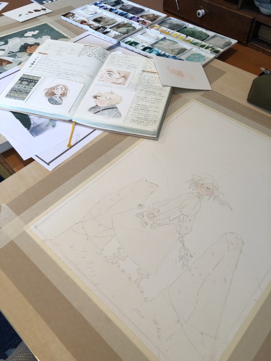
Supplies: I use winsor and newton gouache and arches cold press paper blocks, usually 140 lbs (the lime green ones) and sometimes 300 lbs (the teal green ones). Even though this paper comes pre-stretched in blocks, I actually take the sheets off and stretch them myself because I've found arches' glue isn't as strong as it used to be. This is how you get watercolor paper to lay flat! I recommend youtubing some videos on how to do it -- there's a lot of great tutorials out there. Also, I use princeton brushes, and kraft paper tape and these boards to stretch my paper. (these aren't affiliate links, I just shop at blick)
A word about art supplies: these are the exact tools I use but everyone uses supplies differently and two people with the exact same supplies might get different results! A lot of it is about what works for you and what you like, so I always suggest that gouache/watercolor beginners just buy a few tubes from a couple of different paint companies and some small pieces of paper from different manufacturers to see what you like. Just changing one ingredient in the above has created massively different results for me, but maybe that'll end up being something you'd like! The first step in learning a new medium imo is to play. Just have fun!
ALSO: gouache isn't super light permanent, check your tubes for which ones hold up to sunlight. Here is winsor and newton's color chart explaining which ones will fade when exposed to sunlight -- all manufacturers will give you this. I only use the colors rated A and AA, and I still frame my pieces with UV glass just to be safe. Not all gouache is re-wettable, but winsor and newton is. I just put it in my palettes and refill my palettes if it runs low. AND SOME PAINT IS TOXIC. A lot of paints have cadmium and cobalt in them. I don't use any of the toxic colors, but if you do, make sure you don't eat while working and wash your hands thoroughly afterwards. This information is also usually available on manufacturer's websites. As more people are rejecting cadmium paint, you'll see more tubes labeled things like cadmium-free yellow. This is why. More artists should be aware that their tools can be dangerous. You don't need that many tubes of paint to begin, just a warm and cool red, warm and cool yellow, warm and cool blue, white and black. I have around 50 colors and use 20 regularly. I always mix all my colors myself, and never use straight tube paint. Most of my colors have about 5-6 different tube colors mixed together. If you use re-wettable paint a tube of paint will last you years; even as a professional I only buy new paints every 5 years or so.
Process: I ALWAYS start with a sketch first. Not everyone has to, but because I do illustration work -- where sometimes a client gets input on a drawing -- I always do a lot of preliminary work before I even begin to paint. At this point, even my personal work usually involves the exact same process:
I start with a 3" or so thumbnail that I scan (left; I traced it quickly digtally for clarity to myself here) and then either clean up digitally or print out and clean up traditionally with tracing paper (right):
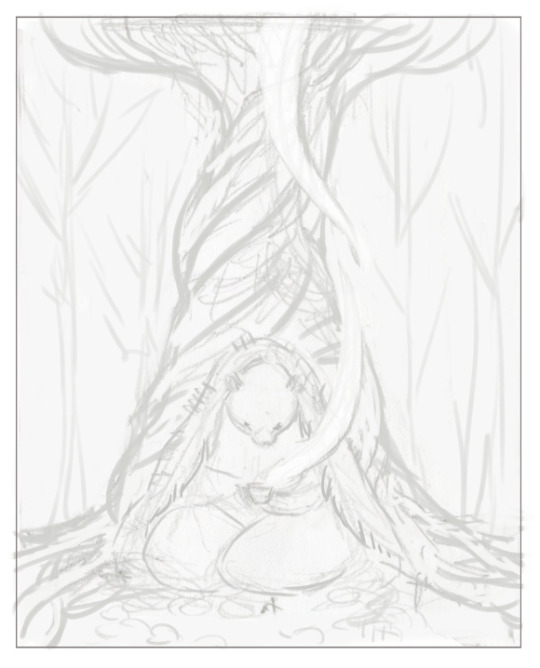

Then I scan the cleaned sketch in and color rough it digitally (left, this was for a gallery show, so no one had to approve my color roughs, so it's messy!) then I transfer my sketch to my paper (with either carbon transfer paper or a light table), stretch my paper, and paint (right):
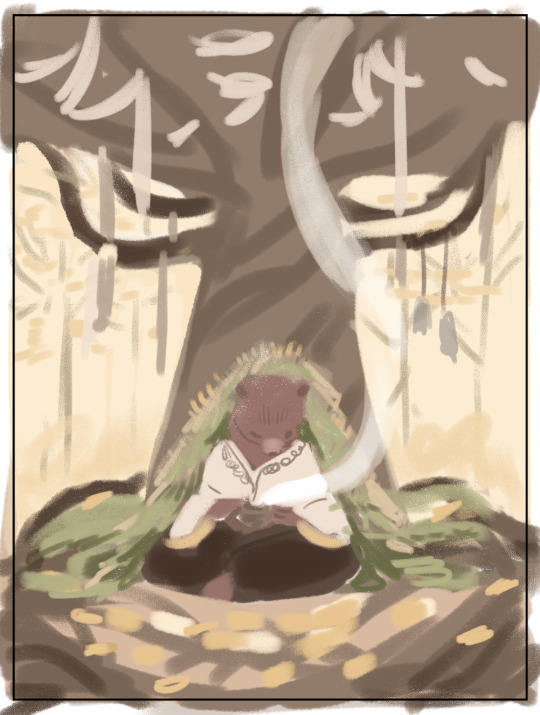
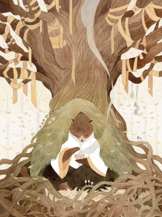
I obviously changed my mind about the color of the ribbon in the trees, ha, and made everything a lot more vibrant. The benefit again of gallery work is no pre-approval!
You are correct, I paint in a series of washes, going from lightest to darkest, where I apply the same color beneath all shapes that are the same warmth (cools under all upcoming cools, warms under all upcoming warms). I paint a piece usually in one or two days, depending on complexity. I didn't take pictures of the above painting, but here's a different painting to show you a little bit what I mean:
I painted the peach color under everything (and twice for skin tones), and the gray color of the sky under everything that would be grayish (the rocks, trees, her pants, her skirt, and coat). I do this to stop me from getting darker lines where two different colors butt up against each other, and also for color harmony. I have step by step photos of this in my process stories highlight on my instagram; also check my FAQ and tip highlights for more info on all this stuff. Most pieces take around 25-30 washes before I start adding in the details (sometimes I add in face details early though because if I mess those up it's not worth finishing the rest of the painting! 😅)
All this might seem like a lot of work (...it is) but I do it so that I can show clients previews of the final piece and so I don't have to repaint the finals. I also used to pre-test all of my washes on scrap paper like this:
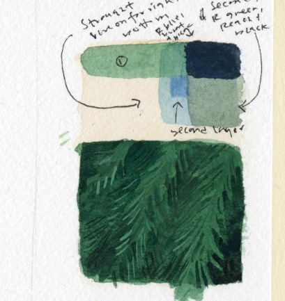
I still recommend doing this if you're just beginning! But at this point I only do it when testing techniques because I know my paints really well. (the above was my test for the pine boughs in this piece)
Painting by far is the longest part of the process, so I do more work up front to not have to do it twice. Every piece takes about 6-24 hrs of actual work time to produce. Stretching watercolor paper takes about 24 hrs to dry, and because I sell most of my originals in galleries, they need to be flawless, so planning ahead is useful and in the end saves me time.
And to conclude this novel of an explanation, don't be overwhelmed by all the information I've given you! I put it here so that people at various stages of their artistic journey can maybe find something useful in it. But seriously, the first step to learning how to paint whether it's traditionally or digitally is just to have fun. Try it out, see what's working and what isn't, and then try to solve specific issues that you're struggling with. I've been doing this for a loooooong time at this point, but here's my first watercolor piece from when I was re-teaching myself how to paint traditionally nine years ago:
Obviously, I was destined for greatness. Ha, yeah, no. If you scroll back through my tumblr archive, you can see me learning how to use these paints in real time. And keep in mind that I'd been working digitally for years before then, and years before that where I didn't post my work online at all.
So for anyone who needs to hear it: there's no such thing as talent, just hard work, patience, and trying again and again and again...and sometimes again. What I do is a skill and anyone can learn it. Sometimes, progress is slow. I'm 38. I only really feel like my art was half-way decent starting a few years ago, but I've been making art my entire life, and I went to art school at 18. 20 years later I'm kind of figuring it out.
The best advice I can give, whether it's about art or not, is find the thing you love so much that you'll keep at it even when you suck at it, because most skills you'll suck at to begin with -- and perhaps for a long time. I sucked at art for yeeeaaaaarrrrs. On top of the usual learning curve, I struggled with fine motor control and dexterity. But I loved it so much I kept trying every time I failed. If I can do it, so can all of you, no matter what stage of art you're at now, and no matter how old you are.
Anyway, thank you to those still reading this deep in. I wish you all the best on your artistic journey. Art can kick your butt sometimes, but it's also pretty dang rewarding 💛
543 notes
·
View notes
Text
EDIT: I HAVE FOUND THE PEOPLE WOHOO
We need 3 responsible digital artists who can most definitely finish the collab! It doesn't matter if you're a beginner or a pro; the main priority is to have fun!
If you're interested, just drop a comment! Then we can move to Discord or Insta to create a group chat and discuss which ref you like the most and who wants to draw who!
I'm fine drawing whoever ^^
So here are these 3 reference images that I think could work with them


#nijisanji en#nijien#nijisanji fanart#by the beat#kaelix debonair#nijisanji#zeal ginjoka#seible#freodore#digital art#art#artists on tumblr#digital artist#art collab#collaboration#art challenge#drawing challenge#vtuber#vtuber fanart#virtual youtuber#en vtuber
25 notes
·
View notes
Text
My DIY Art Degree
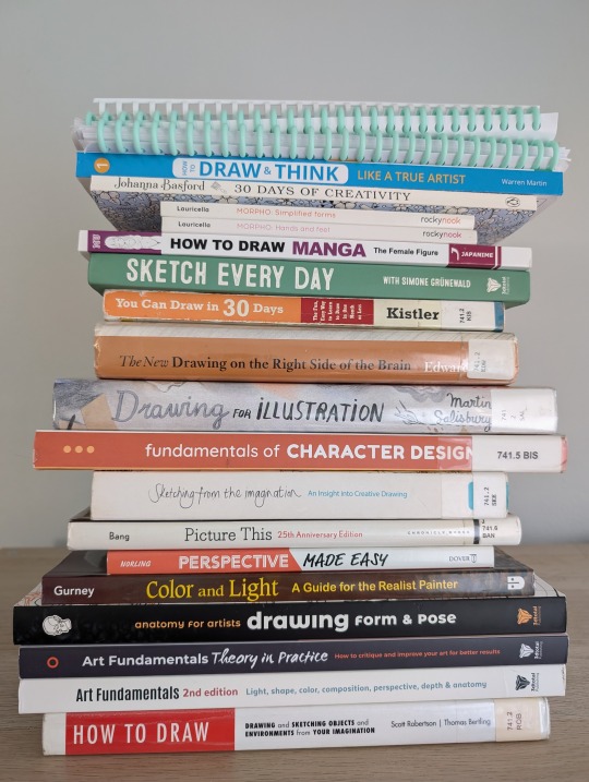
Some people think there’s an arbitrary marker where you’re finally a self-taught artist, that you eventually reach a point where you’re done with your art education. But I think we spend our whole lives learning, so my goal for my 37th year on earth is to start being a committed self-teaching artist.
I have so many interests I want to improve and learn that I can’t predict what my progress or end result will look like, but some of the things I want to explore are:
Sketching and drawing
Coloring techniques and color theory
Painting with watercolor and gouache
Painting on the Procreate app
Creative Journaling
Handwriting, hand lettering, and calligraphy
So I dug up a bunch of books and videos to make up a curriculum and planned out my own DIY art degree to start learning them all!
Each month has its own focus:
Learning About Learning Art
Mark-making, Sketching, & Basic Shapes
Perspective
Figure Drawing & Anatomy
Gesture Drawing
Character Design
Color & Light
Composition
Landscapes & Environmental Design
Using Markers & Colored Pencils
Painting with Gouache & Watercolor
Digital Art
I don’t have a syllabus for the full year planned out yet, but here’s a rough draft of the materials and activities I want to try out for Quarter 1:
❄️ January ❄️
✨January Focus: Learning About Learning Art✨
📚 January Materials 📚
Drawabox.com: Lesson 0
[Book] Art & Fear by David Bayles
[Book] Debt Free Art Degree. Foundations in Drawing by Marco Bucci: Chapters: 1
[Book] Drawing on the Right Side of the Brain by Betty Edwards
[Book] How to Keep a Sketch Journal by Marisa Lewis
[Book] Sketching from the Imagination: An Insight into Creative Drawing by 3DTotal Publishing
[Book] Art Fundamentals: Theory in Practice by 3DTotal Publishing. Chapters: Fundamentals & Critical Thinking
[YouTube] Veritasium: The 4 Things it Takes to Be an Expert
[YouTube] Ian Roberts: 5 Principles to Master Anything
[YouTube] Proko: Getting Better Faster - Painting with 80/20 Rule
[YouTube] Proko: How to Hold and Control Your Pencil
[YouTube] Sycra: Iterative Drawing
[YouTube] Love Life Drawing: 10 Stages of Learning Any Art Skill
[YouTube] Love Life Drawing: Practice Like a Pro - How Steve Rude Improves
[YouTube] Sinix: Art Theory Tutorials Playlist
[YouTube] Sinix: Art Warm Up & Exercises
[YouTube] belartsy: the “right” way to start learning how to draw
[YouTube] Paintable: Sketching For Beginners
[YouTube] Marc Brunet: How to Draw Anything - The 7 Fundamentals
[YouTube] Marc Brunet: How to Draw Good Lineart
[YouTube] Marc Brunet: Stop Learning to Draw the Wrong Way
[YouTube] Marc Brunet: The Most Important Art Skill
[LinkedIn Learning] Drawing Foundations: Fundamentals
[Gumroad] moderndayjames: Intro to Dynamic Sketching ($8)
[Reddit] r/ArtistLounge: How to get better at observing the world around me?
✍️ January Activities ✍️
Set a baseline by making whatever I want
(I know January has already passed; I'll post an update with what I actually managed to get through.)
💝 February 💝
✨ February Focus: Mark-making, Sketching, & Basic Shapes ✨
📚 February Materials 📚
[Book] How to Draw and Think Like a True Artist by Warren Martin. Days 1-5
[Book] Drawing for the Absolute Beginner by Mark and Mary Willenbrink. Chapters 1-2
[Book] You Can Draw in 30 Days by Mark Kistler. Lessons 1-7; 10-13; 15; 19
[Book] Perspective Made Easy by Ernest Norling. Chapters 1-8
[Book] Art Fundamentals 2nd Edition by 3DTotal Publishing. Chapter: Perspective & Depth
[Book] Drawing on the Right Side of the Brain by Betty Edwards
[Book] Debt Free Art Degree: Foundations in Drawing by Marco Bucci. Chapters: 1, 3
[Book] How to Draw by Scott Robertson. Chapters 1-2
[Reference Pictures] Fundamentals: Shiny Forms
[Reference Pictures] Fundamentals: Basic Forms
[YouTube] Uncomfortable: Drawabox Videos Playlist (Lesson 1)
[YouTube] moderndayjames: Perspective 1
[YouTube] moderndayjames: Perspective 2
[YouTube] moderndayjames: Perspective 6
[YouTube] The Art of Nemo: The ONLY Box Rotation Exercise That’s ACTUALLY Useful
[LinkedIn Learning] Drawing 2-Point Perspective
✍️ February Activities ✍️
drawabox.com
Lesson 1 & Homework
250 Box Challenge
🍀 March 🍀
✨March Focus: Perspective ✨
📚 March Materials 📚
[Book] Perspective Made Easy by Ernest Norling. Chapters 9-18
[Book] Drawing for the Absolute Beginner by Mark and Mary Willenbrink. Chapters 2; 5
[Book] You Can Draw in 30 Days by Mark Kistler. Lessons 22-27
[Book] How to Draw and Think like a True Artist by Warren Martin. Days 6-14
[Book] How to Draw by Scott Robertson. Chapters 2-7
[Book] Art Fundamentals 2nd Edition by 3DTotal Publishing. Chapters: Perspective & Depth
[Book] Framed Perspective I - Marco Mateu-Mestre. Chapter: 1
[Book] Debt Free Art Degree: Foundations in Drawing by Marco Bucci. Chapters: 3
[YouTube] moderndayjames: Perspective 3
[YouTube] moderndayjames: Perspective 4
[YouTube] moderndayjames: Perspective 5
[YouTube] moderndayjames: Visual Library I
[YouTube] moderndayjames: Visual Library II
[YouTube] moderndayjames: Visual Library III
[YouTube] moderndayjames: Vehicle Sketching I
[YouTube] moderndayjames: Vehicle Sketching II
[YouTube] moderndayjames: Vehicle Sketching III
[YouTube] moderndayjames: Vehicle Sketching IV
[YouTube] moderndayjames: Sketching Figures in Extreme Perspective
[YouTube] moderndayjames: Emulating Even Amundsen Series
[YouTube] moderndayjames: Becoming a Gi Series
✍️ March Activities ✍️
drawabox.com: Lesson 2 & Homework, 250 Cylinder Challenge, Begin 25 Texture Challenge
100 Rotated Objects - based on moderndayjames Visual Library videos
100 Unique Studies (machinery, vehicles, plants, animals)
🖌️ Some Ongoing Activities 🖌️
50/50 Rule: 50% studying, 50% funsies
[Book] 30 Days of Creativity by Johanna Basford
[Book] 2025 Johanna Basford Wall Calendar
[Book] The Lost Art of Handwriting by Brenna Jordan
[Book] Spencerian Handwriting: The Complete Collection of Theory and Practical Workbooks for Perfect Cursive and Hand Lettering by Platts Roger Spencer
[Workbook] New Spencerian Compendium Plate 2 Practice Sheets (Found on PDF Drive)
Hand lettering worksheets I made in Canva
This is by no means a comprehensive education, but I feel like I came up with a good introduction to the things I’m interested in. I’m not going to learn everything about all of these topics in just a year, and I know I'm not going to get through all the resources I found.
I also want to make this process as cheap as possible, so I’m using a lot of free stuff from YouTube and my local libraries. Many of the resources came from radiorunner’s Curriculum for the Solo Artist and suggestions I found through the almighty social media algorithms.
If your libraries can’t get the books on order or Inter-Library Loan, or if you’d rather just buy them to keep, I’m including Amazon affiliate links. (Many can be found as PDFs through other free methods but I definitely don’t recommend looking for the books on Demonoid, Mobilism, or PDF Drive.)
What do you think I'm missing? What do you think is too extra?
Learning is a life-long process, so even though I gave myself a year to restart, it’s just that: my restart.
37 notes
·
View notes
Text
💜💜💜💜💜💜💜💜💜💜💜💜💜💜💜💜💜💜

💜💜💜💜💜💜💜💜💜💜💜💜💜💜💜💜💜💜
INTRODUCTION
Purp
She/her
Muslim
Malaysian
Artist, beginner animator, beginner writer
Sona : text
Kinsona : text
Reblog blog : @purpsfunnireblogs
Purps Crew Ask blog : @askpurpscrew
Hello and welcome to the blog!
You can call me Purple, Pur, or anything that you'd like! Except suggestive ones..
This post will be a whole introduction to me and my blog! You're encouraged to read the whole thing to better know me =]
CHAPTERS
CHAPTER 1 | More About Me
CHAPTER 2 | Not Allowed List
CHAPTER 3 | Fandoms
CHAPTER 4 | Tags
CHAPTER 5 | Ask blog
CHAPTER 6 | Socials
CHAPTER 7 | Special Lovely Mention
Anyways, long introduction under cut!
💜💜💜💜💜💜💜💜💜💜💜💜💜💜💜💜💜💜
CHAPTER 1
You might be thinking, what am I good at?

My main talent is drawing! I'm improving on it but it's going out pretty well =]


Here's some art examples showing what i can do from recently! I can do GIFs too =3
Animation is my second specialty! I'm learning more about it but animation can be a genuinely fun thing to do sometimes

I have my own silly Sona =D
I'm a very open and social person! I love interacting with people. I'm that type of person to do a huge ahhhh project then be like "y'know what let's make more"
It might be surprising but I do tend to swear a lot! I apologize for that one.
I'll add more here but for now, this is what I got =3
CHAPTER 2
Ofc I would I have a things I don't allow list. Or else this would be a real wreck.
WHAT I DO NOT ALLOW
Asks for donations
Yes I have answered some asks regarding this, but I seriously cannot donate.
I do feel sorry, I genuinely do. But, I should be honest that I can't donate, therefore, I ask for people to not spam my ask box with donations
NSFW
Obviously huge no-no sign for me. I want this place to be as clean possible.
Any mentions of controversies, etc
Keep this place happy for all of those stuff. I'll only talk of it if it's terrible, but I'd like to keep this place not walking with negativity.
I'd prefer to be quiet about it.
Inappropriate behavior
This type of behavior will NOT be tolerated here. Any sign of it will be deleted, or you will be banned.
Anywaysssss with that one done let's get on with the next oneeeee
CHAPTER 3

I will mostly do SMG4 content but I'll try to do other content for fandoms I'm also in!
Such as...
Among Us
Murder Drones
Cookie Run
The Amazing Digital Circus
And etc =D
I also have a couple of aus that you might know/not know!
Brainwashed AU
Circus Showman AU
And more =3
I'm in love with Mr Puzzles aihsiahsodhosb... 💜💜💜💜💜💜💜💜💜💜💜
CHAPTER 4

Here's some tags that I use!
GSP : #SMG4 GSP
Aspen : #SMG4 Aspen
Rambles, reblogs, etc : #Purps random shitposts
Asks : #purps silly questions =]
Strawpage content : #strawpage
Purps AU's : #Purps original aus
Brainwashed AU : #SMG4BrainwashedAU
CHAPTER 5

My askbox it's very welcome for interactions with ocs, requests, and etc!
Feel free to ask me, I love reading what you all have! You can also send in fanarts if you want through there too, it's all perfectly fine =]
CHAPTER 6

Socials are also very very real =D
Twitter : @Purp_IsSus
Reddit : u/Purp_1456
Wattpad : @PurpIsSus
I do have Discord but thats private =]
CHAPTER 7

Lastly, don't forget to check our all the cool people in my follow section!
They all deserve a follow because of how amazingly great and good they are like check them out!!!!!
.
.
.
.
.
.
That's about all my lovelys!
Please enjoy my blog and have fun yippeeeeeeeee 💥💥💥💥💥
💜💜💜💜💜💜💜💜💜💜💜💜💜💜💜💜💜💜
81 notes
·
View notes
Note
hiii!
i am so so fascinated by your art, it's absolutely mesmerising. i'm very curious of your process! would you mind sharing your speed-paint and walking us through it? no pressure ofc tho! i'm asking as a beginner/intermediate (?) artist trying to learn and grow :3
hi buddy, thank you so much! 💖
i don’t really do speed painting (mostly bc i often work in fits and starts over many weeks) but i do have a few time lapse videos posted here, here, and here from recent months that might help! they're all from the same piece but there's some variety in technique, and i think they're a good example of the difference that pose & palette make, even if the changes are subtle.
my process usually consists of a reference stage (i love to make a little vision board with lots of poses, expressions, paintings I'm trying to channel, etc.), a very messy sketch stage (for me these are never meant to be pretty, just functional in terms of shape and composition- they are a map to the destination, not the destination itself!), and a coloring stage over top of the sketch. for coloring, i have a few palettes saved for various skin tones, which takes a lot of the guesswork out of it. there is also a secret fourth stage sometimes, in which i get very frustrated and give up for like six months and come back with totally fresh eyes. there is no shame in the fourth stage. it happens to everybody.
all my favorite reference tools are here and can be used interchangeably for traditional and digital art:
i will try to do a longer time lapse on my current piece and try to figure out how to add an audio walkthrough, but i hope this is helpful in the meantime! 💕
#genuinely I hope I at least sort of answered your question. 💕😭 got me wishing I had more time lapse videos but! that can be rectified#art stuff#ask box
18 notes
·
View notes