#border icon tutorial
Explore tagged Tumblr posts
Visit Tumblr Blog
Explore Tumblr blogs with no restrictions, modern design and the best experience.
Last Seen Tumblr Blogs


Fun Fact
Tumblr.com is the 103rd most visited website in the world.
Text
PHOTOPEA TUTORIAL: RP ICONS/ICON BORDERS !
HOW I USE CLIPPING MASKS && RECTANGLE SELECT TO CREATE MY ICON BORDERS. this post will include framing the rp icon itself, the border around the icon && adding on optional block quotes—also, a bonus how-to for applying patterns to your block quotes and/or icon border; in case you're after some zesty editing !
pictured below is a simple, PRE-MADE icon that we will be attempting to recreate in this tutorial. all you need is a screencap && photopea ! as for the blockquote pattern, it is an optional design / example that i will provide later on in the tutorial ! this tutorial will involve rectangle select & clipping masks and i will cover how to do them both.

start a New Project, make sure the background is transparent. pick what size you'd like the overall border to be, not the icon itself.

you should start out with a transparent rectangle, as seen above. for this particular recreation, i've listed the width & height of my standard icon border sizes below. if you don't know, these sizes are determined by pixels.
W: 640 H: 107 i.e., W: 640 pixels H: 107 pixels.
next step: select Layer>New>Layer as seen highlighted below. this new layer is where your icon base will be/your clipping mask will go.

now that we've added a new layer for the icon base/mask to go, we're going to use rectangle select to set the size of our icon. right click where the yellow highlight(left bar) is pointing in the example below && drag your cursor to expand the "rectangle select" to whatever size icon you want. for this example(as seen below) i've chosen the size 80x80.

after you've set your desired icon size, you can now drag the selection(you should see a dotted border outlining your selection) to where you'd like your icon to be placed. i personally chose to place mine in the center—i did accidentally forget this step in the tutorial, so don't mind it if you see it move in the next two examples. though not an incredibly important detail, you can always move it after you fill it in !
once you have placed your base, select your brush tool && choose a color(highlighted in yellow, located on the left bar in the example below). you can use whatever color you'd like here, as long as it stands out to you—i usually choose red or green so that it can stand out from the background. once you've picked your color, you're going to color inside of the selection that you've made. don't be afraid to color outside of the lines...the brush will not exceed past what you've selected in advance with your rectangle tool !

once your base is colored in, you may now de-select your rectangle select tool(right click>deselect).
pictured below is an example of our current progress. as you can see i finally moved my icon to the center.

this colored shape will be your 'x marks the spot'—it is where your screencap(as a clipping mask) will be going once we finish the border of the icon.
speaking of which, now it's time to create our border ! add a new layer with the same process as before. Layer>New>Layer. name it whatever you'd like. i've simply labeled the new layer as "icon border" because it will be the layer the border goes on. make sure it is on a layer that is separate from the icon base.

in the "icon border" layer, repeat the rectangle select process outside of each side of your square/icon base. selecting one side at a time, be sure to fill it with the color of your desired border. i will be using a white border, which will be 3 pixels wide on each side. (example is of me expanding the select tool to the preferred pixel height/width outside of the base)

once you've finished creating a selection && filling each section, you can deselect && should be left with something like this:

this is optional, of course, but if you'd like you can also make an outer border/border edge. you can do this in a new layer or simply place it on the same layer as the white border. in the example icon at the top of the post, you can see that the icon i made has a gray outline outside of the white border. to do that, simply repeat the rectangle select option; and this time, only select 1 px width of space(or more, depending on how thick you want it/if your border is wider) on the outer edges of the white border. with you're new color(mine being gray as depicted) you can fill each of these edges. here's what we got going on so far !

now, to add your icon inside of the border! (it doesn't really matter if you do it before or after, just as long as you got your layers right!)

as you can see, i already added my icon to the base; you can do this before or after you've created your border && border edge. in the image above, the rectangle select you're seeing is an example of where the outer border/edge was filled in with gray. of course, to add your icon, file>open and place>choose your screencap. once your screencap is opened, right click it && once you're met with the drop down, left click the option that says "clipping mask." doing this will give you free reign to zoom in or out and move your icon around(to move it, edit>free transform && drag) all within the confines of the icon base you've created with your selection tool && brush.
our current result:

now... for optional blockquotes. make sure to start a new layer for your blockquote/s. once again, you're going to use the rectangle select tool; choose the width && height of your blockquote by dragging/expanding the tool with your cursor. i've made my blockquote 2 pixels wide because i prefer them thin—if you would choose wider blockquotes, just expand the selection.

once selected, fill that selection with the preferred color of your desired blockquotes. most people choose gray or colors relevant to their characters—i will be using red because i will be treating this as a clipping mask, so i can show you how to put a pattern into the blockquotes if you want something that stands out.

you can see ive put two blockquotes in place. you can choose to move them however you want them, or include both the blockquotes in one layer or seperate layers. i've personally separated mine for this example. (layers bq 1 + bq 2 on the side)
ADDING A PATTERN: do the same thing you did with your screencap...file>open and place>choose image. i will be using this abhorrent little pattern(free to use!) i created for the sake of this tutorial. and just like you did with placing your screencap, right click and select "clipping mask" on the dropdown. again, you can move it, zoom in and out however you please. just make sure the image is lined up with the blockquotes!

and here's what you should end up with, or something similar !

EXTRA / ADDING A PATTERN TO YOUR BORDER:
once you've gotten the hang of rectangle select/clipping masks, this part is self explanatory. basically, if you'd like to put a pattern inside your border (this will be the white border you created) you can repeat steps you took to add a pattern to your blockquote, this time placing your clipping mask over the layer with your border.

and that's pretty much the formula of all formulas for me personally—these tools come in hand for a lot of my editing !
#* MY TUTORIALS.#long post /#rp community#icon tutorial#rp icon tutorial#psd tutorial#roleplay help#roleplay resources#roleplay community#roleplay graphics#coloring psd#psds#icon psd#psd#roleplay psd#rp graphics#rp psd#rp resources#tutorial#editing tutorial#rpc tutorial#editing resources#psd coloring#icon border#icon border tutorial
289 notes
·
View notes
Text

HELLO? I DID IT??
#y'all wtf#i just wanted to fuck around w a border at least#but my rectangle tool was stuck from when i tried the icon tutorial#and it kind of works??#not to mention the quality is ass BUT
7 notes
·
View notes
Text
tag drop ━ my resources
#⭒⊱✿⋅⋆ 𝔪𝔦𝔫𝔢 ⋮ resources#⭒⊱✿⋅⋆ 𝔪𝔦𝔫𝔢 ⋮ graphic template#⭒⊱✿⋅⋆ 𝔪𝔦𝔫𝔢 ⋮ base icons#⭒⊱✿⋅⋆ 𝔪𝔦𝔫𝔢 ⋮ psd coloring#⭒⊱✿⋅⋆ 𝔪𝔦𝔫𝔢 ⋮ border template#⭒⊱✿⋅⋆ 𝔪𝔦𝔫𝔢 ⋮ commission example#⭒⊱✿⋅⋆ 𝔪𝔦𝔫𝔢 ⋮ updates#⭒⊱✿⋅⋆ 𝔪𝔦𝔫𝔢 ⋮ tutorials#⭒⊱✿⋅⋆ 𝔪𝔦𝔫𝔢 ⋮ chatter#⭒⊱✿⋅⋆ 𝔪𝔦𝔫𝔢 ⋮ polls#⭒⊱✿⋅⋆ 𝔪𝔦𝔫𝔢 ⋮ carrd templates
2 notes
·
View notes
Text
📌 sideblog dedicated for resource hoarding for carrd, rentry & graphic design. i also reblog flags i identify with. i may occasionally post things i've made myself as an archive. tags i use found below.
#psd#graphic#layout#gif#png#overlay#divider#carrd#flag#border#metadata#asset#tutorial#icon#mine#mask
5 notes
·
View notes
Text
✳ 𝜗𝜚 : NEW TAGS , part two . ⋆゚⊹
#୨˚̣̣̣୧ ·˚ ༘ OOC . ◞ : not mine : free resources ᵎᵎ 𝜗𝜚 ♡ྀི#୨˚̣̣̣୧ ·˚ ༘ OOC . ◞ : not mine : paid resources ᵎᵎ 𝜗𝜚 ♡ྀི#୨˚̣̣̣୧ ·˚ ༘ OOC . ◞ : not mine : edit templates ᵎᵎ 𝜗𝜚 ♡ྀི#୨˚̣̣̣୧ ·˚ ༘ OOC . ◞ : not mine : edit textures ᵎᵎ 𝜗𝜚 ♡ྀི#୨˚̣̣̣୧ ·˚ ༘ OOC . ◞ : not mine : edit tutorials ᵎᵎ 𝜗𝜚 ♡ྀི#୨˚̣̣̣୧ ·˚ ༘ OOC . ◞ : not mine : fonts ᵎᵎ 𝜗𝜚 ♡ྀི#୨˚̣̣̣୧ ·˚ ༘ OOC . ◞ : not mine : icon borders ᵎᵎ 𝜗𝜚 ♡ྀི#୨˚̣̣̣୧ ·˚ ༘ OOC . ◞ : not mine : masterlists ᵎᵎ 𝜗𝜚 ♡ྀི#୨˚̣̣̣୧ ·˚ ༘ OOC . ◞ : not mine : fc help ᵎᵎ 𝜗𝜚 ♡ྀི#୨˚̣̣̣୧ ·˚ ༘ OOC . ◞ : not mine : carrd templates ᵎᵎ 𝜗𝜚 ♡ྀི
7 notes
·
View notes
Text

Know your place
#meeelis#icon#icons#iconic#wild girl#crazy girl#girlhood#girlblogging#this is what makes us girls#girls icons#wildlife#life lessons#life#lifestyle#life hacks#life tips#love#soul love#self love#lovers#loving life#tutorial#no limits#borders#self blog#self care#humanization#human psychology#humans#style
1 note
·
View note
Note
HIIIIIII!!!! sorry if this is like a stupid ask lol, but could you do a stamp tutorial? your stamps are always so high quality oml, how do you resize your gifs and images???


HIIII and no worries, I can totally make a stamp tutorial! (⌒▽⌒)
I’ll be going through on how to make a normal image stamp and then a gif stamp. By following these two tutorials, you’ll be able to make stamps just like these!


PROGRAM USED ★ Ibispaint
STAMP TEMPLATE BY ★ AHMED-ART on Deviantart.
To start off, you must find an image you’d like to make into a stamp. Then, find a stamp template you think would pair well with your image. There are many different types of stamp templates out there and you can find a lot of them on Deviantart.
Make sure to read the terms of use for the template before using though! Here is the template I will be using for this tutorial.

Making stagnant stamps is easy once you got the steps down. You can use any art program and follow a similar process, but I only use Ibispaint to create mine.
First, create a canvas that is the same width and height as your stamp template. This one is 97x57. Most stamp templates have super similar proportions. If you are unsure of your stamps dimensions, you can create a 100x100 canvas then crop it around the stamp template once you have inserted it.
(Brush icon -> Canvas button -> Trim)
To get higher quality on the image inside your stamps: the closer the better! For example:


See how the first stamp’s image is rather far away? This makes the quality appear much lower. However, once you zoom in, it becomes higher! So I recommend finding images to create stamps out of that you are able to zoom in on so the quality can pop.
You’ll need to erase the parts of the image that don’t fit inside the stamp so it remains transparent around the border.
If you want to change the border color of the stamp, fill in the canvas with the color you want. Then, clip it to the stamp border. Lastly, go and set it on multiply. This will change the stamp borders color!

If you want to put a line texture on your stamp, you can utilize the ruler tool in Ibispaint to draw lines over your stamp.

I’ll add these every once and awhile to my stamps for fun. If you set the opacity of the lines to 10%, it’ll end up looking something like this.
And that’s the completed stamp!
Changing the border color and adding the line texture is completely optional, though it’s always fun to customize stamps!

PROGRAMS USED: Ibispaint, Ezgif
GIF stamps are a little trickier, but the process is not too difficult once you got it down!
First, find a gif that you would like to make into a stamp. I’ll be using this one!

if you want to have a different colored or customized stamp border, you must edit it on Ibispaint before like explained above.
You can combine the layers and save them transparently so it’ll end up looking something like this.

I made this one blue and added a gradient to it to match the gif I want to make into a stamp! You can add a gradient to the border by adding a darker color onto the multiply layer then using an airbrush to blend both colors together in the middle on both sides of the template.
Now, open up Ezgif and click the tab called Crop. Then, insert your stamp template there. The way I find the dimensions of the inside of the stamp is by cropping my way around the inside of the template.
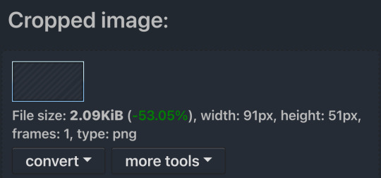
The dimensions inside this template in particular are 91x51. This is what we will resize our gif to! Before we can do that, click the crop tab again at the top of the page to refresh it and then insert your gif. This isn’t required to do, but I like to crop my gifs a bit so they focus more on what is going on inside my stamp. Like I said before, the closer the better, as it will make the quality higher!

Now that we have our cropped gif, click the tab called resize at the bottom of the page. The dimensions of the inside of this stamp are 91x51, so insert those numbers in the width and height boxes to then resize the gif.

Next step is to click the overlay tab at the bottom. You will need to click the button that says “extend canvas size” so we have room to overlay the stamp template on top of the gif. After extending the size, upload the stamp template as an overlay where it says choose file.

On computer, after clicking upload image, you can just drag the stamp template over the gif and situate it. However, you can also figure out the number coordinations to fix the template ontop of the gif by messing around with it a bit. I make my graphics on my phone so I use the numbers instead of dragging.

Left means to move the template left or right depending on the numbers you insert. Top moves the template up or down. The left for this template is 42 and the top is 21. It takes a bit of messing around to find the exact numbers.
Now that the template is ontop of the gif, all that is left to do is to crop the space around it. Click the crop tab again at the bottom of the page and then click where it says “trim transparent pixels around the image.” This will easily crop the extra space around the stamp.

Click download to save your gif and that’s it! Here is the finished product!
The whole process for making gif stamps is always the same, the only things that can vary or change are the dimensions of the gif (so it can fit inside different templates) and the left/right.
I hope you find this tutorial helpful and if anyone needs anything else explained, let me know. These stamps are free to use if anyone would also like to use them.
Happy stamp making everyone! 🩷
Dividers (c) @coco-coquette

#tutorial#web graphics#graphics#webcore#old web#rentry#stamps#web decor#gif stamps#alien stage#alien stage till#strawpage#spacehey#ᯓ ᡣ𐭩🐚asks
781 notes
·
View notes
Note
how do you make your userboxes? i've gone looking for tutorials before but the only one i found didn't work for me .::(
I use ibis paint x to make them! I also use this template

I usually get my images from pinterest and/or google, depending on what the request is for.
let me show an example:
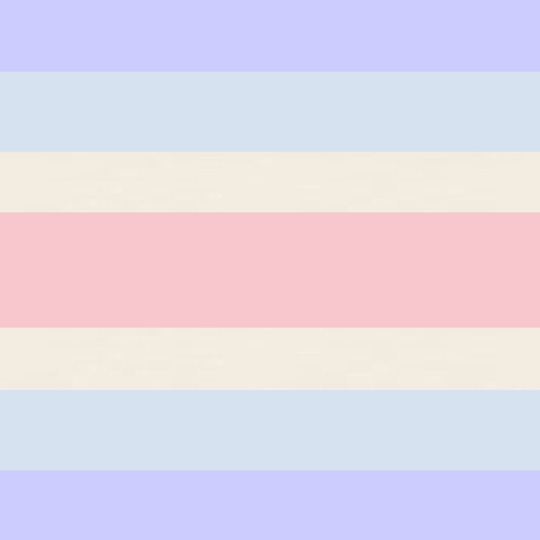
I get my subject and my 2 pictures. the left one is for the icon, and the right one is for the background (credit to this post for the pet dreaming flag!)

I then import the template as a new piece.

I use the selection tool to select the icon box, and then insert the icon picture I want.


for the smaller rectangle, I select that rectangle and then fill it in with whatever colour fits the userbox (you can also lower the opacity to 80-90% if you want)


I then insert the background WITHOUT selecting the background. you do not need to select the background, but you can if you want. IF YOU DO, you’ll end up with a thin white line around where the template is.
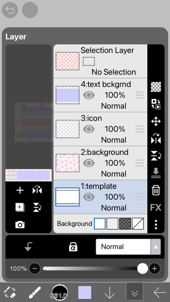
this is what the layers should look like once you’re done the designing part
now you just gotta insert the text! just go to the text option, select “add text” and put in the text you want for your userbox. you can also change the font and size if you want (highly recommend this because the default font kinda sucks and you want the text to be big enough to read). if you want to have that little white border around the letters, just go to style and change the stroke colour/thickness (the FIRST slider, not the second one!!)


and there you go! you now have your userbox! just save it, and bam! here’s the finished product of the example.

hope this helps! feel free to leave any questions below; I’m free to answer any questions if anything was confusing or unclear :3

#alterhuman#nonhuman#otherkin#therian#my userboxes#custom userboxes#userboxes#art tutorial#tutorial#how its made#kin stuff#kin request#open requests
195 notes
·
View notes
Text
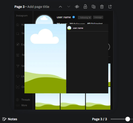
𓈒༷♪˚.✧ How to make a mockup like this for smaus, ocs, etc. (step-by-step tutorial ☆ no Photoshop, easy, free) (requested by @lovebittenbyevans) ✿
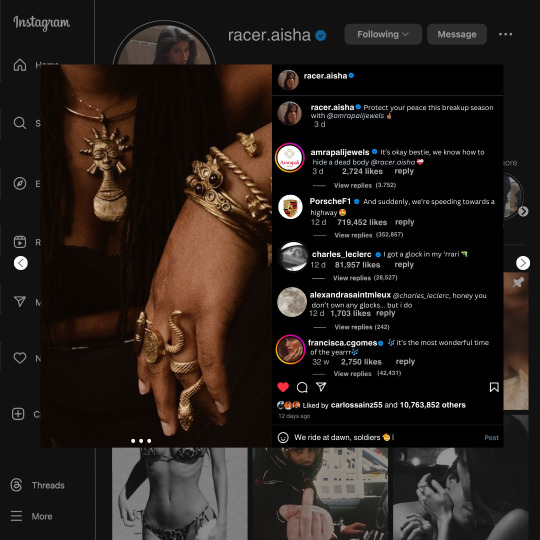
guys this took me two hours to make and you could probably get this done in like, 30 minutes :) I hope this is coherent <3 Please look back this image for comparisons, if my explanation is not well explained, etc.
first of all, if you dont already have one, make a free canva acount. once you're signed in, hit the purple "create design" button on the sidebar. A pop-up will appear with different design template options. For this design, we want the dimentions to be 1080 x 1080, so you can either make a custom size or choose the instagram post (square) template by either searching or scrolling through the list.

2. Now you have a blank page. Zoom in with the slider at the bottom of the page if you need to (Mine is currently zoomed in 41%). Click on the page and change the color to an off black (hex code #111111).
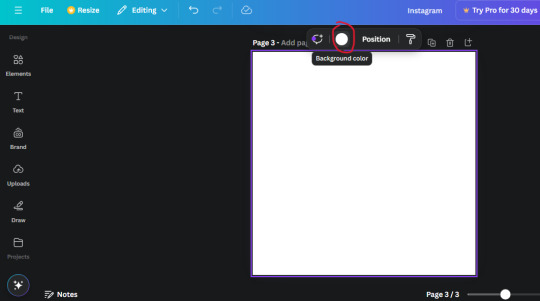
3. Now that the color is changed, click the "elements" tab and search "line". Click the shape and it will add it to the page automatically. These line are particularly hard to navigate and hard to get it at the right angle and length so this part might take a little longer than the rest.
4. stretch it from top to button and turn in a 90 angle so its straight on the left side of the page. Change the color of this as well to a grey tone (hex code #2F2F2F).
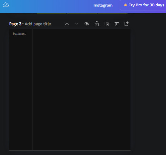
5. Now we'll add the Instagram logo. Click the "text" tab then click the purple "add text box" button. Write "Instagram" in the box and change the font to "apricots". This is the closest font I could find that resembled the logo font but if you find a better one, feel free to use that instead. Make the font size 19.3 (you can do this manually or do it in the text options). Change the color to grey color (hex code #707070). Add it to the upper left corner of the page like this:
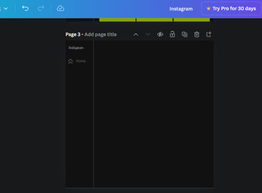
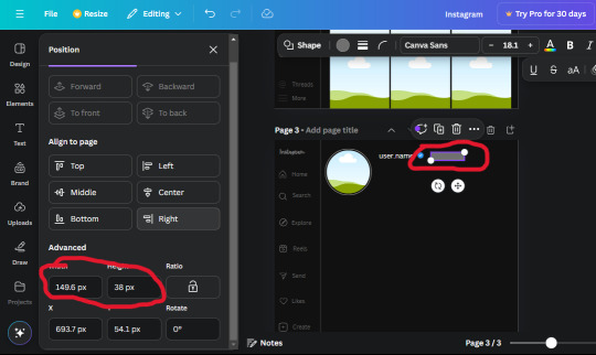
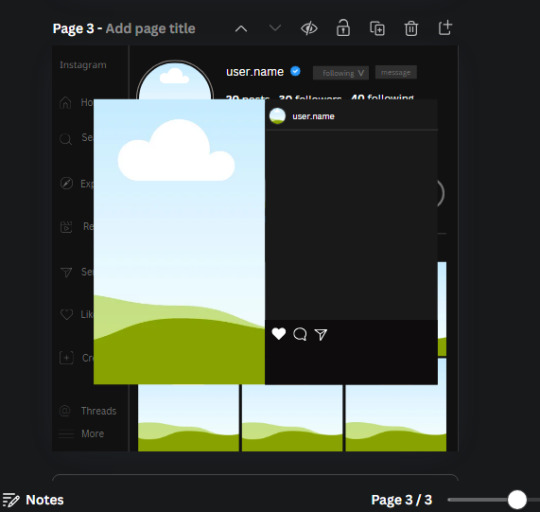
6. now we're adding icons and a menu inside the border we just made. Click the "elements" tab again and search for "instagram home icon" and add the element by sketchify to the page. Click the home icon, an options icon with pop-up above the page. Look for the "Position" button and click it. Scroll to find the advanced options and you can manually type in the width and height at 26.6 and 28.7.
Move it inside the border, under the logo (photo below). Change the color again (the hex code is #707070).
7. Open the text tab and add a text box. Change the font to Canva Sans and write "Home" in the box. Change the font size to 18.1 and align with with the house icon. It will look something like this,
8. Go into the elements tab again and search "instagram search icon". Scroll until you find the one by sketchify and add it to the page.
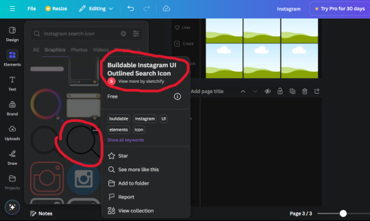
9. Shrink it so the W and H is at 36.6 and 31.3. Move it below the home icon until a purple "67" pop ups and aligns under it. Change it to the same color as the Home text and icon (#707070). Go ahead and Duplicate the the "Home" text box and clicking it and a pop-up will show up then edit the text so it says "Search" and align with the searcch icon we just added.
10. You know the drill. We are continuing to search up more icons in the "elements" tab. Search "instagram compass icon" and choose the one by sketchify (are u seeing the pattern?). Add it to the page and change the width and heigth to 33.1. align it under the search icon just like how we did before and change it to the say colors as the other icons.
11. Do the same as before and write "Explore" in a text box and align it with the icon. We're doing the same thing for all of these.
We'll be using the same search prompt for all of these icons so just change the type of icon you're looking for like we've done before hand. Next look for the Instagram reel icon and add the outlined one by sketchify and change the W and H to 31.2 x 30.9. Change the color to the ones we've used before, align it underneath the icons above and add your text ("Reels").
12. The next icon is an outlined, "sent" one. W and H is 31.1 x 27. The text will say "Send". Then an heart outline by sketchify; W and H is 34.2 x 29.1 and the text is "Likes". Next is the "create" outline icon by sketchify, W and H is 36.8.
(p.s if you are struggling to align the icons and text correctly, shoot me a message and I'll send you the X and Y positions ;D)
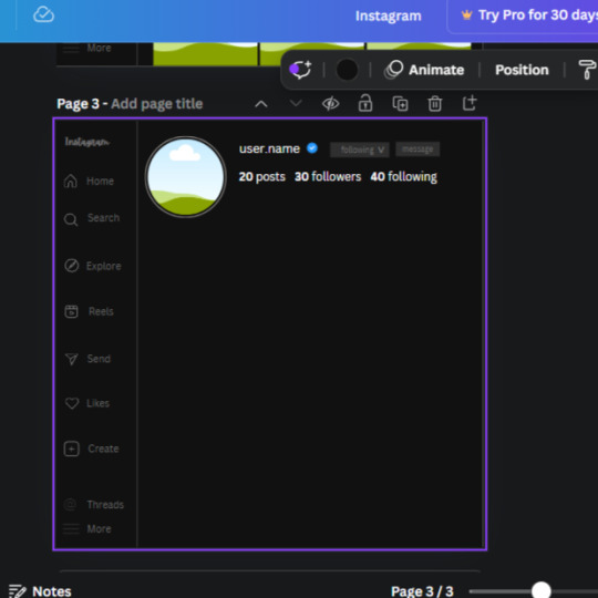
If you followed it through, it should look like this,
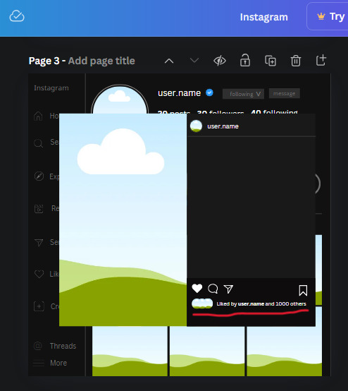
13. Now onto step 13, we'll be adding the Threads logo. You don't have to add this but to make it look more like the actual website, I will be adding it. Open the "text" tab and add a text box. Write an "@" symbol in the box and change the font to Nanum Sqaure and the size to 24.9. Add in the bottom corner below all the icons we just added to our page. We need another text box now (Color is still #707070), write "Threads" and align it to the "@" symbol.
14. We're adding another icon now. Search "Instagram menu icon" and find a wireframe menu icon by sketchify. the W and H are 42.5 x 24.6. Add a text box that says "More". It will look like this:
We are a quarter way done now :D
15. Search in the elements tab "circle frame" and look for the one with a little border around it.
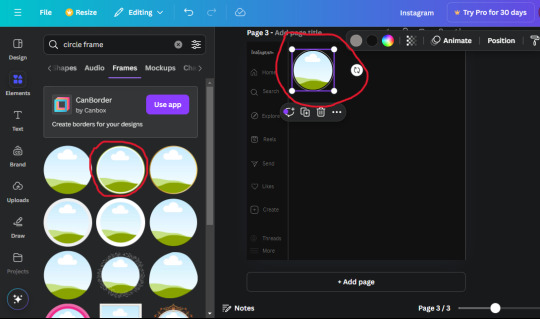
At first, the circle will be green and inside the circle will be white. Change the white to color of the background of the page (hex code #111111) then change the green to a grey color (#8D8986).
16. Add a new text box, change the font to Canva Sans and the size to 22.8 and the color is white. I just wrote "user.name" in the box. the W and H will be 153.3 x 35.7.
Enter the "elements" tab and search for a blue checkmark and find the icon by Victor Aguiar. The W and H is 28.1 by 28.
17. Search in the search box for a rectangular shape and add it to the page. Place it next to your username and checkmark icon and make the W and H to 149.6 x 38. Add another and place it next to the other rectangle shape. the W x H is 111.4 x 36.7.
Change the color of both boxes to #2F2F2F. Add a text box and write "following" then change the W and H to 82.6 x 21.8 and fit it inside the first box. Add a second text box and write "message" in it then change the W and H to 77.8 x 21.8. Change both text colors to #7A7A7A

18. Add another text box. Write "<" and turn it upside down and place it beside the "following" text inside the rectangle. Adjust the size as you need to. I also like the round the corners to around 8 so its not so pointy and square.
19. Add 3 new text boxes. Write the amount of posts, the amount of accounts you're following and the amount of followers your have. Write "20 posts", "30 following" "40 followers". Bold the numbers and change the text W and H to 116.4 x 32.7. These are just place holders that I use.
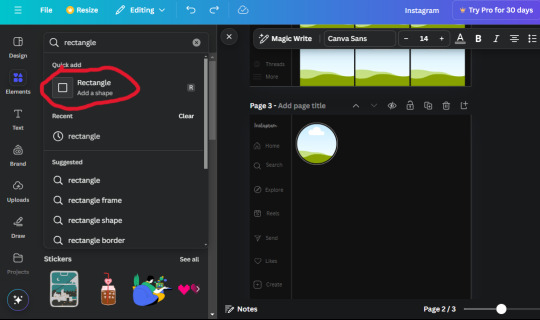
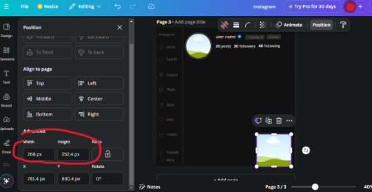
20. Open the "elements" tab again and search "frame". Choose the first one.
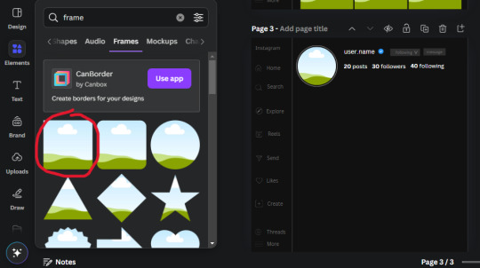
We want the height and width to be 268 x 252.4. Place it at the bottom of the page but we want some space between the frame and the page.
Now we'll duplicate the frame we just placed (the icon between the comment and trash can on the pop up above the frame). Place it next to the previous frame but we want to leave a bit of space between them like this:
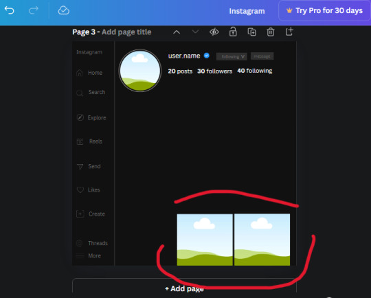
If its a little wonky, don't worry. You can always adjust it so it looks right.
Duplicate the frame again and place it next the second frame you just placed, same distance between. Make sure they're even. Now we have a row.
Select all three frames and duplicate them. Move them above our original frames but leave a little space between them.
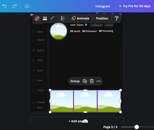
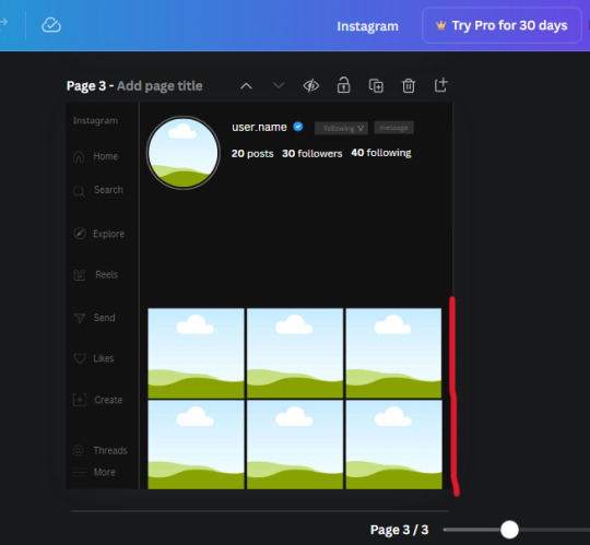
Again, if they're uneven, adjust them as you need to.
21. Select the line again from the elements tab. Stretch starting from the top frame to the last frame and make the color grey (#2F2F2F).
Because the line is stupid hard to navigate, use something like a text box to mark where you want it to end like this:


Delete the text box and the line with be where we want it.
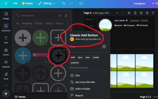
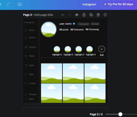
22. On to the highlight reels. Seach for "add button" and find the one by Barudak Lier.
Change the heigh and width to 81.1 and move it above the border.
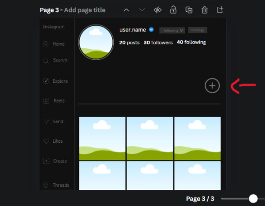
Search for circle frames now and add this one to the page (The same one we used for the pfp), change the width and height to 85.4 and move it next to the add button. Since this is a generic, blank template, I add about 4 of these highlight frames but you can do however many you want. You can change the border color to a gradient or leave it grey.
Add a text box now. The font will be Canva Sans, the size will be 18.1 and the color will be white. Change the text to "Add" and place it under our add button. Make more of these text boxes to place under the circle frames. Depending on which frame its under, write "Highlight 1", "Highlight 2", etc. etc. or you can give them different names and such.
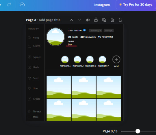
23. Add another text box, write "name" and bold it, change the size to 19.1 and the W and H to 69.2 x 28.8. The font will be Canva Sans and the color will be white. It will go under the amount of posts, followings and followers.
Add another box. The font is Canva Sans, font size to 20.1, the W and H is 40.8 x 31.3 and the color is white as well. This is our "bio". Place it under "name".
Yay!🎉🎉🎉 You're halfway done!
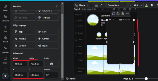
24. Search for a shape in the elements. Look for the rectangle again and add it. Change the width and height to 460 x 760.4 and the color to an off black/grey color (#191919), placing it like this:
Get the same kind of square frame we used before to make the profile grid and make it the same size as the rectangle we just added. Place right up against the rectangle like it's its other half. Add another line like before and span across the upper half of the black rectangle as a border then add a circle frame inside the border.
Add a text box, "user.name" and align it with the frame. The text is white and the W and H is 111.5 x 25.9
25. Add more circle frame along the inside of the rectangle to resemble the comment section. Make sure the W and H of the frames are 46.1.
Add more text boxes that align with the frames you just made and write "username" again and bold them. Add even more text boxes that align with the usernames and write "comment". These are place holders for when you decide to use this template.
Add another rectangle on the lower part of the rectangle and make the color black. and search for "instagram heart icon", "instagram comment icon" and "instagram send icon". Make sure the lines are thick. Find the heart icon by sketchify, and the the comment and send icon are by Mirazz Creations. Make the lines white and make sure the W and H are the following:
Heart icon: 38.7 x 32.9
Comment icon: 35.2 x 35. 8
Send icon: 35 x 32
Next, look for "instagram bookmark icon" and find the one by Adricreative. Change the color to white and the W and H to 29.7 x 40.2. Move it to the other end of the rectangle.
26. Now add three circles frames and change the W and H to 37.2. Move them below the heart icon and have them overlap each other some. Then, add a text box and write "liked by username and 1000 others". Change the font size to 13.6 and change the font to Canva sans. the color will be white. Align this with the three overlapped frames.
27. Look in the elements tab for an emoji icon and choose the one by Soni Soukell from Noun Project. The W and H will be 32.8 and the color is white.
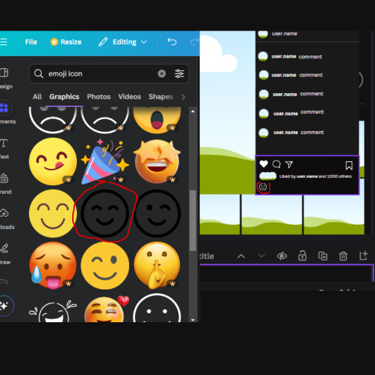
Now add a another text box and write "Write a comment". The color will be white, the font size will be 14.2 and align with the emoji icon you just placed.
Search for "next arrow button" by Pixeden and make the W and H 42.8 then add it to both sides of the post.
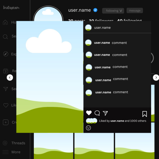
And you're all done with your template! All that is left to do is fill it but before doing that, duplicate the page so you always have an extra blank mockup if you want to use it again.
To fill the frames, upload an image (or use a Canva stock photo), drag and hover it over the frame and it will fill the frame.
Hope this was helpful and you you successfully made one :D <3
#requests#text#smau#template#mockup#moodboard#instagram#instagram moodboard#instagram mockup#graphic design#canva#psd#free tutorial#tutorial#instagram au#social media au#free psd#photoshop#resources#fanfiction resources#graphic design resources#graphic design tutorial#psd tutorial#photoshop tutorial#au#au ideas#mockups#digital design#digital design tutorial
170 notes
·
View notes
Text
PHOTOPEA TUTORIAL / PHOTO FILTER FOR SKIN TONES:
a tutorial on HOW TO BRING OUT SKIN TONES if an image is 'too gray' (faded) or has too much of one (likely over saturated) color! this technique can easily be applied to icons that already have a border ! just put your focus on the base image / icon ! this works on relatively anything, including poc and non-poc. WHAT YOU WILL NEED: photopea...and your desired your base image(for example, i'll be showcasing inconsistent or otherwise dark/faded scene lighting, like twilight and saw). DISCLAIMER: not all lighting/images are the same, nor are psd colorings. while some colorings may be designed to bring out reds/yellows(which is the filters we'll be using in this specific example), others may mute them and you may have to improvise with whatever color the psd you're using is designed to focus on. this is just a general idea, you will have to explore as you see fit. it's all going to depend on your personal taste !
by the end of this, you should be able to manage results like this !

cool, huh?....anyway, on with the mechanics !
EXAMPLES:

[ BEFORE PSD ] [ SYNOPSIS ]
#01 / LEFT IMAGE ABOVE: too much green, becomes muted with psd and doesn't show variety. #02 / RIGHT IMAGE ABOVE: the colors are very faded in this scene, and the pink focused psd in question made the image seem gray. we will start with EXAMPLE #01. i will be using the same PSD on both, a custom psd i made and focuses on reds/pinks.

as you'll see above the PSD has now been applied...but now it's kinda boring :// (there's nothing wrong if you don't mind how it is above, everyone's got their aesthetic choice—HOWEVER, we're aiming to add skin tone...)
once you have your image open, you'll want to go to image>adjustments>photo filter; i went ahead highlighted it in yellow for easy finding !

since this psd DOESN'T mute reds/yellows, (and those are usually the base of most/general skin tone combinations) i applied both a yellow and red filter. now, these colors i'll be using in this example, because they're in my default colors on the photo filter option—you can totally choose lighter or darker variants of these colors, or like i said, a different color altogether based on how the PSD you're using works. the toggle setting doesn't have to be exact to this example either—this is just what worked best on this image combined with the chosen PSD ! // RIGHT IMAGE IS THE FINAL RESULT AFTER APPLYING THE RED FILTER AFTER THE YELLOW.


repetition on a different example . . .


this scene in particular is very faded, and the red feels a little blotchy/over saturated here...so i'll show you an EXTRA STEP you can use ! in saying this, you don't have to do exactly this; you can even choose to go ahead with selective color to fix your image, without doing the filters, if you find that suitable. but i'll be showing you the magic of selective color to balance out the red toned overlay.

same concept as before, just a different selection: image>adjustments>selective color. think of selective colors as "balancing" the colors. it does have a toggle selection for each color, which is super helpful, including diminishing or adding white highlights. given the PSD colors, naturally, i'll be focusing on yellow and red.


it's now got a general skin tone and red is not as blotchy !
[ FINAL RESULTS / CONSISTENCY WITH PSD APPLIED ]

this is a great hack i use quite a bit, it's great for maintaining consistency in your icons when the lighting is working against you...hope this was comprehensible and helpful, happy editing !
#* RE - RELEASE#* MY TUTORIALS.#sorry i didnt realize i forgot to reupload this one!#long post /#FREE TO REBLOG !#rp community#icon tutorial#rp icon tutorial#psd tutorial#roleplay coloring#roleplay help#roleplay resources#roleplay community#roleplay graphics#coloring psd#psds#icon psd#psd#roleplay psd#rp graphics#rp psd#rp resources#tutorial#editing tutorial#rpc tutorial#editing resources#psd coloring
254 notes
·
View notes
Text

…make reply icons?
reply icons (or as i call em, replycons) are a weird kind of edit. they’re in the same genre as rentry or carrd graphics—i.e., that you can do whatever you want with no real rules. that said, these are some guidelines i follow
i. make your canvas much wider than it is tall
there’s no exact measurement for this. my reply icons for this blog are 600x150, but they’re fairly uniquely small. the general consensus at least amongst my peers is about a 4:1 or 3:1 ratio will work best.
the reason why your replycons should be wider than longer is because it keeps them from taking up a lot of space. here’s mine as an example:

enough space to be visible, but not so much as to be obnoxious. that should generally be your goal.
ii. collect a wide variety of expressions
this’ll be limited depending on your characters, but it’s best to have a good variety of expressions. i also save my files with whatever the expression is to me for easier searching but you don’t have to do that LOL
also, i feel obligated to mention it, but you don’t have to stick with just one character. you can use a whole group, either an in-game group (i.e. leo/need) or a visual group (i.e. blonde characters.) they don’t even really need to match, though it’ll look better if they do. with this blog and my old ones, i used a variety of characters with the same color palette so i could get the expressions i wanted.
iii. just make the damn thing
ah, the worst part of all editing—actually editing. god fucking damn it. now that you’ve got your canvas and your character(s) it’s time to grit your teeth and make some replycons
first thing i usually do is narrow down a theme. this can be as simple as a color or as complex as something like “cybercore” or whatever -core scratches your brain. for these replycons, my theme is just attempting to match the rest of my blog layout. god fucking speed.
it can sometimes help to make a thumbnail like this ^ but that’s 100% optional. i like to do it for tutorial purposes and it helps me to get my thoughts from my brain and into photopea. your thumbnail need not make sense nor be cohesive. it’s just for you to know
a good way to start is to make a shape and make it interesting—i usually make a shape and give it a border and some fun lines, rp style, but you don’t have to do that. all of those things can be done with just the shape tool. you can also find existing icon masks on tumblr or resource rentries (make sure you credit properly!!) and you can find some templates, like mine!
once you’ve got a theme and a base, start adding shit.

^ pretty easy base. i pixelated the lines around her eyes and added eyes, and added a stroke and drop shadow to the shape to make it easier to see! if you’d like, you can stop there. but i think it needs a background and some details so i’m going to keep going
background complete! for this i just used a color fill and went rasterize > filter > noise > add noise but you can add whatever you like—patterns, wallpapers, solid colors, etc. it’s up to you! i also added a small stroke around my character png so as to distinguish her from the background a little further :)
this one is a little blank on the left side so i’m gonna add some text and details!!

there we are. i added the cd png to break up the monotony of my base, added text because it’s my personal preference, and added a chibi so the text is distinguished! if you do add text, make sure it’ll be readable in any modes—light and dark. i typically add both a black and white stroke for this, and a drop shadow can help a lot, too!
an important thing to note here is any extraneous images of the character you add can’t be too distracting to the main image. if i had, for example, done this:
the new png is obviously too distracting, right? it takes up too much space and completely draws the eye away. this is even more true when the base and the png have conflicting expressions, like so:
because now i can’t tell what emotion you’re conveying—is the replycon happy or sad? what part do i focus on??
so it’s best to keep any extraneous decals pretty simple, for the sake of clarity. it’s also best to remember that english-speakers read from left to right, and native speakers are conditioned to interpret most things that way. you’ll want to draw the eye in that direction as you work, and not the other way around. hope that makes sense lmfao
iv. save as a psd
once you’ve got all your layers and details situated, make sure that you save your replycon as a psd. this is imperative, because it enables you to make new reply icons as the occasion arises, or you can recycle the basic components for a new theme!
if you’re unsure on how to save as a psd, click file in the upper left-hand corner and then ‘save as a psd.’ i recommend labeling it so you can file it more easily; i’m naming this file cobaltpegasi replycons, which is an easy template—just stick your url in instead.
once you’ve done that, keep adding expressions until you have a suitable amount of replycons! i usually made about five to ten to start with and then add new expressions as i see fit, but you can do whatever works best for you.
also, when saving your replycons, it helps to sort them by what emotion you think they convey. for example, my canarysage replycons are sorted by character and then by emotion—so this one is labeled “len smug” because that’s how it seems to me

you don’t have to do that, but i find it helps a lot when trying to find specific ones, especially if you have a lot.
v. go forth and use them
now that you’ve got your replycons done, you can use them! go forth and clear out those week old requests in your inbox (🤨) or whatever it is you want to do with them. that is all. canarysage signing off <3
…so that’s how you do it.
95 notes
·
View notes
Text

— COMO BUSCAR TEMPLATES?
Onde e como encontrar templates.

Recebi uma ask pedindo por um tutorial de como encontrar templates, e mesmo que seja um trabalho que não tem como eu facilitar, sei que muita gente chega aqui no tumblr e não sabe onde procurar e por onde começar.
Por isso, nesse guia, vamos discutir onde procurar templates para usar aqui no tumblr, seja em um blog pessoal, 1x1, blogs de personagens ou, até mesmo, em uma central.
Antes de tudo, como eu disse ali em cima, não tem muito como cortar caminho. Se você quer encontrar templates que gosta, vai ter que passar um tempo fuçando nas tags até encontrar o que você está procurando. Aqui você não vai encontrar uma fórmula mágica, e é importante saber que demanda tempo além do que você vai dispor para editar seu template. Dito, isso, vamos começar.
Adendo: o casal do @twilightalks postou um super post com vários blogs e sites pra vocês encontrarem conteúdo pra edições e que vai facilitar muito a sua vida. Clique aqui pra ser direcionado para o post!
RPHs
Primeiro, a maioria (se não todos) os tumblrs de rph reblogam templates. Você pode abrir um rph da rp br ou da tag gringa e vai encontrar resources, isso é fato. Mas se você não sabe o que procurar, abrir um blog não vai te ajudar tanto assim, já que é impossível ir olhando página por página.
Para facilitar a sua vida, eu vou colocar aqui algumas tags de helpers brasileiros onde você encontra templates:
jackhelps
#char psd; templates específicos para introdução de personagens. #ps template; templates em geral. #icon borders; templates para banners & ícones. #psd; psd para aplicar em imagens. #dividers; divisores para posts.
sakurajjam
#( templates ) #( psd ) # ♡ · ❄️ : photoshop
neozhelps
#⊰ 🍄:photoshop resources ˎˊ˗
desireeh
#templates
yeagrist
#* ⠀𓈒 ׄ ✮ ﹕ 𝐫𝐞𝐬𝐨𝐮𝐫𝐜𝐞𝐬 ⸝⸝ template . # * ⠀𓈒 ׄ ✮ ﹕ 𝐫𝐞𝐬𝐨𝐮𝐫𝐜𝐞𝐬 ⸝⸝ psd .
gwldcnz
#m: templates. #m: dash icons. #m: graphics. #m: colorings. #m: ps resources. #r: templates. #r: colorings. #templates. #colorings.
yixinc
#template
twilightalks
Mega post de help com vários links úteis, incluindo perfis de criadores de conteúdo.
Tags
Certo, mas onde esses rphs procuram esse tipo de coisa pra reblogar? E se não encontrar nada ali, como procurar?
Pra ir direto na fonte, você vai precisar usar as tags do tumblr. Se você notou ali pelos links, temos termos específicos mas em geral usamos template em rph. É assim com todo conteúdo? Não, você vai precisar pesquisar tags específicas pra encontrar algo que você procura.
#rph
Essa é a tag geral de helpers do tumblr, então você pode encontrar conteúdos em geral, como templates, gif packs, pngs, etc. Não é frequentemente que vejo templates por ali, a maior parte dos posts é de gif packs, mas pode ser que você encontre algo se der uma olhada pela tag.
#rp resources
Resources variadas, desde pngs, templates, ícones, etc. Aqui você vai encontrar tudo mais misturado, e com outros tipos de resources como starters e etc. Se você está procurando algo mais específico, pode dar um trabalhinho. Se não, vai encontrar bastante coisa bacana.
#rp template #psd template #rp psd template #graphic template #photoshop template
Nessas tags você encontra templates gerais. Acontece de ter alguns posts irrelevantes, mas, em geral, são só templates que você pode usar, só precisa filtrar conteúdo gratuito.
#character graphic #character template #character psd #char psd
Character psd/graphic/template são aqueles templates que se encaixam em fichas. São especificamente feitos para mostrar personagens, e podem ser usados como fixado também. Alguns têm espaço para nome e outras informações, outros são focados só em imagens. Quando você estiver buscando esse tipo de template, as tags acima são ideais para essa busca.
#rp psd #psds #free psd #psd
Quando você quer encontrar ajustes de cor para colocar nas suas imagens, e não templates, as tags que usamos são as de psd. Nelas você encontra psds gratuitos e pagos, alguns que só alteram coloring e outros que alteram as cores de forma mais extrema.
Outras tags úteis:
#faceless gif pack para packs de gifs de cenários, pessoas que não mostrem os rostos, objetos, etc.
#aesthetic pngs #transparent png #png icons #transparent icons para ícones em png. Podem ser usados em templates e como ícones.
#dividers #tumblr dividers #aesthetic dividers #post dividers são os divisores de posts em png.
#icon border #free rp icon border #icon borders sendo bem sincero eu só me deparei com esses templates recentemente, vejo eles sendo usados (e já usei) como banners.
#dash icons template são os templates pra fazer ícones transparentes pra dashboard.
Deviantart
Se você pretende usar templates com frequência, vai ter que se acostumar a usar o Deviantart. É um site onde criadores postam arte, mas também armazenam templates, psds, e etc, e disponibilizam para baixar. Alguns criadores aqui do tumblr armazenam lá, e você recebe um link para baixar pelo deviantart, e outros você só encontra por lá.
Para baixar, você vai precisar criar uma conta, o que é bem simples de se fazer, e depois ir até o link do que pretende baixar. Embaixo da imagem do template, você vai encontrar esses botões:

Você clica na seta de download, e o conteúdo vai ser baixado. Algumas vezes vem direto como psd, outras em uma pasta com arquivos, ou até mesmo um arquivo zipado. Depende do criador.
Mas atenção, se você entrar em um conteúdo em que no lugar da seta, apareça o valor, assim:

Significa que esse conteúdo é pago, infelizmente.
Mas, além de ser direcionado para o Deviantart apenas para download, você também pode pesquisar templates diretamente por lá. Eu considero até um pouco mais fácil, pois você consegue especificar exatamente o que está buscando.
Exemplos:


É claro que vai surgir algum conteúdo que não interessa, mas você consegue fazer uma busca mais direcionada ao que você está buscando.
Aconselho sempre adicionar o termo template no final da busca para garantir que você filtre por templates mesmo, e buscar usando termos em inglês pra ter mais resultados. Depois é só ir selecionando os que você gostar e conferir se não são pagos. Não se esqueçam, é claro, de dar uma olhada na descrição do conteúdo para saber como o criador gostaria de ser creditado.
No post do twilightalks também tem uma lista ótima de usuários que postam templates, o que facilita essa busca.
Buscar templates é um trabalho um pouco cansativo, não tem muito como correr disso, infelizmente. Mas sabendo onde buscar facilita bastante e poupa um pouco do seu tempo. Então espero que esse guia ajude, e qualquer dúvida, só chegar na ask!
25 notes
·
View notes
Text
How to make icons like these:


Flags: Idol system, Bubblegender, Musicstar
Warning: This tutorial relies on the idea that you have some understanding of how to use photoediting software like photoshop, however if something that doesn't make sense then feel free to ask and I will explain it as best as I can.
All the icons we made for this can be found here! Thank you for reading, please consider reblogging this post and the icons because this took forever to write up and the icons take a LONG time to make.
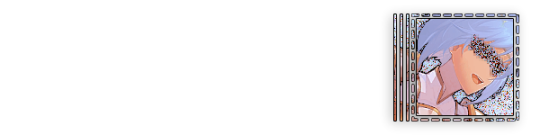
In this tutorial I will make DID/OSDD Aoi Miyake icons.


Anyway let's get into it!
Step one, choose what you're going to make (and gathering resources)
This may seem obvious, but going in with a plan makes these so much easier.
In this stage we consider three things:
The flag and/or colors we want to use in the icon, this is important as it can affect the images used or even the character depending on how similar their colors are
Character and the general colors associated with them, this is important as it can makes the filtering stage easier (or harder) and can make an icon look 'wrong' or 'right' sadly
The border of the icon and how that will affect the icon itself, sometimes they're easy to work with, others not so much. Our method differs from a lot of other peoples so we take more time with them than most others
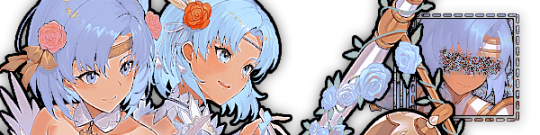
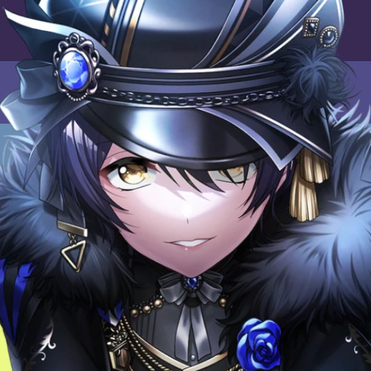
In this case I will be making DID icons of Aoi Miyake from D4DJ, however due to how most of her cards have a blue tint I will be using the plural peafowl flag by m0dem0n than the original DID flag- This is to save time and make th icons look more harmonious.
We will also be using this mask by i'mjustchillinghere as the icon base


Step two, coloring the middle image (optional step)
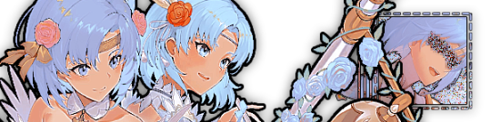
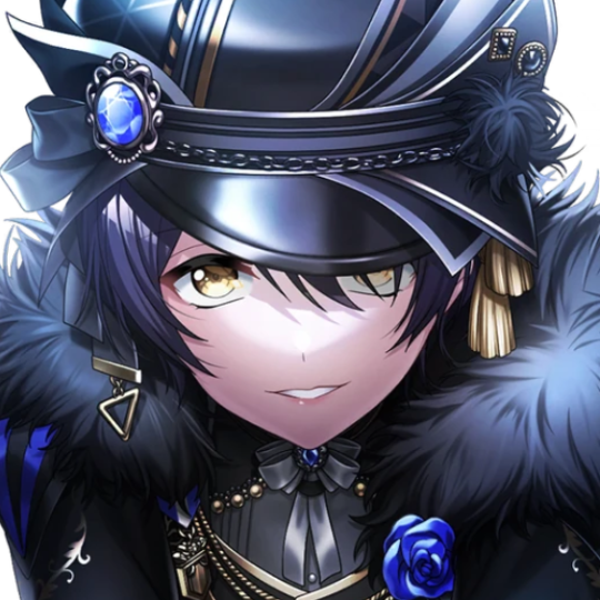
This is a lot of guess work and everyone has a different process for this. Essentially we're going to make a PSD that makes the image look better with the colors of the flag.
As shown above we have the flag and the character image, but they don't match completely. The rose and other blue accents are too saturated compared to the flag and the black is too black and the wrong blue hue, the eye could also be a bit greener and saturated imo.
What I like to do is open the image with the flag behind or infront, so I can see the colors I'm working with.
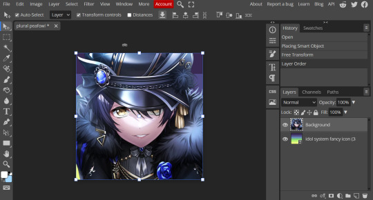
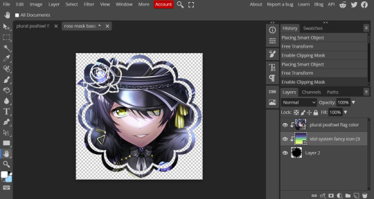
Then I open the hue editor layer (Layer > New Adjustment Layer > Hue and Saturation). It's very important to clip the hue layer to the image so it doesn't start messing with the colors of the flag (we've had this happen many times before it's very awkward trying to match a color that keeps changing) to clip right click 'Clipping Mask'.
Your screen should then look like this:
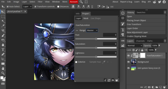
Okay so if you need to adjust the screen to get the icon in the center so you can see everything do this now.
Next where the box with the hue options says master, click it.
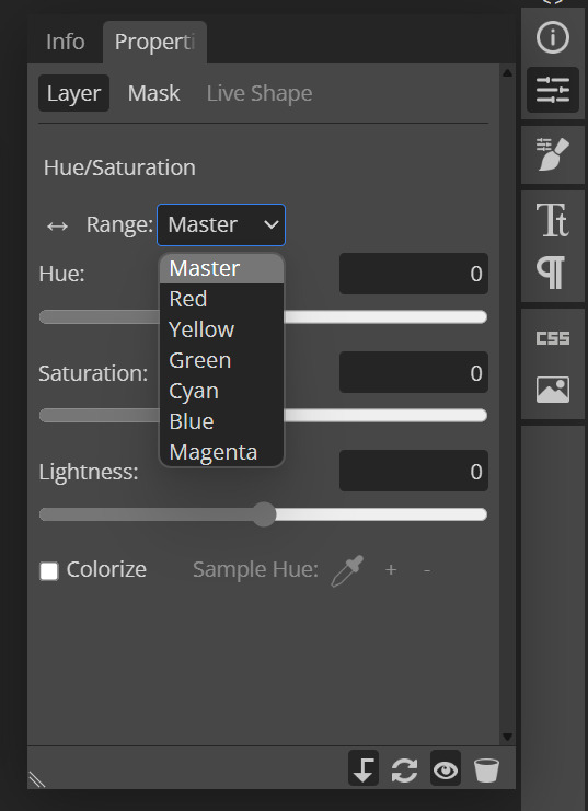
These are all the color options you can change, in this we'll mostly be using, yellow, green and blue. For other projects blue and cyan sometimes get 'mixed up' and can control both shades so be careful with that.
Other color settings we personally use are: Vibrance and Selective Color (both are located under the Layer option), but in this case I'm happy to just use Hue and Vibrance.
This is what the icons look like:

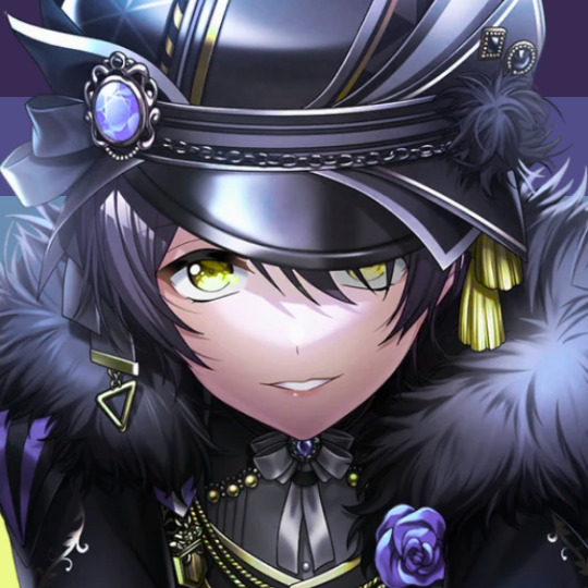
No color editing | Just Hue and Saturation | Hue and Saturation + Vibrance
Now your middle icon is ready turn off the background layer and save the image as a transparent png!
Step three, preparing the mask for use
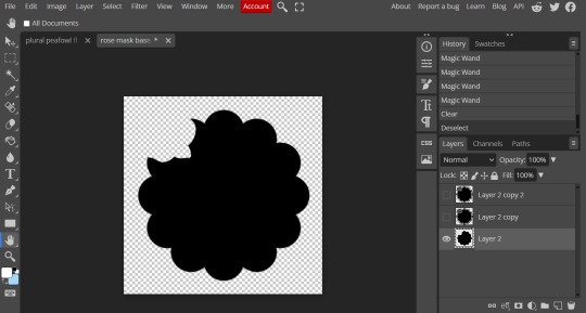
So the mask is the base of your icon, however if you clip all aspects of your icon to the mask it looks like this and you can't see the flag.
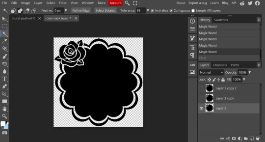
So what you need to do is layer the mask. This will vary in difficulty, it can depend on how far apart the pieces of the mask are and how they interlink. You could erase the border parts but that takes a lot of time.
This icon is simple because to me there's three clear sections, the middle part, the border and the rose. What you need to do is copy the layer three times and get the wand- I would reccomend having the wand strengh over 100 or else black lines may remain, but this will depend on how close the black parts are.
Hide the top two layers and work from the bottom up. Select all the areas you want to delete, in this case I can only delete the rose (the border is too close to the middle part and would delete that as well) and then hit delete.
In this case, I will just erase the border by hand, and then BOOM, you have a base!
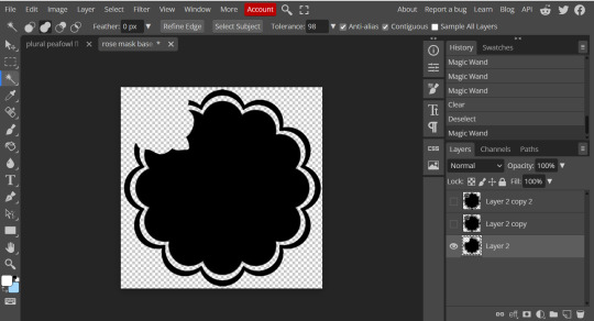
Hide this layer and move to the next, for this one I'm removing the middle and the rose.
For the next layer you can select what's in the layer below and delete it without it impacting the border, which makes the icon process easier, however in this case I'm going to give out the border layers for you here!


Step four, using the mask
NOW you can clip the flag to the layers! We always clip it to the base and border layer.
As for the rose... We make a seperate layer and clip it to those rose. Then (using the eye dropper tool) pick colors from the flag to use to color it in! As shown:
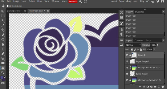
Next step is to add the image you colored!
Go to File > Open and Place and then choose the PNG from your gallery and place it in the icon. Once it's there fiddle around with it until you get the image you want and then BOOM!

Now you have a singlar icon!
Feel free to repeat this as many times as you want and make as many icons as you want.
-
All the icons we made for this can be found here! Thank you for reading, once again please consider reblogging this post and the icons because this took forever to write up and the icons take a LONG time to make.
101 notes
·
View notes
Text


a blog for editing resources, including overlays, cutouts, line stickers, psds, tutorials, etc. run by @/grimescum. how to request
please at least skim over everything under the cut. if you dont, i reserve the right to be a little bit of a bitch about it
( ! ) message board –
jan 14 📌 updated tag list!
jan 4 📌 inbox & requests back open!
📌 donate to my ko-fi if you'd like! ♡
( ! ) content – with the exclusion of graphics taken from picsart and occasionally pinterest, i only upload raw, unedited graphics to be used in edits.
– the same generally applies to images of characters; i don't upload cutouts of fanart unless the artist has given permission for their artwork to be reuploaded
– my crediting can be a little wonky at times, but i generally don't credit pictures sourced from large companies such as walmart.
– this blog has no queue, i post whenever i feel like it
( ! ) interaction – spam likes and reblogs are perfectly fine in moderation!! if you're going through an entire tag and liking/reblogging everything you see, i'll block you temporarily
– credit for my work is not necessary, but it is advised to credit the original creators for their work if provided.
– i block freely, mostly according to my main blog's dni. don't be stupid. this also includes r4dqueers and pr0ship.
( ! ) other asks – i read them all! kind comments are part of what keeps me going, so regardless of how quickly i respond to them, know i appreciate every single one deeply.
– you can also ask for a promo!
( ! ) requests – i take requests for finding pngs of or based on whatever you give me, be it a character, prompt, aesthetic, image, etc.
– i'm selective about what i choose to do, so please don't be upset if i decide not to. it's nothing against you personally.
blacklist, media i won't do or will be very picky about: d/smp or related, genshin impact or anything by hoyoverse, kp0p, harry p0tter, p0rn (because of guidelines)
whitelist, media i will do no matter what: any of the fandoms im into!
– i'll also try to find the source of any image you send to me if you can't or don't feel like doing it yourself.
– i have autism, so being as specific as you can helps a ton! there is a difference between edits "based on" and "of" a character to me. also, if you want a certain kind of graphic (ie. a drawn divider rather than an image cutout), please do clarify that
( ! ) tag directory – under construction! a new tagging system is coming soon. for now, please refer to my rentry.
edited by me, fandom, inspo, made by me, op talks, promos, psds, reblogs, resources, tutorials
backgrounds & images, banners/headers, basics, borders (cutouts), borders (drawn), colorable, cutouts, digital scrapbooking, digital stickers, dividers, drawings, fonts, frames (cutouts), frames (drawn), gifs, icons, masks, overlays, patterns, templates/bases, textures
from canva, from flaticon, from google drive, from line, from picmix, from picsart, from pinterest, from pngwing, from roblox
aesthetics
( ! ) miscellaneous links – other links worth putting here.
archive this blog! internet archive (no dl) grab-site (dl) archive bot (dl) httrack (dl) imgdownloader (no dl)
posts 99 resource sites my psds
more resources eros' resources pluto's resources
my resource drive (decode from base64 to get link) aHR0cHM6Ly9kcml2ZS5nb29nbGUuY29tL2RyaXZlL2ZvbGRlcnMvMUxDUGEyV3JnZFpVdHFvNVVPeVZYLTJCWHpJTnVZQVJD
#!! .rblgs#!! .edited by me#!! .inspo#!! .tutorials#!! .psds#!! .op talks#!! .made by me#ℹ️ : masks#ℹ️ : borders (drawn)#ℹ️ : overlays#ℹ️ : cutouts#ℹ️ : digital stickers#ℹ️ : frames (cutouts)#ℹ️ : dividers#🔎 : from pinterest#🔎 : from picsart#🔎 : from canva#🔎 : from line#🔎 : from flaticon#ℹ️ : digital scrapbooking#ℹ️ : textures#❓︎ : text
35 notes
·
View notes
Note
[waddles in] Hello! I just saw some of your Sonic icons and I have a question for you, if you don’t mind! How do you make those pride borders? I have been. Going insane. Trying to find a tutorial somewhere. 😭 Maybe it’s because I use procreate? I’m humbly begging for your advice, oh knowledge one 🙏🏻
I use Ibis, but this should work for Procreate.
If you just want circles:


Use a clipping mask to attach the flags to the black circle. Then, use a clipping mask to attach them to the gray. My layers look like this:

For any other shape:
Get a transparent image of the shape and put it into your program. Size it down so that it doesn’t touch the edges of the canvas. Duplicate the layer and use a border tool (Ibis has one built in but from what I know, Procreate doesn’t, so here’s a website that does it for free). Adjust the width of the border until you’re satisfied. Then do the same as the circle (clipping mask flags to layer with border and character images to layer without border)
#using this to clarify: ik ive been kind of dead for like days but! it is exam season time lmao#gotta lock in and get those As#But once exams are done trust that all requests will be posted and icons will be made like a flower makes pollen#i have. So many drafts.#not icons#icon tutorial#how to make icons#icons
9 notes
·
View notes
Note
Hi! I’m absolutely in love with the look of your carrd and was wondering how you customized it :) I’m new to the site and how to use it and stuff
Thank you! If you're not familiar at all with the site and want a really introductory crash course this post explains the basics of building elements on a site better than I could
Honestly I have not done anything fancy I really just slapped some elements on there and played around with the appearance settings until I liked it, even the grid background is something you can add within carrd. This page is just a text element (the header), buttons element, and some containers broken into columns so I could add the text and images next to each other. the only slightly weird thing is the "about" title with the little icons is actually an embedded HTML element which is only available with the pro plan features and I used it to add the font awesome icons (font awesome my beloved). There are lots of settings for adding borders, drop shadows, etc to different elements and stuff. My gallery page is just a gallery element I added a bunch of pics to as well. I would like to try doing more interesting stuff with carrd at some point but if you're fine with the structural elements being relatively basic I think there's a good amount of aesthetic customization you can do that's built in
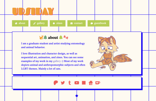
#the guestbook is also an html embed from 123guestbook#ask#anonymous#I would love to make a real site or neocities or something also but I have minimal coding skills and it's not worth the time sink for me#so I use carrd for now
143 notes
·
View notes