#icon tutorial
Explore tagged Tumblr posts
Visit Tumblr Blog
Explore Tumblr blogs with no restrictions, modern design and the best experience.
Last Seen Tumblr Blogs


Fun Fact
US Tumblr user growth rate is estimated to slow down to 4.1%.
Text

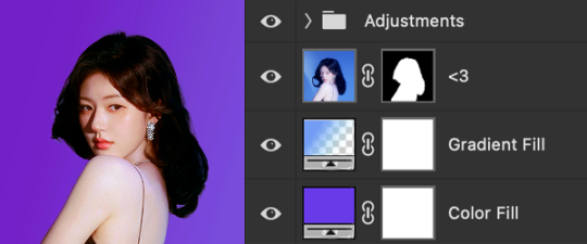
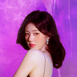
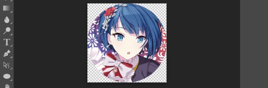
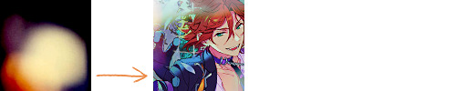
Hi! I got asked if I have an icon tutorial so I thought I'd do my best to go through my (probably way too long) process :) I'm going to show how I made that icon up there 👆
When I first started making icons I used this great tutorial by @/strwrs and then slowly added my own preferences to make this chaotic process 💕
First for getting screencaps of things i normally just google "[name of show/movie] screencaps" but one of the ones I use a lot is this site.
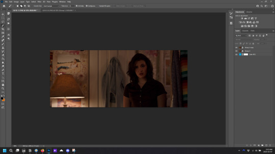
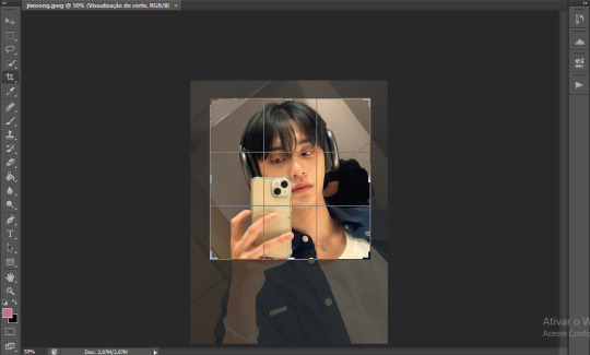
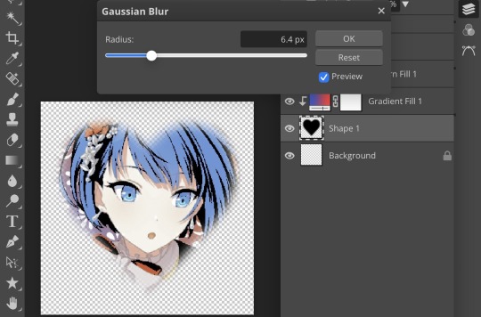
1. Open the pic in photoshop and crop it
Here's the full image:

Here's where I'm cropping it:

I like to make the size of my icons 250x250 but it can be more of a preference thing, a lot of people use 200x200 or I've seen 100x100 too.
I also like to crop a little above the image sometimes to give more space above the head
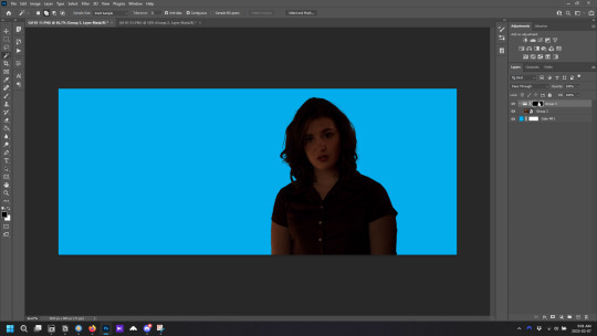
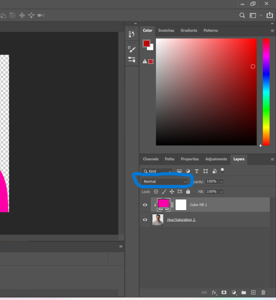
2. Removing the background
Removing the background is way easier on animation than on real people sometimes so I can show 2 examples even though I do it the same way...
First I go to select > select and mask:

Then I use the quick selection tool to select as much of the head as i can and the brush tool to remove/re-add parts that got missed so it should look like this:


(is the quick selection tool great? not all the time but when it works well it's great 🤡)
For something like this where her hair has a lot of texture in it and it's difficult to get a good outline, I'll zoom in really far and use the brush tool to get as many of the big pieces as I can so it looks a little more natural when the background color is added

Sometimes there can be a white/black line around the icon that got missed from erasing the background and you can use the brush tool to erase that as well.
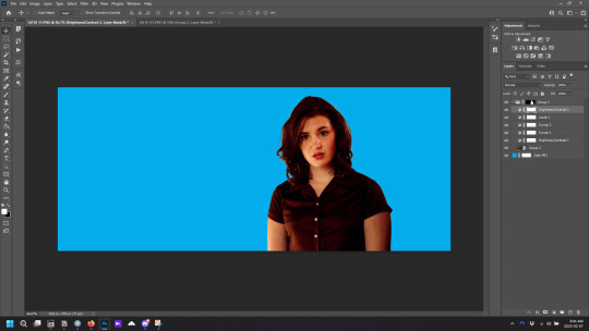
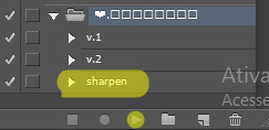
3. resizing and sharpening
Now everything should look like this:

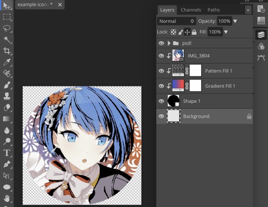
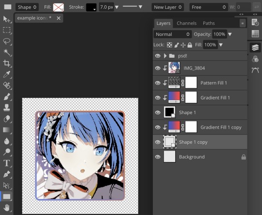
I'm going to go to the right where my layers are at and create a new group by clicking on the folder at the bottom
Then I drag the layer mask up to link it to the group instead of just the image and drag the image into the folder:

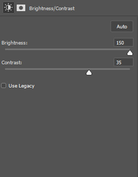
Next I like to sharpen before I resize the image so I open the group and highlight the image layer and then go filter > convert for smart filters and then for sharpening: filter > sharpen > smart sharpen with these settings:

Now with the image layer still highlighted i go to image > image size and set it to 250x250

4. the fun part ✨
Now we can add the background color and everything else ✌️
I have a lot of previous templates saved to save me time so what I normally do is open a psd template I have then highlight the group layer i just made then right click > duplicate group and have the destination be the psd and then I can just change the colors of gradients i've already made (For this tutorial though I'll show you how I make the gradients/paint layers)
For coloring this is pretty much what my process usually looks like (im probably going way overboard with it but oh well lol) it really depends on the pic being used, some don't need to be colored as much.
I have found that over brightening/upping the vibrance isn't necessarily a bad thing sometimes (not all the time though) because of how small the icons are it kind of helps the image stand out more when they're used but it's up to you!
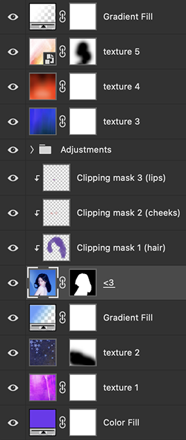
(I also put all the adjustment layers into one group because it gets a little chaotic if I don't)

Next we're going to make a gradient ✨ first i go to the adjustment fill button (?) and pick gradient

Then I just pick one of the generic photoshop options that kind of has the look I want ( it doesn't matter too much since it will be edited so it can be any color)

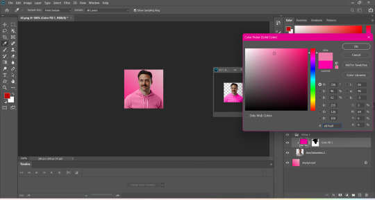
Now to change the color of the gradient click on the color part in the gradient section and you'll see this

I deleted the bottom middle square because I didn't want it, but to change the colors double click on the bottom left or right squares and a color wheel will pop up.
When I pick the lighter color i normally just go up to a lighter section above the darker color
This is the change i made, you can move the middle diamond slider to have the darker or lighter color be more prominent

Next is playing with the angle/scale until it's how you want it, these are what mine ended up being

I also normally adjust the angle so that the lightest part of the gradient is in the top corner where the light source is coming from in the icon pic to make it look more natural
Next I add a solid color layer over the coloring layers with a color that's similar to the background gradient color im using and switch to the brush tool with black paint and with the layer mask selected on the solid color layer paint over everything i don't want colored with black
Then I do a second solid color layer set to a lightish brown, normally on just the hair, to add a bit more contrast

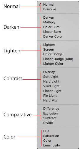
then i set the color fill layer that matches the background to either overlay, soft light, or color (depending on which one looks best for the image) and adjust the opacity/fill to where I want it.
I always set the brown layer to soft light with the opacity at around 80%
And NOW just when you think I might be done...I'm not...because I have to make this process as long as possible 😂
Now I do another color fill layer but this time over the entire image group layer. I normally make the color a slightly lighter color than the darkest part of the background color, set it to soft light, lower the opacity/fill to about 50% or lower, (depending on how much it changes the pic) and then right click > create clipping mask so it only effects the image and not the background
This kind of just tints the image a little with the color to bring it together a little more

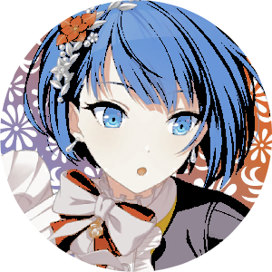
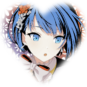
Now the icon looks like this:

You can add more fun stuff like doodles/background textures i've used these and these but there's a lot of resource blogs like @/completeresources and @/allresources that have long lists of different textures
If i wanted to add a texture though i would put it over the gradient layer and set it to overlay or soft light


And to add a doodle you just put it at the very top of everything and resize it/turn it using the move tool :)


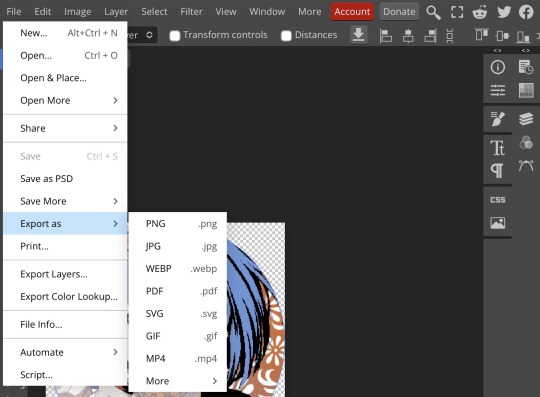
Then you're done! you can go file > export > quick export as png and thats it 👏
Hopefully this makes sense! I've uploaded the template i made in the tutorial here if that's easier to follow but feel free to ask if you have any questions!
#icon tutorial#dailyresources#completeresources#icons#tutorial#tutorial*#photoshop tutorial#usertana#userzo#tusertha#ps*
78 notes
·
View notes
Text
PHOTOPEA TUTORIAL / PHOTO FILTER FOR SKIN TONES:
a tutorial on HOW TO BRING OUT SKIN TONES if an image is 'too gray' (faded) or has too much of one (likely over saturated) color! this technique can easily be applied to icons that already have a border ! just put your focus on the base image / icon ! this works on relatively anything, including poc and non-poc. WHAT YOU WILL NEED: photopea...and your desired your base image(for example, i'll be showcasing inconsistent or otherwise dark/faded scene lighting, like twilight and saw). DISCLAIMER: not all lighting/images are the same, nor are psd colorings. while some colorings may be designed to bring out reds/yellows(which is the filters we'll be using in this specific example), others may mute them and you may have to improvise with whatever color the psd you're using is designed to focus on. this is just a general idea, you will have to explore as you see fit. it's all going to depend on your personal taste !
by the end of this, you should be able to manage results like this !

cool, huh?....anyway, on with the mechanics !
EXAMPLES:

[ BEFORE PSD ] [ SYNOPSIS ]
#01 / LEFT IMAGE ABOVE: too much green, becomes muted with psd and doesn't show variety. #02 / RIGHT IMAGE ABOVE: the colors are very faded in this scene, and the pink focused psd in question made the image seem gray. we will start with EXAMPLE #01. i will be using the same PSD on both, a custom psd i made and focuses on reds/pinks.

as you'll see above the PSD has now been applied...but now it's kinda boring :// (there's nothing wrong if you don't mind how it is above, everyone's got their aesthetic choice—HOWEVER, we're aiming to add skin tone...)
once you have your image open, you'll want to go to image>adjustments>photo filter; i went ahead highlighted it in yellow for easy finding !

since this psd DOESN'T mute reds/yellows, (and those are usually the base of most/general skin tone combinations) i applied both a yellow and red filter. now, these colors i'll be using in this example, because they're in my default colors on the photo filter option—you can totally choose lighter or darker variants of these colors, or like i said, a different color altogether based on how the PSD you're using works. the toggle setting doesn't have to be exact to this example either—this is just what worked best on this image combined with the chosen PSD ! // RIGHT IMAGE IS THE FINAL RESULT AFTER APPLYING THE RED FILTER AFTER THE YELLOW.


repetition on a different example . . .


this scene in particular is very faded, and the red feels a little blotchy/over saturated here...so i'll show you an EXTRA STEP you can use ! in saying this, you don't have to do exactly this; you can even choose to go ahead with selective color to fix your image, without doing the filters, if you find that suitable. but i'll be showing you the magic of selective color to balance out the red toned overlay.

same concept as before, just a different selection: image>adjustments>selective color. think of selective colors as "balancing" the colors. it does have a toggle selection for each color, which is super helpful, including diminishing or adding white highlights. given the PSD colors, naturally, i'll be focusing on yellow and red.


it's now got a general skin tone and red is not as blotchy !
[ FINAL RESULTS / CONSISTENCY WITH PSD APPLIED ]

this is a great hack i use quite a bit, it's great for maintaining consistency in your icons when the lighting is working against you...hope this was comprehensible and helpful, happy editing !
#* RE - RELEASE#* MY TUTORIALS.#sorry i didnt realize i forgot to reupload this one!#long post /#FREE TO REBLOG !#rp community#icon tutorial#rp icon tutorial#psd tutorial#roleplay coloring#roleplay help#roleplay resources#roleplay community#roleplay graphics#coloring psd#psds#icon psd#psd#roleplay psd#rp graphics#rp psd#rp resources#tutorial#editing tutorial#rpc tutorial#editing resources#psd coloring
259 notes
·
View notes
Note
hi! i love your icons, i was wondering if you could do a tutorial on how you remove the backgrounds? the lil hair details you have is so good idk how to word it 😭🩷
thank you rachel i'm glad you like them 😊
removing the backgrounds is a pretty simple process, but depending on the shot you choose, it can take a bit more work. i'm a visual learner, and tend to over-explain, so there's a lot of images
make sure to sharpen your image first, but don't resize/crop, or at least not too much, i find it easier to work with a large canvas. also, add a solid fill layer underneath your image layers, set it to a bright colour, we'll use that later.
Option A
if you've a got a shot with good contrast between the character/hair/clothes and the background, we have the quick option
copy your image layer, we're gonna work with the top one first
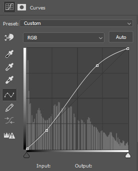
the image already has good contrast, but to make step 4 easier, we're gonna add a brightness layer, crank the brightness way up, and add a little contrast. then i also added a curves layer and just played around with the lines till i felt the contrast was enough
as you can see, she's ugly. but that's okay cause we're gonna get rid of that colouring later
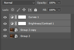
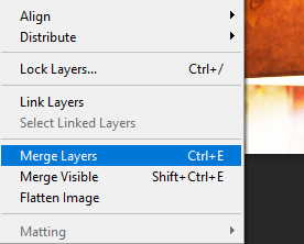
3. select the two adjustment layers, and any other adjustment you added, and also select the top copy of the image, the merge those layers layer/ merge layers (that is not your default merge layer shortcut, don't use it, i don't remember what it originally does)
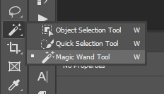
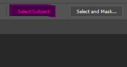
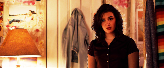
4. take the magic wand tool, and with the now merged layer selected, choose "select subject" from the top toolbar
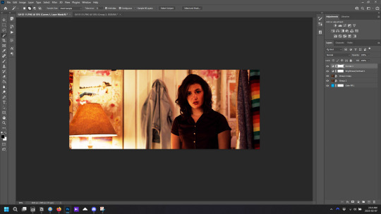
your image should now look like this, with the person outlined. if the outline isn't completely perfect don't worry about it right now
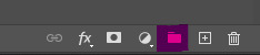
5. now select the bottom copy of the image, click create folder, and with the new folder selected click "add layer mask"
now delete the top merged copy, and you should be left with this
very dark
6. right click on the layer mask and select "disable layer mask" and you'll be left with the the original image.
7. you can now do all your base colouring for the icon. make sure the adjustment layers are inside the group you just made, so when you make your background underneath the group, your adjustment layers don't affect it.
colouring tips: toggle the layer mask on and off as you colour, because sometimes colouring that looks good in the scene doesn't look so good without the background. i tend to make the colouring brighter on icons than on gifs, so the character stands out more against the background.
now she looks pretty good, ready to be cropped and have a background added. but maybe the character outline wasn't perfect. the solid fill layer is to help see any errors in the outline. if there is we move on to step 4 of Option 2 and fix them
Option B
if the image you've chosen is darker or has little to no contrast, do steps 1-3 from option A first
4. add a blank layer mask to your merged layers (if you're coming from option A, use the layer mask you've already made) and select the paintbrush. for most of the image you'll want to use a brush between 20px and 50px, with a hardness of 50%. and now the not so fun part, paint over the background. toggle the layer mask off and on as needed to check what's background and what's character. make sure the layer mask is selected before you paint
painting tips:
-paint the outline first, then you can use a much large brush to quickly cover the rest of the background.
-move slowly, but smoothly.
-work in sections; don't try and paint the entire background with one mouse click, because if you mess up and use undo, you lose all the work.
-sometimes you should paint over parts of the character/clothes/hair to make it more cohesive. in the above image, the shirt juts out oddly on her left arm, and can pull focus without the original background, so i would paint over it to make it look more like her right arm
-for hair, use a smaller brush around any loose bits you want to keep. remember that the canvas you're working on is much larger than how the icon will appear when used, so you only need to paint over the parts where the background is very obvious. zoom out if necessary to see how it will look
5. when finished painting, right click on the layer mask and select "add mask to selection", then continue with step 5 of Option A. you can always adjust the layer mask after the final colouring if things don't look quite right.
and that's how you remove backgrounds for icons! probably made it seem more complicated than it is, but i'd rather tell you something you already know than assume you know it when you don't and leave you without crucial information. come back if you have any more questions
39 notes
·
View notes
Text
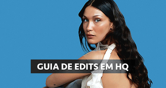
GUIA COMPLETO DE COMO EDITAR FOTOS EM ALTA QUALIDADE (HQ)!
oiê, bem vindos(as)! à pedidos, estou trazendo um tutorial bem abrangente sobre como editar fotos no geral para icons, headers, etc., em alta qualidade. neste guia/tutorial trarei dicas, truques e informações gerais sobre o que é preciso para editar em hq. lembrando que o conteúdo deste guia é sobre como eu edito, a maneira que funciona comigo e meu progresso e aprendizado ao longo de quase 12 anos editando icons, ou seja, o que contém neste guia pode — e deve — ser adaptado à sua maneira e ao software de sua preferência. aproveitem e se divirtam!
nota: este tutorial está bem longo, então, se possível, veja este guia pelo pc/notebook!
O QUE VOCÊ VAI ENCONTRAR NESTE GUIA
softwares necessários com links para download;
onde e como baixar as fotos para as edits;
métodos de edição e passo a passo;
como melhorar a qualidade de uma foto;
como salvar a foto corretamente para postar;
dicas de actions e outros resources.
clique em “continuar lendo” para ver o tutorial.
1. SOFTWARE
photoshop
eu recomendo fortemente o uso do photoshop cc na versão mais recente, ou outra versão com camera raw ou filtros neurais suportada pelo seu pc ou notebook.
você também pode usar o photopea como alternativa (eu particularmente prefiro o photoshop pois acho que as edits ficam com mais qualidade). se você preferir o photopea, algumas dicas desse guia poderão não funcionar devido à falta de algumas funcionalidades que o photopea não oferece (ex: camera raw, galeria de filtros, filtros neurais e outros).
eu uso a última versão do photoshop (atualmente, a versão 25.5.1) e uso a versão paga (obrigada adobe pelo desconto de estudante!!!!!), mas vou deixar alguns links para você baixar o photoshop gratuitamente caso você não seja estudante e/ou não tenha condições para assinar um plano.
atualmente eu uso um mac mini 2014 para editar, mas sempre usei windows, então, as dicas e os links valem para os dois sistemas operacionais.
links
macos: 1, 2 & 3.
windows: 1, 2, 3 & 4.
2. BAIXANDO AS FOTOS
galerias de fotos
muitos artistas têm fansites com galerias de fotos e você pode achar facilmente digitando no google: “nome da pessoa + gallery”.
o artista que eu quero não tem galeria própria e agora? tranquilo, ainda temos galerias de fotos de famosos variados como hqdiesel, hqsource, hq-pictures e até mesmo o theplace.
em último caso você pode usar o gettyimages e usar um removedor de marca d’água ou um site como o gettyimages downloader.
instagram
para artistas estrangeiros que tenham apenas instagram e/ou não tenham fotos em galerias de imagens, eu recomendo o instagram pessoal da pessoa.
você poderá fazer o download das fotos com extensões de navegadores como o image downloader for instagram (para firefox e google chrome), ou sites como o saveig, o snapinsta ou o igdownloader.
eu recomendo baixar pela extensão do navegador, pois ela baixa a foto direto do site do instagram no computador, diferente dos sites que você precisará ir foto por foto, copiar o link e colar no site para fazer o download.
mas, caso a extensão esteja indisponível, com algum erro ou pare de funcionar, o site é uma excelente alternativa (só precisa ter mais paciência).
nos sites para baixar fotos do instagram, geralmente eles dão a opção para você escolher o tamanho da foto. você deve sempre selecionar a resolução maior da foto (acima de 1000px é o melhor).
pinterest
em casos extremos de artistas low profile, sem instagram, sem aparições públicas, sem galerias de fotos, nadica de nada, eu recorro ao pinterest.
porém, é preciso ter muito cuidado ao fazer download de fotos do pinterest, porque são muitas fotos repetidas e muitas com baixíssima resolução e qualidade.
se você for baixar fotos do pinterest, escolha a foto com maior resolução (imagens maiores que 500px já são ok para editar icons), e depois de baixar a foto, eu recomendo fazer um tratamento na foto para melhorar a qualidade dela, como vou ensinar.
3. EDITANDO
3.1 importando a foto no photoshop
apertando ctrl+o ou cmd+o uma guia vai abrir no programa, onde você vai até a pasta onde a foto foi salva. selecione a foto e clique duas vezes nela para abrir.
3.2 cortando a foto nas dimensões desejadas
muitos tutoriais de edições de icons sugerem que você copie a imagem e cole ela em um documento novo já do tamanho da sua edit, mas eu não recomendo essa opção, pois ao redimensionar a foto com a ferramenta de transformar (ctrl+t), ela dá poucas opções para manter a qualidade da foto e se você não souber o que cada opção faz, poderá perder a qualidade da imagem. então, eu sempre faço o recorte na própria foto para não alterar muito a qualidade dela.
aperte a letra c no teclado para abrir o atalho da ferramenta de corte. (se o seu photoshop for alguma versão do cc, eu recomendo que você marque a opção para usar o modo clássico de corte, assim fica mais fácil e você tem um controle maior sobre a ferramenta!). para fazer essa alteração é simples, vá no ícone de engrenagem, clique e marque a opção “usar modo clássico”.
para fazer icons, você deverá cortá-lo usado dimensões quadradas, ou seja, 1x1, e para headers 15x5. você pode mudar as dimensões na caixinha da ferramenta de corte.
3.3 redimensionando a foto
nessa parte você precisará prestar atenção, pois ao redimensionar a foto, você poderá perder ou ganhar um pouco mais de qualidade na foto, e para isso você usará uma opção chamada reamostrar (ou resample se seu photoshop estiver em inglês). deixe a opção marcada para usar as definições.
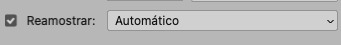
3.4 explicando as definições do reamostrar e qual definição usar de acordo com o resultado que você quer
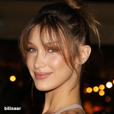


bilinear: a melhor opção para redimensionar gifs, mas para fotos não é tão bom pois dependendo da foto algumas partes ficam nítidas, outras mais suaves e se você for aplicar action de nitidez, pode ficar com um aspecto de “craquelado” com as bordas granuladas, o que eu pessoalmente acho que fica um pouco estranho.
bicúbico mais suave (ampliação): como o nome já diz, ele deixa a foto mais suave, ou seja, os pixels “craquelados” e granulados da foto ficarão mais suaves. é uma ótima opção tanto se você for aplicar actions de nitidez ou actions mais desfocadas e mais suaves.
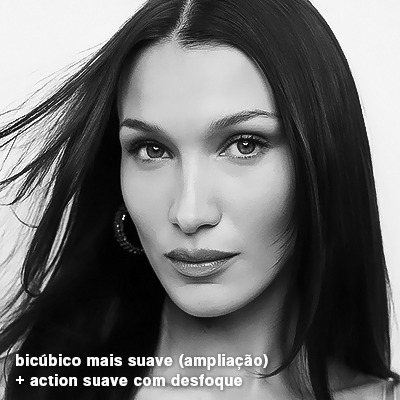
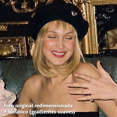
bicúbico (gradientes suaves): pode parecer a mesma coisa do bicúbico mais suave, mas esta opção além de suavizar a imagem, cria um “desfoque iluminado” nas transições das cores da foto. é a melhor opção para fotos sem muita qualidade e principalmente se você for usar actions suaves e desfocadas, sem muita nitidez.
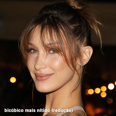
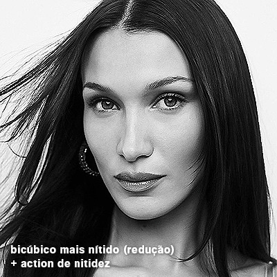
bicúbico mais nítido (redução): acentua os pixels e as arestas nítidas da foto, ou seja, essa definição redimensiona a imagem mas preserva a nitidez da foto. se você usa actions de nitidez que não tem desfoque nas configurações, essa é a melhor opção de reamostra. (mas cuidado, se sua imagem ficar muito nítida com essa definição, você precisará usar outra opção. caso contrário, quando você aplicar a action, a edit poderá ficar muito exagerada e/ou com aspecto áspero.)
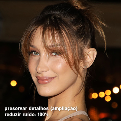
preservar detalhes (ampliação) com redução de ruído: esse em especial é ótimo para quando você precisar redimensionar uma foto para deixá-la maior sem distorcer tanto a imagem. você pode ajustar a redução de ruído para deixar a foto mais suave, sem perder muita qualidade. (obs.: essa opção não deve ser usada para redimensionar imagens muito pequenas, por exemplo de 200x200 para 400x400, ou a imagem vai ficar muito distorcida. ela deve ser usada quando a diferença de pixels não é muito grande, por exemplo, você cortou a foto e ela ficou no tamanho 370x370, aí sim você pode redimensionar para maior sem perder muito da qualidade. então você pode ir ajustando a qualidade com a porcentagem da redução de ruído).
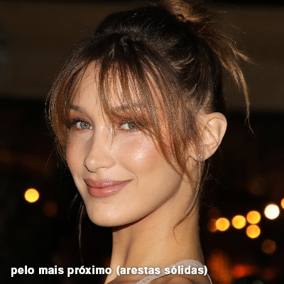
pelo mais próximo (arestas sólidas): essa é uma opção traiçoeira, pois não fica bem em quase nenhuma imagem (a menos que seja um pixel art). essa definição redimensiona a imagem e mantém os pixels nítidos, ou seja, a foto fica menor mas tudo nela que tem aspereza vai prevalecer. é muito usada para redimensionar pixel art, pois preserva as bordas ásperas. pode ocorrer de ficar boa em uma foto aleatória mas não será possível aplicar action, ou a imagem ficará exagerada.
3.5 aplicando a nitidez depois de redimensionar
depois de escolher a foto, baixar, redimensionar de acordo com o estilo da action da sua escolha, está na hora de aplicar.
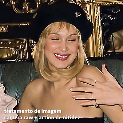
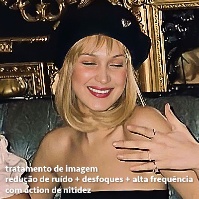
eu fiz duas versões para mostrar como fica com cada tipo de action:
assim, os dois icons tem uma alta qualidade usando actions diferentes, graças a remostragem ideal para cada tipo de action :)
4. TRATAMENTO DE IMAGEM PARA MELHORAR A QUALIDADE
nesta parte, é muito importante que você tenha baixado uma versão do photoshop com neural filters e/ou com o camera raw, mas caso você não tenha, tudo bem também, vou ensinar como fazer uma melhoria na foto de três jeitos: com camera raw, com neural filters e com desfoques. a melhor forma vai depender de quão ruim está a qualidade da sua foto. em geral, apenas fazendo ajustes no camera raw você já tem um ótimo resultado na maioria das fotos.
camera raw
se seu photoshop tem o filtro do camera raw, ele vai estar em filtro > filtro do camera raw...
tudo que iremos fazer será na aba de “detalhe”, ali você deve dar mais atenção ao ajuste de redução de ruído, pois é ele que vai remover o ruído da imagem e melhorar a qualidade dela.
vá mexendo nas configurações de redução de ruído até que a foto fique mais suave. ajuste também o detalhe e o contraste da redução de ruído.
essa parte será mais no olhômetro mesmo, pois as configurações vão variar de foto para foto, mas eu recomendo muito você mexer também na nitidez para não deixar a foto tão desfocada, mas nada muito intenso para não interferir na action que você irá usar.
eu mexo também na redução de ruído de cores, porque dependendo da foto, algumas cores estarão saturadas ou com muito ruído. só cuidado para não colocar um número muito alto, pois esse ajuste pode tirar a saturação da sua foto e deixá-la apagada.
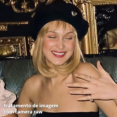
enfim, aqui está uma comparação da foto original com o tratamento feito com o filtro do camera raw e depois já com a action de nitidez aplicada:
e essas foram as configurações que usei nessa foto em específico:
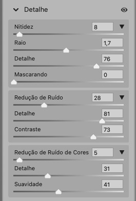
como eu disse antes, as configurações irão variar de foto para foto, a depender da qualidade de cada uma e de quão ruim a foto está, mas com essa configuração básica, você já vai conseguir melhorar algumas fotos.
neural filters
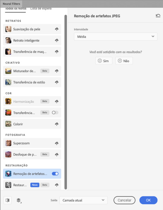
se a versão do seu photoshop vem com neural filters (ou filtros neurais), ele estará em filtro > neural filters...
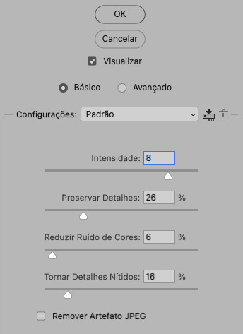
irá abrir uma janela com vários filtros mas o que a gente irá usar vai estar em “restauração”, com o nome “remover artefatos jpeg”. se precisar, faça o download do filtro.
eu recomendo usar a intensidade sempre média, a menos que a foto esteja muito ruim, aí você usa a intensidade alta. mas em geral, a intensidade média ou baixa já dá conta do recado.
a saída deve sempre estar na camada atual, ou seja, na camada da foto selecionada.
assim:
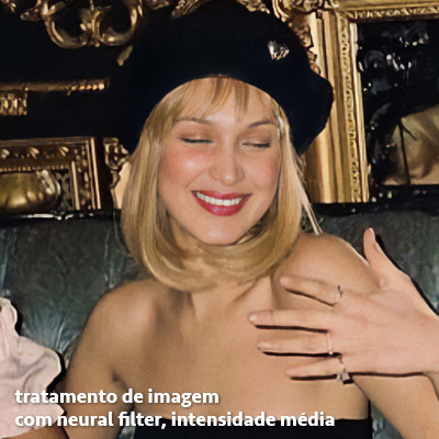
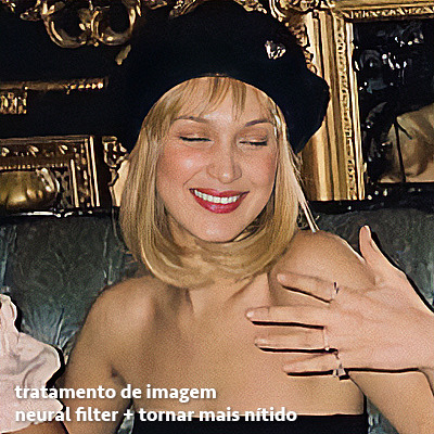
e aqui está uma comparação da foto original com o tratamento feito com o neural filter e depois já com a action suave com desfoque aplicada:


a opção do neural filter é uma ótima alternativa ao camera raw, o único contra é que ele deixa a foto com uma textura áspera, e quando você usa uma action de nitidez eles ficam muito visíveis e acaba não ficando muito legal.
porém, um bom jeito de contornar isso é adicionando ruído na foto. eu uso o efeito de granulação do camera raw para adicionar ruído no icon (você também pode adicionar o ruído em filtro > ruído > adicionar ruído..., mas eu prefiro o camera raw pois ele dá mais opções para ajustar o granulado do jeito que eu preferir).
no primeiro icon abaixo, dá para perceber a textura áspera que o neural filter deixa depois de melhorar a foto e adicionar nitidez; já no segundo icon eu mostro como eu adicionei o ruído e contornei esse defeito.

as configurações de ruído que usei no camera raw foi 12 de granulado, 35 de tamanho e 20 de aspereza.
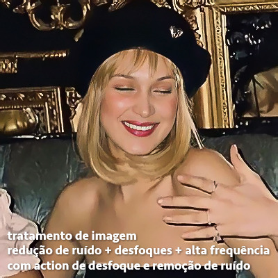
lembrando que, se você for usar uma action de desfoque e/ou remoção de ruído, não será necessário adicionar a granulação, pois a própria action já vai suavizar a textura do neural filter (a menos que você queira adicionar o ruído, claro).
redução de ruído + desfoque
caso a sua versão do photoshop não tenha nenhuma das opções de camera raw ou neural filter, caso você use um photoshop mais antigo, photoshop portable ou prefira usar o photopea, essas alternativas podem ser úteis.
mais uma vez, irei me basear no olhômetro, de acordo com a foto e irei ajustando as configurações de acordo com o que eu quero e acho necessário.
vamos começar com a redução de ruído! ele está em filtro > ruído > reduzir ruído...
na janela de redução de ruídos você verá alguns ajustes que são: intensidade, preservar detalhes, reduzir ruído de cores e tornar detalhes nítidos e vou explicar cada um para que você possa saber ajustar eles de acordo com sua foto:
intensidade: o número de 1 a 10 irá definir a intensidade da luminescência, a intensidade do filtro e o quanto da imagem você quer preservar ou extinguir, sendo 1 o mínimo da intensidade do filtro e 10 o máximo;
preservar detalhes: o número digitado irá definir a porcentagem de detalhes a serem preservados. quanto maior o número, maiores serão os detalhes mantidos na foto, como ruídos, manchas e outras aberrações da foto;
reduzir ruído de cores: o número digitado irá definir a intensidade e reduzir o ruído cromático, ou seja, vai reduzir as aberrações cromáticas, como por exemplo, fotos que distorcem as cores. preste atenção na porcentagem inserida, pois quanto maior o número, menos saturação sua foto terá e poderá ficar com aspecto de foto envelhecida;
tornar detalhes nítidos: o número digitado vai definir a porcentagem de nitidez para restaurar pequenos detalhes da foto. quanto maior a porcentagem, maior vai ser a intensidade dos detalhes da foto. preste atenção na porcentagem inserida, pois se a intensidade da nitidez for muito alto, vai afetar a sua action, seja ela de nitidez ou de desfoque.
sendo assim, para a foto usada eu fiz estes ajustes:
obs.: se você for um usuário mais avançado do photoshop, poderá explorar a opção avançado, que possui as configurações básicas para melhorar a foto e também as configurações para remover ruído das cores primárias (vermelho, amarelo e azul) individualmente. mas, mesmo se você não for um usuário expert, eu recomendo você dar uma olhada nessa opção e explorá-la, mexendo nas configurações e ir ajustando e aprendendo, pois o resultado poderá ficar ainda melhor nos ajustes avançados.
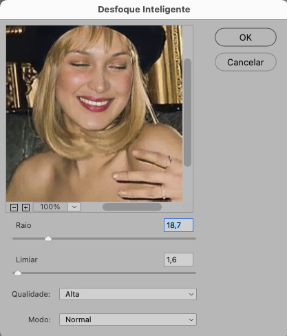
aplicado a redução de ruído, vamos partir para o desfoque! eu estarei usando o desfoque inteligente antes do desfoque de caixa. você vai achá-lo em filtro > desfoque > desfoque inteligente...
na janela que abrirá, você verá os ajustes: raio, limiar, qualidade e modo. vou explicar eles:
raio: vai determinar o tamanho da área que será considerada para o desfoque. quanto maior o número, mais detalhe serão preservados;
limiar: vai determinar a diferença dos pixels entre si antes de serem alterados pelo desfoque.quanto maior o número, maior será a área em que o desfoque será aplicado;
qualidade: vai determinar a qualidade e intensidade do desfoque. ao escolher a opção mais alta, mais partes da foto o desfoque atingirá;
modo: vai determinar o traçado das linhas de bordas que o filtro identificar. o modo normal aqui é o ideal, pois os outros modos “somente arestas” e “sobrepor arestas” irão identificar somente as bordas da imagem.
sendo assim, esses foram os ajustes:
após o desfoque inteligente, partiremos para o desfoque de caixa! ele está em filtro > desfoque > desfoque de caixa...
(você também poderá usar o desfoque gaussiano a depender da foto, mas para esta em questão, o desfoque de caixa funcionou perfeitamente)
a intensidade do desfoque de caixa, assim como do desfoque gaussiano, é medida em pixels e o mínimo é 1 pixel, e para icons é uma intensidade forte, então eu coloco o número mínimo (1, no caso) e depois de clicar em OK e aplicar o desfoque, vou em editar > atenuar desfoque de caixa... e ajusto a porcentagem de acordo com a foto. nessa foto deixei a porcentagem em 33% e ficou ótimo.
no entanto, infelizmente, por não ser o melhor método para melhorar a qualidade de uma imagem, ela ficará um pouco desfocada demais. mas podemos contornar isso usando o filtro alta frequência para devolver um pouco da nitidez e detalhes na foto. você encontrará esse filtro em filtro > outros > alta frequência...
o filtro de alta frequência, assim como os desfoques, é medido através de pixels e quanto maior o número, mais detalhes passarão despercebidos, ou seja, menos detalhes e menos nitidez sua foto terá. eu recomendo em torno de 2px se você quiser mais detalhes e em torno de 5px se você quer mais suavidade.
a primeira vista esse filtro parecerá estranho e distorcido, mas dará tudo certo, você só precisará mudar o modo de mesclagem. para isso vá em editar > atenuar alta frequência e mudar o modo de mesclagem para “sobrepor” ou “luz indireta” se você quiser que fique mais suave. se preferir, poderá também ajustar a opacidade para os detalhes ficarem mais ou menos intensos.
assim:
assim fica o resultado sem o filtro de alta frequência e com o filtro:
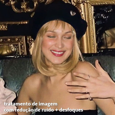

sendo assim, fica a seu critério usar o filtro ou não.
aqui está a comparação das fotos com o tratamento de redução de ruído + desfoque com e sem o uso das duas actions:
5. SALVANDO A EDIÇÃO
e chegou a melhor parte: salvar a edição para postar!
seja a edição um icon, uma header, ou qualquer outro gráfico estático (edições não animadas), a melhor opção é sempre, sempre, SEMPRE, salvar no formato PNG!
o formato jpg ou jpeg não preserva a qualidade original como o formato png preserva. então, sempre escolha esse formato ao salvar suas edições estáticas!
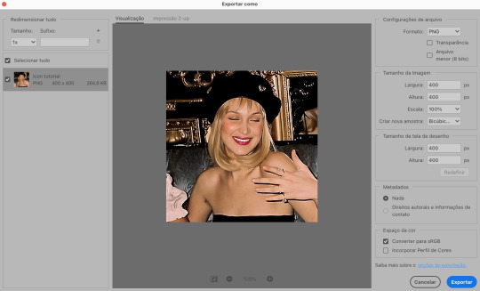
a melhor forma de salvar uma edição em alta qualidade é exportando ela. sendo assim, vá em arquivo > exportar > exportar como...
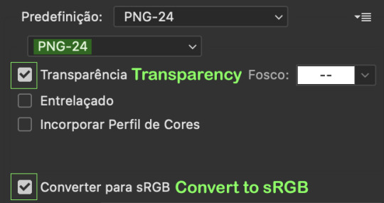
em “configuração de arquivo”, selecione o formato PNG e desmarque a opção “transparência” se sua foto não é uma imagem com fundo transparente; em “tamanho da imagem” deixe como a altura, a largura e a escola como estão, apenas mude a opção em “criar nova amostra” para BICÚBICO AUTOMÁTICO; e em “espaço da cor” marque a opção CONVERTER PARA SRGB, porque assim, independente da calibração do seu monitor, a foto ficará com as cores originais e não sofrerá alteração.
assim:
no entanto, se você tiver um pc ou notebook lento, ou apenas não tiver paciência para salvar sua edit em exportar, você pode salvar no modo normal, indo em arquivo > salvar como... OU arquivo > salvar uma cópia..., no entanto, se você for usar essa opção, não esqueça de marcar a caixinha para “incorporar o perfil de cores srbg”, essa opção geralmente fica na parte de baixo da janela que abre quando você vai salvar a edição.
6. ACTIONS & RESOURCES
para facilitar pra vocês, todos as configurações de filtros usados neste guia, estarão disponíveis para download em uma pasta de action. para fazer o download é só clicar aqui: ★. já a dupla de actions usadas (a de nitidez & a de desfoque suave) estarão disponíveis para download na lista de dicas abaixo.
dicas de actions de nitidez – premium & gratuitas (free)
lovie potion by @loviestudio [premium]
action #26 by @harupsds [premium]
action #25 by @harupsds [free]
01 action by @harupsds [free]
cherrie by @loviestudio [free]
action #11 by @miniepsds [premium]
face action by @miniepsds [premium]
crispy by @nebulies [free]
scarlett by @l-agallerrie [free]
eight action by @peachcoloring [premium]
bubblegum by @hisources [free]
kendall by @hisources [premium]
hekate by @hisources [premium]
sharpen by @l-agallerrie [free]
#01 action by @buntterflies [free]
dicas de actions “suaves” – premium & gratuitas (free)
teddy bear by @loviestudio [free]
action ten by @peachcoloring [premium]
caelestis by @miniepsds [premium]
fleuriste by @hisources [free]
angel by @loviestudio [free]
action #13 by @harupsds [premium]
action #12 by @harupsds [premium]
wild action by @hisources [free]
outras actions – premium & gratuitas (free)
denoise action effect — remove o ruído das fotos sem perder muita qualidade by @loviestudio [premium]
photopea quality action — action para melhorar a qualidade da foto no photopea by @loviestudio [free]
exclusive hq actions — um conjunto com as actions que foram usadas neste tutorial by @girasois, @loviestudio [free]
denoise and sharpen actions — conjunto de actions para melhorar a qualidade da foto automativamente by heavnsent
7. BÔNUS: DICAS EXTRAS
a adobe cc learn tem muitos tutoriais que você pode dar uma olhada e aprender muito mais sobre o photoshop e outros programas da adobe!
o youtube é outra fonte incrível para você aprender edição no photoshop, lá você encontra tutorial para quase tudo de edição de fotos e muito mais! se você entende inglês, eu recomendo muito os canais piximperfect e brendan williams tutorials.
para fonte de inspirações, o tumblr é o lugar certo! se jogue nas tags para se inspirar e nos blogs de photoshop para ver muito mais tutoriais e muito mais resources.
o blog @looksgreat infelizmente não é mais atualizado, mas você ainda pode encontrar muitos tutoriais sobre quase tudo de edição, e o melhor, todos os tutoriais são em português!!
ainda recomendo outros tumblr brasileiros de resources e tutoriais: @miniepsds, @harupsds, @peachcoloring, @gmfioart, @colour-source, @l-agallerrie, @wasirauhlpsds, @hisources, @opulenceps, @sunshinepsds, e @loviestudio; e no deviantart: jungrainsoul, rockjealous, heavnsent, aureangels e rohdossantos.
8. CRÉDITOS E INFORMAÇÕES
crédito colorings
off hearts + whimsy by @miniepsds ♡
informações
antes de tudo eu gostaria de pedir desculpas pelo tamanho deste guia, mas eu quis abranger o máximo de dicas possíveis para vocês e deixar o tutorial super completinho.
em segundo lugar eu gostaria de agradecer todo o carinho de vocês, isso me motiva muito a continuar. obrigada, de coração!
enfim, é isso! minha ask estará sempre aberta para dúvidas, sugestões, pedidos e mensagens fofas (sempre com educação e respeito, claro)!
#tutorial#photoshop tutorial#tutoriais#tutorials#resources#hq tutorial#tips#useful#ptbr#adobe photoshop#photopea tutorial#tutorial tips#dicas#dicas de edição#dicas de actions#guia completo#guia#guia de edição#guia de edits#edits tutorial#edit tag#masterpost#long post#editing tips#icon tutorial#header tutorial#hq edits
169 notes
·
View notes
Text
How to make icons like these:
Flags: Idol system, Bubblegender, Musicstar
Warning: This tutorial relies on the idea that you have some understanding of how to use photoediting software like photoshop, however if something that doesn't make sense then feel free to ask and I will explain it as best as I can.
All the icons we made for this can be found here! Thank you for reading, please consider reblogging this post and the icons because this took forever to write up and the icons take a LONG time to make.
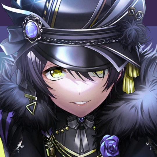
In this tutorial I will make DID/OSDD Aoi Miyake icons.
Anyway let's get into it!
Step one, choose what you're going to make (and gathering resources)
This may seem obvious, but going in with a plan makes these so much easier.
In this stage we consider three things:
The flag and/or colors we want to use in the icon, this is important as it can affect the images used or even the character depending on how similar their colors are
Character and the general colors associated with them, this is important as it can makes the filtering stage easier (or harder) and can make an icon look 'wrong' or 'right' sadly
The border of the icon and how that will affect the icon itself, sometimes they're easy to work with, others not so much. Our method differs from a lot of other peoples so we take more time with them than most others
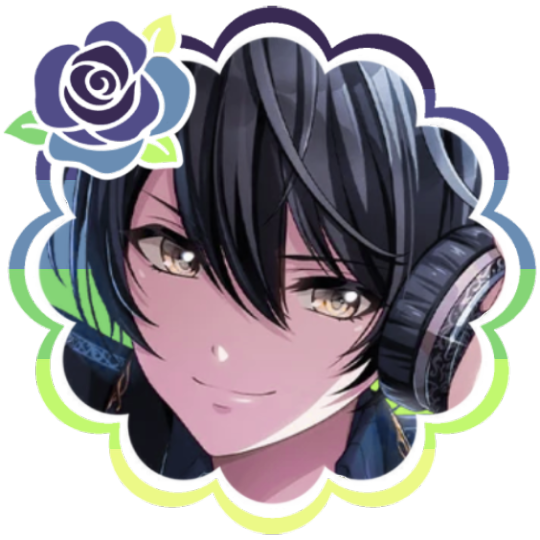
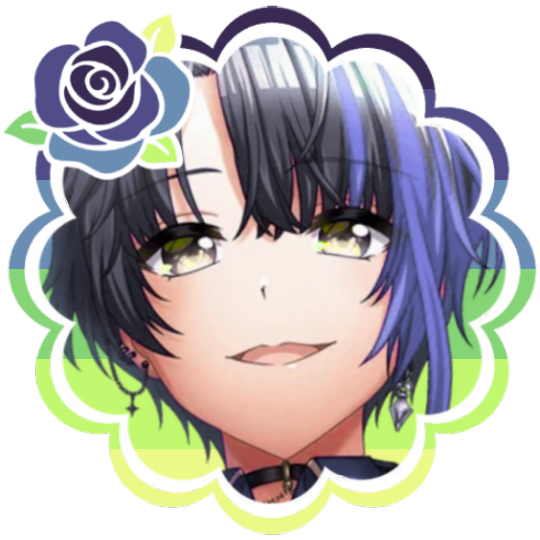
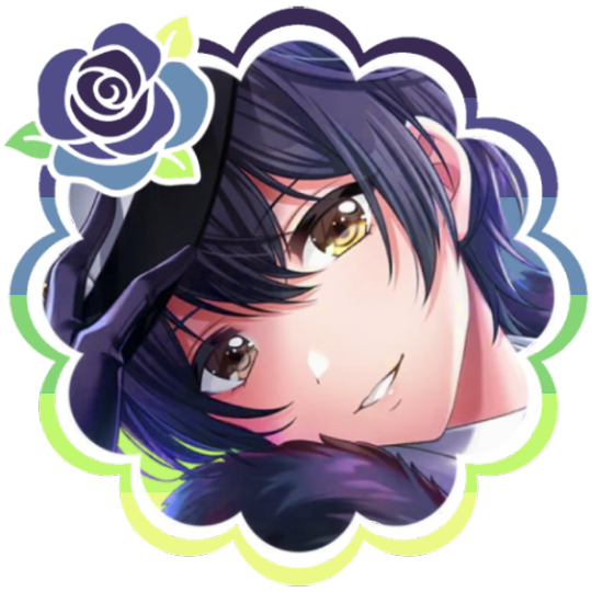
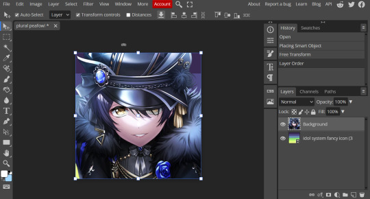
In this case I will be making DID icons of Aoi Miyake from D4DJ, however due to how most of her cards have a blue tint I will be using the plural peafowl flag by m0dem0n than the original DID flag- This is to save time and make th icons look more harmonious.
We will also be using this mask by i'mjustchillinghere as the icon base


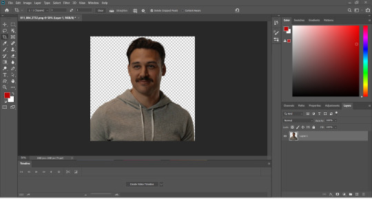
Step two, coloring the middle image (optional step)
This is a lot of guess work and everyone has a different process for this. Essentially we're going to make a PSD that makes the image look better with the colors of the flag.
As shown above we have the flag and the character image, but they don't match completely. The rose and other blue accents are too saturated compared to the flag and the black is too black and the wrong blue hue, the eye could also be a bit greener and saturated imo.
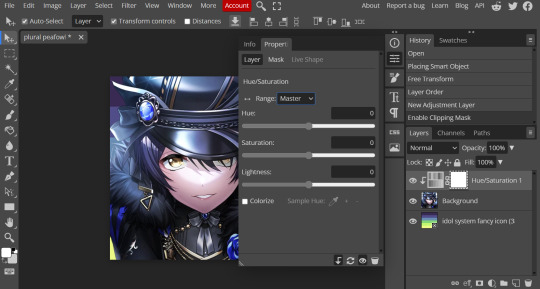
What I like to do is open the image with the flag behind or infront, so I can see the colors I'm working with.
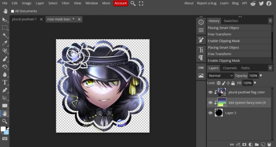
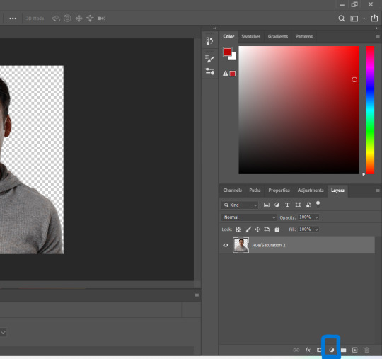
Then I open the hue editor layer (Layer > New Adjustment Layer > Hue and Saturation). It's very important to clip the hue layer to the image so it doesn't start messing with the colors of the flag (we've had this happen many times before it's very awkward trying to match a color that keeps changing) to clip right click 'Clipping Mask'.
Your screen should then look like this:
Okay so if you need to adjust the screen to get the icon in the center so you can see everything do this now.
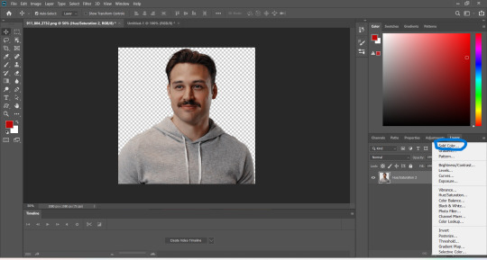
Next where the box with the hue options says master, click it.
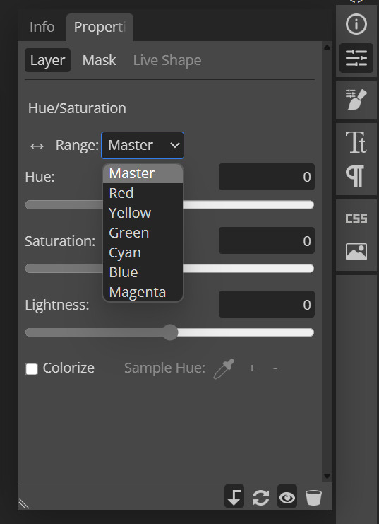
These are all the color options you can change, in this we'll mostly be using, yellow, green and blue. For other projects blue and cyan sometimes get 'mixed up' and can control both shades so be careful with that.
Other color settings we personally use are: Vibrance and Selective Color (both are located under the Layer option), but in this case I'm happy to just use Hue and Vibrance.
This is what the icons look like:
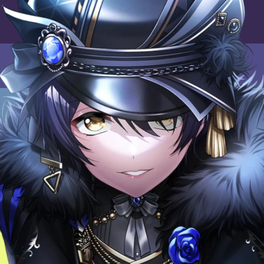

No color editing | Just Hue and Saturation | Hue and Saturation + Vibrance
Now your middle icon is ready turn off the background layer and save the image as a transparent png!
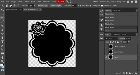
Step three, preparing the mask for use
So the mask is the base of your icon, however if you clip all aspects of your icon to the mask it looks like this and you can't see the flag.
So what you need to do is layer the mask. This will vary in difficulty, it can depend on how far apart the pieces of the mask are and how they interlink. You could erase the border parts but that takes a lot of time.
This icon is simple because to me there's three clear sections, the middle part, the border and the rose. What you need to do is copy the layer three times and get the wand- I would reccomend having the wand strengh over 100 or else black lines may remain, but this will depend on how close the black parts are.
Hide the top two layers and work from the bottom up. Select all the areas you want to delete, in this case I can only delete the rose (the border is too close to the middle part and would delete that as well) and then hit delete.
In this case, I will just erase the border by hand, and then BOOM, you have a base!
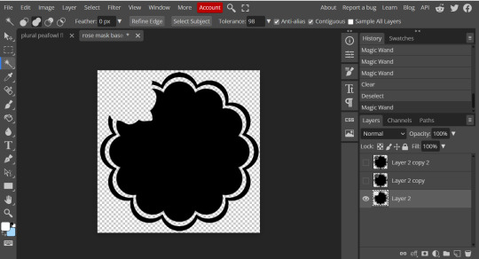
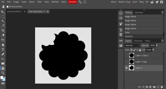
Hide this layer and move to the next, for this one I'm removing the middle and the rose.
For the next layer you can select what's in the layer below and delete it without it impacting the border, which makes the icon process easier, however in this case I'm going to give out the border layers for you here!


Step four, using the mask
NOW you can clip the flag to the layers! We always clip it to the base and border layer.
As for the rose... We make a seperate layer and clip it to those rose. Then (using the eye dropper tool) pick colors from the flag to use to color it in! As shown:
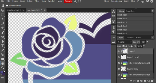
Next step is to add the image you colored!
Go to File > Open and Place and then choose the PNG from your gallery and place it in the icon. Once it's there fiddle around with it until you get the image you want and then BOOM!

Now you have a singlar icon!
Feel free to repeat this as many times as you want and make as many icons as you want.
-
All the icons we made for this can be found here! Thank you for reading, once again please consider reblogging this post and the icons because this took forever to write up and the icons take a LONG time to make.
103 notes
·
View notes
Note
Hiii your icons are so pretty, would you have a tutorial on them or tips on how to do it?
hello lovely and thank you so much!! i have been making icons for a long time, but have also just started with this style of icon, so i don't know how much of a help i can be but i'll try my best! i make all my icons in photoshop, but when i first started i used gimp, it works similar and i'd recommend it if you dont want to commit to ps just yet. this ended up getting kinda long because i went step by step on how i make my icons like the ones from this post, with a bunch of tips and tutorials linked, so i put it under a read more. i specifically go deeper into how to change the colours of his hoodie depending on your background/preferences. i hope i could help even a little bit!

1. the base
one of the first steps is deciding what you want the base to look like. you can do just a solid colour, gradients, patterns, etc. you can use the solid colours and gradients that are already a feature in photoshop, but there are also a lot of amazing resources and bases by other talented people either on here or on deviantart. just look up icon textures on deviantart, you'll be able to find a bunch of textures and pre-set gradients you can use as your base. this is a really great pack you can find on deviantart that offers a bunch of bases. if you'd like to make gradients yourself, here's a really good tutorial! i am not really an expert on explaining how to use textures because i've only really just started with headers.
2. the picture/png
onto the star of the show - the person you want to have in your icon. i usually get those from screencaps from whatever show/movie i am making icons of. you can get screencaps of most shows and movies from screencaped.net. i then isolate the person i want to be in my icon so that the background is removed and transparent. you can do that yourself, here is a very good tutorial on how to do that in photoshop, or you can use other platforms like canva or adobe express, that have features to remove the background for you. you usually cannot adjust those, so if they dont cut out things the correct way you have to adjust in photoshop afterwards. when chosing a screencap you should make sure that the person and silhupette are clear and delinated from the background, without any obstruction in the foreground, so that you can cut out the entire figure easily without parts of their body missing. i usually also look for screencaps where the head and the sites aren't cut off, so that i can freely adjust the sizing and move the figure around. i also try my best to get a scene where the lighting is alright so that i don't have to fight for my life colouring it, but sometimes it can't be helped.
this is one of the screencaps i used for my recent eddie icons and it's a good example: his upper body is clearly seperated from the background, nothing is cut off, etc.
this screenshot is an example that i personally wouldnt use because there is a jug in the foreground in front of eddie that would be in the icon as well.
buck looks very cute in his lil hat but the shot is cut off on the right and on top, so i didn't end up using it either. you just kinda go through the screencaps you have (or take your own) and figure out which frames fit for the type of icon you'd like to make.
if you'd like to make screencaps yourself, here is an easy tutorial to follow!
3. basic colouring
when i make icons like these, i usually dont go too crazy with the editing, i mostly just adjust the lighting and colouring the create a well-lit base. here you can see the unedited png (first picture) and then once ive used a basic colouring (second picture).


this is a very good tutorial on basic colouring using curves, hues, etc, as i've done as well. it is for gif-making but those same editing steps can be applied to still pictures as well.
4. colour isolation
the icons i am currently making are in a style that you can see a lot around tumblr - where parts of the person in the icon, usually their clothes and other accessories, are edited to be a certain colour that matches the background, and that colour can be changed to match different bases. you can see that the hoodie eddie is wearing has a different colour to match the different colours of the background.
i desperately tried to find the tutorial that i used to learn how to do this but i can't, so i'll try my best to explain it myself (brace yourself). i have seen people do this by drawing onto the png, but i use a different method. for this you'll need to have some basic knowledge on layer masks.
we're gonna start with our png image that already has the colouring applied to it (1).

now, click on the layer and add a solid color layer (2). you do that by clicking the symbol i've marked on the bottom and then selecting "solid color...".
in the screen that pops up now you can select the colour you would like the accents to have (3). choose the colour you want and then click "OK".

your entire image should be in the colour you chose. now right-click on the solid colour layer in the layers panel on the right and select "create clipping mask" (4). this will apply the solid colour layer only to the cut out of your lil guy. it should looks like this now (5).


now we're going to adjust the blend mode. right now it should be set to "normal" (6). click onto the drop down arrow and select the blend mode "colour"(7).

now we can see eddies features again! now we want to edit it so that the pink is only on the parts that we want to be colourful. for this left-click on the white box in your solid color layer (8) so that it's selected. after that select the brush tool (9) and make sure it's set to black. we use black to take colour away and white to add colour back in.
now go over all the parts that you don't want to be colourful. if you accidently take too much away don't worry, just switch the brush colour to white and go over what you want to add in again. it looks like this (10) for me afterwards.
you can change your colour if you double click on the little pink box of your colour layer and adjust it however you want.
5. adjustments
after i've done everything listed above i usually group the two layers (your cutout and the solid colour layer) together so i can move them as one (11). after that i pull the group over onto my base and adjust it so that fits properly (12).

now that the cutout is on the base layer i usually go in to properly adjust the colours and make sure the colours on the cutout match well with the background. you can do that by changing the colour manually or using the eyedropper tool. and voilá! i know it sounds like a lot right now reading this, but once you've gotten the hang of it, it really isnt that hard.
i hope this was at least somewhat understandable and that i could help a bit! there are a ton of amazing tutorials out there for all parts of editing and photoshop in general that go deep into details in case there is a specific part you want to learn more about. for now i hope this gives you at least a small overview.
38 notes
·
View notes
Note
[waddles in] Hello! I just saw some of your Sonic icons and I have a question for you, if you don’t mind! How do you make those pride borders? I have been. Going insane. Trying to find a tutorial somewhere. 😭 Maybe it’s because I use procreate? I’m humbly begging for your advice, oh knowledge one 🙏🏻
I use Ibis, but this should work for Procreate.
If you just want circles:


Use a clipping mask to attach the flags to the black circle. Then, use a clipping mask to attach them to the gray. My layers look like this:

For any other shape:
Get a transparent image of the shape and put it into your program. Size it down so that it doesn’t touch the edges of the canvas. Duplicate the layer and use a border tool (Ibis has one built in but from what I know, Procreate doesn’t, so here’s a website that does it for free). Adjust the width of the border until you’re satisfied. Then do the same as the circle (clipping mask flags to layer with border and character images to layer without border)
#using this to clarify: ik ive been kind of dead for like days but! it is exam season time lmao#gotta lock in and get those As#But once exams are done trust that all requests will be posted and icons will be made like a flower makes pollen#i have. So many drafts.#not icons#icon tutorial#how to make icons#icons
10 notes
·
View notes
Note
your icons are soooooo so cute honestly!!! i wanted to ask if there's any way you can make a tutorial on how to make them? of course if you want, if you don't want to, that's okay :)
Hi! I really appreciate that you like my icons, thank you so much! 💖💖💖🥹
It's been a long time since I've done a tutorial so I hope I can explain it well haha
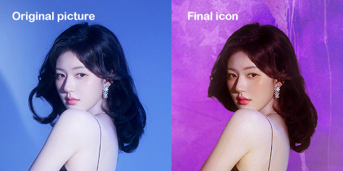
So I will explain how i go from the original picture and the final icon below:
I'm using Adobe Photoshop 2024 but you can use other versions too!
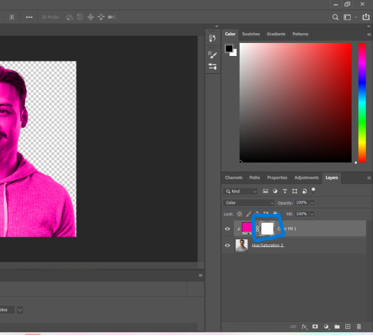
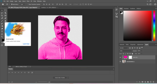
First, I create a 250x250px document and apply a random color fill layer to be the background color of the icon, you can do it by going on Layer > New Layer Fill > Solid color (the color in this moment doesn't matter because I change them later according to the picture I choose to edit).
Then I place the picture I want, adjust the size to make the subject on the center and apply some smart sharpen:
I apply some adjustments to try to color correct if the original picture using Levels, Selective Color and Color Balance to get something like this:
If you want to know the exact adjustments settings I used on this picture you can download the psd here.
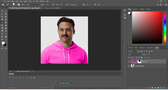
To remove the background, I do the hack where I go to the Properties panel (Window > Properties) and click on the "Remove background" option. It's not always that I will get a perfect result but I think it makes easier for me to adjust the little details such as hair and accessories, etc. And I do that using the Lasso tool (shortcut L).
Now, with the background removed I pick a color that I think will match the icon in the Color Fill layer that I created before. To make the background more "fun" I like to add a Gradient Fill layer (Layer > New Layer Fill > Gradient) with a color that might go well with the one I picked earlier to make a smooth and light gradient.
My result until now:
Now it comes the fun: adding textures! I like to add some textures to make the icon more lively and I usually download them on deviantart or on resources websites. You can download some cool textures here, here and here. On this part I really test a lot of textures with different Layer blending. There are a lot of different blending options so you can try as much as you want.
Other thing I like to do is add a clipping mask above the subject layer when I want to color something specific in my picture such as the hair, the clothes or even applying some "fake" blush on the cheeks. I do this adding a new layer, then using the shortcut option (or alt) + command (or ctrl) + g to make it a clipping mask and then using the Brush layer to color what I want. For the blending mode I usually use Soft Light and sometimes Color if I want the color to really stand out.
And in the end I will have something like this:
And my layer tab will be like this:
For using on the dashboard I usually resize it to 100x100 to make it look more sharper and defined but it's really a choice, you can already start making your icon using the size you want, I just prefer doing on 250x250px because i'm used to.
To save it I use the shortcut shift + option (alt) + command (ctrl) + s to save it for web with these settings:
And that's it! Sorry for not going to deep in each step but I guess you can get the feeling when you try making your own icons! Is really about trying different methods and things until you became satisfied with your result.
104 notes
·
View notes
Note
a tutorial would be nice please, thank you for answering my question
alright i hope this makes sense, tutorial for making icons on picsart under the cut!!
first things first open picsart, this should be the home page.
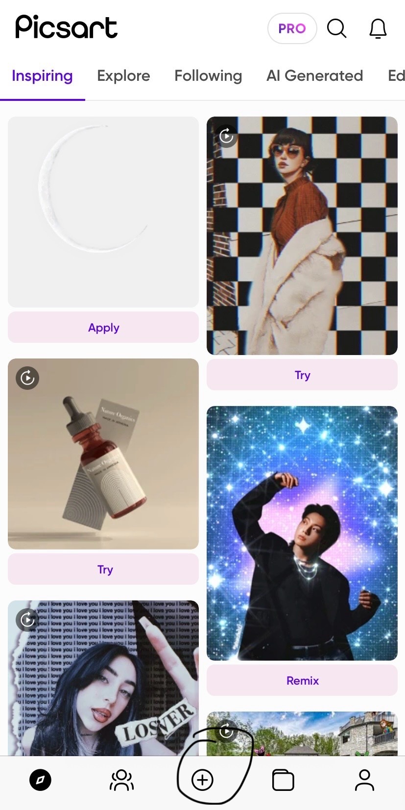
click the little plus sign to start a new project!

then hit see all and find the flag u want from ur phone gallery
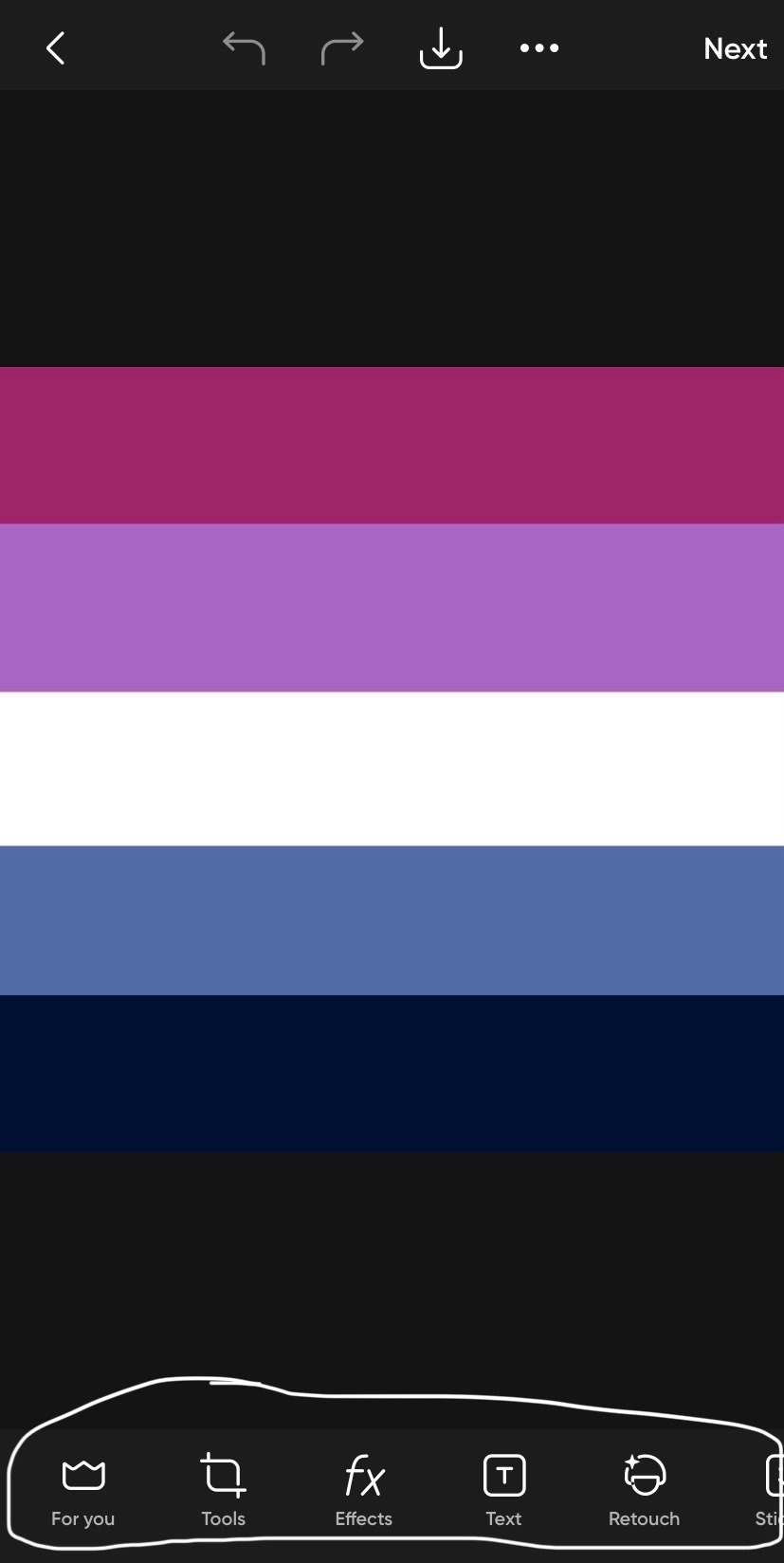
now that u have the flag u want on this bottom roll scroll until u see this option

and add the photos u want. i’m gonna show how i do it with a transparent and non transparent image. for transparent it’s rather simple, just move the photo and align it how u want it to look then hit this save button
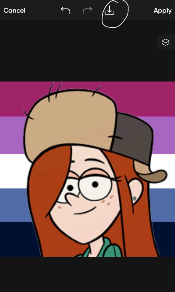
for non transparents u will have to find a way to either crop it out urself or if u are like me and have a subscription to the app u can just hit a simple button and it’ll remove the background. there’s also websites that can do this for u

now when u hit remove background sometimes not all of the background is gone so u can use this eraser tool to clean it up, then u save like usual!
i hope this is helpful, lmk if u have any more questions!!!
18 notes
·
View notes
Note
oioi, acho a sua galeria tão linda e queria saber como você faz seus icons, já tentei de vários jeitos e nunca consigo fazer :( se puder ensinar, eu agradeceria
Oioi! Fico muito agradecido com o seu elogio! E bem, eu não sei explicar direito as coisas, mas dei meu máximo! agora, vamos lá.
AVISO: esse tutorial foi feito no programa photoshop cs6!
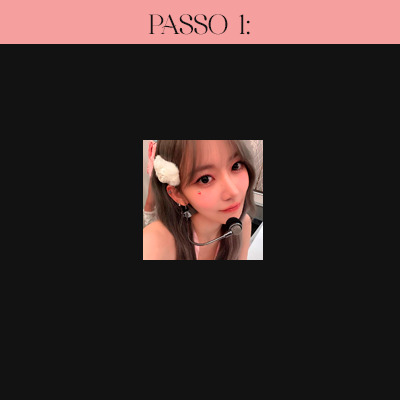
Passo 1: importe a foto que deseja, seja ela já cortada ou não (clique em "Arquivo" e depois em "Abrir". selecione a foto e pronto!). Se a sua foto não estiver cortada, clique na letra "C" do seu teclado e corte no programa mesmo, ou clique no símbolo mostrado abaixo:

Passo 2: Com a imagem cortada, redimensione-a no tamanho correto, sendo este, 120x120 (clique em "Imagem" e em seguida, em "Tamanho da imagem"). Faça conforme o print a seguir:

Passo 3: após redimensionar, aplique a nitidez! eu uso um action, e você pode baixá-lo aqui. Com ele aberto no ps, selecione "sharpen" e clique duas vezes no botão mostrado abaixo:
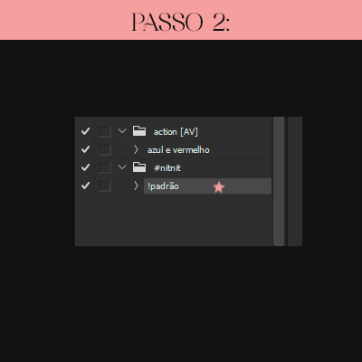
Passo 4: agora vem a hora do psd! e essa é a parte que você pode se soltar! eu uso dois no momento, mas você pode usar somente um se preferir.
(para colocar o psd no arquivo, você pode clicar com o botão direito na pastinha do psd e selecionar "Duplicar grupo". em seguida irá aparecer uma janelinha, você vai na parte "Destino > Documento" e seleciona o arquivo que você está editando).
Passo 5 (opcional): e enfim chegamos ao penúltimo passo! porém este é opcional, ou seja, você não precisa seguir se não desejar. bom, sem enrolação, não é? com o psd já posto e tudo feito e certinho, você já pode salvar se quiser, mas caso deseje um toque a mais, pode seguir esse passo simples! selecione a última camada e a duplique (você pode duplicá-la rapidamente clicando nos botões "Ctrl" e "J"). após isso, mova um pouco para a direção que desejar usando as setas do teclado (é necessário estar com a ferramenta mover ativada. para isso, clique na letra "V" do teclado). feito isso, selecione a camada duplicada e clique no símbolo mostrado abaixo:

após clicar nele, irá abrir uma janelinha, clique em "Opções de mesclagem". assim que clicar, irá abrir uma janela maior, e nessa parte pode parecer difícil, mas é bem simples e tranquilo! tudo o que você precisa fazer é desmarcar uma das letrinhas. eu desmarco a "G", e com isso fica uma bordinha verde.

com tudo feito, clique em "Ok".
6º e último passo: ufa, finalmente chegamos ao final. não é tão difícil quanto parece (mas pode parecer, já que fui eu quem explicou, né, cofcof). agora você já pode salvar o seu trabalho! e é bem simples, basta clicar em "Arquivo" novamente > salvar como > PNG ou JPEG e prontinho!
Aqui está o resultado do icon feito neste tutorial! Fiquem a vontade para baixar!

#icon tutorial#120x120#tutorial#photoshop#spirit fanfics#icons 120x120#icons spirit#social spirit#spirit fanfics icons#kpop icons#spirit icons#icons#design simples#photoshop tutorial#photoshop psd#kim jiwoong#zerobaseone#zb1#zb1 jiwoong#zerobaseone jiwoong#photoshop cs6#ask#jiwoong icons#scifiyeol
37 notes
·
View notes
Note
hiii so sorry if this is a stupid question but how do you make icons that aren’t squares? the only canvas i can make Is square 🥲

how to make shaped icons!
no worries anon! things like this can be a little confusing at first, so i get you. let’s get into it!
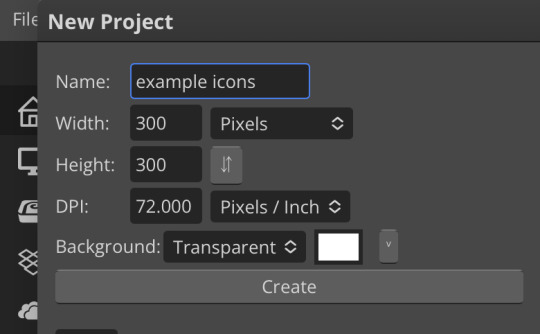
first thing’s first is creating a new project in photopea. i tend to make my icons 300x300, but it doesn’t really matter the dimensions as long as they match (so you shouldn’t do 750x700, for example.) make sure your background is set to transparent (no worries if you forgot this step—just delete the colored background layer!)
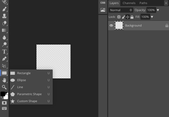
next thing is getting the shape! i tend to use photopea’s shape tool for this, since it’s easiest for me, but you can also just google “circle png” or something. (make sure your image is actually transparent, though. click and drag or click and hold and see if the dotted background lingers or goes away!)
for the first icon, i’m going to use the ellipse tool. feel free to change the color of your shape—i usually set backgrounds later, but that’s up to you. the exact dimensions of this shape don’t matter, but like your canvas, they have to match so the circle is even. click and drag to make your shape
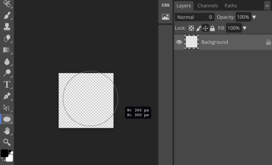
as you can see, my shape isn’t centered just yet—but i corrected that by using the click and drag tool: the one at very top of your sidebar. photopea will center and align your shape for you if you move it towards the middle
now you have your base! time to start adding backgrounds and such things. i used my usual method for the background, but you can do whatever. one thing to make sure for this step is to set all your layers to clipping mask (putting the shape below all your other layers)
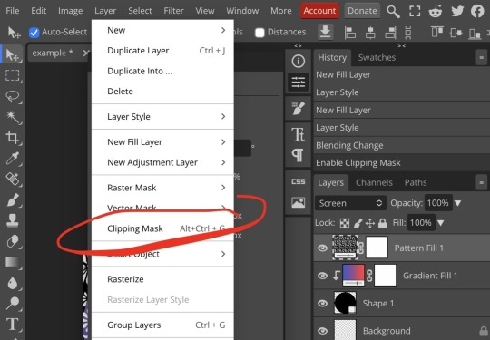
to find clipping mask click the button that says layer at the top
as you can see, my gradient fill is already clipped mask’ed. if for whatever reason you want your layers un-clipping mask’ed later, just go back and click the clipping mask button again. (i’ve said clipping mask too many times. it feels like a fake word.)
(hello, haruka!) this is how my icon looks so far! everything is clipped mask’ed to my circle. if you’d like, you can stop here, and download your image. i went ahead and added a psd. unless you’re using a color fill later or something similar in your psd, that doesn’t really need to be clipping mask’ed.
(the psd i used here is really simple and i didn’t save it, but always put your psds in folders, just to make your life easier.)
now that we’ve got that done, time to export! make sure that you export as a png. otherwise, your icon will still be square.
the finished product! pretty simple, right? you can use this method for all sorts of shapes. i went ahead and did two other kinds—bordered and faded.
for the border, i copied my original shape (a square in this instance) and switched the fill mode to the icon with an x through it, and switched the stroke mode to a solid color, and set the stroke to seven pixels. i think for bordered icons you can also shift the border so that there’s a space between it and your icon, but i left it where it was this time
as you can see, i didn’t change any other layers, except that i duplicated my gradient fill! this is the same project i was working on before, just with a different base.

now for the faded icon! i used a heart shape for this, as that’s pretty standard, “but wait! photopea’s shape tool doesn’t have a heart option!” it does, actually! it’s just hidden. click your shape tool and go down to custom shapes. then scroll at the top until you see the little arrow with the star beneath it (which should be as far right as you can scroll.)
wow! so many shapes!! i scrolled down until i found the heart, and added it. the heart i didn’t worry too much about the numbers—i just adjusted it until it looked nice.
now to make our heart faded! first thing to do is to rasterize your shape layer. make sure you have your dimensions and everything set before you do this, as you won’t be able to correct them after your shape is rasterized.
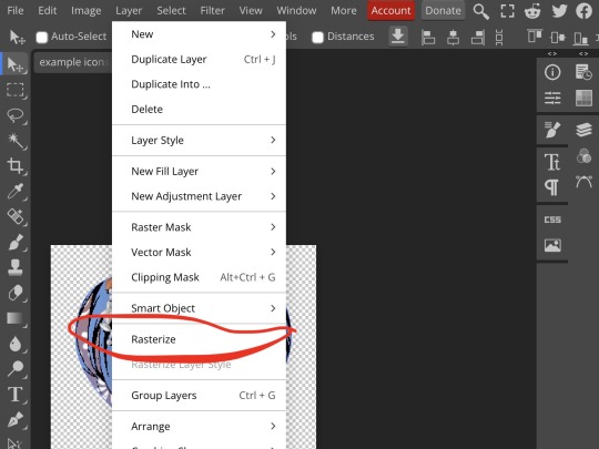
rasterize can be found in the layer drop-down menu, where you found clipping mask. click that, and now you can blur your shape! the blur tool can be found in filter > blur > gaussian blur. you can also use motion blur or radial blur, but i like gaussian blur
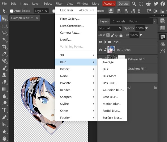
clicking gaussian blur will give you one of our old friends the sliders. just mess with that until it looks about right. click “ok” once you’ve got it set how you want it
i also adjusted my heart’s sizing a bit by going to edit > free transform and making it bigger. just do what looks good to you!
and there’s your faded icon!
i hope this is helpful!! feel free to ask if you have any questions :3
sincerely, eos
92 notes
·
View notes
Text
PHOTOPEA TUTORIAL: RP ICONS/ICON BORDERS !
HOW I USE CLIPPING MASKS && RECTANGLE SELECT TO CREATE MY ICON BORDERS. this post will include framing the rp icon itself, the border around the icon && adding on optional block quotes—also, a bonus how-to for applying patterns to your block quotes and/or icon border; in case you're after some zesty editing !
pictured below is a simple, PRE-MADE icon that we will be attempting to recreate in this tutorial. all you need is a screencap && photopea ! as for the blockquote pattern, it is an optional design / example that i will provide later on in the tutorial ! this tutorial will involve rectangle select & clipping masks and i will cover how to do them both.

start a New Project, make sure the background is transparent. pick what size you'd like the overall border to be, not the icon itself.

you should start out with a transparent rectangle, as seen above. for this particular recreation, i've listed the width & height of my standard icon border sizes below. if you don't know, these sizes are determined by pixels.
W: 640 H: 107 i.e., W: 640 pixels H: 107 pixels.
next step: select Layer>New>Layer as seen highlighted below. this new layer is where your icon base will be/your clipping mask will go.

now that we've added a new layer for the icon base/mask to go, we're going to use rectangle select to set the size of our icon. right click where the yellow highlight(left bar) is pointing in the example below && drag your cursor to expand the "rectangle select" to whatever size icon you want. for this example(as seen below) i've chosen the size 80x80.

after you've set your desired icon size, you can now drag the selection(you should see a dotted border outlining your selection) to where you'd like your icon to be placed. i personally chose to place mine in the center—i did accidentally forget this step in the tutorial, so don't mind it if you see it move in the next two examples. though not an incredibly important detail, you can always move it after you fill it in !
once you have placed your base, select your brush tool && choose a color(highlighted in yellow, located on the left bar in the example below). you can use whatever color you'd like here, as long as it stands out to you—i usually choose red or green so that it can stand out from the background. once you've picked your color, you're going to color inside of the selection that you've made. don't be afraid to color outside of the lines...the brush will not exceed past what you've selected in advance with your rectangle tool !

once your base is colored in, you may now de-select your rectangle select tool(right click>deselect).
pictured below is an example of our current progress. as you can see i finally moved my icon to the center.

this colored shape will be your 'x marks the spot'—it is where your screencap(as a clipping mask) will be going once we finish the border of the icon.
speaking of which, now it's time to create our border ! add a new layer with the same process as before. Layer>New>Layer. name it whatever you'd like. i've simply labeled the new layer as "icon border" because it will be the layer the border goes on. make sure it is on a layer that is separate from the icon base.

in the "icon border" layer, repeat the rectangle select process outside of each side of your square/icon base. selecting one side at a time, be sure to fill it with the color of your desired border. i will be using a white border, which will be 3 pixels wide on each side. (example is of me expanding the select tool to the preferred pixel height/width outside of the base)

once you've finished creating a selection && filling each section, you can deselect && should be left with something like this:

this is optional, of course, but if you'd like you can also make an outer border/border edge. you can do this in a new layer or simply place it on the same layer as the white border. in the example icon at the top of the post, you can see that the icon i made has a gray outline outside of the white border. to do that, simply repeat the rectangle select option; and this time, only select 1 px width of space(or more, depending on how thick you want it/if your border is wider) on the outer edges of the white border. with you're new color(mine being gray as depicted) you can fill each of these edges. here's what we got going on so far !

now, to add your icon inside of the border! (it doesn't really matter if you do it before or after, just as long as you got your layers right!)

as you can see, i already added my icon to the base; you can do this before or after you've created your border && border edge. in the image above, the rectangle select you're seeing is an example of where the outer border/edge was filled in with gray. of course, to add your icon, file>open and place>choose your screencap. once your screencap is opened, right click it && once you're met with the drop down, left click the option that says "clipping mask." doing this will give you free reign to zoom in or out and move your icon around(to move it, edit>free transform && drag) all within the confines of the icon base you've created with your selection tool && brush.
our current result:

now... for optional blockquotes. make sure to start a new layer for your blockquote/s. once again, you're going to use the rectangle select tool; choose the width && height of your blockquote by dragging/expanding the tool with your cursor. i've made my blockquote 2 pixels wide because i prefer them thin—if you would choose wider blockquotes, just expand the selection.

once selected, fill that selection with the preferred color of your desired blockquotes. most people choose gray or colors relevant to their characters—i will be using red because i will be treating this as a clipping mask, so i can show you how to put a pattern into the blockquotes if you want something that stands out.

you can see ive put two blockquotes in place. you can choose to move them however you want them, or include both the blockquotes in one layer or seperate layers. i've personally separated mine for this example. (layers bq 1 + bq 2 on the side)
ADDING A PATTERN: do the same thing you did with your screencap...file>open and place>choose image. i will be using this abhorrent little pattern(free to use!) i created for the sake of this tutorial. and just like you did with placing your screencap, right click and select "clipping mask" on the dropdown. again, you can move it, zoom in and out however you please. just make sure the image is lined up with the blockquotes!

and here's what you should end up with, or something similar !

EXTRA / ADDING A PATTERN TO YOUR BORDER:
once you've gotten the hang of rectangle select/clipping masks, this part is self explanatory. basically, if you'd like to put a pattern inside your border (this will be the white border you created) you can repeat steps you took to add a pattern to your blockquote, this time placing your clipping mask over the layer with your border.

and that's pretty much the formula of all formulas for me personally—these tools come in hand for a lot of my editing !
#* MY TUTORIALS.#long post /#rp community#icon tutorial#rp icon tutorial#psd tutorial#roleplay help#roleplay resources#roleplay community#roleplay graphics#coloring psd#psds#icon psd#psd#roleplay psd#rp graphics#rp psd#rp resources#tutorial#editing tutorial#rpc tutorial#editing resources#psd coloring#icon border#icon border tutorial
298 notes
·
View notes
Note
oiee, seus icons são umas gracinhas juro!! queria saber como vc faz eles☝🏻
oláaa, primeiramente fico feliz que goste dos meus icons😭😭 e segundamente perdão pela demora!
bom, bom, separei em partes para que fique melhor de entender, vamos lá!
A primeira coisa que faço é criar um novo arquivo no Photoshop em 120x120, que é o tamanho do spirit fanfics e depois ajusto a fotinha.
O passo 2 consiste apenas em aplicar o efeito 3D, e nitidez no icon, marquei com estrelinhas as actions que uso e que eu mesma faço. [OBS: sempre aplico nitidez DEPOIS do efeito 3D]

e tcharaam!! o resultado do passo 2 é este:
Estamos quase lá!! agora só aplico PSD´s de minha preferência. Usei estes, também feitos por mim :)
e o grand finale!!
E esse é o resultado final, está um pouco saturado depois que salvei o icon e o abri no photoshop novamente, mas acontece nékkjk, enfim, espero que tenha te ajudado em algo, qualquer dúvida minha ask está aberta.💟
caso queira o icon que fiz para o tutorial, está aqui:

aah, uma dica simples mas que nem sempre lembramos, salve seus psd´s em uma pasta, nomeando todos eles para poder diferenciar mais rápido, nada de salvar como "Sem-Título 1"
31 notes
·
View notes
Text
Welcome back to "Icon Making With Killian: An Intro to the 'Lost' Art of LiveJournal Icons"
aka, you didn't think I was one and done, right?
This tutorial was written in Photoshop 2020, but you can probably recreate it in as far back as CS2-ish (since I still use the same sort of techniques I've been using since then, lmao). It also assumes basic understanding of the software, though I've tried to be as clear as possible throughout.
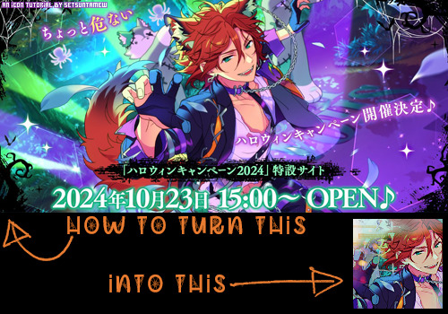
I was possessed with a need to both make an icon of Madara's new event card and then write a tutorial, so let's all be proud that I busted it out before Halloween 💪
I started with the bloomed art of Madara from The Howling Forest★Lupine Halloween event (image from the Halloween 2024 campaign announcement, because the event hasn't started yet).
Since there's a lot of extra text & etc on this, I knew I'd be cropping it pretty close. I started with a blank 100x100 canvas, pasted the original image in, and then resized + rotated it until I liked the composition/crop.
First up, I wanted to get some cobwebs in here (for Halloween!), but didn't want them to overwhelm the whole icon. I used a texture from lookslikerain, set to Lighten, and rotated it a bit before erasing anything covering his face.

Next, I used another texture from lookslikerain and set it to Darken. There's a lot of green in the images for this event and I wanna pull some of that back into the icon, since it most got cropped out.

Time for light textures!!! I used a bunch in this icon~ I started with one from lookslikerain (can you tell I love their resources?), rotated it, and set the layer to Lighten, before deciding that it was too harsh. I used a small, soft brush set to 30% Opacity to erase most of the texture from his face, as well as softening the edges of the light.
The next few light textures are kinda subtle, but overall add to the icon. I'd say sometimes less is more, but I'm a maximalist at heart XD For the next few steps, just assume that the light textures were rotated/resized/moved/etc as I saw fit. I used yet another texture from lookslikerain, set to Lighten, and tucked in the bottom right corner.
This light texture from Sanami276 is also set to Screen. I moved it around to get just a bit of orange in the top left corner- gotta keep those Halloween colors in there!! :D
I wanted some more depth/texture in the upper left corner, so I decided to use part of a texture from Sanami276.
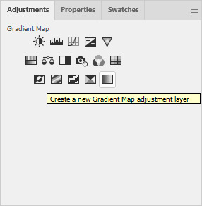
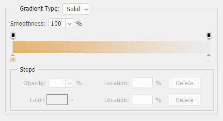
However, it's way to harsh to just throw in there like that...at least not for my purposes. I decided to invert the colors and recolor the black parts orange. My go-to method is with a Gradient Map adjustment layer. The easiest place to find it is in the Adjustments window.
I then used these colors for the gradient itself: #e7b676 at 0% and #ececec at 100%.
And it left the texture looking appropriately orange! I then pasted it into the actual icon, moved it so the rectangles were in the upper left corner, and set the layer to Darken.
Now for more light textures!! I used a couple from ianthinae, set them to Lighten, and went to town. I cut them up, moved them around, rotated them...just about anything to make them fit where I wanted. I love playing with light textures in general, and I find that even when I use similar ones a lot, they can look very different depending on how they're place.
Finally, I used part of a large grunge-y texture that I've unfortunately lost the source to D: I inverted it and set the layer to Multiply, before moving it around a bunch until I found a spot that looked good.
And with that, it's done! You've now got some new skills to make icons with~
If you have any questions, please feel free to ask, and I'll answer as best I can- as long as it's not about making icons in other software D: I only know Photoshop (and Paint Shop Pro, but I don't think anyone uses that anymore). If there are any other icons of mine you're interested in seeing tutorials for - or even just specific techniques! - just lemme know. I love helping :D
Also, I'm happy to share where I get icon resources from. I have a whole post dedicated to that on my DW graphics journal, though tbh that's the best place to talk to me about making graphics in general. But I will absolutely answer asks/replies/etc about icons here on tumblr, don't worry!!!!
#livejournal#icons#tutorials#graphics#icon tutorial#graphic tutorial#photoshop#LJ icons#100x100#100x100 icons#tutorial#reference#halloween#madara mikejima#enstars#ensemble stars
13 notes
·
View notes
Note
Thanks to you, I learned and created my very first icon! Your Tumblr has it all — technique, great taste, and generosity. Thank you so much, truly.
show meeeeee! i have an icon tutorial for you:
2 notes
·
View notes
Text
I need help with getting screencaps so I'm hoping people on tumblr can help. I know there's a method to extract them from a website like the one linked HERE because many years ago I used to do it, but for the life of me I can't remember how to do it, and I really don't want to go through each picture individually to save it onto my computer so I can make icons
So if anyone can help I would be eternally in your debt
5 notes
·
View notes