#design analysis
Explore tagged Tumblr posts
Visit Tumblr Blog
Explore Tumblr blogs with no restrictions, modern design and the best experience.
Last Seen Tumblr Blogs


Fun Fact
Tumblr was acquired by Yahoo for $1.1B in 2013.
Text
The Comprehensive Semi-Serious Tartaglia Design Analysis
because im so fucking tired of slander lmao, feel free to only read the image notes, draw ur own conclusions and add on to mine, bc this one is a doozy

Been making small observations for a while, and now that we know what he used to look like it's as good of a time as ever, so here goes nothing.

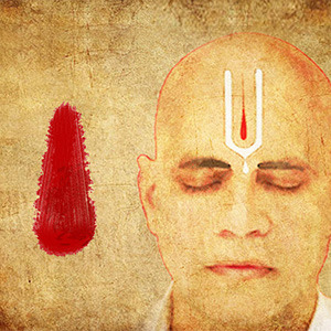
Newborn narwhal
Ajax's color scheme used to be mostly blue (early indicator of Hydro) with earth-y tones present, it's a very grounded look that ties him to his previous life and lost childhood. His undershirt splits in a lambda shape. He even used to sport a sort of scarf covering his neck in a direction similar to later looks. Can't help but note the two belts near his neck, like his self was restrained in a way. The DNA shape's connection to Sourcewater Droplets and Primordial Sea hint at his future as well as his current state of being: the origin of his problems, the source, if you will.

Wound
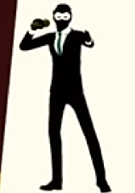
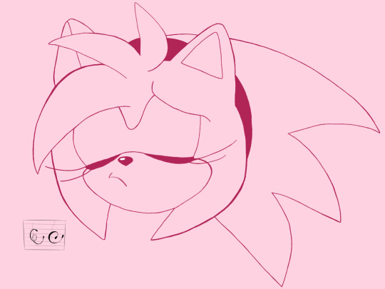
Now, the bulk of this analysis is dedicated to Tartaglia's base design, as it is one of the best showcases of a large amount of info hidden in a relatively simple look. Color change is a sign he has strayed away from his old self and his fate. The blue hues are completely gone, aside from his ever dead fish eyes, the last drops of his old values. Instead he got a bunch of reds, even the grays are in the red-ish register. Thus begins the cascade of bodily comparisons.
The scarf kept its basic shape from before, and is now distictly blood-red. It's flowing from a jewelry piece located where the two belts used to be. It's an open wound, that oozes with Hydro energy when he uses his vision. Light blue a symbol of purity, as seen in pure vs tainted waters of Fontaine's Phantasms, and Tartaglia is losing it rapidly.
His jacket has a white "belly" (and back), a common trait for cetaceans. It unravels in the same lambda shape along with the deep red shirt (more blood or muscle tissue), starting at the aforementioned wound. The gray streaks on pants are outlines of leg bones with 4-pointed star motif that shows up all over his (and a few other characters' (like Traveler)) outfit, especially in jewelry, like the two buttons near his collar. (The significance of this symbol has been already mentioned by other analysts, so I'd rather not to get into it, sorry)
I read the position of his mask as a head wound, not just because it's red, but because of the red jewel in his earring, it goes along with blood drop theme seen in the other two similar gems and their respective locations. The armor plates on his hips wrap around, forming a pelvic-like structure that connects with chains to a dark streak on the back of his jacket forming the base of spine and followed upwards by vertebra-like jewelry. A chain connects it to the chest wound in a rib-like direction. The scarf is held in place by a shoulder blade piece (whales have shoulder blades too).
So we got a fatui soldier uniform that manages to also depict a wounded whale-like creature. I say "like" because pelvis and femur are decidedly humanoid.

Decay
It proved to be fatal. The purple of electro delusion also extends to dark grays of the uniform, creating a rotten flesh look, enhanced by the new hue of red in his scarf and a pink-ish streak on it. Incidentally, purple in Genshin Impact is frequently used to signify curse and contamination, specifically god remains, as seen on Yashiori Island and in Sumeru desert near Consecrated beasts. The shirt is showing from under it all like bones.
Childe's left eye is covered with a red patch on the same side as the earring, could be seen as it getting covered in blood or as him losing that eye altogether. The structure of his mask has a basic shape of a fantastical narwhal, it is foreshortened from front view, as if the whale is approaching.
Lastly, I found the delusion symbol on the back of Tartaglia's vision while messing around in photo mode, as seen on the screenshot. I highly doubt it is lore, likely just an asset hidden on the model so it can be flipped while animating the Childe boss. This could be supported by looking at the back of Arlecchino's vision, which I haven't done. Dunno if this was discovered before, just wanted to share this find while I have the chance.

Remains
Foul Legacy, of course, resembles Abyss Heralds in structure, so I'd like to focus on what remains of Childe. Abyssal armor is now even more like human skeleton. The mask kept its basic structure and is also a callback to Teucer's favorite Mister Cyclops. The iconic red collar doesn't even connect to a shirt anymore but instead flows into a white scarf, then into tainted purple and finally to a sea of stars. It's a messy amalgamation of his human form that has ascended to the sky, or into the Abyss, take your pick.
I find it particularly interesting how his vision is now where the lethal wound used to be. Did it stop the bleeding? Or did is cause the wound in the first place?
Foul Legacy's color scheme included the blue hues back, closing the cycle. As for the final color I'd like to point out, its the hair. The ginger that never meshed with any other color, yet was preserved in every evolution stage as a reminder of Childe's identity. As a reminder, that all of these looks and everything he ever did - is still him.
Happy birthday, you little goober. Sorry I showcased your design as process of death on such a day lol. Go achieve the unachievable, chump.
#sorry if there are typos yall im so tired its maddening#GOD i wanted to make this for so long ggaaAAAHHH#happy birthday#genshin impact#ajax#childe#tartaglia#foul legacy#childe genshin impact#my art#signs talks#design analysis#long post
284 notes
·
View notes
Text
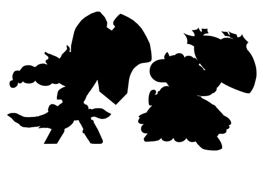
Anyone else kind of disappointed by the awakened Hollyberry design? And I’m not talking about the whole “they made her skinnier” thing (I do think they did that, but that’s a conversation for another day), I’m talking about the design itself. It looks nice and it’s really pretty, but it just… doesn’t look like Hollyberry? If you told me that these were two different characters, I would believe you. Their silhouettes also look pretty different (for the silhouette I had to get rid of awakened Hollyberry’s back hair because it muddied it up too much)

My main point of critique however is the shape language. Hollyberry’s original design has super strong circular/round shape language, which I’ve always been a huge fan of. However, her awakened design has very very little of that and is very angular (I also feel like her facial proportions are different? But I’ll let that slide cuz it’s just a trailer). The heart shapes that were on her original design are still there, yes, but a lot smaller, less prominent (the shield for example) and again more angular.

Another thing that’s bugging me is that her Souljam changed shape to be more angular? I don’t think that Souljam’s shape’s are supposed to change like that, and it makes it look a lot more like Eternal Sugar’s Souljam. (Yes there’s probably gonna be a lore reason why, but why is she the only ancient to get her Souljam changed?)

#cookie run#crk#cookie run kingdom#hollyberry cookie#awakened hollyberry cookie#design analysis#shape language#also they gave her a wing motif which is ESC’s thing like what#and i think her dough is lighter but we’ll hope that’s just the lighting
169 notes
·
View notes
Text
This is my analysis of Ishmael's design. For clarity, I have divided her into 6 parts:
1. Rope
2. Hair
3. Eyes
4. Sinner number
5. Coat
6. Shield + Subtitle

Part 1: Rope

Note 1: "Tying the knot" as an expression for "getting married" originated from Celtic traditions was a coincidence. "In joy and in sorrow" used in Presbyterian weddings vow is a funny coincidence. Book Ishmael being Presbyterian is even a funnier coincidence wowie.

Note 2: Although it is technically not on her design, I also analysed other ropes.
Note 3: I only analysed the rope from Ishmael’s perspective. If I do it from Queequeg’s perspective also the rope section would be as long as the entire thing.
Part 2: Hair
In this part I analysed Ishmael’s hair in relation to both Queequeg and Ahab.

Part 3: Eyes

Part 4: Sinner number
This is technically not any special design thing but I still find it significant enough to include.


Part 5: Coat

Part 6: Shield + Subtitle

Thank you for reading.
Wow I really thought this was going to be painless and easy.
95 notes
·
View notes
Text
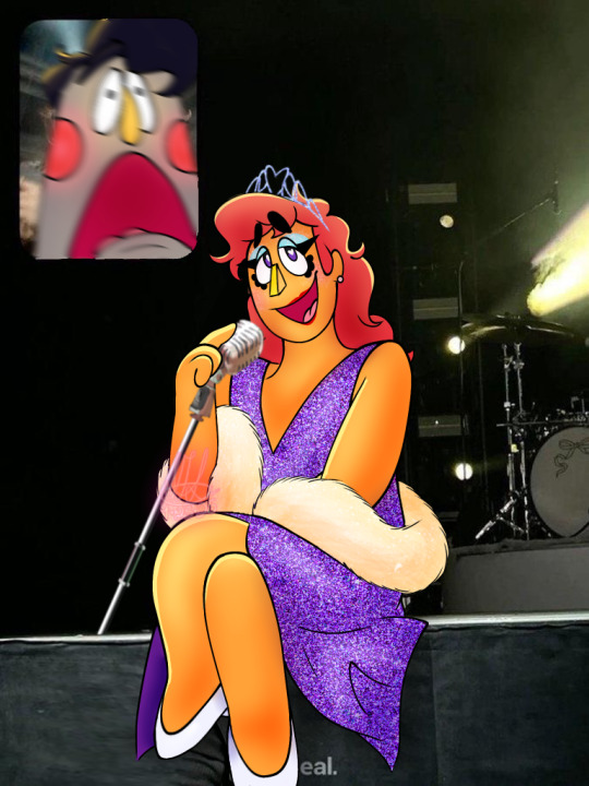
And now: a comprehensive analysis on Eddie Dear’s drag persona
(Or at least how I interpret it✨)
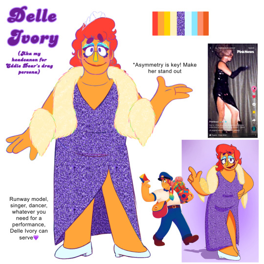
💜💎💜💎💜💎💜💎💜💎💜💎💜💎💜💎
The Tiara:
Ah, starting this off with the glittery tiara sitting atop Eddie’s head. Its royalty and elegance is easy to notice, and its glimmer emphasizes the brightness Delle Ivory brings to any room she walks into. The only thing is…the tiara is fake, merely plastic and easy to break if one wrong step is made, much like the persona of Delle Ivory. Regardless, it’s taken seriously by all who don’t take the time to look closer to it.
The makeup:
I’ve seen other artists draw the makeup much closer to actual drag makeup, and that’s something I very much so aspire to work on. The way I enjoy drawing it is a bit simple however: just some red lipstick, subtle blush, shimmering blue eyeshadow, and a very large eyeliner wing.
Blue eyeshadow and red lipstick was often used in counter culture, especially from the 1960s-90s. In an article by flannels.com, “the look came to symbolise both the establishment (take, Barbie) and a critique of the steadfast rules of what a woman should look and behave like that predated that era.”
Blue eyeshadow was also associated with drag queens, specifically the late drag queen Divine in the film Pink Flamingos
The red lipstick also has some symbolism. During World War II, red lipstick stood as a symbol of defiance and unwavering spirit, as even in concentration camps women made their own red lipstick out of either crushed brick or berries
After the war as well, red lipstick was a staple in 1950s and 60s Hollywood, with stars such as Marylin Monroe, Elizabeth Taylor, and Audrey Hepburn, with the lipstick color being also a symbol of seduction and confidence (paraphrasing from bangstyle.com
Akin to the blue eyeshadow, as large eyeliner wings became popular in film, it drew close with the drag performance community, being a symbol of grunge and counterculture
Couldn’t find much in terms of blush throughout the 60s or 70s, but there was a rise in popularity of pastel shades of blush (you can call the blush Delle uses pastel in comparison to her skin tone, right?)
The dress:
The sparkling mass that is Delle Ivory’s dress, wow. Purple is a color that is very, very rarely used within the world of Welcome Home, reserved mostly just for shading in blue. Eddie however, is the only one who has purple on his body, that being his eyelids.
The whole idea of purple being a reserved color is flipped entirely on its head, with Delle Ivory absolutely holding the mantle for the character associated with purple.
The slit that leaves room for Eddie to show some leg tells us that Delle is not at all afraid of being open with herself, letting everything she feels reveal itself to others.
There’s no real message behind the glitter, the dress would just be a simple purple dress without it, and trust me, drag queens do not do simple.
Even with today’s modern associations with purple, it’s known as a color for iconic moments and sass. This can be often seen with TikTok and its collection of Purple Heart (💜) memes. They’re a bit corny, but that’s what plays into how iconic they are; it’s not a subgenre of TikTok that’s meant to be serious with it’s humor, simply being a subgenre to recognize humorously stan culture moments.
The boa:
There wasn’t really any intended symbolism with the sparkly boa. I just thought it would be a nice accessory for Eddie/Delle to have from time to time.
The heels:
At first I didn’t think that much about the heels, I thought of them as pretty white heels, but that’s when I thought about it more.
White is often seen as a color of innocence. Despite all the showiness of Delle Ivory, it has to be reminded that this does take place in a puppet show made for children. The dainty white shoes balances the star power the persona of Delle Ivory dazzles the audience with, by also carrying Eddie’s humbleness and kindness towards others.
Another character in the neighborhood seen in white shoes is Julie Joyful. In my head, I headcanon that Eddie has just a hint of jealousy towards Julie, being able to be loud and overflowing with positive everywhere she goes. The white heels of Delle Ivory mimic Julie’s mary janes, as both share their matching energy with everyone they come across.
What else am I missing…oh yeah!
The name:
Most drag names are puns or some kind of play on words. I wanted Eddie’s drag persona to still be tied to his career of being a mailman, so what’s the one thing mailman do? Deliveries
Deliveries
Delivery
Delle Ivory
DelIvory
Delivery
Mailman
Delivery💜
#can you tell I’m passionate about this subject?#welcome home#welcome home puppet show#welcome home arg#eddie dear#eddie dear welcome home#welcome home eddie dear#eddie dear drag#drag persona#drag#drag queen#design analysis#tumblr rambles
126 notes
·
View notes
Text
Okay I'm working on the hair headcanons, BUT I wanted to make a little extra note here for something I noticed.

So, a lot of people have noticed that Hypnos' hair has a small section that looks like a wing! Most likely a little reference to how many depictions of him have wings on his temple, or only one wing after a myth where his other is torn off.
However, I don't see this mentioned very often and I didn't notice this myself until just a few seconds ago... but Nyx's hair looks a little like she has wings, too! The way a section of her hair flairs up vaguely resembles them, with stars looking like the underside of the "wings".

Might just be me being blind to what should be obvious, but it makes sense because many depictions of Nyx have wings.
I find it extra interesting, because I haven't noticed any wing imagery on Thanatos, yet, outside of his outfit. Meanwhile, both Nyx and Hypnos have "wings" in their hair, which is a part of their body like they both inherited them. Of course, Thanatos could have wings but just not show them, and I'm probably doing my fun pastime of Overanalyzing™, but it's an interesting detail.
I like to think of it as Thanatos inheriting Nyx's "colder" parts of her personality. Like how serious the both of them can be. Meanwhile, while Hypnos is a pretty cheerful and unserious a lot of the time in the first game, he inherited his mother's wing hair.
Which makes it all the more depressing when I look to Hypnos in Hades II and his little wing in his hair is GONE. 😭

I have so much more I could say, but I'm going to keep it for the full post. I mainly wanted to get this out because I found it cute (and sad when I give a little context in my full post but I'll leave you in baited breath).
#hades#hades game#hades ii#hades 2#hades supergiant#Hades 2018#hades hypnos#hypnos hades#hades nyx#nyx hades#hades thanatos#thanatos hades#hades 2 hypnos#hades II hypnos#design analysis#overanalyzing#overanalysis
150 notes
·
View notes
Text
I noticed something interesting about IEYTD's shillouette character models.
Here's a pair of Nameless Zoraxis goons from Operation: Stage Fright
And here are Important Named Characters John Juniper and Dr. Roxana Prism
There are a few noticeable differences - John and Roxana have more colored accents than the Operatives' red bandana(?), but what i found the most interesting was that they also had elements of design that specifically locates and frames their eyes - a mask and pair of Goggles respectively
And it makes sense: these characters are The Antagonsits and Most Important Characters of their respective games, we should be able to get close to able to look them in the eye.
All of this is my thought process towards making a prediction: Other important characters, if and when we meet them, will likely have elements framing their eyes too. Reginald would be wearing glasses or Valeri will have a mask - Heck, these Eye elements might be genuine evidence towards Dr. Zor having an eyepatch of some kind.
Just something to chew on when it comes to the designs of major vs minor characters.
#ieytd#i expect you to die#character design#analysis#john juniper#dr roxnana prism#prediction#design analysis
42 notes
·
View notes
Text
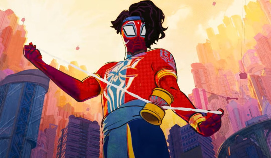
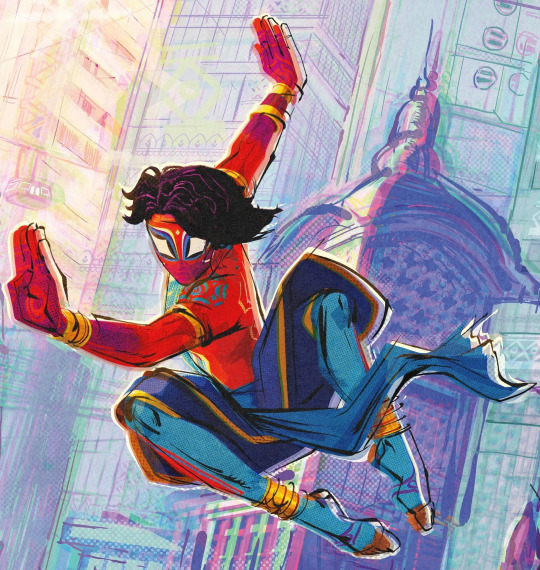
In Which I Ramble About Pavitr's Character Design and the Indian Cultural Stuff Related to It
DISCLAIMER: I'm an Indian, and these are all my thoughts and analyses, but I'm also just one person and by no means am I speaking for everyone. I am not all knowing, and I am not immune to being wrong sometimes. These points are all my own thoughts and stuff that I know through my lived cultural experiences and some history and book knowledge, but I've not particularly researched any of these. I'm just out here giving my take from what I know. This is mostly just going to be me rambling, okay? Okay. Let's go!
Anyway okay so I just wanna go from the top down:
No. 1:
First of all his hair
His fucking hair
This is one aspect that i k n o w I'm overthinking and probably wasn't as significantly thought out in the design but it just Spoke to me and by all accounts I'm not the only one
But I'm so glad we have him with his thick gorgeous fricking hair, especially them being like curly/wavy and slightly long instead of straight and cropped or whatever
Like. Indians usually have very thick and luscious hair, not everyone ofc but generally it's a thing, and it's considered a point of pride to have long dark thick hair.
And the thing is for the longest time the beauty standard in India was to have very straight and shiny hair, all the actresses and heroes were doing it, even though that's literally not the realistic case for a lot lot LOT of Indians. There's a pretty big variety of hair texture in India; some of it is regionally concentrated too, eg. in South India you get a lot of frizzy, tightly coiled hair that's rough textured, whereas curly hair is usually silkier and looser curled as you go Northwards,, Bengalis tend to have very wavy thick hair,, etc. By no means a rule or anything, it's just a thing that there's a lot of curl variety and a lot of it was for the longest time considered ugly and unkempt (there are some classist/regionalist elements to this stereotype also unsurprisingly) still is by some people,,, bc the standard was Shiny Straight Hair. It's a standard that's slowly shifting. It's currently leaning more on the wavy and voluminous side. But it's def a thing still.
All that to say, it makes me so so happy to see Pav with his curly-ish lush hair that he wears with such pride and style,, that are a symbol of his own pride and self care too!!!
Also the line about "coconut oil, prayers and good genetics" - I LOVE THAT REFERENCE AHAHABSSK, using coconut oil for the hair is a very common thing here, it's so so good for the hair and the scalp alike and it's relaxing to massage it in too.
I've seen people try to write Pavitr in fics as "quickly brushing some coconut oil through his hair" as part of his morning routine and. Um. That's not how it's done askaskjas, I don't mean to be rude to the writers at all, everyone does the best with what they know and no one knows everything, but also practically speaking that would be greasy and awful.
There are multiple ways to apply coconut oil, ofc. Coconut oil is often massaged into the scalp and rubbed into the hair like an hour before washing, sometimes with lemon juice mixed in, and then washed off when bathing. Some people, especially those with drier and finer hair, apply it as a regular after-hair-wash thing, too, but even so it needs to be rubbed in.
A really beloved thing we have is coconut oil champis, too! This is basically when you sit down cross legged in front of youe mother/grandmother, and she massages the coconut oil into your scalp and hair in a way that literally cures all tension and headaches and leaves your head reeling and is so so good for hair and stress and everything. It's a family bonding thing more than just a hair routine. It's not always done by the mom/grandmother ofc, it's just how most of us first experience it, and they have a technique that none of us can ever quite replicate to the same effect later. As we grow up, we often do it for ourselves and for others. It's a weekly or monthly or even just occasional thing depending on who you ask. But yeah that reference was great I love it dearly!
Also about the hair length
So in the current modern "civilized" standard (Indian schools and society in general tend to do a lot of shit trying to assimilate us into western culture and stamp out our own,, for example all my life I've been in schools where speaking Hindi and Telugu and stuff in class or in the hallways was Wrong and Forbidden and We Must Speak Only In English Bc We Are Educated And Cultured. This is so fucking hypocritical bc they would also have Hindi and Telugu classes and then criticize us for not getting it right or whatever), boys are meant to have short hair. Teachers literally single boys out in class for leaving their hair longer, not the exact length they set as the limit. This was my entire school experience; thankfully it doesn't seem to be the case in college, but that may just be bc I'm in an artsy college. In the workplace it's less stringent but it's still a thing.
HOWEVER, historically and culturally, long hair was considered good and even Important for both men and women. There's huge regional variations in this ofc; Maratha peshwas and higher classes and stuff for example wore a "pilaka" (idk what else it's called), which is the head shaven clean except a tuft in the middle that's sometimes braided. Brahmins still do it too.
But my point being, long hair was considered good for the most part, at most it would be worn in a bun for fighting and working,,, braids are a pretty big deal too. Having to cut your hair short=a symbol of dishonour and/or exile, or reserved for menial workers and so called "low classes".
(This is not stuff you even get explicitly told btw. This is stuff I've mostly inferred and studied from history and mythology and stuff , so there's no guarantee I'm 100% right)
Also, in Sikkhism (I'm not Sikh myself so correct me if I'm wrong, this is just what I know) having long hair is super fucking important for men. The hair is wrapped up in the turban, and the turban is a symbol of honour and pride and literally considered life. The long hair is considered sacred.
Removing the turban is basically a symbol of literally losing your honour pride and sense of self,, not just in Sikkhism, just generally at this point. Cutting your hair? Insult on injury.
Pavitr doesn't have particularly long hair ofc
But having grown up with such rigidly enforced things abt boys having very short cropped hair, it makes me so happy to see an Indian character who defies that.
Also!! Quick tangent about braids and their significance,, they're considered very beautiful and another symbol of pride, intricate buns and what not too! Just wanna drop this to give you an idea of what i mean:
In the Hindu myth of the Mahabharata, Draupadi, the wife of the Pandavas (she's a very interesting and important and beloved character, regionally also considered a goddess, she was a princess born of fire married to five princes and the vengeance for her honour literally fuelled the war for righteousness etc etc) vows never to braid her hair again until she has washed it in the blood of Dushasana, a man who forcefully tried to disrobe her in court (it's a whole myth of its own). At the apex of the war, Bheem, her husband, brings her his blood. She washes her hair in it and then for the first time in thirteen years, she braids it.
Braids are not as significant now but it was basically a Pretty Big Deal and I just wanted to talk abt it.
In Hinduism too the gods are portrayed with long hair, it's a Thing.
No. 2:
Okay so moving more downwards,, I have a bunch of Thoughts abt Pavs mask design!

Okay so obv we have the spiderweb-pattern that's a given.
But. The interesting parts are these:
The bindi-like design on his forehead.
Bc my point is
Sure that looks like a bindi. And that's beautiful in itself but I HAVE ANOTHER TAKE
Bindis are traditionally worn by women as a symbol of beauty, prosperity, and again, pride. But while nice, that's not quite a symbolism that fits imo
You know what else is ver similar where my mind immediately goes? A tilak.
The shape is kind of off for a tilak actually, a tilak is more of a U or a V with a dot or a flame-like stroke in the middle. So in that case it looks more like a bindi
But i really like thinking that it's inspired by a tilak too, bc
While a bindi is a decorative mark stuck or painted on a woman's forehead as a symbol of beauty and prosperity
A tilak is basically a mark that's finger-painted on the forehead of , usually a man but there's a softer smaller version for women too and ofc there are women warriors who got tilaks, for auspicious and blessing reasons. So in a Puja or ceremony, a tilak is put as a blessing and an auspicious thing, also meant to impart strength. The head of the household usually gets the most striking or biggest one.
Pandits usually wear tilaks for blessing purposes too, although their design is different and more elaborate than the ones given to others
Gods and goddesses had their own tilaks, some of them very distinctive like Shiva's
The part that applies to Pav is the warrior tilak
Basically before a king or warrior went to battle, it was customary to do a small sending off ritual and for the wife or mother to put the tilak for them and say "Vijay bhava" (may you be victorious)
It's still done for big undertakings and challenges like exams and new jobs and stuff.
It's basically for strength, bravery and victory
The main difference in a bindi and tilak is the intent:
Bindi is for beauty
Tilak is for valour
Which. For a HERO. Just. Chef's kiss.
2. the markings around his eyes!!
I'm sure this has been said before, but it's very very reminiscent of kathakali makeup.
Regionally there's a lot of eye makeup stuff also btw. There are some absolutely beautiful tribal designs and regional designs with a lot of colours but I cant remember specifics rn
Also!! The very distinctive black lines around Pav's eyes?? I love them sm bc they feel so so based in kohl and kajal. Another huge beauty and often pride related thing.
There's even a whole thing where a mother or older sister will often rub a bit of her kohl off on her fingertip and press it behind their loved one's ear so that "buri nazar na lage" (no one's bad gaze catches you). It's called a kaala teeka
The idea being that you're so beautiful and/or cute and bright and lovable and nothing should jinx that and nothing bad should happen to you. It's very rare now and I've never experienced it myself but it's so so precious <33
3. the white markings on his cheeks!
I've seen that explanation of how it's reminiscent of Ganesha, the elephant headed god who is kind of a symbol of new beginnings, intelligence, prosperity, and a ton of stuff I don't even know how to explain honestly, but he's very cool and beloved and has a lot of Good Vibes™ and i love him basically.
I personally am reminded more of kathakali makeup again!! But that explanation is very cool too and i like it!! I don't know if I agree bc i think it m i g h t be a blasphemy to have that imagery on your face, afaik no one here does it for any reasons and we have literal festivals and pujas dedicated to Ganesha
But then again I am a human with limited knowledge and i don't know everything
I personally think the tusk like designs are very cool. However, I also think it would be a bit of a No No for religious reasons. I also think it reminds me more of classical dance face makeup and stuff.
I also think if they meant to make it a Ganesha reference, then he should only have a tusk on one side, bc there's a huge deal about Ganesha being "ekdanta" (transl: one toothed) bc he has a well known myth of breaking off one of his tusks to write a mythologically and culturally significant epic.
There are also a lot of actual cultural face painting things in India that are way cooler than the Ganesha thing in my opinion. So while that theory is cool, I don't personally agree with it. I could be wrong, again, idk what the design intent was exactly.
No. 3:
Next thing: this is a very very small thing and i only have a sentence on it, but i really appreciate Pav's neckline in his suit.
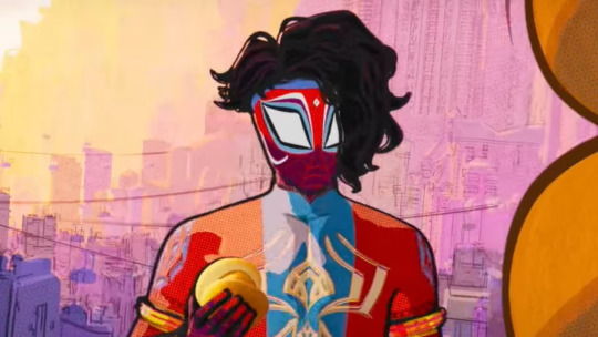
The neckline here? That's the kind of cut that's most typical of kurtas. Especially more ceremonial, kingly, wedding sherwani, or generally festive attire; a regular kurti might have a v-neck or something, but this curved collar? Very Indian and classy in a way I can't fully explain.
No. 4:
This next thing I'm going to go completely ballistic about, everyone hold on to your seats!!!
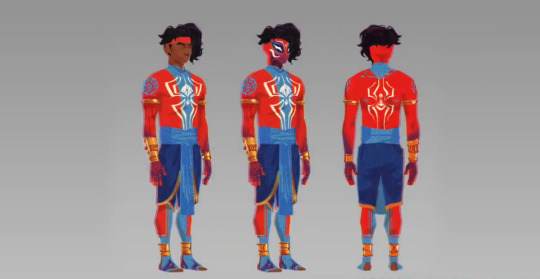
THE FUCKING MOTIF ON HIS UPPER ARMS. IT'S EVEN ON THE MEHENDI-ISH PATTERN ON HIS WRISTS AND HANDS. THE SPIDER SHAPE TOO. I AM NOT NORMAL OKAY
LISTEN.
LISTEN TO ME
TBIS IS CONFIRMATION THAT KRISHNA PAVITR IS CANON
HE IS SO SO KRISHNA CODED
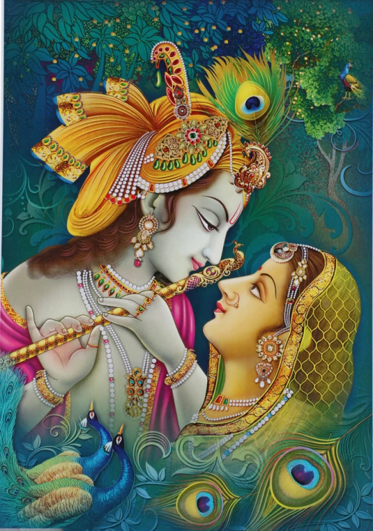
Idc if I'm delusional, i DARE you to look at that blue design and tell me it doesn't look like a peacock feather
THE SHAPE OF HIS FUCKING SPIDER IS OH SO SUBTLY CURVED TO BE PEACOCK FEATHER SHAPED TOO
There is no human way for me to be normal about this i need a minute
Okay for context:
Krishna is a very important and beloved god in Hinduism. I cannot overstate the love I have for him, even being mostly non religious myself.
There is SO MUCH about him he is such a big deal and thanks to him being made a character in popular Indian cartoons and so many animated and live action movies being made about him, he is literally woven in the fabric of our collective consciousness and love for our culture
He's a mischevious and fun and chaotic and lowkey antiestablishment kid deity. He contains the literal universe. He has a deep abiding love for his people and his family and loved ones and the world he serves. He is a dancer, flute player, sweetheart, lover of life. He has a thousand wives, yet one Radha who he never married but is his literal immortalized soulmate. He guides heroes to duty. He is full of wisdom but also silly hijinks. He is so so beloved.
The peacock feather is his symbol! You could see the peacock feather anywhere and it's immediately OH KRISHNA! He wears a peacock feather, famously. In all his iterations, from childhood to adulthood. Peacock feather is his emblem.
Krishna is depicted through the peacock feather. It's become a very common motif in arts like mehendi and various textile arts to have peacock feather and peacock patterns; I'm sure that existed before Krishna too in several cultural circles but he is definitely a huge part of it since. There is a chikankari motif that is very recognisable that's reminiscent of peacock feather but I'm mostly unsourced on that, going off my own interpretation
But there's a definite link between peacock feather=Krishna=inextricable part of culture and art.
At least in North India. He's less of a big deal the further south you go. Still very widespread and overall loved tho.
So anyway seeing that peacock feather type motif on Pav?? Mixed with his Spiderman identity??? Is so amazing to me.
Krishna coded Pavitr real ✨
(Also yeah people have already pointed out that Pav's hand designs are based on mehendi so I don't need to go into that askjasjkas)
No. 5:
Also. Huge fan of his arm cuffs. It's just another Indian warrior thing; often in ye olde times and in mythology, the cuff would be a lot simpler, often just a thread with an amulet to grant you protection. But it steadily became fancier, and now it can be decorative or a valour thing or both
Very often just decorative now actually. Often seen in weddings and ceremonies too
No. 6:
Okay about his bangles now:
I absolutely LOVE THEM I love them so much I am so obsessed with them actually!!
So. First of all
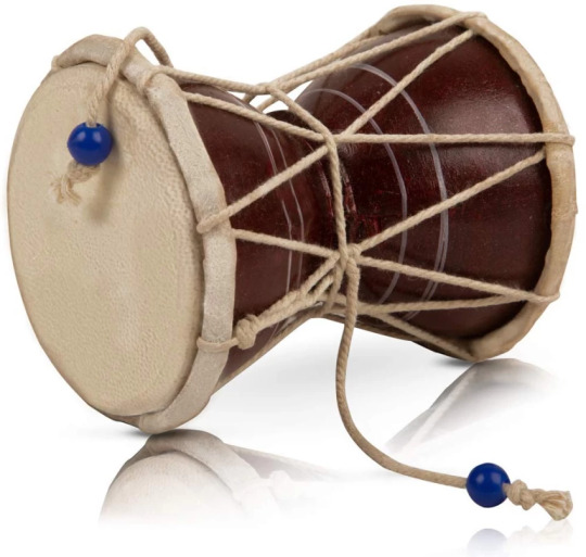
I remember there being a confusion in like earlier fics especially on whether they were bracelets or damrus or bangles or what
And i have Thoughts
So first of all
They are not damrus/damarus.
Damarus are a musical instrument made of wood and with two beaded ropes to beat on the small drum-like ends. They're also symbols of lord Shiva who uses a damaru.
They are very different from what Pav wears and i remember my fucking whiplash when earlier fics called his bangles damarus. I think i choked on my maggi.
I don't mean to be rude to the writers ofc, they were doing the best with what they knew. But it's just very jarring to me to hear that
I think an explanation I heard was that Pav's web shooter design was inspired by damarus? Which yeah I get that and I actually wanna talk about it bc I very much see it. But they are very much NOT damarus themselves
So
First of all i personally have never seen nor heard of the kind of bangles Pav wears which appear to have a strip of cloth in the middle? While being gold cuffs on both ends? Which is new and interesting actually and opens up aspects abt his character that i find really interesting
Bc first of all: that implies he made them himself from stuff he already had inspired by things he saw. It seems, at least to me, like he used bangles/kadas he had to make the shooters he uses, which are designed the way they are for easier slinging and his cool tricks with them which would be harder if they were solid gold, and also the shape when he does the cool yoyo-y trick and hits The Spot with it and everything is very damaru shape. Which is also pretty cool if it's meant as a reference to Shiva and his damaru (he's a very fierce god with the damaru) or a reference to the street performers who use it nowadays.
Either way - and also additionally the fact that PAV LITERALLY DOUBLED HIS BANGLES AS WEB SHOOTERS WHICH IS SO CREATIVE AND SMART - and developed his own whole signature skillset with it?? And made his own bangle/shooters as I said before????
My boy is PEAK jugaadu
He is the embodiment of jugaad
Never has anything been so true to the Indian spirit than jugaad
Okay so for context, the jugaad that I keep talking about:
It basically means makeshifting and/or inventing stuff you need from the limited stuff you have. That's a very simple way of explaining it. Just imagine that, but up the silliness level x100.
For example, a guy jugaaded a showerhead by poking holes in a sprite bottle and putting a hose in it and routing it to the tap.
Jugaad can be both very smart, and very funny and silly
And it usually involves combining useless stuff/trash/just stuff you had lying around to make smth that you didn't wanna waste money buying, and often ends up having more functions than the stuff it was meant to replace. This but it's also very crackheaded. Like idk how to explain. It's basically makeshifting, but it's just developed into such an Indian Spirit Thing™ that we have a word for it
So i love that Pavitr's bangles do all of that. He is a true Indian boy to his core!
No. 7:
Okay I have thoughts on his dhoti too!
So.
Blue.
I know why they used blue for his dhoti, what with the spiderman colours, the need to complement his bright red with smth softer, and everything. I get it and i love it so so much. What I'm about to say next is not a complaint against this at all, it's very good design imo
But.
Everytime I look at him in his fucking blue dhoti
I just remember all the times my grandmother has apprehended me and made me go and change for trying to wear blue or black at a Puja
Bc they're apparently unholy colours ;_;
Basically yellow, saffron, red are the appropriate holy colours. Now that i think about it, I've never seen a god or mythological king depicted in a blue dhoti or generally blue clothing either - farthest they go from the three i described is pink or green
I never really thought about it until my Nani pointed it out. I'm still not sure if anyone except her even knew or cared about it.
But that is the memory that bonks me on the head every time i Perceive the blue dhoti
Bro upgraded from funeral colour (white, which is his dhoti in the comics and absolutely infuriates me on a visceral level) to unholy colour askaskjjska it's so funny to me
Purple was still a luxurious colour, but generally warmer and/or lighter colours are The Done Thing. It's an old notion and the cultural connotations are now very diluted by Western influence and also none of us Caring about a lot of it anymore (not necessarily a good or bad thing particularly)
Indigo also has. Loaded connotations.
Because Britain did a Colonialism and a lot of Indians suffered for it. It's a whole history lesson.
I would rather not get into the whole details but basically Indigo (the plant from which the dye was made) was a valuable commodity and Britishers essentially forced farmers to grow only that, ignoring their need to grow food or sustenance or care for the land in general, especially in the Bihar-UP regions. There were eventually a lot of revolts where many people, esp farmers, died.
Basically a double whammy of starvation and death as a direct result of colonialism. It was a major part, historically, that sparked rage for the freedom movement
If you wanna learn more abt it you can search up Champaran farmer revolts!
Also about the drape of Pav's dhoti:
I've seen a couple of memes and reels abt how Pav, in an emergency, suiting up for Spiderman duty, would be taking an hour to drape the dhoti and stuff
And those are hilarious and i love them
But also
That's literally not even a proper dhoti -
So the thing pav wears is basically more of dhoti-pants with a cummerbund.
So okay I need to explain this better hold on
A dhoti is basically a sheet of fabric that is draped around the waist and down. The elaborateness of the cloth can vary vastly from intricately patterned silk and brocade, to plain white cotton with a thin gold border optional
The drape of the dhoti varies even more depending on region, occasion, occupation, and status. You can have everything from the casual simple towel like drape and tuck that some men wear to relax on a daily basis, to an intricate thing with many folds and pleats and tucks and the middle part that hangs (I forget the name for that) that would actually legitimately take hours and is often adorned with jewellery . To a thing that's flexible to move in and also looks very pretty and is genderneutral some dance forms call for.
Basically. The drape varies vastly. And it's all one cloth, maybe a second one for a separate cummerbund sometimes, I'm not that well versed abt dhotis tbh.
But the thing Pav wears?? It doesn't seem to me to be folded the way I've ever seen any dhoti
The way it's folded and shaped is not how those style of dhotis work. There would be a lot more pleats and folds, for one. But it's not shaped the way to match the less-folded dhotis either.
Now, I'm no dhoti expert, but that leads me to believe that's not a full on dhoti. What it's more likely to be is dhoti-pants
Dhoti pants are this fusion thing. It's in the name. I haven't seen it much but I know/think/am pretty sure its a thing, bc most Indian guys now don't know how to drape a dhoti either and it's a good solution. Worn like a pant, looks like a dhoti. Simple. A cummerbund for the middle drape, and you're set!
Also side note: the fold with the distinct two legs and the middle drape that Pav has? Is the most commonly depicted warrior and king drape,, at least in North and Middle India, I'm not as well versed about the South but I think it's the case there too. The gods are depicted in that drape too
I have fewer comments on his leg design, I like that it's reminiscent of mehendi even on his feet bc yeah that's also done on the feet, although rarer now and also a bridal thing
No. 7:
He has gold cuffs on his ankles that I really like!
Okay so here's the interesting thing:
I could be wrong, but
But that kind of thick ankle cuff is not actually an Indian thing?? At least not in the warrior hero context that a lot of his design seems based on. At least not of that shape and width.
What we do have though are very simple metal ankle cuffs put on (I think) one ankle of young kids for protection,, again a tradition I'm not very familiar with, it's more localised
The other thing we have that's more interesting tho:
We have payals and ghungroos!!! Which opens up so many exciting prospects to me because those are both dancer things
Like. The payals are ornamental. They are beauty things as well. All women would wear them, their elaborateness and style depending on status, money, and region ofc
They double as dance and performance things too ofc
But ghungroos are specifically dance things
Very very sacred and honoured to the dancers, too. Quite personal
(These are all little bells on the ghungroos btw!! Hundreds of them. They ring out when the dancers dance)
This is what Pav's ankle cuffs most remind me of. It's not the same thing ofc, and idk if the designers were even thinking of this.
But it would be really cool if he was inspired by ghungroos to have cuffs of similar thickness and placement on his legs. Perhaps even familiar to him hmmm?
This is me theorizing HARD to support my headcanon, but combined with Pav's classical dance-n-martial-arts-y moves, i present to you: Pav learning classical dance when he was younger (a thing that a lot of Indian kids do and only a few seriously continue for their lives) is real.
I rest my case
Like yeah it's known at this point that Pav's moves are based a lot off the martial art of kalaripayattu. Which is SO AMAZING AND I LOVE IT SO MUCH!!! But I also think this would be a cool influence alongside that, bc it really feels visible too.
No. 8:
The fact that Pavitr is barefoot is so so important and dear to me!!!
In Indian culture, you're supposed to take your shoes off as a mark of respect, before entering the ranabhoomi (literal transl: battleground, but not in an actual war with swords and shit ofc)
Being barefoot for pujas and in temples and on sacred ground in general is very important
As is being barefoot when you're walking onto a kabaddi or wrestling ground,, basically any fight that's supposed to be important and/or with honour. It's a respect thing for the opponent and for the earth you fight on.
There are a lot of contexts where being barefoot is important or a given
There's the prayer ground bc it's sacred and holy and you can't be dragging your dirty ass shoes there it's super disrespectful. You gotta enter with clean feet specifically, dirty feet are considered disrespectful too. that's also why there wil often be feet washing areas outside of temples here
Then there's the ranabhoomi that I just said, which is more of respect for your opponent and the earth. Respect to the earth especially is very important in the combat forms and sports I know of at least
Then there's the basic respect and tbh the hygiene thing too, of always taking off your footwear before entering another persons house. That one is more flexible, sometimes you can take it off inside, but the done thing is to take them off outside generally. Especially if you're a guest who's not particularly close. You'd be considered really rude if you didn't take them off at all. But again that still varies by person,, the older generations are way stricter abt it
Then the bride thing,,, it's actually a whole small ritual. The bride and groom will enter the groom's house for the first time,, which is considered the bride's new home bc misogynistic tradition so yeah. But basically it's supposed to be an auspicious beginning to a new home and life. (Btw being barefoot during the wedding ceremony is also generally required)
Usually, at least in North Indian tradition, a small vessel of rice is kept at the threshold that the bride must tip over with her foot when entering. It's for prosperity. Then she steps directly into a plate of a red liquid I forget the word for, but it's basically a sindoor paste type of thing. Her first steps into the house must be taken leaving those red footprints behind. That's for auspicious beginning
So Pavitr being barefoot is so so cool from a cultural and a character building standpoint
He takes his job seriously, he does it with respect and honour!!! He seems so chill and happy go lucky, but he's deliberate and respectful abt it!! And he's super connected to his culture too, bc you could just Not and no one would care, but it's so important that he does!!
So yeah!
That has been my full ramble askjasjkas. If you made it this far, have a cookie! Thank you and I hope this was interesting <33
#pavitr prabhakar#atsv pavitr#spiderverse pavitr#spiderman atsv#across the spiderverse#spider man: across the spider verse#character design#rant#starr rambles#analysis#design analysis#character analysis#culture#indian culture#cultural references#pavitr my beloved#myths and legends#chaipunk#goldenpunk#spiderman india#india love#indian#long post
587 notes
·
View notes
Text
Probably reading into it too much, but it's interesting that Viktor's waistcoat folds over the left side instead of the standard.
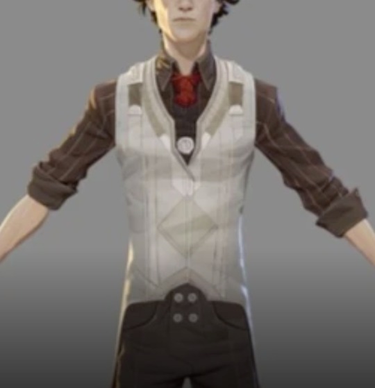
Context:
Most mens clothing buttons/fastens over the right with the left side on top like so:
While women's clothing folds the other way:
Supposedly, this is not to distinguish gender, but to aid in dressing. This distinction dates back to when most [upper class] women were assisted in dressing. It was easier for [right handed] servants to fasten clothing which was buttoned over the wearer's left. Men, however, would dress themselves and had an easier time buttoning clothes that folded over the right.
Now, in today's society (or in the society of Arcane) this is irrelevant as most people dress themselves (with the exception of those with mobility or cognitive issues such as infants, the elderly, or the disabled). Thus, this has become nothing more than a gender-distinguishing trait in fashion.
This probably doesn't mean anything, but I noticed it while looking at references for my cosplay. It bothers me.
The possible takeaways are as follows:
Viktor wears women's clothing for a plethora of possible reasons (trans viktor confirmed!!!!?!?!??)
Viktor lacks the motor skills needed to fasten his clothes and requires some form of help
He's left handed and has custom clothing to aid mobility
It's symbolic of his physical ability and independence (like how vi and jinx have Vs and Xs in their designs)
It's a meaningless design trait that the artists incorporated without any deep, hidden meaning and I'm just projecting my historical fashion hyperfixation onto my current project.
(Although please note that every male character has vests/blazers/coats that fold over the correct way or down the middle, with the exception of Viktor and also Heimerdinger for some reason) (but also note that I didn't check every character) (and I don't seriously believe any of this, I'm just bothered by the knowledge that the way everyone's clothes fold over is seemingly random and has nothing to do with established fashion norms and no other apparent pattern. But the idea of trans viktor, however unlikely, was enough to cast my findings into the void.)
#arcane#arcane analysis#viktor arcane#viktor#viknat#viktor nation#cosplay#fashion history#design analysis#please this bugs me so much
83 notes
·
View notes
Text
Amy Rose’s Quills
Yes, it’s that time again! Where I ramble about character designs and why I adore them so much. In this post, I want to talk about Amy’s quills and why I like the different ways it can be represented in official and none official media.
Just like Amy’s eye color. I’ll also make guesses as to why her overall design changed officially and in canon to make things interesting. Let’s get started!
Long Quills
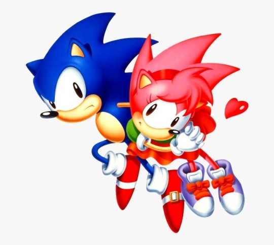
This style is in Amy’s first design. Being the Minnie to Sonic’s Mickey, she had the same quill style as him. Aside from her bangs. While I do think the quills look cute, it almost makes Amy look like Sonic’s sister. I guess that’s why they changed it later on.
I say this only in comparison to her modern design. The Minnie inspiration is the reason she’s here. I’m only talking about her changing designs and making it less identical to Sonic.
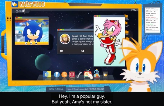
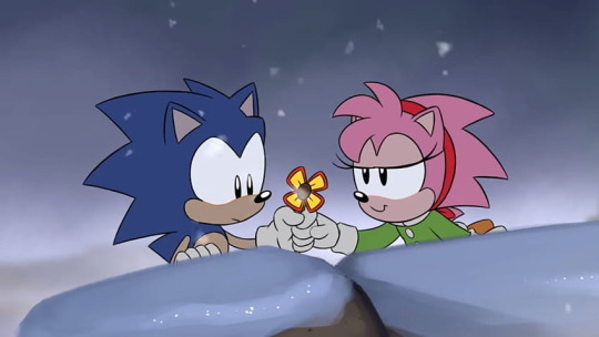
My favorite iteration of her classic look is in Sonic Mania Adventures Christmas special. Just look at the differences. It may not be a HUGE change, but even her nose is slightly smaller. I just love the Mania’s designs in general. They’re awesome! I still do love the OG design too. Classic Amy is so precious.
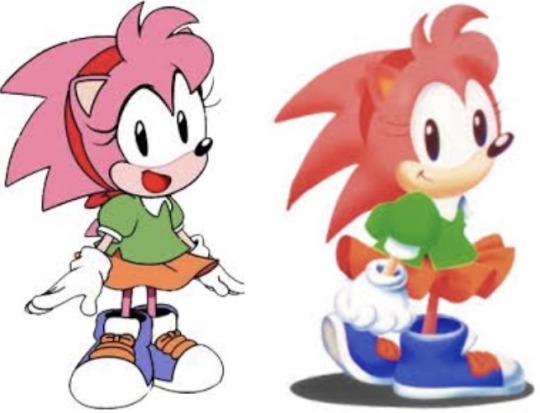
Look at how Sonic’s quills are messier than Amy’s here. I think it gives them more dimension. Showing how one cares more about grooming themselves than the other. It’s kind of cool and I wish it was integrated in canon more. Not because it’s “important” but it’s a fun idea.
Short Quills
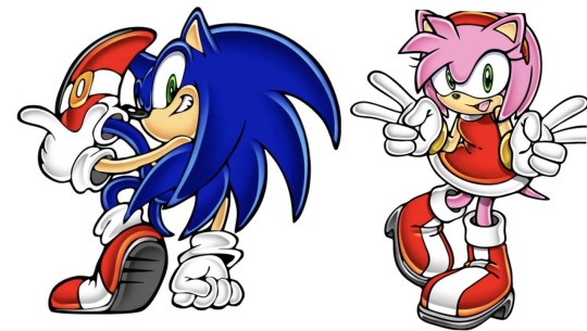
Ever since Sonic Adventure, Amy’s design changed immensely. Even Sonic himself noticed it in Adventure 1. Her outfit, eye color, nose, and quills (besides her iconic bangs) are different. Giving her an older more teenage look. I say this because Amy doesn’t look any older or younger then Sonic.
(Or any other teenage/young adult character for that matter)
They are sometimes even shown to have the same hight at times. Back to the quills, Amy now barely resembles her classic design and definitely looks less like a Minnie Mouse inspired design. Her classic design is still amazing, but I believe the change was a necessary one. The differences between her and Sonic are more apparent and noticeable and I think that’s a good thing.
Mixed
Here’s my own example, but there are many other fantastic fanartist who does something similar with both styles together.
Why do people like this quill style a bunch? I’d say it adds more flavor to her personality. Her having the classic long quills along with the short front dreads could symbolize her adventurous side along with her girly side. It blends the two nicely and overall looks visually interesting. While I will say her shorter quills does differentiate her better, I’ve seen plenty of artist change it up a bit in unique ways. It’s fun to create and see what ideas an artist could have for Amy.
Why Amy’s Quills Were Changed?
I’d say the official reason is because of the things I said before. But the in canon reason could be Amy wanting to look pretty enough for the next time she sees Sonic. Or perhaps she thought to change her appearance simply because she wanted to look cuter. Though I’d say the first answer is the most likely because her love for the blue blur was much more prominent in the past.
Conclusion
Did I use this as an excuse to gush about Amy again? Yep! I regret nothing. I love love LOVE Amy Rose and how interesting her design is in the past and present.
Stay Creative! 💜
#sonic the hedgehog#sth#amy rose#amy rose hedgehog#sonic and amy#Sonamy?#modern!sonamy#classic amy#classic sonic#sonic adventure pose#sonic fanart#fanart#my art#sonic art#tailstube#sonic mania#sonic fandom#sonic design#design analysis#character design#quills#art on tumblr
159 notes
·
View notes
Text
I’ve noticed there’s a (seemingly) intentional disconnect between Blot and the other troupe members.
Yatta and Looey are very, very similar visually and conceptually. Which is what made it so hard for me to theorize what Blot could be before he was released. They have a THEME. Both primarily yellow, party supplies that goes in the air, and very fragile (you can pop a balloon with a pin just as easily as you can beat a piñata). In some scenarios they’re both intended to be destroyed as well. They are bright and colorful, but very short term.
Both commons as well! And that’s what immediately stuck out to me, because Blot is a rare, I assumed the entire troupe was going to be common when Yatta didn’t introduce an ascending pattern in rarity, but it’s Blot specifically that’s singled out.
Not only that, but he completely defies the set theme. He’s not any sort of party supplies, he’s completely monochrome, and as opposed to his friends; ink has permanence. It sticks to things, it’s hard to get rid of. If you spill ink on paper you are not getting that out! He even has a speech quirk furthering his difference with the rest of the cast. And an extra star in stealth defying the clear distractor setup with Yatta and Looey!
And ya, most of these traits are for his mime theming. Black and white color scheme, weird speech, slightly stealthier due to being a less attention grabbing form of entertainment; but that doesn’t excuse them.
His entire gimmick is surrounding himself with things like him. The mini-mes, the hands. He’s completely stationary, alone, in his twisted. “Striking anyone who gets close”. If twisteds are the polar opposite of their toon counterparts, then T!Blot pushes people away. Keeping them from getting close, surrounding himself with barriers and extensions of himself. As opposed to the toon who’s found companionship, who’s active and conversational (“for a mime you sure talk a lot”)
Maybe I’m just looking too deep into things, but it’s interesting to me. Yatta and Looey look to be designed for each other, while Blot seems to be the oddball out. But they don’t treat him that way! They care about and enjoy his presence, and he shares the sentiment. He doesn’t doubt for a second they want him around (as seen by his interaction with Vee). And honestly? I find that really sweet
Different but cherished. I love Blot for that.
#berryboxed#dandys world#dandys world blot#design analysis#????#I think?????#idk I just kinda ran a yapathon with no clear goal and hoped it came out coherent#blot the ink blob#Blobs of ink are often seen as mistakes too. Something that happens on accident and ruins things#which I find interesting#makes me wonder if their friendship either in show or in Gardenview wasn’t planned#I think it’d be cute if they were some of the few toons who formed their relationship naturally#as opposed to ‘well we like each other in the show. so we like each other here’#but that’s just HC territory#lol#proxy rambles#dandys world looey#dandys world Yatta
29 notes
·
View notes
Text
Nope still not normal about Timeskip Mayday
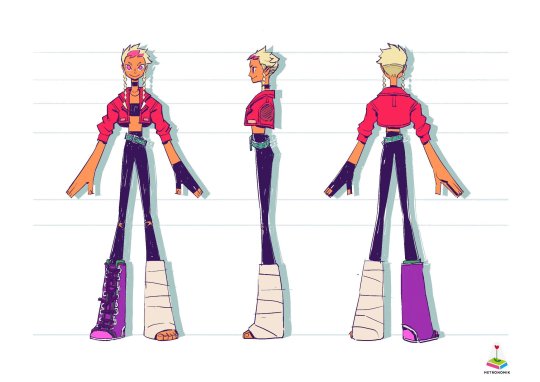
They didn't just give her the Tati cut- they lengthened her legs by getting rid of her dress/skirt and made her top half fuller with the jacket.
Ellie did everything she could to make Mayday's sillouette as close to Tatiana as possible
#mayday#timeskip mayday#design analysis#i#hhhh#ellie what are you doing#metronomik what are you cooking#nsr#no straight roads
101 notes
·
View notes
Text
One thing about Apple that’s always intrigued me is how her hair is blonde, and seeing a TikTok slideshow sharing the OP’s head cannons and reading ‘Apple white dyed her hair but her mother taught her how to embrace her own natural hair’ which is so cute but it actually lead to me thinking about it for a week straight
Personally, I too also like to think that Apple had her whole childhood with her mother reassuring her that her blonde hair is beautiful, even if it’s not black like Snow White’s. But seriously, I never searched for any character analysis regarding Apple’s design— specifically her blonde hair differing to her mother Snow White, whose hair is supposedly as black as ebony. But big kudos to the designers of Apple, her Blonde hair makes her interesting and it adds up to her character, maybe taking one’s curiosity and interest into wondering how. Black hair, Blonde hair— I don’t know, both hair colors somehow suit her color scheme perfectly (though I prefer the blonde color more)
Unlike other Snow White inspired characters like Neige LeBlanche from Twisted Wonderland whose hair is black just like the snow white he’s inspired from, Apple’s hair being blonde makes her really unique !!
Okay I’ll stop the yap-sesh rn, since it’s just me talking about how curious I am of Apple’s blonde hair but then later on saying how much I love it

96 notes
·
View notes
Text
You know? With how much nefera changed for her doll I’m curious about if we ever get an g3 Iris doll. And how much she would change.


Because the number one thing I do not want them changing is her body type.
Do not make her skinny, do not just give her a modified version of catty’s body.
She has the biggest body type of the cast and with G3s good track record with giving characters doll body types that actually fit them, I do expect them to give Iris her own body mold.
Nor do I expect them to change her fashion style much. Not talking about these specific pieces but the general vibe. That being casual alternative.
She looks like a teenager who wants to dress alternative but knows they can’t push their parents buttons about it so this is the best they’ve got at the moment. And that’s interesting!
That builds up a character! A character they seemed to be slowly leaning into in the 2D webisodes. Someone who knows the person they genuinely want to be but needs the push to actually begin that self actualisation journey.
As much as they could without her speaking that is. The g3 media seems to have a running idea of Iris not really speaking much (though she can sing.) the 2D webisodes re contextualise this as shyness but I really like the idea of her being selectively mute.
The actual fashion pieces themselves though? Yeah I can see those changing.

G3 Iris’ current outfit design is in a weird place design wise. Because she’s not designed with being a toy in mind, but she’s also not not designed with being a toy in mind.
It’s weird. Like she’s halfway there? The graphic T-shirt, beanie and necklace definitely give doll outfit design. But the rest of the outfit doesn’t. At least not in the way G3 monster high usually does it.
Her shoes being near detail-less bordering on “sock shoe syndrome” is probably the thing I notice the most and the likely guaranteed change.

Monster high does not mess around with its shoes and with her standing next to clawdeen it becomes clear what I’m talking about.
G3 core Clawdeen already has what I’d consider on the simpler end of monster high shoes. I definitely think Iris would at least get a shoe upgrade.
Nothing crazy of course. Don’t think she’s the type for a fancy heel. But something like g3 core clawdeen but trade out the fang motif for an eye motif? I think that would suit her really well!
But little changes and tweaks aren’t really what we’re talking about in a post nefera doll reveal world are we?
Like I expect them to change her more than that. And the best place to visualise that kind of significant outfit change? Is with her concept art! Which we are lucky to have!
And no, I’m not talking about these outfits.


Do not get me wrong. These are gorgeous designs! But I don’t want them to completely abandon the idea of Iris being an alt kid. These are simply telling too different of a visual story. Maybe if she gets siblings though! (Or a mum for the fourth. Why does it read significantly older?)
I’m specifically talking about these ones.


The alt kid iris’! Now I doubt they’d go with something like the outfit right next to the outfit chosen for the show. It has a lot of the same problems translating to a toyetic doll.
In fact it might be worse in that regard. The pattern on the sleeves and neck isn’t enough to make up for how empty the whole shirt feels. Also without the black under shirt the final Iris has, it’s blending into her skin too much.
The shorts/bag are stand out parts of the design, which draws your eyes away from her face in a way I don’t particularly care for.
It’s still too simple. It’d be cute if she had a doll in the budget day out line but we’re talking about a hypothetical core doll here.
But the other two? I think are genuinely great! Both having a good amount of detail in the right places but not overdoing it.
My favourite though? This one.

(I must stress clearly though. I’m talking outfit and hair. Not bodytype. I’d fully expect them to use her canon body type.)
This one genuinely feels like it popped off a pre-existing doll. It has a strong monster/greek theming to it, while also keeping that exact vibe we’re looking for when it comes to iris’ G3 personality!
A piece I particularly love is the plaid shirt tied under the hoodie.
It really leans into the “I snuck my alt hoodie into school in my bag and changed into it when I got here” vibe.
I had friends who did stuff like that as a kid! It’s genuinely excellent character building!
Now I understand why she didn’t get this design back then. This is a lot of detail for what was a minor character at best. It’s a lot of clean up when animating to avoid clashing errors and clipping. For such a non important character it wouldn’t have been smart.
But that would change if she got a doll! This kind of detailing is encouraged on doll design! Especially on the average budget of a core g3 doll! Take one look at g3 Jinafire!
I doubt they’d copy it exactly. I’ve heard unused concept designs can get a bit weird when it comes to copyright.
But it’s the direction I want them to take <3
32 notes
·
View notes
Text
You know what? Screw it
PORTAL 1 GLaDOS MODEL STUDY AND REFERENCES
(Below cut VvV)


--- --- ---
Decided to boot up Garry's mod once again, but I wanted to play around with Portal 1's GLaDOS animations and realised that she doesn't get much love with this design. I know it's TECHNICALLY been retconned out at this point, but I still find this older interpretation of our favourite killer robot lady quite interesting. This version of GLaDOS holds more of that "upside-down woman" vibe that is seen in a few pieces of Portal 1 concept art more than Portal 2 does. I guess you can interpret that however you want, but something something she sheds more of her more "humanoid" façade now that she's completely free from the scientist's control.

(source)
Fun fact: They were going to lean into the "humanoid" details of GLaDOS as in old Portal 2 beta test animations, she's emotes a lot more with her body and the "arms" on the sides of her body. She's straight up sassing it. Serving as some may say. But it confirms that GLaDOS in this design is supposed to be a humanoid figure bending backwards(or upwards due to the angle she's held at) and being connected to the ceiling by the legs.


(source)
I haven't really drawn Portal 1 GLaDOS myself aside from a couple headshots when I'm bored, but being able to put her design into the restraints of a somewhat human body has made me a little more confident with learning.
A few extra notes before I close this up.
Portal 1's body is rigid and stiff. I suspect it to be due to the two supports that link the upper and lower body together. The arms also stabilises the two.
A lot of the tech details are pretty nonsensical compared to her Portal 2 appearance. I don't hold it against the devs though, as it was (most of the team's) first giant mainstream videogame.
Portal 1 has a completely different art style compared to Portal 2 as well. Can be summed up to sleek, white plastic shelling and very circular geometry. Again, a product of 2007 graphics.
Anyways, Hope you liked this little analysis. I'm off to bed 👍
#portal#portal glados#design analysis#reference sheet#art reference#reference#garry's mod#I've got a whole bunch of extra portal character studies so I might post them as well if people want me to#im gonna do it anyways but it would be nice to see if people ALSO want it <3#No art today because my whole pen tip broke. time to wait a week for 1 SINGULAR PEN NIB#anyways#goodnight peeps hope you find this useful
29 notes
·
View notes
Text

Speaking ab the cover art from a Design pov *aside frm the comments that Cale looks out of character in the lore standpoint of vol. 2 art
(spoiler free, dw)
◇ TLDR; vol. 2 cover is beautiful, but it couldve had better color synergy. I can see why the artists did what they did, its just not my fav.
. man I'm just happy to have an official English print lmao, ill take what I can get
---
At first I didn't like the red shirt cause it was too much the same color as his hair. (Like if it was a darker or desaturated maroon, I feel it would've looked better, at least so he isn't matching with his own hair-)
. But now taking a step back n looking at vol. 2 again, zoomed out, I actually think his Face is the most jarring part [more on that later ◇]
◇ . The bright red of the shirt being lit by a yellower light, altho matching w his hair, actually isn't so jarring to me anymore cause I noticed two things
◇ 1) his pants are also tinted red (if my eyes aren't deceiving me) meaning compared to the background and the other two characters, Cale *in his entirety* is a red-toned silhouette -> this is a illustrative design strategy where the artist assigns a group of colors to a specific subject n *Restrictvely* uses the Hue Differences to their advantage. In my opinion, its a good choice in making him contrast and stand out. You can definitely Tell he's the main character with just the cover art.
. BUT it can also give off an Outlandish or alien feeling because (in this case) Cale is the ONLY red in the scene. Theres no balancing of red tones from his character to the background At All (e.g. the artists doesnt add Any red to the surroundings so his character can "fit in" with the scene- like as if you photoshopped a guy in sunny lighting into a dark room, the lighting differences is jarring n you can tell the guy is just slapped on top [not saying the artist did that at all, but the way they painted Cale to stand out feels jarring in that sense). While this does an insanely good job at putting him in the spotlight, it perhaps does Too great of a job, making him feel isolated or strange compared to the rest of the piece.
. (Then again, you can justify that that was the goal. To isolate Cale n show hes alien from a lore standpoint as he's "not from this world" as an isekai story)
◇ 2) but we're forgetting this is a COVER art. It's not Just an illustration to be pretty. To break my earlier point, altho Cale IS the only red in the *Illustration,* this art piece is - fundamentally - a Cover Art. It has the Title thats a part of its design <-<-<- And if we looksey at the title, what do we see? Red and warm tones. Like what other thing thats only reds? Cale Henituse himself!
. The Title IS the balance I said was missing in point 1). My theory is thats Also why the artist tinted the lighting on Cale to be warmer n more yellow, so as to use the yellow orange in the title (and the contrast of cools n warms from the focal points to the rest of the art) to their advantage. It helps add reds to the lower half of of the piece where the only warm tones are Choi Han's hand (the other character) and the fleeting window curtain; both of those details being at the edges of the piece and Both very small so they hardly have an influence on the overall design.
. So the title, taking up the majority of the lower half of the piece, draws the warmth down n assists in balancing the overall cover design.
So the reds have now been explained, but why are the whites so white now?--
◇ . Earlier I had said Cale's face was the most jarring part of the cover. And I still fully stand by that sentiment. Its the same idea where the reds do Too great a job isolating Cale; the whites do Too great a job contrasting w the background n the two other characters - who are black n cool tones - to the point where it Heavily draws the eye, practically in a violent manner.
. The extreme paleness is quite lore accurate for Cale's character, who hes isekaied as, but the extreme lighting Highlighting just his face compared to Choi Han's face is an extremely bold design decision (again, not a bad thing as he IS the main focal point, but adding onto the Isolating Spotlight trait going on)
◇ Ok then, but why's his jacket also so freakishly bright white? I heard from a fellow lcf fan (love discussing w you dawg <3) that they think the jacket is the worst part of his cover design.
N I agree. The reds standing out can be justified as a design strat, his face is the focal point so thats why that stands out, but why the jacket??
. Here i am on my artist apologist era <3
◇ . The jacket being blindly white is (probably) to Dampen the Harshness of his face being so bright.
. Altho the guy looks great in white ☆°• with how extreme the lighting is in this cover art, I think the artist wanted to balance the laser beam that is Cale's face paleness by spreading it out to his jacket, specifically that left collar fold ( i think that's called the lapel?)
. Basically by making the jacket's collar also intensely white, the artist gives their best attempt at trying to make Cale's skin less jarring so as to not make it so ridgedly highlighted. Like black ink spilt onto fresh paper, they tried to spread it out so its not so condensed in high contrast. ...But that only made the jacket join in on the uncanniness- TTvTT
---
(Posting the pic again so yall don't gotta scroll far o7)
Other notes I've noticed n wanted to just point out while I'm here looking through the Design Lense ☆°•
☆ The red of Cale's hair and the red of his shirt n neck scarf sandwiches his face, making it stand out even More. Ealier I said the contrast of the vibrant red to the paleness makes his face draw the eye, but thats also thanks to the *position* of the colors! Not just the colors themselves B) isn't that so cool (tell me yes even if you have to lie-)
☆ The lighting on Choi Han's cape, chest, to face -> the window arch -> to Cale's entire person being lit up + how he's wearing a long white jacket
. It all creates this general arch of light tones and highlighted features which surrounds and hugs the title! The artists really knows how to use their darks and lights !!
☆ Choi Han's entire person, Cale's pants, and our lovely Roan Miru (the dragon) are the only deepest dark black tones in the entire piece! The privilege of being the subjects <3
☆ cale looks crossed eyed lel
. Im glad I'm not the only one who struggles with eyes still
. Or maybe this artist did it right n I just don't know how to draw eyes- (very plausible tbh)
Man I love artists
---
All in all, Im not a fan of vol. 2 cover art but I can see why the artists did what they did
◇ . One of the most important things of commercial art is that its visually pleasing, regardless of design, lore, or even logic. The design choices are golden but putting them all together couldve been done better. Not that the art is ugly in any way. Its still gorgeous af, there just couldve been more balance or overall color synergy.
This is just my opinion anyways :D! No hate anywhere <33
#textpost#man im a fcking nerd LMAO#lcf#tcf#lout of the count’s family#lout of count’s family#trash of the counts family#trash of the count's family#cale henituse#choi han#art analysis#spoiler free#color analysis#design analysis#oh jeez what a hefty post#i love art man
121 notes
·
View notes
Text
Hi everyone who happened to stumble upon my humble post! I am absolutely terrified of the internet and its inhabitants when it comes to sharing ideas and opinions, but I am simply too ecstatic about Eternal Sugar Cookie and her upcoming update. I swoon over cute characters who are secretly evil. It feels like I will implode if I do not share these thoughts, so please, feast on my theories!
This post will focus on Eternal Sugar Cookie's design alone. I might write a different one about her Garden of Sweet Delights and more in depth theories about her story soon.
Keep in mind I am not a professional, and feel free to share your thoughts with me!
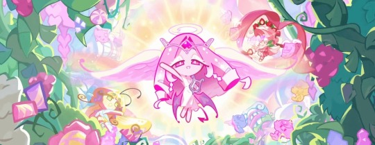
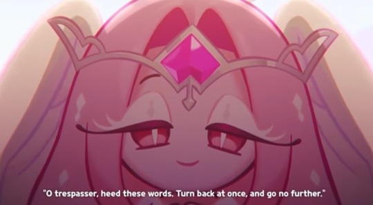
Eternal Sugar Cookie has both angel and devil motifs in her design. She has two big white wings and a halo floating above her head, giving her the appearance of an angel. At first glance, this makes her appear divine, innocent.
But when you take a closer look, she has a different set of wings underneath, darker and pointier than the white ones, and a spaded tail, typical attributes of a demon. This all alludes to her not being the sweet entity she appears to be.
Her eyes are pink with white slit pupils. Slit pupils are often associated with snakes. Snakes symbolize deception, if not the devil itself.
Something also worth mentioning, and something that also may be a stretch, is the tiara on her head that holds her Soul Jam. The head garnment makes shapes on the sides of her head that almost make it look like she has devil horns.
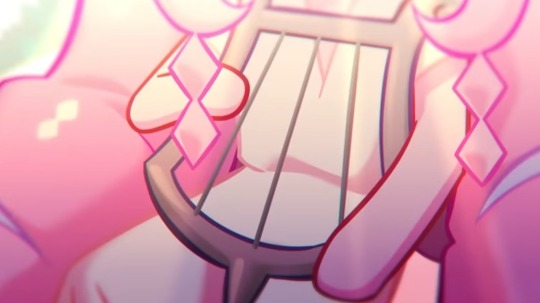
Eternal Sugar Cookie wears a white dress, which appears to be a toga, a type of robe people wore in ancient Greece. This specific style of robe might have a different name than a toga, considering there are many different styles, though I am not very knowledgeable on that subject so I couldn't say which one for sure.
She also plays a lyre, an instrument that was one of the most, if not the most important instruments to the ancient Greeks.
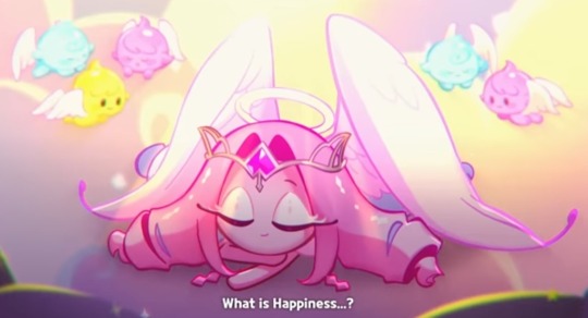
She also has a lot of themes in common with the goddess Aphrodite. Aphrodite is the Greek goddess of love, beauty and procreation. She has a lot of pink in her design, and hearts on her lower wings, both symbolizing love.
One of the animals associated with Aphrodite is the white dove. Her large white wings could, aside frrom the obvious angel imagery, resemble a pair of dove wings. White doves symbolize purity, which ties in nicely with the idea she is trying to appear innocent.
Another detail I noticed was the little arrow underneath Eternal Sugar Cookie's Soul Jam. It could be a coincidence, but it looks like the symbol of Venus, Venus being the Roman counterpart of Aphrodite.
Those were my thoughts and theories about Eternal Sugar's design! There's probably some overlap with the ideas of other people out there, but I hope I might have given some new insights. Feel free to discuss other theories, I'd be delighted to read them!
#cookie run kingdom#eternal sugar cookie#eternal sugar crk#crk#character design#cookie run#symbolism#design analysis#first time posting#please be nice
20 notes
·
View notes