#discord ui update
Explore tagged Tumblr posts
Text
the new discord layout on desktop SUCKS
everything feels squished together! the bar on top is new! the server icons are squircles instead of circles! also the server icons are WAY smaller and i feel like the chat column is smaller (even when the discord window is the same size/bigger).

also the text entry box is bigger but the + and emoji button are smaller?!

also if i scroll to the bottom of the member list there's just. a large blank space
tbh the top bar where it has the "inbox" button and it says the server's name (which is also above the channel list still so yay redundancy 🙄) is maybe the biggest thing making it feel squished
plus there are just. margins between each section that didn't used to be there. like those light grey lines have spacing on either side and that squishes it even more
6 notes
·
View notes
Text
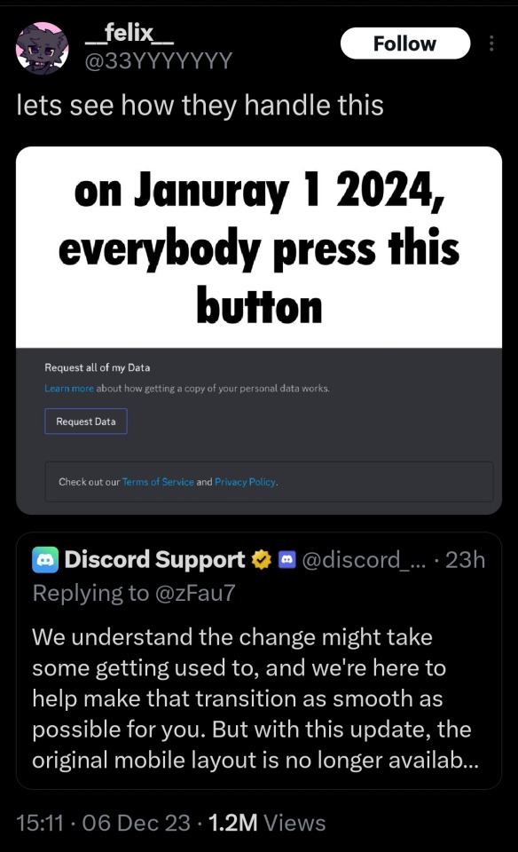
just adding to this, in order to cause the most pain you want a huge and sudden uptick in requests - this is more likely to overwhelm support / capacity because resources are generally allocated depending on prior demand. low prior demand -> less attention on the feature -> greater chance of freaking out developers / management when there's a big uptick in demand :3 according to this Discord article on data retention policy, "Public posts may also be retained for 180 days to two years for use by Discord as described in our Privacy Policy". as far as I can tell from the types of data they retain as described in the Discord Privacy Policy , this means pretty much everything you send (messages, files) but not voice / stream recordings. long story short that's a hefty chunk of data to return for one regular discord user! according to the same privacy policy above, discord also "collect[s] information about your use of Discord and your activities on the services. This includes the friends you add, the users, bots, and apps you engage with, the games you play on your device, the servers or other communities you join and participate in, your roles in servers, content moderation decisions you make, information about purchases or sales you make on or through Discord including what you purchased or sold, and other related actions." (bold added by me). this is stuff i'm curious to know what they know about me!


hey. hey guys you know what would be funny.
#source : have been slammed before by giant increase in feature users#unpleasant especially when you're not expecting it#give em hell!#discord ui update
77K notes
·
View notes
Text
Anyone who was unlucky enough to get the update with the new discord layout,
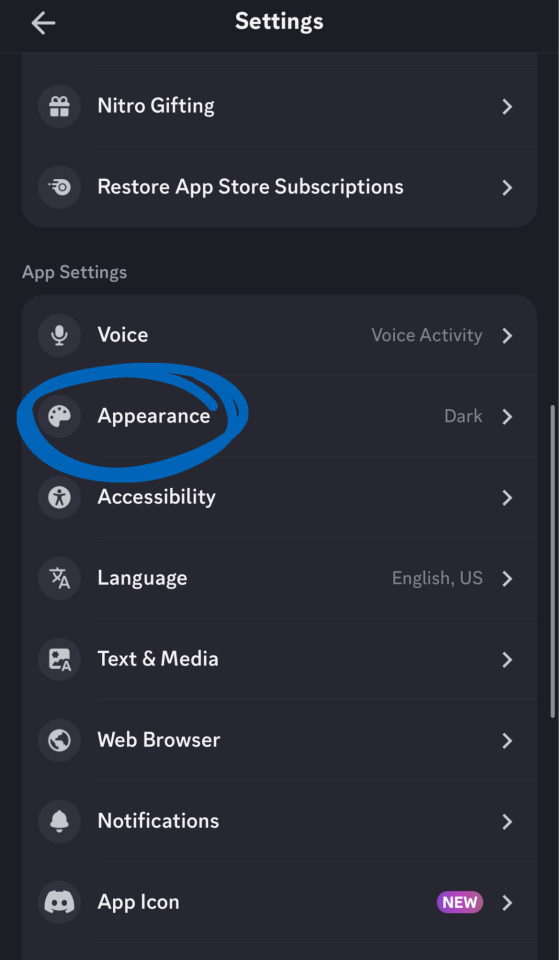
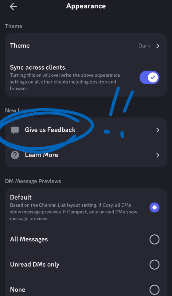
Settings > Appearance > New Layout then choose to opt out
It'll then give you a feedback form. Please fill it out! If it gets enough negative response in the testing phase they may scrap it.
0 notes
Text
can we mass-rate the discord app 1 star for that awful fucking ui change
#i havent updated since summer 2022 bc of all the changes and my friwnd showed me that new ui and. jesus fucking christ#it looks awful. the layout is completely different.#discord#discord server#mine
721 notes
·
View notes
Text
Ok because I'm geniunely curious as to how many people on Tumblr actually like the refreshed Desktop UI for Discord, here's a poll.
Please don't start a fight in the notes I beg of you. Even if you don't like the refreshed UI, remain calm & civil and most of all constructive. :)
71 notes
·
View notes
Text
Okay I don't have as much to say about the 'its ugly' parts of this, I didn't notice the color change all that much, and I had pretty good success fiddling with the channel list layout and classic text size settings to make it look at least palatable (though I am on android and that may factor).
But the UX choices. The bugs.
I'm not sure which is a more insane decision, the swipe-to-reply (a thing that no one wanted, destroyed the ux mirroring of that motion, and actively penalized users for their muscle memory from every other version of the app), or using a menu style commonly used for swipeable panels (at the bottom w/ servers, dms, etc) in a way that is not swipeable at all. Anyone with any understanding of ux would call you a moron.
Also I'm just going to say that this is far and away the buggiest rollout that I remember... maybe in the entire time I've been using discord? Consistent bug #1: If you open the app from a notification, then swipe to see your servers, 80-90% of the time the animation finishes on the same channel you were in. Swipe again, you clown. Numerous people have had the 'message still in the chat' bug, and I've had several instances where no matter which channel you try to select, it only shows contents of the same one until you reboot the fucking app. And that's not even counting all of the weird animation delays and the odd floatiness and non-responsive-feeling-ness of the whole interface, which I have no idea if that's a (bad) intentional design decision or a bug, because *gestures at all of this bullshit*.
pissed abt the new discord mobile update so heres my rant.
the new hud is ugly, laggy and impractical. the lil servers button will ALWAYS have a blue light unless you read every server message which is dumb. they should have an option to turn that off or revert it back to the old HUD (like how reddit has its current site and its "old site HUD" verision), it feels laggy to swap between servers and messages and its slow, making it hard to balance having two conversations at once. you cant even see which people are online in servers by swiping to the side anymore and have to press the search button (which takes a moment to even load, adding more to the lag factor), not to mention, messages look weird now since you ALSO cant side swipe to see whos online/status messages, you must press the search tab and then itll lag to load and show up like how instagrams messaging system does, with it separating the media sent, link and some other stuff. overly complex and unneeded.
not to mention, the new "midnight" color background doesnt even look midnight, you'd expect it to be pitch black on all parts but instead they made it blueish, which is dumb and knowing current discord, they'd put pitch black behind the discord nitro color themed backgrounds (which is also stupid but thats a whole other can of worms.)
overall the new interface is annoying, laggy, UGLY, and hard to traverse, the seperation of areas was unneeded, made worse by the fact that discord themself have said that a setting to make it go back to normal wont be made and if anyone doesnt like it, to delete their accounts. (most likely not caring due to the fact that they have no competition in purely texting apps), it is also full of glitches such as: people being able to send messages but it STILL being in the text box, being so laggy its unuseable and from what ive seen, nobody online is happy as it completely removes all user-friendly access to things and makes it generally hard to use.
178 notes
·
View notes
Text
tumblr staff being reduced to a skeleton crew doesnt mean the site will suddenly blow up everyone can calm down now
it just means there will be less new/"experimental" features and handling reports & fixes will take a little longer
#if youre jumping ship anyway all i'll say is that you can ask for my discord & made a cohost a while ago but literally havent even used it#dont even ask for tw*tter i rarely updated that thing im not about to start now. i hate the ui#venspeaks
415 notes
·
View notes
Text
My message on Discord's new UI
"I have visual snow syndrome, a symptom of visual snow syndrome is that white text on a very dark background can cause afterimages. You know screen burn? Imagine screen burn in your eyes, where whatever you were looking at is stuck there for up to an hour. Light mode is physically painful and dark mode is disabling. Your new changes are an accessibility nightmare and have made the app fully unusable for me. And that's not even mentioning the fact that a lot of the changes you made to the app are absolutely awful, convoluted and just plain stupid for ease of use. I know companies love to pull the "well we know every single tester has hated it, but we spent a lot of money redesigning it so we're doing it anyway!" card. But this isn't the logo, this isn't the blue, this isn't minor changes you'll stop noticing after a while. This is a huge overhaul that is again AN ACCESSIBILITY NIGHTMARE! Cut your losses and listen to your audience because I'm seeing a lot of people posting API alternatives to Discord in other servers and Reddit. People will not be using your app. Do better. Discord mobile is fully unusable to me until you make changes, I physically cannot look at the text anymore. Please fix it and do the smart thing."
I downloaded the last APK file for Discord before the change, but this is genuinely disheartening. Discord is actively refusing to even read genuine complaints, telling people 'Well this is how it is now'. Much like Tumblr.
Please send feedback on the Discord app as well as on the store pages! Please let them know this isn't the same as just changing the icon or the colour of their blue. This is an actual accessibility issue!


I will admit though, the ONE good thing about the change is the new Media feature while searching chats, but it's completely overshadowed by everything else and the lack of pages (only infinite scroll) makes it difficult to find things.
400 notes
·
View notes
Text
Cannot stand the new Mobile Discord UI, actually. Like. Why? Just why? I liked that it reflected Desktop, it was simple to understand and use and all the information I needed (locations of unread messages) were all in one spot instead of split up by buttons on a hot bar.
Also that DMs tab is fucking trash, dude, that triggers every part of my ADHD so bad, why does it look like a screen of emails what is WRONG with you people?
And why is the settings button so stupidly difficult to find? Like it should not be that small and take that many steps to get to. What the fuck?
I've already used a process to rollback to an older version of the app but like why can't there just be a toggle? Why can't we let apps be unique and have unique interfaces instead of trying to make them all work the fucking same? I use Discord because it ISN'T Amino or Instagram or Google Hangouts or Skype or Steam or anything like them! That's the point! That's the fucking point!
Stop fucking homogeonizing everything into Messenger App #57! This fucking sucks!
#slime speaks#i've already left feedback in every avenue i can#i wouldn’t be complaining if they just. gave me a toggle option for ui preference#i get the new ui might make more sense to other people but like#it's too cluttered and has too many steps#i use this app to message because it's simple and has all the things i need it to have#and all of it is easy to find because i know where it is#discord#discord update
279 notes
·
View notes
Text
Ok, no, I actually want to talk about how bad the new discord mobile design is as a user.
If I get a DM on discord, then a little notification icon appears at the top of my discord app alerting me of this. To view the DM, I then have to swipe to open the server list, and then look to the bottom of the screen to see that it's a DM. Upon tapping the messages icon, it opens the messages, and where is the new message? Near the top of the fucking screen.
Compare this to the old layout. The notification appears in the top left, and I swipe to open the server list. I can now not only instantly see that I have a DM (or DMs) because my eyes are already looking at the top of the screen, but I can also see exactly who has messaged me because it shows me their icon. And if more than one person has messaged me, I can not only see that too, but I can also choose whose message I want to read first.
In addition, not only is it significantly more inconvenient to view my DMs, it's also more inconvenient to get back to the server list.
It utterly baffles me that discord would change this design. I have to go through more screens now to see my DMs, and I have to move my eyes from the top, to the bottom, then back to the top of the screen to view them. It is just straight up worse design! What were they thinking???
328 notes
·
View notes
Text
This is what I wrote in the feedback section for the new discord update:
I absolutely hate that the messages like group chats and DMs are in a different tab than servers now. there was absolutely nothing broken about the way that it was laid out and displayed before, so there's no reason to "fix" it!! I also am sorely missing the ability to swipe left to look at all members of a server, the having to click on the top feels clunky and visually unpleasant. I hate being taken to an entirely different screen just to see who's online! it's an entirely unnecessary extra step that helps no one. the idea of "prioritizing messaging" by putting private messages and group chats in a tab seperate from servers is completely asinine when discord as a whole is a messaging service in and of itself! also, it's a small aesthetic change but rounding the corners of the servers when swiping to look at the servers at the side is unnecessary and unwelcome and overall incredibly displeasing to look at. speaking of swiping, making it so swiping left creates a reply to a message is the most unnecessary, confusing, and almost MALICIOUS feeling change yet, especially when swiping left had an entirely different function before. please listen to your user base and stop making so many changes that absolutely NO ONE is actually asking for and actively make the user experience worse. you have a good app, it is not broken, stop trying to fix things that don't need to be changed because you've continually only made things worse.
#im having a very normal and neurotypical time#so do you think discord just hates autistic people or like. what. because what was the reason#discord you do not need your mobile app to look like a fucking social media platform YOU ARE A MESSAGING APP#WHY WOULD YOU PUT DMS IN A SEPERATE TAB TO FOCUS ON MESSAGING. ITS ALREADY A MESSAGING APP!!!!#what is actually wrong with them#i hope everyone involved in this UI change dies in 7 days#discord#discord app#discord update#discord server#discord changes
192 notes
·
View notes
Text
#discord#discord chat#discord server#discord stuff#discord layouts#discord ui#discord update#discord things#discord issues#discord problems#discord app#discord shit#discord drama#discord hell#discord commentary#discord community#discord nonsense#discord moment#tumblr polls#polls#peeb post
153 notes
·
View notes
Text
oh wait i get it now, hell is real it's just in discords new ui
152 notes
·
View notes
Text
why are icons round now...................it looks Bad
17 notes
·
View notes
Text
looking at spotify wrapped like. Well sorry for the rest of you but i would rather die than update apps on my phone so the version of spotify im running is from like 3 years ago and no longer can do anything except play music (exactly how i like it). i know what my results are. you can't tempt me.
#tick biz#imagine updating tumblr and discord and experiencing the godawful UI changes. couldnt be me
24 notes
·
View notes
Text
IM KILLING DISCORD SO BAD they really hate their fucking community this much huh. they REALLY want people to be using their new shittier UI this much huh.
yeah so anywayssss here's a way to go back updated to two hours ago i guess
10 notes
·
View notes