#gfx tutorial
Explore tagged Tumblr posts
Visit Tumblr Blog
Explore Tumblr blogs with no restrictions, modern design and the best experience.
Last Seen Tumblr Blogs


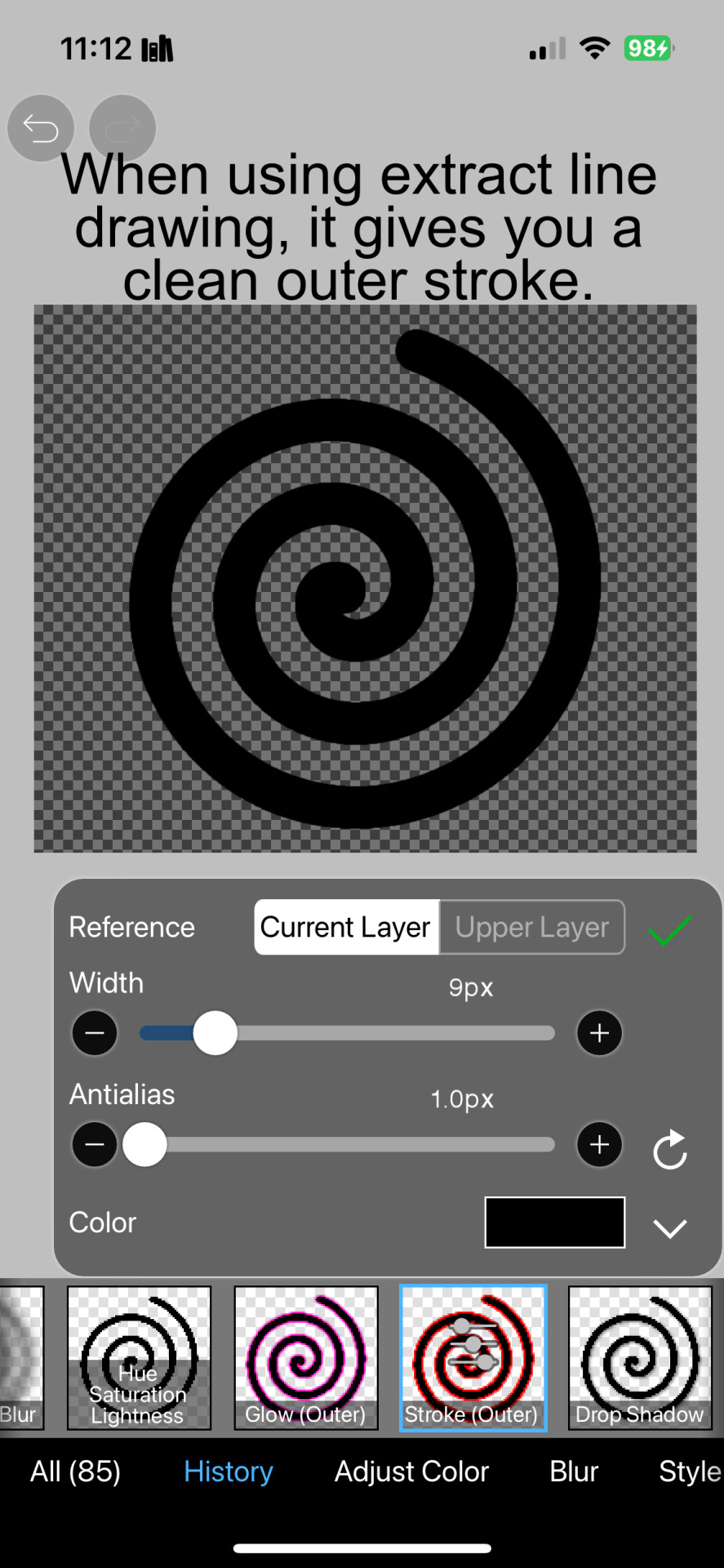
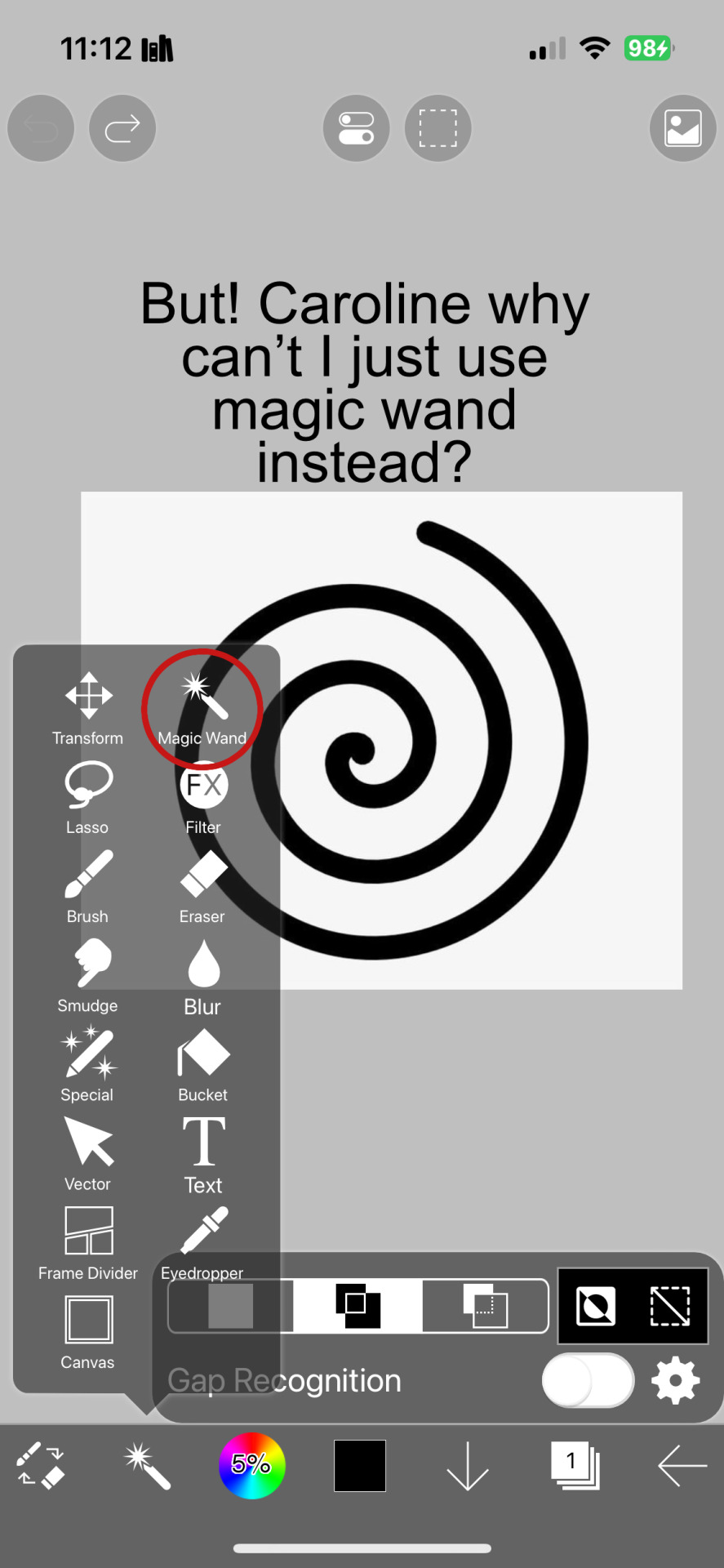
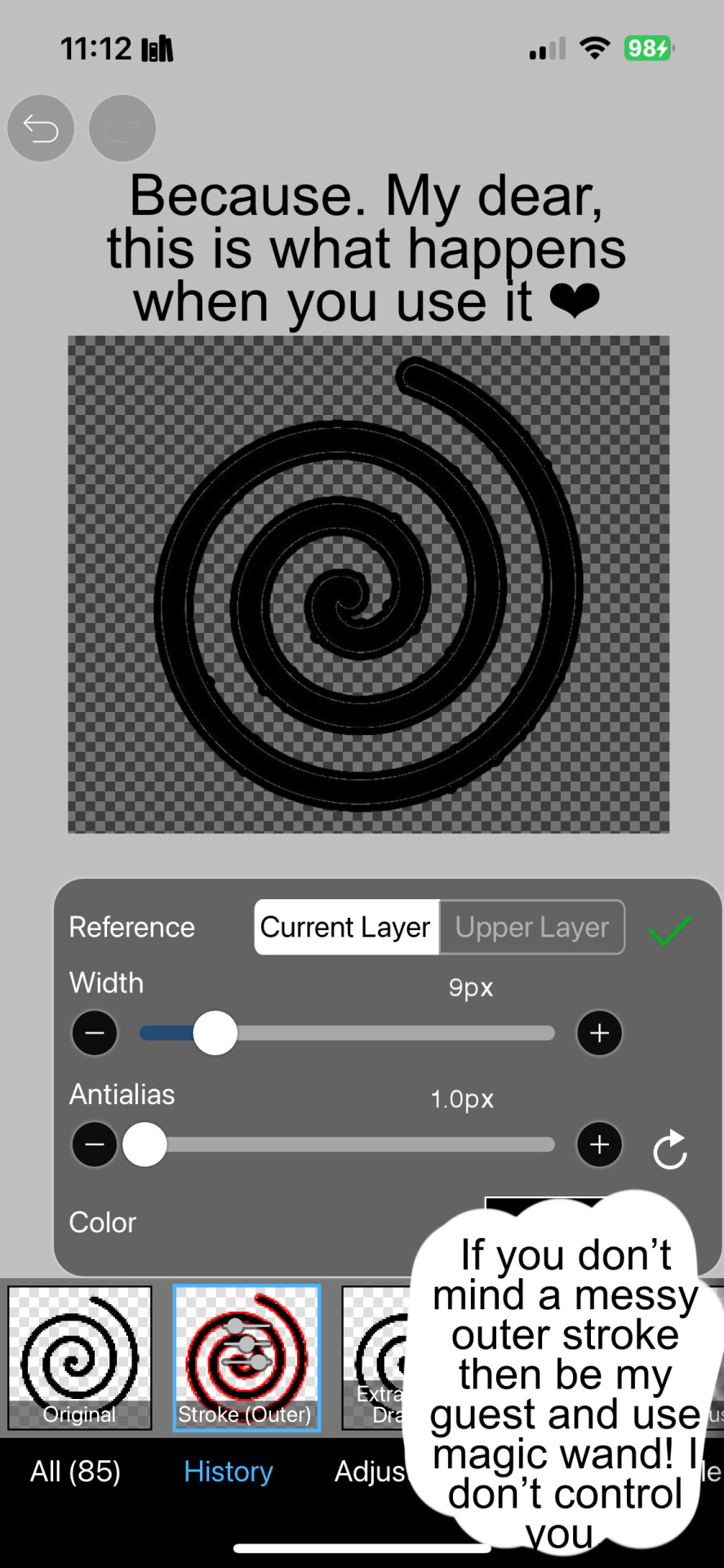
Fun Fact
Post activity is at the highest at 4:00 pm EDT; notes peak at 10:00 pm EDT.
Text
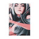
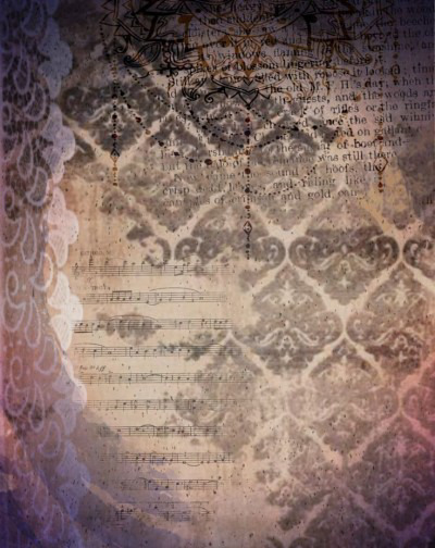
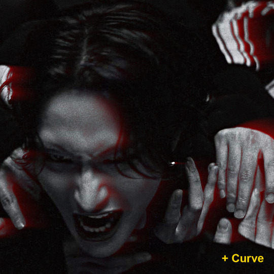
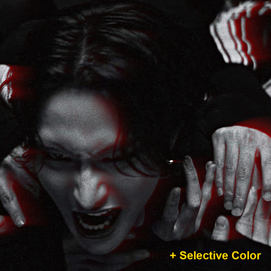
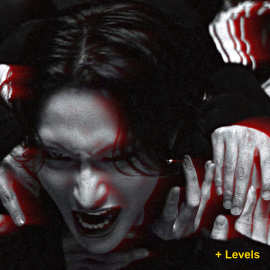
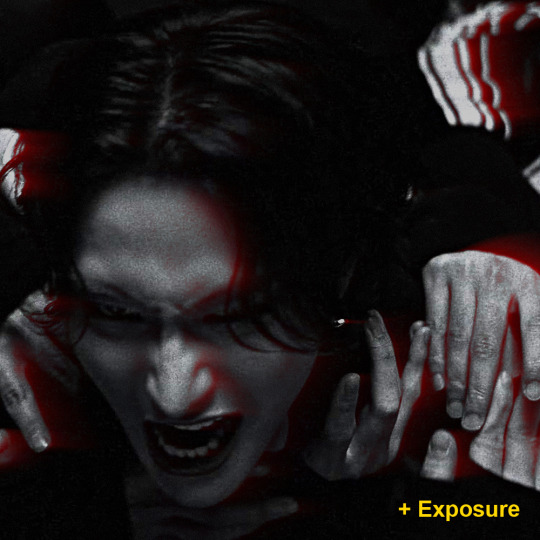
Custom colours for ibis gradient maps tut :3
@azureaedits HERE PAL !!!!!!! :3
#rentry#rentry decor#rentry resources#decor#editblr#rentry stuff#rentry help#rentry tutorial#gfx tutorial#how do I even tag this actually
98 notes
·
View notes
Text

more tips because I'm unemployed much.
I've gotten here without watching videos on how to get better, without tips and so on ,, I'm self learnt. getting good at gfx is the same thing as getting better at drawing.
BUT. you will NOT get better at it without any kind of inspiration.
you NEED inspo to get better here. and many editors don't allow inspo, so make sure to search for editors who ALLOW inspo.
you are going to pick up the image and resources you think were used, then, you are going to try to recreate it.
that's how I got better.

#ʚ♡⃛ɞ 𝐃𝐄𝐕𝐈𝐋 —#editblr#edit tutorial#my edit#edit#editorial#rentry resources#rentry stuff#rentry#rentry inspo#rentry graphics#rentry decor#my gfx#gfx
20 notes
·
View notes
Note
hi so can u give a tutorial just for like.. anythinf?? i wannna learn how to edit but it always looks empty / wrong
hi anon !! i decided to give you a tutorial on how to make your layouts (whether it be graphics, rentries etc) more full since that seems to be your main concern !1!1
the first thing i started doing is using more pngs and masks. it might seem like you’re overdoing it, but trust me, once you get the hand of it, it starts to look a lot better ! i use textured masks (such as these) to create certain effects ! you can use these as overlays, decorations etc, you don’t have to put an image into them.


i also recommend using inspo from other creators on where to place stuff ! it can be hard to figure out what will look good, but if you decide to go in without any inspo that’s okay ! i do that too sometimes :3 just take it slow with yourself! tutorials for text designs are also extremely helpful, especially when it comes to gfx. if you’re looking for more scattered pngs but don’t know where to start, you can try using the stuff that’s already in ibis paint! i love using this stuff a lot :3

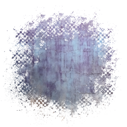
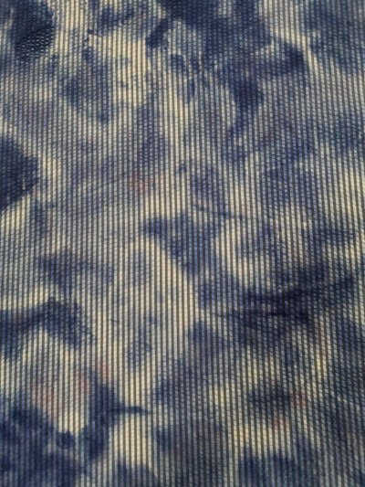
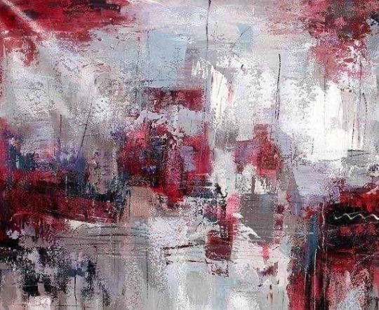
try looking for resource rentries for more textures and overlays ! speaking of, textures are really, really helpful for making your designs look better. here are some of the ones i use the most ! play around wit the settings and stuff until you decide you like where your design is at !
i also recommend playing around with the filters in ibis paint, such as using the filter chrome as an overlay! i use that way too much.. uhm, i also recommend using grayscale and playing around with the brightness and contrast section before coloring your graphics ! theres also a really helpful website if you don’t have ibispaint bro (thank you kapri!!) for gradient maps ! i’ve been using this a lot, and it really helps make my stuff look better :,)
i hope this helps, anon! and anyone else who needs it ^_^. i’m in the process of making a discord server and rentry for my resources also, and there will be some tutorials and whatnot there as well !!
125 notes
·
View notes
Note
hey balu, do you know how to recolor skin / how a coloring psd works for that? like for a character that's pale and not the shade they should be ( cough cough natlan ) asking bc I want to that but idk how
Hiya, anon! I can explain how I personally do it, but here's a huuuuuuge disclaimer: I'm colourblind, so I heavily rely on colour wheel pointers. Throughout this tutorial, you'll see me constantly comparing where the pointer is and trying to use my somewhat limited knowledge of colour theory. I'm sure other creators have other ways to do this that are much simpler and/or more effective; you should look for and check out other tutorials here on Tumblr, YouTube, or Twitter!
Due to the limited previews of images on Tumblr, you can also open the images on new tabs to see more details.
For religious and political reasons, I will not use a Natlan character as an example. Instead, I'll use Candace (also from Genshin Impact) as our muse. Specifically, I will use her character card art image, which can be found on the Genshin Impact fandom wiki. The image quality is not so great, so that's why we'll see some bleeding pixels here and there. Dealing with those is another tutorial altogether. Also, if you meant an absolutely pale character (with littler to no melanin), that would be another tutorial, too. So, I'll be sticking with these examples and explanations here! This can give you a starting point.
In this tutorial, we will go from this before (left) to this after (right):

Also, I'd like to point out that these steps are for this specific picture/character. Though the same logic can be applied to other characters and images, it's imperative to remember, especially when you're starting your editing adventures, that there is no fool-proof and 100% universal PSD. I'm just explaining the logic behind how a colouring PSD works and some of my mental processes behind it.
Please consider reblogging, liking this post, and/or supporting me on ko-fi if this helped you! That way, I can keep bringing you tutorials like this faster and more effectively. ~
Now, let's begin!

First, we must notice that skin colours (even paler ones) are shade variations of yellows and reds. If we check the hex code colour/colour pointer on the colour wheel, we will see that Candace's skin colour is at the intersection between red and yellow, and is on the lighter/less saturated part.

Here, I am deepening/saturating the blues of her clothes by creating a Hue/Saturation layer, changing from Master > Blues and adjusting the Hue and Saturation values. Colour theory basics: opposing colours on the colour wheels will give a more significant idea of contrast; the bluer colours will appear colder, and the warmer colours will appear hotter and, therefore, more saturated.

In this second step, I am creating a Selective Colour layer, focusing on the Reds. I want this to be highly reddish for now, so I'm lowering the Cyans to the minimum values I can. Notice how the colour wheel pointers went down, meaning we are in a redder, more saturated and more precise zone. The darker the skin, the redder its colours will be in pictures.

Thirdly, I am now creating a Colour Balance layer. Since I want to adjust the warmer colours (e.g., Reds), I am adding more reds, magentas, and yellows.

The exact process I did for Candace's clothes, I'll do for her accessories. Her accessories blended too much with her skin tone (hex code-wise and I imagine that for the normal eye, too). So, to make the yellows on her accessories pop and be more different from her skin, I created yet another Hue/Saturation layer and changed from Master > Yellows, altering the Hues, Saturation and Lightness values.

Now that we have the image's primary colours (blues, reds, yellows) separated, it is time to deepen/saturate the reds. So here, I made another Selective Colour layer, also focusing on the Reds. Notice that now I'm also increasing the Cyan values. Why? Because Cyans make the reds look darker, and I want exactly that. So everything will increase in value.

To further deepen these colours, I created a Curves Layer and tweaked each RGB curve. I made the blues lighter; meanwhile, the greens and reds went darker. Again, colour theory! Notice on the colour wheel that her skin is extremely red and saturated. This is precisely what I want. Why? Well...

... Because now, by using a Selective Colour layer again, I can make her skin magentaish. Pure magentas are rare in pictures, even fantasy/2D characters. Generally, you will find variations of purples, pinks or reds, but magentas are more difficult to find. Therefore, they're easier to work with/edit. Even if the character had magenta colours, we could've isolated them beforehand, too. This step guarantees that my PSD will solely focus on her skin tone, basically.

Our final step is to create another Hue/Saturation layer and change the setting from Master > Magentas. We will decrease the Saturation and Lightness values and slide the Hue bar to the right. And now, check the colour wheel: it's a beautiful dark brown! It's popping a lot against the yellows and blues. ~
This is where we started vs where we finished!
So there you have it! A speedy but hopefully informative tutorial on how colouring PSD works and how you can quickly love your characters a bit more when doing edits and graphics for them!
Again, please consider reblogging, liking this post, and/or supporting me on ko-fi if this helped you! That way, I can keep bringing you tutorials like this faster and more effectively. ~
If you have any questions, please let me know!
#♡: tutorials! *#gfx tutorial#graphics tutorial#graphic tutorial#gfxs tutorial#resources#rolep#ps tutorial#ps tutorials#photoshop#photoshop tutorial#photoshop resources
56 notes
·
View notes
Note
hi! your gfxs are THE COOLEST !!! what's your thought process behind designing them?
Well I mainly fit the design to the card and I watch tutorials on perspective and banner making I recommend fall lyn They're real helpful then I scroll on Pinterest ( ꈍᴗꈍ)
5 notes
·
View notes
Text
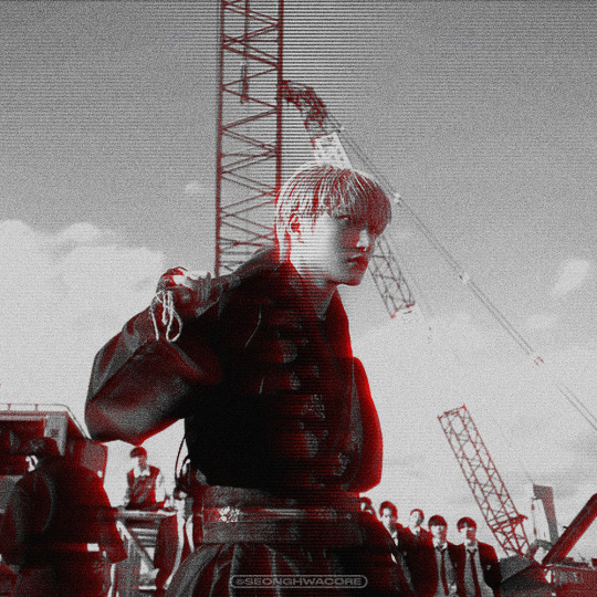
🏍 AKIRA-ISH MOTION BLURRED LIGHT EFFECT (or the cooler name, ✨Rear Sync Flash effect✨)
as requested for my carrot kid @renjunniez (and everyone) <3
⁕ Tool: Photoshop 2021 (PS)
⁕ GUIDE:
1. Open/place your picture of your choice on PS. For this set, I took a screenshot from the MV using VLC. Didn't bother to take it from VS.
You need a black & white picture with dense shadow/black shade and focused highlight to achieve this effect. If your base is as colorful and bright as a 4 year old's imagination about the world of unicorns, you gotta need some adjustments. The effect still appears but give a totally different vibe. I put an example at the end of the tutorial.
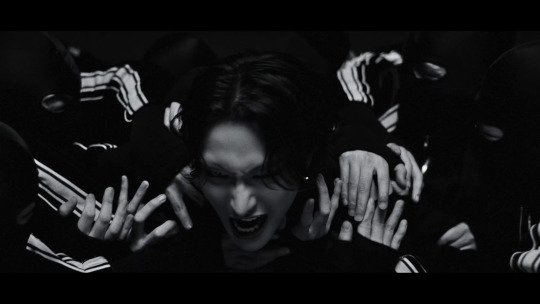
2. Then, do the basic sharpening and resizing for the base layer. I crop them to 540x540px.
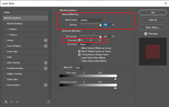
3. Copy the base layer and delete the sharpening smart filters. Double click the layer to open Layer Style panel.
On General Blending, change the Blend Mode to Lighten. On Advanced Blending, uncheck the Green (G) and Blue (B) channels, so you'll be left with Red (R) channel. And then, move the picture to the right because you want the red shadow to "trail" Seonghwa (your subject)'s movement.
Your pic will look somehow like this:
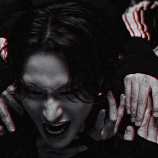
4. Go to Filter > Blur Gallery > Path Blur. The default option is usually Basic Blur. Change the option to Rear Sync Flash.
Now, you have to decide the direction of the "red trail". This is quite tricky because it's better if you apply the blur with the subject's real movement in mind. In this example, I imagined Hwa was swaying to the left in slow motion as he restrained from being dragged away. So, my path's starting point is from the left.
Once you've decided, click on a random point to pin a starting point and stretch the arrow to your desirable distance. You can also curve the arrow to give a more, well, fancy direction.
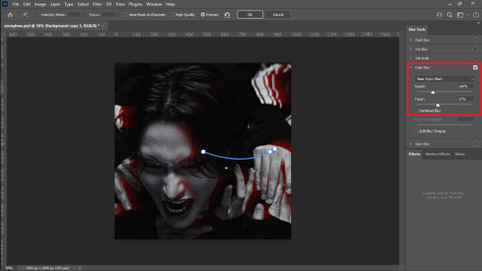
I set the Speed to 146% and the Taper to 17%. Uncheck everything else.
*Hover over the word "Speed" and "Taper" to know what it'll do to your pic
**If you wanna know more about Rear Sync or Rear Curtain Flash in photography [x]
5. After this part, basically you're free to do whatever with your gfx. These steps below are OPTIONAL.
5-a. First, I adjusted the lighting and contrast.
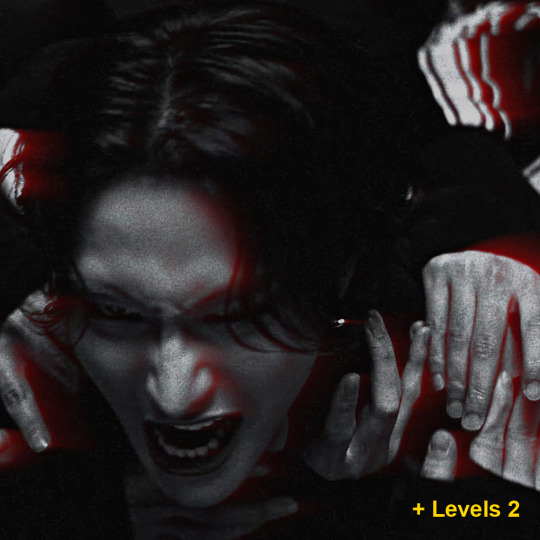
5-b. Then, I added text.
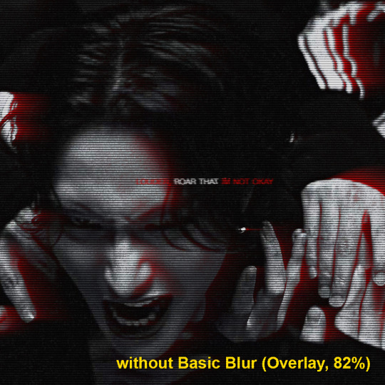
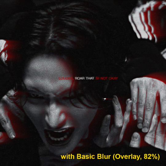
5-c. After that, I placed a lined texture. I set the blending to Overlay with 82% Opacity and gave it a Basic Blur effect from Path Blur. I definitely just fuckin around with this step and found out that it changed the opacity of the lines depending on where it's applied on: shadow, midtone, or highlight parts.
5-d. Lastly, add grains texture
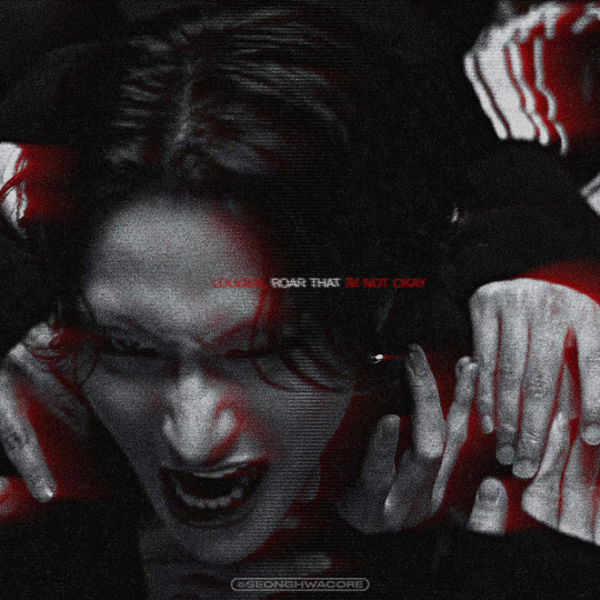
Et voila! You'll get this effect 🤩
Now, if you have a bright, colorful pic as the base. For example, I use this The Real Hwa dontevenaskmehowmanypicsofhwaihaveinmyputer. The "highlight" part (the sky) is surrounding the "shadow" (Hwa in hanbok). Then, I applied the same effect.

Still slay but definitely not as "dramatic" and intense as the dark mode version. Kinda lose the purpose of the trail to me. HOWEVER. I encourage you to fuck around and improvise 👍
Hope this helps!
#ann.txt#gfx tutorial#rear sync flash effect#if theres something i need to revise or if you want to discuss about this just lmk
50 notes
·
View notes
Note
haiii i'm the anon who asked about gfx, thanks sm for the help!! ( ´∀`)
what's your usual thought process while you make them? (placement of pngs, backgrounds, etc. i think this is also related to filling empty spaces!)
do you have any tutorials or other sources that helped you learn gfx ?
again tysm for helping me outt >< enjoy ur week nd stay hydrated <3
okay wow this is really long over due ( and im so sorry for that ) but feel free to ask me any questions about gfx heh ill try my best to help !

⠀O1. honestly my thought process depends on what im making. it adheres to the concept im going with. so for example if its cyber core or something like that id add specific pngs that suit the concept like game controllers and pixel type pngs !
and as for the placement of the pngs I try to fill empty spaces one by one if that makes sense. I usually start from the corner and work my way in and look at a lottttt of inso from my pinterest boards ( or you could just search up gfx ideas ) anything to make it look pleasing yet not overwhelming. honestly a quick tip from me, don't try to add too many pngs because I use to do it a lot and it does not work out
like look at the difference its insane over the two years of me doing gfx like yikes...


another thing you might frequently see in my works is that I blend a lot of pngs in the background as in if you take this hanni header for example you could see there are a bunch of strawberry cheesecakes in the background and that makes the hanni cut out pop more yk? id chose a specific point where I want it to stand out a lot and start building some things around it that would compliment the focus point and the overall look of the header if that made sense.
so to sum it up, just try to do what feels right and start working from a small point and expand from there onwards. I dont really know if this is the same for other gfx designers and what their thought process is but this is what helped me and if you want a similar style to mine, this is probably what I would do ! 💌
⠀O2. im gna be so honest, I haven't ever followed any tutorials. my attention span is too short for me to be sitting down and watching how people make graphics like thats so honk shoo mimimi... idk how but making graphics just came to me like I could analyse my inpso from pinterest and just make something with a smiliar style in mind. like I could prolly break it down into sections and have a clear goal on what I want to make. and making graphics on how I do it today took me a crazy amount of practice considering I started in like early 2023 which is insane so I think it comes to you over time if you get what I mean.
I do understand everyone is different when making headers and they have different processes but id recommend looking at Inspo which looks simple to achieve and has enough clarity to make you know what you want. you could also start planning it out ahead of time as in sketching it out and then making it.
okay I hope that helped you and feel free to ask me any more questions you have!! have a good day 😝
2 notes
·
View notes
Text
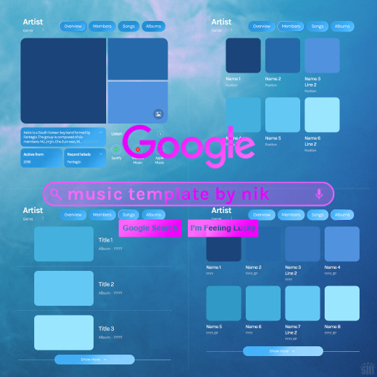
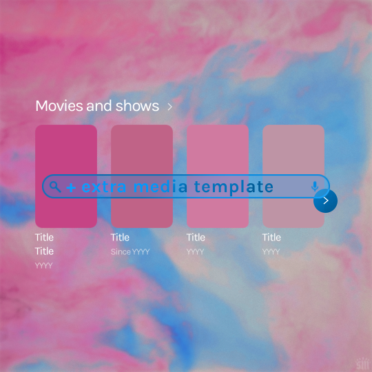
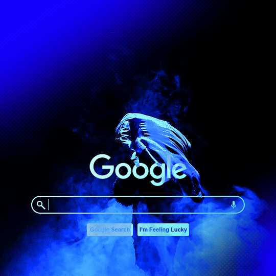
Hi! I've had these templates sitting with me for a while and never got around to uploading them lol. Here are Google templates for musical artists, a newer style originally seen in this set. Plus, an extra template that goes with my previous layouts, showcasing media titles (seen in this set). As always, my templates are free — all I ask is that you give me proper credit in your caption if you use my template or take inspo from my design. Enjoy! :)
Get the NEW Google templates free via ko-fi: MUSIC TEMPLATE | MEDIA TEMPLATE (Donations appreciated but not required <3) Includes PSD/PSB templates with pre-made layer masks, shapes, and tips for the following designs: – Overview – Members – Songs – Albums – Movies and shows (.psb)
Additional resources: – My original animated Google search overlay tutorial & template – Extended Google template (image search results, biography, related searches, animated "no search results") – Karla Google Font (this is the only font used) – Backgrounds via Unsplash: [Blue] [Pink]
#gif tutorial#completeresources#usershreyu#useryoshi#userzaynab#usersalty#alielook#tuserabbie#useraish#userabs#mialook#resource*#gfx*#google*
434 notes
·
View notes
Text

Tutorial on how I cutout my PNGs!!
I use Ibis paint X for this entire process and get all of my images off of Pinterest.
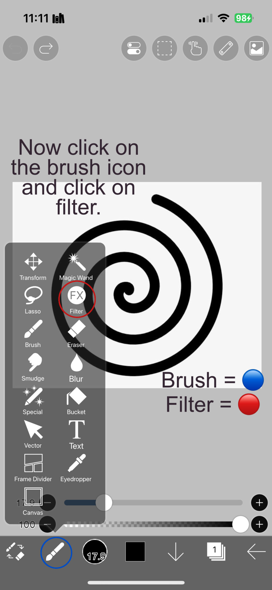
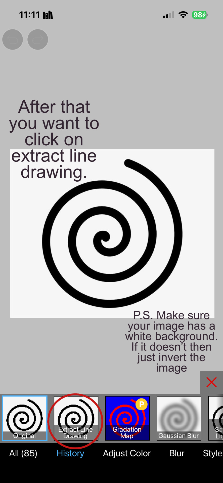
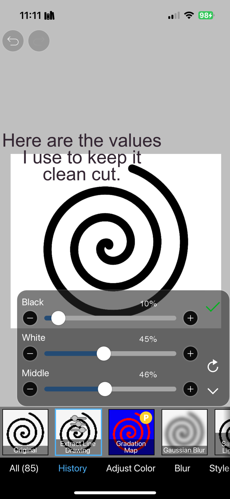
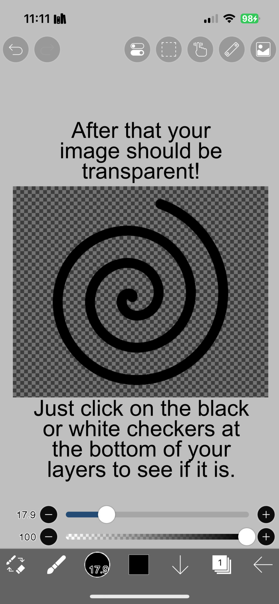

And hopefully this helps! Sorry if I didn't explain certain things well enough or the image ID text is confusing. I don't include it all too often.
#png#answers#rentry decor#rentry#puerileds#transparents#tutorials#talking#my stuff#decor#carrd decor#carrd resources#rentry resources#carrd png#rentry png#gfx#vector#vectors#graphic design#design#pinterest png#ibis paint#carrd stuff#rentry stuff#editblr#Is this enough tags
264 notes
·
View notes
Note
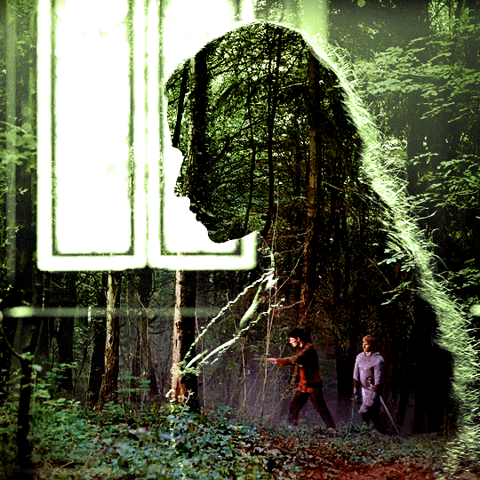
Hi! Can I ask how you did the double exposure gifs for your merlin set? They're beautiful btw!
heyy, thank you!! of course!
it's actually not very hard, the trick is to find the right shots for this. here's how i did it (reference gifset), under the cut.

for this tutorial i will be: — using photoshop cs5 on windows — assuming you know how to make gifs using the timeline — have basic coloring, sharpening, groups, and layer masks knowledge
I. CHOOSING THE RIGHT SHOTS
the ultimate trick to pull this off is to choose the right image. in order to do the double exposure, you need a silhouette shot that has these:
a defined and dark silhouette with a background that is not too busy
enough contrast between the silhouette and the background
the silhouette should take at least 50% of the space
not too much movement
here are a few examples of why they work and why they won't:
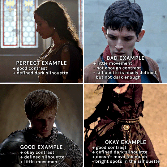
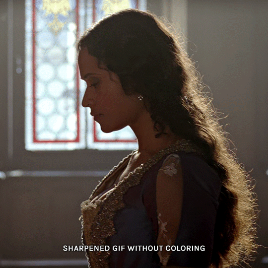
gwen: perfect example since this shot is already quite contrasted with a defined silhouette. there won't be a lot of work needed to make this one work.
merlin: not a great example because even tho there's a somewhat good contrast between him and the background, the silhouette is just too bright, not dark enough.
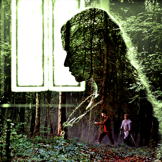
arthur: another good example, even if there are some bright spots on his face and armor. since he's not moving too much, you can definitely brush some black over him to make his silhouette darker (i'll explain/show later)
morgana: this one could work because the contrast is great, but of course her skintone is very bright against the black clothing. that being said, since the movement is not too bad, it could be possible to brush some black over her and move these layers with keyframes (as mentioned for arthur's example). i haven't tried it tho, but i think it would work well enough.
once you have your silhouette shot, you need another gif for the double exposure. what works best, in my opinion, are:
wide, large shots
shots with no to little camera movement (no pan, zoom, etc), but the subjects in the shot can have little movement of course
pretty cinematography/scenery shots
i find these are easier to find and make it work, it's not as "precise" as with silhouette shots. it's mostly just trial and error to see what works best with the silhouettes.
II. PREPPING THE SILHOUETTE
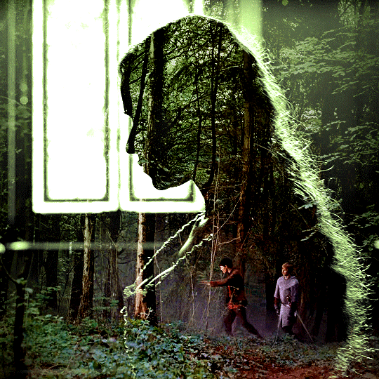
for the effect to work, we want a silhouette that's dark as possible. i'm gonna use the gwen and arthur shots as examples.
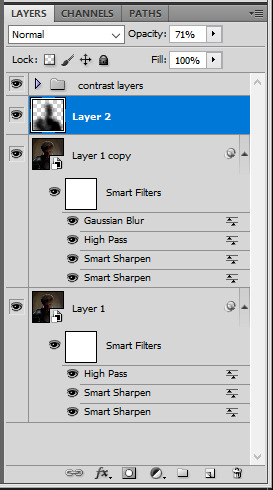
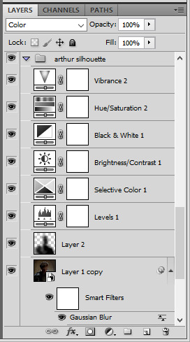
for the gwen gif, i started by sharpening, and then upped the contrast by quite a lot so her silhouette is mostly black, while retaining some nice details. i've used only 3 layers here:

selective color layer: in the blacks tab, playing with the black slider (value: +10)
brightness/contrast layer: added a lot of contrast (+61) and a bit of brightness (+10)
black and white layer: on top, its blending mode set to soft light and at 20% opacity. gives a bit more depth and contrast

then for the arthur example, i've also sharpened it first, and added contrast layers in this order (the skintone looks horrible, but it won't matter soon lol):
levels layer: black slider at 0, grey slider at 0.76, white slider at 104
selective color layer: in the blacks tab, black slider at +10
brightness/contrast layer: brightness at +1-, contrast at +47
black and white layer: on top, its blending mode set to soft light and at 20% opacity. gives a bit more depth and contrast
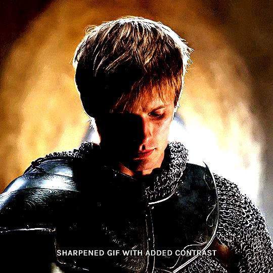
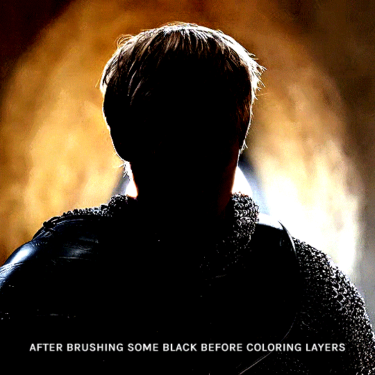
as you can see, half of his face is still quite bright. to correct that, create a new empty layer and put it between the gif and the coloring layers.
using a really soft brush and the black color, brush some black over his face and body on that new empty layer. you can edit the layer's opacity if you want, i've set mine to 71%. since arthur doesn't move much here, there's no need to keyframe this layer's position. for the morgana example, this is where you'd need to play with keyframes to make it work. here's where i'm at now after this:
you can always edit this layer later if you need, after doing the double exposure blending.
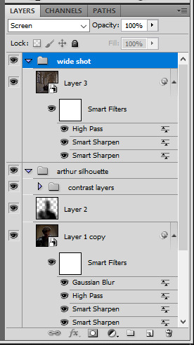
once the silhouette is all ready, you can put all layers in a group and rename it (i've renamed mine silhouette).
III. BLENDING
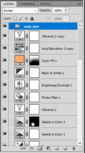
now the fun part! import the wide/scenery shot in photoshop, then resize it to the same height of your silhouette gif. make sure the gif is a smart object layer, and sharpen it. finally, bring this gif onto the silhouette canvas (by right clicking the smart object > duplicate layer). once you have both gifs onto your canvas, put the wide shot gif layer in a group, and set this group's blending option to screen.

you can then position the wide/scenery gif the way you like it in the canvas. this is how it looks for both examples after i've done that:

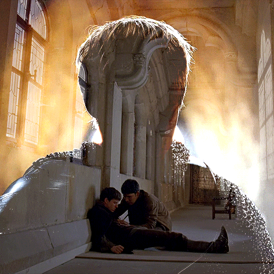
if the blending mode screen doesn't give you the best result, so you can play around with other blending modes (such as lighten and linear dodge in these particular cases), but generally speaking, screen is the real mvp here haha.
IV. COLORING
now that the double exposure effect is done, we need to color the gifs to bring them together. i went with simple coloring here, simply enhancing the colors that were already there. just make sure that the coloring layers for each gif are in their respective groups. here's how i've colored both examples:
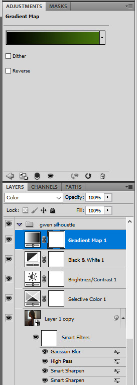
gwen silhouette group: i added a gradient map layer on top of the contrast layers in black to green and set the blending mode to color
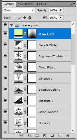
scenery shot group: multiple coloring layers, with a green color fill layer (blending mode set to color), with a layer mask so it only affects the top half of the gif
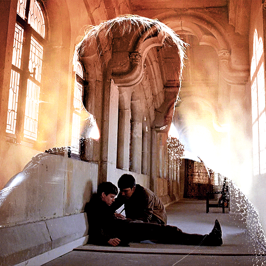
for the arthur gif, i did something very similar but with warmer colors. i didn't use a gradient map for arthur though:
arthur silhouette group: i made the yellow warmer, closer to orange/red, with a hue/saturation layer, and added more vibrance. didn't feel like it needed a gradient map layer here though.
wide shot group: basic coloring layers to enhance colors from the merlin & daegal shot, and an orange color fill layer set to the color blending mode.
at this point you're pretty much done. just need to add some final touches and typography (if you want).
V. FINAL TOUCHES
a small and completely optional detail, but i wanted to soften the edges of the wide gifs. to do so i've duplicated the smart object gif layer and removed the sharpening filters (right click on smart filter > clear smart filters). put this layer on top of the other smart object layers (but still below the coloring).
then with this same layer still selected, go to filter > blur > gaussian blur... > 10px. this will give you a very blurry gif, but we only want the edges of the canvas to be softer. so add a layer mask to this layer. with a very large and soft brush (mine was at 0% hardness and about 800px size), brush some black onto the layer mask to remove the blur in the middle of the gif.

you can play with this layer's opacity or gaussian blur amount if you want (by double clicking on the gaussian blur smart layer filter). here how both examples look with this gaussian blur layer:

you can also mask some of wide/scenery gifs if you'd prefer, so it shows less outside of the silhouette. just put a layer mask on that whole wide shot group and brush some black or grey on the layer mask. it's what i did for the gwen gif, with a very soft brush and i set the mask density to 72% (i kept the arthur one as is tho):

and that's how i did it! hopefully that was clear enough :)
#alie replies#*ps help#resource#tutorial#allresources#*gfx#usercats#usersmia#userrobin#userfaiths#usertina#usermoonchild#userchibi#uservivaldi#usertreena#userraffa#userriel#userelio#usermadita#usersmblmn
1K notes
·
View notes
Text

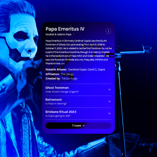
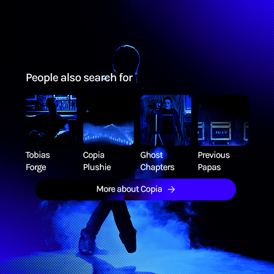
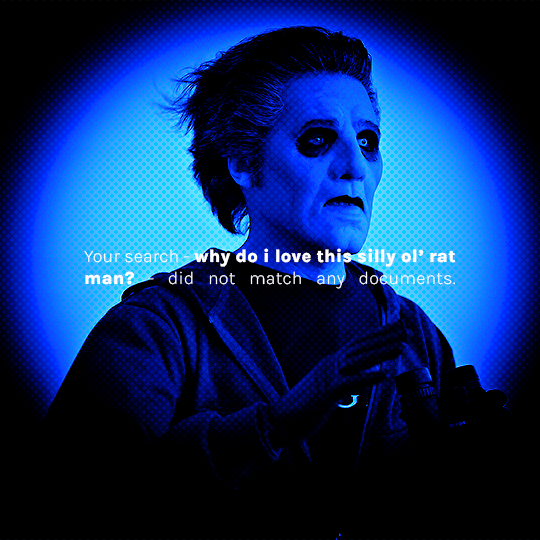
prompt: something for the silly ol' rat man? [template tutorial insp] [fan vids: ♡ ♡ ♡]
#the band ghost#ghost#ghostedit#dailymusicians#blogmusicdaily#usergif#musicgifs#usermusic#tobias forge#copia#papa emeritus iv#cardinal copia#bandsedit#musicedit#batslook#*papaseries#*gfx#~#id in alt#wanted to do this since i saw the template go up! so fun and simple to follow the tutorial too#needed something new to learn today so i broke my content ban just this once#prays no one has already done this and i was unaware orz
320 notes
·
View notes
Text
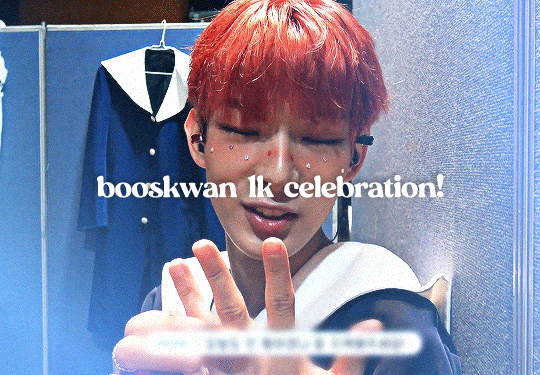
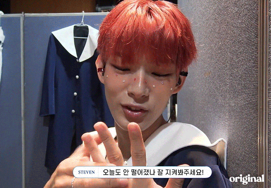
i finally hit 1k!!! (no thanks to tumblr glitching my follower count) i'm really glad so many people like the little images i make☺️ to say thank you i prepared a little something! i've put together all the overlays i have downloaded that i use in my gfx as well as the fonts i've collected over the past couple years (and an updated giffing "tutorial"!) love u all hope november is kind to you<33
for starters here is the mega folder with all of my fonts and pngs! below is my semi-updated giffing process along with some of my actions<3
my process is pretty much the same as my old tutorial but now i've changed how i export gifs! my basic process is outlined in the gif below and and i've added 3 of my actions i use almost every time i gif in this google drive! (explanations below) :]
so after i know what clip i want, i put it into vapoursynth (download tutorial) and once that's saved i screencap it. what i do for screencapping is open the mov in mplayer osx extended and hold down shift+command+s but i know there's way easier ways to do it that i haven't figured out yet lol (tutorial i just found here)
once the screencaps are all on my desktop i delete any extras on either end of the clip i want and put them in a folder just so it's easier to load them in to photoshop. to do that, on the home page of photoshop go to file -> scripts -> load files into stack, then from that menu browse -> select all the screencaps you want to use for the gif and click open then ok
after they're all loaded into photoshop this is where i use my first action which just shortcuts all the way to the sharpening being done. once that's done i go to image -> mode -> 16 bits/contrast. this can help if the background is super pixely or anything like that. then i mess around with sharpening if i feel like it's too much. usually i'll change the opacity of the second sharpen layer to 50 and/or change the settings of the first sharpen layer like 200 to 150 or 0.3 to 0.2, whatever i feel like looks best. something i've also learned over the years is that sometimes you let noise do the heavy lifting and don't worry about making it look too sharp. if the gif is still a little bit unsharpened (?), the noise will make it look fine
then i do coloring which is the fun part! like i said, my process is more or less the same as my old tutorial so i'll just skip over that part and if you want more details feel free to check that one out. once i'm done with that i combine it all to a smart object, add noise (usually 1-1.5 these days), and then use my second action!
after the second action does its thing, i select all frames and set the rate. i usually set it to 0.04 for youtube videos and 0.02 or 0.03 for ts files. then, because vs leaves me with duplicate frames, i run my action for duplicates which selects all of the unwanted frames and then go to the hamburger menu just above the timeline -> delete frames. then it's ready to be saved!
#i tried to find a tutorial for how to put actions in ps but i couldn't find one sorry ㅠㅠ#pls do send me an ask or tell me in a rb if there's anything unclear or if you have any issues with anything!#*tutorials#resources#gif resources#gfx resources
22 notes
·
View notes
Note
https://www.tumblr.com/kitconnor/738913211394473984/usergif-new-year-new-fonts-day-1-layer absolutely loved this set 🩷 how did you make the second gif where it goes from color to b&w?
hello, and thank u !! it's a pretty basic process to follow but it can be effective if you're trying to add depth to something.
this is the gif, but this is the effect we're hoping to achieve:
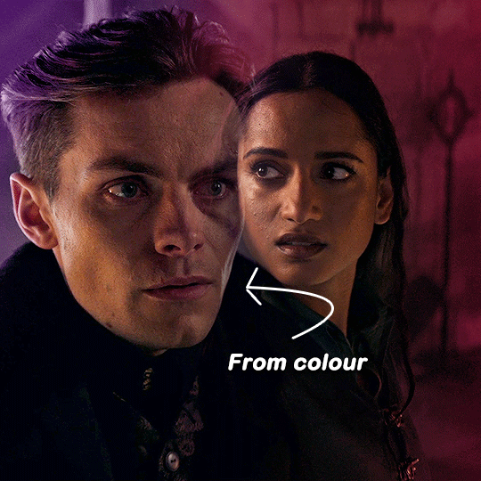
i'm not going to cover every part of the process (ie. colouring, cropping, setting up your gif and blending skills) simply because i'm just trying to achieve the colour to b&w effect ! if you want a guide on anything else, please feel free to ask :)
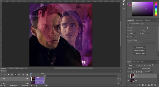
please note this will guide you through timeline and not frames !
start by doing your basic crop and colouring and then duplicate one gif onto the other for blending. here you can see i'm about to use the layer mask + brush tool to achieve a smooth blend. the top layer (inej) is set on screen.
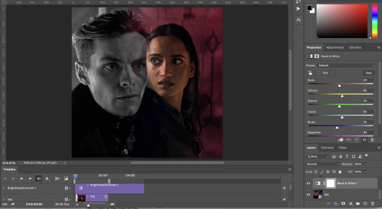
so after getting everything into position, i'll add a layer mask and then use both the gradient tool (set to black) and the brush tool (also set to black) to get the right blend.
(note: i went back and re-cropped my kaz layer and reordered my layers. try and blend on empty space and not overtop of the subjects faces !)
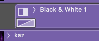
depending on which gif you choose for b&w, you may need to clip the black and white layer. for instance in the gif that was in the set:

lucy gray is the top layer, and i only needed to clip it to her. to get a clipping mask, right click on a layer and there should be an option called 'create clipping mask', like below !

but back to the main guide 😭 now that i've blended and decided which gif will go to b&w, add that layer above whichever gif you chose. kaz is the bottom layer in this gif so i don't need to worry about the clipping mask.
at this point now (yes i've added different layers here and there, but that's natural) you need to move your b&w to whatever point you need it to come in. however, don't move it to the very end. somewhere around halfway or 3/4 will work best.

after moving the b&w layer, it comes in halfway, but it's clunky. to fix that you'll use a fade transition. fade transitions are found in this little button (a half grey half white box cut diagonally)

then you'll click and drag the fade transition over the b&w layer and drag on the fade transition (NOT the gif) to alter the duration. that's the transition itself below:
and then it looks like this :)
it might take a few tries to get it into the right timing where it's not too quick or too slow. also note that the transition bumps up the gif size, so keep the gif around 30-40 frames if you're cropping at 540x540 like me !
17 notes
·
View notes
Note
hi!! if i may ask, how did you edit the manga header so beautifully in your 'obsessing over what's theirs?' fic? i apologize, and you totally don't have to but i kinda fell in love . . . 😳
i specifically use alight motion for my edits ! but i know a mutual of mine does it a different way which makes it look the exact same , pero like you just find a manga screen cap from either the hashtag here on tumblr ; “#mangacaps” or going to accounts similar to @/stepghost. and then size it to your liking ( but remember that tumblr is very tricky with showing you in tags for certain sizes so test a few of em out!! and then you wanna import it into picsart and go to effects, then color gradient! choose whatever two colors you want and then slide the blend option over to color burn and it should blend into the darker area of your header!
OR you can download ibis paint x and import your header there , choose the two colors you want , or just singular color and then go to the blend mode and put it on lighter color! cause that’s what i do 😋🤞 and then you can save that header, re import it into the file and then put a gausian blur on it, tweak the amount of blur and the change the blend to screen, then mess around with the opacity!! i do the gausian blur for mine cus it looks cute and sometimes blurs inappropriate parts of the picture that would normally get you flagged on tumblr !
#⸰ 𖥔 ͙ࣳ a — nonimo ⭒ msg !#if you’d like a proper tutorial just lmk and i’ll make one for ya😋🤞#anyone who knows me knows that i don’t typically give out tips or anything related to gfx but im trying this ONE last time#and hopefully no one fucks it up#otherwise i wont give help anymore#😕🫶🩷
1 note
·
View note
Text

Create Your Own Main Menu for The Sims 4 - Tutorial
Hey folks!
This tutorial will walk you through creating your own main menu override for The Sims 4 based on my custom repository.
_________
What is required:
JPEXS Free Flash Decompiler
Sims 4 Studio
Raster graphics editor (e.g. Photoshop, Gimp, Photopea)
Your Own Main Menu repository
_________
Step 1: Download and unzip the Your Own Main Menu repository
It's available on my Patreon page for free.
_________
Step 2: Prepare your custom images
There are two images that you need to customize:
SimMattically_YourOwnMainMenu_MainBG.pngThis is the main background image, where you want to put the desired graphic.Size: 1440px x 1200px
SimMattically_YourOwnMainMenu_BarBG.pngThis is the second background for the navigation bar on the right.Size: 480px x 1200px
Prepare your own images based on these templates. Do not change the size of the images.
Tips: If you're using a more complex background, such as a screenshot from your game, I recommend blurring the Bar_BG with a Gaussian Blur (~60px). Additionally, I suggest adding a white overlay with ~50% opacity and a 5-pixel wide white bar on the left edge with ~10% opacity. This helps improve the readability of the navigation bar buttons and adds an extra layer of detail to your menu design.

The repository also contains the optional file "SimMattically_RefreshedMainMenu_ScenarioButton.package" from my other mod, which replaces the Scenario button icon with a semi-transparent white version. It's up to you whether you want to use it.
_________
Step 3: Import the images to the .GFX file
Firstly, open JPEXS Free Flash Decompiler and then open my SimMattically_YourOwnMainMenu_Template.gfx with it.


Select "No to all" when prompted.

On the left, choose "images" and scroll to the bottom where you will see the images you just edited in their original form. Right-click on each and select "Replace." Select the custom images you prepared in step 2.


Save the file.
_________
Step 4: Import the .GFX file into the .package file.
Open Sims 4 Studio, then click on "My Projects" and open SimMattically_YourOwnMainMenu.package. Select "Scale Form GFX" (the one with the "gameentrylauncher" description) and click on "Import." Select the modified .GFX file and import it. On Windows OS, you need to switch from .binary to all file types to see the file.


Save the .package file via File -> Save As... Give it a custom name and place it in The Sims 4/Mods folder.
That's it! Enjoy!
_________
IMPORTANT INFORMATION/TERMS OF USE:
Main menu overrides can become outdated with some game updates, causing them to break the game. You will have to remake your custom main menu with a new, updated template in this case. Always make sure you are using the latest available template and that it's not outdated.
Since these mods can break the game, I do not advise sharing your custom main menus with other players. You are free to do so, but be aware that since you're relying on this repository to create your own version, you most likely won't be able to update the mod and resolve issues for other players on your own, so you take responsibility for breaking their game.
If you decide to share your version with other players, please credit my repository and link to my Patreon post.
Do not put your custom main menu based on this repository behind any paywall or early access. I made this repository and tutorial free for everyone, so keep it fair.
I do not take responsibility for people misusing this repository or breaking your game with incorrectly modified files. I do not provide support for custom main menu overrides created by other creators using this repository.
_________
#sims#thesims#thesims4#sims4#sims 4 mods#sims 4 custom content#simblr#s4cc#ts4#main menu override#sims tutorial
321 notes
·
View notes
Text
Would anyone be interested in a small series of tutorials for gfx beginners ?
It would be 2-5 min DETAILED tuts and explanation vids focusing on simple styles of editing for rentry, discord/tumblr/twt/etc lays and possibly requested things if the hoard so wishes :3
By detailed I mean like giving explanations for basically every step, giving examples and refs, n all that stuff so that the process is super clear !!
Just cuz I couldn’t find a THING that was actually helpful and detailed when I first started editing and I wanna at least help a few users progress >.<
TLDR; Small advice series for editing beginners yay or nay ???
OH AND IF YOU SAY YIPPEE YAY THEN PLEASE REBLOG WITH IDEAS AND SUGGESTIONS SO I KNOW WHAT YOU GUYS WOULD WANNA SEE !!!
#editblr#rentry#rentry help#rentry tutorial#rentry resources#rentry decor#decor#graphics#rentry stuff#rentry graphics#ignore the tag spam I want actual answers :3#theoreticallly pinned posts
33 notes
·
View notes