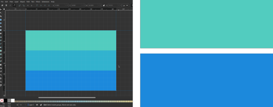
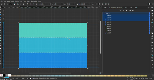
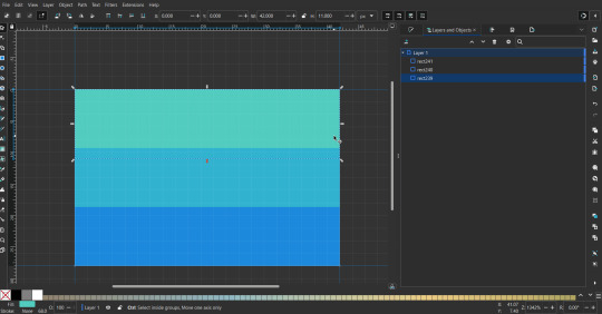
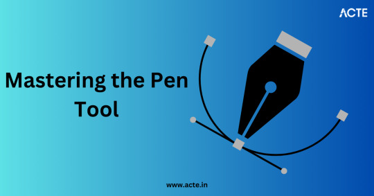
#gradient mesh tool
Explore tagged Tumblr posts
Visit Tumblr Blog
Explore Tumblr blogs with no restrictions, modern design and the best experience.
Last Seen Tumblr Blogs


Fun Fact
12.7% of mobile users access Tumblr.
Text


Gradient Mesh Tool
#adobe #adobeillustrator #illustrator #illustration #vector #vectorart #Ai #graphicdesign #graphicdesigner #creative #creativegraphicdesigner #creativegraphic #creativedesigner #sahdevvala #valasahdev #kshitijvivan #kshitij_vivan #educationvala #educationcala.com #drawingandillustrations #vectorart #art #illustartiondrawing #gradientmeshtool #meshtool #usinggradientmeshtool #usingmeshtool #realisticproductdesign #realisticvectordesign
#adobe#kshitijvivan#sahdevvala#adobe illustrator#illustrator#realistic product design#realistic vector#mesh tool#gradient mesh tool#gradienttool#illustrations
3 notes
·
View notes
Text
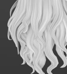
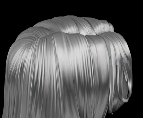
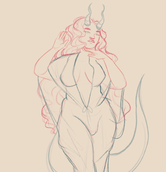
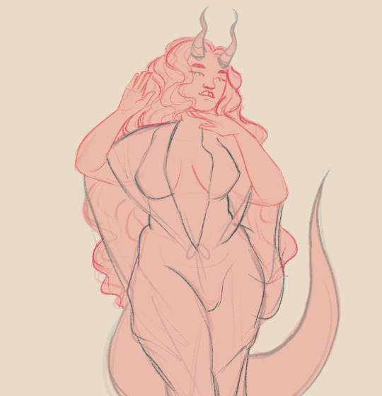
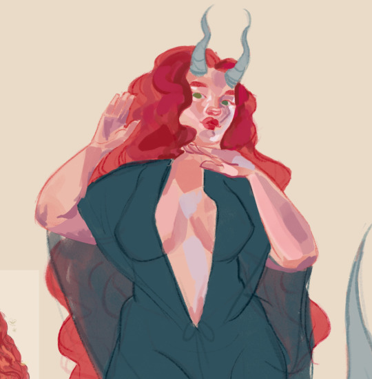
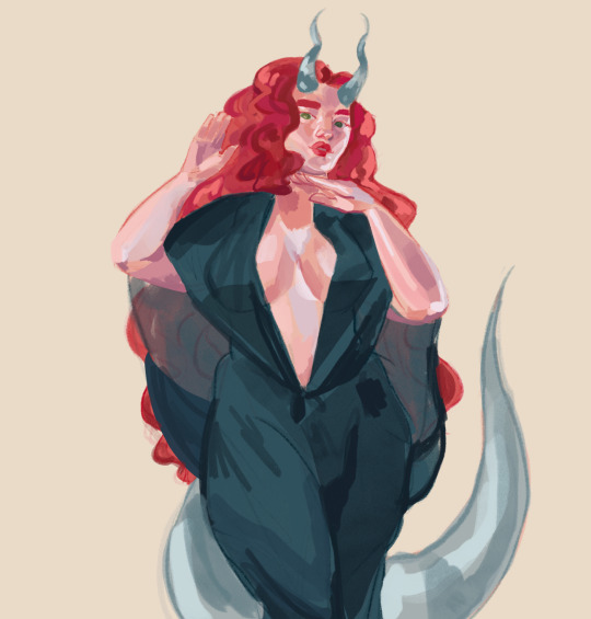
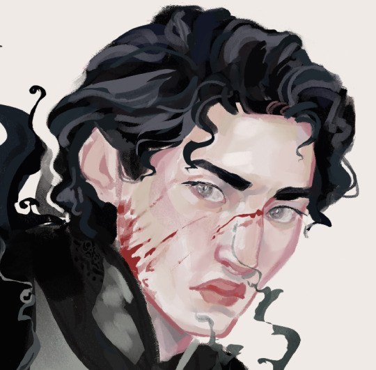
Hair texture tutorial.
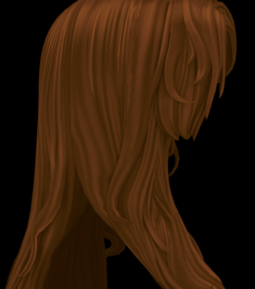
Hello!
While I'm doing a new hairstyle, I wanted to share one topic that has been on my mind for a long time. I finally figured out a more or less easy way to create textures, and I really, really want to share it. I'm not going to explain the basics, so I expect that you already understand basic concepts like uv, and are familiar with baking ui in blender and know shader nodes basics (please, enable node wrangler...)
Also you'll need this add-ons for better uv manipulation and uv-packing
FIRST STEP - UV
To begin with, we need a hair model, preferably one you’ve created yourself. However, game hairstyles also partially fit these requirements, since they're colored in a similar way. I’m basically trying to replicate something close to the Maxis pipeline using the tools and methods I have.
The model should be unwrapped and shouldn’t have overlapping UV islands. If you used hair curves, your UVs are probably already rectangular. Just rotate and resize them as you normally would when applying game textures.
You can place some UV islands in the head’s texture space, where the hairstyle overlaps the mesh. You can also check the game textures for reference. There’s usually plenty of space used by the hair textures, not just that tiny rectangle in the top-left corner.
This is how my UV looks like:
To achieve this result, you can use free add-ons for uv packing such as UV-packer.
I prefer hand modeling over using curves, so my UVs look a bit different. I used the UV manipulation add-on I mentioned earlier to get them this way, but that’s not the topic for today.
IMPORTANT: All UV islands should be as straight as possible and oriented vertically. Otherwise, this method won’t work. This is crucial because the noise texture stretches vertically to imitate hair strands. It’s too time-consuming to handpaint them, and honestly, no one really does that.
SECOND STEP - Material setup
I - Go to the Shading tab. We’ll set up a small procedural node material.
If you’re not familiar with the shader editor or how nodes work, I recommend watching a few blender tutorials on the basics first. Othervise my instructions may be confusing for you.
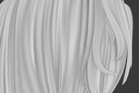
You’ll need two nodes to start with: Ambient Occlusion and Noise Texture. Above, you can see an example of what you should get using this setup.
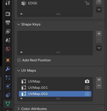
Use a UV Map node with your hair UVs. Usually, it’s called uv_0, or just UVMap if you haven’t renamed it yet. (I have multiple UV sets in my project because I was experimenting a bit.)
To get the correct mapping for the noise texture, connect the UV Map node to a Mapping node, and make sure you stretch the texture along the Y axis. This is exactly why your UV islands need to be aligned vertically, so the strands flow in the right direction.
I usually set the Noise Texture scale to 100–200 to get a nice strand-like effect.
Plug the Ambient Occlusion node into a Color Ramp to reverse the colors and adjust the contrast. Do the same with the Noise Texture. I recommend it to tone down the strong contrast a bit.
If you have the Node Wrangler add-on enabled (which I highly recommend), you can press Ctrl+Shift and click on a node to preview its output.
Use the result from the Ambient Occlusion Color Ramp as the Factor (think of it like a mask in Photoshop) in a MixRGB (color mix) node. Then, plug the result from the Noise Texture Color Ramp into the A socket, and set the blend mode to Multiply (again, just like in Photoshop).
You can control how dark the ambient occlusion appears by adjusting the color in the B socket of the color mix node.
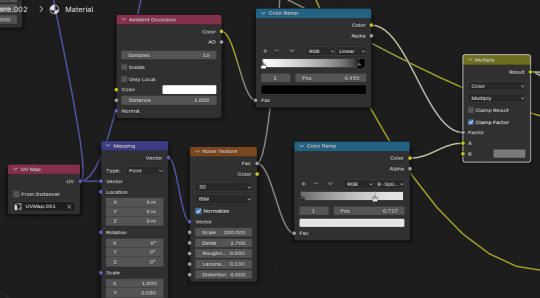
After, I plug result into color ramp again to adjust contrast.
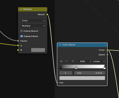
II (optional) - gradient.
Though not necessary, I do it to add a little variation to tones. You may skip it.
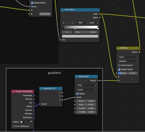

It makes little difference - but don't make mixing factor too high or it will be too dark later.
III - Principled BSDF and lighting setup for baking.
Although stretched noise texture with occlusion works wonders, hair wouldn't be hair if it didn't have shine. This “shine”, although it can be painted, is in most cases just baked-in highlights.
First, change the render engine to cycles and set following options:
You don't need too high amount of samples.
You'll need a little scene setup. If you have any lights, delete them.
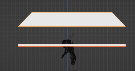
Then, create two cylinders and delete top and bottom side. in the modeling make something like in the screenshot. Sometimes one cylinder above is enough.
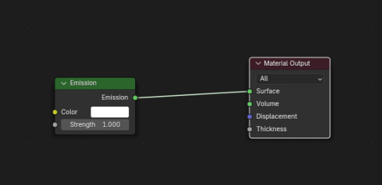
Create material for them and use simple emission node. This cylinders are necessary for that gloss effect hair does have.
Create area light and scale. Put it above head - and set power around 10, not too strong.
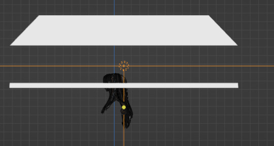
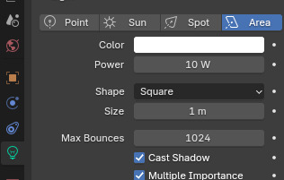
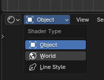
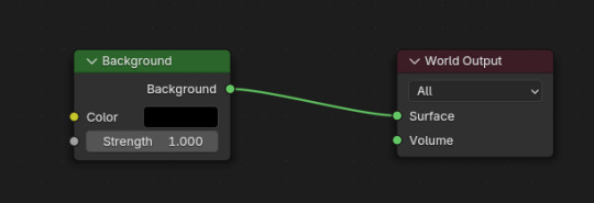
In left top corner of shader editor switch to the world. Set it to black.
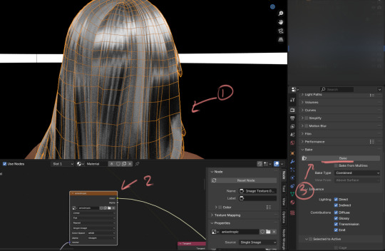
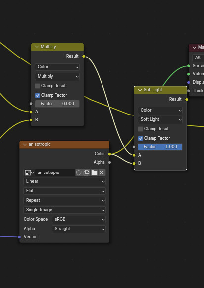
Go back into object shader editing. Select your hair in edit mode. Create Principled bsdf and empty image texture ( 1024*2048 or 2x bigger). Remember noise texture? Create bump node and plug it into height. Copy the values below to make effect subtle. Plug bump node to normal.
In principled bsdf, set metallic 1, roughness around 0.4. Open specular tab and put anisotroptic to 1. Create tangent node, change to Uv map, choose your map and plut tangent node into tangent.
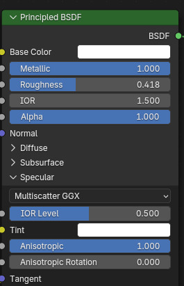
Don't forget to plug principled bsdf into Material output node!!
Phew, setup is done! Go into render preview and enjoy results!
It should look like this:
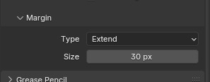
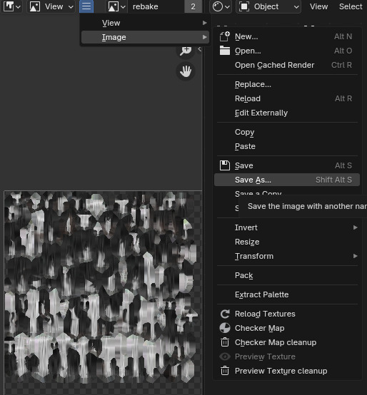
Now we have to bake this. it's easy - go into render tab again, scroll down and open bake menu. Open margin menu and set 8 px at least - or more (just cut later to hair area). Change magrin type to extend.
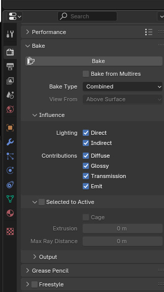
Now, select your object - and select Uv map you're baking to. In shader tab, select blank texture you had created before. Go into render tab again, and in the baking menu press bake. Now wait - and voila!
Now go back into the shader editor and plug the texture into the color mixing node into B. Plug into A procedural texture we're done before. Set mode to Soft light.
Now, since you know how to bake I won't explain it over again - create new blank texture with same resolution and bake result to it.
Save the texture and color it in any graphic editor you have with gradient maps. You may adjust texture contrast we're created before, but that's all.
You're done!
Here, in part 2, I will explain how to color this grayscale texture.
92 notes
·
View notes
Note
Ik vind het geweldig hoe levendig en karaktervol je gezichten zijn! – en de manier waarop je je haar tekent is ook prachtig! Zou je, indien mogelijk, wat tips kunnen delen over je proces?
Dank u!
Process:

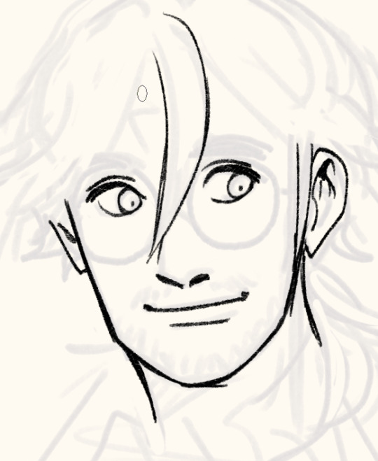
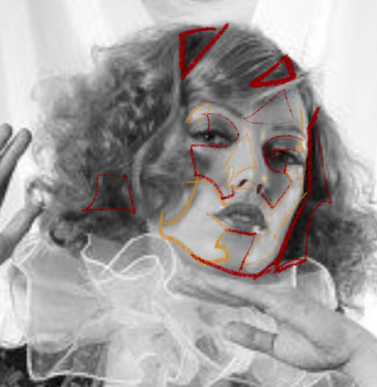
I sketch very loosely, usually using a pencil brush. Drawing quickly and lively is the priority here, but sometimes it means the drawing quality is really awful lol. I try to flip the image a few times to make sure it's not like, Wrong. Which it will be, to be clear. I hold my pen at a dramatic slant, so my faces are always distorted.
Here's a corrected face next to how I instinctively sketch it out (after flipping the image):

Bad
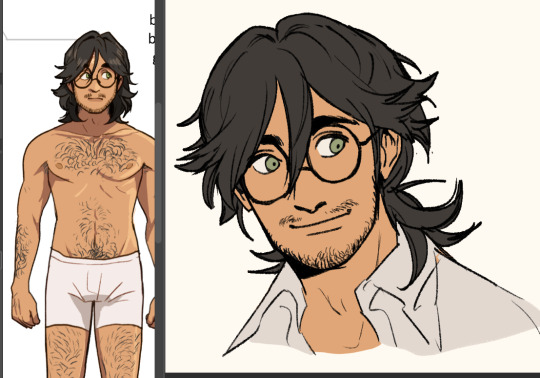
I wanted to say you can tell when I use 3D models to expedite this but actually they look identical because I not only correct my natural distortion but I also correct the 3D jank. Is correction my art style...?

Anyway, the rest of the piece.
I find it easier to use a thinner brush and go over the lines a few times to make it thicker than use a brush with thick line weight. This gives me more control and looks more natural.

I build up thickness on the beard with condensed hairs curling one direction and then in the other. Layering them makes it look thick and natural. (Mustache is more sparse, so it's just single curves.)
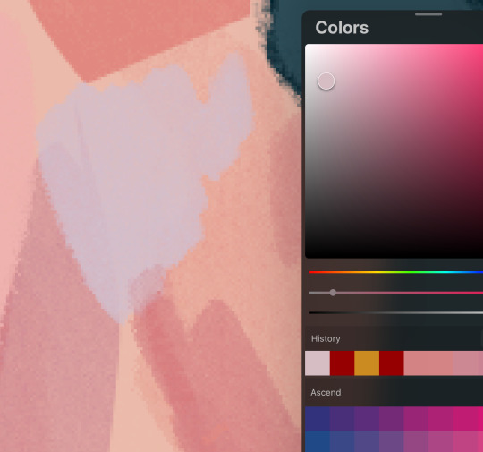
Then I pull up old colours to flat it. I usually work in only 2-3 layers, one for darks and one for lights - dark and light colours will fill differently, and splitting them like this means I can use a lasso fill faster. If there's a really detailed element, I give it its own layer for ease of lasso.

When colouring, big gloopy pen pressure is actually useful to livening up the piece. Make sure theres a light source. I always pick the one that makes the nose easier to draw. Add a second, deeper shadow in corners (like just under the chin) for some depth.

Now that he has more dimension, I can actually see there's a wee bit more to correct. What am I correcting? I don't know. It just looks wrong. I use mesh transform and the liquify tool until my brain stops hurting.

Good enough! Now for the mandatory filters.
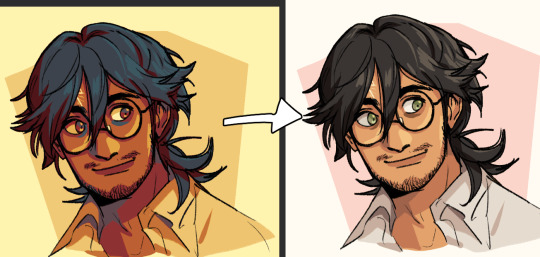
I use mzxmmz's iikanji gradient sets (all 3), because they're very drastic and make interesting colour splits. I set them to 20%~30% opacity on a soft light correction layer.

And there he is. Crazy stalker handsome rogue Harry
As for the way I draw my hair, there's actually a quick cheat:

Draw the curls like ribbons (orange). Note how the thickness varies, like the angles of a ribbon. Add texture with little accent lines (green). Fill it out by following along the edge of the curl (purple). Repeat this with a bunch of different strands. It will end up looking very full and with a strong sense of shape.
You can establish this shape by just drawing single lines of the curl pattern/shape you want and then filling out the rest with the ribbon form, detail, and following-line.
Beautiful complex-looking organic curl pattern in minutes!
74 notes
·
View notes
Note
hello! hope this doesn't come across as imposing. was wondering how long it usually takes for you to finish your custom hairs depending on length and how detailed each style is with their unique strands and swatches. would you interest in recording tutorials as well? If not do you have a link to a video where you learned how to make your colors look like that. I really like how there's dimension to your pieces!
tysm! it takes me like a week or so. i get a reference pic (i have a whole Pinterest board just for that), then i draw a more simplified/stylized version of it either in Clip Studio Paint or with the annotate tool in Blender so it's easier to mesh. like with drawing, use a reference, simplify it with larger shapes first then add details later (just something i like to do). as for colors, i use gradients and i have a PSD file with just my custom swatches for easier recoloring. i honestly just took a few swatches from simomo's palette and made some adjustments to match my personal hair dye collection lol.
ik you sent a follow up ask but i will gladly provide some more tutorials that helped me!
youtube
youtube
youtube
youtube
#anonymous#resources#tutorial#sorry for the late reply#i’m not as active on tumblr as i used to when i was 13-17#i’m trying tho and it nice to start fresh#my main blog is dead so this is a side blog#wish there was a way to make this my main so i can follow people back#like why the fuck haven’t they made that a setting yet i remember having the same issue years ago
83 notes
·
View notes
Text
Flag Making Tutorial
This will be a more technical step-by-step tutorial on how I make my flags (also a long post because I wanted to be thorough, plus I love flags lol).
The program I use is Inkscape, a free vector (.svg) editor program for pc.
I have templates set up, so the actual flag making process is pretty easy/quick.

Hotkeys/Locations/Other Reference
I'll be mentioning these options, so I thought to put them here all in one list. (They list the keyboard shortcuts first)
Snapping: magnet symbol (top right of screen), or under the adjacent arrow ◀️ symbol.
Document properties: shift+ctrl+D, or under the file menu (top left corner of screen). Display (1st tab) Guides (2nd tab) Grids (3rd tab)
Fill and Stroke: shift+ctrl+F, or under object (top of screen).
Layers and Objects: ctrl+shift+L, or under object (top of screen).
Align and Distribute: ctrl+shift+A, or under object (top of screen).
Import (Images): ctrl+i, under the file menu, or by dragging into the Inkscape window.
Save As: ctrl+shift+S, or under the file menu.
Export: shift+ctrl+E, or under the file menu.
Selector Tool: S, or cursor symbol (left side of screen). Click, or click and drag around the objects, to select them.
Locking a selection: lock symbol between the width and height boxes at the top of the screen.
Transform Selections: the width/height and x y position can be changed by typing in the X,Y,W,H boxes (near top middle of screen), or by dragging the corners/edges (resize) and inside the object (move).
Duplicate: ctrl+D.
Delete: delete key, or right click on the object.
Node Tool: N, or below the selector tool (left side of screen).
Rectangle Tool: R, or square symbol (left side of screen).
Pen Tool: B, or pen symbol (left side of screen).
Gradient Tool: G, gradient square symbol (left side of screen).
Mesh Tool: swirly square symbol (left side of screen).
Dropper Tool: D, or dropper symbol (left side of screen).
Undo: ctrl+Z.
Redo: ctrl+Y.
Creating the Template
Download Inkscape and open it, under the Time to Draw tab, click New Document.
First, snapping needs to be enabled, and under advanced mode enable grids and guide lines snapping. (This is crucial for making the stripes equally sized, spaced, and the overall flag in the right ratio.)
I'll be making a template with a 2:3 flag ratio.
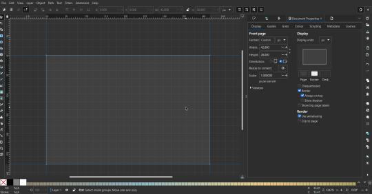
Open document properties. (I like to move these types of windows to the right side.)
Under display, set the width to 42px and height to 28px.
Under guides, just click create guides around the current page.
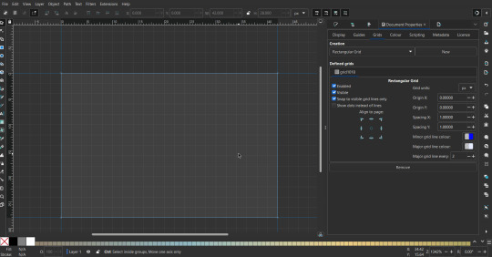
Under grids, make sure rectangular grid is selected, and click new. (Grid units should be in px.) For the major grid line every option, change it to 2. (I also prefer to change the minor grid line color to be transparent.)
That's pretty much it, your template is done :D ! Just save it wherever you want. I like putting it in an easy-to-access flag folder, as it is needed to open it every time to make new flags.

You can use a different width / height / grid size / flag ratio if you want, these are just the numbers I'm comfortable with / used to.
Also, since this is a vector, the image can be infinitely big or small without any quality loss, so the small dimensions above don't actually translate to a low res image.
Creating the Flag
(I'll be using the rainbow flag to demonstrate.)
Start by having the template open.
You can import images (like .png/.jpg files) to color pick / reference if you want. Said images can be transformed (resized/moved) by selecting and transforming them using the options mentioned in reference. (This is optional, they should just be off to the side so they don't get in the way.)
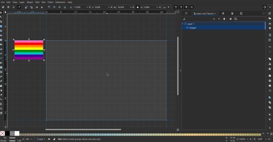
To create the stripes, use the rectangle tool. Click and drag from one grid corner, to a lower grid corner.
While the rectangle is selected, use the dropper tool to pick a color from a imported image. You can also use the fill and stroke (shown on right) tab to create your own colors / edit colors / etc.
You can make these stripes however you want, they just need to all be equally sized. (They don't have to all have the same height, if you intentionally want that (like the demisexual flag for example).)
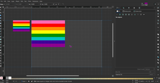
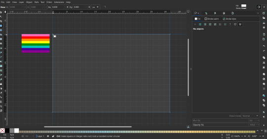
Then select all the stripes and transform them so that they fit the page.
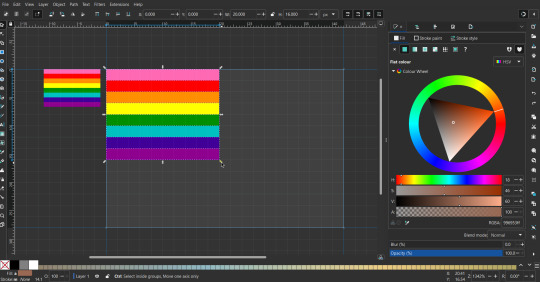
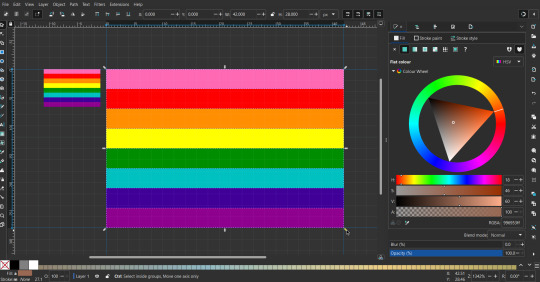
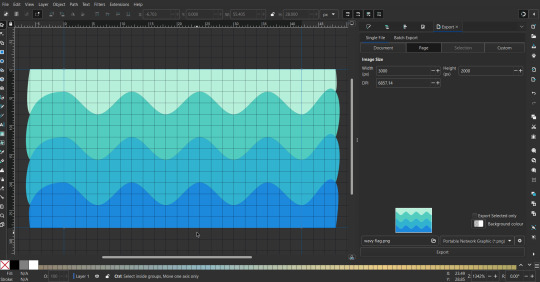
All that's left is to save/export it.
To export it, use the export tab, under single file, page, adjust the width and height (in px) to however high res you want your image to be. (I usually do 3000 by 2000.)
Type in the desired file name in the box next to the folder symbol, use the folder symbol to choose its export location (which can also be used to determine the file name and save/export it), the adjacent drop-down-menu to select what to save it as (,png, .jpg, .svg, etc.), and the gear symbol to adjust other settings (I leave it as default, with antialias turned off (set to 0)).
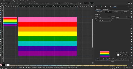
And done, you've made a flag :D 🏳️🌈
Extra Notes
Layers and Objects: a menu that can be used to manage objects. Like their layering position (whether they are above or below another object), and other options can also be done here instead of with keyboard shortcuts.
Vertically striped flags: it's very similar to above. You would just make the rectangles taller rather than wider.
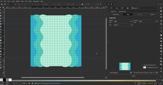
Wavy stripes: first use the pen tool to create zigzags. (The pen tool works like a outline, so just click along the grid corners, and join the line at the end. The fill and stroke menu can be used to make it a solid colored shape, and remove/add outlines). The steepness/frequency of the zigzags is up to personal preference, they just need to extend off the page a bit. To create equally sized wavy stripes, have the all side lengths (highlighted in red) be equal except (depending on how you draw your zigzags) the first or last wave, which should have half the side length of the others.

Select everything, and with the node tool, select all the zigzag nodes (the corners don't need to be selected), and click make selected nodes smooth (half circle with point in middle symbol, at top of screen). (It'll likely look like it has weird lines in-between the waves, see glitch section at the end for how to fix that.)
Then resize it all to the height of the canvas. And done :)
This can of course be vertical too.
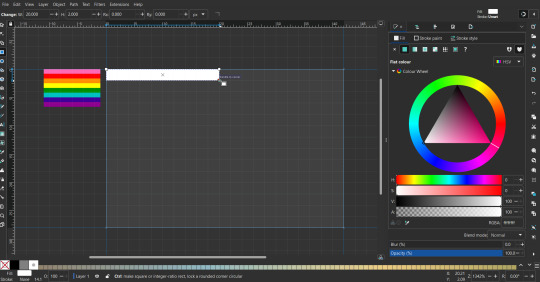
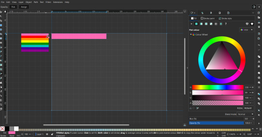
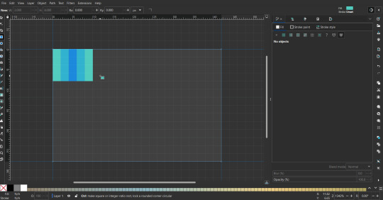
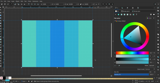
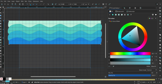
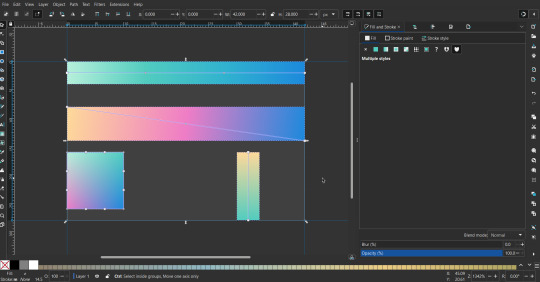
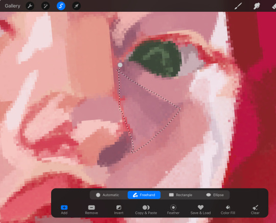
Gradients: You can use the fill and stroke dialogue, gradient tool, or mesh tool to do this.
To create the gradient, select the object, click the linear gradient symbol (gradient box) under fill and stroke. Or dragging / double clicking with the gradient/mesh tools. (The mesh tool is what I used to create the square gradient.)
To change the colors, click on the arrows or circles under fill and stroke, or by clicking the points on the shape, to select the nodes. Then use fill and stroke to change the colors.
To create new colors/stops, click on the plus+ symbol under stops (under fill and stroke), or double click on the gradient. Edit the new colors in fill and stroke again.
To change the location of stops, use stop offset under fill and stroke, or drag the nodes on the gradient. You can also move the end points on the object to make the gradient slanted or vertical.

Symbols: I make my own when I can (like the demi- triangle can be drawn with the pen tool, and resized to the correct proportions). When the symbol is too complicated, I import a .svg of it. Wikimedia commons is a great resource, and the popular twemoji comes in .svg format too. You could also edit it on over the .png in a rastor program if need be.
The align and distribute tab can be used to center symbols (or any other selected object). Select page for the relative to option, and use the symbols underneath to center/align it however you want. (You can also use different relative to options, like last selected, if you want to align it to an object instead.)
Deleting imported reference images: you can do this before saving it as a .svg, if you don't want to keep them / want to clean up the .svg file.
Antialiasing: an option that blurs things basically. A image with antialiasing off will be sharp pixels, while a image with antialiasing on will have transition colors between the main colors.
Below is an example. The left side is without antialiasing, and the right side is with antialiasing.

I can see why it might be preferable to have it on (like for diagonal shapes), but antialiasing can make recoloring .png (not .svg) files hard. The extra different colors messes with fill tools. I also think it looks cleaner without, so I prefer it off.
Exporting glitch: sometimes an exported image will have a thin line between the stripes, despite the fact the stripes are perfectly next to each other. (This seems to not just be a problem with Inkscape, but with vectors in general.)
Below is a zoomed in example of what it'd look like. The left side shows the stripes are all next to each other, but the right image has a transparent line in-between the stripes.
This can be fixed a number of ways.
You could select all the objects, and duplicate them twice.
Or overlap them. The stripes will still be the same size when overlapped, but they will technically be behind each other, so there will be no gap.
With all the different stuff mentioned, you can basically think of them as building blocks with the grid as reference. They can all be mixed and matched together.
I didn't mention all the options, just because there's that many different things you can do in Inkscape. I'd encourage you to play around with all the different options/tools yourself.
There's also some great Inkscape guides on YouTube, it's where I learned how to do a lot of this from (even if they're not for flags specifically, the concepts in those videos can be applied to flags).
Here's an overly elaborate flag I made, just to demonstrate some (but not all) of the things that can be done.

Anyways what a long post haha. But maybe this will be helpful for anyone interested in making (pride) flags.
218 notes
·
View notes
Text
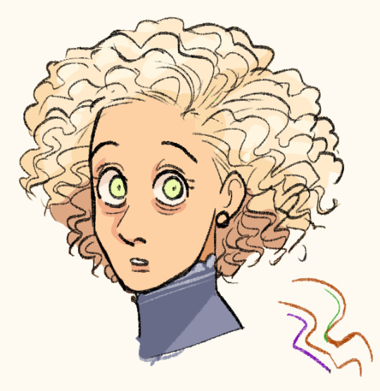
a trashcan’s guide to coloring
using @thoughtfulshepherdmongerkid beautiful ivy rose, because I’m thinking of her always and also really struggling w the comm sorry (also this is long as hell fair warning)
sketch/line-art. I suggest making it at least kinda neat so you have a solid guideline, but honestly just do whatever you gotta do. I also like to set my sketch layer to multiply so that the line art meshes w the base
2. usually I lay down one base color (in this one it’s pink), then I use a clipping mask to lay down some flat colors. the brush you use for this won’t really matter because it’s gonna get covered by rendering (merge layers when you’re done)
3. get your references!! you’ll need them for when you start painting over your base, trust me. references changed my life and saved my summer harvest
4. now, on a layer created above your sketch and base, go in w/ a mix of lasso tool/freehand brushing and start blocking in your colors. the values on our faces naturally form blocky shapes, so try to focus your energy into getting those down
I like to use the spectra brush to render because it adds a nice texture, but feel free to experiment with what you’ve got. also, I tend to go darkest -> lightest -> middle in terms of coloring order
if you struggle with value, I suggest finding any picture (make it black and white by turning saturation down) where there are 3 clear values (black, grey, and white). then with a colored brush, outline all of the different shapes those values make. kinda like this!
5. quick color theory run down before we wrap up: use a cool toned grey (red based, pink based, purple, etc) for the blue parts of the skin, a desaturated red/pink for purple, and gray yellow for green. this will give you very lively and compelling coloring without being too crazy. obviously, you can do whatever you’d like, but I’ve found that this makes my palettes more cohesive and adds depth to the skin
6. so I can’t really finish this piece because I have to start working on commissions again, but after an hour ish of blocking and blending, you should end up with this
and then if you continue and blend a whole lot more, you’ll end up having something more like this!
also, little lasso tool guide
to lay down the colors you’ve gotta click the brush, personally I like to freehand instead of color drop, but you do you
finally, if you aren’t satisfied, you can either 1) merge all of your layers and add a gradient map, or 2) merge your layers, duplicate your new layer, add a gradient map at 100%, and change your canvas blending mode to soft light + change the layer opacity. this’ll make your piece more vibrant and cohesive
#final disclaimer: you will not get these exact results if you aren’t at my skill level#art tutorial#sage’s art tag
72 notes
·
View notes
Text
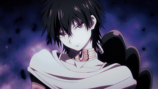
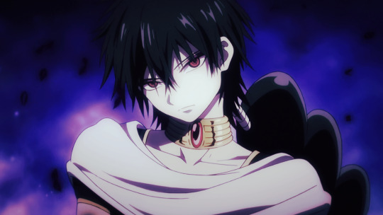
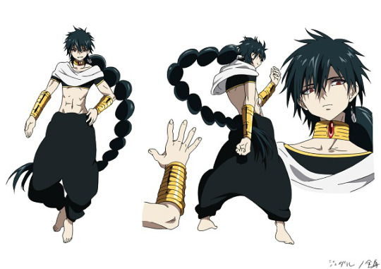
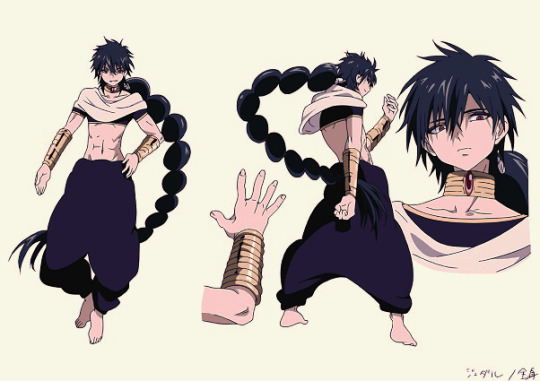
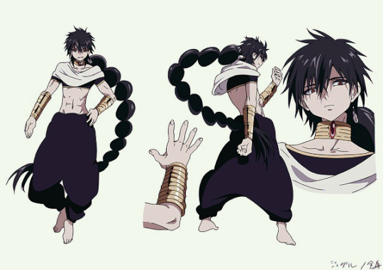
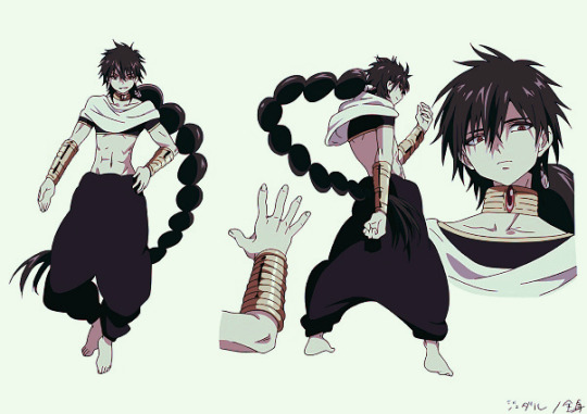
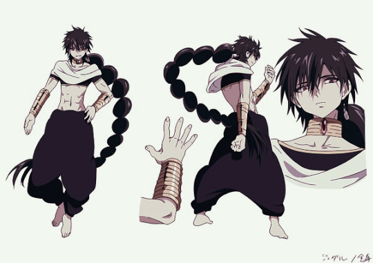
【Magi】 Judar Edits 🖤❤️🐈⬛☀️🌙❄️
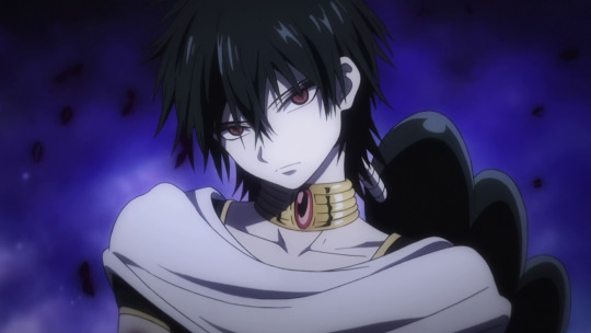
Magi Anime: Season 2, Episode 1
Judar: The Black Magi 🖤❤️🐈⬛☀️🌙❄️
Judar colour edits I made 💖✨
First one is the OG!
I had fun playing around with the colours. Teehee 🥰💗
You can read more of my rambles under the cut.
Magi Manga: Ch. 112
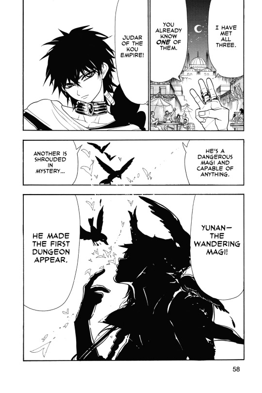
Magi: Ch. 112
Based on this panel.
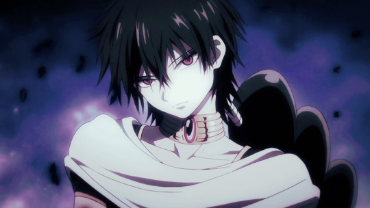
Misc Colour Edits (2024)
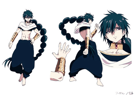
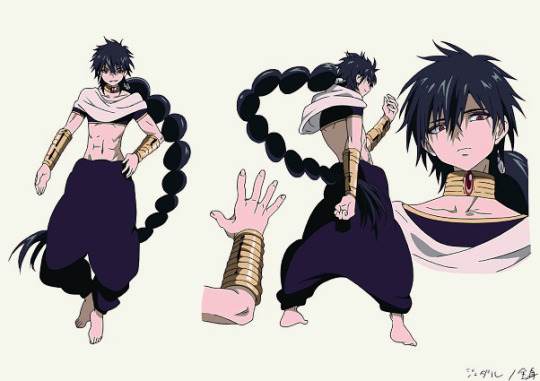
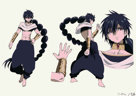
Original: 1
Colour Edits: 2/3/4
OG and colour edits I did back in 2024 :3
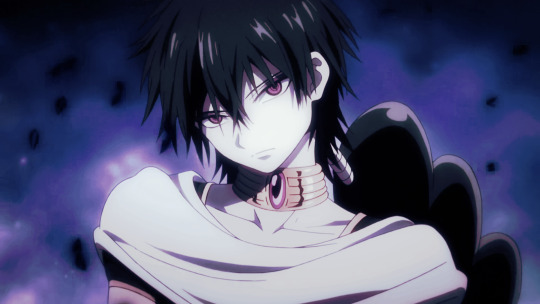
Misc Colour Edits (2025)
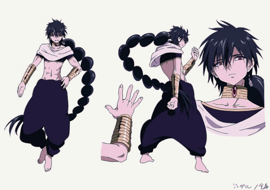
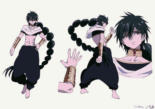
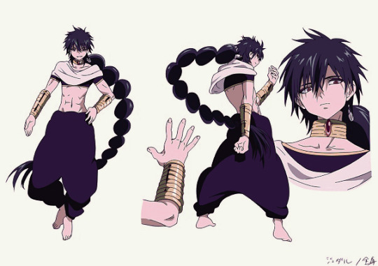
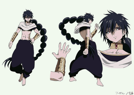
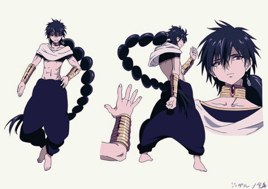

Colour Edits: 5 ~ 15
I remember I did the initial batch of Judar colour edits back in 2024 🖤 ❤️
I added some new colour edits now.
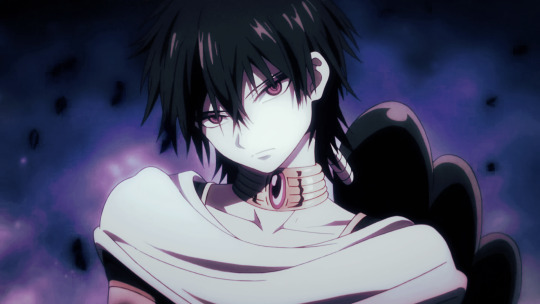
Manually edited the colours a bit with the 3rd one with the magic wand + bucket tool so it's a bit pixellated.
Gets the idea across though ^^
Might put these in its own post...
With my recent colour edits up top, I think my sense of picking colours has gotten stronger.
1st one for this set is the OG.
I love 3/4 out of the 2024 batch, and 5/6/8/11/12 out of the 2025 batch.
The 3rd and 4th one (2024), and the ones from the 2025 batch feel like the kind of colours I'd pick nowadays.
Rambles
Ok I actually don't have a long ramble thread like most of my posts do, cuz I made these edits on a whim.
The way I choose colours is just "Random bullshit go" /jk
Ok I'm kidding.
I mainly go off aesthetics/vibes and my preferences. 🙏
I like to shift colours to cooler tones for the overall colour palettes I choose, and then saturate red and pink tones.
I try to create visual contrast by shifting hues for shadows and highlights.
I use CSP's Adjustment Layers a lot (ie. Hue/Saturation, Brightness/Contrast, Colour Balance, Tone Curve, Gradient Maps)
I like doing colour edits for fun... They help serve as colour guides for me for when I pick colours for my own arts. 🥰🤭
I do them so I can see how the colours work together on the character's design, so I can edit/adjust the colours as needed to harmonize the colours.
It's more helpful to me than making a colour swatch.
Rambles
Rambles with my friend Feila 💗
Me: I think I'm getting better at doing colour edits… I love using gradient maps ✌️
I'm curious which ones you like?
It's cuz I'm considering doing a Judar doodle (eventually, not right now) with colour vibes based on my edits 🤔
Since I make colour edits to help me pick colours for future arts and improve my sense of picking colours. And also I just do these colour edits for fun 😌
I made the 6th one a while back. I recently made 2 ~ 5 now 💕
F: I really like 3rd or 5th :D
Me: Oooo ty! I like those ones too ^^ 2nd/3rd are pretty similar except for the hue change.
2nd is more blue, 3rd is more purple. I made the last image first out of my colours edits.
I like the glowy effect I chose later. The purple hue on the 3rd and 5th one are nice hehe
Ok the 4th one is too similar to the 2nd one now that I put them all together like this
My personal faves irt my aesthetics would probably be like:
2nd/3rd > 4th/5th > 6th
(I used slashes to tie them since the colours are pretty similar, but just use different hues)
F: I only play around with colours when I'm editing stuff :v
It helps me with colour theory so it's worth it
Me: I used to do colour swatches but then found doing colour edits more helpful. Cuz then I get to directly see on the colours work on the chara's design and how the colour palette works together
So then I can edit/adjust the colours as needed to harmonize the colours better 👍
F: Oohh. I don't do it that way, I mesh the original palette, played around with the lighting and then I trust the process
Me: Oooh I see! Yeah I remember I used to colour pick right off the original palette (official arts) and then shift the colours for my own arts.
Nowadays I pick based on my colour edits and colours/vibes and gradient maps to shift the colours 🥰🙏
#magi: the labyrinth of magic#judar#judal#judar magi#judal magi#magi: the kingdom of magic#magi anime#my edits#stepswordsen edits#anime edits#edits#I had this in the drafts a few weeks ago but just got to clean this up
4 notes
·
View notes
Text
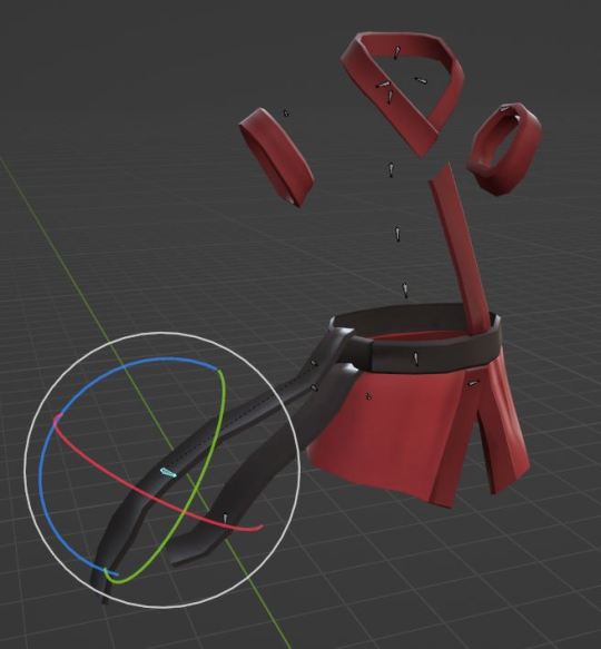
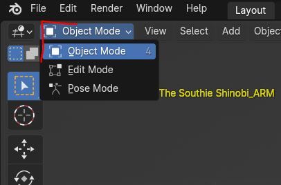
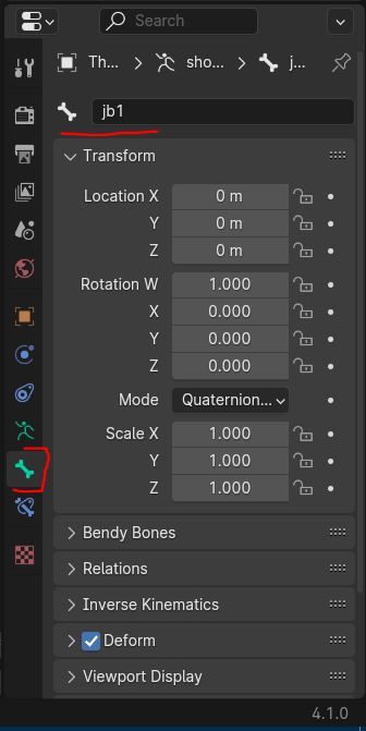
Blender Guide: Adding and Editing Extra Bones to TF2 Cosmetics and Props
Why add more bones to cosmetics? Cosmetics are designed for in-game use, instead of in SFM, so they may miss bones that would add better control over animating them.
Why add bones to TF2 props? Some props are for objects you may want to animate, but don't have bones by default.
This guide will show you how to do both. I'll be editing the Southie Shinobi (Scout cosmetic) as an example.
Adding and Editing Extra Bones to Cosmetics
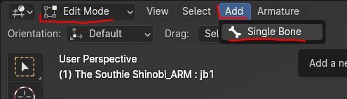
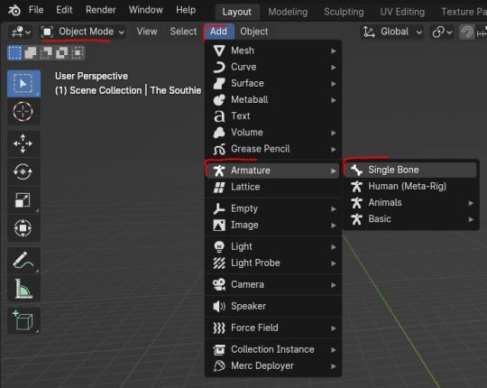
First, let's add a new bone. Select the armature of the cosmetic. Go into Edit Mode. Select Add > Single Bone. Move the bone to align to the area you wish to add an extra bone to. The head of the bone (the thicker end) should be placed where you want the pivot of the bone's rotation to be.
Rename the bone (to something clear and descriptive) by selecting the bone, going to the Bone Properties tab, and clicking on the bone's name at the top.
If you are having trouble getting a prop to bend the way you want it due to not enough vertex points (example: a piece of string made up of a cylinder with), you can edit the mesh to add more vertex. Note that this is destructive as this cannot be undone easily (or at all) afterwards.
Tip: In terms of the degree of movement, a joystick lever is one bone. A door hinge is two bones. And a bendy piece of string is 3 bones at minimum.
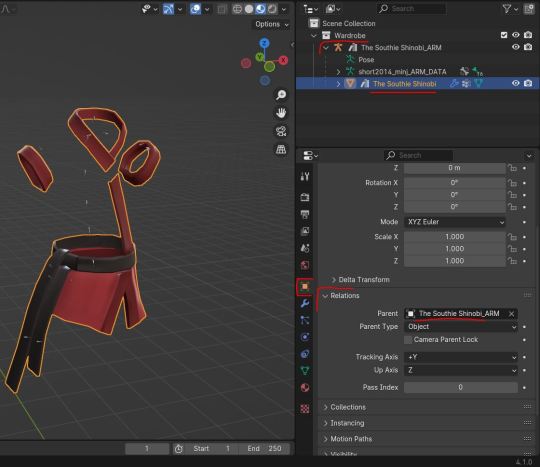
Parenting bones
Now you need to add this new bone to the armature's bone hierarchy, so Blender knows which bones move it. (Like how the neck bone is connected to the top of the spine, etc.)
With the new bone selected, in the Bone Properties tab, go to the Relations header and next to the Parent property, add the name of the bone you want this new bone to be directly parented to.
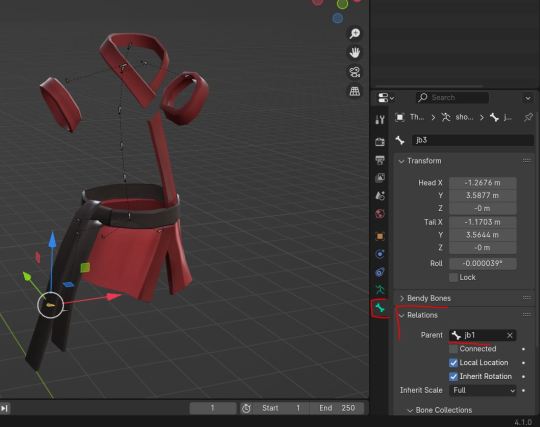
Optional: If you need the bones to follow a specific merc bone when the cosmetic is Bonemerged, be sure to rename the bone with the same name that the merc bone has, making sure no other bone for the cosmetic shares the same name. To help make sure it will be compatible with the Bonemerge tool in the TF2 Trifecta addon, the merc bone you pick should be one that exists on the Legacy FK rig (the in-game rigs) even if you are using an IK rig.
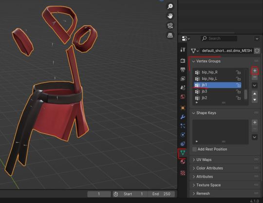
Adding Vertex Groups
Switch to Object Mode. Select the mesh of the cosmetic.
In the Data Properties tab, under the Vertex Groups header, add a new vertex group by clicking the + button.
Rename the newly added vertex group with the same name as the bone. This assigns the vertex group with the bone.
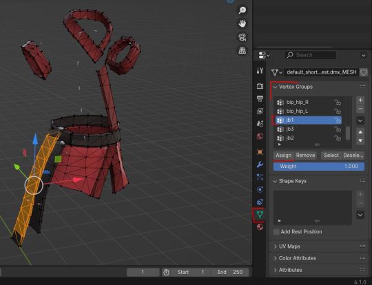
With the mesh still selected, switch to Edit Mode.
Select the vertex points of the mesh you want affected by the new bone. With the vertex group's slot selected (in the Data Properties tab), press the Assign button. If the selected vertex points are assigned to other already-existing bones, go through each vertex group bone slot in the list and press the Remove button to unassign them to that bone. You can have vertex assigned to multiple bones, but note that that means those vertex will no longer move 1:1 with the new bone, as it's sharing influence with multiple bones (which may be what you want, such as fabric on a cosmetic or other soft objects).
Editing Weight Paints
With the mesh still selected, switch to Weight Paint mode. In the Data Properties tab, select the vertex group slot with the name of the new bone. On the mesh, paint in the strength of the different vertex points assigned to the group. For solid objects (example: a metal hinge), you'll probably want a 1.0 Strength (seen as red) weight for all the assigned vertex points. For soft objects (example fabric), you'll probably want a gradient blend where the vertex points closest to the bone's head are 1.0 Strength and then gradually get a lower and lower Strength (closer to the colour blue, which is 0.0 Strength).
Do this for every new bone you have added, selecting each respective vertex group slot as you go.
Weight painting is I think the most fiddly bit of this guide. You may wish to look up a tutorial on weight painting in Blender, and how the different interface tools related to it work. I used the Gradient Tool here.
Optional: You can also edit pre-existing weight paints if they are affecting the mesh in ways you don't want. Do this by selecting the vertex group slot in the list and edit the weight paints as you wish.
Bonus: Adding Bones to Props
Adding bones to a prop is similar to editing a cosmetic, but with the added step on creating an armature.
In Object Mode, select Add > Armature > Single Bone (or one of the other options if they are more appropriate for your situation).
Then parent the armature to the prop. Select the mesh of the prop. In the Object Properties tab, under the Relations header, go to the Parent property and assign the name of the armature to the mesh.
You can rename the armature by clicking on its current name at the top of the Object Properties tab.
Then go through the steps for Adding and Editing Extra Bones to Cosmetics, creating a bone for each moving part of the prop.
6 notes
·
View notes
Text
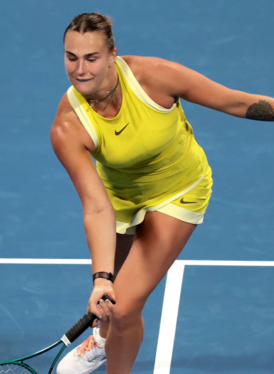
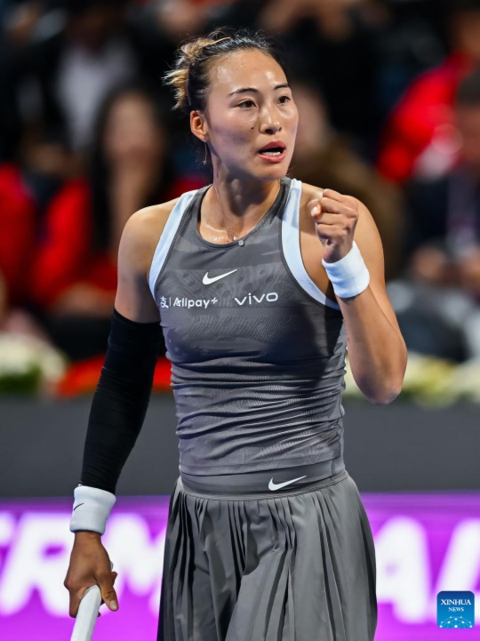
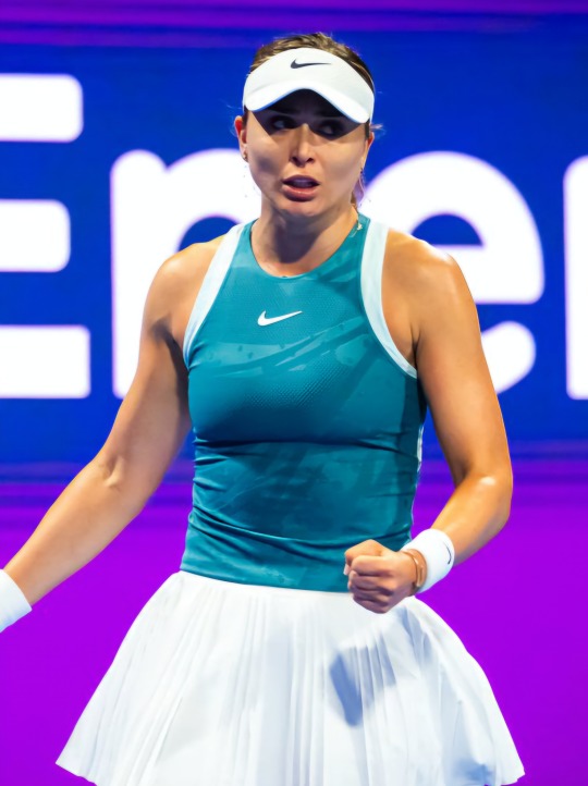
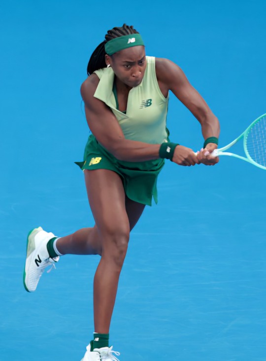
wta top 10 player's kits in doha (ranked)
8. jasmine paolini (asics)
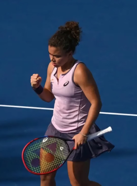
why can't they just put her in something that looks even a little good? the colors aren't all that bad I'm just not a big fan of the silhouettes that they have her in. certified asics hater. solid 4/10
7. iga swiatek (on)
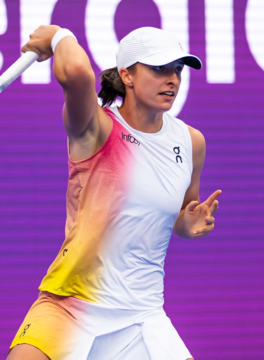
why do they still have that gradient tool in their hand?? somebody take it immediately please i begg. i think this would look better if it were fully colored rather than mostly white, and I would say something about how the skirt looks but it gets dawged on every time, so I'll give it a pass. maybe a 5.5/10
6. aryna sabalenka (nike)
i don't hate this actually! much better than the strange tanktop-esque ones that she wore at the ao, and the color is still bright and fun so I think that's cool. don't love the asymmetrical cut on the skirt/skort thing, but otherwise it's a pretty good simple kit. I'll give it a 6/10
5. zheng qinwen (nike)
same thing she wore at ao, and, like sabalenka's, it's not bad! the skirt's folding parts look a little funny, but I like the rest of it and the way it matches with the arm sleeve. the color is lame, but it's nike so I'll take it. slightly better than aryna's, so 6.5/10
4. paula badosa (nike)
i love the contrast between the blue and white!! and while I believe this is a similar skirt to what zheng was wearing, it looks better in white so props to that. it's a cute one, not many notes. 7/10
3. coco gauff (new balance)
while I love me some new balance, this one isn't in my top two simply because it's not spectacular or anything. i still like it, tho! the collar is a nice edition and I really like the shade of green. the neon yellow undershorts confused me a bit, but you don't see them all the time so i guess it's fine if they don't match. I also don't love the cut of this skirt, but i dont seem to like the cuts of any of the skirts so we'll take that w/ a grain of salt. I think maybe 7.5 or 8
2. elena rybakina (yonex)
okay strawberry poundcake!! I've liked this pattern since yonex released it before ao because i just think it's so funnn! the geometric shapes are cute and I love the pink. the slit in the dress is definitely unique, but I don't hate it! not too many notes here, just a nice outfit overall. 8/10
jessica pegula (adidas)
im a sucker for jessie she lowkey makes all the lame adidas look not-so lame. they made up for the atrocious purple/white/black line with this one very well, I rlly like the red against the blue courts! the skirt is cute and I like the mesh (?) + flowiness of the skirt. the top and visor matching are cute and I just overall enjoy it. while it is basic, it's the good kind of basic, yk. I give it a solid 8.5/10
(none of these are 10/10s 😭 but they're not all too bad!)
#this is such a yap mb#emma navarro isn't here because I couldn't find a pic of her kit and I did not want to go searching#aryna sabalenka#iga swiatek#coco gauff#jasmine paolini#jessica pegula#elena rybakina#zheng qinwen#paula badosa#badosa and coco are kind of interchangeable cuz they're on the same-ish level#tennis looks
4 notes
·
View notes
Note
How did you manage to improve your art so fast in so little time?
i dont think 5 years is that little 😭😭😭😭 i mean.drawing daily for that long ....thats like thousands of drawings since on some days i draw several times
i started drawing fr at the start of quarantine for whatever reason (end of my gacha phase + i wanted to branch out + general boredom) and had a relatively supportive friend group who liked what i made (even tho i deem it utter garbage by my standards now) so that did motivate me to do it often asides from my general love for it... i usually focused on chibi/more cartoony stuff without a general sense of direction (didnt know anatomy or anything) so i guess the real start of me taking it seriously (whatever tha means) was watching fight club? cause i was like Yeah no way am i drawing tyler as a twink in my usual artstyle so hence came my insane focus on learning anatomy and how to draw muscles/fat whatever else
i dont ever do studies and barely use references (aside from character ones so ik how to draw them correctly) because it feels incredibly restrictive and i just like drawing what interests me and cant force myself to do anything that idgaf about which is probably a bad habit and uhm. I should actually learn color theory and whatever but I dont care I draw for fun.art isnt a serious thing if you put your heart to it you can learn anything with enoguh trial and error❤️ experiment!!! if it turns out like shit, good! you learned not to do that thign next time! you also learned how to utilize said style in the future to make something better!!!! If you struggle with studying shit make your favorite character/topic a core component of it!!! if you dont like drawing something, dont!!! take inspo from other artists, use the components you like from their styles to create your own!! its probably not that easy for most people but its how it came to me i Guess... if you struggle with something you want to get better at just fuck around with it until it looks good.......i have horrendous perfectionist issues and if my brain doesnt like what its seeing its gonna tell me (un)fortunately and i draw until its good enough. Or i dump it. my main goal is make as much shit as possible until i just gradually get better at it
i never take more than 5 hours on a drawing since my style is relatively flexible and i dont focus on much than besides basic anatomy and making it as funky/appealing as possible.if ur pose is too stiff mesh transform it until it looks fine, feel free to scrap shit if it looks bad. dont dwell on it for too long. people always talk about rules and whatever other shit or using tutorials it just Doesnt work for me...
only rule i Do like is you have to learn anatomy to break it properly ok. this applies to cartoonish shit too. and chibis. Learn it
gradients are awesome and will make ur stuff look 50 times cooler and I encourage using filters if ur colors look bad.. (i do it for every drawing)
dont compare urself to other artists EVER!!!!!!!!!!!!!!!!!!!!!!!!!!!!!!!!!!!!!!! I mean EVER you can like another persons art but NEVER compare yourself to them IT WILL KILL YOUR ART Only compare yourself to yourself . compare new art to old art if you need to. Do Not compare yourself to others you dont know how long theyve been drawing, how much time thye spent on it, their circumstances, talent, tools Ok. Dont . Jealousy is bad and ugly and you should never indulge in it. draw for nobody but yourself. if you like it its Good enough
tldr: fucking around
2 notes
·
View notes
Text
This Week in Rust 542
Hello and welcome to another issue of This Week in Rust! Rust is a programming language empowering everyone to build reliable and efficient software. This is a weekly summary of its progress and community. Want something mentioned? Tag us at @ThisWeekInRust on Twitter or @ThisWeekinRust on mastodon.social, or send us a pull request. Want to get involved? We love contributions.
This Week in Rust is openly developed on GitHub and archives can be viewed at this-week-in-rust.org. If you find any errors in this week's issue, please submit a PR.
Updates from Rust Community
Official
Announcing Rust 1.77.2
Security advisory for the standard library (CVE-2024-24576)
Changes to Rust's WASI targets
Rust Nation UK
Hannah Aubrey - A Web of Rust: The Future of the Internet Depends on Trust
JD Nose - Rust Infrastructure: What it takes to keep Rust running
Amanieu D'Antras - The path to a stable ABI for Rust
Luca Palmieri - Pavex: re-imaging API development in Rust
Lachezar Lechev - Typed for Safety
Marco Concetto Rudilosso - Building a profiler for web assembly
Jon Gjengset - Towards Impeccable Rust
Nicholas Yang - Porting Turborepo From Go To Rust
David Haig - What’s that behind your ear? An open source hearing aid in Rust.
Frédéric Ameye - Renault want to sell cars with rust!
Nikita Lapkov - Type-safe and fault-tolerant mesh services with Rust
Andre Bogus - Easy Mode Rust
Lars Bergstrom - Beyond Safety and Speed: How Rust Fuels Team Productivity
Tim McNamara - Unwrapping unsafe
Nicholas Matsakis - Rust 2024 and beyond
Project/Tooling Updates
Shipping Jco 1.0, WASI 0.2
This month in Pavex, #10
"Containerize" individual functions in Rust with extrasafe
rust-analyzer changelog #228
Rerun 0.15.0 - Blueprints from Python · rerun-io/rerun
Bevy 0.13.2, Curves, Gizmos, and Games
What's new in SeaORM 1.0-rc.x
Observations/Thoughts
Improve performance of you Rust functions by const currying
Ownership in Rust
Thoughts on the xz backdoor: an lzma-rs perspective
hyper HTTP/2 Continuation Flood
Leaky Abstractions and a Rusty Pin
[audio] Launching RustRover: JetBrains' Investment in Rust
[audio] Pavex with Luca Palmieri
[video] Decrusting the tokio crate
[video] Rust 1.77.0: 70 highlights in 30 minutes
[video] Simulate the three body problem in #rustlang
[video] Exploring Fiberplane's 3-Year Rust Journey - with Benno van den Berg
Rust Walkthroughs
Working with OpenAPI using Rust
Zed Decoded: Async Rust
Writing a Unix-like OS in Rust
Fivefold Slower Compared to Go? Optimizing Rust's Protobuf Decoding Performance
Write Cleaner, More Maintainable Rust Code with PhantomData
[video] Extreme Clippy for an existing Rust Crate
[video] developerlife.com - Build a color gradient animation for a spinner component, for CLI, in Rust
[video] developerlife.com - Build a spinner component, for CLI, in Rust
[video] developerlife.com - Build an async readline, and spinner in Rust, for interactive CLI
Research
"Against the Void": An Interview and Survey Study on How Rust Developers Use Unsafe Code
Sound Borrow-Checking for Rust via Symbolic Semantics
Miscellaneous
Rust indexed - Rust mdbooks search
March 2024 Rust Jobs Report
Rust Meetup and user groups (updated)
Embedding the Servo Web Engine in Qt
A memory model for Rust code in the kernel
Building Stock Market Engine from scratch in Rust (II)
Ratatui Received Funding: What's Next?
Crate of the Week
This week's crate is archspec-rs, a library to track system architecture aspects.
Thanks to Orhun Parmaksız for the suggestion!
Please submit your suggestions and votes for next week!
Call for Testing
An important step for RFC implementation is for people to experiment with the implementation and give feedback, especially before stabilization. The following RFCs would benefit from user testing before moving forward:
No calls for testing were issued this week.
If you are a feature implementer and would like your RFC to appear on the above list, add the new call-for-testing label to your RFC along with a comment providing testing instructions and/or guidance on which aspect(s) of the feature need testing.
Call for Participation; projects and speakers
CFP - Projects
Always wanted to contribute to open-source projects but did not know where to start? Every week we highlight some tasks from the Rust community for you to pick and get started!
Some of these tasks may also have mentors available, visit the task page for more information.
If you are a Rust project owner and are looking for contributors, please submit tasks here.
CFP - Speakers
Are you a new or experienced speaker looking for a place to share something cool? This section highlights events that are being planned and are accepting submissions to join their event as a speaker.
If you are an event organizer hoping to expand the reach of your event, please submit a link to the submission website through a PR to TWiR.
Updates from the Rust Project
431 pull requests were merged in the last week
CFI: change type transformation to use TypeFolder
CFI: fix ICE in KCFI non-associated function pointers
CFI: restore typeid_for_instance default behavior
CFI: support function pointers for trait methods
CFI: support non-general coroutines
MSVC targets should use COFF as their archive format
actually use the inferred ClosureKind from signature inference in coroutine-closures
add Ord::cmp for primitives as a BinOp in MIR
add a debug asserts call to match_projection_projections to ensure invariant
add aarch64-apple-visionos and aarch64-apple-visionos-sim tier 3 targets
add consistency with phrases "meantime" and "mean time"
assert FnDef kind
assert that args are actually compatible with their generics, rather than just their count
avoid ICEing without the pattern_types feature gate
avoid expanding to unstable internal method
avoid panicking unnecessarily on startup
better reporting on generic argument mismatchs
cleanup: rename HAS_PROJECTIONS to HAS_ALIASES etc
do not ICE in fn forced_ambiguity if we get an error
do not ICE on field access check on expr with ty::Error
do not ICE when calling incorrectly defined transmute intrinsic
fix ByMove coroutine-closure shim (for 2021 precise closure capturing behavior)
fix capture analysis for by-move closure bodies
fix diagnostic for qualifier in extern block
hir: use ItemLocalId::ZERO in a couple more places
impl get_mut_or_init and get_mut_or_try_init for OnceCell and OnceLock
implement T-types suggested logic for perfect non-local impl detection
implement minimal, internal-only pattern types in the type system
instantiate higher ranked goals outside of candidate selection
link against libc++abi and libunwind as well when building LLVM wrappers on AIX
make inductive cycles always ambiguous
make sure to insert Sized bound first into clauses list
match ergonomics: implement "&pat everywhere"
match lowering: make false edges more precise
more postfix match fixes
move check for error in impl header outside of reporting
only allow compiler_builtins to call LLVM intrinsics, not any link_name function
only inspect user-written predicates for privacy concerns
pass list of defineable opaque types into canonical queries
pattern analysis: fix union handling
postfix match fixes
privacy: stabilize lint unnameable_types
put checks that detect UB under their own flag below debug_assertions
revert removing miri jobserver workaround
safe Transmute: Compute transmutability from rustc_target::abi::Layout
sanitizers: create the rustc_sanitizers crate
split hir ty lowerer's error reporting code in check functions to mod errors
teach MIR inliner query cycle avoidance about const_eval_select
transforms match into an assignment statement
use the more informative generic type inference failure error on method calls on raw pointers
add missing ?Sized bounds for HasInterner impls
introduce Lifetime::Error
perf: cache type info for ParamEnv
encode dep graph edges directly from the previous graph when promoting
remove debuginfo from rustc-demangle too
stabilize const_caller_location and const_location_fields
stabilize proc_macro_byte_character and proc_macro_c_str_literals
stabilize const Atomic*::into_inner
de-LLVM the unchecked shifts
rename expose_addr to expose_provenance
rename ptr::from_exposed_addr → ptr::with_exposed_provenance
remove rt::init allocation for thread name
use unchecked_sub in str indexing
don't emit divide-by-zero panic paths in StepBy::len
add fn const BuildHasherDefault::new
add invariant to VecDeque::pop_* that len < cap if pop successful
add Context::ext
provide cabi_realloc on wasm32-wasip2 by default
vendor rustc_codegen_gcc
cargo: Build script not rerun when target rustflags change
cargo add: Stabilize MSRV-aware version req selection
cargo toml: Decouple target discovery from Target creation
cargo toml: Split out an explicit step to resolve Cargo.toml
cargo metadata: Show behavior with TOML-specific types
cargo: don't depend on ? affecting type inference in weird ways
cargo: fix github fast path redirect
cargo: maintain sorting of dependency features
cargo: switch to using gitoxide by default for listing files
rustdoc-search: shard the search result descriptions
rustdoc: default to light theme if JS is enabled but not working
rustdoc: heavily simplify the synthesis of auto trait impls
rustdoc: synthetic auto trait impls: accept unresolved region vars for now
clippy: manual_swap auto fix
clippy: manual_unwrap_or_default: check for Default trait implementation in initial condition when linting and use IfLetOrMatch
clippy: allow cast lints in macros
clippy: avoid an ICE in ptr_as_ptr when getting the def_id of a local
clippy: correct parentheses for needless_borrow suggestion
clippy: do not suggest assigning_clones in Clone impl
clippy: fix ice reporting in lintcheck
clippy: fix incorrect suggestion for !(a as type >= b)
clippy: reword arc_with_non_send_sync note and help messages
clippy: type certainty: clear DefId when an expression's type changes to non-adt
rust-analyzer: apply cargo flags in test explorer
rust-analyzer: fix off-by-one error converting to LSP UTF8 offsets with multi-byte char
rust-analyzer: consider exported_name="main" functions in test modules as tests
rust-analyzer: fix patch_cfg_if not applying with stitched sysroot
rust-analyzer: set the right postfix snippets competion source range
Rust Compiler Performance Triage
A quiet week; all the outright regressions were already triaged (the one biggish one was #122077, which is justified as an important bug fix). There was a very nice set of improvements from PR #122070, which cleverly avoids a lot of unnecessary allocator calls when building an incremental dep graph by reusing the old edges from the previous graph.
Triage done by @pnkfelix. Revision range: 3d5528c2..86b603cd
3 Regressions, 3 Improvements, 7 Mixed; 1 of them in rollups 78 artifact comparisons made in total
See full report here
Approved RFCs
Changes to Rust follow the Rust RFC (request for comments) process. These are the RFCs that were approved for implementation this week:
Merge RFC 3513: Add gen blocks
Final Comment Period
Every week, the team announces the 'final comment period' for RFCs and key PRs which are reaching a decision. Express your opinions now.
RFCs
[disposition: merge] RFC: Drop temporaries in tail expressions before local variables
[disposition: merge] RFC: Reserve unprefixed guarded string literals in Edition 2024
Tracking Issues & PRs
Rust
[disposition: merge] Always display stability version even if it's the same as the containing item
[disposition: merge] Tracking Issue for cstr_count_bytes
[disposition: merge] rustdoc-search: single result for items with multiple paths
[disposition: merge] Tracking Issue for #![feature(const_io_structs)]
[disposition: merge] Tracking Issue for alloc::collections::BinaryHeap::as_slice
[disposition: merge] Tracking Issue for fs_try_exists
[disposition: merge] stabilize -Znext-solver=coherence
[disposition: merge] Document overrides of clone_from() in core/std
[disposition: merge] Stabilise inline_const
[disposition: merge] Tracking Issue for RFC 3013: Checking conditional compilation at compile time
[disposition: merge] sess: stabilize -Zrelro-level as -Crelro-level
[disposition: merge] Implement FromIterator for (impl Default + Extend, impl Default + Extend)
[disposition: close] Return the delimiter from slice::split_once
[disposition: merge] Support type '/' to search
[disposition: merge] Tracking Issue for Seek::seek_relative
[disposition: merge] Tracking Issue for generic NonZero
New and Updated RFCs
[new] Add an expression for direct access to an enum's discriminant
[new] RFC: Drop temporaries in tail expressions before local variables
Upcoming Events
Rusty Events between 2024-04-10 - 2024-05-08 🦀
Virtual
2024-04-11 | Virtual + In Person (Berlin, DE) | OpenTechSchool Berlin + Rust Berlin
Rust Hack and Learn | Mirror: Rust Hack n Learn Meetup
2024-04-11 | Virtual (Nürnberg, DE) | Rust Nüremberg
Rust Nürnberg online
2024-04-11 | Virtual (San Diego, CA, US) | San Diego Rust
San Diego Rust April 2024 Tele-Meetup
2024-04-15 & 2024-04-16 | Virtual | Mainmatter
Remote Workshop: Testing for Rust projects – going beyond the basics
2024-04-16 | Virtual (Dublin, IE) | Rust Dublin
A reverse proxy with Tower and Hyperv1
2024-04-16 | Virtual (Washington, DC, US) | Rust DC
Mid-month Rustful—forensic parsing via Artemis
2024-04-17 | Virtual | Rust for Lunch
April 2024 Rust for Lunch
2024-04-17 | Virtual (Cardiff, UK) | Rust and C++ Cardiff
Reflections on RustNation UK 2024
2024-04-17 | Virtual (Vancouver, BC, CA) | Vancouver Rust
Rust Study/Hack/Hang-out
2024-04-18 | Virtual (Charlottesville, VA, US) | Charlottesville Rust Meetup
Crafting Interpreters in Rust Collaboratively
2024-04-21 | Virtual (Israel) | Rust in Israel
Using AstroNvim for Rust development (in Hebrew)
2024-04-25 | Virtual + In Person (Berlin, DE) | OpenTechSchool Berlin + Rust Berlin
Rust Hack and Learn | Mirror: Rust Hack n Learn Meetup
2024-04-30 | Virtual (Dallas, TX, US) | Dallas Rust
Last Tuesday
2024-05-01 | Virtual (Cardiff, UK) | Rust and C++ Cardiff
Rust for Rustaceans Book Club: Chapter 5 - Project Structure
2024-05-01 | Virtual (Indianapolis, IN, US) | Indy Rust
Indy.rs - with Social Distancing
2024-05-02 | Virtual (Charlottesville, NC, US) | Charlottesville Rust Meetup
Crafting Interpreters in Rust Collaboratively
2024-05-07 | Virtual (Buffalo, NY) | Buffalo Rust Meetup
Buffalo Rust User Group
Africa
2024-05-04 | Kampala, UG | Rust Circle Kampala
Rust Circle Meetup
Asia
2024-04-16 | Tokyo, JP | Tokyo Rust Meetup
The Good, the Bad, and the Async (RSVP by 15 Apr)
Europe
2024-04-10 | Cambridge, UK | Cambridge Rust Meetup
Rust Meetup Reboot 3
2024-04-10 | Cologne/Köln, DE | Rust Cologne
This Month in Rust, April
2024-04-10 | Manchester, UK | Rust Manchester
Rust Manchester April 2024
2024-04-10 | Oslo, NO | Rust Oslo
Rust Hack'n'Learn at Kampen Bistro
2024-04-11 | Bordeaux, FR | Rust Bordeaux
Rust Bordeaux #2 : Présentations
2024-04-11 | Reading, UK | Reading Rust Workshop
Reading Rust Meetup at Browns
2024-04-15 | Zagreb, HR | impl Zagreb for Rust
Rust Meetup 2024/04: Building cargo projects with NIX
2024-04-16 | Bratislava, SK | Bratislava Rust Meetup Group
Rust Meetup by Sonalake #5
2024-04-16 | Leipzig, DE | Rust - Modern Systems Programming in Leipzig
winnow/nom
2024-04-16 | Munich, DE + Virtual | Rust Munich
Rust Munich 2024 / 1 - hybrid
2024-04-17 | Bergen, NO | Hubbel kodeklubb
Lær Rust med Conways Game of Life
2024-04-17 | Ostrava, CZ | TechMeetup Ostrava
TechMeetup: RUST
2024-04-20 | Augsburg, DE | Augsburger Linux-Infotag 2024
Augsburger Linux-Infotag 2024: Workshop Einstieg in Embedded Rust mit dem Raspberry Pico WH
2024-04-23 | Berlin, DE | Rust Berlin
Rust'n'Tell - Rust for the Web
2024-04-23 | Paris, FR | Rust Paris
Paris Rust Meetup #67
2024-04-25 | Aarhus, DK | Rust Aarhus
Talk Night at MFT Energy
2024-04-23 | Berlin, DE | Rust Berlin
Rust'n'Tell - Rust for the Web
2024-04-25 | Berlin, DE | Rust Berlin
Rust and Tell - TBD
2024-04-27 | Basel, CH | Rust Basel
Fullstack Rust - Workshop #2 (Register by 23 April)
2024-04-30 | Budapest, HU | Budapest Rust Meetup Group
Rust Meetup Budapest 2
2024-04-30 | Salzburg, AT | Rust Salzburg
[Rust Salzburg meetup]: 6:30pm - CCC Salzburg, 1. OG, ArgeKultur, Ulrike-Gschwandtner-Straße 5, 5020 Salzburg
2024-05-01 | Utrecht, NL | NL-RSE Community
NL-RSE RUST meetup
2024-05-06 | Delft, NL | GOSIM
GOSIM Europe 2024
2024-05-07 & 2024-05-08 | Delft, NL | RustNL
RustNL 2024
North America
2024-04-10 | Boulder, CO, US | Boulder Rust Meetup
Rust Meetup: Better Builds w/ Flox + Hangs
2024-04-11 | Lehi, UT, US | Utah Rust
Interactive Storytelling using Yarn Spinner with Rex Magana
2024-04-11 | Seattle, WA, US | Seattle Rust User Group
Seattle Rust User Group Meetup
2024-04-11 | Spokane, WA, US | Spohttps://www.meetup.com/minneapolis-rust-meetup/kane Rust
Monthly Meetup: The Rust Full-Stack Experience
2024-04-15 | Minneapolis, MN, US | Minneapolish Rust Meetup
Minneapolis Rust: Getting started with Rust! #2
2024-04-15 | Somerville, MA, US | Boston Rust Meetup
Davis Square Rust Lunch, Apr 15
2024-04-16 | San Francisco, CA, US | San Francisco Rust Study Group
Rust Hacking in Person
2024-04-16 | Seattle, WA, US | Seattle Rust User Group
Seattle Rust User Group: Meet Servo and Robius Open Source Projects
2024-04-18 | Chicago, IL, US | Deep Dish Rust
Rust Talk: What Are Panics?
2024-04-18 | Mountain View, CA, US | Mountain View Rust Meetup
Rust Meetup at Hacker Dojo
2024-04-24 | Austin, TX, US | Rust ATX
Rust Lunch - Fareground
2024-04-25 | Nashville, TN, US | Music City Rust Developers
Music City Rust Developers - Async Rust on Embedded
2024-04-26 | Boston, MA, US | Boston Rust Meetup
North End Rust Lunch, Apr 26
Oceania
2024-04-15 | Melbourne, VIC, AU | Rust Melbourne
April 2024 Rust Melbourne Meetup
2024-04-17 | Sydney, NSW, AU | Rust Sydney
WMaTIR 2024 Gala & Talks
2024-04-30 | Auckland, NZ | Rust AKL
Rust AKL: Why Rust? Convince Me!
2024-04-30 | Canberra, ACT, AU | Canberra Rust User Group
CRUG April Meetup: Generics and Traits
If you are running a Rust event please add it to the calendar to get it mentioned here. Please remember to add a link to the event too. Email the Rust Community Team for access.
Jobs
Please see the latest Who's Hiring thread on r/rust
Quote of the Week
As a former JavaScript plebeian who has only been semi-recently illuminated by the suspiciously pastel pink, white and blue radiance of Rust developers, NOT having to sit in my web console debugger for hours pushing some lovingly crafted [object Object] or undefined is a blessing.
– Julien Robert rage-blogging against bevy
Thanks to scottmcm for the suggestion!
Please submit quotes and vote for next week!
This Week in Rust is edited by: nellshamrell, llogiq, cdmistman, ericseppanen, extrawurst, andrewpollack, U007D, kolharsam, joelmarcey, mariannegoldin, bennyvasquez.
Email list hosting is sponsored by The Rust Foundation
Discuss on r/rust
1 note
·
View note
Text
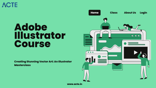
From Zero to Hero: Navigating the Advanced Features of Illustrator
Welcome to the world of Adobe Illustrator, where creativity knows no bounds, and design possibilities are limited only by your imagination. In this blog, I invite you on a journey—a journey that spans my transformation from an Illustrator novice to a virtuoso of its advanced features. Together, we will explore the significance of mastering Illustrator's advanced capabilities, my personal evolution, and what you can expect to discover throughout this narrative.
The Novice Stage: Getting Started with Illustrator
My journey with Adobe Illustrator began like many others—with curiosity and a blank canvas. As a novice, I was eager to dip my toes into the realm of vector design, but I had a long road ahead.
Reflecting on the Early Days
In the beginning, Illustrator felt like a vast and intricate puzzle. I was fascinated yet overwhelmed by the sheer array of tools and options. But every designer starts somewhere, and I began by mastering the basics.
Embracing the Fundamentals
The basic tools and features of Illustrator were my foundation. I delved into concepts like shapes, paths, and colors. It was a phase of exploration, trial, and error, but it laid the groundwork for my journey ahead.
The Novice's Misconceptions
Looking back, I can't help but chuckle at the misconceptions I had as a novice. Some tools seemed mysterious, and I wondered if I'd ever need to use them. Little did I know that they would become indispensable in my advanced design work.
The Turning Point: Discovering Advanced Features
Every artist has a moment when they decide to venture beyond the familiar. For me, it was the allure of Illustrator's advanced features that beckoned me to explore new horizons.
The Turning Point
There came a day when I realized that Illustrator offered more than just basic shapes and colors. It held a treasure trove of advanced capabilities waiting to be uncovered. This realization marked a turning point in my Illustrator journey.
The Fascinating Advanced Features
What advanced features fascinated me the most? The answer lies in the realm of precision and creative freedom. Features like the Pen Tool, gradients, blends, and intricate text effects opened doors to endless design possibilities.

Motivation to Excel
The motivation behind delving into Illustrator's advanced features was simple: the desire to excel in design. I wanted to create artwork that not only captured attention but also pushed the boundaries of my creativity. Illustrator's advanced tools promised just that.
Mastering the Pen Tool: Precision and Control
The Pen Tool—a powerful yet enigmatic instrument in Illustrator's arsenal. It became my first stop on the journey to advanced vector design, offering unparalleled precision and control.
The Pen Tool Unveiled
The Pen Tool was my gateway to vector mastery. Understanding anchor points, curves, and handles was like learning a new language. But with practice and patience, I unlocked its potential.
A Journey of Precision
Mastering the Pen Tool is akin to mastering calligraphy—it requires a steady hand and an eye for detail. I share my learning process, tips, and techniques for achieving precision and control in your vector designs.
The Pen Tool in Action
From creating intricate illustrations to crafting custom typography, the Pen Tool played a pivotal role in my advanced projects. I showcase examples where precision and control were paramount.
Beyond the Basics: Gradients, Blends, and Meshes
Beyond basic shapes, Illustrator's advanced features brought gradients, blends, and gradient meshes into focus. These tools added depth and realism to my designs, transforming them into works of art.
The Artistry of Gradients
Gradients became my go-to for adding depth and dimension to my designs. I delve into advanced gradient techniques, sharing step-by-step tutorials and examples of complex gradient-based artwork.
Seamless Blending
Blends allowed me to seamlessly transition between objects, creating smooth transitions and captivating visual effects. Discover how I harnessed the power of blends to elevate my design game.
Mastering the Mesh
Gradient meshes—the secret sauce for creating realistic shading and textures. I unravel the complexities of mesh creation and provide insights into its application in advanced Illustrator projects.
The Art of Typography: Advanced Text Effects
Typography is the unsung hero of design, and Illustrator offers advanced text effects that can turn a mundane text element into a stunning visual centerpiece.
Typography's Vital Role
Text effects can make or break a design. I discuss the significance of typography in design and how advanced text effects became a game-changer in my projects.
Showcasing Text Mastery
I proudly showcase examples of intricate text designs and typography projects I've undertaken. From 3D text to custom lettering, these advanced text effects brought my designs to life.
Manipulating Text with Finesse
Manipulating text effectively in Illustrator is an art in itself. I share insights into techniques for fine-tuning typography, achieving visual harmony, and creating typographic masterpieces.
Illustrator's Hidden Gems: Lesser-Known Advanced Tools
Illustrator harbors hidden gems—lesser-known advanced tools and features that can significantly enhance your design workflow and creativity.
Uncovering Hidden Treasures
Exploring these lesser-known tools felt like stumbling upon a hidden garden in a bustling city. I unveil some of Illustrator's hidden gems and explain their potential impact on your design work.
Practical Tips and Use Cases
I offer practical tips and use cases for these hidden gems. Whether it's using the Shape Builder tool for intuitive shape manipulation or harnessing the power of the Width Tool for expressive strokes, you'll find valuable insights here.
Streamlining Your Workflow
These hidden gems aren't just novelties—they are efficiency boosters. Discover how incorporating these tools into your workflow can streamline your design process and elevate your output.
Real-World Applications: Showcasing Advanced Projects
The true test of any skill lies in its application. I share a glimpse into real-world design projects where I applied advanced Illustrator techniques to solve complex design challenges.
From Concept to Creation
Walk with me through the creative process of these projects, from concept development to execution. Each project posed unique challenges, and Illustrator's advanced features were my trusty companions.
Challenges and Solutions
Designing at an advanced level isn't without its hurdles. I candidly discuss the challenges I faced and the creative solutions I devised to overcome them. These experiences enriched my journey.
Elevating Design Quality
The advanced skills I honed in Illustrator undeniably elevated the quality of my work. See for yourself how these projects reflect the power and versatility of advanced Illustrator techniques.
Bridging the Gap: Integrating Illustrator with Other Adobe Apps
Illustrator doesn't work in isolation—it thrives when integrated with other Adobe Creative Cloud applications. I delve into the advantages of seamless integration and offer tips for collaboration.
The Adobe Ecosystem
Adobe Creative Cloud is a family of applications, each with its strengths. I explain how Illustrator complements other Adobe apps like Photoshop and InDesign, creating a harmonious design ecosystem.
Enhancing Design Capabilities
Integration isn't just about convenience; it's about enhancing your design capabilities. Discover how the synergy between Illustrator and other Adobe apps can empower your creative endeavors.
Collaboration Made Easy
For designers, collaboration is key. I provide insights and strategies for collaborating seamlessly between Illustrator and other Adobe software, ensuring a smooth workflow in team projects.
Continued Learning: Resources for Aspiring Virtuosos
The journey from novice to virtuoso is ongoing, and the quest for knowledge never ends. I recommend a curated list of resources for those aspiring to advance their Illustrator skills.
Books for In-Depth Learning
Reading has always been a great way to learn new things. I recommend essential books that delve deep into Illustrator's advanced features, offering in-depth insights and tutorials.
Online Courses and Tutorials
The digital age brings learning to your fingertips. I point you to online courses and tutorials that cater to various skill levels, helping you master advanced Illustrator techniques at your own pace. Think about enrolling in extensive educational platforms like the ACTE Institute, which provide a wealth of materials and programs especially designed for Adobe Illustrator students. These platforms frequently offer structured courses, mentorship, and certification alternatives, enabling you to systematically lay a solid foundation.
Joining the Illustrator Community
The Illustrator community is a vast and supportive network of fellow designers. I encourage you to join forums, social media groups, and communities where you can learn, share, and grow with like-minded enthusiasts.
In conclusion, As I reflect on my journey from Illustrator novice to virtuoso, one thing becomes clear: the path to mastery is marked by curiosity, practice, and an unwavering commitment to continuous learning.
I summarize the transformative experience of navigating Illustrator's advanced features and how it elevated my design prowess. Illustrator is a canvas of limitless possibilities, and my journey is far from over. I encourage you to embark on your own odyssey, embracing the challenges and triumphs that await. To those aspiring to become virtuosos of Adobe Illustrator's advanced features, remember that the path may be daunting, but the rewards are immeasurable. May your creativity know no bounds as you navigate the advanced features of Illustrator.
3 notes
·
View notes
Text
Thermal Simulation Tools Are Evolving—Is Your Workflow Keeping Up?
Simulation Is No Longer Optional
Designing electronics without thermal simulation today is like racing without a dashboard, you might keep moving, but you’ll miss the warning signs. With tighter enclosures, higher power densities, and diverse operating environments, thermal challenges aren’t just probable—they’re inevitable.
Modern Mechanical & Thermal Design workflows are evolving fast. Simulation tools have become more intelligent, more accessible, and more essential. The real question is: has your workflow kept up with the change?
Why Thermal Simulation Is Getting Smarter
A few years ago, thermal simulations were mostly post-layout activities. Now, they’re integrated earlier in the design phase, sometimes even during concept development.
What’s driving the change:
Compact form factors with high power loads
Multi-board systems generating localized heat
Demands for silent (fanless) cooling
More design teams working remotely and asynchronously
These pressures make it critical to simulate heat flow, temperature gradients, and component interactions early in the process. That’s where Mechanical & Thermal Design takes center stage.
What Modern Tools Bring to the Table
Today’s simulation platforms aren’t just about running heat maps. They’re smarter, faster, and often integrated with your PCB and CAD tools.
Here’s what’s new:
Intuitive interfaces for 3D airflow modeling
Real-time co-simulation with mechanical CAD
Faster meshing algorithms that don’t need expert tweaking
Cloud-based options for collaborative work
With these features, Mechanical & Thermal Design is no longer siloed—it becomes a fluid part of the product design journey.
The Cost of Outdated Workflows
Still relying on spreadsheets, ballpark guesses, or legacy simulation methods? You’re likely leaving performance and time on the table.
Outdated approaches can lead to:
Over-engineered cooling systems (cost and space waste)
Missed hot spots that cause long-term failures
Design delays due to thermal issues in late-stage testing
Modern Mechanical & Thermal Design practices use simulation not just to fix problems but to prevent them from happening in the first place.
Early Simulation = Fewer Surprises
Integrating thermal simulation during early mechanical concepting avoids cascading design changes later. Whether you're using passive cooling, forced airflow, or heat sinks, the earlier you simulate, the better your decisions.
Benefits of early-stage thermal simulation:
Faster time-to-market
Smaller, more efficient enclosures
Fewer physical prototypes
Tighter collaboration between electrical and mechanical teams
Thermal modeling is now a strategic step in the Mechanical & Thermal Design process—not just a safety check.
Real-World Integration Tips
If your team is moving toward integrated simulation, here are a few quick tips:
Model real-world conditions: Include surrounding components, airflow paths, and mounting orientations.
Use 3D board models: Import IDF/STEP files to ensure geometry is accurate.
Validate against extremes: Simulate worst-case power and ambient temperature scenarios.
Involve mechanical engineers early: They understand enclosure constraints that affect cooling.
These strategies help you get the most from your Mechanical & Thermal Design simulations.
Why It Matters More Than Ever
Products are getting smaller, hotter, and expected to last longer. Your mechanical and thermal considerations need to evolve just as fast.
It’s no longer about just surviving temperature—it’s about:
Meeting performance targets
Achieving compliance
Extending product lifespan
Delivering consistency in every unit shipped
All of which are tied to one core capability: how strong your Mechanical & Thermal Design workflow really is.
Final Thoughts
Thermal simulation tools are not only evolving, they’re becoming essential allies in creating better products. If you’re still waiting until the end of a project to think about cooling, you're already behind.
It’s time to treat Mechanical & Thermal Design not as a checklist item, but as a dynamic, simulation-driven pillar of your product development process.
FAQs
Q1: Do I need thermal simulation if my design isn’t high-power?A: Yes. Even low-power devices in enclosed spaces can overheat. Thermal simulation helps avoid risk early.
Q2: Can mechanical and thermal simulations be done in the same tool?A: Many modern platforms offer co-simulation, streamlining Mechanical & Thermal Design into a single environment.
Q3: How often should thermal simulations be run during a project?A: Ideally at multiple stages—during initial layout, after major component shifts, and before prototyping.
0 notes
Text
How Many Colors Can You Use In Screen Printing?
Screen printing is a timeless technique that continues to thrive in today’s digital world. From fashion brands to corporate stationery, businesses across industries rely on screen printing to create bold, vibrant visuals on various materials. One of the most frequently asked questions in this field is: How many colors can you use in screen printing?
The answer isn’t as straightforward as a single number. It depends on the design, printing method, screen preparation, and budget. Let's dive deep into the color capabilities of screen printing and explore how this versatile process is used for everything from apparel to custom printed boxes and tag printing near me options.

Understanding Screen Printing Basics
In screen printing, each color in a design is applied using a separate screen. This means that the number of colors used equals the number of screens required. The process starts with preparing a stencil on a fine mesh screen. Once ready, the printer presses ink through the screen onto the desired surface.
This method ensures vibrant and durable colors that don’t fade easily. Unlike digital printing, which blends colors using dots, screen printing applies solid layers of ink, making it ideal for bold, high-impact visuals.
How Many Colors Can You Use?
Technically, there’s no strict limit on the number of colors you can use in screen printing. However, practical limitations and cost factors come into play. Most screen printing projects typically use between 1 to 6 colors, but high-end commercial jobs can include up to 10–12 colors or more.
Factors That Influence Color Use:
Design Complexity: Simpler designs work well with 1–3 colors. If your artwork includes gradients, shadows, or photo-realistic images, you'll need more screens and advanced techniques.
Budget Constraints: Each additional color means a new screen, which increases setup time and cost. Therefore, using more colors will affect your overall project budget.
Material Used: Printing on fabric, plastic, metal, or paper may limit or expand your color choices based on ink compatibility.
Equipment Capability: Some screen printing machines are equipped to handle only a limited number of colors. Advanced setups, especially in commercial units like screen printing in Mumbai, can handle up to 12 or more.

Spot Color vs. CMYK in Screen Printing
Two primary methods determine how colors are applied in screen printing: spot color printing and CMYK (process) printing.
Spot Color: This is the traditional method where each individual color is printed separately. It gives the most vibrant and accurate results, especially for logos and bold designs.
CMYK Printing: This process combines four base inks — cyan, magenta, yellow, and black — to create a wide range of colors. It’s commonly used for photo-realistic images but may not provide the same vibrancy as spot colors.
Using CMYK requires fewer screens (only 4), but color accuracy can vary. For brand-specific colors or sharp graphics, spot color printing remains superior.
Specialty Inks for More Color Effects
If you're looking to go beyond the basic color palette, specialty inks can create stunning results:
Metallic Inks: Great for luxury tags or apparel.
Neon Inks: Perfect for bold streetwear or event merchandise.
Glow-in-the-Dark Inks: A fun option for children’s apparel and novelty items.
Puff or Raised Inks: Add a 3D texture effect to your prints.
These special effects require extra steps and precise screen alignment, so it’s essential to work with experienced professionals—like those offering screen printing in Mumbai—to ensure high-quality results.
Color Use in Custom Printed Products
Screen printing isn’t just for t-shirts and hoodies. It’s also widely used for printing on packaging, stationery, and labels.
1. Custom Printed Boxes
Custom packaging is a branding tool, and screen printing helps create visually appealing boxes with vivid colors. You can use 1–4 spot colors for logos or decorative borders. Metallic or UV inks further enhance luxury appeal.
2. Tag Printing Near Me
Businesses that need product tags or labels often search online for tag printing near me services. These tags are frequently screen-printed with brand names, barcodes, or design elements in 1–3 colors for sharp visibility and durability.
Whether you run a boutique or sell handmade crafts, screen-printed tags offer a premium touch that leaves a lasting impression on customers.
The Role of Location in Screen Printing Services
Cities like Mumbai have become central hubs for screen printing and related services. If you're searching for screen printing in Mumbai, you’ll find a range of professional setups equipped with multi-color machines, experienced technicians, and eco-friendly ink options.
Mumbai also caters to creative industries, and many screen printing providers work closely with fashion designers, product manufacturers, and event planners to deliver custom, color-rich prints on various materials.
Screen Printing vs. 3D Printing in Color Options
While screen printing is excellent for flat surfaces and textiles, 3D printing services in Mumbai are growing fast and offer a different dimension to customized designs.
But what about colors?
3D printing typically uses materials like PLA, ABS, and resins, which come in limited colors. Full-color 3D printing is possible but often limited to industrial setups. Unlike screen printing, you don’t layer colors; instead, you print with pre-colored filaments or use post-print coloring.
If your project requires detailed color work on flat materials, screen printing is the better choice. If you're building a prototype or model that needs structural design, go for 3D printing and consider post-processing for color.
Tips to Maximize Colors in Screen Printing
To get the most out of your color usage in screen printing:
Simplify Your Design: Use fewer colors strategically to create strong visual impact.
Use Halftones: These allow you to simulate gradients or shades with fewer inks.
Work with Experts: Choose a reliable printing company—especially if you're in a market like Mumbai where expertise is abundant.
Choose the Right Substrate: Some materials hold ink better, allowing for brighter and more vibrant results.
Communicate Clearly: Provide your printer with vector files and Pantone codes for precise color matching.
Conclusion
So, how many colors can you use in screen printing? Technically, as many as your design and budget allow—commonly up to 6 for most commercial jobs, and more for advanced printing setups.
From branding with custom printed boxes to local solutions like tag printing near me, screen printing offers an affordable and high-quality method for vibrant, professional results. And in places like Mumbai, where screen printing and 3D printing services are booming, you’ll find a range of providers who can deliver both innovation and color precision.
If you’re ready to bring your designs to life with bold colors and crisp details, screen printing remains one of the best options available today.
0 notes
Text
The Art and Science of Glass Bottle Printing
Glass bottle printing has become an essential element in product packaging, blending creativity with functionality. Through glass bottle printing, brands can apply vibrant designs, logos, and product information directly onto glass surfaces, resulting in eye-catching packaging that enhances consumer appeal. This method offers durability, ensuring that prints withstand handling, moisture, and temperature changes without fading or peeling.
What are the main benefits of using bottle screen printing for packaging
One of the most widely used methods in the decoration of glass containers is bottle screen printing. This process uses mesh screens to transfer ink onto the bottle’s surface, allowing for precise, multi-color designs. The technique supports a wide range of colors and finishes, including matte, gloss, and textured inks, enabling brands to customize bottles in ways that resonate with their target audiences.
The Elegance and Precision of Wine Bottle Etching
For those seeking a more sophisticated and tactile approach, wine bottle etching offers a refined alternative to traditional printing. Etching involves chemically or mechanically removing parts of the glass surface to create permanent designs. This method produces a subtle yet striking effect that conveys quality and craftsmanship.
What recent technological advancements have improved glass screen printing
Modern glass screen printing techniques have advanced significantly with the integration of digital controls and improved ink formulations. These advancements provide greater precision, allowing for detailed graphics and consistent results across production batches
What are the advantages of direct printing on glass compared to traditional labels
Printing on glass bottles is a strategic tool for brands aiming to stand out in crowded markets. Direct printing eliminates the need for paper labels, offering a seamless and modern look. This approach enhances durability and hygiene, as designs remain intact regardless of moisture or abrasion. Brands can leverage this technique to incorporate unique branding elements such as metallic inks, gradients, and personalized messages, creating a memorable customer experience. Additionally, printed glass bottles are easier to recycle, aligning with growing consumer demand for sustainability.
Why Screen Printed Bottles Continue to Lead the Market
Screen printed bottles maintain their popularity due to a combination of durability, customization options, and aesthetic appeal. The screen printing process ensures vibrant, long-lasting colors that resist wear and fading. These bottles offer flexibility in design, supporting everything from simple logos to elaborate artwork. Their ability to combine artistry with industrial efficiency makes them a top choice for packaging in beverages, cosmetics, and specialty products.
0 notes
Text
Chapter 10: Lightmap UV seams

Figure 20. Lightmap UV split visible across the hand after baking (left). Unity fixes seams after enabling the Stitch Seams option and baking again (right).
10.1 Why does this happen?
By default, GPUs cannot blend color values between separate UV shells. Without the extra post processing step, this limitation can cause visible seams to appear in a lightmap. Aggressive filtering and low lightmap resolution can exacerbate this problem by bleeding texel color values into neighboring UV shells.
10.2 How to fix it
Disclaimer: fixing lightmap seams in a single object can be trivial. It is more difficult to address this problem when working with modular meshes. This is a common issue that most lightmapping backends face, and it is a hard problem to solve.
10.2.1 Enable Stitch Seams option
Stitch Seams option is available in the Mesh Renderer component, under the Lightmapping header. By enabling it, Unity will attempt to fix seams by blending color values between UV shells that share a stitchable common edge in the model.
Note that this option only works with single GameObjects. Multiple GameObjects are not supported.
10.2.2 Combine meshes in a DCC tool

Figure 21. Cornell Box scene assembled using modular meshes with visible seams after lightmap baking (left). Meshes combined in a DCC tool prior to exporting with no lightmap seams visible (right). You can achieve the result on the right by disabling filtering and baking with high sample counts.
The easiest way to mitigate seams is to combine meshes in a 3D modeling package. Make sure to weld overlapping vertices before exporting. Or, you can weld vertices in in the Model Import Settings window. Skipping this step might impede automatic lightmap unwrapping in Unity.
10.2.3 Combine meshes via an API
Mesh.CombineMeshes method combines meshes into one, achieving the same result as merging them in a DCC package.
10.2.4 Combine meshes using ProBuilder
When working with ProBuilder meshes it is possible to merge multiple objects by using the Merge Objects option.
You can make this option available for regular meshes by converting them into ProBuilder meshes using the ProBuilderize option.
10.2.5 Disable filtering and denoising
By disabling filtering, it is possible to avoid blurring and dilation issues described earlier. The main drawback of this approach is long bake times, as you would need to increase the number of samples to achieve clean results.
10.2.6 Increase lightmap padding
If disabling filtering does not solve the issue, try increasing Lightmap Padding value. When working with modular meshes, each mesh has its own UV atlas. Lightmap Padding property allows you to change the distance between UV atlases – but not between UV shells within the atlas - to prevent leaking.
10.2.7 Use light probes
Light probes are often used to provide indirect illumination for dynamic objects. Consider utilizing light probes for difficult to lightmap objects.
It is worth mentioning that probe-lit objects receive lighting information from a single probe. It can be detrimental when illuminating large objects. Light Probe Proxy Volume (LPPV) component can mitigate this problem, by creating a grid of light probes within a bounding volume. As a result, probe-lit objects that make use of LPPVs have a spatial gradient improving their look.
Adaptive probe volumes allow for per-pixel lighting and streamlined placement when compared to light probe groups, and LPPVs.
10.2.8 Hide seams using meshes or textures
If the art direction allows for it, try using trim meshes to hide seams between objects. This is a commonly used technique in game development.
0 notes