#html footer tag
Explore tagged Tumblr posts
Visit Tumblr Blog
Explore Tumblr blogs with no restrictions, modern design and the best experience.
Last Seen Tumblr Blogs


Fun Fact
When “GIF” was named word of the year in 2012, Oxford Dictionaries U.S.A. credited Tumblr for pushing the word.
Text
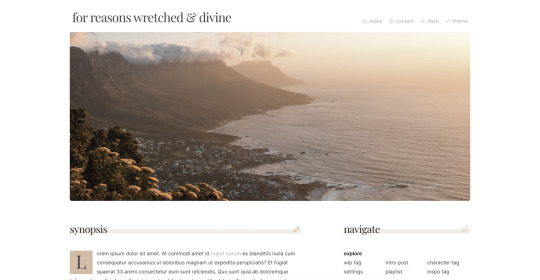
wip page 08 - an all-inclusive wip page
preview / code
several people have asked for this one, so sorry it took me so long to release it!
featured image and sections for synopsis, themes/tags, links, project details, major characters, minor characters, and general sections like 'locations' and 'terms to know' which can be use for anything
footer section for additional info, but you can delete it if you don't want it
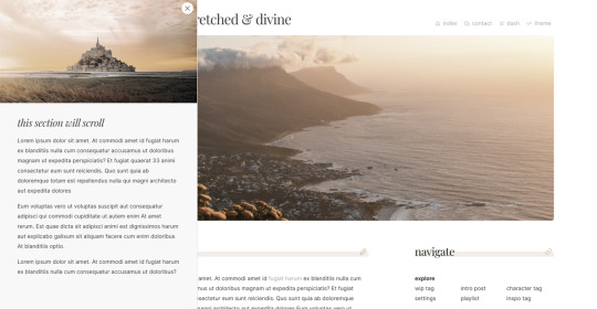
slide out menu with a second image, can be used for additional information or to feature an excerpt
pls like/reblog if you use, let me know if you run into any bugs, and pls don’t remove credit. thanks! ♥
additional info under the cut :)
if you'd like to change any of the icons, you can find more at phosphoricons.com
scripts are noted in the code so you can delete them if you want a javascript-free theme. without the javascript, the slide out menu will not work, just an fyi! delete the slide out menu at the top of the html section, and delete the script at the bottom of the code.
all images in preview via unplash.com. i recommend using unsplash or similar websites for images because they're free and high-res. (to create the character icons, i just crop the images into a square, upload into a tumblr post, save as a draft, and then right click the images for the url.)
#code hunter#theme hunter#tumblr themes#page themes#page codes#yeeting this out into the void#i have looked at this so long i'm sure i'm missing something!#lemme know if you find anything wonky lol#bebe codes
1K notes
·
View notes
Note
Hi!! I wanted to say that I loved reading about your journey of creating a personal website. I'm still unsure between Vercel and Netlify. I have a small question to ask. See, one of the reasons I want to make a website is to archive drawings and journal/sketchbook. Would you have any tips for creating an area on my website just for the diary/journal, which has tags, files for each entry, etc.?
Bello!

Really happy to hear about your interest in websites! I want everyone to make their own site so I don't have to log into social media and get instant tummyaches ♥
Vercel vs Netlify: I think I settled on Vercel for absolutely no reason whatsoever. I just made a site on Netlify, then tested on Vercel, and now I have like 5 websites on Vercel so I just kept using it LOL. I'm sure a more tech-savvy person would know the difference - I think they have certain integrations with specific programs.
Creating a diary or journal with tags:
There's a couple of different ways you can do that, with different levels of work needed.
you got me yapping again:
This sadgrl tutorial might be outdated and may or may not work, but explains the process better than I can.
Easiest: make a journal on Dreamwidth, or another blogging site (wordpress??) that allows easy tags and RSS feed, and embed that RSS feed onto your site.
This requires almost no HTML set-up, and the easiest to organize tags, but you don't truly have the data on your own site since it's just embedded.
When I snuck into a web design class at college, this was one of the methods that the professor used for a blog within a portfolio site LOL.
Shit like wordpress is what a LOT of ~professional~ sites do for their blog section. They code it separately from the main site haha. It's the most popular thing, but not necessarily the best. And wait til you read on what the CEO of wordpress has been having meltdowns about... he owns tumblr too!
It's made with a tutorial for Neocities if that's what you use.
Medium: Set up zonelets.
It will require some HTML and JS editing, but will help automate making headers/footers for each page of a blog.
I've never used it myself, but I see other people speak highly of it.
HARD FOR ME CUZ I'M A GORILLA: I believe a lot of professional web devs will slap your face with their coding cock until you use a static site generator (SSG) to make your site.
You will need some coding knowledge to set up the tagging system since it doesn't come with it enabled by default. But it's made explicitly to be an alternative to big Static Site Generators which are...
It requires some more intimidating knowledge, because it's a lot of scripts that turn files that are not HTML/CSS/JS into plain HTML.
Also you have to use the command line, and that doesn't come with buttons that tell you what you can do. You have to copy/paste all that shit or memorize the code to 'dev build astro' and it all looks silly.
I've used Eleventy, and now am using Astro. Other people use Hugo or Jekyll or some other stuff with crazy names like Glup Shitto. I hate all these sites cuz none of the words mean anything to me. This is a common theme for me and tech. I don't know what NODES or CONTENT or ISLANDS are!!!
I had the most success attempting to learn how to use a SSG by downloading a template and altering it with github + VScodium. Here's the template page for Astro. You click on a theme you like, and it takes you to its github page. (If you don't want to use evil Microsoft stuff sorry. Skip this entire section.) Follow the instructions on the page for "forking" the glup shitto. When it tells you to run commands, I run those commands through the terminal window in VScodium. These tutorials never tell you what these commands do cuz they assume you already know. Usually those commands automatically install the files you need onto your computer, and create the final files.
You can see my wip here for a "tag system" that SHOULD show members of a web listing haha but I don't know what I'm doing and I have a reading disorder AND don't know cumputer good.
THEORETICALLY this will be the simplest and easiest way to maintain tags and files, because after you set it up you just have to write the "content" of the blog page. And you don't have to set up the header/footer ever again. I see the vision, and potential, but I am not there yet when it takes me 5 hours a day to figure out what any of the words in the documentation mean and I don't want to ask an actual tech person cuz they will be like 'obviously just press the Blip on the Repository and then Suck My Ass in the command line".
(side note I haven't updated fujofans in like a year cuz I'm struggling with this part to make updating easier).
Con: the final HTML/CSS code is really ugly if it's "minified", and a lot of themes use """"""professional"""""" CSS libraries like Bootstrap and Tailwind that I honestly think are ugly cuz that's what every fuckin' tech website uses to style their pages and make them look Professional and Minimalist with stupid code like style="500-w dark-gray-balls D-cup-bra" on every single element. Even Toyhouse uses Bootstrap. Eugh!
But maybe you're smarter than me and can wrangle these things better!
That was really long. Woops. I hope you can slug through this wall of text and find something helpful. Feel free to email me if you have any more specific questions. I may or may not be helpful.
If someone else sees this and has better suggestions for making BLOGS, please chime in. I'm begging you.
64 notes
·
View notes
Text
Day 7 [Semantics In HTML]
Introduction To HTML
Day 2 [Multimedia Elements In HTML]
Day 3 [Table in HTML]
Day 4 [Link Tag In HTML]
Day 5 [Lists In HTML]
Day 6 [Forms In HTML]
Code:

Line By Line Explanation:
Semantic Tags in HTML give clear meaning to the code. These are tags like:
<header>: Used for the title of the page.
<nav>: Contains navigation links of the website.
<main>: The main part of the page.
<section>: A group of content that is similar.
<article>: A group of content that is an independent piece.
<aside>: Extra info, like side notes.
<footer>: The bottom of the page that contains the copy rights and additional info.
Navigation Tag:
The navigation tag must be within an unordered list tag. And each item of that list must contain the link tag that should have the URL of that specific page.
Comments In HTML:
It is a note in your code that the browser ignores.
It’s just for you to read.
You can use it to explain your code or temporarily hide some code.
Syntax Of A Comment:
<!-- This Is A Comment -- >
Output Of The Code:

Notes: The arrows and the words in red are something I included. It is not included in the code!
______________
Hope This Helps :)
#code#codeblr#css#html#javascript#python#studyblr#progblr#programming#comp sci#web design#web developers#web development#website design#webdev#website#tech#html css#learn to code#school#study motivation#study aesthetic#study blog#student#high school#studying#study tips#studyspo#website development#coding
25 notes
·
View notes
Text
Mini React.js Tips #3 | Resources ✨
Continuing the #mini react tips series, its components making time~!
In React, a component is like a Lego brick for building websites or apps. It's a small, independent part of the user interface (UI) that you can reuse whenever you need it. These components can be combined to create bigger and more complex applications. Examples are the header, footer, cards, asides, etc!
What you'll need:
know how to create a React project >> click
know the default React project's file structure >> click
know basic HTML
know basic JavaScript
basic knowledge of using the Terminal

What We Are Creating:
The footer at the bottom!
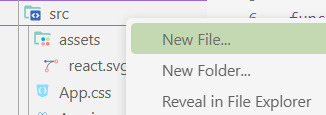
[ 1 ] Navigate to the 'src' Folder: Open your project in Visual Studio Code, locate the 'src' folder, and right-click on it.
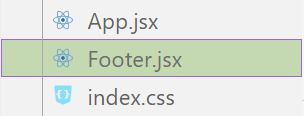
[ 2 ] Create a New File: Click 'New File' to create the file within the 'src' folder. This file will house the code for your React component.
[ 3 ] Naming Conventions: Give your component a name, according to the convention of starting with a capital letter. This naming convention is essential for React to recognize your component~!!
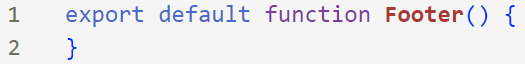
[ 4 ] Create The Initial Function: Open the file and type:
export default function [name of component]() {}
[ 5 ] Insert The return() Statement: The statement is used within a component to specify what content should be rendered when the component is invoked or used. Type:
return()
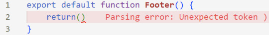
*the error is there because we haven't added anything inside yet, don't worry!
[ 6 ] Insert The Empty Tags: Inside of the return(), add empty tags (tags that don't have a specified element inside of them).
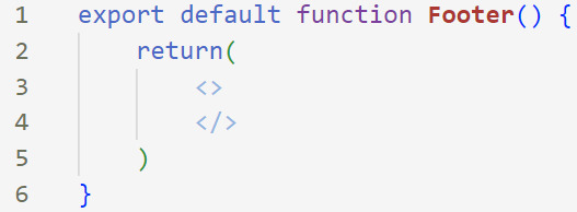
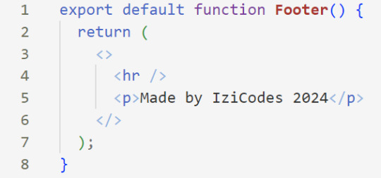
[ 7 ] Time For Some HTML: Inside the empty tags, enter the normal HTML elements that you want~!
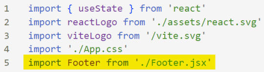
[ 8 ] Integration with App.jsx: Navigate to the 'App.jsx' file in the project, which is typically the entry point of your React application. At the top, import your newly created component. Type:
import [name of component] from './[location of the component]'
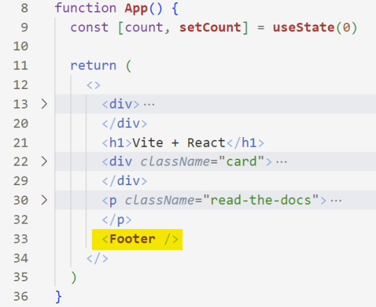
[ 9 ] Use Your Component: Inside the return() statement of the 'App()' function, include your component using the following syntax:
<[name of your component] />
[ 10 ] Run the Development Server: Start your development server with the command (the 'Local' link):
npm run dev
[ 11 ] Preview Your Project: Open the link provided in your terminal in your web browser. Witness your component in action!
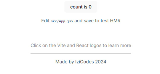
Congratulations! You made your first component! Try and create some new ones and place them around in the App()~!
BroCode’s 'React Full Course for Free’ 2024 >> click
React Official Website >> click
W3School's React Components >> click
Importing and Exporting Components >> click
🐬Previous Tip: Tip #2 The anatomy of the default React project >> click
Stay tuned for the other posts I will make on this series #mini react tips~!
#mini react tips#my resources#resources#codeblr#coding#progblr#programming#studyblr#studying#javascript#react.js#reactjs#coding tips#coding resources
33 notes
·
View notes
Text
New and Improved!
FOP followers who like reading my works on AO3, rejoice!
- New Rainbow Train series - Contains all my FOP works unrelated to the 130 Prompts, meaning you can subscribe to both that series and 130 Station for all my FOP works (and exclude my other fandoms)
- New footers - Something I've been wanting to add for ages to maintain consistency with works I've posted in other fandoms; the footer explains the above information to AO3 readers and includes a link to my Tumblr
- New headers with links - Navigate storylines more easily, both in recommended reading order and chronological order
- Changed AO3 series order - Up until now, 130 Station was arranged in chronological order, providing that info to interested readers; the FFN version was arranged in posting order. Now that I've added chronological order links to individual works, I've changed 130 Station to posting order.
I think that's much more important than chronological order. All pieces contain links informing you what comes previous or next, so you can easily read them chronologically if you ever want to (and I still have the much more in-depth Chronofics page for anyone interested).
This new order should make things easier for future readers getting into the series and for me when I post new content
- Updated tags - Minor clean-up. I added tags like Dimmsdale and Fairy World to some pieces, plus any tags I felt I'd missed on the first go-around (Ex: "Original Non-Human Characters")
- Removed extra space characters - Copying my work into AO3 causes blank spaces (special characters) to appear in HTML. These cause italicized words to split lines awkwardly at the edge of the screen. While adding headers and footers, I took the time to remove them from all the 130 Prompts I could before I got burned out. But, a lot of them are gone, especially from the shorter pieces.
Story recap link - Linked the originsums & knotssums pages in the headers of all Origin and Knots chapters (respectively) to provide brief recaps of story beats.
Character Spreadsheet - Linked the existing Gen 2 Pixie age spreadsheet + Anti-Fairy name list from the sideblog in the headers for Origin and Knots (respectively) to remind readers who they are. Useful for a longfic about a pixie with 500 offspring and Anti-Fairy World's culture of multiple names.
Reading should be a cleaner experience now! The story recaps and spreadsheet links are totally optional, but hopefully helpful in these longfics. Enjoy!
#Fairly OddParents#FOP#FAIRIES!#ridwriting#130 Prompts#This took so very long but I've wanted to update headers / footers for a long time so I'm glad I finally did
7 notes
·
View notes
Text
Let's understand HTML

Cover these topics to complete your HTML journey.
HTML (HyperText Markup Language) is the standard language used to create web pages. Here's a comprehensive list of key topics in HTML:
1. Basics of HTML
Introduction to HTML
HTML Document Structure
HTML Tags and Elements
HTML Attributes
HTML Comments
HTML Doctype
2. HTML Text Formatting
Headings (<h1> to <h6>)
Paragraphs (<p>)
Line Breaks (<br>)
Horizontal Lines (<hr>)
Bold Text (<b>, <strong>)
Italic Text (<i>, <em>)
Underlined Text (<u>)
Superscript (<sup>) and Subscript (<sub>)
3. HTML Links
Hyperlinks (<a>)
Target Attribute
Creating Email Links
4. HTML Lists
Ordered Lists (<ol>)
Unordered Lists (<ul>)
Description Lists (<dl>)
Nesting Lists
5. HTML Tables
Table (<table>)
Table Rows (<tr>)
Table Data (<td>)
Table Headings (<th>)
Table Caption (<caption>)
Merging Cells (rowspan, colspan)
Table Borders and Styling
6. HTML Forms
Form (<form>)
Input Types (<input>)
Text Fields (<input type="text">)
Password Fields (<input type="password">)
Radio Buttons (<input type="radio">)
Checkboxes (<input type="checkbox">)
Drop-down Lists (<select>)
Textarea (<textarea>)
Buttons (<button>, <input type="submit">)
Labels (<label>)
Form Action and Method Attributes
7. HTML Media
Images (<img>)
Image Maps
Audio (<audio>)
Video (<video>)
Embedding Media (<embed>)
Object Element (<object>)
Iframes (<iframe>)
8. HTML Semantic Elements
Header (<header>)
Footer (<footer>)
Article (<article>)
Section (<section>)
Aside (<aside>)
Nav (<nav>)
Main (<main>)
Figure (<figure>), Figcaption (<figcaption>)
9. HTML5 New Elements
Canvas (<canvas>)
SVG (<svg>)
Data Attributes
Output Element (<output>)
Progress (<progress>)
Meter (<meter>)
Details (<details>)
Summary (<summary>)
10. HTML Graphics
Scalable Vector Graphics (SVG)
Canvas
Inline SVG
Path Element
11. HTML APIs
Geolocation API
Drag and Drop API
Web Storage API (localStorage and sessionStorage)
Web Workers
History API
12. HTML Entities
Character Entities
Symbol Entities
13. HTML Meta Information
Meta Tags (<meta>)
Setting Character Set (<meta charset="UTF-8">)
Responsive Web Design Meta Tag
SEO-related Meta Tags
14. HTML Best Practices
Accessibility (ARIA roles and attributes)
Semantic HTML
SEO (Search Engine Optimization) Basics
Mobile-Friendly HTML
15. HTML Integration with CSS and JavaScript
Linking CSS (<link>, <style>)
Adding JavaScript (<script>)
Inline CSS and JavaScript
External CSS and JavaScript Files
16. Advanced HTML Concepts
HTML Templates (<template>)
Custom Data Attributes (data-*)
HTML Imports (Deprecated in favor of JavaScript modules)
Web Components
These topics cover the breadth of HTML and will give you a strong foundation for web development.
Full course link for free: https://shorturl.at/igVyr
2 notes
·
View notes
Text
The menus don't work, the menus don't work, the menus DON'T WORK...

OK, my few readers. I took a break, I went back to fix the navigation, it's unfixable as-written.
I need some complex stuff in places, I was willing to forgive WP for putting out a new site editing interface that barely works - as long as it has the basic features someone would use on a storefront. I'm an outlier. I know this.
BUT IT IS NO LONGER POSSIBLE TO CREATE A MENU WITH A WORKING SUB-MENU IN IT. IF YOU TRY, THE SUB-MENU LINKS ARE UNCLICKABLE.
I am using their site editor and their 2024 theme, I should say.
I crossed my fingers and looked for the (now liable to vanish from anything more complicated than a paragraph) "edit as html" option. Nope! It's gone! I can't fix it. I would have to hack the interface somehow to fix this for WordPress, within WordPress.
I had to go looking for plugins. I HAD TO GO LOOKING FOR 3RD PARTY SOFTWARE TO GET A FUNCTIONAL MENU. And, of course, they paywall features I need. I found a "floating" menu that actually does work well enough (it's a little cramped on mobile unless you put the screen in landscape mode, but at this point you should really do that anyway, I can only format so much) but the sub-menu function is paywalled. And I'm actually fucking tempted to buy (haha, I mean "rent") it. Because the damn thing works in dark mode and across devices. And it sticks to the side in a fairly unobtrusive way, which WP's menu will not. It won't stick anywhere. And it sure as hell won't do that thing where you scroll up and it plops down for your convenience.
But if I use that floating menu without sub-menus, it's gonna get longer, and longer, and longer, until it doesn't fit on your mobile screen anymore, or potentially your tablet or desktop, and then I dunno what happens. Also, in order to keep it small, everything is a cryptic icon that displays a title when you tap it (on mobile) or hover over it (on desktop). That's kinda counterintuitive, I don't know if I want my one working menu to be like that.
I might keep looking and find another plugin that also works that well but... it's not likely. Or, if I do, I may run into another paywall. They gotta get their rent somehow!
This is a stupid problem and so far I am unable to come with with a non-stupid solution. I can:
Put all the links in the header menu, and you'll have to scroll through EVERYTHING to find the actual content every time.
Put all the links in the content area, in different places and different combinations depending on the page. (And this would mean doing some reformatting on every instalment AGAIN.)
Start fucking around with the sidebar - I don't know if it works and I'd have to rip up every template I've already made to add it.
Put all the links in the footer menu, and nobody will notice them.
Put all the links in the floating menu (see above for the issues with that).
Make sub-pages for Misc/Notes and similar that are just lists of links and serve the function of a sub-menu.
Actually put the content on the sub-page and have it navigable via anchors (this seems like it would be a bitch to load, but most of my content is just text).
Make a list of links that isn't actually tagged as a menu, thus losing the collapsible function for small screens.
Kill God.
That last one is probably the most doable but I feel like someone would get mad at me. Like, Hazbin Hotel finally got its first season on Amazon, and if God dies they might have to rewrite some shit.
If I don't lay out the money for the cryptic icon menu, we're probably going to end up with three or four accordions that are not technically menus at the top of every page. And I'll hafta check back every once in a while to see if WP fixed their shit yet.
If they don't stick with that site editor and make it useable, all this work is going to vanish like chalk marks in the rain.
I WANTED to put up another six-pack in February. I have it ready to go! But the site doesn't work. If I can't fix it this week, I won't even be able to put things up without illustrations. And forget having time to fill in the missing artwork. I got enough to do trying to kill God!
#tin soldier and soldier on#updates#website woes#in other news i woke up with an inexplicable ability to focus better on text today#which i should not have?#I'm not wearing reading glasses to write this#pretty sure this isn't gonna stay like this but wtf happened?
3 notes
·
View notes
Text
🌐 What Is Web Designing?
Web Designing is the art and science of creating the visual layout and user experience of websites. It focuses on the look, feel, structure, and usability of a website — how it appears and how users interact with it.
It blends graphic design, UI/UX design, and front-end technologies to create responsive, accessible, and visually appealing websites.
🧩 Core Elements of Web Design
ElementDescriptionLayoutArrangement of visual elements on a page (header, content, footer)Color SchemeColors that match the brand and create emotional impactTypographyFont styles that enhance readability and personalityImageryIcons, illustrations, photos, and animations that support the contentNavigationMenus and links that help users move through the siteWhitespaceEmpty space that improves clarity and flowResponsivenessDesign that adapts to all screen sizes (mobile, tablet, desktop)
💻 Web Designer vs Web Developer
RoleFocusTools/Languages UsedWeb DesignerVisual layout, colors, fonts, UI/UXFigma, Adobe XD, Photoshop, Canva, WebflowWeb DeveloperCode-based implementation of the designHTML, CSS, JavaScript, frameworks (React, Vue)
💡 Many people today do both — especially freelancers.
🎨 Popular Web Design Tools
ToolUseFigmaInterface design, prototyping, team collaborationAdobe XDUI/UX design, wireframes, clickable mockupsCanvaSimple designs for web banners, graphicsWebflowVisual web design + code-free website buildingWix / SquarespaceDrag-and-drop website buildersPhotoshop / IllustratorAdvanced visual asset creation
🧠 Design Principles You Should Know
Visual hierarchy – Use size, contrast, and placement to guide the user
Consistency – Keep fonts, colors, and elements uniform across pages
Accessibility – Ensure usability for all users, including those with disabilities
Mobile-first design – Design for smaller screens first, then scale up
User-centric design – Prioritize ease of use and simplicity
📱 Responsive Web Design
Responsive design ensures your site looks great on all screen sizes.
Use media queries (CSS)
Use flexbox/grid layout systems
Test with browser tools and tools like Responsively App
🧭 Web Design Learning Roadmap (Beginner to Pro)
✅ Step 1: Design Fundamentals
Color theory, typography, layout
Learn tools like Figma, Canva, or Adobe XD
Understand UX/UI basics
✅ Step 2: HTML + CSS
Learn HTML5: structure, semantic tags
Learn CSS3: styling, Flexbox, Grid, animations
Practice with tools like CodePen
✅ Step 3: Responsive Design
Mobile-first layout
CSS media queries
Use frameworks: Bootstrap or Tailwind CSS
✅ Step 4: JavaScript (Optional, but powerful)
Add interactivity (menus, sliders, tabs)
DOM manipulation
Use lightweight libraries (like Alpine.js or jQuery)
✅ Step 5: Build Projects & Portfolio
Portfolio website
Business landing page
Blog layout
E-commerce front page
Redesign of an existing site
📚 Best Resources to Learn Web Design (2025)
PlatformCourse NameCostfreeCodeCampResponsive Web Design CertificationFreeScrimbaLearn Responsive Web Design (interactive)$12/moUdemyWeb Design for Beginners: Real World Coding₹400–₹800CourseraUI/UX Design by California Institute of the ArtsFree/PaidFrontend MentorPractice real-world UI challengesFree/Paid
💼 Careers in Web Design
RoleSkills NeededWeb DesignerVisual layout, design tools, basic HTML/CSSUI DesignerInterface-focused designUX DesignerResearch, wireframing, user flow planningFront-End DeveloperCode the design using HTML/CSS/JSFreelancerCombo of design + dev + client communication
🛠 Web Design Project Ideas
Personal portfolio
Photography website
Small business landing page
Responsive blog site
Redesign of a famous website (your version)
🔥 Final Tips
Start small: Redesign your own resume as a website
Get feedback: Share your work on Dribbble, Behance, or Reddit
Learn from others: Browse Awwwards, One Page Love, and Mobbin
Practice, practice, practice — design improves with experience
0 notes
Text
Top HTML Interview Questions and Answers for Freshers and Experts

HTML (HyperText Markup Language) is the fundamental building block of web development. Whether you’re a fresher stepping into the tech world or an experienced developer looking to refresh your basics, mastering HTML is essential. It is often the first topic covered in web development interviews, making preparation in this area crucial for any frontend or full-stack role.
This blog on Top HTML Interview Questions and Answers for Freshers and Experts is designed to help candidates at all levels confidently prepare for job interviews. From simple questions about tags and attributes to complex concepts like semantic HTML, accessibility, and new features in HTML5, this guide will walk you through the most frequently asked and impactful questions that hiring managers love to ask.
Why Learn HTML for Interviews?
HTML is not just a markup language. It is the foundation of every webpage. Even modern frameworks like React, Angular, or Vue render HTML at the core. Interviewers want to see if you understand how web pages are structured, how elements behave, and how HTML works in harmony with CSS and JavaScript.
Whether you're applying for a position as a front-end developer, UI/UX designer, WordPress developer, or full-stack engineer, HTML questions are almost always a part of the technical screening process.
HTML Interview Questions for Freshers
1. What is HTML?
Answer: HTML stands for HyperText Markup Language. It is used to create the structure of web pages using elements like headings, paragraphs, images, links, and more.
2. What is the difference between HTML and HTML5?
Answer: HTML5 is the latest version of HTML. It includes new semantic elements (<header>, <footer>, <article>), multimedia support (<audio>, <video>), and improved APIs like canvas, local storage, and geolocation.
3. What is a tag in HTML?
Answer: A tag is a keyword enclosed in angle brackets that defines the beginning and end of an HTML element (e.g., <p>Paragraph</p>).
4. What is the purpose of the <DOCTYPE html> declaration?
Answer: It defines the HTML version and helps the browser render the page correctly. For HTML5, it is written as <!DOCTYPE html>.
5. What is the difference between <div> and <span>?
Answer: <div> is a block-level element used for grouping sections, while <span> is an inline element used for styling a part of text or inline elements.
Intermediate to Advanced HTML Interview Questions
6. What is semantic HTML?
Answer: Semantic HTML uses meaningful tags (like <article>, <section>, <nav>) to describe the content, making it more readable for developers and accessible for screen readers and search engines.
7. What are void (self-closing) elements in HTML?
Answer: Void elements do not have a closing tag. Examples include <img>, <input>, <br>, and <hr>.
8. How is HTML different from XML?
Answer: HTML is designed for web page layout, while XML is used for storing and transporting data. HTML is more lenient with errors, whereas XML is strict and case-sensitive.
9. What is the difference between id and class attributes?
Answer: An id is unique for a single element, while a class can be applied to multiple elements. IDs are used for single-item styling or DOM targeting, whereas classes help in grouping and styling multiple elements.
10. What is the use of the alt attribute in images?
Answer: The alt attribute provides alternative text for images when they cannot be displayed. It also helps screen readers understand the image content, enhancing accessibility.
HTML5-Specific Interview Questions
11. Explain the difference between <section> and <article>.
Answer: <section> defines a thematic grouping of content, while <article> represents independent, self-contained content like blog posts or news articles.
12. What is the purpose of the <canvas> element?
Answer: The <canvas> element in HTML5 allows drawing graphics, animations, and visualizations using JavaScript.
13. How does local storage work in HTML5?
Answer: HTML5 introduces localStorage, allowing you to store data in the browser with no expiration time. It helps in storing user preferences or app data even after the browser is closed.
Why Interviewers Ask HTML Questions
To evaluate your core web development knowledge
To assess your understanding of page structure and layout
To test your awareness of accessibility and SEO principles
To understand your readiness to work on real projects
Even if you're familiar with frameworks like React or Angular, understanding raw HTML ensures you're not dependent on abstractions.
Tips to Prepare for HTML Interviews
Practice writing HTML code regularly.
Read documentation on HTML5 and its newer features.
Understand semantic elements and SEO best practices.
Use online editors like CodePen, JSFiddle, or Visual Studio Code for hands-on experience.
Explore real-world examples like building forms, creating layouts, and embedding media.
Who Should Read This Blog?
This blog is ideal for:
Freshers preparing for entry-level front-end interviews
Self-taught developers polishing their HTML fundamentals
Web designers shifting to development roles
Professionals brushing up on HTML for technical assessments
Conclusion
Preparing for HTML interviews doesn’t just help you answer questions—it helps you build a stronger foundation for web development. Whether you are just starting or have years of experience, reviewing these Top HTML Interview Questions and Answers for Freshers and Experts will give you the confidence to tackle interviews effectively.
0 notes
Text
Web Development Training Program

Master the Core Front-End Technologies: HTML, CSS, JavaScript, and BootstrapThis course provides a complete introduction to front-end web development, enabling you to build responsive, interactive, and professional websites from scratch. By mastering these technologies, you'll be equipped with the foundational skills needed for a career in web development.Tools & Technologies Covered:HTML5 CSS3 JavaScript (ES6+) Bootstrap 5 Text Editors: Visual Studio Code, Sublime Text Web Browsers: Chrome, Firefox, Edge Understand how websites are structured and styled using HTML and CSS. Create interactive, dynamic web pages using JavaScript. Build responsive, mobile-first web designs using Bootstrap. Overview of the Web Development Process Understanding Client-Side and Server-Side Development Setting Up the Development Environment (Text Editors, Browsers) Structure of an HTML Document Basic HTML ElementsHeadings, Paragraphs, Lists, Links Images and Media ElementsAdding Images, Audio, and Video Forms and Input ElementsText Fields, Buttons, Dropdowns, and Checkboxes Semantic HTML5 Tags (header, nav, section, article, footer) CSS Syntax: Selectors, Properties, and Values Styling Text and ElementsFonts, Colors, Backgrounds, Borders The Box Model (Margins, Padding, Borders, Content) Layout and PositioningStatic, Relative, Absolute, Fixed, and Sticky Responsive Design with Media Queries Advanced Features: Animations, Transitions, Gradients Introduction to JavaScript Variables and Data Types (var, let, const) Operators and Control Flow (if-else, loops) Functions and EventsWriting and Calling Functions Handling Click, Mouse, and Keyboard Events Arrays and Objects Manipulating the DOMSelecting and Updating HTML Elements Adding Dynamic Behavior to Web Pages Setting Up Bootstrap (CDN or Local) Understanding the Grid SystemRows, Columns, Breakpoints for Responsive Layouts Using Bootstrap ComponentsNavigation Bars, Modals, Buttons, Cards, Forms Styling with UtilitiesColors, Spacing, Typography Advanced FeaturesCreating Hero Sections and Interactive Forms Customizing Bootstrap with Custom CSS and Sass Combining All Technologies to Create Web Pages Styling and Adding Interactivity to Content Building Responsive and Dynamic Multi-Page Websites Developing a Full-Stack Web ApplicationResponsive Landing Page with Navigation Interactive Elements (Forms, Buttons, Modals) Using JavaScript for Dynamic Content and Validations Styling the Project with Bootstrap Components Hands-On Practice: Build multiple projects throughout the course. Real-World Application: Work on a capstone project to create a complete website. Certification: Earn a Web Development certificate upon successful completion. Aspiring web developers and designers. Students looking to start a career in front-end development. Professionals seeking to build personal or business websites. Read the full article
0 notes
Text
SocialMedia Front-End design Copycat
Just interested in which problems persisted that started the framework bloat we see today [looking at you React Devs].
So I'm going to type out a pseudo-code design paper, that's closer to twitterX for the site with hooks to add-in stuff Facebook later added.
So a basic design for the HTML looks kinda like this:
Http Index
- header stuff
- Visual Body
- Body Header
-Sidebar stuff
- Body Body
- footer nobody ever sees or reads or care that it exists that provides contact info that is relatively unused or non-existent.
There's only a few moving parts in the front end, a Login/sign up widget (which could be its own page, doesn't matter)
The Comments&Posts, which are mostly sorted and distributed from the backend
The Post Bar itself which is just a textbox
The big parts we care about initially are the posts and comments.
In the HTML this is a single template like this:
<div id="post template" class="post/comment">
<img class="Avatar" src="whatever the backend.jpeg" />
<p class="text">The Text</p>
</div>
And then all you need to do is copy and paste that for every "actively visible" comment, and as you scroll, more comments appear as they are downloaded to the page.
Which is something like
Onload(){ global template= document.get("div#post_template")
Function DisplayPosts(array) {foreach (item in array; that is visibile) { post = template.copy; post.populate(item). }
In React this turns into something else;
ReactWidget PostTemplate = theAboveTemplate
New post = new PostTemplate(array item);
With which to simplify the code needed to process, and to help separate all the pieces from the original HTML page.
Which does help clarify stuff... But how would it have been brittle originally? I can only think that it was perhaps the devices that Facebook originally had use of, and modified in order to be able to be on cheapo devices that don't really exist anymore.
Or maybe due to the original way JS worked in browsers. And I. mobile specifically.
As I'm writing this, I still see most of the processing being done on the back ends... So the only way I can think it would be particularly buggy is if a lot of all that backend stuff was integrated into the frontend somehow.
Extensive ajax calls maybe? Unsequenced calls?
It's a handler that determines if the page should request more comments from the server or not, and maybe need to unload non-visible comments for performance reasons.
How many posts on a single scrolling page would it take for it to affect the performance these days?
100? 1000? Uncertain. In this day and age, even the cheapest devices can load an encyclopedia (or several) worths of information on the background and work fine.
Youd also need to handle for pages to view a post with comments... Twitter handles this by making ALL comments just posts with @tags and #tags.
So they all are at the same level in the database, probably.
Non-SQL Backends append a sub-stack to the original post as well. I wonder how that affects backend performance.
There's also pointers and stuff that get shuffled around that need to be built together to fully form the data for front lend use. UniqueIds for every post entry, directing to user accounts with their own personalization and not having immediate access at the comment level.
Old bugs in Social Media would have artifacts like [User#######] while the page is loading extra stuff, so you'd be able to read the comment before knowing who posted it. And [User Deleted] on Reddit when that ID is no longer pollable.
Browsers really need to allow for html_templates (and not HTML written in the JavaScript portion) to encourage ease of access...
The purpose of react, it seems, was to create a single widget used to populate comments and posts, and make it a little bit easier to read.
And now... Components are out of hand.
Too much developing in JavaScript and not enough talking with the w3c and browser devs to make the coding conventions easier on everyone maybe. A product of the times.
Or maybe the templates each had their own JavaScript and ajax handlers and that's why it became brittle...
Calling the backend whenever a *blank comment* becomes visible which requests a new comment for each newly visible comment and then some?
I think it's that one. That one's the most likely mistake I would have made during a prototype.
I believe that it's highly probably that a refined social media page could be reduced in size and complexity. But what isn't inherently visible is about how many *wasted processes* are prevalent because we no longer need to deal with because the Technology of the average device improved.
And, because of that, how much waste gets added on top of it to error-correct for things that would have been fixed correcting those oversights..?
Well, if I were a billionaire who recently lost a lot of money purchasing a thing that may be needs to be worked on... That's where I'd look first. Which processes actually need to be handled by the front end, and a reduction in the amount of calls to the backend per user.
As the said billionaires are working on other ways to make money instead, I doubt these are things that will get fixed...
I kinda want to write a social media thing to throw on GitHub or something, just to prove the thing. But I'm also... Not about that life right now for some reason...
I'm just curious as to why apps that are primarily just Fetch(More Text) water so much battery and data on their lonesome.
Since May 21 (it is currently July 4th+1) TwitterX has used 16gigs! And I rarely click the video media... Because everything is viens and tiktoks now I guess.
In comparison, Tumblr used 3... Though, I don't scroll as much on Tumblr due to my feed here not updating as much as Twitter. Probably?
Staying connected, always on like that, might be good for ads... But... It doesn't mean the user is actively engaging with the content. Or even caring about everything in there feed.
I would assume that the price of scrolling outweighs the adverts being fed to the users, and hence the blue check marks, which likely are also not helping catch up.
So while the cost reduction from the URL when Twitter switched to X is a stop gap.
Possibly meaning that there's a catch-22 on twitterX, where you need more scrolls to make money, but they also cost more money from data serving costs.
Those backend calls add up.
How would you make an analysis team to discover and develop a path that won't interrupt service? Honestly...
It'd be cheaper to hire a [small experienced team] to develop the front end as if they were starting from scratch and developing as minimalistically as possible with a very solid design and game plan.
And then creating a deployment test bed to see whether or not all the calls made right now are value added.
I say that, because it's quite likely that most (if not all of social media) today is still built on the original code bases, which were extended to add features, and not really dedicated to ironing out the interfaces. (Because needed to make money somehow).
But now, you're worried about retaining customers and satisfying advertisers instead, which affords the opportunity to work on it. Or to find a small coder that already put a concept on GitHub already.
(Probably the real reason I don't just make another one.)
Actually. Let's see where this AI-Generated-Full-Stack development goes....I wanna see exactly how much the ancient newbie coder bugs can destroy.
0 notes
Text

Webflow Tip of the Day
“Boost Accessibility and SEO with Semantic Tags + ARIA Roles in Webflow”
Most Webflow projects look great, but many miss out on real SEO + accessibility power simply because semantic structure isn’t optimized.
Here’s What You Can Do:
1. Use Semantic HTML Tags:
Why: Search engines and screen readers use these tags to understand structure.
Use this in Webflow instead of just
<header> regular div for nav
<main> body content section
<section> logical content blocks
<footer> bottom area or copyright.
How to set:
→ Select element → Settings Panel → Change Tag from div to section, main, nav, etc.
2. Add ARIA Roles Where Needed:
Use aria-label, aria-expanded, and aria-hidden on elements that change dynamically.
This improves screen reader understanding for tabs, accordions, modals, etc.
3. Image Alt Text + Proper Heading Order:
Use alt text on all images inside Webflow’s image settings.
Use <h1> once per page, then nest properly: <h2>, <h3>…
Pro Example:
For a Blog CMS Page:
Use <main> as the wrapper
Use <article> for the blog post
Use <aside> for related posts or author bio
Use <nav> with links to categories
This improves SEO ranking, helps screen readers, and gives a better structure for indexing.
Perfect For:
SEO-focused landing pages
Client projects with accessibility requirements
Long-term scalable sites (e.g. SaaS, documentation)
📌 Want clean, accessible, SEO-ready Webflow builds?
Check out my work here:
🌐 Portfolio: www.webflowwork.com
🎯 Upwork: https://bit.ly/4iu6AKd
🎯 Fiverr: https://bit.ly/3EzQxNd
#WebflowTips #WebflowSEO #Accessibility #SemanticHTML #ARIA #WebflowExperts #MadeInWebflow #ClientReady #A11y #SEOFriendly #WebflowIndia #CMSDesign
#webflow#freelancewebdeveloper#web design#web development#webflowdesign#webflowlandingpage#webflowexperts#website#nocode#ui ux design
0 notes
Text
Common Web Development Mistakes and How to Avoid Them
Introduction
Launching a website is exciting—but in the back of the smooth user interface and flashy animations, there’s a complex web of code, content material, and strategy. And in case you're no longer careful, even the smallest internet improvement errors can hurt your web page’s overall performance, usability, and search scores.
Whether you are a business proprietor, startup founder, or aspiring developer, understanding what not to do is just as vital as understanding the satisfactory practices. In this guide, we'll spoil down the most not unusual internet development errors—and extra importantly, the way to keep away from them for a quicker, purifier, and more person-friendly website.

1. Ignoring mobile Responsiveness
The error:
constructing a site that handiest seems right on computer and falls apart on mobile.
Why it matters:
With over 60% of internet traffic coming from cell devices, a non-responsive design ends in high leap fees, poor UX, and a dip in search engine optimization scores.
A way to keep away from it:
Use responsive frameworks like Bootstrap or Tailwind CSS.
Frequently check your website online on diverse screen sizes and gadgets.
Layout with cell-first concepts—optimize for small displays earlier than scaling up.
2. Sluggish Load times
The mistake:
Heavy photographs, bloated code, and too many scripts slow your website online to a crawl.
Why it subjects:
pace is an immediate ranking thing in Google and a first-rate person revel in difficulty—traffic will depart if a web page takes greater than 3 seconds to load.
A way to avoid it:
Compress pictures the use of tools like TinyPNG or WebP.
Minify CSS, JavaScript, and HTML.
Use lazy loading and caching.
Opt for a dependable, overall performance-centered internet host.
Three. Poor Navigation shape
The mistake:
customers can’t locate what they’re searching out because of a cluttered or confusing menu.
Why it topics:
horrific navigation frustrates users, increases bounce costs, and hurts seo crawlability.
How to keep away from it:
Keep navigation easy, smooth, and predictable.
Use breadcrumb trails, a properly-based sitemap, and clear category labels.
Restriction pinnacle-level menu items to five–7 to reduce decision fatigue.
Four. Loss of seo basics
The mistake:
Skipping primary seo like identify tags, meta descriptions, and header hierarchy.
Why it topics:
engines like google want dependent records to index and rank your content material nicely.
How to keep away from it:
Implement unique title tags and meta descriptions on every page.
Use proper heading tags (H1 for titles, H2/H3 for subsections).
Add alt text to all snap shots for accessibility and seo.
Submit your sitemap to Google seek Console.
5. No longer the use of Semantic HTML
The error:
the usage of <div> and <span> for the whole thing as opposed to suitable semantic tags.
Why it subjects:
Semantic HTML improves accessibility, search engine optimization, and code readability.
A way to keep away from it:
Use tags like <header>, <footer>, <article>, <section>, <nav>.
Make your code logical and descriptive to help screen readers and seek bots.
6. Broken hyperlinks and 404 errors
The mistake:
links that lead nowhere or to removed pages.
Why it subjects:
damaged links frustrate customers and signal terrible renovation to search engines.
How to keep away from it:
Run normal audits using tools like Screaming Frog or Ahrefs.
Set up 301 redirects for moved content.
Create a custom 404 web page that facilitates users navigate some other place.
7. Inconsistent design and Branding
The error:
blending fonts, colors, or button styles across pages with out a coherent gadget.
Why it topics:
A fragmented visual identity erodes believe and professionalism.
How to keep away from it:
Create and stick to a style guide.
Use steady coloration palettes, typography, and layout components.
Adopt design systems or UI kits for higher cohesion.
8. Not Optimizing for Accessibility
The mistake:
Ignoring customers with visible, auditory, or mobility impairments.
Why it matters:
Accessibility isn't always just ethical—it's regularly legally required and complements person reach.
A way to keep away from it:
Use sufficient color evaluation.
Make certain keyboard navigability.
Upload ARIA labels and proper semantic shape.
Test with equipment like WAVE or Lighthouse.
Nine. Forgetting go-Browser Compatibility
The error:
Your web site appears outstanding in Chrome, but breaks in Safari or Firefox.
Why it subjects:
not all customers browse the equal way—your web site have to paintings seamlessly everywhere.
The way to keep away from it:
Check throughout all main browsers regularly.
Keep away from browser-particular code.
Use standardized CSS and JavaScript practices.
10. No clean call-to-action (CTA)
The error:
users don’t know what to do subsequent—subscribe, contact, or purchase.
Why it topics:
A susceptible or missing CTA kills conversions and leads.
The way to avoid it:
Vicinity clear, visible CTAs on every page.
Use actionable language: “Get started out,” “down load Now,” “communicate to Us.”
A/B take a look at CTA styles, positions, and colours for maximum effectiveness.
End
Internet improvement isn’t pretty much making something that appears accurate—it’s about developing a site that works nicely, loads speedy, ranks high, and converts site visitors. Via averting these not unusual pitfalls and applying clever, strategic fixes, you’ll construct a virtual revel in that wins over both customers and engines like google.
Don’t simply build a internet site. Build a clever, user-pleasant, seo-optimized revel in.
FAQs
1. How regularly need to I audit my website for those issues?
As a minimum as soon as every three–6 months, or after predominant updates.
2. Can i fix those mistakes myself?
A few are clean (like compressing pictures), at the same time as others may need a developer’s help.
3. What gear can assist me pick out web improvement mistakes?
Use Google Lighthouse, GTmetrix, SEMrush, or Ahrefs for targeted diagnostics.
4. What’s the most damaging mistake from this listing?
Sluggish load instances and terrible cellular responsiveness are the various most critical.
5. How do I prioritize which problems to restore first?
Consciousness on anything that influences consumer enjoy or seo—like speed, broken hyperlinks, or cell problems.
0 notes
Text
How Can the Restinn WordPress Theme Help You Attract More Hotel Guests Online?
In today’s fast-paced digital world, a potential guest’s decision to book a stay often begins—and ends—online. Travelers are no longer calling for information or flipping through brochures. Instead, they are judging your property by how your website looks, feels, and functions. If your hotel’s site doesn’t make a great first impression or lacks smooth booking functionality, you’re losing business.
Fortunately, the Restinn WordPress Theme is specifically designed to help hotels, inns, and bed-and-breakfast businesses create a stunning online experience that turns casual browsers into confirmed guests. Whether you’re running a luxury retreat or a cozy countryside inn, this theme provides the tools to showcase your space beautifully and boost your bottom line.
Here’s how Restinn can give your hospitality brand a competitive edge.
First Impressions Matter: Design That Reflects Your Brand
Before a guest ever steps foot in your lobby, they experience your hotel through its website. A clunky, outdated design can lead visitors to think your service will be the same. With Restinn, you get a sleek, modern design optimized for hospitality businesses.
Key design features include:
A full-screen homepage slider to showcase scenic views, rooms, or amenities.
Clean, readable fonts and well-organized layouts that reflect professionalism.
Multiple homepage sections for highlighting services, features, and promotions.
This allows you to create a website that speaks directly to your ideal guests—whether they’re honeymooners, solo travelers, or families.
Simplified Booking for Guests and Staff
At the heart of any successful hotel website is a seamless booking system. The Restinn theme supports integration with leading hotel booking plugins, making it easy for users to check availability and reserve rooms.
Benefits include:
Instant room reservations 24/7.
Streamlined payment options via WooCommerce or PayPal.
Reduced reliance on OTA platforms and third-party fees.
By giving guests a friction-free way to book directly from your site, you take back control over your sales and customer relationships.
Mobile-Ready for Travelers on the Go
Modern travelers rely on their smartphones to research, compare, and book accommodations. If your website isn’t mobile-optimized, you could be missing out on a large segment of potential bookings.
Restinn is 100% responsive, meaning your site looks and works great on all devices. It:
Adjusts layouts automatically for phones, tablets, and desktops.
Maintains fast loading times even on mobile networks.
Offers easy navigation for smaller screens.
This ensures you’re prepared to meet travelers wherever they are, with a website that’s always accessible and easy to use.
Designed for Higher Google Rankings
Search visibility is key to getting more guests through your digital doors. Restinn is built with clean, lightweight code that helps improve your search engine performance. Combined with proper content structure and plugin support, your hotel can appear higher in local and travel-related searches.
SEO-ready features include:
Optimized header tags and HTML structure.
Fast-loading design for better Core Web Vitals.
Plugin compatibility with Yoast SEO and Rank Math.
This makes it easier to target keywords like “boutique hotel in [City]” or “romantic getaway near [Landmark]” and attract the right visitors organically.
Drag-and-Drop Customization Without Coding
Don’t want to touch a single line of code? No problem. The Restinn WordPress Theme works perfectly with drag-and-drop builders like Elementor and Gutenberg, so you can build or edit pages visually.
Customize:
Your homepage layout to highlight top services or offers.
Room pages with unique galleries and descriptions.
Headers, footers, and color schemes to match your hotel’s brand identity.
This user-friendly customization allows you to evolve your website over time—promoting seasonal packages, new rooms, or limited-time offers with ease.
Multilingual and International-Friendly
Hotels often cater to guests from around the globe. To improve communication and customer experience, it’s essential to offer a multilingual website.
Restinn is translation-ready and supports popular plugins like WPML and Polylang. It also offers RTL (right-to-left) language support, enabling you to provide content in languages such as Arabic, Urdu, or Hebrew.
This inclusivity builds trust and opens your business to a broader global audience.
Testimonials and Social Proof to Build Trust
Guests want to know that others have had a great experience at your property. With built-in sections for testimonials and reviews, you can feature glowing feedback from past visitors.
You can also:
Showcase TripAdvisor or Google Reviews.
Embed star ratings or review carousels.
Display guest photos or video testimonials.
Social proof is a powerful conversion tool. It shows that others have trusted you with their vacation or event—and that they were thrilled with the results.
Speed, Security, and Performance
Booking a hotel room involves entering personal and financial data. Your site must feel safe and function smoothly. The Restinn WordPress Theme has been optimized to deliver both speed and security.
Performance perks include:
Support for SSL certificates.
Fast page loading for better user experience and SEO.
Compatibility with top security plugins like Wordfence.
Together, these features reduce bounce rates and increase user confidence—two essential factors in driving conversions.
A Perfect Fit for Diverse Accommodation Types
While Restinn is designed with hotels in mind, it’s flexible enough to support:
Guesthouses and vacation homes
B&Bs and hostels
Luxury resorts and spas
Eco-lodges and boutique retreats
Its multipurpose nature makes it easy to tailor the theme to your specific type of lodging by simply adjusting content, colors, and imagery.
Final Words:
If you’re running a hotel or lodging business and need a professional online presence that actually drives bookings, the Restinn WordPress Theme is an ideal solution. With a stunning layout, easy booking integrations, mobile-friendly design, and SEO-ready features, it helps you compete in the online travel space without hiring a full-time web team.
Your website is more than just a digital brochure—it’s your best sales tool. Invest in a theme that reflects your brand’s values and hospitality. Make the booking process as easy and enjoyable as the stay itself, and you’ll see more guests checking in—both online and off.
#restinn WordPress theme#rest inn hotel template#inn website WordPress theme#bed and breakfast WordPress site#peaceful inn WordPress theme#relaxation stay WordPress template#quiet inn WordPress theme#resting place WordPress theme#vacation inn WordPress site#cozy inn WordPress theme#sleep inn WordPress template#weekend inn WordPress site#motel and inn WordPress theme#budget inn WordPress template#room booking inn theme#serene lodge WordPress template#classic inn WordPress site#small stay WordPress theme#travel lodge WordPress theme#guest inn website template
0 notes
Text
5 Advanced HTML Techniques to Enhance User Experience
With countless websites vying for attention in the digital universe, providing an excellent and visually appealing user experience (UX) has never been more important than it is today. HTML is the language of the web and serves more purposes than simply defining content. It can also be leveraged to help deliver usability, interactivity, and performance. When it comes to user experience, CSS and JavaScript are typically the stars of the show, but if you can master HTML and apply some techniques we will discuss in this blog, you can improve how users interact with your website.
So, whether you're a developer, designer, or digital marketer, the following 5 more advanced lessons in HTML will open up a world of techniques to consider when creating a memorable and user-friendly experience to harness a professional website.
1. Semantic HTML - More than a coding best practice
Semantic HTML usage is the only part of the UX we talk about here that has a direct impact on all aspects of accessibility and SEO, how search engines see your content, and how assistive technologies interpret your content. Semantic tags like <article>, <section>, <header>, <footer>, and <nav> provide meaningful structure to your web pages.
Benefits:
Enhances screen reader support for visually impaired users
Helps search engines understand page hierarchy and content relevance
Improves the maintainability of code
Example:
<article>
<header>
<h2>HTML Tips You Should Know</h2>
<p>Published on June 7, 2025</p>
</header>
<p>This article will cover some HTML techniques...</p>
</article>
Pro Tip: Combine semantic tags with ARIA roles to maximize accessibility.
2. Lazy Loading Images for Improved Page Speed
Page load time can have a direct impact on both bounce rate and SEO ranking. One of the best ways to improve speed is by lazy loading images. The HTML attribute lazy loading, which loads images in the user's viewport whenever the images become visible, instead of loading the entire page.
How to Use:
<img src="product.jpg" loading="lazy" alt="Product Image">
Benefits:
Improves site speed on initial load
Reduces unnecessary bandwidth usage
Enhances mobile performance
SEO Insight: Google officially supports lazy loading, so it’s both a UX and SEO win.
3. Using <details> and <summary> for Interactive FAQs
Want to add interactive elements without JavaScript? The <details> and <summary> tags allow users to expand and collapse sections of content natively.
Perfect For:
FAQs
Collapsible descriptions
Hiding extra content until requested
Example:
<details>
<summary>What is responsive design?</summary>
<p>Responsive design is a web development approach...</p>
</details>
User Benefit: These elements improve content readability and reduce visual clutter, making the page more user-friendly.
4. Embedding Accessible Videos with Captions
If you use videos on your website, HTML5’s <video> tag is your friend. To truly enhance UX, especially for users who are hearing impaired or in noisy environments, add subtitles or captions.
Example:
<video controls>
<source src="promo.mp4" type="video/mp4">
<track src="captions.vtt" kind="subtitles" srclang="en" label="English">
Your browser does not support the video tag.
</video>
Why It Matters:
Increases content accessibility
Helps convey your message without sound
Can boost SEO when transcripts are provided
5. Anchor Links with Smooth Scrolling
Long content pages can be obstructive to the user. Anchor links with a smooth scrolling effect help users effectively go through longer form content. HTML will set up the link, while CSS or JavaScript will provide the smooth scrolling effect.
HTML Setup:
<a href="#features">Jump to Features</a>
...
<h2 id="features">Key Features</h2>
Smooth Scroll CSS (optional):
html {
scroll-behavior: smooth;
}
Why It’s Great:
Makes navigation smooth on long pages
Increases user interaction and decreases bounce rate
Improves overall UX, cleanly and easily
Conclusion
HTML is way more powerful than most people give it credit for. By making a deliberate use of modern HTML capabilities, you can create websites that are faster, more accessible, and provide a more engaging user experience, while keeping your markup clean and easy to maintain. These five techniques are easy to use, yet can have an incredibly positive impact.
Use these advanced HTML techniques today to impress your users and set your website apart from the competition.
Need help implementing these techniques on your website? Xplore Intellect, the best web development company in Coimbatore, specializes in digital marketing and UX optimization. Let us help you build websites that look great and perform great.

0 notes
Text
How to Build ADA-Compliant Websites for Legal & Healthcare Sectors

ADA compliance refers to making sure your website can be used by everyone — including people with visual, hearing, motor, or cognitive challenges. This means that no matter who visits your website, they should be able to read, understand, and interact with your content.
Why ADA Compliance Matters in These Industries
Legal and healthcare services are essential. That means your website is often the first place people turn to when they need help, advice, or information. If the site isn’t accessible, those visitors may leave — or worse, feel excluded. For legal firms, accessibility shows professionalism. For healthcare providers, it shows care and responsibility.
These sectors also have higher chances of being held accountable for accessibility. That’s why many organizations turn to experienced website development companies in Bhubaneswar that understand how to build accessible and user-friendly sites from the start.
Key Features of an ADA-Compliant Website
Building an ADA-compliant site doesn’t mean starting from scratch or adding complicated tools. It’s mostly about thoughtful design and smart coding practices. Let’s look at the features you’ll need to focus on:
1. Text Alternatives for Non-Text Content
Any images, icons, or media should have descriptive text so screen readers can explain what they are. This is helpful for users who are blind or have limited vision.
2. Keyboard-Friendly Navigation
Not everyone uses a mouse. Some people rely on keyboards or other assistive devices. Your website should work smoothly with just a keyboard — that means all buttons, menus, and forms must be reachable using only the Tab, Enter, and arrow keys.
3. Clear and Readable Text
Use simple fonts, appropriate sizes, and strong color contrasts. Avoid very light text on a white background or low-contrast buttons. This helps everyone, especially those with visual impairments.
4. Descriptive Links and Buttons
Avoid using generic links like “click here.” Instead, use labels that clearly explain what happens when you click. For example, “Download the patient form” tells the user exactly what to expect.
5. Forms That Are Easy to Use
Forms should have labels that are visible and helpful. For instance, instead of just “Name,” try “Full Name (as it appears on your ID).” Error messages should be specific and easy to fix.
6. Video and Audio Accessibility
If your site includes videos, add captions or transcripts. Audio content should have a written version available. This helps users with hearing difficulties stay informed.
7. Consistent Layout and Navigation
Keep menus, headers, and footers in the same place across all pages. This consistency helps users who rely on assistive technologies find what they need faster.
Steps to Build an ADA-Compliant Website
Here’s a simple process that any developer or business can follow:
Start with accessibility in mind. Don’t wait to add features later — it’s much easier to design with accessibility from the beginning.
Use an accessibility checklist. The Web Content Accessibility Guidelines (WCAG) 2.1 is a good place to start. It gives clear advice on what to include.
Test with real users. Tools can only do so much. Testing with people who use screen readers or other tools gives valuable feedback.
Use modern coding standards. Clean HTML and ARIA (Accessible Rich Internet Applications) tags help screen readers interpret your content better.
Work with experienced teams. Many businesses prefer to work with website development companies in Bhubaneswar that understand both accessibility and industry-specific needs.
Final Thoughts
ADA compliance is more than just following rules. It’s about creating a space online where everyone can get the information and help they need. Legal and healthcare organizations, in particular, must take this seriously — both to serve their clients and to meet required standards.
Building accessible websites may seem detailed, but once you understand the basics and plan carefully, it becomes a natural part of the development process. Whether you're redesigning an existing site or building a new one, making it accessible is the right — and smart — thing to do.
#online reputation management agencies#website development companies in bhubaneswar#ecommerce website development companies in bhubaneswar#shopify website development agency#best digital marketing company in bhubaneswar#digital marketing services in Bhubaneswar
0 notes