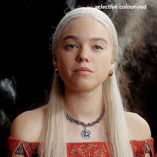
#hue/saturation. curves. levels
Explore tagged Tumblr posts
Visit Tumblr Blog
Explore Tumblr blogs with no restrictions, modern design and the best experience.
Last Seen Tumblr Blogs


Fun Fact
Tumblr Inc. is using 66 technologies for its website.
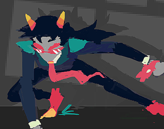
Text


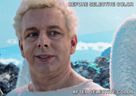
you ever watch a video so attractive you have to relearn how to make gifs
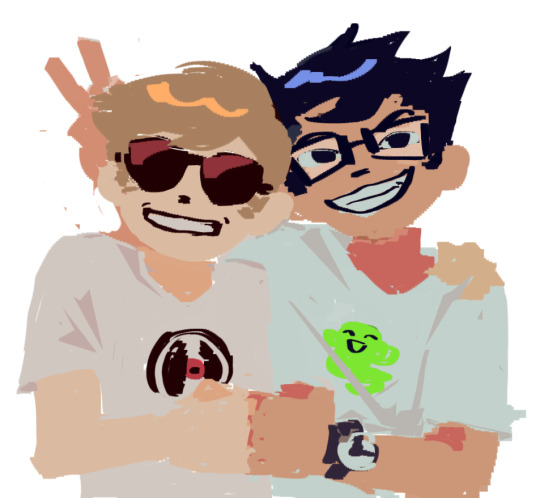
#a.c.e#wow#ace wow#acenet#im still in acenet right. i was in acenet the whole time#mine#gif*#i truly don't remmeber how to tag this shit#to think i used to make like 2 sets a week#and today i had to be like. i create... a videoed timeline???#import video frames?#hue/saturation. curves. levels#some of these layers were my friends#ace#love that i'm just gonna subject the asexuals to this#king wow transcends
27 notes
·
View notes
Text
here is the colouring tutorial i promised to go with my beginner's gifmaking tutorial.
to save image space, i've written up a simple explanation of how each adjustment layer works here, so i'm just going to over my colouring for these 4 different gifs.
as always, very image heavy underneath
there are many ways to get the same results and i'll use various methods usually just based on what i'm feeling at the moment. some of it is a little convoluted, but hopefully this will give you a rounded idea of how it all works so you feel more comfortable playing around with your own colouring
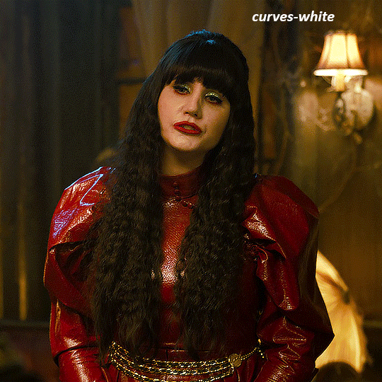
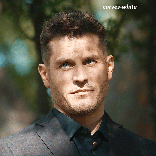
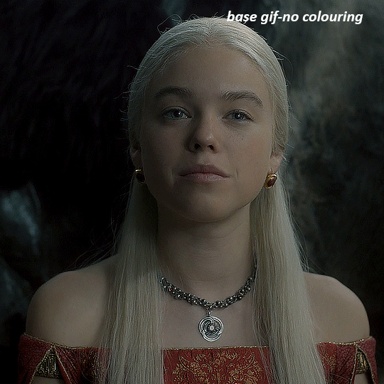
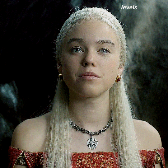
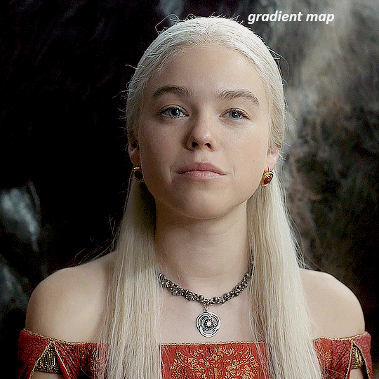
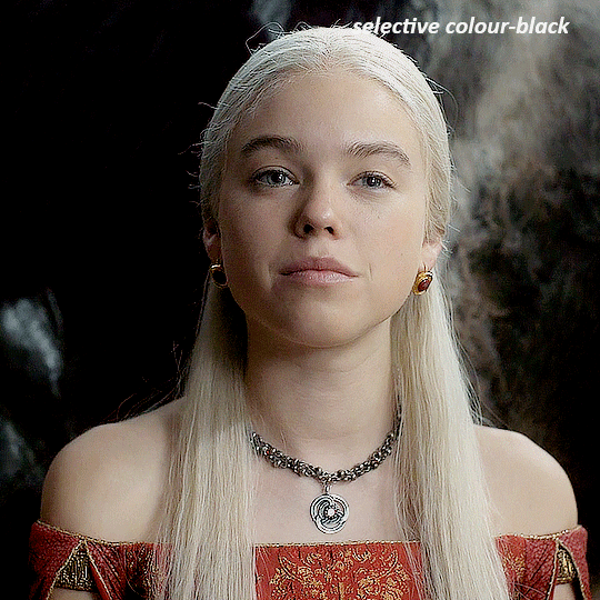
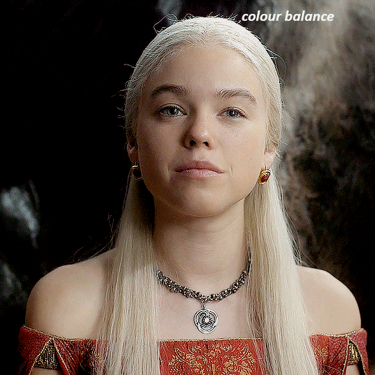
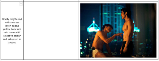
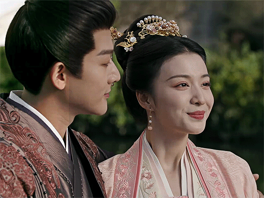
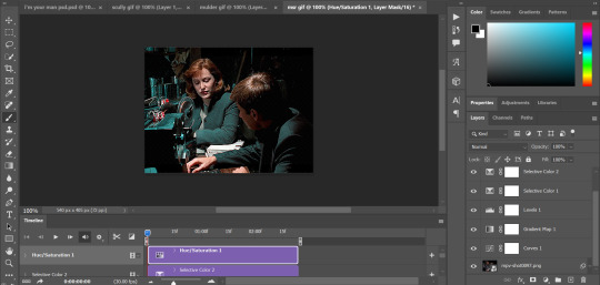
NADJA
this is the base gif with zero colouring adjustments, just resized and sharpened.
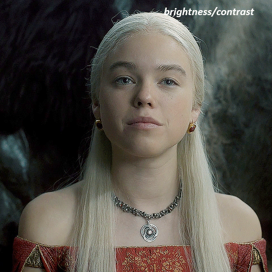
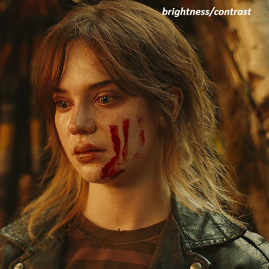
unless the base gif is already very bright, which doesn't often happen because directors nowadays are allergic to light, the first layer i add is always a brightness/contrast layer. i don't adjust any of the sliders, i just change the blending mode to "screen", and then adjust the opacity if needed. this gif was pretty dark, so i left it at 100%,
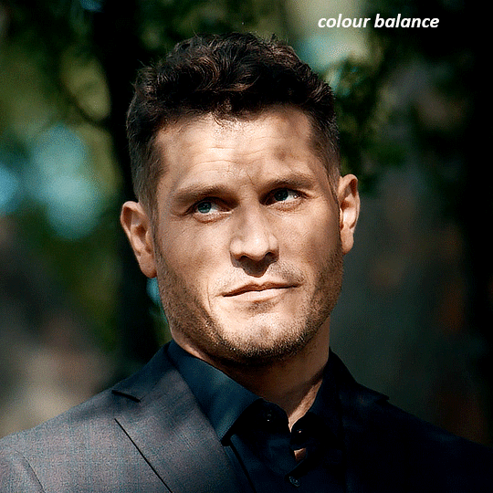
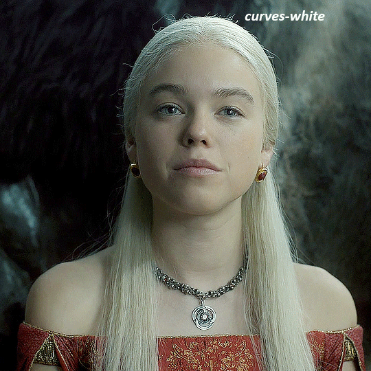
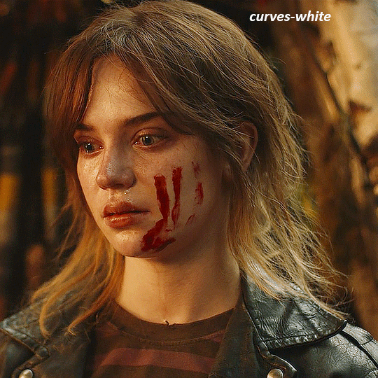
my next layers are always curves to even out the white and blacks. i use two curves layers, one for white and one for black. i used the white drop-picker and selected just below the lightshade on the lamp behind her, and for the black drop-picker i selected her hair near her neck which gives us this
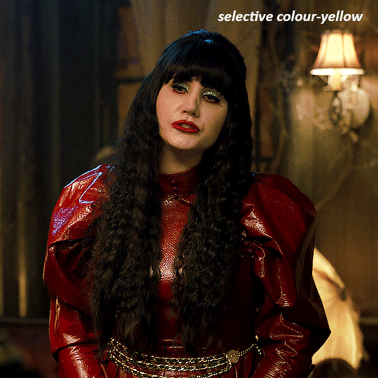
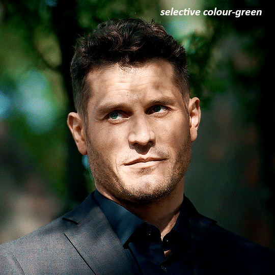
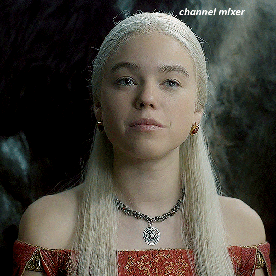
it's already looking much better, it's not as green tinted, but i want to make the red of her dress pop a bit more. in order to do that without making her face too red, i'm gonna remove some of the yellow. so next i'm gonna add a selective colour layer, and under the yellow channel i moved the yellow slider to -5 and the black slider to -52. now
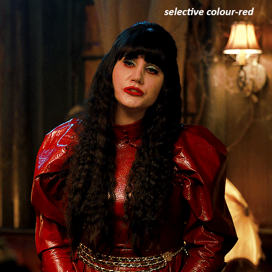
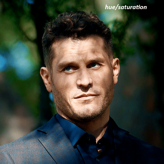
now that the yellow is reduced, i add another selective layer, and under the red i move the cyan slider to -66 and the black slider to +29. now the red of her dress pops and her face is still a realistic tone. when i first made the gif, i added the red selective layer first, then added another selective layer under it and adjusted the yellows to offset it. you can always shift layers around or add a new layer underneath as you go.
voila
TOMMY
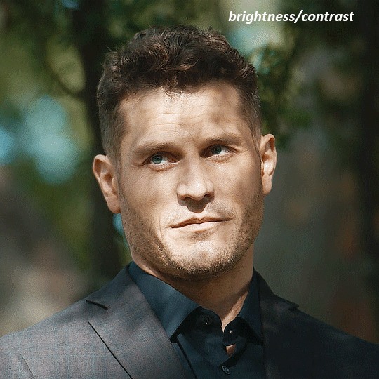
here is our base gif

this scene is better lit than the nadja one, but i prefer bright and colourful gifs, so i'm gonna once again add a brightness/contrast level and keep it at 100%
and then the curves layers to even it all out. since there isn't a spot that is immediately noticeable as white, you can hold the alt button with the white dropper selected and it will highlight all the white/very near white pixels. you can also zoom real close in to select specific pixels. i selected a from the white area around his chin/mouth. the same process works for finding a black spot with the black dropper, and for that i selected from a dark spot in his hair
the curves layers evened it out but also made the gif a bit more red and warm toned, and since i've decided i want the end result to be more blue/green, so i'm gonna add a colour balance layer. in the shadows channel i moved the cyan/red slider to -16, and the yellow/blue slider to +11
now the gif already looks great, it's bright, skin tone is accurate, he's not washed out, but like i said i like my gifs colourful, so i'm gonna add two more selective colour layers. in the first i'm gonna adjust the greens, bringing the magenta slider to -87, and the black slider to +81. in the second layer i'm gonna adjust both the blues and cyans, because when you see blue in a gif it's rarely ever straight blue or straight cyan, so always adjust both. (you could adjust the blue and green in the same layer, but i prefer to do them separately in case i need to move the layers around)
now finally i'm gonna add a hue/saturation layer because i think the blue of his suit is too blue when the sky behind him is more cyan. (also, since you only have 256 different colours to work with, you don't want too many different colours otherwise it will distort the colouring.) in the blue channel i move the hue slider to -12 to make the blue a bit more cyan, and i also move the saturation to +38 to make it pop more
and voila
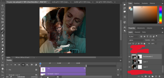
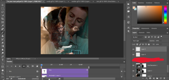
RHAENYRA
here is the base gif (this one is going to get very convoluted and imo best exemplifies what colouring gifs is like most of the time)
as always, a brightening layer set to screen
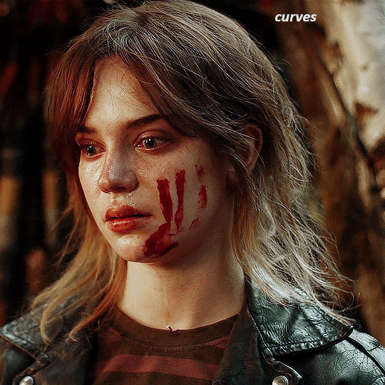
now the curves layers. for the white i clicked on her hair at the top of her head, and for the black i i clicked in the shadows to the left of her.
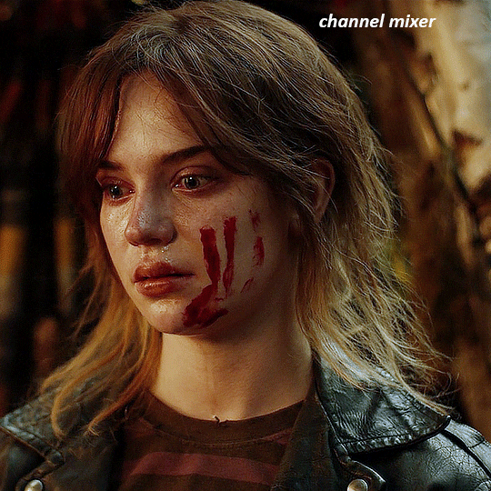
but as you can see, while it added contrast, it also made the gif more green tinted than it was. you could click around more, or manually adjust the red, green, and blue lines on the curves until it looks better but i decided to add a channel mixer layer instead. in the green channel i set the greens to -95, and in the blue channel i set the blue to -97
next i wanted to add a little contrast, but i find that using the contrast in brightness/contrast can saturate it too much, so instead i added a levels layer. first i adjusted the bottom bar, moving the right slider to 230 which reduces the overall brightness of the gif, so when i adjust the top bar it doesn't brighten the gif too much. on the top bar, i moved the right slider to 212, and the left slider to 9
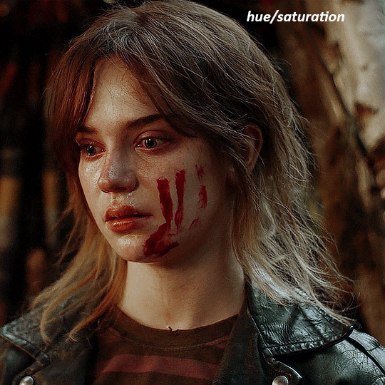
now, i'd like it to be not exactly warm toned, but less cool, and while i could use colour balance or a photo filter, i'm instead going to add a gradient map, using the default gradient pink 08, and setting it to blend mode soft light at 50% opacity

next i just want to increase the blacks a little, so i'm gonna add a selective colour layer and under black i'm gonna set the black slider to +10
it's still not as warm as i'd like, so i'm gonna add a colour balance layer, in the midtones setting the cyan/red to +10 and the yellow/blue to -5
we're almost done, but i want to make her dress pop a bit more, so first i'm gonna add another selective colour to bring the yellows down a bit, setting the black slider to -15

and finally one more selective colour layer, in the reds, setting the cyan slider to -50, the yellow slider to +10, and the black slider to +15
voila
NATALIE
here's the base gif
as always the brightness/contrast layer set the screen
now the curves layer. for the white, i zoomed in and selected a pixel on her cheek under her right eye. for the black i the dark spot just above her head
now she's very yellow, so i added a channel mixer layer. in the red channel i set the reds to +88. in the blue channel i set the reds to +10
she's still a little too yellow for my liking, so i'm gonna add a hue/saturation layer, and under the yellows i'm gonna adjust the saturation to -60
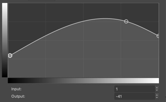
finally, i want her to be a it brighter, so i'm gonna add another curves layer, but instead of using the drop, i'm going to manually adjust it. the two points along the line are where i selected it and then i dragged until it looked how i wanted. i start with the upper dot, which made it brighter and moved the line into an arch, and then selected at the lower end of the line and dragged in back closer to centre to add some darkness and contrast
voila
and that's how i do my colouring. it's generally all trial and error, using a layer to fix one thing and then needing another layer to fix something the previous layer did.
play around, have fun, see what works for you and what doesn't. it will take a while for you to develop your own method and style, and even then you'll come across scenes that make you question if you have any sills at all. you do, directors just hate us
have fun and feel free to ask any questions
#tutorial#gif tutorial#colouring tutorial#photoshop tutorial#gifmakerresource#completeresources#*tutorials
273 notes
·
View notes
Text

hello and welcome to my tutorial on how to create gifs like this one! full explanation under the cut, but if you wanted to take a little peek at the gifset attached to this tutorial, here ya go!
for the purposes of this tutorial i am assuming you know
how to make a gif
what vhs footage looks like
STEP ONE: MAKING YOUR GIF
choose your footage and plug it into your desired software of choice! i use photoshop for this so i can only attest to the efficacy of these methods in that context
as for shot selection, you could feasibly choose anything. however, i prefer shots without too much movement in them - makes it look more like a home video.
because of the heavy amount of colors and filters, i'd recommend a gif somewhere around the 40-50 frames! but of course you can play around.
oh i also set the frame delay to 0.08 seconds. this is slower than most gifmakers tend to set theirs, but it makes it run buttery smooth imo.
STEP TWO: MAKING THE COLORING
here's where we get vhs specific. if you're unfamiliar with vhs footage, i recommend clicking through this youtube playlist! if you're not interested in the coloring, skip to step three (smart object fuckery + filters)
now while making a set i tend to choose some primary colors for my gifs. in the gifset i linked above, i chose to work with blue and orange-y yellow. in some of the other gifs i'll be using as examples (from an unfinished set) i chose green and yellow.


to create the above coloring i generally use these steps:
1) curves
i'm a maniac so i use the same curves layer to initially edit the luminosity AND colors of my gifs. the purpose of this layer is to edit brightness/contrast like i normally would and already start the process of changing the colors a little bit. this is my curves layer for the blue house gif:

to make the gif go from the left image to the right image:


as you can see i used the brightening curves to make the footage a whole lot lighter. i also increased the reds to get rid of the cyan tint a lot of blue footage has, slightly increased the blues, and once again decreased the greens to get rid of any cyan. this does make the blue hue a bit more purple, which is a nice bonus!
as for the gif of the boy, that one's a little harder to show a before and after for, but i'lls how the curves for good measure:

the original shot was already quite bright so i only edited the brightness a litttle bit. because i knew i wanted the gif to be green and yellow, i increased the greens, decreased the reds (except in the shadows), and decreased the blues (to get yellow)
2) channel mixer
now the channel mixer layer takes a little getting used to so i recommend experimenting. ALWAYS USE THIS LAYER ON THE COLOR BLENDING MODE for a more even result.
i use channel mixers to sort of... unify the colors a bit more. for the house gif, for example, i increased the blue channel to +110% blue, but decreased the blue in the red (-12%) to retain the yellow in the window.
if you want me to explain this more in depth, send an ask! it'll be kinda longwinded though


before / after of the boy gif with curves/channel mixer.
3) levels
this is where it starts looking more vhs-y! vhs footage has light shadows and dark highlights.
first, set your levels layer to luminosity blending mode to retain your beautiful colors.
then, crunch the hell out of your gif to make it very... mid.


this may feel a little wrong at first but i prommy it'll look okay at the end. a before/after for the boy:


now that's starting to look familiar right?
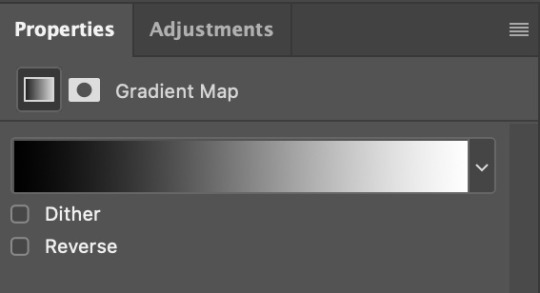
4) color fill/gradient map
because i want to unify my colors/make sure my gif is saturated, i usually add either a color fill or gradient map layer. in the case of the house, i chose to go with a dark blue color fill:


because the coloring of the boy gif was a little more complex, i decided to go with a brown to green gradient map.

this will make the shadows yellow, and the highlights green.


BOTH THESE LAYERS ARE SET TO OVERLAY. i usually fiddle with the opacity of them until i like it, but it's anywhere from 7% - 17% depending on what i feel like that day
5) curves (again)
this layer is probably useless but i do it anyway to make myself feel better. this is just a regular curse layer to up the brightness a tiiiiny bit and amke sure everything's clear. also it helps counteract the darkness your overlay color will add in.
6) color balance
this is my most subtle layer so i won't be able to show before and after but i fiddle with the color distribution a little until i'm satisfied. set this layer to color blending 'cause that's what you wanna affect!
i decided i wanted the house gif shadows to be a little more purple, for example, so i added in red (+3), magenta (-1) and blue (+1). etc etc. do what feels good!
STEP THREE: SMART OBJECT FUCKERY AND FILTERS
OKAY that was a lot. sorry or you're welcome. but good news: now's the fun part. convert your animation to a timeline, then select both your coloring and gif layers, right click, and select convert to smart object.
now that your gif's a smart object, i usually crop it. i tend make vhs aes gifs a 4:3 ratio (so 540 x 405 px) because that's what vhs footage was usually recorded as! crop your gif, resize, and then we can continue.
1) color bleeding
vhs footage usually bleeds its colors - this manifests as a short of... weird subtle halo around any object. the way to recreate this in photoshop is to duplicate your smart object.
set your copied smart object to color blending. now move it to the side a couple of pixels (i usually do around 5px, but you do you!)


as you can see, the tree and chimney (and everything else but less prominently) have a yellow shadow to them. this is exactly what we want!
2) filters
now's the time to add your filters and make it look like shit (but on purpose!) first, select both smart objects and convert to smart object again. this will ensure the filters apply to all layers evenly.
i use the following filters:
unsharp mask (amt 35%, radius 4px) - this will subtly add some sharpening but only on the edges of objects
add noise (amt 7.5%, distr. uniform, not monochromatic) - this will add the signature vhs grain.
box blur (2px) - i edit this to be 75% opacity with the little arrows to the right, just to make sure you can still make SOMETHING out when you're looking at the gif. MAKE SURE THIS FILTER IS ON TOP OF YOUR NOISE FILTER. tumblr will kill your gif otherwise
4) ONE LAST THING
usually at this point i'm not happy with either the saturation or levels. (usually the levels). so on top of your smart object, add another saturation or levels layer and fuck around!
in the case of the house gif, i thought it was too bright still so i set my output levels to 13 and 216. for the boy, i thought the shadows were too dark, so i set my shadow output to 11.
BEFORE & AFTER:


aaaand that's it! thanks for reading! if you have any questions, feel free to come to my askbox, i'm always happy to explain my process. happy giffing 🥰
#gif tutorial#ps tutorial#photoshop#completeresources#allresources#giffing tutorial#vhs gif tutorial#idfk. what do you even tag for tutorials lmao
323 notes
·
View notes
Text
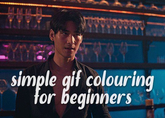
✨ Simple Gif Colouring for Beginners ✨
I wrote up my basic gif colouring process for a friend recently, but a couple of people here mentioned they'd also find it helpful! so, as requested, this is a beginner-friendly walkthrough of the way I colour my gifs :) it's aimed at brand new gif makers with no prior experience with photoshop or photo editing.
when I first started gif making I found colouring and photoshop in general suuuper daunting, so I've tried to simplify everything here as much as possible. hopefully this will be relatively easy to follow and not too intimidating!
a couple of things to begin with:
I'm only talking about colouring here - this is not a full gif making tutorial. I've linked to some of my favourites of those here!
I personally like to make bright, 'clean' looking gifs with vibrant but natural colours, so that is the style of colouring this tutorial is geared towards. most of gif colouring is subjective and about personal taste - the only thing that I'd say is possible to get wrong is skin tones, which I talk about a lot in this guide.
as I mostly gif Thai dramas, most of the advice is geared towards colouring for East Asian/South East Asian skin tones - but the techniques should be fairly universally applicable (and here are some tutorials that talk about gif colouring for other skin tones).
I'm not an expert! I'm not claiming this is the best or the only way to colour gifs - it's just how I do it.
this post is very image-heavy. if the images aren't loading (or the gifs are running slowly or cutting/looping weirdly), then try viewing the post in its own tab (rather than on the your dash or someone's blog) and refreshing the page.
okay, full walkthrough beneath the cut!
contents:
1. intro a. natural gif colouring goals b. very very basic colour theory 2. super simple colouring (the essentials) a. curves b. selective colour (and skin tone correction) c. hue/saturation d. saving and reusing colouring e. another simple colouring example 3. other adjustment layers a. brightness/contrast b. levels c. vibrance d. colour balance e. channel mixer 4. troubleshooting a. curves b. saturation 5. fin!
1. intro
the colouring part of gif making can be super overwhelming, especially if (like me when I first started!) you're completely new to photoshop and/or have no experience with colour theory or photo/video editing.
if you're opening photoshop and making gifs for the first time, I highly recommend getting used to making a few basic, uncoloured gifs to begin with. just to practice, rather than post anywhere (though you can always come back and colour them later if you want) - but it'll make the rest of the process much easier if you're already beginning to get used to working in timeline mode of photoshop. give yourself a bit of time to practice and get a feel for things like how many frames you tend to like in a gif, where you like to crop them for the best loop, what kind of aspect ratio you like etc* - so that you're not trying to navigate all of that for the first time on top of everything else!
* frames: for me between 60-90 frames is ideal, but 40-120 frames is the absolute min-max I'd personally use in a normal gifset loops: for the smoothest loops, try to avoid cutting someone off mid-movement or mid-word if possible. aspect ratio: for full-size (540px) gifs, I tend to go for either 8:5 (slightly 'skinnier' gifs), 7:5, or 5:4 (particularly big, thick gifs lmao)
✨ natural gif colouring goals
part of what can be so daunting about starting gif making is not knowing where to start or what you want to achieve. this is definitely something that gets easier with practice - the more gifs you make, the more you'll get a feel for what kind of look you like and the more instinctively you'll know how to get there. it also helps to see if any gif makers you like have made "before and after colouring" posts - these can help with getting a sense of the kinds of changes made through gif colouring. here's one I made!
in general, I like to make my gifs bright and 'clean' looking, with vibrant but natural colours. these are the things I'm usually hoping to achieve with colouring:
brighten dark scenes
remove muddy, yellowish lighting or filters
saturate colours
correct any skin lightening filters or overexposure
make lighting and colours as consistent as possible between gifs within a single gifset, especially gifsets featuring gifs from multiple scenes/episodes/videos
this guide is focusing on natural colouring, but of course there are many cool ways to make stylised/unnaturally coloured gifs. imo you'll need to master these basics first, but if you want to learn how to do things like change the background colour of gifs or use gradients or other cool effects, then @usergif's resource directory has loads of super helpful tutorials!
✨ very very basic colour theory
[disclaimer! I don't know shit about fuck. I do not study light or art. this is just an explanation that makes sense to me exclusively for the purposes of gif making.]
the primary colours for light/digital screens are red, blue, and green. having all three colours in equal measures neutralises them (represented by the white section in the middle of the diagram).
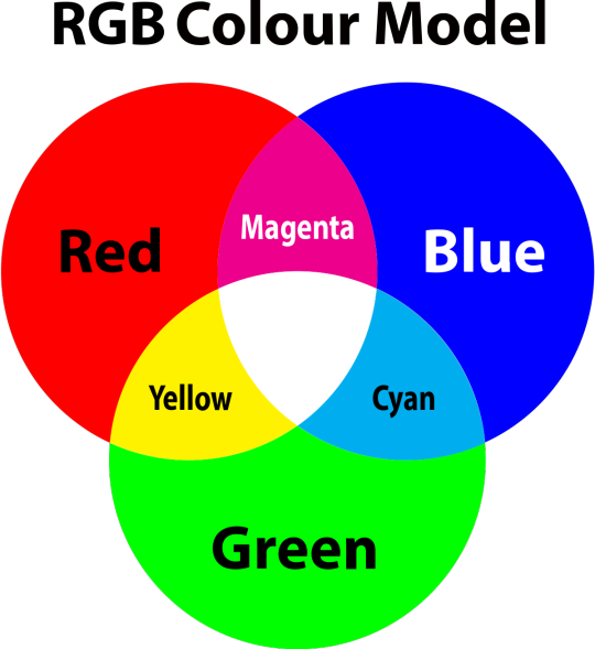
so to neutralise a colour within a gif, you need to add more of the colour(s) that are lacking.
in practice this usually means: the scene you want to gif is very yellow! yellow is made of red and green light, so to neutralise it you need to add more blue into your gif.
it can also mean the reverse: if you desaturate the yellow tones in a gif, it will look much more blue.
looking at the colour balance sliders on photoshop can make it easier to visualise:
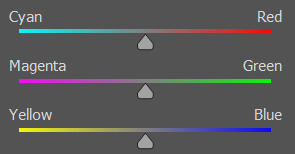
so making a gif more red also means making it less cyan.
removing green from a gif means adding magenta.
taking yellow out of a gif will make it more blue.
tl;dr:
neutralise yellows by adding blue (and vice versa)
neutralise reds by adding cyan (and vice versa)
neutralise green by adding magenta (and vice versa)
2. super simple colouring (the essentials)
starting with a nice sharpened gif in photoshop in timeline mode. (these are the sharpening settings I use!)
some scenes are much harder to colour than others - it helps to start out practising with scenes that are bright/well-lit and that don't have harsh unnaturally coloured lights/filters on. scenes with a lot of brown/orange also tend to be harder.
I usually save a base copy of my gif before I start colouring just in case I end up hating it, or find out later that it doesn't quite fit right into a set and need to redo it etc.
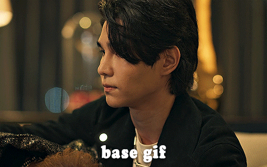
so here is my base gif!

it's an okay gif, but it has a bit of a yellow tint to it that I want to reduce.
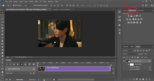
colouring is easiest to do in adjustment layers, which can be found under layer -> new adjustment layer - or for me they are here:
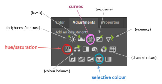
there are lots of different types of adjustment layers that do lots of different things - but for me the absolute essentials for colouring are curves, selective colour, and hue/saturation.
I also use brightness/contrast, levels, exposure, vibrance, colour balance, and channel mixer sometimes, depending on the gif - but I use curves, selective colour, and hue/saturation on every single gif.
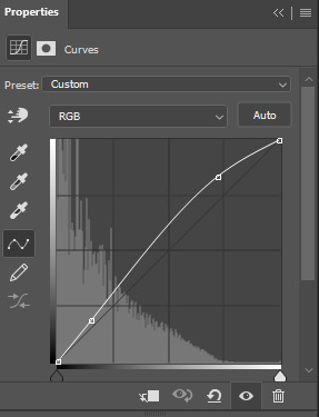
✨ curves layer
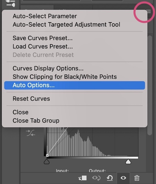
the first thing I always do is a curves layer. when you first open one it will look like this:
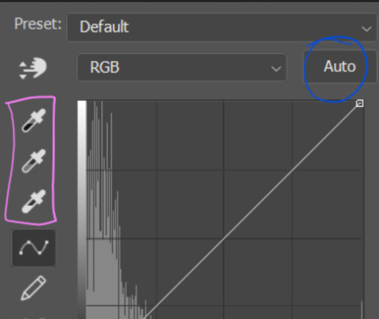
first I usually click the ‘auto’ button, just to see what happens. sometimes it makes a big difference (it usually brightens the gif a lot) - but on this gif it didn’t do much.
if it had made the gif look nicer then I would have kept it and added a second curves layer on top to do the rest of these steps.
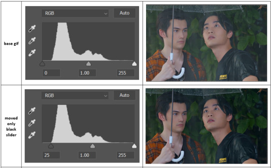
the next step is selecting the white and black points with the little eyedropper tools.
the bottom eyedropper lets you pick a white point for the gif. click somewhere super light on the gif to see what happens - for this gif, I clicked on the lampshade on the left. if it looks weird, I just undo it and try somewhere else - it usually takes a few goes to find something that looks good.
here's what that did to the gif:

then I pick the top eyedropper and use it to pick a black point by clicking somewhere really dark, again playing around until I find a black point that looks good.
here's what the gif looks like after picking the white and black points:

this can take some experimenting, but you can make super easy drastic changes to your gif just with this. in this case, the curves layer took out a lot of that yellowy tint.
and this is what the curves graph looks like now:
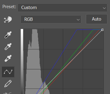
you can click and drag those lines to make further changes if you want - I usually leave them alone though. the colours of the lines indicate which colours have been changed in the gif - for example, you can see from that steep blue line on the graph that blue has been added to neutralise those yellows.
next I usually do another curves layer and just press the ‘auto’ button again to see what happens. usually it brightens the gif a bit more, which I like.
‼️if nothing is working: usually with a bit of fucking about a curves layer works well - but sometimes you can’t find a good white and black point anywhere, and instead your gif turns wacky colours and nothing looks good. this happens more often with very heavily colour tinted scenes :( the troubleshooting section at the end goes over some options, including starting with a levels layer instead.
✨ selective colour (and skin tone correction)
skin tones are made up of a mixture of yellow and red.
removing yellow (or adding blue or red) to a gif will make the skin-tones too red - and removing red (or adding cyan or yellow) to a gif will make the skin-tones too yellow.
adding blue to this gif with the curves layer took out the yellowy tint, which I wanted - but it also took the yellows out of Kim's skin tone, which I don’t want. so I need to put yellow back into the skin tones specifically - without putting it back into the rest of the gif.
selective colour layers let you select an individual colour and adjust the levels of other colours within that colour. you can change how yellow the green shades are, or how much cyan is in the blues, for example.
I need to add yellow back into the red tones to correct the skin tones on this gif. this is the case for most gifs in my experience - the vast majority of the time, unless a scene is very heavily tinted in another colour, a curves layer will add blue/remove yellow.
in the 'colors' dropdown, select the 'reds' section and drag the 'yellow' slider higher - this will add more yellow into just the red shades within the gif.

the amount of yellow you need to add back into the reds depends on how much yellow was taken out of the gif initially - I just play around with the slider until it looks right. if you're not sure, it helps to have some neutrally-coloured (not white-washed!) reference photos of the people in your gif to compare to.
here's the result. Kim's skin is a lot less pink toned and much more natural looking:
✨ hue/saturation
this adjustment layer lets you adjust the hue and saturation of the gif as a whole, and also of each colour individually.
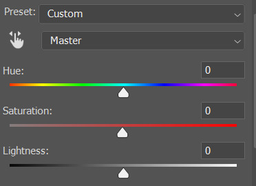
I don't use the hue or lightness sliders unless I'm trying to do something more complicated with the colouring.
clicking the dropdown menu that says 'master' lets you edit the saturation of each colour individually. this is useful if your gif is still super tinted in one colour.
I thought the yellows on this gif were still slightly too bright, so I switched to the yellow channel and desaturated them slightly. (remember if you do this then you need to go back to selective colour and add more yellow into the red skin tones to balance out the desaturation!)
then I increased the 'master' saturation of all the colours to +5:
I usually find the right amount of saturation is somewhere between +5 and +12, but it depends on the gif.
‼️if the gif feels undersaturated, but the saturation slider isn't helping/is making the colours worse, try a vibrance layer instead.
done!
✨ saving and reusing colouring
you can copy and paste adjustment layers between gifs to make your colouring even across each of your gifs for one scene - so if you're making a set of multiple gifs of the same scene, or you think you might want to gif the same scene again in the future, you can save it as a psd so you can reuse the colouring again later.
each gif's colouring will then still need tweaking - different cameras/angles/shots of the same scene can still start out with slightly different colouring.
I recommend uploading the gifs as a draft post on tumblr so you can see what they all look like next to each other and catch any inconsistencies.
✨ another one! (speedrun!)
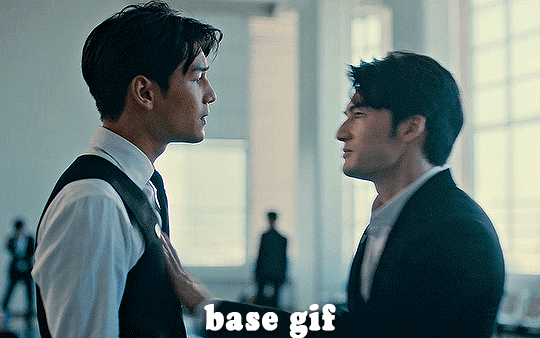
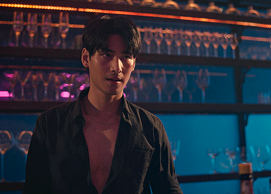
HI KEN!
the white point for the curves layer was in the window behind them.
the curves layer removes the muddy yellow tint, but again it makes their skin tones (especially Ken's) very red toned, which is adjusted by the selective colour layer.
3. other adjustment layers
imo many many gifs can be coloured really nicely with just those three adjustment layers, but some need different adjustments.
✨ brightness/contrast
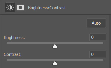
pretty self explanatory!
I personally usually avoid using the 'brightness' slider because I rarely like the effect - I only tend to use the 'contrast' one.
the 'auto' button is sometimes useful though, especially if you’re struggling with the curves layer.
✨ levels

levels alters the white and black points of the gif, like curves - but unlike curves it doesn't also alter other colours.
use the sliders beneath the graph to alter how dark/light the gif is. you can slide the black slider further to the right to make the blacks darker, and the white slider to the left to make the whites lighter.
levels is a good place to start if your curves layer isn't working.
(I'm going to hit the image limit for this post lol so here are some screenshots of a table I made to demonstrate this rather than actual gifs. sorry!)

on both sides, I dragged the sliders up to where the big jumps are on the graph - this is usually a good place to start!
✨ vibrance
vibrance... makes the colours more vibrant. it's more subtle than saturation.
it's really helpful for gifs that feel grey. sometimes adjusting saturation just makes the greys kind of weirdly tinted, but a vibrance layer can fix that.
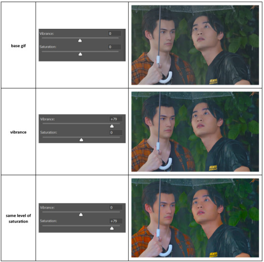
vibrance is much more subtle!
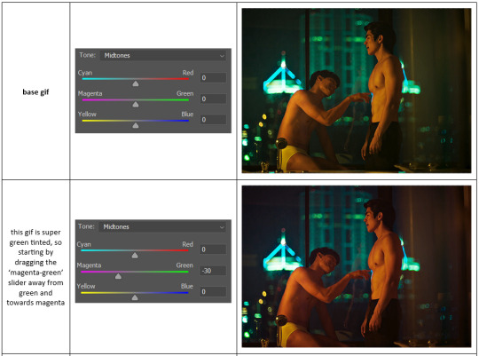
✨ colour balance
colour balance affects the overall balance of colours within a gif.
it's good for scenes with heavy tints.
I tend to stick to the 'midtones' dropdown, but you can also alter the colour balance within the shadows and highlights if you want.

✨ channel mixer
I avoided channel mixer for such a long time because it scared me. but it's great for scenes that are very heavily tinted in one colour.
basically, it works with the levels of red, green, and blue within a gif. you select an output colour and then play around with the levels of the colour you selected within each other colour.
kind of the reverse of selective colour?
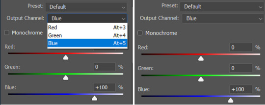
so in the 'blue' channel, the levels of blue are at 100%, and the levels of red and green are at 0% - but you can impact how much blue is in the reds and greens and blues.
this tutorial explains it well - but imo the best way to get to grips with channel mixer is just to play around with it a bit (sorry)
(when I made this guide for my friend, I also made a slightly more complicated gif colouring walk-through that included using channel mixer. there isn't space to include it within this post, but if anyone is interested I could always upload it as an 'intermediate' gif colouring tutorial - lmk!)
4. troubleshooting
‼️curves
usually with a bit of fucking about a curves layer works well - but sometimes you can’t find a good white and black point anywhere, and instead your gif turns wacky colours and nothing looks good. this happens more often with very heavily colour tinted scenes :(
for example, with this base gif:
using many of the brightest points as a white point turn it wacky colours, like this:

yikes :(
some options for these cases:
try brightening the gif first with the 'auto' button on the curves layer or with a levels layer. having a brighter gif to start with can give you better options for picking a white point.
try finding an alternate, whiter/brighter white point. look for places the light reflects - on this gif, using the light on Porsche's cheekbone works well as the white point. it also helps to find places that would be white if the scene wasn't tinted - the lightest part of a white shirt is often a good place to start, for example.
skip the curves layer, and instead use a levels layer to alter your white/black points, and colour balance or channel mixer to balance the colours.
‼️over/undersaturation
if your gif (especially the skintones) is looking a little washed out or lifeless, it might be undersaturated. boost that saturation - or if that's not working, try a vibrance layer.
oversaturation is often easiest to spot in the mouths and ears of any people in a gif. if the mouths are looking unnaturally, vibrantly red, then you've gone too far with the saturation.
5. fin!
and done! I hope this was coherent helpful to somebody.
if there's anything that I've missed or that doesn't make sense pls feel free to shoot me an ask or a message and I'll do my best to help! I've also collated a bunch of additional reading/resources below.
happy gifmaking 🥰
✨ some links!
photoshop basics by @selenapastel
gifmaking for beginners by @hayaosmiyazaki
gifmaking guide for beginners by @saw-x
dreamy's gif tutorial by @scoupsy-remade (includes instructions on how to blur out burned-on subtitles or annoying video graphics)
beginner's guide to channel mixer by @aubrey-plaza
how to fix orange-washed characters by aubrey-plaza
colour correcting and fixing dark scenes by @kylos
does resampling matter? by usergif
how to put multiple gifs on one canvas by @fictionalheroine
watermarking using actions by @wonwooridul
resource directory by @usergif
#i got a couple of asks about this so i figured i'd type it up as a post#it's been sitting in my drafts for a while now though i'm so sorry omg.#i had to replace my laptop and it took me a while to get round to downloading photoshop on the new one#but i hope this is helpful!!#gif making#tutorial#photoshop tutorial#colouring tutorial#coloring tutorial#gif colouring#gif coloring#photoshop resources#gif tutorial#gif resources#userbunn#uservik#darcey.txt#darcey.gif#usergif
899 notes
·
View notes
Note
hi, I was wondering if you could help me with how to color the bucktommy helicopter ride? I haven’t been able to get rid of the green, and when I do it’s all blue or super pink. Any suggestions? Thank you!
hi anon! i'd be happy to share how i coloured that scene for this gifset, just keep in mind that this was my first attempt at this scene and i'm always tweaking my colouring!
the channel mixer is you best friend for these kinds of scenes, and here is a helpful tutorial explaining how to use it. i like to think of it as taking the colour of the tab and "pushing" it into the colour of the sliders (so if you're in the red tab and increasing the green slider, you're "pushing" red into the green areas of the gif).
under the cut i'll explain the major steps that helped me get the colouring here:

these are my regular colouring steps, which i'll be mostly following and referencing throughout, but with some tweaks.
Prepping the scene
i start with a blank brightness/contrast layer set to 'screen' to brighten up the shot


then i use the curves layers i mentioned in my colouring tutorial and use the white and black eyedroppers to select the brightest and darkest green pixels in the scene. this brings out some of the blue.

Channel Mixer
now i use the channel mixer to do some heavy lifting. these are my settings but play around with them until you're happy. i started by reducing the green, and then adding back red and blue.


Adding brightness
now i use another blank brightness/contrast layer set to 'screen' at 50% opacity, and use the second exposure layer, levels, and brightness/contrast layer from my colouring tutorial to brighten up the scene.


Channel Mixer 2.0
now as you can see the scene is still pretty green, so i add a second channel mixer layer with these settings:


Color balance and hue/saturation
i do my color balance and hue/saturation steps as described in my colouring tutorial, with these settings:


Selective colors
now it's just a matter of using your selective colours to add back warmth in the skin tones. i use multiple selective color layers and adjust the reds, yellows, and magentas to get the skin tone to look better (6 layers for this alone). i also adjust the cyans and blues to get the lights and uniform colours the way i want them. and i end off by adjusting the whites/neutrals/blacks to get some more brightness and contrast.
i've explained my reasoning in how i use my selective colour layers in my colouring tutorial.
Final Touches
i use the same final layers as my colouring tutorial, ending off with an auto curves layer at 25% opacity which leaves me with the final colouring i obtained here:

hope this somewhat helped anon! let me know if you have any more questions or want me to clarify anything further!
#911#bucktommy#tommy kinard#evan buckley#<- target audiences#answered#Anonymous#*tutorial#sorry this was just a rough explanation! i'm still tweaking things to get a colouring that i *love*#the channel mixer does most of the heavy lifting though and is the most important part#supplemented with color balance and selective colors to make things not look corpse like
134 notes
·
View notes
Text
ok gifmakers community, important question here:
#reblog plz 💚#my pools#im genuinely curious#tuserpris#usernewbs#useraimz#usertiny#usererika#usermaguire#userkitkat#userange#userspacey#spxcekya#alivedean#deanncastiel#userallisyn#tusermarissa
363 notes
·
View notes
Text

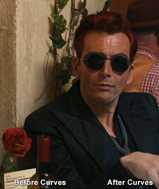
Thank you @cobbbvanth for asking me for this; I’ve never been more flattered! ☺️ I’ve only been making gifs for a little more than 2 years, so I’m really still only figuring Photoshop out, and my colouring owes everything to other people’s tutorials (some of which can be found here). To be honest, I was only asked some tips, but I have no clue what to include and what to leave out; so, here’s my complete (if random) colouring process.
NOTE: This is a colouring tutorial, not a gif-making one. The tutorial that taught me everything I know about that (and to which I am eternally grateful) is this one by @hayaosmiyazaki.
I. SHARPENING My standard sharpening settings are:
One Smart Sharpen filter set to Amount: 500 | Radius: 0,4
A second Smart Sharpen filter set to Amount: 10 | Radius: 10
One Gaussian Blur filter set to Radius: 1,0 and Opacity: 30%
One Add Noise filter set to Amount 0,5 | Distribution: Gaussian
II. BASIC COLOURING This is the part where I add most of the adjustment layers available and just play around with them. Obviously different settings work for different scenes, but I do have some standard ones.
Brightness/Contrast I usually up the Brightness to +10-30, and the Contrast to about +10.
Curves
For the first Curves layer I go to Auto Options > Enhance Brightness and Contrast, and then adjust the opacity until I’m happy.
I might repeat the above step if the gif still looks too dark to me.
I add another Curves layer, I go to Auto Options and this time I pick either Find Dark & Light Colors or Enhance Per Channel Contrast, and check or uncheck the Snap Neutral Midtones option, until I see something I like. I will then adjust the opacity.
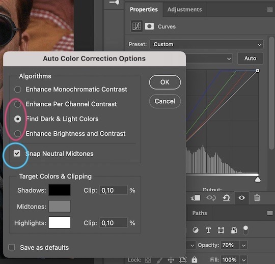
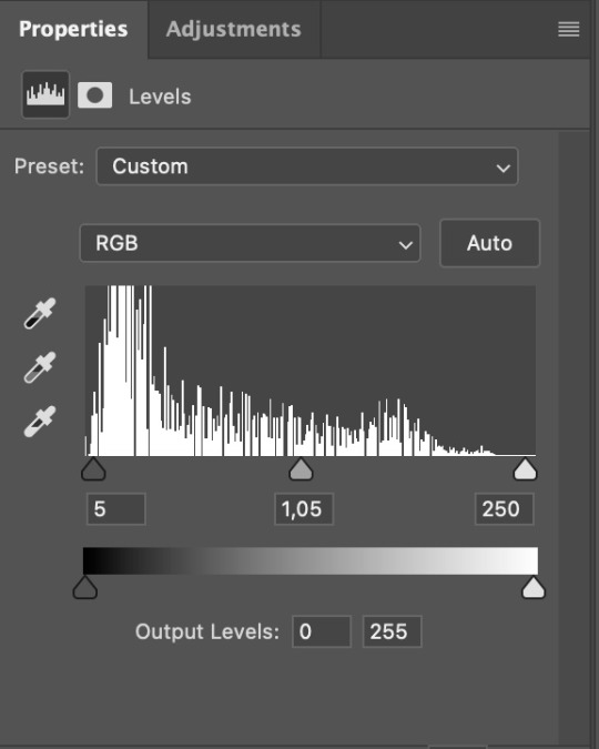
Levels I add a Levels layer that usually looks something like this:
Exposure I add an Exposure layer, where I usually set the Offset to around -0,0010.
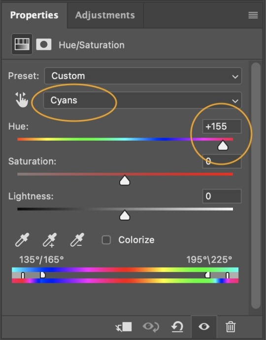
Selective Color To make the faces look okay, I create a Selective Color layer, select the Reds and usually add some Cyan (+10-20%) and play around a little (±5%) with Magenta and Yellow too. I might also add another layer, select the Yellows and make slight tweaks there too.
III. FUN COLOURING About colour manipulation: PiXimperfect just uploaded a tutorial that explains everything so much better than I ever could, so I highly recommend you go watch it. It’s made for static images though, and things are more complicated with moving images, so I also recommend @sabrinaacarpenters’s tutorial.
The reason I usually go for a softer colouring is that a more vivid one requires a lot of patience and precision, and I honestly can’t be bothered. Instead, I try to tweak the colous only a little, so that the edges can be a little rough without it looking too wrong.
One thing to remember is that each gif is different, and there isn’t one foolproof way to do this, so you will need to use a different technique depending on the gif you’re working with.
Okay, so, after I’ve decided what colour I want my background to be:
1. I create a Hue/Saturation layer and change the greens, cyans, blues and magentas to that colour. That’s easy enough, since it doesn’t mess with the face colour. I then set the blending mode to Color. If your background doesn’t include any yellow or red, you might be done here, like in the case bellow:
2. To change the yellows and reds, I create a new Hue/Saturation layer, select the yellows/reds, move Saturation to 100 (temporarily) and then play around with the sliders until the face colour isn’t affected. I then change it to whatever I’ve chosen and change the blending mode to Color.
3. If for whatever reason step 3 doesn’t work (the background is white or black for example, or just too red), I might create a Solid Color layer set to whatever colour I want, set the blending mode to Color and then select the layer mask and carefully paint with a soft, black brush over the people’s faces/bodies. I will then lower the Opacity, to whatever looks smooth enough. If there’s a lot of movement in your gif, you might have to use keyframes (see sabrinaacarpenters's tutorial linked above). However, my main goal is to avoid using those; that’s why I try my hardest to tweak around as many Hue/Saturation layers as needed and not have to create a solid color layer.
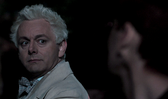
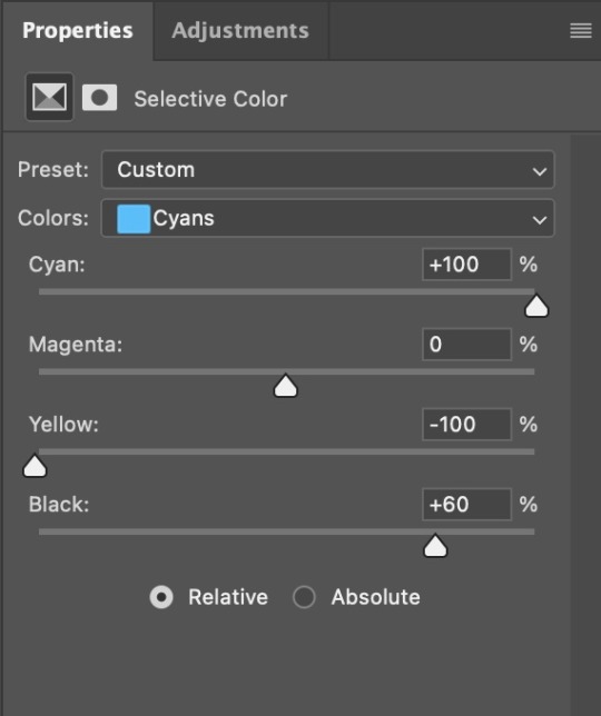
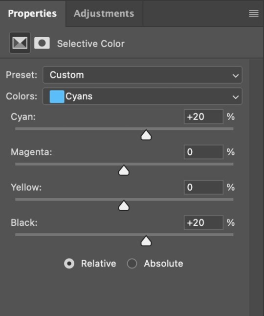
4. Once my background looks the colour I want it, I might add a Selective Color layer that matches my background color and then try to make it look more vibrant. For this Aziraphale gif below for example, I’ve selected the Cyans and then set Cyan to +100%, Yellow to -100% and Black to +60, then created another one, selected the Cyans again and then set Cyan to +20 and Black to +20.
5. If the gif has a white area, I create a Solid Color layer with a colour that matches the rest of the background and then set the Opacity low. I might also create a Selective Color layer, increase the Black and then play around with the colours.
IV. FINISHING TOUCHES
I create a Vibrance layer and set the Vibrance to around +30 and the Saturation to about +5.
I create a black and white Gradient Map layer (with black on the left end of the spectrum and white on the right), set the blending to Luminosity and the Opacity to about 20-30%.
AAAND that’s about it I think! This ended up way too long and perhaps a little incoherent. I tried to make it as general as possible, so you might have to mix and match for best results. Feel free to ask me for further explanations about any one of these steps, and please tell me if you want me to go through the colouring of a specific gifset (although, as I said, I'm by no means an expert). Happy gifmaking!
#gif tutorial#allresources#completeresources#dailyresources#photoshop tutorial#minee#tutorial#tutorial*#chaoticresources#uservivaldi#userdanahscott#usersanshou#userfanni#userbuckleys#userrobin#tuserjen#userdavid#userzaynab#tusermimi#thingschanged#tuserju#usertj#userhallie
392 notes
·
View notes
Note
hello there ! thank you for posting your lovely resources for us to use ! i was wondering if you have any advice for someone who's experienced in using photoshop but has never made their own psd colouring and would like to give it a shot ! i've only ever used pre made colourings by other creators, but i'd love to take the next step and try creating my own.
thanks for your time ! ♡
Hi anon! Thank you for your kind words 🤍
There's so much to say about colorings, but basically the only tools you will ever need to make your own are the adjustments layers, specifically:
Brightness/Contrast
Levels (which I personally believe to be the easiest and most efficient out of the "light focused" adjustment tools)
Curves
Exposure
Hue/Saturation (one of the most important tools for editing the colors in your picture, since it modifies each color individually)
Color balance
Black and White
Photo Filter (incredibly useful to adjust the tone of your picture for example, depending on whether you'd like your image to be warmer or cooler in tone)
Channel Mixer
Color Lookup (I don't use this one a lot but it can save you some time!)
Selective Color (another one of the important tools when editing colors)
Gradient map (very cool tool that you can use in many ways, it can also serve as a bit of a cheat code if you don't have a ton of time to spend on a coloring, can also help harmonize the general colors in your picture)
To familiarize yourself with each one of them, I would recommend making sure the Adjustments panels is visible in your preferred panels (in Windows, then clicking on Adjustments). Then, I find opening a random picture for practice and testing out each tool most instructive.
You can also open up the coloring files you like and "dissect" them: toggle the visibility button for each layer to compare what the before/after difference is, this will also contribute to help you see what effect each tool has.
Basically, when creating your own coloring, you're looking to modify two key components of your image, light and color, while keeping in mind that both work together (for instance, changing the brightness will also change the colors in your picture, and vice versa).
There is no unique or correct way to colorize a picture! At the beginning, it's important to just play around with everything, sometimes a coloring works with just 8 layers, sometimes it will require over 70, and just taking your time is the key. You also don't necessarily need to start with a very precise idea of the type of coloring you want to make. After a while, it will start coming pretty naturally to you, you'll know which tools work most efficiently depending on the coloring and lightning you're looking for, and you'll end up with some "base" colorings that you can easily add on or tweak moving forward.
Hope this helps a bit! I don't have much time to do a rundown of each tool in the adjustments tools, but if you feel like it can help, I'll gladly write something up ♥️
Have a great day anon! (and happy coloring ✨)
28 notes
·
View notes
Note
YOUR COLOURS ARE BONKERS HOW DO YOU PICK EM
Ahh thank you so much, this is high praise! On an ideas level, most of my palettes have the color = emotion/symbolism tradition at the forefront. I don't think that's changed really in the years I've been drawing. "Red means you're incorrigibly murderous" or "blue = this character" simply makes me happy.
I usually gravitate to complimentary color schemes because I love the friction I see in them (although triadic is a close second for me, three guys in a stable face off). Color relativity and tricking the brain into thinking the colors are, lets say, "white" but actually completely not is huge to me as well.
Technically speaking, I usually tell people I tend to "see" better in tones, or from white to black, so I usually organize colors that way while I'm working on something. A huge part of it is experimental, using color balance, curves, or hue/saturation until I get the readability + feeling I want. If I'm painting I'll use gradient maps primarily. Other times I play with color schemes I find and enjoy (shout out to @color-palettes), which I then tweak to my personal taste.
Thanks again for the ask and the compliment, it means a lot! I look up to a lot of artists for color work, it's cool to know my sense stands by itself.
23 notes
·
View notes
Text
Tips and Tricks for krita (part two electric boogaloo)
Ok so this one is going to be a doozy because im going to include a lot of examples and tips for how to use filters (AKA YOUR NEW BEST FRIEND)
Link to part one.
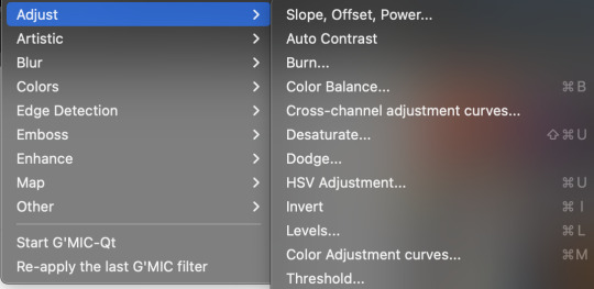
Ok so filters in krita can be a doozy so ill cover the ones i use in my art the most, these will be adjust, artistic, and enhance dropdowns. I will be using my art pieces to show how i modify my art- colourwise!
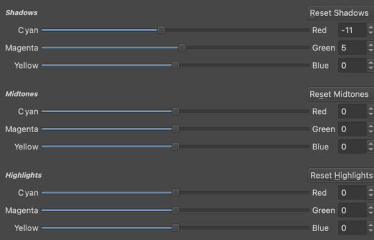
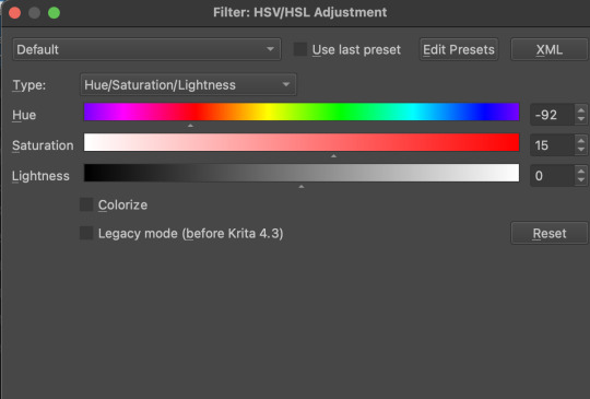
Obviously, start off with opening the filter menu up. Color balance brings you to this menu, where you can play around with the colour of your shadows, your midtones, and higlights. Its a lot of trial and error, just messing around to see what fits, and its how i got to this point. through just pushing the dials up and down. Honestly, a lot of this part of the tutorial is going to be me telling you to hit those dials and levers like you dont know nobody.

Even just small modifications as you can see can play so much of a difference. For here, i upped the cool tones for john, and upped the warm ones for dave. Colour theory without colour theorising i suppose you could say.
Crosschannel adjustment curves can help with contrast and colour intensity. Usually i have one point which i use to move up and down per my whims to control how bright my work is, and it can really help with really bringing out those colours so it doesnt all fall into one hue. Colour adjustment curves works similiarly, play around with them to get the desired effect.

Krita also has HSV adjustment, but i usually use just the hue and saturation. Theyre pretty self explanatory, and can switch up your palette in pretty fun ways.
Now we move on to the ARTISTIC part. Again, i recommend you play around with them yourself, but i find index colours works really well for making really pretty art really fast! You just put in a few colours with descending lightest to darkest and you get an awesome art piece! Id say this is useful for pixel artists, but also useful for other parties. I might just start using this more myself. Its so easy wtf.
AND FINALLY THE MOST IMPORTANT THING.
HOW MY ART IS SO CRUNCHY.
If youve been following me for a while you probably noticed theres a slight crunch to my art. It gives it a slight bit of texture and makes it noticable. How do i do it?


You're welcome.
insert image of face on 90% opacity and comedic text for purpose.
Alternatively, if youre looking for a sbahj level of crunchiness, smack that "mean removal"for some fun.
Thats all! Happy drawing.
142 notes
·
View notes
Text


before & after color challenge
thank you for including me for this challenge @i-got-the-feels, @ryoun, @moonlightsdream 🥰🌻
I love love love this challenge but I don't save psd as much as I should so these are the few I saved. I try to make my sets to be as natural as possible with vibrancy. I also colour everything from scratch so there'll be slight difference depending on the raw vids but I keep the process the same. Starting with curves to slightly brighten, then auto on the levels, play on neutrals and black from selective colours, add some hues and saturation and ending it with some exposure for added vibrancy.
tagging for y'all to show your magic-: @xiaolanhua @khaotungthanawat @jugeullae @ruanbaijie @becomeundone @kateknowsdramas @catronac7 and anyone else who chance upon this and wanna join in the fun!
22 notes
·
View notes
Note
Hi lovely, I adore your gifs. I wondered if you couple share your colouring tips as I can never get my colouring right. Thank you.
hey anon!
that's very sweet of you, ty <3
i'm not sure if there's something specific you're struggling with but tbh my process is pretty basic, im a less is more person and it works for me.
the adjustment layers i utilise the most are below and used when needed sometimes all of them, sometimes not. as always depends on the gif :
curves/exposure/brightness
colour balance channels go thru them all/selective colour channels whichever are needed go thru them all but always blacks/neutrals/hue and saturation/vibrance
gradient maps
levels
channel mixer
i'll link a tutorial here that might help you with some tips and whatever sharpening you use can also make your colouring pop!
honestly, just experiment with each adjustment layer until you get a feel for them and what they do and you'll soon develop your own colouring style. just practice and good luck!
#soph asks#i hope this helps in some way anon#im on mobile so quickly typed what i could remember#im terrible at gif advice honestly i just pray for the best each time i gif#with colouring you never stop learning#im a cool tone gif girlie some people are warm toned#its what you like best#gifmaking advice
8 notes
·
View notes
Note
just wondering, do you think you might be interested in posting graphic tutorials for like promos or headers or icon borders or whatever? all your graphics are so cool!!
hello! and thank you very much! 😊 currently, the only full tutorials i have are these if you find them helpful !
recoloring icons/graphics to add skintone if it's washed out by one color. how to fix fried colors/color match fried effect on psd colorings. simple icon borders. * this is the main formula to all my borders, including the ones in my commission examples; once you're able to get yourself an icon and (if you'd like) blockquotes, you can just slap some pngs around ur icon however you see fit and add your psd and you've got the idea to make your own !
as for a tutorial, i'd have to put some thought into whether or not i could make a full fledged tutorial, since making graphics can be a little more complex than a step-by-step walk through...at least, for me. a lot of it depends on the images i use, the placement of those images && recoloring/balancing colors. it depends on what you're trying to accomplish. however, here are some quick tips i'd personally recommend. i will be referencing photopea tools, as i use photopea.
PSD/COLORING. if you plan to use a psd on your graphic, add it first so you can see your progress as you go forward with your edit. // to add a psd (file>open) // when your psd is open, right click on the psd layer, layer>duplicate into and you'll see 'destination' with a dropdown. select the tab that your edit is taking place in.
even if you don't use a psd, there are several ways you can color match or adjust images if they look out of place. i personally use image>adjustments>selective color because i find it to be a major help; other helpful adjustments are image>adjustments>color balance // image>adjustments>channel mixer // image>adjustments>hue/saturation // image>adjustments>brightness/contrast // image>adjustments>levels // image>adjustment>curves // image>adjustment>exposure. really, just play around with it, psd or no psd—you can always come back to this step if you decide to add more imagery or balance something out later.
SHARPNESS/QUALITY/NOISE FILTERS. adding sharpness to an image can improve the quality of an image; though, it's best to stray from images with too poor of quality. ways to adjust sharpness are filter>sharpen // filter>smart sharpen // filter>unsharp mask. noise && grain filters can also add a sort of 'coverage' to any quality issues && you can do this in two ways. filter>noise>add noise // as is or monochromatic or filter gallery>film grain—lower the intensity or mess with the toggles as you please. you can either do this directly to your image if you're not worried about undoing it, or you can add a layer; if you're only trying to apply the grain layer to one object/png, you can turn that layer into a clipping mask. layer>new>layer, fill your new layer with white or black(or a chosen color, if you wanna experiment) && pick a blending option from the dropdown(it should say normal by default) i usually add a white layer && choose multiply or soft light. make sure to adjust your opacity toggle as you see fit && add noise/film grain as you see fit.
OVERLAY IMAGES/BLENDING. to blend overlay images (this can be texture overlays or simply adding another image), play with the blending options && opacity of your layer like you did with the noise/grain layers. this one you'll have to play with because it all depends on the lighting of your images && whatnot. you can also erase pieces that you don't want in frame if you need. to erase a corner or part in a way that doesn't look too harsh, i'd recommend lowering the hardness of your eraser brush.
TEXT. there are a variety of free fonts out there; here are some sites i use: one. two. three. // to make your text more dynamic, click the 'warp' button at top right, and you'll encounter a popup. you will go to where it says: style && choose from the dropdown (default is set to none). you can just play with the text until you're satisfied. you can also use the blending options on your text, if you so see fit.
additionally, you can duplicate your text layer; under the opacity of your text is a option that says 'fill'. switch the 'fill' to 0% && once you've done that, you can now right click blending options && check 'stroke'. adjust the color and size of your stroke and move the stroke layer around to add dimension(i usually move it back && downwards slightly). you can click your original text layer, right click it, go to blending options and check '3d'. you can change the color && distance && adjust the "darken" toggle to 0%.
PNGS. THESE STROKE && 3D EFFECTS LISTED IN TEXT ALSO WORK ON PNGS TO ADD DEPTH. png/cutout sites i use: one. two.
CLIPPING MASKS. if you want to put an image(lets say a image of a fc you have) inside of a shape(like a heart or circle), you can use clipping masks. you can refer to this tutorial i've made to see how clipping masks work for borders/icons. to get your desired image inside of a shape, right click your image>clipping mask && your image will be within the confines of the layer beneath it—the layer beneath it should be whatever shape/png you have in place.
that's all i can think of on the spot ? hope this helps !
#answered#anonymous#sorry if this is illiterate im very spacey today#* my tutorials.#these are more like tips but bgjhdgehw#free to rb //#btw..no idea if other people do the same exact methods?#since i had to like...figure (most) things out myself#so it may not be traditional methods in some areas ? i really don't know#either way these work for me#re: editing resources
27 notes
·
View notes
Text
gif tutorial
@bakedbakermom requested a tutorial on how i made the gifs in this set, so i've put together a little walkthrough of the process for this gif under the cut!
(disclaimer: this tutorial assumes that you already have basic photoshop/giffing knowledge - i.e. how to make and colour gifs using correction layers, how to use things like layer masks, etc. if you don't, i recommend these tutorials, they're very comprehensive)
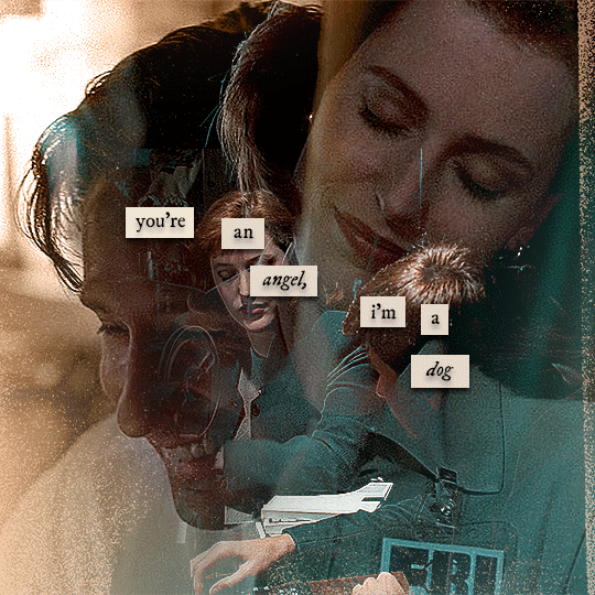
alright! so as stated before, i'm not going to go in-depth here on the basics of gifmaking. for this one in particular, i blended three gifs, but we'll get into the third one later.
(i should also mention that blending gifs as i did here is usually easier if you have scenes with shadowed/dark areas like the ones above, so to keep that in mind when picking your scenes! i also find it easier to use scenes where there isn't a whole ton of movement going on- again, not a requirement but it's easier to plan and position gifs if the characters aren't moving across the whole canvas)
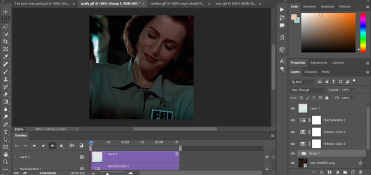
first, i started by making the base gifs of mulder and scully in "paper hearts". both are cropped to 540x540 px, and the same length (around 50 frames). i did some standard sharpening, brightening, and adding contrast (my usual process is curves, a b/w gradient map set to "soft light" at around 20% opacity, and messing with the levels a bit) before using selective colour and hue/saturation layers to highlight the teal and peach colours in the gif. sometimes this is enough colouring on its own, depending on the gif and the look you're going for, but in my case i wanted to add more.
so, on top of my colouring, i used a combination of layers set to "colour" and "hard light" to paint over the background of my gifs in teal and peach. on mulder's gif i also used a gradient fill layer in the two colours set to "colour" and used a layer mask to erase anywhere i didn't want the colour to be. the opacity levels for all of these layers again just depends on how vibrant you want your colours, i just mess with that on a gif-to-gif basis.
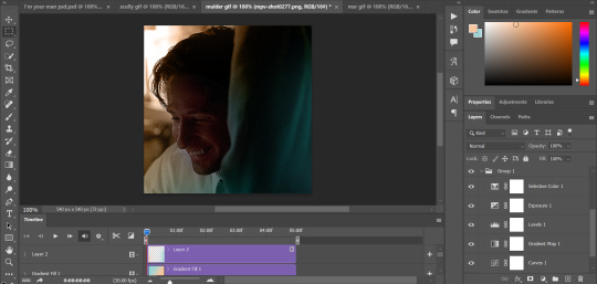
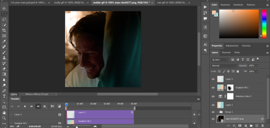
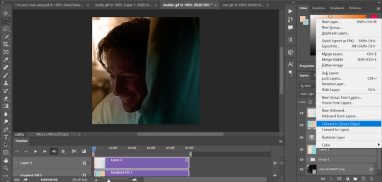
so we have our two gifs, cropped and coloured to fit the palette we want. next, i converted each coloured gif into a smart object, by selecting all my layers, right clicking, and hitting "convert to smart object."
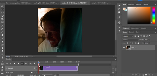
once that's done, you should be able to click and drag one of the gifs onto the other gif's canvas, so that it's sitting on top. then change the blending mode of the top gif- most people use lighten or screen, this again depends on the look you want and the gifs you're using. for this one, i used screen. it'll probably look something like this:
at this point you can move your gifs around and position them as you like. for mine, i just moved scully a little off to the right, as you can see. in order to get rid of the part that's covering mulder's face, i added a layer mask to the scully gif and used a large, soft brush set to black to erase it.
(another note: i didn't need to do it here, but if you want to move/erase parts of your bottom gif, add a layer of solid black underneath both gifs.)
usually i would stop blending here, but for this set i decided to add a third gif, so i made and coloured the gif of mulder and scully holding hands, using the same methods as the first two. this one was cropped to 540x405 px to make it fit better on the canvas, since i knew i only wanted it to cover the bottom part.
i converted it to a smart object and dragged it onto the same canvas as the other two gifs. this time i used "lighten" as my blending mode, positioned it in the bottom right corner, and again used a layer mask to brush away the parts i didn't want.
on top of all three gifs, i then used layers set to "normal" and "hard light" to brush some extra colour onto the gif. this part i also just play around with on a gif-to-gif basis, but for this set i mostly used a combo of colour, hard light, and normal layers at varying opacities until i got the look i was going for. i generally just like to use big soft brushes to add colour around the edges, as i did here.
now, i have a bunch of texture/grain pngs saved on my laptop that i like to add to gifs for some extra flair, so i opened one of those and cropped it down to 540x540px. i then added a gradient map to give it that peach colour. (any textured png/jpg should work fine for this, as long as you have your gradient map set to black and white/your accent colour)
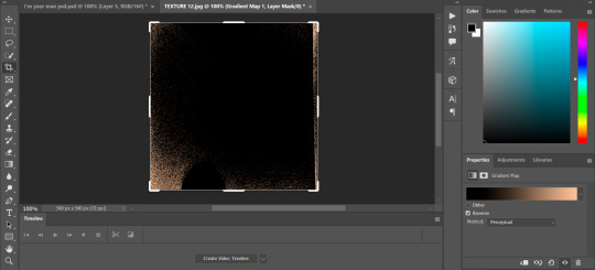
like i did with my gifs, i converted the texture + gradient map to a smart object and dragged it onto the shared canvas. i set the blending mode to "screen", with the opacity at 70%. i like to put these textures underneath the extra colouring i've done on the gif, as seen here. i don't always do this, but i feel like it sometimes helps the texture blend into the finished gif. you can also use a layer mask if needed to erase any unwanted parts of the texture.
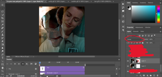
now for the text!
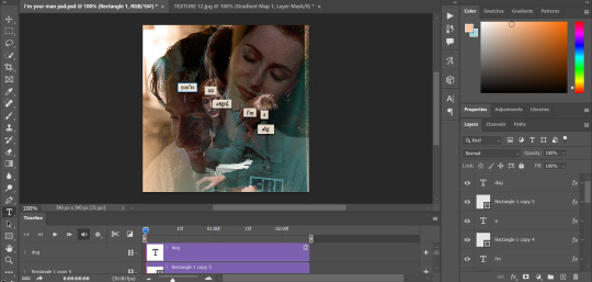
for these gifs i used the font "IM FELL DW Pica" in both regular and italic, in black, at 16px. i didn't do anything fancy with the text itself besides adding a drop shadow in the blending options (right click on the text layer and hit "blending options).
then, underneath the text layer (i was working one word at a time) i used the rectangle tool to draw a small rectangle around the text- i wasn't too picky about the size or evenness since i was going for a collaged look. i set the colour of the rectangle to a light cream colour, and added a drop shadow in the blending options.
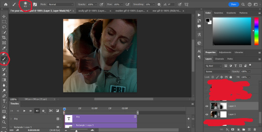
then i just selected both the text and rectangle and duplicated them using ctrl+j, changing the text for each word and adjusting the size of the rectangles as needed. once i had all of the words on my canvas, i just moved them around until i found a positioning i liked. again, since i was going for a purposefully scrapbooked look, i didn't overthink this part.
i exported my gif the way i usually do, with these settings:
and that's it! i used pretty much the same process for all the gifs in this set, give or take. hopefully this little walkthrough made sense, but i know i'm not always the best at explaining my process, so if anything needs clarifying feel free to shoot me an ask or dm!
90 notes
·
View notes
Text


For anyone who's interested in this kinda process stuff, here's a before/after of some GIFs I bashed out. I only started making them like two months ago so it's been a learning process!
I largely follow hayaosmiyazaki's GIF tutorial with a few notes: - I cut the raw videos with Davinci Resolve - I don't use sharpen filters (I personally don't like the way those look on this film) - I start with 4K video (always work with a better raw if you can; fix it in post is bullshit) The adjustments I make are primarily to brighten things up, and I try to maintain the overall proportions on light/dark and various colors. I always tinker with Exposure, Levels, and Brightness/Contrast at a minimum, with Curves, Hue/Saturation, and Selective Color as needed. I'm usually adjusting/desaturating reds, yellows, and sometimes greens if I handle Selective Color, though a lot of color correction can happen with Levels/Curves (the last set being an example). I don't really work with presets on these; I copy/paste the adjustments if I'm making a series from the same scene, but other than that I'm pretty much starting from scratch for each batch (save for actions that speed up some of the repetitive file-setup stuff). Most don't take that long to tinker with so it doesn't bug me, plus I'm often learning new ways to tweak things when I work this way (like tinkering with Selective Color>white to reduce overexposure on outdoor light). I usually try to stay with as much fidelity to the original as possible, but sometimes I will further color correct (like in the last set, the original was much greener and I preferred the warmer result).
8 notes
·
View notes
Text
coloring tutorial - requested by @hiraismomorin ♡
i color from scratch for every single set. i am by no means perfect and can always improve and try new things, but this is my basic progress. i tend to focus on fixing whiteness/paleness first and then adjust colors. when giffing files that aren't pale (i.e. movies, shows, western music, etc.), i don't do as many corrections.
sharpen first! sharpening can (and often will) emphasize highlights and can take nice coloring and make it seem pale. here is my source video upscaled using handbrake and sharpened.

first, i use levels! i use the top eyedropper and select the area i want to have as black - this is generally hair (when the hair is very dark) or the very center of the pupil.

i use curves and exposure next. i normally adjust all four channels (especially when the original lighting is difficult, or for stage gifs) to make a base brightness, contrast, and skin-tone that makes other edits easier. i also try to adjust the tone / shade of black areas to be neutral. exposure can be easily overdone and i rarely go over +.30.


i use brightness and contrast next. i almost always use negative brightness and positive contrast at this time to counterbalance some of the paleness exposure and curves tends to add.

i use hue/saturation to adjust reds and yellows! i try to lower saturation here so it doesn't look too strong when i do my next adjustments, and i try to even out skin-tone (i.e. fixing areas that are noticeably a different shade because of previous adjustments)


i use selective color to adjust the tone of reds, yellows, whites, and blacks. i occasionally adjust neutrals on harder source files. i then do a second selective color to lighten highlights on peaks of the face, the bg, etc. (the previous one added black to the white channel)

generally, this is enough! if i'm not satisfied i do hue/saturations, brightness and contrasts, and color balance until i feel like the coloring is nice! below is the result, exactly as i showed step-by-step.


here are two other colored gifs with more difficult bases! attached in this drive folder are all 3 coloring psds i used over a sharpened frame of each gif.


#m:tutorial#m:coloring#long post#resources#userdoyeons#awekslook#ninitual#useroro#tuserflora#useranusia
34 notes
·
View notes