#its like very rough sketch -> rough sketch -> base colors -> basic shading -> rendering/lineart ??? ?? ? -> touch ups ^_^
Explore tagged Tumblr posts
Visit Tumblr Blog
Explore Tumblr blogs with no restrictions, modern design and the best experience.
Last Seen Tumblr Blogs


Fun Fact
Users from the US are the majority of Tumblr visitors.
Note
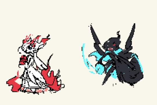
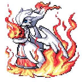
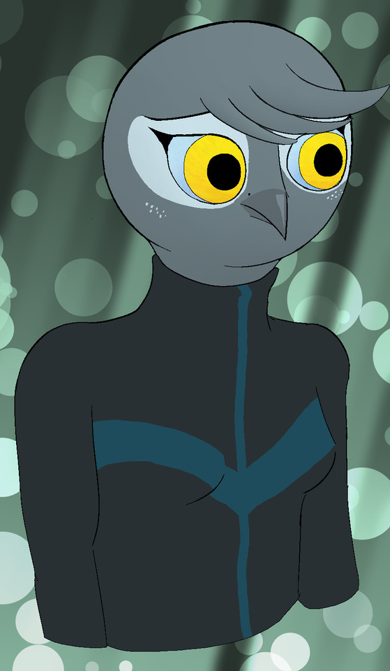
oh my god his beautiful eyebrows and soft nose and those tiny lashes and the sparkles in his eyes and the lighting and shadows on his face and whole body and i wish i could touch his lip with my thumb WAIT HE HAS TWO SETS OF WINGS THISB IS SO PERFECT those vast gorgeousss wings. you are incredible calder. i’m imagining your drawing process and i’m just so grateful for the amount of detail and effort and thought and love you’ve put into this for me 🥲🥲💕💕💕
my thoguhts are all over the place i’m sorry AHAHAHAH
wahhhh ty for all the compliments seriously that means so much to mee 🙁💗💗💗 especially when you point out the stuff i like about the drawing too, cause yay!! someone else thinks it looks good too!!!
#ask#wings are so fun to draw i put the second set there kinda last minute#bigger ones are difficult for me to draw though >_<#my drawing process is a whole mess its hard to put in definitive steps lool#its like very rough sketch -> rough sketch -> base colors -> basic shading -> rendering/lineart ??? ?? ? -> touch ups ^_^#i hate doing line art and cant do it to save my life so i simply decided to remove it entirely from my drawing process lol
2 notes
·
View notes
Note
What's your favorite thing that you've drawn right now? :DDDD
This is actually a super hard one for me! There's a lot of my art that I look back on and think "Well that isn't right" or "That's confusing to look at"
I really do strive to do my best in my art! Seeing as it's something I take pride in, and use any past mistakes I made as a learning experience moving forward! Such as watching out for tangents, knowing when to stop adding to a drawing, how to make a drawing look balanced, how I can make sure the values are clear and concise; Stuff like that!
That being said, there are some drawings I *do* still take pride in! Flaws and all!
I have a few favorites! So I'll show them below and list why for funsies lol!

"One last lie, one last witness."
This one was an absolute DOOZY to make and I'm very fond of it because this was actually me drawing in black and white for the most part! I did I lot of the color blocking and basic shading in black and white with a mixed up color palette, and it was super fun! Not to mention, this drawing really helped me figure out how I like to render, and I often draw in black and white still to this day to check for values!
Im also in love with the style I drew this in and the perspective, even if that wasn't the main focus :3

"(I don't actually have a name for this one I drew it for my fanfictionnn shhhhh)"
(Guys you'd never guess my favorite colors-)
This one you may be thinking looks like a similar case to the top one! But you'd actually be wrong! This one was actually me practicing mood lighting! Kokichi is my muse, if you couldn't tell lol. BUT regarding the mood lighting, I realized before drawing this I never actually practiced shading and lighting to create a specific mood, and while the colors probably don't fit the mood at all i think the shading does a pretty good job of it! Not to mention, this drawing actually solidified my rendering style! I found I actually working best painting over a rough sketch, and thanks to my previously mentioned drawing it was a lot easier for me to block out shadows! My "In the arms of a fallen angel" Kokichi drawing was a similar idea to this one, and is definitely lore refined than this one and executes mood lighting MUCH better. But I learned from THIS drawing to make that one look so good, so I like this one a lot lol.
I also just like the way this one looks, hehe... I think I drew Kokichi really well.

"The Impetus"
This was one of my FIRST times designing a character with a story to tell with its design! And boy, it was r o u g h. I used to communicate a lot of character traits through colors, instead of through design, which actually caused A LOT of issues with me making interesting character designs. So being forced to not only work in black and white, but design a character whose appearance is a direct outcome of the story and choices of the player was a challenge for me! This drawing may be far from perfect, but I learned a lot from it and that's why I'm so fond of it!

"THE ENTIRE MY LITTLE HARMONY LINEUP"
You know how I said I learned a lot about character design from the last one? Yeah, well now TAKE THAT UP A NOTCH
You may be like "But you're creating characters based off already made designs! It can't be that hard-" WRONG! It has been such a challenge designing these guys and putting my brain muscles to work because it's one thing to design a single original character, but designing pony versions of characters I love? THATS A WHOLE OTHER CHALLENGE
Between learning how to draw ponies, which mind you I haven't really EVER drawn before now, but also trying to capture the character INTO A LITERAL P O N Y was a harder challenge than I ever expected. Even as I'm working on it now, I'm looking back on design I made not that long ago and thinking about what I could've done better! Wild Card, for instance, looks to purple and lacks that iconic white and black feeling that suits Kokichi to a T! Avocado Toast may be aesthetically pleasing, but he lacks the same charm Rantaro has! Hazy Light is a pain in my butt and I can't figure out what is wrong with his design, but it doesn't feel like *Shuichi* yet, and eventually I'll figure it out!
This series has not only expanded my character designing abilities, but also helped me get a better feel for the characters I've loved for so many years! Which in turn helps me with designing original characters, believe it or not!
Now I could go on and on with other pieces I've learned from, but I think these are some of the major pieces that helped me improve my art the most! Hence becoming my favorites, hehe. I understand this was probably a bit overkill for this ask, but I just think art is neat in the way that art doesn't have to be GOOD to be a FAVORITE. A piece that looks good is nothing compared to a piece you LEARNED something from, and a piece you put THOUGHT and EFFORT into even if it was tough! That's so much more admirable than a piece that just looks pleasing to the eye.
Thank you for sending the ask anon! I hope you have a lovely day <3
15 notes
·
View notes
Note
I absolutely love the sprites you've been posting! They're so good! Do you have any tips for spriting? I'd like to get better at it, but it's not easy :'D
Thank you so much! and oh my god im so sorry for how long this took me to get to Truthfully infinite fusion helped a lot to get me into it myself haha. Not because of anything about the concept, but because it eased me into it with editing existing sprites. That way you don't have to do a lot at the start yourself yet, but you DO have to really look at how the shading is constructed to edit things together. Maybe hand draw a new leg or alter the expression a bit- again, not a ton of work, but it'll force you to deconstruct how the sprite was made to match the style!
That is probably THE best tip I can give to anyone. Find a (preferably somewhat simplistic- video game sprites r great here) style you like, and start off by working in that. Simple edits etc arent a big bang beginning, but theyre great for learning the basics.
Now for random tips I can have. Be mindful, these are just how I personally work ! Genuinely there are so many different styles and ways of working with pixel art as with any medium- you can break any rule and still have things come out amazing!
Dont worry as much about having distinct sketch/lineart/colors/shading phases. Technically you can work this way? But I find it makes me focus too much on how each individual phase looks when most of the time (at least for me) a sprite doesnt pull together until the very end. it WILL look slightly mad until then its simply part of the process. I tend to put a rough base with some beginning colors and then simply refine from there. wips vs finished attached below for visuals
Also, careful with stuff like dithering! It can be very fun , and some styles have a ton of it which works fine and can look good! But from what I can see at least in the IF disxord a lot of ppl will slap it on anytime anywhere at the start which makes things look... messy. I personally mostly use it for fabrics. (Also, get a dithering brush. Love yourself, dont do that by hand, especially on bigger sprites)
Limit your colors! This is a general tip and not tehcnically that important, but I find it really helps me.
I tend to stick to 3/4 shades per color max. Some of the darkest shades of a color can also be the lightest parts of the outline for that color! Pic below I used the browns not just for the hair, but also for the gold shading and for the darker parts of the skin. It just helps pull a pallete together easier when youre reusing it where you can.

Dont be afraid of using the outlines color to shade with either for dark shades btw ! It is fun it is fresh

Only real warning for outlines Ive got is to be careful of jaggies. Like the upper line reads 'smoother' then the lower one because the longer pixels all follow eachother gradually. Jaggies can be useful especially in folds and whatnot, but when something is supposed to look smooth or round- no jaggies usually show!
12 notes
·
View notes
Note
Better art ask: What Brushes do you use?
uhhhhh oh fuck
well mostly i use csp and custom brushes from the asset store. for details and jewelry and blood splatters and more i kinda just go ham with a bunch of them. but as for brushes i use all the time unfortunately some arent available anymore :( but sure i'll show them
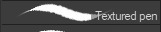
most lines i actually use this brush:
its more of a pencil but was in fact designed for lines. at a small size and on a large canvas you dont notice the texture that much it just gives it a lil smth smth. outside that i also use what im pretty sure is the default textured pen bc i just like my lines with a bit of texture.
for sketching i will use the standard colored pencil default brush

to get the basic shapes as it is pretty light to start off with and i dont want anything too detailed, before i move into
uhhhh this one i also can't find. i know its kind of a graffiti style marker supposedly (at least based on what i can read of the name tho i am illiterate rn given i am abt to pass out)
onto coloring--i will fill in colors with a standard hard-round/g-pen or the textured pen depending on what im coloring. and as for shading it is almost always

before fully moving to csp despite liking pretty much all of it more i struggled with coloring as i was deeply attached to the watercolor tool in csp. i tried and tried over and over to find a brush that worked the same and finally found one which was close enough. over the years i have tweaked it here and there. but when people say "i love your rendering!" it is almost always this bad boy doing most of the heavy lifting.

bad example but it can do hard or soft edges depending on the pressure. its soft, kinda transparent, and easy to control (for me anyways). you can also drag the colors around when blending which is helpful because i also use this to like. erase and redefine shadows too. i would link you but uhhhh i think i found this brush in. 2018-2019???? and i havent found it or the others mentioned unfortunately. problems that come with people deleting or privating brushes and also dling a bunch of them but i might have also changed it so much its not really the same thing anymore LMAO
also honorary mention for the standard round airbrush for gradients and to get very rough shading and form down. and also i will use the standard default colored pencil brush for highlights sometimes on skin or shiny fabric because i feel like it looks???? more realistic???? cause skin and fabric has texture. yknow.
if you guys find any of these feel free to link them bc i havent had any luck even googling the name or digging around my downloads history
4 notes
·
View notes
Note
Hope you don't mind me asking, but how do you do your shading in your art???? it looks gorgeous🥺
I don’t mind at all! I’m actually really flattered! Thank you so much for the compliment! ^.^
My shading style is, admittedly, a bit all over the place, but I’ll try to explain as best as I can!
For almost all of my shading I use a rough pencil brush expanded to a large size. It’s actually the same brush I use to sketch! (Although it’s much smaller when I sketch compared to when I shade)
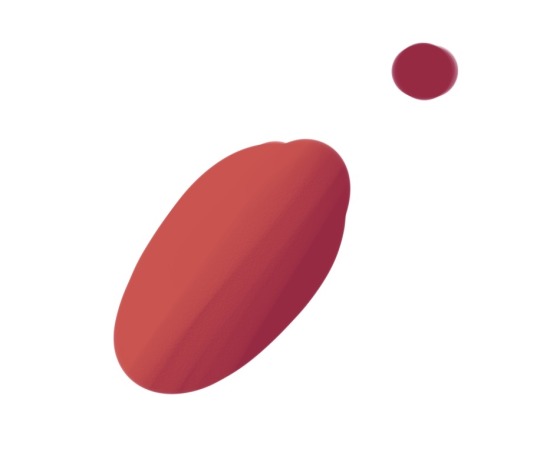
On its own, it looks like this.
When it comes to actually shading, I usually do it in steps like this

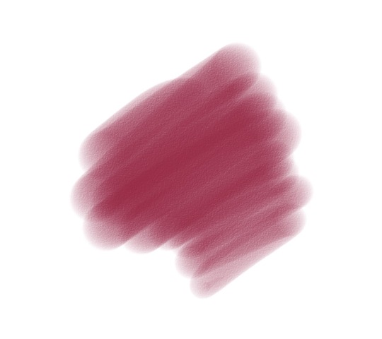
So first you have your base color, right? For my example I’ll use a nice, soft red. (Color in the top right)
Then, I basically take that color and make it both darker and slide it closer to blue on the color wheel, making it look a bit closer to purple.

Then, I basically repeat the previous step, covering a smaller area where the shadows would be strongest. This step is optional, but I feel like it adds a lot of depth!

Finally, I go back to the original base color and make it both lighter and closer to yellow on the color wheel, which is why the color is more orange than red now.
To brush itself is actually really good for blending, although I usually also use the brush as a soft eraser to make the transition between the colors a lot less harsh. To do this I very softly erase the area where the dark color meets the lighter, again using the original brush as an eraser so it isn’t as harsh. A blending tool also works, but I like the texture this technique give it.

Some examples in my art (below):

This is a really recent one I’ve done. Basically I only do step 1 in this drawing and very minimal blending (you can see this mostly in the left arm and hair. The rest is a lot harsher.)

This one goes through almost all the steps, except for the darker shading layer. While the texture is still obvious, I still slightly erased the shadows as it gets closer to where the light hits it to make it blend a bit smoother. However, in some areas (like the fur hoodie), I don’t do any blending at all to give it even more texture. I also usually do this with highlights to give something an extra shine (like with the highlights on the hair).

Texture is VERY prominent in this one, especially with the hair. I actually use pink highlights in the hair instead of a light grey to make it pop even more, and you can see these pink highlights more subtly on the clothes as well, albeit blended a bit more. I also tend to blend less when it comes to wrinkles in clothing.
A shortcut I like to use occasionally is to only use rim-lighting, where you place only a few highlights where the light hits, and that’s it!

(This image has a slight texture overlay, where I simply used one of my heavily textured brushes and went wild over the entire thing before lowering the opacity. I don’t do it all the time, but it just looks so nice!)
So yeah! That’s basically my process! I’m not the best at explaining things, but hopefully this was helpful! Thanks again for the ask, it makes me really happy that you like my art!
#myasks#anon ask#not sure what else to tag this as lol#tutorial?#maybe???????#idk I’m afraid to tag it as that lol
3 notes
·
View notes
Photo
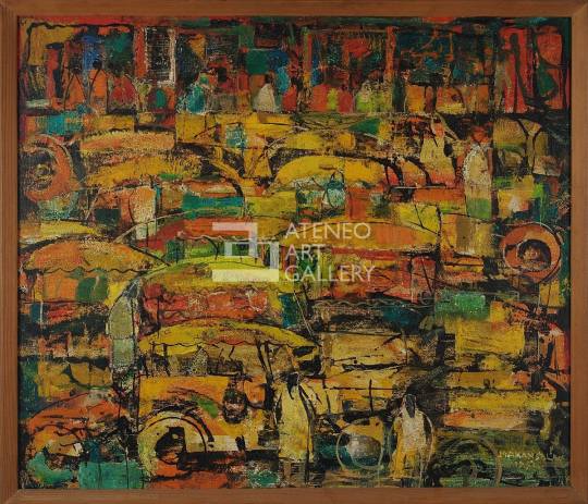
Jeepneys by Manansala 1951 Enamel on fiberboard 51 cm x 59 cm
Born on January 22, 1910 in Macabebe, Pampanga, Vincente Silva Manansala is an acclaimed Filipino painter and artist. In his youth, he considered his hobbies, kite-making and creating charcoal sketches on paper, as fun, temporary escapes from his labor-intensive jobs of being a newsboy and shoe shiner in Intramuros. At the age of 15, he found that his inclination to the arts brought him under the mentorship of Ramon Peralta to learn the fundamentals of painting at a sign and poster shop. A year after, he enrolled at the University of the Philippines School of Fine Arts. When he graduated in 1930, not only was he able to master the basics of oil-painting, but he was also able to merit a great deal of financial aid, scholarships, and grants from art establishments around the world due to the artistic prowess and prodigious creativity he displayed during his stay in the institution. Later in his career, he received multiple awards and held positions in esteemed local and international art establishments.
The education and training he took up in countries like France, Canada, the United States of America, and Germany, was reflected in his approach to his artworks, which were obviously products of international influence. It was refreshing in the local art scene at that time, which drew in a massive audience for his exhibits. Rapidly gaining popularity, Vicente’s eccentric aesthetic made him a pioneer of modernism of the arts in the Philippines. His style could be referred to as “transparent cubism,” which involves scattered facets of varying hues across the painting. His paintings created lasting impact to their audience, as his technique seamlessly blended geometry with expressionism, calculation with spontaneity. His genius as an artist transcends beyond his technical innovation, as the subject matter in his paintings, centered on the post-war urban experience, spoke to a new Filipino audience. The end of World War II sparked a type of social awareness that Vicente tastefully incorporated into his artistry. As he took inspiration from his immediate surroundings, Vicente’s paintings revolved around the life of the commoner. He took everyday scenes, objects, and places, like family gatherings, cockfights, native delicacies, the slums in the urbanized areas of the country, religious figures, and painted them in his slightly more westernized fashion that somehow made them iconically Filipino (Paras-Perez, 1980).
Jeepneys is the title given by Vincente to his work. Based on the title, and the painting itself, the image he intended to create was the daily traffic congestion in the metropolis. Given that the jeepney is one of the most affordable means of transportation readily available to the masses, Vicente probably wanted to cement the theme of daily Filipino encounters as the core of his collection. This work was made in 1951, just six years after the war ended. It is known that jeepneys quickly surfaced as a makeshift, creative way in an effort to re-establish inexpensive public transportation, much of which had been destroyed during World War II. This was done by repurposing and decorating the surplus jeeps from American troops in order for it to be suitable to accommodate several passengers and look visually appealing, colorful, and eye-catching as it traveled on the road (Platino, 2014). The popularity and the history of the jeepney during that time may have also prompted Manansala to create this artwork. The painting is currently displayed in the Ateneo Art Gallery as a gift from Fernando Zobel.
Jeepneys is a painting done on a fiberboard using enamel. A wash of white and bright yellow was laid down first, before hasty, daubs of other colors in varying saturations, like orange, red, and brown were applied. The use of enamel on fiberboard allowed for the different-colored strokes to be semi-translucent and glassy without the need for tedious modification of the paint, permitting the yellow hue to penetrate through the secondary layer of pigments. This mimicked a filter of warmth throughout the piece and brought about a more cohesive color palette. The presence of the different colors also distinguish one entity in the painting from another, allowing for clarity of scenery despite the expressive style employed by Manansala. This clarity is also achieved through the use of actual, irregular, black lines that serve as outlines of the subjects in the painting. The inconsistency and coarseness of these lines give a sense of spontaneity to the piece. On top of these outlines, smudges of warm blues were added as accent colors to impart variety against the otherwise unified, chromatic value scale of only varying shades of red and yellow; this makes the painting more interesting and more captivating of the attention of its viewers. Slivers of white highlights also creep through the painting.
With the guidance of the chromatic value and the black outlines in the painting, I can identify many jeepneys and people as subjects, which makes me infer that the setting is an urbanized area, like Metro Manila. In the upper portion of the painting, I can see even more people, lined up, probably waiting for a ride to get where they want to be. I deduce that these are common Filipinos, patiently queuing for transportation to get home from work. The reds and yellows make me believe that it is sunset, or time for people to return to their homes after a day at their jobs. The primary colors of the painting may also signify the colors of the Philippine flag, in order to place emphasis on the Filipino origins of the jeepney, and on just how routine the scenario depicted in the painting is in the country.
Unlike the vast majority of Manansala’s works, this particular painting of his makes use of more organic shapes than geometric ones, a hallmark of his signature “transparent cubism” style. Similar to his other paintings, this painting is composed of superfluous shapes of different colors that contribute to an overall puzzle-like look. The distribution of these shapes and visual weight is more or less uniform across the entire work, which makes the painting balanced. The irregularity of the shapes, formed by both colors and lines, also evoke a touch of movement and life to the whole piece to be perceived by the viewer. There is also very minimal negative space in the painting; the fiberboard is saturated with different objects and characters. This gives the piece an disorganized rhythm which almost makes the conveyed scene feel chaotic to the viewer. The seemingly rough texture of the painting, probably achieved through the use of a fiberboard with grooves and indentations as its canvas, gives the painting a rustic, undone edge. There is also an absence of a defined vanishing point in the painting, which makes the elements appear very packed and arranged in a collage-like manner.
In my opinion, all of these elements reinforce the mayhem and frenzy of the traffic scene in the painting. Manila is known for its notorious traffic; streets are rarely peaceful in the midst of the relentless honking of vehicles, the reckless attempts of drivers to beat a red light, and the rowdy crowds of people on the street desperately trying to find a good deal or any sort of transportation to get where they need to be. The dynamism and movement in this painting, that I was able to immerse myself in, was successful in transporting me into the legendary Manila traffic. Given that this painting was made just a few years after the end of World War II, the Philippines was eager to rebuild its economy that had suffered tremendously during the war. This could have led to more Filipinos joining the workforce, and the subsequent increase in the number of people that had to be on the road to earn a living. The work of Manansala, Jeepneys, through its elements and composition, has successfully communicated the essence of a bustling city, brimming with vitality just as it is with madness.
I have utmost respect for Filipino artists like Vincente Manansala, who use their acquired techniques from other parts of the world to help in the progress and development of their own country. Jeepneys, along with Manansala’s other paintings and illustrations, is a carving etched on the history of art in the Philippines, as he spearheaded the rise of modernism in the local field of art. Other artists like Mauro Malang Santos, Antonio Austria, Angelito Antonio, and Mario Parial have been inspired to experiment with their own distinct, unconventional styles in painting because of the contributions of Manansala. His artistry birthed a new generation of artists that embraced their personal aesthetics. Beyond his mastery of art, I commend him for the common thread of daily, purportedly hackneyed conventions in the lives of everyday Filipinos that is firmly woven throughout his series of paintings. He shows that the average Filipino is worth creating art for. An image of the traffic-bombarded roads of the city are just as enthralling as extravagant portraits of doñas and dons, paintings of picturesque views that only the upper class can afford to see in a lifetime, and illustrations of glamorous novelties. I believe that in a way, Manansala’s work was able to open the once inclusive, intimidating realm of art to other people who resonate with his work that captures the unfeigned, honest heart of the Filipino.
To me, this painting does not necessarily pass the classic standards of rhythm, harmony, balance, and proportion, as it does in fact look disarrayed at first glance, especially when I consider that Manansala did in fact intend for this painting to represent a scene of jeepneys. It might even be difficult for some to make sense of the painting at first. In spite of this, I cannot help but be in awe when I look at this painting, maybe because a sight that I am so familiar with, has been transformed into a expressive impasto of color, with details that take my gaze from one impressive fragment to another. The more I look at the painting, the more things I am able to find that make the work even more fascinating. I do find significant cultural value in this painting as well. The use of primary colors keeps the painting grounded in its Filipino roots, and it also allows for a more graphic projection that the jeepney is a mode of transportation unique to the Philippines. Its history of it being a product of Filipinos’ resourcefulness and resilience after the war makes it a cultural staple in the country. There is a deep heritage and origin to something deceivingly simple like a humble jeepney, like there is a hidden complexity and masked grandeur and to the everyday, seemingly mundane, themes of Manansala’s works.
References:
Paras-Perez, R. (1980). Manansala. PLC Publications.
Platino, M. (2014). Philippine jeepney: World War II surplus vehicle that became a cultural icon. Retrieved from https://globalvoices.org/2014/04/20/philippine-jeepney-world-war-ii-surplus-vehicle-that-became-a-cultural-icon/
3 notes
·
View notes
Note
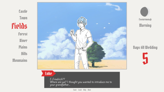
What is your process working on art for Ghosts? How do you choose which scenes to draw, and how do you go about capturing that essence when you’re drawing? I love your art and I look forward to seeing every doodle and full piece each chapter :’)
ayyy fun art skills question
okay sO. here’s a cut because there’s gonna be a lot of screenshots probably.
edit: hey tumblr why did you eat my cut--
so for choosing scenes: well i’ve got a hard rule that there’s one for every flashback, because consistency is a good thing, and as a result of that i actually have a whole file that’s JUST concept sketches for flashback pictures, but i’ll get into concepts in a second here. Other art for chapter is largely just me looking for striking visuals; moments we have planned in the chapter that i feel would translate well to art, and which i could enhance the weight of with an image, or failing a good moment sometimes as with this past chapter i’ll go for something a little more abstract to capture a general vibe of the chapter. The picture of astrid w/ trent behind her, with her in his shadow looking dangerous--A lot of the tension in Ghosts is gonna come from that; from the ambiguity on where Astrid stands in all this and what she’ll do if/when she learns certain things, etc etc
anyway though! that’s how to choose things; the next step is for me to do some sketches until i hit on a concept/composition that i like. These sketches are sometimes very small at first, because thumbnails are a great way to get composition down without worrying too much about the details, and when i do that they look like this:
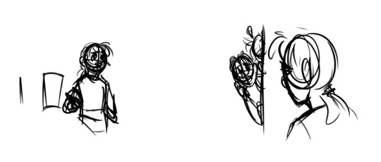
(Both of these were attempts at the art for chapter 6′s flashback; the one on the left was scrapped, and the one on the right i ended up using!)
Sometimes i don’t go small at first though, it varies. Sometimes I get a sketch I like on the first try, too, but other times it takes a LOT of tries--chapter 5′s went through three attempts before I got one I liked; and these were also all drawn before the actual flashback was written!
here was attempt 1:
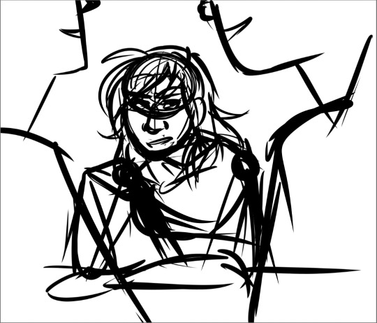
which has an ok composition for the basic theme of “the boys are being romantic and astrid is being an annoying little sister about it”, but i wasn’t in love with it, plus it broke a rule that i’ve been using for the art that i can’t explain without spoiling some stuff but trust me it just doesn’t work.
then we came up with the idea of the kids specifically hanging out at soltryce around this dried up fountain hidden behind some bushes, and that worked out better for this scene; the first attempt at it looked like this
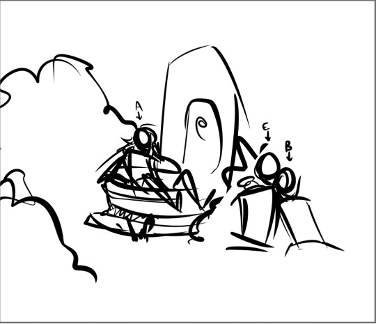
which was getting there but still not really interesting composition...and then, hey, third time’s the charm
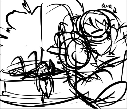
im just gonna keep using this picture as the example because its absolutely one of my favorites i’ve done. but anyway
from this stage then i copy the whole sketch and move it onto its own file, and i collect whatever reference photos or palettes i need and start cleaning up the sketch a bit so i can lay down base colors!
...i apparently dont have the rough flat colors for this image anymore, oops, but i can at least give you an idea of what those would’ve looked like and what a somewhat cleaned up sketch looks like!
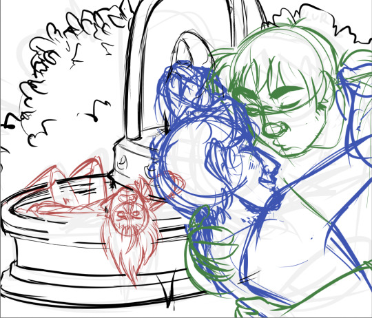
(i always sketch astrid in red, bren/caleb in blue, and eodwulf in green at this stage; it helps make it easier as my sketches get more complicated to determine where one person starts and another ends)
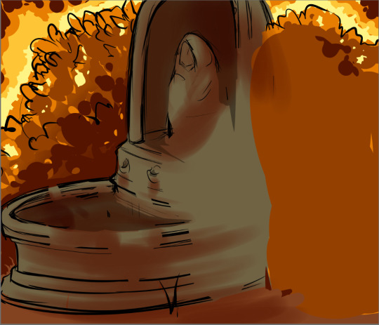
and then this first pass of flat colors is 100% purely to determine if i like the composition still when it’s colored, how the lighting/shading works, if the characters look like they really are in the background, if the mood is conveyed through the color scheme chosen, etc. it’s not supposed to be neat or look at all polished yet, in fact a lot of the time this stage can be REALLY sloppy. this is purely just making sure the overall feel is what i want
and from there every other step is basically just cleanup and tweaking! like, lineart and everything else are technically a lot more complicated than that, but i mean, the hard part of conveying the mood and getting the composition down are done and the rest is usually pretty smooth sailing, aside from the occasional hiccup of “why wont you LOOK RIGHT” and spending hours looking for more references,
anyway thats how the art happens! :D
the whole time, also, ed @tactfulgrimalkin is getting spammed with wips. just. so many.
17 notes
·
View notes
Note
How did you make those drawing that mimic the dragon age tarot card look?
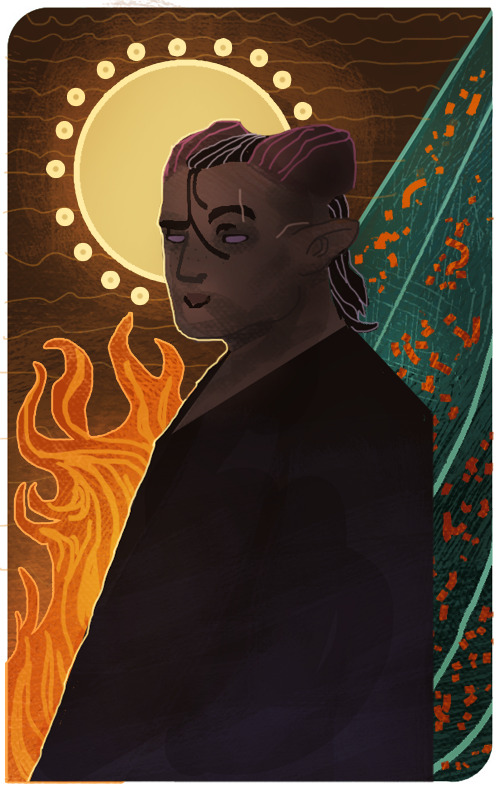
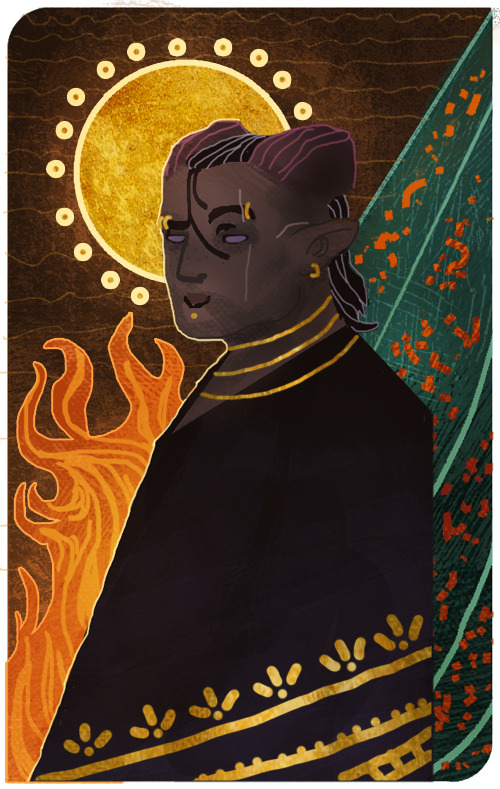
I’m sorry that it took me this long to reply, anon! There were some complications and illness that kept me away for a bit, but better late than never! I assume the drawing you’re referring to is the experimental card I made of my Inquisitor 4 years back?
It’s been a while since I worked on it, but I tried to dig up the old psd file to go through the layers and see what steps I made. The drawing itself was highly experimental, as I was completely new when it came to trying my hand at the DA:I card style. For the most part I decided to make the character and his anatomy very simplified, and rather focus on putting the details in the shading and background.
Let me show an example of what my drawing looks like without the added textures and extra overlay soft brush shading:
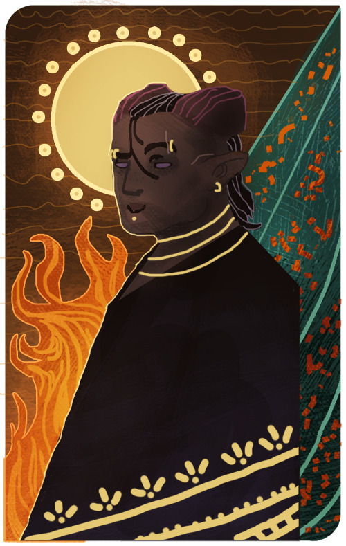
And here is the same drawing where the textures and shading are added:

But if there is one thing I’ve learned from both my own attempts and other artists, is that textures can sometimes make a very huge difference when it comes to that final touch. Whenever it’s from digital brushes or images that you’ve gathered. It’s no question that most of the work with these paintings lies in the drawing itself, but adding those final textures can really give it that ultimate DA:I card feel you’re looking for.
I’m not really experienced enough to give proper advice or tips on how to make these drawings, but for now, all I can recommend is studying the DA:I cards themselves, take inspiration from other artists, tarot cards in general, or patterns/paintings that can inspire what to use for the backgrounds. Another thing I personally like to recommend, is staying away from too much realism or overblending the image. The more the textures and those rough brush strokes are apparent, the more it adds to it. Keep it simplified, while the more detailed/realism stuff is kept to a minimum in comparison. But once again, this is my personal taste, and not the ultimate way to do this.
However, something I can add to my reply, is showing you guys a very quick, basic and simple way on how I generally go on with these paintings and how I add image textures. Please, rather look at these tips as suggestions on how to do it, as there are plenty of other and simpler ways to go about it. But since this will be a very long post filled with images, I’m gonna keep it under a cut, so that anyone interested can check it out there! Also keep in mind that I’m using Photoshop CS5 on an iMac for this.
First of all, I will apologize to everyone for the extreme low art quality, as I only have my computer mouse to draw with for this. Not to mention the extreme lack of balanced values that makes this more chaotic than it should. Make sure to always keep values in mind with these things, folks!
Anyways, I always start by making the drawing itself. Most of the work and style are put into this part of the process, as the image textures will just be extra flavoring.
Now let’s say that we want to add some fancy gold details to this drawing. We’ll be doing so by making a new layer over the drawing itself, then use a basic round brush to draw the shapes we want to be textured with gold. Wherever you choose to make something more detailed, or just make simple shapes with a single color, is all up to you.
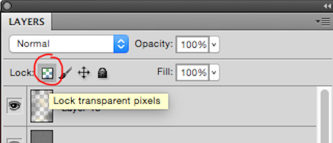
Now I’ll be locking the layer by clicking the icon shown in the image below. It’s usually found over the layers, and make sure to keep the layer with the new shapes activated when you click it.
This will now make us able to draw on the shapes without going outside of them, so let’s use this to add some simple shading based on gold in general. This will add a bit extra once we apply the texture itself in the end. (References are your best friend here!) Also be aware that the colors you choose on these shapes will affect the end results once they are merged with the texture image. Here’s how it looks like after I’ve added some simple shading with a brush.

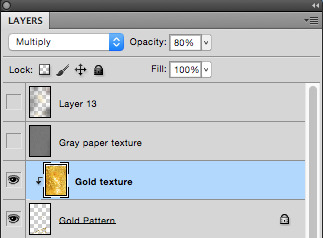
Now it’s time to add the extra gold texture itself. We’ll be doing so by first digging up your preferred gold texture image that you can either place or copy/paste into the psd file. Make sure the image is on a layer above the shapes we just added. Once that is done, we will right click on the layer with the image, and choose the option ‘Create Clipping Mask’

Now it should only be covering the shapes drawn in the layer below it. So now we can mess around with the image layer until it gives you a look you’re satisfied with. It’s mostly common to put the layer on Multiply or overlay, but try to experiment to see what you prefer. Also play around with the opacity of the layer, too! In this case, I set the layer to multiply and the opacity to 80%. I also adjusted the colors on the shape and the texture itself until I was satisfied.

I also added a gold texture to the circle in the background by doing the exact same thing. Make a layer with the shape, add the gold texture image in a layer above it, right click it and choose ‘Create Clipping Mask’. Then adjust to your heart’s content. This layer is set to multiply with 100% opacity. Colors were adjusted until I was pleased with the results.

And this is basically how I add textures to my art in general. Sometimes the Clipping Mask isn’t even needed if you want to cover the whole drawing itself with it. However, another thing you can do to add a texture over a painting, is having the image on its own layer over the drawing, but instead of setting the texture layer to Clipping Mask, you add a Layer Mask by having the layer itself chosen, then clicking the icon shown in the image below.

The texture layer should now have a white page next to it that looks like this.

This layer will now only let you draw on it with either black or white. Basically what this means, is if you draw on the layer with black, it will “erase” the texture, so that you can draw on the spots where you don’t want the texture to show on the painting. If you want to bring the texture back, all you have to do is draw over the black again with white, and it will appear.
I added a final grunge texture to the background, using the same method as we did with the gold, but simply skipping the Clipping Mask part. Instead I added a Layer Mask and drew over it with black, so that the texture would only show on the brown colored part of the background.
As a final touch, I added one more texture to cover up the whole image. It’s the same gray paper texture that I made and use for all my sketches or paintings in general. It can be found and downloaded here.The gray paper texture was set to overlay, and I darkened its values, as it tends to brighten up the drawing a bit too much when set to overlay.I also added a final layer on top of it all, setting it to overlay, and then draw with a soft brush to add some extra highlights and shadows to give it that final touch. Highlights were drawn with a very light/pale yellow, while the shadows were drawn with more dark brown tones. All in all, I used colors to match the ones used in the drawing.After all of that, this is how it finally looks.

Now this last step is completely optional, but I’ll add it to this post, in case some people will find it useful. One final step you can do to give the painting that extra crisp, is to add Unsharp Mask.First you need to save the drawing as a png file, and then open that file, so that all the layers are merged into one image. From here, we will click on Filter, among the tabs found at the very top of the program. From there we will find and choose Sharpen, then Unsharp Mask. Here’s an image to make it more clearer.
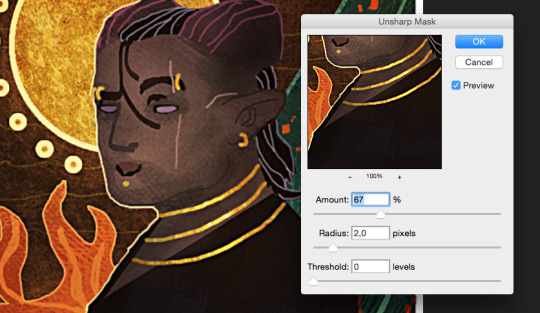
When you click Unsharp Mask, a little window will pop up, letting you adjust on three different sliders. Treshold will be on 0 levels, Radius will be on 2,0 pixels, while Amount is where we can adjust the slider to our liking. Usually it’s enough to keep it somewhere between 60-80%, but experiment and see what you prefer. Once you are done, click OK, and the changes will be added. Make sure to check the box next to Preview, to see what the changes look like before you click OK. When you resize the image to make it smaller, the unsharp mask effect can look pretty neat!
Aaaand one more optional final touch that we can add, is something called the Grain Texture. However, there is already a very great tutorial made that explains easily how to add it, so I’ll link to it here!
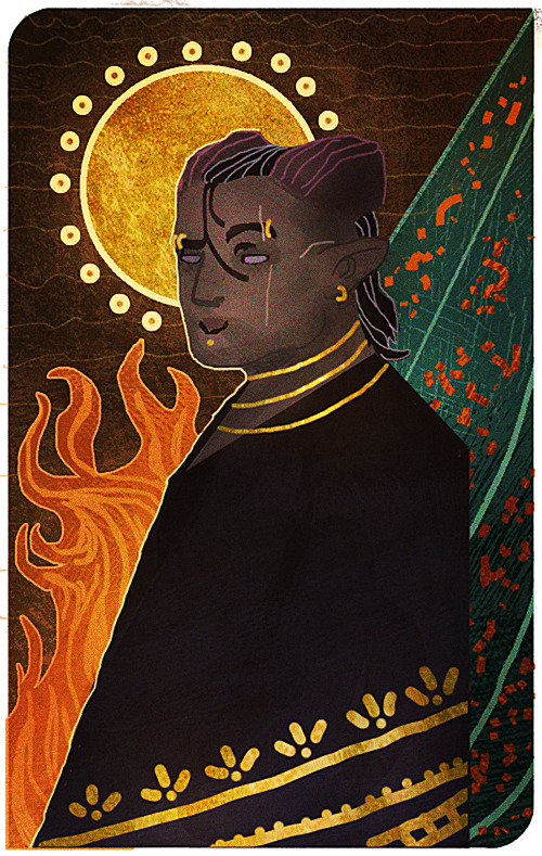
And FINALLY. After all these walls of texts and images, this is what the end results look like.
I apologize if my way of explaining these things is confusing and pretty bad. It’s always been a weakness of mine, so if any of you have any questions, don’t hesitate to ask! I’ll try to answer as good as I can.Other than that, I hope this is somewhat helpful to some of you. This is basically how I do things in most cases when I make art.I’m not sure how much this helped to answer your question, Anon, but hopefully it shed some light on some of it! If not, I can always try to make another tutorial some other time, once my health allows me the extra time.
Thank you so much for reading, and good luck with your art!
#Anonymous#Mieran replies#Tutorial#Long post#Anon#Ask#I'm sorry for the long post#And sorry if this whole thing is messy xD#I tried my best
32 notes
·
View notes
Text
Sans Tutorial?
Last year someone sent an ask for a tutorial about how I draw Sans, but I have been pretty busy and not gotten around to making it! I don’t know how helpful this will be, because it turns out my technique is basically:
1. draw a circle
2. draw the rest of the skeleton
But anyway, I’ll post the steps for this picture here :3
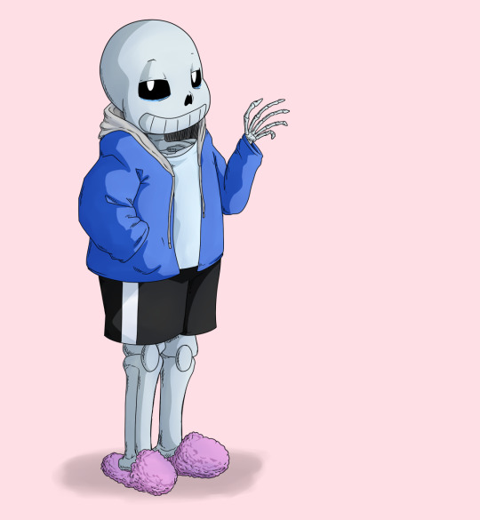
I have picked up some good tips from tutorials but I don’t use them very much because some are too basic, some are too advanced, some are written too proscriptively, and usually the example art looks way better than what I’m doing if I follow along. So my tips may be a mix of too-obvious and not-adequately-explained, but perhaps a few beginner or intermediate level artists will find something useful here :3 I will assume you know what layers are and have software that can do layers. I use Paint Tool SAI, which is pretty affordable, and there are other programs that are free.
First I draw a circle where I want the skull to be. I don’t necessarily stick with this circle as I continue sketching. And one of the advantages of drawing digitally is that I can move parts around if it’s not working. If I’m planning out a complex picture, Sans will be a circle with two more circles for eyes and a vague cylinder/blob as a body, at first.
Then sketch in more detail. Fingers are important, and I often have to go back and refine the sketch of the hands in the middle of doing the lineart.
There are many different and valid styles for drawing Sans. I always draw his eyes as this sort of arch-like shape, like a half circle that’s stretched out vertically. Even if they’re half-lidded, I start with the whole eye shape (and if they’re half closed they tend to end up pretty rectangular).
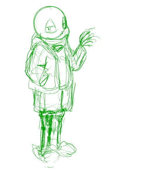
In this picture, I made his legs too short, then too long, and you can see some artifacts of how they got moved around and adjusted. (I pretty much never draw him just standing there in full-body, I guess owo) It’s much easier to adjust things in a sketch than after it’s been lined, so take your time. If I wasn’t feeling confident, or if I wanted to make the linework easier, or if I wanted someone to approve the picture before I did lines, I would do another, more-refined sketch on top of this one. But I’ve been drawing a lot of Sanses over the past few years so I didn’t :3 I do have a brush for sketches that is not totally opaque.
(Beginner tip: If you’re using a serious art program, you can reduce the opacity of the sketch layer and draw the next sketch in a new layer on top. This is how you’ll do the linework too. I also put Sans’s legs on a separate layer when I was adjusting them in this pic. This is also a good time to adjust the framing of the picture; I usually drew it too small and off-center. This pic is a bit off-center because I thought I might add text on the right side about the steps. But then I didn’t.)
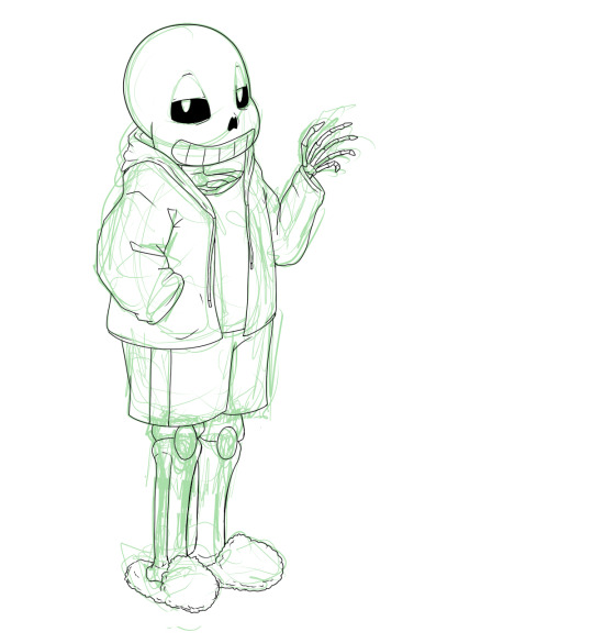
Next is lines. In Paint Tool SAI, I can have multiple layers in a folder and select the whole folder as “selection source” (so I can fill in the colors later). This makes it easy to use a Lineart layer for the smooth curve of Sans’s skull, and a regular Raster layer for the rest of the lines. Of course, make sure the line width is similar. (Being able to choose a selection source other than “current layer” or “whole image” is one of the advantages of SAI in my experience.)
I used thin lines here. I don’t always, but sometimes I try to use thin lines and add plenty of detail and I’m pretty pleased with it. (Often if I want to save some energy I use thicker, rough-textured lines, so that you won’t be able to tell so much where I got the curve of the skull wrong and then adjusted it.) When I first started drawing Sans, I gave him too many teeth. Then I overcompensated and gave him too few teeth. Now I’ve settled on about this many teeth. I like to draw bony, skeletal hands. For any bones, Google image search is your friend. You don’t need to know the proper name of the bone; just search for the body area + bones. I usually draw the nose hole a bit more simplified. I don’t always bother with the drawstring. Sometimes I give him a turtleneck sweater so I don’t have to draw a glimpse of collarbone, ribs, spine inside his shirt. Idk why his tibiae are so thick today owo

Flat colors and cel shading. I like to put a bright color that contrasts with the colors I’m using in the background, so I can easily see corners that got missed by the fill tool. Usually, I do multiple layers of the base colors, so that I won’t have to worry about the edges when shading. (All the color layers are collected in a folder. Not the bg though; if it’s complex it will have its own folder.) Here, I used a shading layer for each base color layer (the shading layer is a clipping layer, so the shade color won’t be visible unless it’s overlapping its correct base color). I don’t like to be organized and label my layers, so I do the shading right after the base color, while I still remember what layer it’s on :3 You can also do the flat colors on one layer (or just in one folder) and then put a multiply or shading layer as a clipping layer over that for the shading (many fewer layers to deal with but you must pay more attention to the staying inside the lines). Aside from the sketches, I still haven’t used any brush other than the default pen. You can of course use more layers and more colors for fancier cel shading. I have used a few extra darker shades on Sans’s neck.

More shading. I usually choose between cel-shading and more shading, but I tried adding a little bit more here since it’s a tutorial. It doesn’t make a huge difference though; if I hadn’t done cel-shading, I would have made the blendy shading stand out more. You can do each color individually (here’s a tutorial about that), but you can also make a clipping layer over all the colors (flat colors on one layer or all the color layers in a folder) and make it a multiply or shade layer, and shading for all the colors there. I like to fill in this shading layer with white so it blends more between the light and dark. This is also a great technique for adding shading to something that has a pattern on its surface (e.g. you can add fur texture to your rainbow cat without painting the texture in every color of the rainbow). This is where I use brushes I adapted myself or stole from other artists :3 and another place where SAI has an advantage because it’s specifically designed to be good at painting. I lightened the background and added a little shadow (blurred with the watercolor brush).

Extra cross-hatchy lines. When I do thin lines, I like to add these lines as a little extra shading/detail. I usually do them before color, and on a separate layer so I can keep them out of the “selection source” when filling in flat colors. This time I did them at the end. They add a little texture to everything and I think they work well on the hand bones.
22 notes
·
View notes
Text
Devlog #34 - Status Update, Character Design, and UI
Hello! It's time for another update on the development status of Brassica. It’s also our first actual devlog purely about Brassica!
After working on separate projects for a while, we are now in the process of getting back on track working on the same game again. Because of that we're happy to announce that the rest of Brassica's Act 2 will be released in March!
It grew a bit in size from what we originally planned but that just means more game for you~
The exact date will be announced when we can more clearly estimate how long the remaining tasks will take but we're in the process of finishing everything up so it shouldn't be too long.
As for Act 3, our current plan is to release it in April. From now on development should be a lot faster but because we mainly worked on it on the side until now, that is still only a rough estimate. We'll definitely keep you updated on any developments regarding the release dates though!
Well, and that's about it for the status update. Because it's been a while since our devlogs actually described much of our development process (and we haven't shared much about our thought processes behind Brassica), we decided to bring that back with today's devlog.
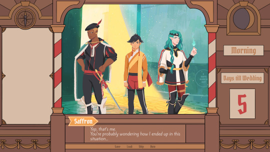
PECTIN will tell you a bit about Saffron and his design while eZombo describes the development of the UI. So without further ado, here we go:
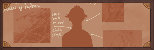
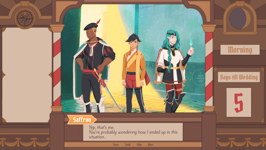
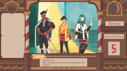
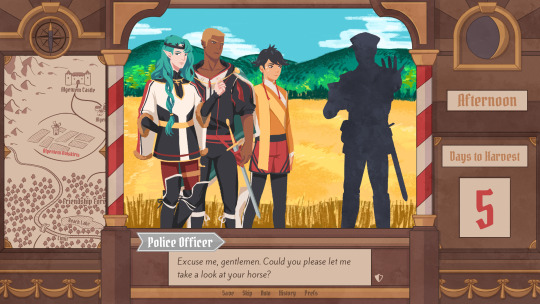
Art - PECTIN
Saffron is the curious prince the player takes control of in Brassica. Before I began concepting him Felix and I defined his character. At this point we already knew he would be one of the princes Sappho tricks into going on the journey. (And would then fall in love with another prince because YaoiJam'18). We soon agreed on naming him Saffron. So I already associated the colours of the spice "saffron" with him here. We also wanted to make him a protagonist with his own personality. Thinking of the player who role-plays him we thought it would be cool to have his character split into three separate personalities he could have: - the cunning and a bit wild prince - the typical goody two-shoes type of hero - and the soft boi who's overwhelmed by the whole predicament and really needs a hug Another external influence was, my intention to try and fuse traditional things with modern sportswear. Brassica is a fairytale but it's told in a contemporary voice. That's where the idea came from. ...Okay. So I had his name, colours I could associate with him, the three archetypes and my goal to fuse sportswear with traditional clothing. Having all of these "pointers" I began looking for reference pictures. I browsed through online stores of popular sports brands to find things that would fit the character. Due to Saffron's character ranging from cute to rather untamed (in the sense that he would climb a tree without hesitation) I thought that wearing shorts would be most suitable and comfy. But for the top and the overall outfit I wanted to let myself get inspired by traditional elements. The name "Saffron" reminded me of the spice and then its use in Indian culture. I never designed a character with Indian influences before and thought researching into that would be interesting. I found a lot of stuff I could translate into the design. Even the leggings Saffron wears were intially inspired by my findings about Indian culture. Here's a visual breakdown of what inspired what (excuse my srawly handwriting >-<):

During the process of drawing out his design, as I always do, I thought about how each component of the outfit would "flow". There're lot's of lines and intersections in his outfit that guide the eyes along the his body:

And here is our boy again as a sprite. Not much different right? Here I put one of his hands in his shorts' pocket, because I think it would suit someone who is either unsure and does that or feels liking hiding something.
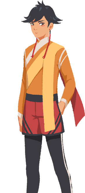
That's it about Saffron! I could go on about his colours but I'll save that for when I explain the general artstyle of Brassica! :3
UI - eZombo
Because Brassica was planned as an entry for Yaoi Jam 2018, we thought about ways to keep the scope small. One idea we came up with was to reduce the size of the screen that shows backgrounds and characters so producing the art is a bit faster than filling a full HD 16:9 canvas. One inspiration for that was Sticky Zeitgeist by Porpentine & Rook but something like the Undertale console version where the graphics at the border of the screen change based on the in-game location was also something we considered.
When it came to actually planning the screen, Undertale's influence came through again, because the main area of the screen actually has an aspect ratio of 4:3. This obviously leaves a lot of unused screen space but one thing we knew we could definitely use to fill this was the text box. Having it separate from the main screen also made sure that it didn't overlap with the characters or backgrounds so the space that was reserved for that could be used to its full potential.
With two elements already on the screen, we still had the sides to fill with content. Just using graphics as borders definitely was an option but because Brassica's story plays out a bit like a road movie, we thought having a map of the game world would definitely add to the feeling of that. And to make the UI visually more balanced again, the last bit of free space was then filled with some information on the time of day and how many days were left for the quest of the princes which basically added all the important context for what is going on in the center of the screen.
A first mock-up of the UI featuring a familiar face and St. Bernard...
Around that time, we also developed the idea of presenting the whole game screen like a paper or puppet theater. This seemed like a good way to bring all these different elements together while still supporting the colorful fantasy-ish look of the game art.
I did a quick sketch of how this could look, which turned the mock-up into this:
Aside from adding some more purely graphical elements, I adjusted the text box and the flag that showed the name of the character that is currently speaking. The map was graphical now instead of just a list (which would have given away future locations) and I was overall fairly happy with the direction the UI was going in. A few of the border elements overlapped with the main screen now but I tried to make sure it only happens in areas where we wouldn't put any focus.
After getting some feedback from PECTIN I then went on to work on the final lineart while also trying to simplify all the shapes. By then, the characters were also being concepted so instead of Luke I could put Ode into the mock-up (along with a reference for a possible background style).

As you can see, some unnecessary lines, elements, and text were removed to simplify the look of the UI and make sure that the important elements aren't overshadowed by anything else. Overall I tried to keep the lines clean without making them look overly sterile, so any round shapes are generally drawn freehand instead of using any vector shapes. Except for the compass, moon, and their enclosing arcs. Those just looked sloppy when they weren't exact. Not using fixed line widths was another way to make the lines more organic even when they were perfectly straight. The idea to use different colored flags for each character also came into play now, although Ode's color here is actually used by Hans now…
Colors were next on the agenda. First a basic pass, followed by some adjustments and line colors to make the lines fade more into the background. Having the concepts for the three princes was very helpful for this step because it was important that the UI colors fit into the overall color scheme while keeping the focus on the actual game art. That's why red is only used close to the center and for important UI elements (the current location on the map is also marked in red). The rest of the colors are rather muted and monochrome on purpose with only a little bit of gold to break it up.
Throughout the whole process my main references were old paper theaters but especially during the coloring process I deviated from these references in favor of using colors that would match with most backgrounds.
Once we were happy with the colors, I did a relatively quick shading pass, just adding shadows with a fairly abstract light source to keep most shadows parallel to the lines. I also added some subtle noise to make everything look a bit more organic.
For the most part it still looked too clean though, so PECTIN suggested overlaying the UI with some watercolor textures.

Which lead to this final mock-up and not only solved the problem but also gave the UI a more painterly look that didn't interfere as much with the general artstyle.
Well, but as always, there are still a few things that changed on the way into the engine.
The map was obviously added (which could probably fill a devlog by itself), the text on the side was changed to better reflect the current quest of the princes (although the other sign may or may not return in future acts...), I added a CTC icon and updated the quick menu (although I can't remember why "Load" was removed so maybe that will return again), but most importantly: The text box was reduced from three to two lines of text. This wasn't as much an active decision as it was caused by the fact that small line spacing in Ren'Py cuts of parts of some letters until all lines of text are displayed. There are some games that still do this but personally I don't really like how it looks while the text appears. Increasing the textbox would have caused a lot of work because I would have had to shift around more elements of the UI to keep a balanced layout so it was simply easier to remove a line of text and increase the line spacing.
This had a pretty strong effect on the writing because sentences have to be fairly short now or if that doesn't work, broken up into multiple lines. Even if it wasn't exactly planned, it still influenced the writing style of Brassica and further distinguished it from our other games (although there's more to say on that one) and in hindsight, only two lines of text also look a lot cleaner in this layout.
I could go on about the actual implementation of the UI but this has already been a pretty lengthy post so maybe I'll save it for another devlog.
But that's it for now! We'll be back in two weeks with some more development insights and our current status. We also plan to start posting these devlogs regularly again, so stay tuned for that! As always, thank you so much for reading and we hope you could find a few things of interest in this devlog.
#brassica#fairytale#devlog#gamedev#game#development#otome game#romance#tutorial#visual novel#indiedev#indie#okay
8 notes
·
View notes
Text
Ya so i got her outta the ugly stage also i love rendering its so ❤️❤️❤️❤️❤️❤️❤️❤️

Alr now i wanna break down how i got to here. If u wanna try new tricks for ur art i might have some.
So when i color i do a shadow base first, then block in lighter colors. Sometimes ill go deeper if i need more drama there. Then you figure out textures. Skin is usually smooth with some roughness, so i use my blending brush small and blend it out till its smooth enough. My blending brush is a circle brush that basically pushes the color and blends it a bit with other colors around it. Very simple brush. It lets me push the shadows so theres more or less and gives lots of control. With clothing theres usually a lot more texture so i blend with a bigger brush bc that makes more texture. Then for hair, i usually go smooth but also with a bigger brush than the skin just cuz its convenient. I blend shadows in, blend highlights out, then push the middle shade towards the highlight so i can use that circle brush to get that nice arc shape on the highlights!! For lighter peices i use my highlighter brush on screen with a slightly lower opacity and dash some lines in the middle of the highlights. I outlined the whole body in light because the light hits from behind a little, then my main colors are done!!
I have 2 other shading layers on this peice. A screen and a multiply layer. I used screen for the spotlight and so i can highlight lighter parts without messing with my main colors, then i use the multiply layers to add more shadow and depth to where the light cant reach. I just blocked them in with a full opacity circle brush, then blended them out to my liking. I used red on the eyes on both layers to make em pop. On the multiply layers, the shadow color was dark blue. On screen, i used a purplish grey. Try to draw colors directly from your color pallete to make em blend better! I also added a viggenete or however you spell it to the bg.
Then i realised the colors werent popping enough. So i went to the filters and picked the halftone one on seperate channels. It boosted the colors A TON and also i just like how halftones look on my art so that was nice :D
I messed with the opacity on the shading layers, set the line work to color burn and blushed that a bit, signed it, and thats that!
ALSO heres my tip for getting your signature stuck on there. Hide a signature on the peice. Pick a spot thats not too noticable, lighten or darken the color a bit, then sign there. Its very hard to notice and can be p hard to remove.
Also also i have like 5 brushes i used on this. Also I use Krita. My sketch brush which is a square brush with high opacity that varies size and opacity based on pressure. My line brush which is just a default textured brush on Krita (changes size with pressure). A basic circle brush at full opacity(size w/ pressure). A highlighter brush with high opacity. Doesnt change size, also fades with pressure. Then my blending brush! I just edited a preset blender so it wouldnt put down more color. It doesnt change size or opacity with strokes. Just blends. I keep it at 100% opacity just cuz it blends better.
Ive decided to go on a drawing rampage. Imma pick this one up tmrw morning
We got em to the ugly stage bois 😎😎 also listen to herald of human soup its a bop
I think this ones gonna turn out well :D the angles and the face got a good structure so ill just havta blend and shade well and opias set 😎😎

#umbrabyte#vocaloid umbrabyte#vocaloid#fanart#art#artists on tumblr#digital illustration#digital painting#herald of human soup#art tips
20 notes
·
View notes
Text
Doodling in Class: A Final Reflection for Biological Illustration
My thoughts concerning the fusion of art and science!
Overall, I feel very fortunate to have had the opportunity to take Biological Illustration this semester. The course was quite interesting and educationally valuable, as I learned a great deal about illustration and myself as an illustrator. Completing class assignments reminded me of my love for drawing and inspired me to continue developing my skills. Throughout the semester, my drawing abilities evolved in terms of line work, pencil shading, artistic media utilization, and scaling.
I have always had a passion for creating works of art, but I have not had the chance to do so for academic purposes in a few years. One of my favorite aspects of the illustrative process is that the majority of the work is done by hand. It is extremely fulfilling and rewarding to craft an art piece entirely from one’s own artistic skills. I appreciate the fact that I am completely responsible for the final outcome of the project. Since beginning this course, I have decided to change my minor from Photography to Drawing and Painting. Unlike photography, pure illustration does not involve the use of machines or chemical processes to make and influence the final artwork.
One area in which I have definitely become more confident is my line work. When I first started the class, my contour lines were very light and sketch-like. I did not apply a significant amount of pressure, and I always chose an HB graphite pencil. The lines were hard to discern from the white background due to the fact that they were so thin and indistinct.
As I progressed through the course, I developed the ability to draw using stronger, more defined lines. Each time I drew in my sketchbook, I mentally reminded myself to draw with certainty. Initially, doing so felt strange. When I took art classes in middle school, I was taught to draw using gentle “sketch” lines. I still use this technique to establish the rough form of my subject, but I also remember to edit the composition by substituting more solid lines. This effectively increases the prominence of the sketch. Various pencil exercises gave me experience in applying more pressure when drawing.
These graphite activities also allowed me to practice using different grades of pencils to improve my pencil shading abilities. In the past, I did not truly consider my choice of pencil while sketching. Many of my drawings had a grayscale appearance due to their lack of contrast. Pencil sketches that I have completed for this class are a welcome advancement from my oldest works. After I gained a greater understanding of the grading scale, I was able to apply that knowledge to my drawings. I developed a habit of first using an HB pencil to sketch a basic contour. Once the contour was complete, I began shading with B and 2B pencils. I only used the 6B pencil for the darkest areas in my compositions. I added value to light areas by lightly applying HB or carefully shading them with a freshly sharpened 2H or 4H pencil. This gave many of my subjects a sharp, defined edge without implying a textured surface.
In addition to using a variety of pencil grades for the first time, this class was my first exposure to proper scaling. Prior to this point, I indicated the proportionality of a drawing based on visual estimation alone. I was surprised that the syllabus required a 14” × 17” sketchbook, as I had never drawn anything so sizable before. At the beginning of the course, drawing on such a vast expanse of paper was a bit intimidating. Sketches of my earliest subjects do not occupy whole pages as my later compositions do.
As I progressed through the class, I realized the benefits of drawing my subjects larger than they appear in reality. Doing so allowed me to account for minute details that may be overlooked if the subject(s) had been drawn using a true-to-life scale. I have grown much more comfortable with creating compositions that make use of all of the space on a single page. Scaling each individual part of a subject with a clear ruler is time-consuming, but it yields impressive results. In order to ensure maximum accuracy while scaling, I entered my measurements into a calculator and subsequently multiplied them by the chosen scale value to generate a new measurement.
Aside from fostering my personal growth as an artist, this course also heightened my awareness of the relationship between art and science. Illustration is a valuable way to convey scientific information for many reasons. It requires the illustrator to view the world through an objective lens in order to provide an accurate representation of a living subject. Art also gives scientists a unique opportunity to communicate their findings to the public in a way that is interesting and original. While there exist surprising similarities between these two fields, there are also differences that set them apart from one another.
Scientific illustration is based on the principle of reporting realistic and unbiased information. Scientific illustrators must be able to differentiate between what they see and what symbolic items they imagine to exist. This means that these artists have a keen eye for creating impartial records. In essence, an illustrator acts as a human camera, capturing only the image that lay before him/her/them.
Art also serves as a unique method that scientists may use to draw the attention of the public. Oftentimes, scientific subjects are complex. They can seem abstract to people who are unfamiliar with the scientific world, and this often leads to disinterest. Illustrations have the power to make scientific knowledge more accessible to the public. They provide a visual explanation of the processes that the Earth and its organisms undergo daily. When people have a greater understanding of scientific topics, they will be more likely to become interested themselves.
This was the primary goal that I aimed to achieve while sculpting my final creative piece. By creating a fish anatomy “puzzle,” I hoped to inspire people of many different age groups to take interest in the biology of fishes. My sculpture is modeled to look like a blue chromis (Chromis cyanea), an iridescent blue fish that lives in the Caribbean Sea. I made the external body from shades of blue and black Crayola ® Model Magic to provide a valid representation of the real fish. The internal organs do not reflect realistic pigments, but I chose these colors so that each part could be easily discerned from the others. All of the internal structures are removable, as are their tags. This interactive feature allows people to learn about bony fish anatomy in a way that simply feels like a game.
Although they may seem vastly different, art and science share some striking similarities. Both fields require creators to think critically about the compositions. Scientific illustrators and sketch or portrait artists must draw exactly what they see; nothing more, nothing less. People in each of these fields also possess the ability to make strong statements to the rest of society. However, creative artists have much more freedom to employ their artistic license and make stylistic choices. Scientific illustrators can emphasize specific features of their artwork, but they cannot imply meaning through symbolism.
#cass talks#art#science#biological illustration#science communication#marine biology#scientific illustration#art and science#reflection#artist development
0 notes
Text
The moving sketches of Goro Fujita
the whimsy of looping motion
Goro Fujita is an animator who posts 3D animations, which he calls quillistrations, using the VR software Quill. The animations are very fun. They uniquely show a 3dimensional space in a sketchy manner. The staccato motion of his work makes it feel lifelike even with the limited frame count.
https://twitter.com/i/status/1319333281314242565
in this first animation, Goro creates an incredibly frantic scene through a multitude of arms. It almost reads as motion blur. The shaky patterns serve to further drive the tension. Throughout this whole piece small actions are used to communicate a theme rather than reality. There is no pepper coming out of the pepper mill. Nonetheless, it reads. This is a long running theme in his work. The human mind is quick to file off the sharp edges of an animation. As long as the principles of animation are adhered to, the artist is capable of getting away with a slightly more choppy piece of art.
https://twitter.com/gorosart/status/1318362826357047298?s=20
This and the above illustration were done just this month for Inktober. Both are illustrated in just black grey and white. This should limit the readability of the compositions, but clever usage of Despite the fact that these animations are made with a strictly limited color palette, they use chiaroscuro and texture to show the volume of the objects. The small crosshatched shadows place the dog and cat within the world.
https://twitter.com/gorosart/status/1303463893558341633?s=20
Here we have a clearly looping animation. This is a form of pattern which allows Goro to suspend a moment in time. Clear perfectly looping gifs like this are something which animation is uniquely suited to. Something that should also be noted here is the artist’s intelligent usage of angles. In all of his animations he uses a hand full of different shots. I believe it is a way to show off the three dimensionality of the piece. Nonetheless, he remains restrained, never breaking the 180 rule. It grounds the world without upsetting the composition of the piece.
If you want to check out his work, you can follow his twitter at:
https://twitter.com/gorosart
Glossary
Pattern - an arrangement, configuration, array, formation, guide, matrix of repeated forms. Patterns create rhythm and can be used to predict and organize design elements such as using a grid.
Alternating pattern - means to occur in succession, such as day alternating with night. To pass back and forth from one state, action, or place to another such as alternate between happiness.
Chiaroscuro - a technique of painting or drawing using a predictable sequence of light and shade to achieve a three-dimensional quality.
Collage - a technique of an art production, primarily used in the visual arts, where the artwork is made from an assemblage of different forms, thus creating a new whole.
Gradient - continuous change, darkening, lightening, increasing or decreasing color saturation. A gradient is created when two or more different colors are layered to paint one element while gradually fading between the hues or values.
Grid - a rectangular system of coordinates used in locating the principal elements of a plan.
Progressive patterns - create active change, momentum by shifting in a direction, increasing, escalating, or accelerating.
Radial balanced patterns - based on a circle with its design extending from its center. A few examples of radial balance are; a star, the iris in one's eyes, and a wheel with spokes.
Texture - the way something feels when you touch it, how smooth or rough it is. The texture of an object depends on the unique structure of its molecules.
Tactile - tactile textures are physical, touchable textures that you can actually feel on your skin in the real world, like when you pet a cat or dog.
Texture mapping - Texture mapping is a process in which a two-dimensional surface, a texture map, is wrapped around a three-dimensional object. When wrapped, the 3-D object acquires a visual surface texture.
Visual texture - an illusion of texture. Pixels or traditional drawing and painting media can be manipulated to give the impression of texture, while the surface actually remains smooth and flat.
180-Degree Rule - a basic guideline regarding the on-screen spatial relationship between a character and another character or object within a scene.
Anticipated Action - A dramatic action frozen in time, the tension mounts, we feel anticipation.
Camera Motion Arrows - a simple and recognizable way to show motion or progression in a storyboard
Kinesthetic Empathy - A player’s actual movement when responding to action in a game.
Line of Action - an artistic concept, an invisible line that captures the thrust and vitality of the movement. The line of action can be drawn by artists as the first element to capture or exaggerate the pose.
Motion Blur - When your eyes or objects are in motion, the image will suffer from motion blur, resulting in an inability to resolve details.
Optical Movement - is an optical illusion. Although the image is not moving, it appears to move.
Stillness - calm, quiet, inaction, and peace. Stillness is the opposite of motion.
0 notes
Photo
Here it comes! Time for an end of the year “Here’s what I drew this year” list. Mainly just to archive my art now for future’s sake and tell myself my thought process and how I felt about it now.
I’m skipping over sketches and going straight to stuff that was finished and polished and I’ll explain each image as we go. Buckle up boys its going to be a long one.
We’re going to go to the first image I did this year and explain how things went from there!
Drawing #1, Scrubbed off Katia Managan
March 3rd 2017

Art is actually kind of hard when you don’t know what form, line consistency, anatomy, or any of those things are! In fact I only know about two of them right now! And how to put into practice one of them! This image shows what its really like to start out with base-nothing. The idea is cute! And I’ll probably redo it later on when I am probably a years worth better. It marks however the first thing I really posted online. To me, that makes it special.
Drawing #2, Sigrid, but smug.
September 9th, 2017

BIG gap between the two! And not a lot of improvement, or maybe a lot of improvement? Who knows. I think this image was the first thing I did digitally that I put up for other people to see, and it was exciting! There’s absolutely no construction to this. Prior to this image being done I was basically drawing people’s heads and circles. Like, pages upon pages of circle grinding to actually know how to draw a circle digitally.
The main reason why there was such a gap between March and September was due to me graduating high school. I basically didn’t feel like drawing at all when I already had the work load of school ontop of me. But the art starts coming a lot faster now. Yes you can see there was a huge prequel influence.
Drawing #3, Blushin Bob
September 29th, 2017

Art is something that you can really do a lot of, but you can easily get burnt out on. Animal crossing is actually one of my favorite games out there, and to try to pay tribute I drew this. Not uh, not exactly my favorite.
This image has me trying basically 3 new things I’ve never done before. Shading, clothes, fur tufts, and bodies. Yeah. Not exactly my best job at any of those. The shadows are, very inconsistent and its clear I didn’t really know how to do it properly. The fur is atrocious with it looking like spiked tumors, and the shirt rides up way too high like hes wearing a shirt thats way too short! Also he might be a bit too skinny.
This is kind of an image that broke me. At the time I was trying to fix every error when I just couldn’t, from the arm in the first attempt being god awful, to how the shading and shirt looks. I genuinely think this is the worst image in my library, and I knew it at the time since I drew nothing for all of October. You know. The month that’s meant to be the most inspiring artistically?
Drawing #4, Gondola The Peaceful Giant
November 12th, 2017
This was actually just a shitty paint up I did of a sketch practicing perspective. It was mainly for a draw thread on 8chan’s /v/ and probably my only work I’ve posted to an image board. I think generally doing art for anonymous people is a bit thankless. Its great for practicing but it really gives back no validation.
Keep in your memory these clouds, I’ll be talking about those later.
Drawing #5, Bunny, The space mechanic.
November 12th, 2017
This character was a mistake, not the drawing but the character! This is my first actual tabletop character and boy I flubbed it. But this is art retrospective. Not roleplay retrospective. Anyway. A portrait done with a new pen style that I don’t think worked out too well. It comes off a bit too rough and gritty. But it makes for unique coloring when it comes to painting. I’ll actually have some more to say about that in a bit too! This also marks the point where I really got into drawing again. See. The table top group I’m in rewards you for drawing pictures of your characters, no matter how shitty it is, as long as you do your best, you get a reward in game. Its actually a really, really neat system!
Drawing #6, Oh dear god why.
November 16th, 2017

This is going to be a reoccurring character, so. Lets get to talking about it here. This character was as far as I know, a joke character made by a friend that got turned into a full blown character for a campaign, she is nonsensical, random, actually crazy, and worst of all, vibrantly colored. She is the Deviant Art Sparkledog as a character. Which funny enough, is her character name. This was my first attempt at really going ‘sexy’ and ‘nude’. And actually I think Sparkledog is a perfect candidate for it because its already cringy and god awful to look at! So it hides my bad attempts at a sexy lady behind an already cringy character. Thanks friend.
Anyway to talk about the art its self. It was done with no ref or pose. And I think it kind of shows. Everything’s proportionate to a degree but something about the perspective of the whole thing feels... off. Of course the background is just slapped together with glue but I mean on the character. She’s laying on the ground but not in a way that I think is possible or comfortable.
This also goes as my second attempt at fur, it’s, better. But definitely not good. Ontop of that this is probably my first attempt at an actual muzzle! Pic below related.
Muzzles are really hard to do. For some reason. If you ever read Loomis’ Fun with a Pencil it becomes slightly easier, but it also kind of isn’t. A month later and I still struggle with them, A lot of my joke sketches I often forgo any sort of attempt at drawing a muzzle and go for round head shapes, this works out if the character’s species is a prey type, as the eyes for herbivores are often on the side of the head, while for predators, its facing dead ahead. On another note, apparently I can just *do legs* with almost ease. I’ll touch on this more in a bit.
Drawing #7, A background for the end.
December 2nd, 2017
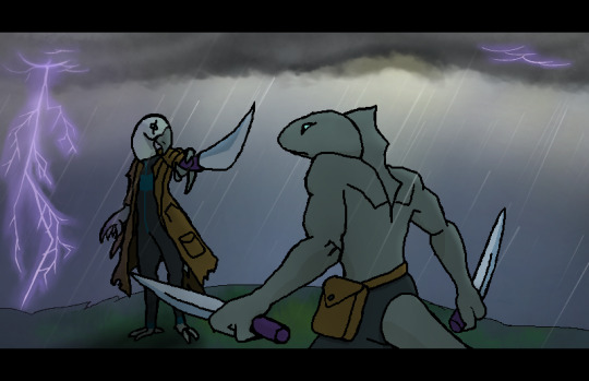
Tabletop is a wonderful thing, art groups are also an amazing experience to ever be apart of. The group I’ve been with has been an amazing experience for me artistically as I’ve learned to grow so much more. This is an image I did as soon as I woke up on my birthday. Friend A. did the character sketch. Friend b. did the coloring of the characters, and I got to practice something that I’ve wanted to do for ages.
Environmental art.
Ontop of character art and such, one thing that always draws my attention is environment art. Its something you can always get lost in. Your eyes can search to every corner imagining what it would be like to be there. Genuinely amazing works of art is often environment art.
Its also time we talk about the clouds. I hope you remembered them from the gondola picture. See. Clouds are all about layers, and layers, and layers. Especially when done in a thunder storm. They’re something I might recommend painting if you ever want to start out! I do however think the clouds in the gondola image work a lot better. But I think that might be from the several things I did to trick myself to think they look better.
And that’s all there really is to say on this image. Which is a problem. I learned a bit more about perspective and how floors work when under character’s feet... and how to do lightning kind of. But there isn’t much else. If I were to do this more I’d probably add another cliff to the background. A mountain, a landscape just beyond the fog, because it seems unfinished as it stands.
Drawing #8, Oh dear god why, Revengeance.
December 5th? 2017
Probably the only unfinished image that gets posted! So lets talk about it. I think fur is my least favorite detail to make ever.Yet it also is my favorite when its done. The tail also might not be the best but its league’s better than my first attempt! But lets talk about the main thing about this image.
PAWS.
I don’t have a thing for paws, or feet, that’s not my kink. I think footjobs are sort of appealing sure but I don’t care much for it. so this was my first attempt at paws, and I think I did damn well. However, digitigrade legs are something I still have an issue with, and I am working towards fixing that. I don’t think furry characters look great when their legs are humans, but with paws. As well I think legs are the easiest part of the body to draw in some ways, that might just be me.
The face also is a bit of a mistake? Its better than its.. original incarnation...

[NOT EVEN THE DEAD KNOW PEACE FROM THIS EVIL]
Animal faces with human features is the proper way to do things, but human faces with animal features is... Hell incarnate.
Also that ass took me like 30 tries to get right god damn.
Drawing #9, The last hoot for today.
December 18th, 2017

The last one for today. Some point after Christmas I’ll post probably another three drawings. But this is the final one. Lets talk about a few things about myself.
Art style is all about inspiration. You pick up inspiration from everywhere. Specifically from art styles you really, genuinely enjoy. You might have noticed the art style at first was I Wanna Be The Kazerad and then to something completely different from Kazerad but not distinct from anyone else. This is the process I think to finding your own art style. Emulation.
You might also noticed I ditched aliased (pixely) lines in favor of smooth lines, this was because I was having a tiny issue with drawing at large scale. For some reason I always liked zooming in real close on my 2000x2000 canvas and drawing tiny little things. The bunny picture is a really good example of this. He only took up the tiny corner of my much, much larger canvas. Speaking of his part of this post, lets get into color.
There’s been 3 ways I colored things, the first was plain flats, second was with a sort of homemade crayon brush (Ala Bunny and Gondola), and third was a unique way in how I did the eyes of this image. Looking at them closer you can see theres, actually a lot of rich detail in them!

This was a pretty easy thing to do and it has such amazing results that, I want to do a full image using it just to try it. For how I did it, I use krita, and how it handles gigantic brushes is like most art programs, by automatically raising the spacing between each ‘use’ (for a lack of a better term.)
Here’s what the blue part looks like with a white background behind it and the layer count to make this beside it. (Only one of them visible.)
It also kind of hits close to to another artist I’ve been following pretty closely as of lately. (And more recently on tumblr.)
You might not have heard of @jamdrawers , and you should definitely check them out if you haven’t. They are someone who, in my eyes, has such a wonderful art style. Other artists that do a style with pixelly, aliased lines don’t even come close in my opinion. I bring jam up here because of a few things, the art style he presents has thoroughly inspired me to pick back up trying to draw in aliased lines again, and because going forward I’ll continue looking to him for inspiration. Also if you read this jam tell winrarphile I said thanks for getting me into your art.
Now, when it comes to the owl its self. I regret not adding a thicker outline to all of her character, and instead kept it to just the head shape, as well I do think she comes out a bit bland. Of course color wise its to keep in theme with the rest of the table top groups color theme. But outline wise? Definitely needs work. I tried a ‘hair style’ for her but that didn’t really work out either. So I kept it to the three feathers at the top of the head. I also think I spent more time on this image than I did any other, to quote myself “I’ll finish this owl up in about an hour or two”, which quickly lead to 8 days instead, just through procrastination.
Don’t do something in art if you really don’t want to do it. You can easily, easily get fatigued and burnt out with out delay, but among this procrastination came other sketches that, I don’t think I’ll post here, but helped me learn hands somewhat. So there is that.
Thus ends this posts governing topic. If you read this whole thing, good job. If you didn’t and skimmed to the end. That’s fine too! I understand I got a bit wordy but, I genuinely wanted to lay out my thoughts about all this.
In conclusion, I think the rate at which I’m getting better is decent, Mistakes are being ironed out each new drawing I take on. Each study and figure drawing adds onto the many experiences I’ll use for later in my artistic career, and I think the rate at which I’m drawing is far too slow for my own tastes, as such its a goal for the upcoming year to get a lot faster with finishing each drawing so I can quickly move onto the next. Thank you for reading this.
Have a noid chewin’ some pizza as a reward for coming down to the end.

7 notes
·
View notes
Text
i’m actively screwing myself over, like, all of the time
under the cut is a thing here for mostly my own reference because i need to actually write down what i need to do so that i can start doing it
it is also here as a starting point to being more transparent with people i’m working for (i need to contact these people directly, but if they see this before i message them, they’ll at least know that i haven’t forgotten them/i’m not waiting for them to forget or something).
if i do owe you something on here, please do not feel guilty about stressing me out, this is my own dang fault and i want to try and figure this shit out and get it finished, because if i can do that then my whole life will get monumentally better by like, a MASSIVE margin, i can’t even fathom having the weight of this stuff off of my shoulders and i should use that as motivation to power me through this stuff
anyway
stuff i gotta do:
SCHOOL:
GROUP PROJECT
character sheet for group project
get out sketchbook to double check the design
open a new photoshop document
draw the thing (include construction guides)
put thing in google drive
text group to let them know i put the thing in there
read the textbook chapters i didn’t read
look up which chapters we’re supposed to read
check to see when the assignment that requires the reading is due
SENIOR PROJECT 1
update my trello page and my checkpoints
open the checkpoints sheet, for the love of god why don’t you do this
clean up character sheets
make the orbs on orbo more dimensional, add in one more angle to view orbo from, increase the size of the height chart, dress it up to look more professional
take existing character sheet for zookeeper and fix it up
finish the backgrounds
give ash the folders i made for the backgrounds
potentially just loan them your thumb drive so that it’s better organized?? or make a google drive for that
make color scripts and give these to them for each scene
COMPILE NEW ANIMATIC for presentation next class
put the images for the AfterEffects file into my thumb drive so that i can actually use the file WITH IMAGES while at school
WORLD MYTHOLOGY
dude you’re fuckin’ failing world mythology, i mean i know that this is the class you decided to prioritize last but holy god you could at least TRY to get a passing grade so that your parents don’t have to pay for you to take the class AGAIN over the summer
check upcoming deadlines
post in the thread before sunday night
read the chapters for world mythology and watch any talks or episodes of black mirror the professor inevitably wants us to watch
make the post
comment on 3 other people’s posts
start putting together paper (paper due tuesday 11:95 pm)
find sources
cite sources in MLA
make sure paper is formatted correctly this time because you thought it was the first time but it wasn’t
GENERAL SCHOOL
check your e-mail because your world mythology professor is worried about you and wants you to make a counseling appointment for next wednesday at 2 PM
ASK SOMEBODY ABOUT INTERNSHIPS because i gotta look for those
do this before my father finds out that i lost my scholarships due to my GPA falling too low because i keep failing classes because i can’t make myself write papers anymore
OTHER STUFF:
AYWAS:
you’re gonna get another sketch list at some point this week, probably monday??
cat sketch that has taken you way, way too long to start
contact commissioner about sketch to apologize for radio silence and offer it to them for free or something because dear god (its not that hard to do, i could be doing it now instead of making this list but i’m so overwhelmed by all the other shit i have to do that i just haven’t started)
contact other commissioner about sketch that it’s been MONTHS since you said you’d do it
apologize and ask if they’re still interested, offer it to them for free since dear GOD (again, it doesn’t take me long to do sketches??? why haven’t i started these)
contact person about animation you owe them that you haven’t gotten past half of a rough pass of
i don’t know how to apologize to this person
i am very afraid
COMMISSIONS for moya
more sketches for their xaoc since it came back 22%
attic dragon colorations for the plbc they put in ages ago that’s just waiting for predicts
finish plush quolgarian
add more plushies
shade
send to them for approval and make any necessary fixes
color
finish squid scc coloration
finish blocking in base colors and then send it to them for feedback
finish coloring it
send them the crumb pet sketches you did ages ago
2 COLORATIONS FOR COMMISSIONER-
witch cat
finish basing the colors and send to them for approval
finish
moth dog (i think)
base the colors and send them for approval
finish basing and coloring the pet for the sketch basing contest before February ends
BASIC LIVING SHIT
eat regularly
eat healthier, find some dang vegetables you like and actually remember to eat them
bathe regularly
do the goddamn dishes regularly
wash that FUCKING SHRIMP PAN that’s been in the sink for 2 weeks
get work done before dnd tomorrow
gotta visit the cat boarding place to make sure my gfs cousins cat is doing okay there, since we discovered that she’s too loud and needy for us to illegally house in our apartment while he is away
these are the things i have to do
now that i have made this, i need to find a way to organize it so that i can see what things are most urgent...
#i don't work hard enough and that stresses me out too much to work#!!!#negative#also positive i guess??? i WANT to be productive#it just doesn't happen very easily#reference for me#reference#personal
6 notes
·
View notes
Quote
Uncluttered ...plenty of thought to internal storage choices and reducing "things" its not necessaryAiry ... an absence of upper cabinets so your eye moved round the spaceCalm and vivid... from shade and style selections and layoutWarm and tranquil ... no laminate, granite, or different hard surface countersOrganic... from natural basic products like lumber, cork, vegetation etc.Adhere to your visionA reno is really a headache in many ways, and you will reach a point what your location is completely fed up and want to take the easy way out. Don't. Have a break as a result and look at the problem with fresh eye. Make all choices based on your initial ideas for the area.Related Images with Contemporary Apartment Ideas Soften with Rustic Wood and Country Home Decorating ColorsA Miami Apartment in Stormy, Muted TonesWorkout a rough sketch on paperMost likely it's my time and my aesthetic art training, but I start out everything with newspaper and pencil. I came across your kitchen booklet we found at IKEA a great help when achieving this because all cabinet sizes were posted and you could plainly find that which was inside each one of these. There is a web based version. I didn't invest a lot of time at this time, just enough to decide on the stream and keeping drawers or doors.Decoration Apartment Living Room Ideas — LIVING ROOM DESIGN 2018Refine your sketch in the kitchen plannerI work with design and style apps on a regular basis, but I found the IKEA house planner very irritating. It had plenty of little glitches, and if you might have an island or peninsula when i did, the units kept attempting to line up by a wall. I had been also working on a MAC. In the end I refined the plan enough to give to IKEA and get the order produced, but it in no way looked pretty.18 Pictures With Ideas for the Layout of Small Living RoomsImagine employed in your new cooking areaOnce you have a preliminary design and style in mind, ponder over it next time you bring home groceries. Will there be a place for everything. If you are entertaining, is there a place for anyone things you merely use once in a while? Prepare an imaginary meal and clean up. Are your actions efficient? Have you solved all of the design issues in your previous kitchen?Interior design living room 2019 / Home Decorating Ideas YouTubeExplain your design and style to a person outside your loved onesWalk through your design with somebody outside the spouse and children and make clear your layout choices. This really helped me concur that I wanted points just how I thought. You also have a chance to issue the IKEA personnel when you order your kitchen. These were super helpful once i called.
http://myhomedreamshome.blogspot.com/2019/08/contemporary-apartment-ideas-soften.html
0 notes