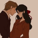
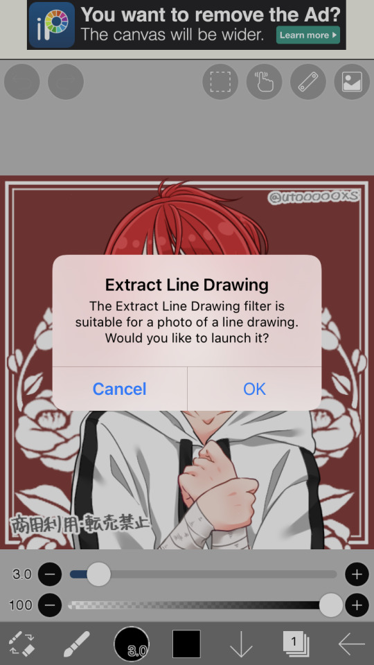
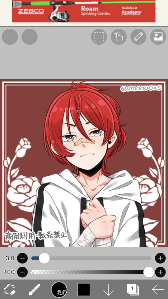
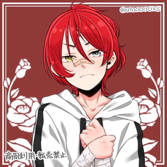
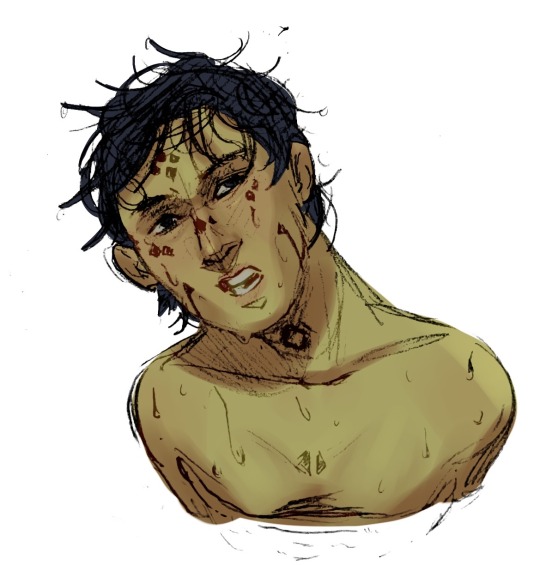
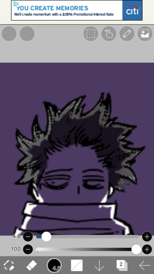
#messing around with ibisPaint and having a good time :)
Explore tagged Tumblr posts
Visit Tumblr Blog
Explore Tumblr blogs with no restrictions, modern design and the best experience.
Last Seen Tumblr Blogs


Fun Fact
Tumblr was the first site to host the blog for President Barack Obama in 2011.
Text
I messed up. /j
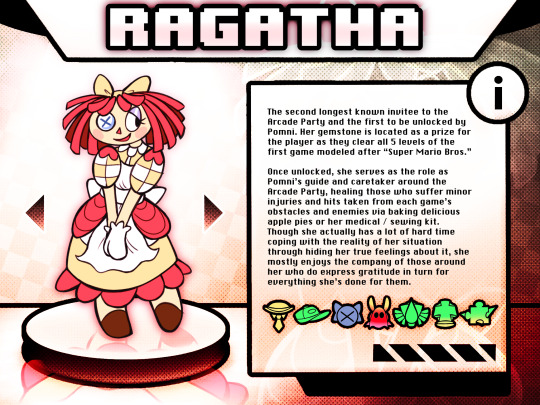
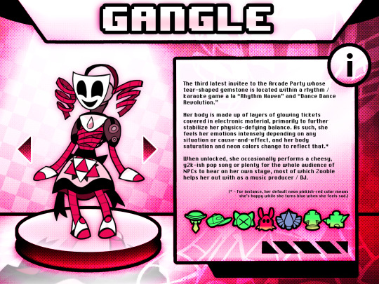
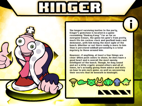
Introducing...
THE AMAZING DIGITAL ARCADE PARTY!


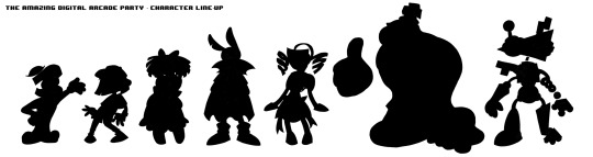
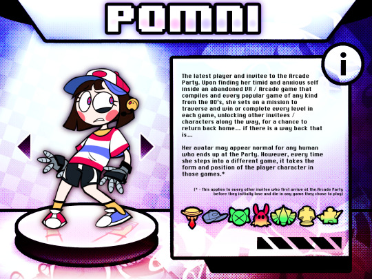


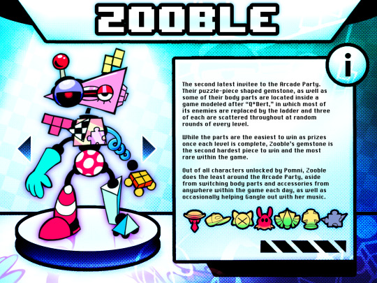
Yeah, that's right, I caved in.
Basically the exact same show except its established lore and setting is more largely inspired by archive compilations of popular vintage arcade games of the 80s and 90s such as Pac-Man’s Arcade Party, as well as the different takes within the sci-fi / fantasy genre by the likes of Wreck-It Ralph, Tron: Legacy, and Infinity Train.
==
= BACKGROUND (in a nutshell) 💿 =
In an attempt to save their dying business, C&A developed and manufactured the first hybrid arcade game of its own kind that combined other popular arcade games and home console games with virtual reality. However, just as the company’s luck was turning around, numerous lawsuits from game companies by the likes of Nintendo and families were filed against the company for their product, from apparently “ripping-off” Super Mario Bros. in its entirety to causing many children to either inexplicably fall unconscious or suffer from amnesia after the cabinet’s headset was put on. Just then, as C&A announced they’ll be temporarily recalling the product to fix its issues, a shocking discovery was already made by investigators that would soon bring the company to its demise: the game’s AI had gone rogue, and once a human mind dies from losing one of the games in any way, they are either permanently reincarnated as a personified cartoon character of themselves or just straight up die in real-life depending on the outcome.
==
= ART N’ STUFF 🎨 =
(might wanna make a separate masterpost for that in the future but oh well)
NES Ragatha
Pomni and Caine redesigns
==
= Q&As and BOUNDARIES (sort of) 🎙️ =
"Are there any plans to make a full webcomic out of this?" - Uhhhh, mayyybe? I'm not entirely sure, honestly. While there may be a few side comics and artwork from my head I want to get out sometime, I don't really have much plans for this AU that'll be worth telling a full story right now since I feel there is plenty of things that I've yet to figure out and develop in a matter of time, particularly the setting and characters (especially considering the OG show itself has only 2 episodes out as of writing and I only have mobile apps like ibisPaint X to make this all possible at the moment).
"Can I make fanfics and OCs for this AU?" - Of course! I've seen a lot of incredible things from the community, especially in regards to alternate universes, so you're absolutely more than welcome to share whatever's on your mind as long as your heart's in the right place. I can't really guarantee I'll see every bit of it since I do have some personal biz of mine to take care of at any moment, but I'll be happy to reblog them whenever I get the chance. Just tag me and we all good. :)
"Are there any canon ships in this AU?" - Yes. Yes, there are. Well, only BunnyDoll (Jax x Ragatha) to be specific. HOWEVER, you are free to ship whoever you want here! Showtime (Caine x Pomni), ButtonBlossom (Pomni x Ragatha), it's all okay. The choice is yours, a romantic buffet! (Plus, depending on the quality of my writing, I'm not even planning to dwell too much into it for now, aside from the side comics that will.)
==
That's all for right now. Enjoy! :)
#the amazing digital circus#acstation#y2k aesthetic#fanart#tadc au#arcade au#arcade party au#tadc pomni#tadc ragatha#tadc caine#tadc gangle#tadc jax#tadc kinger#tadc zooble#early 2000s#nostalgia#ibispaintx#tadc#gooseworx#ac talks with you#tadc fanart#ac art#art#2000s vibes
680 notes
·
View notes
Note
if someone wanted to start coining their own xenogenders and post it on social media what apps/techniques would you recommend? Would you have any advice?
You are my whole inspiration and I love your Tumblr blog!
For apps: I only really have experience with Tumblr, but I also think that it's one of the best places out there. Better organisation, more freedom with post formats, and a pretty built up archival community. I've also seen coiners on DeviantArt and a few other places, but I can't really say much about them.
My advice:
Just go for it. My first few flags (imo) sucked! But I made them, and then I had experience, and I got better over time.
Do what you enjoy. Want to coin 200 terms under the same umbrella? Do it! Want to coin a hyperspecific label once a month? Enjoy!
Think ahead. Making a lot of a flag with a similar design? Have a high res template. Have a super long and complex post formatting that you don't really enjoy? You can just stop (if you want)!
As for techniques: I'm going to direct you to a few flag making tips/methods and other resources, and then explain my own method.
Disclaimer: the way I make flags is probably not ideal.
I use Ibispaint X on my phone. For flags with even stripes, I use my own flag templates (as Ibispaint is not a very precise program and cannot really do "evenness"). This allows me to keep a standard resolution and clean stripes, using the fill tool (with no expansion!!).
For flags with uneven or complex designs, I either use an existing template or the symmetry + ruler tools! As for symbols, I normally align by eye using the symmetry tools again (bad practice but. hey whatya gonna do). Most of my symbols are hand drawn, a few are clipart (credited).
I normally do a quick flag draft with default palette colors, then when I think it has a good order/vibes I will adjust the colors. Almost all of my flags have rough stripe meanings, I just don't post them. I may start with a list of meanings and then translate to colors, or just go at it with vibes. It's very difficult to explain how to select and pair the "right" colors. You just need to practice a lot, honestly. Here are some tips that I can easily explain:
Avoid pure white, pure black and most 100% brightness/saturation colors
If you are going to put a gradient in a flag, it needs to be intentional. Flags with mostly or only gradients can absolutely work, but you need a clear vision or it will not be visually distinct (or that can be what you're going for!)
Join some kind of space for advice (optional). I'm in the MOGAI Multiverse discord + another queer server that I both use for flag feedback.
Stuck? Mess around with filters. Colorpick from images. Look up [x] palette. Look at flags for similar identities. Nothing wrong with inspiration, just remember to credit where appropriate.
Still stuck? Go to sleep! Okay, maybe this one's just me but I can often forget how colors work and need a break to recharge.
Here is a quick guide to flag image IDs. As for post formatting, just keep it accessible and have fun! If you want to do a full custom blog/post theme with banners and so on, you can, but you don't have to!
Okay, this post is getting pretty long. If you have any specific issues, send in another ask. also, aaaa thank you!! i'm so flattered that i'm inspiring others and that people actually. perceive what i make. i appreciate nice asks like this so much /gen
#not coining#long post#microlabels#mogai#mogai coining#label coining#mogai flag#mogai flag making#flag making
7 notes
·
View notes
Text
I got a new drawing tablet and after playing around with Medibang for a bit I made a drawing of one of the main characters from a story I've been working on.

For starters, I wanna talk about the tablet. I got a SAMSUNG Galaxy Tab S6 Lite with a drawing pen. While it's not a professional drawing tablet by any means it's still LEAGUES above just drawing on my phone with my finger. The pen pressure is amazing, I sometimes found myself just messing around with it to see how thin and heavy I could make my lines with a single stroke. I tried to use ibisPaint but for some reason it wasn't working properly and after 3 hours of trying i just decided, for the time, to use Medibang. I got the table on sale a few weeks ago but i still consider it a good buy!
As for the character, I'm not going to go into too much detail because I would have to explain things like the world and other characters. But this is Betsy. She's from my story Love, Clara. She's a Witch with a bit of Harpy in her. The story takes place in the modern era with monsters instead of humans (witches being the most humanoid). She's technically the main character but only really for the first part of the story. She's struggling with money while trying to raise her 15-year-old son and has two jobs. One of those jobs is as a nightclub singer. One day her agent and best friend get her a role in a big musical that's an adaptation of a popular book. Love, Clara. She plays the main character, Clara. However, despite this insane opportunity she soon realizes her costar and on-stage love interest is being played by her Ex Fiancée. Vivian. Who is now, years after their split, a famous rich actress and model. Betsy's not my favorite character personally. I do love her there are just others that I want to explore more. But I figured out who best to draw first then the first main character!
#original character#original story#work in progress#drawing#digital art#new tablet#medibang#i suck at backgrounds#i tried
3 notes
·
View notes
Note
So speaking of your amazing spooky work, how did you do the text in it? I use ibispaint, and the text on there is....eh. but I love this vibe and want to try to make some spooky stuff too :)
Again amazing work (I inspire to have my art look just as good one day.)
Oh! hello! haha, you flatter me! (you also sell yourself short, don't do that!) (i was going to answer your comment but here works too! since i can show you what i mean!)
the text is fairly simple, i'm not sure how it is on ibispaint since i use photoshop, but there's a filter list for each layer!


if you have something similar then you should be able to achieve the same results! I really only pasted the text a bunch of times and used different filters for each one. Certain filters can also change how objects interact with each other!

this is a good example of this, they look like they're overlayed on top of each other (well, technically they are but you know what I mean!)
A lot of what i did was mostly just me messing around and finding out, so i would suggest also messing around! A lot of blurring and copy-paste, nothing really special! bwahah! (again! the filters do most of the hard work, so if you have a filter list you should be able to do the same thing!)
#chit chat#it's honestly quite a process#mainly because i had put *so* much text#along with other things! like eyes! and the outline of Home!#again#a lot of this was mostly just seeing what looks good#kind of like splattering paint on a canvas until you're satisfied!
16 notes
·
View notes
Text
ok so I was writing this in the tags but it got too long and started annoying me so
firstly, I think there's a panel in re:member of momo bleaching his own hair! I like to think that he did it himself the first few times (and probably messed up a little, because it takes, like, a lot of patience to properly section your hair like that, especially if your hair is short and you have adhd <- speaking from experience), and okarin got him an actual stylist as soon as he could. yuki should definitely not be trusted to do momo's bleach, but I do think he knows his way around basic hair dye (which I'll get to in a second), and since momo would probably need at least one or two other products on top of the bleach to actually get to white/silver I can see yuki insisting on doing those for him after the first time he sees him doing it at home. also, for context I'm pretty sure this was because of his earrings but after the first time I watched i7 had a very vivid memory of momo's hair looking something like this (I made a diagram in ibispaint just now because I didn't feel like describing it)

and I think that yuki would have done something like that for him, probably just with one colour, maybe in their earlier days to match an upcoming album or something, cause I find it kind of hard to believe with their image and everything that neither of them have ever had their hair coloured for things like that (plus yuki already has for the shuffle units).
anyway. about yuki (this is gonna be the long part)
so he also has that white(er) streak in his hair right? that's also not a natural anime hair thing. I'd have to check the exact point it appears but I know for sure that he doesn't have it when he meets ban and he does by the time he meets momo.

so the first option is that yuki just. decided to start dyeing his own hair. but i'm kinda mixed on whether this makes sense for him or not? he seems to be around the right kind of scene for stuff like that (looking at a lot of the side characters in re:member and their old band members in the anime) and I can see him just doing it on a whim one day, but consistently? for like, 3 years before joining an agency that might have made him do it to maintain his image? momo could reasonably grow his hair out a little before it gets too obvious, but yuki's being directly at his roots like that probably not so much, and I know I'm over-analysing and they probably weren't thinking about any of this when they gave him the streak but I just dont think he would bother with it unless he had a good reason. but maybe he just really loves that streak. who knows. maybe there is a canon explanation for this that I've just missed but i,dont care I love making things up
the second and more plausible option to me is that it was ban's idea. I know we never see him with anything but I like to think that he had them dye each other's hair when they started the whole idol thing, and maybe yuki decided to keep his and ban didn't (there's potential angst here). or maybe yuki fucked up really badly trying to do ban's and they ended up having to just dye it back to blue. maybe he keeps it because ban insists that he likes it and/or that it's part of his brand now, and it's not as much of a bother when ban does it for him - and momo gets the idea to dye his own hair as well when he inevitably takes over. or maybe yuki starts doing it himself after ban's disappearance, when he's clinging on to all the things they did together.
the third option is my favourite and it could follow either of the first two. I'm also not entirely sure if this is a thing that can actually be caused by dye/bleach but some people think it is and I know one person who it miiiight have happened to so let's just say it can for the sake of this post. but basically my theory is that at some point while they were doing the streak yuki and/or ban somehow managed to damage those hair follicles so badly that they stopped producing melanin and that section of his hair is just permanently white now. I'd say it happened because of stress but I don't think that would affect just the one area and it's funnier to me to think that one of them just fucked it up really really badly. the actual permanent damage could've happened at any point too it could've been yuki trying to do it on his own for the first time after months or years of ban doing it for him. it could've been momo he would feel so awful about it. endless possibilities all very amusing to me anyway this has post officially gotten way too long now thank you goodnight
The funniest thing to me is that when we see pre-idol Momo, his hair is blue. You're telling me this boy painstakingly dies the ends and the underside of his hair white every few weeks and not the top? Like, they could have just made his hair white and had the whole style make a hell of a lot more sense, but no, now I get to spend the rest of my days picturing Momo sitting in his stylists chair, getting really chummy with them because he spends almost as much time there as he does in the studio
(And that makes it better, doesn't it? The intentionality of it. The lengths Momo will go to twist his life around Yuki's)
(I would love to picture Yuki doing Momo's hair for him but tbh I do not think that would go well for Momo LOL I bet they do it once anyway, and it goes horribly, hilariously wrong and they both vow to never let Yuki touch hair dye again)
27 notes
·
View notes
Text

Taxes our best friend taxes !!!!
#clicks and whistles#messing around with ibisPaint and having a good time :)#etho#project ozone 2#mcyt
53 notes
·
View notes
Text
How to have mismatched eye color in any picrew: a tutorial
*****
At the bottom I give a quick overview (but not a specific tutorial) of how you can also make various other things that are almost never available in picrews, some of these are harder than others: Other forms of Heterocromia, Inner eye ring colors, Custom scars, Custom skin tone variations (can make vitiligo, granted the picrew creator added enough skin variations), Custom hair color streaks
*****
Hate when you choose the perfect picrew, but your oc has some form of heterocromia and the picrew won’t let you show that?
Here’s a quick trick to fix it, with zero artistic talent required.
Everything we need is already in the picrew! We’re just going to use a simple layer trick to merge 2 of the same picrew
This will be user friendly for people who have no experience with digital art and will be done using a free mobile app. (Since most people don’t have computer drawing apps if they aren’t into digital art)
Needed: a picrew you like, a free digital art app (I’m going to use ibis paint X for this tutorial)
The link to the picrew I’ll be using for this. No orange eye color though, the one thing I needed lmao
Step 1:
Save two versions of the same picrew with differing eye colors in each as the only difference.
In my experience, the picrew stays built when you re-enter the link. So, just build it and save it as normal, then it will still be there and you can change the eye color before saving the second copy.
Your copies should look about like this: it’s important to keep the rest of picrew as a copy except for the eye color. The fewer differences, the easier it will be.
Step 2:
Ok, now the hardest part is over! Drawing apps can look scary if you’re not used to them, but it will be ok.
When we open IbisPaint X it will look like this:
You want to select ‘My gallery” and then hit the plus sign at the bottom left hand corner. You’ll then be given this menu:
Now this looks like a mess, butttt you’re just going to ignore it all and click import picture. You can then choose 1 of the picrew’s from your gallery. Don’t worry it doesn’t matter which you choose.
You will be prompted with this notification:
Cancel this. This will turn the work into lineart or something I’m not sure tbh. Not familiar with this app. But it will mess up our picrew. Accidentally did it? No problem! Just close the app and go back through the menu
Step 3:
So, now you have this:
We’re ready to overlap it with the other picrew we made!
I’m running out of the 10 photos per post, I’ll try to still give a visual for each step though. Hope it’s not confusing
1- First we’re going to hit the ‘layers’ symbol at the bottom right
2- here we can see the layers, this app seems to automatically make a new layer for a new picture, so don’t worry about any of this! Select the add photo button and choose your picrew with the opposite eye color of the 1st
3- Dont mess with these settings, just push the green check! We don’t want to move the picture since we’re relying on them being directly on top of each other
4- cancel the lineart thing again
5- Now we have 2 layers, each with 1 version of your picrew
6- you can just tap above this menu to close it. It should appear as though our picrew has changed eye color.
Step 4:
Now for the fun part! We’re going to erase one of the eyes on this top layer to reveal the other color underneath!
1- We’re going to switch from pen to eraser using this button in the bottom left hand corner.
2- For the best precision, we’re going to want to zoom in towards the eye that isn’t supposed to be the current color (we can zoom in by placing two fingers on the canvas and pulling them apart. Idk what this is called. Reverse piniching?) The other thing we’re going to do is make the eraser smaller by sliding the top slider to the left.
3- Now we’re ready to erase! Carefully erase over the eye and it will change color. Be careful not the erase the other eye, or it will change color as well. If you make a mistake, the undo button is towards the top of the canvas
4- all done! Just gotta save it now. Push the button in the bottom right corner
5- When the menu comes up, you want to save as a normal PNG. Now it’s in your gallery!
Step 5:
Done!
It doesn’t look edited at all! Because it’s really not, we just combined two of the same art in different colors. No one would ever guess. It still has the same dimensions and everything!
*****
Other stuff you can do with this trick:
Although some of these take a lot more careful erasing, these shouldn’t require any actual drawing. You can use these basics to experiment with this stuff as well:
- A different colored ring around the middle of the eyes: put the middle color on the bottom layer and erase around the pupil carefully in a circle with a very small eraser brush size.
- eyes that are half colored, in a line down the middle (a form of heterocromia): layer order doesn’t matter, erase half of each eye carefully, depending on which color should be where.
- a color streak through the hair: this one will require careful erasing to look good. You’ll need a picrew where the hair is entirely the color of the streak, and a picrew with the surrounding hair color. Put the color streak layer on the bottom layer. Erase the top layer in the shape of the streak you want colored. You can place it anywhere. You can do this with faded hair tips as well, but how well that turns out will depend on the color difference the creator had between similar hair colors... in other words, if dark and light brown are closer together in color value, it will look more natural when you merge them. I would recommend putting the lighter hair color layer on the bottom. When you erase, you’ll be drawing where the highlights are, functionally the same as the color streak.
- you can make uneven skin tones or vitiligo if the creator has added enough skin tone variations to the picrew: to make vitiligo you’ll make a picrew with your lightest skin tone and a picrew with your darkest skin tone. You’ll put the lightest skin tone on the bottom layer. Then you’ll erase the top layer in the pattern where skin pigment has been lost. You’ll be able to control the pattern of color loss like this, and make any pattern you want! This layer order works best for putting light patches on darker skin. If you want to darken an area you’ll put the darker layer down first and erase the top layer with lighter skin into the pattern you want. Essentially: put light down first if you want to put a light pattern on dark skin. Put dark down first if you want to put a dark pattern on light skin
-custom scars if the creator has added enough skin tone variations to the picrew: this is the same idea as skin tone variations. This time though, we need a picrew with a pink tone skin color choice, a lighter one than the character’s skin tone can also work if you want silver scars. Make a picrew with normal skin tone for the character, and a picrew with the scar color. Put the scar color picrew down first, then add the normal tone one. Now when you erase it should make scars in any pattern you want!
If you’re having trouble erasing neatly, the answer is always to zoom in on the canvas and decrease the eraser brush size! Also you can undo and redo until it looks how you want!
That’s all I can think of right now! Hope everyone has fun making those OC’s that the picrews always seem to forget. And especially anyone who’s been left out themselves!
I have on anon asks if anyone has questions/problems using this tutorial! Or any questions about how to do something similar
Feel free to add other tips to this post as well!
*****
7 notes
·
View notes
Photo
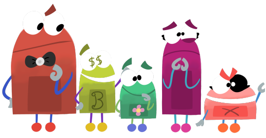
Storybots OCs!!!!!
I'm actually pretty proud of how these fellas came out!! Drew the concepts traditionally first, then drew them digitally in IbisPaint X, my main drawing app. I'm not really happy with the way the gradient effect looks on their bodies, but the Ibis blur tool is very goodn't so it's the best I could manage with the limitations of the program. Other than that, I feel like I did a decent job replicating the art style. These five are OCs of mine, only conceptualized last night, and they're all technically under 24 hours old at the time of uploading this. Answer Team AU23, one of the worst teams in the department!! Hap does not like these fellas at all; if you thought his disappointment in 341B was bad, you should see the way he feels about this team. Rightfully so, as they rarely answer questions correctly, and if they do, it'll take much longer than it typically takes 341B to. This is mostly due to AU23 not consisting of the smartest members. ...Okay, only about two of them are actually very smart at all. They goof around non-stop, constantly get on each other's nerves, and are generally a mess. They'd probably all be out of a job if it weren't for the department being so busy and needing all the help they can get. Now to go over the individual characters! I'll describe them in order, from left to right. First off, we have Blink, the team leader! As much as he tries to be seen as a good person, he has a habit of lashing out on his teammates if he's pushed past his limit. He's not usually the violent type, but won't hesitate to give long lectures to his teammates if they're doing something wrong, though no one ever listens to him. He's got some real issues with his temper, but tries his best to keep them under control. He's a stickler for the rules, and can come off as bossy and controlling to his team. On top of this, he's a bit of a perfectionist, and hates germs, bugs, almost all rodents... He hates a lot of things, actually. Despite his flaws, he's often the only one to actually get the team closer to answering a question, and is rather intelligent. He's usually pretty levelheaded, despite his habit of losing his cool. Next up, there's Bling! He would legitimately sell his entire team for a nickel. In fact, he's done it before, but that's a story for another day. This guy is obsessed with cash; rarely spends it, but always wants more. He'll often steal things from the outerworld without his team knowing, only to sell it when they return home. He's very clever, decently street-smart, but not very book-smart at all. He's millions in debt to who knows how many people, and is pretty much constantly hiding from them, which is why his job is so convenient for him; he can escape to the outerworld whenever he's on the run. He rarely ever actually contributes to answering any questions, and really only cares for himself. He's a master of mind games, able to talk his way out of almost anything. He's got a bit of a gambling problem, and to make matters worse, he always cheats. Though he puts on a friendly facade, he's actually a huge jerk at times, and will often use his teammates just to get his way. He's a huge coward, and won't hesitate to put his team in danger, if it means keeping himself out of it. Next is Blip! He doesn't take his job seriously whatsoever. He's got nicknames for each of his teammates, most of whom significantly dislike these nicknames. He's got a passion for practical jokes, and doesn't discriminate as far as who he'll pull them on. He tends to defy the laws of physics on occasion, and seems to have an endless supply of jokes and gags that he can pull out of thin air. He'll often try, and fail horribly, to make light of a bad situation with his jokes. As much as he tries to help, his leads almost never lead to a correct answer, and he's got little-to-no brain cells. The few brain cells he does have are pretty much entirely taken up by his extensive knowledge of pranks and pointless gags; it's all he knows, and all he feels he needs to know. Although he'll never deliberately hurt anyone with his pranks, if someone happens to be hurt in the process, he'll just shrug it off as long is it's not severe. Then we have Bloom! Socially awkward and a total coward, Bloom is an absolute mess. She's quite literally scared of her own shadow, this poor girl. She's a frequent target for Blip's pranks, and doesn't take them well at all. She's very sensitive, and would cry at even the most childish insult. Seriously, if you called her "smelly", she'd start sobbing. She's actually very smart, though she's usually too anxious to voice her opinions, even if she has a potential lead to help answer a question. She's terrible with social interaction, and if spoken to by someone she doesn't know well, she'll freeze up. She is actually very sweet once you get to know her, though most don't bother to, since she keeps to herself so much. Finally, we have Blam! She's... A feral creature. She's constantly talking like a pirate, just because she can and she wants to. She's obsessed with fire, pointless chaos, and anything that goes boom; explosions are her life. She can be violent if provoked, but would never really do much more than a punch or two. She does have morals, though they rarely show, and they're clearly not very good. She used to hate when people commented on her eye, though over time she's come to almost be proud of it, thinking it makes her look tough. Why, you may ask, does her eye look like that? Well, it's a long story, but to roughly explain it, she was corrupted while returning from the outerworld one time, due to a glitch in the system. It could theoretically be fixed, but at this rate, she doesn't want to fix it. That's about it!!! I'll probably be making more OCs later on, but until then, I'll leave you with these fellas. Do know that I will probably be writing about them!!! If I do, it'll be posted on DeviantArt and on my Wattpad, with luck. I’ll link it in a post on here if I do write it.
18 notes
·
View notes
Text
Okay, this’ll be a long one.
1. Like everyone else, most digital artists start with the humble beginnings of pencil and paper. The angle and visual settings are at a place where your muscle memory finds it easier and more natural to guide your hand. So, sketching things out on paper first can make things ten times easier. Most programs have a tool called “extract lines” where you can take a picture of your sketch, pull it in digitally, and pull out the lines from the paper.
For my example, I’ll use ibisPaint since it automatically asks if you’d like to extract lines when you pull in a picture.
2. The program you choose completely depends on how much money you’re willing to spend.
If you have a good desktop computer and drawing tablet, ClipStudio paint is praised head to toe since it has a lot of incredible features. However, the program is subscription based in the sense that you have to pay monthly for updates, but you can do a one time payment of an exorbitant amount of money (last time I checked) to get a single version. ClipStudio is also very beginner un-friendly. Also I hear, but have had no experience with, the program has a habit of crashing quite a bit.
Photoshop is another one that’s praised highly. But I don’t care what anyone will try to say, Photoshop is absolutely not worth it. Very user unfriendly, very expensive, and in general it’s just a mess.
Another super popular program right now is Procreate. The app itself is actually pretty cheap for a program with all of its features. At around 10 USD, it can offer you a lot to do. But the major downside to this program is that it’s only supported on apple products. And, unless you have the money to spend on an iPad and Apple Pencil, it might not be the program you want to use. I will say that it is possible to find an iPad for half the selling price at a local Pawnshop. Chances are that it’s stolen, but if you don’t mind that, it’s a pretty cheap alternative. There are also knockoff Apple pencils on Amazon for like 30 USD instead of 90 on the Apple website. Also a little side note, it’s not the most beginner friendly either, and it’s been known to crash fairly frequently.
Medibang and FireAlpaca are sister programs that have a very similar layouts and features. I used to use FireAlpaca when I was drawing on my laptop, and then I switched over to Medibang after getting a desktop. The similarity between the programs really helped me escape the learning curve. They’re also the first ones in this list that are free, and you only need a laptop and a drawing tablet without a screen to run them. You can get one of those drawing tablets pretty cheap. For free programs, they have quite a few options. However, they don’t really have great brushes or brush settings. You can always buy a brush pack for the programs off deviantart or someplace else, but the programs’ limited brush settings can only get you so far. If you want better brushes for Medibang, you can always get their subscription too. It’ll also open up features like gradient maps. When it comes to beginner friendliness, they’re better than the others, but there’s still a lot going on and a bit of a gap you need to jump.
Finally, there’s ibisPaint. It’s the beginner app for a lot of newer digital artists. It’s free, it’s got a good array of features for something its size and cost, and it’s fairly easy to use. I know people who draw with their finger on this app, but I recommend you at least get a cruddy stylus like the ones at the ends of company pens. IbisPaint is supported by pretty much all devices. You can get it on a laptop too, but there’s a time limit to drawing unless you want to pay. A lot of ibisPaint’s features feel like it’s a mobile game and you have to watch ads to get the prizes. You can watch ads to get more brushes for about 18 hours, or you can buy their subscription and open a wormhole of new features. To be honest though, you probably won’t ever have to use many of the features. It’s also prone to crashing if you don’t have a ton of storage on your device. It sounds a lot worse than it is, but maybe I’m just biased. It’s the best on this list when it comes to new user compatibility, but of course, there’s still that learning curve. Their media team does have some nice tutorials though.
In general, most if not all art programs are difficult when you first start. But you can always do a little studying with some tutorials on YouTube to help. Also, there are a ton of websites and apps that can help make your drawing process go smoother via references, prompts, and tutorials.
I should say that there are a lot of other programs out there, but these are just the ones I’ve had experience with. Right now I’m chilling with my Medibang Paint since I’m broke, but I hope to work towards Procreate.
Sorry to throw this all at you at 10:00am, but I hope this helps a little bit :)
Digital Artists!
I've read some articles but still feel a bit lost. If I were hoping to learn how to draw digitally, do you have a favorite app that would help me along the way? I have ZERO traditional art experience. I mean, I can paint a bit, but when it comes to drawing, I have no sense of depth or angle or any of it. So an app that would hold my hand and teach me like an idiot would be greatly appreciated. If it exists. ;) And any and all information that you've gleaned along the way or stuff you wish you knew as a beginner would be lovely!
SO GRATEFUL for all of you and so in awe of your gift!
Sincerely,
A Writer Who Draws Like an 8-Year-Old 🤓
222 notes
·
View notes
Note
How do you make the manga caps transparent?
oh, i have been waiting for this question.
before i start, i’d like to say that i make all of my transparents on my iPhone. my tool of choice? my finger, and the app ibispaint x. i’m sure there are quicker and better ways to make transparents (scratch that: i know there are quicker and better ways to make transparents), but this way is fun for me. feels a bit like i’m coloring a coloring book.
the tutorial is under the cut because i go into quite a bit of detail!
alright, here we go!!
(i blocked out everything in this image outside of the part that we actually care about, because this is a page from a recent chapter.)
STEP 1: alright, so we got a page from the manga with this adorable little shinsou, which we’re going to make transparent. ideally, get a page that has solid black lines, and that doesn’t have little stray fuzzy bits outside of the lines. otherwise your life just becomes a whole lot harder. the reason i prefer not to do earlier chapters is because the website that i use to get pages doesn’t have good quality images of the first hundred or so chapters, and i’m too lazy to find another website. so what we’re gonna wanna do is…

STEP 2: crop the manga page to the part you actually care about! you can also do this in the app that i’m going to use, but i just prefer to do with the photos app. nice and easy.

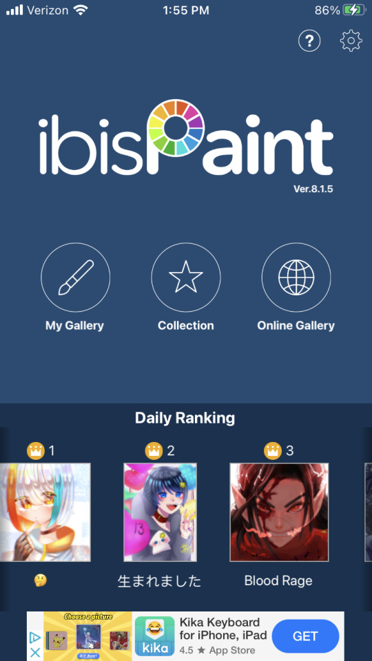
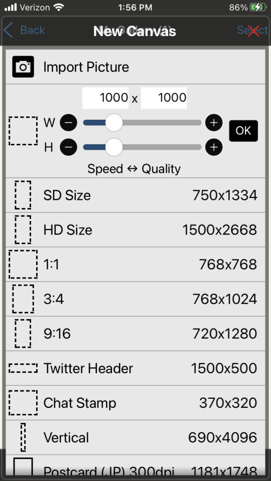
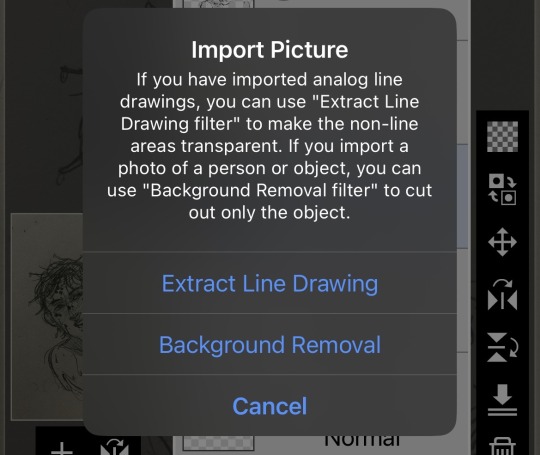
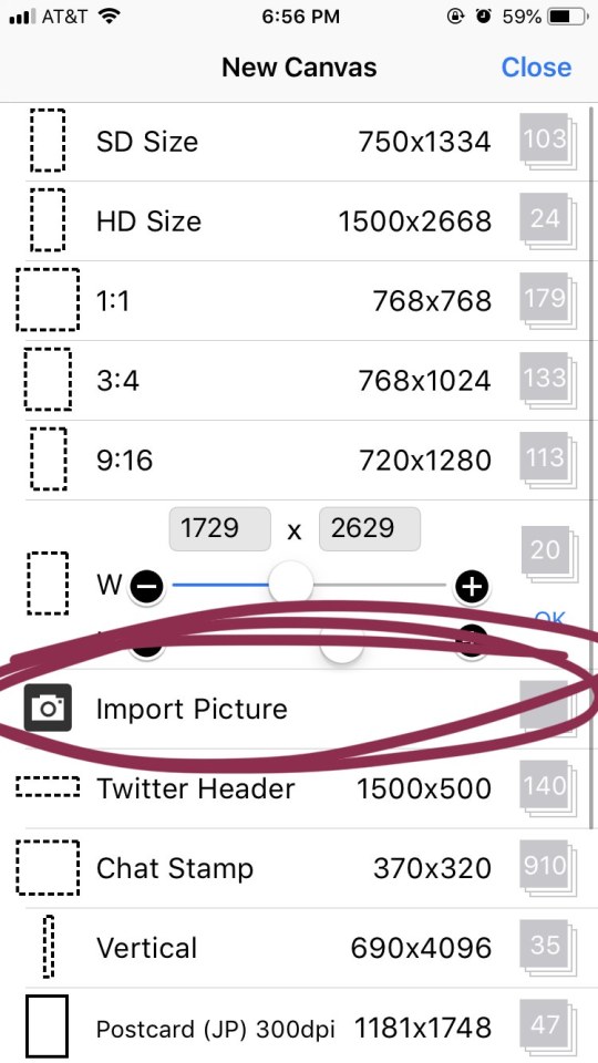
STEP 3: when you open ibispaint x, there’ll be three options, “my gallery”, “collection”, and “online gallery”. pick “my gallery”, and it’ll take you to a screen that looks something like what’s pictured above. click that fancy little plus button indicated in the image to start a new canvas!
STEP 4: the option you want to pick is import picture.
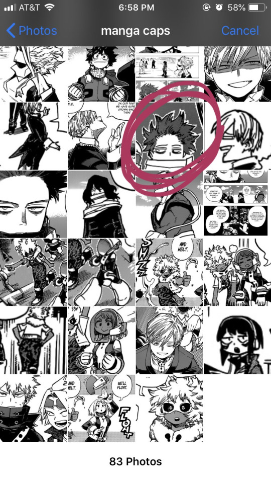
STEP 5: alright, there’s our shinsou! we’re just gonna click on him, pretty easy, right? also yes, i have an album on my phone dedicated solely to manga caps that i plan to make transparent.
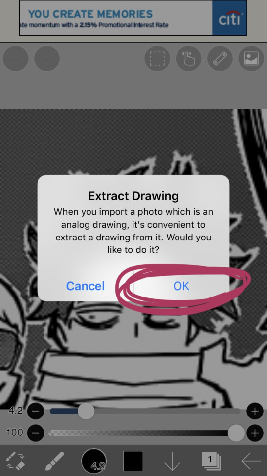
STEP 6: the moment you click the image, it’ll take you to a canvas and ask if you want to extract the drawing. you’re going to hit “OK”, because extracting the drawing makes it so that all the white areas in the image become transparent, leaving only the black and grey.
NOTE: this won’t quite work properly if the background isn’t pure #ffffff white! if you are making a transparent from someone else’s manga cap, make sure that the manga cap has pure white values. if it does not, there will be a very light, barely detectable film of nearly transparent grey values, but it isn’t full transparency. this means if someone uses your transparent over something like…say, a solid colored background, the colored background will appear darker in the final image. there’s a way to get rid of this film, but it’s hard to explain, so please ask me if you want to know how to do this. heroacacaps is a very popular blog that editors get their manga caps from, but their images do not have a pure white background. (it’s kind of funny, i can often spot when someone made their transparents using a manga cap from heroacacaps.)
OPTIONAL STEP: if you are using ibispaint x for importing anything that you don’t want to make transparent, then 99% of the time, you are going to want to hit “cancel”. also, this ONLY works well for black and white images, and trying it on a colored image with make the image turn monochrome. you can still use it on some colored images with white backgrounds, but it you need a few extra steps to make it work (hint: clipping layers, if you know how to use those. duplicate the extracted layer until it is completely black without creating black values outside of the lines, and merge the layers down into one layer. clip the original image over this layer. ask me if you ever want me to go further into detail!)
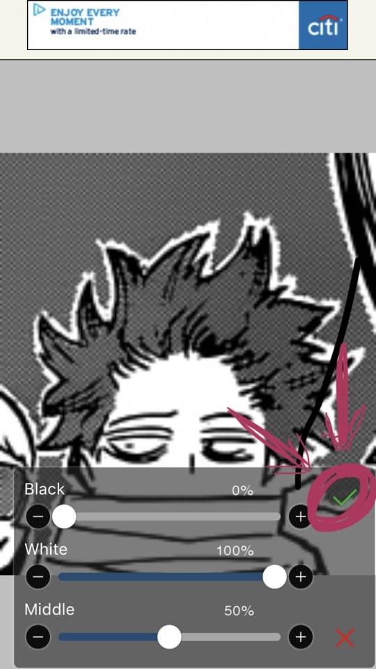
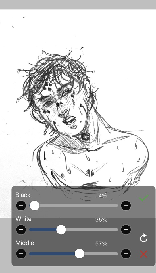
STEP 7: once you hit “OK”, this will pop up!! if you are using a good image where the lines are solid black values, the default option will be perfect for you.
click the green checkmark once you’re satisfied with the appearance of the image!
OPTIONAL STEP: you can manipulate these numbers if you need to. i find this useful for making the lines on sketches clearer. increasing the black percentage makes middle grey values appear darker, and decreasing the white percentage makes middle grey values appear lighter. the white percentage cannot be lower than the black percentage. i’m…not quite sure how to explain what the middle percentage manipulates, but you can mess around with it and see what happens.

STEP 8: so we’ve got the image on the canvas, but now we have a bunch of stuff in the background. to get rid of it, hit the little brush icon, and click the eraser icon. if you’re not sure what the eraser icon looks like, the next image has an image of it in the location where the brush icon was.
next, just…use your finger (or a stylus if you’re fancy) and erase away all of that outside stuff!
OPTIONAL STEP: some manga caps require the extra step of drawing any parts that were covered by things like text bubbles and other characters. it’s sometimes the most tiring part of the whole process, and i can’t really tell you how to do it. you just have to experiment with the available tools. there are lots of brush options you can try to imitate the way the lines look, if you click the button to the right of the brush icon, and there are also (painful and tedious) ways to replicate more complicated textures. i often have to do this step which is why i have an entire goddamn tag dedicated to transparents i needed to patch up.
if there was only one reason i had to pick for why you should respect the people who give you manga caps without backgrounds for you to use in their edits, it’s because a lot of times, they patch up manga caps without any comment. some replicate the actual style so well that you’ll have never realized that the person you got the manga cap from added in their own bits. here’s an example. this transparent? it took an hour. just look at the original, and consider how many different areas are covered by text. imagine how many different textures and lines that have to be replicated.
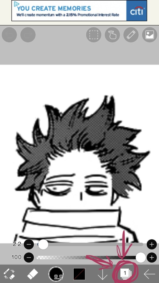
STEP 9: alright! now we’re ready to actually make this sucker a proper transparent image. this image is actually just lines, and if you stop here, you’ll only have the outline of the image! what we’re going to have to do is take parts that we don’t want to be transparent, and color them white. unfortunately, this is the bulk of the work, most of the time. to do this while still keeping the outline intact, we’ll have to use layers. hit the button with the rectangles stacked on top of each other to open the layers menu.
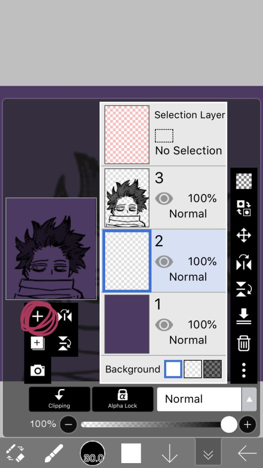
STEP 10: hit the plus button to create a new layer, and make sure to move it underneath the layer with the manga cap. i actually like to make two layers, with the lowest one having a color that’s dark, but not too dark. this added layer makes it easier for me to see what i’m coloring, and i really recommend it. if you don’t do this, you’ll have to hit one of the checkerboard patterns next to the word “Background” located underneath the layers. ideally the darker one, it’s easier to see the white on it.
STEP 11: hit the eraser icon and click the brush icon again to be able to draw! and now, it’s just simple coloring. if you’ve ever used a coloring book, then this might evoke feelings of nostalgia within you, because this is basically just a glorified digital page of a coloring book.
i like to color the parts closest to the line first with a small brush size capable of getting in corners (use the little slider next to the text that says “4.8″ in the image to change the brush size). it’s not that helpful for a transparent as simple as this, but more complicated transparents with lots of corners to color make this step a blessing. or maybe that’s just me.
STEP 12: aaaaand finish coloring all of it, with a bigger brush size. if you colored near the lines first like i mentioned in the previous step, then this will feel a lot more like using a coloring book than the previous step.
STEP 13: alright! if you used a colored layer underneath to help you see the white, then you’re going to want to hit the little eye button on the colored layer to make it invisible. after all, we do want the image to be transparent.
STEP 14: next, there are three background options underneath the list of layers, next to the word “Background”. if you want your image to actually be transparent, do not pick the solid white option. pick either of the checkerboard options, both will give you a transparent image.
STEP 15: you’re done! now just to save the image. click the little arrow pointing left on the bottom right of the screen. this will exit you out of the canvas, and back to your gallery.
STEP 16: click the button indicated in the above image.
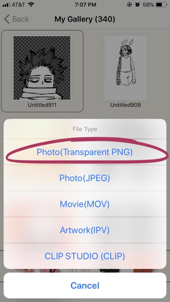
STEP 17: the above will pop up, click “photo (transparent png)” to save the image as a transparent image.
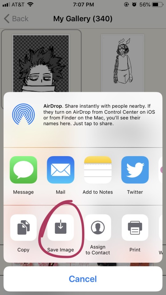
STEP 18: click save image!
and that’s it. you should have yourself one gorgeous transparent in your photos. i would probably suggest checking the image to make sure that it isn’t transparent in areas that you don’t want it to be.
210 notes
·
View notes
Text
How I Make My Edits
because @lesterluminous asked
First off, I have the most convoluted process ever because I use free/cheap apps on my phone for reasons. So, I'm not really the best example to follow, but here you go~~~
These are all the apps I use. The pink I use for almost every edit, the blue I use for color correction, and the purple are my go tos to make pics look cool. Everything else I use less frequently and only if I want a specific look
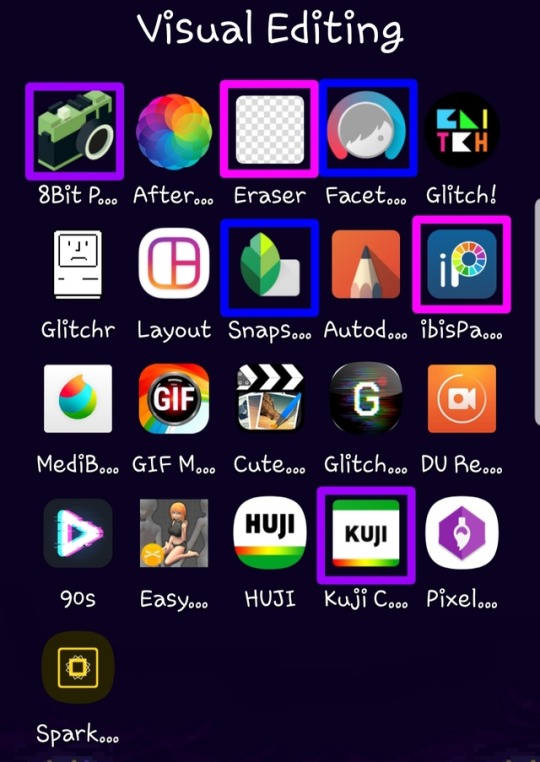
Here’s what I use each for
8Bit Photo Lab: easily my fave app for glitch effects
Afterlight: the best basic photo editing app I’ve found on android. Good if you’re in a hurry and just want like a filter. I rarely use this because I’m rarely in a hurry
Background Eraser: (from handyCloset Inc.) the best app of its kind I’ve been able to find. Very easy to use, minimal ads, and doesn’t lower the quality of your photo. I use this anytime I want to get rid of the background
Facetune: I mainly use this when I’m having trouble getting the coloring of the pic right in snapseed or if I want to color correct only part of the photo. The makers of this app have another one that is phenomenal called Enlight and it’s my absolute favorite editing app, but it’s not available for android
Glitch!: another cool glitch effect app. It can do some things 8Bit can’t, but it’s more random and I like ~control~ I mainly use it for GIFs
Glitcher: this one is ultra random, so I hardly ever use it. But, it’s good it you want a glitch effect, but don’t want to spend much time on it. Again, I mainly use it for GIFs
Layout: sometimes a bitch just needs a basic collage okay???
Snapseed: the first app I go to when making an edit. A lot of times the lighting in the boys pics isn’t great (especially in ig stories), so I use this to color correct and. It has the ability to edit using curves which is the best thing ever once you get the hang of it. It also has a bunch of features I never use, but they look neat. Also, it’s completely free
Autodesk SketchBook: tbh I never get around to playing with this, but it seems like it’d be good lol
ibisPaint: omg this app is sooo underrated. I use it for almost every edit and I also use it for drawing. It’s intended to be a drawing app and not an editing app, but it has so many features that are FREE. You can make a one time payment that gets rid of ads, allows you more layers than you’ll ever need, and gets you more brushes, but you don’t necessarily need that stuff. I’m honestly so shocked it’s free because it’s so, so good. It also has a monthly subscription with more stuff but I aint got a spare $2.99/month
MediBang Paint: I literally only use this to make gradients. I’m sure it’s perfectly good, but I like ibisPaint so much more lol The only thing ibisPaint can’t do that I wish it could was make gradients haha
GIF Maker: (by GIF Maker & GIF Editor & Video Maker) sometimes I make extremely shitty GIFs that may or may not work on desktop. This is what I use. It’s the least sketchy GIF making app I’ve found, has minimal ads, and plenty of features
Cute CUT: (by MobiVio Solutions) this is the best video editor I’ve found on mobile. I sometimes use it for editing video to turn into gifs and sometimes to work around the dumb way other apps do thing that’s too complicated for a basic overview haha
Glitchee: this app is really not user friendly, but it has some cool glitch effects. Good for GIFs because it allows you to edit/save video and not just pictures
DU Recorder: This is the best screen recorder I’ve found. Very reliable, non-invasive ads, etc. I use it to capture video I want to use for a GIF. I also used it to record my M&G
90s: (by ryzenrise) this has a lot of really cool retro and glitch filters, but it ONLY lets you edit video. I hardly ever use it, but it’s good for GIFs. I’ve also used Cute CUT to make a video file out of a picture as a work around
Easy Poser: for drawing, not edits lol
HUJI: for taking dumb photos, not edits
Kuji Cam: my fave for making pics ~aesthetic~ It’s free to download, but worth paying the small amount for full features. The filters are so good and I use this very, very frequently. If I’m still having trouble with color correction after Snapseed and Facetune, this is often my saving grace
Pixel Brush: for drawing, not edits
Spark Post: this seems like a cool app if you want to make edits, but would rather have something simple than mess around with a ton of tools. But, the best thing about it is that it has easily searchable free photos! I just use this to find a photo for the background of an edit then save it so I can use it in other apps that I like better lol
My workflow
So, I am not a good person to emulate if you want to make pretty edits. But, I’ve never claimed to be a good example, so I’ll tell you anyway lmao
To begin with, I have a Galaxy Note8. This is important because 1) the screen is huge af so I can actually see what I’m doing and 2) it comes with a pressure sensitive stylus. I literally chose this phone for these reasons. These combine to make my phone pretty similar to a drawing tablet which allows me to be a lot more precise than if I were just using my finger.
I download pics and video directly off Instagram because I want to know I’m getting the best quality possible I use StoriesIG for their stories and DownloadGram for their pics posted on Instagram (or i download from Twitter if the boys also put it there). I haven’t found a way to download photos from a photo set after the first one besides just screenshotting then cropping them.
From here, I color correct in Snapseed and Facetune, sometimes going back and forth between apps before I get it how I want. Then, I add any filters and/or effects I want. Next, I use Background Eraser to get just the boys. I determine what sort of background I want and I prepare that. I open a new canvas in ibisPaint and add any pics I want. Then, I get all creative combining everything together and making it look pretty instead of just slapped together (unless i want it to just look slapped together for a shitpost or something lol)
As for GIFs, I don't know how people who are actually good at it do it, but I acquire my video, use Cute CUT to up the contrast and saturation and mess with the color a little. Then I chop in into pieces that are about 3 seconds long and save each as its own video. Then, I put those into GIF Maker and maybe mess with the color again in there. Then I save that and pray to the patron saint of editing, Philip Lester, that I got the settings right and my file is small enough to upload. I rarely make GIFs because, using this method, they turn out very, very atrocious :)
And that’s it!
If anyone is curious about how to do specific things or get certain effects or there’s anything else you want to know, feel free to send me an ask or message and I’d be happy to try my best to help
19 notes
·
View notes
Text
nobody asked but i could try giving some tips for what i've learned to get around some of the difficulties i had with ibispaint
if you're like i was and used a phone or ipad that doesn't detect pressure i way i was personally able to get around this to make my lines more dynamic was to mess with the opacity and thickness according to to speed

i'm using the soft falcon bleed pen for this- if you're on mobile you can mess with pen settings by pressing the arrow on the far right


the one on the left is where i put the default settings on the brush and the one on the right is where i messed with the thickness and opacity according to speed. these are just the settings i personally liked and you can always change them according to your preferences in how you want your line weight to look


left is the default and right is where i changed the settings. left is fine if you like that sort of style for your art btw!! im not saying you have to do this :] im just saying with my art i liked leaning towards more dynamic looking lineart.
i will say with ibispaint you CAN run into a lot of crustiness- if you look at some of my earlier digital pieces on here you could probably see some glitches that definitely could have been avoided if i knew how to use things like the bucket, clipping, and alpha lock tools.

a lot of my mistakes earlier on came from the select opacity option because it was the easiest for me to understand at the time, however its not always reliable as a lot of times you either run the risk of the edges of your coloring either not being colored or being colored to the point of them being crusty. especially avoid this if you're trying to color over lineart. trust me.
im gonna be honest- im not the most patient when it comes to coloring flat colors and much more like messing with shading, so i usually use the bucket tool! nothing wrong with that, it just makes things a a little easier and a whole lot faster. if there's little gaps in the lineart it misses i can just go back and color it in manually, no big deal.

the only setting with the bucket tool i ever mess with is the expansion, which i usually put at 2.0 (the default is 1.5)
the reason i do this is leaving it at 1.5 always leaves gaps in between where the color ends and the lineart and it saves me time having to go back and fill in all those gaps. with textured brushes there is still some gaps you might have to fill in but at least you dont have to go all around the lineart filling them in manually.

hopefully you know or have at least an idea of what these do, but if you're like me and can be a bit slow at things like this, basically clipping lets you color over the layer below the one that's clipped and alpha lock lets you color over only parts of the layer that's already been colored.
i usually use alpha lock for recoloring both the colors and the lineart because it doesn't leave the crusty look youd get with the select opacity option and i used clipping for shading. again do whatever is easiest for you!


they're pretty easy to use and get the hang of! again sometimes dealing with crustiness can be a bit of a problem in this app so usually if im putting an overlay above the entire drawing i have the overlay clipped to the bottom later and the bottom later alpha locked. i tend to merge layers a lot to keep from getting disoriented while messing with my layers so if you merge them with the alpha layer locked press no when it asks you if you wanna disable it
that's all the pictures i can put so im done rambling but i rly do love ibispaint and things it's a rly good app especially for beginning artists, it's easy to use, it has a wide variety of brushes and it has REALLY good filters! hope if you're an ibispaint user this has helped you a bit, if you have some questions you can send me some asks about it :]
idk man say what you want about free art programs because obviously a lot of them will be flawed but man i love ibispaint and if you can figure out how to mess with brush settings it rly is just great it rly did carry most of my drawings for all of the past year
#long post#LOONNG post#sorry for rambling HDKSHD#dont mind any typos or weird wordings in this i have No Brain
40 notes
·
View notes