#parallax backgrounds are cool
Explore tagged Tumblr posts
Visit Tumblr Blog
Explore Tumblr blogs with no restrictions, modern design and the best experience.
Last Seen Tumblr Blogs


Fun Fact
Tumblr is used by 21% of adults online aged 18-29 years.
Text
Devlog 17
Today was a great week for game development!
I finished up the main backgrounds for the Yokai Forest, and I gotta say I'm pretty pleased with how they turned out!
The Yokai Forest is the first area in the game. As the name implies, it is home to the many yokai (supernatural creatures) that live there. Wandering spirits and vengeful Yurei are common to see, but if you're lucky (or unlucky) you might run into a Danuki. While it may look like a dense, eerie forest for humans, it is a safe haven for all the Yokai that live there.
Most of my work this week was spent polishing up the background layers for the Yokai Forest as well as setting them up to be parallax backgrounds. The other thing that I was working on that didn't quite get finished before today was fixing some camera issues. Now that background stuff is taken care of, I plan to move onto making the UI look nice. Maybe I'll mix some minor bugs along the way.
That's all for this week, I hope you stay tuned for the next!

Mizuki and the Crimson Moon - Devlog (tumblr.com)
#devlog#indiegamedev#game development#platformer#indie games#solodev#screenshot saturday#gamedev#japanese inspired#forest#yokai forest#pixel art#pixel background#pixel scenery#mizuki and the crimson moon#matcm#parallax backgrounds are cool#those trees were a lot of fun to make too#shiitake mushrooms grow in the wild right?
10 notes
·
View notes
Note
your carrd is super cool! do you mind telling how you made it? it looks like its coded (aka i had NO idea you could make something like that in the app) and its vibe fucks ^^
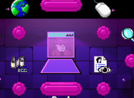
Sure! The only two unique pages are the home page and cast page, so I'll just describe those real quick. If there is anything else you want to know about, I can elaborate on that too. This is my first time using carrd, so I'm really no expert here!

On the HOME PAGE, the background is a container with a parallax (which causes the scrolling effect). I also faked the homepage UI by making the text buttons images and adding a brighten effect when hovered over. "DEMON DETANGLED" is a separate image overlaid over everything.

The CAST page is a series of two-column containers. The writing is actually an image, with text in the alt text for screen readers. (saying this and realizing i forgot to put alt text on the other images!!! oh no!!!) This was mostly done to both save on how many assets I was using (since carrd only gives you 50) and also because I wanted everything to be written in that specific font. Unfortunately, I then got lazy, so only the cast page is written in it.
Anyway, no coding used! Just me fiddling with layouts.
45 notes
·
View notes
Text
Trembling Essence:💙Background + poll results💙
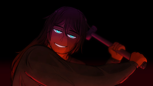
Hello hello and welcome new followers! :]
Firstly I just want to say a very big thank you to everyone that participated in the poll I did last week, I was really surprised but happy with the results and responses! This will help me a lot moving forward! :,] If you missed it and would like to say which route you preferred feel free to comment!
Anywho, this week mainly focused on art practicing again but I did work on the game and managed to get my bearings even more!
Here is the new background for the start of the game:
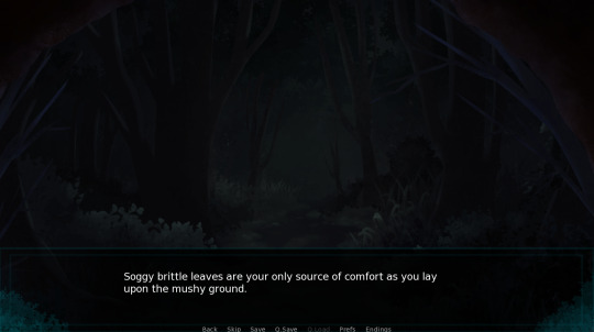
This took a long time to draw up since I sketched out the background instead of looking at references this time. Once I got a basic idea of how I wanted it to look it felt.. too empty and flat. At first I couldn't figure out why until I added more shrubbery and grass. After that I started adding the trees and then added a few more to give it depth and adjusted some of the coloring. So far the immersive symbolism I'm going for is slowly coming together! Since it just finished raining where you're located I tried to give the background the illusion of looking tolerably humid but slowly getting colder over time with a hint of decay in the distance. This is a better look of the dreary foreboding atmosphere compared to the "fairy-forest" from last week. >:,] It took a while but I also added a parallax effect here and optimized the images to save space. I kept getting an error when it came to the middle ground so I had to find and fix the problem which delayed things. I don't have a video to show it in action but maybe next time. I do want it to be known again that these automatically happen and don't follow the cursor. :,,]
Here's a sneak peek of the new choices you can do when you're in this area now. >;]
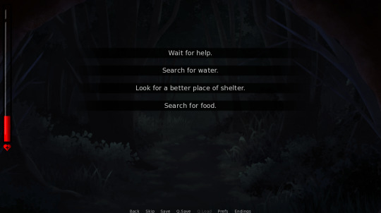
This part required a lot of brainstorming before I figured out how I wanted the explorative part to go. This was originally going to go a different way completely but a particular day caused me to just scrap it and start everything over. I have a very solid idea on how I want all of this to go better than ever so I can't wait to show some of the new areas! I didn't expect this background to take as long as it did to draw up but hopefully next week I'll have more done!
Progress doodle layout:
Since certain endings are being changed I thought it would be cool to animate a progress layout to visually show how everything is going! It shouldn't take too long to finish this section up since I already have a foundation laid out.
Noah's sprite sheet update:
As far as Noah sprite sheets goes, it's still in sketch mode and I haven't messed with them yet since I've been practicing. :,,]
There are some old drawing prompts I wrote down and sketches that I'm still doodling up behind the scenes so hopefully I can get to them at some point with some attached lore. :,]
Q&A / Ask box is still open:
If you have any questions about Trembling Essence/Noah feel free to ask here please. This makes it easier for me to see and answer accordingly! I would really like to hear from you guys!
Thank you to those who have sent in asks after everything got reset! I'll try to get to them when I can along with the ones that come to mind that got deleted. I just need time to answer since I like to respond with doodles/drawings as practice. :]
Overall that's everything I have to share so far, thank you guys for your continued encouragement and support through all of this, I wholeheartedly appreciate it! :,,]
#te updates#male yandere#visual novel#dating sim#yandere#game development#itch.io#yandere vn#anime drawing#vndev#vn#artists on tumblr#indie games#renpy#horror games#otome#art#digital artist#murder sim#interactive fiction
27 notes
·
View notes
Text
Procreate Dreams
I've been playing around in Procreate Dreams for about a week or so now, and I think I've got enough of a handle on the software to offer a fair review! If you're interested in hearing my thoughts, click the read-more below.
A little context before we get started; I have two degrees in animation, but they're both in 3D. My personal specialty is tech and articulation/rigging, but I think my background puts me in a unique position with Procreate Dreams; I know all of the theory behind animation, but I'm not going into Procreate Dreams and comparing it to a professional-grade software I generally prefer to use (like Toon Boom Harmony, for example).
So, let's get into it!
First Impressions
I hated it. I opened the software, it crashed. I couldn't figure out how to enable onion skins. I couldn't increase or decrease the exposure of my frames. I couldn't figure out how to swap to the eraser. I was confused, I was frustrated, and then I realized that I was expecting to jump in and animate without taking the time to learn the software first.
Once I stopped trying to strong-arm it and started looking up documentation, things got a little easier.
Re-Thinking My Approach
Procreate Dreams isn't comparable to any other animation software I've used before. The UI is different, there's a focus on gesture over buttons, and everything about it is meant to be minimalistic. None of this reflects poorly on the program, in my opinion. It's different. You can't go to Procreate Dreams and get mad at it for not being like the other software out there in terms of how it's used. In fact, I think one area of Dreams that should be applauded is the sheer ambition on display. It's a hybrid of traditional frame-by-frame animation and offers a slimmed down version of some of After Effects' most useful compositing & motion graphics tools. That's just plain cool.
The Good
For those of you who've used Procreate Dreams, you may find it's a little... difficult to see all the good it has to offer through the muddied waters it's launch-day bugs kicked up, but under all the grime, there's a little bit of gold.
Dreams is a one time, $20 USD purchase. That's huge in terms of affordability and accessibility in the software market right now.
The "Perform" option is great, and I think we'll see the longer that it's out, the more creative people are going to get in using it. I've already seen people create gorgeous parallax on their illustrations.
Simple compatibility with Procreate is a huge win. I'm finding my pipeline uses both software together.
The UI is a mixed bag overall, but I find the ability to move between flipnote mode and timeline mode to be great. It keeps the screen free, but I can still access the features I need while doing frame-by-frame.
The move/filters option is a great way to add a little compositing magic to your work.
The Bad
The "bad" here exclusively covers issues with the software as intended. Bugs will be covered under "The Ugly" below.
The lack of a lasso tool is a huge setback. I've seen people saying that it doesn't make sense not to have that feature at launch, especially when it's part of Procreate, but I understand why it may have been difficult to implement in conjunction with the move/perform/warp options. If you save a warp on top of an illustration, then cut and move part of the drawing, how is the warp/local translation data applied to that image? Does the pixel remember it's movement, or is it applied on top of the drawing? There's a lot to consider.
Similarly, the "reference" tool in Procreate would be an excellent tool to add color to layers beneath current layers. "Add Reference Track" would be great! That said, I think this conflicts with the move/warp tools like the above.
The timeline is a time sink. I should be able to adjust the exposure of my frames easily and consistently. As of right now, I have an 80-20 shot of selecting my layer or grabbing the handle for exposure. A small button on the edge of each frame (like a dot) would improve this considerably.
As far as I can tell, you can't mask a group onto another group.
No double-tap on the Apple Pencil 2 to swap to the eraser. This one I'm not sure about; it runs in Procreate, it seems simple to implement here... though it'd be great to see it customizable.
The Ugly
This includes bugs and other issues that are separate from the features (or lack thereof) of Procreate Dreams.
Crashes are frequent. I haven't used the software reliably during any of my sessions so far, but Dreams' autosave feature is extremely strong and very forgiving, so I have lost no work.
My pen pressure become erratic at times, necessitating a restart of the software.
Sometimes my pen will stop working, though other features in the app will continue to run.
The good news is, I think that Dreams is overall a huge win for artists and animators worldwide. Everything that's not working about Dreams will hopefully be resolved in future updates. I'd encourage anyone who wants to try animating for the first time to pick it up-- with the understanding it might take some time to get used to/master.
61 notes
·
View notes
Note
(For the metroidvania) Mayhap a mix? Valuable space station goes down (likely doing something experimental/black ops) and some violent entity loots the tech and goes underground. Quite literally?
It's an idea for sure, though might risk losing some of the innate isolation that space provides. Could of course also be some kind of station built directly into an asteroid that proves to be hollow and containing mysterious stuff™ too etc
Part of the reason I'm so undecided is because there's a lot of competing factors involved? Like I want multiple different, and preferably at least somewhat interesting, biomes rather than have everything just be a series of progressively darker caverns, and I would like to be able to have at least the occasional "room", for lack of a better word, that opens up a bit and gives a sense of space rather than having just cramped tunnels and facilities everywhere.
At the same time though, I want the location to be physically isolated without having to rely too much on invisible walls? Like an island or a crater or a space station or something where you can't easily just leave without hitching a ride via aircraft or space ship or something?
It's one of those things that's easy to do in 2D because you can just wall the player in with discrete "rooms" while displaying an open expanse in the background via parallax scrolling, thus creating the illusion of a much larger open space without making said space possible to traverse. With 3D, there's far less of a distinction between playable space and background space, so it's harder to wall off in a way that feels natural - especially in a genre infamous for providing significant levels of traversal.
Plus there's also just the simple question of what kind of setting and situation might be cool to have etc - like it might also be interesting to allow players to occasionally move around in zero gravity, see Prey (2017) using space walking almost as a kind of fast travel system etc. Not to mention that all of this has implications for how the actual engine needs to be built - like there's a reason why Doom and Quake don't have a lot of wide open outdoor spaces, why Descent I and II takes place entirely within caverns, and why MechWarrior 2 is almost entirely just wide open space with relatively sparse and simple terrain and a minimal amount of structures you can walk into or otherwise interact with.
There's also the possibility of taking a page from the narrative setup behind Quake and use teleporters as a basis for how completely different locations can still somehow remain both related and interconnected, but at the moment it's all just really up in the air.
Especially since I still don't even have a working triangle rasterizer implemented, lmao.
5 notes
·
View notes
Text
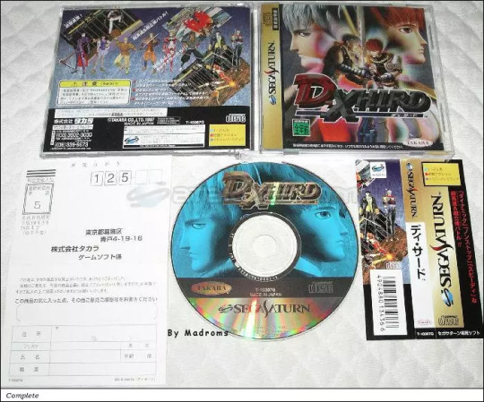
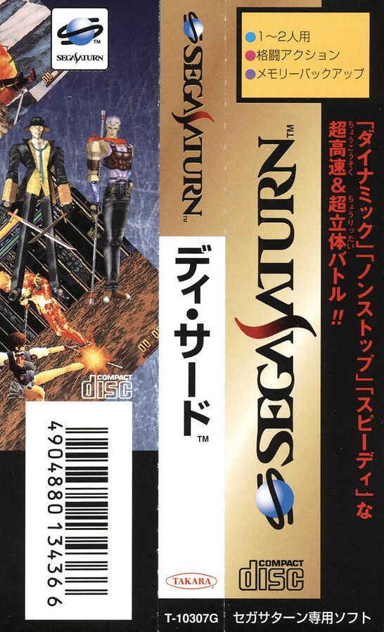
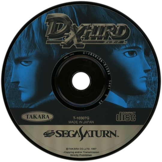
Sega Saturn - D-XHIRD
Title: D-XHIRD / ディ・サード
Developer/Publisher: Takara / Nextech
Release date: 30 May 1997
Catalogue No: T-10307G
Genre: 3D Fighting
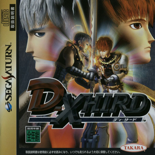

Nextech have sure brought some treasure to the Saturn with this title. Originally known as Project DDD running on unknown hardware, co-developer and publisher Takara showed off a 3D 1 on 1 Beat'em up running in Hi-rez with transparent 3D fighting arenas, multi-parallax scrolling backgrounds, light sourcing, and shading. It came as a shock to everyone that the game was in fact running on a standard Saturn!! D-Xhird (pronounced D-Third) is a technical achievement on the Saturn since it does everything that people said the Saturn couldn't do. The polygons are pretty solid looking too with no bending or break up.
So, is D-Xhird the best fighter for the Saturn? Well, sadly not. The game has amazing graphics for a Saturn and has some pretty cool 3D play mechanics, but everything seems a bit stiff. After playing this for a good 2 hours I started to get into it by trying out every one of the 10 selectable characters plus the 2 hidden characters. I'd say that this game is more of a "look what the Saturn CAN do" game than an actual sit down and play for a few hours game. Saying that, if you want a new fighter for a few quick games every now and then, get D-Xhird. It's far better than all of the other non-Sega 3D fighters out there on the Saturn.
youtube
youtube
2 notes
·
View notes
Text
Random notes and thoughts from me rewatching Gravity falls first ep (now that im not questioning if its the gnome episode....)
under cut for spoilers....? Mayhaps????
-IT HE in the intro! I can't pause at the right time to FULLY see the page image but it HE! Bill Cypher!!!! He's thereeeee.........(and like triangle motifs all thoughout the 3rd book anyways...
-I continue to love the intros theme music....its so funky!!!! :DDD
-it seems most of the scenes with the cart being driven is with a 3D model....but not always, sometimes its more like a DRAW OVER of the cart with some elements still as 3D assets (the banner thingys on the cart) along with what looks like a 3D model version of Dipper....but its only like this when the cart is smaller on screen...
when up close its usually just 2D animation instead! :DD
-And it looks like the chase scene (and other scenes with the cart speeding and the background blurred trees) is using 3D models for the background and its really funky cause they're lower poly but they look good enough to not draw the eye cause the blur and other visual elements!
-AND THE PARALLAX EFFECTS AHHHHHHHH SO FUNKYYYY
-...the general music within the mystery shake is cool......vaguely spoopy and smoothly fades in and out during convos between Dipper and grunkle stan so far......love the sound of it!!!
-.......who plays X and O's on a journal for supernatural stuff ON THE PAGE FOR VAMPIRE BATS???? (....I know a lot of the little numbers and triangles and other ambiguous shapes and notes are probably not ALL important...some probably are and some are just fluff/filler/red herrings but STILL)
-....the comedic foreshadowing moments of the GNOME page of the book......
-....8190 the arcade in the twins attic room......
-....purple bunnnyyyy on random person in the crowds shirt as grunkle stan argues over the rock that looks like a face FNAF?!?! ....ya probably not but I can pretend still
-Something about Mabel reminds me of Cass, not sure what....hmmmmm......Cass is Mabelcore or Mabel is Casscore /pos
-SMEBULOCK. (....I am likely butchering the spelling)
-..........it looks like all gnomes EXCEPT Jeb (don't like you, you are annoying mr. gnome.) and Smebulock have sharp teeth (....and maybe some normal flat ones....or that was an animation error on the one next to Smebulocks mouth.....) cause they have generic pearly whites and...2 teeth, respectively (the respectfully only applies to Smebulock not Jeb.)
-...ok no, it might not be an animation error, Jason just has weird teeth sitch.....
-.....or they can just change teeth to be sharp.............mayhaps I should stop questioning the teeth of the gnomes so much........Jeb had nubby sharp teeth tho. So it could be a way to appear more harmless to gain favor....like a mimicry behavior for hunting....(like Pinks flase mouth...and other creatures.....traits to give a more docile appearance to be underestimated.....)
-The chase scene music gives spooky retro video game vibes...and I love that so much (...also gives me early 2000's vibes a wee bit at times.......but that could just be my brain comparing it to eps of What's new Scooby-Doo cause <333)
-Ooooooh the leafblower when Jeb's face is being smooshed might be a rig! :DD
-....awkward sibling hug is just.....hug.....but between siblings??? its just a regular hug???
-Grappling hook!!! ......I hope whatever was in the fragile box that was not over wasnt important.....
-....sneaky old man..........mystery rooms in the mystery shake in the place of much mystery and eccentricity.....
-I know he's probably fine but with the (likely intentional for atmospheric affect) vending machines lights go out I wonder if he's just trapped back there now cause it ran out of juice......again he's probably fine but its a thought
-.........I would hate to think of how long it took them to get the audio for the GNOME PUKING in the credits and how many possible retakes they mightve had to do cause it is LONG bloody 'ell....
Watch through number 2 complete! Now some time to digest it before watching again :3
#jcrambles#gravity falls#....i am just being a nerd as i watch and watch and watch it :3#season 1 ep 1 second watch (in this sitting....)
5 notes
·
View notes
Text
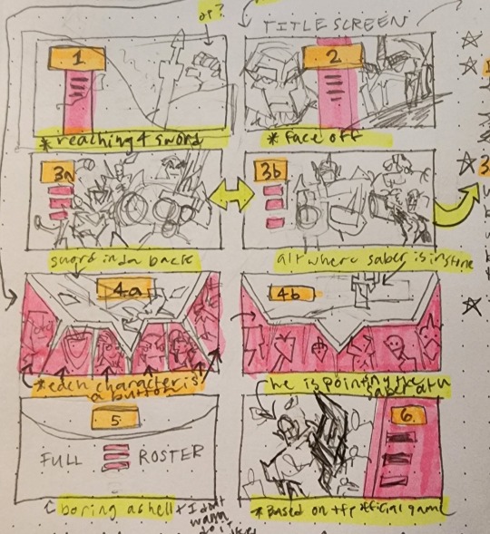
hi guys! deciding on a new main menu right now.
a short description on each:
1) Optimus is reaching for the Star Saber as it is lodged into a rock (the bg will have a cool parallax effect)
2) "Face off", where OP and Megs share the game's title screen (no cool parallax effect, sorry).
3a + 3b) 3a and 3b will be picked at random when you enter the main menu. Sometimes, you will get 3a, which illustrates some characters in the Decepticon & co. roster; Other times you will be greeted with 3b, the Autobot & co. roster. (hopefully parallax, but I'm kinda iffy on this one because I'm not too sure on how to code it quite yet)
4a) The star saber laid across in the background while the start/preferences/load buttons are portraits of some of the main characters
4b) a lazy alternate version of 4a where the sword is stuck into something instead
5) Not doing 5 but it's meant to showcase the full roster lol. just an idea I threw out there that I would NOT be able to draw lmao
6) A cool-ass parallax image of Optimus pointing the star saber at you. It pays homage to that one tfp wii game kinda
22 notes
·
View notes
Text
Why you should NEVER use RpgMaker
I know the title sounds clickbaity but it's the best I could think of. I am going to use a lot of screenshots from my game “Foundational Agora Premises: Hardware And Resource Dynamics”, to illustrate my points.
Before anything, I want to make something clear:
Whoever plays your game will not care if said game is built in RPGMaker, Godot, Gamemaker, Unity, Unreal, WolfRPGMaker, RPGInABox, or if you coded it from scratch in ASM.
Gamers are not developers, nor are they coders. It is perfectly fine to mess-around with an engine if you just want to have fun, make a game for yourself, your friends or just make a tech demo, but I am writing this from the POV of someone that wants to make a cool game that plays smoothly and can actually be made without having to fight the engine itself. I would advice anyone reading this to also give a read to LogLog's “Leaving Rust gamedev after 3 years”.
Now RPGMaker is advertised as a no-code, beginner-friendly engine. And for the most part this is true, you can make a very basic JRPG in RPGMaker with no experience at all. I myself made a terrible RPGMaker game when I was 13 years old. If you need to squish more juice out of the engine, you can always download plugins to add more capabilities and custom content. But it's not all sunshine and rainbows, as a matter of fact it's not at all like that. RPGMaker has a lot of limitations out of the box, for example the fact that the engine can only work with spritesheets formatted in a certain way, the fact that you have only a few layers to work with (parallax, background tiles, tiles A, B and C) and the fact that the code blocks you work with are simply terrible and teach you horrible programming practices. Most of these shortcomings can be addressed by installing plugins, for example a plugin to allow you to use .png files instead of sprite-sheets, a plugin to add more layers, a plugin to allow you to play .gif files in your game, etc. But plugins have problems of their own, some plugins are paid, others are incompatible with certain plugins you want to use, and other plugins simply do not exist at all so to add that functionality to your game you will either need to code it yourself or commission someone to do it. Or find a plugin that does what you want 'close enough' and settle-in for that. Besides, I know a lot of people are passionate about ARPG in RPGMaker but let's face it, 'Legend of mana' released in 199X plays a lot better than the best ARPG plugin written in 202X, the engine is simply not meant to handle this kind of work, and it shows whenever you try to push it too far from it's intended purpose. To put it simply, just because you can make brownies in a mug in your microwave does not mean it's going to taste the same as brownies made the traditional way in the oven.
Large 'complex' projects also suffer from performance problems, I do not know the details of why this happens but I have seen it enough times for it to become a noticeable problem with games with a lot of complex mechanics, really big maps or just a lot of things going-on.
Now, about the terrible code-blocks that RPGMaker offers:
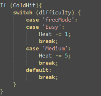
They surely make everything look very straightforward. Let's think of the 'conditional branch' block, for example, it's basically an 'if'. The code in RPGMaker would look something like this for a simple operation:
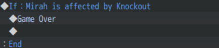
If your actor is dead, we game over. Simple, right?
Sure is, but what if we want to add another condition? For example, maybe I want to also check if the enemy's HP is 0 so I can play a sound or something. What would that look like?
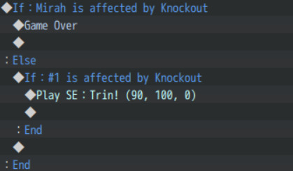
Itty bit harder to follow, but not terrible, right? Seems like it in the beginning, but what if you want to check for 4 or 5 conditions? This is normal depending on what you are doing... Your code will end-up looking like this:

Now, this is just a big if, else; if... chain. It takes about 5 minutes to write this thing depending on how far apart the variables are because you have to navigate a few menus, but the problem here is that RPGMaker conditionals do not offer a 'If, else if' by default, nor a switch statement. You have to chain together a lot of conditional branchs to emulate what a simple switch statement would do in any normal language.
Here's what the same code would look like if I used JavaScript instead of events:
Oh wow, with the power of the switch statement, we transformed 5 minutes of navigating menus and searching through variables to make a big chain of else if conditions into... A very short 30 seconds top condition check...
But the gist here is that not only do I need to actually know javascript to write this code in the no-code engine, this code as it is would not work out of the box. I know people love to claim 'you can always use JS if you need to', but RPGMaker makes even this a daunting task. For something like this to work, instead of switches, difficulty would need to be a variable, and we would also need to use the script box to set the value of 'difficulty' in RPGMaker so even then we will be writing javascript... For this to actually work first you'd have to set the code like this in the game:

Here we set the value of the 'difficulty' variable to hard, because we are not using switches anymore if we are moving to javascript. Now the actual javascript code would look like this, I'm adding variables to make it more readable since now we have to access the variables from the game itself:
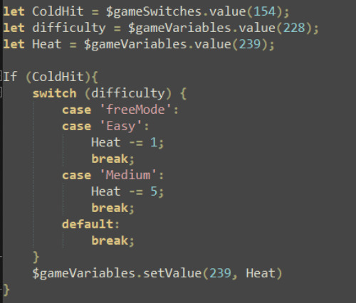
Now this looks more in-line to what you can expect from modifying variables in RPGmaker through a script call. Notice that in the end of the switch statement I have to update the actual variable, we only retrieved the value at the start of the function but did not actually directly modify it so we have to assign it at the end.
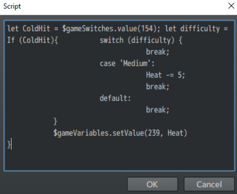
Here we will run into another tiny problem, the script call box itself, what happens if I try to add my script to RPGMaker?

Hmmmm that does not seem right... What's happening here?Well, you see, for whatever unholy reason the script call box in RPGMaker extends infinitely to the right side, but it's only about 12 lines height. Meaning that any complex scripting you want to make in-game (without needing to mess with plugin writing) will end-up looking like this:
Now that's a tad harder to read innit? It's going to be hell to maintain too. But at least you can always copy-paste it. I had to manually remove spaces here to fit it in the script box, but what about a really big script? Removing spaces manually would be a daunting task, so I would use a tool like JS.minify to do it for me. Take a look at this script for example:
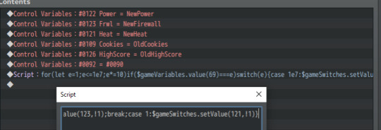
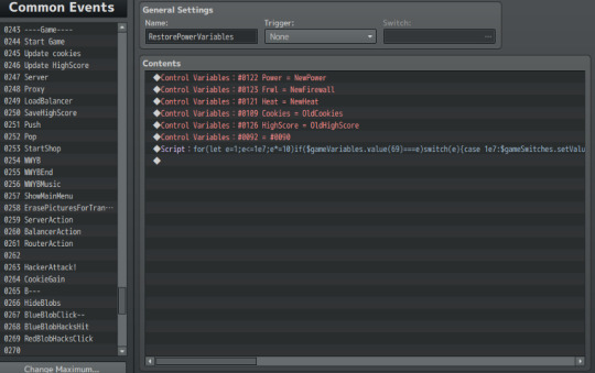
Can you tell what this thing is doing? No?
Well the name of the event is 'Restore power variables' so I guess it does something like restore the power variables? I did not leave a comment here and that's a bad practice on my side. However just by looking at this code you can tell it is impossible to rewrite or extend, if I ever need to add functionality to this I'd have to run the code through a LLM to un-minify it and then I'd be able to edit it.
Of course you could instead just use a service that removes white space from Javascript to make it all a big line, I'm not sure if a service like that exists, but it would make the whole process a little bit simpler if it does... Or you could just write a plugin...Right? Wait wasn't this a no-code engine...Oh well let's ignore that part.
Now, plugins. Good ol' plugins. I once wrote a whole self-driving car neural network in vanilla JavaScript following a YouTube tutorial, I'll admit JavaScript is not my forte, I like C/C++ best but let me tell you, even if you do know some JavaScript You don't know RPGMaker core.
At first this may not seem like a problem at all, after all you just want to create functions and set variables, right?
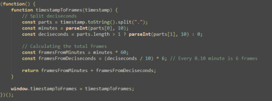
Here's a tiny plugin I wrote to convert tenths of a second to RPGMaker frames.
Now it's all standard JavaScript, but you see that window.timestampToFrames = timestampToFrames ? That's what actually lets you call the function from within the game itself, and it's part of RPGMaker. Without exposing your function like this you can only really run the plugin as soon as the game starts.
This is not a big issue when it comes to simple plugins like this one, with a lot of hard-coded values, but if you don't know your way around RPGMakers' core, and how to work with plugin parameters, you will have a bad time writing complex plugins or actually extending the engine at all. I ran into this issue after hitting my head on my keyboard for two hours in my 'last fireplace' game, I made a cute little plugin to make snow fall on the screen but for the life of me I could not figure out how to A: Make the snow fall in the background and not on top of everything else, and B: How to actually stop the snow from falling and delete every snowflake after I added them via scene_manager (My despawn function simply did not seem to work as expected).
This is, of course, a me issue here. I simply do not know enough about RPGMakers' core to extend the engine to allow me to do this sort of thing properly...
Now, darling, please sit down for a second and tell me, when was the last time you have heard a Godot developer tell you 'Damn I don't know enough C++ to extend Godot's core for this feature to work in my game'. Do you see my point?
Why am I trying to extend the game engine in order to make a game? It's a game ENGINE, it's supposed to make the game-making process easier, yet the amount of times I find myself coding everything from scratch is astounding. Simple quality of life things such as being able to play an animation through a sequence of PNGs numbered from 1 to 12 becomes an hour-long plugin development and debugging campaign, instead of the 5-minute experience that is setting-up an animation in other engines, such as Godot (I'm using Godot as an example because it's a simple engine and GDScript is truly a simple language).
Please if you have ever used RPGMaker in the past and DONT TRUST MY POST, just follow one simple Godot tutorial, I know you're going to feel annoyed after reading this post and tell me 'godot sux!!!! I don't want to h4xx0r code!!!' but please, please please just try to follow-through, I promise the code you will actually write is very, very basic and not at all hard to understand, just please try-out a real game engine to SEE by yourself what game-making should look like. I can recommend this tutorial here, it's what made me fall in love with Godot's simplicity: https://youtu.be/LOhfqjmasi0
In about an hour of work you can get yourself a working platformer, I did it myself with 0 knowledge of Godot and indeed I got myself a working platformer in about 2 hours (I took pauses).
Now If I made a similar game in RPGMaker (which I did), how long do you think it may take me?
Answer is, one day and a half (about 24 hours of work) to make this game: https://nxonk.itch.io/the-last-fireplace
And that is with 11 years of experience in this engine under my belt, and knowledge of javascript, C, C++, programming logic and a lot of functions and code I have written for old projects that never saw the light of day (https://lamadriguera.neocities.org/Games/Games)
And the end result is...Eh, honestly. I polished it a bit but there are many things that the engine does not like, for example I could not really make use of a pixel movement plugin because it messed-up a lot of the events in the game, so I had to rely on grid-based movement as that is the way the engine likes it (and there is no easy way to modify this).
Please remember that people that will actually PLAY the game don't really care which engine I used to make it, they only care about the game itself. Sure I made a game, I made it fast and slapped-together a very traumatic story about a past life experience of mine, but is the gameplay actually good?
Compared to my 1-hour Godot platformer, no, it sucks and it sucks bad. Maybe one or two RPGMaker devs will find the project cool cause I'm getting the engine to do something it's not supposed to do without 3000 lines of plugin code, but most people will just ignore the game altogether. And I don't blame them, why would anyone play this when they could be playing some other game with better gameplay or innovation?
Well is that all I have to say about RPGMaker?
No, not at all, I have even more bones to pick with this engine, the event system:

Now you may think that is a lot of events...Just wait till you see how many COMMON events I got going-on
removing unused common events (I have a template project with a few useful events I almost always use set-up) and white-space I use for organization, this game is using about 100 common-events to perform some basic tasks. Since some events simply cannot be a common event they are left on the map itself.
Now just by looking at it, you can get an idea of what the common events do, because they have actual names, but what about the map events? Just by glancing at it, it's impossible to tell what they do at all, maybe I know what they do today but will I know in 4 or 5 months?
Of course you can name events, and if you click on said event on the map you can see the event's name in the bottom-right corner:

Here's my event named 'HAHA MY EVENT' I just named it that as an example. Even then to figure out what each of these events do, I would have to click every single one of them and hope I named them all and that the name clearly states what the event is supposed to do.
Now I know it may seem like this map is cluttered with a lot of unnecessary events... Believe me, it's not. Every single event in that map is doing something important for the game, from the first to the last and I am willing to open source the project files (https://drive.google.com/file/d/1XiiT72Ybhznapzmaz8lak6k5JLHtsO06/view) just to prove my point.
And as a last tiny bone to pick with the engine, there is no way to preview your parallax mapping as you edit the game, you have to actually launch it to figure out what it looks like. Here's what my game looks like when I launch it:
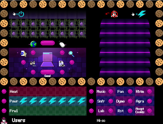
Not the biggest bone to pick but it is still annoying that I can't tell what's where unless I actually run the game (Takes about 10 seconds but you'll find yourself pressing that run button a lot of times as you playtest).
Speaking of which, you see that little computer screen In the map? I had to really big brain myself to get that simple thing working as intended, it may not seem like that big of a detail but that thing alone took about half an hour of brainstorming. The mechanic is simple, whenever an agent guy appears on the screen and you click them, you 'capture' them and their little icon is shown on the screen:
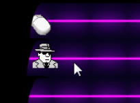
It looks simple, right?
It is, in theory. In practice it's a nightmare to implement, like every other mechanic in this game. The mouse clicks themselves have a problem if you play it for long enough, and it is a problem with RPGMaker itself:
When an event is moving, it will only execute code within said event if you activate it AFTER it has stopped moving. You can NOT activate events while they move, if you want to do that, you have to write a plugin to overwrite this behavior or find a workaround. It may not seem like a big deal but if you try and play my game for a while you will notice that it feels as if your mouse is not working properly because sometimes a click will simply not register. This is one of the obscure engine's limitations when it comes to games that are not something that looks like final fantasy 1.
As for some closing thoughts on all of this, if you are a beginner, don't waste your time using RPGMaker. It is painful to say for me because I wasted 11 years in this engine, but all the 'experience' you will gain by using this engine is worthless. The engine will force you into writing bad code, learn bad coding practices and over-rely on third-party plugins.
If you do happen to learn javascript, you will barely learn anything that can be translated to another engine, so you will have to start from scratch on a lot of things such as movement and physics.
The games you make with RPGMaker will look terrible at worst and unpolished at best. And if you do manage to squish the engine into making a game that's not samey and it's actually interesting, people can always just say 'it's an artsy fartsy game'. Plus developing in RPGMaker somehow makes the whole game-making process take twice as long for whatever reason.
EVEN if you want to make an old-style RPG game, you will just make a terrible game!
Please please please actually look-up what 199X RPG games actually played like.
Here's a tiny list of 199X games THAT DO NOT LOOK LIKE FINAL FANTASY:
Legend of Mana (1999)
Atelier Elie: The Alchemist of Salburg 2 (1998)
Blaze And Blade: Eternal Quest (1998)
Digimon World (1999)
I know a lot of people think of final-fantasy and final fantasy-like games when they think 'retro RPG' but GOD PLEASE ACTUALLY PLAY OLD GAMES, not every RPG out there was a gird-based final fantasy copy-paste! A ton of RPGs from the time had weird and interesting mechanics, 3d, 2d, grid and pixel movement, VN-style portraits and not, there was a lot of variety besides final fantasy-like games!
The argument that RPGMaker is an engine to make 'J-rpgs' is in itself flawed! RPGMaker only ever shines when it comes to make games that look like a cheap copy of a very old final fantasy game. And final fantasy itself has moved-on from that format for a few decades now. The engine is not even capable of doing something as basic as a retro dungeon crawler without plugins, have you seen what a retro dungeon crawler looks like?
Just take a look at Shin Megami Tensei 1 (1992), do you think vanilla RPGMaker can build something similar?
Please remember that RPGMakerMV was released just a few years ago and that it actually costs money to use, and it cannot even realistically replicate a game that's over 32 years old out of the box!
If you really REALLY want to use RPGMaker to make games, please do, but please, please at least once in your life try using a real game-making engine. You can pick any engine, Unity, unreal, godot even Scratch if you really want to, but please broaden your horizons.
RPGMaker is a terrible engine destined to make terrible games, anything but a VN or a terrible game will be VERY hard to make and take at the very least twice as long as it would take in a normal engine. You are only hurting yourself by using RPGMaker and I make this post because a lot of people don't realize this, using this engine is actually bad for you, and not enough people mention it. As a matter of fact, the amount of people that actively defend this terrible engine is astounding.
EVEN if you want to just make games 'for fun', please TRY A REAL ENGINE, you will have WAY more freedom and even if the learning process takes some time, the end result will be WAY better AND EASIER TO MAKE than anything you will ever produce in RPGMaker.
Do you ever wonder why every time people mention how 'great' RPGMaker is, they mention a very, very few games?
IB, Toiler wonderland, OFF, Hylics, Fear and hunger, Mad father, Witch house, Killer bear, Corpse party...
How long is the list? 50, maybe 100 games? RPGMaker has been out for about 24 years now, that's 24 years of people from all kinds of backgrounds making games, and in all of those 24 years we only got about 100 'awesome' games?
Please, if you want to make a game, if you really really want to make a game and you want your game to be pretty, and you want people to like your game and maybe even form a fan-base around it, please use a real engine. I know we all want to make games because we all want to make something fun, or tell a story, or build an experience, or maybe we just want to learn and have fun making games. Not everyone needs to learn game design, and not every game must be different from final fantasy 1, but please, even if all you want to do is an 1v1 replica of final fantasy 1, or a very simple visual novel, try another engine. Do not fall into the RPGMaker hole, it will only gobble-up your time giving back nothing in return.
In short, RpgMaker is the self-harm of game-making engines, in the long run it is only bad for you, and people that actually talk about this get shoved under the rug. Here's a devlog that more or less helped me finally take the jump, it's another dev's experience with RPGMaker development and it's totally worth a read: https://yobobgames.com/harvest-island-rpg-maker/
Thanks for reading my post, if I can convince even a single person to try a better engine, that's all that counts for me. I really hope everyone succeeds in their game-making projects, that is the reason why I made this post. After about 11 years I can surely say this engine is never worth it. PS: I forgot to mention it but some version of RPGMaker are literally just a cash grab, for example RPGMaker MZ and RPGMaker Unite (Unite barely works, MZ is just RPGMaker MV with a few QoL improvements). PSS: Sorry for all the grammar mistakes and the few lines of code/comments that don't make that much sense, it's 2AM rn and I need to sleep. I will probably edit these later.
#rpgmaker#devlog#gamedev#game development#blog#indiegamedev#indie game#rant#rant post#dont use rpgmaker#godot#game engine#video games#games#indie games#review#rpgmaker mv#rpgmaker mz#rpgmaker xp#rpgmaker vxace#text post#bad rpgmaker#rpgmaker bad#rpgmaker review#important#rpg maker
1 note
·
View note
Text
so i had a scrapped idea from the wyvern pack i liked and made a higher rez version of the tileset for fun

the idea was an flipped ancient city w/ Wyvern stonework, where everything except you had reversed gravity.
zero idea what im gonna use this for but heres a parallax background gif ( it kinda sucked to make but its cool)

3 notes
·
View notes
Text
Storm the Core Dev #3
So I've implemented a prototype wave system that spawns in enemies in batches. Currently it just works as a simple batch spawner where each wave consists of a certain amount of enemies, and spawns them in groups with each group having the same amount of enemies. I might try to design a better system later on but for now, this is a decent enough test of the wave system.
Also playing around with the dynamic background generation in the video. I've made several layers in the background for the parallax effect. Kinda cool how the star assets and the space background can change. Definintely helps with the feel of the game when the player enters new sectors in the galaxy and coming across brand new looking areas.
0 notes
Text
The Science Behind Visual Perception in 3D Vector Maps

Science Behind Visual Perception in 3D Vector Maps
In an age where data visualization is central to design, planning, and decision-making, 3D vector maps have become powerful tools for spatial understanding. From urban planning to interactive architecture illustration, these maps combine aesthetics with data science to create deeply informative visual experiences. But what makes them so effective? The answer lies in the science of visual perception—how the human brain interprets spatial cues, depth, motion, and color in 3D environments. This blog explores how visual perception principles are embedded in the creation and use of 3D Vector Maps, unlocking a new dimension of insight in modern cartography and design.
Understanding 3D Vector Maps: A Quick Overview
Before diving into the science of visual perception, let’s clarify what 3D vector maps are.
Unlike raster-based maps that rely on pixels, 3D vector maps use geometric shapes—points, lines, and polygons—to represent spatial data. When combined with elevation data and advanced rendering techniques, these maps create realistic yet scalable 3D environments. A 3D Map Illustration of a city, for example, can showcase building heights, terrain contours, roads, and even underground structures, all in one comprehensive layout.
Architects, urban planners, and designers frequently use these maps as part of Architecture Illustration to present development plans, site analyses, and spatial simulations.
The Role of Visual Perception in 3D Map Interpretation
Several scientific principles guide how we perceive 3D visuals, and when used correctly in 3D Map Illustration, they enhance clarity, engagement, and utility.
Let’s explore the major components of this science:
1. Depth Perception and Perspective Cues
Humans perceive depth using monocular cues (like shadows, texture gradients, and perspective) and binocular cues (like stereopsis).
For instance, a map showing a proposed stadium in a city center can use gradient shading and vanishing points to give a sense of scale and positioning.
2. Color Theory and Layer Differentiation
Color is not just aesthetic; it’s functional. In the context of 3D Vector Maps, color helps users distinguish between different types of data—residential zones, commercial areas, vegetation, water bodies, etc.
Designers use warm colors (reds, yellows) to highlight features or areas of urgency, and cool colors (blues, greens) for background or non-critical regions. This contrast guides the viewer’s attention naturally.
Moreover, color gradients help illustrate elevation changes, water depth, or land use intensity. When combined with proper Architecture Illustration techniques, color becomes an intuitive guide through a complex 3D environment.
3. Motion Parallax in Interactive Maps
This movement introduces an important cue called motion parallax—objects closer to the viewer move faster than distant objects, mimicking real-world vision.
This feature helps users understand spatial relationships and navigate virtual environments more intuitively. In architecture, a rotating 3D map illustration can show how a new building casts shadows at different times of the day or how its massing affects nearby structures.
4. Gestalt Principles in Spatial Grouping
Gestalt psychology offers a set of principles explaining how humans perceive visual groups and patterns.
Similarity: Buildings with the same function (like schools or hospitals) are grouped with similar icons or colors.
Proximity: Closely spaced objects are perceived as related.
By leveraging these principles, designers can reduce clutter and help users focus on what's most important in a 3D map interface.
5. Visual Hierarchy and Cognitive Load
Good design organizes information by importance—a concept known as visual hierarchy. In 3D vector maps, this is achieved by manipulating size, brightness, contrast, and placement.
Important landmarks may be rendered larger or in bolder colors, while less critical features fade into the background. This mirrors how the brain naturally filters visual input—what stands out gets attention.
Additionally, minimizing cognitive load (mental effort to understand a visual) is crucial. A clean and intuitive 3D Map Illustration allows users to grasp complex spatial data quickly without feeling overwhelmed.
Neuroscience and Attention in 3D Map Design
Recent neuroscience research supports these design principles. The human brain has specialized regions like the parietal lobe, which processes spatial orientation, and the visual cortex, which interprets patterns, edges, and motion.
Studies using fMRI scans have shown that interactive, well-structured 3D environments activate these areas more effectively than static 2D layouts. This suggests that 3D Vector Maps not only look better—they literally engage the brain more efficiently, leading to better retention and understanding.
This makes them ideal for architecture illustration, where clients or stakeholders need to grasp spatial relationships and design intent in a short time.
Practical Applications: Why This Science Matters
Urban Planning and Zoning
City planners use 3D map illustrations to visualize new developments, evaluate land use, and forecast population density impacts. The visual perception techniques mentioned above ensure these maps are not just accurate but also accessible to non-technical audiences.
Architecture and Construction
An Architecture Illustration showing a building's relationship to surrounding structures, road access, and topography becomes far more persuasive when rendered as a 3D vector map. Stakeholders can “see” the design rather than imagine it.
Tourism and Navigation
Interactive 3D vector maps of tourist destinations provide immersive previews. By simulating real-world depth and texture, they enhance wayfinding and user engagement, critical for digital tourism platforms.
Future Trends: AI and Eye-Tracking in Map Optimization
Emerging technologies like eye-tracking and AI-powered UX optimization are refining how 3D Vector Maps are designed. By tracking where users look and for how long, designers can adjust elements to better align with natural visual patterns.
In the near future, we might see adaptive 3D map illustrations that change based on user behavior, offering personalized layers of information or dynamically adjusting visual hierarchy in real time.
Conclusion
The effectiveness of 3D vector maps lies not just in their technical sophistication but in how well they align with the human brain's natural way of seeing and understanding the world. By grounding design in the science of visual perception—through depth cues, color theory, motion, and cognitive psychology—these maps become powerful tools for storytelling, communication, and decision-making.
Whether you're creating an Architecture Illustration for a new high-rise, a zoning proposal for city planners, or an interactive tourism guide, understanding the visual science behind 3D Map Illustration ensures your message is not just seen—but deeply understood.
0 notes
Text
Side scroller
Shovel knight

Shovel Knight’s visuals are heavily based on the 8-bit style of the Nintendo Entertainment System (NES), but they deliberately push beyond what the NES could actually do, with smoother animations, more background layers, and a richer colour range. Characters, enemies, and objects have a slightly "chunky" look, big heads, bold outlines, making them pop clearly against detailed backgrounds. Each level is packed with thematic background elements, crumbling castles, lush gardens, spooky graveyards, all drawn with love and clarity. Smooth parallax scrolling, richer lighting effects (like sparkling gems or magical glows), and dynamic environmental details give it a more refined, less "flickery" look compared to real 8-bit games.

While aiming to feel like an NES game, Shovel Knight uses more colours on screen at once than the real NES could, giving it a nostalgic feel without strict technical limits.
Plains of Passage: Bright, lively greens and sky blues — cheerful and welcoming.
Lich Yard: Dark purples, muted greens, and eerie blues — spooky, mysterious.
Explodatorium: Hot reds, toxic greens, and flashing effects — chaotic and explosive.
Stranded Ship: Cool whites, icy blues, and frosty pastels — cold, crisp.
Foreground elements and enemies are always designed to stand out sharply from the backgrounds, essential for a fast-moving, precision-heavy platformer.

Shovel Knight has Royal blue armour with silver highlights, heroic, classic, easily recognizable. Each knight has a highly distinct colour theme that fits their personality and stage, like Specter Knight’s dark ghostly palette or Treasure Knight’s shining golds and teals.
Shovel Knight is built with simple, bold shapes. His horns, rounded helmet, and stout body make him iconic and easily readable even at a small sprite size. Bosses have highly creative, exaggerated designs, each one looks unique at a glance, with elaborate costumes and oversized weapons. Minor Enemies are Often goofy and memorable, with bright colours and exaggerated animations that give life to the world.
youtube
Whether you're in a lush garden, molten foundry, haunted graveyard, or icy fortress, every stage has a strong, thematic look, reinforced by its colour palette. Multiple scrolling layers give depth to the world, creating the illusion of distance and space in a 2D plane. Even with tiny pixel art, you can see collapsed ruins, sunken ships, ancient machinery, the world feels old, lived-in, and full of history.
0 notes
Text


A background I did for a class where we had to make a parallaxe out of it. It was a cool exercise and I think it came out good im very happy with the result.
1 note
·
View note
Text
Parallax Scrolling Effects: Enhancing Depth and User Engagement

What is Parallax Scrolling and Why Is It Popular in Web Design?
Parallax scrolling is a web design technique that creates an illusion of depth by making background elements move at a different speed than foreground elements as the user scrolls. This simple yet impactful effect can transform an ordinary website into an immersive and interactive experience. 🌟
How Parallax Scrolling Creates an Immersive Experience
Parallax scrolling draws users into a story-like journey. The layered movement captivates the eye, giving a website a 3D-like feel. This effect not only looks cool but also makes users feel more connected to the content. It’s like turning a flat page into a living, breathing scene. 🖼️
Why Parallax Scrolling Is Gaining Popularity Among Web Designers
Web designers love parallax scrolling because it’s a game-changer for engagement and storytelling. With users increasingly looking for memorable web experiences, this technique has become a go-to solution for adding that "wow" factor. 🚀
Benefits of Parallax Scrolling for Website User Experience
Parallax effects do more than just look good—they’re strategic tools for improving how users interact with your website.
Enhancing Visual Appeal with Layered Backgrounds and Scrolling Effects
Parallax scrolling helps break the monotony of static designs. By layering elements and introducing movement, websites can feel dynamic and engaging. For example, a travel website might use parallax to show clouds moving in the background while a plane glides across the foreground. 🌥️
Here’s a simple CSS snippet to create a parallax effect:

.parallax { background-image: url('background.jpg'); background-attachment: fixed; background-position: center; background-repeat: no-repeat; background-size: cover; }
Encouraging Longer Visitor Sessions Through Interactive Design
Interactive designs, like those using parallax scrolling, encourage visitors to spend more time exploring. The curiosity to see "what happens next" keeps users scrolling, which boosts engagement metrics and conversion potential. 📈
Best Practices for Using Parallax Scrolling Without Overloading Users
While parallax effects are impressive, they need to be used wisely. Overdoing it can lead to slow-loading pages and frustrated users.
Striking the Balance: When and Where to Use Parallax Scrolling
The key is moderation. Use parallax scrolling on key sections—like landing pages or storytelling elements—rather than across the entire site. For example, a product launch page can leverage parallax to highlight features dynamically. 💡
Ensuring Accessibility with Parallax Scrolling for All Users
Not all users experience websites the same way. Ensure parallax effects don’t interfere with accessibility. Add options to disable animations for users with motion sensitivity and optimize for screen readers. 🛠️
Website Development Services for Parallax Scrolling Implementation
Creating seamless parallax effects requires expertise. A professional website development company can ensure your site’s design is both visually stunning and technically sound.
How Website Development Services Help Incorporate Parallax Scrolling
From coding smooth animations to optimizing for mobile, website development services bring the technical know-how to integrate parallax effects. Working with experts ensures your site maintains performance and user-friendliness. 🤝
Final Thoughts: Making the Most of Parallax Scrolling in Web Design
When done right, parallax scrolling can turn a simple website into an unforgettable experience. Whether you’re aiming to tell a story or boost user engagement, this technique is a powerful tool. If you’re looking to incorporate it into your site, consider partnering with a custom website development provider to make your vision a reality. ✨
Frequently Asked Questions (FAQs)
1. Is parallax scrolling SEO-friendly?
Yes, when implemented correctly. Parallax effects should not interfere with page load speed or usability. Use lightweight animations and ensure content remains accessible to search engines. 🔍
2. Does parallax scrolling affect website speed?
It can, if not optimized. Heavy animations or uncompressed files may slow down your site. Minimize impact by optimizing images, using clean code, and testing performance. ⚡
3. How can I create parallax effects on my website?
You can use CSS and JavaScript to implement parallax scrolling. Tools like GSAP or libraries like ScrollMagic can simplify the process. If coding isn’t your strength, consider white label website development services. 💻
4. Can parallax scrolling be used on mobile devices?
Yes, but it requires careful optimization. Mobile devices have less processing power, so use simplified animations and test responsiveness to ensure a smooth experience. 📱
5. Is parallax scrolling suitable for all types of websites?
Not always. Parallax scrolling works best for creative sites, portfolios, and storytelling platforms. For content-heavy or data-driven websites, simpler designs may be more effective. 📊
#Website Development Company#Website Development Services#White Label Website Development#Custom Website Development
1 note
·
View note
Text
12/2/24 devlog
Split the background tiles into separate layers for a cool 3D parallax effect
Added a mini-map
0 notes