#raw image editing software
Explore tagged Tumblr posts
Visit Tumblr Blog
Explore Tumblr blogs with no restrictions, modern design and the best experience.
Last Seen Tumblr Blogs


Fun Fact
Average visit duration of Tumblr.com is 10 mins and 25 secs.
Text
talking about james somerton's dogshit color grading
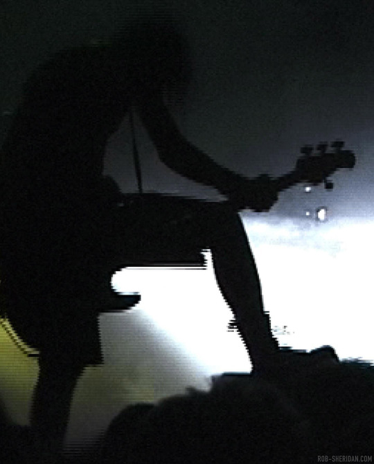
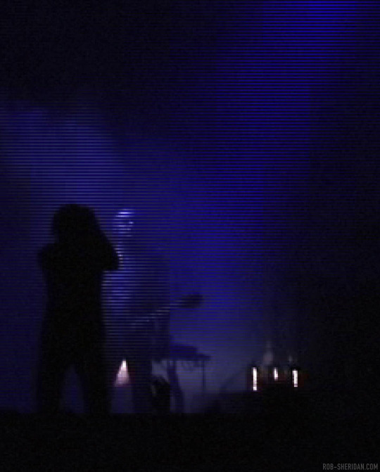
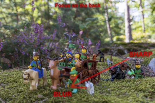
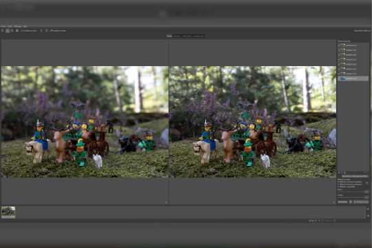
okay, i see people talking about how poorly james somerton's videos are lit and at first i was like "how does this dumbass not understand three point lighting, its like something you learn about within the first month of film school" but then someone on twitter pointed out he probably just didn't know how to properly grade footage and i was like ooooh my god how did i not realize?
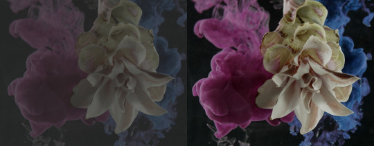
so when you first shoot something, it will probably look fine on your camera, but when you import it to your computer it might look like dogshit on your monitor, like in the image on the left. this has to do with whether you shoot it in LOG or RAW. basically RAW= huge file size but no change in saturation/exposure/white balance, ect. LOG= smaller file size but really ugly, little saturation and contrast, etc.
when you take this footage into your color grading software, you have to put a LUT (look-up-table) matching the camera you shot on onto the LOG footage to restore it so it looks like the image on the right. After that, you can start grading (fixing the exposure, adding colors to the highlights or shadows, there's a million different things you can do when you color grade.)
but whoever edited these (I'm assuming it's James, who we can always count on to be extremely lazy in his "creative" endeavors) just skipped that crucial step and went straight into color grading the LOG footage. Which is a huge no-no.
that is the reason why shots like these look so weirdly lit. conversion to LOG literally drains the contrast and saturation from the footage. which is why it is STEP ONE to correct it in post. but this dude probably just went straight into applying filters and colors and just thought upping the exposure or brightness would fix the footage.
obviously i don't have access to these files personally, so i can't say this with 100% certainty, but it would explain why the footage looks so damn weird. in my personal opinion it's not a lighting mistake necessarily (though the choices of colored gels he uses for his lights are very questionable.)
1K notes
·
View notes
Text
If you're not willing to pay for Adobe, then I strongly recommend RawTherapee as a raw processor.
I don't use it nearly to its full potential (afaik it can functionally replace lightroom), but as just a raw processor it offers some very deep control, all the way down to choosing which demosaic algorithm you want to use.
About the only thing that I've found that the RawTherapee and GIMP combo can't easily do is panoramas and auto HDR (both of which, iirc, used or were based on the Photomerge feature in Photoshop).
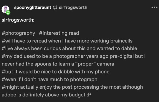
@spoonyglitteraunt There are some free or low-cost RAW editors out there. I haven't researched them for a while, so I don't know what is good these days. I think they are mostly phone apps. But I'm sure you can find a "Top 5" list or something on Google. Or someone might leave a suggestion in the replies.
However, Adobe might be cheaper than you realize. They have the photography bundle that includes Lightroom and Photoshop for $10 per month. And as long as you do the monthly plan, you can cancel without any fees.
I don't know if that is out of your budget, but I did want to make everyone aware of it.
Some people despise subscriptions, but I personally find 10 bucks a month more accessible than a one time $1000 fee. And pirated Photoshop could get super buggy sometimes. I also like that I get access to the beta and all the new features as they are released.
So the subscription model has worked well for me personally, but others find it frustrating not owning their software.
In any case, I do hope you experiment even if it is with your phone. Good luck!
18 notes
·
View notes
Text
Writing Notes: Cookbook

Whether you want to turn your own recipes into a cookbook as a family keepsake, or work with a publisher to get the most viral recipes from your blog onto paper and into bookstores, making a cookbook is often a fun but work-intensive process.
How to Make a Cookbook
The process of making a cookbook will depend on your publishing route, but in general you’ll need to work through the following steps:
Concept: The first step of making a cookbook is to figure out what kind of cookbook this will be. Your cookbook can focus on a single ingredient, meal, region, or culture. It can be an educational tome for beginners, or a slapdash collection of family favorites for your relatives. If you’re looking to get your cookbook published, a book proposal is a necessary step towards getting a book deal, and can also help you pin down your concept.
Compile recipes: If you’ve been dreaming of writing a cookbook, chances are you probably already know some recipes that have to be included. Make a list of those important recipes and use that as a jumping-off point to brainstorm how your cookbook will be organized and what other recipes need to be developed. If you’re compiling a community cookbook, reach out to your community members and assemble their recipes.
Outline: Based on your guiding concept and key recipes, make a rough table of contents. Possibly the most common way to divide a cookbook is into meals (appetizers, breakfast, lunch, dinner) but cookbooks can also be divided by season, raw ingredients (vegetables, fish, beef), cooking techniques, or some other narrative structure.
Recipe development: Flesh out your structure by developing beyond your core recipes, if needed, and fine-tuning those recipes which need a bit more work.
Recipe testing: Hire recipe testers, or enlist your friends and family, to test out your recipes in their home kitchens. Have them let you know what worked and didn’t work, or what was confusing.
Write the surrounding material: Most cookbooks include some writing other than the recipes. This may include chapter introductions and blurbs for each recipe.
Photography and layout: If your book includes photography, at some point there will be photo shoots where the food will have to be prepared and styled for camera. Traditional publishing houses will likely want to hire stylists and photographers who specialize in food photography. Once the images and text are both ready, a book designer will arrange them together and make the cover design, but you can also make your own cookbook design using software like InDesign or old-school DIY-style, with paper, scissors, and a photocopier.
Editing: If you’re working with a publisher, there may be several rounds of back and forth as your editor works with you to fine-tune the recipes and text. The book will then be sent to a copy editor who will go through the entire cookbook looking for grammar and style issues, and indexer for finishing touches. If you’re self-publishing, give a rough draft of your book to friends and family members to proofread.
Printing: After everything is laid out and approved, your cookbook is ready to be printed. If you’re printing your cookbook yourself, you can go to a copy shop to get it spiral bound, or send it off to a printer for more options.
Common Types of Cookbooks
More so than any other kind of nonfiction book, cookbooks lend themselves to self-publishing. Of course, cookbook publishing is also a huge industry, and a professional publisher might be the best route for your book depending on the scope and your reach as a chef.
Self-published: This is a cookbook made of up your own recipes, which you might give as gifts to family and friends. You can easily self-publish a cookbook online as an individual. But if having a print book is important to you, there are many options. You can print and staple together a short cookbook, zine-style. Many copy shops will also offer options for wire-bound cookbooks, and there are resources online that will print bookstore-quality softcover or hard-cover books for a fee.
Community cookbooks: A special subset of self-published cookbook made up of recipes from multiple individuals, usually to raise money for a cause or organization. Working with a group has the advantage of a large pool of recipes and testers, and is a great way to share your recipes with a larger audience while also supporting a cause you believe in.
Through a publishing house: If you think your cookbook has a wider audience, you may want to seek out a mainstream publishing house. Get a literary agent who can to publishers who can connect you with publishers who are interested in your cookbook. Large publishing houses don’t usually accept pitches from individuals, but you can reach out to small, local publishers without an agent as intermediary. To publish a cookbook through a publishing house, you’ll typically need a book proposal outlining your concept, audience, and budget.
Things to Consider Before Making a Cookbook
Before embarking on your cookbook project, it’s a good idea to get organized, and to figure out what kind of cookbook you want to make.
Photography: More so than other texts, cookbooks often include visual accompaniment. Beautiful pages of full-color photos are expensive, which is one reason publishers like to work with bloggers who can style and photograph their own food. Not all cookbooks need photos, however. Some of the most iconic cookbooks rely on illustrations, or words alone. Figure out what role, if any, visuals will play in your book.
Audience: Are you turning recipe cards into a keepsake family cookbook, or selling this cookbook nationwide? Your intended audience will greatly influence how you write and publish your cookbook, whether it’s vegans, college students, or owners of pressure cookers. You’ll need to consider your audience’s cooking skill level, desires, and where they buy their food.
Budget: Once you have a vision for what you want your cookbook to be, budget your time and resources. Do you need help to make this book? The answer is probably yes. Assemble a team of people who understand your vision and know what kind of commitment will be involved.
Source ⚜ More: Notes & References ⚜ Writing Resources PDFs
#cookbook#nonfiction#writing reference#writing tips#writeblr#dark academia#literature#writers on tumblr#spilled ink#writing prompt#light academia#writing ideas#writing inspiration#writing resources
46 notes
·
View notes
Text
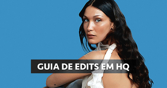
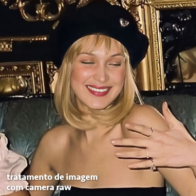
GUIA COMPLETO DE COMO EDITAR FOTOS EM ALTA QUALIDADE (HQ)!
oiê, bem vindos(as)! à pedidos, estou trazendo um tutorial bem abrangente sobre como editar fotos no geral para icons, headers, etc., em alta qualidade. neste guia/tutorial trarei dicas, truques e informações gerais sobre o que é preciso para editar em hq. lembrando que o conteúdo deste guia é sobre como eu edito, a maneira que funciona comigo e meu progresso e aprendizado ao longo de quase 12 anos editando icons, ou seja, o que contém neste guia pode — e deve — ser adaptado à sua maneira e ao software de sua preferência. aproveitem e se divirtam!
nota: este tutorial está bem longo, então, se possível, veja este guia pelo pc/notebook!
O QUE VOCÊ VAI ENCONTRAR NESTE GUIA
softwares necessários com links para download;
onde e como baixar as fotos para as edits;
métodos de edição e passo a passo;
como melhorar a qualidade de uma foto;
como salvar a foto corretamente para postar;
dicas de actions e outros resources.
clique em “continuar lendo” para ver o tutorial.
1. SOFTWARE
photoshop
eu recomendo fortemente o uso do photoshop cc na versão mais recente, ou outra versão com camera raw ou filtros neurais suportada pelo seu pc ou notebook.
você também pode usar o photopea como alternativa (eu particularmente prefiro o photoshop pois acho que as edits ficam com mais qualidade). se você preferir o photopea, algumas dicas desse guia poderão não funcionar devido à falta de algumas funcionalidades que o photopea não oferece (ex: camera raw, galeria de filtros, filtros neurais e outros).
eu uso a última versão do photoshop (atualmente, a versão 25.5.1) e uso a versão paga (obrigada adobe pelo desconto de estudante!!!!!), mas vou deixar alguns links para você baixar o photoshop gratuitamente caso você não seja estudante e/ou não tenha condições para assinar um plano.
atualmente eu uso um mac mini 2014 para editar, mas sempre usei windows, então, as dicas e os links valem para os dois sistemas operacionais.
links
macos: 1, 2 & 3.
windows: 1, 2, 3 & 4.
2. BAIXANDO AS FOTOS
galerias de fotos
muitos artistas têm fansites com galerias de fotos e você pode achar facilmente digitando no google: “nome da pessoa + gallery”.
o artista que eu quero não tem galeria própria e agora? tranquilo, ainda temos galerias de fotos de famosos variados como hqdiesel, hqsource, hq-pictures e até mesmo o theplace.
em último caso você pode usar o gettyimages e usar um removedor de marca d’água ou um site como o gettyimages downloader.
instagram
para artistas estrangeiros que tenham apenas instagram e/ou não tenham fotos em galerias de imagens, eu recomendo o instagram pessoal da pessoa.
você poderá fazer o download das fotos com extensões de navegadores como o image downloader for instagram (para firefox e google chrome), ou sites como o saveig, o snapinsta ou o igdownloader.
eu recomendo baixar pela extensão do navegador, pois ela baixa a foto direto do site do instagram no computador, diferente dos sites que você precisará ir foto por foto, copiar o link e colar no site para fazer o download.
mas, caso a extensão esteja indisponível, com algum erro ou pare de funcionar, o site é uma excelente alternativa (só precisa ter mais paciência).
nos sites para baixar fotos do instagram, geralmente eles dão a opção para você escolher o tamanho da foto. você deve sempre selecionar a resolução maior da foto (acima de 1000px é o melhor).
pinterest
em casos extremos de artistas low profile, sem instagram, sem aparições públicas, sem galerias de fotos, nadica de nada, eu recorro ao pinterest.
porém, é preciso ter muito cuidado ao fazer download de fotos do pinterest, porque são muitas fotos repetidas e muitas com baixíssima resolução e qualidade.
se você for baixar fotos do pinterest, escolha a foto com maior resolução (imagens maiores que 500px já são ok para editar icons), e depois de baixar a foto, eu recomendo fazer um tratamento na foto para melhorar a qualidade dela, como vou ensinar.
3. EDITANDO
3.1 importando a foto no photoshop
apertando ctrl+o ou cmd+o uma guia vai abrir no programa, onde você vai até a pasta onde a foto foi salva. selecione a foto e clique duas vezes nela para abrir.
3.2 cortando a foto nas dimensões desejadas
muitos tutoriais de edições de icons sugerem que você copie a imagem e cole ela em um documento novo já do tamanho da sua edit, mas eu não recomendo essa opção, pois ao redimensionar a foto com a ferramenta de transformar (ctrl+t), ela dá poucas opções para manter a qualidade da foto e se você não souber o que cada opção faz, poderá perder a qualidade da imagem. então, eu sempre faço o recorte na própria foto para não alterar muito a qualidade dela.
aperte a letra c no teclado para abrir o atalho da ferramenta de corte. (se o seu photoshop for alguma versão do cc, eu recomendo que você marque a opção para usar o modo clássico de corte, assim fica mais fácil e você tem um controle maior sobre a ferramenta!). para fazer essa alteração é simples, vá no ícone de engrenagem, clique e marque a opção “usar modo clássico”.
para fazer icons, você deverá cortá-lo usado dimensões quadradas, ou seja, 1x1, e para headers 15x5. você pode mudar as dimensões na caixinha da ferramenta de corte.
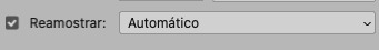
3.3 redimensionando a foto
nessa parte você precisará prestar atenção, pois ao redimensionar a foto, você poderá perder ou ganhar um pouco mais de qualidade na foto, e para isso você usará uma opção chamada reamostrar (ou resample se seu photoshop estiver em inglês). deixe a opção marcada para usar as definições.
3.4 explicando as definições do reamostrar e qual definição usar de acordo com o resultado que você quer
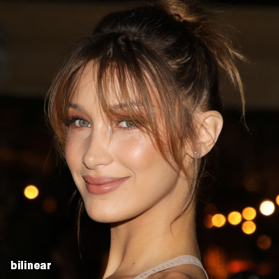


bilinear: a melhor opção para redimensionar gifs, mas para fotos não é tão bom pois dependendo da foto algumas partes ficam nítidas, outras mais suaves e se você for aplicar action de nitidez, pode ficar com um aspecto de “craquelado” com as bordas granuladas, o que eu pessoalmente acho que fica um pouco estranho.
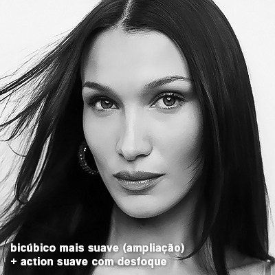
bicúbico mais suave (ampliação): como o nome já diz, ele deixa a foto mais suave, ou seja, os pixels “craquelados” e granulados da foto ficarão mais suaves. é uma ótima opção tanto se você for aplicar actions de nitidez ou actions mais desfocadas e mais suaves.
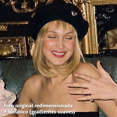
bicúbico (gradientes suaves): pode parecer a mesma coisa do bicúbico mais suave, mas esta opção além de suavizar a imagem, cria um “desfoque iluminado” nas transições das cores da foto. é a melhor opção para fotos sem muita qualidade e principalmente se você for usar actions suaves e desfocadas, sem muita nitidez.
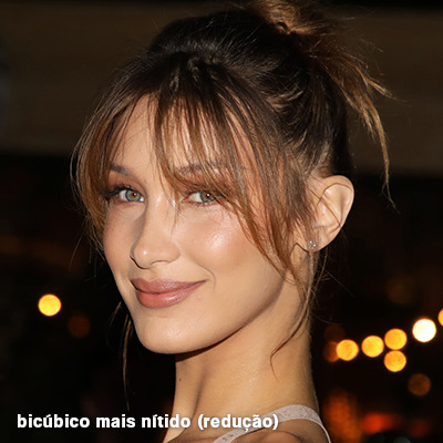
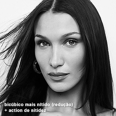
bicúbico mais nítido (redução): acentua os pixels e as arestas nítidas da foto, ou seja, essa definição redimensiona a imagem mas preserva a nitidez da foto. se você usa actions de nitidez que não tem desfoque nas configurações, essa é a melhor opção de reamostra. (mas cuidado, se sua imagem ficar muito nítida com essa definição, você precisará usar outra opção. caso contrário, quando você aplicar a action, a edit poderá ficar muito exagerada e/ou com aspecto áspero.)
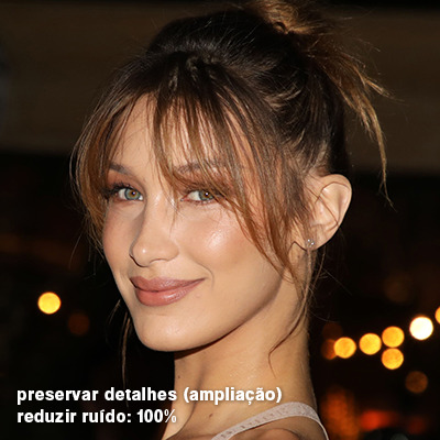
preservar detalhes (ampliação) com redução de ruído: esse em especial é ótimo para quando você precisar redimensionar uma foto para deixá-la maior sem distorcer tanto a imagem. você pode ajustar a redução de ruído para deixar a foto mais suave, sem perder muita qualidade. (obs.: essa opção não deve ser usada para redimensionar imagens muito pequenas, por exemplo de 200x200 para 400x400, ou a imagem vai ficar muito distorcida. ela deve ser usada quando a diferença de pixels não é muito grande, por exemplo, você cortou a foto e ela ficou no tamanho 370x370, aí sim você pode redimensionar para maior sem perder muito da qualidade. então você pode ir ajustando a qualidade com a porcentagem da redução de ruído).
pelo mais próximo (arestas sólidas): essa é uma opção traiçoeira, pois não fica bem em quase nenhuma imagem (a menos que seja um pixel art). essa definição redimensiona a imagem e mantém os pixels nítidos, ou seja, a foto fica menor mas tudo nela que tem aspereza vai prevalecer. é muito usada para redimensionar pixel art, pois preserva as bordas ásperas. pode ocorrer de ficar boa em uma foto aleatória mas não será possível aplicar action, ou a imagem ficará exagerada.
3.5 aplicando a nitidez depois de redimensionar
depois de escolher a foto, baixar, redimensionar de acordo com o estilo da action da sua escolha, está na hora de aplicar.
eu fiz duas versões para mostrar como fica com cada tipo de action:
assim, os dois icons tem uma alta qualidade usando actions diferentes, graças a remostragem ideal para cada tipo de action :)
4. TRATAMENTO DE IMAGEM PARA MELHORAR A QUALIDADE
nesta parte, é muito importante que você tenha baixado uma versão do photoshop com neural filters e/ou com o camera raw, mas caso você não tenha, tudo bem também, vou ensinar como fazer uma melhoria na foto de três jeitos: com camera raw, com neural filters e com desfoques. a melhor forma vai depender de quão ruim está a qualidade da sua foto. em geral, apenas fazendo ajustes no camera raw você já tem um ótimo resultado na maioria das fotos.
camera raw
se seu photoshop tem o filtro do camera raw, ele vai estar em filtro > filtro do camera raw...
tudo que iremos fazer será na aba de “detalhe”, ali você deve dar mais atenção ao ajuste de redução de ruído, pois é ele que vai remover o ruído da imagem e melhorar a qualidade dela.
vá mexendo nas configurações de redução de ruído até que a foto fique mais suave. ajuste também o detalhe e o contraste da redução de ruído.
essa parte será mais no olhômetro mesmo, pois as configurações vão variar de foto para foto, mas eu recomendo muito você mexer também na nitidez para não deixar a foto tão desfocada, mas nada muito intenso para não interferir na action que você irá usar.
eu mexo também na redução de ruído de cores, porque dependendo da foto, algumas cores estarão saturadas ou com muito ruído. só cuidado para não colocar um número muito alto, pois esse ajuste pode tirar a saturação da sua foto e deixá-la apagada.
enfim, aqui está uma comparação da foto original com o tratamento feito com o filtro do camera raw e depois já com a action de nitidez aplicada:
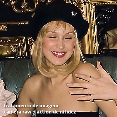
e essas foram as configurações que usei nessa foto em específico:
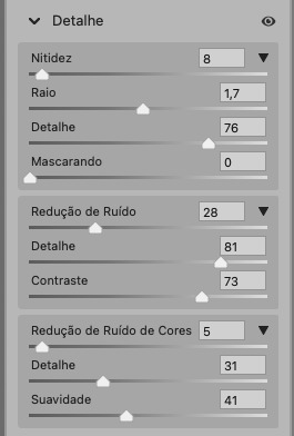
como eu disse antes, as configurações irão variar de foto para foto, a depender da qualidade de cada uma e de quão ruim a foto está, mas com essa configuração básica, você já vai conseguir melhorar algumas fotos.
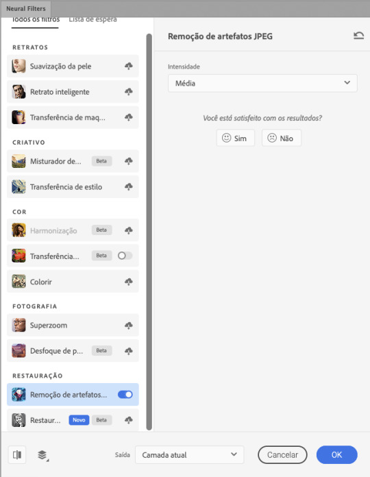
neural filters
se a versão do seu photoshop vem com neural filters (ou filtros neurais), ele estará em filtro > neural filters...
irá abrir uma janela com vários filtros mas o que a gente irá usar vai estar em “restauração”, com o nome “remover artefatos jpeg”. se precisar, faça o download do filtro.
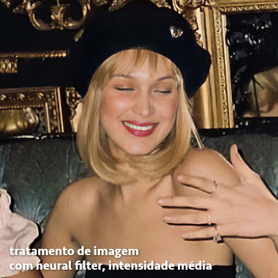
eu recomendo usar a intensidade sempre média, a menos que a foto esteja muito ruim, aí você usa a intensidade alta. mas em geral, a intensidade média ou baixa já dá conta do recado.
a saída deve sempre estar na camada atual, ou seja, na camada da foto selecionada.
assim:
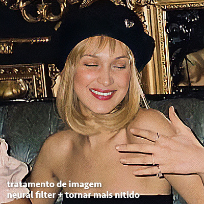
e aqui está uma comparação da foto original com o tratamento feito com o neural filter e depois já com a action suave com desfoque aplicada:


a opção do neural filter é uma ótima alternativa ao camera raw, o único contra é que ele deixa a foto com uma textura áspera, e quando você usa uma action de nitidez eles ficam muito visíveis e acaba não ficando muito legal.
porém, um bom jeito de contornar isso é adicionando ruído na foto. eu uso o efeito de granulação do camera raw para adicionar ruído no icon (você também pode adicionar o ruído em filtro > ruído > adicionar ruído..., mas eu prefiro o camera raw pois ele dá mais opções para ajustar o granulado do jeito que eu preferir).
no primeiro icon abaixo, dá para perceber a textura áspera que o neural filter deixa depois de melhorar a foto e adicionar nitidez; já no segundo icon eu mostro como eu adicionei o ruído e contornei esse defeito.

as configurações de ruído que usei no camera raw foi 12 de granulado, 35 de tamanho e 20 de aspereza.
lembrando que, se você for usar uma action de desfoque e/ou remoção de ruído, não será necessário adicionar a granulação, pois a própria action já vai suavizar a textura do neural filter (a menos que você queira adicionar o ruído, claro).
redução de ruído + desfoque
caso a sua versão do photoshop não tenha nenhuma das opções de camera raw ou neural filter, caso você use um photoshop mais antigo, photoshop portable ou prefira usar o photopea, essas alternativas podem ser úteis.
mais uma vez, irei me basear no olhômetro, de acordo com a foto e irei ajustando as configurações de acordo com o que eu quero e acho necessário.
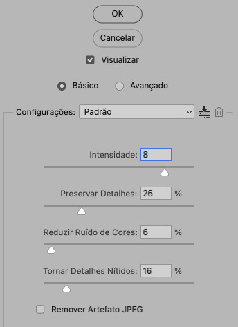
vamos começar com a redução de ruído! ele está em filtro > ruído > reduzir ruído...
na janela de redução de ruídos você verá alguns ajustes que são: intensidade, preservar detalhes, reduzir ruído de cores e tornar detalhes nítidos e vou explicar cada um para que você possa saber ajustar eles de acordo com sua foto:
intensidade: o número de 1 a 10 irá definir a intensidade da luminescência, a intensidade do filtro e o quanto da imagem você quer preservar ou extinguir, sendo 1 o mínimo da intensidade do filtro e 10 o máximo;
preservar detalhes: o número digitado irá definir a porcentagem de detalhes a serem preservados. quanto maior o número, maiores serão os detalhes mantidos na foto, como ruídos, manchas e outras aberrações da foto;
reduzir ruído de cores: o número digitado irá definir a intensidade e reduzir o ruído cromático, ou seja, vai reduzir as aberrações cromáticas, como por exemplo, fotos que distorcem as cores. preste atenção na porcentagem inserida, pois quanto maior o número, menos saturação sua foto terá e poderá ficar com aspecto de foto envelhecida;
tornar detalhes nítidos: o número digitado vai definir a porcentagem de nitidez para restaurar pequenos detalhes da foto. quanto maior a porcentagem, maior vai ser a intensidade dos detalhes da foto. preste atenção na porcentagem inserida, pois se a intensidade da nitidez for muito alto, vai afetar a sua action, seja ela de nitidez ou de desfoque.
sendo assim, para a foto usada eu fiz estes ajustes:
obs.: se você for um usuário mais avançado do photoshop, poderá explorar a opção avançado, que possui as configurações básicas para melhorar a foto e também as configurações para remover ruído das cores primárias (vermelho, amarelo e azul) individualmente. mas, mesmo se você não for um usuário expert, eu recomendo você dar uma olhada nessa opção e explorá-la, mexendo nas configurações e ir ajustando e aprendendo, pois o resultado poderá ficar ainda melhor nos ajustes avançados.
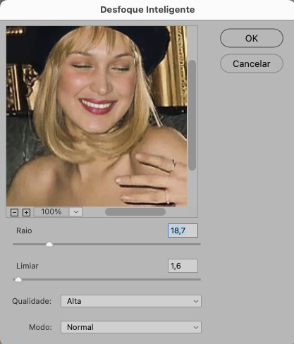
aplicado a redução de ruído, vamos partir para o desfoque! eu estarei usando o desfoque inteligente antes do desfoque de caixa. você vai achá-lo em filtro > desfoque > desfoque inteligente...
na janela que abrirá, você verá os ajustes: raio, limiar, qualidade e modo. vou explicar eles:
raio: vai determinar o tamanho da área que será considerada para o desfoque. quanto maior o número, mais detalhe serão preservados;
limiar: vai determinar a diferença dos pixels entre si antes de serem alterados pelo desfoque.quanto maior o número, maior será a área em que o desfoque será aplicado;
qualidade: vai determinar a qualidade e intensidade do desfoque. ao escolher a opção mais alta, mais partes da foto o desfoque atingirá;
modo: vai determinar o traçado das linhas de bordas que o filtro identificar. o modo normal aqui é o ideal, pois os outros modos “somente arestas” e “sobrepor arestas” irão identificar somente as bordas da imagem.
sendo assim, esses foram os ajustes:
após o desfoque inteligente, partiremos para o desfoque de caixa! ele está em filtro > desfoque > desfoque de caixa...
(você também poderá usar o desfoque gaussiano a depender da foto, mas para esta em questão, o desfoque de caixa funcionou perfeitamente)
a intensidade do desfoque de caixa, assim como do desfoque gaussiano, é medida em pixels e o mínimo é 1 pixel, e para icons é uma intensidade forte, então eu coloco o número mínimo (1, no caso) e depois de clicar em OK e aplicar o desfoque, vou em editar > atenuar desfoque de caixa... e ajusto a porcentagem de acordo com a foto. nessa foto deixei a porcentagem em 33% e ficou ótimo.
no entanto, infelizmente, por não ser o melhor método para melhorar a qualidade de uma imagem, ela ficará um pouco desfocada demais. mas podemos contornar isso usando o filtro alta frequência para devolver um pouco da nitidez e detalhes na foto. você encontrará esse filtro em filtro > outros > alta frequência...
o filtro de alta frequência, assim como os desfoques, é medido através de pixels e quanto maior o número, mais detalhes passarão despercebidos, ou seja, menos detalhes e menos nitidez sua foto terá. eu recomendo em torno de 2px se você quiser mais detalhes e em torno de 5px se você quer mais suavidade.
a primeira vista esse filtro parecerá estranho e distorcido, mas dará tudo certo, você só precisará mudar o modo de mesclagem. para isso vá em editar > atenuar alta frequência e mudar o modo de mesclagem para “sobrepor” ou “luz indireta” se você quiser que fique mais suave. se preferir, poderá também ajustar a opacidade para os detalhes ficarem mais ou menos intensos.
assim:
assim fica o resultado sem o filtro de alta frequência e com o filtro:

sendo assim, fica a seu critério usar o filtro ou não.
aqui está a comparação das fotos com o tratamento de redução de ruído + desfoque com e sem o uso das duas actions:
5. SALVANDO A EDIÇÃO
e chegou a melhor parte: salvar a edição para postar!
seja a edição um icon, uma header, ou qualquer outro gráfico estático (edições não animadas), a melhor opção é sempre, sempre, SEMPRE, salvar no formato PNG!
o formato jpg ou jpeg não preserva a qualidade original como o formato png preserva. então, sempre escolha esse formato ao salvar suas edições estáticas!
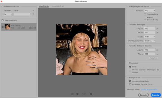
a melhor forma de salvar uma edição em alta qualidade é exportando ela. sendo assim, vá em arquivo > exportar > exportar como...
em “configuração de arquivo”, selecione o formato PNG e desmarque a opção “transparência” se sua foto não é uma imagem com fundo transparente; em “tamanho da imagem” deixe como a altura, a largura e a escola como estão, apenas mude a opção em “criar nova amostra” para BICÚBICO AUTOMÁTICO; e em “espaço da cor” marque a opção CONVERTER PARA SRGB, porque assim, independente da calibração do seu monitor, a foto ficará com as cores originais e não sofrerá alteração.
assim:
no entanto, se você tiver um pc ou notebook lento, ou apenas não tiver paciência para salvar sua edit em exportar, você pode salvar no modo normal, indo em arquivo > salvar como... OU arquivo > salvar uma cópia..., no entanto, se você for usar essa opção, não esqueça de marcar a caixinha para “incorporar o perfil de cores srbg”, essa opção geralmente fica na parte de baixo da janela que abre quando você vai salvar a edição.
6. ACTIONS & RESOURCES
para facilitar pra vocês, todos as configurações de filtros usados neste guia, estarão disponíveis para download em uma pasta de action. para fazer o download é só clicar aqui: ★. já a dupla de actions usadas (a de nitidez & a de desfoque suave) estarão disponíveis para download na lista de dicas abaixo.
dicas de actions de nitidez – premium & gratuitas (free)
lovie potion by @loviestudio [premium]
action #26 by @harupsds [premium]
action #25 by @harupsds [free]
01 action by @harupsds [free]
cherrie by @loviestudio [free]
action #11 by @miniepsds [premium]
face action by @miniepsds [premium]
crispy by @nebulies [free]
scarlett by @l-agallerrie [free]
eight action by @peachcoloring [premium]
bubblegum by @hisources [free]
kendall by @hisources [premium]
hekate by @hisources [premium]
sharpen by @l-agallerrie [free]
#01 action by @buntterflies [free]
dicas de actions “suaves” – premium & gratuitas (free)
teddy bear by @loviestudio [free]
action ten by @peachcoloring [premium]
caelestis by @miniepsds [premium]
fleuriste by @hisources [free]
angel by @loviestudio [free]
action #13 by @harupsds [premium]
action #12 by @harupsds [premium]
wild action by @hisources [free]
outras actions – premium & gratuitas (free)
denoise action effect — remove o ruído das fotos sem perder muita qualidade by @loviestudio [premium]
photopea quality action — action para melhorar a qualidade da foto no photopea by @loviestudio [free]
exclusive hq actions — um conjunto com as actions que foram usadas neste tutorial by @girasois, @loviestudio [free]
denoise and sharpen actions — conjunto de actions para melhorar a qualidade da foto automativamente by heavnsent
7. BÔNUS: DICAS EXTRAS
a adobe cc learn tem muitos tutoriais que você pode dar uma olhada e aprender muito mais sobre o photoshop e outros programas da adobe!
o youtube é outra fonte incrível para você aprender edição no photoshop, lá você encontra tutorial para quase tudo de edição de fotos e muito mais! se você entende inglês, eu recomendo muito os canais piximperfect e brendan williams tutorials.
para fonte de inspirações, o tumblr é o lugar certo! se jogue nas tags para se inspirar e nos blogs de photoshop para ver muito mais tutoriais e muito mais resources.
o blog @looksgreat infelizmente não é mais atualizado, mas você ainda pode encontrar muitos tutoriais sobre quase tudo de edição, e o melhor, todos os tutoriais são em português!!
ainda recomendo outros tumblr brasileiros de resources e tutoriais: @miniepsds, @harupsds, @peachcoloring, @gmfioart, @colour-source, @l-agallerrie, @wasirauhlpsds, @hisources, @opulenceps, @sunshinepsds, e @loviestudio; e no deviantart: jungrainsoul, rockjealous, heavnsent, aureangels e rohdossantos.
8. CRÉDITOS E INFORMAÇÕES
crédito colorings
off hearts + whimsy by @miniepsds ♡
informações
antes de tudo eu gostaria de pedir desculpas pelo tamanho deste guia, mas eu quis abranger o máximo de dicas possíveis para vocês e deixar o tutorial super completinho.
em segundo lugar eu gostaria de agradecer todo o carinho de vocês, isso me motiva muito a continuar. obrigada, de coração!
enfim, é isso! minha ask estará sempre aberta para dúvidas, sugestões, pedidos e mensagens fofas (sempre com educação e respeito, claro)!
#tutorial#photoshop tutorial#tutoriais#tutorials#resources#hq tutorial#tips#useful#ptbr#adobe photoshop#photopea tutorial#tutorial tips#dicas#dicas de edição#dicas de actions#guia completo#guia#guia de edição#guia de edits#edits tutorial#edit tag#masterpost#long post#editing tips#icon tutorial#header tutorial#hq edits
168 notes
·
View notes
Text


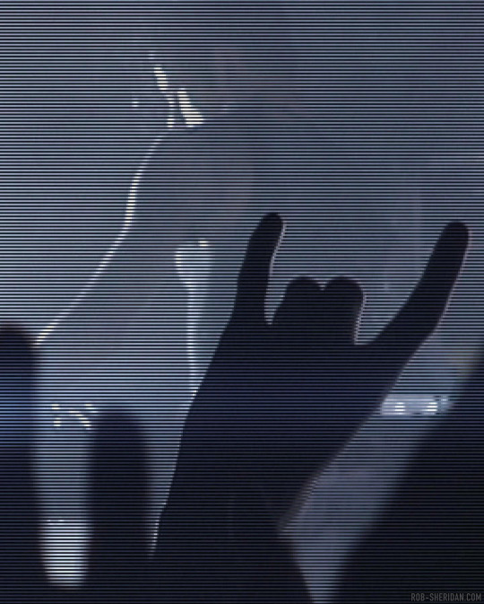
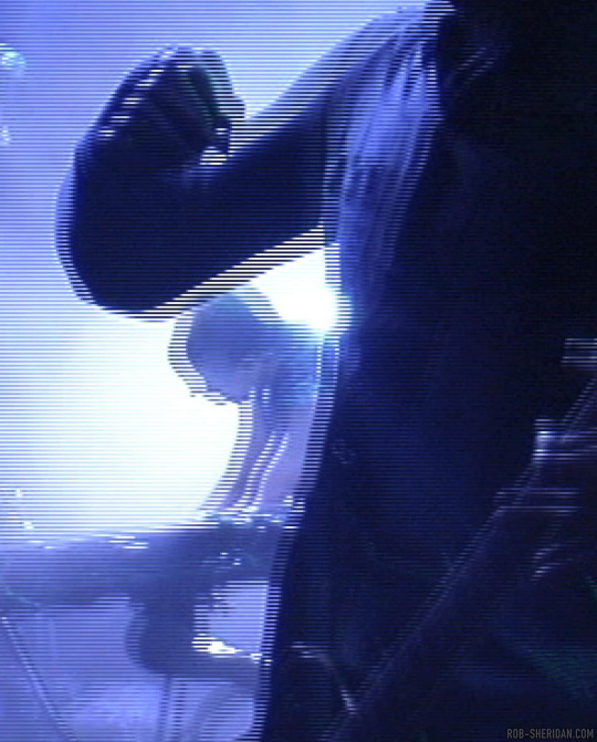
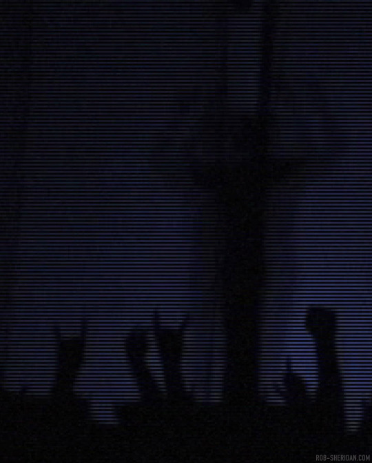


Nine Inch Nails' And All That Could Have Been DVD, released on this day in 2002. I found a folder of raw screengrabs from 2001, during the editing process, where some of the footage was still interlaced from the consumer DV cameras I filmed on in 2000. Here are some enlarged details, which have a phenomenal early-digital texture to them now, and it’s remarkable to see the resolution we were working with to put that film together (these were direct TIFF frame outputs from FCP - all the compression you see in here is from the camera!)
I always loved the way interlaced frames digitally ripped an image apart, and it inspired me in the creation of the “With Teeth” visual aesthetic a couple years later. In 2004, as the prosumer digital video world was continuing the clunky transition away from interlacing, I discovered the first version of Apple’s Motion software did not know what to do with interlaced footage, and would in fact render the interlacing as part of the video when you zoomed into it. That happy glitch accident formed the aesthetic foundation of the video for “The Hand That Feeds.”
#nin#nine inch nails#and all that could have been#aatchb#rob sheridan#trent reznor#glitch#dvd#digital video#dv#2000s music#early 2000s#2000s aesthetic
207 notes
·
View notes
Note
Since you don't see many edits here, and i am a dumbass in editing, could you make a tutorial on it? Like: what apps should we use, what should or shouldn't do, devices, etc. Since i personally worship your editing prowess, i couldn't help myself but ask for your guidance sensei. 🙇♀️
I don't use a "special device" to make my edits, just a computer which can run a videoediting software and Wallpaper Engine correctly (in my case it's an Apple Mac Pro 4,1 from 2009 with upgraded RAM and GPU, and also with Windows 10 installed on it, but that's not important). My server pc build out of my spare parts, and it's serves as a network bridge, and a file storge (like a NAS, or something) to store my personal files, like the assets for the edits on HPP. The way I make my edits, is a different story. I like to put the charaters in different scenarios to make the edit more enjoyable. I usually chose one image from my pre-granarated ones, or I use (if i see a, as i call an edit "suspicious" image here on Tumblr or X) an image from my "Likes", or if I can't find any which is good for the scanario in my head I generate one using PixAI's Ebora Pony XL AI model. Than if I have an image, I put together a static version of the edit in Paint.NET (PaintdotNET). Here I cut down the unnecessary and the broken (weirdly generated hands, .etc) parts of the image, and I remove the background if I'd like to use a different one. Than I chose a stethoscope png what are suitable for the edit, but I recently using the hand with stethoscope one which you can see in my recent edits. I also make some barely visble changes to the main image and the stething image. If it's done, and looks good I save them (the base image, the background, and the steting png separately) in a folder. After that it's time to "animate" the edit, which is just using the Wallpaper Engine's built in Shake effect, if that part is done, I record the animated soundless edit using OBS, which is usually a 5-6 minutes raw mp4 file. Than I put the raw recording into the video editor which is my case is the Wondershare Filmora X. I chose one of the heartbeat and bearthing audios from my server (if it's needed I modify it a bit in Audacity), and speed them up to mach with the animation. I make the breathing way quieter to have the heartbeat in focus, also i duplicate the hb sound to make a stereo effect, which means the I make the left side a bit louder and add more bass to it than the right side, which make a really good heart pulse effect (ROLL CREDITS). Also in here I add some video effects, cut down the unnecessary parts, I cut down the video to 2 minutes to become uploadable for X, than it's time to export it. After I exported the final edit, i check it for mistakes and I fix them if i find any, and the fixed version gonna be uploaded to Tumblr and X. This whole process is 2+ hours usually, but it's could be more for longer and more complex edits. But you doesn't need to follow my way to make edits, if you ever used a photo editor and a video editor before, and you know how put a transparent png on an image, and a greenscreen video on another one, you good to go. There is a lot of ways you can make an edit, so you can chose one which are suitable for you. If you still need help, you can join the Cardio Editor's Hub, there are lot of other people who gladly gives you some tips and tricks. Good luck, have fun! :D
11 notes
·
View notes
Text
the outlines in kirby's return to dream land deluxe are very interesting, theyre definitely the cleanest 3d outlines i have ever seen anyone do
visually theyre just the model but darkened and expanded out a bit, and instead of clipping into any geometry they simply fade out and seem aware of the other outlines and models in the scene, merging together perfectly
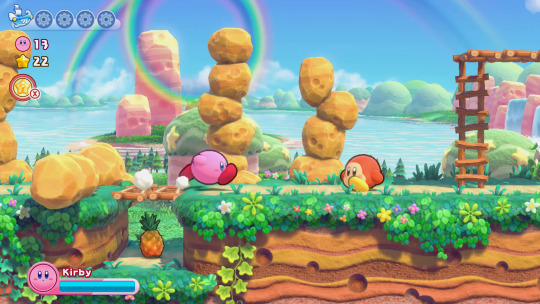

im VERY surprised no one else has done this, because the way they pulled it off is actually EXTREMELY simple
(this will go into kinda technical graphics rendering talk)
the first clue is that looking into the code used for rendering reveals that the game draws the outlines after the rest of the scene has been drawn
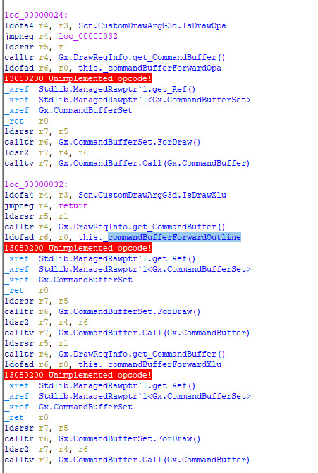
specifically, the order that objects are drawn from this function is:
opaque models (deferred rendering)
decals (deferred)
opaque models (forward rendering, essentially just fully rendering every single model)
outline models (forward)
transparent models (forward)
interestingly, outline models count as transparent, disabling transparency rendering will also disable outlines
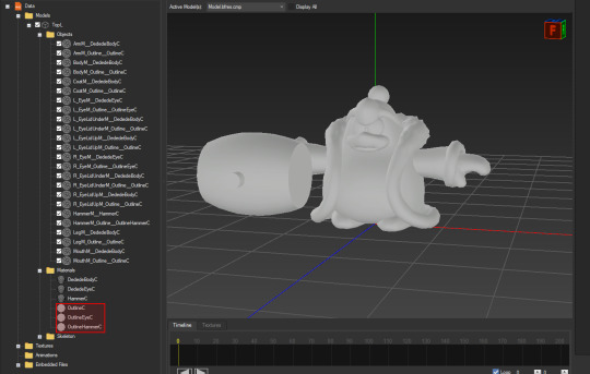
the next hint about how it works comes directly from this enum listing all of the passes the game draws
the most important part of this is "OutlineDepth" and "Outline", which reveals that the outlines render their own depth buffer!! this contains essentially how far away each pixel is from the camera, in ingame/world space units
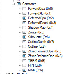
looking into the models themselves, all of the models for characters have duplicated meshes that use a material specifically for outlines
using this information alone, its very easy to recreate the outlines in blender!!

this is achieved in the same way, by rendering the raw scene and the outlines in two separate images using blender's render layers feature, with the outlines being significantly darkened, using only the diffuse texture, and the meshes themselves expanded slightly using geometry nodes
the rest of the models are rendered normally with PBR
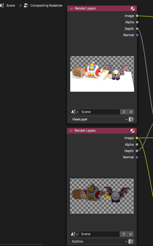
determining where the outlines are drawn is just the result of some extremely simple math using the depth buffer of each layer
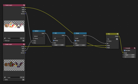
if you would like to see the result of this math, this is the "outline mask buffer":
as a bonus, if we gaussian blur the outline we can achieve a similar look to the game's promo art as well!! however, this doesnt look super good, improving on how this looks specifically most likely requires more tinkering in image editing software like photoshop
214 notes
·
View notes
Text
Yvette Heiser - Enhance Your Photography with These Pro-Level Photo Editing Techniques
Photography is more than just capturing a moment—it’s about storytelling, emotion, and creativity. However, even the most well-composed shots can benefit from post-processing. Yvette Heiser Painting with Pixels: A Guide to Advanced Photo Editing Techniques explores how professional editing can elevate an ordinary image into a visually stunning masterpiece. Whether you're a beginner or an experienced photographer, mastering these pro-level editing skills will help you refine your photos and bring out their full potential.

1. Start with RAW Editing for Maximum Control
Shooting in RAW format instead of JPEG gives you more flexibility during editing. RAW files retain all the image data, allowing you to adjust exposure, color, and details without losing quality. Most professional photographers use software like Adobe Lightroom, Capture One, or Photoshop to process RAW images.
Quick Tip:
Adjust the white balance first to ensure accurate colors before making other edits.
2. Perfect the Exposure and Contrast
Even with careful shooting, exposure may need fine-tuning. Adjusting brightness, highlights, and shadows can balance an image and add depth. Contrast adjustments help differentiate between light and dark areas, making your photos pop.
Pro Tip:
Use the histogram in your editing software to ensure a well-balanced exposure without losing details in highlights or shadows.
3. Enhance Colors with Precision
Color correction and grading can completely transform the mood of an image. HSL (Hue, Saturation, and Luminance) adjustments allow you to control specific colors, making them richer or more subdued.
Best Practices:
Use split toning to add artistic color effects to highlights and shadows.
Adjust the vibrance instead of saturation for a more natural color boost.
4. Sharpen and Add Clarity for Crisp Details
Clarity and sharpness adjustments enhance textures and bring out intricate details, making your subject stand out. However, excessive sharpening can create an unnatural look, so it’s essential to find the right balance.
Quick Tip:
Use the "masking" feature in Lightroom when sharpening to apply it selectively, avoiding unnecessary noise in smooth areas like skies.
5. Remove Unwanted Elements with Retouching
Even the best photos may have distractions, such as dust spots, stray hairs, or background clutter. Tools like Clone Stamp, Healing Brush, and Content-Aware Fill in Photoshop can seamlessly remove unwanted elements without affecting the overall quality.
Pro Tip:
Use a low-opacity healing brush for subtle and natural-looking touch-ups.
6. Apply Dodging and Burning for Depth
Dodging (lightening) and burning (darkening) are classic darkroom techniques adapted to digital editing. These adjustments help shape the lighting in an image, drawing attention to important areas while adding dimension.
How to Use It:
Dodge the highlights on faces to create a soft glow.
Burn background elements to add depth and guide the viewer’s focus.
7. Use Gradient and Radial Filters for Dramatic Effects
Filters like gradients and radial adjustments help enhance specific parts of an image while keeping the rest untouched. These are particularly useful for improving skies, adding vignettes, or drawing focus to the subject.
Best Use Cases:
Apply a linear gradient to darken overexposed skies naturally.
Use a radial filter to subtly brighten the subject while keeping the edges darker.
8. Final Touch: Add a Signature Style with Presets and LUTs
Professional photographers often develop a signature look using presets (Lightroom) or LUTs (Look-Up Tables for video and photo editing). These tools speed up editing by applying predefined color and tone adjustments.
Pro Tip:
Customize presets to fit each image rather than applying them universally.
Final Thoughts
Editing is an essential part of modern photography, allowing you to refine your images and bring out their full artistic potential. Yvette Heiser, investigating the Transformative Power of Photography, highlights how post-processing can turn ordinary shots into breathtaking visual narratives. By mastering these professional-level editing techniques, you can transform your raw captures into visually stunning works of art. Whether you’re adjusting colors, enhancing sharpness, or removing distractions, the key is to maintain a natural and polished look.
Experiment with these tips and elevate your photography to the next level! Would you like any additional insights or software recommendations?
#wedding#camera#moments#pictures#childphotography#photographer#photography#yvette heiser#photographytips#events
10 notes
·
View notes
Text
What are Optimal Character Recognition (OCR) Services?
OCR Outsourcing Services

Optical Character Recognition is a technology and resource that converts various types of documents—such as scanned and printed paper documents and sheets, PDFs, or images and physical documents captured and scanned by a digital camera or device—into editable and searchable data of information. OCR Outsourcing refers to hiring third-party experts to handle these processes, making data management more efficient and cost-effective for businesses.
How Do OCR Services Work?
OCR technology scans printed or handwritten text and translates it into digital characters using pattern recognition and machine learning. Once the data is converted, it can be edited, searched, and stored electronically. This is especially useful and beneficial for the businesses that manage and hold a high volume of paper records or image-based files as raw source data.
Key Benefits of OCR Outsourcing -
Faster Data Processing:
By outsourcing OCR services, businesses can process large volumes of data significantly faster than they can do in-house. Professional experts leverage tools and advanced resources and employ trained professionals to assure the prompt turnaround times and processing for faster data proceedings and operations.
Improved Accuracy:
High-quality OCR Outsourcing providers use AI-driven tools and resources that minimize and lower down the errors. As this guarantees that the captured data is examined up to as precise as possible, lowering the demand for manual corrections and errors.
Cost Efficiency:
Maintaining and leveraging in-house source OCR setup can be expensive and costly. As the outsourcing eliminates the demand for costly software and system, infrastructure, and specialized staff, offering a more affordable option for ongoing needs and business demands.
Better Data Organization:
OCR Outsourcing makes it easier to store and retrieve data as scanned documents become searchable. While this is quite helpful and considerable for industries such as healthcare, law, finance, and logistics.
Scalability:
Whether you need to process a few documents or thousands, outsourcing partners can scale their services to match your demand without affecting quality or delivery speed. Companies and professional experts such as Suma Soft, IBM, Cyntexa, and Cignex are known for offering reliable OCR Outsourcing services. They aid businesses to simplify the data capture process, lower down the workload, and improve the operational efficiency by handling document digitization with precision and care. Choosing a trusted partner ensures high-quality results and seamless data management. They combine technology, skilled teams, and secure processes to deliver high-quality OCR results tailored and personalized as per the settings of different industries and business sizes.
#itsolutions#techsolutions#it services#technology#saas#saas development company#software#saas technology#digital transformation
2 notes
·
View notes
Text
Podcast Editing Service vs DIY: What’s Best for Your Brand?

With the rising popularity of podcasts and video content across nearly every industry, standing out means delivering not just great ideas, but high-quality production. As a result, many creators face a common dilemma: Should you edit your podcast or videos yourself (DIY), or hire a professional editing service? The answer largely depends on your goals, time, budget, and technical skill level. Let's break down the pros and cons of each approach to help you decide what’s best for your brand.
The Case for DIY Podcast and Video Editing
Many new podcasters and YouTubers choose the DIY route, especially when starting out with a limited budget. With free or low-cost software like Audacity, GarageBand, DaVinci Resolve, or Reaper, editing your own episodes or videos can seem manageable—and even empowering.
Pros of DIY editing:
Cost-effective: No need to pay for professional services, which can range from $50 to $500+ per episode or video.
Creative control: You can tweak every second to your liking, from pacing to transitions and effects.
Learning opportunity: Gaining editing skills can be valuable, especially if you plan to scale your content production.
Cons of DIY editing:
Time-consuming: Editing a 30-minute episode or YouTube video can take several hours, especially for beginners.
Steep learning curve: Poor editing can result in distracting quality issues, which hurt audience retention and credibility.
Less time for content creation or promotion: DIY editing pulls time away from growing your brand and audience.
The Case for Professional Editing Services
Professional editing services specialize in turning raw content into polished, professional-grade media. Whether you need a podcast editing service or a video editing service for YouTubers, these providers handle everything from noise reduction and color correction to music integration and show notes.
Pros of using a professional editing service:
Professional quality: Experienced editors ensure your podcast or video is crisp, clean, and engaging.
Time-saving: Outsourcing frees up your schedule to focus on content creation, marketing, or running your business.
Brand consistency: Many services offer packages that include intros, outros, visual branding, transcripts, and publishing support—keeping your image polished across platforms.
Cons of hiring a service:
Cost: A quality podcast editing service or YouTube video editing service is an investment and may not fit every creator's budget.
Less direct control: You may have to rely on someone else to understand your tone and voice, which can take some adjustment.
Dependency: Relying on an editor may delay production if timelines or expectations aren’t managed clearly.
What’s Best for Your Brand?
If you’re just starting out and working with limited resources, DIY editing may be a great short-term solution. However, if your goal is to grow a professional brand, scale your YouTube channel, or attract sponsors, investing in a podcast editing service or video editing service for YouTubers can be a smart move.
As your channel or show grows, you’ll likely want to hire editors for YouTube or podcasts to help you maintain quality and consistency. Whether you're creating episodes or producing content for a growing audience, a trusted YouTube video editing service can save time and elevate your brand.
#video editing service for YouTubers#youtube video editing service#youtube editing services#youtube video editing services#video editing service for youtube#video editing services for youtube#youtube editing service#editors agency#best youtube editor#hire editors for youtube#video editing firm#Podcast editing service
2 notes
·
View notes
Text
𝐓𝐨𝐩 5 𝐅𝐮𝐭𝐮𝐫𝐢𝐬𝐭𝐢𝐜 𝐒𝐢𝐝𝐞 𝐇𝐮𝐬𝐭𝐥𝐞𝐬 𝐟𝐨𝐫 𝐓𝐞𝐜𝐡𝐢𝐞𝐬 𝐢𝐧 2025
In today’s fast-paced tech world, side hustles can be a fantastic way for professionals to boost their skills and earn extra income. With advancements in artificial intelligence, remote working, and a growing need for tech solutions, 2025 is filled with exciting possibilities for tech enthusiasts.
This post dives into five promising side hustles, supported by data and trends. Techies can capitalize on their expertise and thrive in these areas.
1. Remote IT Support
With businesses shifting to hybrid work models, the demand for remote IT support has skyrocketed. According to a report from the International Data Corporation (IDC), the global IT services market is set to hit $1 trillion by 2025, hinting at tremendous opportunities in this field.
Techies with skills in troubleshooting can offer services to both businesses and individuals. The TechServe Alliance notes that the demand for IT support roles surged over 10% last year, making this a vibrant market.
Starting a remote IT support hustle is easy. Freelancing platforms like Upwork and Fiverr allow techies to find clients quickly. Depending on the complexity of the service, they can earn between $25 and $150 per hour while enjoying the flexibility to work on their own schedule.
2. Cybersecurity Consulting
As cyber threats evolve, companies increasingly prioritize cybersecurity. A report from Cybersecurity Ventures predicts that costs from cybercrime could reach $10.5 trillion annually by 2025. This statistic underscores the growing need for cybersecurity professionals.
Techies with experience in cybersecurity can offer their services to businesses looking to protect sensitive data. A survey by Proofpoint found that 55% of organizations fended off phishing attacks, indicating a strong demand for seasoned professionals.
In this consulting niche, technology experts can earn between $100 and $500 per hour, based on their experience and project complexity. Earning certifications, like the Certified Information Systems Security Professional (CISSP), can significantly boost credibility and income potential.
Minimize image
Edit image
Delete image

3. Software Development and Mobile App Creation
As the world becomes more mobile-first, demand for software and app development is expected to rise. Statista reports that the global app economy may generate over $407.31 billion in revenue by 2026, presenting a lucrative chance for techies skilled in coding.
Developers can enter this space through freelancing or by launching their own projects. Tools like React Native and Flutter allow for efficient cross-platform application development, saving both time and resources.
Freelancers can charge between $50 and $200 per hour based on expertise and project scope. For those willing to turn a side hustle into a full business, the income from app sales and in-app purchases can be enormous.
4. Data Analysis and Visualization
Data remains one of the most valuable assets today, with analytics aiding decision-making. The global data analytics market might reach $300 billion by 2026, creating fertile ground for techies skilled in data analysis.
Freelance data analysts can help companies extract valuable insights from their data. Utilizing tools like Tableau, Power BI, and R can help create compelling visualizations, making their services even more attractive.
Data analysts typically charge between $40 and $150 per hour depending on analysis complexity. Mastering data storytelling enables techies to transform raw data into practical insights, positioning themselves as key assets for businesses.
5. E-Learning Course Creation
The rapid growth of online learning has made creating and selling e-learning courses a sought-after side hustle. The global e-learning market is anticipated to reach $375 billion by 2026, driven by rising demand for skill development.
Techies can harness their knowledge to develop courses on platforms like Udemy or Teachable. Topics can range from programming languages to software tools and emerging technologies, such as AI and machine learning. Statista reported that 42% of online course creators are tech professionals, showing the market's strong bias toward technical education.
Successful courses can generate substantial passive income, sometimes yielding thousands of dollars. Since course creation has low overhead, techies can concentrate on producing high-quality content and devising effective marketing strategies.
Minimize image
Edit image
Delete image

Unlocking New Opportunities in Tech
The side hustles mentioned offer exciting paths for tech-savvy individuals aiming to enhance their skills and income in 2025.
As technology keeps evolving, the need for skilled professionals in IT support, cybersecurity, software development, data analysis, and e-learning will continue to grow.
By leveraging their expertise and using the right platforms, techies can build rewarding side hustles that provide financial perks and opportunities for personal and career growth.
Whether solving challenging problems for clients, creating innovative apps, or imparting knowledge, the potential for side hustles in the tech sector is vast. The key is to find a niche that aligns with personal interests, engage in continuous learning, and embrace the entrepreneurial spirit in this dynamic environment.
In a landscape where technology is at the center of everyday life, techies hold a unique position to lead future innovations. Engaging in these side hustles will not only keep them relevant but also equip them for the challenges and opportunities that lie ahead.
#TechSideHustles#RemoteITSupport#Cybersecurity#SoftwareDevelopment#DataAnalysis#MobileAppDevelopment#Elearning#Freelancing#TechEntrepreneur#FreelanceLife#TechProfessionals#FutureOfWork#TechOpportunities#DigitalTransformation#AI#DataVisualization#Coding#TechConsulting#OnlineLearning#CareerGrowth#TechSkills
2 notes
·
View notes
Text
Amazon-Style Product Photography Tips
I got this message from a lovely follower.
Now, a fairly large part of my new steady job is product photography. Not glamour shots, more documentation. The company I work for makes, among other things, licensed drinkware (think water bottles, mugs, tumblers, etc.). Part of my team's duties is to photograph a mockup or finished product both for our records and to submit to the license holder.
The routine typically goes: put item facing forward in lightbox. Click. Rotate to the left. Click, etc. for the back and right. Then a closeup of the copyright info.
Here, finally, is my question: one of the license holders decreed that all of our photographs must be taken at f/8 and shutter time (?) of 1/25s. This strikes me as… not always optimal, considering the range of colors of objects as well as different materials: polypropylene both transparent and opaque, stainless steel, and lacquered cardboard for packaging. I would love to hear your thoughts on how I might better (while being consistent!) adjust camera settings to account for these kinds of factors
As an added bonus, we let the camera decide white balance/color correction. But I don't think I'm knowledgeable enough to try and correct myself, considering none of the monitors/printers I use are color-correct in the first place. I just know there have been many times where I've submitted photos only for the license holders to be like, "Hmmmm, that green doesn't seem like the right kind of green…RESUBMIT!"
First, I'm going to answer this specific question, but at the end I'm going to recommend a full setup for taking these type of rapid fire product shots.
My answer:
f/8 makes sense. Outside of macro photography, this allows a deep depth of field assuring the photo is sharp and in focus for the entire depth of the product. It is usually the sharpest part of the lens and it is not so small of an aperture that you risk diffraction effects softening your image. They probably were told this by a photographer and thought it applied to all of the camera settings.
The shutter speed is problematic. By forcing it to a fixed setting, your camera is going to choose whichever ISO gives a good exposure. And if you don't have enough light, it will choose a high ISO that will possibly add a great deal of noise to your photo. Noise can corrupt the colors of your photo and it just looks bad.
If your camera is on a tripod and they want the sharpness and depth of field f/8 grants you, then I would set your camera to aperture priority mode (usually Av), lock your ISO to it's lowest number (usually 100) and then your camera will choose the best shutter speed on its own.
So… Camera on tripod Av mode f/8 ISO 100 Camera chooses shutter speed
This is all assuming you are using a tripod and continuous lighting. If you are handholding the camera or using flash, I can rewrite the recipe. Otherwise this will get you very sharp photos with minimal noise.
I'd also recommend getting a shutter release cable so you don't shake the camera when taking the picture. Just search your camera brand and “shutter release” and get the cheap wired version unless you really need wireless.
This is the Canon DSLR one, just to give you an idea.
Be warned, if you do not have powerful lighting, you may get some long shutter speeds. That is perfectly okay as long as it is on the tripod and you aren't shaking the camera when taking the picture.
As far as white balance goes, if you really want it to be accurate, you can order a cheap photography “gray white balance card”. They are as cheap as 10 dollars.
This is the one I use.
There are a couple of ways to utilize the gray card.
Option 1:
You put the gray card in the exact lighting as the product or just hold it directly in front of the product.
You take all your photos in RAW format (JPEG will not work) and adjust the white balance in Lightroom, Photoshop, or any RAW editing software. Use the white balance picker tool (looks like an eyedropper) and click on the gray card.
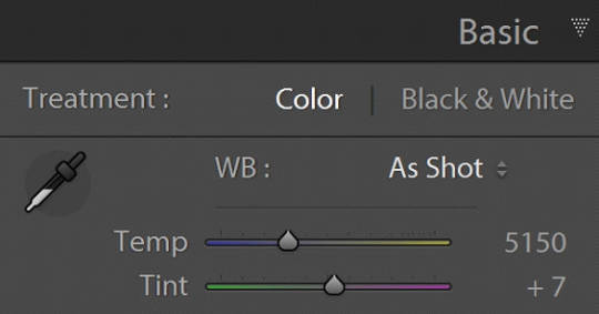
This will give you an exact white balance for that lighting environment. You can synchronize those white balance numbers across all of your photos. Lightroom has a copy and paste function or a "sync" button that will change adjustments in all selected photos as you go.
This is the most accurate option because it allows for “tint” adjustments for extra color accuracy.
youtube
Option 2:
Do the same as above and remember the white balance value. Then set your camera to a custom white balance matching that value. It will probably be around 3200K or 5500K depending on your lights.
Pro tip: If you have any ambient lighting from overhead or other room lights, it could contaminate the photo and skew the white balance into a weird color temperature. Try to make the room as dark as possible aside from your photo lights to avoid this. If you are using flash or have really bright photo lights, this isn't a huge concern.
Option 3:
Use your camera's built in custom white balance tool. It's different for every brand, so you will need to search for a tutorial. But the basic idea is the same. You put the gray card in the lighting of the products, take a picture, the camera analyzes it, and then sets a custom white balance. This can also be done with a white sheet of paper in a pinch.
Here is a video demonstrating the process. Remember every camera brand mau have a slightly different method.
youtube
Good white balance means accurate colors. That is important with product photography and a good value add for your clients. Just be warned, if you change the lighting even a little bit, you have to redo this process. If you bump a light or switch it out for a different one, redo your white balance calibration.
Also, some continuous lights have white balance drift, especially if they allow you to adjust the color temperature manually. Not only will the white balance change depending on the power setting, but it can also change over time. Especially if the lights are used frequently.
Move the lights, redo white balance. Change the power, redo white balance.
And if your lights are stable and on the same power all the time, I’d still redo the white balance every week or so. Personally I would do it before every shoot, but you’ll have to decide if that is worth it depending on how fast you need to turn things around. I usually do it as my first photo in the series so I can set the white balance, select all the photos, and copy the settings to all of them at once.
The nice thing about doing white balance with a gray card is that the results are display agnostic. Even if your monitor is poorly calibrated, you can be assured the white balance is accurate. And if someone says your photos are green, it will be their monitor and not your problem.
You just have to avoid doing any color specific adjustments to the images. Trust the gray card and white balance tool more than your eyeballs and display.
You can boost saturation a tad, but that is all I would mess with unless you know what you are doing. Even if the photos look a little drab or not very colorful, I would leave it alone. It sounds like the importance for this task is accuracy of color rather than making them as pretty as possible.
------------------------------
Okay, that is the question answered. Now I'd like to go through how I would build a setup to do this kind of work.
In the product photography world, this workflow is referred to as "pack shots." The idea is to create a consistent setup so you can just swap out the product one by one and speed through the shoot. It is best to control as many variables as possible so all you need to do is set the product down, take the shot, and repeat.
I'm going to show you my ideal pack shot setup with a light cube. I think it will be similar to what my follower is using. And, if not, it might help him streamline his process a bit.
A light cube is just a box made of diffusion material.

You drape a background with the color of your choice. White is usually preferred for Amazon-style pure white background photos. Though I prefer dark gray for aesthetic reasons. You just want to make sure the backdrop has that natural gravity curve so there isn't a hard line or wrinkles.
For lighting, you should get two *identical* lights. They can be desk lamps as long as they are the same and have the same light bulb inside. Then you just place them on either side of the cube. You want the ball of light on the cube to be in front of your subject.

Remember, your light source isn't your actual lights. It's the ball of light on the sides of the cube.
If you want to make it a little fancier, you can get a black or white acrylic sheet to create a reflective surface. You want it as far forward as possible and a little elevated. Here are some things I did in a simple light cube with the setup above.
Here is what the white acrylic looks like.
I placed a big book under the acrylic sheet like this.
This allowed me to hide the curve of the background and get a nice crisp transition between the acrylic and the background.
And if you do white acrylic, you can get the background to seamlessly blend.
As I said, two desk lamps will work, but if this is for a business and you want something fast, convenient, and reliable, I would suggest something more robust.
I'd probably get two daylight balanced COB (chip-on-board) LED video lights that have a Bowens mount attachment.

This Godox light is very reasonably priced for its features.
Daylight balanced means one consistent color temperature, so less chance of drift. These are very bright so you can use a quick shutter speed and you won't even need a shutter release cable (still a good idea). You also don't *need* a tripod, but you should still use one. The main advantage of bright lights is they can't be overpowered by room lights. You can be assured any overhead lights or window light will not contaminate your photo. A darker room is always preferable, but if you crank these it won't matter.
The Bowens mount allows you to place any modifier you wish on the light from softboxes to reflectors. But the standard reflector should be fine for the light cube. But if you are taking photos of tall cylinders, a couple of strip boxes might help.
Don't worry about putting the grids on. You just line them up towards the front of the light cube so you have even light from the top to the bottom of your cylinder. Again, this is optional.
Since these lights are so versatile, you can do any kind of lighting for any other photographic needs. Slap on a white umbrella and take company portraits if you want. Or you can use them as video lights to film a worker safety video.
So, here is my recommended ingredient list for a pack shot light cube setup.
Light Cube COB video light Black Plexiglass Seamless paper (color of your choice)
Colored poster board also works if you keep it from getting dinged up. And the light cube also comes with some cloth backgrounds, but watch out for wrinkles.
BONUS TIP: If you want that pure white background like in Amazon shots, add a third light from behind with no background paper. Make the light cube material your background and shine a light through it. You have to make sure it is bright enough to give you pure white, but not too bright that the light blasts your subject from the rear.
Otherwise just use a white backdrop and use Photoshop to brighten it to pure white.
Karl Taylor shows a pack shot setup without a cube, but the same principles apply. He shows you how to dial in that white but not too white background. Just imagine instead of shining a light onto a background, you are shining a light through the background (the back of the cube).
youtube
13 notes
·
View notes
Text
📖TIPS: Focus stacking

Hello everyone,
I'm @jbarchietto and I'm honored to have been contacted by Brickcentral to offer you the tips for month September.
I'd like to talk about a technical subject that you probably won't use every day, but which can be very useful in certain cases, and which I use regularly in my photography: the focus stacking.
During photo shoots, we're generally looking for good sharpness on the main subject. However, it can happen that the depth of field used is too shallow to fully contain the subject. In such cases, the focus stacking technique can help us to enlarge this area.
In this first example, I wanted to show a caravan of forestmen in the forest. It's quite long, and as it's framed in depth, I can't get both the leading figures and those in the background in focus. I'm going to use the technique described:
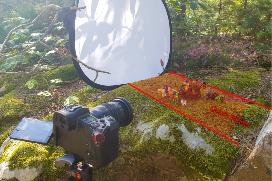
I've set the aperture of my lens to its sharpest point, the famous "sweet spot", around f/8. And I'm going to take a series of photos, sweeping the entire focus area from the closest to the furthest point. To do this, you need a tripod, so as not to change the framing between each shot, and set your camera to manual focus. To be sure of scanning the entire subject, I can mark the focus interval on the lens ring. Personally, I use the visual aid of my monitor. Then I photograph my images, which can vary according to the width of the zone. In this case, 10 images.
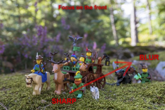
The rest of the process takes place on the computer, where you process the stack of images. With your photo editing software, or with dedicated software such as Helicon Focus, which you can try out as a demo. The algorithm will isolate the sharp areas of each image to recompose an entirely sharp image.
And then, the Final picture is processed. I’m working with raw files, so I can edit the final picture just as a regular shot to enhance colors or add details. I couldn't have achieved such a depth of field with a single shot, unless I reoriented the subject to bring it more into focus.
@jbarchietto, Guest Tips Mod
29 notes
·
View notes
Text

How to Color Match Images for Photo Retouching: I wish someone taught me this 10 years ago. 1. Start with Consistent Photography ↳ Ensure all product images are taken under the same lighting conditions. ↳ Use consistent light sources with the same color temperature. 2. Use RAW Format ↳ Capture images in RAW format for maximum detail and flexibility. ↳ This allows for better adjustments in exposure, white balance, and color. 3. Adjust White Balance ↳ Correct the white balance using photo editing software like Adobe Lightroom or Photoshop. ↳ Use a gray card shot during your session as a reference point. 4. Color Calibration Tools ↳ Incorporate color calibration tools such as color cards (e.g., X-Rite ColorChecker). ↳ These tools help establish a reference for accurate color representation. 5. Use the Match Color Tool in Photoshop ↳ Open both the source and target images in Photoshop. ↳ Select the target image and navigate to Image > Adjustments > Match Color. ↳ Adjust parameters like Luminance, Color Intensity, and Fade to harmonize colors. 6. Create Adjustment Layers ↳ Utilize adjustment layers for non-destructive editing. ↳ Hue/Saturation Layer: Modify specific colors without affecting the entire image. ↳ Curves Adjustment: Fine-tune individual RGB channels for precise control over color tones. 7. Utilize Selections for Precise Editing ↳ Isolate areas of interest using selection tools (e.g., Lasso or Pen tool). ↳ Target specific regions of an image to ensure accurate changes. 8. Adjust Saturation Carefully ↳ Adjust saturation levels to enhance or reduce color intensity as needed. ↳ Be cautious not to over-saturate, as this can lead to unrealistic representations. 9. Final Review and Comparison ↳ Conduct a thorough review by comparing your retouched images against actual products or reference samples. ↳ This step ensures accuracy in color representation and maintains consistency across your e-commerce catalog. Which of these techniques will you master first?
4 notes
·
View notes
Note
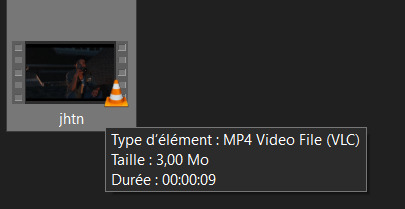
Sorry if you’ve answered this question before, but how do you make your gifs?
With an outdated version of photoshop and a lot of patience 😤 my messy process under the cut
let's say i have this movie downloaded in .mp4 i open it in windows movie maker - or any other software that lets you do quick and easy edits and whatnot but me i use wmm even tho it's obsolete i knoooow leave me alone - cut the scene i want to gif out and save it into this tiny little file
then i open photoshop and go into import > video frames into layers (i may be a little bit off in how things are called on PS in english, but they should be in the same places anyway)
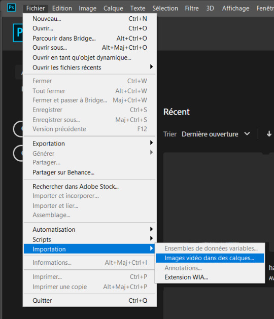
this little popup will open

since my file is exclusively the thing i want to gif i don't need to bother with the little arrow-ish things underneath the video player, they're there if you need to shorten your thing or like cut into it.
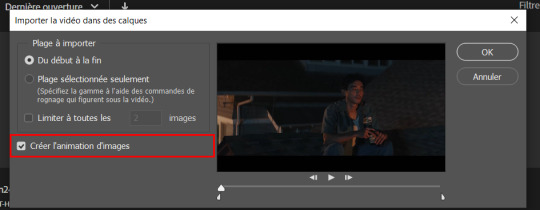
this bit here needs to be checked like this, it'll set up the gif animation or whatever. so yeah then click Ok
bim bam boom photoshop will open like this
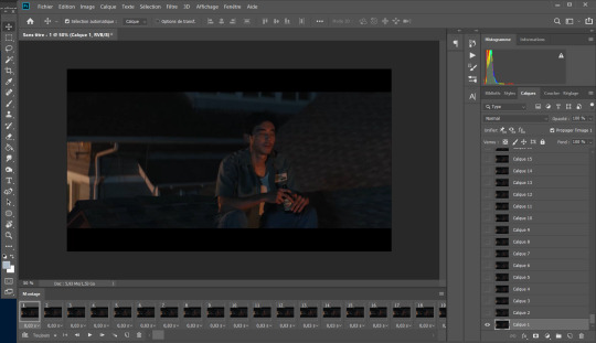
big scary image with many tiny scary images, so first of all what i do is get on the cropping tool

this will show up in the toolbar up top

and in there you set the dimensions of the gif, 1 gif in a gifset that takes up the whole post has to be 540px wide for 2 gif next to each other it's 268px wide and i can't remember 3 by 3 but i never do that so whatever who cares.
once you've set up the dimensions you want, you got this grid thing to move around and set however you want it to be
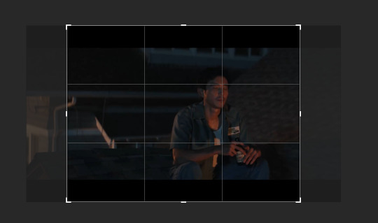
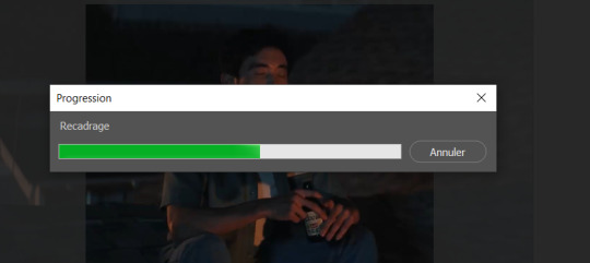
and then you wait as it painstakingly takes its time to do it
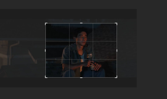
boom! it's done!

so that's your gif raw and unprepared without any filters or whatever, no length, no speed, nothing!
down there you've got the frames of the gif, depending how long is it'll be either a lot or very very short, in this case it's 277 frames, so already you know it's not gonna be just one gif but probably two or three - which i knew btw that's on purpose!!

first thing i do when all the cropping and setting up is done is scroll all the way through the frames to see if there's a bit that won't make it into the gif, and here, there is
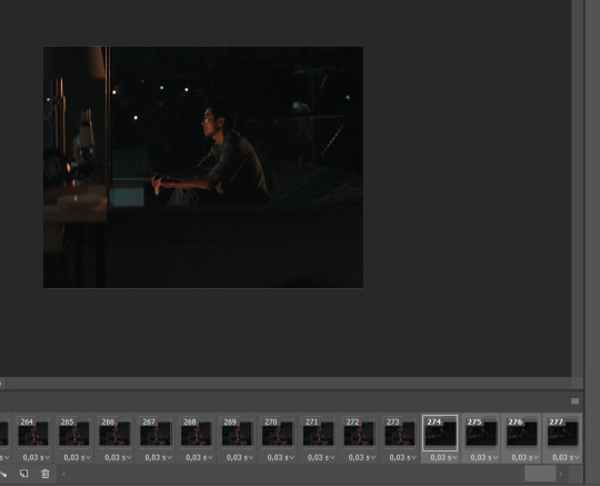
these last four frames show a different bit of the scene because i cut shit very messily and don't check before opening photoshop but you know! trust the process! so make sure to select the unwanted bunch and delete them
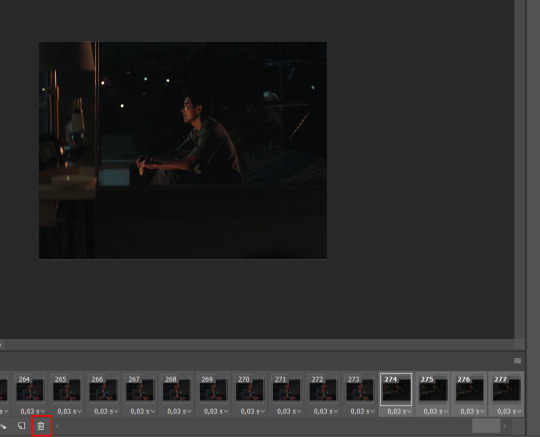
so now hurray the gif is 273 frames and it's only the one scene i want

and now the fun not fun starts!
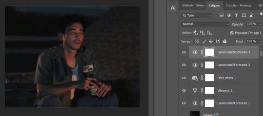
to the right you got these, the layers
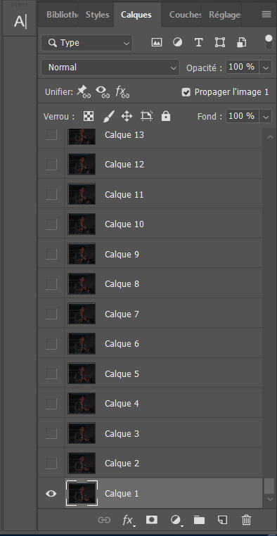
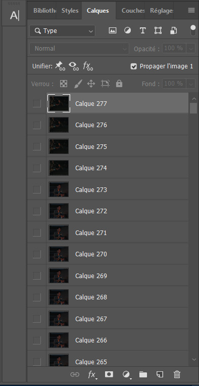
so you gotta scroll all the way up and NOT forget to click on the very last layer before you start playing around with filters and all that

this little guy right here is my bestien he's the only one i use when editing gifs, fuck everybody else on that row. when making gifs i mostly just use a combination of those three things, brightness/contrast, vibrancy and photo filters
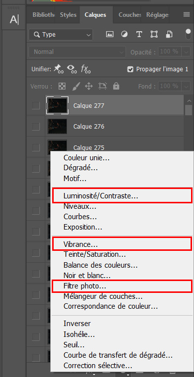
so anyway, let's fool around with those little things and make a gif (i realize now the scene is very dark and it will look very ugly but never mind! we carry on) so there a bunch of random settings added - you gotta make sure they are all the way on top of everything or else they just won't appear on every single frame
what i do then is probably very stupid and there's probably a better way to do it, but MY PROCESS, so i divide the amount of frames i've got by the number of gifs i want to make in a set, so 273/3 that's 91 (thank you google), so we look back down at the frames
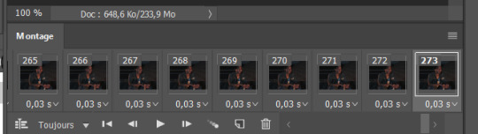
and then scroll aaaaaalllll the way back to frame 91 (if you hold shift and use the wheel it'll be much faster) and while still holding shift pressed down click on frame 92
that will select every frame from the last to that and we delete that shit

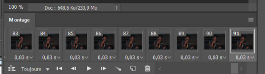
so now we only have 91 frames and that's one gif. so let's save it! but wait, no you forgot to do something! see the 0.03s? that's the gif speed or whatever, idk how it works but 0.03s is too fast, me i usually use 0.05s so what you do next is select every one of those frames you've got left and click the little pointing down arrow, that'll open that

click Other... and then set it as the speed you want
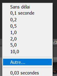
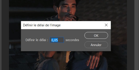
ok so your gif is at the correct speed NOW you can save it so it's file > export > save for web
this new popup will appear
currently as of 2024 gifs can't be bigger than 10Mb/Mo, this one is 4mo

so we're good we're fine. so then you just click save, name the file whatever you want and VOILAAAA, a djeef!

(and then undo the delete and repeat everything for the other two gifs you'd want to make in that set)
7 notes
·
View notes
Text
Q: What is "Piki.exe"? A: It is my own personal story involving my Vocaloid and SynthV banks, mainly Piko x Miki and V_Flower x Fukase. I will not monetise the series because of the toxic western fandom and the effort it takes to get the rights, so bits and pieces of its lore and storyline will be shown in talkloids between covers. "Piki.exe" refers to the software installed into Piko and Miki once they traded their humanity for a cyborg body. It is the "soulmate software" created by their company HEARTFAST in which they need to overcome and remove in order to learn what true love means to them. Friendly reminder that this series is not yet rated. This may change with time! No, this is not shit posting, it is basically an alternate universe fan fiction, however there will be bloopers.
This blog provides upload notifications and behind the scenes lore and headcannons. MMD Credits ALL posts: ~https://www.deviantart.com/search/deviations?q=edit+jjinomu+model ~https://www.deviantart.com/venussempai/gallery/44479842/mikumikudance *Nothing MMD inherently belongs to me. On this blog and my channel I edited some TDA models for non-profit personal use for the specific reason of making this series, please contact me if you have questions or require a donation for this reason. I do not make models from scratch, further credits are in the links, as well as the author's other downloadable works. I also have ZERO intention of sharing my MMD edits nor do I ever intend to use them for R18 situations/profit. Please understand I do not have a deep understanding of the history of MMD, I am blindly experimenting, so I would appreciate if you go easy on me about how things are done and how I can help you. Thank you. Disclaimers for ALL posts: I am primarily a writer and talkloid tuner and focus on nostalgia. I legally own copies of my voice banks, V4 Editor, SynthV + 2 Pro, the tuning work, the raw bass and electric violin sounds, the story writing itself, its Japanese, English, and later Italian translations. I position and edit other people's MMD models to help portray some events and use stock images and any other sounds from copyright free sources simply because I do not draw or do my own voice work anymore thanks to A.I.. I create my videos with CaptCut for free and use a legal copy of RPG Maker VX Ace for the subtitles. Most of this is freeware and creativity. That said, if there is something I have done that unintentionally offends you through my work, tell me directly and I will be civil and take things down as necessary. Anyone can collect these things and do what I am doing, please do not be afraid to start yourselves, this is done for fun and purely therapeutic purposes outside of my full time job. A Patreon for my .vsqx and .svp files and other completely original works will be started if you wish to support me personally. Some of the song lyrics or files may contain R18 content or explicit themes, therefore I do not accept subscribers under the age of 18. This will apply to some episodes on my channel, I will set an age limit to certain episodes depending on the subject matter. If I am under any suspicion that you will blatantly mock or disrespect me or share explicit materials to minors then I will not sell to you. That said, I do understand 1,000% enforcement is unreasonable online, people will undoubtedly pirate tuning files anyway, so my works that I own will have a high paywall and require credit upon use. Once it's out there, it's out there; the internet will outlive me and I honestly just care for respect while I'm still breathing. Nothing is copyrighted as of yet but that may happen in the future. Please note that I take suggestions into consideration but I have no interest to collaborate outside my circle. This is for my mental wellbeing.
Contact me here on Tumblr, or see my YouTube channel (@mandragora-p). I no longer accept Discord friend requests. I was and still am incessantly harassed by people/haters so they could try to steal my content and then "cancel" me when I asked to be left alone. It's been almost 3 years and I am over it. My goal is not fame. Do not send anybody hate. Do not start drama. If you do not like anything, then you have every right to leave. In the meantime, keep calm and ship Piko x Miki.
~~~~~~~~~~~~~~~~~~~~~~~~~~
𝑪̲̅𝒉̲̅𝒂̲̅𝒓̲̅𝒂̲̅𝒄̲̅𝒕̲̅𝒆̲̅𝒓̲̅ 𝑳̲̅𝒐̲̅𝒓̲̅𝒆̲̅
*Main Characters*
🎙️フカセ [Fᴜᴋᴀsᴇ]
🤡Mɪᴋɪ's ʀᴇʙᴇʟʟɪᴏᴜs ᴀᴅᴏᴘᴛᴇᴅ sᴏɴ
•Pʟᴀʏs ɢᴜɪᴛᴀʀ﹠ʙᴀss
•Hᴀᴛᴇs ᴏᴡɴɪɴɢ ᴛᴏᴏ ᴍᴀɴʏ ɪᴛᴇᴍs, ᴘᴜᴛs ᴏᴛʜᴇʀs ꜰɪʀsᴛ
•ジョーカーデレ "ᴊᴏᴋᴇʀ⁻ᴅᴇʀᴇ":Cʜᴀᴏᴛɪᴄ ᴇxᴛᴇʀɪᴏʀ, ᴄᴀʟᴄᴜʟᴀᴛɪɴɢ ʏᴇᴛ ɢᴇɴᴛʟᴇ ɪɴᴛᴇʀɪᴏʀ
•Age: 21
💬 Jᴀᴘᴀɴᴇsᴇ ɴᴀᴛɪᴠᴇ, Eɴɢʟɪsʜ ꜰʟᴜᴇɴᴛ
🎙️フラワ(花)[V⁻Fʟᴏᴡᴇʀ]
🎻Vɪᴏʟɪɴɪsᴛ ﹠ᴍᴇᴛᴀʟ ᴠᴏᴄᴀʟɪsᴛ
•Mɪᴋɪ's ʙᴀss student﹠Fᴜᴋᴀsᴇ's ᴄʟᴀssᴍᴀᴛᴇ
•Vᴇʀʏ ᴍɪsᴜɴᴅᴇʀsᴛᴏᴏᴅ﹔ sʜᴇ ɪs ɪɴʜᴇʀᴇɴᴛʟʏ ᴘᴀssɪᴏɴᴀᴛᴇ ᴀɴᴅ ɴᴀᴍᴇs ʜᴇʀ ᴘʟᴀɴᴛs ᴀꜰᴛᴇʀ ʜᴇʀ ꜰʀɪᴇɴᴅs
•クーデレ "ᴋᴜᴜᴅᴇʀᴇ":ᴄᴏᴏʟ ᴇxᴛᴇʀɪᴏʀ, ɢᴇɴᴛʟᴇ ɪɴᴛᴇʀɪᴏʀ
•Age: 20
💬 Jᴀᴘᴀɴᴇsᴇ ɴᴀᴛɪᴠᴇ, ʟᴇᴀʀɴɪɴɢ Eɴɢʟɪsʜ
🎙️(𝚂𝙵-𝙰𝟸開発コード) ミキ [Mɪᴋɪ]
🍒Cʏʙᴏʀɢ ʙᴀssɪsᴛ
•Sᴘᴀᴄᴇsʜɪᴘ ᴘɪʟᴏᴛ, ᴇʟɪᴛᴇ ᴄʟᴀss ᴅʀɪᴠᴇʀ, sᴄɪ⁻ꜰɪ ᴘɪɴ⁻ᴜᴘ ᴍᴏᴅᴇʟ
•Sᴛᴀɢᴇ ꜰʀɪɢʜᴛ ᴀꜰꜰᴇᴄᴛs ʜᴇʀ ᴘɪᴛᴄʜ ᴀᴛ ꜰɪʀsᴛ, ᴀ ʀᴏᴍᴀɴᴛɪᴄ ᴡɪᴛʜ ᴀ sᴛʀᴏɴɢ ᴍᴀᴛᴇʀɴᴀʟ ɪɴsᴛɪɴᴄᴛ
•Lᴏᴠᴇs ᴄʜᴇʀʀɪᴇs, ᴀʟᴘᴀᴄᴀs, ᴜᴘʟɪꜰᴛɪɴɢ ᴏᴛʜᴇʀs
•Age: 23
💬 Jᴀᴘᴀɴᴇsᴇ ɴᴀᴛɪᴠᴇ, ᴘᴏᴏʀ Eɴɢʟɪsʜ
🎙️(𝙺𝚂𝚁𝚆-𝟷開発コード) 歌手音ピコ [Uᴛᴀᴛᴀɴᴇ Pɪᴋᴏ]
🍛Cʏʙᴏʀɢ ɢᴜɪᴛᴀʀɪsᴛ
•Sᴘᴀᴄᴇsʜɪᴘ Nᴀᴠɪɢᴀᴛᴏʀ, CʏʙᴇʀSᴇᴄᴜʀɪᴛʏ Gᴜᴀʀᴅ, ᴄᴏᴅɪɴɢ ᴘʀᴏꜰᴇssᴏʀ
•Hᴀs ᴀ ᴅᴜᴀʟ ᴠᴏᴄᴀʟ ʀᴀɴɢᴇ, sᴏᴍᴇᴛɪᴍᴇs sɪɴɢs ᴍᴇᴛᴀʟ
•Cʜᴇᴇᴋʏ sᴇɴsᴇ ᴏꜰ ʜᴜᴍᴏᴜʀ, Oꜰᴛᴇɴ sʟᴇᴇᴘʏ, ꜰᴏᴏᴅ, sᴇxʏ ᴡᴏᴍᴇɴ, ᴀɴᴅ ᴅᴏɢs ᴀʀᴇ ʜɪs ᴡᴇᴀᴋɴᴇssᴇs
•Age: 24
💬Jᴀᴘᴀɴᴇsᴇ ɴᴀᴛɪᴠᴇ, ᴠᴇʀʏ ɢᴏᴏᴅ Eɴɢʟɪsʜ
🎙️オリバー [Oʟɪᴠᴇʀ]
🐤Pɪᴋᴏ's ʟɪᴛᴛʟᴇ ᴀᴅᴏᴘᴛᴇᴅ sᴏɴ
•Pᴇᴀᴄᴇꜰᴜʟ ᴜɴʟᴇss ᴀɴɢᴇʀᴇᴅ, ʜᴀᴛᴇs ᴡᴇᴀʀɪɴɢ sʜᴏᴇs, ʟᴏᴠᴇs ᴛᴏ ʙᴇ ᴄᴏᴅᴅʟᴇᴅ
•Hᴀs ᴀ ʏᴇʟʟᴏᴡ ʙɪʀᴅ ɴᴀᴍᴇᴅ Jᴀᴍᴇs
•Sʟɪɢʜᴛʟʏ ᴄʟᴜᴍsʏ, ᴅᴏᴇs ʜɪs ʙᴇsᴛ ᴛᴏ ʙᴇꜰʀɪᴇɴᴅ ᴇᴠᴇʀʏᴏɴᴇ ᴀɴᴅ ʙᴇʜᴀᴠᴇ
•Age: 13 *Has a software that keeps his mind safe and childlike with a reset cycle. Memories stay intact but irrelevant events are filtered out and are replace, or erased. He has a very strong electrical defense system if he is ever in danger.
💬 Eɴɢʟɪsʜ ɴᴀᴛɪᴠᴇ, ᴘᴏᴏʀ Jᴀᴘᴀɴᴇsᴇ
Note: ﹡Vᴏᴄᴀʟᴏɪᴅs ᴀʀᴇ ᴀᴅᴠᴀɴᴄᴇᴅ ᴀɴᴅʀᴏɪᴅs ᴡɪᴛʜ ʜᴜᴍᴀɴ sᴏᴜʟs ᴡʜᴏ ʟɪᴠᴇ ɪɴᴅᴇꜰɪɴɪᴛᴇʟʏ.
﹡Cʏʙᴏʀɢs ᴀʀᴇ ʜᴜᴍᴀɴs ᴛʜᴀᴛ ᴄᴏɴsᴇɴᴛᴇᴅ ᴛᴏ ɪɴsᴛᴀʟʟ ᴠᴀʀɪᴏᴜs ᴀᴅᴠᴀɴᴄᴇᴅ ᴛᴇᴄʜɴᴏʟᴏɢɪᴄᴀʟ ᴜᴘɢʀᴀᴅᴇs ɪɴᴛᴏ ᴛʜᴇɪʀ ʙᴏᴅɪᴇs. Tʜɪs ɪɴᴄʟᴜᴅᴇs ᴀɴ ᴇxᴛᴇɴᴅᴇᴅ ʟɪꜰᴇsᴘᴀɴ, ᴛʜᴇʀᴇꜰᴏʀᴇ ᴀʀᴇ ᴀʟᴍᴏsᴛ ɪᴅᴇɴᴛɪᴄᴀʟ ��ᴏ ᴀɴᴅʀᴏɪᴅs.
Happy tuning!
2 notes
·
View notes