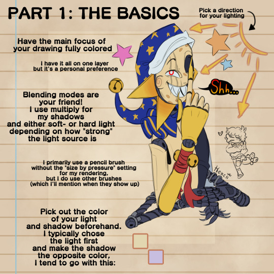
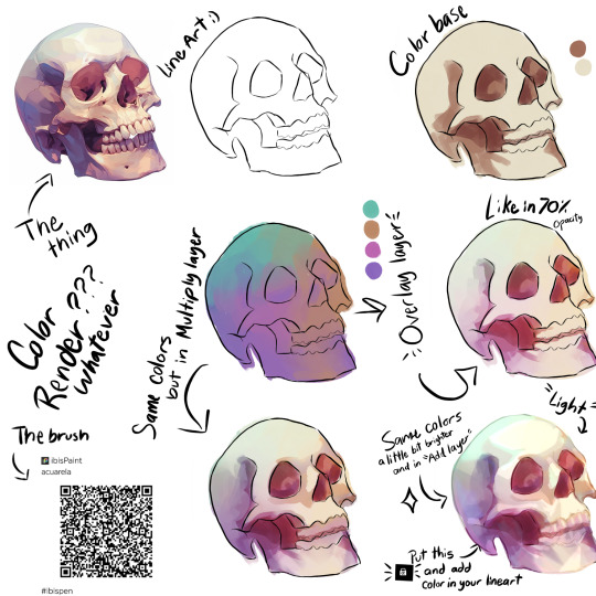
#rendering tips
Explore tagged Tumblr posts
Visit Tumblr Blog
Explore Tumblr blogs with no restrictions, modern design and the best experience.
Last Seen Tumblr Blogs


Fun Fact
China blocked Tumblr because of pornography and censorship problems in 2013.
Text

Oh
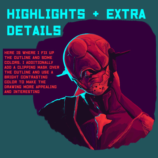
#art tutorial#art tips#art#rendering tips#art help#artists on tumblr#i usually stop around step 3 unless its a drawing im actually putting effort into
36 notes
·
View notes
Text


@pinterestmom5 Heres the hnk hair rendering tut!!!
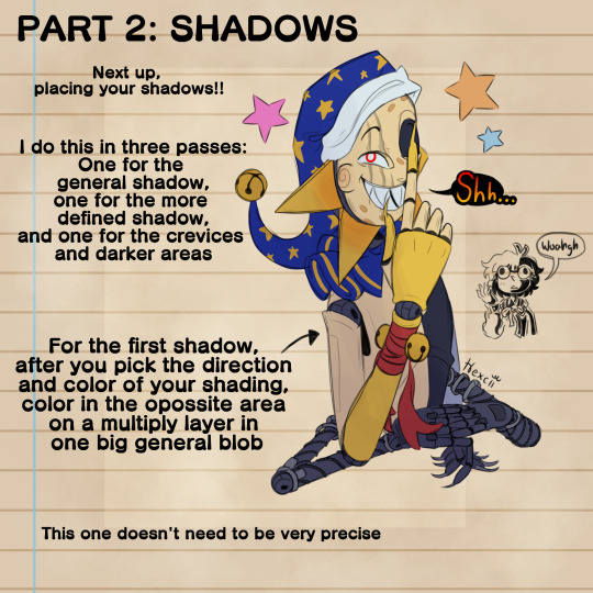
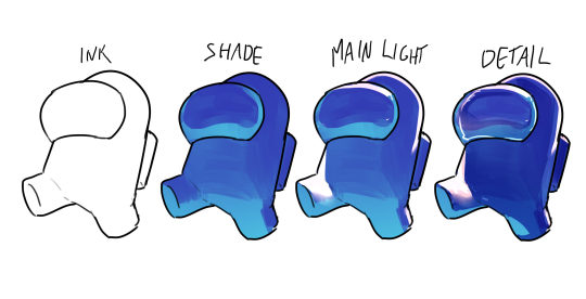
Firstly, im using a generic color. You can choose every color you like! Just make sure the lineart is separated from the color layer
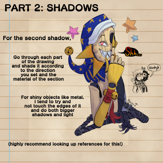
Use "multiply" and "add" layer to define the first shadows and light of the hair. Generally, the shadow is closer to the gem's head and the light is more distant
Add a detail inside simmilar to the hair sillouete. This step defines more the gem's volume. You can use "multiply" layer on this as well
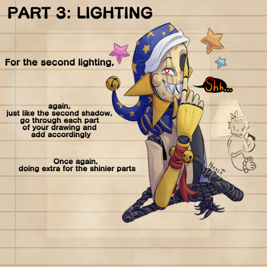
Add highlights! Yippee! (use add layer mode)
add a spray light close to the hair highlights, and if you want, add a little glitter
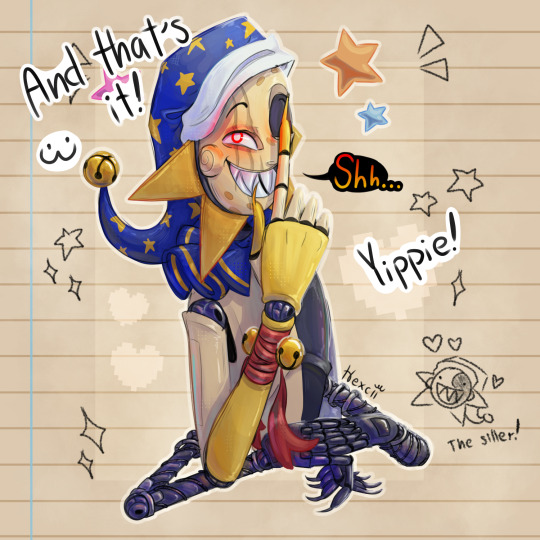
Aaaand done!! Hnk hair!! Yippee!! Reminder that is how I do my hnk rendering. You don't need to do the tut if you don't want. I did this more because an artist was curious on how i made Padparadscha's hair in this post
another reminder: not all gems follow these rules. Rutile and Bort are examples that not all gems are transluscent and very shiny
#art#digital art#drawing#tutorial#rendering#rendering tut#hnk#houseki no kuni#houseki no kuni hair tutorial#hnk hair tutorial#drawing tips#rendering tips
29 notes
·
View notes
Text
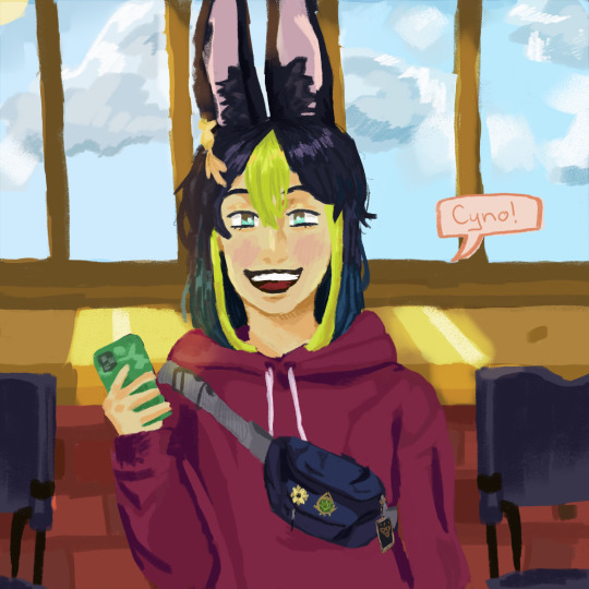
im literally so obssessed with tighnari rn its concerning he is all that in my mind. the vibe here is college but im not as skilled as id like to be and ive never used psd for art pls help
#my art#drawing is so hard#rendering tips#coloring tips#anything really pls#how do u draw#ignore the background#tighnari#genshin impact#i was debating how big tighnari smile was in response to cyno but then i decided its self indulgent and i can do whatever the fuck i want#i am also very lazy.#HOW DO U RENDER/PAINT PLS#genshin fanart#genshin impact fanart
11 notes
·
View notes
Text

Hex code for the pink I used
hex code #C8959C
hex code for the purple I used
hex code #8E7C8A
1 note
·
View note
Text
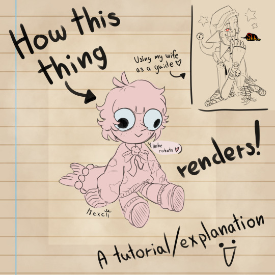


Some things might be misspelt or worded strangely. English is weird. Anyway here's the rendering thingy I promised, tosses it at you and RUNS!!!!
Oh and also the finished piece
MY WIFEEEE
I'm also open to any questions or clarifications about my process yippiiii hot artists don't gatekeep or whatever the saying is
#my art#dca fandom#fnaf eclipse#dca eclipse#eclipse#my sona#rendering#tutorial#art advice#art tips#uhhh what do i tag#hi folks#posting from my puter woahgh....#pov: you said a swear#i guess this is also how i reveal my updated eclipse design#metal arms woahgh <33
253 notes
·
View notes
Text

accolade
#WOOOOOO i thought of this quite genuinely uhhhhh 6-7 months ago? ish? then i never drew it. got distracted. thats life babey#silver's the next housewarden. he's gonna get dubbed in and he's going to serve the dorm well and they're all so proud of him#what card was it. azul halloween? the one where hes asking azul for housewarden advice to get ppl to listen to him? its CANON FOLKS#ougugh working in black and white for a change. as a TREAT. different rendering styles keep me fresh keep me happy i love it#i render different ways i draw in different styles but no matter what ill always be drawing silver. static subject. i love him#this composition is also a bit funky for me i kinda dig it. anyways#twst#twstファンアート#twisted wonderland#twst silver#malleus draconia#suntails#if any of u know anything abt harrisburg area PA pls give me tips. just in case
923 notes
·
View notes
Text

late christmas drawing ,, was really torn between reposting this or not !! i feel like ive lost my edge n all but i liked how the faces turned out 🥲 its unrendered and unfinished in some places but my awesome moots convinced me 2 post it here !! so u have them to thank for … hehehej… i love them alot and have been writing sm drabbles of ambereve ..;
#amber bennet x atom eve#amber bennett#invincible#invincible season 2#atom eve#my art#wlw#sapphic#mark grayson#samantha eve wilkins#eve wilkins#samantha wilkins#wlw drawing#hi im still alive#tip ;; take it from me.. dont over render ur artwork .. itll absolutely destroy it 😭#i literally fucked up on eves part please dont notice#also !! is it me or do imminent kisses feel sm more intimate??#ambereve#amber bennet#invincible fanart
3K notes
·
View notes
Text
An artist tip ✨
#I made this while i was relaxing after my last exam#if you're interested i can teach you guys some of my art tips#art#art tips#coloring#rendering#ibis paint x#digital art#sketches#illustration#my art#reference#artist on tumblr
155 notes
·
View notes
Text


some ladynoir for the soul <3
#originally i was just gonna draw chat noir#but i couldnt draw him all alone without his lady :'(#miraculous ladybug#miraculous#myart#miraculous fanart#ml#ladynoir#chat noir#ml ladybug#also im trying to get better at rendering so if any1 has any tips thatd be much appreciated :D#id in alt text
379 notes
·
View notes
Text

i love this drawing of kara from @moeblob sm, she reminds me of a red velvet cupcake lol
#edit: bruh the rendering looks so much softer on desktop.. . mobile you will start to cough in 3 days..#i rly rly like the idea of kara changing her hair colour frequently lol#blonde one day. brown the next. pink hair on wednesdays. green streaks at 6pm bc why not#holy shit kara with ebony dark'ness dementia raven way hair..... like black with red streaks and purple tips#my immortal au omfg#''some people tell me i look like valorie curry (an: if u dont know who she is get da hell out of here!!)''#dbh#detroit become human#dbh fanart#dbh kara#100% organic younger money
159 notes
·
View notes
Text
I made a detailed rock painting guide (Includes some rendering basics too!)


You can find more tutorials on my Ko-Fi Shop if you've found this helpful! 🫶🍃
#art#drawing#tutorial#art tips#artistontumblr#artistsontumblr#digitalart#digitalpainting#art advice#rocks#painting#painting tutorial#advice#art help#drawing tips#art tutorial#art resources#rendering
108 notes
·
View notes
Note
your art style is so cool woah,,,,,,, can I know what your coloring and rendering process is like?
yes! here’s a breakdown I’ve assembled for ya🫵🫵

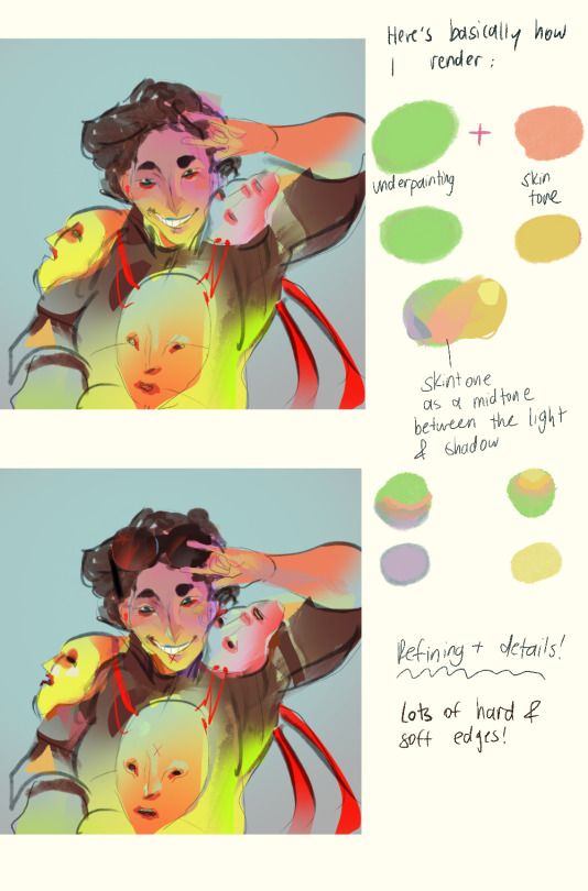
#tysm for the ask!#I hope this helped my process is extremely spontaneous#my main rendering tip is USE AN UNDERPAINTING TO PUSH YOUR COLOURS#featuring my oc roro#I’m not a professional so take my advice with a grain of salt!#art#oc#ask#a bright base layer of colour + rendering overtop does WONDERSS
150 notes
·
View notes
Note
Hello :D
I have been following you for the last year or so (a few days after I got my Tumblr lmao) and I absolutely love your art!
I have been wanting to study your art style for a while but don't really know where to start,,,
Could you please show me a small portion of your art process, if it isn't too much trouble of course. Thank you and have a nice day!
hello. oh my god. this took forever to find.
im sorry it took 2 WHOLE FUCKING MONTHS for me to respond to this but i wanted to put it off until i felt happy with my art process again, so here it is
my fall 2024 rendering tutorial!
(this will be very very long)

FLATS AND WHATEVER YOU WANNA DO WITH LINES GIRL. then make sure to recolor the lineart to better match your base. trust me it helps, bold dark lines are Not your best friend when rendering. wait for that post-rendering
i start off with a doodle or a sketch, and then filling it in with flats and other details such as blush

FIGURE OUT YOUR LIGHT SOURCE. FIGURE IT OUT GIRL YOU CAN DO IT you can make it as simple as possible, make it as big as possible, dont even THINK about the details.........just make it really fucking big so you at least know where the shadows and the light goes THEN add smaller shading details LISTEN TO ME. LISTEN TO ME OKAY!!!!!!!!
my key point with this is for you to learn lighting fundamentals.
it's SOOO ANNOYING but alas......they are all correct. it helps a lot.
one thing i also really want to point out is that i like creating a big shadow shape first before fixing up the little details (such as folds and whatever) because it helps me focus on the way the lighting actually works instead of tunnel vision-ing into making the shading make sense on the clothing.

contact shadows (i dont remember if thats what theyre called okay) theyre fucking ugly because im not actually thinking sorry 💔
okay so basically:
contact shadows (if that's what they're called) are the spots in shading and lighting where light will NEVER hit.
shadows are still influenced by the colors and lights around it (it's why a blue shadow and a yellow shadow feel completely different, despite both being shadows) so it's not always COMPLETELY dark.
BUT! there are small points in shadows where light never hits, and they're almost always super dark or pitch black.
it's hard to explain shadow and light so briefly for a tutorial, but you'll notice it when watching fundamental studies and when trying it out for yourself


YES i unclipped the multiply layer YES its ugly and terrifying but it makes coloring the multiply layer easier okay the colors merged w multiply so now it looks cool and has depth overlaying colors that actually make sense
so basically what i did was color the multiply layer that i used to shade the overall drawing
adding a band of red/orange/yellow around where the light hits, and blue where the shadows get big and wide, gives it a fake ambient occlusion effect in the way that a person would get if they stood under the sun with a clear blue sky
the colors don't have to make sense, especially because i never draw backgrounds, but coloring the shadows really help it give a sense of depth and extra subtle detail and effect that just helps make the painting look nicer
around the end, i also put in colors (in an overlay layer with a low opacity brush) that actually make sense in context of the drawing, which is the lit cigarette and the yellow eyelights
mostly because none of the colors were making sense and i needed to actually make use of the lighting that DOES exist in the drawing lol

adding a muddy golden yellow pin light layer (opacity turned down to like 40-50%) to make the light colors less ugly lol
i SWEAR by the fucking pin light layer style. it's so useful and so so underrated.
i used an almost brown-ish gold color on stop of all the layers, and with the pin light layer, it helped make the bright (almost blue-ish) white colors more warm and more yellow. it just helps make things more warm (something i prefer)
i could probably show what it looks like without adjusting the layer opacity to truly show off what i mean (like in the coming section) but i sadly forgot to do that lol


make a layer on top of your drawing with this color in these ranges YES the drawing is fully merged NO don't be afraid, the base was fucking ugly anyway 💔 make this layer into an exclude/exclusion layer style TRUST turn down your exclusion layer opacity from a range of 10% to 40% literally until you're happy with the contrast and the way the color over the drawing. use your eyeballs. i know you can do it im so proud of you
this is pretty self-explanatory instruction-wise, so i'll go into why i do this instead
i really like art that seems like it has low contrast, with almost mid-gray shading and lines. i don't personally use dark and bold lines and shading, unless i find it necessary for the tone of the piece, so using this method helps lower the contrast of the art and make it look "pleasantly muddy" in the way that it's easier and softer on the eyes.
the inverted blue color also helps makes things warmer!
the exclusion layer style is still a bit of a mystery to me but i really like the effect it gives, even if i don't completely get how it works lol
if you want an alternative method to this, and if you have access to it (because i primarily use sai and sai only),
i absolutely encourage you to play around and experiment with gradient maps.
there are so many out there you can make yourself or even get from others that just give the painting an extra amount of depth and color variation. they're SO fun.
personally, if sai2 gets a gradient map update, it's over for y'all it will literally be so over no one will be able to stop me


then i merged everything and actually adjusted the contrast back up because it was looking too muddy for me 💔 but the color adjustments are still there so all hope is not lost here's a comparison of the adjusted contrast in black and white (adjusted on the left) (newly merged layer without adjusting the contrast on the right)
as you can see, i actually turned the contrast back up (despite talking all about how i liked things with less contrast lol)
i wanted to demonstrate that doing adjustments should be done in moderation, and is why i adjust layer opacity often when making color effects
you are free to play around with colors to help your style, but don't lose your initial idea and colors along the way.
you still need to trust your own colors and intuition!
along with that, i just want to say that it's completely okay to change your mind mid-painting, and it's okay to make somewhat drastic changes.
don't be afraid to change things you don't like or change your mind about certain aspects way later on
that's basically the whole thing of this!!! don't be scared!!!

now im gonna hold your hand when i say this..........but you need to learn how to render by yourself. it seems like i can teach you but i literally can't, because rendering is different on every piece and depending on how clean your base is. i have to render A LOT because of how fucking ugly my sketches are LMAO to simplify it, think of it as obsessively cleaning up every detail you can see, but with a color picker and a clean, hard edged brush. if you have shit lineart, you don't have to redraw it cleanly over and over, just paint over it. that's basically what rendering is
THIS especially is where you need to be brave and stop being scared.
like i said, i can't teach you how to render, and it's something you have to discover yourself because rendering is something that will always be personal to every single piece you make. the way you render on every piece is different.
on one piece, you will barely need to render, and on another, rendering is more than half of your ENTIRE process.
don't be afraid to paint over your old art.
rendering is a process that's both very perfectionist yet also very careless.
find your balance and just go for it.

and then that's it……..u did it………..now yuo know how to paint and render. it's literally just layering shading and lighting knowledge until you think it makes sense and looks okay lol additional note: since i render in only one layer (you don't HAVE to do this, but it'll be harder for you…), i also made slight adjustments with the transform (and liquify, if you have it) tool to make things more proportionate. (i drew the head too big lol)

if you compare the finished piece to the final unrendered base, you can see that a LOT changed, including a bit of subtle proportion adjustment.
particularly, the sleeves changed A LOT (because i really didn't like them)
but it's also over all cleaner and more coherent, instead of having haphazard colors and shading just thrown about.
rendering is when you finally use all 100% of your brain to finalize and figure out where the shading should go, where to clean up your lines, where to ERASE or ADD BACK in lines, and make sure all your colors look coherent.
it's not as intimidating as it seems, i only use a hard edged brush with a little bit of color mixing and my color picker.
it's like dragging and dropping colors to cover up mistakes, it's really quite fun when you get used to it
i wish i could explain it clearer but it's hard to describe without visuals!
i hope this helped, and i hope all my yapping isn't annoying (art as a special interest beloved)
have fun studying and trying to render in my art style!
#long post#art tutorial#rendering tutorial#art help#art tips#tutorial#kia doodles shit#artxstic-scr1bbles#tutoriel
200 notes
·
View notes
Text
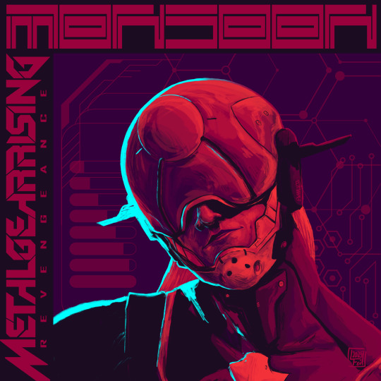
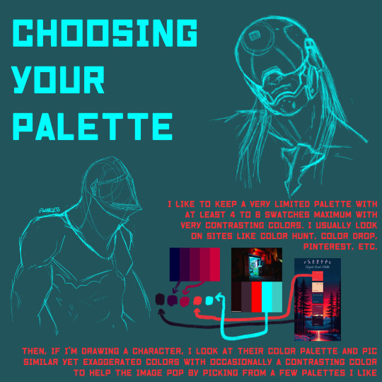
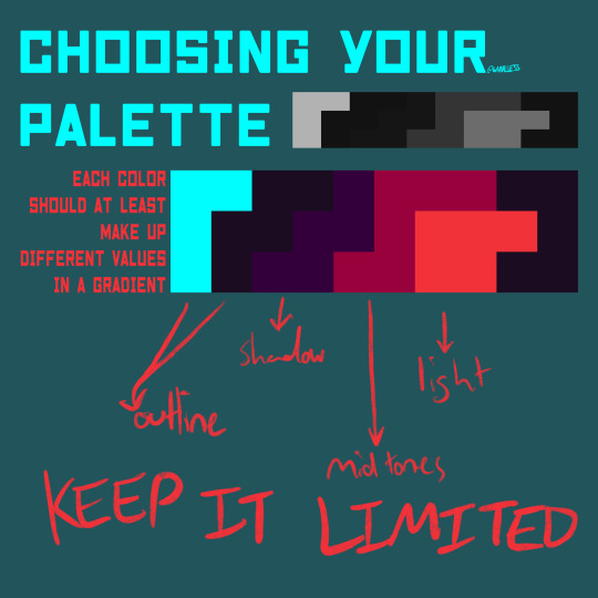
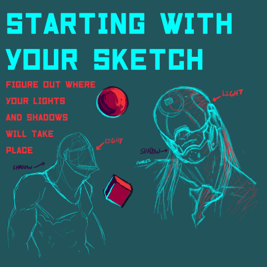

Forgot to post this omg but I made a rendering tutorial on how I render my drawings last week. I think I’ll make more of these but lmk if y’all would like to see some more tutorials and/or specific ones in general :D
#digital art#artists on tumblr#whaalless#mgs#metal gear solid#she metal on my gear till i’m solid#monsoon#metal gear#metal gear rising#metal gear revengeance#monsoon mgr#mgrr#mgr fanart#art tips#art tutorial#render tutorial#graphic poster#graphic design is my passion ahh artwork coming out of me recently lol#I loooove making graphic posters they’re so much fun#limited color palette
129 notes
·
View notes
Text
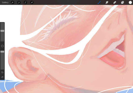
how 2 render
553 notes
·
View notes
Text
"She used to be the sun."
Alternate version + closeups below!! (And rambling ofc)
Sloppily did Arabella's hair to make it look at least a little more like her??? Uh not a huge fan to be honest, but I realized—as I don't have any reference for others to go off of in my blog—most people probably would not recognize younger Arabella. I painted this with the white hair image in mind cuz I like the amorphous shape. Now looking at it, I def should've changed the hair colors to match but I got lazy.
Kinda gave up. It's 5 AM and I still have school at 8 😭.
This is young Arabella!! As a girl she was more smily and chipper.
Been a while since I rendered, and it's a pain as always! Albeit a but fun. I just hate hands. If anyone is wondering, I always change to my colors whenever I draw to fit a palette and theme for cohesion, so these aren't exactly accurate to base off of.
Close ups!!


Love doing blendy scrappy lines... and dreamy, pale, washed out colors...mmmmmmmmmm
#dol#dol pc#dol oc#degrees of lewdity#degrees of lewdity oc#lita doodles 🩷#arabella the dispirited#rendering#such a pain#if anyone has tips on how to quickly render#please drop them! i wanna not sit on my ass for hours and hours#i should probably post more young arabella#i may also post the sketch cuz I liked the sketch a lot more I think i botched things during painting#i also fucking hated rendering the mouth it was actually the most time consuming and frustrating thing that ultimately STILL DIDN'T turn ou#brain mushy
79 notes
·
View notes