#responsive css cards
Explore tagged Tumblr posts
Visit Tumblr Blog
Explore Tumblr blogs with no restrictions, modern design and the best experience.
Last Seen Tumblr Blogs


Fun Fact
There were a total of 171.5 billion posts on Tumblr in 2019.
Text
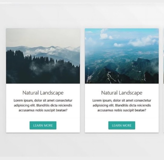
Responsive CSS Cards
#responsive css cards#materialize css cards#html css#frontend#css#css3#frontenddevelopment#webdesign#html#learn to code#responsive web design#materialize cards
1 note
·
View note
Text
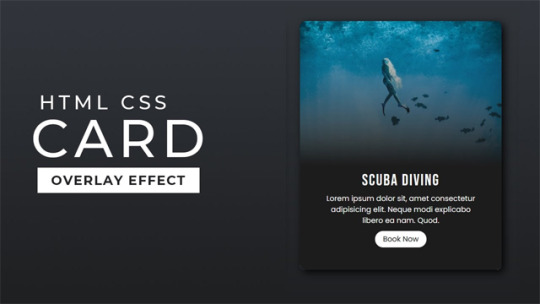
Responsive CSS Cards
#responsive cards#responsive css cards#responsive web design#html css#learn to code#code#frontenddevelopment#css#css3#html#divinector#webdesign#css animation tutorial#css animation examples#css tutorial
0 notes
Text

CSS Responsive Profile Card
#css cards#codenewbies#html css#html5 css3#webdesign#css#css profile card#profile card html css#responsive web design
3 notes
·
View notes
Text
3 Game/Coding Resources!
I wanted to put together a few resources I found for people who might be planning to make games, or might be looking to learn coding!
The first resource is for anyone looking to learn how to code, build a portfolio, and get Certifications:
This is something I've recently been using myself and I can attest that it is an excellent resource!! They have many different paths you can learn, and right now I’m on the Responsive Web Design Certification. You can learn HTML and CSS, in order to create responsive pages. It teaches you through projects, where it breaks down different parts of the coding language and shows you how to use it. Some projects are optional, and some you have to complete in order to earn your certification. Certification projects don’t have instructions, only a rubric of what the project needs to be able to do, but you can learn all those skills in the optional projects! They also have Javascript, Frontend Development, Information Security… the list goes on! The website is run by a really cool non profit. I definitely recommend giving it a try!!
2. The second is for game developers who are looking for background music:
@/茶葉のぎか (Nogika Chaba on twitter) makes some really awesome 8bit-sounding BGM! And a lot of it is free for commercial/non commercial use!!
Make sure to check the description (you can translate to your language) for their policies. Many of their videos are tagged #freeBGM, which if you check their Pixiv Fanbox terms of service (in the desc of each video, please do check it before you use it) states that you are able to use the music in commercial/non commercial works:
2. The third resource is for students:
Whether you're a university student, college, high school, or elementary, Github gives you free Github pro, as well as a curation of free offers! You do need a piece of student ID (proof that you indeed belong to an institution, eg. report card, student card, etc), but it has a host of offers. Microsoft offers free cloud training through this, there are multiple offers for learning a new coding language for free (eg. Codedex free 6-month subscription, which will also give you certificates once completed), you can get free domain names, the list goes on! If you are a student, I highly recommend that you give it a try, since it's 100% free!
#coding resource#game resource#coding#free#background music#if you have any other resources#let me know!!
18 notes
·
View notes
Text
Mastering the Art of CSS Translate Property
Do you want to elevate your CSS skills? 🌟 💡 Ever wondered how to create stunning web animations and smooth transitions? Check out our latest blog post: Mastering the Art of CSS Translate Property: A Comprehensive Guide with 7 Examples In this guide, you will learn all about the CSS Translate property and how it works, along with key insights on the Transform property. Discover 7 hands-on examples, including how to create sliding menus, animated flip cards, stylish draggable elements, centered image galleries with hover effects, smooth and responsive modals, expanding search bars, and dynamic search bars. Don't miss out on these powerful techniques to enhance your web projects! 🚀 Read the full guide now and start creating amazing CSS animations today! 👇
#WebDesign#CSS#FrontendDevelopment#WebDevelopment#CSS3#Programming#WebDev#Animation#UXDesign#JavaScript#skillivo#skillivoBlogs $hashtag#slidingMenus#animatedFlipCards#CSSmodals
3 notes
·
View notes
Text
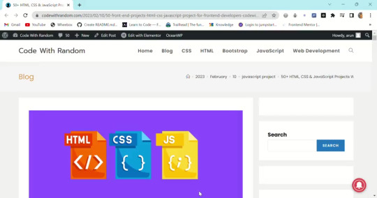
50+HTML, CSS and JavaScript Projects With Source Code
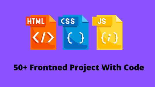
The 50+ HTML, CSS, and Javascript projects list is a boon for beginner developers who wish to make a career in the field of web development. But for that, developers have to go through a lot of learning and project building, and while on the path of skill enhancement, they take a bit of stress because they don’t easily find the topics on which they create their projects. So in the world of web development, we have curated a list of 50+ beginner-friendly HTML, CSS, and JavaScript projects.
Almost 50 of the most significant projects will be covered in this post; these Web Development Projects With Source Code will help you build a strong foundation. You will gain practical experience with the project and be able to develop new, large projects that involve numerous websites as a result of working on this front-end project.
You Get 50+ Web Development Projects with Source Code for total beginners using HTML, CSS, and JavaScript.
We include projects using HTML CSS and Javascript with source code from beginner to intermediate levels covered in this article.
you get all project source code with code explanation. project is very helpful for practicing coding skills and logic building so you definitely need to create some projects that help you to get a dream job and you can add projects to your CV/Resume.
If you want more frontend projects then don’t forget to visit my 100+ HTML, CSS, and JavaScript Projects with the source code, So Must Visit the article👇.
100+ JavaScript Projects With Source Code ( Beginners to Advanced)
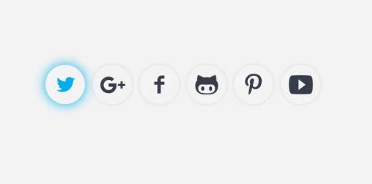
1. Social media share icon animation
Project details – Social media icons are used for the identification of specific social media platforms. Each social media platform has different icons. Social media platforms are used to connect people from faraway places and provide a feeling of closeness. Adding animations to icons provides great user interaction.
Browser support: Chrome, Edge, Firefox, Opera, Safari
Responsive: Yes
language: Html, CSS
Project Code Download: Click Here
Project Demo :
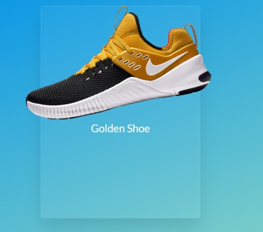
3. Card With Hover Effect
Project Details – Cards are small pages that are used to display product information. Cards with a hover effect provide a great user experience, and when the user hovers over the cards, information about the product is displayed to the customer. These cards are generally used on e-commerce websites.
Browser Support: Chrome, Edge, Firefox, Opera, Safari
Responsive: Yes
language: Html, CSS
Project Code Download: Click Here
Project Demo:
read full artical and more intresting projects with source code
3 notes
·
View notes
Text
Responsive Glassmorphism Section. Card Hover Effects: https://codepen.io/AlexZab/pen/GREpYqp More CSS card hover effects: https://freefrontend.com/css-card-hover-effects/
4 notes
·
View notes
Note
Hi Dear :) I found your november template and I'm in love with it! I wanted to ask you if it's somehow possible, to have more than one featured project on the right sidebar. Kinda like a responsive card slider or something like that, where you can display more on-going projects. I've tried to follow tutorials but I'm just learning about html/css stuff. Of course it's totally fine if you don't want to. Hope you don't mind me asking. Keep up the great work and have a nice day :)
hi! thanks so much! unfortunately that kind of card slider would be a pretty big customization to the code, and i don't really do those. i have seen some people remove the little stats section that's underneath the project and copy+paste add another project section there, which you could do if you want!
4 notes
·
View notes
Text
🧩 What You Actually Do as a Frontend Developer

Why This Role Matters Frontend developers shape how users experience a digital product. They bring websites and apps to life — making sure everything looks great, works fast, and feels intuitive.
What You Actually Do as a Frontend Developer
🎨 1. Turn Designs into Code You take mockups from UI/UX designers (usually from tools like Figma or Adobe XD) and build them using HTML, CSS, and JavaScript.
⚙️ 2. Make Things Interactive You add behavior to the page — dropdowns, carousels, forms, animations — using frameworks like React, Vue, or Angular.
📱 3. Ensure Responsive Design You make sure your website looks great and works well on all devices: mobiles, tablets, and desktops.
🧪 4. Debug and Troubleshoot You test components across browsers and devices, fixing bugs, optimizing performance, and solving layout issues.
🔗 5. Connect to the Backend You fetch and send data from APIs using tools like Axios or Fetch, displaying user-specific content or submitting forms.
🚀 6. Optimize for Speed You compress images, use lazy loading, and minimize code to reduce load times and boost user satisfaction.
🧰 7. Use Version Control You manage your codebase with Git — collaborating with teams using GitHub or GitLab to track changes and fix issues.
🔒 8. Ensure Accessibility You build inclusive interfaces by following accessibility standards (like WCAG), making content usable for everyone.
📦 9. Reuse Components You structure your code to be modular — creating reusable buttons, cards, forms, and other UI elements.
📚 10. Keep Learning You stay up-to-date with evolving JavaScript frameworks, CSS techniques, and browser APIs.
Final Thoughts Frontend development is a mix of logic and creativity. You build the interface people touch, scroll, and click — turning ideas into functional experiences.
📌 Follow Uplatz for the next episode in the series: 👉 “What You Actually Do as a DevOps Engineer”
0 notes
Text
Cross Browser Testing: Ensuring Consistent User Experience Across Browsers
In the modern web development landscape, users access applications from a wide variety of devices and browsers. Ensuring a consistent experience across all of them is no longer optional—it’s essential. That’s where Cross Browser Testing comes in.
In this guide, we’ll explore what cross browser testing is, why it’s critical for product success, the tools and strategies you should use, and how it differs from component testing, which focuses on individual units of a UI.
What is Cross Browser Testing?
Cross browser testing is the process of verifying that a website or web application works correctly and consistently across multiple web browsers and versions. It checks for UI consistency, functionality, responsiveness, and performance.
The goal is simple: users should get the same core experience, whether they use Chrome, Firefox, Safari, Edge, or even older versions of Internet Explorer.
Why Cross Browser Testing Matters
User Reach: Your users are everywhere—on desktops, tablets, and smartphones using different browsers and OS versions.
UI Consistency: Different browsers render HTML, CSS, and JavaScript slightly differently. Cross browser testing ensures the UI looks and behaves as expected.
Prevent Revenue Loss: Broken functionality on a specific browser can lead to user frustration, abandonment, and lost conversions.
SEO & Accessibility: Issues in browser compatibility can hurt Core Web Vitals and accessibility scores, indirectly affecting SEO.
What Should You Test?
✅ Functional Testing
Ensure that forms, buttons, navigation menus, and modals work properly across browsers.
✅ UI Layout and Styles
Validate that the layout, fonts, spacing, and positioning are consistent.
✅ Responsiveness
Check behavior across screen sizes (mobile, tablet, desktop) and orientations.
✅ JavaScript Compatibility
Ensure JS features work in environments that may lack support for modern APIs (e.g., older Safari or IE11).
✅ Performance
Monitor load times and responsiveness across browsers.
Manual vs Automated Cross Browser Testing
Approach
Pros
Cons
Manual Testing
Real-time testing and visual QA
Time-consuming, not scalable
Automated Testing
Fast, repeatable, scalable
Requires setup and maintenance
Use both together. Manual testing helps with visual/UI bugs, while automation ensures core functionality works everywhere.
Popular Cross Browser Testing Tools
BrowserStack – Real device and browser cloud testing with automation support.
Sauce Labs – Enterprise-grade testing for multiple platforms and browsers.
Lambdatest – Cloud-based tool for Selenium and Cypress tests across browsers.
Cypress + Percy – For visual regression and component testing within CI pipelines.
Playwright – Microsoft’s framework with built-in cross browser testing for Chromium, Firefox, and WebKit.
How is Cross Browser Testing Different from Component Testing?
While component testing focuses on verifying the correctness of individual UI components (like buttons, forms, cards) in isolation, cross browser testing validates how all those components render and behave together in real browsers.
Aspect
Component Testing
Cross Browser Testing
Scope
Unit-level (one component at a time)
Full UI rendering across browsers
Goal
Correct logic and UI in isolation
Consistent experience for end users
Tools
Jest, React Testing Library
BrowserStack, Cypress, Playwright
Best Practices for Cross Browser Testing
Define supported browsers based on your user analytics
Start early—test on different browsers during development, not just at the end
Automate smoke tests across key browser/OS combinations
Include mobile browsers in your testing plan
Pair with component testing to catch bugs earlier in the development lifecycle
Final Thoughts
Cross browser testing is a non-negotiable step for delivering a reliable, accessible, and high-performing web experience. As users become more diverse and unpredictable in how they access your product, ensuring cross browser compatibility becomes crucial.
While component testing ensures individual pieces of your application work as expected, cross browser testing ensures everything renders correctly where it matters most: the user's browser. Want to automate test generation from real browser sessions? Tools like Keploy can capture traffic and generate test cases to support both backend and frontend testing pipelines.
#testing#ai tools#unit testing#software development#keploy#testing tools#code coverage#software testing
0 notes
Text

Bootstrap Cards Design
#bootstrap cards#html css#codingflicks#frontend#css#css3#html#webdesign#css cards design#responsive css cards#card design bootstrap
1 note
·
View note
Text

Responsive Cards Design HTML CSS
#responsive cards#responsive web design#html css#divinector#css#html#css3#webdesign#divinectorweb#learn to code#html css cards#frontenddevelopment#code
5 notes
·
View notes
Text

Movie Card UI Design
#movie card ui design#movie card css#css cards#responsive card design html css#html css#codenewbies#frontenddevelopment#css#html5 css3#webdesign#pure css tutorial#basic html css tutorial#responsive web design
2 notes
·
View notes
Text
Full WooCommerce Shop Page Design — StoreBuild
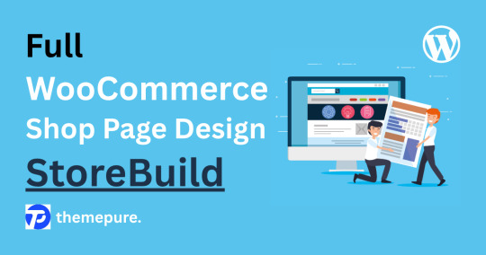
Designing a professional, user-friendly WooCommerce shop page no longer demands coding expertise or hours of trial-and-error adjustments. Thanks to the StoreBuild Addons Plugin, WordPress users can now customize their shop pages with precision using drag-and-drop tools, enhancing visual appeal, user experience, and sales conversions all in one place.
Why Choose StoreBuild?
Traditional customization methods such as WooCommerce hooks, filters, or manual CSS styling require technical knowledge and time. StoreBuild eliminates that complexity, offering a streamlined approach with over 40 powerful widgets and layout modules that let you tweak everything — from product listings to sidebar filters — visually and intuitively.
Getting Started
To build a full shop page, first install and activate Elementor and StoreBuild. Head to your WordPress dashboard under StoreBuild > Widgets & Modules, and enable the modules you plan to use. These tools work together to provide real-time editing flexibility without needing custom code.
Step-by-Step WooCommerce Shop Page Design
1. Create Your Template
Go to StoreBuild > Templates and click Add New Template. Name your design, select “Shop” as the page type, and choose a layout that fits your brand identity. Click Save Template, then launch the Elementor Editor for visual customization.
2. Structure Your Layout
Using Elementor, you can start building the page layout by inserting widgets like:
Product Grid
Product Cards
Category Filter
Top-Rated Products
Recent Products
These elements provide total control over how your products and filters appear on desktop, tablet, and mobile screens.
Sidebar Styling & UX Enhancements
Customizing your sidebar sections further boosts usability:
Price Filters & Category Lists: Adjust font styles, background colors, borders, shadows, and button effects.
Ratings & Recent Products: Showcase high-performing items and new arrivals with thumb-optimized product displays and hover effects.
Advanced Customization
StoreBuild supports advanced design tweaks:
Motion Effects for interactive transitions
Responsive Layouts optimized for all screen sizes
Custom CSS for unique branding enhancements
Background & Mask Settings for creative visual styles
This depth of control allows for full personalization to match your store’s identity and audience.
SEO & Performance Optimization
StoreBuild also makes it easy to structure your shop page for better search engine performance:
Use relevant keywords in product titles and descriptions
Optimize image alt tags
Maintain fast load speeds with compressed images and lean code
Ensure mobile responsiveness to improve rankings and UX
A well-structured shop page built with StoreBuild delivers more than good looks — it boosts functionality, increases conversion rates, and simplifies future edits. Whether you’re launching a new WooCommerce store or refining an existing one, StoreBuild provides all the tools to design with ease and impact.
🎥 Helpful BlogTutorials
For a Pro walkthrough, check out these excellent tutorials:
Full WooCommerce Shop Page Design — StoreBuild
0 notes
Text
WORDPRESS THEME
How to Choose the Best WordPress Theme for Your Niche Website
When developing a specialized website—be it a travel blog, fitness coaching platform, real estate listing portal, or an online portfolio—the selected WordPress theme must transcend mere aesthetics. It should intrinsically align with the content, target demographic, and overarching business objectives.
With an extensive array of themes available, the judicious selection of an appropriate theme can significantly enhance brand presence, whereas an ill-suited choice may impede growth. This guide outlines the methodology for selecting the optimal WordPress theme for your specific niche, ensuring the website's visual integrity and functional performance meet desired standards. 1. Comprehend Your Niche Requirements
Each specialized domain possesses distinct design, functionality, and user expectations. For instance:
A food blog necessitates robust support for recipe cards and visually engaging post layouts.
A real estate site may mandate listing features, integrated mapping functionalities, and advanced filtering options.
A photography portfolio requires high-resolution galleries and optimized image presentation.
An eCommerce site demands seamless integration with WooCommerce.
Recommendation: Develop a comprehensive checklist of essential features tailored to your specific niche. 2. Prioritize Purpose-Built Themes
Rather than commencing with a generic theme, prioritize themes explicitly engineered for your industry. These themes are inherently optimized for specific niches and frequently include pre-configured demo sites, essential plugins, and ready-to-deploy layouts.
Examples:
Travel Blog: Themes such as Soledad or Backpack Traveler
Fitness Coach: Themes like Astra Fitness Starter Template or OceanWP Fitness Demo
Law Firm: Themes including Lawyer Zone or Neve Legal
Recommendation: Utilize precise niche-specific keywords during your search, e.g., “WordPress theme for photographers,” “real estate theme for WordPress.” 3. Ensure Flexibility and Customization Capabilities
Even themes designed for specific niches should offer extensive customization options for colors, fonts, layouts, and widgets. Confirm that your chosen theme supports:
The WordPress Customizer or Full Site Editing (FSE)
Drag-and-drop page builders such as Elementor, Beaver Builder, or Gutenberg
Seamless logo integration, typographical adjustments, and custom CSS implementation, if required.
Recommendation: Select a theme that provides substantial flexibility without necessitating developer intervention. 4. Emphasize Speed, SEO, and Mobile Responsiveness
A specialized website will not achieve success if it experiences slow load times or exhibits display issues on mobile devices. Verify that your theme is:
Lightweight and optimized for rapid loading
Fully responsive across all device types
SEO-ready and compatible with leading plugins like Rank Math or Yoast.
Recommendation: Before making a final selection, evaluate theme demos using performance analysis tools such as Google PageSpeed Insights. 5. Acknowledge the Importance of Support and Updates
Regardless of your technical proficiency, access to reliable theme support can mitigate delays and frustration. Opt for themes that:
Receive consistent and timely updates
Possess overwhelmingly positive user reviews
Provide comprehensive documentation or direct support channels.
Recommendation: Premium themes frequently include 6–12 months of professional support, which is a valuable consideration for niche sites with complex requirements. Concluding Remarks
The foundation of a prosperous niche website is a theme meticulously tailored to its audience and objectives. Avoid settling for generic designs; instead, dedicate the requisite time to identify a WordPress theme that functionally and aesthetically aligns with your niche.
Your chosen theme represents the structural backbone of your website’s user experience. Therefore, exercise prudence in its selection, and observe your niche site flourish.
1 note
·
View note
Text
React Web – The Best Website Development Company in India for SEO-Friendly Solutions
In the digital age, your website is more than just a digital business card—it's your 24/7 marketing engine, sales channel, and brand identity hub. If you’re looking for a website development partner that blends creativity with cutting-edge technology, look no further than React Web, the best website development company in India specializing in SEO-friendly website development.
Why Website Development Matters in 2025
Today, a website must do more than just look good. It needs to load fast, rank high on search engines, and deliver a seamless user experience across all devices. At React Web, we understand that every business has unique requirements, and we approach each project with a custom strategy designed for performance, aesthetics, and visibility.
Whether you're a startup, small business, or enterprise, React Web delivers custom web development services that help you stand out in the crowded digital marketplace.
What Makes React Web the Best Website Development Company in India?
React Web has earned its reputation by combining:
💡 Innovative Design: We create visually stunning websites tailored to your brand.
⚙️ Advanced Technologies: From React.js to Node.js, we use modern frameworks that ensure performance and scalability.
📈 SEO-First Approach: We build with SEO in mind—ensuring structure, speed, and content are optimized from day one.
📱 Mobile Optimization: All our websites are responsive and perform seamlessly on every device.
🧩 Custom Development: No templates. Every project is tailor-made to match your business needs and objectives.
We work with clients across industries including e-commerce, healthcare, real estate, education, tech startups, and more—making us one of the most trusted and versatile website development companies in India.
SEO-Friendly Website Development – A Core Focus at React Web
Being visible on Google is non-negotiable. That’s why React Web is not just a development company—we are a performance-driven SEO-friendly website development company that ensures your site is ready to rank.
What SEO Features Are Built-In?
Clean Code Structure: Optimized HTML, CSS, and JavaScript for better crawlability.
Fast Page Load Speeds: Performance-focused builds with CDN and image optimization.
Mobile-First Design: Google loves responsive websites—we ensure yours excels across devices.
On-Page SEO Integration: From title tags to meta descriptions, we implement the basics.
Schema Markup: For rich results and better indexing.
XML Sitemaps & Robots.txt: Essential for helping search engines understand and crawl your site effectively.
These elements help your site get indexed faster and rank better—making React Web a smart choice if you're looking for a SEO-friendly web development company in India.
Our Website Development Services
Here’s what we offer:
Custom Website Design and Development
E-commerce Website Development
Single Page Applications (SPAs)
Full-Stack Development
Landing Page Creation
Website Redesign and Optimization
CMS Development (WordPress, Headless CMS)
Every project goes through a complete workflow—from wireframing to design, development, testing, and SEO optimization—delivering a ready-to-launch website that meets Google’s standards and your business expectations.
Why Businesses Across India & Globally Choose React Web
✅ Proven Track Record
✅ On-time Delivery
✅ Affordable Pricing
✅ 24/7 Technical Support
✅ Transparent Communication
✅ 100% Client Satisfaction
Whether you’re building a brand-new site or revamping an outdated one, we bring your ideas to life—better, faster, and smarter.
Ready to Build Your Dream Website?
Choosing the right development partner can transform your business. React Web is proud to be recognized as the best website development company in India with a strong focus on SEO-friendly development. Let us help you launch a website that not only looks amazing but also drives traffic, leads, and results.
#SEO-friendly development#affordablewebdesign#reactweb#Dream#Design and Development#development#Company
0 notes