#star wars design
Text
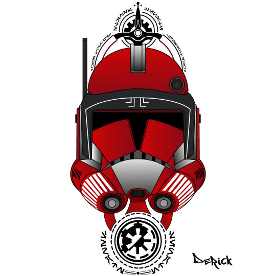
The 501st
Made a new 501st design, I’m quite satisfied with the outcome considering that it’s almost completely freehanded.
I’m going to draw it digitally as well so it’ll look more detailed and more geometric.
#even though i like my first 501st design a little bit more#i think this one is a pretty good one too#star wars#tcw#ahsoka tano#captain rex#arc trooper fives#arc trooper echo#arc trooper hardcase#arc trooper jesse#clone trooper dogma#clone trooper tup#clone commander appo#the 501st#clone trooper kix#star wars design#clone wars fanart
479 notes
·
View notes
Text
you can take the senator out of Naboo
but you cant take the Naboo out of the senator

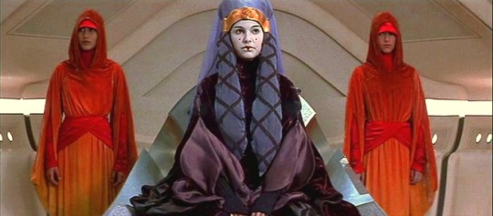

just saying

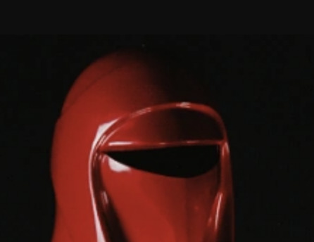
same hat
#star wars#sheeve palpatine#emperor palpatine#star wars worldbuilding#star wars design#imperial guard#naboo handmaidens#padme amidala#star wars meta
114 notes
·
View notes
Text
Sabacc Dice (Updated)
The canon numeric values of the Corellian dice are revealed for the first time in Star Wars: Outlaws.

#star wars art#star wars design#star wars reference#star wars fanart#star wars lore#star wars roleplay#sabacc#star wars#maytheforcebewithyou#star wars concept art#star wars content#star wars outlaws
18 notes
·
View notes
Text
Commander Thorn
Commander Thorn
#artdigital#art#clone trooper#commander fox#star wars#the clone wars#starwarsart#starwarstattoo#clone trooper tattoo#sketchwars#commander fox art#star wars design#cc1010#coruscant guard#starwarsworld#clone#galactic empire#galactic republic#the clonewars fan art#desenho#desenho digital#draw#drawing#painting#desenhos#tcw#commander thorn
380 notes
·
View notes
Text

The Bufor. A completely original Star Wars bomber spacecraft for the separatist alliance! It can carry a massive arsenal from small magnetic bombs to bombs big enough to destroy a city. It is fitted for long-range missions and has 6 point defense turrets and two heavy cannons at the front.
#star wars#3d#cool#star wars clone wars#the clone wars#separatist#star wars droids#star wars fanart#fanart#art#artist#bomber#heavy bomber#blender#star wars design#droid army#spaceship#star wars ships#fan made
12 notes
·
View notes
Text
So lets talk about the design of Ferrix, shall we? I mean, not the physical set qua set, which is amazing and I just sort of want to live there. But rather, let's consider the actual design style at work, okay?

Okay. So that's the hotel in Episode 5, yeah? The one that Blevin is clearing out for the dude who wants to be a Prefect to use as his headquarters, right?
That, my friends, is a gorgeous variation on Bauhaus style. Look at those awesome curved curtain balconies, the round windows, the repeated geometric forms. Honestly, it makes me think of some photographs I've seen of Bauhaus-style apartment blocks in Tel Aviv.
Bauhaus architecture is a celebration of art, craft, form and function-- meant to be livable and practical, and also thoughtful, visually coherent, and accessible to folks of all means. It was a form of architecture that came out of the ashes of World War I in the brief, explosively creative period of the Weimar Republic.

I absolutely love that this is the architectural form ANDOR is using for Ferrix-- it's working class. Deceptively plain, until you appreciate the sweep of the windows, the thoughtfulness and accessibility of space.
I especially love it, given its history. Because the Bauhaus movement, which began in the Weimar Republic, was outlawed under the Third Reich as part of what was identified as "degenerate art," because its emphasis on internationalism and working-class accessibility was deemed too communist and un-German.
I mean, it's not a freaking accident that the set designer, Luke Hull, decided to go with an architectural style outlawed by a fascist regime, yeah? Ugh, it's all so thoughtful.
I'm deeply interested to see what happens with the direct occupation of Ferrix in future episodes-- we're clearly headed back there at some point, and I'm interested to see what, if anything, happens to the physical space.
(Next time on SomeInstant Decides to Obsess About Architecture, we can talk about the Brutalism on Coruscant! IT'LL BE FUN!)*
_
*Edited to add in the link to the Brutalism discussion, because y'all are bad influences.
#andor#andor set design#set design#star wars design#andor spoilers#episode 5 spoilers#art and architecture#sometimes I teach art history#art history#ferrix
344 notes
·
View notes
Text

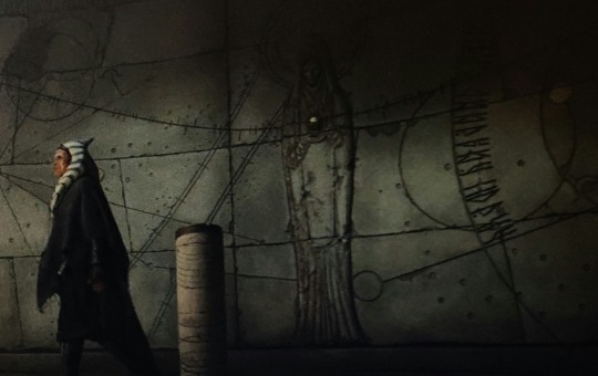
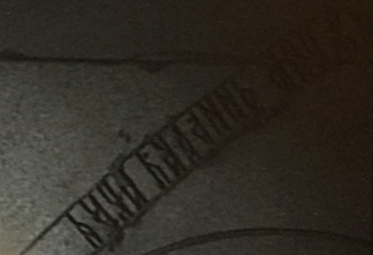
Some script details from the temple on Arcana. Seems to be almost like a variation of Norse Runes, or even Latin or Lydian alphabet. The one above it looks like Sumerian Cuneiform almost, but with squares instead of triangular wedges. I'm familiar with some languages, but I'm no expert, so thoughts are welcome! Will have to see if there's more information eventually. I really liked the design of the temple though. There seemed to be some Egyptian influence as well.
#ahsoka#ahsoka spoilers#arcana#temple#star wars languages#star wars design#languages#star wars#font#script
34 notes
·
View notes
Note
What do Luke, Leia, and more importantly PADMÉ (and the whole gang really) react to Anakin having siblings - and those siblings being literal Dathomiri Force Gods that Anakin also was instrumental in killing
can u imagine if they DIDN'T die tho

(donation doodles! // tip jar)
#i need to draw the mortis gods abt 3000x more i love their designs sm#anakin skywalker#the daughter#the son#leia organa#luke skywalker#padme amidala#mortis#mortis gods#padmé amidala#skywalker family#mortis cousins au#star wars#my doods#thanks for the ask!#mortis arc
5K notes
·
View notes
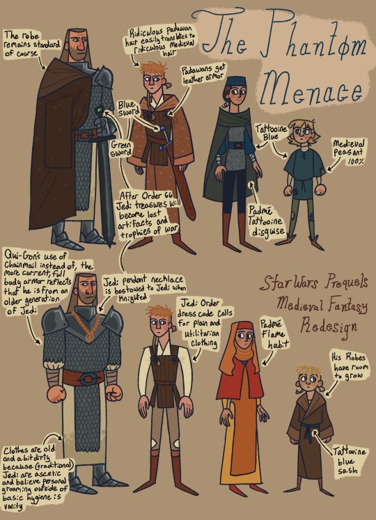
Text
Here's the notes on the Medieval Fantasy Star Wars au! I'll add to this as I do more. If you're new here, this is the saga of me drawing Star Wars but like what if it was Fantasy?


#art#digital art#fanart#character art#character design#digital artist#star wars#star wars fanart#sw fanart#sw art#sw prequels#star wars prequels#sw clone wars#star wars clone wars#star wars au#sw au#obi wan kenobi#anakin skywalker#padme amidala#qui gon jinn#ahsoka tano#leia organa#luke skywalker#mace windu#shaak ti#concept art#star wars art#star wars the clone wars#medieval fantasy au#medieval au
20K notes
·
View notes
Text

The 501st
I finally managed to finish the digital version of my second 501st drawing.
I think it out turned out pretty good with the coloring as well.
#star wars#tcw#tcw fanart#ahsoka tano#captain rex#arc trooper fives#arc trooper echo#clone trooper kix#arc trooper jesse#clone trooper dogma#clone trooper tup#clone trooper hardcase#clone commander appo#the 501st#501st#501st legion#star wars design#the clone wars
105 notes
·
View notes
Text
Coruscant Shift #1 - Deck

Coruscant Shift is a variant form of Corellian Spike, invented for the the immersive Disney hotel Star Wars: Galactic Starcruiser launched at the Walt Disney World Resort in 2022.
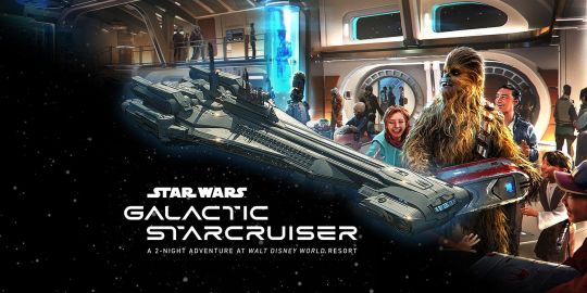
As well as the new rules and variant dice, a new card deck was designed for Coruscant Shift, intended to be a luxury goods version of the game, and was available for guests on the Starcruiser to purchase. Buyers have appreciated the look and feel of the deck, but it is not very hardwearing - the foil materials used in the design frequently begin to peel with time.

The Coruscant Shift deck was more accessible for players because it used Roman numerals. Latin numerals and letters have in Star Wars have been glossed as a 'High Galactic Alphabet', used infrequently compared to Aurebesh, the written form of 'Galactic Basic'.

In Legends material, 'High Galactic', explained Latin-language designations like 'X-Wing' and 'R2-D2', and was said to be descended from 'Old Tionese', which glossed the Greek alphabet, explaining the use of Greek letters Alpha to Omega.
'High Galactic' language use was linked with the lore of 'High Human' culture in Legends, which explained human-centric elements of Star Wars and the lack of aliens in the ranks of Galactic Empire as a the product of racism and human supremacist ideology cultivated in by Imperial elites.

#star wars design#star wars fanart#star wars reference#star wars art#star wars lore#star wars roleplay#sw art#sabacc
7 notes
·
View notes
Text
Commander fox
#artdigital#art#clone trooper#commander fox#star wars#the clone wars#starwarsart#starwarstattoo#clone trooper tattoo#sketchwars#commander fox art#star wars design#cc1010#coruscant guard#starwarsworld#clone#galactic empire#galactic republic#the clonewars fan art#desenho#desenho digital#draw#drawing#painting#desenhos#fox#tcw
305 notes
·
View notes
Text

Almost all of the models for my animated short are ready! I'm very excited to make it! Stay tuned for more updates ☺️
#character design#star wars#sith#star wars design#star wars fanart#clone wars#star wars droids#b1 battle droid#droids#fanart#animation#animated short#3d art#3d#3d animation#art#artists on tumblr#artwork#cool#the clone wars#colors#digital art#robot
5 notes
·
View notes
Text
Brutalism and High Modernism in ANDOR's Production Design
So about a week ago I wrote about how the production design of Ferrix was clearly coming from a Bauhaus school of design, and I might have threatened to write about the use of Brutalism on Coruscant, and some of you fools have encouraged me. So you have only yourselves to blame for this.
I hope you're happy with yourselves.
First, the disclaimer: while I have taught AP Art History in the past, and am a nerd about architecture, I am mostly an autodidact about this stuff. My areas of expertise are in history, anthropology, political science, and education. So please understand that I am not specifically trained in this, and when (not if) I get something incorrect, I'm always open to friendly and helpful correction.
Now. ONWARDS TO CORUSCANT!
I will admit, friends, that I am very much Not A Prequels Person, and I haven't watched any of the animated Star Wars series, so I can offer no points of comparison between ANDOR's depiction of Coruscant and other SW media. I can only work off of Luke Hull's vision of the galactic capital, and-- damn, that is no bad thing.

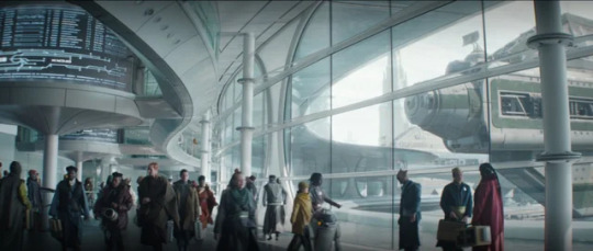
We'll start with an aerial view from episode 7. As the camera soars over a portion of the endless city, we see the occasional building with strong geometric shapes-- such as the one on the above right-- that look like nothing so much as the Chrysler Building in New York City. I mean, look at those stacked triangular corner pieces and the metallic cladding on some of those curves! It's such a strong, unmistakable reference. Now, if you know your architecture, you'll be like, "But SomeInstant, this rant is supposed to be about Brutalism and High Modernism, and that's clearly an Art Deco reference!" AND YOU ARE CORRECT, MY FRIEND. Good eye!
Art Deco is an international style-- one of the first!-- that developed following World War I, reaching its height of influence in the late 1920s and early 1930s. It was associated with style, glamor, craftmanship, rich materials, and a sense of technology and progress. And it shares a common ancestor with Bauhaus designs-- they're both strongly influenced by the Vienna Secession movement. But while Bauhaus was about the accessibility and utility of design for the Common Man, Art Deco was fancy. The materials weren't your common brick or tile: it's chrome and ivory and inlaid tropical woods. Mon Mothma's apartment has some serious Art Deco references in it, if you want to look-- those pretty geometric white screen things between rooms? That's what I'm talking about.
So what we have here is a building that is speaking the same stylistic language as the buildings on Ferrix, but with a VERY different accent, and to a totally different audience. I would like to think that both the building we see here on Coruscant and, say, Maarva's home on Ferrix were built around the same time-- but the language of power and privilege and the physical reality of each are totally separate.
But what happens if we move lower? What if we stop just looking at the skyline, and adjust our gaze down a little?
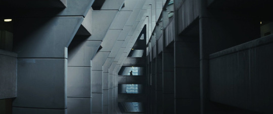
Now, this is Brutalism. (And also a killer shot, god damn.)
So. As an architectural and design form, Brutalism has its roots in post-World War II Britain, and is marked by a reliance on the plain, unadorned exposure of building materials such as concrete, steel beams, plate glass, exposed pipes, and bricks. In its emphasis on common materials, Brutalism is closely related to Bauhaus design. But Bauhaus uses more rounded shapes, and plaster or tilework to turn everyday materials into decoration. Brutalism foregoes that finish, however-- and it has a certain stark, clean appeal, especially when its done thoughtfully.

Brutalism is a style of design that is often associated with public constructions: mass transit, public housing, libraries, universities, government offices. If you've ever been to Washington D.C., the Metro is a great example of this-- that coffered cement curve of the ceiling? Pure Brutalism. And this is because Brutalism could be a form of design that was simple and cost effective. At its best, Brutalist designs offered simple, affordable housing, and could be constructed relatively quickly. Personally, I really dig a lot of Brutalist architecture-- it can be amazing!

But there are many, many criticisms of Brutalism as a design form: it can feel impersonal, cold, and flattening. It's very strongly associated with forced population movements: that is, the destruction of existing neighborhoods, and the mass relocation of people for convenience's sake. (That is, for the convenience of the state. We'll come back to this.) Take a look at Soviet-era apartment blocks, or the forcible relocation of the Inuit in Greenland in the 1950s-- the housing that was provided was typically Brutalist in its design. Thus, Brutalism has become historically associated with totalitarianism and the strong hand of the state, and the loss of individualism.

Another reason why some folks object to Brutalism as a form is the exposure of construction materials like concrete can mean that the surfaces can become stained and discolored, or wear unevenly in some climates. The broad, flat surfaces can become the target of graffiti-- I mean, if you have a problem with that, which I don't, because it can be amazing and the only difference between graffiti and public art is usually the zip code and price tag. Actually, a lot of very cool Brutalist buildings are beloved not because of their designs, but because of the fact that they're perfect for murals. Check out much of downtown Atlanta or Mexico DF (especially the campus of UNAM) for evidence of this.
But I haven't seen a single mural or tag on any of the shots of Coruscant thus far: it's just sterile, industrial concrete as far as the eye can see. That's state control for you.
So, anyway-- that's a Very Good Thematic Reason to use Brutalism as the main design influence on the lower echelons of Coruscant. If the Art Deco skyscrapers are coming from the same lineage as the Bauhaus design on Ferrix and speak to the Empire's surface-level ambitions, the Brutalist underpinnings of the galactic capital show its organizational power.
Which leads us to High Modernism.
High Modernism comes out of Brutalism, historically-speaking-- but as you might be able to guess, the materials used in its construction tend to be more polished than the unrefined, simple finishes of Brutalist architecture. No vast planes of concrete here: no, bring on the sheets of glass, the slabs of polished stone. There's still a strong geometric language at play, a lack of ornate decoration-- but there's a degree of sterility in High Modernism that isn't present in Brutalism.
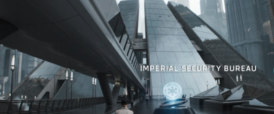
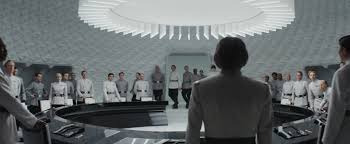
High Modernism is associated with the Cold War era of the late 1950s and 1960s-- and is therefore a DAMN good style choice for the ISB. My god. It's a design school that is all about technology and control: control over the environment, control over civic spaces, control over labor-- you name it.
The thing I associate with High Modernism above all else is the notion of state legibility: the idea that populations and spaces are organized into a structure that the state can read and therefore control. James C. Scott has a whole book about this, called Seeing Like a State. It's not my favorite of his works-- that would be Weapons of the Weak-- but his overriding thesis about how state policies of legibility are often destructive to culture and communities are worth coming back to. I mean, think about city and civil engineering, housing laws, city grids-- or Imperial sectors.
In our world, maybe the best example of High Modernism would be the work of Le Corbusier and his followers-- I mean, consider Brasilia! It's an artificially planned city, designed to reflect the aspirations of a growing nation: Ordem e Progresso, right? High Modernism tends to disregard historical realities, cultural practices, and the way people actually use spaces-- which, again, is exactly why Luke Hull is giving us this:
It's almost like these folks at ANDOR are good at their damn jobs, or something.
(Join me next time on SomeInstant Talks About Architecture in Andor: Wait, Is Niamos Space Acapulco, or What?)
#art and architecture#andor spoilers#andor#episode 4 spoilers#episode 7 spoilers#episode 6 spoilers#brutalism#art deco#high modernism#academic nonsense#sometimes i teach art history#production design#this is now a luke hull fanpage#star wars design#star wars#coruscant
190 notes
·
View notes
Text
emerges from cave with cool togruta designs

back from my holiday so hopefully i can get my lazy butt back into a regular posting schedule!! I have a couple zine pieces in the works but i want to do some personal work as well
ALSO!! if youve read this far, i'm thinking about starting commission some time in the next few months, if you have any tips or just want to say youre interested, please do let me know :3
#star wars#star wars fanart#digital art#my art <3#star wars oc fanart#digital aritst#my ocs <3#sw togruta#togruta#togruta designs#idk what to tag this but seriously guys#concept art
1K notes
·
View notes
Text

rip anakin you would’ve loved nascar
3K notes
·
View notes
Last Seen Blogs

travelfelixferia123
Untitled

muabannhadatgovap
Mua bán nhà đất Gò Vấp

engikei
• OC Database •
engikei
• OC Database •

difracto
Difracto