#user interface designer
Explore tagged Tumblr posts
Visit Tumblr Blog
Explore Tumblr blogs with no restrictions, modern design and the best experience.
Last Seen Tumblr Blogs


Fun Fact
Average visit duration of Tumblr.com is 10 mins and 25 secs.
Text
Honestly, the thing that really burns my ass about mobile web design these days isn't even the bloated ads – it's the pages where there's nowhere that's safe to touch to scroll because every single pixel is a clickable hotspot that whisks you away to somewhere else, including the text. I truly believe the owners of websites that do this should die.
#life#computers#technology#internet#web design#user interface#user experience#ux#ui#grumping#death mention#swearing
5K notes
·
View notes
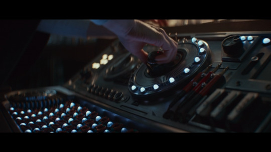
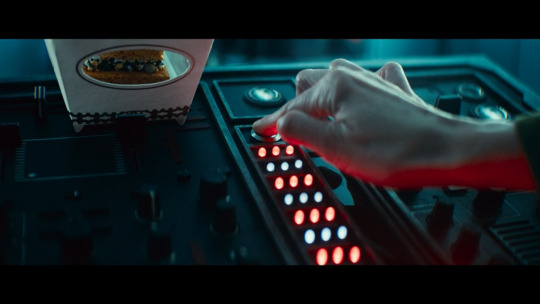
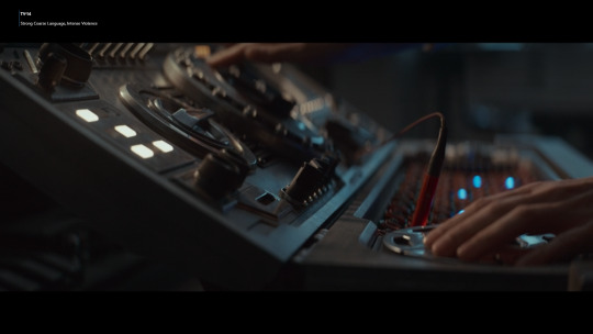
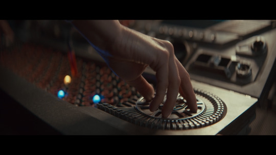
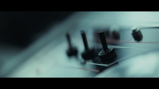
Text


Blame! (2017)
#blame!#cyberpunk aesthetic#scifi anime#user interface#anime#user interaction#graphic design#aesthetic#japanese animation#scifi aesthetic#japanese anime#anime gif#ui ux design#uidesign#ui#glitch video#glitch#glitch art#glitch aesthetic#robotics
1K notes
·
View notes
Text
Our Great Design Tools & Websites For UI/UX Designers | Optical Arc Kharadi
We live in a beautiful design time, with new techniques and ideas developing and disappearing. Frontend development is also gaining traction, with an increasing number of developers becoming active in ui ux.A beautiful UI design might be large and complicated to navigate without a proper UX design.

#ux designer#ui ux#ui ux design#ui design#user experience design#uiux#ui and ux design#ui ux developer#ux user experience#user interface designer#ui design website#ux design website
0 notes
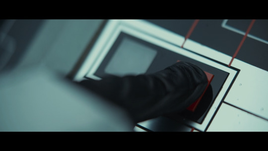
Text


Fake UIs part 6
462 notes
·
View notes
Text

Instagram: cheri.png
#good morning friends#this morning I was looking for inspo for web designs hehe#cybercore#y2k#cyber y2k#old internet#old web#00s#2000s#tech#moodboard#cyber core#cyberpunk#y2k nostalgia#y2k aesthetic#y2kcore#nostalgiacore#nostalgia#web archive#webcore#early web#user interface#windows#old microsoft#tech aesthetics#tech blog
94 notes
·
View notes
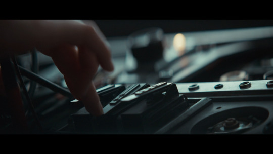
Text
Fictional user interfaces, buttons, and switches in Andor season two
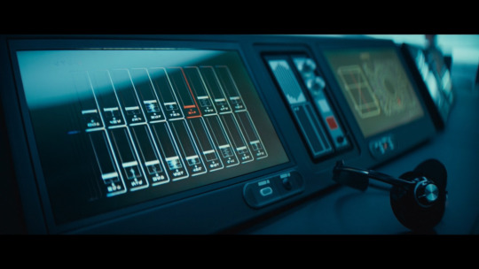
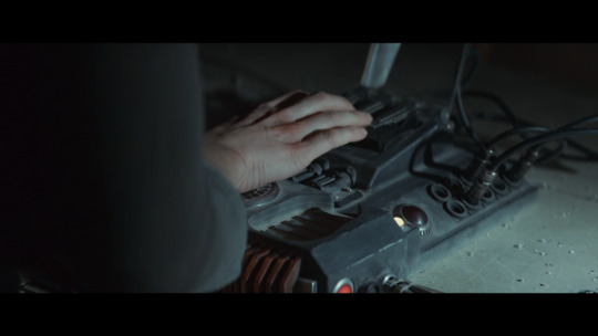
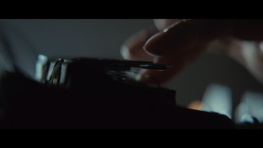
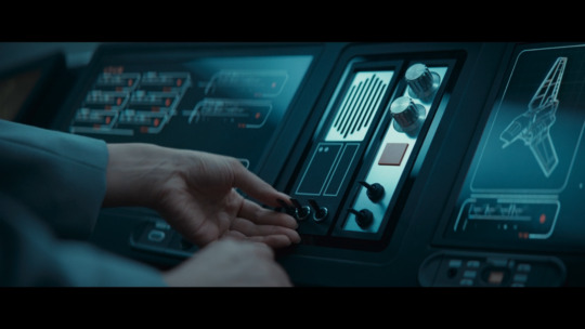
34 notes
·
View notes
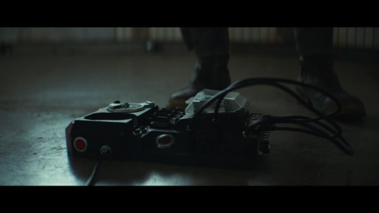
Text
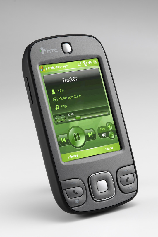

HTC P3400 (2007)
source 1 source 2
#2007#2000s#07#00s#art#cellphone#design#frutiger aero#graphic design#graphics#green#htc#htc p3400#microsoft#mobile#phone#photos#tech#technology#user interface
730 notes
·
View notes
Text

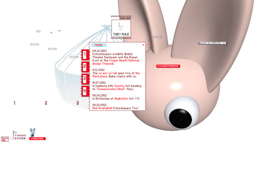

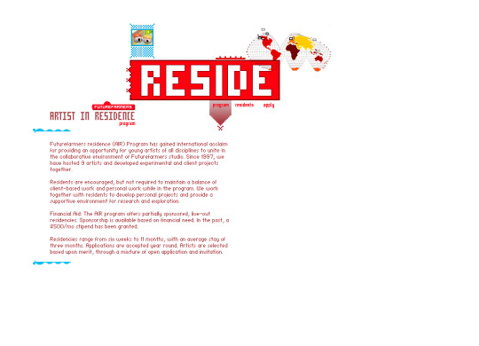

Future Farmers website (2001)
#3d#2001#2000s#01#00s#art#cgi#cybercore#cyber y2k#design#future farmers#graphic design#graphics#internet archive#kaybug#old tech#screenshots#uidesign#ui ux design#user interface#y2kcore#y2kore#y2k aesthetic#y2k core#y2k cyber#y2k design#y2k future#y2k graphics#y2k
274 notes
·
View notes
Text
Y'know what'd be a great UI improvement?
Categorization of fonts. Especially if it's user-controlled. Put that shit in folders.
"Standard", "Web-safe", "Script", "Headers", "Retro PC"...
66 notes
·
View notes
Text
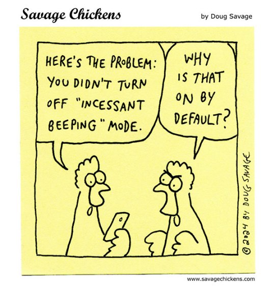
does anyone else feel pure unfiltered rage towards the new samsung ui update? everything is rounder and uglier. not to mention the amount of ai they're using and promoting. i dont think ive ever hated an update more
#autism#adhd#audhd#neurodiversity#neurodivergent#samsung#one ui 7#i just want my phone back#this is not what my baby looks like#user interface#ui design#ui#how do i go back
21 notes
·
View notes
Note
i kinda wanna give Spears a spoon full of peanut butter and see what he does with it (i'd get smacked smacked in the face probably)
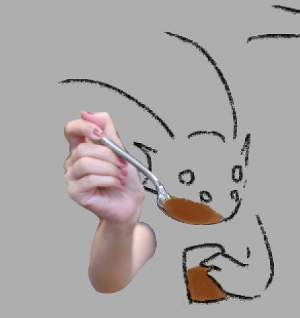
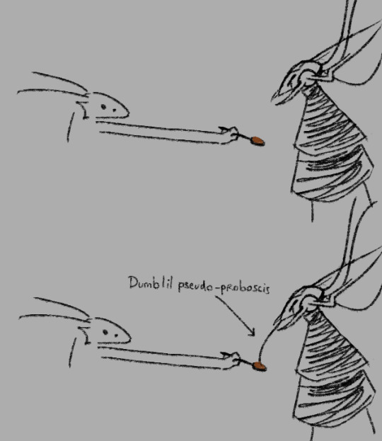
bug behavior
#wawa#weurgh#spears has a dumb lil pseudoproboscis (it's meant to resemble a proboscis but it cant intake anything) with very rudimentary taste receptor#it serves absolutely no use by the way#besides showing that they could make a Physical User Interface (puppet) with extra senses#spears sometimes refers to it as a “Spontaneous Design Choice” because that's how some of his Creators justified it#I guess the real use is making him look even more like a bug#twenty long spears pierce the sky
62 notes
·
View notes
Text
Okay, so: there's a local restaurant whose online ordering process involves various selecting various sauces to be included with one's order – so many units of teriyaki sauce, so many units of hot sauce, so may units of peanut sauce, and so forth.
The idea is supposed to be that you can select any combination of sauces you want, as long as it adds up to no more than four units. However, what the app actually required is that you select exactly four units of sauces; it wouldn't let you submit the ordering form if the total wasn't exactly four.
Just today I discovered that they seem to have fixed it... not by correcting the errant validation rule, but by adding a "no sauce" option, which counts toward the required total of four.
Thus, it's now possible to place an order with, say, two units of teriyaki sauce rather than four by entering 2x "teriyaki sauce" and 2x "no sauce". Similarly, an order with no sauce at all is 4x "no sauce".
This is quite possibly the least intuitive ordering process I've ever encountered, and I've literally worked in e-commerce.
19K notes
·
View notes
Text


The Fifth Element (1997)
#the fifth element#90s#cult classic#retro futuristic#cyberpunk aesthetic#retrofuture#retro futurism#new york city#aesthetic#90s movies#90s aesthetic#cyberpunk#graphical user interface#user interaction#user interface#graphic design#motion graphics#ui#ui ux design#uidesign
1K notes
·
View notes
Text


I've made hundreds of icons for Nightingale, here is a glimpse at some of them! The metal bases for ingots was hand painted, the ores are a mixture of painting, 3D models, and photobash. I referenced Soulslike icon conventions heavily, especially Elden Ring. The alchemical symbol alphabet was developed to help with accessibility (differentiate all the ingots accounting for colour blindness).
8 notes
·
View notes
Text
It's A Feature.
And more from the world of design.
37 notes
·
View notes