
Illustration and design work for ARTG211: Design Culture, a blog made by José Padilla
Don't wanna be here? Send us removal request.
Statistics
We looked inside some of the posts by ablogmadebyjose and here's what we found interesting.
Average Info
Notes Per Post
10
Likes Per Post
7
Reblog Per Post
3
Reply Per Post
0
Time Between Posts
6 days
Number of Posts By Type
Text
10
Last Seen Tumblr Blogs


Fun Fact
Tumblr Inc. has $15.1M in annual revenue.
Text
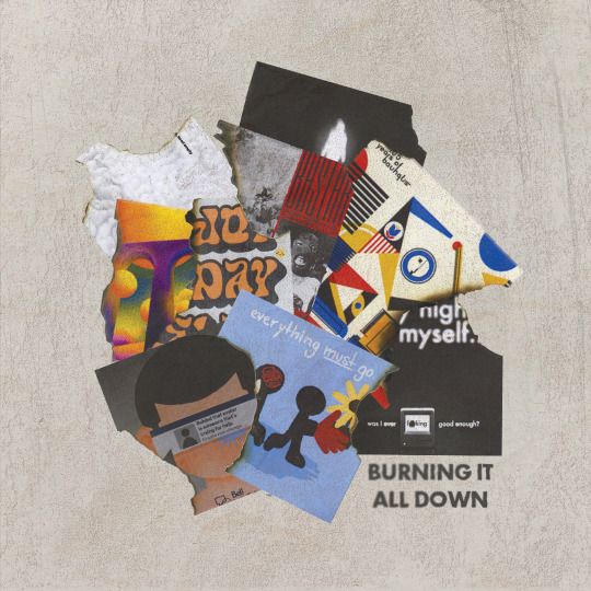
COLLAGE/DO IT YOURSELF | BURNING IT ALL DOWN
Topics of interest
Paper Cutouts | Childish, amateur, playful
An interesting concept for me to pursue, could develop into different compositions. Good form of media to attempt depth and layering.
Collage | Sustainable, re-use, aesthetic
A close tie-in to my own visual style which means I could create a fairly strong composition.
Do It Yourself | Literally anything!
Endless possibilities, no limits.
CHOSEN TOPIC -> COLLAGE/DO IT YOURSELF(?)
This is it, the final illo of the semester. 9 pieces of work later, I knew I wanted to keep this one to congratulate/mark the end of my second year at design school.
Creative Concept
For the final weekly exploration of the semester, I wanted to create a piece that ties back to the past 9 illos that I have created. I knew that from the start. I had multiple ideas for this concept. From full on illustrations, returning back to my roots in photoshop edits, or even animating. Most of these ideas never came into full realization due to wanting to refine and focus on the analog aspect of this week's theme. I ended up going for a collage which would be able to visually spread my message easily enough while allowing for a more deeper narrative.
Description
Crafting my final piece to mark the end of my second year at design school involved a thoughtful blend of collage and do-it-yourself techniques. Reflecting on my previous nine illustrations, I aimed to celebrate them into a single composition. By opting for collage, I embraced its tactile nature and the opportunity it provided for deeper narrative exploration. I constructed a visual narrative that not only signifies my growth but also represents the fact that I, a designer, shouldn't need to hold onto my work forever. It's great that I made these last 9 illos but I know that everyday I'm learning and growing to eventually make better work.
This piece serves as a callback to my past works, drawing upon elements and motifs from each illustration to create a cohesive narrative. I used a lighter to burn the illos as a representation of me wanting to move onto other work.
There were certain illos that admittedly lacked passion or any creativity, some were made under severe time crunch, and others were given the time needed to be excellent. Regardless of my design process for these weekly explorations, I still loved making each and every one of them and I'd argue a few are some of my strongest pieces of work this semester.
This has been an amazing process to witness and be apart of. My skills as a designer have only grown since the first illo and the major assignments in this class only further strengthen my abilities. It's been a rewarding constant cycle to practise and maintain my skills as an up and coming designer and I can't wait to see what's next for me.
KEYWORDS FOR INSPIRATION
Handmade
Faded
Message in a Bottle
Script
Layering
Blur
ROUGH -> PROCREATE
FINAL -> Analog + Photoshop + a Lighter
0 notes
Text
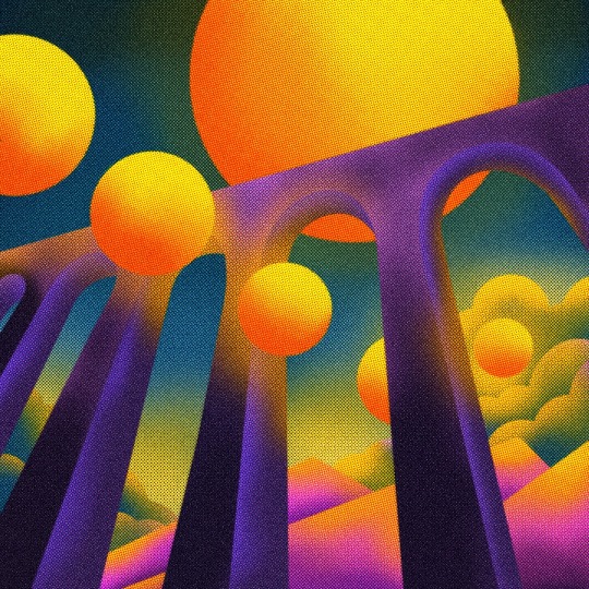
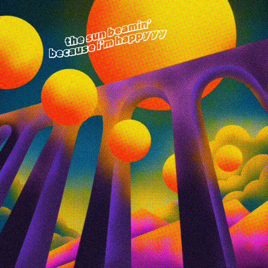
SUPREME GEOMETRY | THE NINE ARCH BRIDGE
Topics of interest
Shadow Play | Contrast, balance, duality
Very familiar in terms of colours, theming, and potential narrative. Could have been a fun experiment to attempt at but my only fear is that it may end up looking familiar compared to my darker tones weekly explorations.
Scan Lines | Digital age, consumption, analog
Not entirely similar to the style I've been attempting for the past 7 weekly explorations yet it leans more towards a digital narrative that my past work haven't quite touched yet (aside from weekly exploration number five).
Supreme Geometry | Boundaries, abstract, simple supremacy
This was the topic I was "recommended" to attempt. As seeing that I want my final three to be strictly illustration based this would be another perfect opportunity to use perspective as I haven't used much of that in my batch of work.
CHOSEN TOPIC -> SUPREME GEOMETRY
The second final illo of the semester! This week I was tasked to attempt supreme geometry. I immediately knew that I had to attempt perspective for this one, not only would it ensure that it would look visually different but it would challenge me to attempt something new that I have never done often enough. This also marks the first weekly exploration that I can call it a proper illustration, one of the first that I actually feel satisfied with illustrating.
Creative Concept
From the start I wanted this to be really different in terms of colour and composition. Inspired by supreme geometry I played with shapes and even some more complex forms to create a sunset bridge setting inspired by the recent sunset that have been occurring lately. Despite working with what are mostly 2D shapes I added shading to create depth as I believe simple shapes can be so much more than just 2D flat objects.
Description
As mentioned before, I want to ensure that these three last illos are fully illustrative and this and this definitely suits that guideline, exceedingly too! This illo is somewhat different than my usual art style which I think helps it to differentiate it from the other 8 weekly explorations. I experimented with colours that I don't use that much such as purples and greens. Yellow and orange seemed like good highlight colours for shading and the suns in the composition.
For this one illustration I didn't use my usual overlay texture technique and instead used photoshop's grain and texture to fulfill that air spray-like texture that's seen on this week's exploration. It really helped tie in the shading and shapes as without it, it looked to artificial and lacked the retro futuristic feel I wanted to emulate.
This turned out to be one of my favourite illos in this semester's batch and I loved the process behind it. I've been wanting to attempt this sort of style ever since semester one's batch of illos but I never got around to it. This illo is inspired by the end of the semester and the weird bliss I get during the final two weeks of school. Sad that school is over and I'll have to say goodbye to my friends and not having a consistent workflow of design work that I love doing, yet happy as I get to go back home and see all my old friends once again and the usual summer activities that occur during that time.
Final illo is next week, I think I've got something good coming up!
KEYWORDS FOR INSPIRATION
Retro
Perspective
Neon
Radiate
Growth
Futuristic
ROUGH -> PROCREATE
FINAL -> PHOTOSHOP
Text version:
3 notes
·
View notes
Text
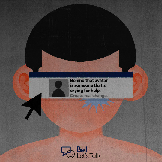
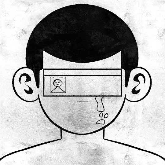
PSA CAMPAIGN | BELL LET'S TALK MENTAL HEALTH ILLUSTRATION
Topics of interest
Propaganda | Manifest, distort, manipulate
Typically a familiar style of messaging of mine, wouldn't push that many boundaries that I've attempted before.
Culture Jamming | Mockery, anti-capitalism, mass media
Also another style of messaging I tend to lean towards, for this instance I haven't created a design criticizing a corporation yet, could be a great exercise to tackle my usual form of narrative and pointing it towards capitalism.
PSA Campaign | Informative, spread awareness, do good
Never attempted before, a bit outside my comfort zone as it would have to take my usual narratives and bring it into a more positive light. This would also be a good chance to start illustrating since there a lot of PSA campaigns that use illustrations instead of photos and type to spread awareness.
CHOSEN TOPIC -> PSA CAMPAIGN
This is it, the final three weekly explorations! Although I really wanted to attempt propaganda, I believe the decision to only being able to work with PSA campaigns will benefit me in the long run and ensure that my batch of designs/illustrations are unique from one another. My goal for these last three weekly explorations are to ensure that they visually and compositionally look different from the past 7 I've posted. So it felt great to power on my drawing tablet and actually illustrate for once.
Creative Concept
Despite never having experience with designing or illustrating a piece of work for a PSA campaign, it never felt too distant from what I have had previously designed (whether that be in school or for clients). However, it did take some time to figure what I was actually going to inform the viewer of. Throughout last week Mackenzie allowed me to take a sneak peek of her illo, during that week I was helping her with her process and giving critiques when needed. At the end I was really inspired by her design this week and the messaging it has. So, I decided to base mine of mental health and how sometimes when you're online you never really know if someone is doing okay. I've been a huge follower of Bell Let's Talk as I think it's a great resource for those that are struggling with mental health and is fighting for the overcoming of the stigma when it comes to mental health. I thought this was the perfect time to incorporate their logo within the composiotion as the subject matter suited the organization.
Description
With the goal that I've set on myself for these last three explorations, that meant that I'll have to be full on illustrating or incorporating other elements that aren't just type and images with a bit of illustrating. For this week I wanted to keep it flat yet convey depth the shading technique that I used, my reasoning behind that is based on corporate art styles and the more (subtle) recent shift towards blending 2D flat styles with 3D shading.
Since this is based on mental health online, I added elements that symbolize the presence of the internet. Such as the pop up window in the middle of the composition representing Facebook with a dark blue and grey colour scheme and a cursor to guide the eye towards that same popup element. Texture was added by me with a brush rather than texture overlays to give it more of a grunge and "real" aspect to the design.
There are tiny little things I would add to this illustration that I may add and repost later on but for now I think it gets the message across. Definitely a bit more illustrative than last time but a solid start to inspire me to push even harder for the final two illos.
KEYWORDS FOR INSPIRATION
Stranded
Isolate
Forward
Dry
Pit
Tear/Shed
ROUGH -> PROCREATE
FINAL -> PROCREATE + ADOBE PHOTOSHOP
2 notes
·
View notes
Text


TERM PROJECT NO.7 | NO THOUGHTS, HEAD EMPTY
Topics of interest
White Space | Liminal, minimalistic, void
Abstraction | Perception, unrealistic, amateur
Picotgrams | Shapes, proportions, legible
CHOSEN TOPIC -> WHITE SPACE
I decided to work with white space this week as recently my illos have been mostly towards darker tones of colour and I wanted to have more white themed explorations while being able to explore the design idea that is white space, using white as a form to frame and ground certain elements within the composition.
Creative Concept
I struggled to find any sense of direction for this week's exploration which lead me to the idea of portraying the state of having no ideas/thoughts whatsoever, and I guess for designers that's what we call art block. I needed to find a way to symbolize the actual "head" part of the title so I used a brain to symbolize being inside someone's head with it being completely void of anything except for themselves and the thought of having NO THOUGHTS, resulting in an empty head.
Description
This is one of the only prompts where it was required to be relatively simple which meant I had to let go of more of my complex ideas as they wouldn't result in fitting the white space theme or any of the themes. I also did want to play with colour but at the end I really only wanted black and white to play key roles in this which I think helped further enhance this design. I overlayed an image of a brain to symbolize that brain motif that I brought up in my creative concept and finding a balance was crucial to not overdo the effect.
KEYWORDS
Organic
Seperation
Vivd
ROUGH -> PROCREATE
FINAL -> ADOBE PHOTOSHOP
1 note
·
View note
Text
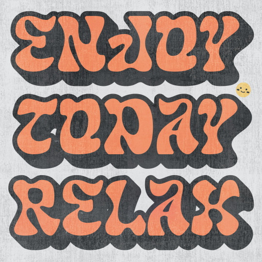
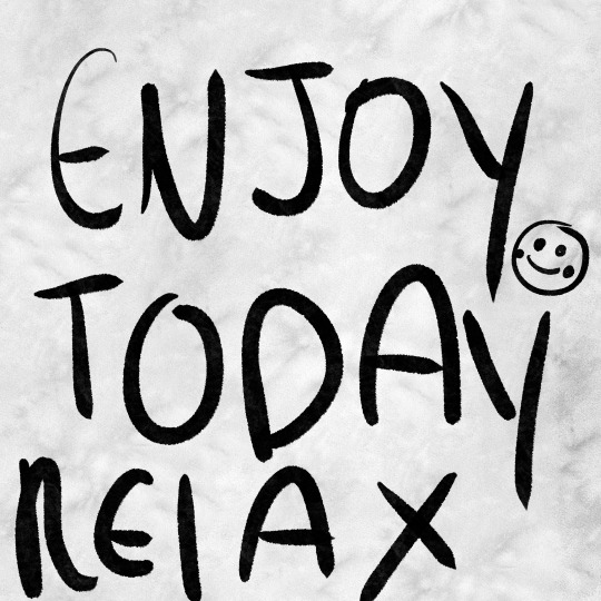
TERM PROJECT NO.6 | ENJOY TODAY RELAX
Topics of interest
Body Type | Personal, close-up, realistic
Tags | Youthful, informal, grunge
Loud Typography | Type, hierarchy, striking
CHOSEN TOPIC -> LOUD TYPOGRAPHY
I decided to work with loud typography this week and although I typically get really excited to work with type, I have to admit that out of all the 6 illos I've created so far, this is the most uninspired entry in my catalogue. After working with type (looking at you type specimen poster...) for so long, I just wasn't able to figure this one out unfortunately. Despite this I still wanted to at least put in SOME effort and make it a lot more cheerful and positive since I believe that was the best option for this week's illo, which is a theme I want to push even further with the next 4 illos.
Creative Concept
One aspect that I liked about loud typography is how much space it takes up the composition, usually it pushes up against its margins or even borders. Another aspect that I liked about loud typography is the use of shodows or more specifically using offset path strokes to create that drop shadow-like shape. Using those qualities in mind with a display typeface that helps creates a unique shape around the type, I went to work and creates a message using type that takes up most of the art board the ensure that the "loud" in typography is most certainly loud.
Description
After the previous two illos, I wanted to bring in some positive vibes and include some positive messages after reading break. I decided on the passage "ENJOY TODAY RELAX" to reflect that notion. However, like I said in the creative concept I wasn't as inspired for this illo unlike how I usually am for others. Finding a typeface that would suit the aesthetic was difficult, it took a solid hour just to find the typeface that I eventually ended on which is called "GLASS WATER." A beautiful decorative font that really has a lot of charm and personality with the amount of curves it contains.
Overall, I'm quite neutral with how this week's illo turned out, despite feeling quite uninspired throughout the process I managed to at least create a composition with type that gets its message across somewhat easily and looks visually distinct.
KEYWORDS
Joyful
Relaxation
Warmth
ROUGH -> PROCREATE
FINAL -> ADOBE ILLUSTRATOR
3 notes
·
View notes
Text
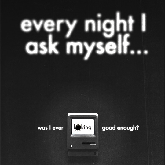
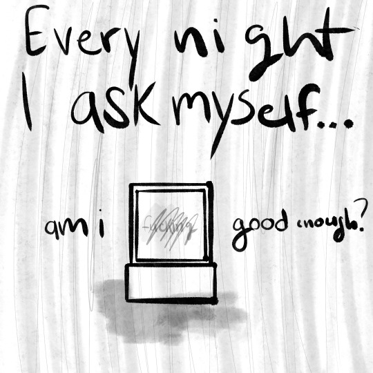
TERM PROJECT NO.5 | WAS I EVER F*CKING GOOD ENOUGH?
Topics of interest
Extreme Close Ups | Relationships, sensual, seductive
Big Book Look | Abstract, asymmetrical, minimal
Monumental Images | Mortality, still, cold
CHOSEN TOPIC -> BIG BOOK LOOK/MONUMENTAL IMAGES??
I'm still conflicted on which theme this actually fits. It fits the requirements of the big book look with its use of scale and typography, but its message is so clear and up front that it could also be categorized as a monumental image. Regardless, I wanted to work with type for this week's illo and make it a huge aspect of my design. That's why I leaned towards those two themes and maybe even combined the two in concept.
Creative Concept
In all honesty, my original idea was completely different from the final result I'm posting now. It would've been an illustration in a style that I have never attempted yet and would be very complicated in execution, and due to the amount of work that was assigned last week, I never got around to really executing my idea. However, that idea will return for the next illustration prompt after the reading break. Anyway, when it came to this concept, I was inspired by one of my failed manifestos from ARTG210: Professional Practice 2, which didn't win the vote for it to be posted online on Instagram. Since this week's theme was scale, I knew I wanted the Macintosh photo to be tiny in comparison to the header text, which would be significantly larger than all the other imagery and text within the composition. I wanted to recreate the feeling when I'm awake past 11 p.m. working on whatever assignment is due the next day; it's tiring yet sort of relaxing.
Description
Despite being bummed out that I didn't get to execute my actual idea for this week's design and having to save it for the next theme, I made sure not to treat this week's design as a throwaway. I decided to go back to Photoshop and create another design, which I'll admit is in my comfort zone, but I always ensure that every weekly exploration looks distinctly unique from one another. This time, I wanted type to have a larger focus and make my narrative as blunt and straight-forward as possible. I tend to use vague and broad phrases for narratives that are way deeper than the actual phrases presented in the final work. Since this one was inspired by both the big book look and monumental images, it was pretty obvious that I had to make this week's narrative as clear as possible.
I feel like every designer or creative will at least suffer from imposter syndrome, and at times it impacts the work we create. It's something that I have to deal with and push through sometimes. I think one of my biggest weaknesses as a designer is that I compare myself way too much with my classmates. They're all so creatively unique in their own little ways, and the work they produce genuinely impresses me. I'm very honoured to be working and being friends with the people in my class, but at the same time, I have never felt this much imposter syndrome in my entire life before. I know I create good work, sometimes even exceptional work. Yet, when people compliment or even applaud my work, I just can't seem to fully determine if it's genuine or not. So, yes. Every night, I do ask if I was ever f*cking good enough! Despite this roadblock I find myself attempting to move past, I still love the work I put in. For the most part, I put in my all for each and every assignment, and sure, some might be better than others, but I'll always appreciate the amount of hard work during the design process that is put in. I think I've come full circle from that failed manifesto from ARTG210; this is my personal manifesto.
Enough of the rationale behind the narrative; when it came to the actual visual aspect of this week's exploration, I mostly used the same principles for the "WHO AM I?" design two weeks ago. However, this time I used different textures and blur effects to experiment more with the tools that Adobe Photoshop offers. I didn't want to overuse the texture; having subtlety there, I think, was a way better decision than it being super apparent and strong, as I wanted to recreate that feeling I have when I'm working on assignments late into the night. I also added some extra outer glow and drop shadows to add more depth, as it was looking very flat without those two effects behind the Macintosh. I adore how the textures turned out in this, especially the field blur effect on the type.
Even though this week's exploration wasn't my intended vision, I loved how it turned out and is so far my second favourite (BASTARD is still my number one!) exploration I've done so far.
KEYWORDS
Desolate
Pessimistic
Melancholy
ROUGH -> PROCREATE
FINAL -> PHOTOSHOP
0 notes
Text


TERM PROJECT NO.4 | EVERYTHING MUST GO.
Topics of interest
Provocative Gestures | Relationships, sensual, seductive
Primitive Figuration | Abstract, asymmetrical, minimal
Vanitas | Mortality, still, cold
CHOSEN TOPIC -> PRIMITIVE FIGURATION
I decided to work with primitive figuration as I wanted to dive even FURTHER into simple compositions and minimalism. I also liked how this historic style is able to convey messages and emotion by turning humans with complex forms into simple abstract shapes while still resembling humanity.
Creative Concept
I loved how colours are used in primitive figuration; colour blocking is mainly used in these types of compositions, and I haven't explored that type of technique yet this semester, so I wanted to give it a hand. For the actual composition itself, I wanted to make this week's illustration the beginning of a send-off for the floral-like themeing I've been way too attached to, and I want to explore new themes, which is why flowers haven't seen an appearance in my work. Aside from my pattern, which is heavily floral-like, I've been slowly distancing myself from that motif, and this felt like the right time to start that path.
Description
OH MAN! This turned out to be an easy and hard illustration. When it comes to design, I think I'm quite skilled at making minimal yet unique work, and I end up feeling satisfied. But when it comes to illustration, I often find the need to create something that takes days to make, but this illustration was made within a couple of hours, which didn't sit right with me. But I know that this week's prompt isn't a very complicated style of illustration to begin with, so I kept on illustration with that in mind. Keeping with the style of minimalism, I used limited textures to let that colour blocking really stand on its own, and this also applied to the type as well, keeping it small while avoiding it conflicting with the main subjects of the composition. This style also plays with asymmetry, so I made sure each shape or form in this composition was unique and wasn't the same, which I think really made this illustration visually interesting while being so simplistic in nature. This also helped make this week's piece look visually different from my last two designs.
Going on, I plan on going for more complex illustration compositions, especially for this week's, but this was once again a nice change of pace, really giving myself more restrictions to work with and pushing myself with the amount of elements I have to work with.
KEYWORDS
Elementary
Limited
Oversimplified
ROUGH -> PROCREATE
FINAL -> PHOTOSHOP
0 notes
Text


TERM PROJECT NO.3 | WHO AM I?
Topics of interest
UPC Codes | Industrial, consumerism, corporate
Photo Montage | Nostalgic, homemade, warmth
High Contrast | Emotional, striking, mysterious
CHOSEN TOPIC -> HIGH CONTRAST
I decided to pick high contrast as I wanted to give myself a restriction and work with black and white to create a high contrast composition. Because of the nature of high contrasting work I decided to keep this week's composition simple and really let the contrast between black and white stand out on its own while adding some narrative with text.
Creative Concept
I have always been interested in the aura that white has on a black background, there always seems to be some sort of tension or noise whenever the two or placed together and I wanted to replicate that effect. When I was thinking of a main subject to be apart of this comp. I immediately thought of angels or ghosts, eventually ending on the theme of souls. I was inspired by concept art of Pixar's 2020 Soul, one in particular was all white with a glowing aura all around it and I was set on that design.
Description
I knew from the beginning I wanted to keep this week's illo relatively simple as I wanted to let the contrast of black and white speak for itself without having too much elements that could distract the viewer from the actual high contrast element that's suppose to be the main subject of this prompt. Again, I use texture and effects to my advantage to tie elements together and enhance the visual narrative. I wasn't intending on using my usual textures/effects but without any it seemed empty as the black background was just void of any depth and the soul-like figure and the text didn't feel connected at all.
The soul-like figure was illustrated by me and using photoshop effects I added an outer glow and motion to blur to create that glowing aura I mentioned earlier, I experimented using that same effect using the text and I quite enjoyed how that balanced the soul-like figure and the text, not to mention I applied a path blur to help enhance my creative concept. I wanted this to feel like a dream or a state of disorientation, nothing would really seem clear just a blurry memory.
Overall I'm quite pleased with how this turned out, I don't typically enjoy creating simple compositions but after the last two it was a nice break and it helped me think outside the box with using limited subjects.
KEYWORDS
Heaven-like
Godly
Liminal
ROUGH -> PROCREATE
FINAL -> PHOTOSHOP
1 note
·
View note
Text
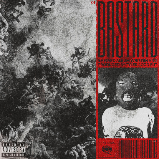

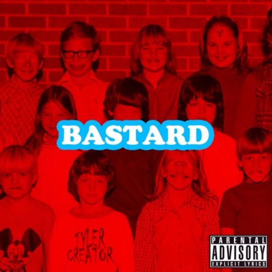
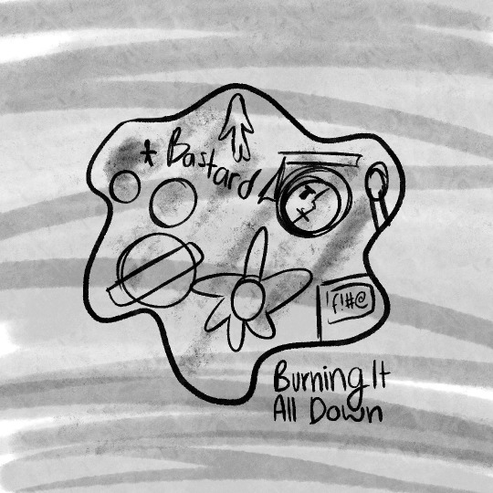
TERM PROJECT NO.2 | BASTARD
Topics of interest
Teen Magazine | In style, bright, advertisements
Film Title Sequence | Serious, emotional, thematic
Record Album Cover | Impression, story, tone
CHOSEN TOPIC -> RECORD ALBUM COVER
I decided to pick a record album cover, as ever since the M&M assignment from last semester, I wanted to have another attempt at an album cover design, but this time I chose a different medium, and in this case, I used Photoshop. I am always so intrigued by the art of album covers, and I appreciate the amount of effort the musician and designer put into the art of an album cover to ensure that the album is well represented to audiences.
Creative Concept
One of my favourite artists of all time is L.A. Tyler, the Creator, and even though his artwork for the last five albums has been outstanding in terms of quality and visuals, his cover designs for his first two albums (Bastard and Goblin) are less than superb. So, I decided to take on the role of recreating Tyler's first album's cover. My main challenge was sticking to a monochrome colour palette with a hint of red to take a nod to the original album cover, which is included above. My secondary constraint was ensuring that I eluded to the story within Bastard without making the design look outlandish and keeping in mind how album cover designs can influence the sales of records.
Description
Bastard is a mixtape by American rapper and producer Tyler, the Creator. Released in 2009, it serves as Tyler's debut solo project and showcases his unique style, blending elements of hip-hop, alternative rap, and dark, introspective lyrics. The mixtape gained attention for its raw and experimental sound, setting the stage for Tyler's future success with Odd Future (Tyler's friend group made up of other rappers, graphic designers, and skateboarders) and his solo career. Tyler, the Creator produced the entire "Bastard" mixtape himself at the young age of 19, demonstrating not only his skills as a rapper but also his talent as a producer. This DIY approach to his music production has been a consistent aspect of Tyler's artistic identity throughout his career.
Bastard is well known for its grunge-like production with tones of darkness in its lyrics and production so I really wanted to capture those characteristics in my redesign. When it comes to my roughs for graphic design I tend to find it quite difficult to really articulate my final vision as my process is changed quite a ton from when I plan my roughs to when I export the final JPG whereas when it comes to illustration I need complex roughs to lay a firm foundation or else I struggle to even begin. This could just because of the amount of experience I have between design and illustration but its a hurdle I must overcome. However, thankfully I will say I am quite skilled in photoshop so tackling this project was a nice refresher after the winter break and I was able to learn some new techniques that enhance my work such as colour overlay and dealing with adjustment layers. Layering multiple images resulted in the texture in the final result and effects such as grain, and roughen to portray the scuffed-like condition of the album. The album heavily contains themes of religion so it felt right to include an image of heaven while Tyler on the left wearing a ski mask with a upside-down cross is there to show a contrast of the rebellious influence Tyler has on the record. I wanted to keep type simple yet unique so I went with a sans serif typeface for the body text and a more decorative yet striking typeface for the title and I adjusted the kerning to increase readability. The graphics on the bottom are all made by me and even though I could've just grabbed them on google I figured I might as well have more pen tool practise. Overall I'm beyond pleased with how this turned out and I plan on recreating other album designs from Tyler, the Creator and I believe I was able to reach my objective in this week's illo.
KEYWORDS
Unsettling
Disturbing
Tone Deaf
ROUGH -> PROCREATE
ROUGH -> FINAL
0 notes
Text


TERM PROJECT NO.1 | 150 YEARS OF BAUHAUS
Topics of interest
Dadism | Natural + machinery, surrealism, striking
Bauhaus | Use of lines, bold colour palette, functional
Art Deco | Geometric lines, inorganic, luxurious
CHOSEN TOPIC -> BAUHAUS
I chose this design movement because it's outside of my comfort zone and I'm not familiar with vector illustration so I decided to give it another try and possible improve my skills in this form of artwork.
Creative Concept
The creative concept behind this illustration is that I wanted to capture the essence of Bauhaus, the concept behind this piece is much more clearly explained later in this post.
Description
2024 marks the 105th anniversary of the birth of the Bauhaus design movement. To celebrate the occasion, I decided to pay tribute to the design movement and the building in which this art was created. The Bauhaus building, located in Dessau, Germany, was designed by architect Walter Gropius and served as the iconic school's main facility from 1926 to 1932. Characterized by its functionalist design, clean lines, and emphasis on merging art and technology, the building reflects the Bauhaus principles of modernist architecture that sought to unite creativity with industrial functionality.
I decided to choose Bauhaus over other options as I'm not quite experienced in vector illustration and I wanted a chance to practice this art form. Using mainly geometric shapes, I created a figure (the main subject) and an abstract rendition of the actual Bauhaus building in the bottom right. My biggest concern was showcasing the characteristics of Bauhaus in ways that didn't look decorative or forced. Maintaining a balance in the Bauhaus colour palette was also a concern, as there were points where each colour would overpower the composition. I think overall I maintained proper colour balance. Certain shapes come together to create motifs that were common during the creation of the Bauhaus and pay tribute to the history of this beautiful design movement.
I still have much work to do to really excel in vector illustration, but compared to my previous illustration made in vector for ARTG241, this has been a slight improvement!
KEYWORDS
Industrial
Elegant
Practical
ROUGH -> ANALOG
FINAL -> ILLUSTRATOR
0 notes