
ac-collection
Works by Aly
A Computer Science major in Ateneo de Manila University with a budding interest in the field of design 🌿
💌 [email protected]
9 posts
Don't wanna be here? Send us removal request.
Last Seen Blogs


practicevewor
Untitled

just-another-terrible-blog
Look How Bad This Blog Is
gakinotsukaigifs
GNT GIFS

xosomienbacworld
Sans titre
Photo

🐺 Monster of The Week Hunter Companion UI
👩🏻💻 UI Design, Ideation, Prototyping
For our Introduction to Software Engineering course, we were given the freedom to develop any kind of project or application we want, as the main goal of the course was to teach us how to properly document a development project. My group decided on creating a digital tool for players of the tabletop role-playing game Monster of The Week.
In order to fully understand what a player may need from this digital tool, we all opted to play through a quick oneshot. After getting an idea of a player’s experience, we formulated a system that handles character management and automated dice rolling that makes it easier for players as they go through a campaign, minimizing the need for multiple documents to reference as well as manually computing roll results.
The above photo shows the UI I designed for the system, following wireframes drafted by my groupmate. The color palette I chose for this project is dark, as my groupmate told me that Monster of The Week has a similar aesthetic to Stranger Things. Since it has been a while since I designed screens at the time of working on this project, my skills were a little rusty compared to the previous year. However, my groupmates have told me that my design looks neat and easy to follow, so my designs have served its purpose. The groupmate who suggested this project in the first place was especially pleased that they showed it to their other friends who also played Monster of The Week. I was very happy that my designs were well-received.
Unfortunately, as we were working with Java and JFrame for the development, the final design wasn’t followed through due to the limitations of JFrame as a front-end tool. Nevertheless, the final system itself has met the functional requirements that we have specified at the beginning of the project.
🎨 Designed using Figma. Link to workspace here.
0 notes
Photo

♟ Pawn Shop System UI
👩🏻💻 UI Design, Ideation
For our Information Management course, my group was assigned to work on designing a system for a pawn shop given a case overview. Part of our final project was to design a front-end UI screen, a sample of which is shown above.
🎨 Designed using Figma.
0 notes
Photo

🌸 Random, Personal Designs
👩🏻💻 Design, Personal
I sometimes design random... anything really! For instance, in the upper left part of the above photo, I made a simple Instagram promo for a new written work I recently posted on my writing blog. On the right-hand side, I made a few sample screens for YouTube playlists in the hopes that I’d upload a playlist of my own on YouTube someday. On the bottom part, I made Notion headers for an organization project initiative, where Notion was used as the main project management tool.
🎨 Designed using Figma.
0 notes
Photo
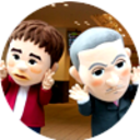
👾 Game Screens
👩🏻💻 UI Design, Ideation
In addition to being a Computer Science major, I am also going to be taking a specialization in Game Design and Development in my fifth year of university. As an introductory elective to game design in the first few months of my third year, the Introduction to the Design and Development of Computer Games course required us to design a few sample game UI screens. Above are the results of my work for this particular requirement.
🎨 Designed using Figma.
0 notes
Photo

🏅 Daily UI Challenge
👩🏻💻 UI Design, Ideation
These are some of the screens I designed for the Daily UI Challenge. I was only able to do the first three days before my academic workload started to pile up.
Random fact: I’m especially proud of the landing page 🥰
🎨 Designed using Figma. Link to workspace here.
0 notes
Photo

🎭 Publication Materials and Template Designs for Organization Work
👩🏻💻 Design, Pub-making, Template-making
Being the Associate Secretary-General for the Computer Society of the Ateneo (CompSAt) meant that I had a hand in handling the organization’s documents. Similar to my motivation for redesigning the CTSK, I took it upon myself to redesign CompSAt’s other templates, such as those used for minutes of the meeting and project summaries, among others. An initiative my department also came up with involved providing services to fellow Executive Board and Associates Council members, that ranged from minutes-taking to workspace and files management consultation, as shown in the photo above. Hoping to share my department’s strengths to ease internal work processes among fellow officers, I suggested this initiative in the hopes of doing exactly that. I prepared the pubs above myself and disseminated them to my fellow officers. Unfortunately, our services weren’t formally availed much, but we were informally asked many times to assist with proofreading and the like.
Our fellow officers expressed gratitude at our willingness to help, however, so all’s well that ends well!
🎨 Designed using Figma.
0 notes
Photo
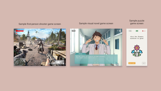
🏃🏻 Core Team Survival Kit (CTSK)
👩🏻💻 Design
Part of my responsibilities as Associate Secretary-General for the Computer Society of the Ateneo (CompSAt) is to create and maintain project guides for core teams. Seeing as the old CTSK wasn’t very friendly on the eyes in terms of style and typography decisions (plus the fact that it was just made on Google Slides), I decided to redesign the CTSK using design techniques I newly learned from UX University 2020. I made both a quarantine and a non-quarantine version, so my successor can simply pick up where I left off with both versions ready. Feedback on my redesign was positive, and I hope it served the core teams well!
🎨 Designed using Figma. Link to workspace here.
0 notes
Photo
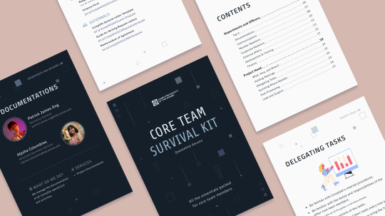
🌱 PUNLA Website ver. 02
👩🏻💻 User Research, UI Design, Wireframing, Prototyping, User Testing
From March to April 2020, my blockmate and I joined our first ever design case competition, UX University 2020, which was hosted by AdMU’s User Experience Society. It was here that I learned how to follow the design thinking process to figure out the best way to go about the problem of singing up for PUNLA, which is an NSTP area engagement requirement for sophomores. After having gone through the very confusing and time-consuming signup process ourselves, my blockmate and I decided on this case study to see if we could craft a solution that could help our fellow students as well.
Much to our surprise, my blockmate and I were able to finish the competition as part of the top finalists, and we learned that what contributed greatly to our score was our user research outputs. Despite the difficulty of an online case competition, we made sure to be very meticulous and thorough with our research, and I’m glad we pulled it off to the best of our ability.
More than just teaching me the technicalities and rules of design however, UXUni 2020 taught me how to design with empathy and understanding, which is a lesson I value and remember the most whenever I try to design anything.
In fact, the design above isn’t actually our final submission to the competition proper, hence version 02! The link to our original design can be found below. In the photo above is a revamped version of our original design that I worked on immediately after the competition ended. After receiving critical and insightful comments about our UI design, I was determined to put my learnings to the test. After some reading, self-studying, and guidance from a few experienced veterans, I came up with the above design. I was told by the aforementioned veterans that I improved so much in such a short time, and for that I’m thankful.
🎨 Designed using Figma. Link to workspace here.
🎁 If you’re curious as to how our original design went, check it out here!
📂 If you’re interested in looking into our files for the competition, from interview transcripts to personas to journey maps and more, feel free to check them out here!
0 notes
Photo
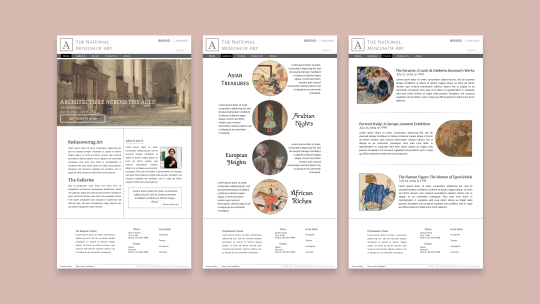
🖼 The National Museum of Art
👩🏻💻 UI Design
During the first few months of my second year in university, I took up an elective called Web Page Design. It was my first exposure to the field of design and I honestly didn’t expect to enjoy the class as much as I did! Above is the end result of my final project. I tried my best to incorporate the lessons I’ve learned throughout the elective, and for my first overall attempt at design, I’m happy to say I was pretty satisfied with it!
🎨 Designed using Figma. Link to workspace here.
0 notes