
Statistics
We looked inside some of the posts by aenorris-blog and here's what we found interesting.
Average Info
Notes Per Post
21
Likes Per Post
12
Reblog Per Post
0
Reply Per Post
9
Time Between Posts
5 days
Number of Posts By Type
Text
7
Photo
1
Last Seen Tumblr Blogs


Fun Fact
70% of Tumblr users say the Dashboard is their favorite place to spend time online.
Text
RN Portfolio 7: Period Style
1. Art Nouveau: 1800-1910 “Total design” can be seen in buildings, furniture, graphic design, silverware, clothing, jewelry, etc. In each image you can see the curve that creates a flowing line. You can see the asymmetric design, the use of color which was dramatic and intense.


2. The Bauhaus: intense militant futurism. Design had brick, concrete, glass buildings that were tall with a hard edge. The inspiration were the American industrial buildings. Functional and stripped down look was seen in building and furniture design.


3. Late-Modernism/”deconstruction”: Time period was shaped by the post war revolt with new set of economies. Split between design and pop culture could be seen. Functionalism, geometry, and bright colors vs the influence of art and youth culture created anti youth consumerism. Counterculture became against the marketing of society. Styles followed bands or pop stars. There was rebellion about capitalist society. The idea of life and culture were a system failed and all styles are available. Nothing is serious the generation revolted and anything went. Lots of mixing of various periods in design. Re-contextualizing space there is no rules, weird. Random and brokenness is okay.


4 notes
·
View notes
Text
#WEEK6TMD126
The Library Restaurant
Portsmouth, NH
Romantic Period: “Gothic” Medieval style with the dark woods. The outside of the building is Federalist style built in the late 1700′s during the Neoclassical period. The inside atmosphere is mysterious and reminiscent of fantasy. You can see from the various pictures the stone and dark wood accents. The rod iron on the railings along with the brass details on the lights. The lions that are guarding the door of the building give it a medieval castle vibe. I do feel that the seating options are not as authentic with the time period. But I feel they have to do this or the furniture would take up to much space in the room allowing for less seating and tables for guests to dine at. The cushioning lack the rich velvet fabric (red or gold). I would guess that this was not chosen as it is not as durable and forgiving if needing to be clean often from food being spilled on them.


Above: Federal style building


1 note
·
View note
Text
RN Portfolio 5-6 Design & Culture
Renaissance Period:
Pictures below show craftsmanship of furniture. It was well made and sturdy to be passed down through the generations. Clothing was wide and grand to show wealth. Buildings put an emphasis on proportion, symmetry, and being orderly.

Above: Tempietto di San Pietro in Montorio, Rome, 1502 by Bramante.

Above: Façade of Santa Maria in Italy the architect was alive 1404-1472 so I suspect this was done 1440-1460 time frame

Above: 1546 Queen Catherine Parr, Aragon

Above: Chest made from walnut in Italy, 1425
Neo-Classicist
Designs are paired down, simplified. Simplicity and harmony was the focus after the Baroque over the top time period. The people did not show wealth outwardly. The design was clean with the use of straight lines. Dress had empire waist, more form fitting (not wide), and made with lighter fabrics.

Above: The Academy of Athens by Theophil von Hansen, 1859.

Above: The Lincoln Memorial, built in 1922. Plans were drawn for it after Lincolns death in 1867.

Above: The White House, Washington, DC, 1792

Above: Rutger Jan Schimmelpenninck and his family, 1801–02, by Pierre-Paul Prud'hon
1 note
·
View note
Text
RN PORTFOLIO 4. SCAMPER
Natural light in the operating room is unheard of. Working in the operating room there are no natural light in the OR suites, hallways, break area and main desk. According to Naccarella et al., (2016) lack of natural light negatively impacted employees. Improvement in the indoor environment can positively impact the staff and translate to better care for patients. When nurses enjoy their work environment, they are more apt to stay. Natural light increases work satisfaction and workforce retention.
Below is the current look of a typical operating room. It is icy looking the walls are usually a very neutral color and there is no natural light.

Substitute:
1. Wall color
2. Replace part of the wall with windows.
To improve the design of the operating room, I would like to modify what we have already as it would be the most economical way to brighten the design. I would suggest that we start by substituting another color for the walls, instead of the room being a light gray substitute in a more peaceful calming shade of blue. See below photo.

I would also like to replace some of the wall space with windows to the outside interior operating room corridors where there is some natural light. They would be high up on the wall to provide privacy but allow the natural light to come in and brighten the space.

The ideal space would have windows to the outside, but the operating rooms suits could not be on the ground level of the hospital. So this design below would not work for my workplace but would be a dream layout to work in.

The benefits of natural light in the operating room would create a better work environment. It would impact employee’s moods, job satisfaction, and retention (Naccarella et al., 2016). We work long hours on call and having natural light would lift my spirits, make me more alert, and not feel like I am working in a dark, depressing room. It would make me happier to go to work each day.
Reference
Naccarella, L., Buchan, J., Sheahan, M., Reading, Chevez, A., and Pollard, B. (2016). Design matters for nurses: Hospital design for nurse attraction and retention. Melbourne, Australia: Hassell.
2 notes
·
View notes
Text
RN Portfolio 3: Elements
TEXTURE

Texture is a pattern that we sense with our fingertips, and we can also see. The chair I picked is made of a brushed velour fabric. To me this creates a warm, inviting, and cozy feeling. The fabric is a smooth brushed material that to me says grab a good book and a warm blanket and cuddle up for the morning.
COLOR

Color: The blue color of this home creates a fresh, crisp, clean feeling for me. To me, it says I belong near water. It makes me crave summer days, warm weather, sandy beaches and being outside. The color creates a sense of peacefulness and is calming.
1 note
·
View note
Text
Stethoscope


· Stethoscope Concept Map
1. Describe how you would communicate what is especially important about the design to this audience?
The stethoscope is a tool to listen to internal sounds that the body makes.
2. Tell us how you would describe its design in 50 words or less to someone who has never seen it before? ·
The stethoscope is an instrument that is used to listen to the sounds the body produces. It is used to listen to the lungs, heart, intestinal tract, and blood flow in your veins and arteries throughout your body.
3. What if you could only use images to convey it to an audience? How would you do that with six pictures? (Tell us and use images if you like)

Allows for an internal checkup.
Aids in hearing what the ear alone cannot hear well.

Allows you to listen to lung sounds. It provides information to alert for inflammation, fluid, and congestion of the airway.

Detects abnormal heart sounds.

Digestive system can alert for infection, obstruction, and illness.
4. What would be three to five physical objects or samples that would be especially effective at the presentation for the audience to touch and hold? Explain why in each case.

Ear plugs, how does it feel to know something is going and you cannot hear any of it?

Model heart: So they can see the complex organ that lives inside of them and helps keep them alive.

Ice cube: this would be so that they can feel how cold an extremity can become when it is occluded.

Oxygen mask: To make them think about when it is difficult for someone to breath. A tool for the medical professional to assess what is going on inside their chest is the use of the stethoscope.

Hearing aid: to draw attention to how much better this small device can change a person’s life. The stethoscope has the same impact. It can keep a person healthy and alert doctors to abnormalities that are happening inside a person.
5. How would you use these in the kind of situations described in either DiNardo 2015 or Eagle 2016?
A stethoscope is a tool that creates a voice for a person insides. The design of the stethoscope provides benefits to the patient and healthcare team and enhances the total care of the patient. It makes the job of the staff easier by painting the picture of what is taking place inside the patient’s body.
1 note
·
View note
Text
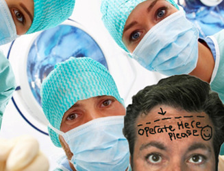
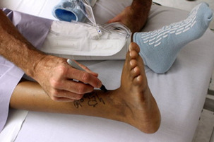
Design to prevent adverse events- Operating room suites were standardized, using proper lighting and cable access to digital images and photographs of the surgery site.
3. Conceptualization is where I feel the problem lies. Wrong site surgery needs to be fixed with more than just access to images and proper lightening. I think they missed that this is a multifaceted problem.
Using SCAMPER, I would focus on Combine. I think that having proper lighting and images up for verification should be a step in the Time-out process to verify the correct site. Let us combine that with having a surgeon initiated time-out where all parties in the room are quiet and engaging in the safety check (that means music off, and everyone is still). The name band should be verified with the signed consent at the start of the case. The pt identifiers should be compared to the images displayed that are used for verification. And the marked body part should be prepped and draped before the time so that it can be verified immediately before the start of surgery. I think with all of these things happening in a systematic checklist that is displayed large enough so all members of the team can follow along will help illuminate wrong site surgeries.
Operating room suites were standardized, using proper lighting and cable access to digital images and photographs of the surgery site allows the design to be functional. If we change the design by adding to it and using a checklist containing the images to use during the time-out process before a surgery starting would fulfill the proficient level of the hierarchy of design needs. It takes the design and allows it to be better than before and protecting patients from undue harm.
9 notes
·
View notes
Photo


For Christmas, I asked for a new alarm clock. I told my husband I was not picky and it just needed the basics. I felt that the one from when I was in high school over fifteen years ago needed to be retired! The new alarm clock has all kinds of fancy features and wakes us up to Pandora music of our choice instead of the screeching of the FM radio that does not come in clearly. The design problem is that if you forget to set the alarm or need to change anything you cannot see the buttons in the dark. This is a problem when your partner is asleep when you get home at midnight. You have to fumble around with a flashlight on your phone or turn the bedside light on to wake them up so that you can reset it. I feel this could be redesigned with buttons that are illuminated in the dark so that you can see them and make changes to the alarm clock without having to turn the lights on and wake everyone up. This would help everyone using the alarm clock to fulfill the psychological level of Maslow’s hierarchy. Once we are all well rested and have the other basic physical requirements met, we will be better ready to move up the hierarchy and live to our highest potential! Michael Graves (2011) could not be more accurate when he says “design something that is ideal and that does not need to be resigned by experts”.
Resource
Graves, M. [TEDMED]. Michael Graves at TEDMED 2011[video file]. Retrieved
from https://www.youtube.com/watch?v=_fiEB3Ktzj8&feature=youtu.be.
2 notes
·
View notes