#TMD126
Explore tagged Tumblr posts
Visit Tumblr Blog
Explore Tumblr blogs with no restrictions, modern design and the best experience.
Last Seen Tumblr Blogs


Fun Fact
Tumblr Inc. is using 66 technologies for its website.
Text
RN Portfolio #7: Period Style
ART NOUVEAU

Moulin Rouge: La Goulue
lithograph 1891
Artist Henri de Toulouse-Lautrec
In the Art Nouveau style, prints tend to have women as a theme. These prints were mass produced. This poster was publicity for the Moulin rouge cabaret in Paris, France.
ART DECO


Chrysler Building
NY, USA
Completed 1930
Architect William Van Alen
The stepped structure of this building is classic of the architectural designs during that time. The crown of this building shows the geometric forms characteristic of this style as well.
LATE MODERNISM- DECONSTRUCTION

UFA Cinema Palace
Dresden, Germany 1998
Architectural studio: Coop Himmelb (I) au.
This building shows no harmony, symmetry or continuity, it is somewhat uncomfortable to see. Fragmentation is typical of the style of deconstruction, here, there is no geometry to follow and it seems chaotic. it does however look pretty cool and new.
7 notes
·
View notes
Photo

This picture is an example of a “WOW” also known as a workstation on wheels. These computers are new to my department and came with our electronic health record system change that we experienced almost two years ago. Prior to this change we did not have medication or patient scanning in our department. We simply printed out our medication order, went to the pyxis, obtained medications and used our paper order as our way of verifying the patient and medication safely. Changing over to the new electronic health record system EPIC was a big change for our department and staff members and these Wow’s didn’t help due to one main reason, the scanner was attached to the computer.
I would have to go back to the identification stage of the design process as I was able to identify the problem within my first couple of hours of my shift when we were using this new system of scanning the patient and medication. The scanner is attached to the computer with a short straight cord. You must be close to the patient to be able to scan them and then the medication. The problem is that emergency department rooms are small, and patients are usually bed bound and may not be able to move their extremities to assist you in scanning their bracelet. There were and still are many times that my computer either comes rolling into my patients’ feet at the end of the stretcher, or into a visitor by accident due to me pulling the scanner closer to the patient. When we identified this problem to our management team, we asked why we didn’t have wireless scanners like the rest of the WOW’s in other units do. We were then given longer, spiraled cords due to the amount of cost it would be to change out all the scanners in our department. If our nurses were involved in the identification stage of the design process this could have been something that was foreseen, and we could have acted on this design prior to it being instituted into our department, saving the hospital time, and money.
With the SCAMPERING method in mind I would use SUBSTITUTE toward a solution to this problem. I would substitute the scanners in our department to wireless scanners. We have an overabundance of computers and we can take the eight computers that are used by nurses daily for scanning and slowly start to change them over to wireless scanning. This would improve our employee satisfaction and may also improve our scanning percentage that at times suffers due to the amount of limited space and fast paced environment we work in. Some nurses chose to “click off” the medication versus scanning, or even scan the patient’s bedside labels due to the straight and spiral cords that do not allow the nurse to reach the patient. This poses a threat to our patient’s and patient safety that could be corrected by simply changing over to eight wireless scanners. The cost of the wireless scanners should never outweigh the cost of patient safety.
Currently the attached scanner is on the usability portion of the hierarchy of design. There is a major issue with the scanners function and usability due to the attached component. The attached scanners greatly affect day to day operations of the department as many nurses look for the computers that have a spiral cord as it may give them a bit more space. But we still have computers that have the straight cord. After scampering and substitution to wireless scanners, they would not only be functional, they would improve usability, proficiency and reliability from staff.
10 notes
·
View notes
Text
Portfolio 7: Period Style
ART NOUVEAU

This is a picture of a 30 foot stained glass window that was installed at the Yale University library by the Louis Comfort Tiffany’s Glass Company in 1889-90. This window has characteristics of the Art Nouveau era with it’s dramatic curves, asymmetry, flowing lines, as well as dramatic and bold colors.
ART DECO

This picture is of a dress from the Art Deco era and is represented by it’s angular lines, geometric patterns, and simplicity. While this picture is in black and white, it appear that it is made with flashy, bold colors typical of this era.
PUNK

Here we have an image of a fan club mailer from the Ramones band popular in the Punk era. This image is strange and defiant in appearance, both of which are typical characteristics for this time period.
5 notes
·
View notes
Text
Portfolio #5-6 Design and Culture
Baroque
This period was the European style, showing itself in the architecture, music and fine arts. This style was improving due to the increase in wealth and resources in Europe. This era started around the 16th or 17th century, and lasted till the end of the 18th. This period was very extravagant, ornate and grandeur. Baroque style often incorporates waves & soft edges in design to create a motion and flowing pattern.
This picture depicts the Fountain of Apollo at the Palace of Versailles. The image shows the Greek god Apollo rising from the sea with his chariot. Charles Le Brun created this piece of the fountain.

Rococo
This style was used primarily in furniture and art pieces. Some unique parts of this style include asymmetry, theatrics, and moldings which contribute to the extravagant and dramatic design. This design focuses more on emphasis and heightened sensuality.
This picture shows an extravagant coffee pot made in the 17th century, incorporating Rococo moldings and bright pastel colors. This design is currently from the Bow Porcelain Factory.

5 notes
·
View notes
Photo

The hospital where I work at has this toilet design that a lot of our patients find convenient but most chose not to use it becasue they’re not comfortable using it. The patient rooms are very small, and therefore we don’t have enough space for bathrooms. I personally wouldn’t use this toilet if I was a patient there. Our rooms then become even crowded because patient always request bedside commode and that takes extra space. We have patients who come for peritoneal dialysis and these patients can’t use those rooms, so they’re sent to B-side where bathrooms are available to prevent them from acquiring infection. A patient told me that it feels awkward when she washes her hand on that sink, “I feel like my hands are dirty even after I wash them because there is a toilet under the sink”.
To change this design and make our patient more comfortable during their hospital stay, I would use the first step in the SCAMPER and completely substitute this design. A smaller bathroom can perfectly be built in the room that fits just the toilet and a sink. That’s how B-side rooms are. It will also make the room more appealing to patients.
5 notes
·
View notes
Text
#week6tmd126


This is my back office. At one time, this was a 3 season room that was screened off and only used during the warmer months. Being that my house is a 1 floor ranch, we decided to turn this area into a year round usable space. A wood stove was installed and this is where we decided to place our home office. The room doesn’t follow a particular design style but it kind of resembles an old farmhouse.
3 notes
·
View notes
Photo


Backpacking trips require a comfortable, well ventilated, durable backpack with plenty of storage pockets. My Osprey Atmos AG 65 backpack is amazing as it has AntiGravity suspension, easy to use stretch mess pockets and stow-on-the-go trekking pole attachments. The problem is that it does not have front pockets to hold a water bottle. I have to store my water in the backpack itself, which requires me to don and doff my pack when I need to hydrate. This slows me down, requires energy and can get annoying. Aspelund (2015) states that inspiration for designing can come from a creative, technical, emotional or situational side: my inspiration would come from a technical side, as the problem stems from its technical use. Inspiration is the first step toward a design solution, and my final solution would hopefully lead to a water bottle pocket in the front, on the shoulder or hip straps, so that you can easily access water. Although the pack does have two hip pockets they are not big enough to hold a water bottle.
Picture 1 shows the shoulder and hip straps. This is where I would like to design a water bottle pocket.
Picture 2 shows the pack itself.
4 notes
·
View notes
Text
Badesign

As anticlimactic as this may be in the world of bad design, it was a HUGE source of frustration during this holiday season.
What you are looking at is the tree stand that I bought (for a great price, I might add). The problem, you ask??? Functionality....
This stand couldn’t hold a normal sized tree for any reason because it is way too small in circumference at the base. The piece of wood below it indicates how we decided to solve this debacle. Mind you, our tree this year was only 5.5′ tall! The tree, itself, fit quite nicely in the stand, however, it was about as stable as a child learning to walk. We secured the stand to this larger piece of plywood to give it the larger base that it needed to maintain it’s upright position, while also lending some protection from our calculating cats, who attempted several times to destroy it.
Sorry for the poor image....I haven’t had time to take my tree down and that’s what left of the bottom of it.
4 notes
·
View notes
Photo

• What might be gained, lost in the transition from one dimension to another?
This image utilizes space and volume. David LaChapelle who photographed this album cover creates elaborate to create his images. In transitioning to 3d the presentation would definitely be immersive and evoke even more of the carnival theme. This 2d image is layered and conveys depth, a 3-d model would heightened that.
• What would we need to be careful about in illustration, modeling, construction about that transition?
We would need to be careful about translating the correct proportions and not changing the overall theme of the design.
• What might be missing in a sketch of it and how might a media choice help?
A sketch of this would lack the color and depth. The mix of photography and graphic design is the image fosters its complexity through space and motion.
- Aurora Faria, TMD 126, Section 1
2 notes
·
View notes
Photo

Baroque period was from early 17th century to mid 18th century originating in Europe. The designs are ornate and extravagant with deep color, movement and grandeur. Quadratura; a painted dome by Andrea Pozzo for the Jesuit Church, Vienna, giving the illusion of looking upwards at heavenly figures around a nonexistent dome (1703)
2 notes
·
View notes
Text
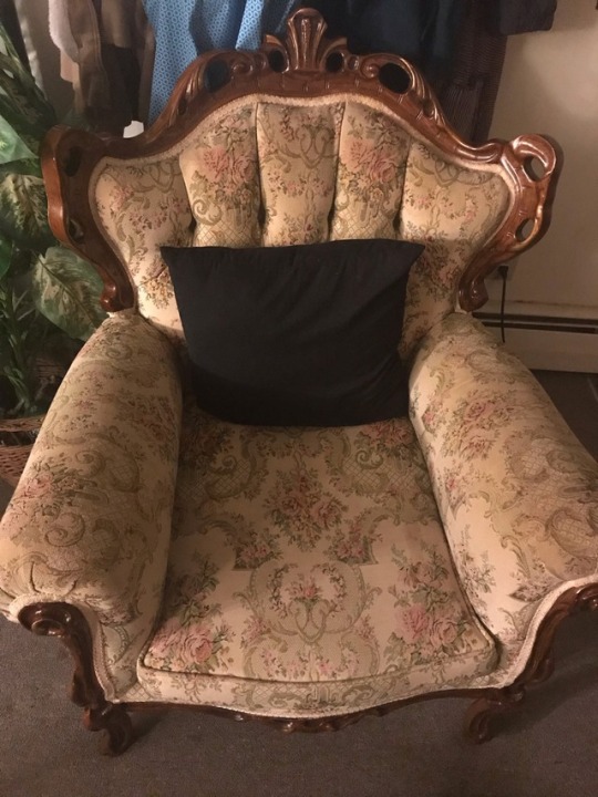
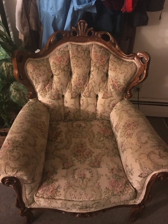
I chose my living room couch. The reason I picked my living room couch is because this couch has always given me a vintage historical renaissance look. I have gone to some of the old Newport mansions and in the inside a lot of the furniture would look like this couch. I noticed that during the renaissance era the furniture would have so much detailing on it. And people could always tell that it was hand made, because the detailing is precise.
1 note
·
View note
Photo

This photo of my front door of a 3 story apartment building with the door handle on the left is simple. The door swings in and to the right. My apartment is on the first floor and the door to get into the living room in my apartment is on the right behind the front door while it is open and the staircase is on the left side of the entryway and there is only room for the door to swing open. There is another door on the left but it goes into the bedroom and is not functional.
The simple fix to this design problem could be to switch the door so it opens to the left. When designing apartments out of 200-year-old homes, there may have been the utility to have the front door open in this way and over the course of the years, the tenants may have changed and had different needs. I know now that it is a struggle for more than one person/animal to get in the door around the door with your hands full or empty.
3 notes
·
View notes
Text

Tumblr Assignment - Cultural Identification
My cultural identification does rely on design. It relies on design because of the way it is interpreted and viewed by myself and others. Products that display a certain place to which others belong to attribute to identification. Additionally certain styles of clothes that I wear contribute to this same matter. Specific significant elements that allow for this identification are the way clothing and items are made and the manner in which they are used.
1 note
·
View note
Text
Portfolio #7 - Period Style

1. Art Nouveau is a design style at was predominately popular in the late 1800’s and early 1900’s. This style includes geometrics and is seen in a variety of features such as interiors, furniture, architecture, paintings and glasswork to name a few. The image from Shed Brand Studios shows a set of doors featuring the Art Nouveau design in the glass portion. The design is also incorporated into the handles and structure of the doors. The black features gently curve around, making the patterns look very focused and gentle. Also, if you look into the rest of their work they make many different designs incorporating Art Nouveau.

2. Art Deco is a design style seen in architecture with a focus on luxury, glamor, and extravagance. This style was seen more in the early 1900’s in France, China and New York City. While exotic designs were growing, new materials such as stainless steel and chrome were expanding the designs even more. This image is of the Bryant Park Hotel in NYC. This building started out as the “American Radiator Building”, with a noticeable black and gold color pattern.

3. Punk design started more commonly in the 70’s when people were starting to rebel against the system and disturb the “happy go lucky” part of societies atmosphere. Punk design was rising in clothing, media, and music arts. This type of design quickly became popular resulting in many young adults rebelling against the system. This picture was from the album cover of the band the Ramones, that started in NYC in the mid 70’s. Their music style was considered “punk rock” and “pop punk”, and although their style was somewhat extravagant, they also considered themselves minimalists.
2 notes
·
View notes
Photo

RN PORTFOLIO 4. SCAMPER
The emergency code carts that we use are old and outdated. For example, they currently use break away zip tags. Code carts are out in the open and in the past, other healthcare providers such as paramedics were being given permission to restock their medications from the cart. As a result, carts were left with insufficient medications and no one taking responsibility. A helpful design change would be to substitute zip tags with biometrics (finger print scanner) to open it. The person who opens the cart will be identified and responsible for documenting all medications that were removed, used, or discarded (not used). This person will also responsible for the restocking the cart. Biometric scanners will cut down on the task being pushed onto someone else, will also serve to reduce errors and accurately identify the source of any issues. Modifying the cart using lighter weight materials would make it far easier to maneuver in a hurry. Eliminating stick on name tags and replacing them with slide-in tag holders would be more efficient and aesthetically pleasing. Adding a Lazy Susan type wheel base would enhance mobility and functionality.
SCAMPER: Substitute: Biometrics to improve the efficacy and flow of the utilization of the code cart
2 notes
·
View notes
Photo

I work in a newly designed Emergency Room and one of the issues I face with helping patients to the bathroom, is the lip from the flooring on the outside to the tile on the inside of the bathroom. This is not the lip in question but it looks a lot like it. (I will post a picture of it tomorrow)
The reason it is a problem is that it is just big enough to make rolling IV poles or wheelchairs over it an issue. You often have to get a rolling start to get over it or pick up the pole. This creates a safety issue for both the staff and the patients. There are plenty of elderly patients whom come in and out of the hospital and if they are unable to pick up their feet, this also creates a tripping hazard.
To mitigate falls and the need to use more effort to go into and out of the bathroom, the lip needs to be more rounded and have a longer slope. This will create a smoother surface for wheeled objects to go over and will not trip patients who have a hard time picking up their feet.
2 notes
·
View notes